Category Archives: Research

Illustration for Designers: A Reflective Blog

Hello. Buckle up your seatbelt, you’re in for a ride.

Not really, just a story.

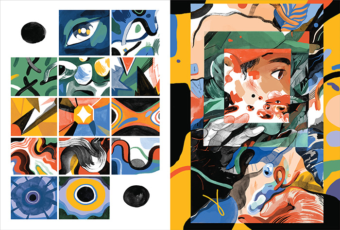
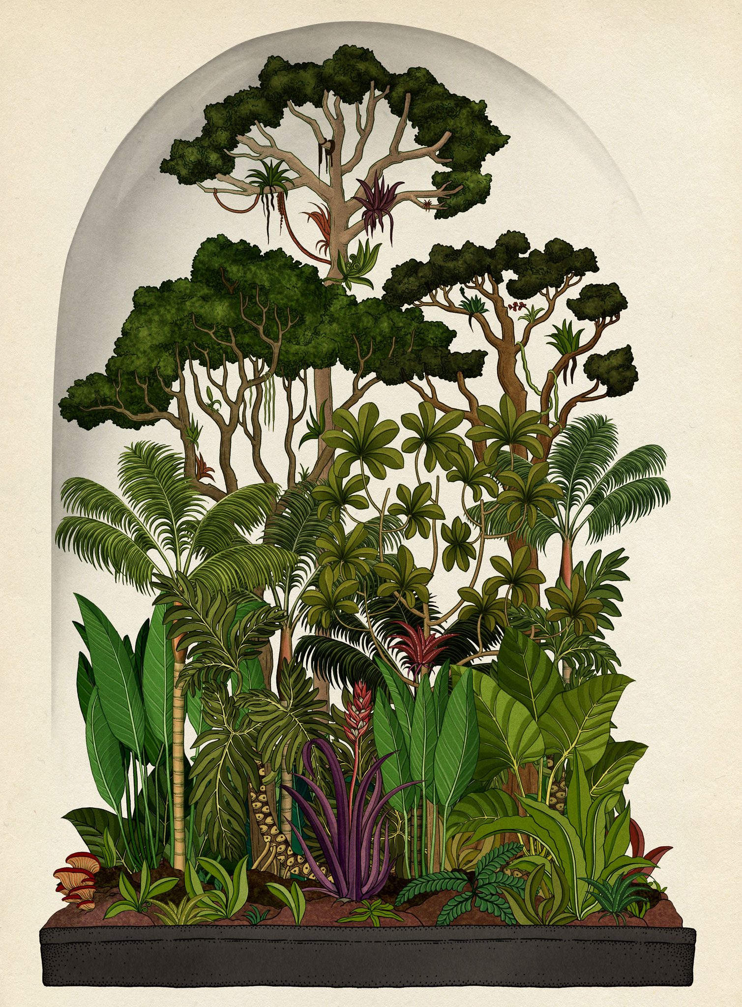
I remember a period of time, last year, where I became obsessed with looking at illustrators’ works online (specifically non-vector ones). I saved Pinterest post after Pinterest post, appreciated tons of Behance projects and followed new Instagram accounts. I wissssshed so badly that I could draw like those artists.

Some of my favourites during that time:

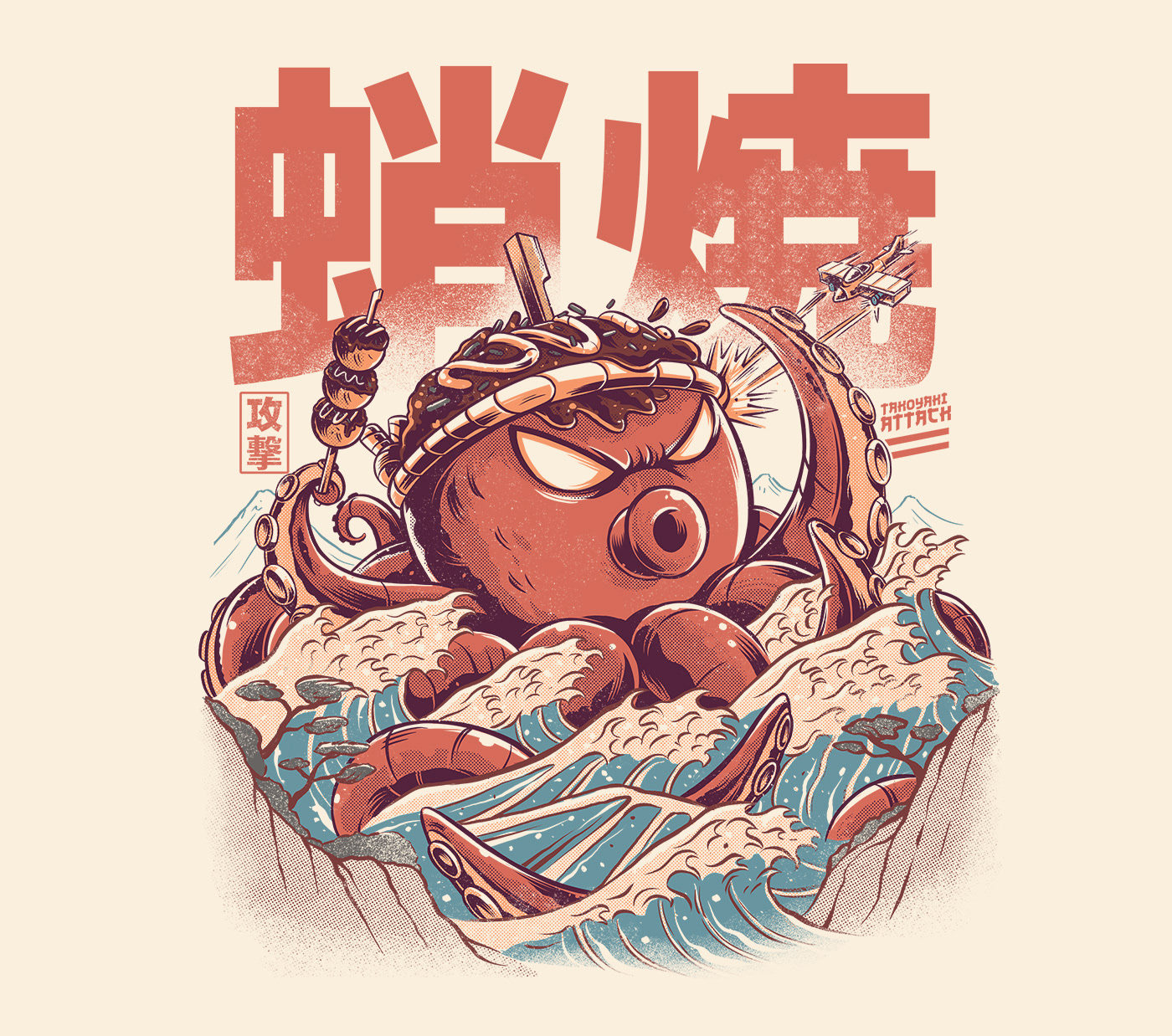
Kaijus + Food illustrations by Ilustrata Studio


Yeaaah! Studio:

YS-Fall2017-6.jpgYS-2018-2019-comic1.jpg


Katie Scott:

Botanicum (Welcome To The Museum): Amazon.co.uk: Willis, Kathy ...

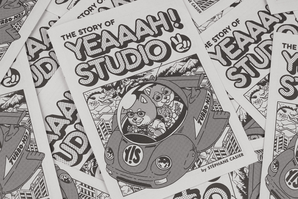
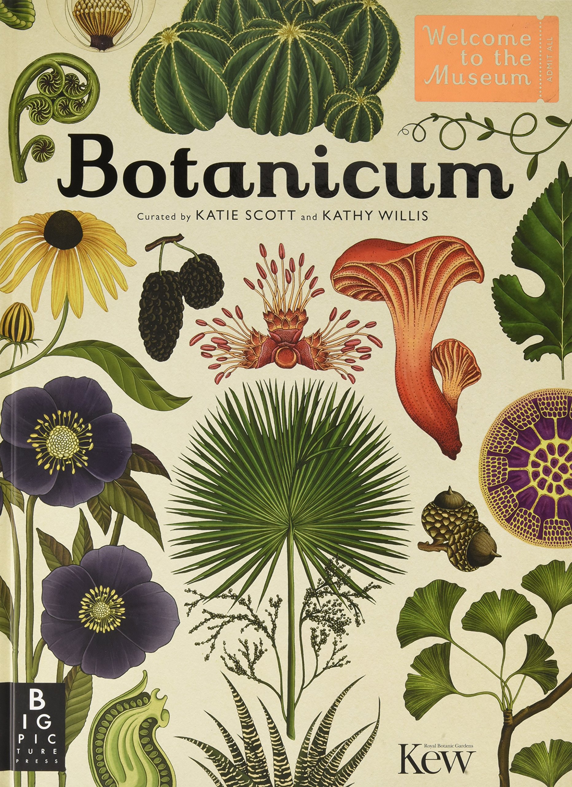
Heck, I even took the opportunity with my time on exchange in the UK (at Hertfordshire!) to get merchandise from Yeaaah! Studio’s store based in France. Actually my friend got it for me for my birthday, but, same thing. AND, even better, the first time I went to London, I stepped into ARKET, and saw a beautiful, beautiful, illustrated book. It was selling at £19. I hadn’t even dared buy myself a turtle neck sweater (that I very much needed) for £19. But I knew I wanted it. I needed it. I bought it. It was this book:

Animalium : Jenny Broom : 9781787411647

By who? Katie freaking Scott! I didn’t even know! It was fate! Could’ve gotten it cheaper off Amazon or something, I was new to the UK, don’t come at me.

Anyway, prior to this class, I hadn’t illustrated much of anything since my foundation year in ADM, and any illustrations I’d done so far were all vectors. So I was really itching to learn how to draw, lines, with my actual hand. I watched YouTube videos, and wanted an iPad to draw on Procreate so badly (because I’m a sucker for technology), but had no money to get one, I almost sold my new DSLR for it (because I was in a photography obsession phase before this).

Eventually the obsession with learning how to draw ended, and I decided against buying an iPad for myself. My mom had offered to get me one, but the offer came with conditions, and I wasn’t up for that, but I’d already lost the fire anyway.

And guess what? My mom decided to surprise me with an iPad anyway while I was in the UK! (With an apple staff discount from my uncle, thanks uncle).

Boy did I feel PRESSURED. I’d lost the fire to learn the new skill, but now I have an iPad in my hands, that didn’t come from my money, and so I HAVE TO MAKE USE OF IT. So, I knew, I was going to take Illustration in my next semester back in Singapore.

So hello, again. Here I am.

Starting off the semester, I was motivated, I was excited to learn a new skill in the new year.

Then school actually started, and I was like, dammit, I don’t want to do this anymore (hadn’t even started anything).

But then I was like, ok, you’re already here, in this class, with a damn iPad that you bought Procreate on, so suck it up and do great things in 2020.

And so I did.

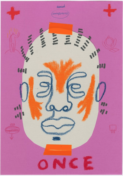
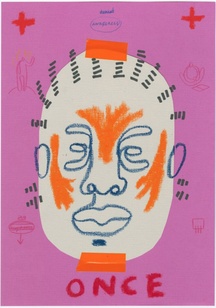
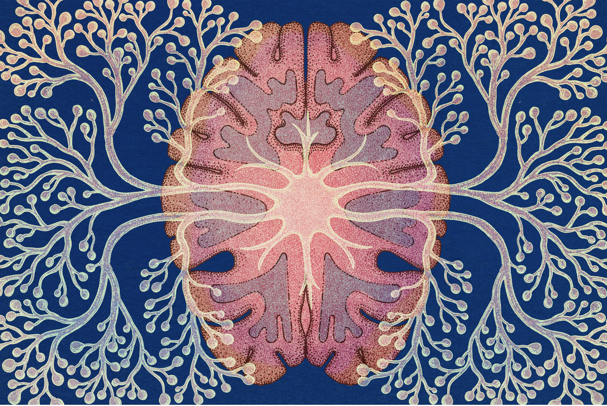
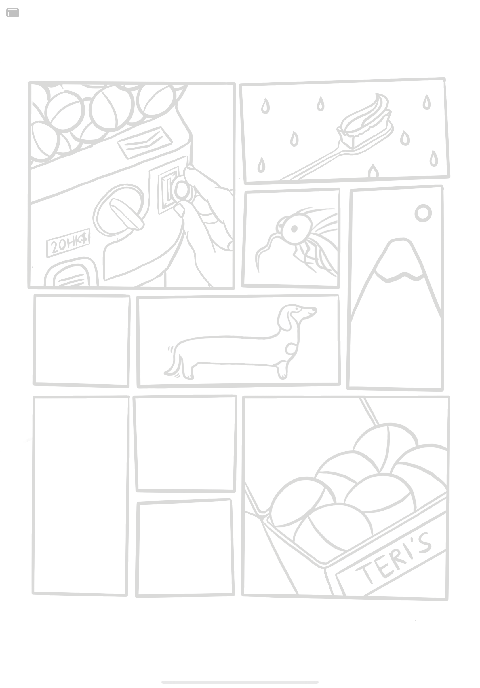
I forced myself to use Procreate for the first Inanimate Portraits assignment. That was fun. Thank God it was in black and white, because I think I’d have been overwhelmed if I had to colour in the drawings too.

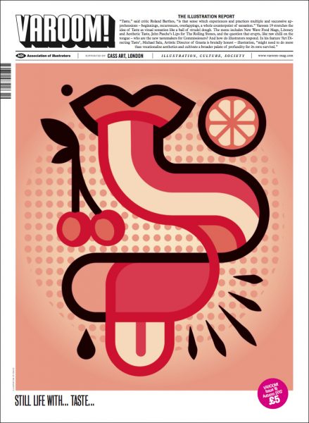
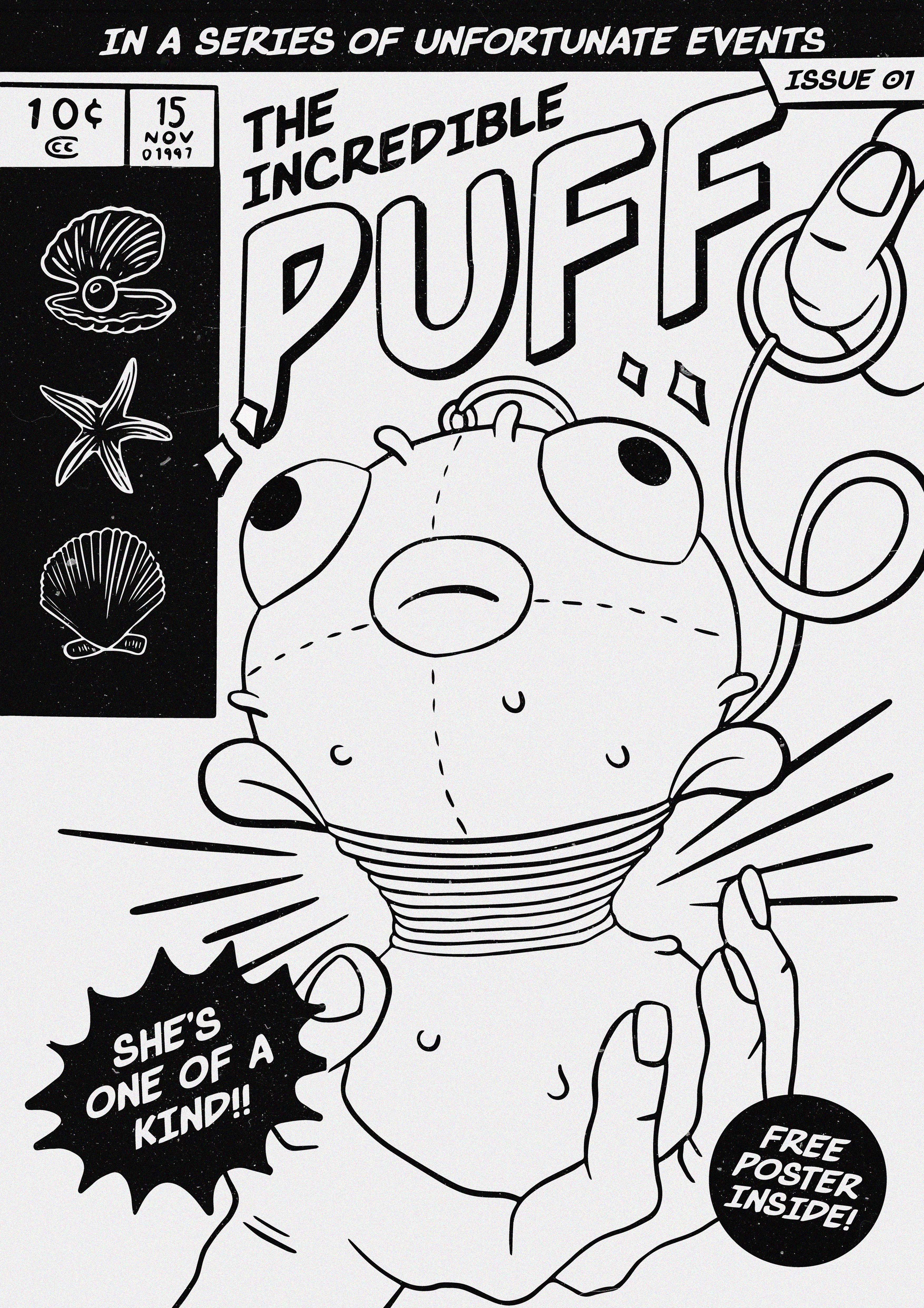
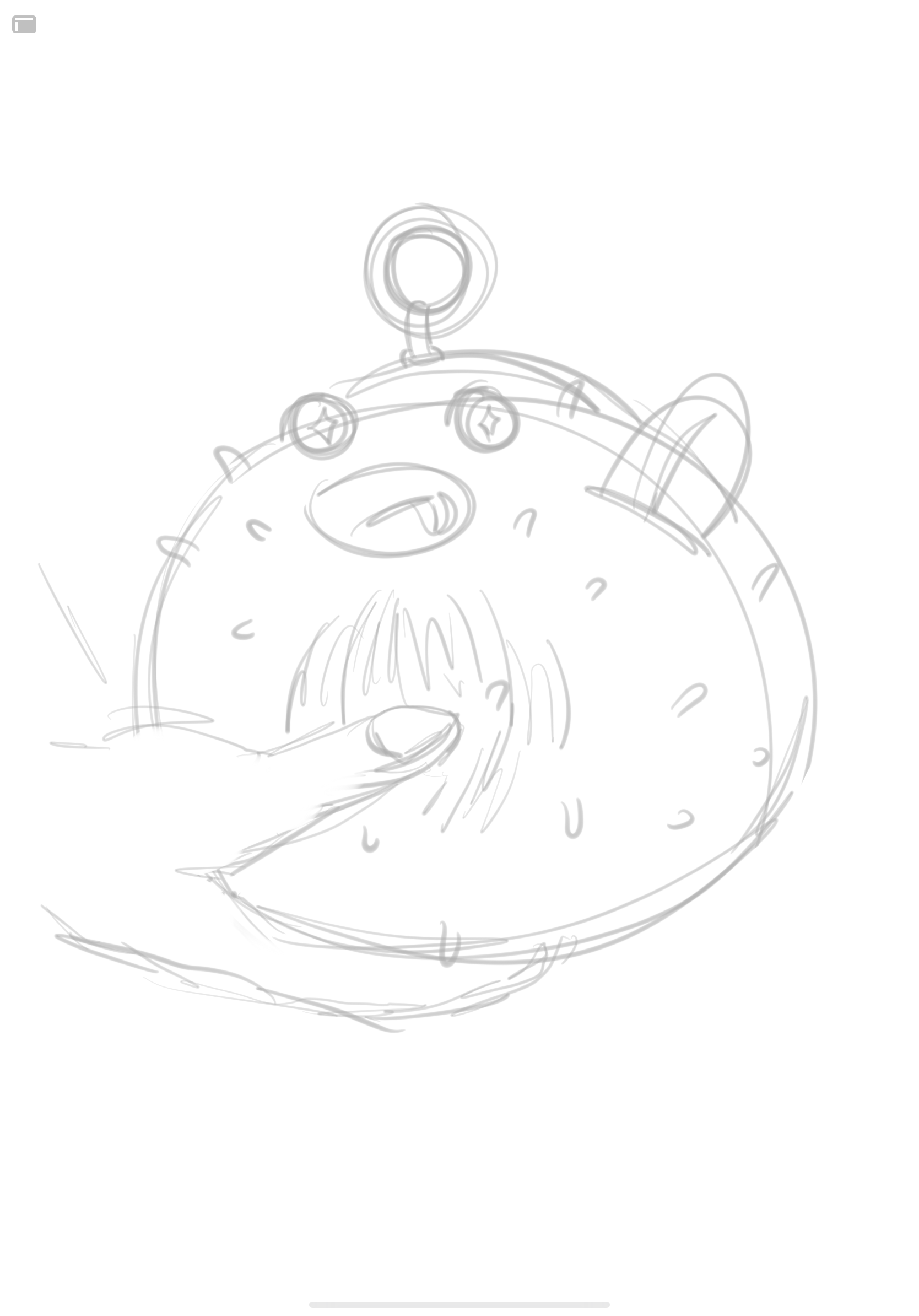
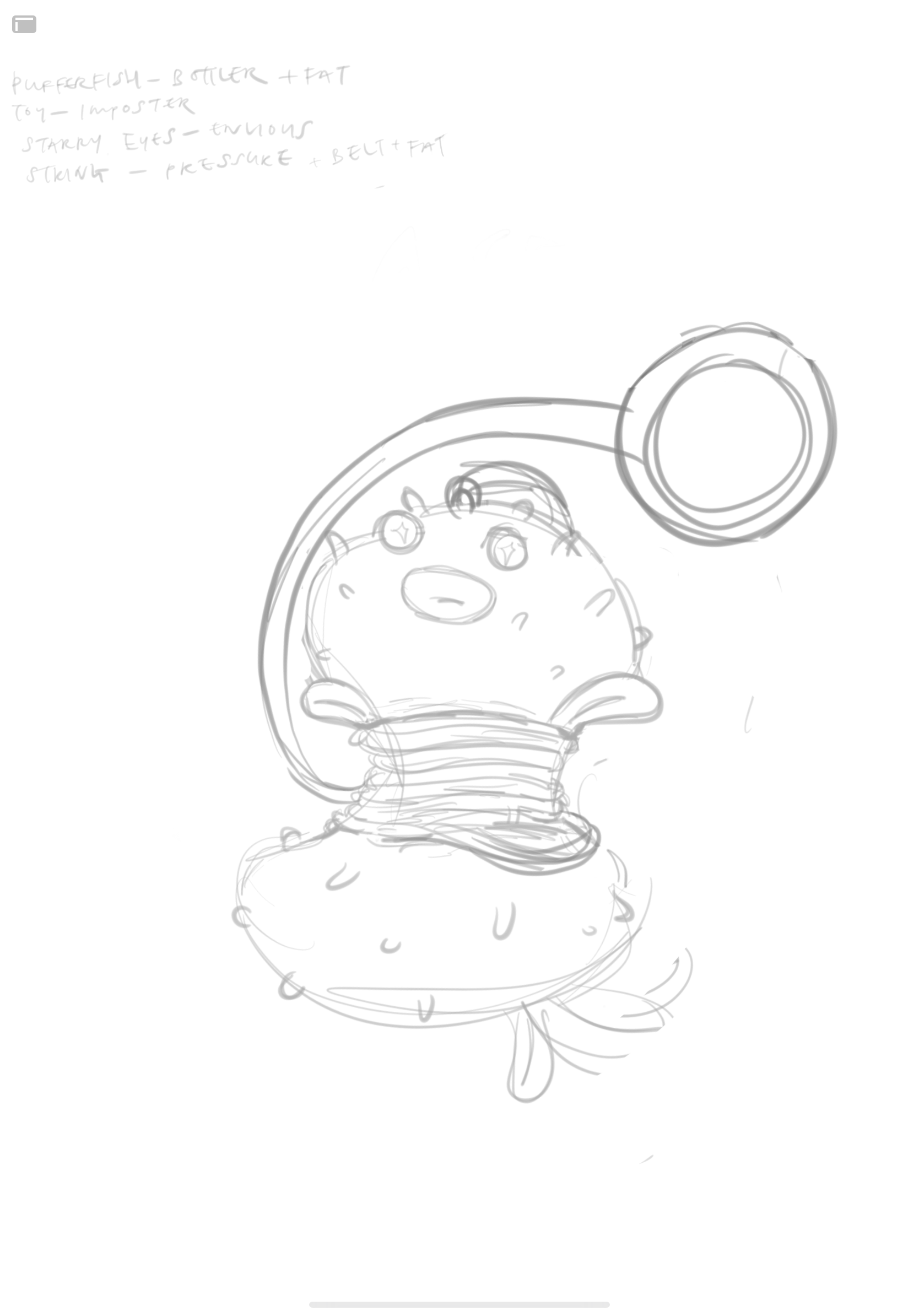
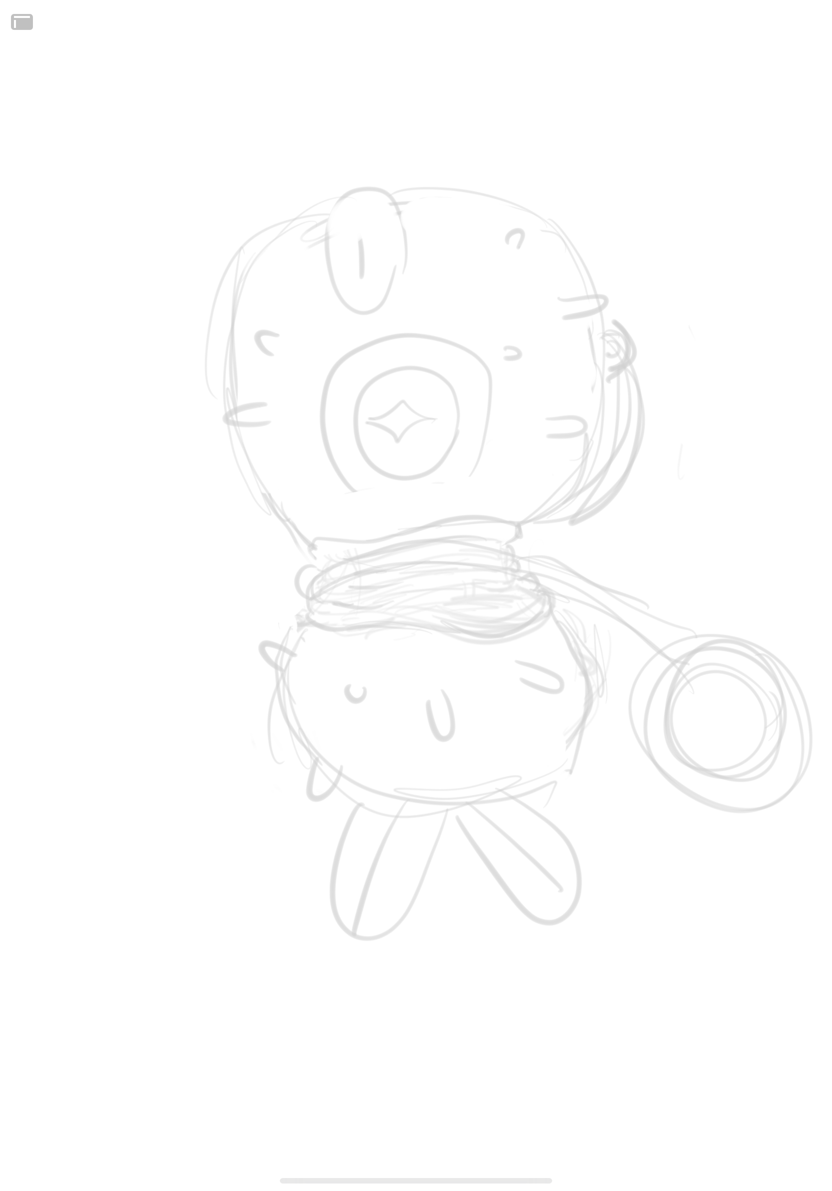
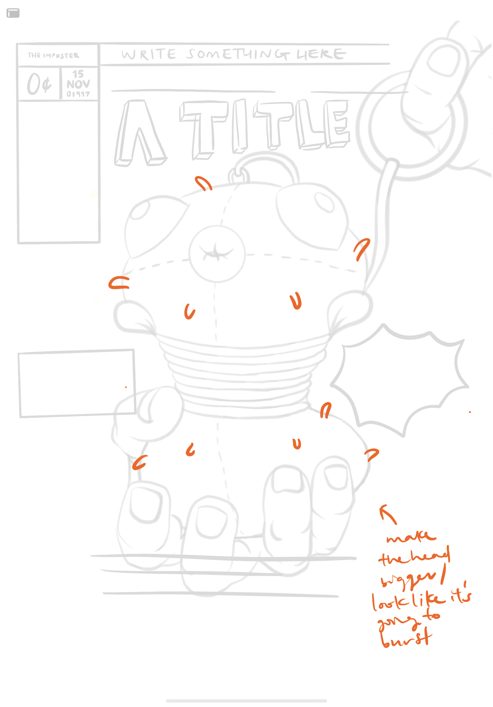
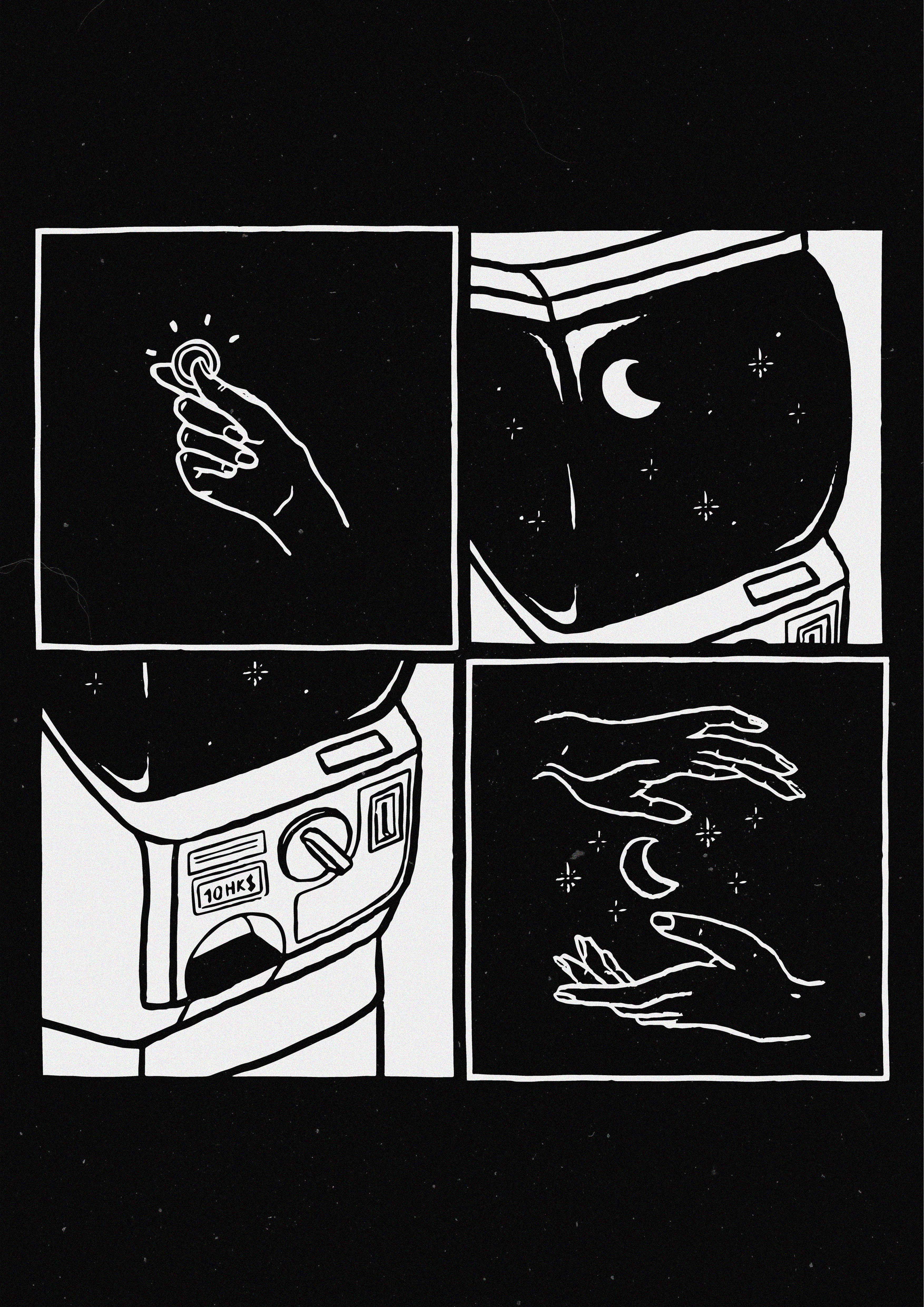
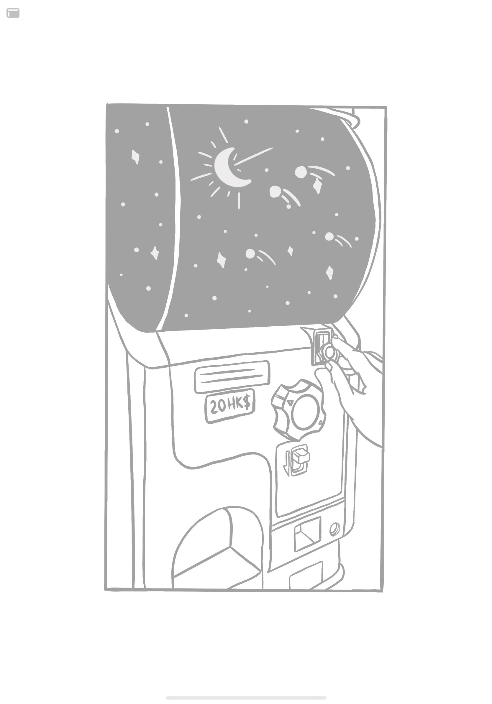
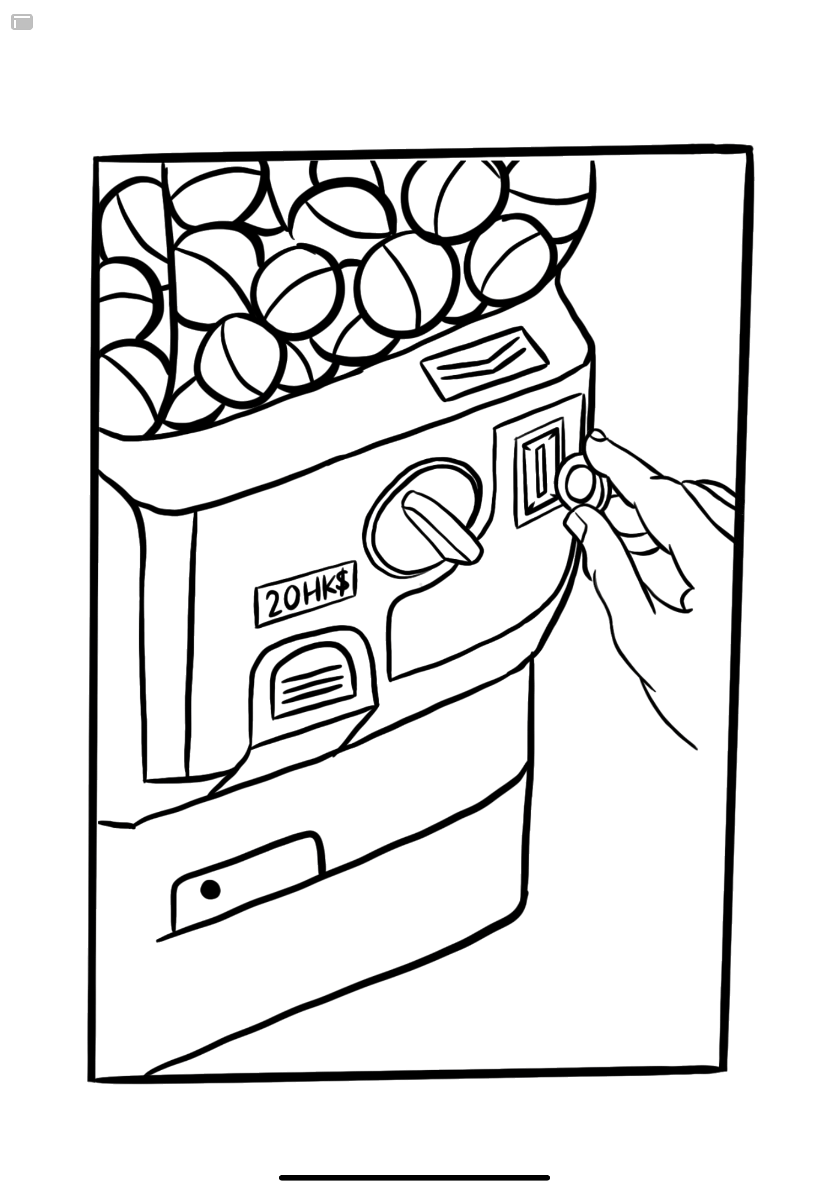
Then came the Varoom assignment.

To be honest, I wanted to get back to vectors at this point, partially because I thought it would be easier/quicker and also because I had inspiration from several vector works. BUT, it’s like the world was pushing me to draw with my hand, because my macbook DIED. Actually it was dying progressively, and it wasn’t actually dead but it could be considered dead, so I had no choice but to draw on my iPad (again, because me+pencil+paper don’t go together).

And so my Varoom cover was born. Drawn by my hand.

Then came the last assignment, and whoops, it’s in vectors!

Well, my main goal of the semester was to really just to try new things, and maybe do things how I wanted to and not listen to my professors all the time. I’m happy I tried this new style of simple vectors, even mixed with photographs, and even freaking motion graphics. I’ve barely touched After Effects ever, and now I don’t feel the need to take the Design in Motion class next year as a UE-that’s-too-heavy.

Also, might I add, I’ve never been naturally inclined to the creative side of things — my best and favourite subjects back in primary and secondary school were math and science, but I somehow ended up in Mass Communication and then in ADM doing Visual Communication. I don’t know where the heck I’m going with my life, I don’t know how the heck I ended up in an illustration class when I like math, science, and logic, but I feel like I’ve conquered a mountain in this class lol. So thank you Lisa for your enthusiasm and open-mindedness with the class!

02 — Varoom: Research

ABOUT VAROOM

What do you find inspiring?
What’s inspiring is that we get to see a full range of expressions through illustrations by illustrators across the globe, across a spectrum of subjects.

What type of information is in the magazine?
Varoom is the globally leading illustration magazine featuring a unique combination of industry insight and critical analysis of the field of illustration.

Explained well by Varoom 36 Rhythm, “Varoom showcases some of the most striking image-making from the crop of 2017 art school graduates, guided by the AOI’s global network of professional bodies and educational institutions. The images are a sample of outstanding work from Kristiana to Kingston to South Korea – from children’s stories to social observation to fashion and politics, there are new rhythms emerging. Follow these young image-makers as they take the pulse of changing time.”

Who is the target audience?
Each Varoom magazine caters to a different target audience with its specific theme/topic. The target audience of each magazine would hence be anyone who can find a connection between themselves and the topic, especially if they appreciate the expression through art and illustration.


(MORE THAN) THREE ARTISTS (FROM VAROOM)

i. Victo Ngai, of course (in Fantasy)

What do you find inspiring?
Her insane amount of detail!!!!!!!!!!!!!!!!!!!!!!!!!!!! Nothing is just for decoration.

What medium(s) do they use?
I’m not sure. On paper then digitised?

How do they creatively interpret the text for the article?
To be fair, the article is about herself and her work, so it’s not much about creatively interpreting the text for the article but just explaining her own interpretation of art and her fantasies.

“Art is a space where I can be my own master – I love that within that space, I can disregard the rules of our reality, and yet manage to create worlds that people can get lost in.”

“By draping subjects in a cloak of fantasy, it becomes easier to explore difficult topics and reflect upon ourselves a few degrees removed.”


ii. Molly Mendoza (in Fantasy)

Digital Fantasy from Messy Reality
Billie Muraben investigates immersive indie games Heaven’s Vault and Telling Lies.

What do you find inspiring?
I like that Mendoza did not conform to the stereotypical visuals of fantasy, as pictured in the Google and Pinterest searches below.

What medium(s) do they use?
Traditional

How do they creatively interpret the text for the article?
As described by Victo Ngai where fantasy is just looking at subjects “a few degrees moved”, I like how Mendoza takes recognisable objects and distorts them in an abstract manner to create a distorted reality.


iii. Radio (in Taste)


Cover illustration created for Varoom by Radio. 

Varoom 19 stretches the idea of Taste as visual sensation like a ball of strudel dough. The menu includes New Wave Food Mags, Literary and Aesthetic Taste, John Pasche’s Lips for The Rolling Stones, and the question that erupts, like raw chilli on the tongue – who are the new tastemakers for Commissioners? And how do illustrators respond. In his feature ‘Art Directing Taste’, Michael Salu, Artistic Director of Granta is brutally honest – illustration, “might need to do more than vocationalise aesthetics and cultivate a broader palate of profundity for its own survival.

What do you find inspiring?
Radio’s ability to portray not just a mouth, but taste, and not just one taste, through such a simple vector image.

What medium(s) do they use?
Digital vectors

How do they creatively interpret the text for the article?
The Taste issue of Varoom talks about not just the taste of food, but also on people’s literary, aesthetic, and music taste. By not using realistic food illustrations, we are directed away from believing that the magazine will talk about only food. The use of red also makes it seem like the content’s gonna be spicy.


iv. Joy Miessi (in Nostalgia)


Awareness by Joy Miessi | Aisha Ayoade talks to Joy Miessi about preserving memory in mixed media for her most recent exhibition.

What do you find inspiring?
The mad simplicity…!!

What medium(s) do they use?
Traditional, looks like crayon, maybe colour pencils? Tape, paper

How do they creatively interpret the text for the article?
Nostalgia? Crayons? Simple, rough, almost scribbly lines? About preserving memory? The art style couldn’t be more appropriate for the article.


(Not from Varoom). Katie Scott

nullnullnull

What do you find inspiring?
I love Katie Scott’s works. She turns her research of ancient science and scientific theories about the world into fantasy-like illustrations of regular biological things like plants, animals, fungus, evolution (dinosaurs), etc. They look so normal, so calm, yet so odd, some of the time. They’re so real, yet sometimes look like they’re not from this world.

What medium(s) do they use?
Pen on paper, scanned watercolour swatches with adjusted hues 

How do they creatively interpret the text for the article?
Oops. Katie Scott isn’t from Varoom. I did this before I realised the artists were supposed to be from Varoom.

01 — Inanimate Portraits (Process & Final)

01 — MYSELF

Here, is I, represented by a comic book cover of a toy pufferfish in discomfort.
My self portrait illustrates a good number of negative traits and insecurities I have about myself. It is illustrated comically, because on the surface I tend to give people the impression of being very ‘happy go lucky’ or… just… being a comical person. (This definitely doesn’t come across in class hahahahaha).

Pufferfish:
A bottler (of emotions), exploding
Body dysmorphia (fat)

A toy, not a real fish:
Imposter syndrome! I’m not real.

Bulging eyes, thick lips:
Bulging eyes because the fish is exploding, but I also do have larger eyes and fuller lips than the average Singaporean Chinese. Heh

Rope/finger pulling hoop:
Society/whoever/whatever’s pressure on me
A belt/corset, squishing my fats

Rounded puffer spikes:
I’ve had several people tell me that their first impressions of me were that I seem to be unapproachable, but once they got to know me, I’m quite… harmless.

Comic book cover:
Teri’s interview with me turned into a life-storytelling session where I just went on and on and on about my very visual/graphic stories. Hence I am a comic book, not a storybook, not an auto-biography.

10 cents:
My worth

15 Nov 1997:
My birthday

Free Poster Inside!:
Because who doesn’t want to just be famous and have ~no problems~ other than worrying about looking bad on a poster that people hang up in their rooms! Not me!

Pearl, sea star, pretty shell:
Everything that I want to be. A pretty shiny star.

Sparkles around eyes:
Either: I’m so beat up I’m seeing stars, or to symbolise my tendency of envying others.

Hand holding puffer:
Either: This poor, poor, puffer, is so obviously beat up but is still being presented as perfectly alright! Yeah! This is fine! I am fine! Or: Sometimes I just want to be held, ya kno…

ILLUSTRATION PROCESS (Click to enlarge)

I pretty much have all the negative traits/insecurities about myself etched in my mind, so it was easy to head straight into ideating and sketching those ideas out. I believe I was scrolling through Behance for an art style inspiration, when I came across an image of a pufferfish and it just felt… perfect. Like when you come across an item of clothing at a store and you just know you have to get it.

An idea I played with was with a pufferfish sitting in Cinderella’s glass shoe, symbolising my imposter syndrome. If the shoe fits, I sits. Another would also be having a hand squish the fish instead of a rope/string. I also tried out different looks for the puffer.

Image result for if it fits i sits meme

For consultation, the main feedback that I got was just to make the pufferfish look like it was exploding more by making the head bigger. I did make the head bigger, and I also thought of adding fat rolls to the puff, but I didn’t want the illustration to be overdramatic/ too obvious (with the fat rolls).

I moved the illustration back and forth through Procreate and Adobe Illustrator to vectorise, add text, and re-adjust the composition.


02 — TERI THE GALAXY

Here is Teri, in a grid.

I asked Teri a million questions rather than just three, so I won’t bother with a whole transcript. I also went through several stages of interpreting her to end up with the elements that I have, hence I’ll go through the relevant information I’d received and referred to whilst interrogating Teri about her life.

SHORT EXPLANATION:

“I would definitely rather save to spend on travel and invest on new experiences than to spend on other things” — Teri, 2020

  • Teri would rather spend on experiences than things.
  • Teri’s significant events both had to do with seeing the world, and making her feel small (in a good way) (travelling to NYC by herself from Canada, and climbing a >3000m high “stupid ass mountain” aka Mount Kerinci in Indonesia).
  • Teri “cannot commit” to pen. Must go in with pencil first.
  • Teri is very difficult to put together. I had to ask her a million questions, and every response I got would not be what I was expecting haaa. In a sense she’s a little hard to predict.
  • Teri is a very private person. She does not have any posts or stories on her Instagram.
  • Teri is Singaporean, but grew up in Hong Kong.

So,

Square 1: Money in hand
Teri has money!

Square 2: Vending machine of a galaxy
The galaxy represents how Teri likes to see the world, likes experiences that make her feel small, and also how I really don’t know much about Teri much like how we don’t know a lot about space. The galaxy represents how Teri would rather spend her money on an experience that makes her feel all those ways rather than on capsules (objects).

Square 3: Vending machine coin/ receiving slot
Teri puts her HK$ money in, and receives something random from the machine!
Other than representing Teri’s expenditure, the machine also represents the part about not being able to predict her.

Square 4: Galaxy in hands
Teri’s Got The Galaxy

And finally, everything is in a grid because: Teri has nothing on her Instagram, and these are the bits and pieces of what I can make up of her.

ILLUSTRATION/ IDEA PROCESS

A significant event

While I made Teri explain the whole scenario of her travelling solo for the first time (in general) from Canada to New York all by herself, what really caught my attention were the last three words that she used to describe her takeaway from the experience.

Grow some balls

From then on I knew I wanted to illustrate something with growing balls, because that was the most visual, metaphorical item she had given me. I didn’t want it to be rated balls though, because Teri is quite the innocent (or at least on the surface).

From then on I just kept thinking of what other ways I could represent balls. I randomly thought of a gum ball machine, then a vending machine of capsules. Perfecto!

I played around with different ideas like illustrating her experiences in the capsules, turning the capsules into takoyaki (one of the foods she likes), or showing a collection of her balls (because I had asked her how many balls she had before her experiences, now, and how many she would like to have by the end of her lifetime – the answer was 3, 6, 10).

Then I thought about illustrating a random grid of all the random things I know about her, because I got frustrated that everything I knew about her was all over the place. For example, she brushes her teeth in the shower, she’s insecure about the scars on her legs from excessive mosquito bites, the dachshund is her favourite dog breed of all.

Then I felt like everything was too random, and the one with the vending capsule machine had a whole story in its own square, so I expanded on that, and tada!


A FEW WORDS

It’s been a fun first mini project. I took this course up because I’ve been wanting to pick up illustration for the longest time but have never gotten around to practicing it. Then I thought about giving up on that idea, but then my mom got me an iPad (thanks mom) and I felt the pressure of making full use of it… so here I am. Now I have something to force me to learn the skill and it’s been fun. The last time I illustrated anything was in vectors and in my first year.

Also this assignment made me realise how much I don’t know Teri at all, even though I’ve known her for 2.5 years. What fake friends we are!