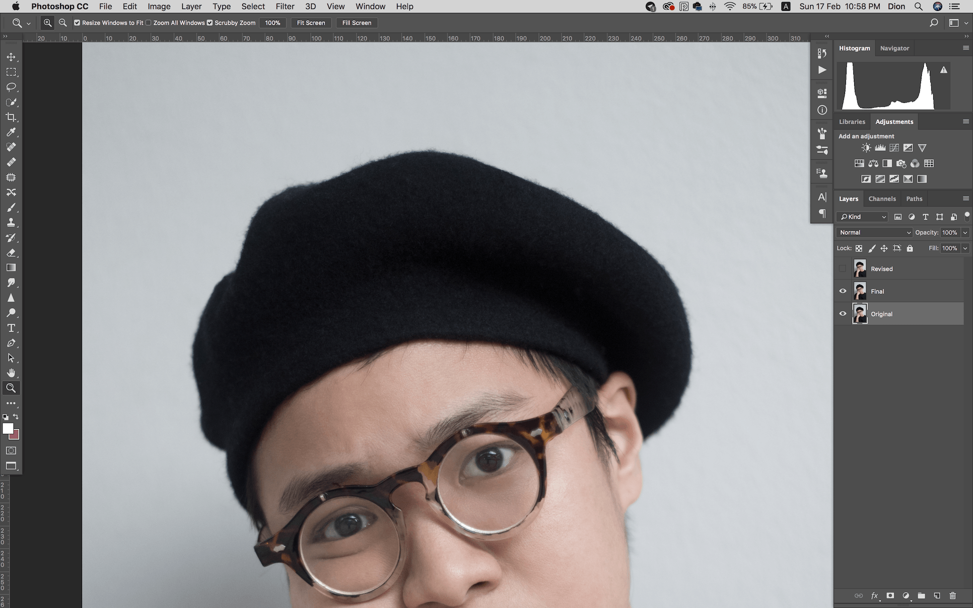

PSD File Download
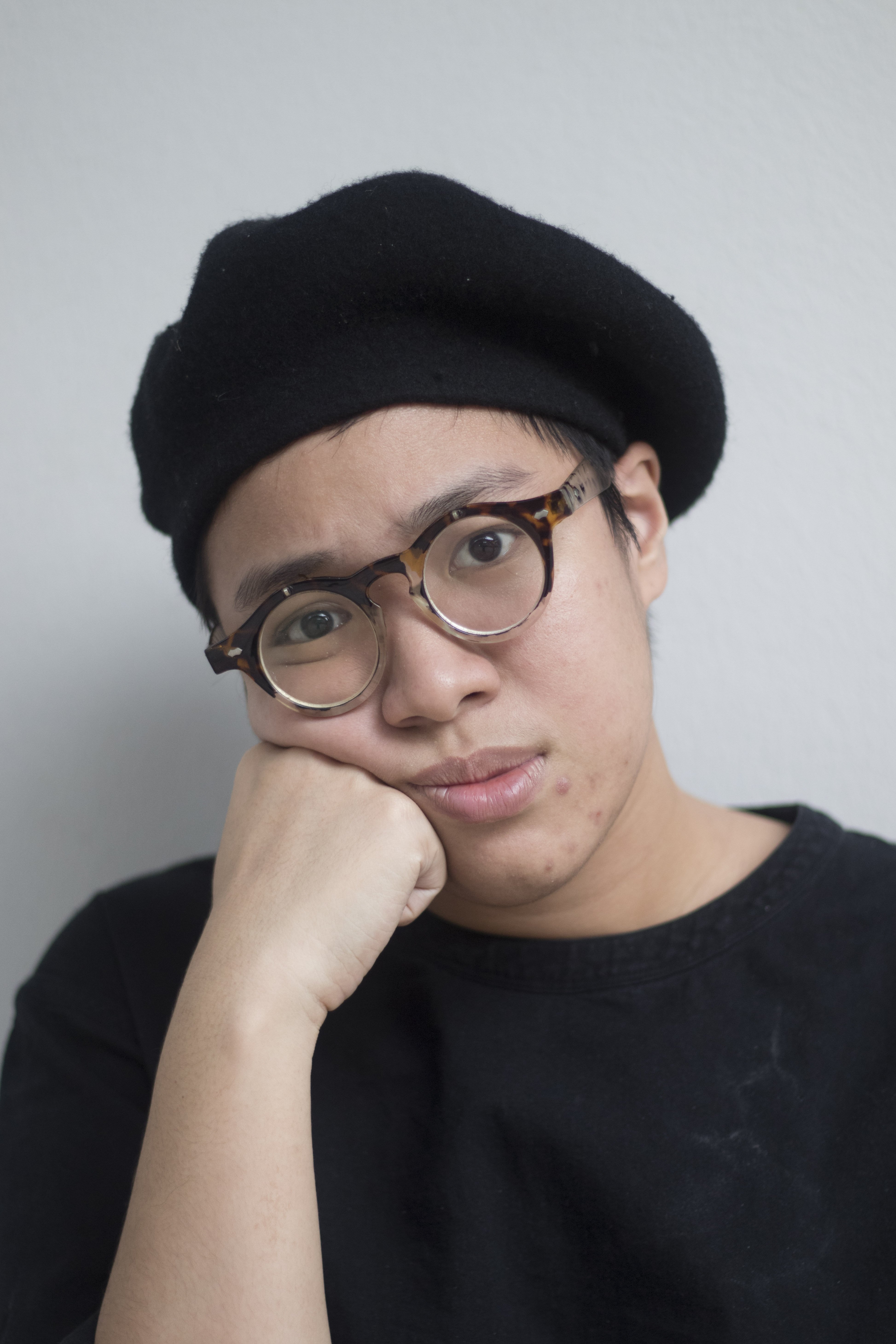
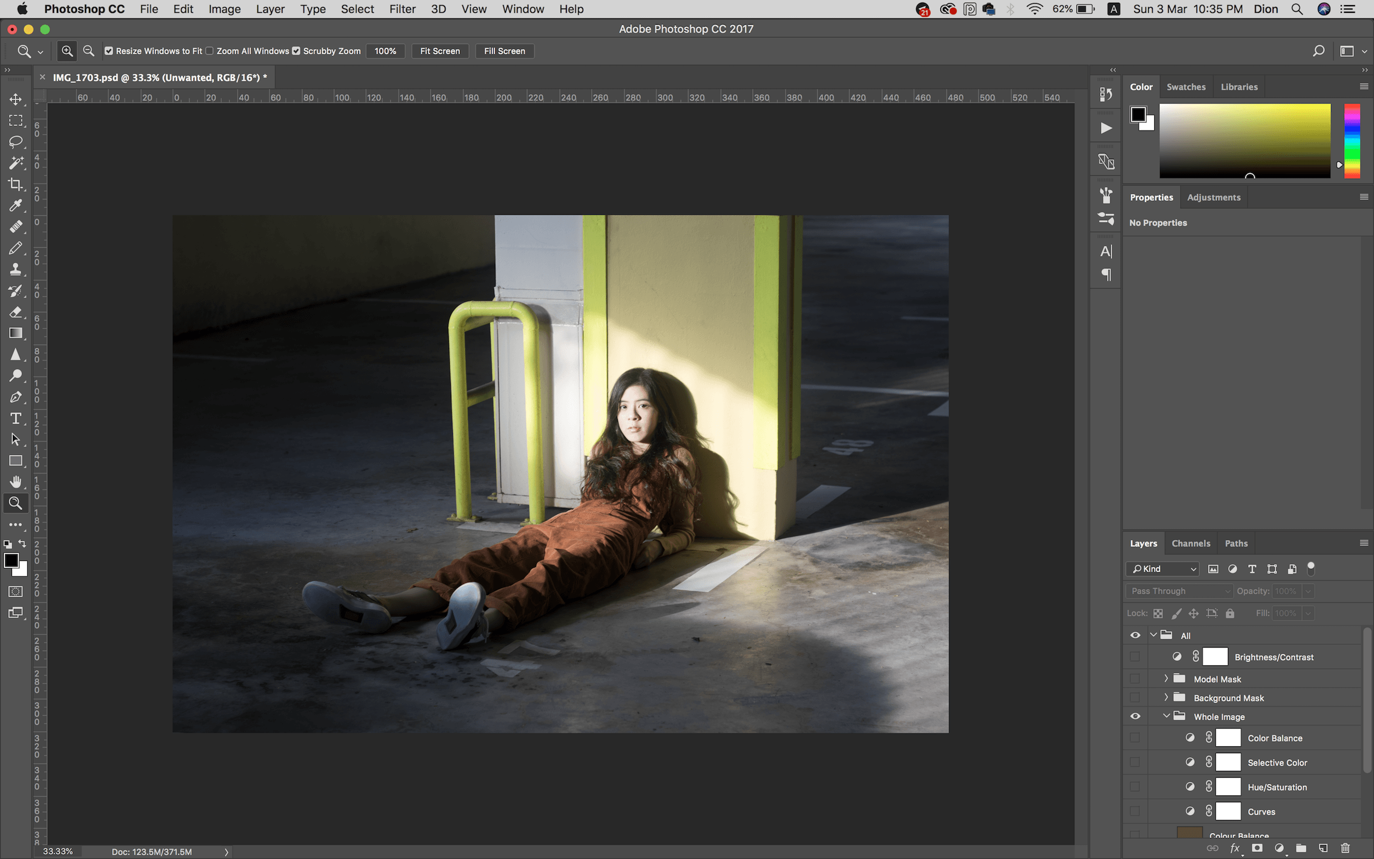
Before

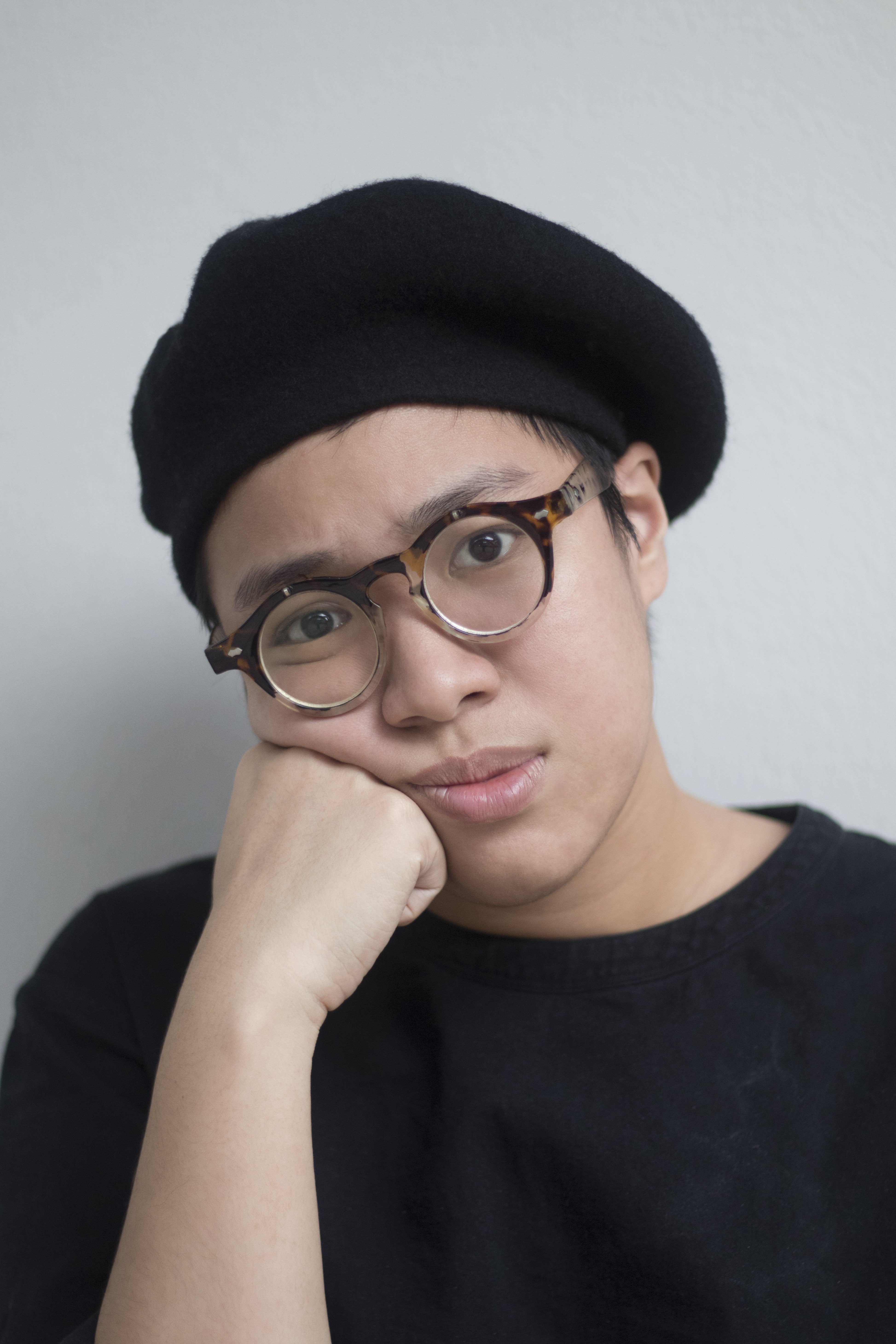
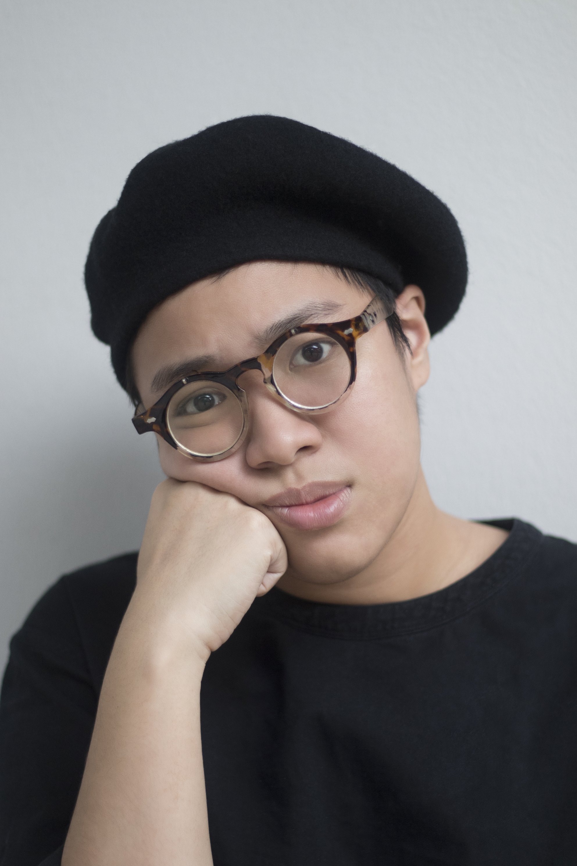
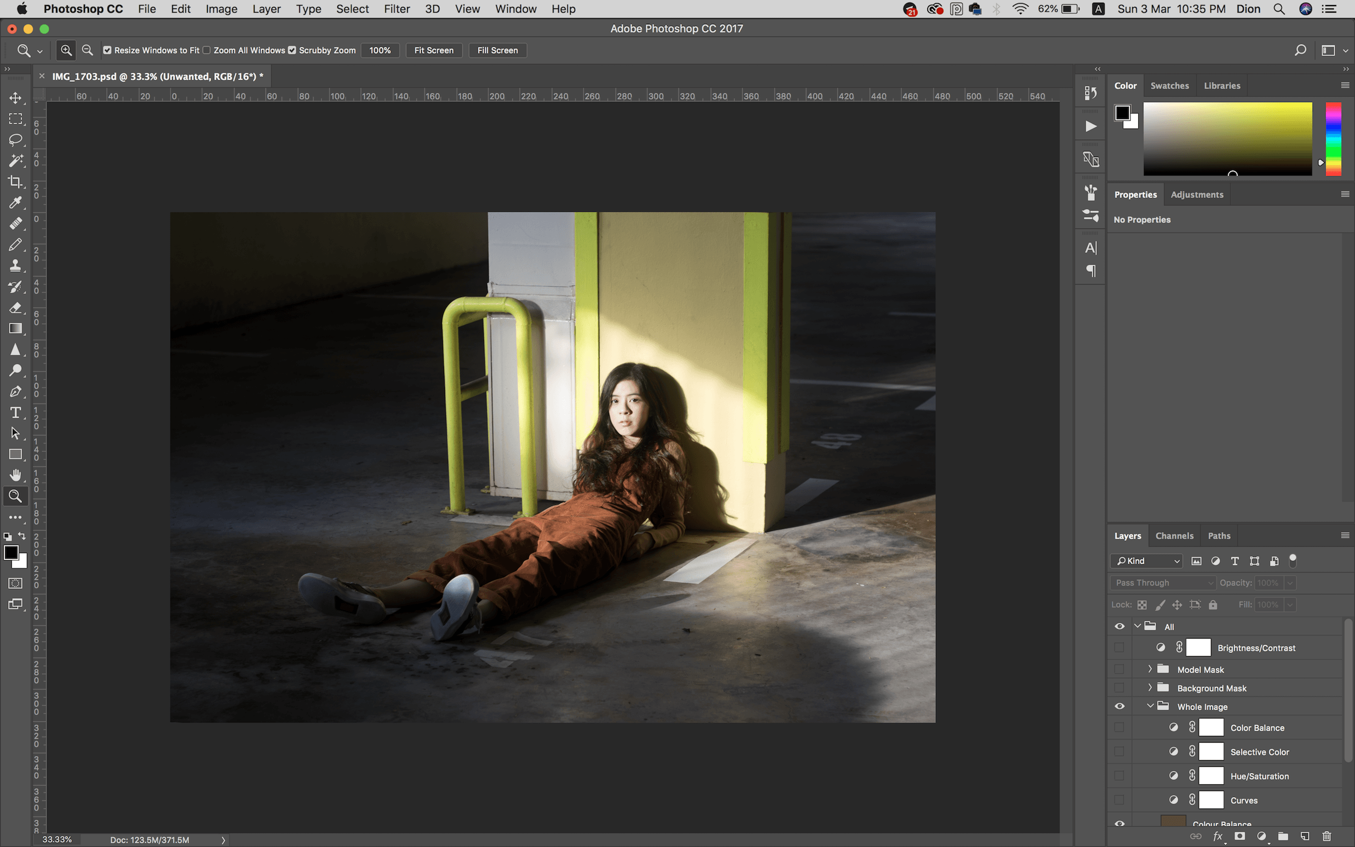
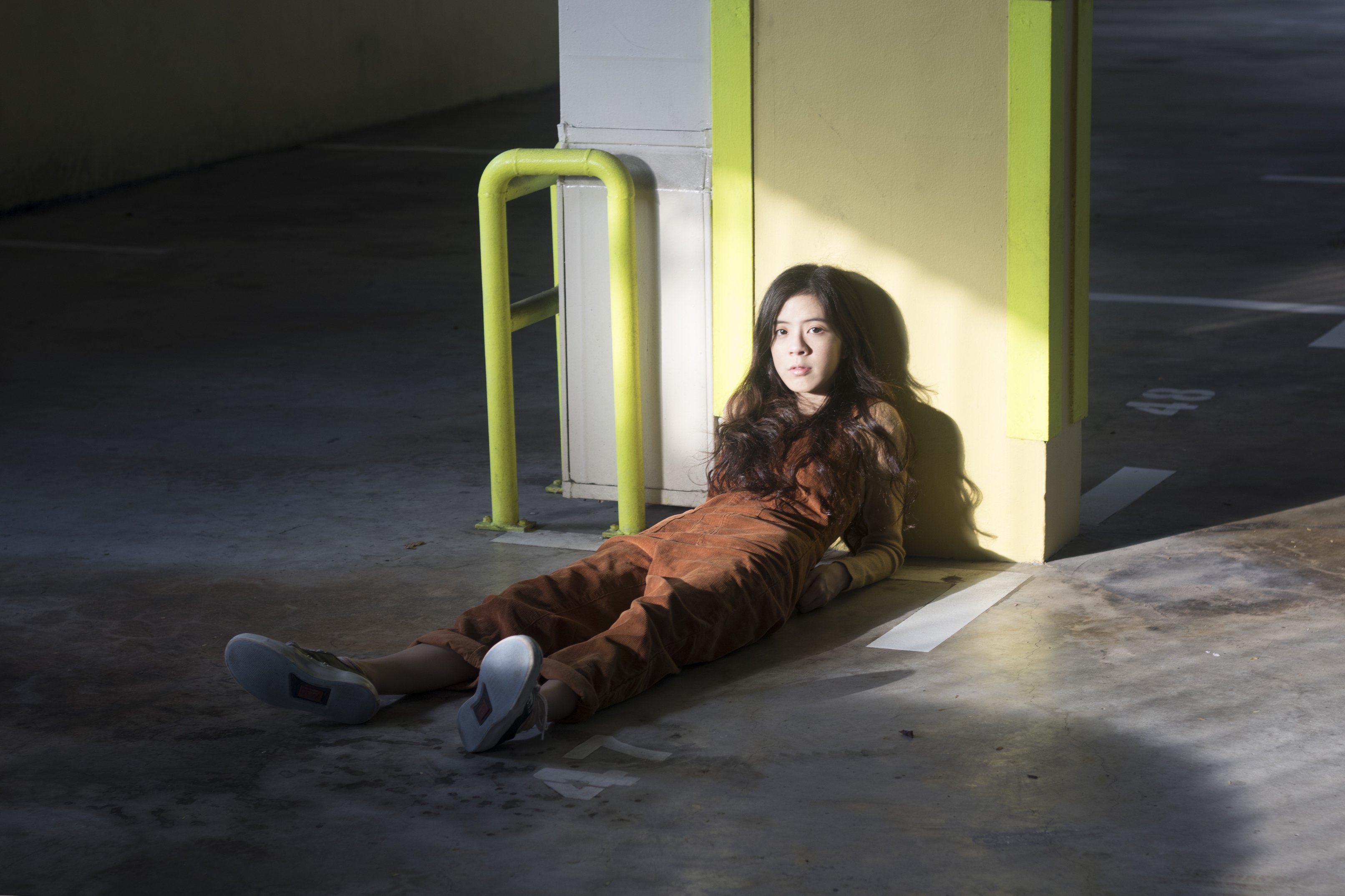
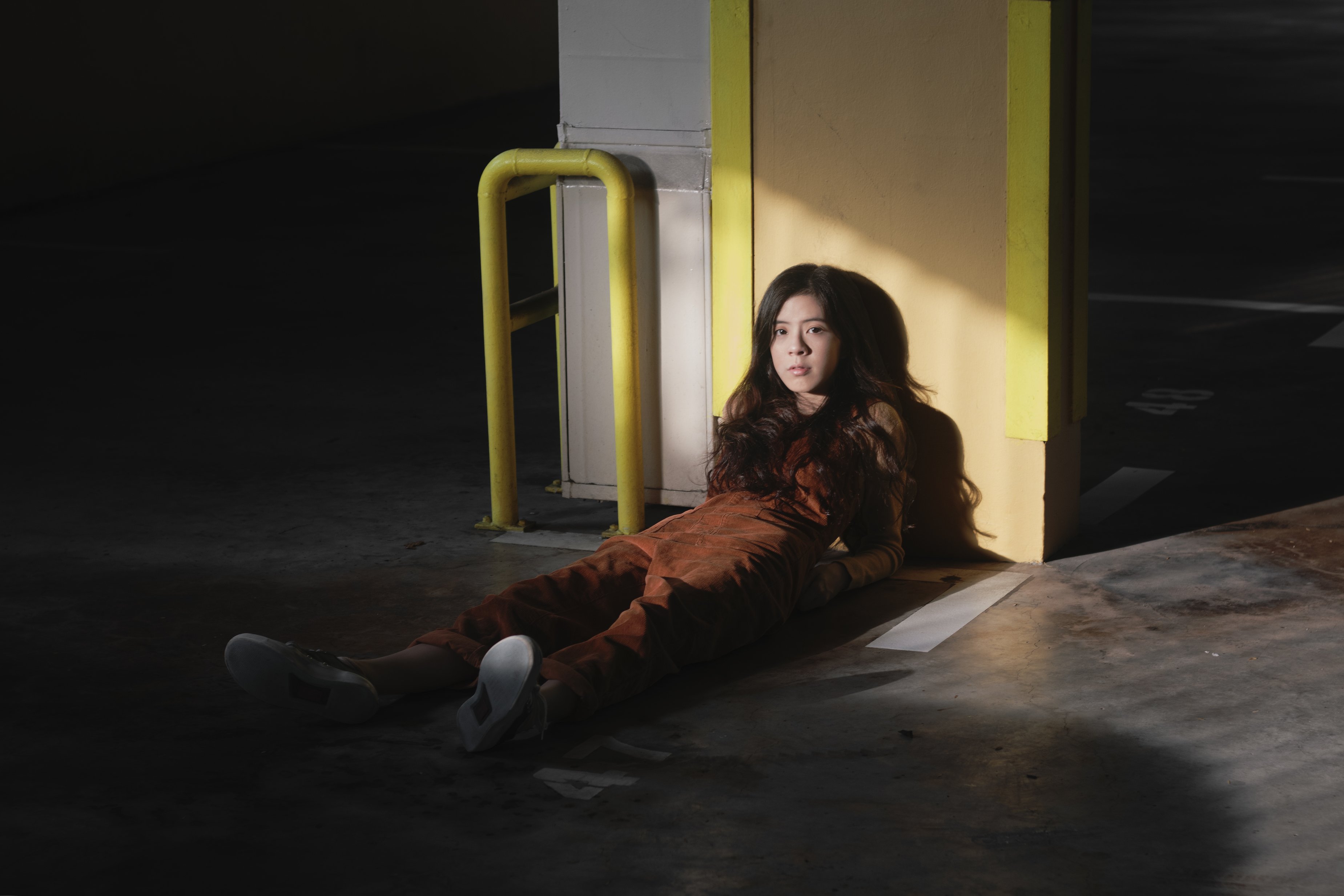
After

Artist Statement/ Concept
I’ve always enjoyed the look of hard light and shadows in photography, whether for portraits or for landscapes. I was walking around with a friend and really liked how the light hit this spot in the basement parking lot, and thought since both her outfit and the wall were somewhat monochromatic (albeit the wall’s yellow was too cool for my preference), I decided to give it a go.
Camera Settings
Of course, since I’m new to photography AND I’m trying to play with harsh light, the turn out was pretty wonky… But at least I can learn now.
Shot with Canon 77D, 50mm
1/25, f 3.2, ISO 100
Digital Process
Left: Before / Right: After
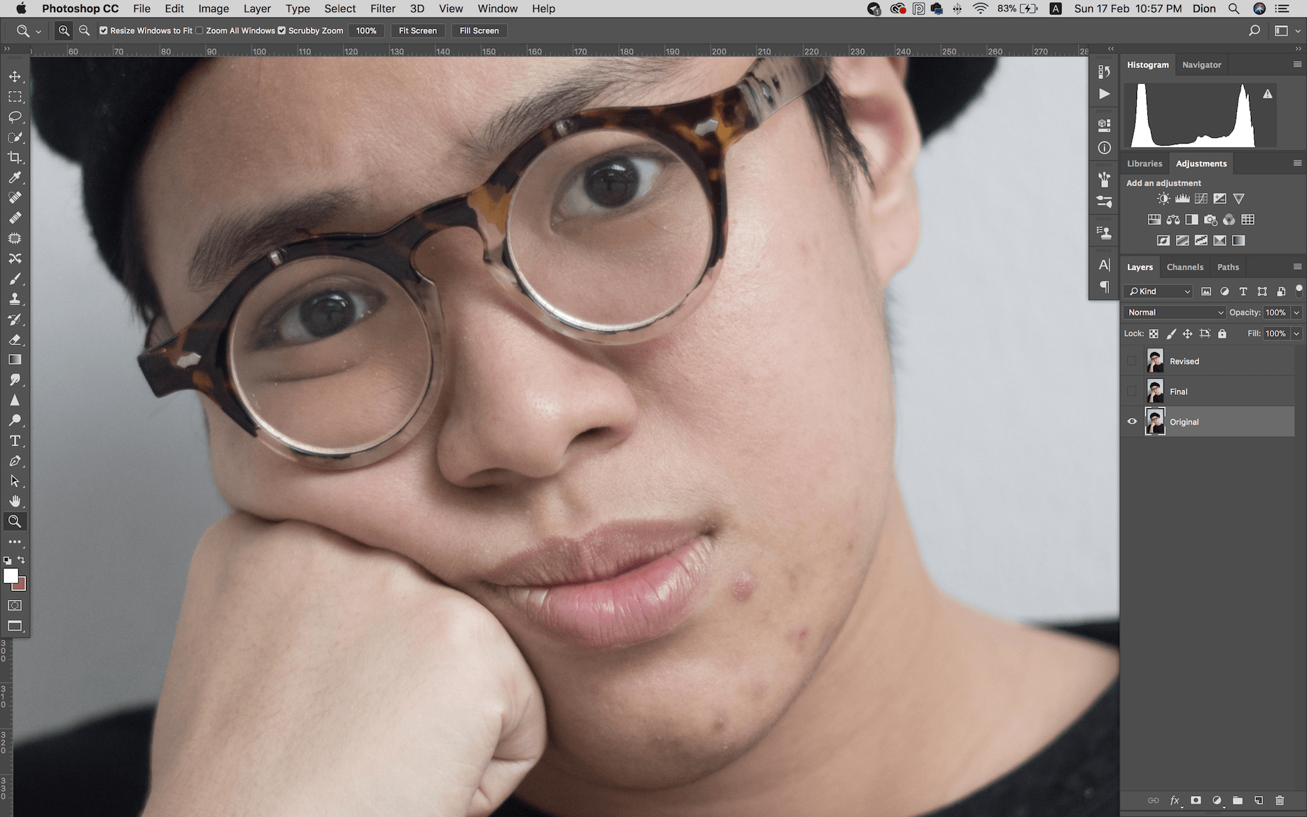
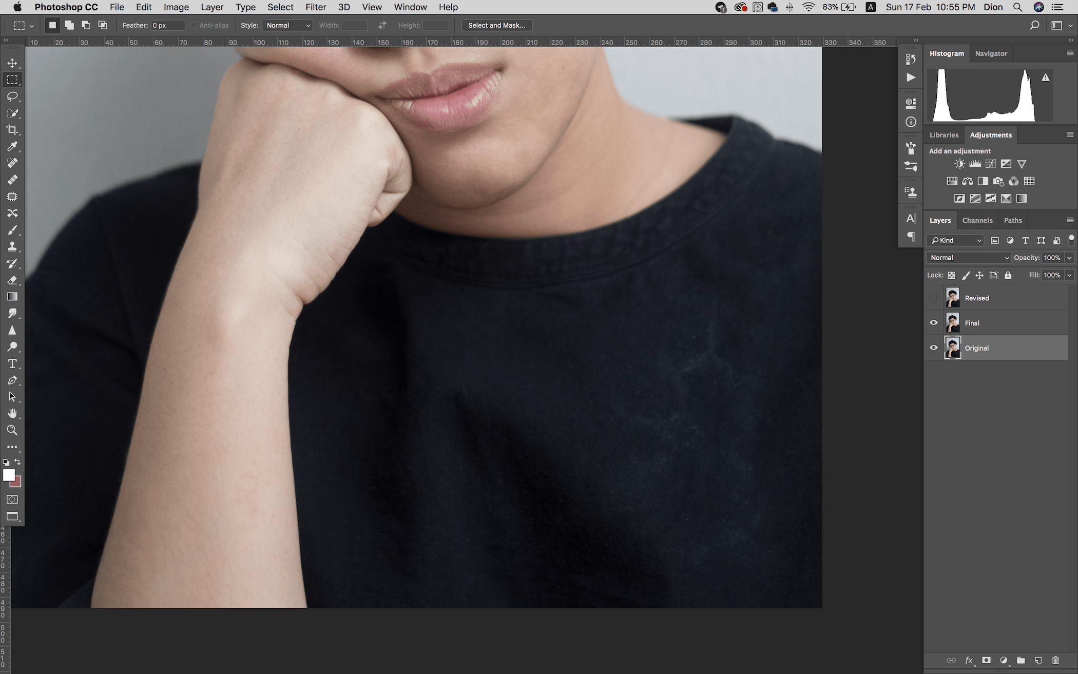
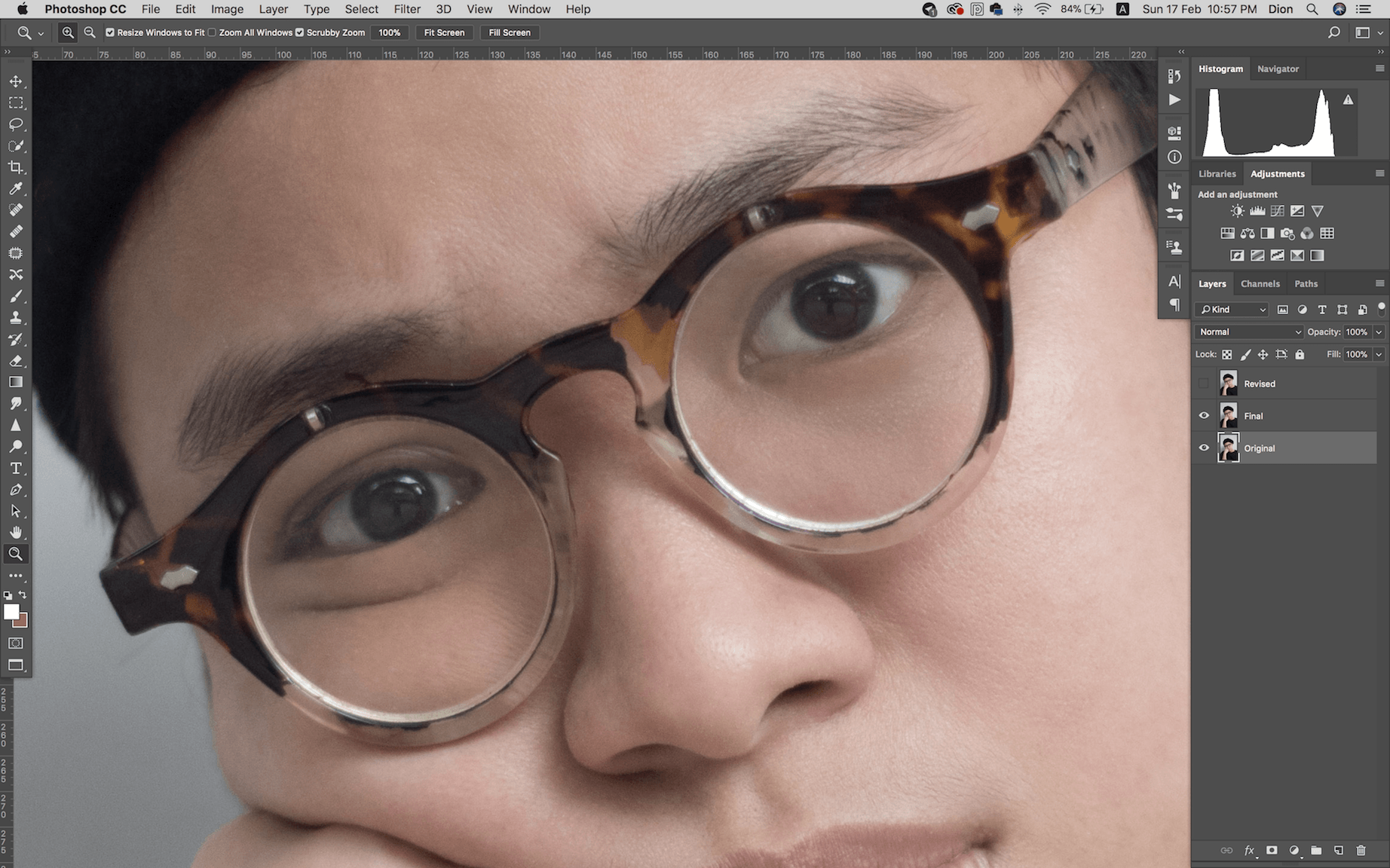
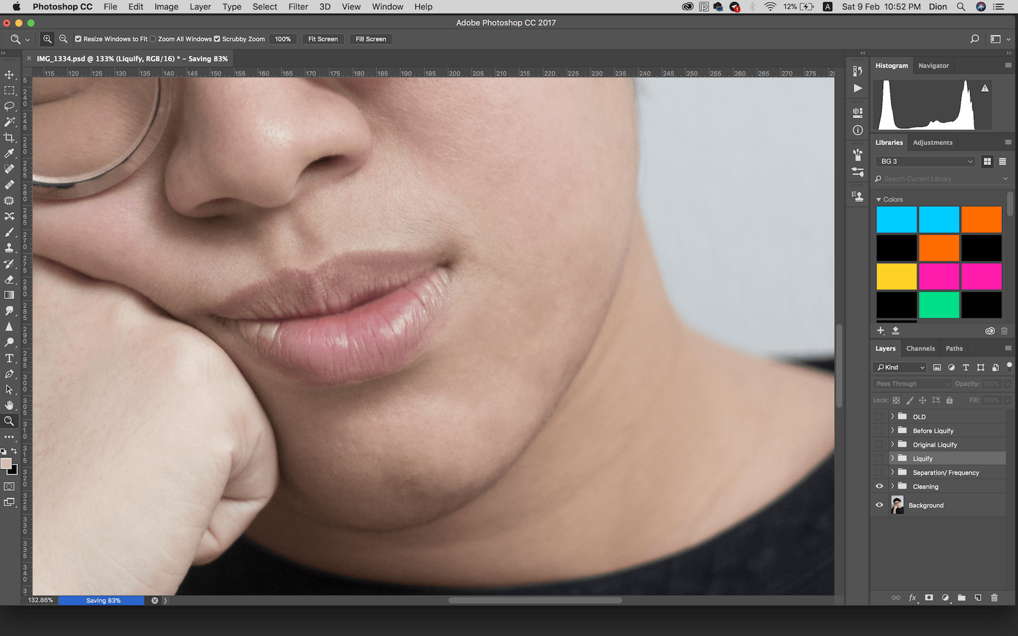
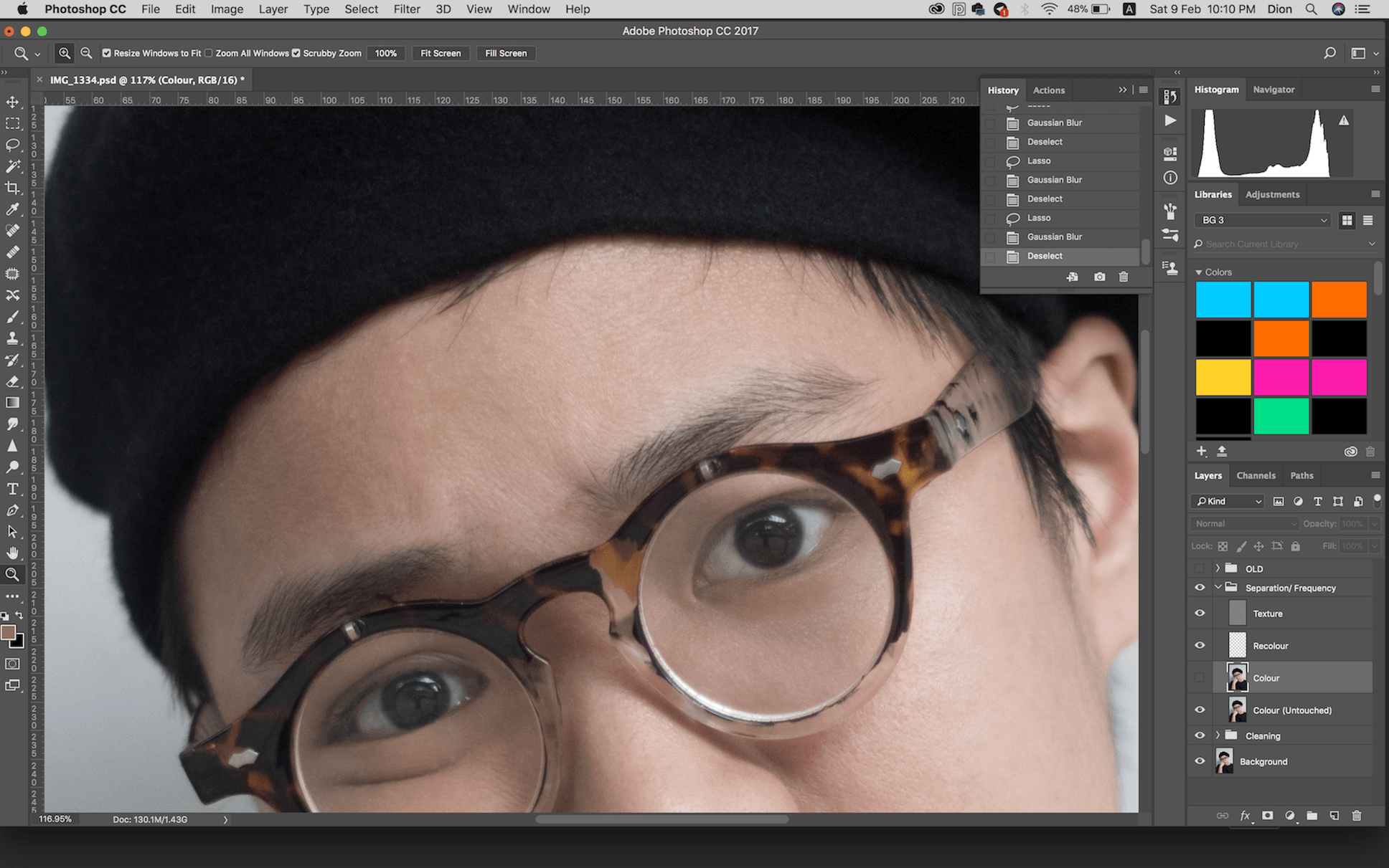
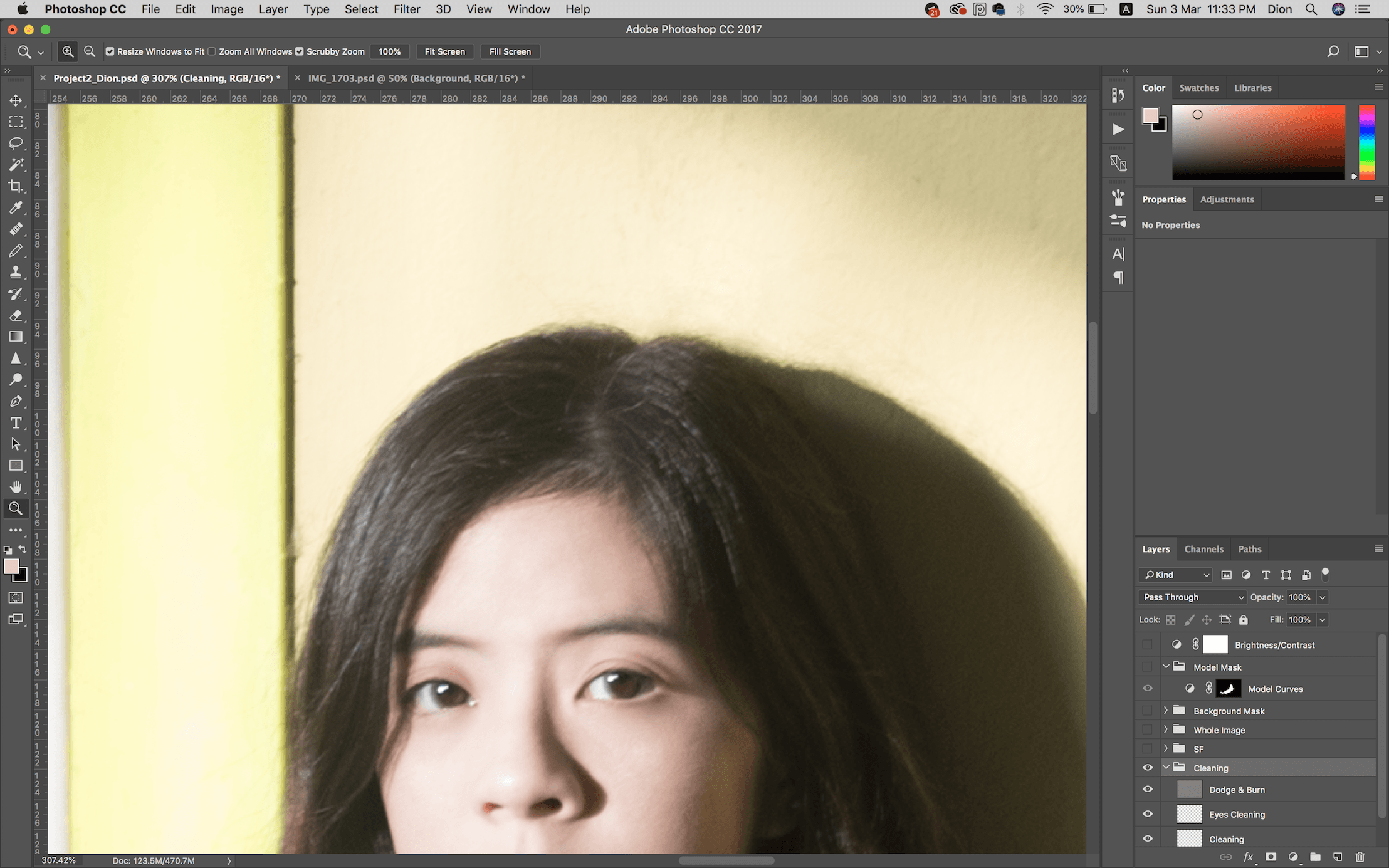
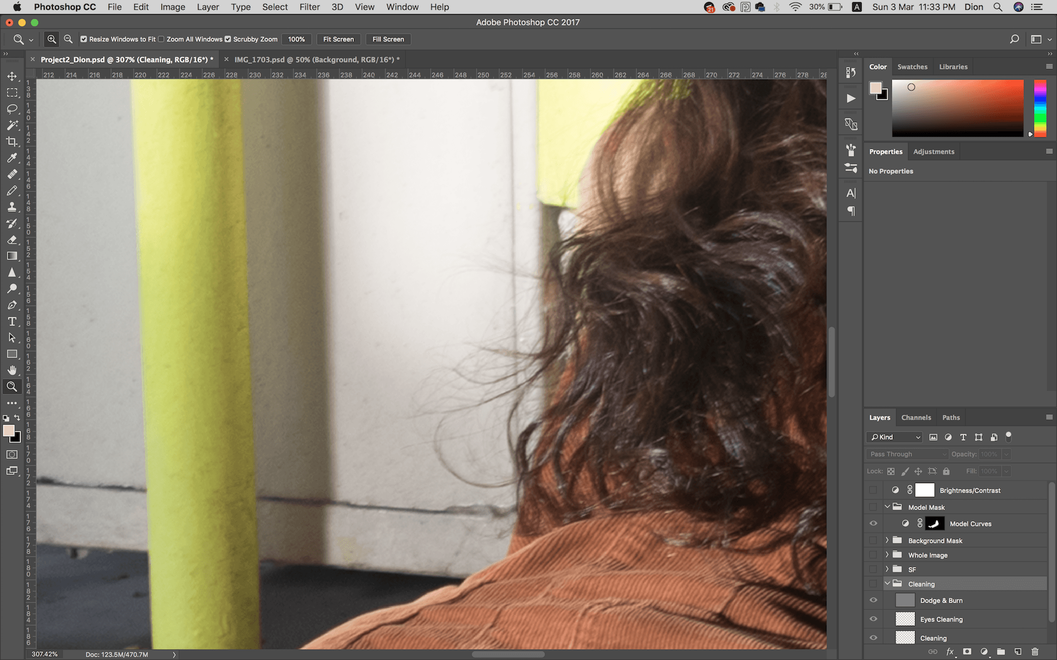
Cleaning (Hair)
I first cleaned out the hair that was flying around using Spot Heal, Clone Stamp and Dodge & Burn. I didn’t remove all the frays entirely since they’re really small when zoomed out, just did what was noticeable.
But I’ve still learned the importance of making sure your model’s hair is well combed.
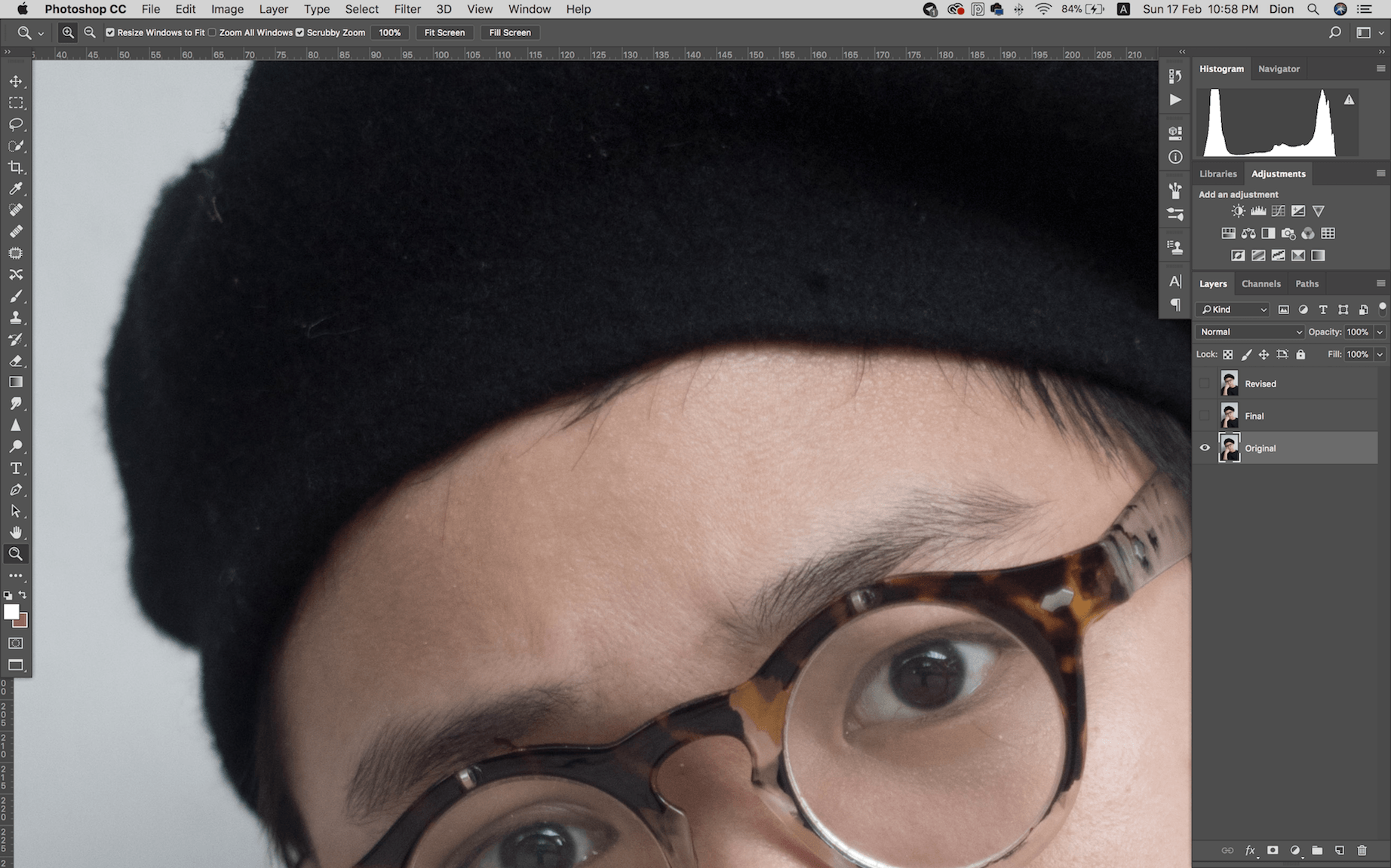
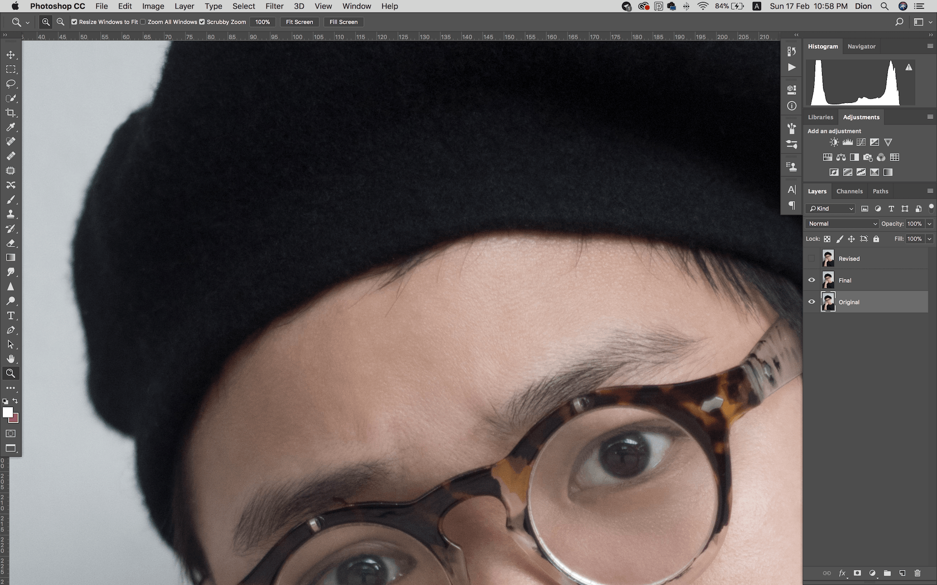
Zoomed for comparison purposes:


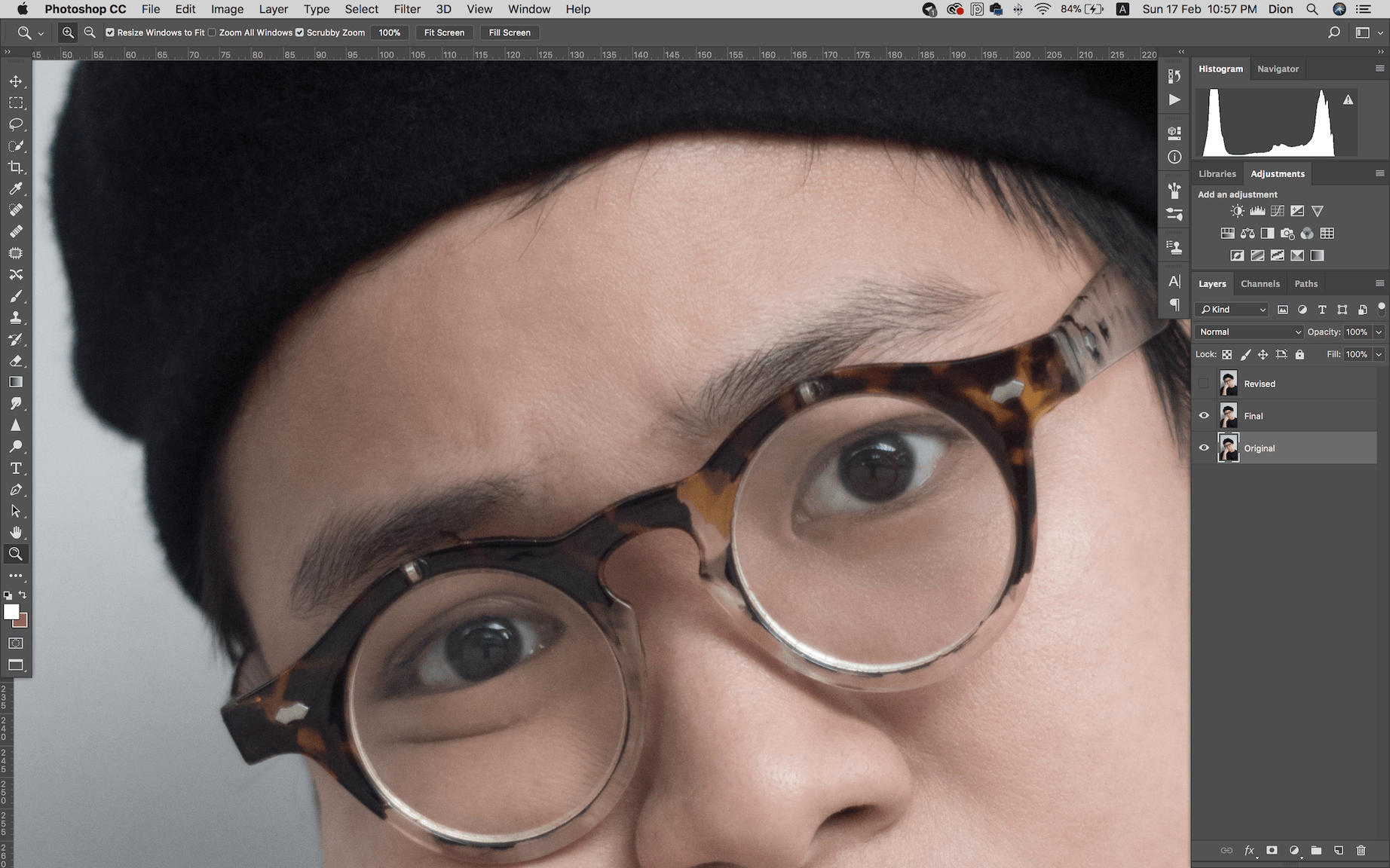
Zoomed out:

I did remove the bottom most frayed hair in her shadow at first, but decided to leave it in eventually.
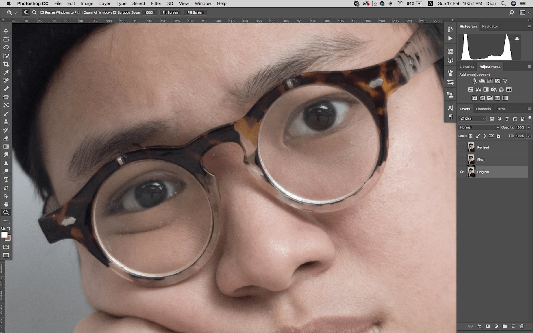
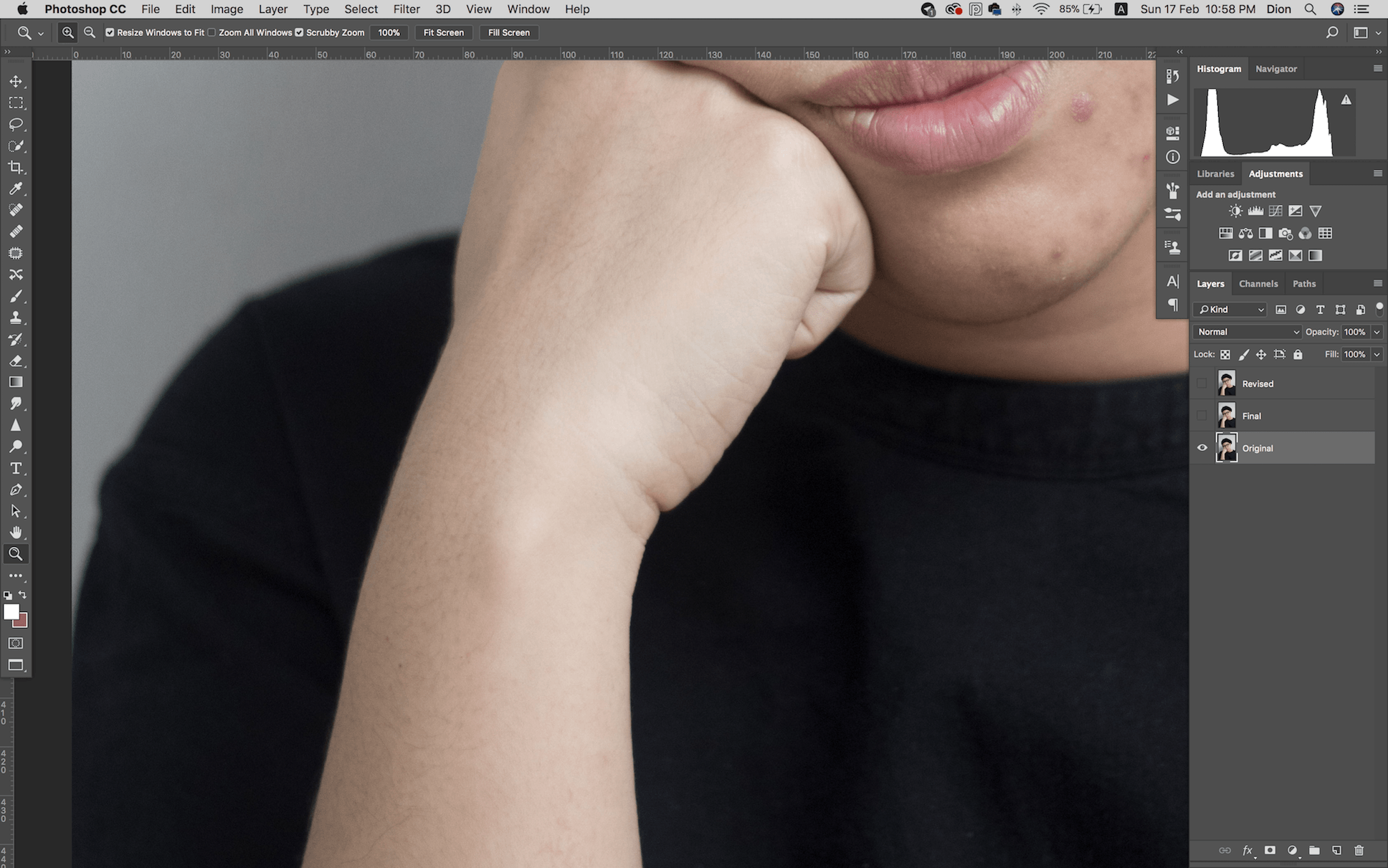
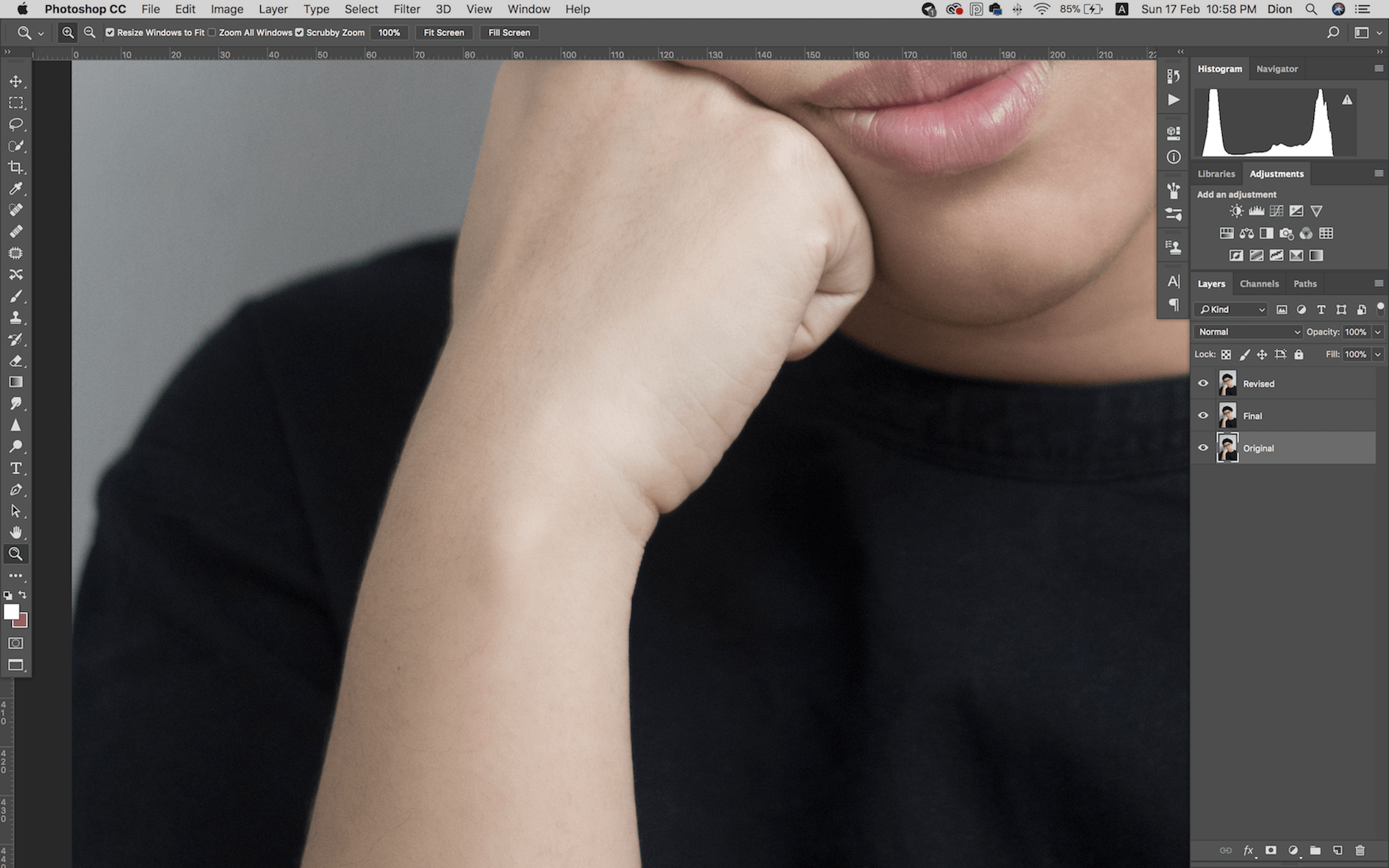
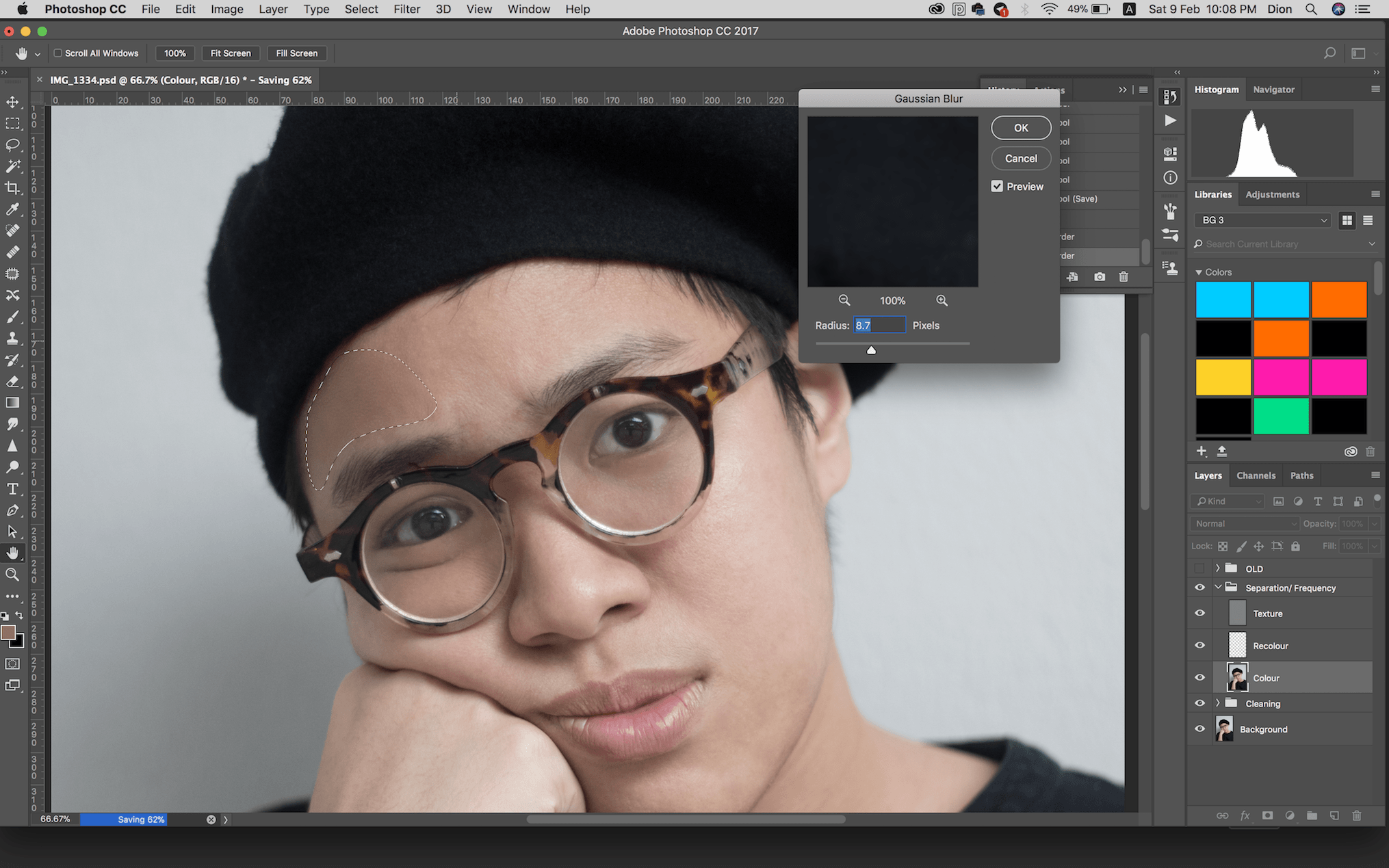
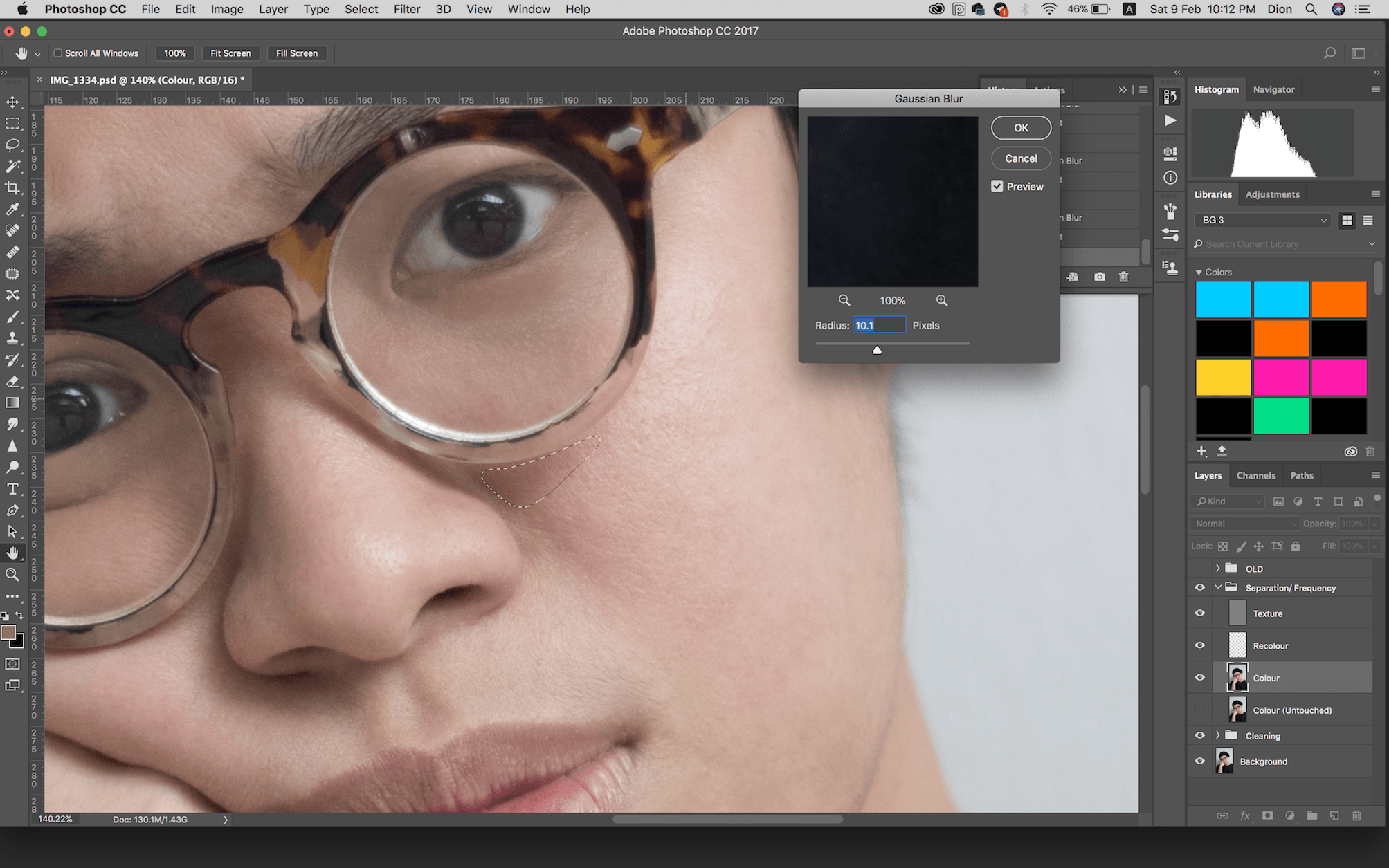
Cleaning (Face)
I Spot Healed and applied Separation Frequency on her skin and dark eye circles. I also didn’t go too crazy with her skin.

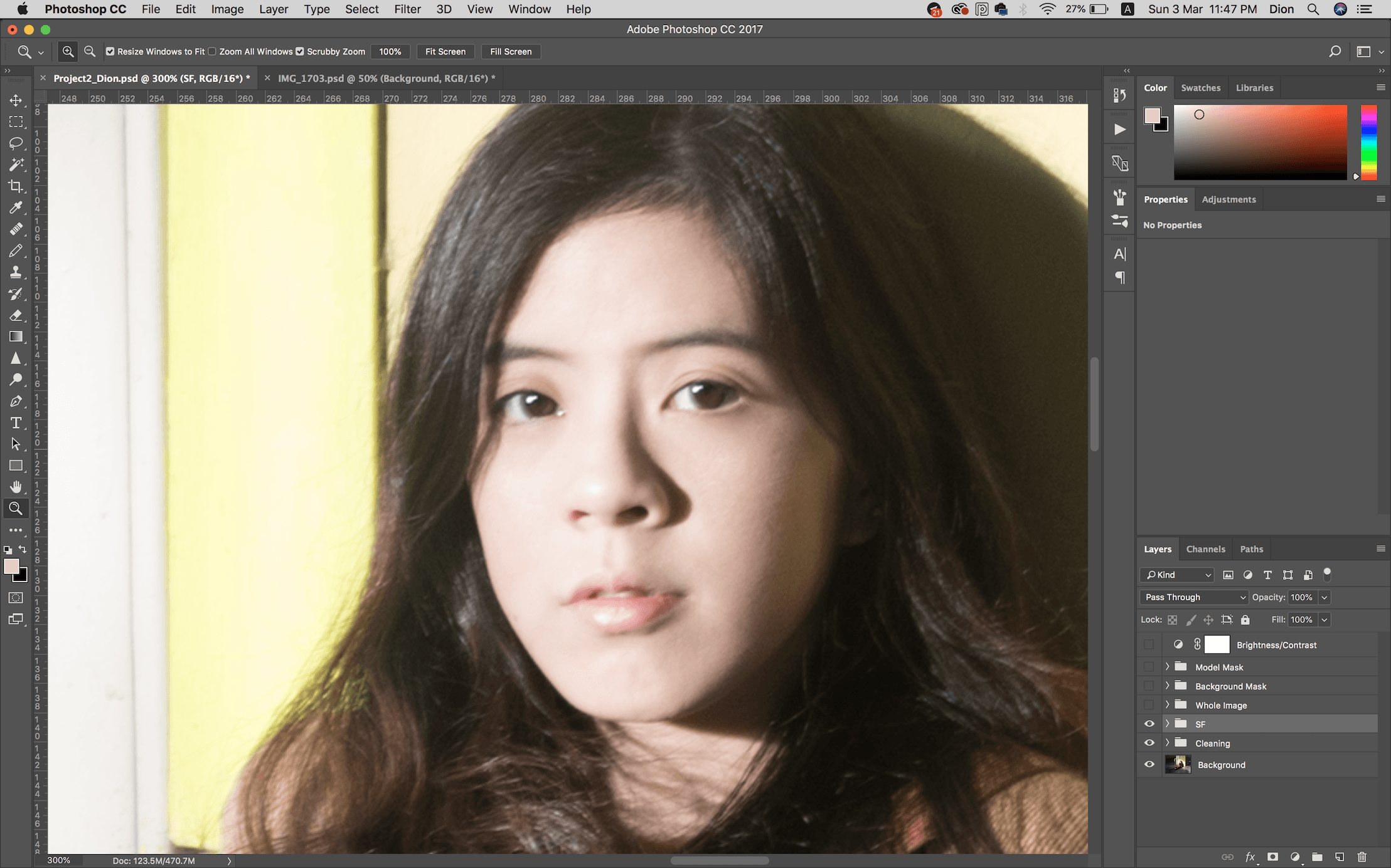
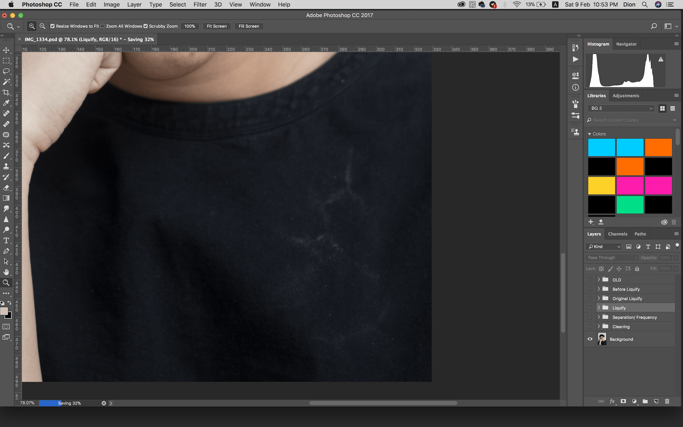
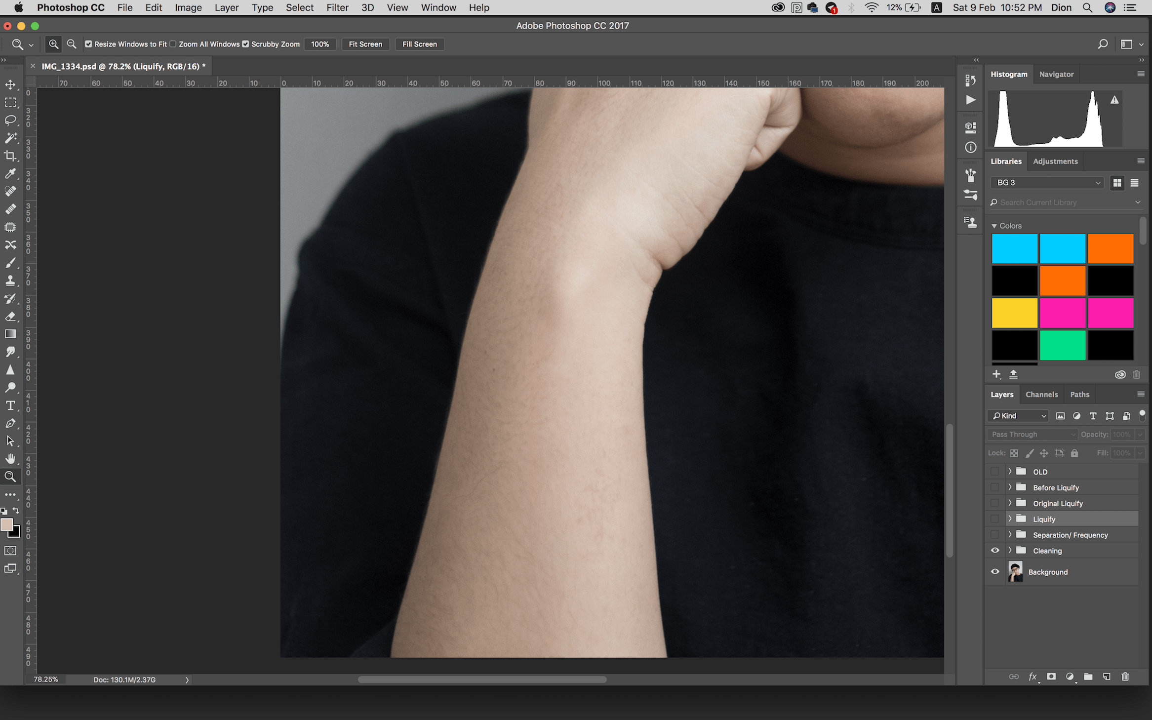
I left the walls and floor uncleaned as I wanted to keep their rustic textures.
White Balance
The colour balance turned the image slightly warmer than balanced, but I decided to keep it.
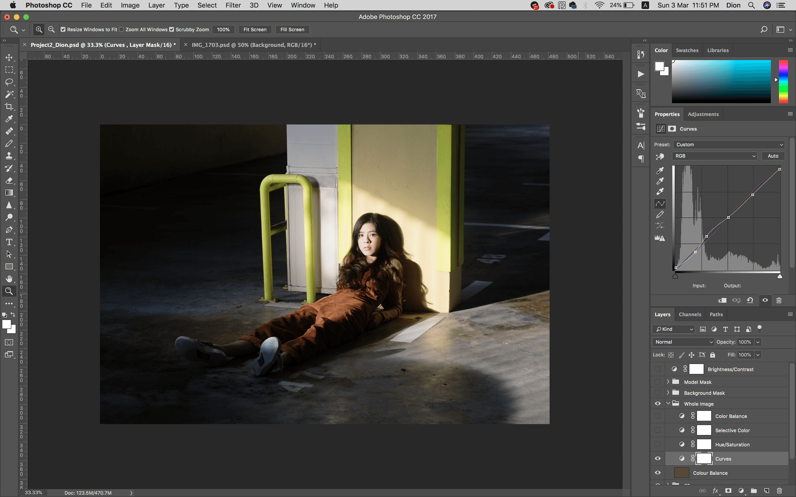
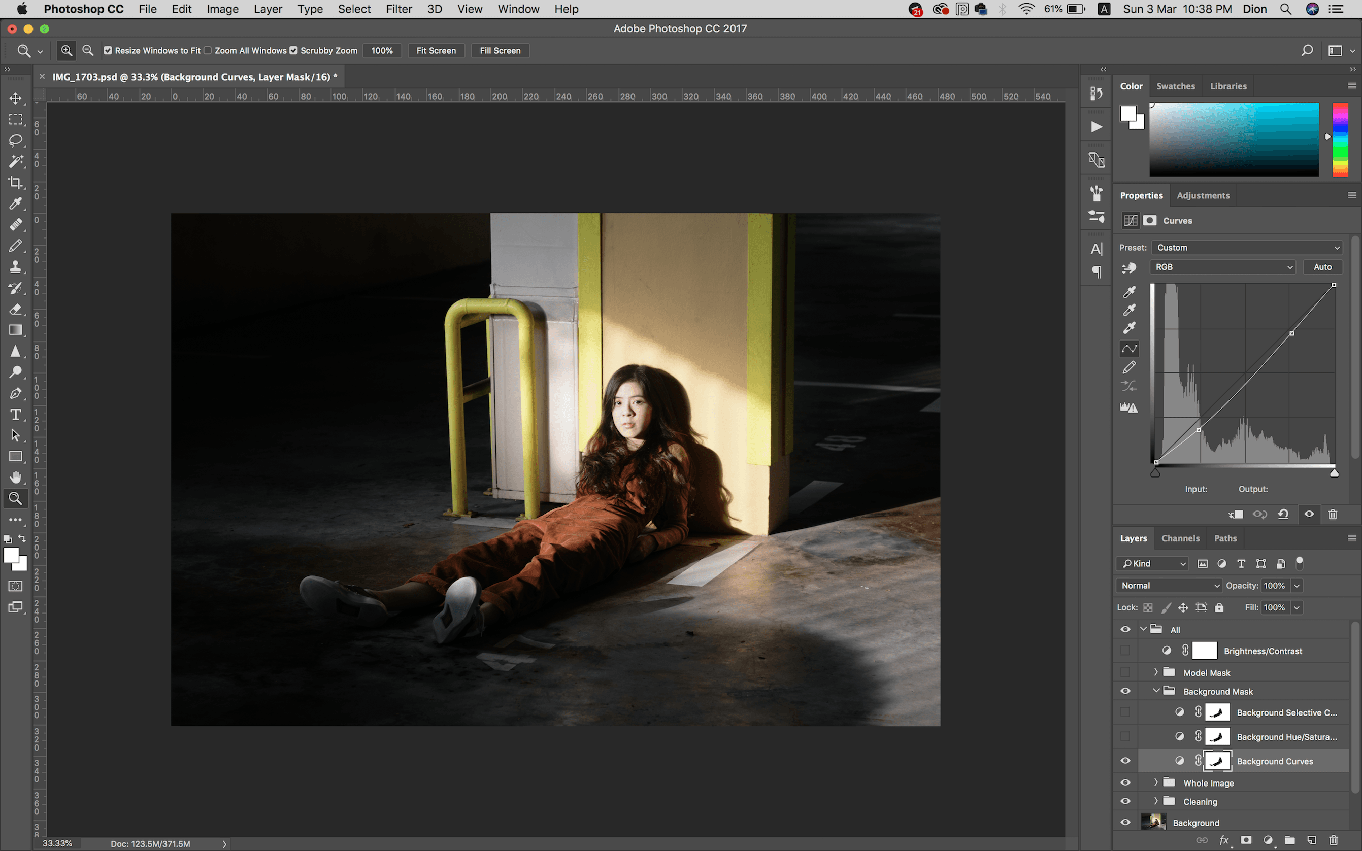
Curves
Adjusted the curves to give the light and shadows heavy contrast. Brought down the highlights as well.
Hue/ Saturation
Adjusted the saturation mostly to decrease the cyans and blues in the floor.

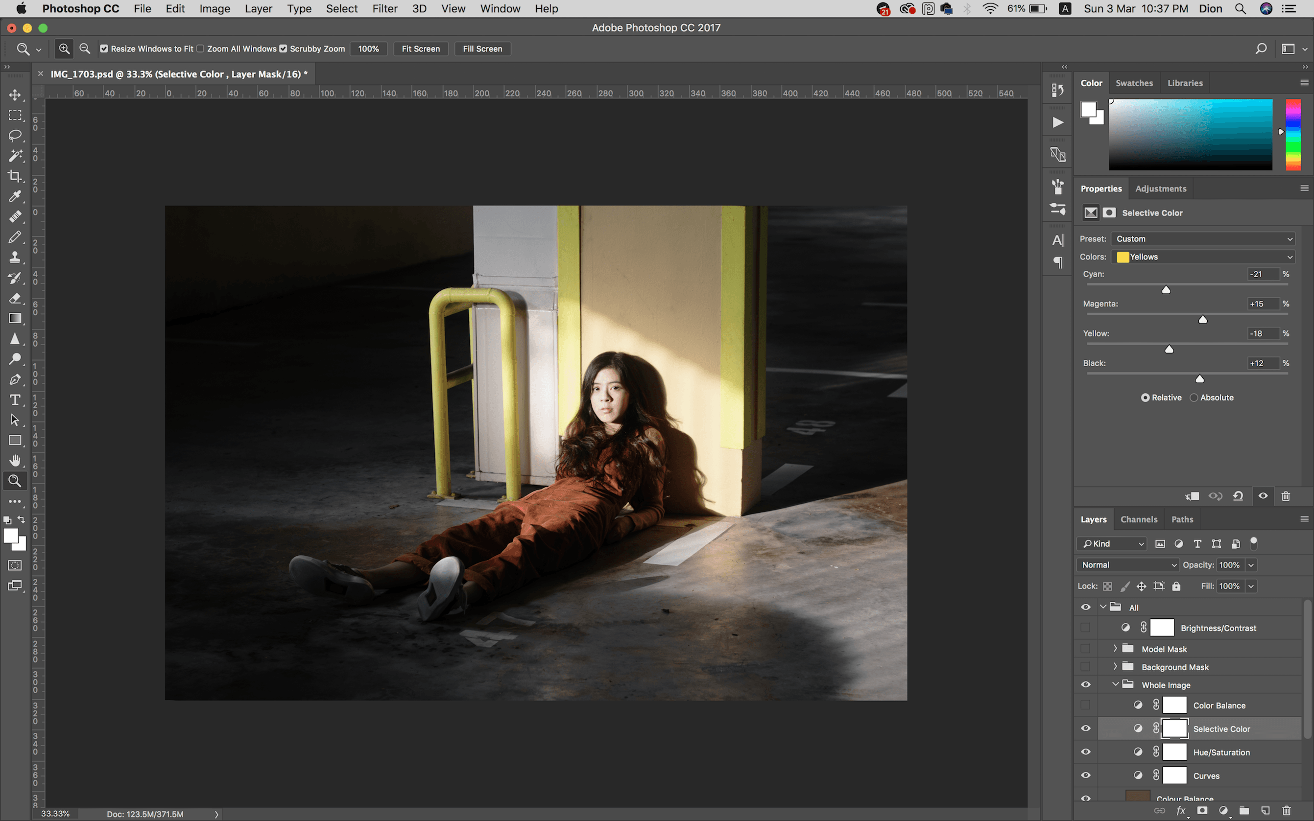
Selective Colour
Adjusted the yellows to be more warm than cool, lowering the cyan and increasing the magentas. Also added a bit of black to the red in her overalls.
Colour Balance
Added a tiny hint of green to the shadows for personal preference of a rusty look.

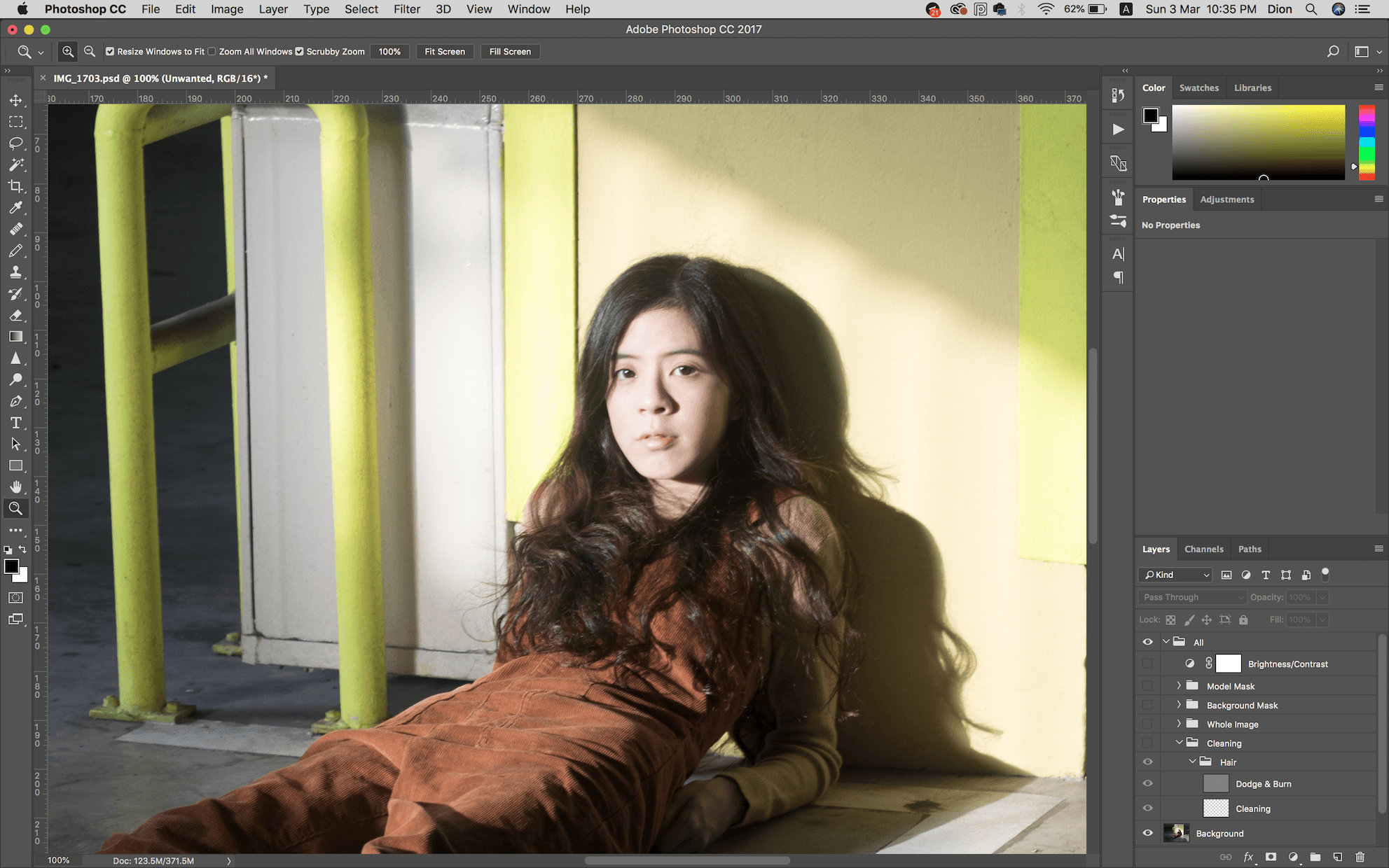
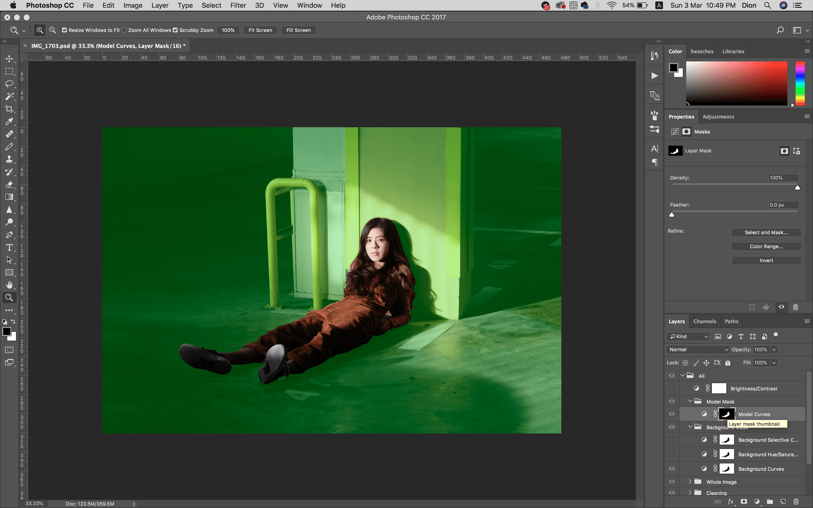
Masking
There still wasn’t enough contrast in the lights and shadows, so I created masks to separate the model and background.
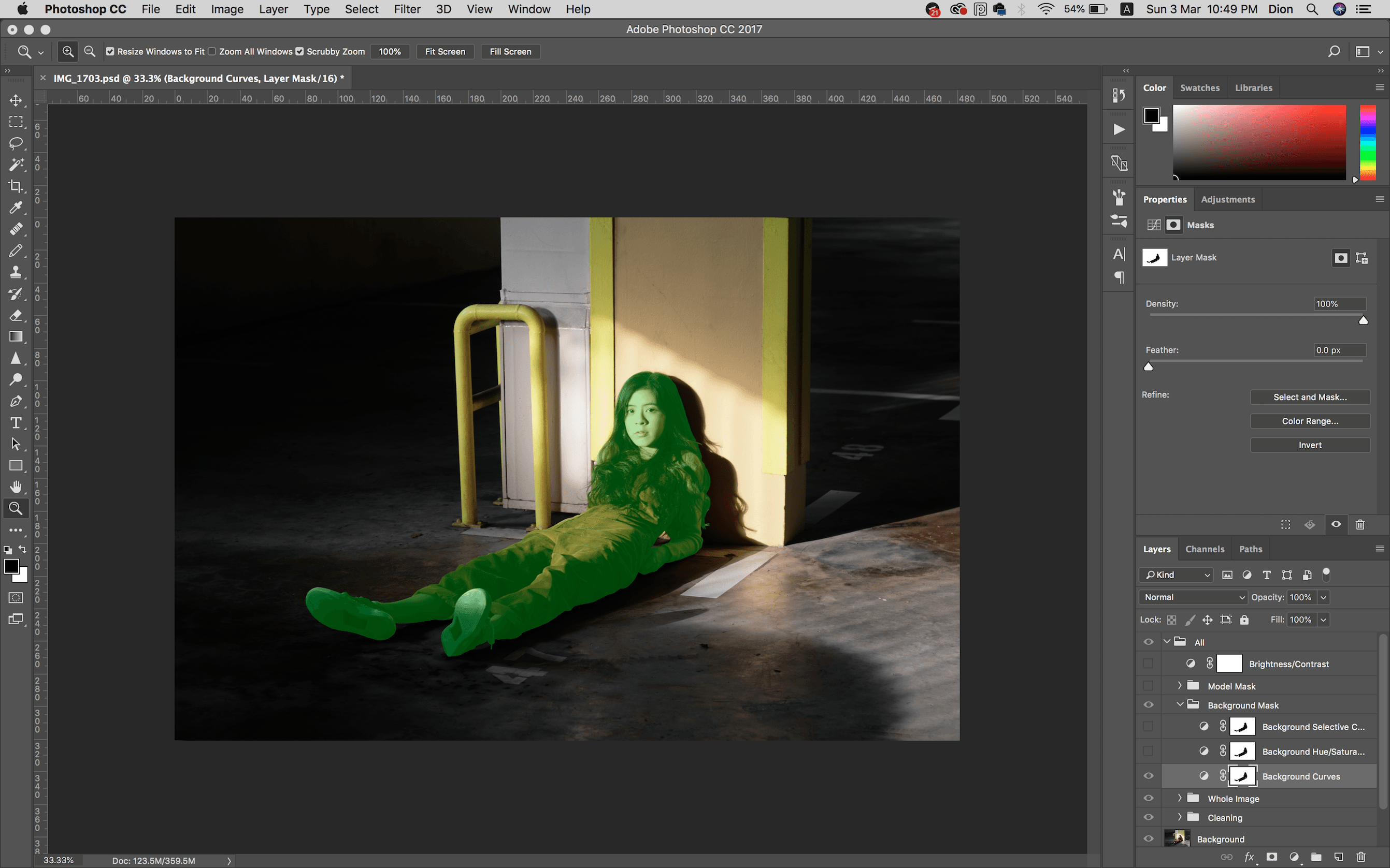
Background Mask Curves
Dropped the shadows of the background. (Left: where we left off before masking)
Model Mask Curves
Then the model felt a bit too bright and looked way too washed out, so I adjusted her too.

Background Hue/ Saturation
Again to remove the cyans and blues in the floor… Heh

Background Selective Colour
Adjusted the tone of the background yellows to be even warmer.

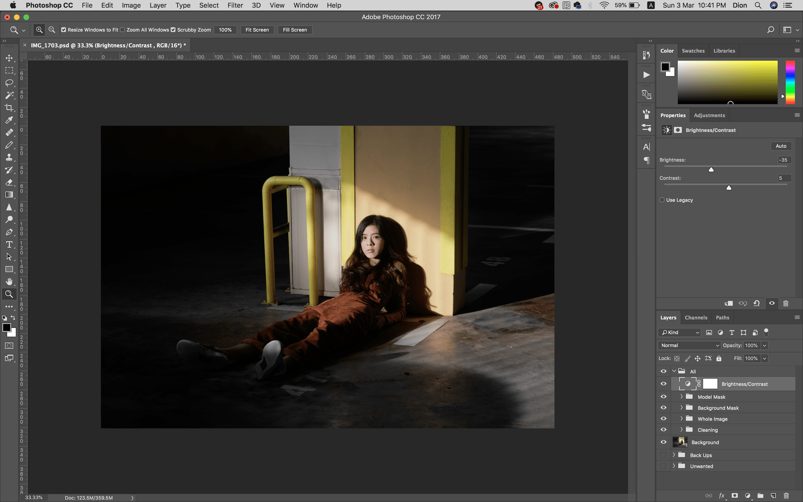
Brightness & Contrast
And I know, we were told to try our best not to touch the brightness & contrast adjustment, but something just still didn’t feel right – so I brought down the brightness of the entire picture a whole lot and increased its contrast a little bit to achieve the dark, contrasty light and shadow feel I was going for.
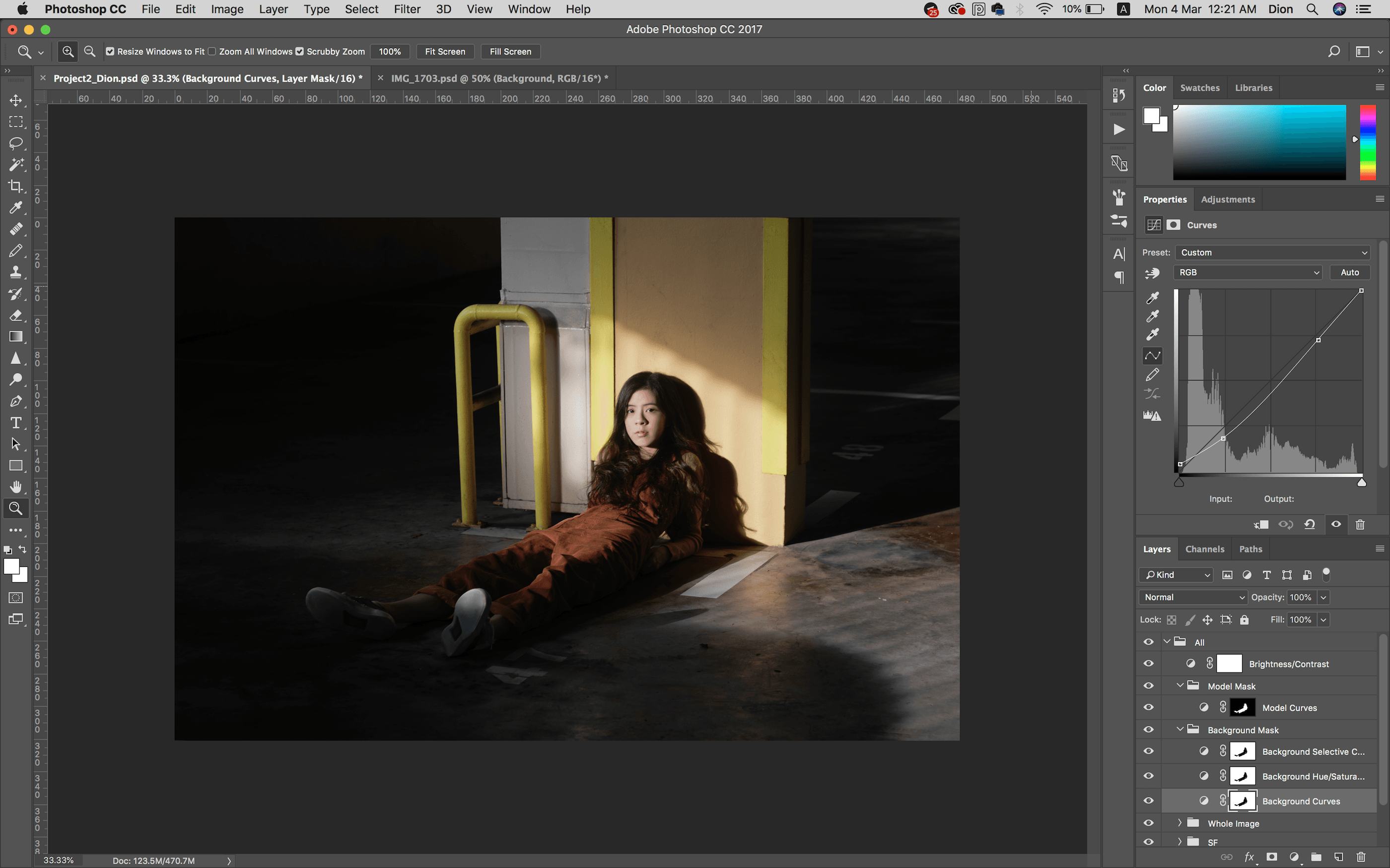
Re-Adjusting Curves
Okay, I thought I was done but I just went back to crush the blacks a bit on both the background and model mask curves for a bit of fade.
Here’s the final comparison again.
I reaaaaally enjoyed editing for this assignment. I’ve tried editing this in Lightroom and was having troubles with it, and being forced to look at every specific part in Photoshop really helped me understand how light and colours work better. Thank you!