Tag Archives: type

Typography: Type Speaks (1948)

The fact that type had existed way before computers did has never crossed my mind before, hence Type Speaks has definitely gotten me intrigued (mind-blown, really) with how the art used to be constructed and appreciated.

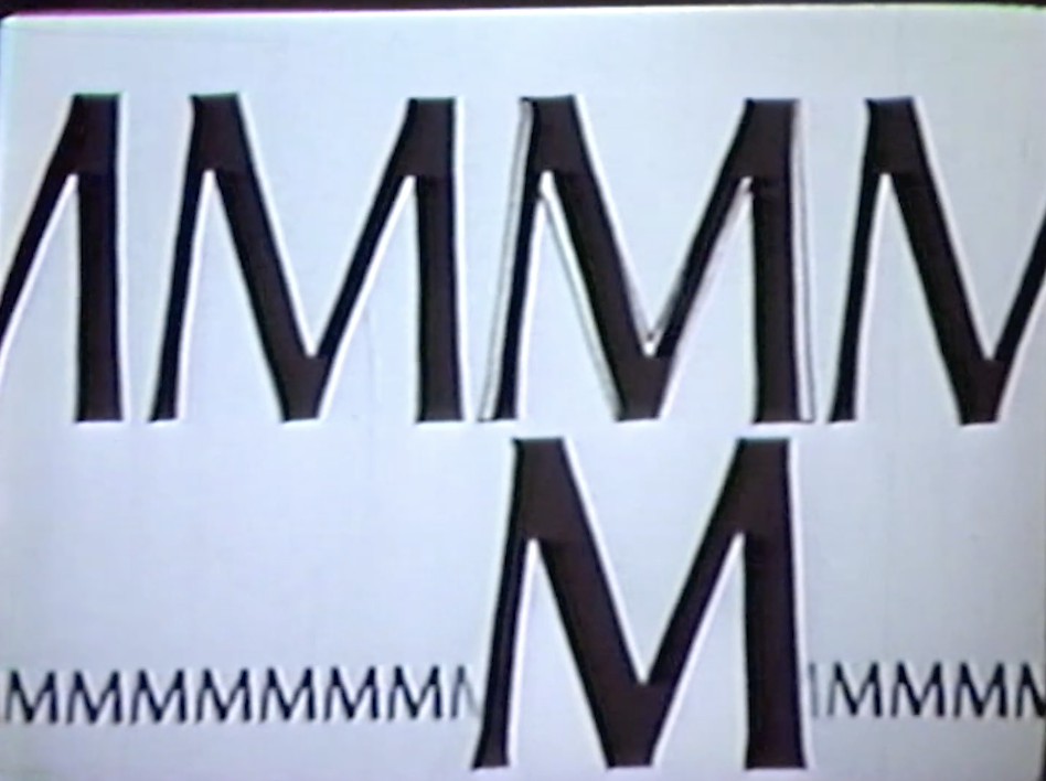
Prior to this video, I struggled to grasp the concept of why proportions of characters for certain types are adjusted for better viewing purposes, as mentioned during class presentations. However, with the video showing the actual transitions of the minute character adjustments between different point sizes and the differences they make, I now understand better why adjustments have to be made for a more pleasant appearance.

It is no doubt that today’s generation has been spoiled by digitisation that has made everything become much more convenient and therefore easier for things to be taken for granted – even outside of design context. However, it cannot be denied that while the smallest of details and efforts in the creation of type have become overlooked, digitisation has also made available much more room for exploration, where new precision details observed have instead become things like…

“this letter’s one pixel too left”

“no, now it’s too much to the right”

“no”

Image result for pepe laughing meme

It is already painful enough to print a feature magazine 500 times only to find never-ending typos, or, for instance, accidental design mess-ups in kernings of titles. No way would I ever want to be casting actual moulds for individual characters and checking precisions for each and every cast!

Typography: Type in the Wild

TYPE IN THE WILD: JURONG POINT

Unfortunately all cooped up in Pulau NTU, the best place that I could get to within the week was Jurong Point Mall. Albeit just a shopping mall, it was interesting to see the distinguishable levels of ‘professionalism’ in type design between the logos/signages/posters of established and non-established brands.

Generally, it is observable how more established brands have cleaner typography in their signages, even with the use of different font classifications and types within one sign. From what I’ve observed, good signages/typography come with proper combinations of different types of font styles, such as combining serif with sans serif, heavy weights vs light weights, uppercase with lowercase, and so on. I’ve seen that it is not a must for ALL of these rules to be applied at the same time, where different combinations can work together as well, as I will “explain” through these pictures.

Observed: Double sans serif face, uppercase vs. lowercase, heavy weight vs. light weight, large pt size vs. small pt size

Observed:
Serif vs. sans serif face, double uppercase, large pt size vs. small pt size

Other observations:

FUJIFILM takes on a simple, uppercase sans serif font.

ESPIRIT plays on font ‘design’ on a simple, uppercase sans serif font and adjusted kerning.

POPEYES combines a playful, lowercase serif font with a clean, uppercase sans serif font

Here are some bad typography examples that show how those observed “rules” are not always foolproof.

You would think a combination of serif and sans serif would mean you could probably also put cursive and a ‘sans serif’ Chinese font together, but no.

Same for these posters that just don’t work, for obvious poor choices in font styles and arrangement in design, even outside of typography.