Both menus use a simple two column grid, with just the logo moved. I did want to have it so that the right column of the first menu would start up at the top, but there wasn’t enough content… so… well. Negative space… is always… great.

Both menus use a simple two column grid, with just the logo moved. I did want to have it so that the right column of the first menu would start up at the top, but there wasn’t enough content… so… well. Negative space… is always… great.

I”m not the best hand letterer.


Following a pretty straightforward concept, the isometric style creates an empty depth for Hollow and a filled one for Solid.
Suggestions include further exploration of style, such as maybe turning hollow into a sort of hole in the ground with tree roots coming out of it, as well as to adjust the font style where hollow could be more rounded.

I’d actually written three haikus in total:
Haiku #1: Jupiter
The Great Red Spot looks
like a ginormous pimple
Rest well, Jupiter
Haiku #2: Oh No
1, 2, cha cha cha
3, 4, oh no no no no
I fell on the floor
Haiku #3: Help
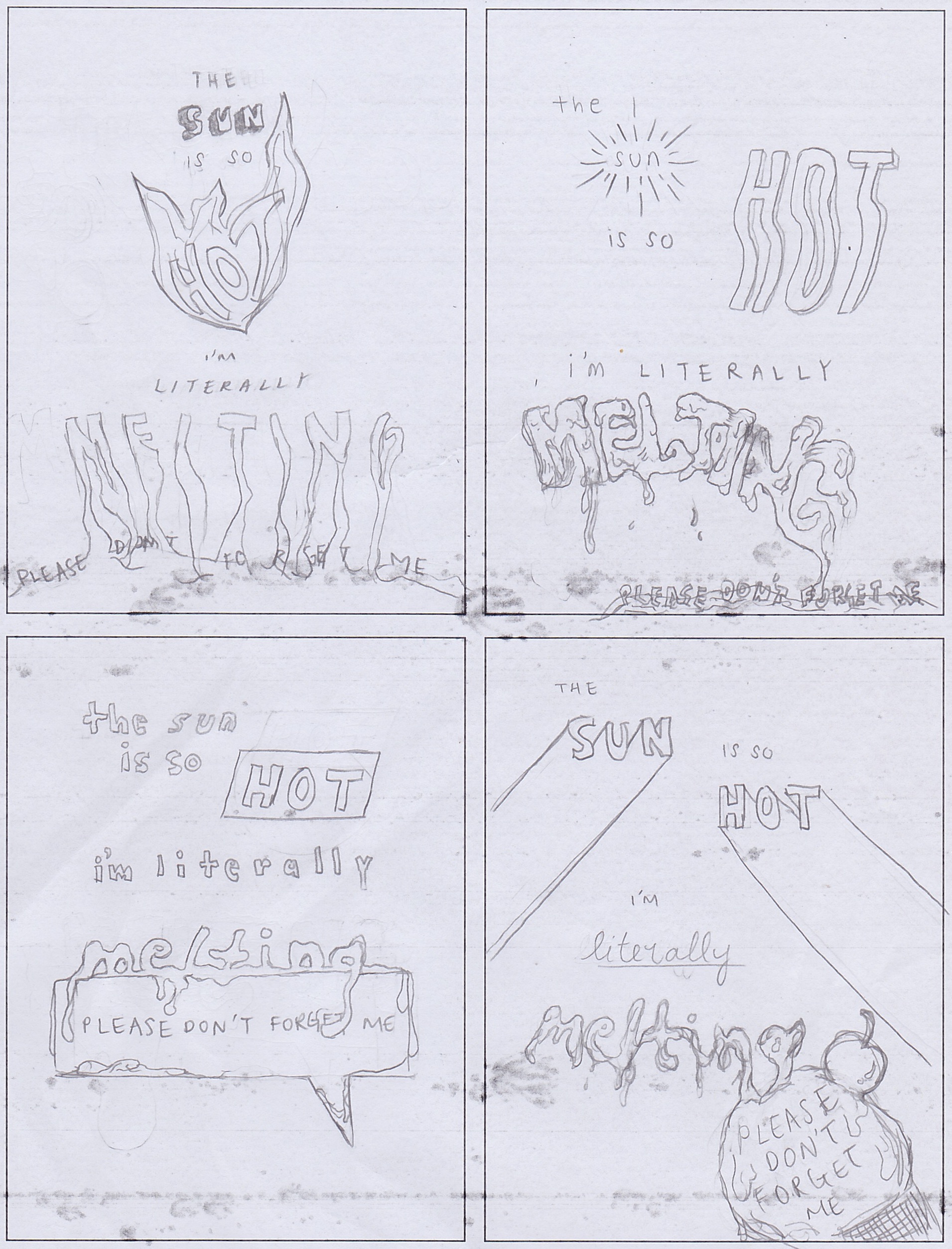
The sun is so hot
I’m literally melting
Please don’t forget me
If I had the time I would love to come up with sketches for all of them, but I decided to go with the third one since it’s the most applicable one to how I was and am feeling.
One refined version:
While creating different sketches, I realised that I worked towards automatically placing emphasis on certain keywords in the poem – specifically sun, hot, literally and melting, by creating completely separate looks for these particular words, in contrast to other filler words. I wonder then, how could I make it so that all the words of the poem gel together well in one style, while still having emphasis be put in the right places?
It was a fun challenge though, to see how my brain could come up with different ways to represent certain words such as for ‘sun’ and ‘hot’. You could be literal with representation, using rays for ‘sun’ and fire for ‘hot’, or you could also use elements that suggest similarly, like a shadow for ‘sun’ and heat waves for ‘hot’. I definitely struggled with ‘melting’ though, and wonder if there are any other ways I could have done it without being so literal.
I also wanted the last line of the poem, “please don’t forget me”, to be small and/or hidden… because… yea. It’s like pleading to not be forgotten.

I wish I’d known of this website earlier, when I was thrown into designing magazines and newspapers for group projects in my previous school without any proper ‘education’ on the do’s and don’ts. Heck, we weren’t even taught how to use InDesign!
First of all, I like that this website literally puts all of the basics that you need to know about type right there, all in one page, so that it’s easy to make comparisons and/or look back when you forget what something means. Like a typography bible of sorts.
While the super analytical portions of the site that recaps most of the information we’ve covered in class really helps me refresh my memory and see very distinctly what they mean, I really appreciate the use of different fonts and typefaces (as well as stating their names) to demonstrate concepts and make comparisons.

This, for example, really shows the differences between typefaces within a font, to understand the adjustments made specifically to the letters, that it’s not just simply making a font look “thicker” for a “bold” typeface, and that italicising =/= slanting.

I especially appreciate this portion of mixing typefaces, where actual fonts are put side by side for a real comparison so that we can easily see the good and the bad of mixes. Stating the fonts also provide a good ‘fall back’ option of what fonts I could possibly consider in the future should I face any difficulty with finding fonts to use, although I would of course source for better paired fonts first.

I’d also like to believe that I had managed to pick up on some of the do’s of mixing typefaces in the past, as I observe some similarities between this extract as well as one from an old newspaper design. PLEASE FORGIVE ANY ELEMENTS THAT MAKE YOUR EYES BLEED, I HAD 0 EXPERIENCE WITH DESIGN (ESPECIALLY, TYPOGRAPHY) AND I CAN ALREADY SEE MANY HORRIFYING MISTAKES MADE IN THE SCREENSHOT BELOW. Still, I think my font choices weren’t all too bad for a beginner.

Now with this website and this class, I hope I’ll be able to make even more beautiful designs with beautiful typography.

This has by far been one of my favourite reads on a figure as I felt that that although on a different topic, I could relate personally to some of Vignelli’s beliefs, which helped me understand him better in context.
The most significant aspect of Vignelli, to me, is definitely his belief in the power of knowledge behind what one produces. Here are some extracts that really stood out to me:
“It is not a matter of style or taste. It is a matter of quality and non-quality.”
“The difference is knowledge. Knowledge shows.”
“How do you define “quality?”: Things that are done with knowledge.”
“There is no absolute reality. Only one’s interpretation of that reality. Therefore, my solution is my interpretation of the problem filtered through my culture, my education, my understanding, my sensibility.”
–
What I’ve gathered from Vignelli’s words is that designers today have become so focused on pure “aesthetics” that many have forgotten about the power of knowledge in their works. He also strongly believes in communicating himself through his works, as he said himself, “I’m not interested in change for the sake of change or novelty. I’m only interested in a projection of intelligence that comes through refinement.”
This reading resonated with me on a personal level, as his words spoke to me in relation to my passion for dance. Yes, I dance. Specifically, I’m into “street” dance (simply: freestyle, you dance with your friends at parties – not like Singapore’s EDM clubs, and you also go for dance battles), and not those choreography style classes that you see a lot of videos of on YouTube nowadays.
Since entering the world of street dance, I’ve always been reminded not to butcher what “dance” is – you could be making nice “moves” and receiving oohs and aahs from everyone around in a studio, but what is dance if you don’t do it with the knowledge and soul of where it came from? Simply putting it, “dance” today has become so commercially understood by society thanks to the never-ending cinematically shot videos of studio classes, where good dancing = making nice-looking moves and hitting beats. The pure authenticity of what dance really means, where it came from, its strong culture, has been lost, and that is what many pioneers of the art shake their heads for today, just like how Vignelli does at many of today’s designs that he believes hold no knowledge. I repeat his words, “It is not a matter of style or taste. It is a matter of quality and non-quality.”
Here’s one of the pioneers of a dance style called Popping, whom Vignelli reminded me a lot of during my read, although this guy’s definitely a lot more… harsh. Also don’t get me wrong, I’m not even super crazy about this guy, and neither do I do popping, but he is a respectable figure in dance’s history.

I’ve probably done a really poor job of explaining how Vignelli’s words has resonated with me, and you might not even understand what I was trying to say about the dance thing (because I myself took at least 2 years trying to understand it), but I hope at least something (I don’t know what, but at least something) came across… haha.

The fact that type had existed way before computers did has never crossed my mind before, hence Type Speaks has definitely gotten me intrigued (mind-blown, really) with how the art used to be constructed and appreciated.
Prior to this video, I struggled to grasp the concept of why proportions of characters for certain types are adjusted for better viewing purposes, as mentioned during class presentations. However, with the video showing the actual transitions of the minute character adjustments between different point sizes and the differences they make, I now understand better why adjustments have to be made for a more pleasant appearance.
It is no doubt that today’s generation has been spoiled by digitisation that has made everything become much more convenient and therefore easier for things to be taken for granted – even outside of design context. However, it cannot be denied that while the smallest of details and efforts in the creation of type have become overlooked, digitisation has also made available much more room for exploration, where new precision details observed have instead become things like…
“this letter’s one pixel too left”
“no, now it’s too much to the right”
“no”

It is already painful enough to print a feature magazine 500 times only to find never-ending typos, or, for instance, accidental design mess-ups in kernings of titles. No way would I ever want to be casting actual moulds for individual characters and checking precisions for each and every cast!