TYPE IN THE WILD: JURONG POINT
Unfortunately all cooped up in Pulau NTU, the best place that I could get to within the week was Jurong Point Mall. Albeit just a shopping mall, it was interesting to see the distinguishable levels of ‘professionalism’ in type design between the logos/signages/posters of established and non-established brands.
Generally, it is observable how more established brands have cleaner typography in their signages, even with the use of different font classifications and types within one sign. From what I’ve observed, good signages/typography come with proper combinations of different types of font styles, such as combining serif with sans serif, heavy weights vs light weights, uppercase with lowercase, and so on. I’ve seen that it is not a must for ALL of these rules to be applied at the same time, where different combinations can work together as well, as I will “explain” through these pictures.
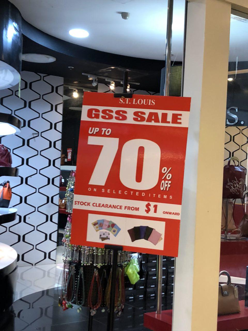
Observed: Double sans serif face, uppercase vs. lowercase, heavy weight vs. light weight, large pt size vs. small pt size
Observed:
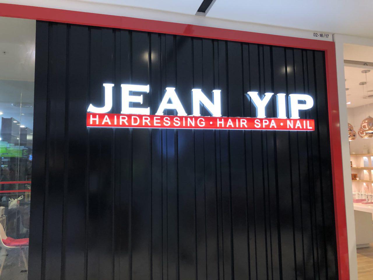
Serif vs. sans serif face, double uppercase, large pt size vs. small pt size
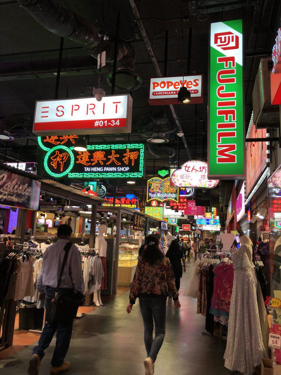
Other observations:
FUJIFILM takes on a simple, uppercase sans serif font.
ESPIRIT plays on font ‘design’ on a simple, uppercase sans serif font and adjusted kerning.
POPEYES combines a playful, lowercase serif font with a clean, uppercase sans serif font
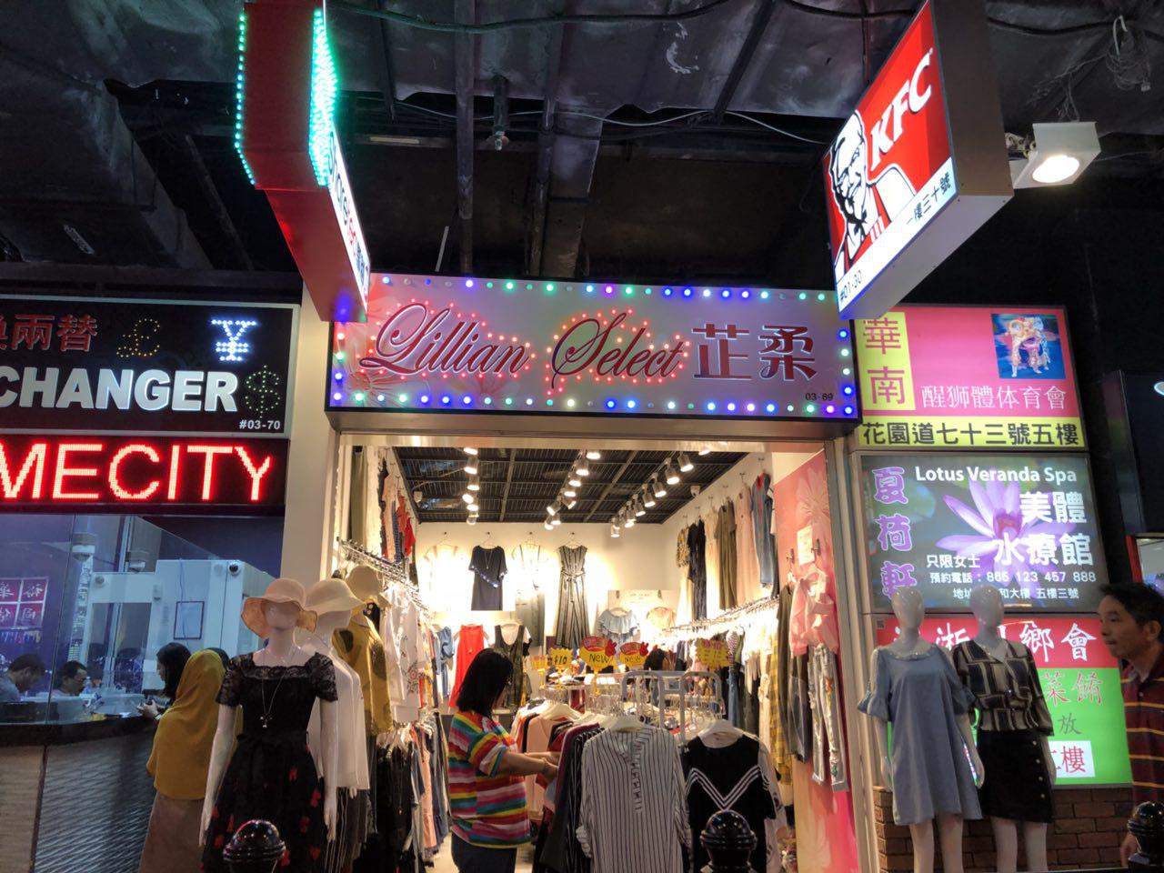
Here are some bad typography examples that show how those observed “rules” are not always foolproof.
You would think a combination of serif and sans serif would mean you could probably also put cursive and a ‘sans serif’ Chinese font together, but no.
Same for these posters that just don’t work, for obvious poor choices in font styles and arrangement in design, even outside of typography.