Password: snapchat
Month: April 2016
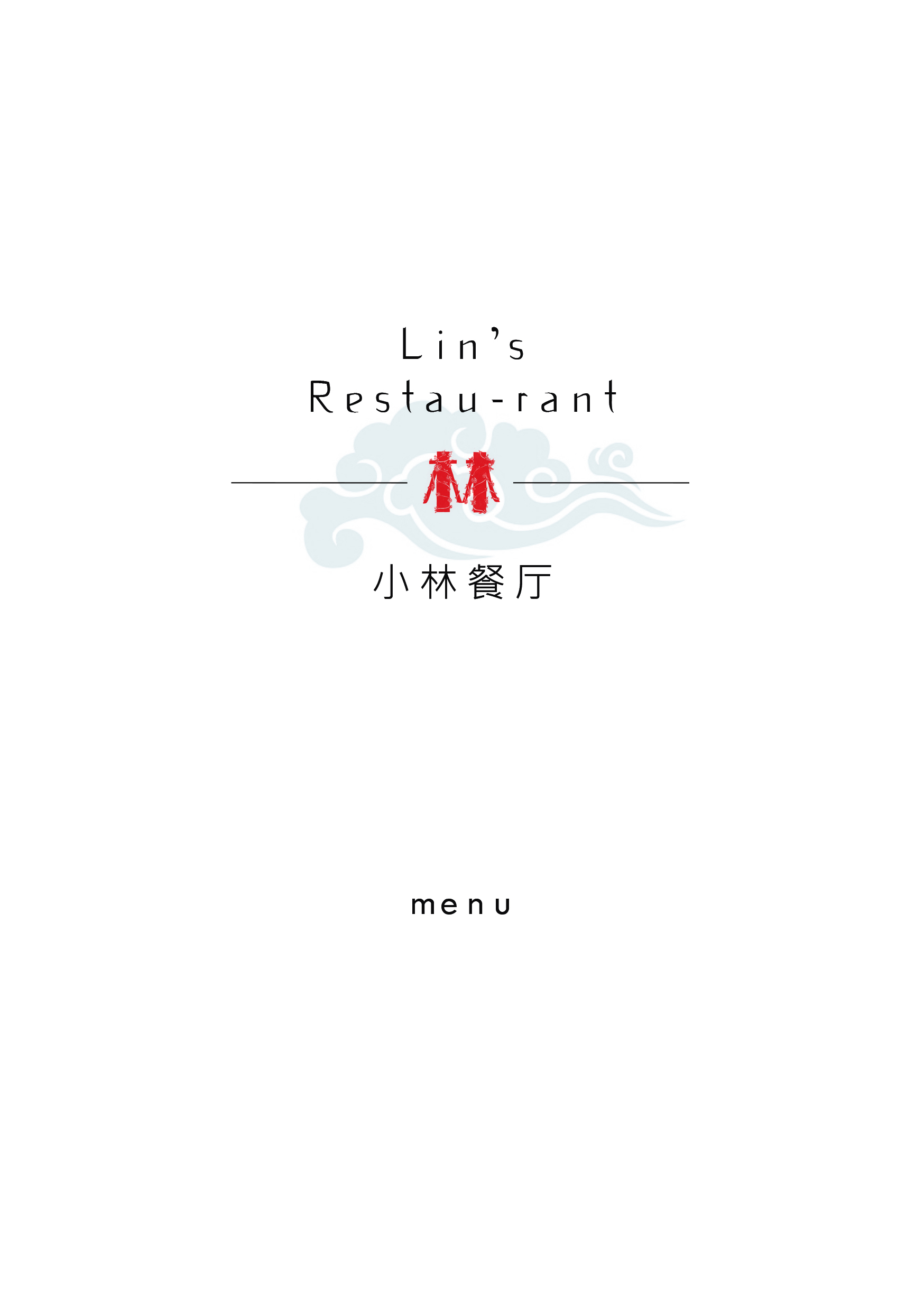
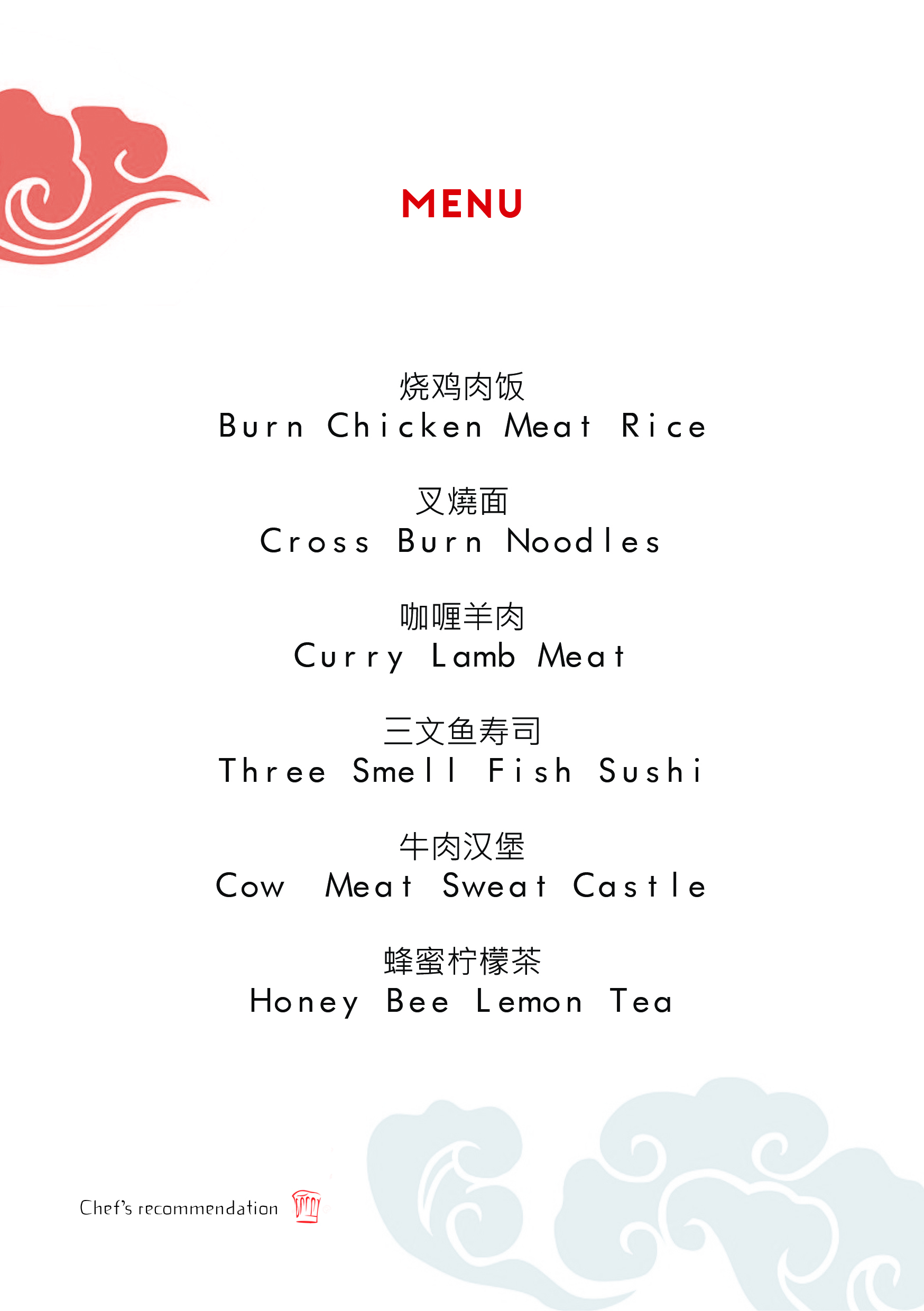
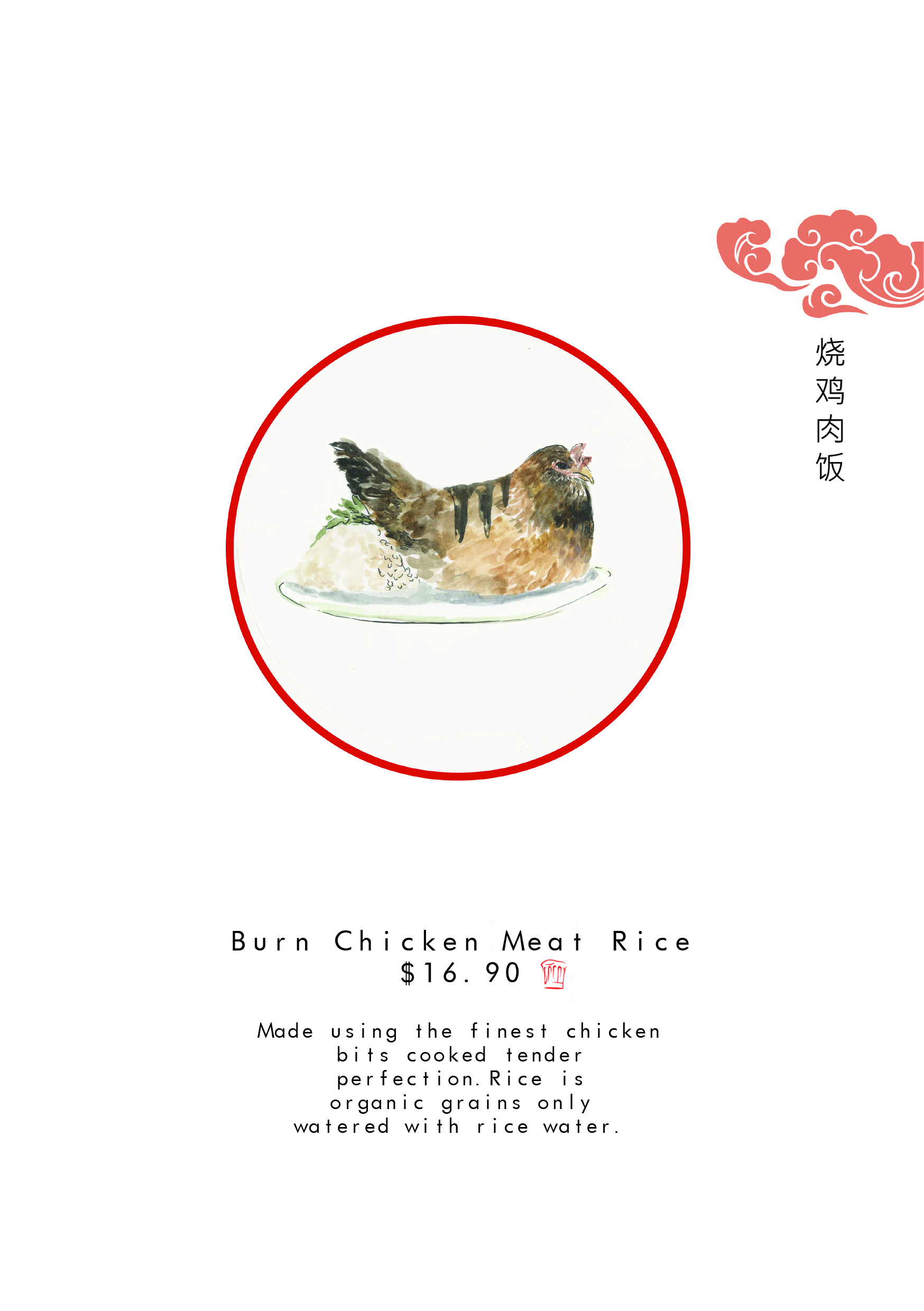
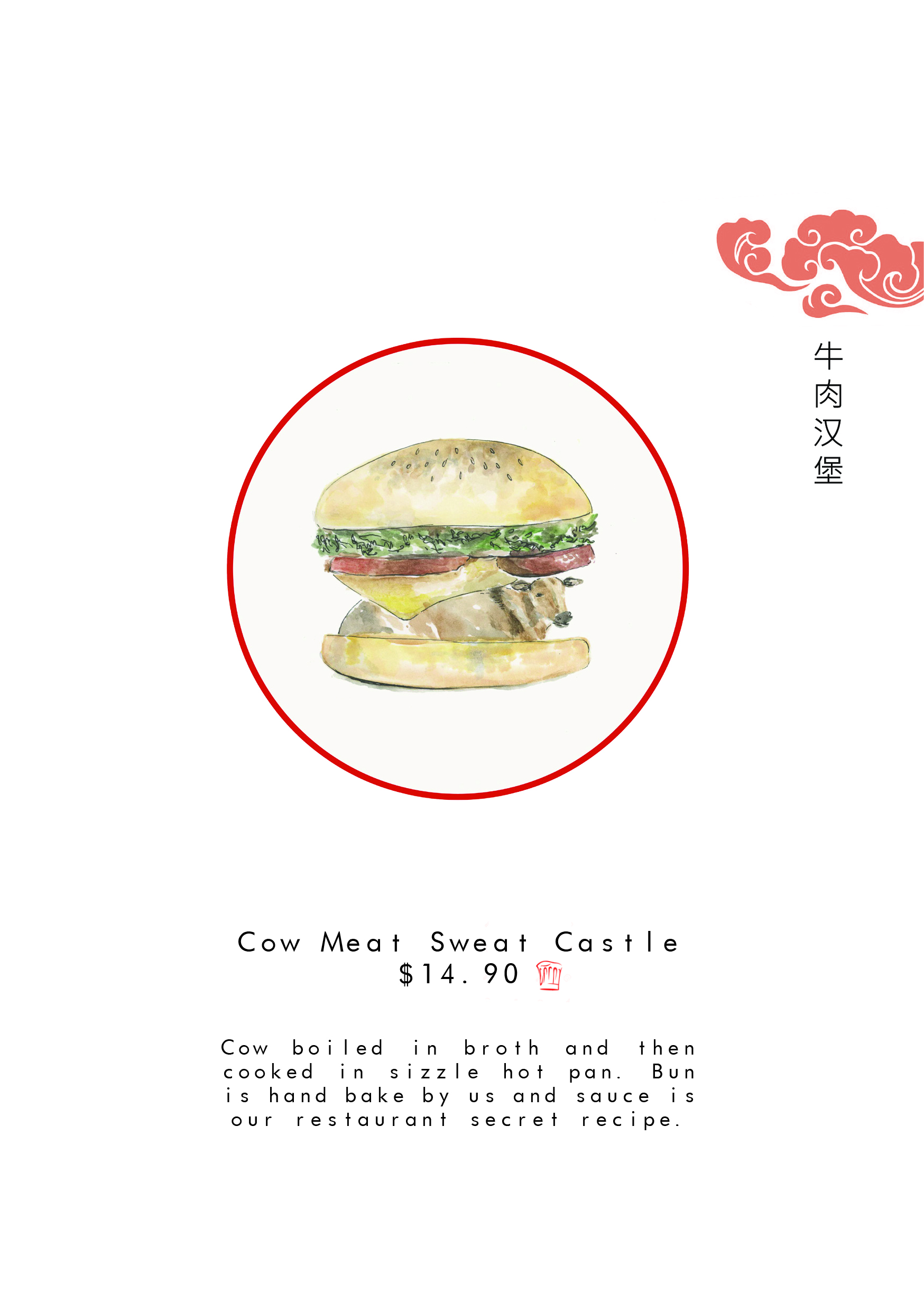
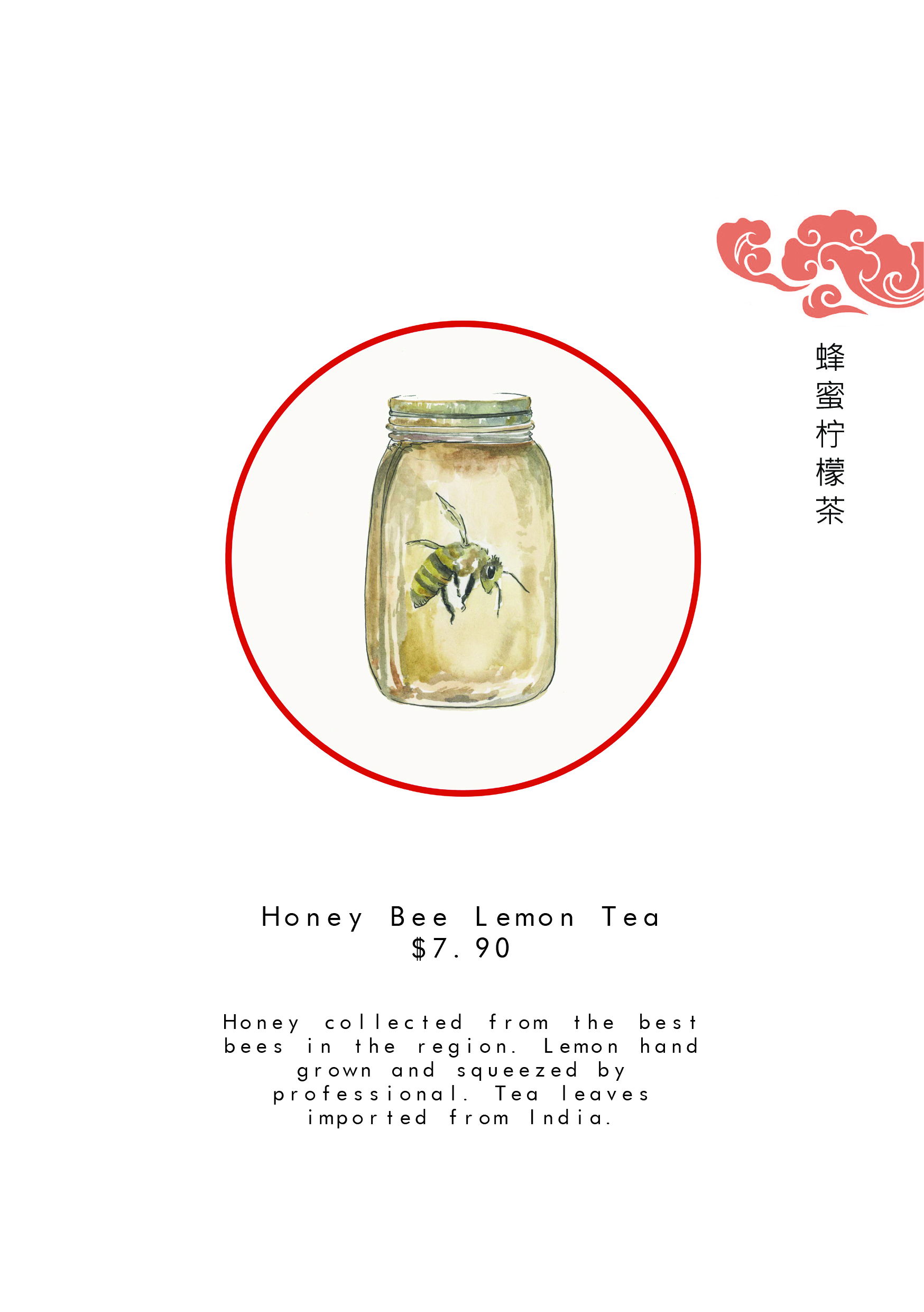
Zine (final)
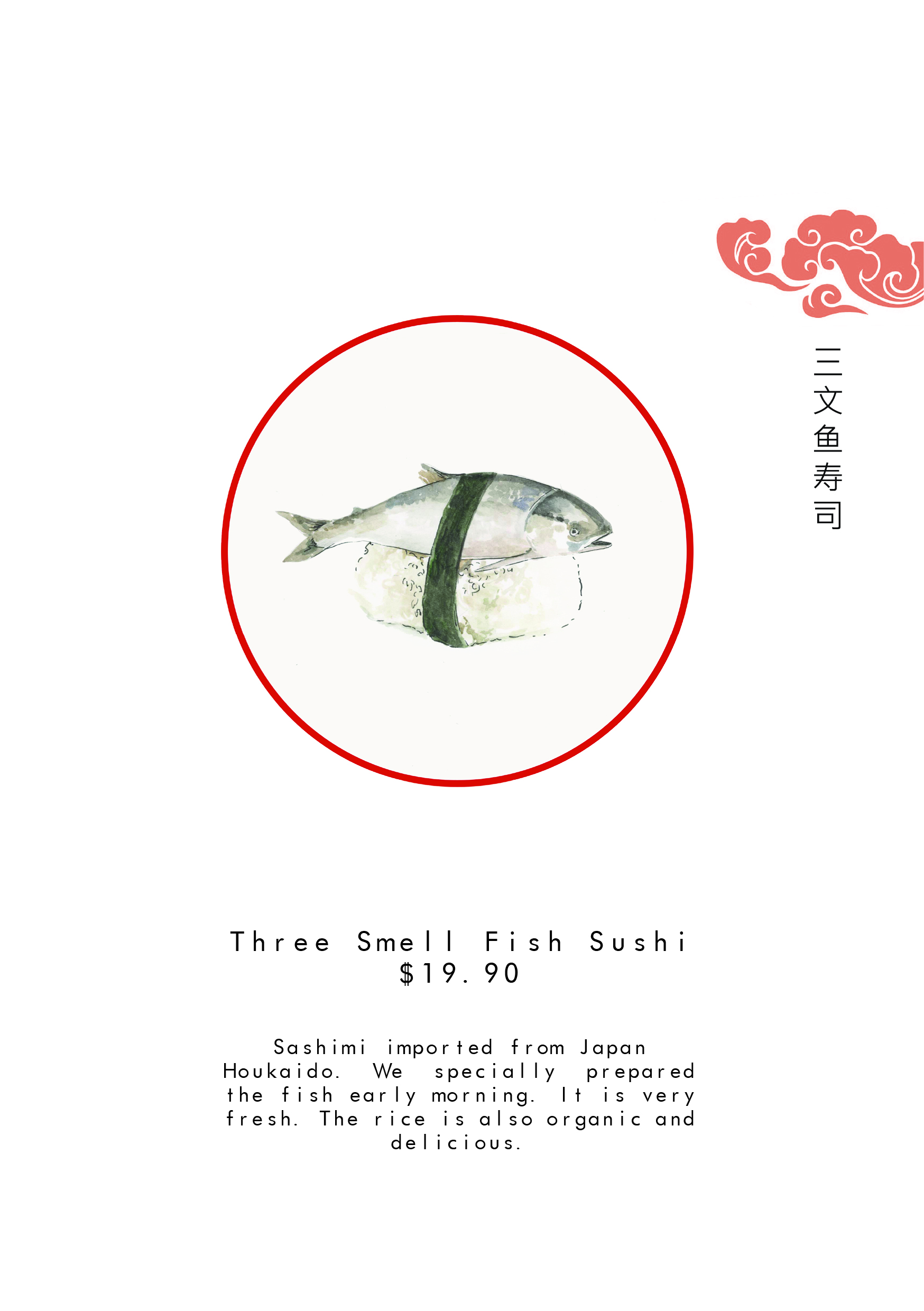
Final pages of my Zine:


Zine (Process) pt 2
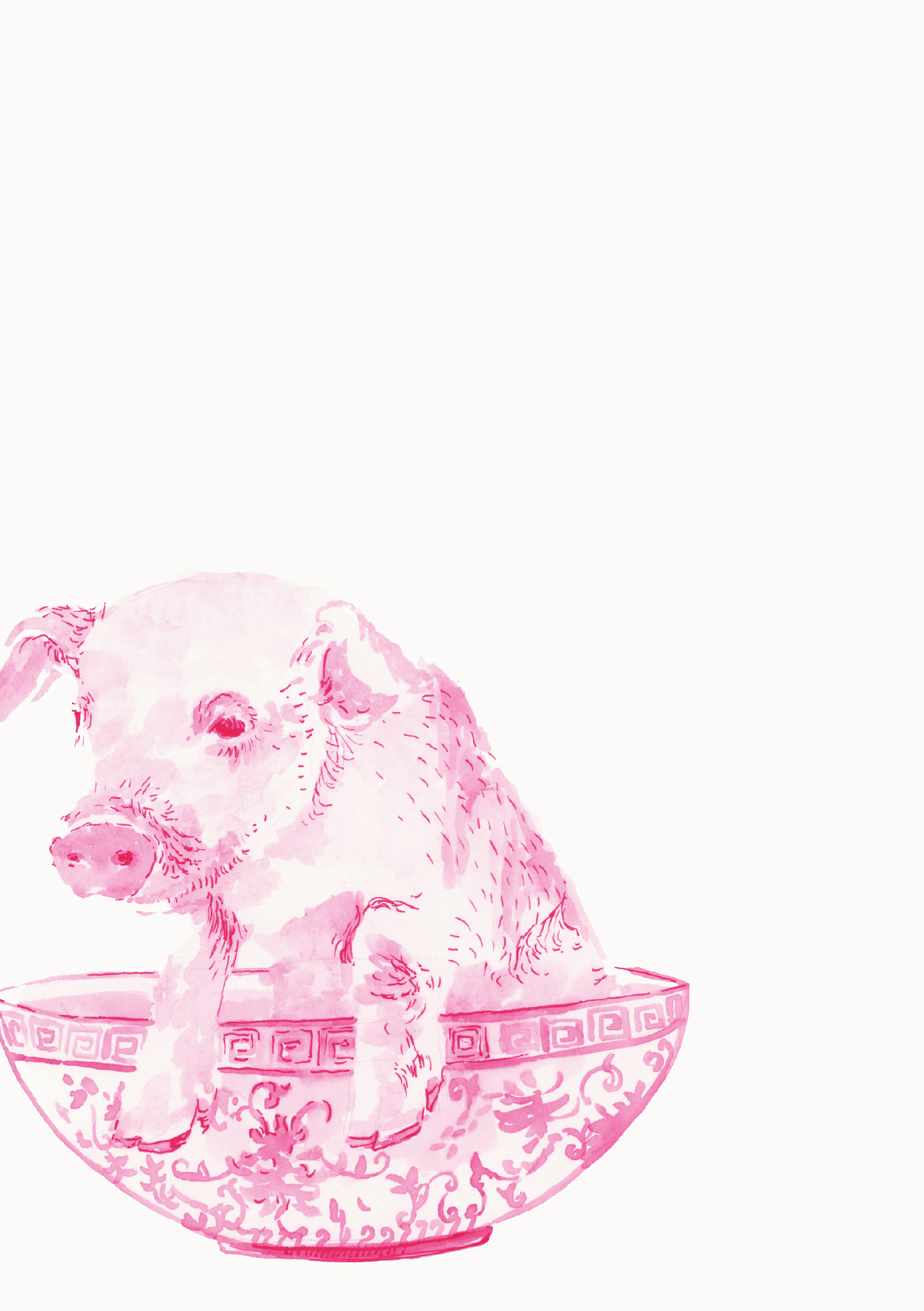
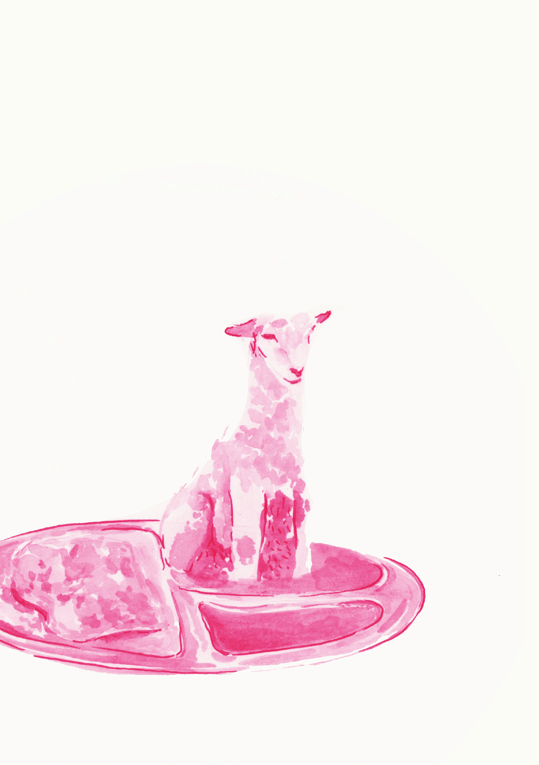
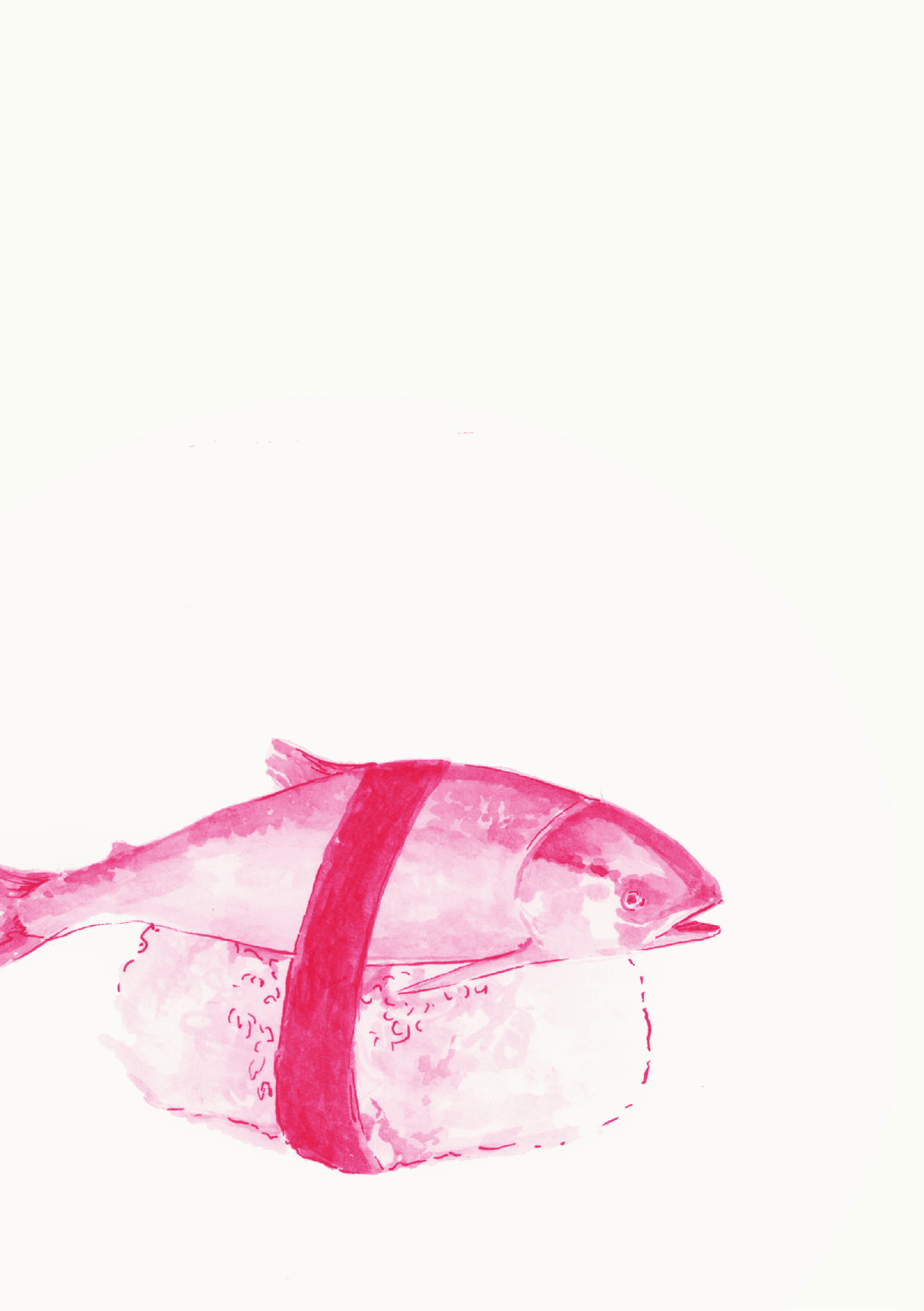
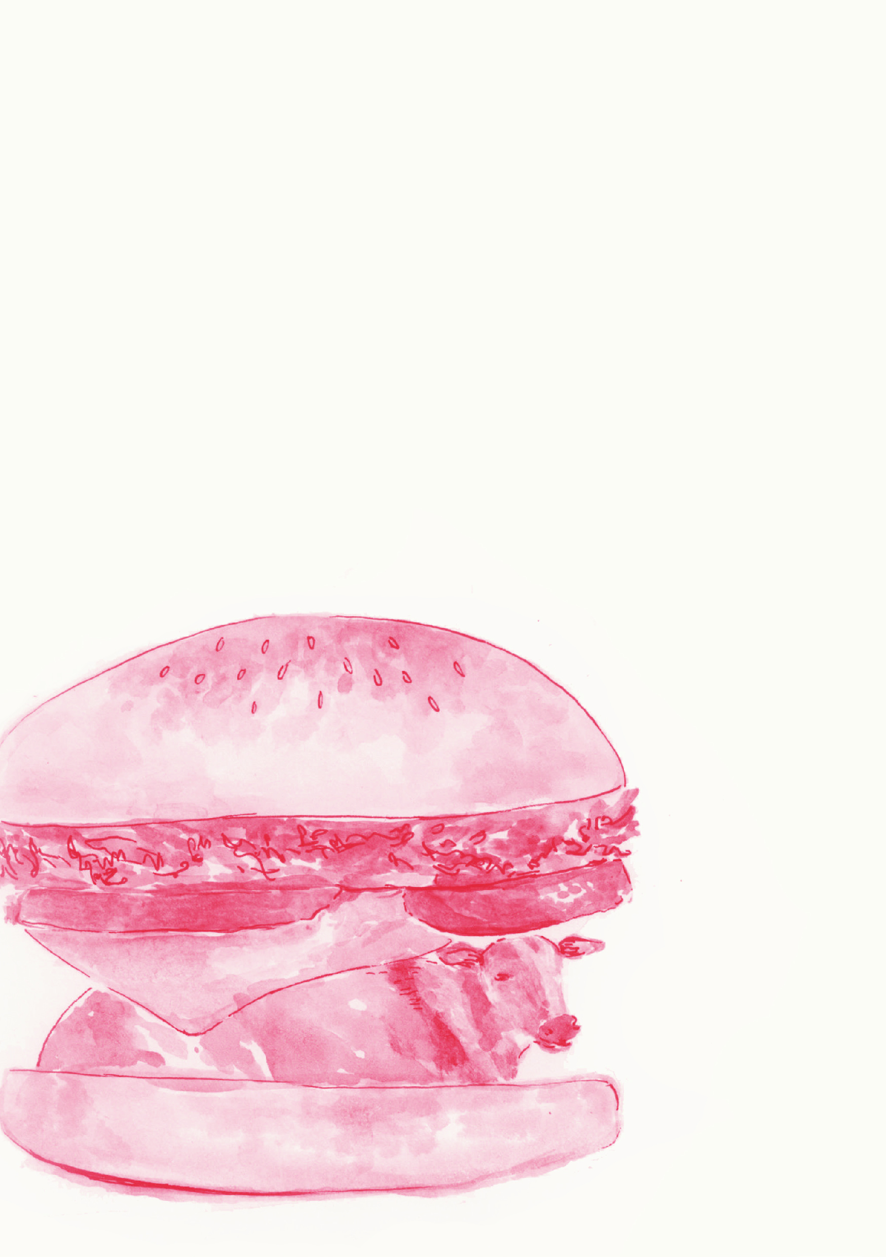
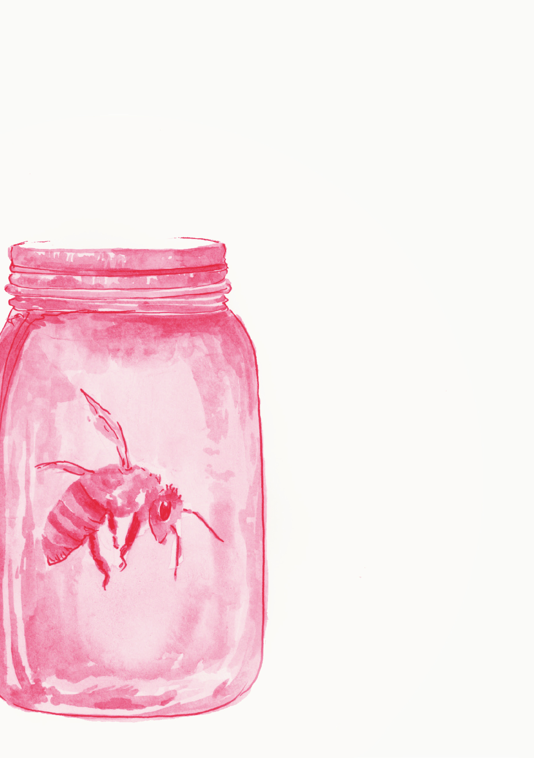
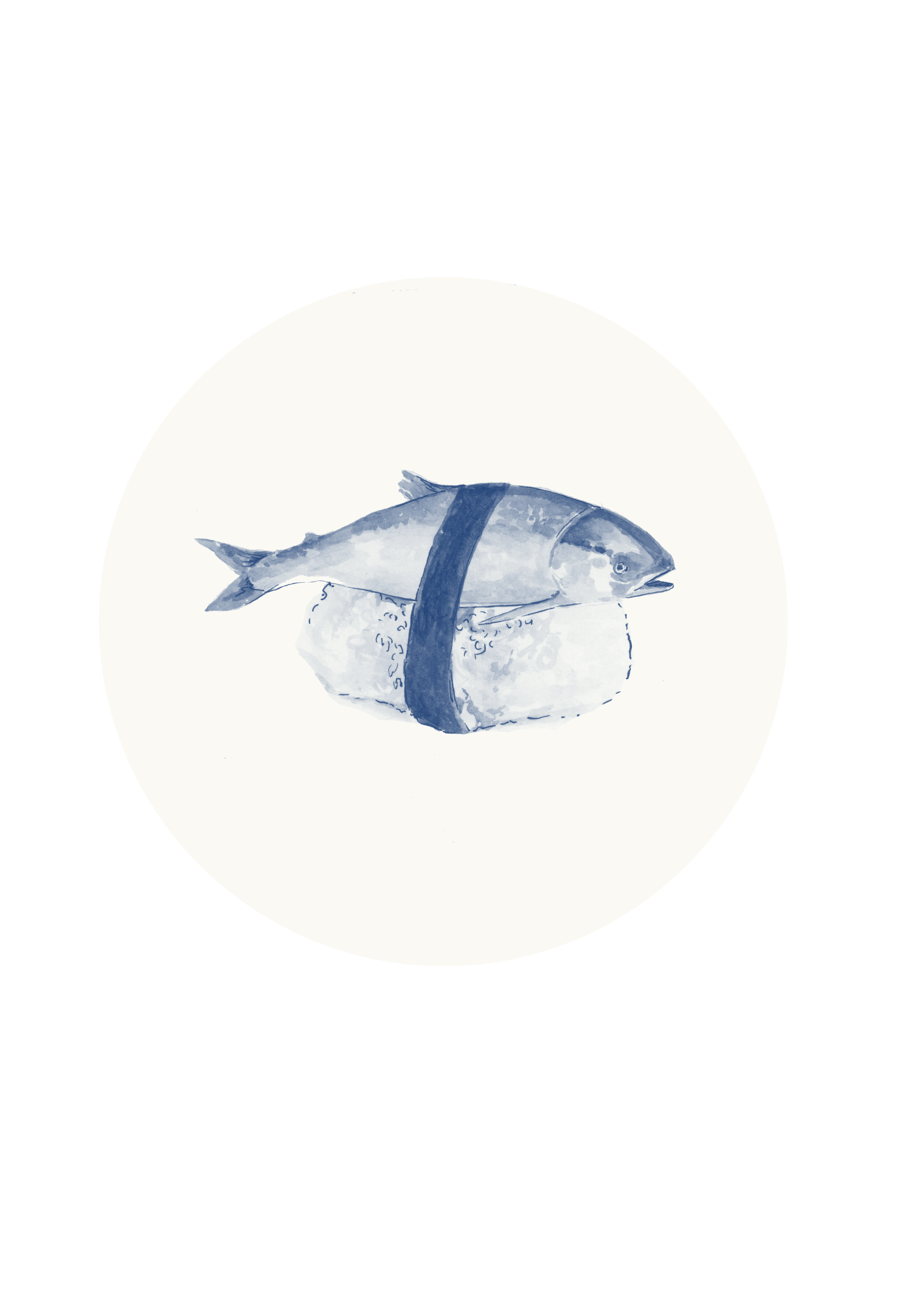
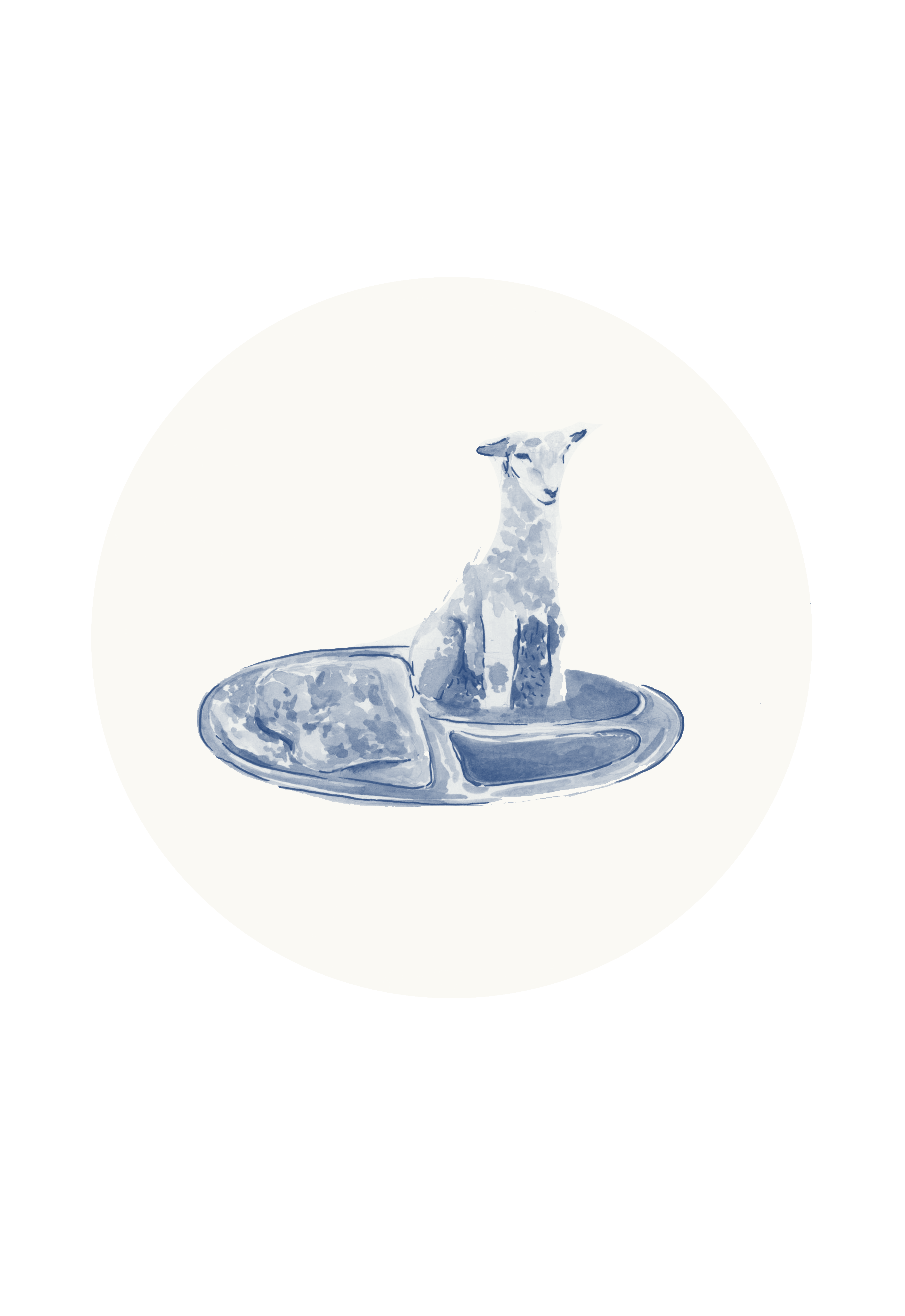
Here, I tested out the original scans and wanted to make them usable since the original colors are pretty interesting…
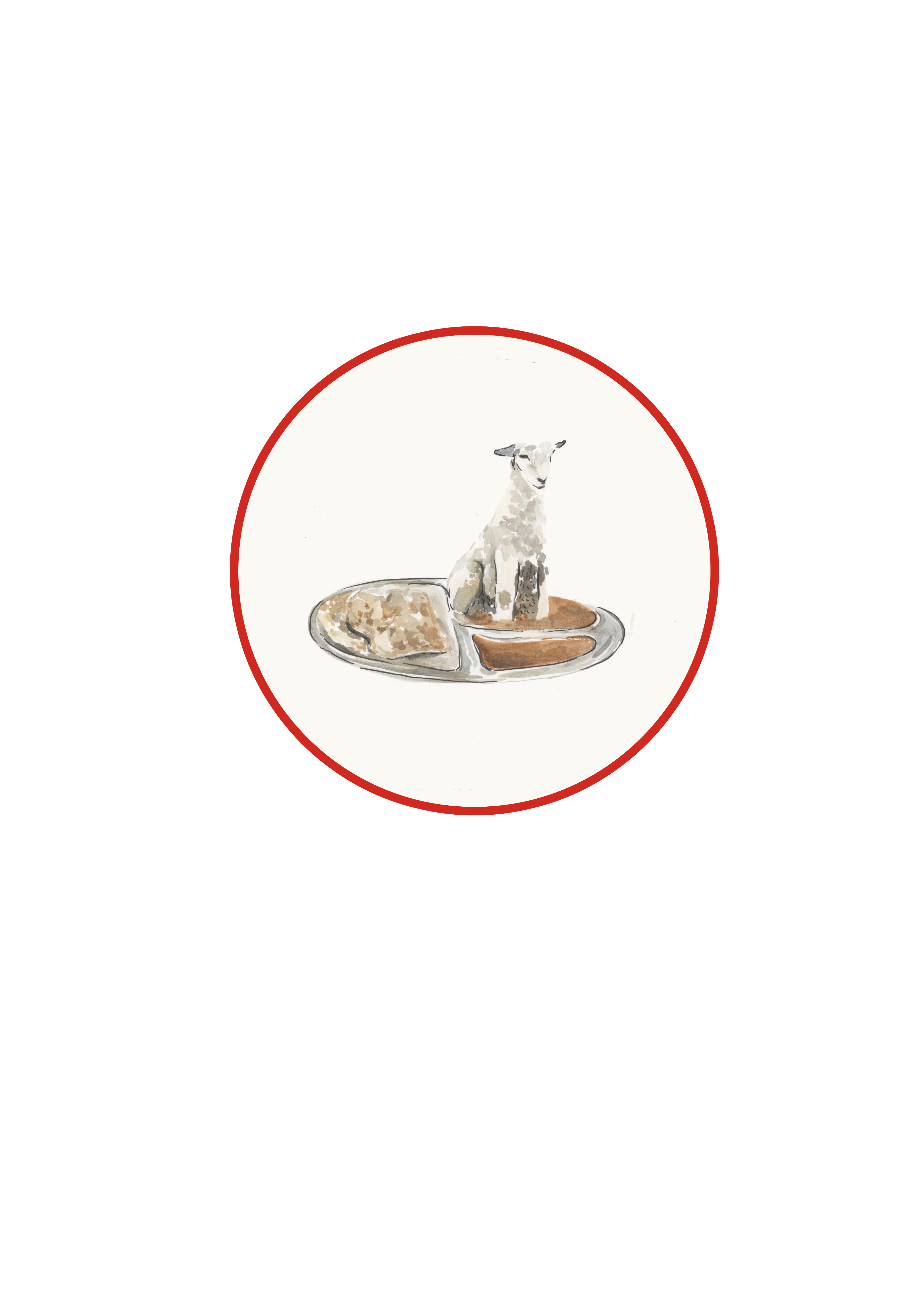
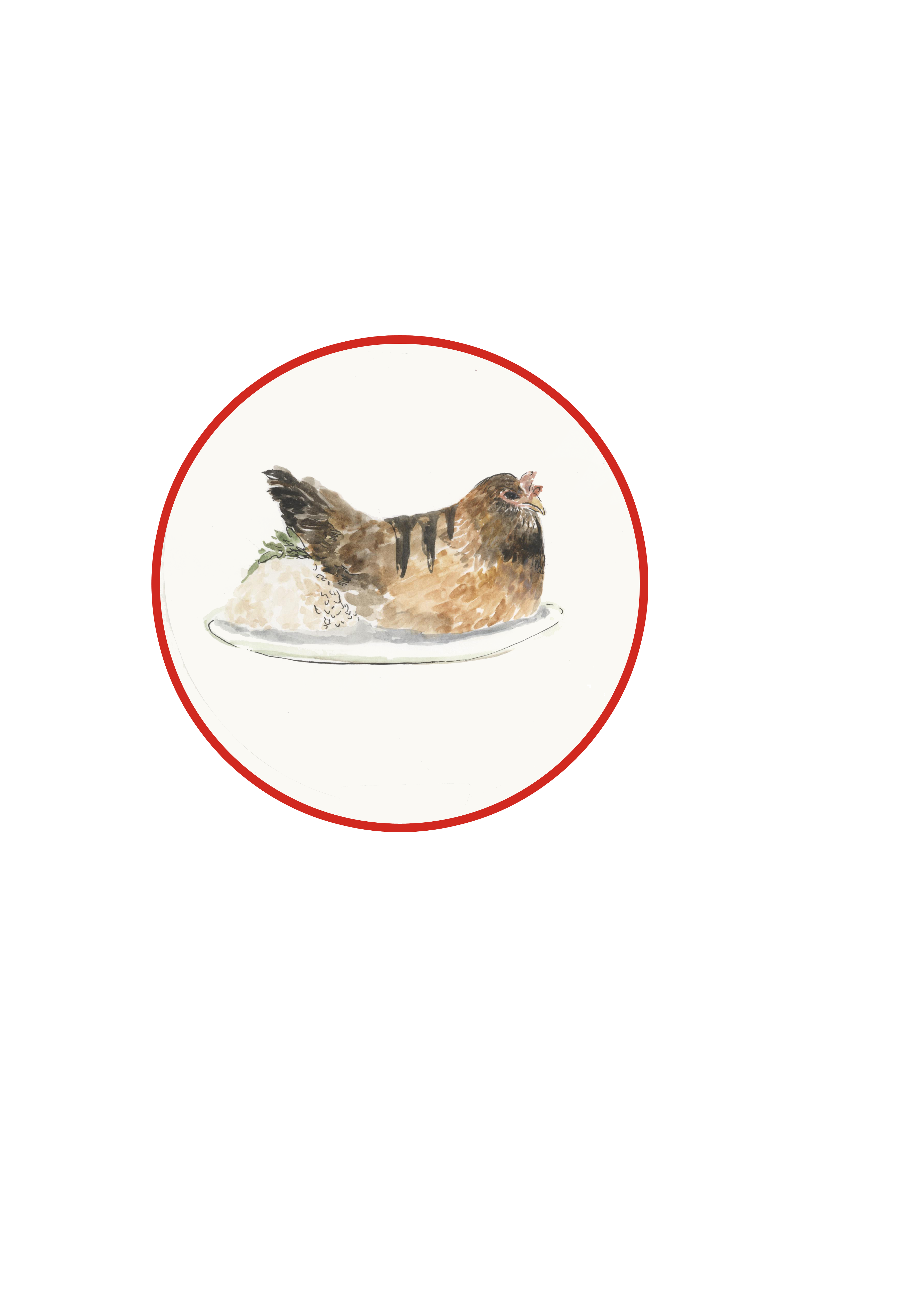


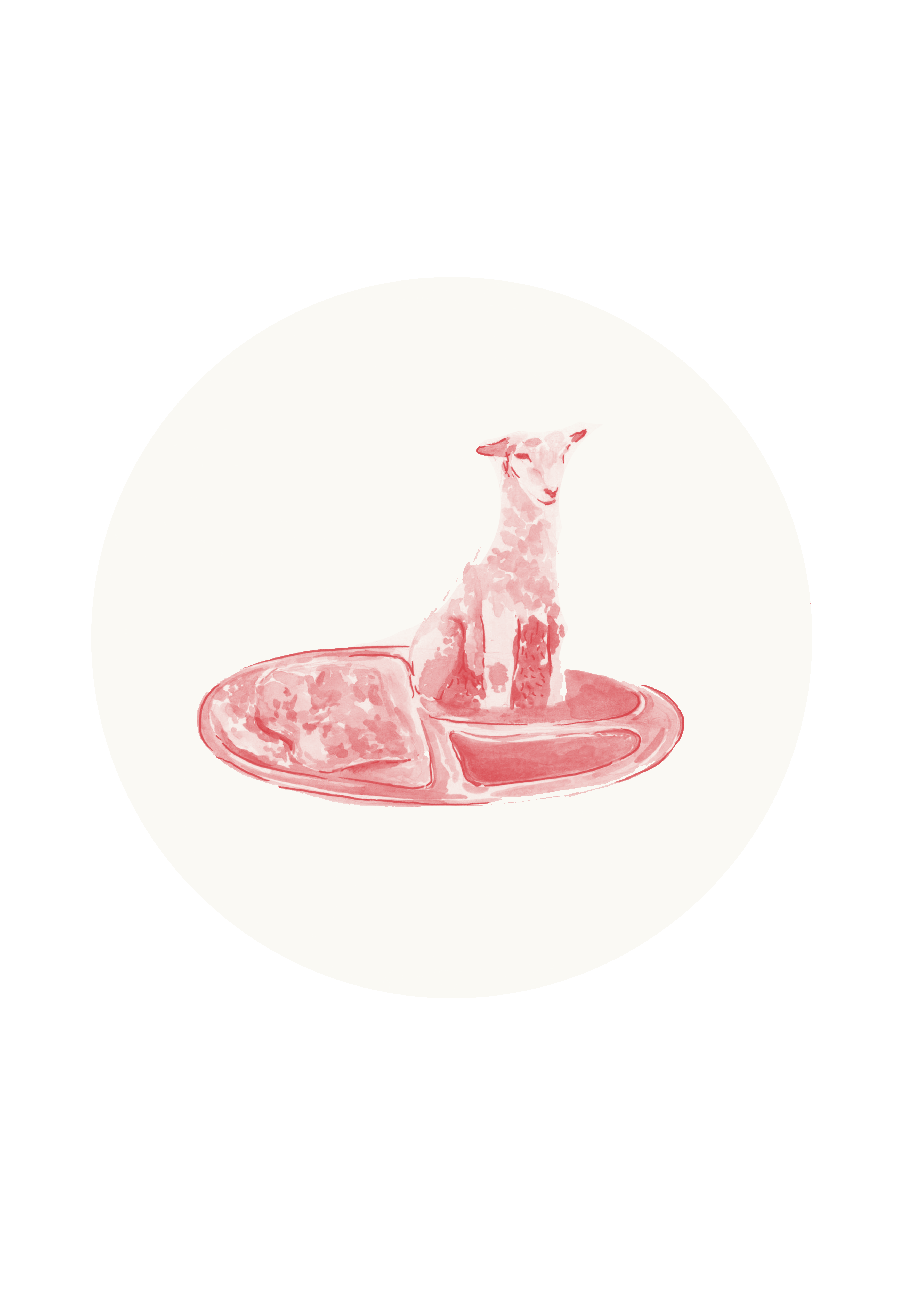
The circle really tie in with the whole Chinese theme I going on here.
Zine (Research)

I got really inspired by this particular menu. I really enjoyed the fragility of the lines and how they make the vectors. The use of black and white colors yet using red really make the red pop. I eventually red pop by using red on the things I wanted to be the main focus of.
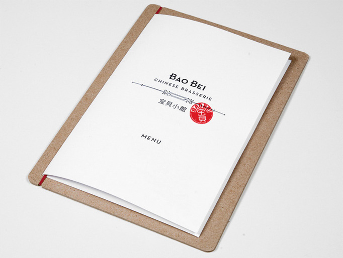
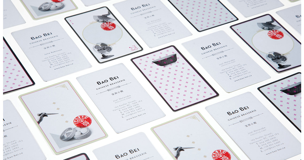
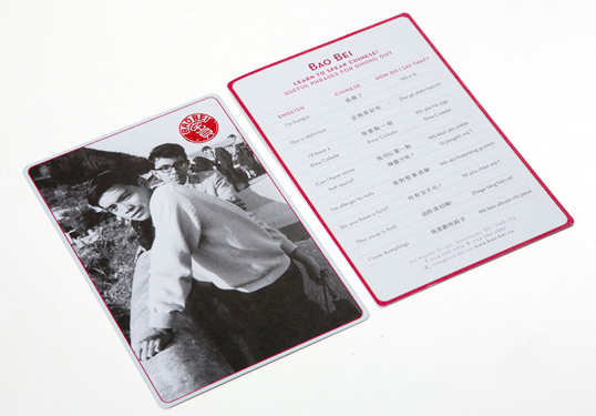
love the idea of using the red look and sort of a chinese name stamp look on teh front cover….(which is reflected in the final outcome of my zine)
Zine (Process)
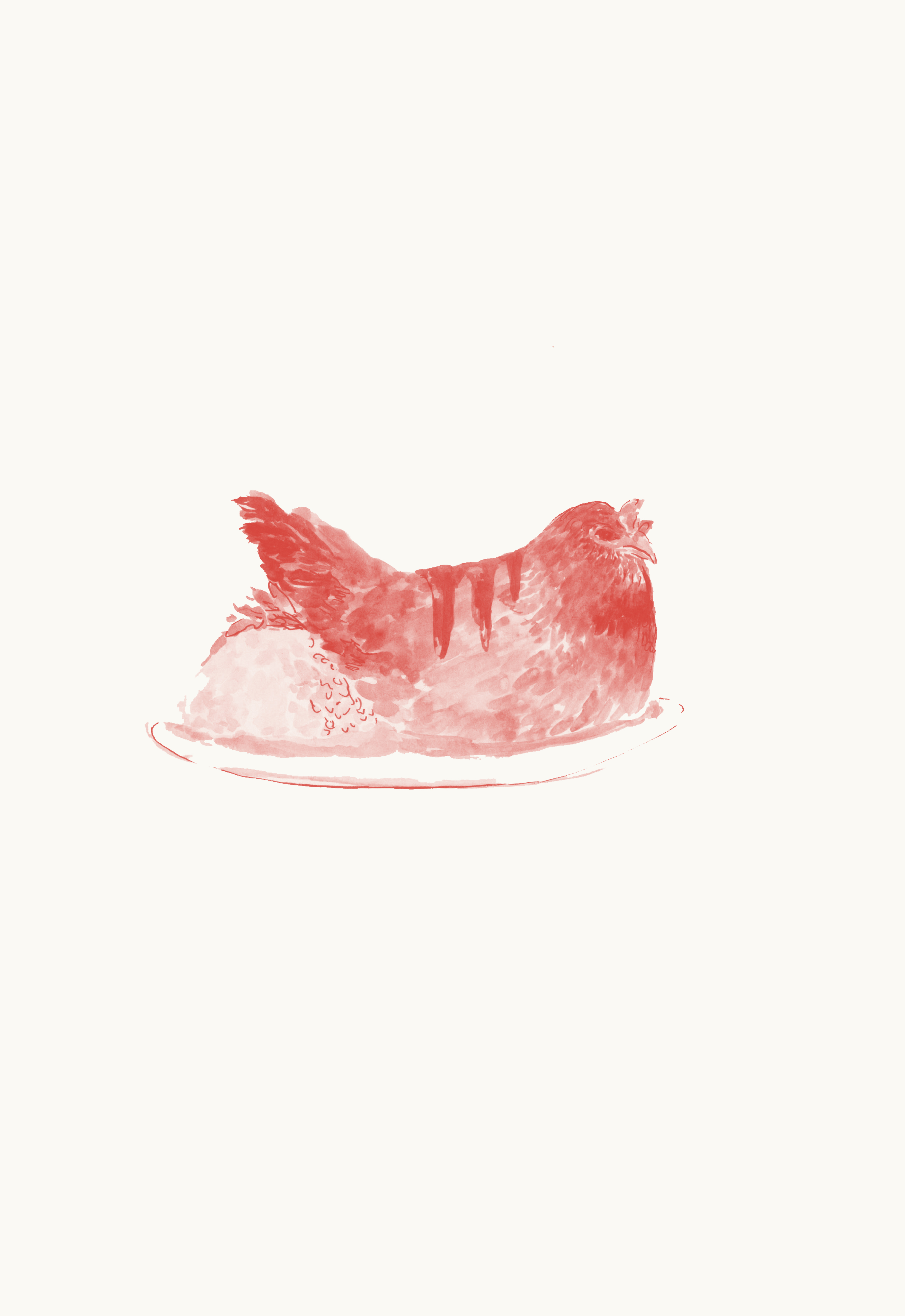
Exploring the color schemes of my zine pages….should I go for a blue toned menu or red toned menu? At this stage I was more or less figuring out the theme of my zine.

After doing the red version of my zine I realised that the red really complements the idea of a Chinese menu and its very obviously a chinese menu. Plus it’s also eye-catching.
This is a try-out of what it would look like without the circle