
I got really inspired by this particular menu. I really enjoyed the fragility of the lines and how they make the vectors. The use of black and white colors yet using red really make the red pop. I eventually red pop by using red on the things I wanted to be the main focus of.
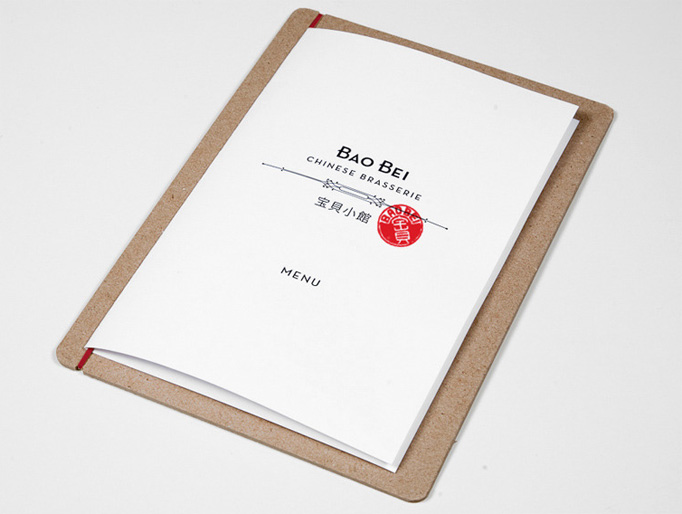
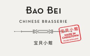
love the idea of using the red look and sort of a chinese name stamp look on teh front cover….(which is reflected in the final outcome of my zine)