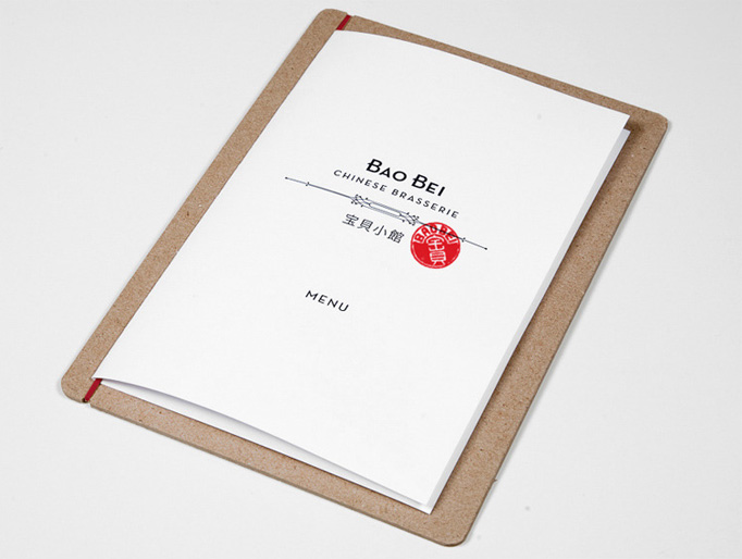
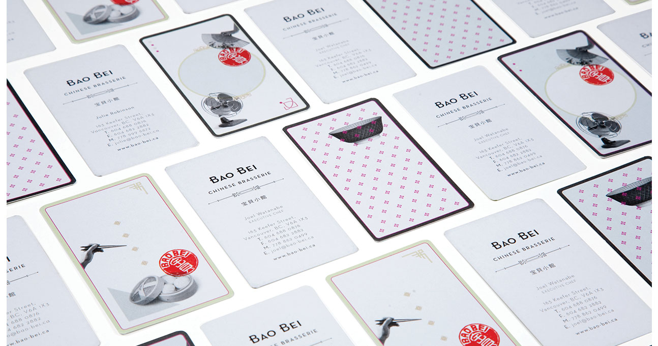
Final pages of my Zine:


It's all about my art.
Final pages of my Zine:
Here, I tested out the original scans and wanted to make them usable since the original colors are pretty interesting…


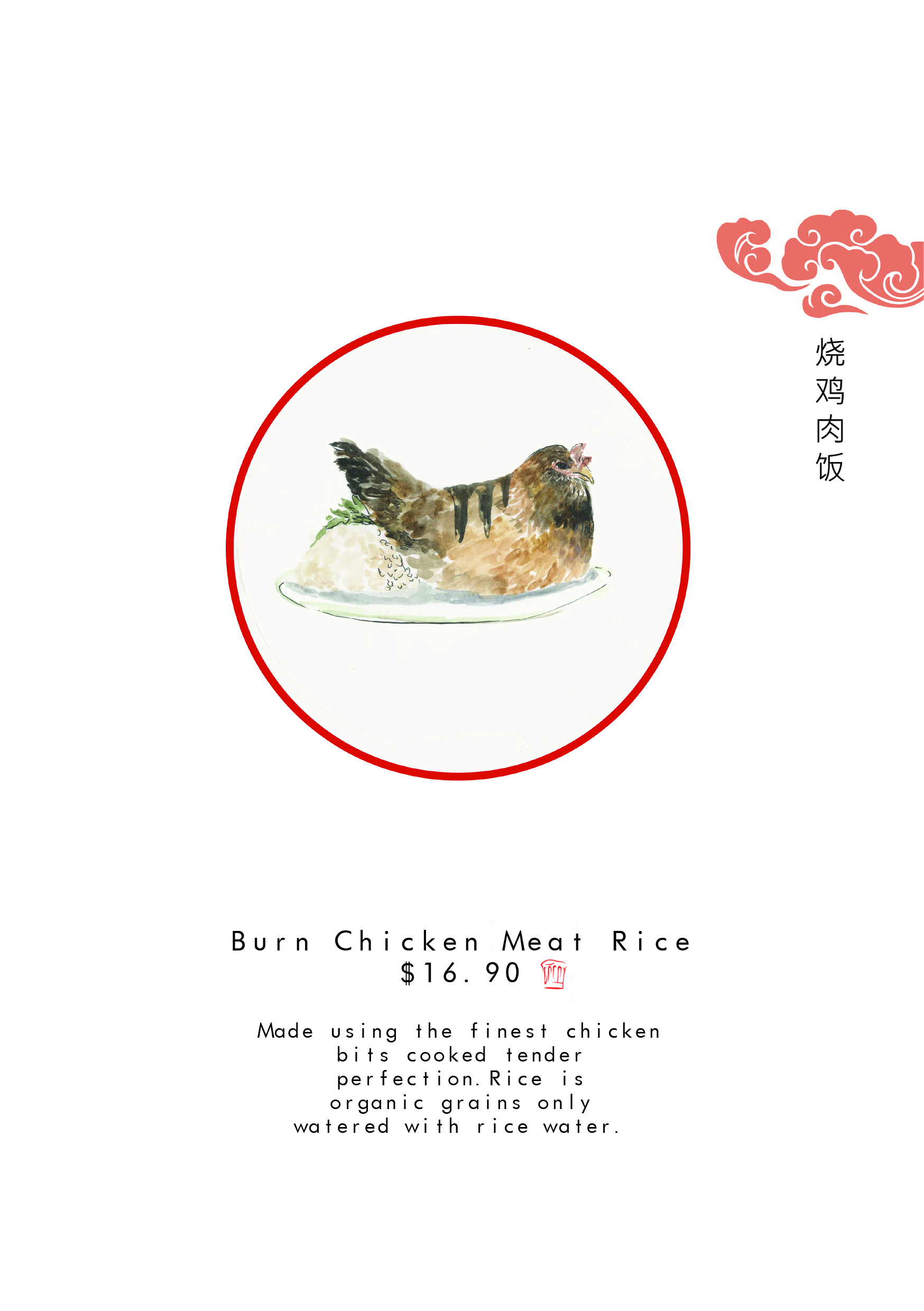
The circle really tie in with the whole Chinese theme I going on here.
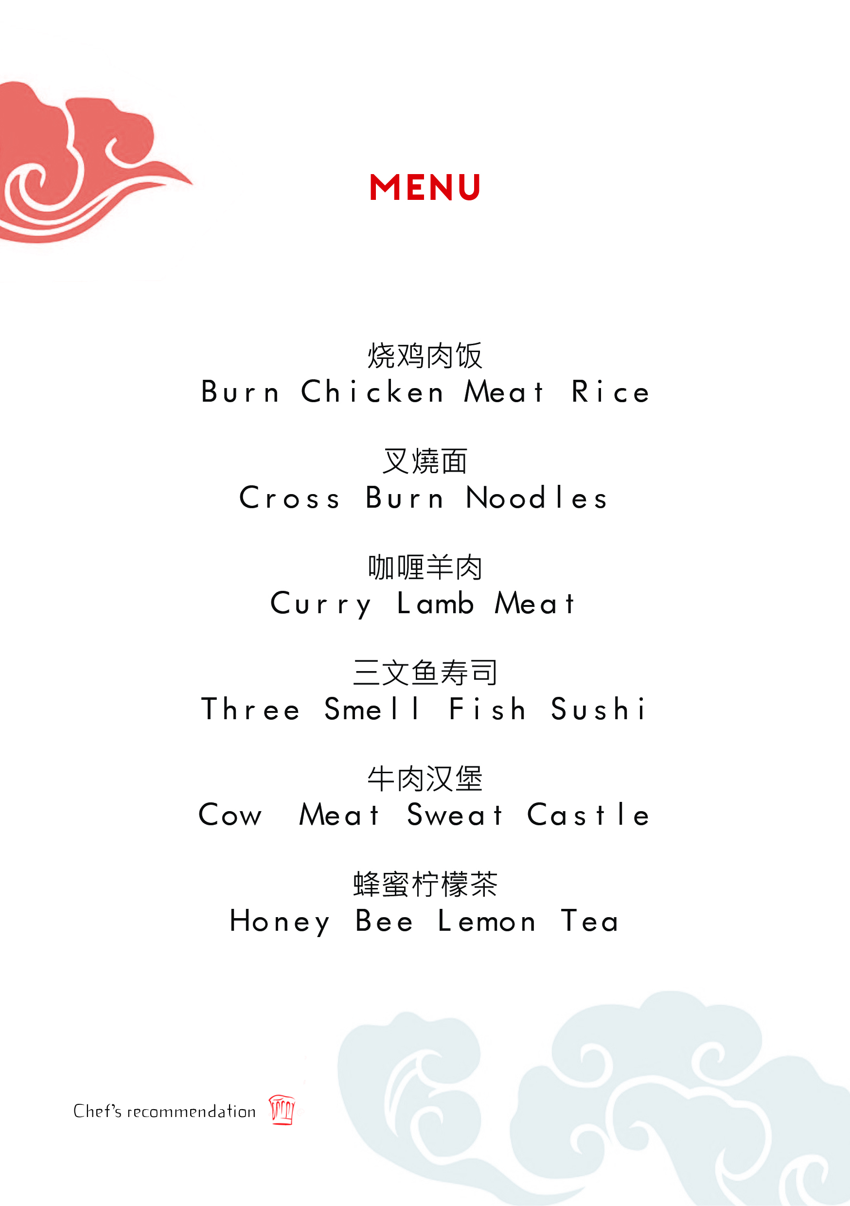
I got really inspired by this particular menu. I really enjoyed the fragility of the lines and how they make the vectors. The use of black and white colors yet using red really make the red pop. I eventually red pop by using red on the things I wanted to be the main focus of.
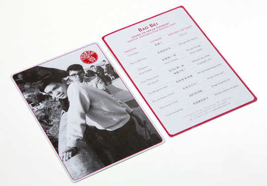
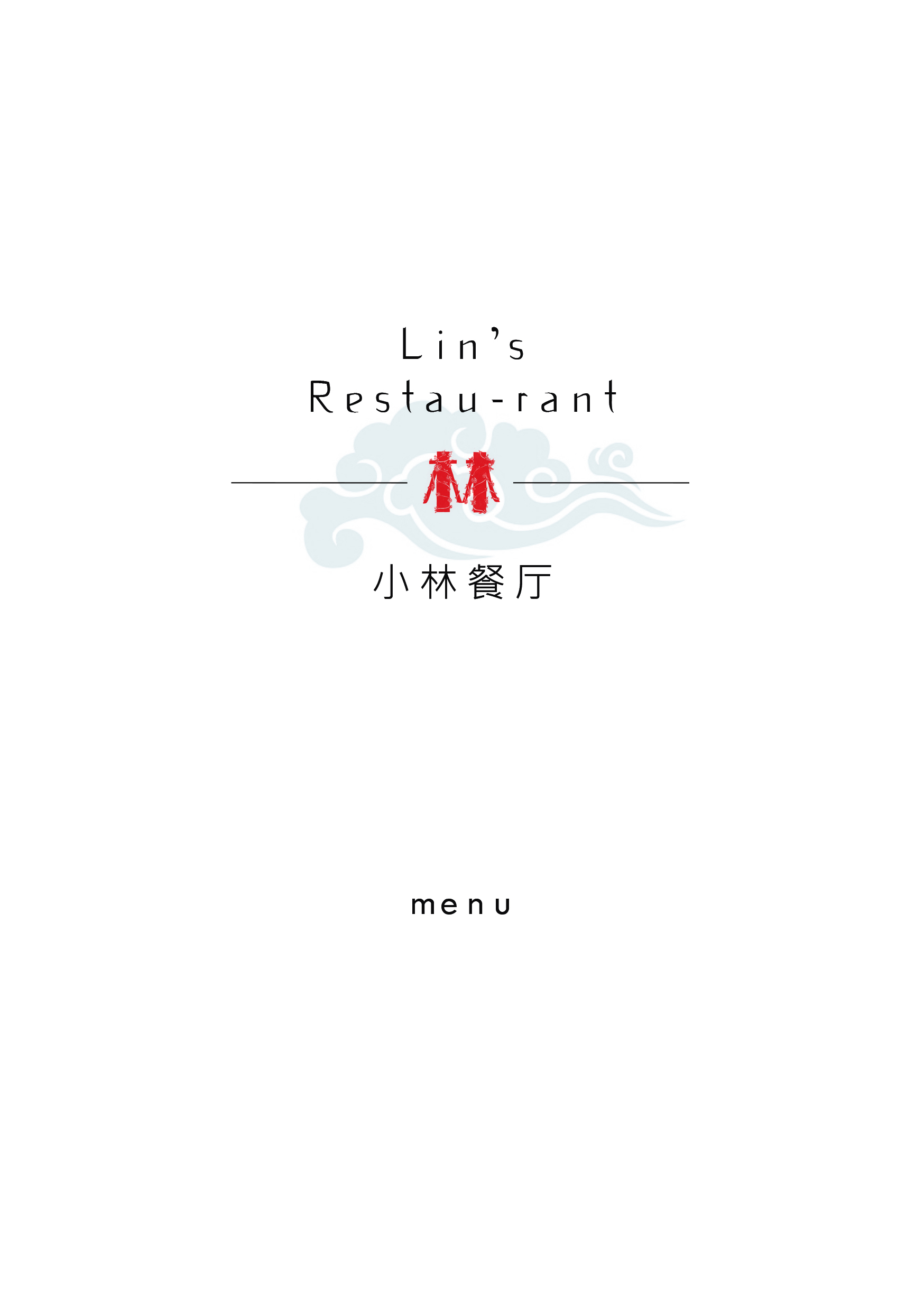
love the idea of using the red look and sort of a chinese name stamp look on teh front cover….(which is reflected in the final outcome of my zine)
Exploring the color schemes of my zine pages….should I go for a blue toned menu or red toned menu? At this stage I was more or less figuring out the theme of my zine.

After doing the red version of my zine I realised that the red really complements the idea of a Chinese menu and its very obviously a chinese menu. Plus it’s also eye-catching.
This is a try-out of what it would look like without the circle
Bunch of doodles. Old sketches…
Before I decided to do animals instead of flowers.

And….after this I decided to do animals. So those are in my process post.
I would present them like this.
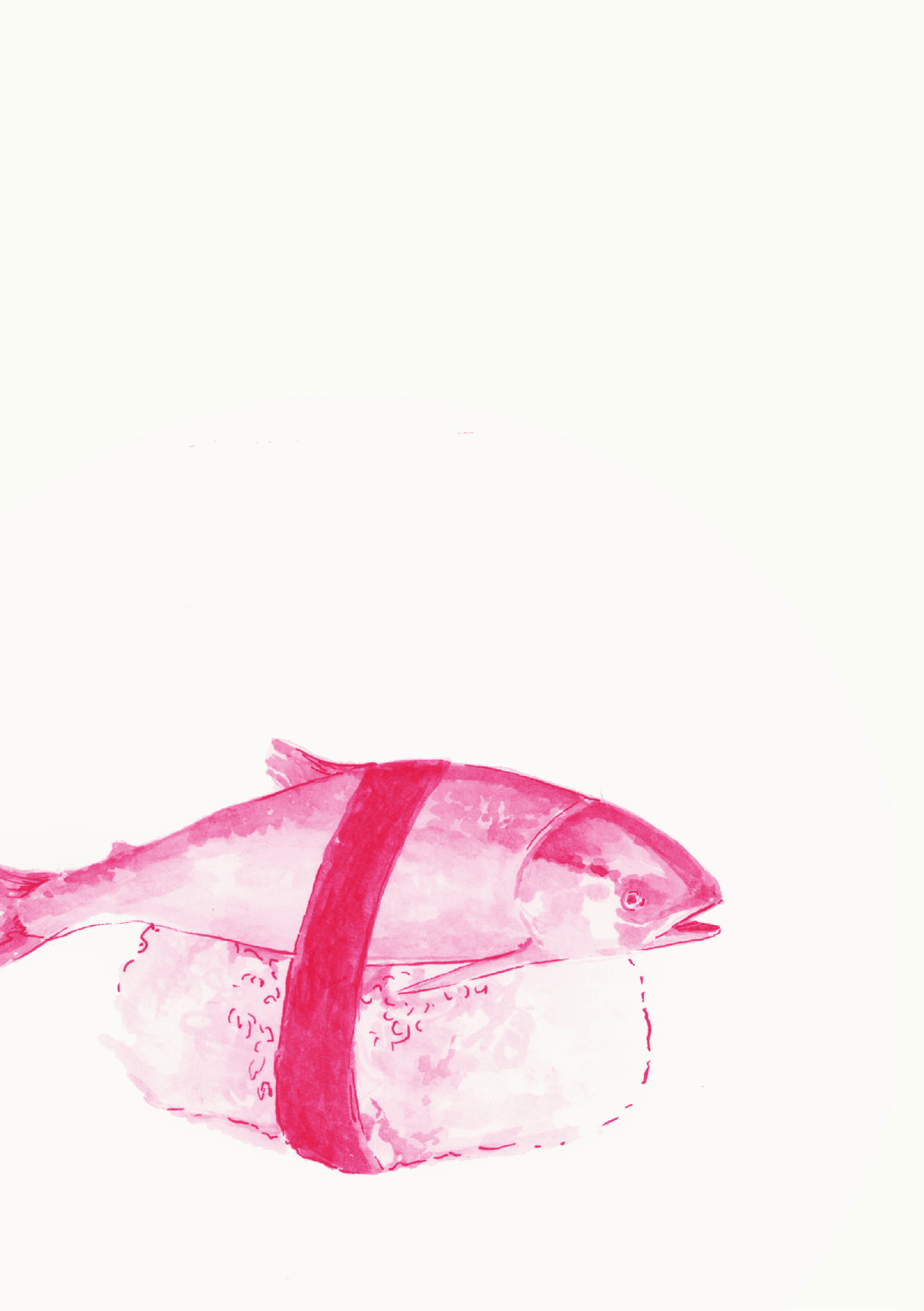
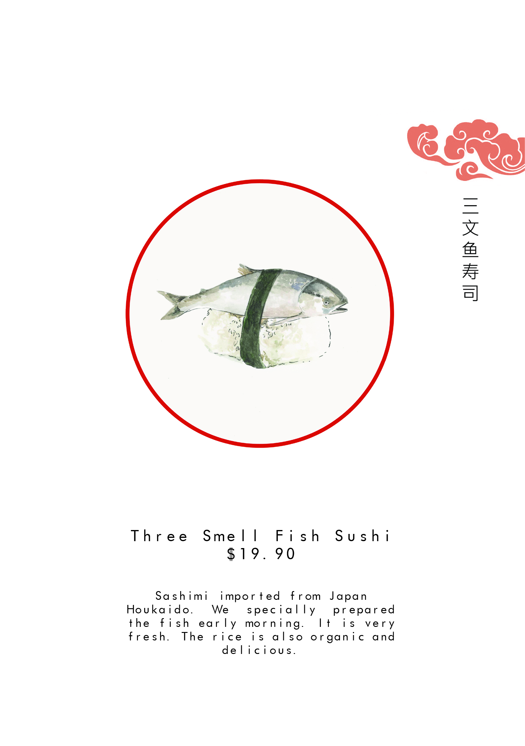
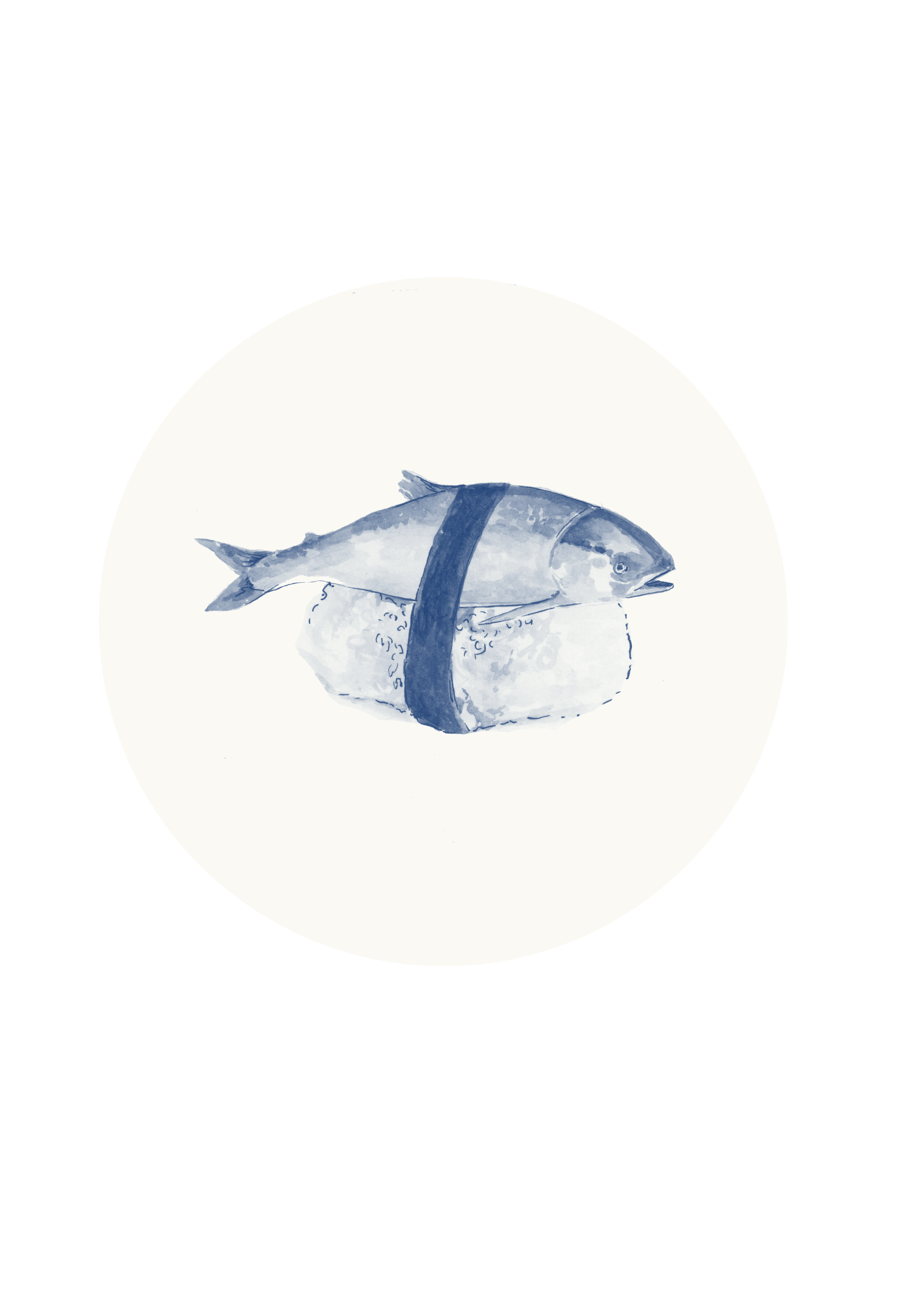
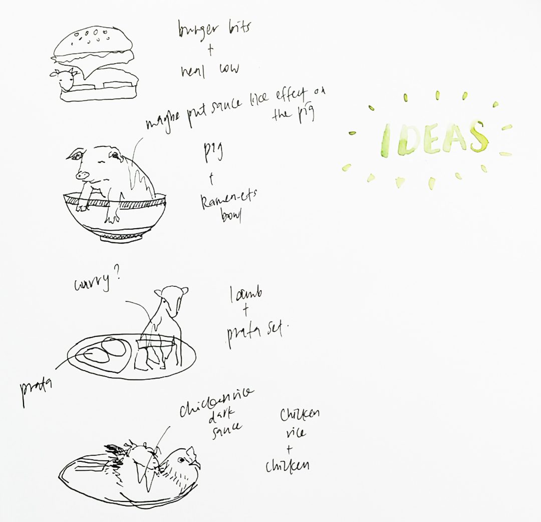
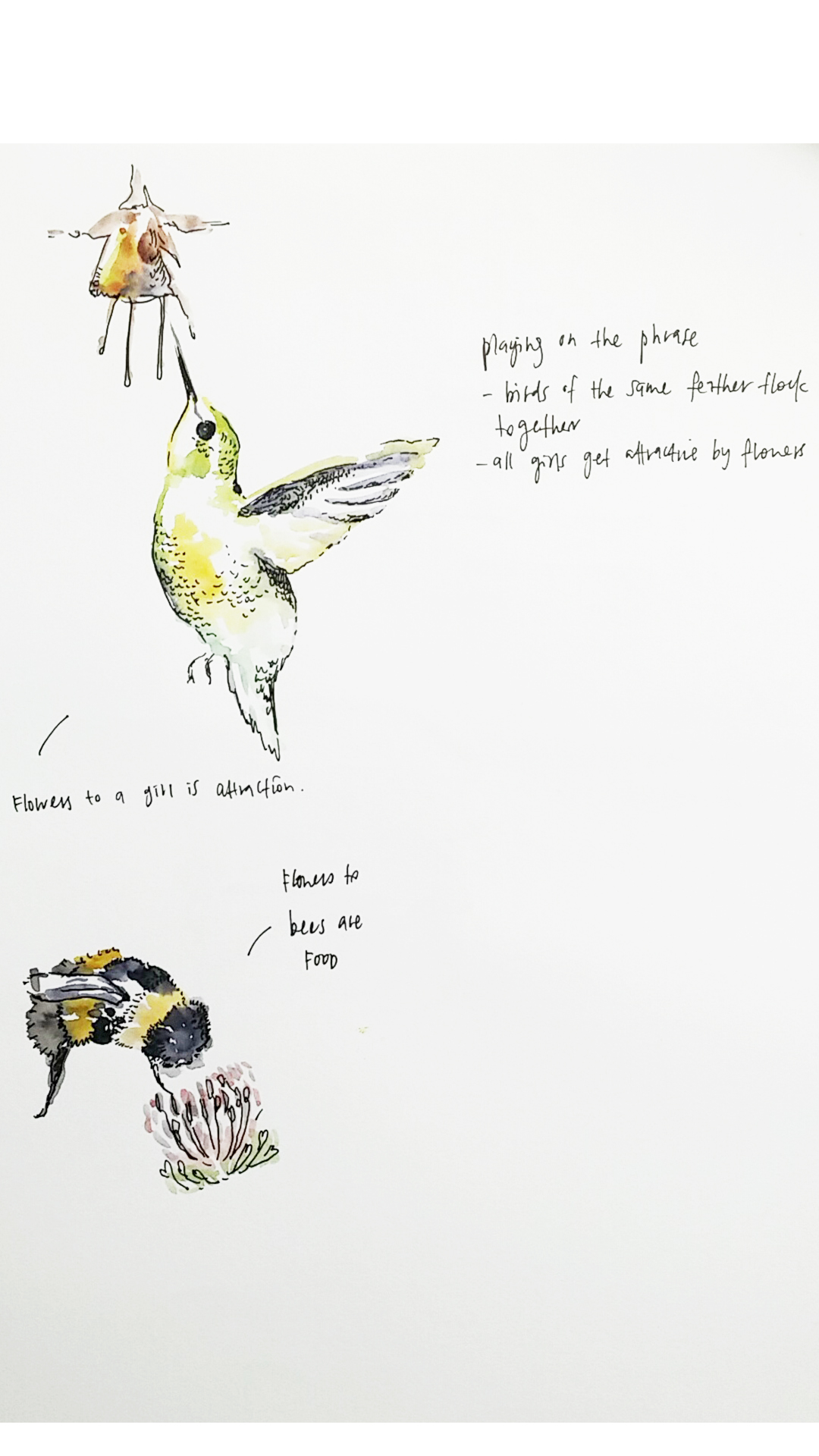
Sashimi from the point of view of Salmon
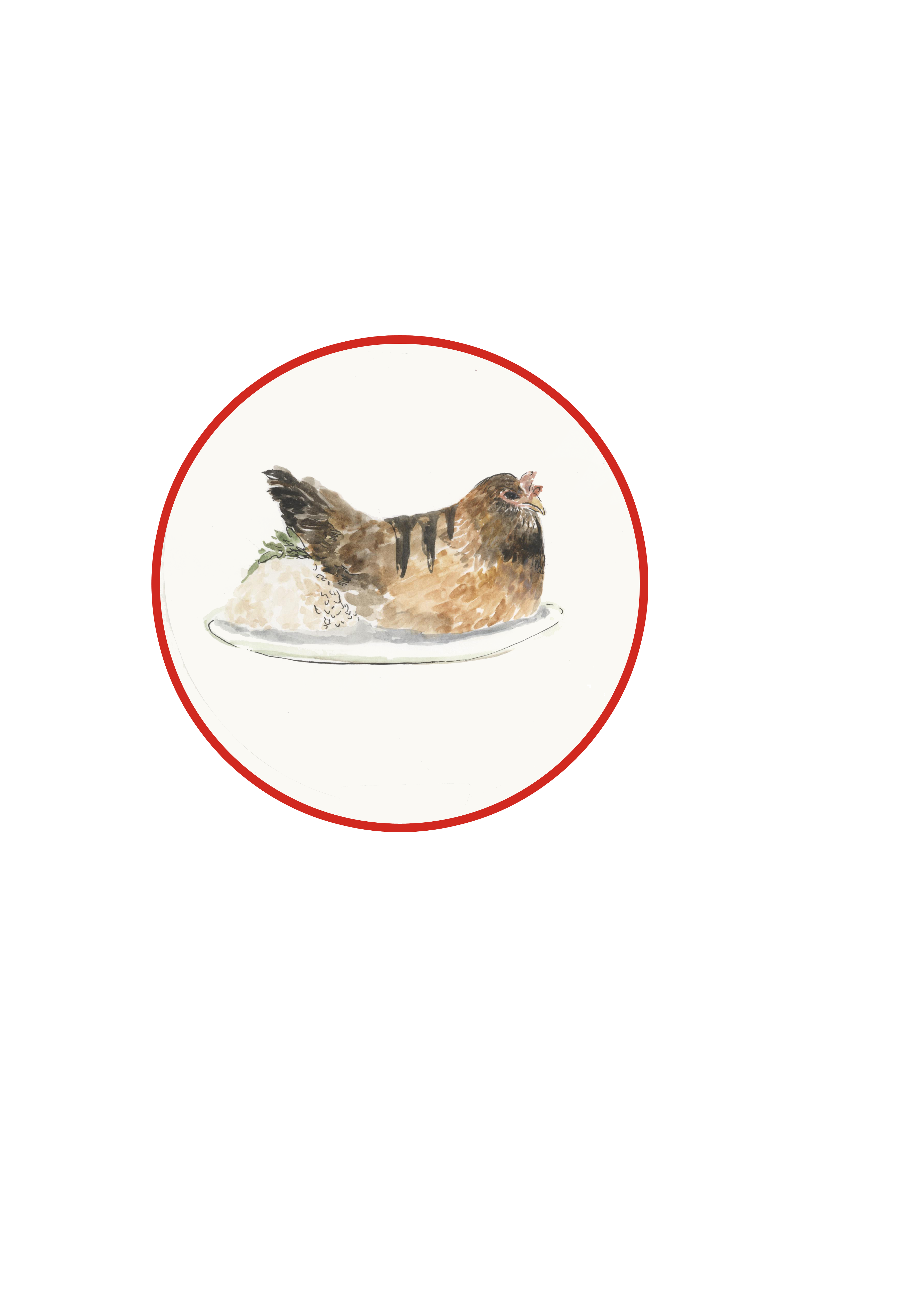
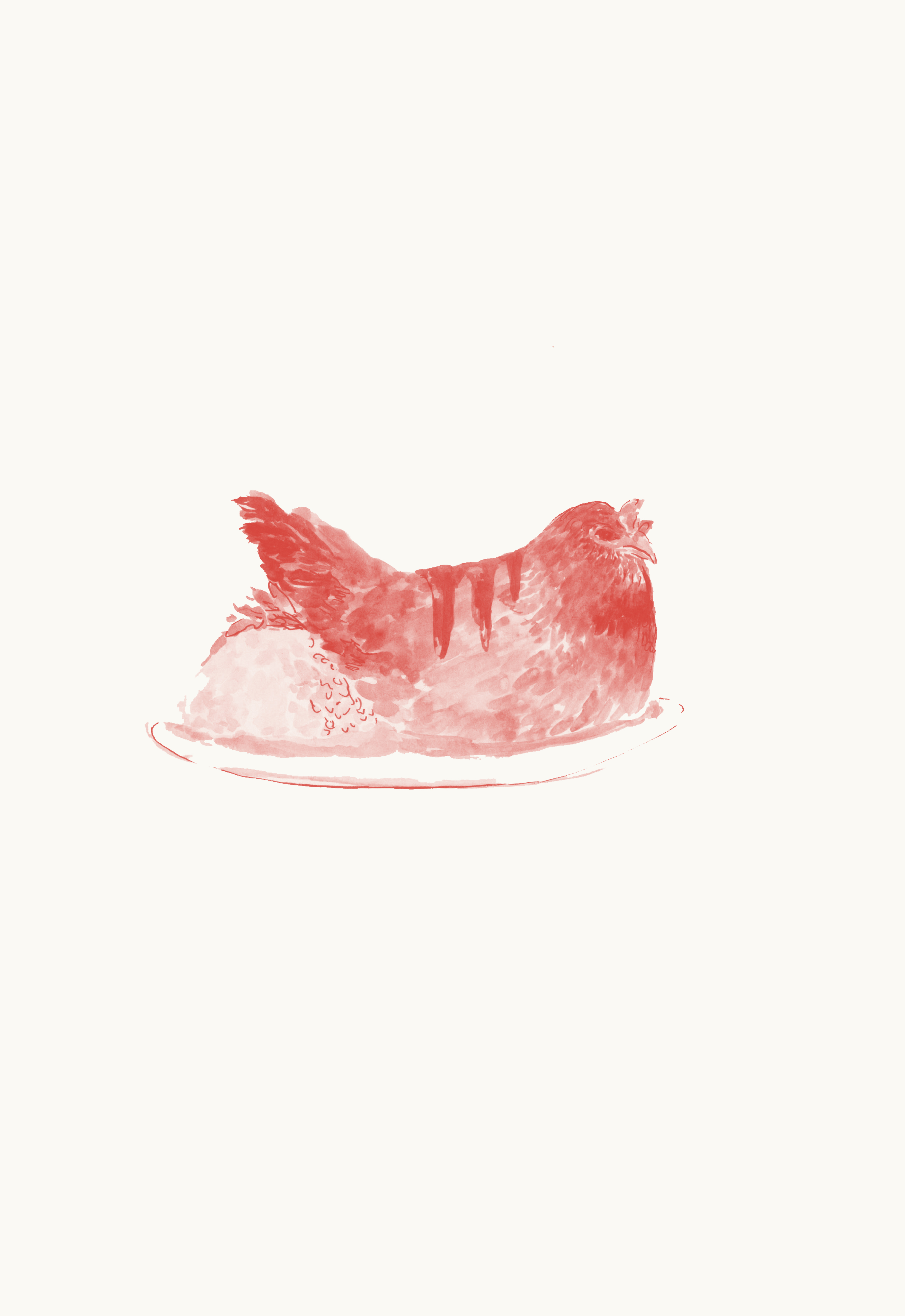
Chicken rice from the point of view of Chicken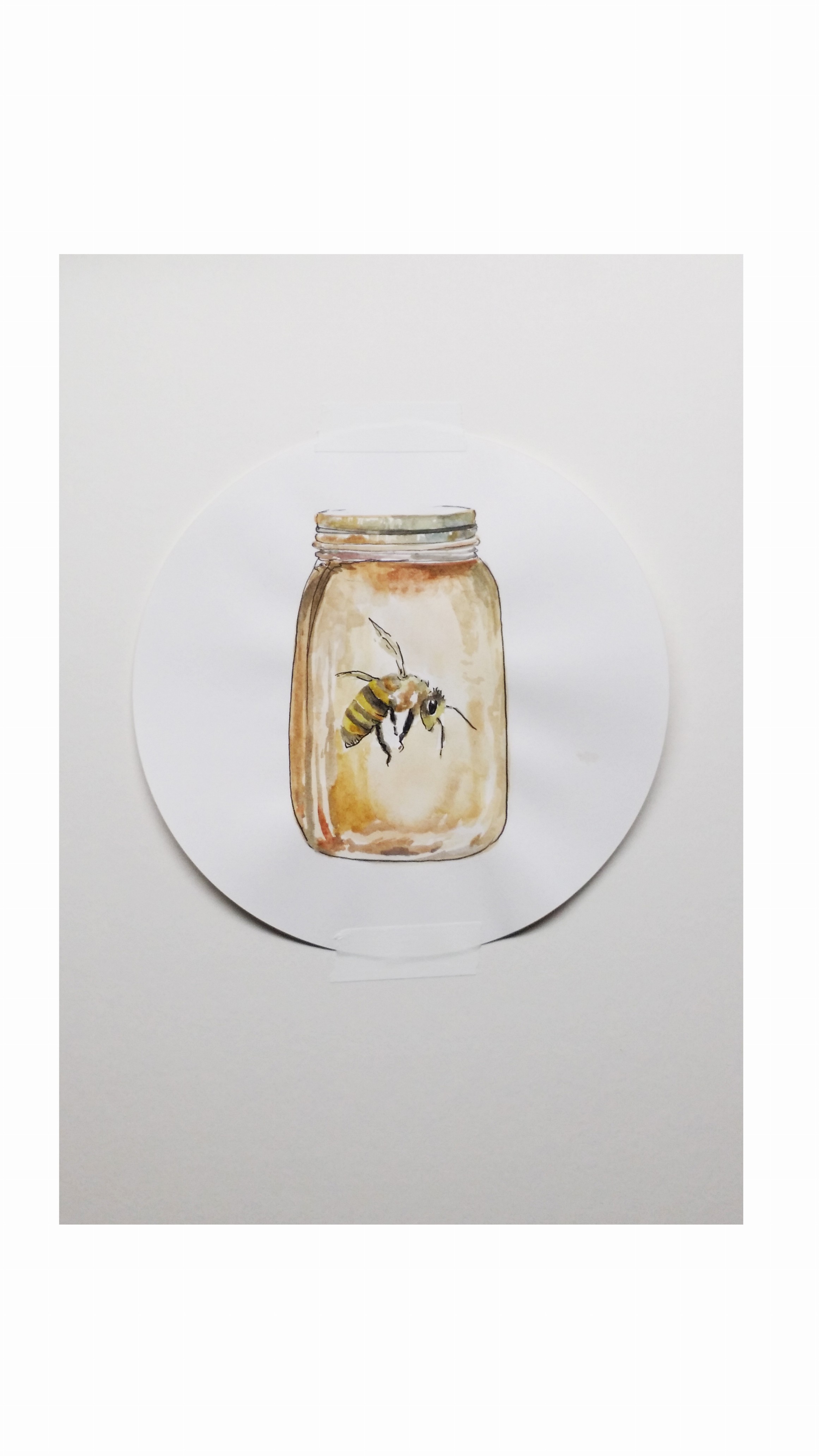
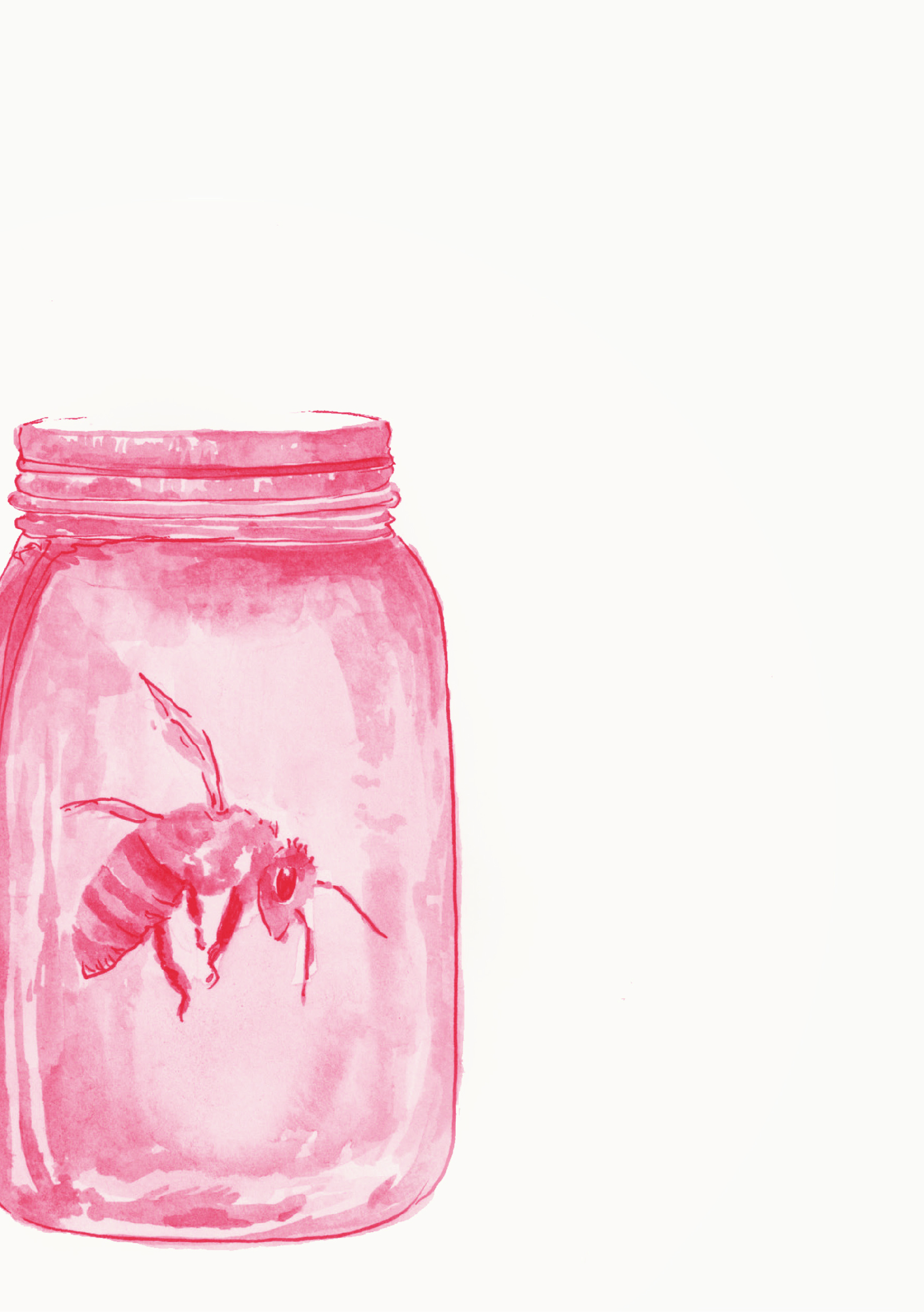
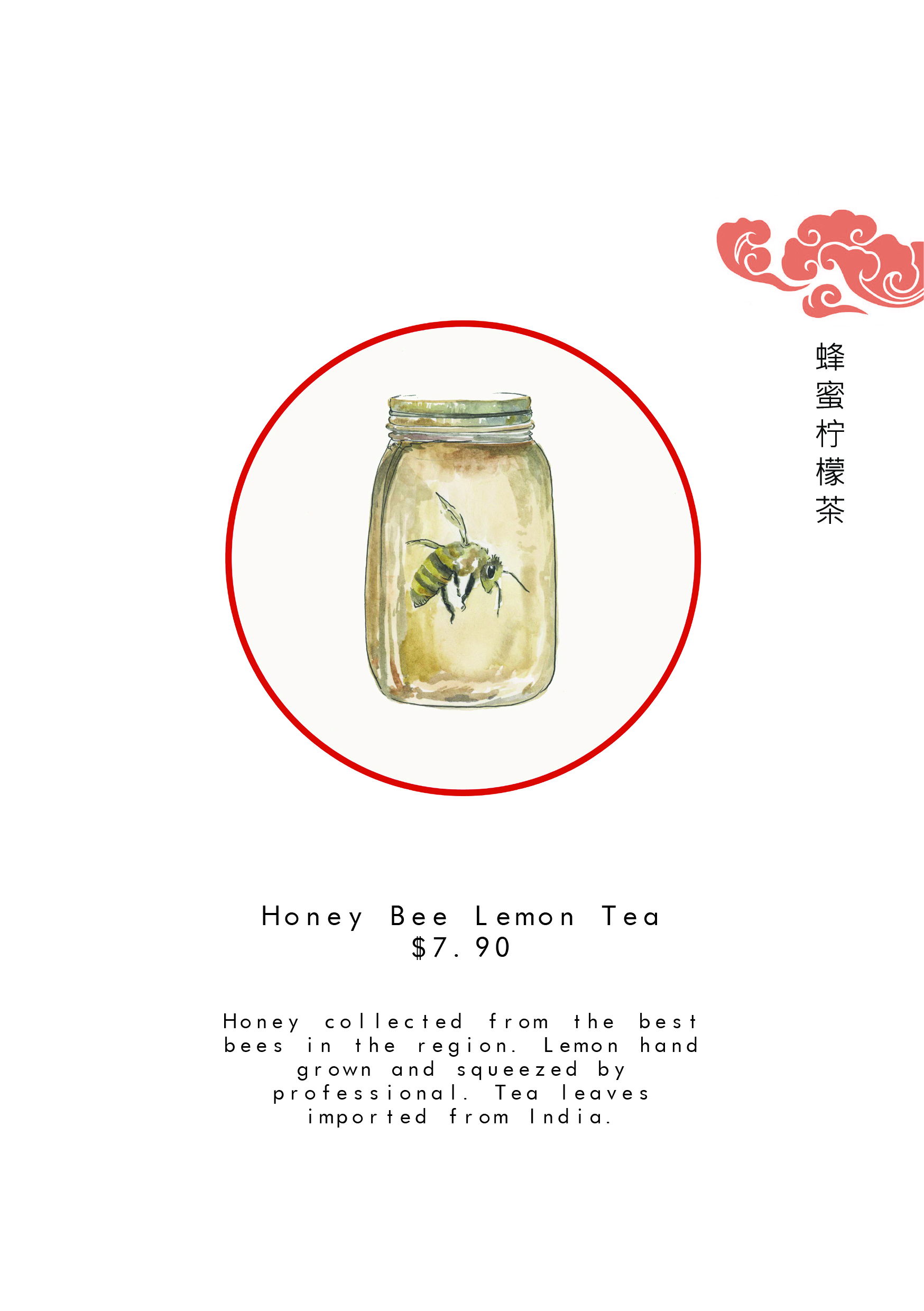
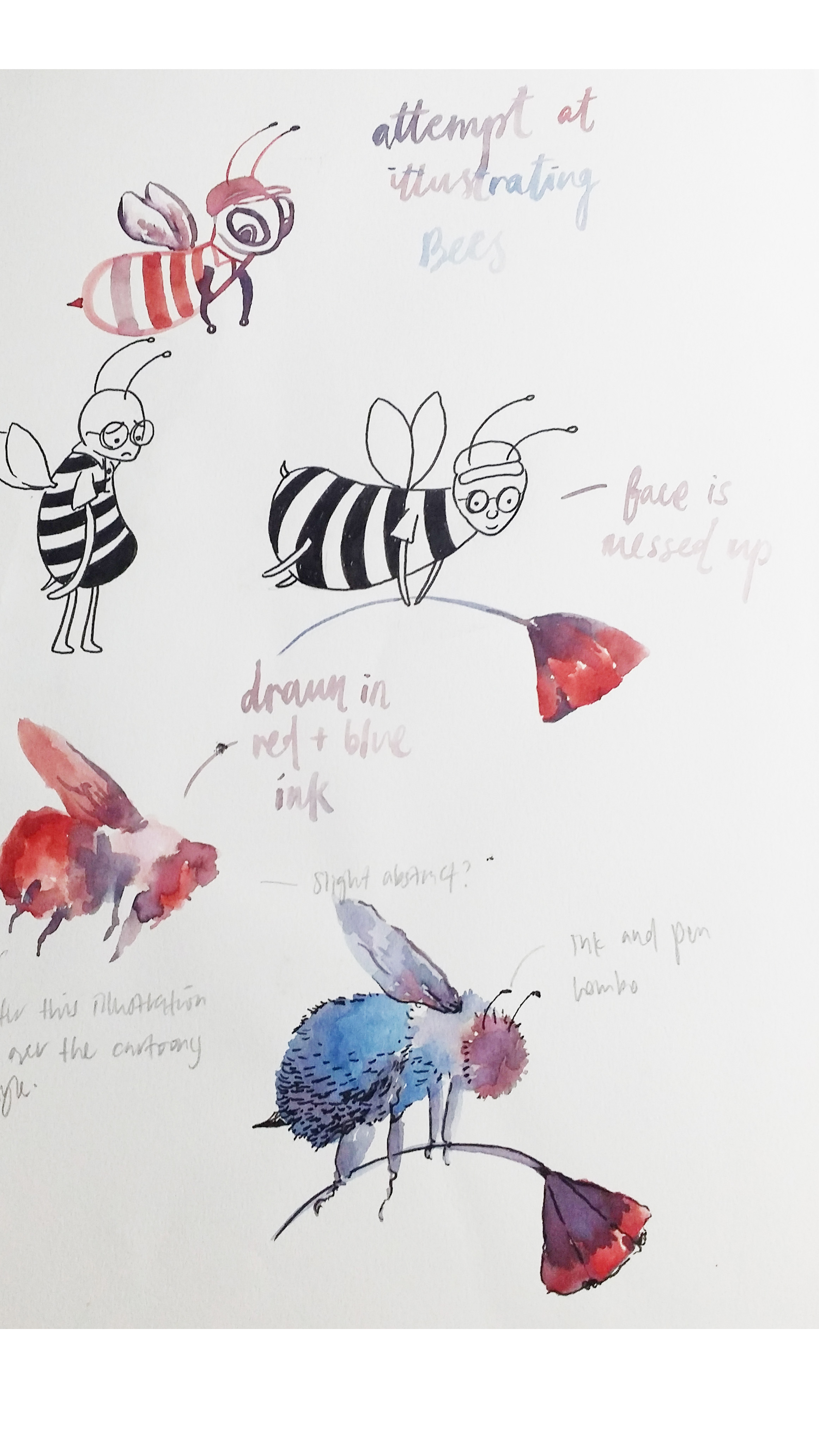
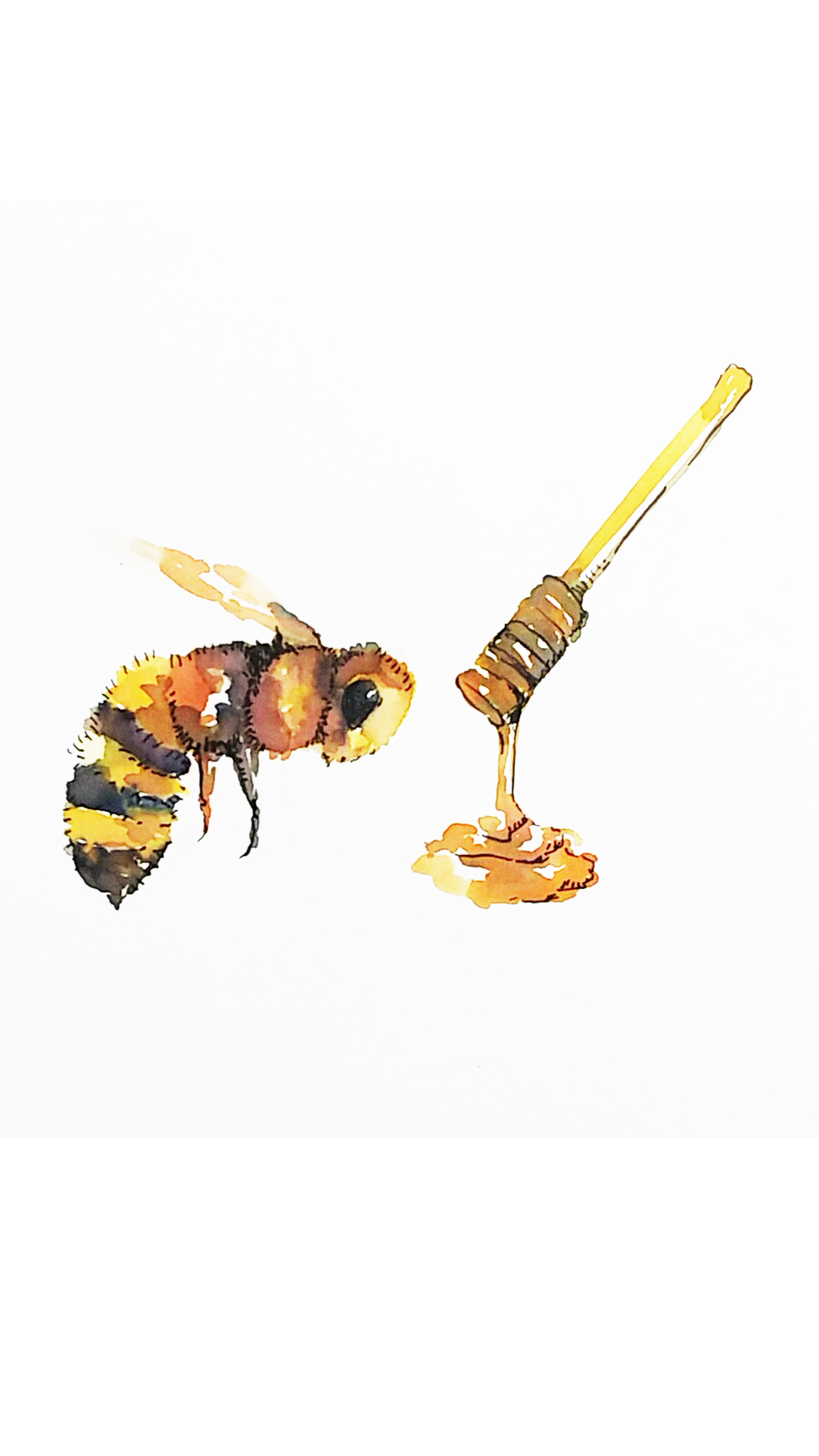
Honey from the point of view of Bee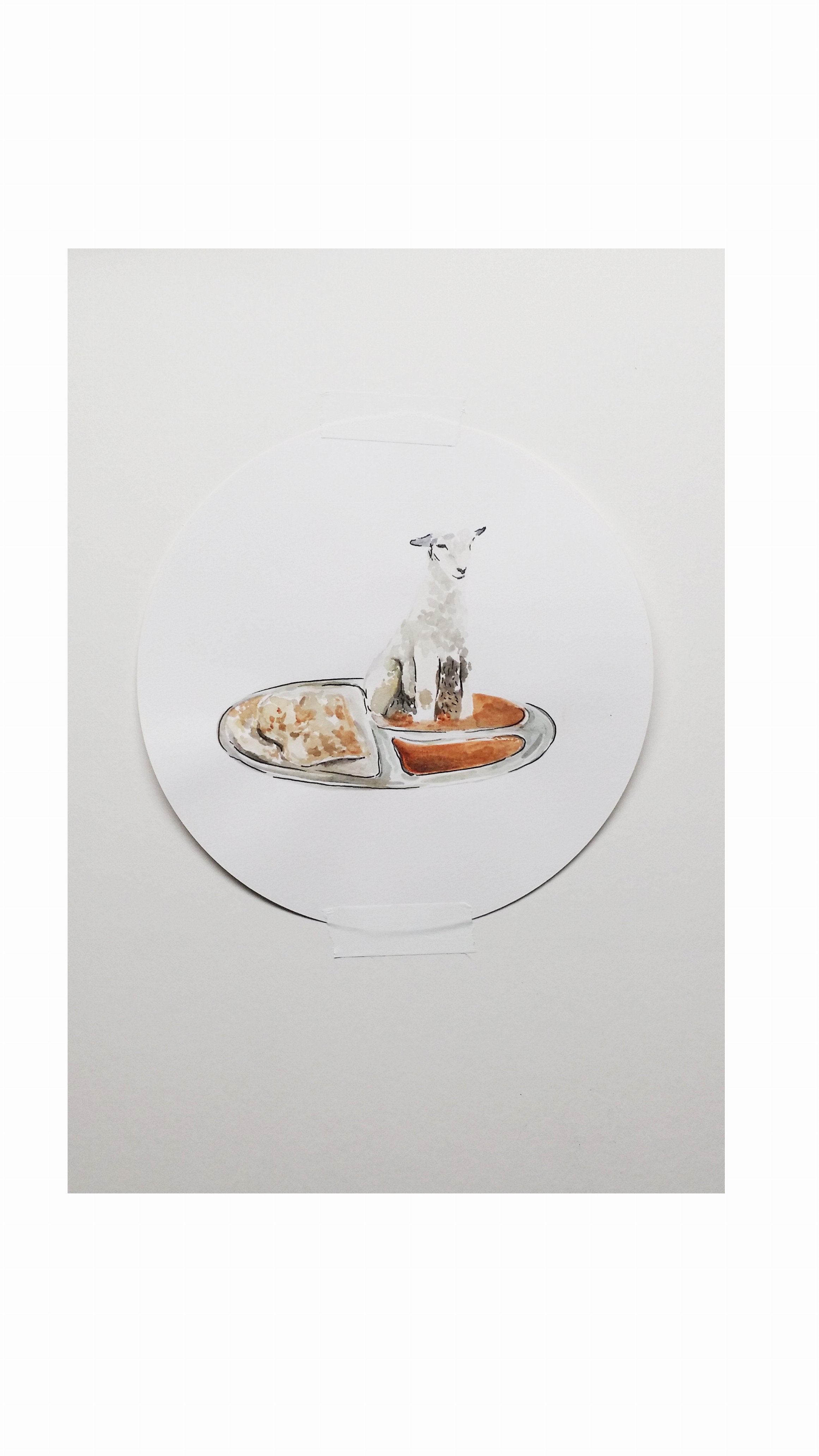
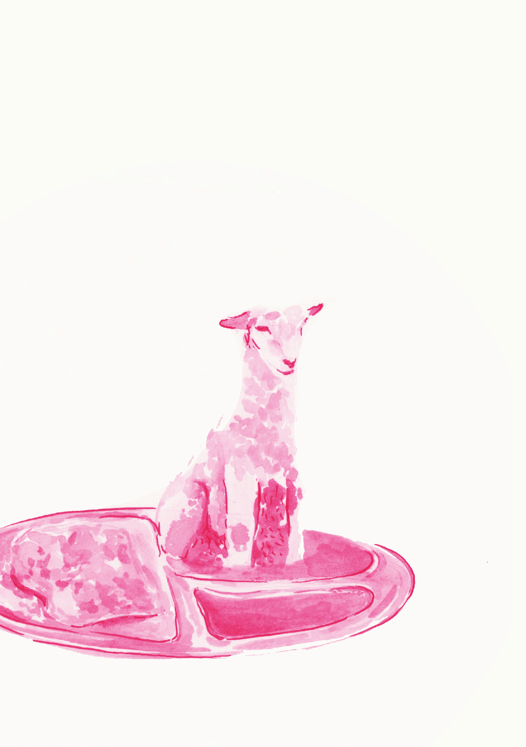
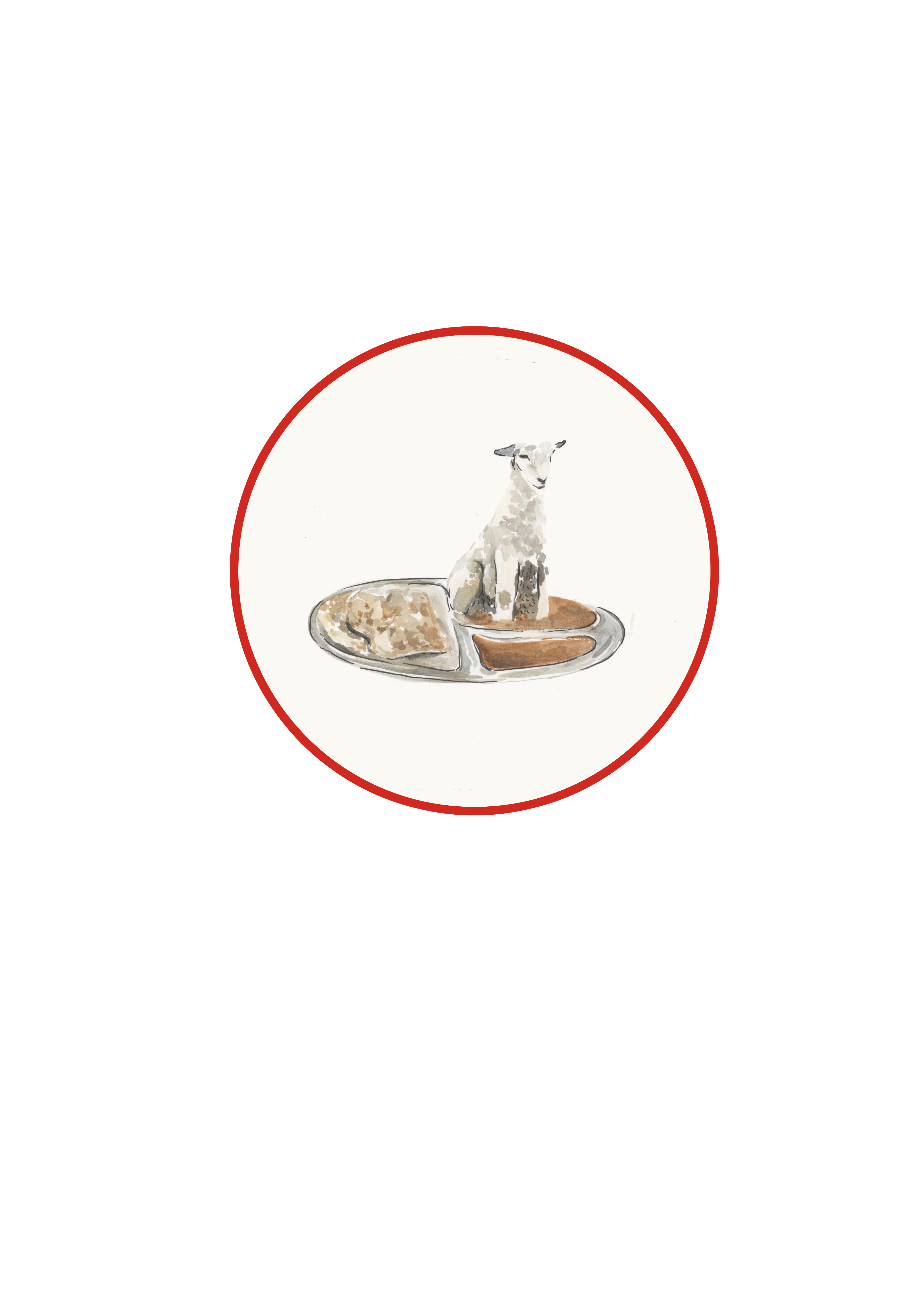
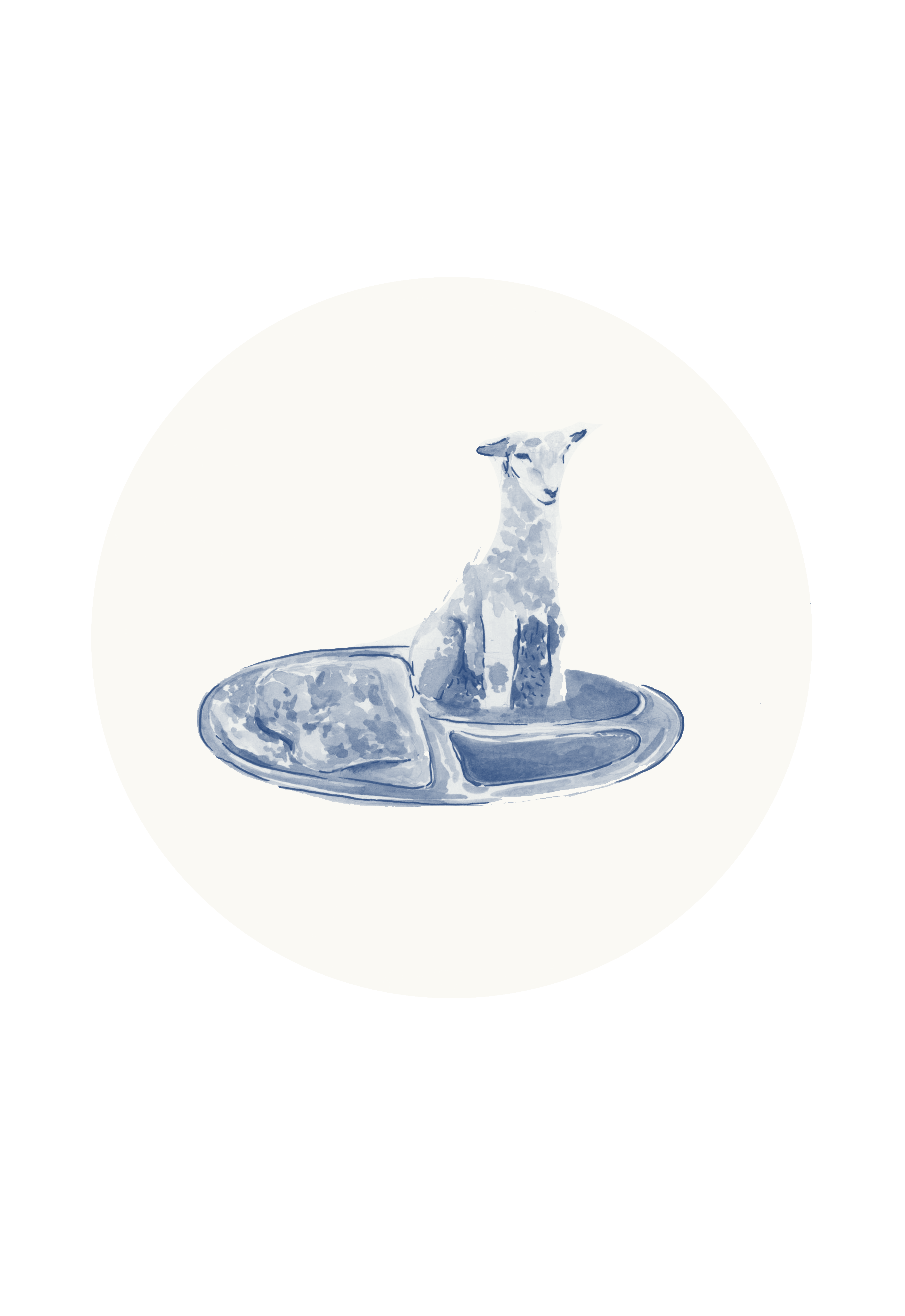
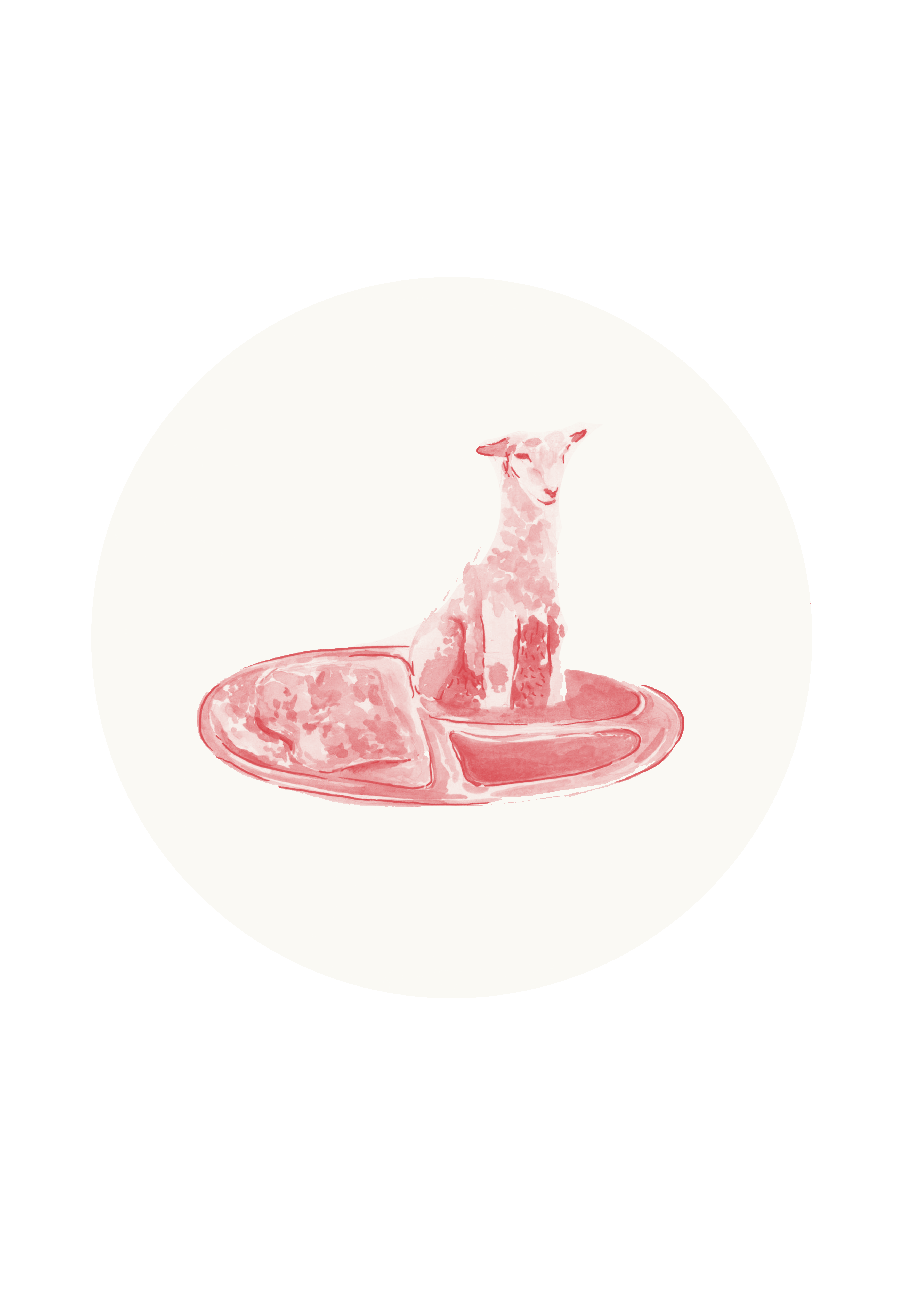
Mutton Curry from the point of view of Lamb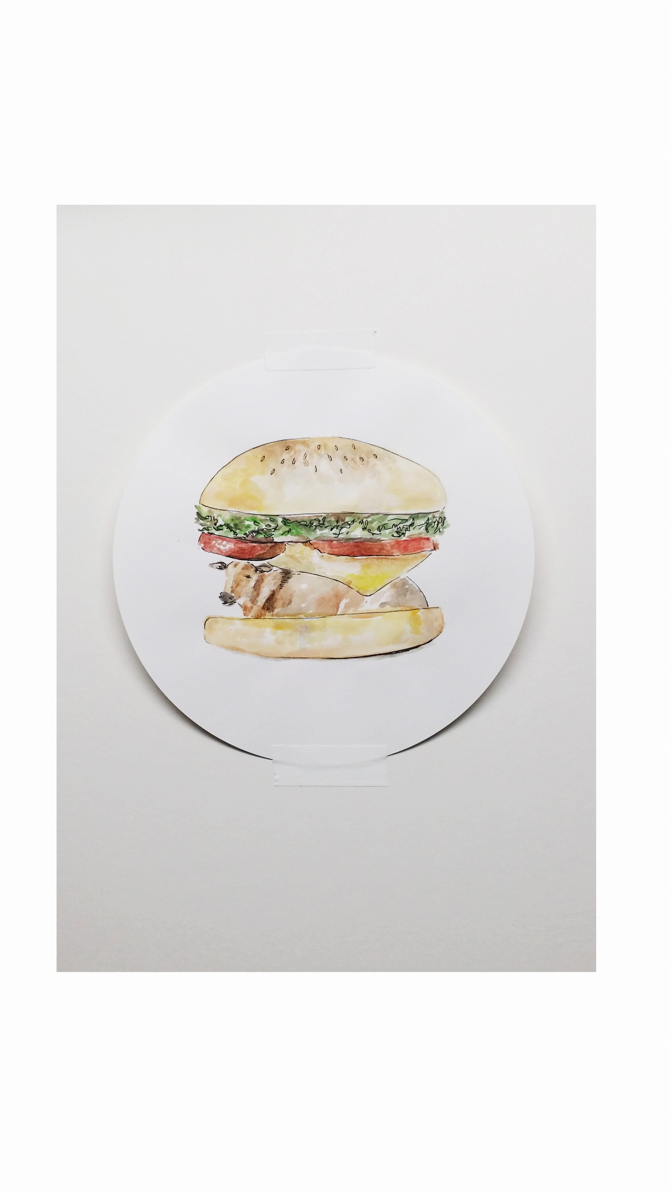
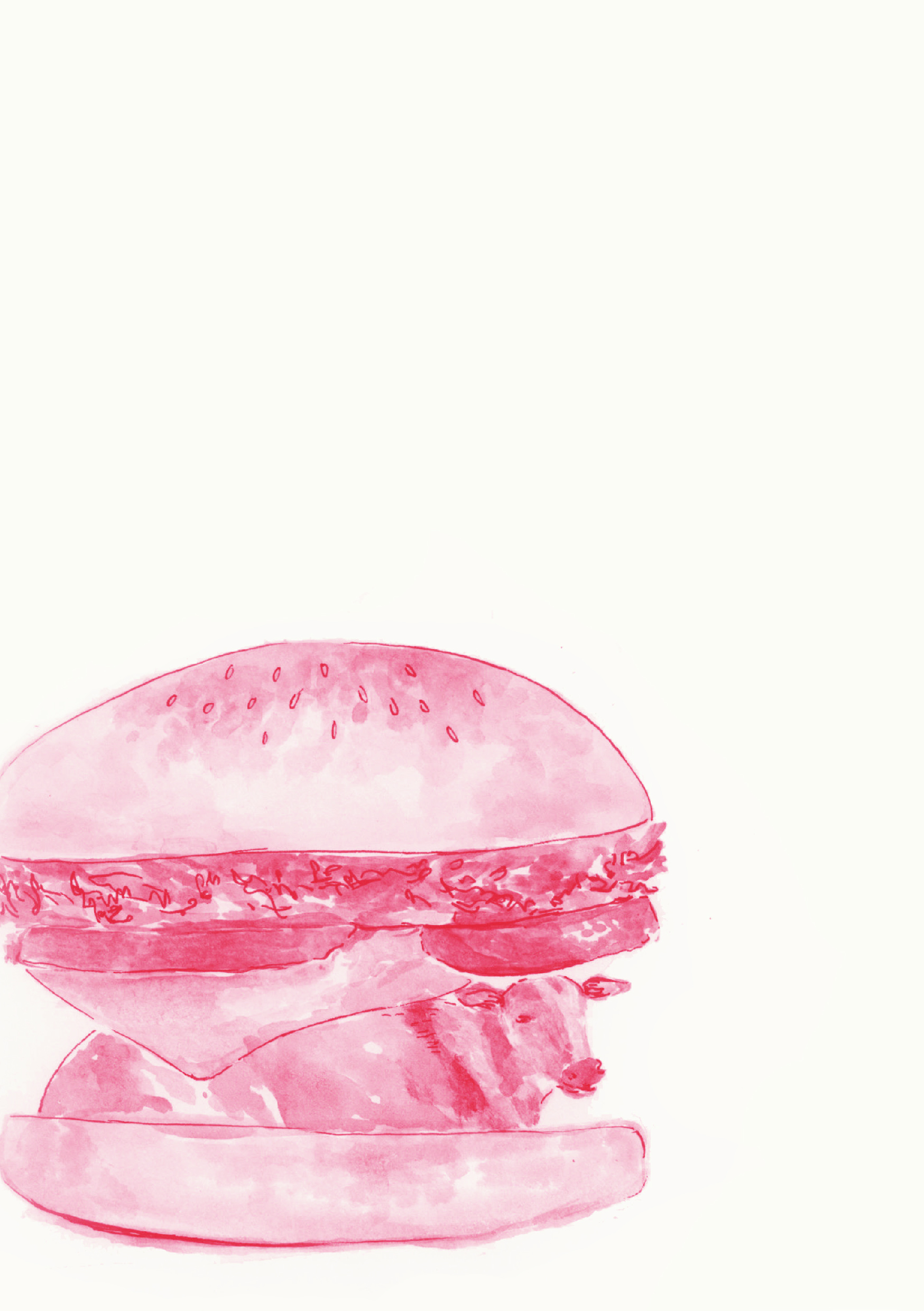
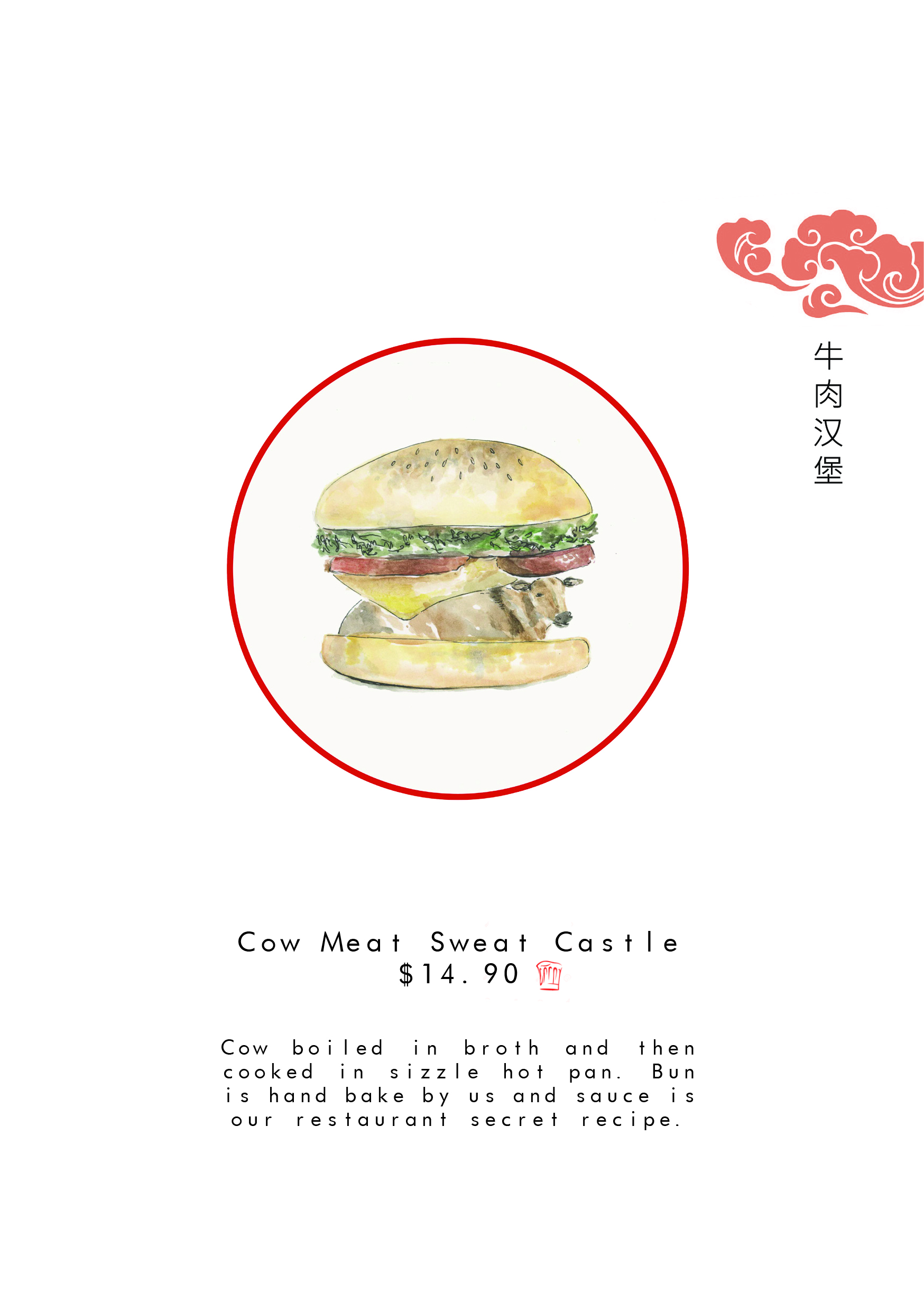
Beef Burger from the point of view Cow
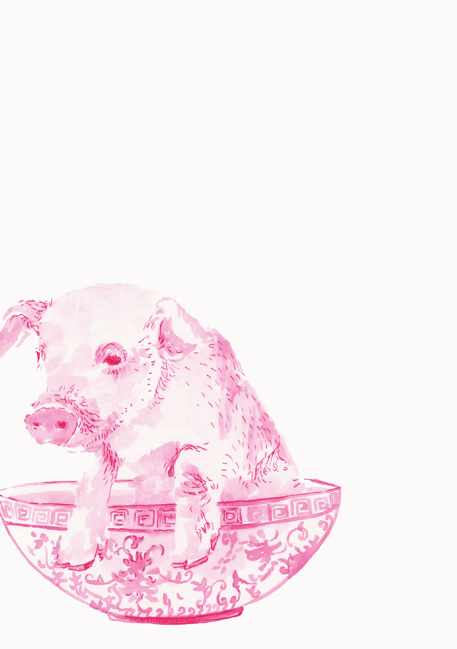
Char siew mian from the point of view of Pig
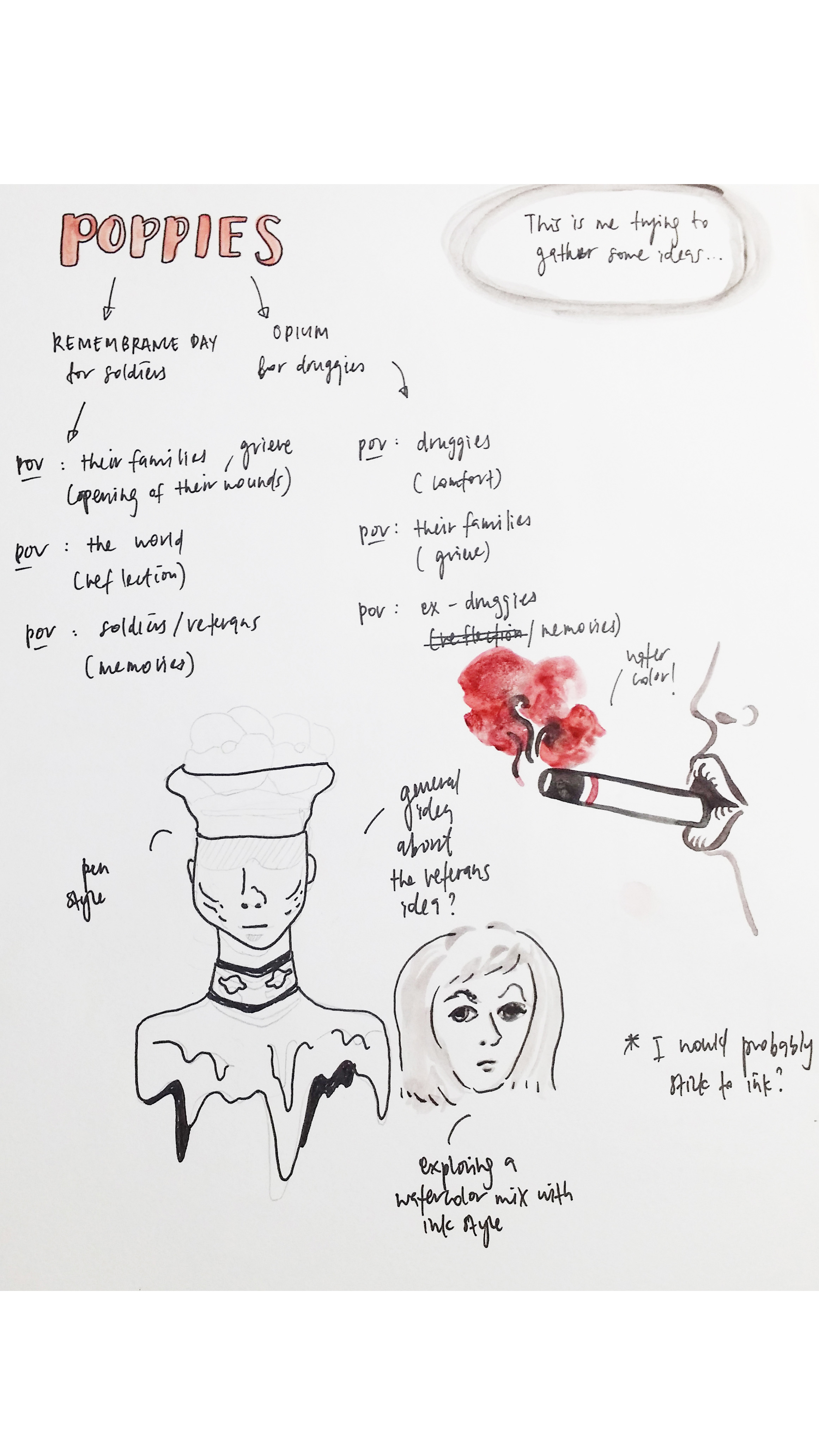
It all started out with random sketches and doodles to gather ideas. I was very interested in animals.
At the same time, I liked food. I liked eating. I wanted to explore the point of view of animals had on food. What do they see human food? How do they see it? I approached it in a quirky way.

By placing the animals in the food itself. I found this way to be quirky yet the watercolor details make it look like I’m serious about this commentary.
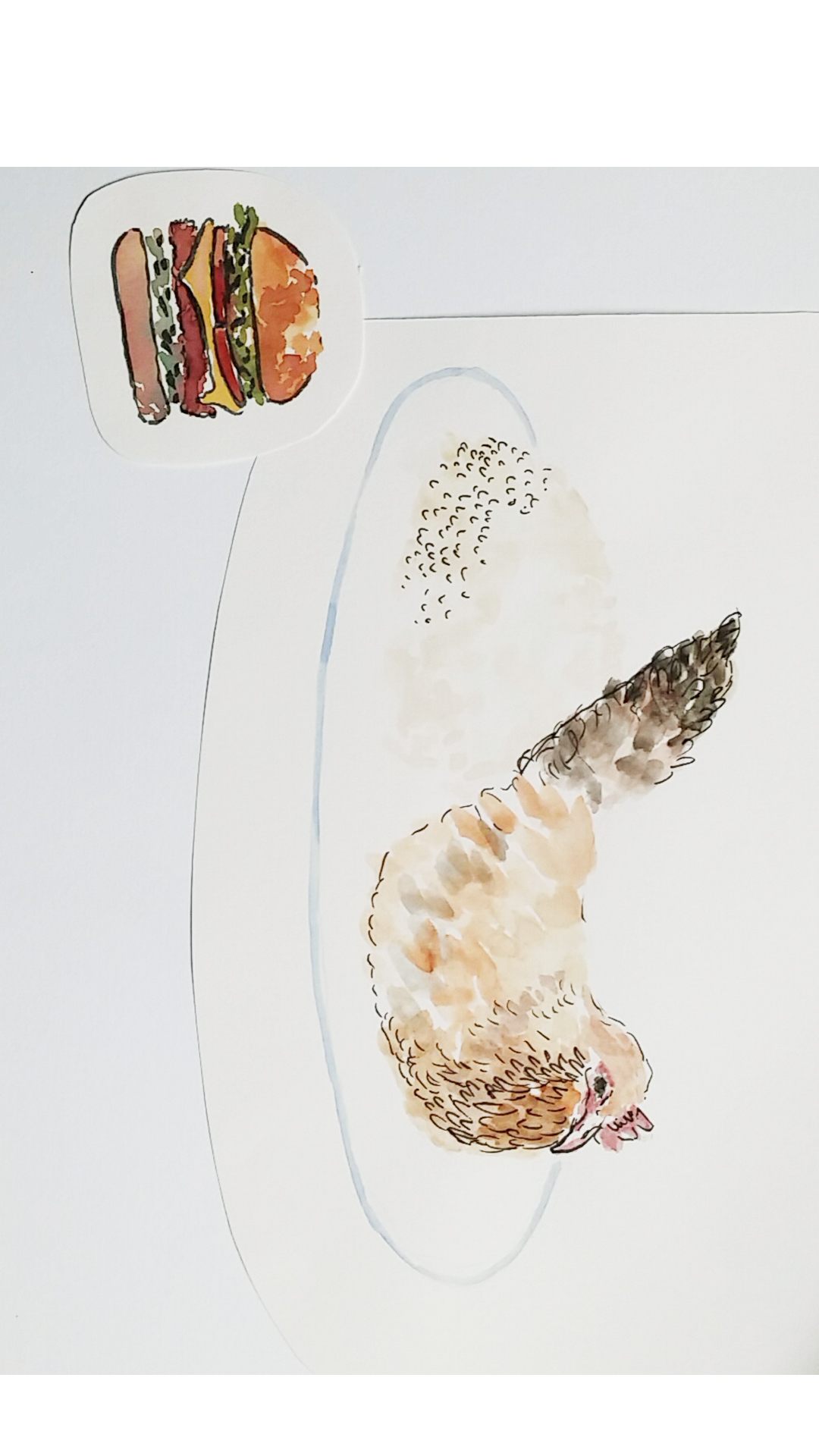
Chicken in the chicken rice was born. i explored the wet mediums like ink and water colors. More examples of how I explored the medium in the “Bees exploration pages”…
My initial idea on the composition and wanted it to have a textbook look.

So, I wrote their names below the illustrations. Over here I’m just testing out the potential fonts or brush lettering methods I can use.
Wasn’t happy with how it turned out. So i decided to explore circle compositions. Looks great. So i did it. I decided on circle composition. Looks like the pupil/telescope looking (#pointofview)
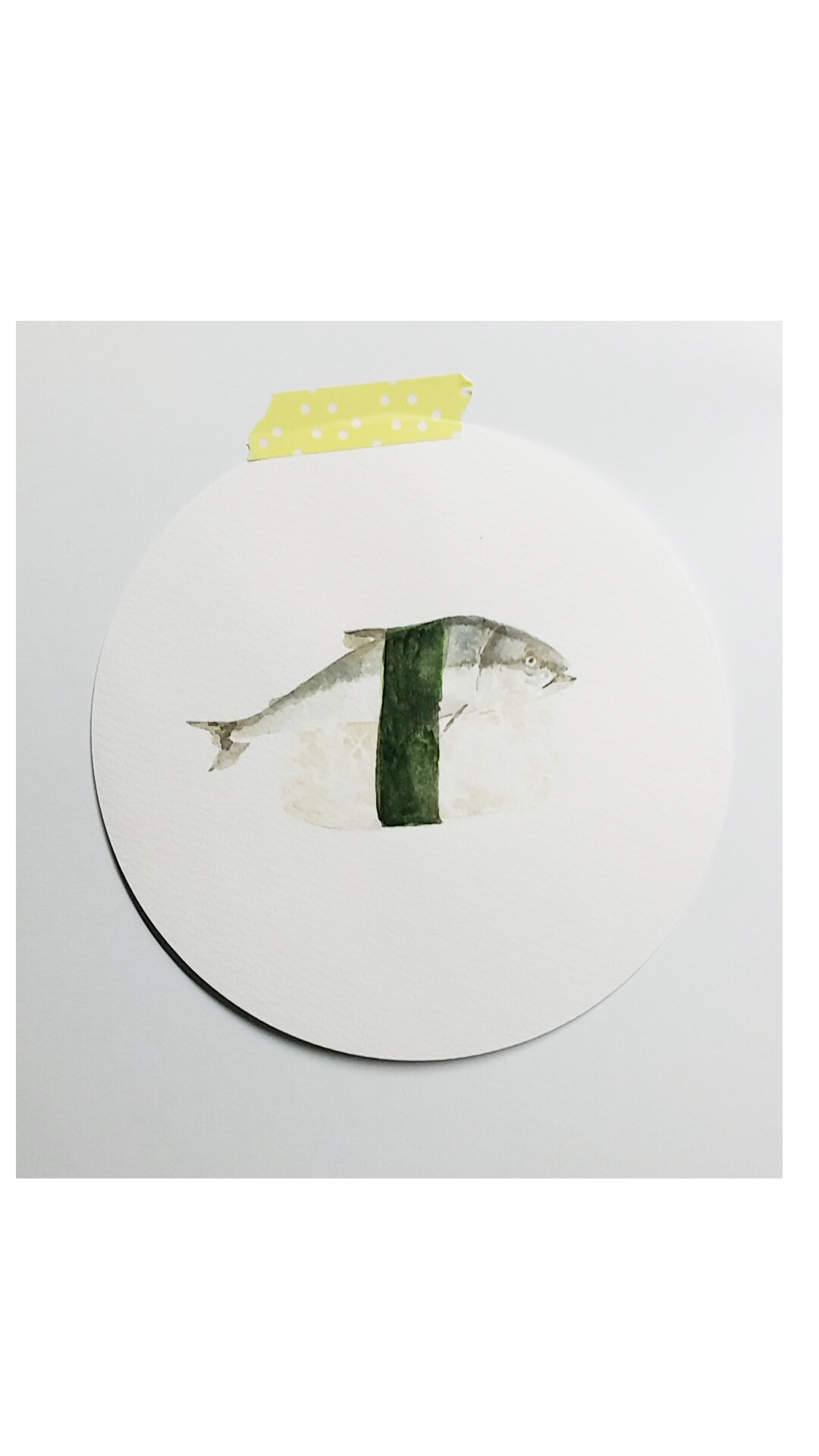
In my final piece, I concluded the image with a washi tape to tape the circle to the mounting board for presentation. I chose to do this because the shadow casted at the side/bottom of the circle give depth to the entire composition

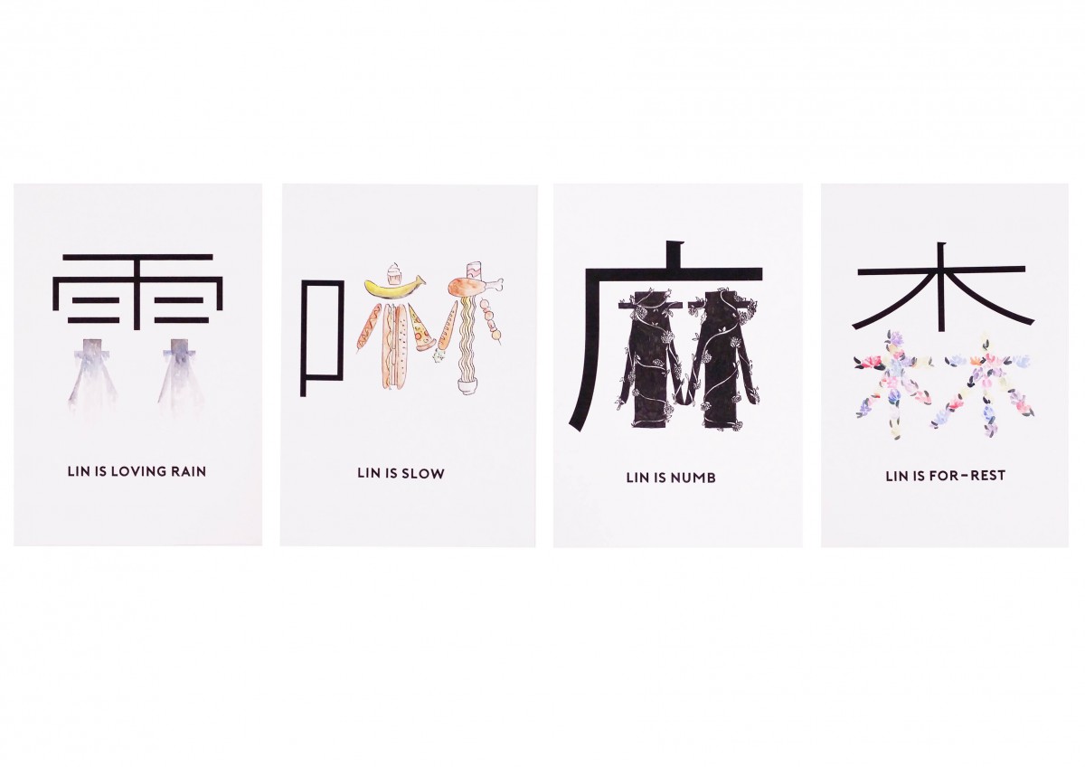
I really like the rain. This words means continuous rain in chinese. To add a bit of flair to the art work I drew my chinese surname in a rain like manner. I really liked the aftermath of this effect. The clash between the calmness of the rain drops and the harshness of the other character really stuck to me. And also the character in black seems to look like an umbrella.

This chinese character means slow. I feel like sometimes even though I’m thin, I eat a lot which slows me down in everything I do.
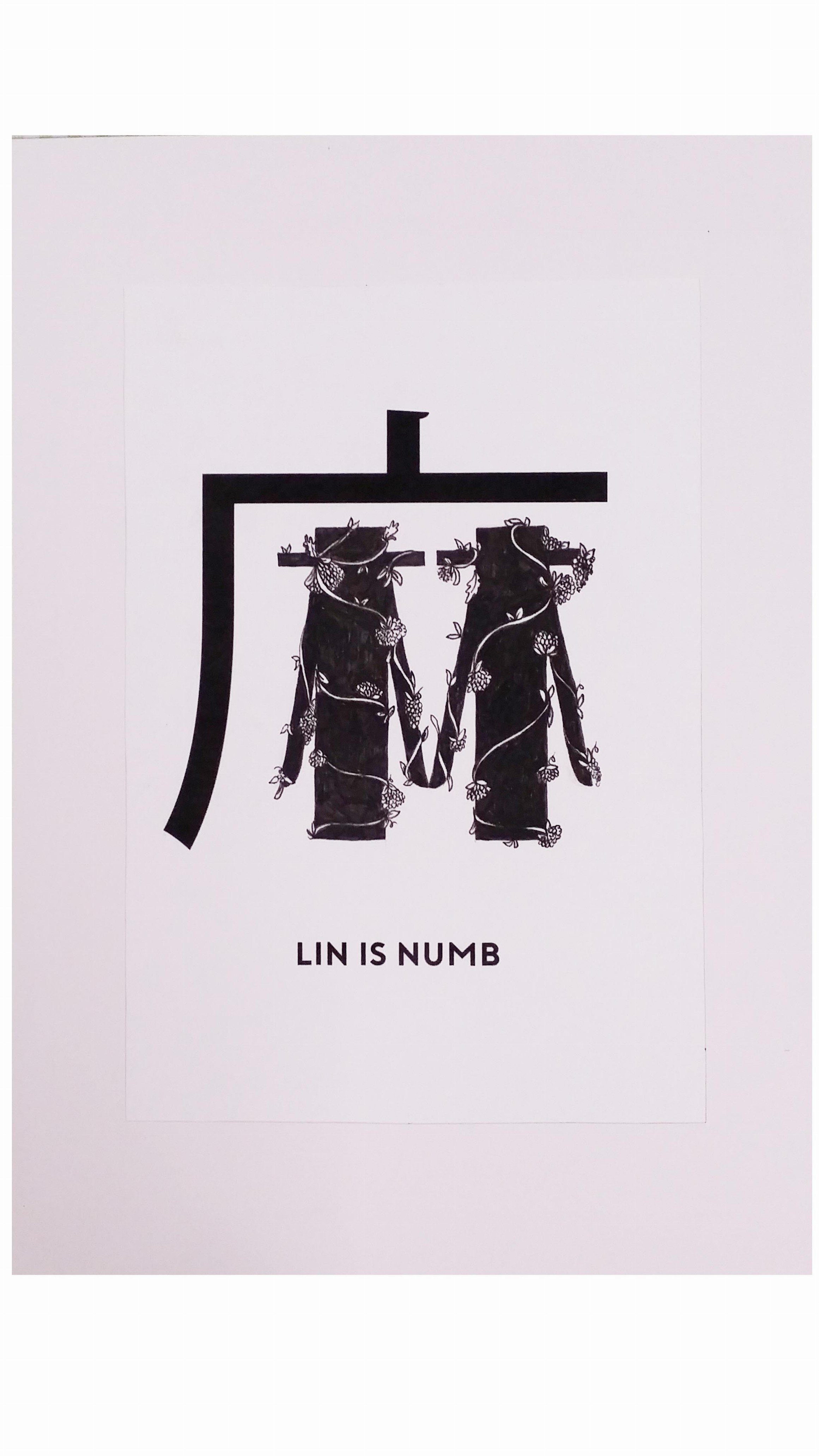
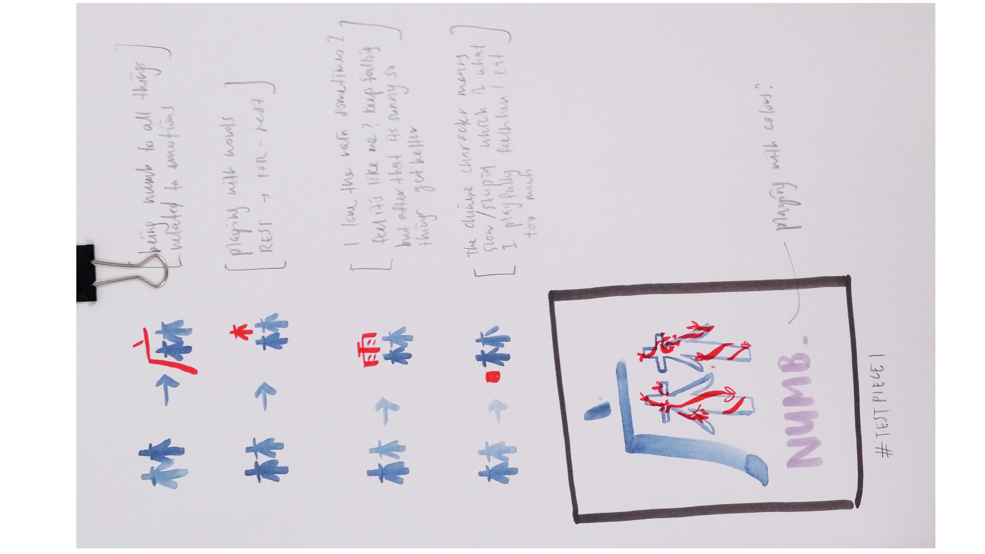
This character means numb in chinese. The black “bracket” over my chinese surname seems to be a shelter than protects me and allow me to be numb to my surroundings and slowly grow as a people. It can mean both negative and positive as the same time. The negativity is brought about by the color black and it seems positive as there is flowers growing.

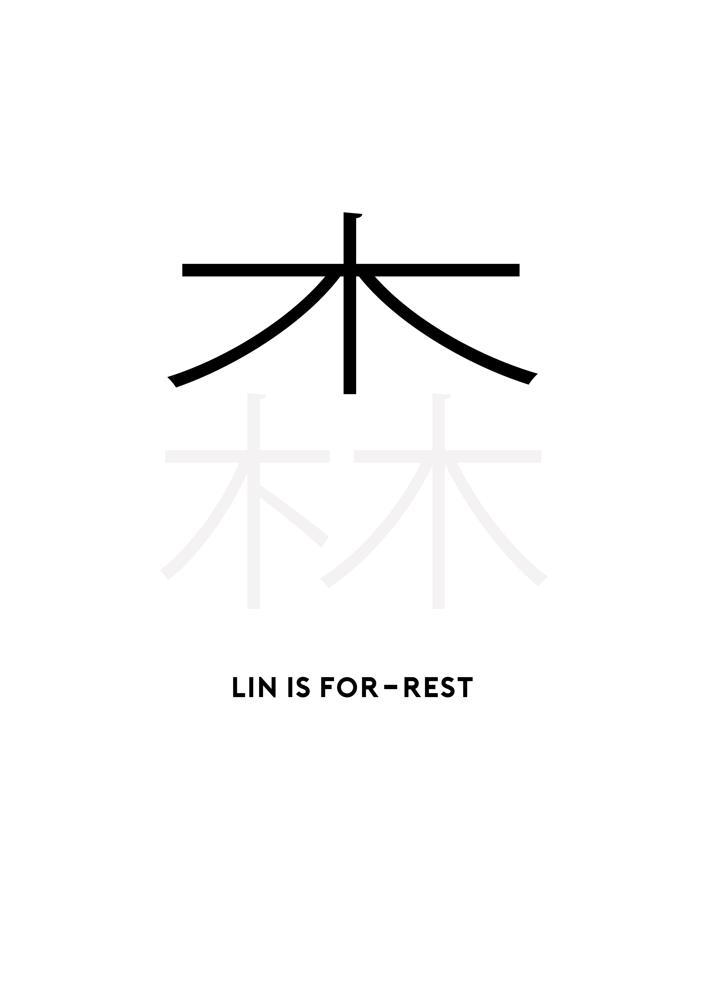
The meaning of this word is forest. As seen, I am trying to make a humorous statement about the work. I support bodily rest. And I feel that the tranquility of the forest and the flowers it haves creates a soothing environment to relax and rest in.
The title:
I named this body of works with-LIN me. I am trying to poke fun at the phrase within me. Since all the works is about things within me and visually the chinese character “lin” is always covered by something whichi symbolizes it being within something else.
Process in my design journal:
Initially I wanted to do my chinese surname is various fonts by using what I like to form the chinese character. But after a while I found that can be a little shallow so I researched on chinese words with my surname’s character in it. And I found words that have that idea and at the same time actually meaning what I wanted to portray in my ideas.

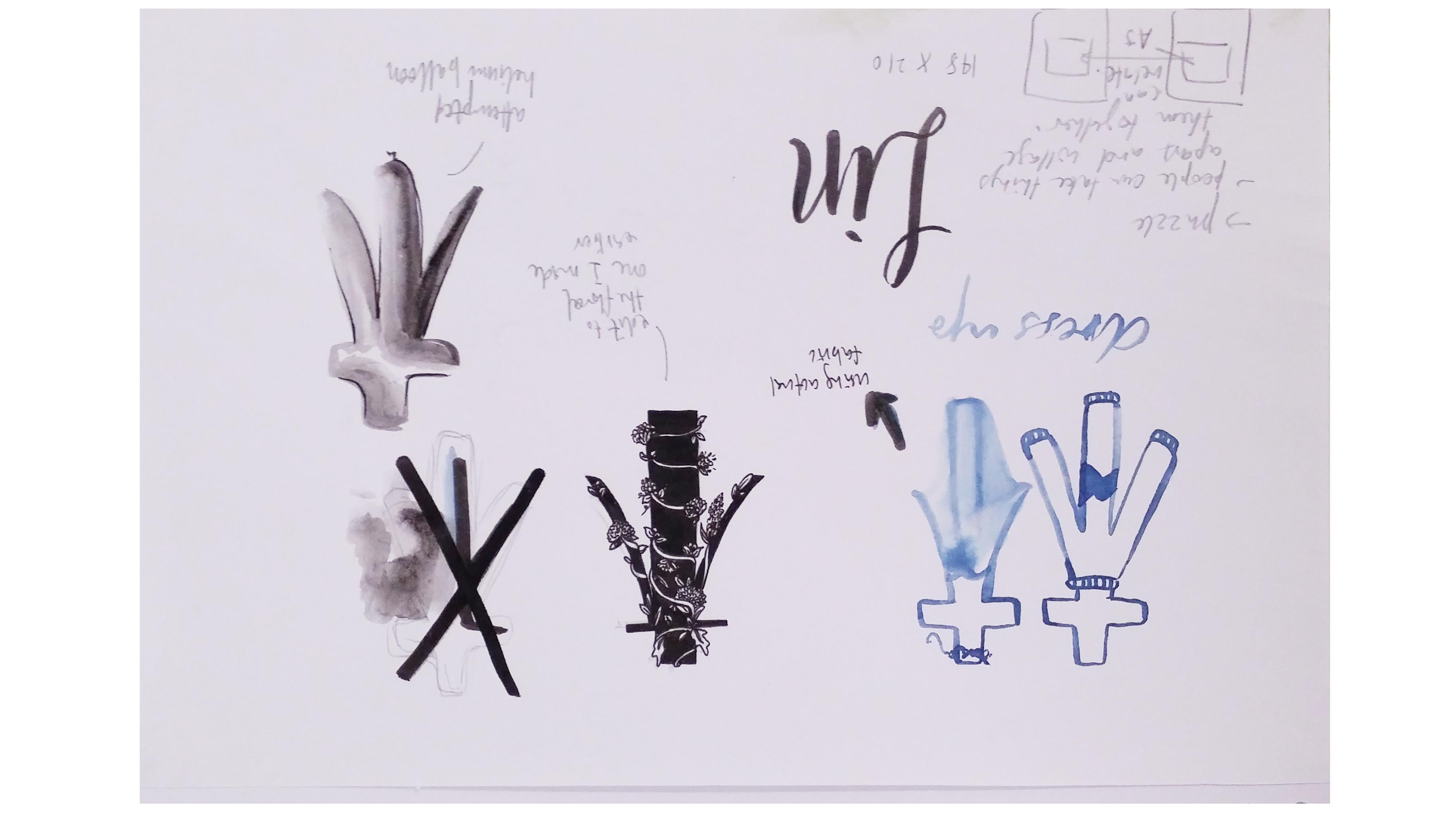

I researched on chinese words and found some words that I could relate to and yet visually have my chinese surname in the character.
 This is the idea I initially wanted to finalise with.
Designs I came up with for the chinese words:
The actual words in the final artworks actually have a literal meaning. The meaning of the words is playfully linked to myself either to my personality of things that effected out of my personality.


I wanted to keep the idea of the old chinese word so I chose to use a plain font for the chinese and english words. And for my surname I chose to hand paint/draw everything to give it a slightly different texture to the entire work.
I am very into textures and using unconventional materials to express my ideas. I enjoy the use of a different sense to accentuate my idea.

Typography Mania #153 | Abduzeedo
http://www.wookmark.com/image/151069/typography-mania-153-abduzeedo-graphic-design-inspiration-and-photoshop-tutorials

3D Typography Book Giveaway | Abduzeedo
http://designspiration.net/image/1239191666691/

Creative Director: Shin Oh
Agency: Interone
Client: Burger King
Location: Germany
http://www.tutorart.com/index.php/typography-fries-wrap-and-burger/


