


“A _________ from the point of view of _________ is _________.”
The ground was selected in this project solely as I wanted to approach this project doing a surrealism style.

From : A Separate Reality: New Paintings of Dystopian Worlds by Alex Andreev
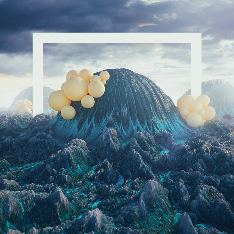
Filip hodas’ otherworldly landscapes.
An interesting point noted when execute dystopian and surrealistic styles is the artist cleverly uses elements in the foreground, mid-ground and background well to evoke a certain overall feel to the composition as well as to bring focus to certain aspects of it.
Thus, I chose to use the ground as a main subject in this project, in order to experiment and try out this new style for myself.
Initial ideas on what could be done , brainstormed and listed down below.
THE GROUND FROM THE POINT OF VIEW OF a seamen IS balance.
THE GROUND FROM THE POINT OF VIEW OF someone dead IS a resting ground.
THE GROUND FROM THE POINT OF VIEW OF the homeless IS their bed.
THE GROUND FROM THE POINT OF VIEW OF farmers IS their livelihood.
THE GROUND FROM THE POINT OF VIEW OF a raindrop IS SPLAT.
THE GROUND FROM THE POINT OF VIEW OF a Hong Kong-er IS nonexistent.
THE GROUND FROM THE POINT OF VIEW OF an Aircraft IS inevitable.
THE GROUND FROM THE POINT OF VIEW OF a colonizer IS a flag post.
THE GROUND FROM THE POINT OF VIEW OF a plant IS home.
THE GROUND FROM THE POINT OF VIEW OF an earthworm IS just the same.
THE GROUND FROM THE POINT OF VIEW OF a fighter IS losing.
THE GROUND FROM THE POINT OF VIEW OF shoes IS dirt and friction.
THE GROUND FROM THE POINT OF VIEW OF a phone owner IS heartbreak and suspense.
THE GROUND FROM THE POINT OF VIEW OF someone eating IS the 5 second rule.
THE GROUND FROM THE POINT OF VIEW OF a street artist IS his canvas.
THE GROUND FROM THE POINT OF VIEW OF an electrician IS the brown wire.
THE GROUND FROM THE POINT OF VIEW OF a nuclear fallout survivor IS a cage.
6 final ideas were chosen and experimented on.
THE GROUND FROM THE POINT OF VIEW OF a Hong Kong-er IS non-existent.
 The skyline of the a section of Hong Kong was warped to fit a small little island rendered from one of the islands from the map of Hong Kong itself. By including the important monuments in the foreground.
By taking a step back and looking at the composition again . I realised that the composition lacked balances and doesn’t shout out Hong Kong . Thus, I decided to rework the composition to include junk boats and colours for easier identification.
THE GROUND FROM THE POINT OF VIEW OF someone who dropped their food IS the 5 second rule.
THE GROUND FROM THE POINT OF VIEW OF a nuclear fallout survivor IS a cage.
I tried to create the feeling of the aftermath and presence of radiation through the colours in the composition. The composition is divided into half to show a cross section of the ground. Components of the composition were experimented on such as animals.

The final composition made use of blending and layering 3 different images of the sky, changing the blending modes as well as the hue and vibrancy.

THE GROUND FROM THE POINT OF VIEW OF an excavator IS a layered cake.
I created this composition to show the different layers of the cross section of the earth in different forms. The bottom most layer being lava, second layer fossils , the third layer precious gems and finally the top layer the earth and grass to resemble toppings of a cake.

THE GROUND FROM THE POINT OF VIEW OF a raindrop IS SPLAT.

I approached this composition with a top down view from above the clouds to show a perspective of a raindrop. My intention is to create a vibrant piece using red to showcase death . I rendered individual spikes to imply that the ground itself is a death trap.

I then included splat marks to the spike to imply “bloodstains” of the raindrops when they drop.

The final layer is to include clouds to finally show to perspective I wanted to show as well as to complete the composition.
THE GROUND FROM THE POINT OF VIEW OF a phone owner IS heartbreak and suspense.
I approached this compositions differently from the rest of the series in which I used pop-art bright colours to create the composition.
Initial idea and digital sketches of the piece, I wanted to do a comparison with flipping over the phone after it dropped to opening your hand during a poker hand. However, it is too much narrative to fit into a small piece . And the whole sketch and idea was remade .
I moved on to use a frames of faces from a recent advertisement from Australia’s Got Talent to create this composition. Overall I wanted to bring attention to the act of the phone falling and cracking upon impact when it meets the floor. This is executed by using a reversed pyramidal composition to do so . Shadows are rendered as well to create a certain depth in the composition as well.

THE GROUND FROM THE POINT OF VIEW OF a raindrop IS SPLAT.
THE GROUND FROM THE POINT OF VIEW OF a phone owner IS heartbreak and suspense.
THE GROUND FROM THE POINT OF VIEW OF an excavator IS a layered cake.

THE GROUND FROM THE POINT OF VIEW OF a Hong Kong-er IS nonexistent.

THE GROUND FROM THE POINT OF VIEW OF someone who dropped their food IS the 5 second rule.
THE GROUND FROM THE POINT OF VIEW OF a nuclear fallout survivor IS a cage.

From the ideas i threw around during the planning phase , I narrowed them down to the following four compositions and decide to focus on them.
I AM DEHYDRATED

I went ahead to buy many different types of fruits and sliced them up thinly before baking them in the oven. Fruits included apples, oranges, grapefruits.


One of the technique I tried was also the freeze the fruits before cutting them, as it would be easier to cut as well as to retain its shape and prevent the flesh from breaking.This can be seen from the beautiful intrinsic web-like lattice of the grapefruit as seen below. However after much experimenting, by baking the different fruits in batches of 15 minutes, 45 minutes and 1 1/2 hours . I eventually used oranges as the grapefruit fell apart after baking. While the apples also did not now show as much of a contrast of colours between the scorched pieces.


                            Process of assembling the piece.
                     Digital representation, blue tint to increase contrast.
          Final piece mounted on orange paper to bring out the orange colour.
I AM ADVENTUROUS - To bring out the sense of adventure. To combine elements of Temple run as well as Pit Fall to create the Indiana Jones feel of adventure. Idea was to bring about pathways in the jungles or wilderness setting to spell out my name.PHOTO TAKEN FROM :h ttp://www.ingexchange.com/img/2-dried-fruit.jpg Pit Fall level screens. For this idea i wanted to keep the simple colour scheme of the game and experimented with the illustration of making paths. Initial drafts were all straight paths . I then moved on to do graffiti like lines to create the pathways.
I then moved on and took this style to be incorporated in my illustration forming my initials MOK.
Vines were included to give the jungle look as well as the different greens to accent the middle rock cliff itself.
I AM SIO BAK/ Siew YokeI am a pig. Experimented with a whole slab of pork belly and doing cross sections of the meat. However on practicality, it was hard to manipulate the meat and to preserve it for display.PHOTO FROM : Corrianderandgarlic "Siew yoke" So I went ahead to select a piece of skin. Keeping in mind and positioning the stamp on the meat as well as the shape. What was interesting was the tip of the piece of meat. Pressing it between two metal grills so as the skin will not curl during the cooking process. Before taking it out again to further dry the crackling itself.

from the photo itself i then made mockups of how I would like the final piece to turn out. I envisioned a animated pig faces that incorporated my name MOK in it.

I then went ahead to slowly carve out all the holes in the piece as well as to paint it red as closely as possible to the mockup.
The choice of red is so as to replicate the stamps that are used on the pig itself .
The final piece did not turn out as well as I have expected on the final presentation day as it had absorbed the moisture in the air the over the days i kept it and turned softer. Overall I was quite satisfied with the outcome as well as the cartoony look of the pig head.
I AM AN ALCOHOLIC The whole project shifted from doing glass bottles and shifted to bottle caps instead. the idea was to rearrange the items to form my name.Started off by sourcing for materials such as bottle caps, sticker labels wine corks and things such as absinthe forks. This was slowly put together later using trial and error.


After taking advice, I realised that there were too many elements in the composition. The variety in colour , materials and textures all . This resulted in me to tone down the variety and stick to bottle caps itself, to give a more consistent all round design.
I then used the bottle caps to spell out my initials DM. Trying two different designs which incorporated the two characters into one, creating a sort of logo . I eventually went with the one which was more compact and had a greater design appeal.
The final composition was placed on a polished black acrylic to resemble blacken glass bottle to give a good overall look. I am quite happy with this piece as this was the most aesthetically pleasing piece.
 Final piece
My initial thoughts penned down for this project involved using a combination of ideas with job descriptions as crazy as possible. Listed below are my ideas.
I AM A DESTROYER - Use of broken rubbish and dirt to represent a warpath and yet show clumsiness. Use of illustrated charging and fumbling elephants/rhinos to show clumsiness, using the paths the spell my name as well as broken glass pieces. Or I could assemble materials and objects that are slightly damaged or chipped due to accidents.Use of negatives created by the images to spell out Darren.
I AM A SOLAR HARVESTER - Idea came from the appearance of solar flares, which can reinterpreted as it being sucked away from the sun itself. Use of bright colours with the “o” in my name sucking in the “solar flares” Larger gravity pull. The use of the Center as it is similar in shape and design of a black hole to suck in the flares.

Thought of the idea of using real fire during the presentation itself using cotton wool and lighter fluids. Back plate to a cutout metal sheet that is a5 in size. Seemingly thicker paper on the top pasted with cotton wool dosed with lighter fluids.

Another idea could be to do a combination of photography with prolonged exposure to create sort of a moving light effect as well as to draw out my composition.


PHOTO TAKEN: AT CLARKE QUAY BY ME
One of my attempts to overlap the lights and to figure out the
composition.
PHOTO TAKEN: AT CLARKE QUAY BY ME
One of my attempts to overlap the lights and to figure out the
composition.
I AM THE PLAGUE - Use of different bugs and pest to create webs and goo like textures. Idea to use webbing or real insects ?
I AM DEHYDRATED - Use of dehydrated fruits and vegetables as a signifier to show dehydration. Additional paint to show “dehydration” after it dries .To create a sort of pattern of repetition to create the compositions . Still unsure what fruits to use . Experiments with oranges , grapefruits and applesPHOTO TAKEN FROM : http://www.ingexchange.com/img/2-dried-fruit.jpg Dehydrated fruits.
I AM ADVENTUROUS - To bring out the sense of adventure. To combine elements of Temple run as well as Pit Fall to create the Indiana Jones feel of adventure. Idea was to bring about pathways in the jungles or wilderness setting to spell out my name.
I AM SIO BAK/ Siew Yoke - Options is to use the differences in soft and hard textured materials to symbolize fat and crusted skin; the three elements I decided to play around with. The use of rectangular like structures that resemble buildings. Play around with skin , fats , muscle as well as meat from a slab of pork belly.

Experiment with focus in mind on the one design element with the highest appeal . Which is the Crispy skin and ats Initial ideas revolve around drawing out the layers of the meat Moving on to create a sort of rhythm and repetition in the background, the use of skin to glorify it. To create my name in block letters. Use of oils to create smell and oily feel to the touch. Idea in my mind was to do a pre-cut skin before salting it and baking it. Block letters.


PHOTO FROM : Corrianderandgarlic
          "Siew yoke"
I AM AN ALCOHOLIC -  Idea of using arranged Glass shards to create my name Use of evaporation and textures to create the name? Includes using wax? Labels of the alcohol bottles on the background? To showcase that im a wide drinker. Drink a lot . Use of bottle caps to spell out the name each from a different beer/ alcohol cap.


"EMPTY BOTTLES ARRANGED?" -
   PHOTO TAKEN BY ME
"EMPTY BOTTLES ARRANGED?" -
PHOTO TAKEN BY ME
__________ + __________ = ME
__________ – __________ = A BETTER ME
__________ x __________ = AN IDEAL ME
__________ +/- __________ = ME IN 5 YEARS
My main focus on this project was mainly the application of the colour harmonies; while still focusing on producing interesting ideas that best represents me. This project is unusually challenging for me as I have a fear of using colour in my works as I have had no prior experience with coordinating colours in my work.

Urban Animal + Love for Nature = ME(@home)
I jumped at this opportunity to showcase my love for both the urban environment as well as nature. And growing up in Singapore; a small urban playground, there is this constant crave to get out. My love for nature grew from the opportunities and experiences I have from exploring the nature parks/reserves as a kid. And although small, I wanted to show how at home I feel being just 20 minutes away from both sides of the fence.

Urban animal. Through the use of strong monotone contrast of the sky to the buildings, I wanted to bring across the mood of how the city can actually be quite a dull environment to br in. Accompanied by the lighting from the back on the bear; which is a representation of myself, I wanted to create two layers in the composition. The use of colours of on the bear also brings the attention of the viewer from the background first and then to the bear itself.

Nature lover. Using a similar picture of the bear , I also wanted to create two layers between the composition. However, the back ground is different. I wanted to bring out the colours of nature (surprisingly complimentary), shades of browns (including the bear) which are in complimentary to the greens that I have picked . The use of stripes to show layers as well as “negative” stripes to bring out and showcase the sky.
 Me(@Home). Through using a photo collage style, I wanted to create a balance of both nature and urbanscape in the composition. Through a manipulation of the Singapore CBD skyline that I have manipulated, I wanted to create a nest like representation to show that feel comfortable and at home, here in Singapore.
Play – Procrastination = More Play ( Better me )
For this series of 3 frames, I retook the persona of the bear, using a style of vector illustration to explore the use of the colour scheme properly. 
Play. Through the use of a picture of a bear playing basketball, I tried to create a sense of play as well as to work on colour harmonies. By using a play of cool colours in the composition .

Procrastination. Through the use of the passing of time by the clock faces, i wanted to showcase procrastination by using a simple task of typing “1,2,3” in laptop in which takes almost 2 1/2 hours just to accomplish this act.

More fun. Less procrastination means that I am more focused in my work , less fearful and taking up less time as well, it leaves me with more time for play. The final frame in this series hopes to bring across two meanings by showcasing the bear playing with time, it means more time for play as well as to play with time . Through the us of complimentary colours to the colour of the bear, it is to my regret that have chosen this colour combination . This is a cooler and darker blue and does not carry across the emotions of fun that I have planned to show.
Teleportation X Immortality = Space Traveler (Ideal Me)
I approached this equation with a take of iconism is this series of 3 frames. While also sticking to a similar vector style to keep simple shapes and intentional colour harmonies.

Teleportation. Taking reference from Apple’s shopfront displays I wanted to recreate how high profile commercialised products are bring displayed in shop fronts.
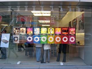
While imagining that in the future, teleportation would be in the form of a button. Teal , Light green and red tones are used to create a triadic relationship in this frame.

Immortality. I wanted to create a fun take on immortality by showcasing the grim reaper being out of work, due to no deaths happening as we have discovered the secret to being immortal. This is thus bring recreated by using popular stock image of people looking for jobs in their uniforms.

By using the contrasting gold on purple background, i tried to create strong contrasts in the composition as well as to create the feel of the grim reaper sitting on heaven’s steps.

Space Traveler. With both teleportation and immortality, one can then hope to travel in between worlds, visiting them and to be a space travelers. Our next holiday destination would not be on earth.

My initial frame was to depict space travel through the use of the iconic astronaut suit. But it did not fit the whole theme and so i decided to change the style and entire composition of the frame.
 The final frame includes a clickable box that once pressed, the viewer will be able to ” travel anywhere he pleases”. This whole series also showcases the need and want to space travel. The whole frame was to create an experiential take on space travel. By closing your eyes and imaging the planets you want to visit, press the button and it’ll take you there.
Hard Work + More Travel = Make My Mark on the World ( Me in 5 years)
I wanted to approach this 3 frames in a fun manner , by using brighter colours in my composition as compared to the rest of the frames.

Hard Work. By using my favourite soft toy to represent the products of my hard work. I used a factory production line to replicate the idea of hard work. In which is not about your ideas but of repetitiveness of work in which may seem robotic even. By using a shade of bright pink, i then proceeded to create my frame in which the background stands out from the conveyor belt itself.

More Travel. To simply put , it is a reflection of my lust to travel. By using bring contrast between the yellow and the pink , I composed this frame to show my need for travel through the plane as well as the world map in which is purposely made unrealistic in scale and shape to show the entirety of how wide i would want to travel the world.

Make My Mark on the World. My plan in 5 years is to see my own products or works being enjoyed around the world. And with my need for constantly wanting to travel alongside with being proud of my work and sharing it with the world, this is where I see myself in 5 years. This idea is thus replicated through the use of the airdrop of the fruits of my hard work , which is the soft toy. Through the use of a contrasting bright orange background the the chutes, I tried to complete this series of 3 frames which showcases my experimentation with brighter colours.

I thoroughly enjoyed the whole process of this project that was presented to us and look forward to taking 2D next semester.
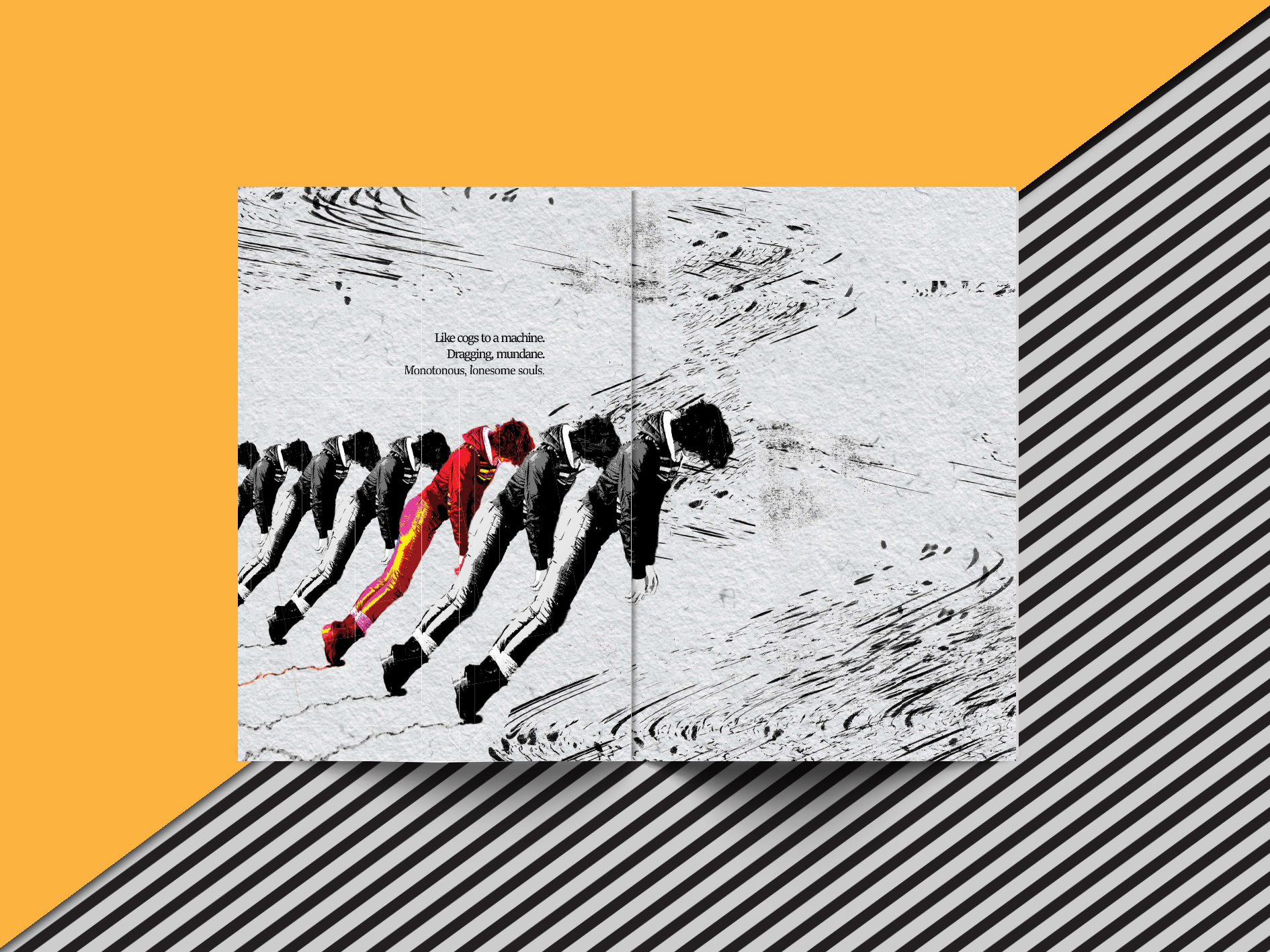
A mishmash of experiences, faces we’ve seen and fears that we all encounter, replayed in our dreams. Dreams are sourced from the deepest depth of our memories, sometimes random and sometimes intentional. And yet , certain dreams tend to always recur, haunting us especially when we are at our lowest.
This project is inspired and based upon recurring haunting dreams , dreams that wake us up in fear and recollection of the dreams and specific past experiences themselves.
Centred around a few themes and shot in first person perspective, i had hoped to recreate the emotions and feelings these dreams of mine have brought to me through these 90 images and transformations.
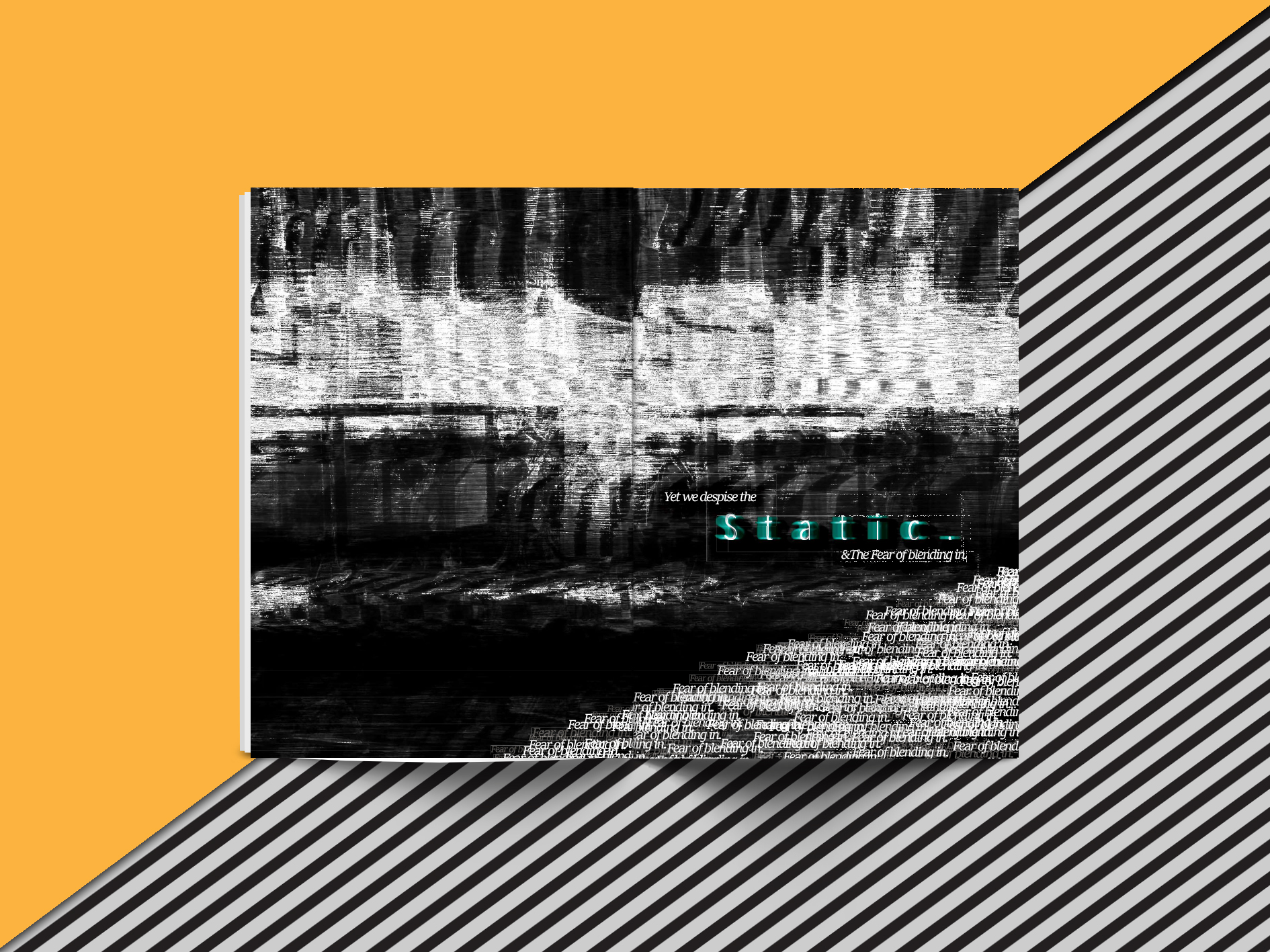
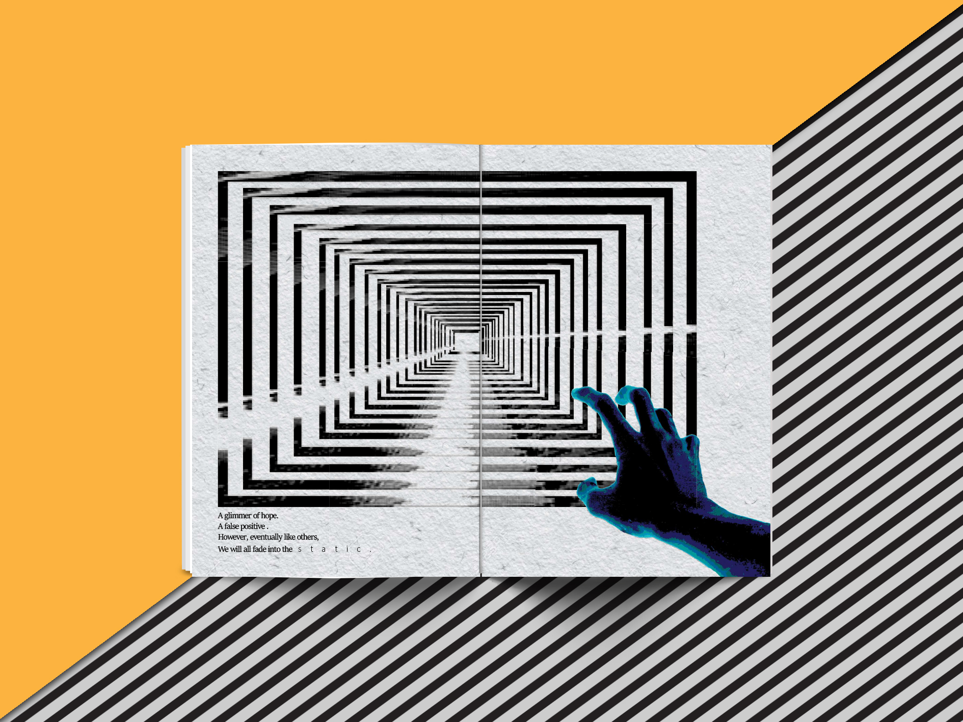
Black and white, colour. What do we truly dream in? The first theme of transformation plays with how colour fades in our dreams. How the world seems to be in black and white, and that colours only appear to be prominent only when you focus into details.
The ideas of cycles that occurs during our dreams. Sleep and dreams follow the REM( Rapid Eye Movement) sleep cycle. A cycle which alternates between deep sleep and periods of REM between, throughout the whole night of rest. Reflected by the awkward change of darker and lighter overall lighting and tones throughout all the 90 images, I recreated how it would seem throughout the whole journey i have taken while dreaming.
The last element I’ve presented is fear. Fear guides us. And fear is ever present in our lives , with it being more prominent and exaggerated in our dreams. Represented through a mirrored image of myself seen and imposed each and every frame, sometimes blended into background and even shrunk down. It represents how fear guides me through my dreams and eventually facing it .
This project certainly opened my eyes to the boundaries of interpretation by my peers and certainly the scope and the diversity of mix-media styles I could have employed in the frames. Although enjoyable, I have my regrets about pushing my creative boundaries as I played with a safer method.
The use of different variations in lightness and chroma of a single colour. This result looks clean and elegant. Monochromatic colours go well together, producing a soothing effect.
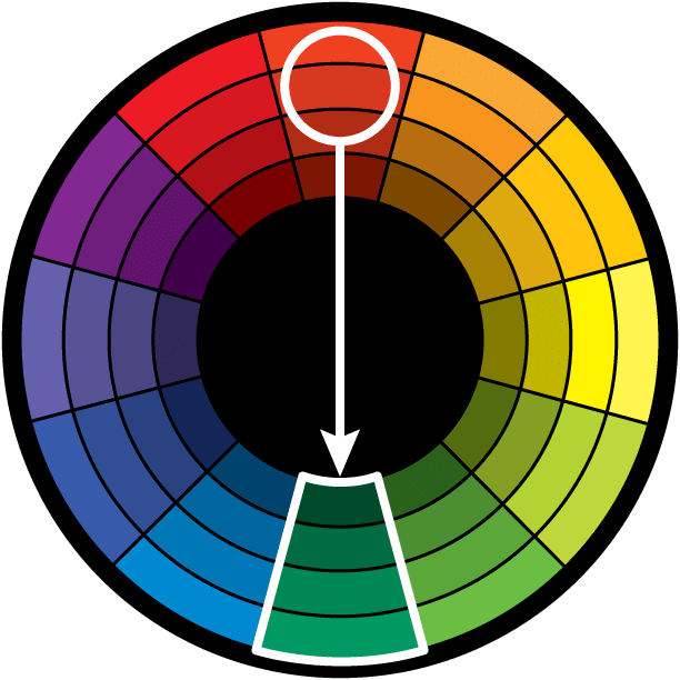
The use of two opposite key or complementary colour on the wheel. It is why colours are arranged on the wheel exists as opposed to a chart or scale.The high contrast creates a vibrancy , especially when used at full saturation.Thu direct harmony works well when your intention is for something to stand out.
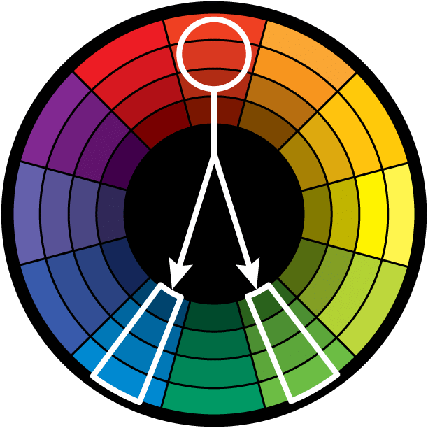
As opposed to the opposite the key colour on the wheel, the split complementary takes the two colours directly on either side of the complementary colour.
This colour scheme has also high visual contrast as the complementary colour scheme, but has less tension. The split complimentary colour scheme is a safe and easy choice for any composition.
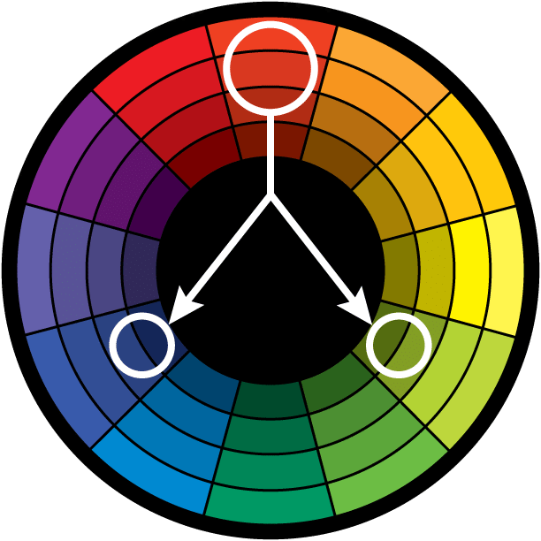
Also called the Triads. This refers to the three colours chosen equally distanced from each other on the colour wheel.
As such, you’re stretching the basic idea of colour harmony and thus this harmony is best used with equal weight in the composition.

Picking my favourite colours, I broke them up into half, splitting them into white and black backgrounds.
 BLACK
BLACK GOLD
GOLD MAGENTA
 MAROON
 NAVY BLUE
 OLIVE GREEN
 PUMPKIN ORANGE
 VIOLET
My approach for this project was to isolate the different phrases from the rhymes. To take each individual word differently , a play of homonyms and names.
Experimented with the design principle of playing with contrast within the image and pulling the whole sentence out of context in which humpty is a person who enjoyed the season of fall.
By including elements of fall such as fallen leaves and pumpkins and the inclusion of a big smile, to bring up a sense of happiness during fall.


The final frame was decided as it showcased a sense of symmetry within the picture.

I approached this phrase to try to create a sense of rhythm and pattern through the use of repetition of having many horses and men riding on them.
 By reproaching the rhyme and concept of using pika’s as the army and the king, while riding on dragons as their steed, I tried to explore the possibilities of creating patterns and rhythm again.
 The final piece was made with having the focus on king while still showcasing the men and their steeds with contrast to their sizes and type of dragon. And also with the use of scale, I also wanted to bring about a sense of dominance and might of the army through the contrast of the scale of the mountains behind. The whole approach was in reference to using the popular pop-culture Japanese style of the rising sun, with the inclusion of the sun rays and mountains.
By approaching the phrase, the comparison of the Fukushima nuclear power plant where engineers are constant trying to repair salvage and minimize the damage cause by the nuclear power plant. In relation to the Humpty Dumpty incident, its as if some form of repairs can be done , but the state of the item/building/person will never be the same again.
Using layers and shades of roses , I tried to showcase the fumes caused by the power plant, a direct contrast to the egg whites and yolk spilt when Humpty is broken.


The final frame is the result of playing around different elements such as the use of welders to showcase a physical attempt to repair the power plant. A play of empty space was experimented by changing about the density of the broken glass textures I used as the background.

I approached the rhyme through the use of the children to create patterns and textures as well as the use of the question mark as an icon to signify the state of being lost and not being able to plan for the future. It is mainly a play of contrast and patterns through the use of negative and positive regions of the question mark.


The use of cockroaches was due to reason that cockroaches breed plenty and that in each egg capsule can contain up to 40 cockroaches. I decided to future experiment with the whole concept of the rhyme and brought in the icon of an old ancient looking lady although the phrase did not mention anything to do with age.


The final piece was made using full body shots of children to create circular patterns that acted as the background for the piece and the use of sunken eyes to create a sense of lost and age. The use of a dark background and placing the face at the bottom left hand corner also brought more attention to the face and away from the patterns.

Principles of design are like guidelines to design and when used with the different visual elements; the basic building blocks of design, artists are able to produce professional pieces of art.
Balance is the distribution of visual elements in a piece to serve the intended purpose of the artist. To control the visual weight of the whole composition in order to bring out different effects.
This brings rise to the different types of balance such a symmetric, asymmetric and radial.

“http://cdn.trendhunterstatic.com/thumbs/body-drawings.jpeg”
Picture features the balance of proportion of the weight of the blue and red colours.
Proportion refers to differences in the sizes of the elements in relations to one another. this is again to bring certain focus to parts of the elements.

http://www.inspirefirst.com/wp-content/uploads/2015/03/001-surreal-art-slattum.jpg
Use of scale to give a sense of power and protection between the two figures.
Contrast is to accentuate the differences in the elements within a piece used by the artists and can range from different methods
 http://www.ufunk.net/wp-content/uploads/2014/11/Shout-Alessandro-Gottardo-illustration-top.jpg
Movement is the use of elements to direct the viewer to follow a certain direction of flow within a piece, to focus or bring the gaze of the viewer on a journey.

http://api.ning.com/files/EFRV*I*wRwInaIdNwq6lalft2DoDnD-oYgMn16rUyv*SOZat*1g1GLwJOsZVJIXiLgtwrOG-rQdsQYFNomvmlYveQ3zvvIhA/2_surreal_illustrations_alternate_world_alex_andreyev9.jpg
The use of perspective lines, size as well as lines to guide us out of the frame.
Harmony and unity is the combining of similar elements and methods used in an artwork to highlight their relationship.
 http://vilearts.se/wp-content/uploads/2015/01/nd-011.jpg
The use of similar hard edged borders and as well as colour sets.
The repeating of art elements in a certain fashion to create fascination and interest.
http://36.media.tumblr.com/tumblr_m62lfaczEE1qbj1sio1_1280.jpg
The use of repeating similar figures to create a sense of society.
Overall I feel that design principles are merely a guideline, a form of trend that tend to follow awhile. But to create successful pieces, I feel its the overall ability of the artist to fully relay his ideas and emotions that is ultimately the most important.


