harmony in hues

The colour wheel can be your best friend when you’re picking hues for artwork, wall colours, and more. These colour themes can help to make your works pop. I’m excited to experiment with some of these harmonies.

Monochromatic harmony

monochromaticmonochromatic art

This colour scheme uses variations in lightness and saturation of a single colour. This result looks clean and elegant. Monochromatic colours go well together, producing a soothing effect.

Complementary/direct harmony

complementary harmony        complementary art

Complementary colours are those that appear opposite each other on the colour wheel.The high contrast of complementary colours creates a vibrant look, especially when used at full saturation. A popular example used in Hollywood is the purple hue of Hulk’s pants, which is a complementary colour of his green skin tone.

Split-complementary harmony

split complementary harmony        split complementary

A split-complementary colour arrangement results from one colour paired with two colours on either side of the original colour’s direct complement, creating a scheme containing three colours. This colour scheme has the same strong visual contrast as the complementary colour scheme, but has less tension.

Triadic harmony

traidic harmony       triadic art

A triadic colour scheme uses colours that are evenly spaced around the colour wheel. Triadic colour schemes tend to be quite vibrant, even if you use pale or unsaturated versions of your hues. To use a triadic harmony successfully, the colours should be carefully balanced – let one colour dominate and use the two others for accent.

Analogous harmony

analogous harmony      analogous art

Also referred to as related colors, these are the colors directly on the left and right of your key color. They usually match up quite well and create a serene and comfortable design. While this color harmony can be pleasing to the eye, it can also come across as monotone.


References:

http://www.tigercolor.com/color-lab/color-theory/color-theory-intro.htm

http://www.color-wheel-pro.com/color-theory-basics.html

http://www.zevendesign.com/color-harmony-hulk-wears-purple-pants/

Color Relationships: Creating Color Harmony


“Colour is like food for the spirit”

Colours are fab things — they can rile up different emotions within you, and without them, the world would be an incredibly boring place.

Red
Turning Your Whole World Around by Michael Carson

Positive: passion, love, sensual, warmth, excitement
Negative: violence, anger, strain, hurt

Blue
Alone (Swimming Pool) by Belhoula Amir

Positive: Calm, serene, intelligent, logical, clear, clean
Negative: Sad, brooding, depressed, cold

Yellow
By Diane Leonard
By Diane Leonard

Positive: Happiness, light, optimism, friendly, confident
Negative: Dirty, untrustworthy, irrational, anxiety

Orange
By Dana Martin Goldrush

Positive: Energy, zest, spontaneous, fun, burst, warmth, comfort
Negative: Immature, frustrated

Green
Forest by Jean Julien

Positive: Nature, clean, fresh, harmony, peace
Negative: Bland, boring, envious

Purple
Vintage Vogue cover, 1934

Positive: Tranquility, luxury, spiritual, fantasy
Negative: Surpressed, introverted

White
Memory 018 by Noriko Kuresumi

Positive: Pure, pristine, clean, innocent, free, truth
Negative: Clinical, stark, sterile

Black
by Andreas Lie
by Andreas Lie

Positive: cool, trendy, minimalist, smart
Negative: Dark, unknown, menacing

Brown
WISDOM by Connie Sonnenberg

Positive: Earthy, neutral, natural, reliable, supportive
Negative: heavy, old, unsophisticated

PINK
Sexual Healing by Oscar Delmar

Positive: Healthy, vibrant, feminine, flirty
Negative: Embarrassed, weak


With references from www.colour-affects.co.uk

The rhyme problem

Assignment objective: to produce abstract narratives based on lines extracted from nursery rhymes

My biggest takeaway from this assignment is the idea that something can look nothing like how it’s described, and still be an effective composition (e.g. a cow can be symbolised by a milk can, or a cowbell). This time, Shirley has pushed us to let go of any previous notions of the nursery rhymes we grew up with, and use abstraction to communicate ideas. I was heavily inspired by surrealist art, which aims to “resolve the previously contradictory conditions of dream and reality.”

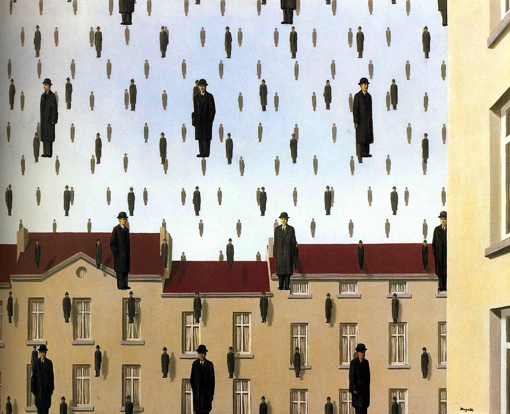
Golconda by René Magritte

I really appreciate the works of René Magritte, a Belgian surrealist artist whose iconic works are often mentioned when studying surrealism. His 1953 painting called Golconda features a group of men in suits and bowler hats (which often appeared in his other works) in a suburban neighbourhood setting. I like it’s ambiguity in direction, so it’s up to the viewer to decide if the men are falling or floating upwards. The clever use of repetition is something I’ve tried to apply in my compositions.

Rejected compositions

Humpty Dumpty sat on a wall

rhyme 1 low res

This was my first ever composition, where I made Humpty Dumpty into a faceless egg wearing bricks for pants. I added a top hat on one of the eggs to produce a focal point. Although I liked the repeated pattern, I rejected this composition because I didn’t feel like it was imaginative enough.

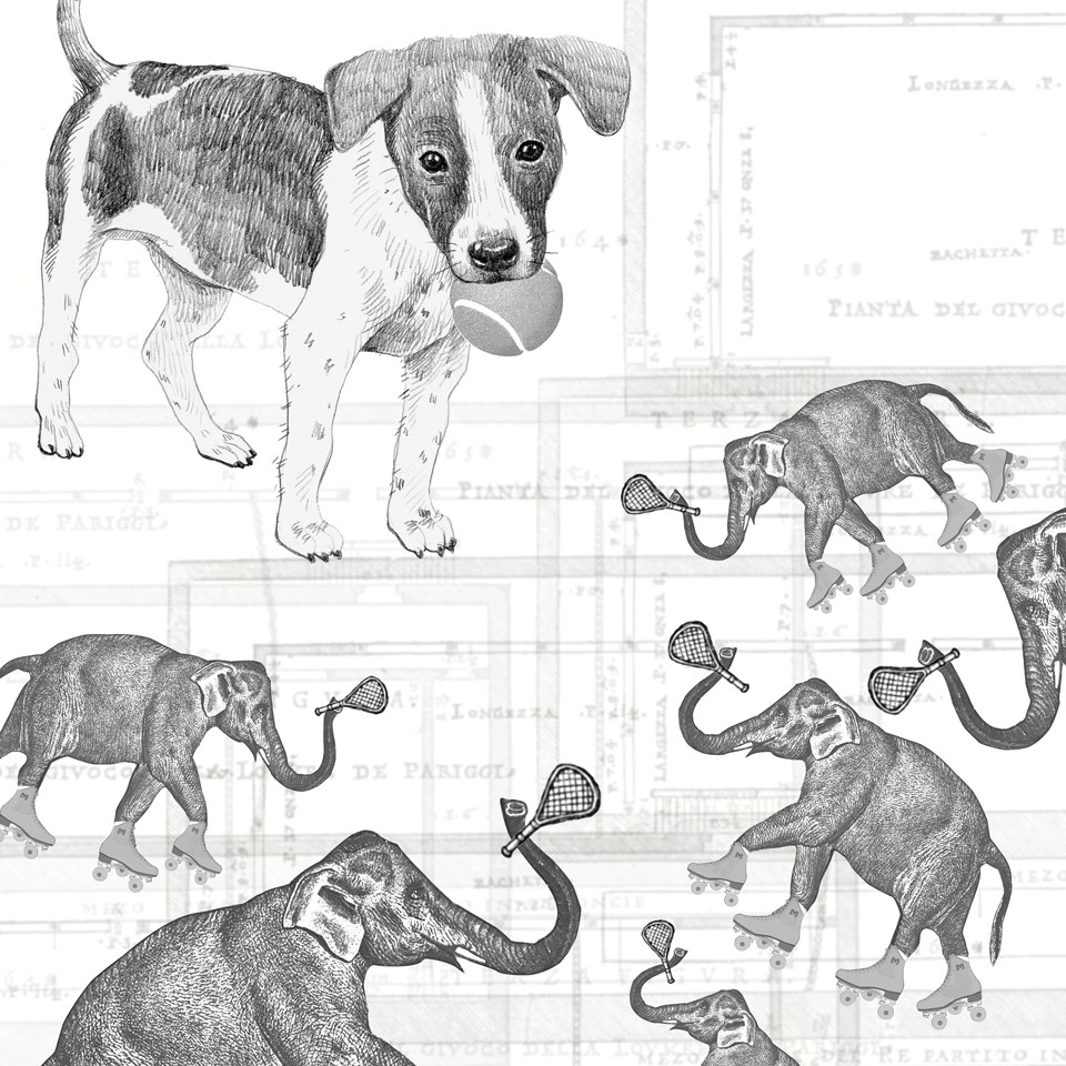
The little dog laughed to see such sport

rhyme 5 low res

Trying to be more abstract with this one, I thought of a sport that would be funny to watch, and came up with elephants on roller skates playing tennis. I intentionally made the elephants smaller than the dog, and arranged them in a manner that would make it seem like they are worshipping the dog, who is holding the tennis ball. The background is made up of layers of tennis court blueprints, which I thought produced quite a cool effect. I rejected this in the end because I thought it looked slightly messy as a whole.

FINAL COMPOSITIONS

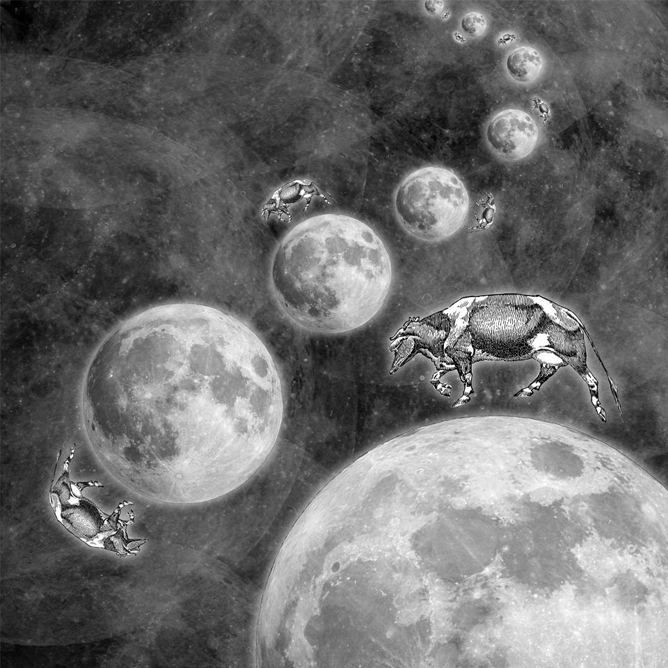
001: The cow jumped over the moon

rhyme 2 low res

This composition is inspired by the possibility of alternate realities and how there could be other beings experiencing the same things we’re experiencing, but with slight tweaks in their realities. I made a trail of moons to show the connection they all share, applying directional force as one of the principles of design we’ve learnt about. I wanted the background to have some texture and ambiguity, so I created a layering effect using the moons in different opacities, and used the multiply effect.

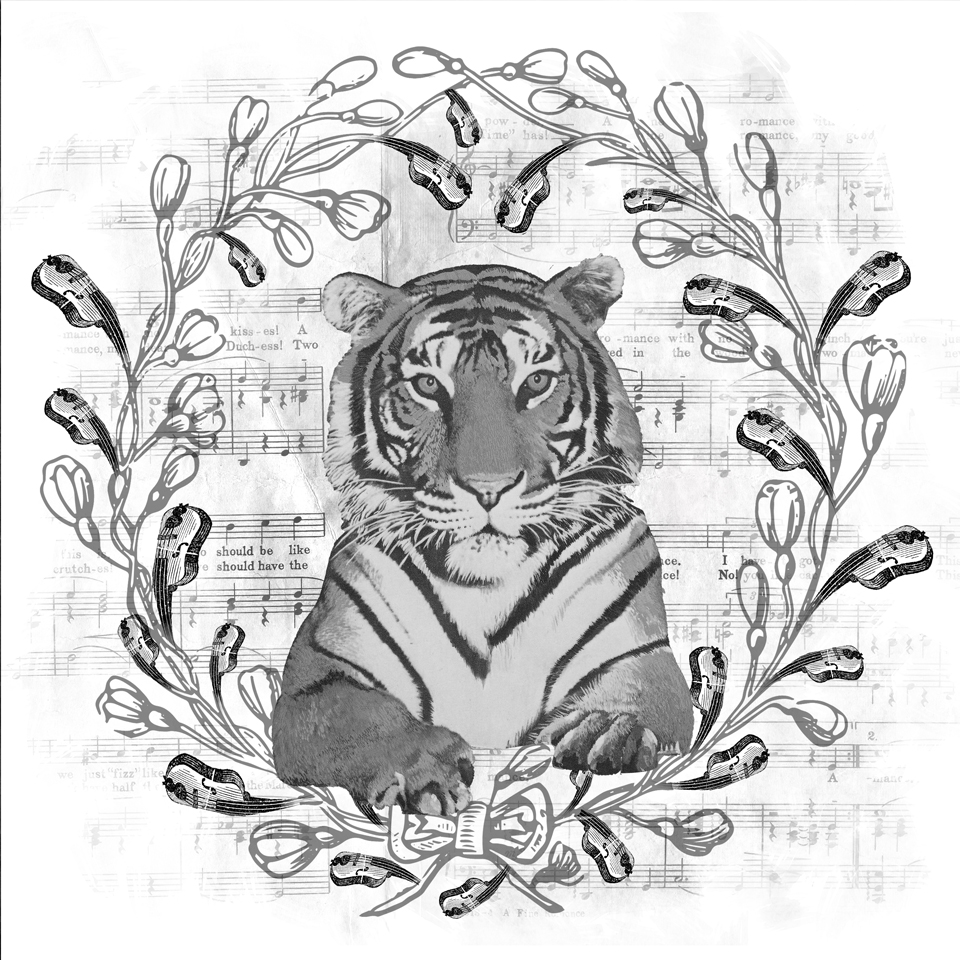
002: Hey diddle diddle! The cat and the fiddle

rhyme 3 low res

I wanted to present the cat in a regal manner, so I used a lion as my main subject. I put the wreath around it to maintain its official and royal vibe, and replaced the leaves with fiddles in varying sizes. I like the feel of unity (another principle of design) it presents. I tried to create a watercolour effect on the music sheet in the background so it’ll show up subtly.

003: Then whipped them all soundly and put them to bed

rhyme 4 low res

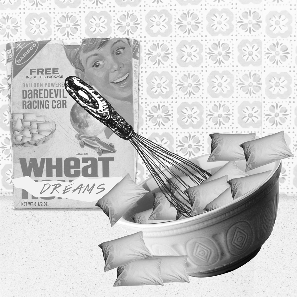
I tried to create a scene in an old-fashioned kitchen. Trying not to take the phrase too literally, I imagined a whisk (the idea of whipping) in a mixing bowl. I used pillows to demonstrate the idea of sleep, and placed a retro cereal box behind the bowl.

004: There was an old woman who lived in a shoe

rhyme 6 low res

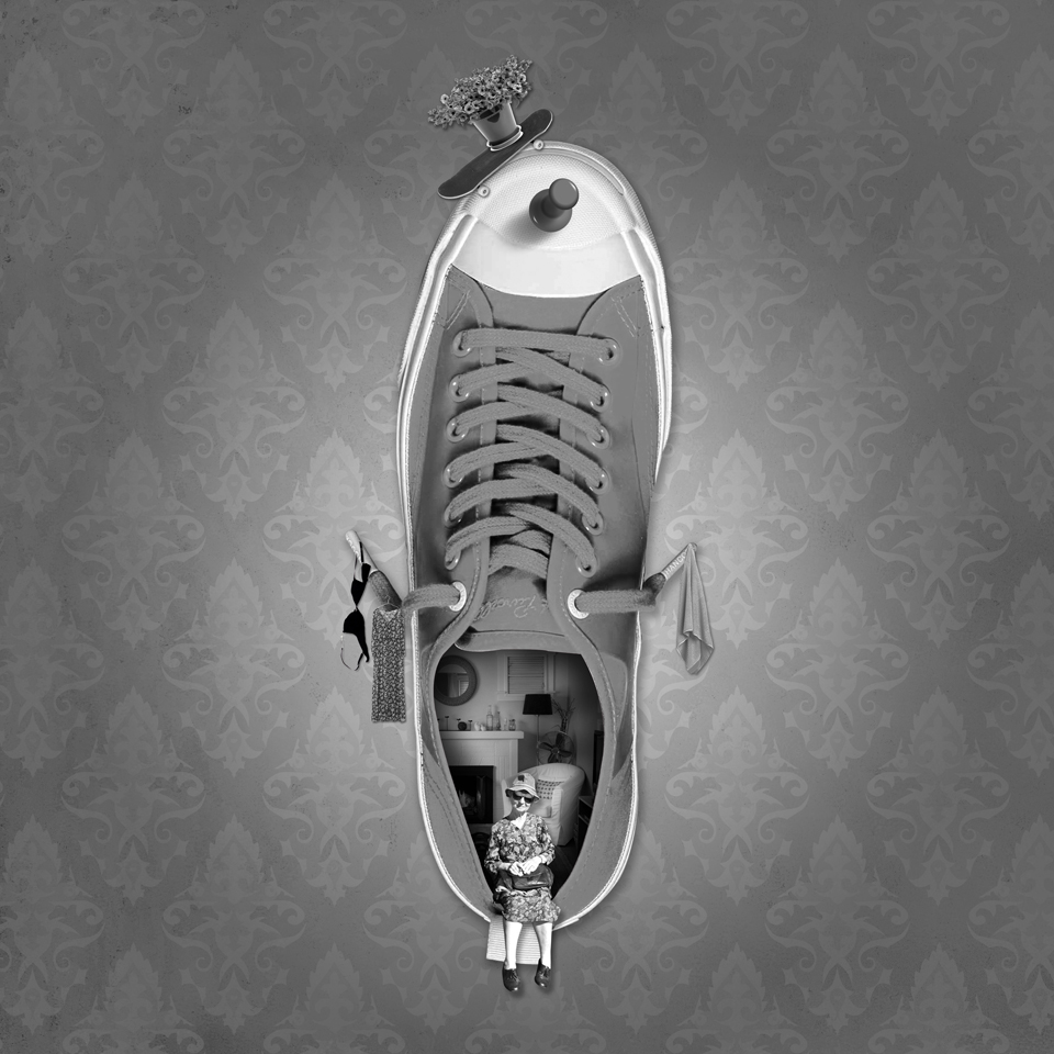
I wanted to portray a badass grandma living in a shoe without a care. I chose a Converse Jack Purcell sneaker for her to live in, and decorated the shoe with everyday items like clothes and a potted plant to show that she’s lived there for quite a while. I wanted the shoe to look like it was pinned on a wall of an old, regal and possibly vacant house, so I picked a royal-looking wallpaper.

Principles of design

balance

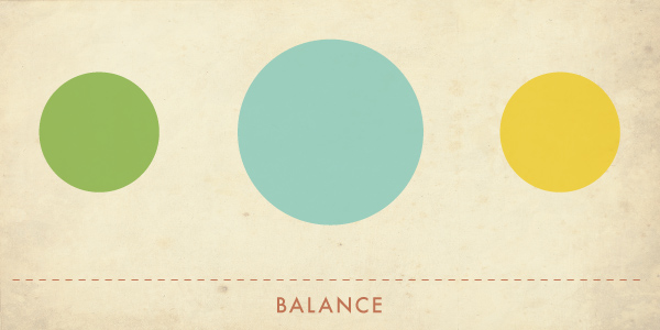
It refers to the comfortable arrangement of things in art. Balance can be symmetrical or asymmetrical.

symmetrical balance

Symmetrical balance (or formal balance) is described as having equal weight on all sides of a centrally placed fulcrum.

asymmetrical balance

On the other hand, asymmetrical balance (also known as informal balance) involves placing objects of varying visual weights in a way that all objects balance one another around a fulcrum point.

contrast

contrast

Contrast is the juxtaposition of opposing elements — e.g. opposite colours on the colour wheel, or light vs dark, horizontal vs vertical, thick vs thin. Contrast allows us to emphasise or highlight key elements in design, and can also be used to create an area of emphasis.

emphasis

emphasis

It refers to the creation of the focal area or centre of interest in a work of art. This area is more important when compared to the rest of the elements in a composition. Emphasis can be created with contrast of values, colours and placement.

movement / directional force

directional force

It refers to the visual flow through the composition. It guides the viewers’ eyes and suggests the idea of motion in a design. It can also help to bind the work into a single entity.

REPETITON / RHYTHM

repetition

Repetition is the recurrence of a design element coupled with a certain order to the repetition. It provides continuity and flow to a piece of work by tying together individual elements. Repetition can be created with shapes, lines or forms.

unity

unity


Unity is the relationship among elements in an artwork that helps all elements work together to create a meaning. An artwork with unity has nuances of consistency and oneness, and is appealing to the eye. This can be achieved with a common background, similar shapes and patterns, or the arrangement of elements.

References:

http://char.txa.cornell.edu/language/principl/principl.htm
http://www.j6design.com.au/6-principles-of-design/
http://www.fuelyourcreativity.com/the-lost-principles-of-design/

Graphics by www.fuelyourcreativity.com