Password: password
Animated clips of personal fears.
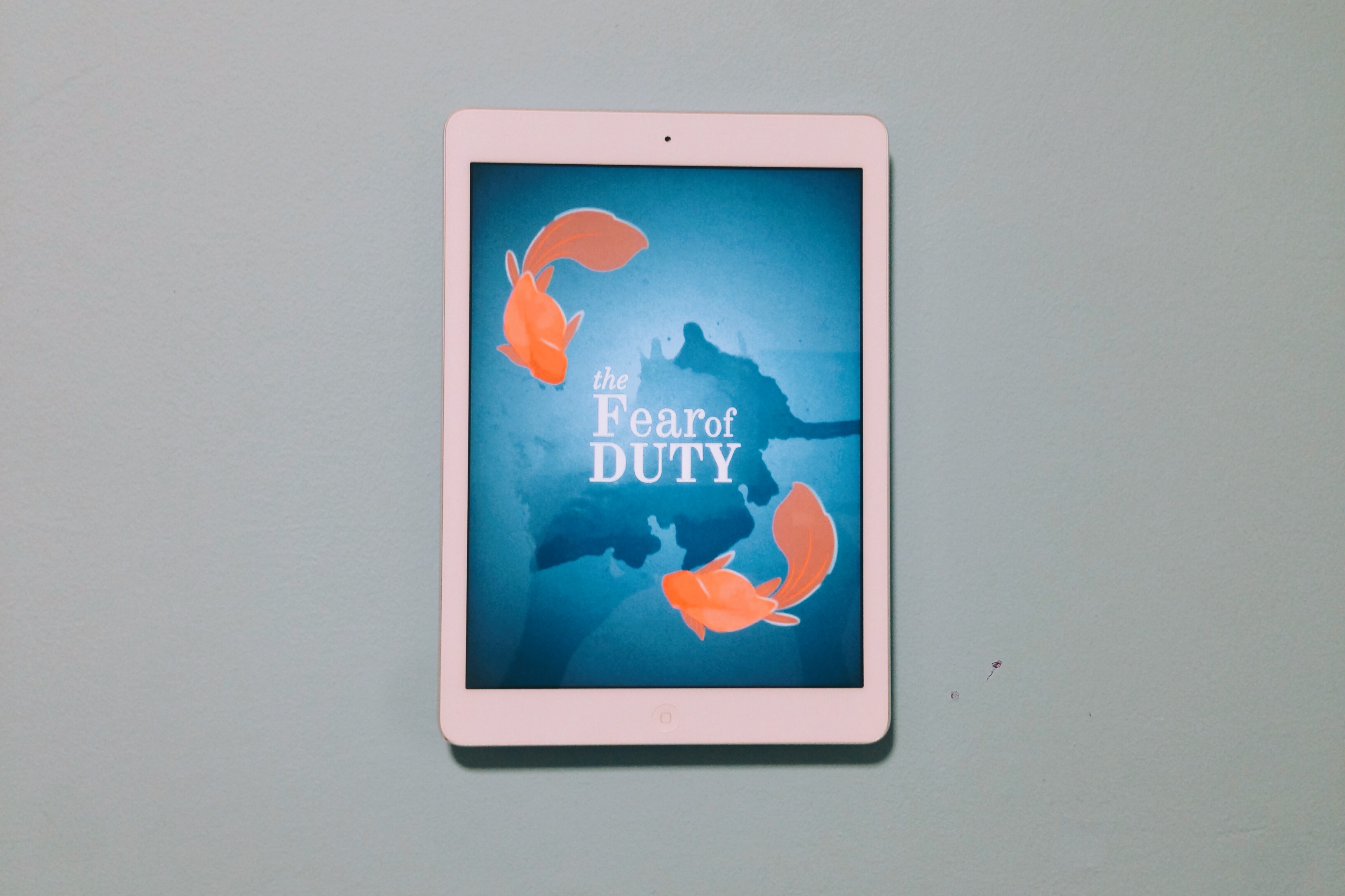
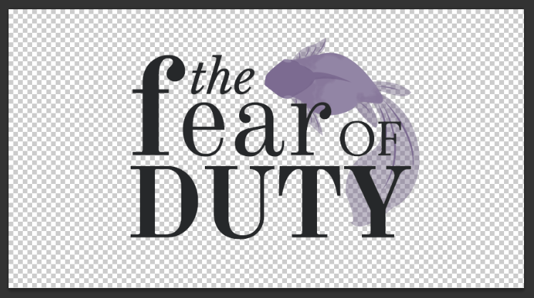
Fear of Duty
Fear of the Spotlight
Fear of Despair
Password: password
Animated clips of personal fears.
Fear of Duty
Fear of the Spotlight
Fear of Despair

The general layout I decided to go with was simple and straightforward – text on left and image on right. This mirrored the concept I wanted, which was a story book zine.
Titles
Playing around with typography and mixing fonts
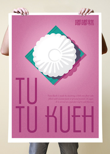
FRONT COVER
Came up with 3 different colour schemes, eventually settling with the red and warm tones, which would go well with aged/toned paper.

PAGES
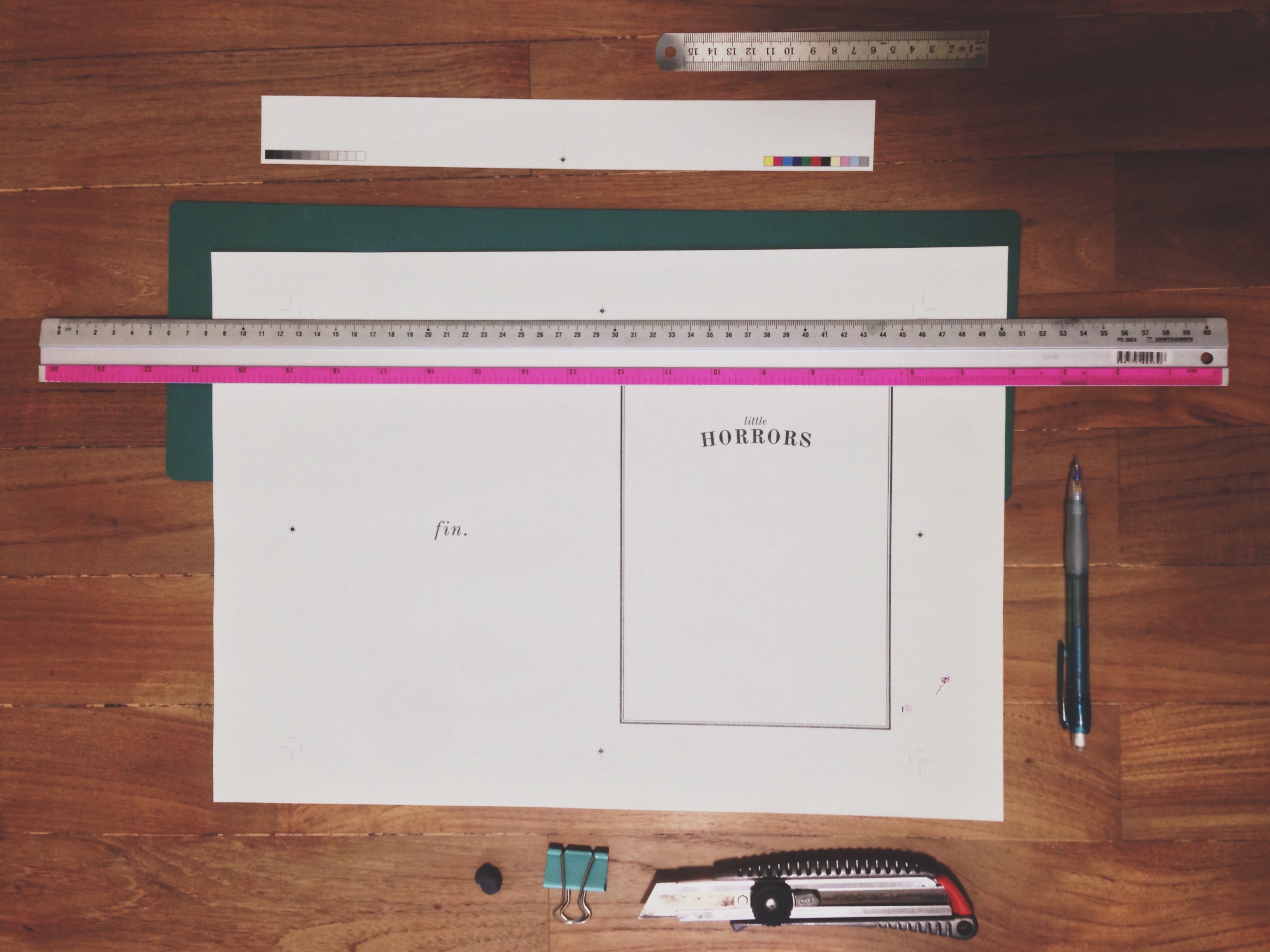
Preparing to trim the pages
Paper options: white and off white
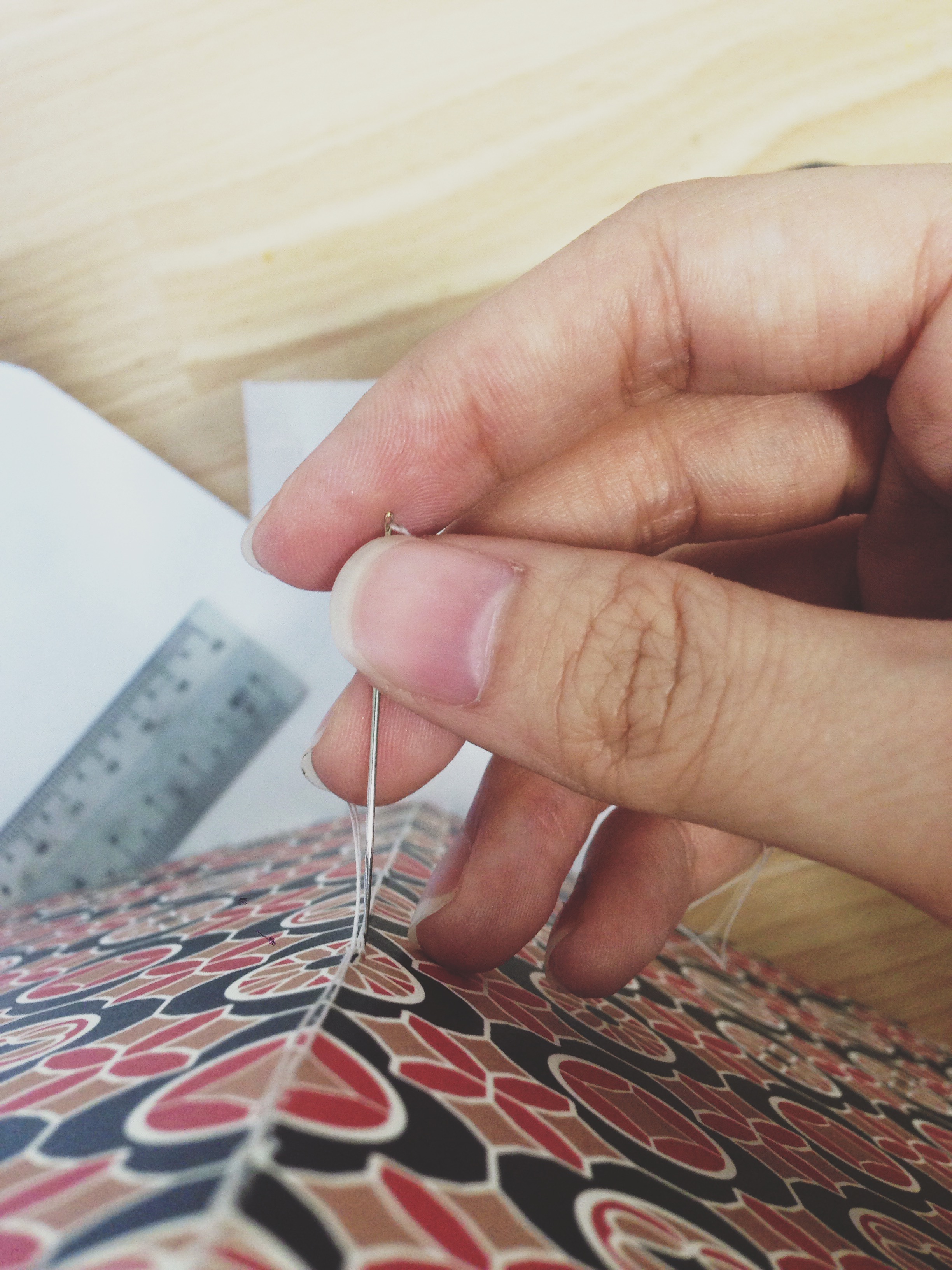
PUTTING IT TOGETHER
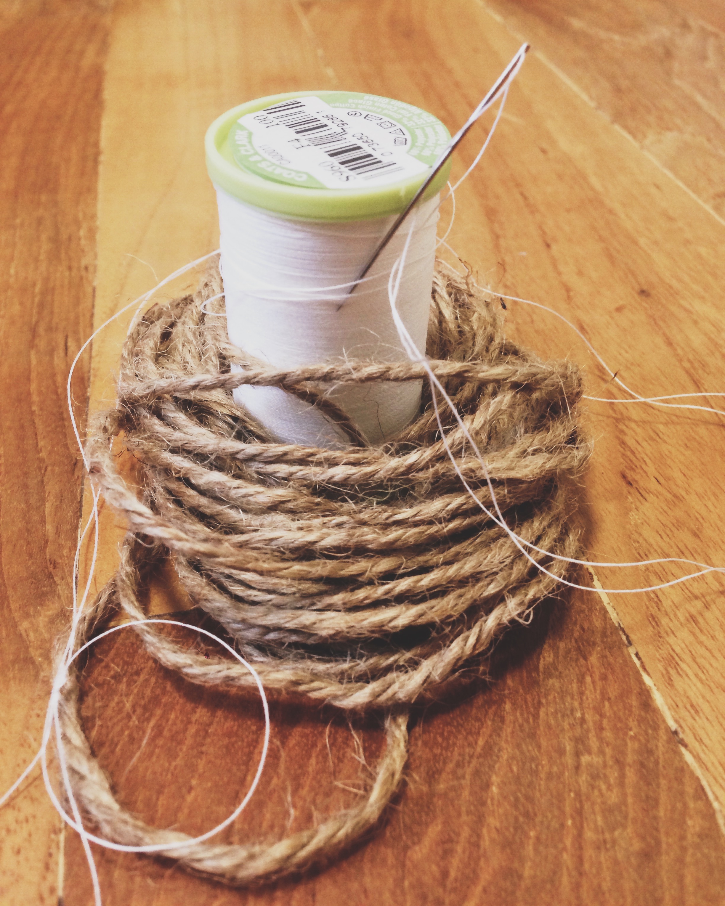
Hand stitch with cotton thread
Marking the holes
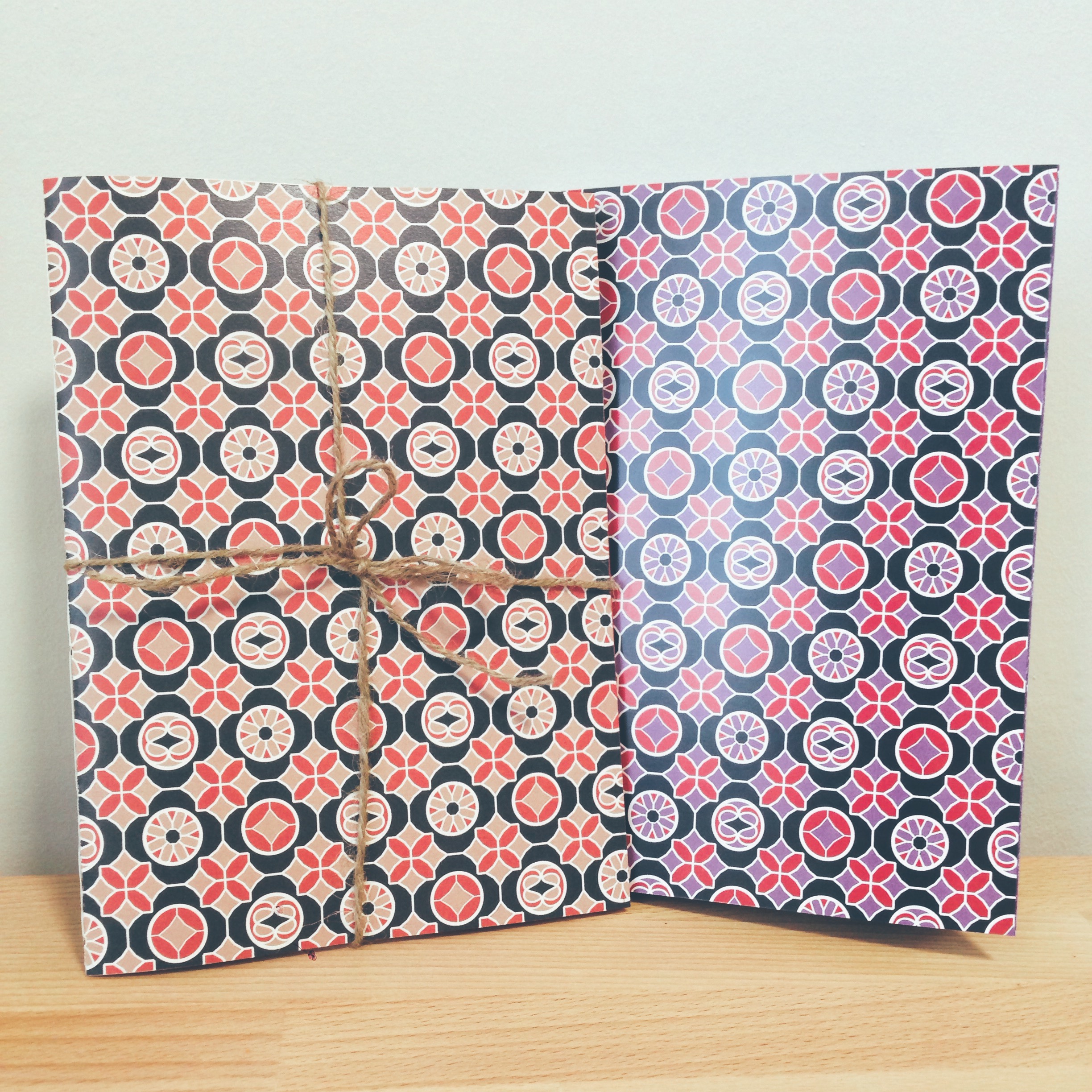
2 Versions

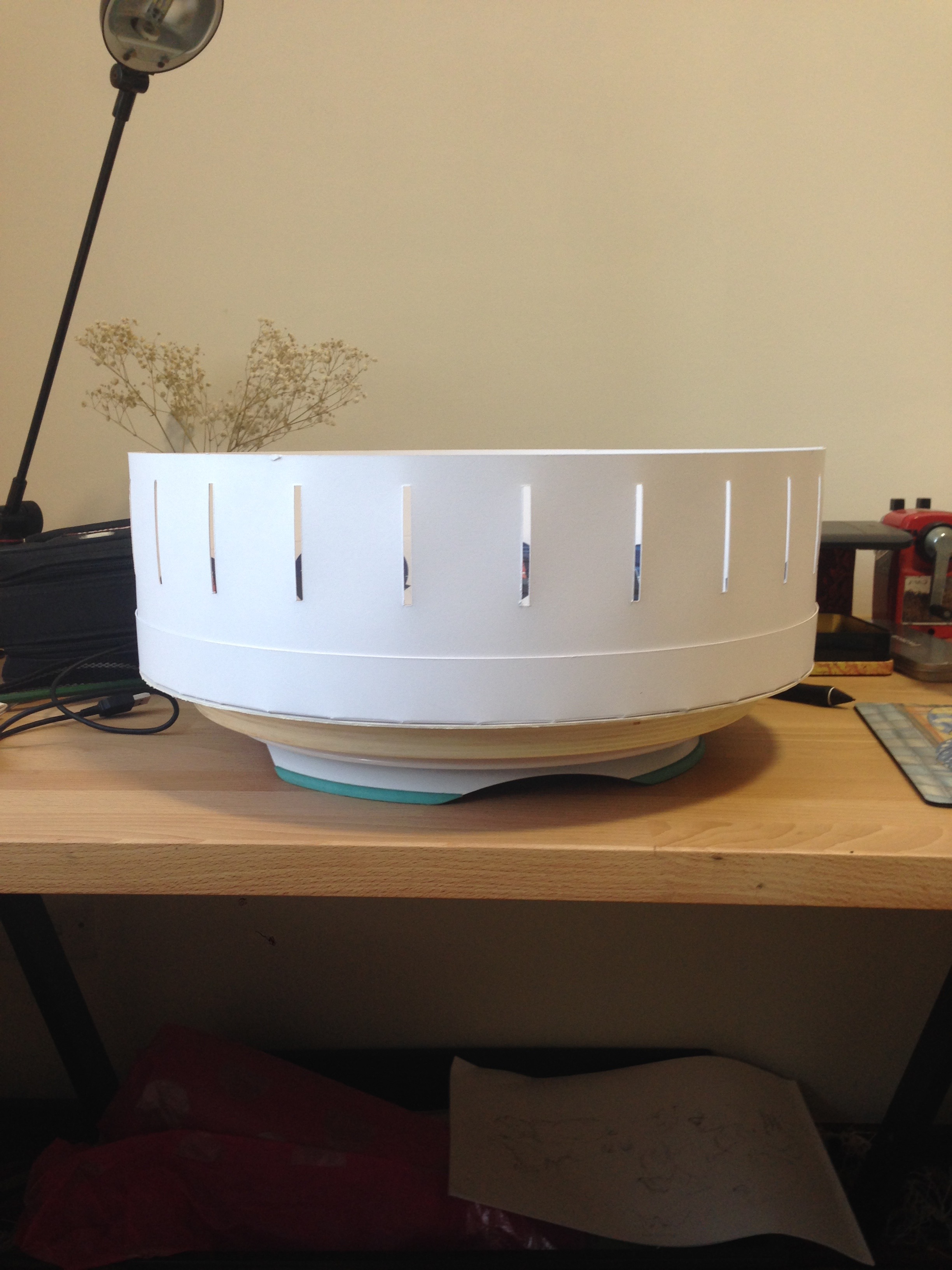
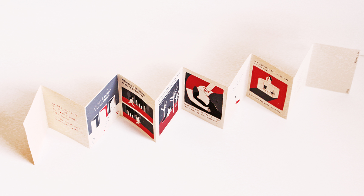
The zoetrope:

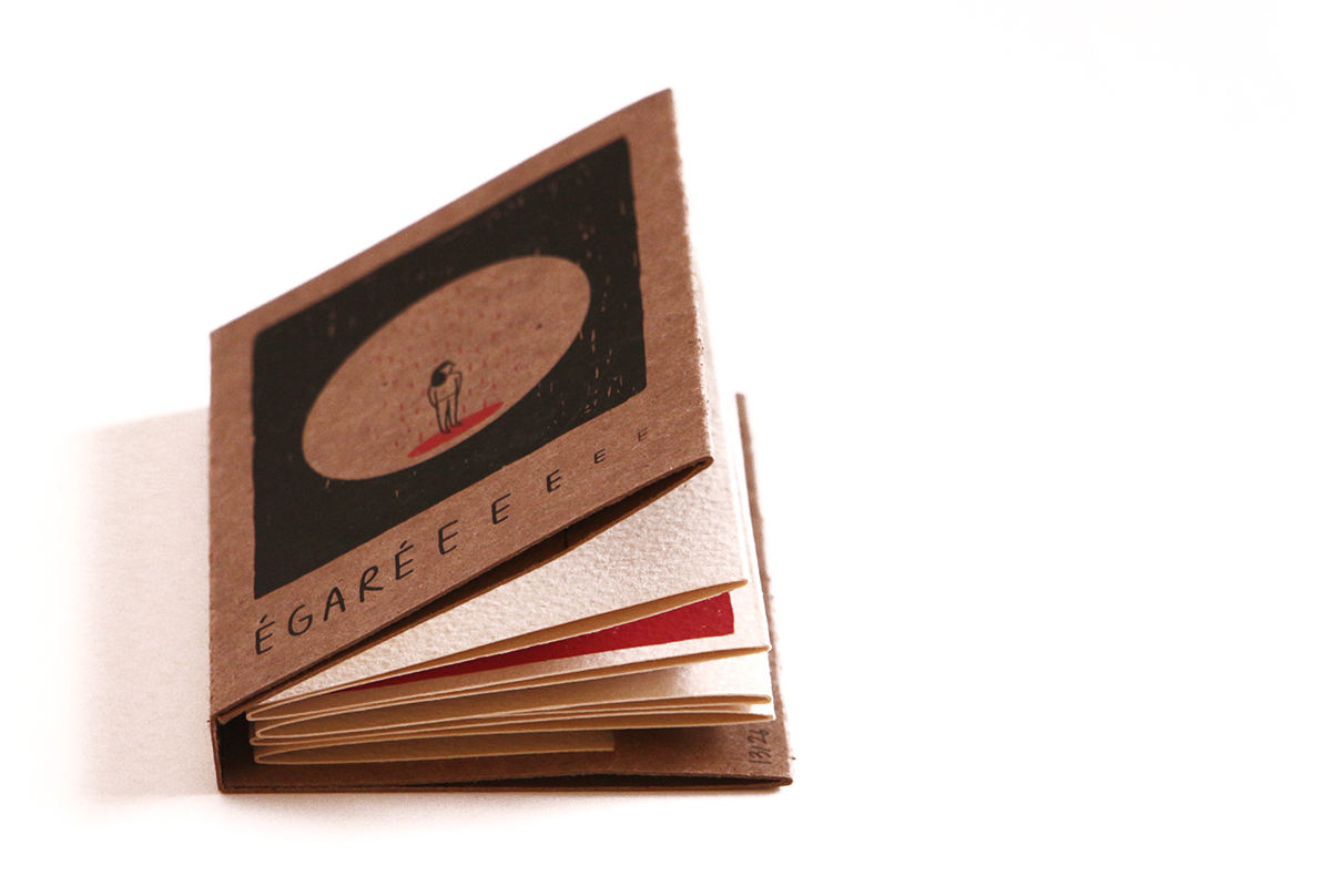
Hardcover story books were my inspiration for this final project. With my zine to be comprised with mainly works from the POV project, the story book concept seemed to fit the style and illustrations.
(By Roxane Fiore)
The accordion format is an idea I’m considering, although much will depend on the size!
(By Sevilya Nariman-qizi Ibrahim)
Vintage Book Covers
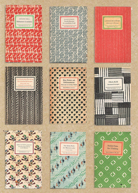
(http://www.thejungalow.com/2010/07/just-gorgeous-check-out-these-vintage-book-covers.html)
(http://jenikya.com/blog/2012/02/book-designs.html)
Other designs on Pinterest – https://www.pinterest.com/jennyhesperus/vintage-book-covers/
THEME
Personal Fears that are seemingly rational (or are they really)
Tailored to an individual’s personality and disposition
Lines –
Fear from the point of view of a casanova is to fall in love/lose his heart
Fear from the point of view of a performer is stage fright/to be eaten alive by his audience
Fear from the point of view of a kind is to be rendered powerless/just a figure head
Fear from the point of view of a free spirit is to be weight down by responsibilities
Fear from the point of view of an optimist is to be in despair
Fear from the point of view of a hunter is to hunted
Fear from the point of view of a fame monster is his hubris
Visual concept:
A narrative approach; illustrative
*Click on the gifs for smoother animation.
PROCESS
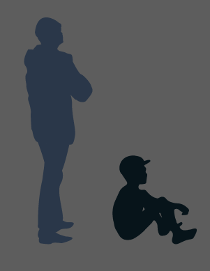
Composition 1: Fear from the POV of a free spirit is to be weight down by responsibilities
With free-spirited referring to non-conformists or individuals who diverge from worldly concerns, the visual concept I had in mind was to mock their individualistic thought of what responsibility means to them.
So I painted a picture in my head; to be tied down by constraints and expectations would be an experience similar to drowning, as if bounded by the ankles and dragged to the inescapable depths of an ocean. To exaggerate this thought, wouldn’t it be sillier to illustrate the anchor as something small and frail in contrast to a human’s capacity for strength?
ELEMENTS:
References

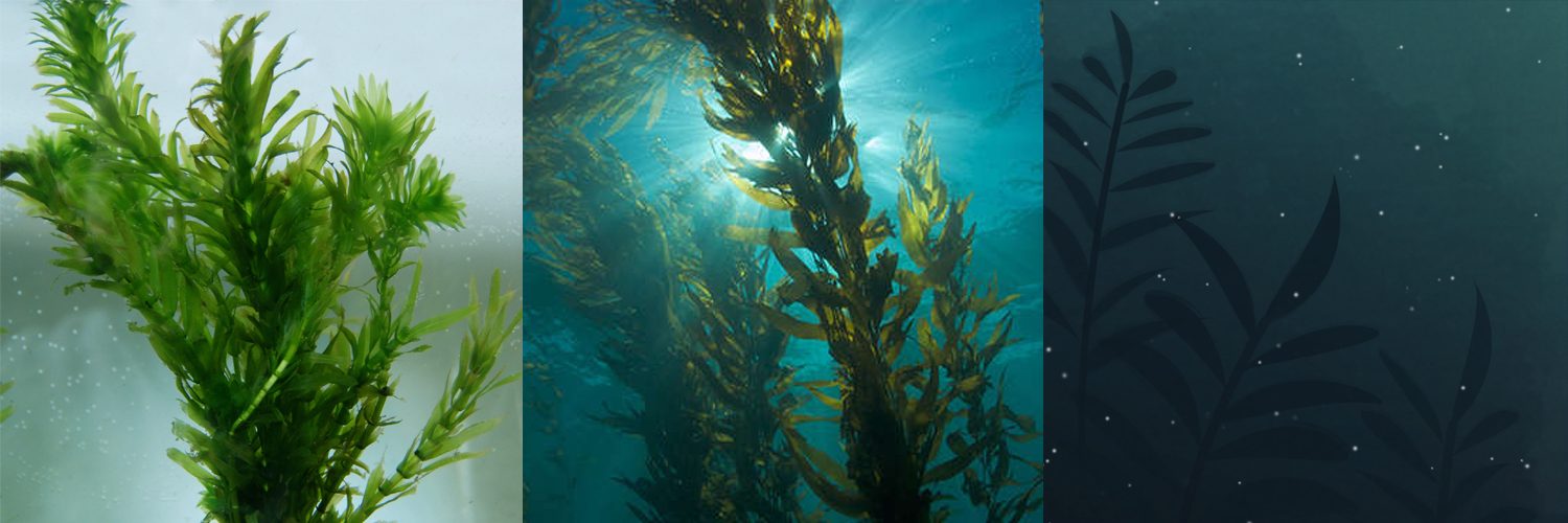
Plant graphic

Character that embodies free-spirited sensibilities
Goldfish to act as the anchor that weighs down the character
FINAL:

Final composition
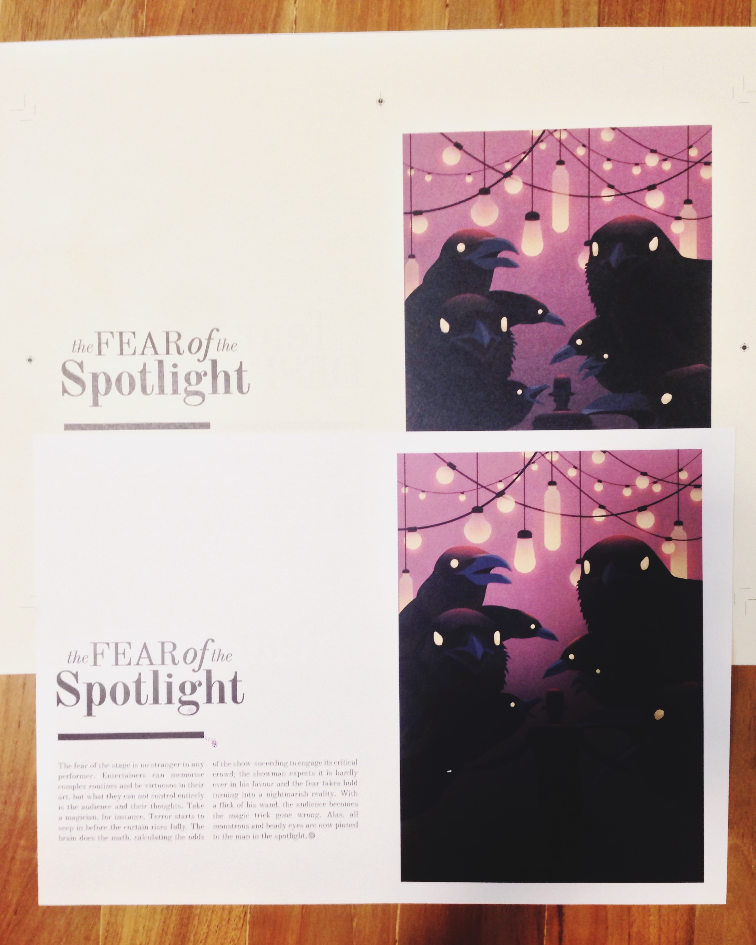
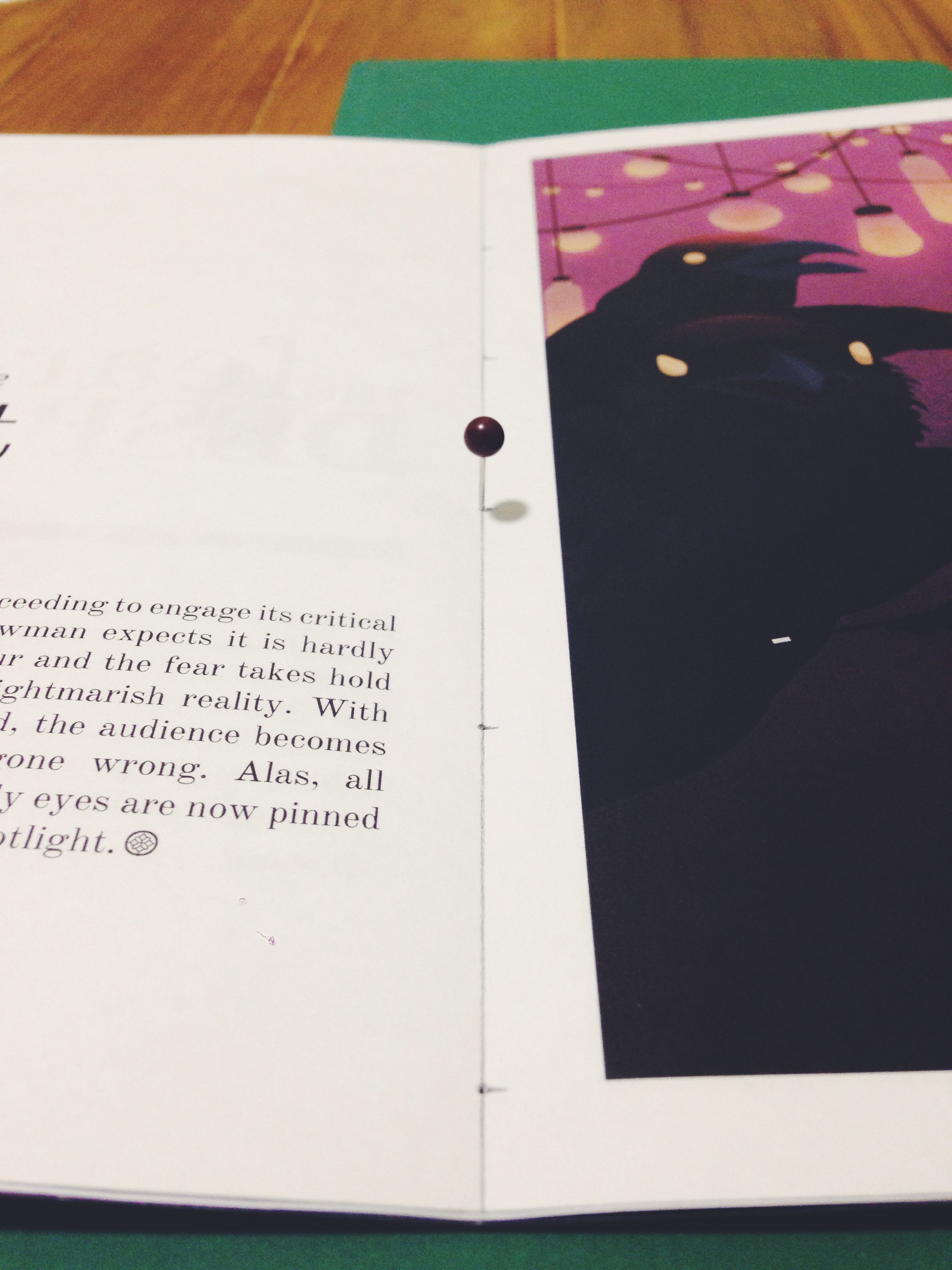
Composition 2: Fear from the point of view of a performer is stage fright/to be eaten alive by his audience
My original idea was to illustrate a performer being eaten alive by his audience, but I struggled to think of what (and how) to animate in the sketch. So playing with perception (again), I decided to why not distort the audience image. With that, this artwork soon took form of ‘a magician’s trick gone wrong’.
ELEMENTS:

References Decided to add noise grain to the bulb’s aureole to make the glow look more natural from its scale
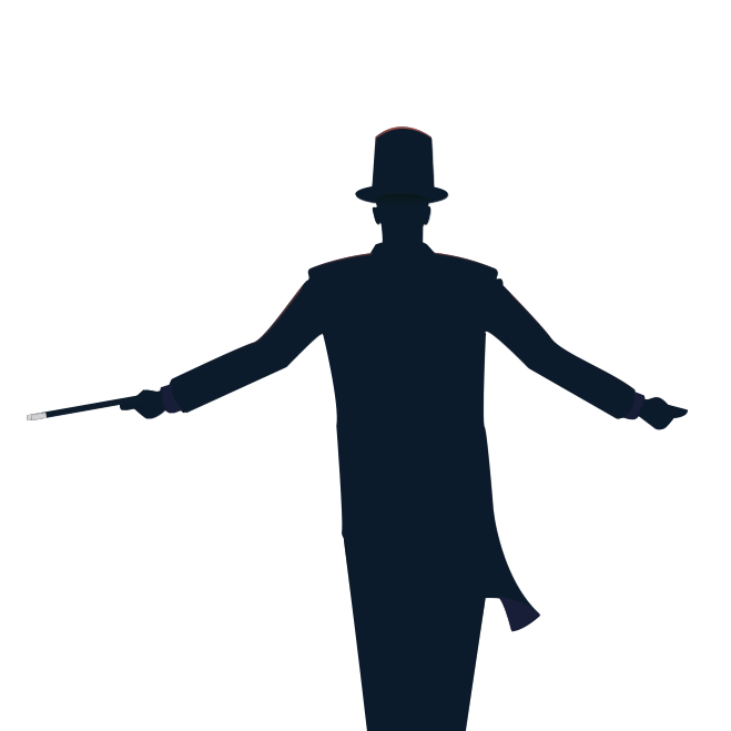
Performer/magician
The audience as large ravens Added subtle texture of feathers to crow as well as the head’s glow from hanging lights above to make it seem more realistic
FINAL:

Final composition
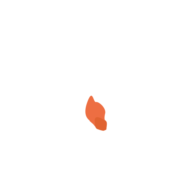
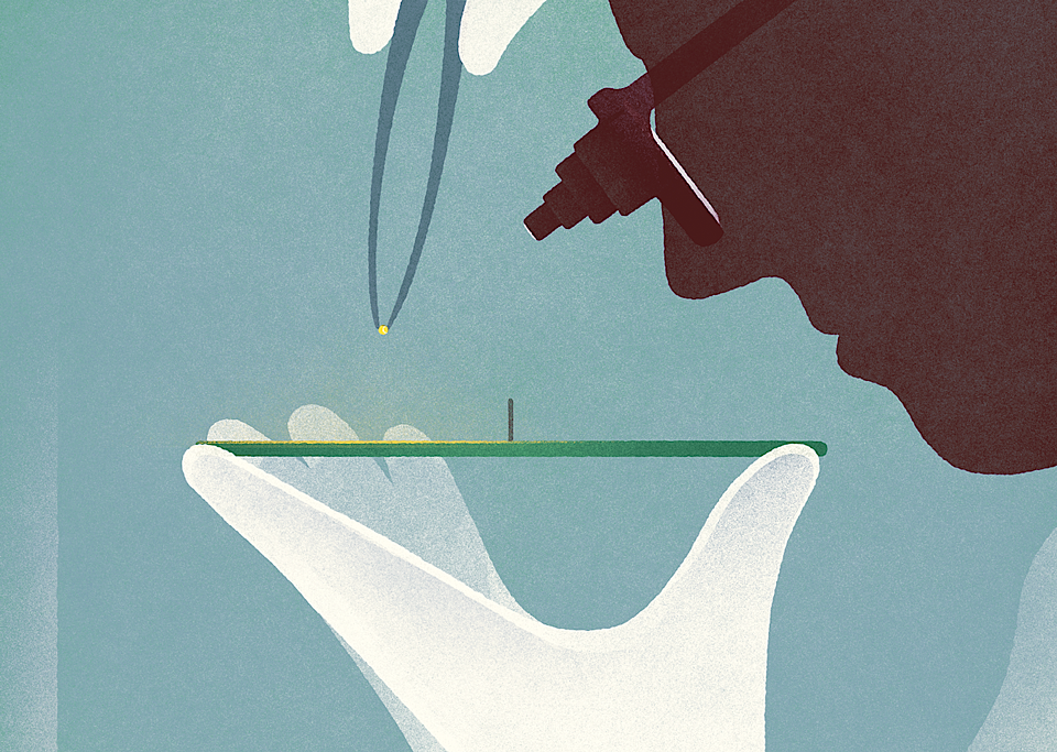
Composition 3: Fear from the point of view of an optimist is to be in despair
Taking the concept of the candle and how it represented hope in darkness, it seemed as the most effective communicative element to use. Also, it fit with what I had envisioned this artwork to take place – in the snowy wilderness.
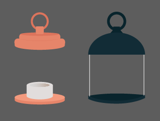
Different lantern designs
Various poses
References, changes made over time

Alternate background for final composition

Final composition
Dropped:
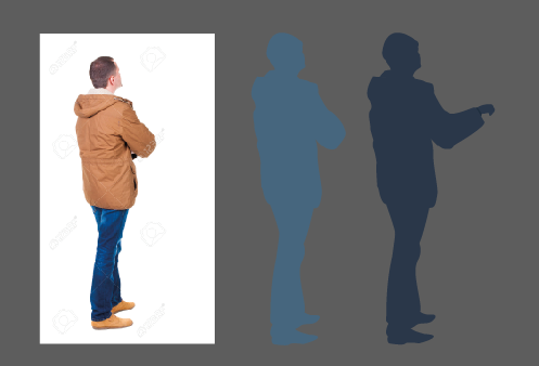
For Fear from the point of view of a casanova is to fall in love/lose his heart and
Fear from the point of view of a kind is to be rendered powerless/just a figure head
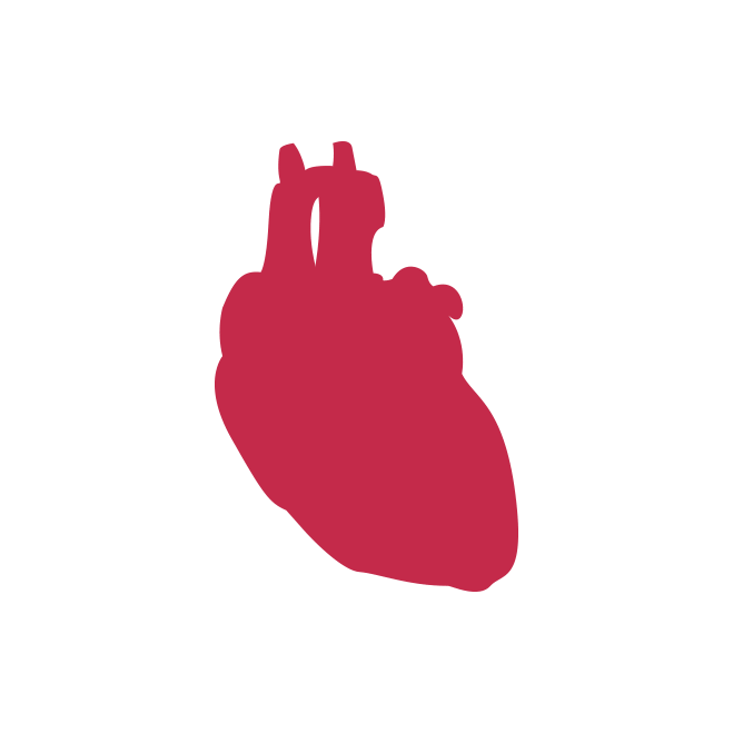
Illustration of a heart

Puppeteer’s hand

A puppet
Going into the second project and i’m feeling ambitious.
GRAPHIC DESIGN WORKS
 (By Karolis Strautniekas)
Behance is my go-to place for inspiration; I can spend hours browsing on it. It’s also really useful when sourcing for inspiration or even particular styles as references.


Some flawless and yet simple(ish) moving graphics. I’m considering perhaps animating my work for this upcoming project. It’ll be a challenge for sure.
Naiise
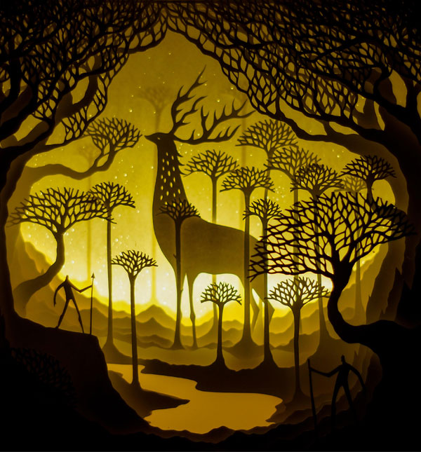
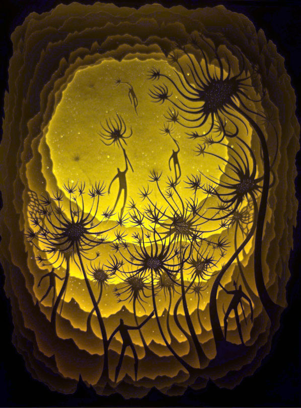
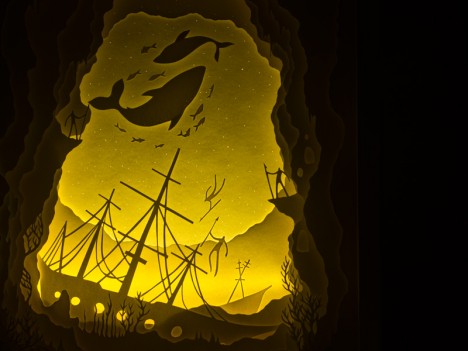
All done with paper and scissors and two pairs of hands; and a LED light used as a backlight. Would love to try their concept out for something in the future?

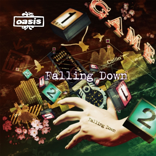


Oasis Album Cover Art
Collage art will probably be my backup plan if my graphics don’t go well.
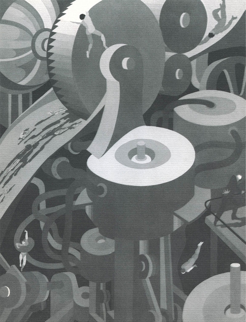

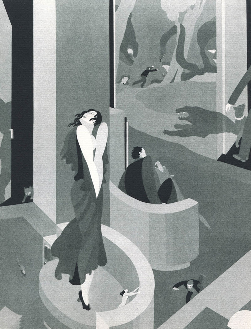
John Vassos
Inspired by Vassos’s phobias, I’m thinking of revolving around the theme of fear, in particularly, personal fears that are atypical – fears that are not necessarily blunt or cause us to be terror-stricken, but rather its subtleties, illustrated in a context that is universally relatable, no matter how individually different we are.
Password: password

My name is Denise and I’m Peranakan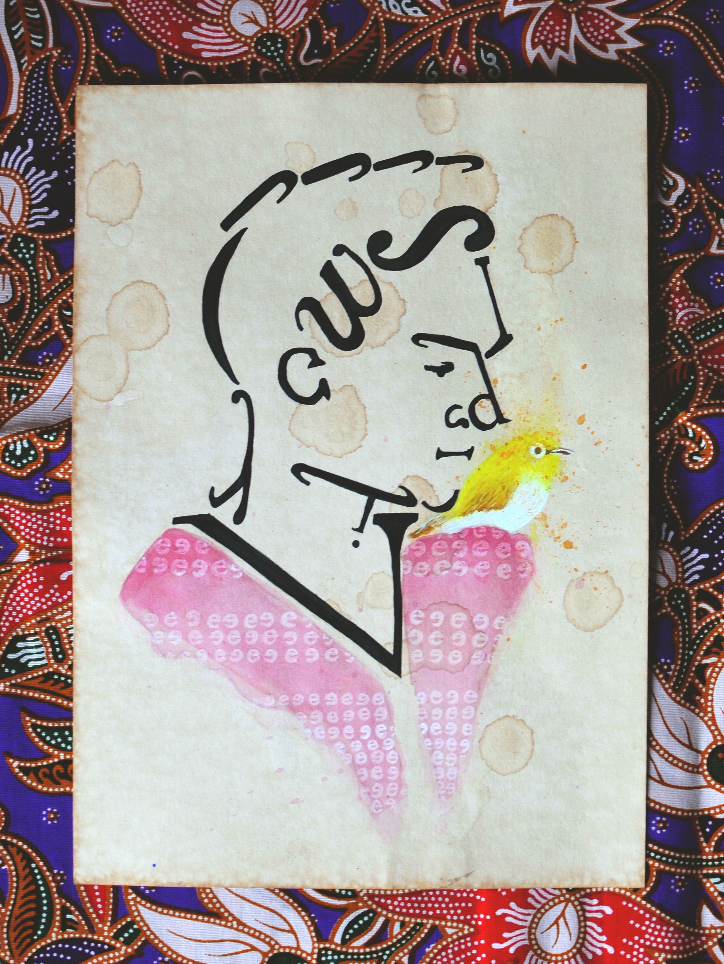
I paired the baba (man) with a mata puteh (oriental white eye) to mimic the sentiment of old Singapore. Back in the day, these birds were admired for its singing quality/buka and the price to appreciate a songbird’s chirp at home could range from $30-500.
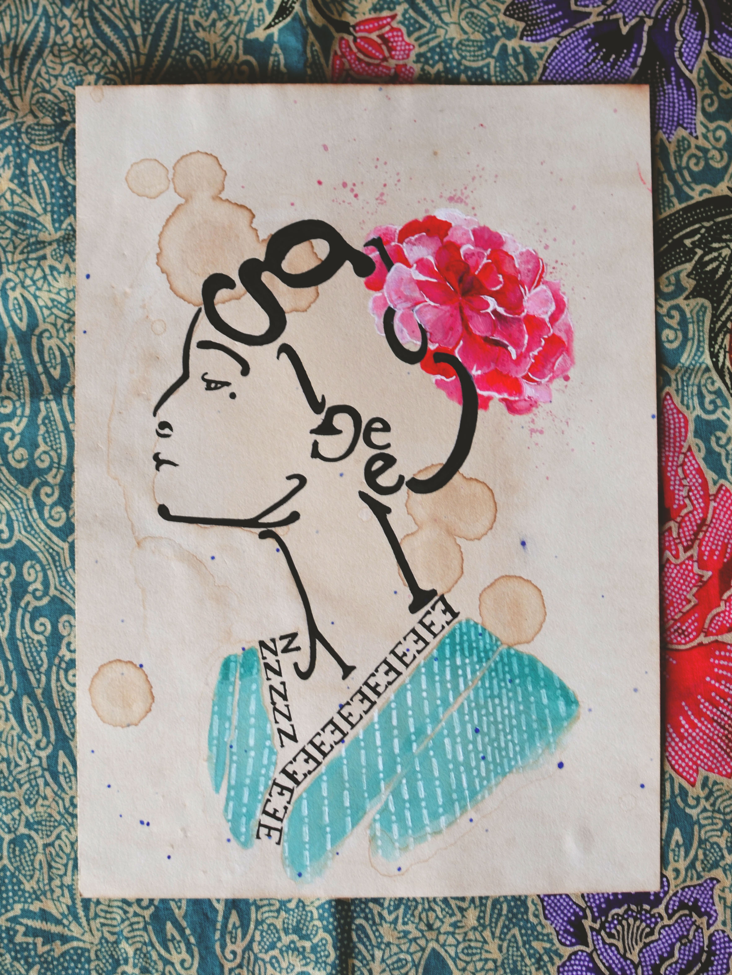
The pairing of the nyonya (woman) silhouette with a peony was more reflective of an old and common Peranakan motif. The peony, regarded as the king of flowers, represents fertility as well as nobility. According to old legend, the emperor of China in the 15th century sent his daughter to the sultan of Malacca together with a band of other nobles and servants. They eventually grew to become what we know as the Peranakans.
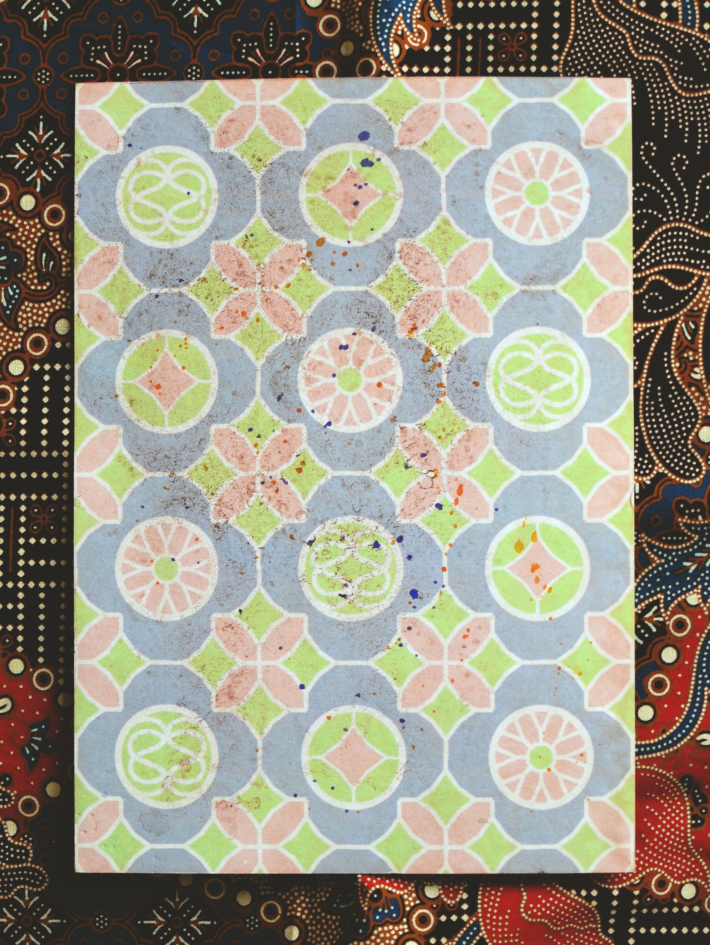
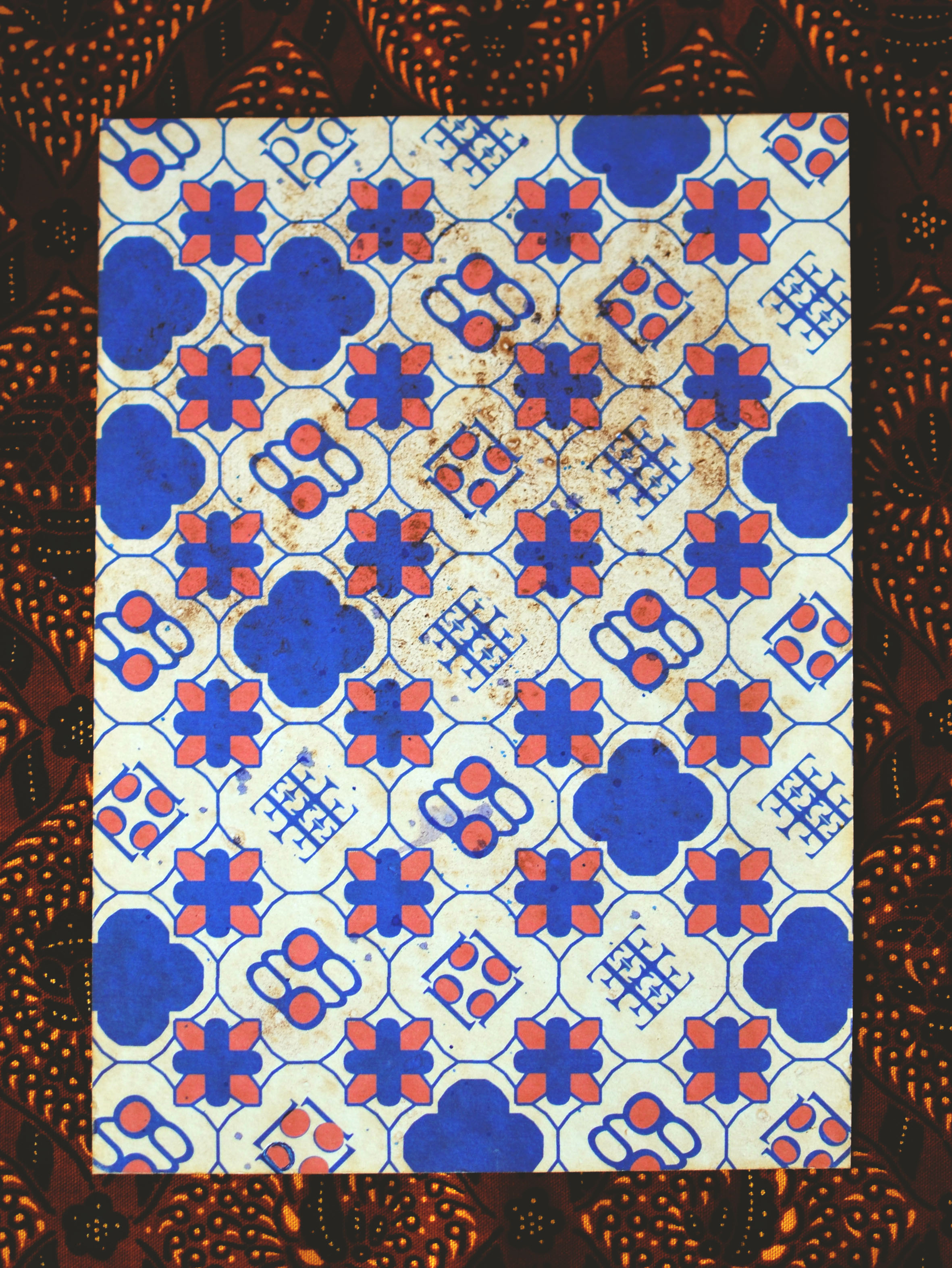
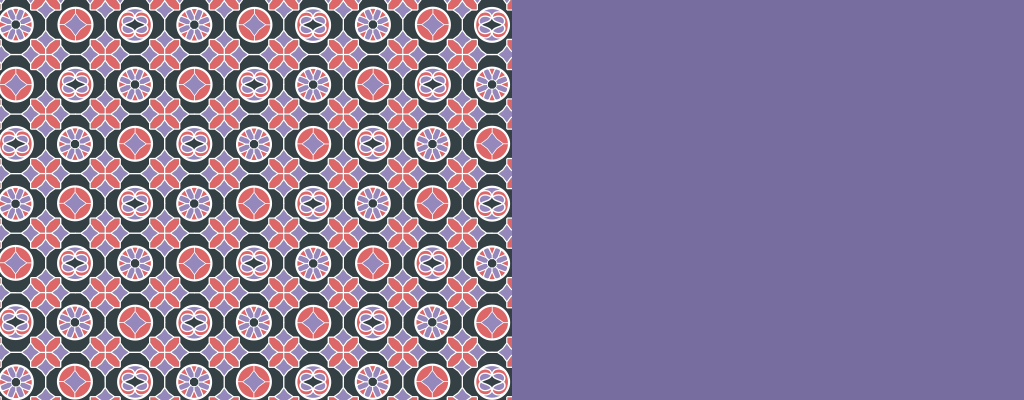
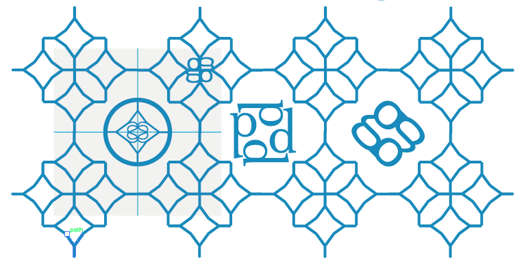
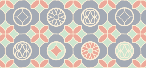
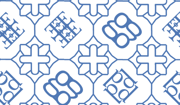
The remaining two pattern designs were inspired by Peranakan tiles. Composed by emblems made of a mixture of letters, each different symbol is meant to be openly interpreted to have its own story or meaning e.g. one symbol could symbolise a flower/family insignia/composition of them could be seen as a family tree.
Overall, I’m pretty content with how the pieces turned out; they were meant to mirror the culture’s sense of femininity and delicacy and I think it was encapsulated to a degree. Can’t wait to start on the next project!

I am Peranakan
Upon interpreting this brief, I saw it as a chance to explore my roots and it seemed only natural to touch on my heritage. In my household, the Peranakan culture is very much celebrated and practiced throughout each year. I still remember the first time I ate my mum’s ayam buah keluak when I was a kid, and it was in that moment when I truly started to show an interest and embraced this culture of mine.
Paper
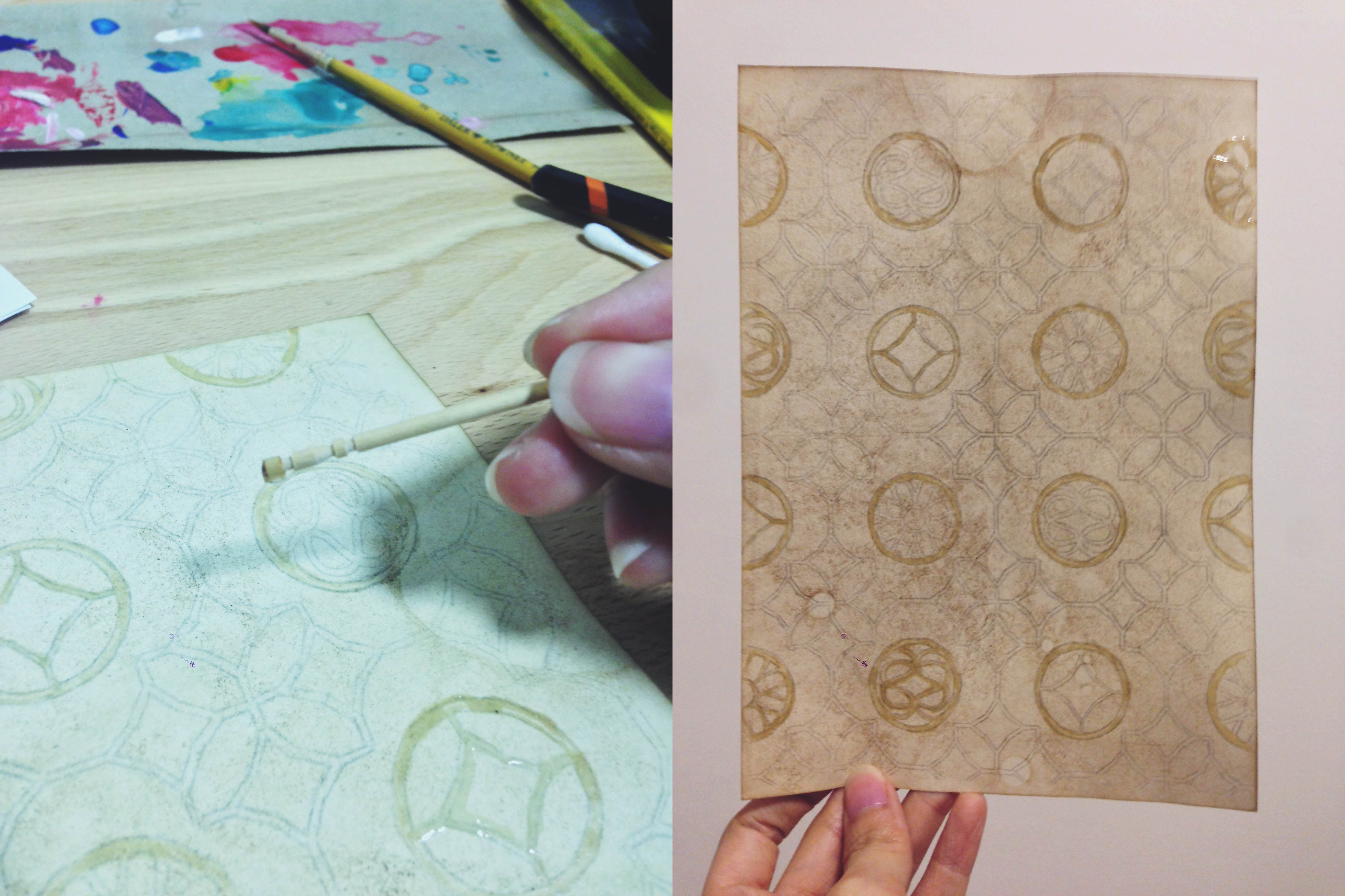
Experimented with coffee grounds, cold/hot water to tone paper
Adding coffee grounds added another detail to the stained paper; spontaneous shapes were formed each time.
Dissecting Fonts

Experimentation with various serif and san-serif fonts; separated them in different ways to get different results.
Nyonya and Baba portraits

Digital sketches. Font: Libre Baskerville
General idea for these pieces are silhouette portraits of a woman and man (much like the victorian ones) formed by letters of my name.
Creating the portraits digitally was more convenient that simply sketching with pencil/pen. It allowed me the flexibility and freedom to edit without consuming a lot of time.
These sketches will later be drawn onto paper and inked. I’m also considering combining other elements with these portraitures for elevation; maybe combining other significant elements of the culture?
Rough colour schemes
Patterns
 Playing around with fonts and silhouettes.
Y, D, U, Y
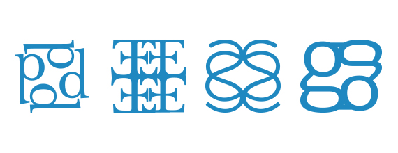
d, E, S, g
EGO, Y, g, i
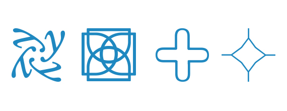
Emblems
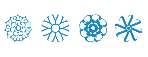
Ideation – Putting emblems into patterns
Testing patterns with colours
Taking inspiration from Peranakan tiles, I combined various letters and used repetition to give it a sense of rhythm. Each individual emblems created has a story/secret bounded within their lines – it’s up to the audience to interpret what they are!
While the fonts themselves form the intricate pattern work, I’m also thinking about how I can play around with the geometric shapes formed by the negative space created.
Applying glue to act as a resist against watercolour
With the digital sketches done and a clearer idea in mind, I began to draw the patterns out on the tone paper by hand. After some experimentation, I realised that watercolour reacted differently with the coffee-stained paper; though the paper did absorb the paint, it did not allow it to spread or blend and I could hardly get clean lines.
For this reason, I decided to use transparent glue to mark out all the negative spaces (the outlined typography work) in hopes that it would stop the paint from from appearing to look too blotted.
Alternatively, perhaps I might print the graphic sketches out first before dying them with coffee to get a more crisp and geometric effect as intended.
Draft 2

Draft 2’s emblem in colour

Password: password