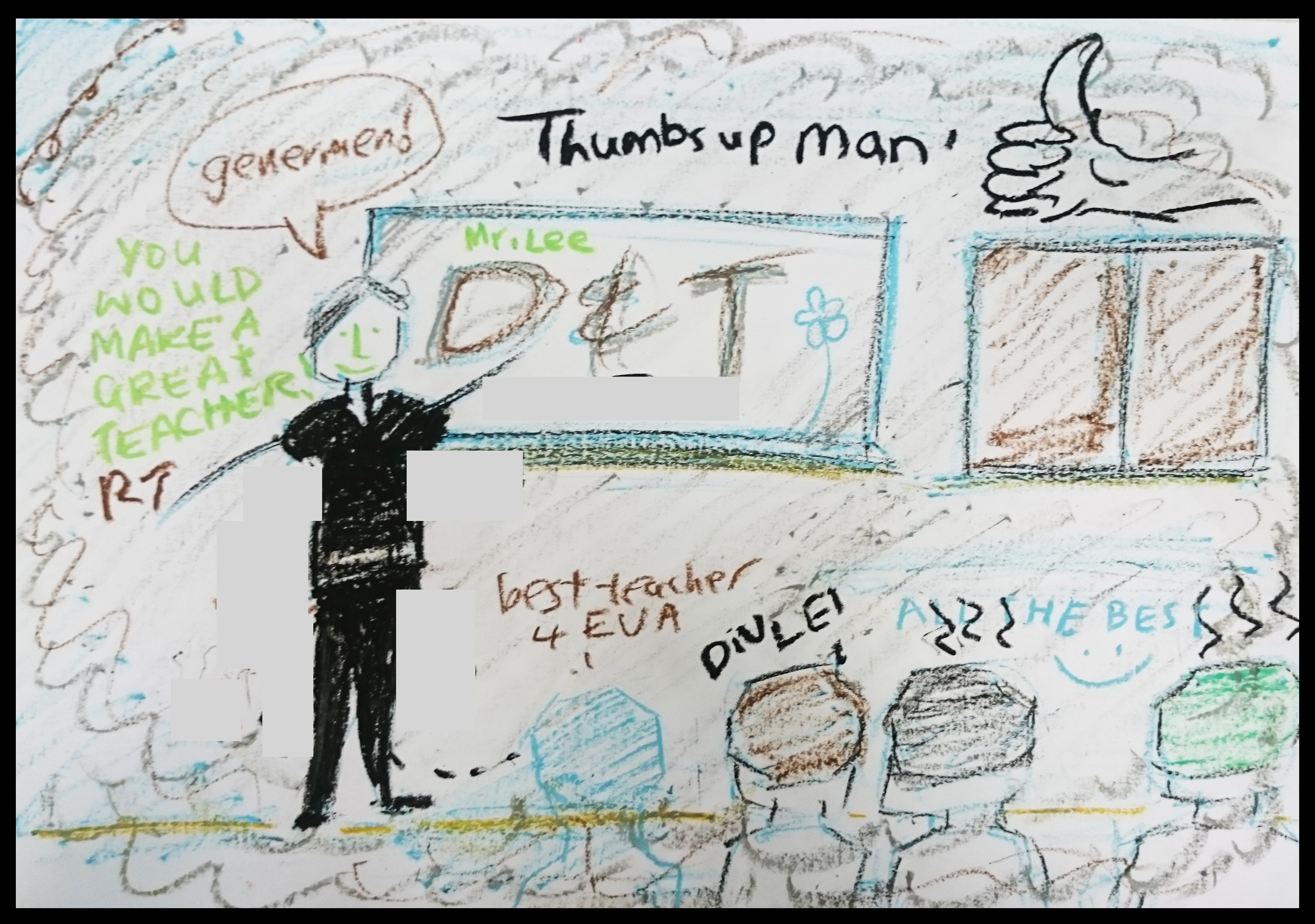
Foundation 2D Project 1 – Final Lines
With this marks the end of Project 1.
I enjoyed the overall process such as the field research and the new techniques that was introduced.
The journey was incredibly tough but it’s worth it!
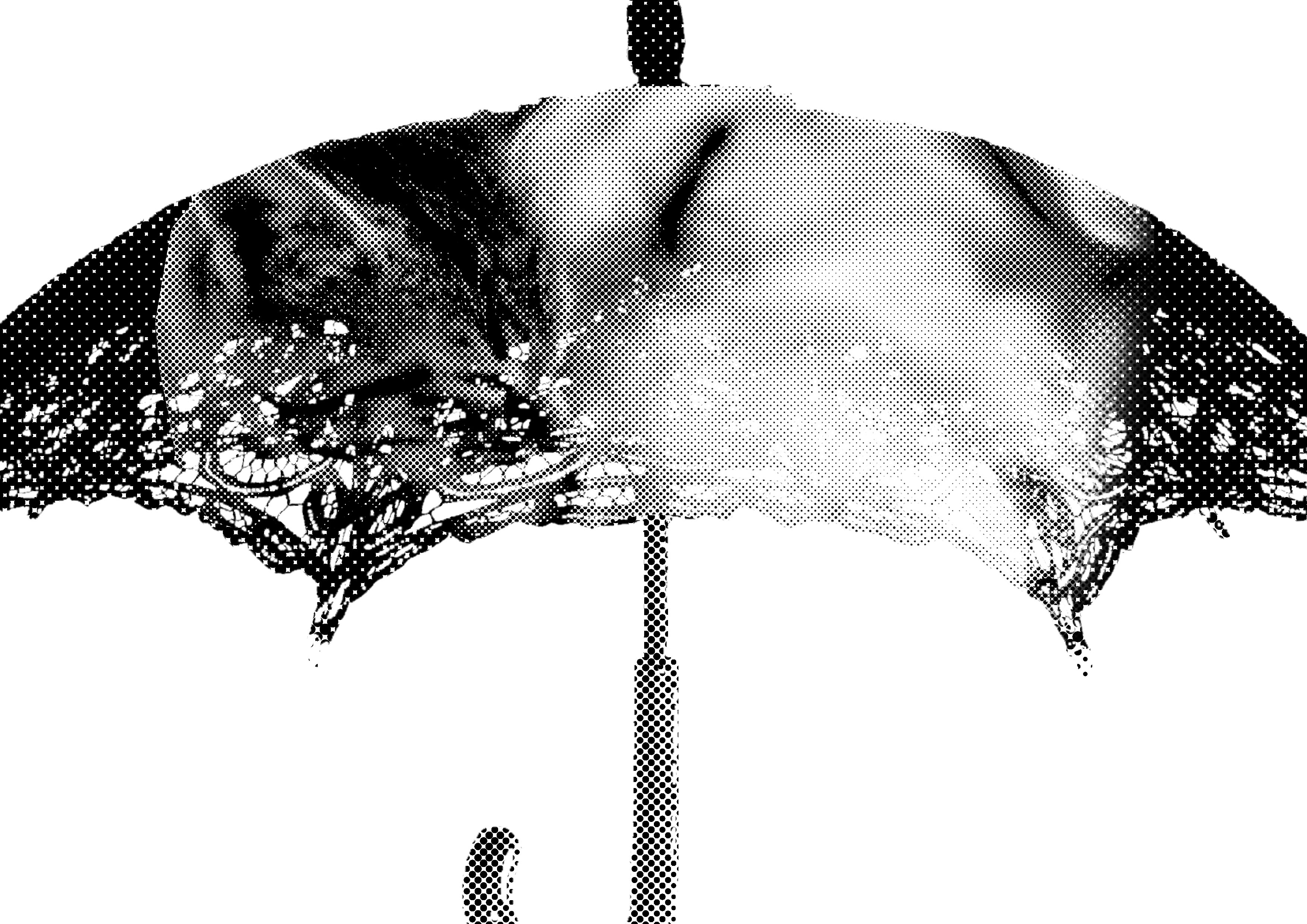
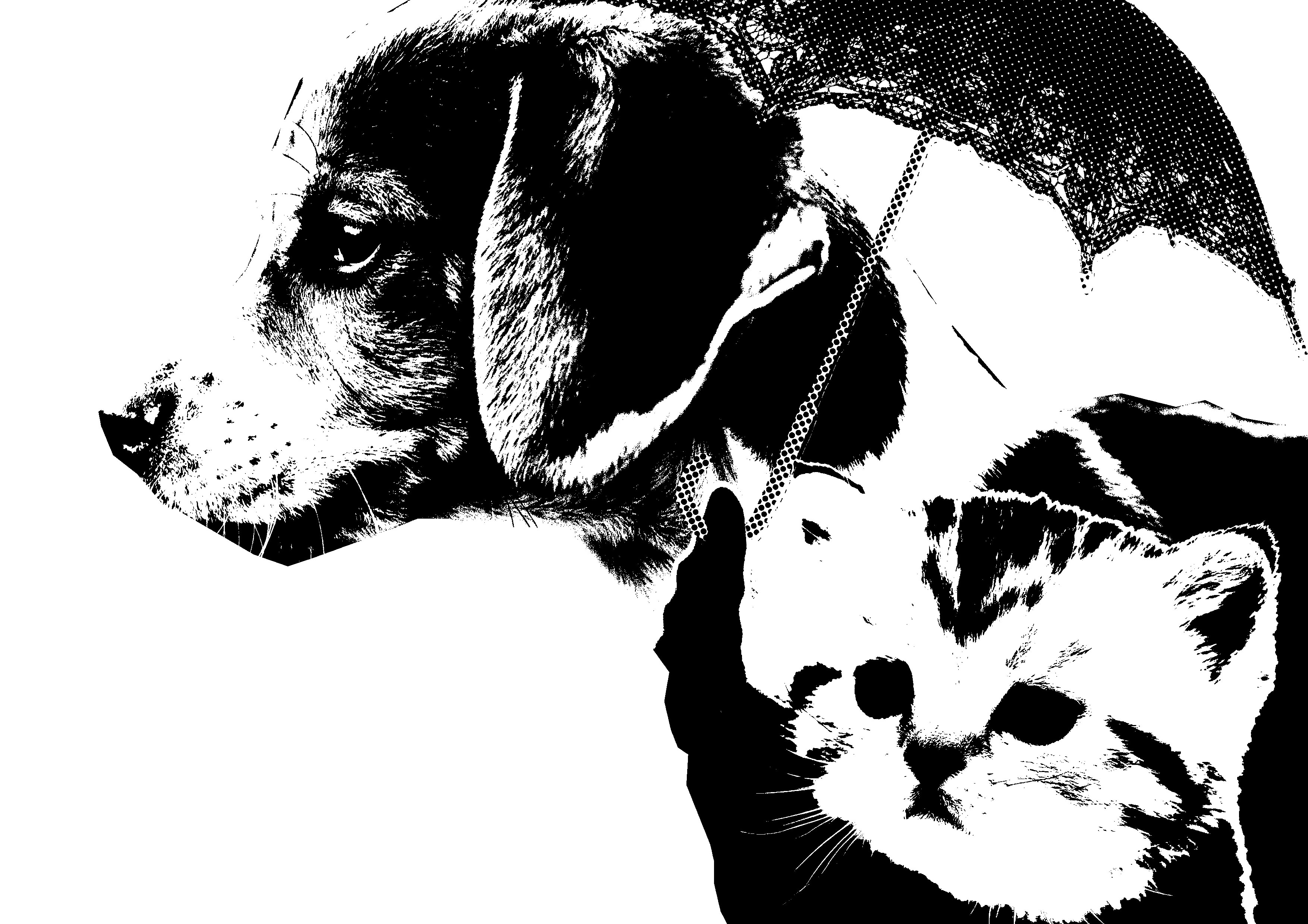
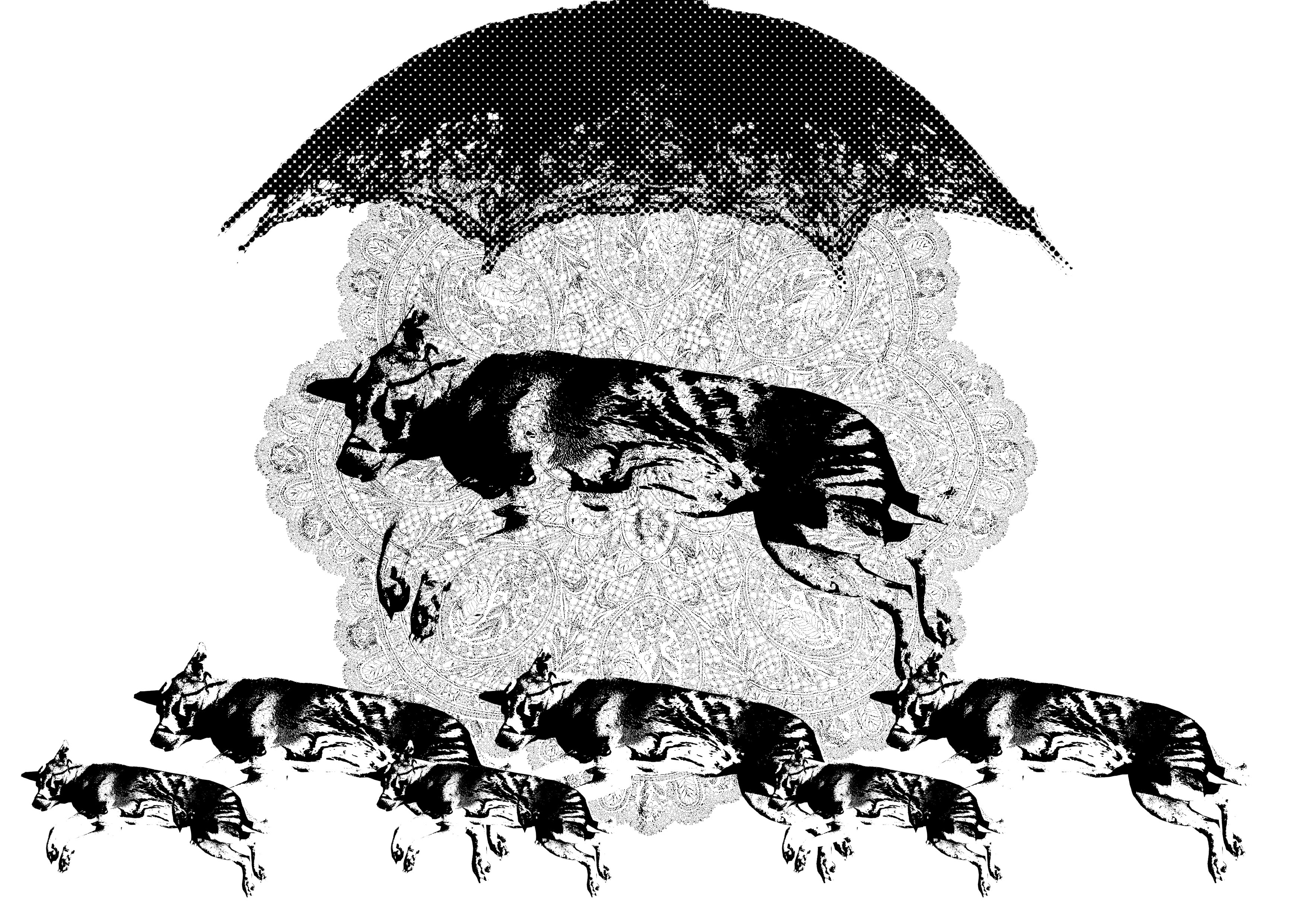
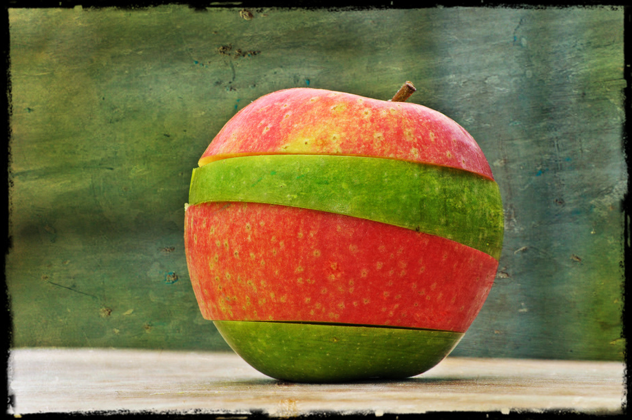
Here is the long waited composition!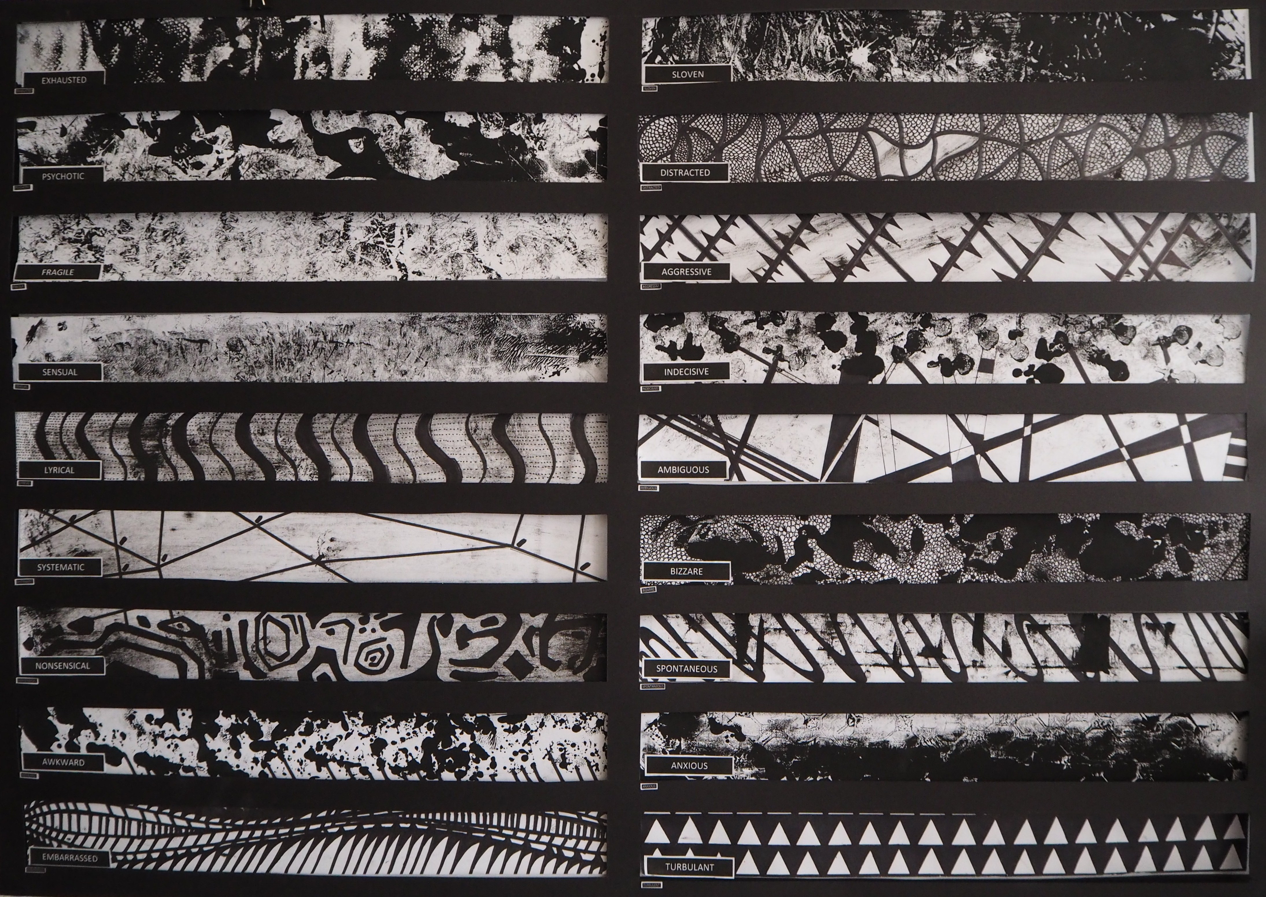
Concept: Tropical Fish
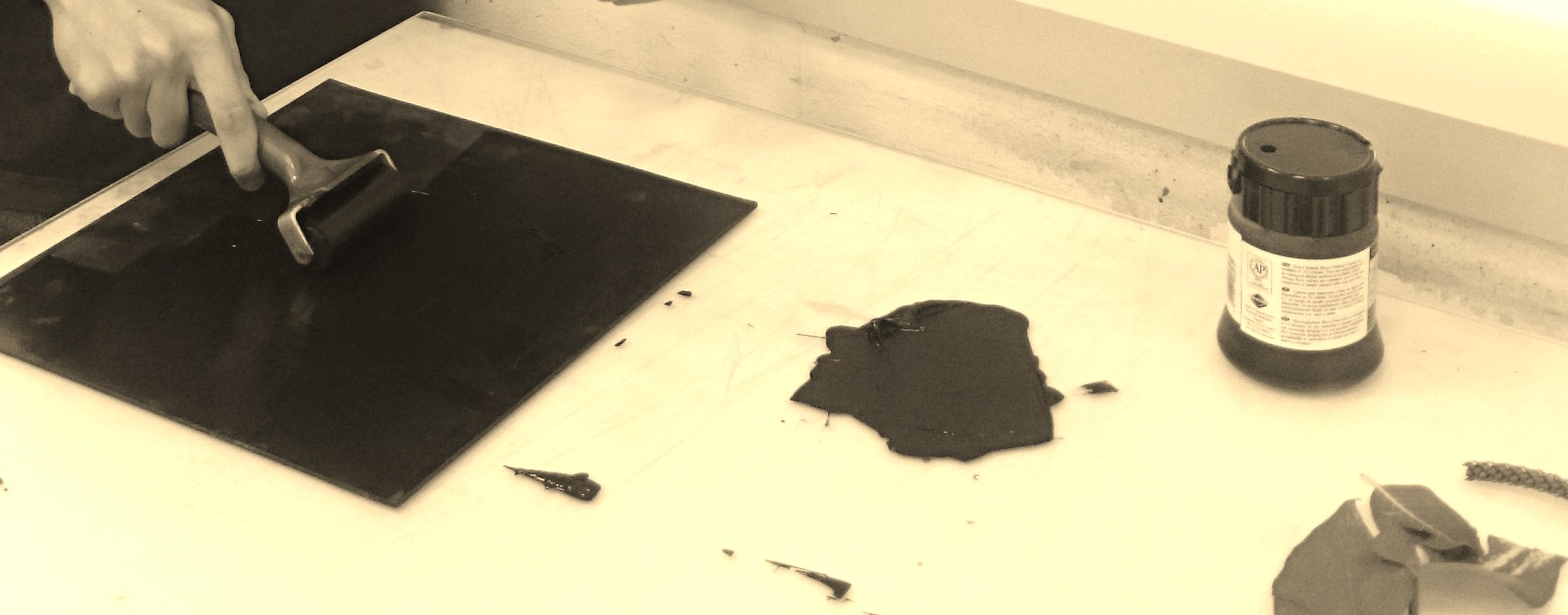
Techniques: Mono-Printing, Stamping, Drawing
Medium Used: Dead Fish, Fish Bones, Plastic Bag, Concrete Block, Bubble Wrap, Pen Knife, Black Pen & Marker
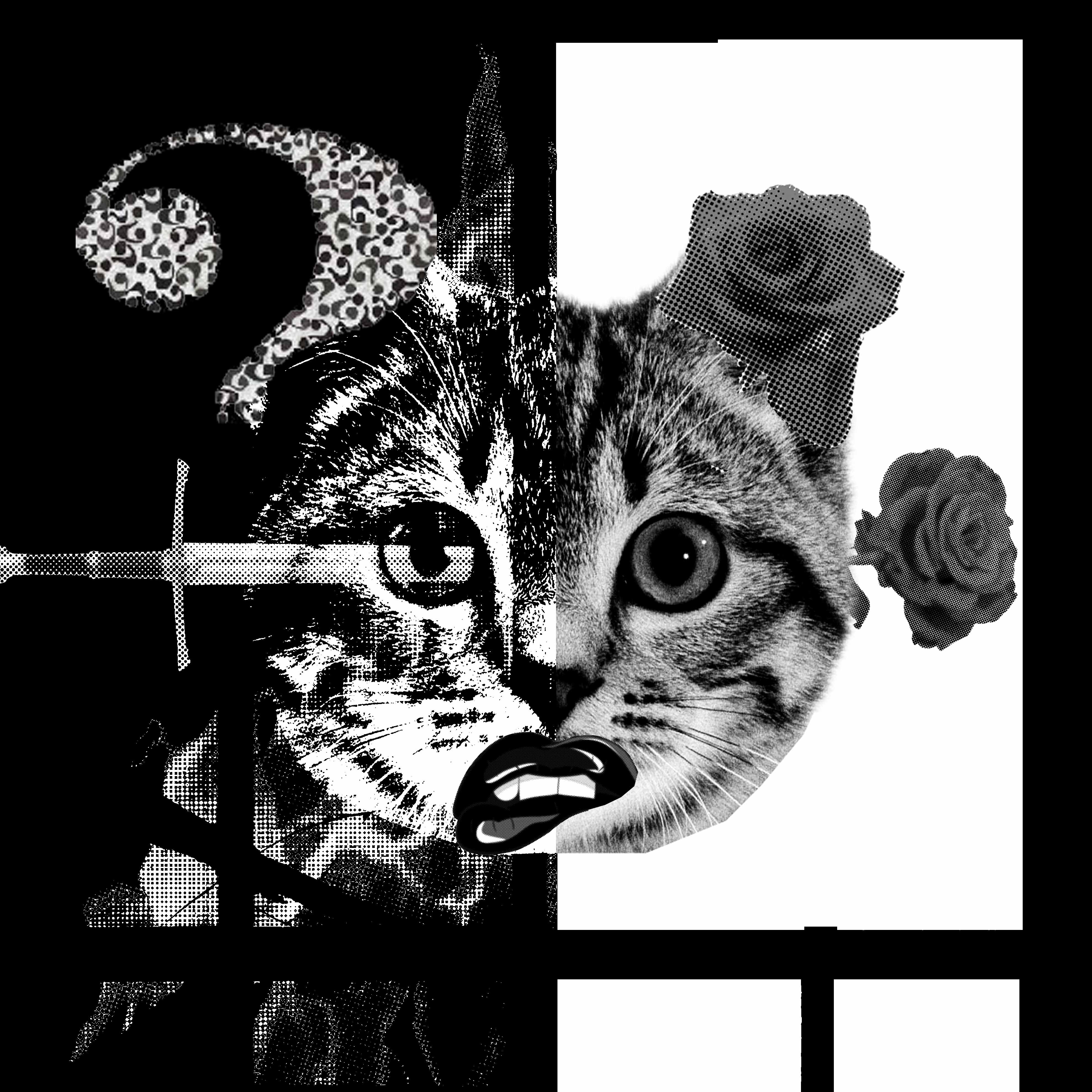
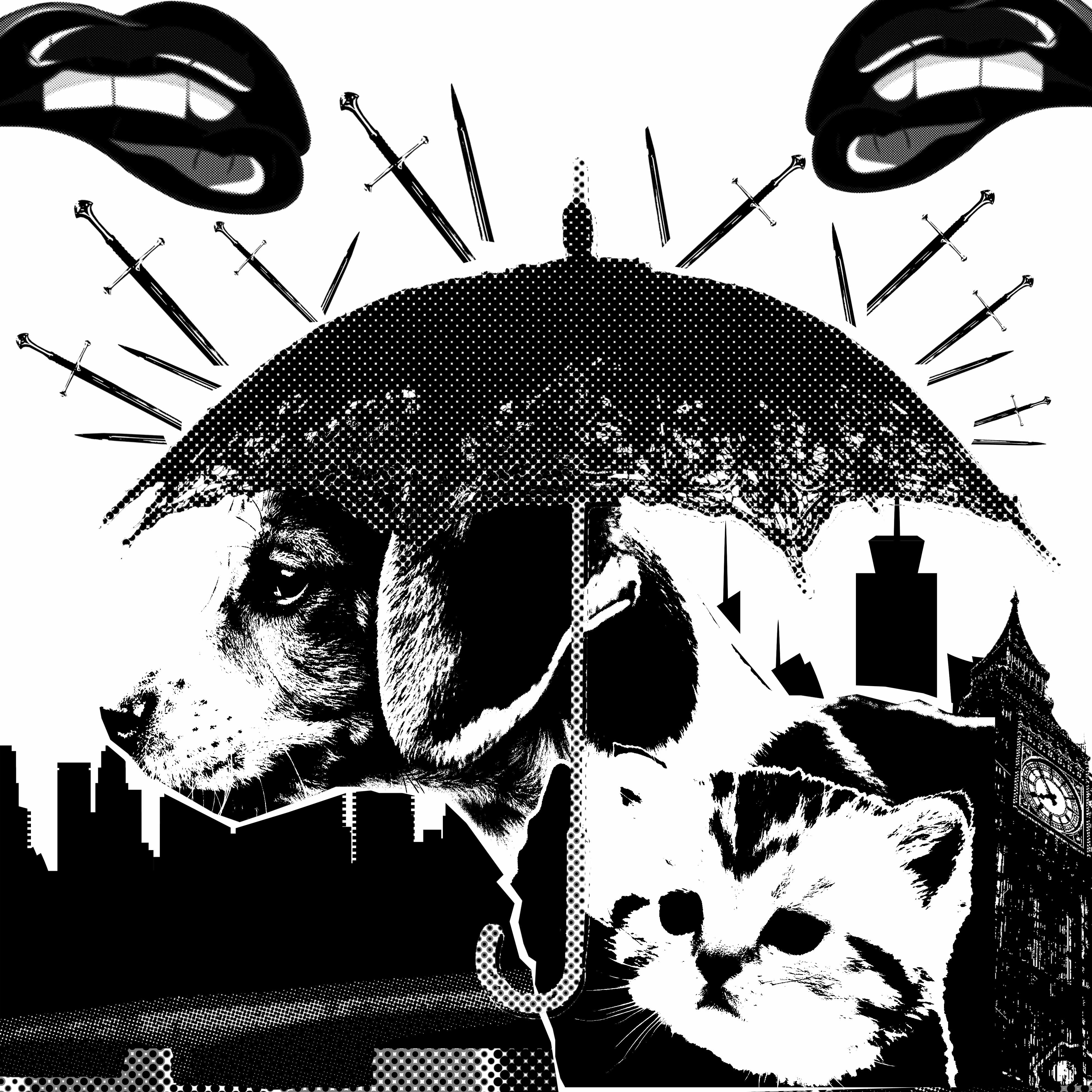
[18 Lines] [18 Emotions] [9 Nice (Left)] [9 Nasty (Right)]
Nice: Exhausted, Psychotic, Fragile, Sensual, Lyrical, Systematic, Nonsensical, Awkward, Embarrassed.
Nasty: Sloven, Distracted, Aggressive, Indecisive, Ambiguous, Bizarre, Spontaneous, Anxious, Turbulent.
Line-By-Line Explanation (Nice)
Exhausted (Guppy) Medium used: Kitchen paper
Technique: Mono-printing
Explanation: Done with mono-printing, the ‘dots’ on the kitchen paper represent the ‘Ovaries’ of the guppies. The guppies are able to store sperm in their ovaries which can fertilize up to 8 months which is exhausting for the females. In the expression design above, the ‘Ovaries’ are seen fertilized over a timeframe of 8 months (Left to right) with fertilization (Black dots) and the white being vice versa.
Psychotic (Gold Fish)
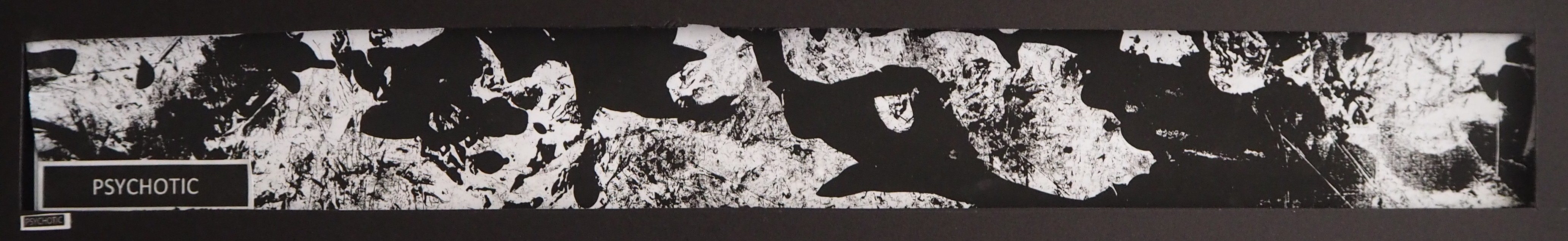
Medium used: Bubble wrap and Pen knife
Technique: Mono-printing
Explanation: Done with mono-printing, the bubble wrap were cut into smaller pieces which was later laid out properly to tell a story. Goldfish suffocate easily if given limited amount of space, it is also not recommended to mix Goldfish with other tropical fishes in the same aquarium tank. In the expression design above, the ‘Goldfish’ can be seen upside down grasping for air on the surface along with random fishes at the side. A bubble wrap was used in this situation to represent air being unlimited for survival.
Fragile (Gold Fish)
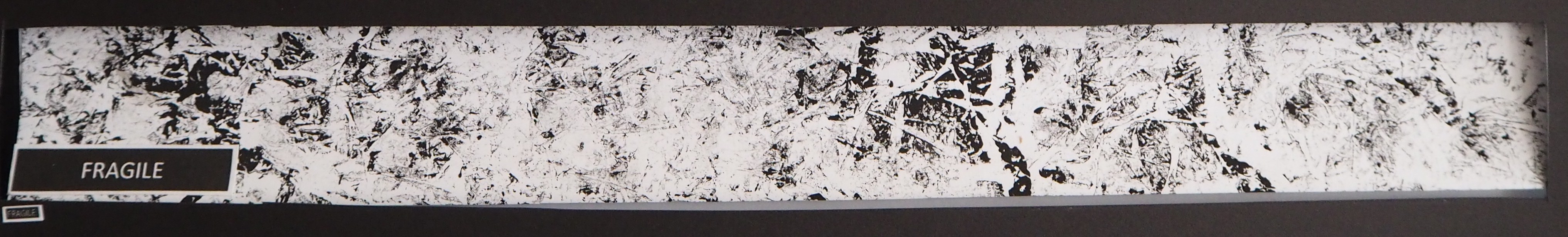
Medium used: Plastic bag
Technique: Mono-printing
Explanation: Done with mono-printing, the plastic bag was used to illustrate the how fragile a Goldfish is. As the feeling of a Goldfish is similar to a plastic bag filled with cold water, touching the Goldfish with bare hands will damage its thin protective layer thus endangering their health. In the design expression above, I made use of the plastic bag to create the texture that illustrate fragility and being vulnerable.
Sensual (Butterfly Fish)
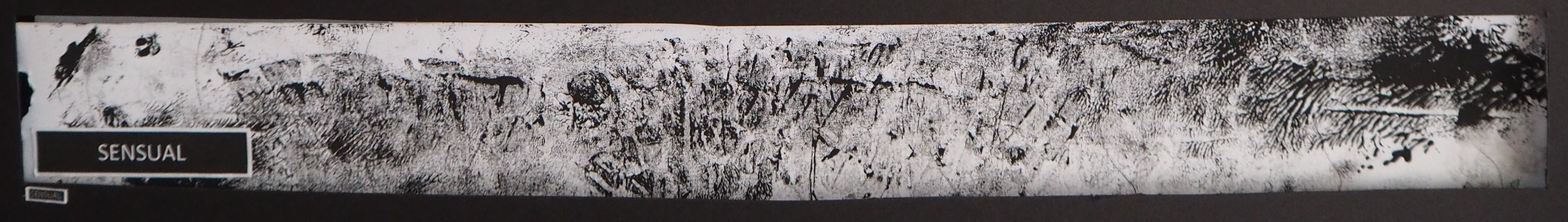
Medium used: Butterfly fish
Technique: Stamping
Explanation: Unlike other tropical fish, Butterfly fish are known for their appealing and striking skin patterns which beautify the oceanic livings. They are also refer to as deep lover, that is, once in love always in love. In the design expression above, I was inspired by Yves Klein body art which I made use of the body of a dead butterfly fish to create the sensual skin prints on the surface.
Lyrical (Butterfly Fish)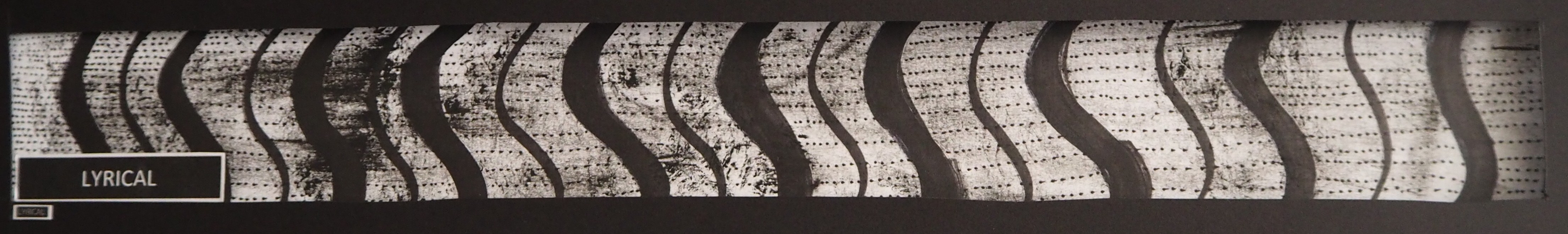
Medium used: Black pen and marker
Technique: Drawing
Explanation: In the ocean, Butterfly Fish travel in a fashion manner. They travel in small school and in a ‘Staff’ formation like the music notes on the horizontal lines. In the design expression above, I made use of the Butterfly fish personality and apply it in my drawing. The process is done by reproducing the distinct pattern of the Butterfly fish and draw them with the same distance apart. The patterns are accompanied by small dots to create the movement of the Butterfly fish (Like the music notes).
Systematic (Upside-Down Catfish)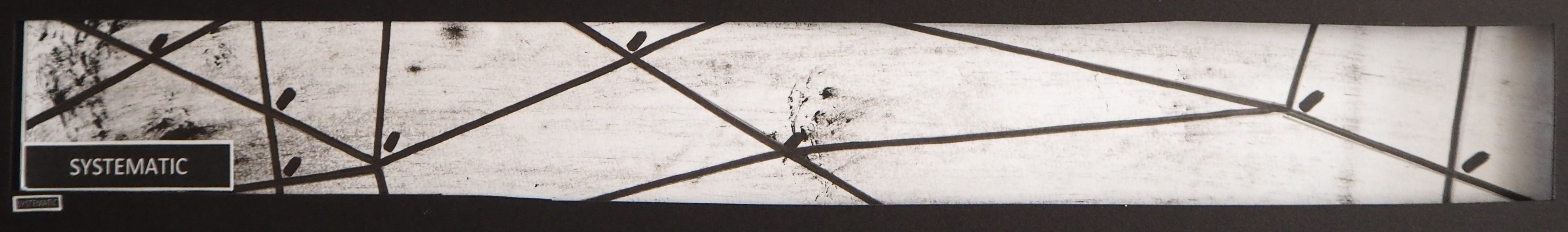
Medium used: Black pen and marker
Technique: Drawing
Explanation: I did a research and made an observation of the movement of the Upside-Down Catfish in the aquarium tank. The Upside-Down Catfish clean and eat the algae in the tank automatically. I have also noticed the fixed movement on the Upside-Down Catfish around the aquarium tank. In the design expression above, I relate the Upside-Down Catfish with the Mass Rapid Transport (MRT) as both share slight similarity. The Upside-Down Catfish move systematically like the train moving from one location to another without missing any stops in between. The Upside-Down Catfish will stop to eat the algae just like the train stopping at stations for the passengers.
Nonsensical (Upside-Down Catfish)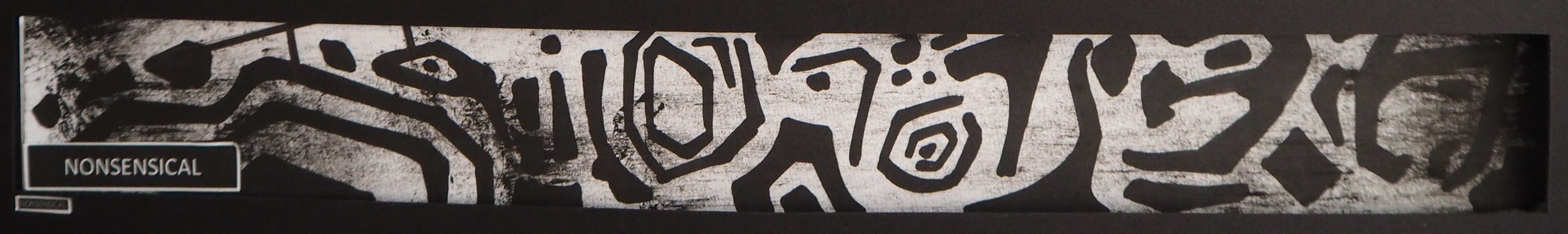
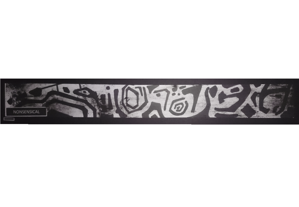
Medium used: Back pen and marker
Technique: Stamping, Drawing
Explanation: The term ‘Upside-Down’ was given to this Catfish because they swim upside-down most of their time. In the design expression above, I relate to how human see thing if what we are looking is the other way around. In the drawing, the word “H-E-L-L-O” was design in a way that at first glance viewers might take it for the skin pattern of the Upside-Down Catfish. Hence, creating a visual perception.
Awkward (Purple Fire fish)
Medium used: Cinder block
Technique: Stamping, Monoprinting
Explanation: Purple Fire Fish are shy in nature. There is no way to determine external differences until we see the internal. In the design expression above, the drawing was made on a surface of a cinder block. This is to represent the ‘hiding area’ (usually stone and rock) of the Purple Fire Fish once feeling awkward or met with another species of fish.
Embarrassed (Purple Fire Fish)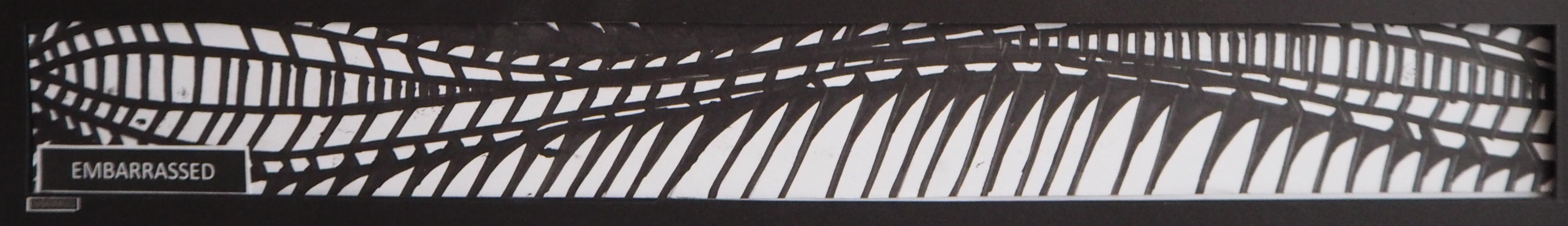
Medium used: Black pen and marker
Technique: Drawing
Explanation: Besides being shy and awkward to new surroundings, the purple fire fish are embarrassed to expose itself to others. It is not recommended to mix Purple Fire Fish with other species of fishes because they will go hiding and probably die of hunger. In the design expression above, I relate ‘Send shivers down the spine’ and the behaviour of the Purple Fire Fish into the drawing. The drawing was based on the movement and the fins of the Purple Fire Fish when it get embarrassed and goes into hiding.
Line-By-Line Explanation (Nasty)
Sloven (Guppy)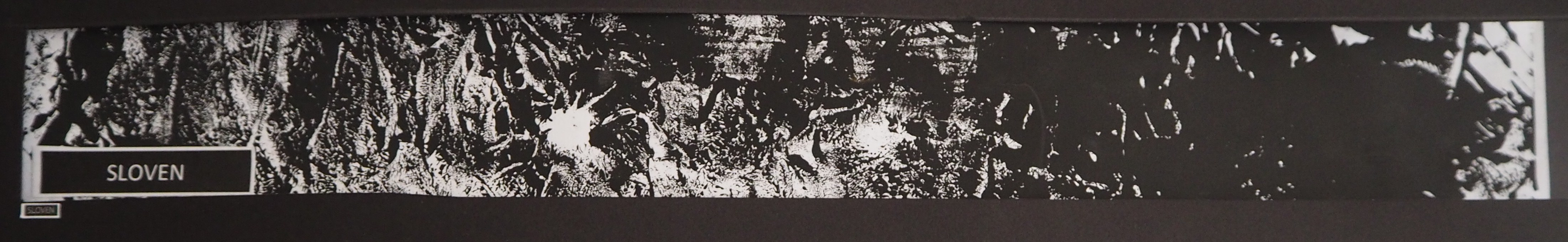
Medium used: Dead guppy, Fish Bone
Technique: Stamping, Monoprinting
Explanation: Guppy are sloven creatures. There is a high tendency for the adult guppy to take their young as food accidently when they go hungry. In the design expression above, I made use of the medium to tell a story of a young guppy being eaten by an adult guppy leaving only the bones at the end.
Distracted (Red Tail Shark)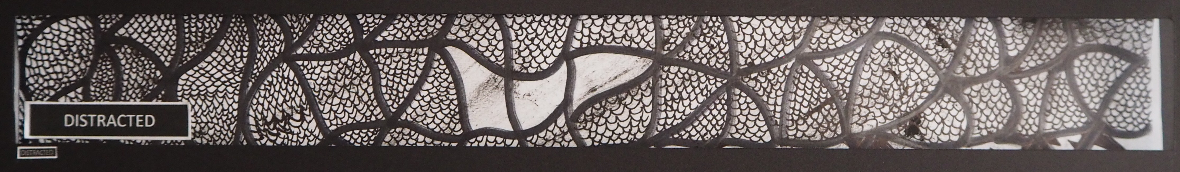
Medium used: Black pen and marker
Technique: Drawing
Explanation: Red Tail Shark are easily distracted by other tropical fishes if their territory are being occupied. In the design expression above, I made a focus point (the black spaces) to represent the other tropical fish (eye-sore) while the ones in black are the Red Tail Shark. The message that I would like to convey is that once the other tropical fishes crossed the boundary or distracted the Red Tail Shark, they will end up being hunt down.
Aggressive (Red Tail Shark)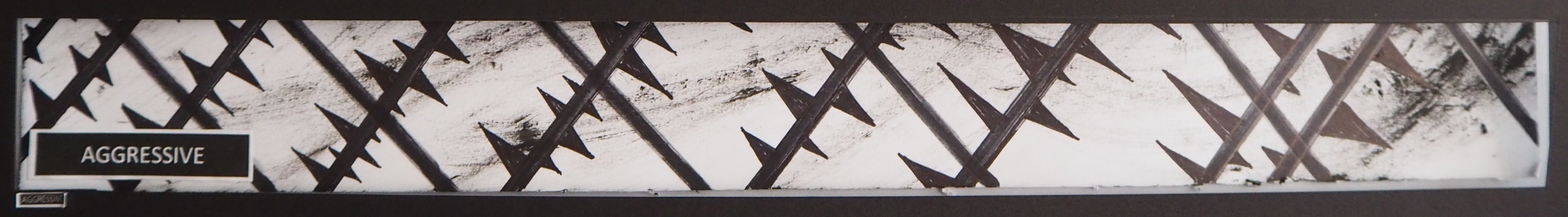
Medium used: Black pen and marker
Technique: Drawing
Explanation: Known for being aggressive, the Red Tail Shark is a aggressive chaser against tank mates. When one Red Tail Shark becomes dominant, it will chase and harass the other shark from being freed and resting. In the design expression above, the drawing shows pointed edges that is hardly enough for any escape plan. As every available route of escape are dangerous, there is no way of escape even if the other Red Tail Shark wish to.
Indecisive (Parrot Fish)
Medium used: Male and Female Symbol Stencil
Technique: Monoprinting
Explanation: Parrot fish are a type of indecisive fish that changes gender throughout their lives. In the design expression above, I cut out stencils of male and female logo from cardboards and printed them onto the surface. In the drawing, both logos can be seen combined as this is to demonstrate the transformation phrase form male to female or vice versa.
Ambiguous (Parrot Fish)
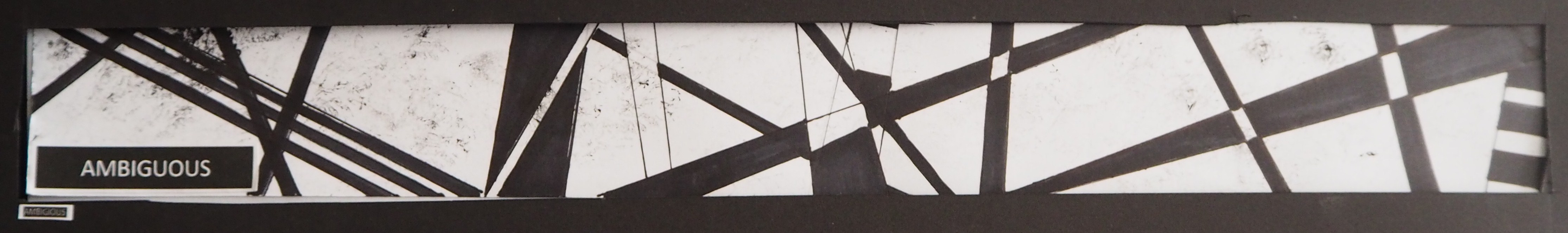
Medium used: Black pen and marker
Technique: Drawing
Explanation: Besides the ability to change gender, the parrot fish is able to transform into a cocoon at night to protect themselves from prey. In the design expression above, I was inspired by the art of Sol Levitt. I made use of the contrast and composition to create a visual perception that confused the viewers just like the parrot fish confusing the prey.
Bizzare (Electric Eel)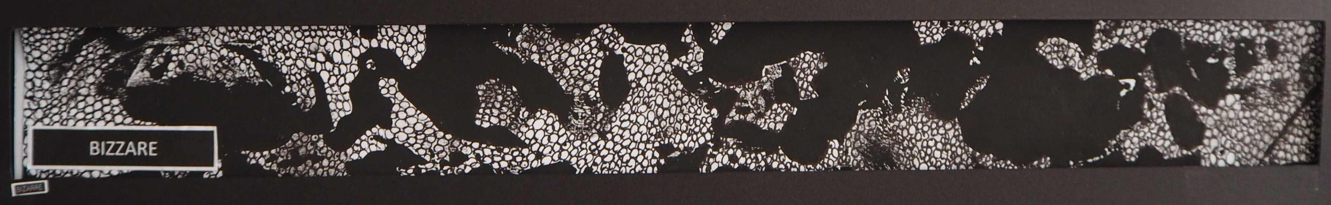
Medium used: Eel Skin, Black pen
Technique: Monoprinting, Drawing
Explanation: Electric Eel are special type of fish that is able to produce electricity. This is because they develop a special organ that enable them to do so. In the design expression above, I took the skin of a eel to show the uniqueness of the fish compared to the rest.
Spontaneous (Electric Eel)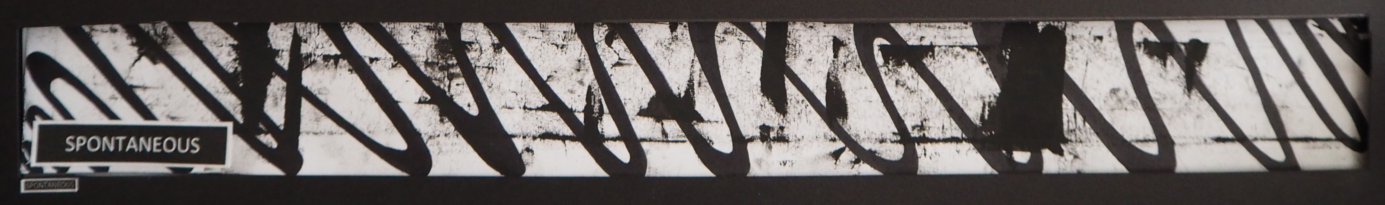
Medium used: Black pen and marker
Technique: Drawing
Explanation: Electric Eel are mostly blind, they don’t know what they are releasing the electricity at. In the design expression above, I demonstrate the energy of electric eel they have with the pulse-like wave. As the Electric Eel can shock electricity for up to an hour without getting tired, the pulse-like wave are consistent in terms of length and width.
Anxious (Pufferfish)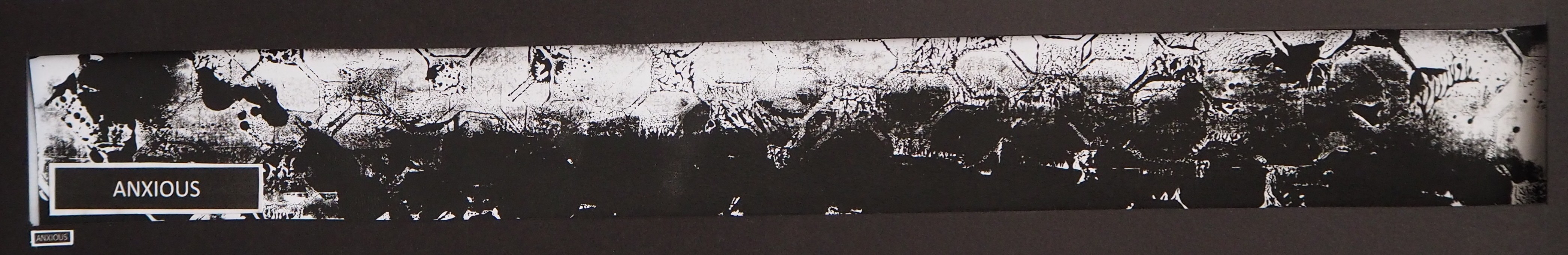
Medium used: Plastic grass synthetic lawn mat for aquarium fish tank, Fish bone
Technique: Stamping
Explanation: Pufferfish get a little anxious when they sense a difference in wave movement. Once they sense danger, they will turn themselves into a ball of spike. In the design expression above, I made use of the plastic frame that holds the plastic grass and stamp onto the surface. This is to demonstrate the ‘boxes of question’ that when one gets worried or anxious. The fish bone was used to represent the spikes of the Pufferfish when it gets pumped up.
Turbulent (Pufferfish)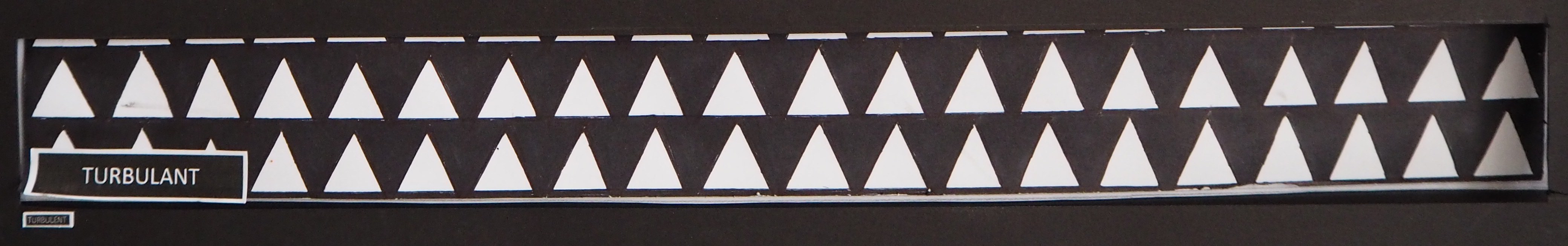
Medium used: Black pen and marker
Technique: Drawing
Explanation: Pufferfish swim in a very slow and clumsy style. In the design expression above, I relate the spikes of the Pufferfish with the arches found in the ancient Roman architecture. The spikes demonstrates the unstableness in behaviour of the Pufferfish while comparing to the strong foundation of Roman architecture.
 Notice something?
Did you noticed that 2 emotions belong to 1 fish?
Hence, when the front border is taken away, you should be able to see the transition of 2 panels.
Reflections
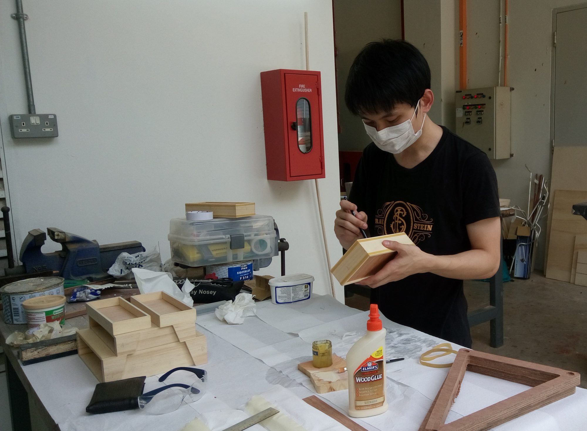
Throughout the project, I have gain valuable experience and skills.
I am grateful for this opportunity to make use of the workshop and applying monoprinting techniques into my concepts.
The project allow me to think critically and create out-of-the-box idea.
I believe that we were given just the right amount of time for submission, hence time well plan. (:
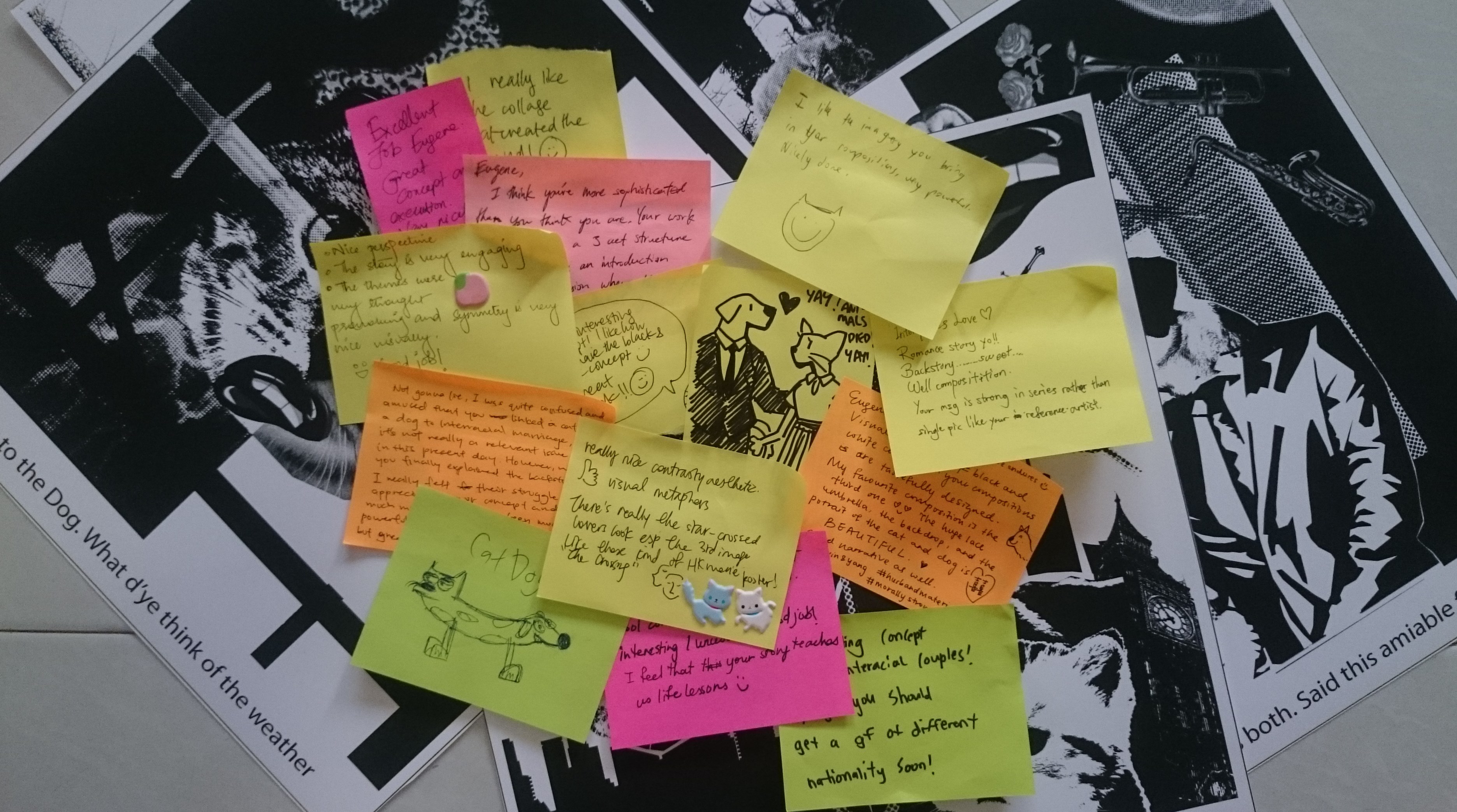
To end off, I hope you enjoyed my research process (Check out the other posts if you have not!!), please give your thought and comments below for suggestions! ^^
Once again, Thank you for checking out!
😀


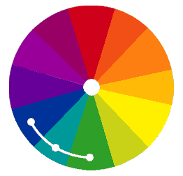

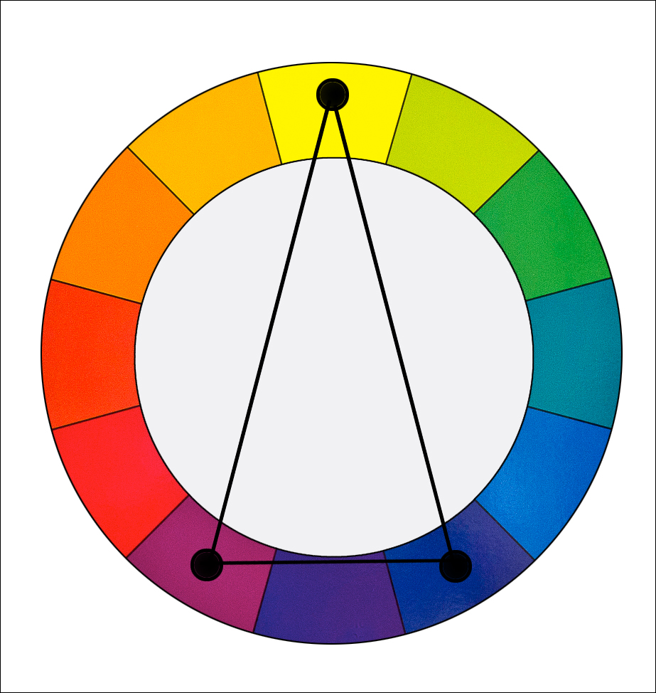
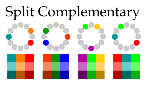

 As the name suggest, it is the selection of colours found in a triangular shape on the colour wheel.
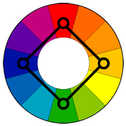 Positioned in a square format, the colours used are found on any four corners on the colour wheel.