Foundation 2D Project 3 – Zine – Final

14 April 2016 Final Week


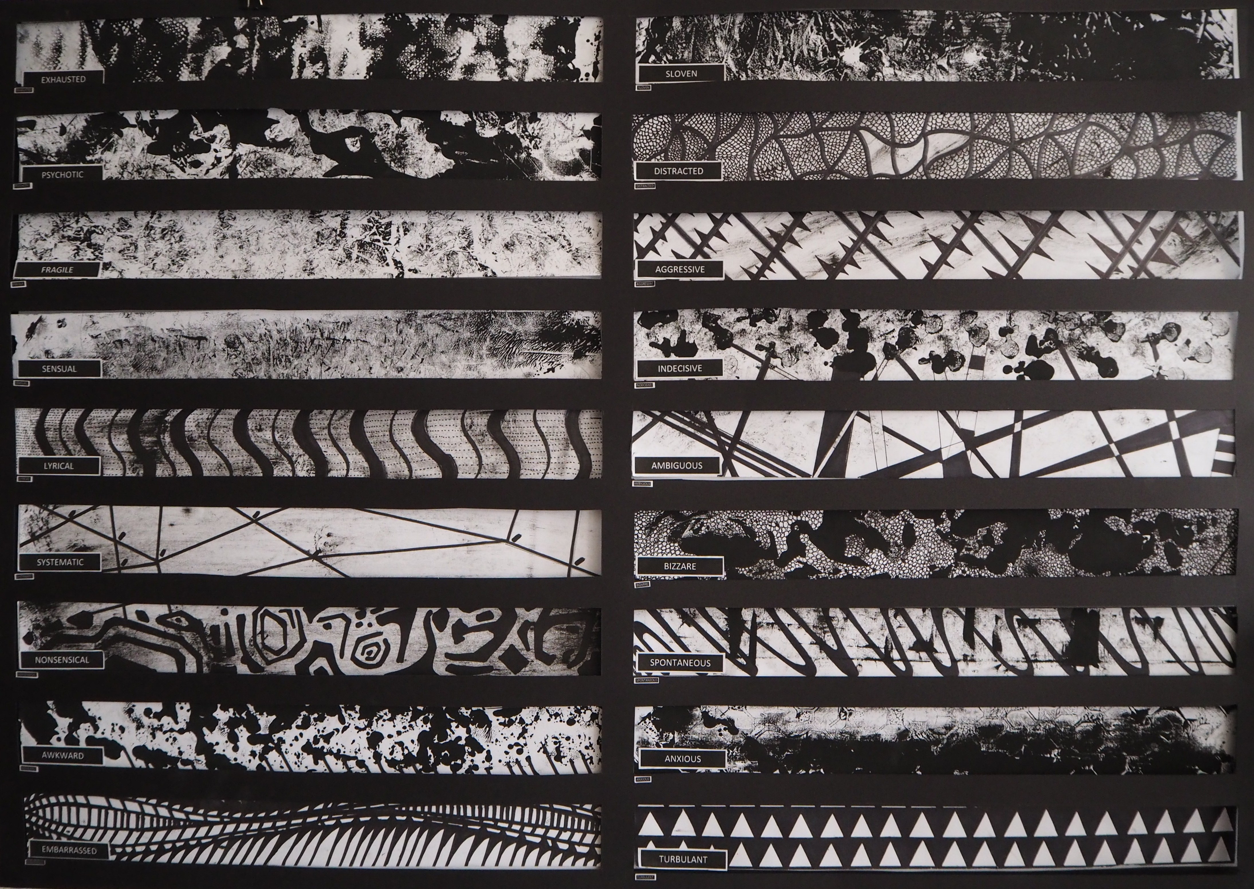
Expansion of Foundation2DII Project 1 – Lines

Given that we are coming to an end of the Foundation term, I thought it will be a good idea to conclude the semester with the first project I received for the module.
In terms of explorations, I’m looking forward to expand the concept in a more interactive way to achieve the ‘wow’ effect in my ‘Typography’ project.
So, the big question is… How do I make it interactive?
EUGENE
Foundation 2D I Project 1 – Lines

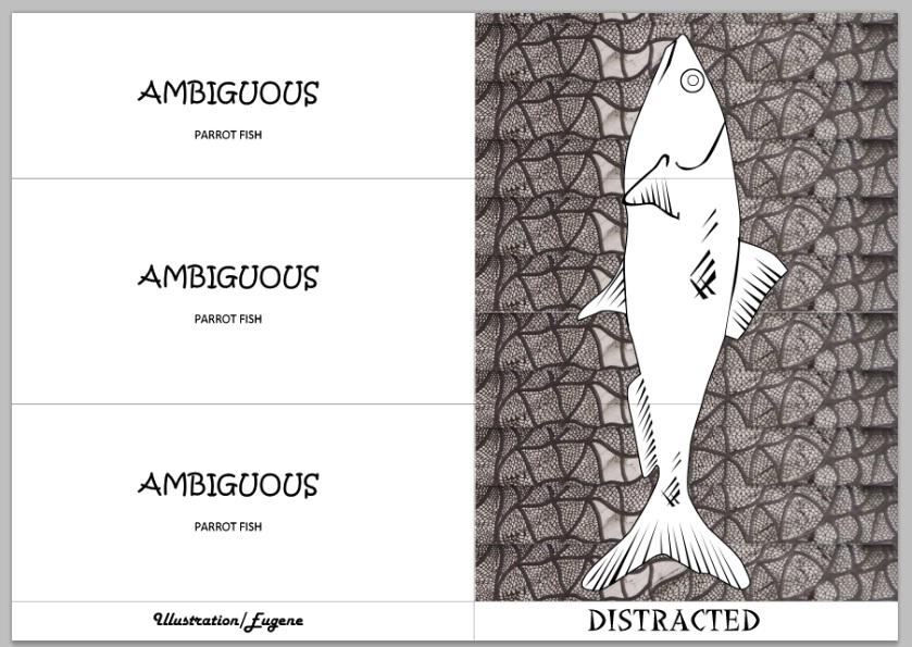
The above composition is the 18 individual lines expression were composed with the ‘Fish’ theme that connects each pieces together.
To understand more of this composition, click this link below:
https://oss.adm.ntu.edu.sg/elee017/2015/10/04/foundation-2d-project-1-final-composition-nice-nasty/


Summary

These video summaries the content of this OSS post.
Video #1 shows ‘Behind-the-scene’ whereas Video #2 shows ‘Work-In-Progress’
Enjoy!^^


Concept

I’ve decided to work on this project due to its potential to create an interaction with the audience. As Miss Joy mentioned; What is the selling point of a particular item/product? – I felt that the selling point depends on how eye-catching a product is.. with that, it will immediately create attention thus drawing audiences.

The term ‘Expression’ varies from different people. For example; Some people sees Apple as a Fruit, Some see it as a form of income, and some see Science (Gravitation Force) in it…
Apple is healthy, eat apple.
The list can go on and on.. But, you get the idea..
I find it explorable due to the fact that different people have different takes/interpretation of a particular subject, therefore, an potential in terms of interaction with the topic.

How do I make my artwork interacts with the audience?
– I find that, for this Zine project, I could make use of the ‘Where’s Wally’ or a ‘Puzzle’ style format that interacts with the audience.
– It can be done so by having to draw one Wally Fish in a aquarium of many other fish.
– It could be printed in a ‘No Staple – 8 page mini’ with the game behind.
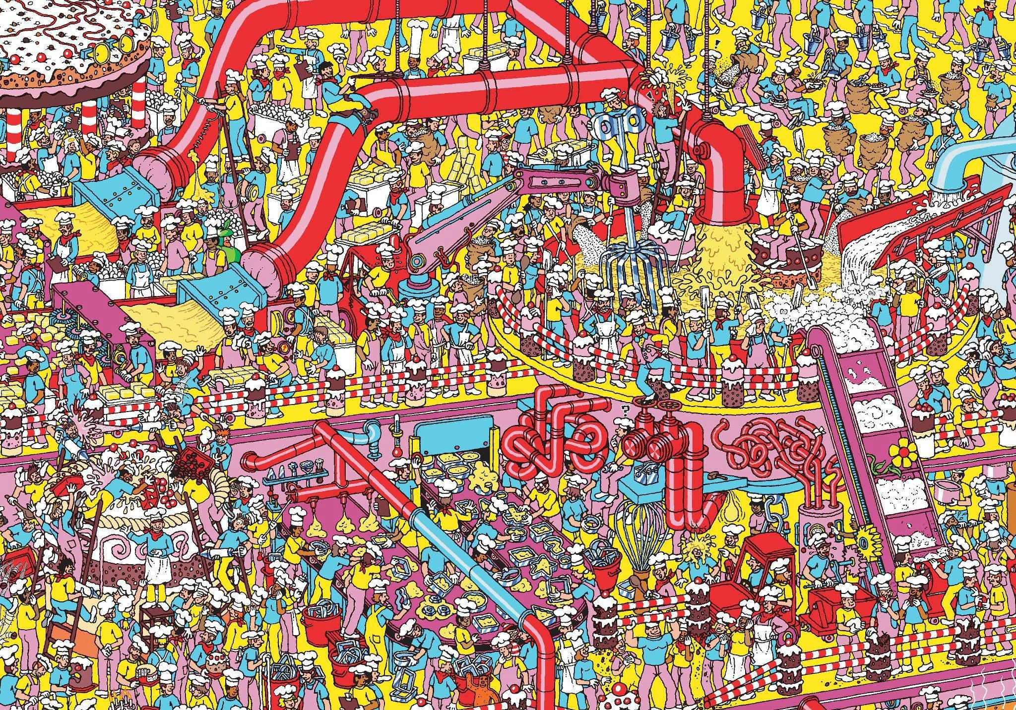
However, I find the theory of putting the game idea with the Line expression inappropriate.
It makes no sense to put these 2 different topics together because it does not relates to the initial concept – To create a sense of personal interpretation.

As a result, I went to do more research on possible Zine methods that I can make use of.


Research [Content]

As research went more intense, I discovered the need for more simplicity approaches.
I looked up into websites to understand how the front, typeface and style were used in relevant to the topic.
Most Zine comes with a simple cover page that somehow summaries its content. Most were literal and some were made with visual metaphors.
The example shown in class by Nestled Ellipsis is an example of using visual metaphors to communicate with her audience. It requires a certain understanding and knowledge of the subject manner in order to decipher the hidden message.

So, to conclude, there can be 2 methods of approach Zine; 1) Simple, Literal 2) Complex, Visual Metaphor.

I looked up for inspiration in various websites and below are the findings.

Clarity by Katie Ravenscraig
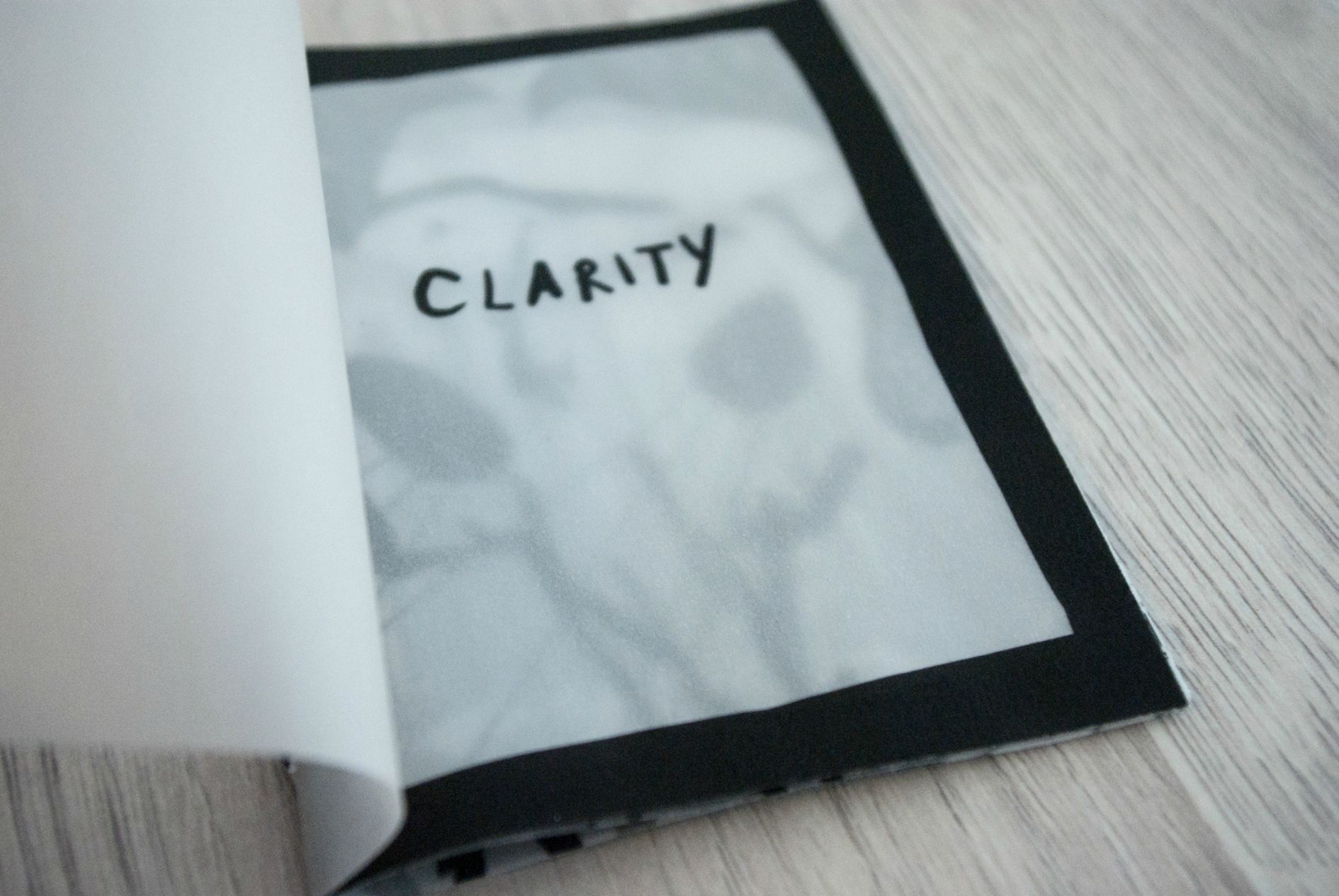

http://katieravenscraig.com/zines/

The use of simple yet communicable images made the Zine standout.
The use of Typeface makes relevant to it’s topic of discussion.
The use of colour scheme set the Dark Mood.

Cheap Art by Pat
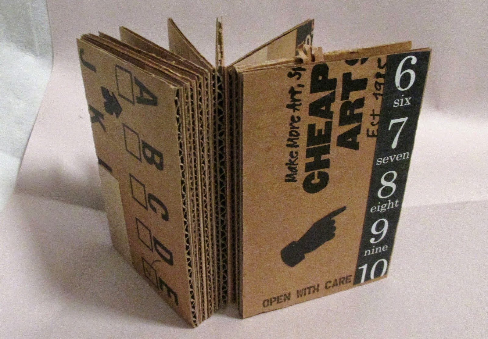
http://artkerfuffle.blogspot.sg/2014/06/cheap-art.html

Don’t do this if you are allergy to dirty cardboards, yes, dirty cardboards because it give you rashes. Unless you have non-sensitive skin.
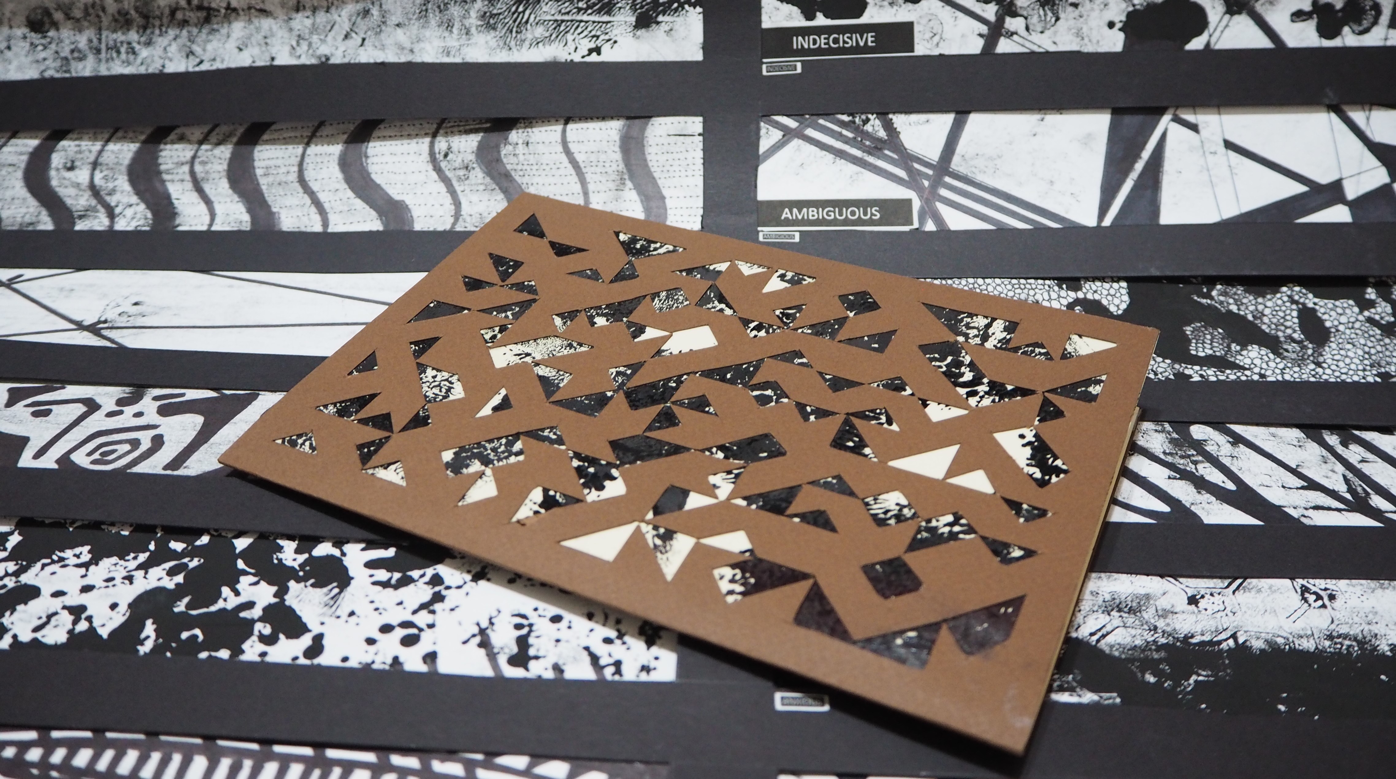
Anyway, this cardboard Zine doesn’t look as cheap as it seems. The artist made several craves out of the cardboard creating patterns which serves as a form a aesthetics.
There are various methods that were used to create the patterns such as; Batik-style dotting and pure-cutting.
When put together, the cardboard Zine looks cohesive and stands out as a whole.
However, due to readability, the use of wordings were kept to minimum.

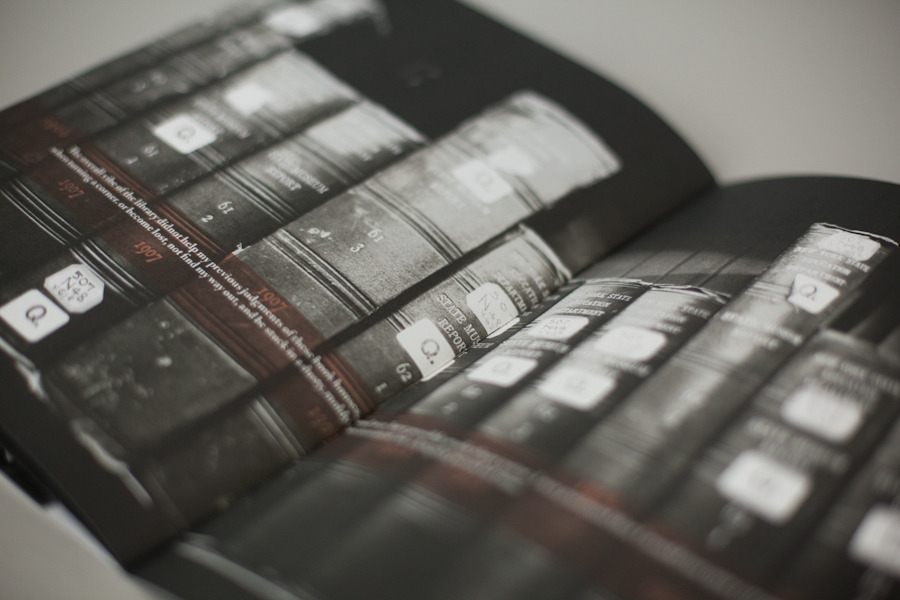
PEREC ZINE by Brad Meyer
http://www.madbreyer.com/perec-zine-1/

One of the coolest Zine yet!
The use of B&W colours set the Zine in a shady moody feel. Which ties back to the topic visually.
The use of wordings and images followed a certain guidelines such as one does not dominate each other.

Through my initial research on Zine, I gather more information and ideas that I can put into consideration for my Zine.
I hope to achieve the simplicity feel in my Zine and I am considering to put wordings as minimum as possible as most of the interaction part will be done visually.


Inspiration / Artist References

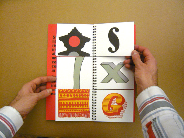
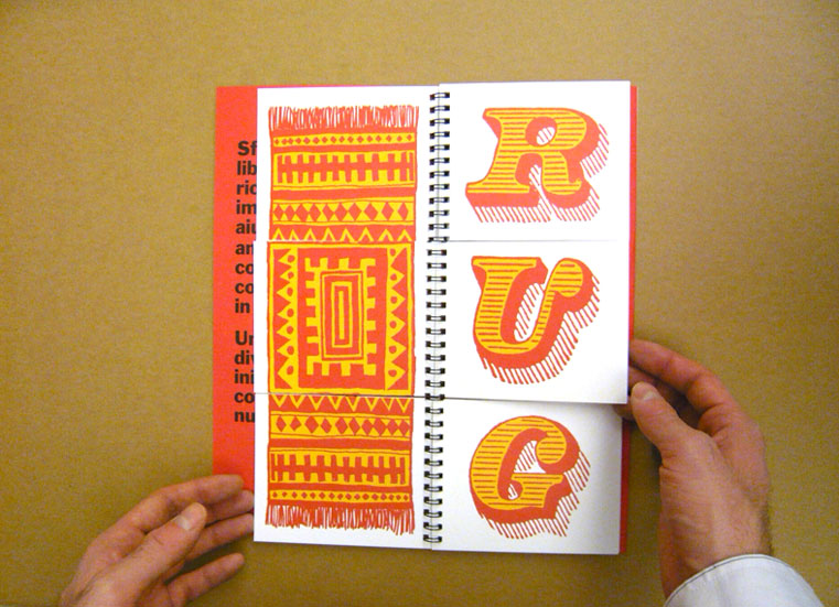
Besides the above mentioned, I continued my search on Zine methods that could introduce the idea of ‘personal interpretation.’ I came across this particular flip book (Image below) that allows the user to mix-and-match the wordings and images to create something new.

Bob Gill’s A to Z


With the flip book concept in mind, I went to look up to more of the other artists that had worked on the same idea.

Phonics Flip Book
http://kidsactivitiesblog.com/6412/word-families-flip-book?crlt_pid=camp.AjqF9sxN0Mzc

SchoolArts Magazine

http://www.schoolartsdigital.com/i/150528-aug-sep-2009

More Works can be found in this link: https://www.pinterest.com/search/pins/?0=flip%7Ctyped&1=book%7Ctyped&q=flip%20book&rs=typed

After checking out the various flip book, I realised that most serve as a education medium such as to identify simple words and or to identify the different parts of the human body. The idea of incorporating the flip book idea into my concept enhance the ability to interact and encourages different interpretations.


Execution [Content]

My intention, for my Zine, is to have a simple yet visual appealing design/layout.
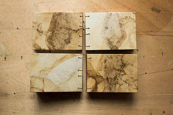
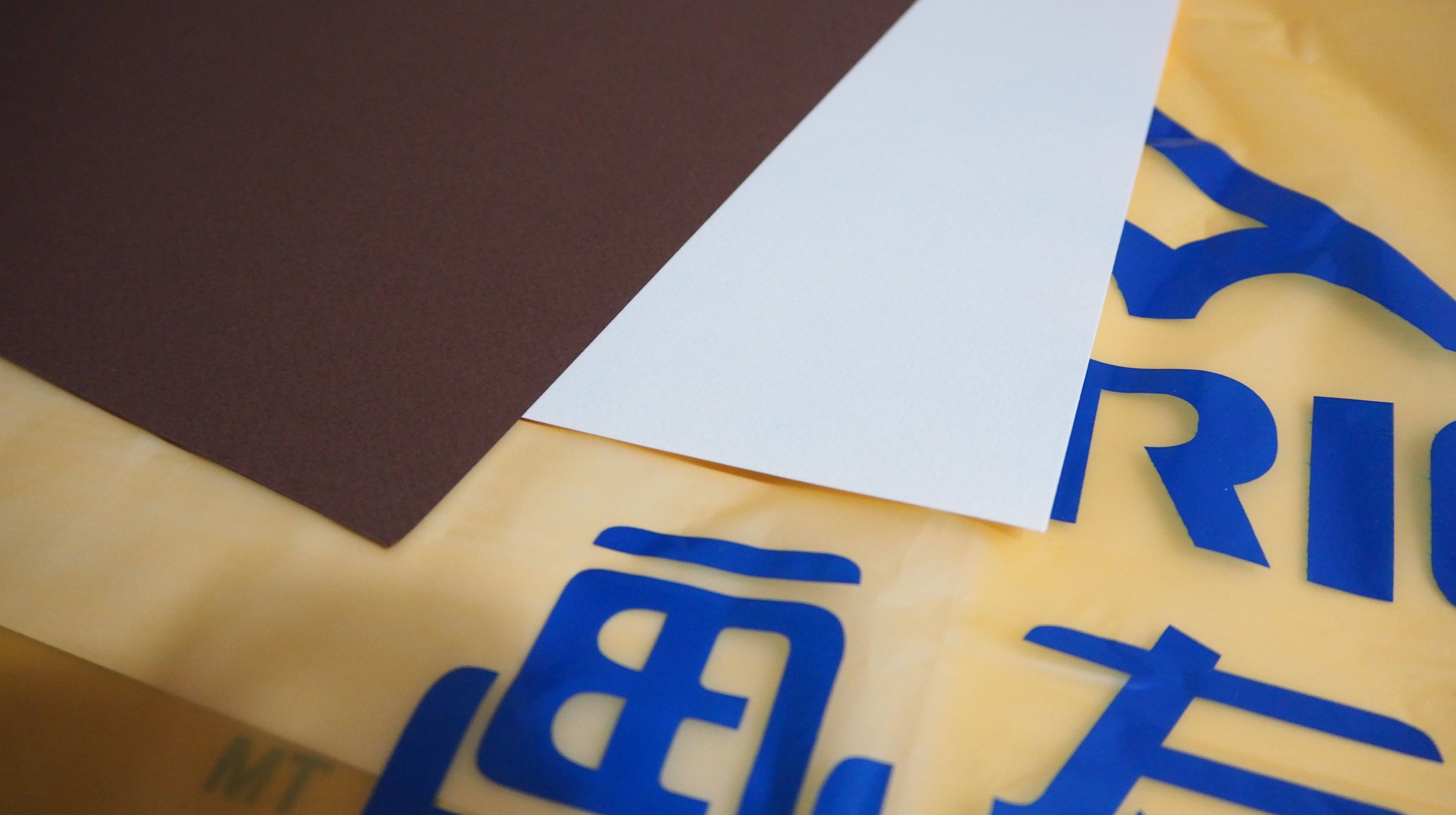
I am also inspired by Nestled Ellipsis to create a Zine based on our own interest, therefore, I brought a pair of contrasting brown Tiziano A3 sheet to build my Zine.
Yup! You got it right! It’s going to be Handmade!

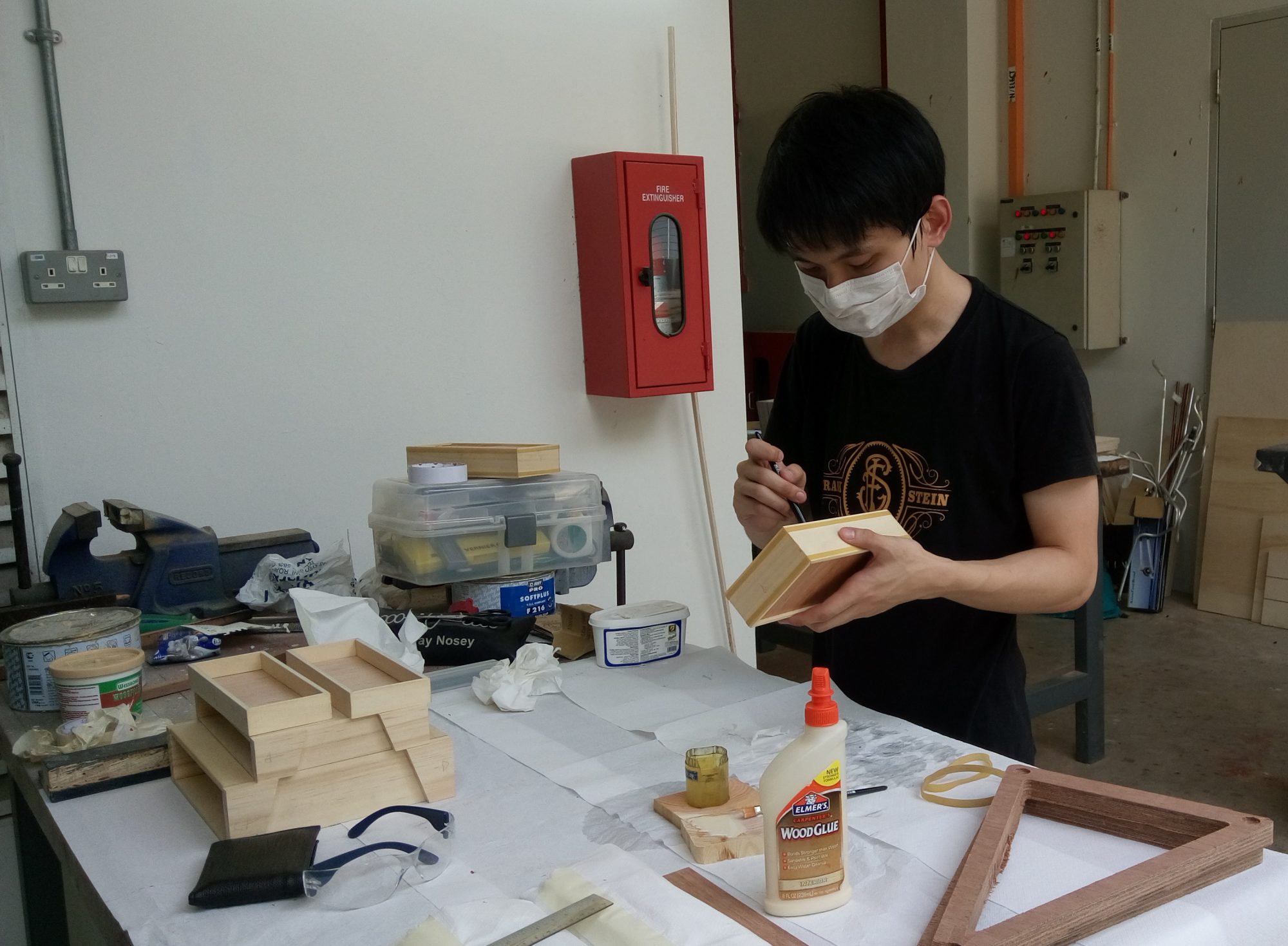
The idea of having to handmade my Zine not only reflects on the Major; Product Design but it serves as a learning journey as well. It is not often for me to have this chance of making a handmade Zine as most of the time I’m dealing with 3 Dimension products.
Hence, got this chance so why not? (:
As always, as the saying goes; “If you fail to plan, you plan to fail.”
Those are wise words that reminds us of the importance of a good planning, just like in the Army.
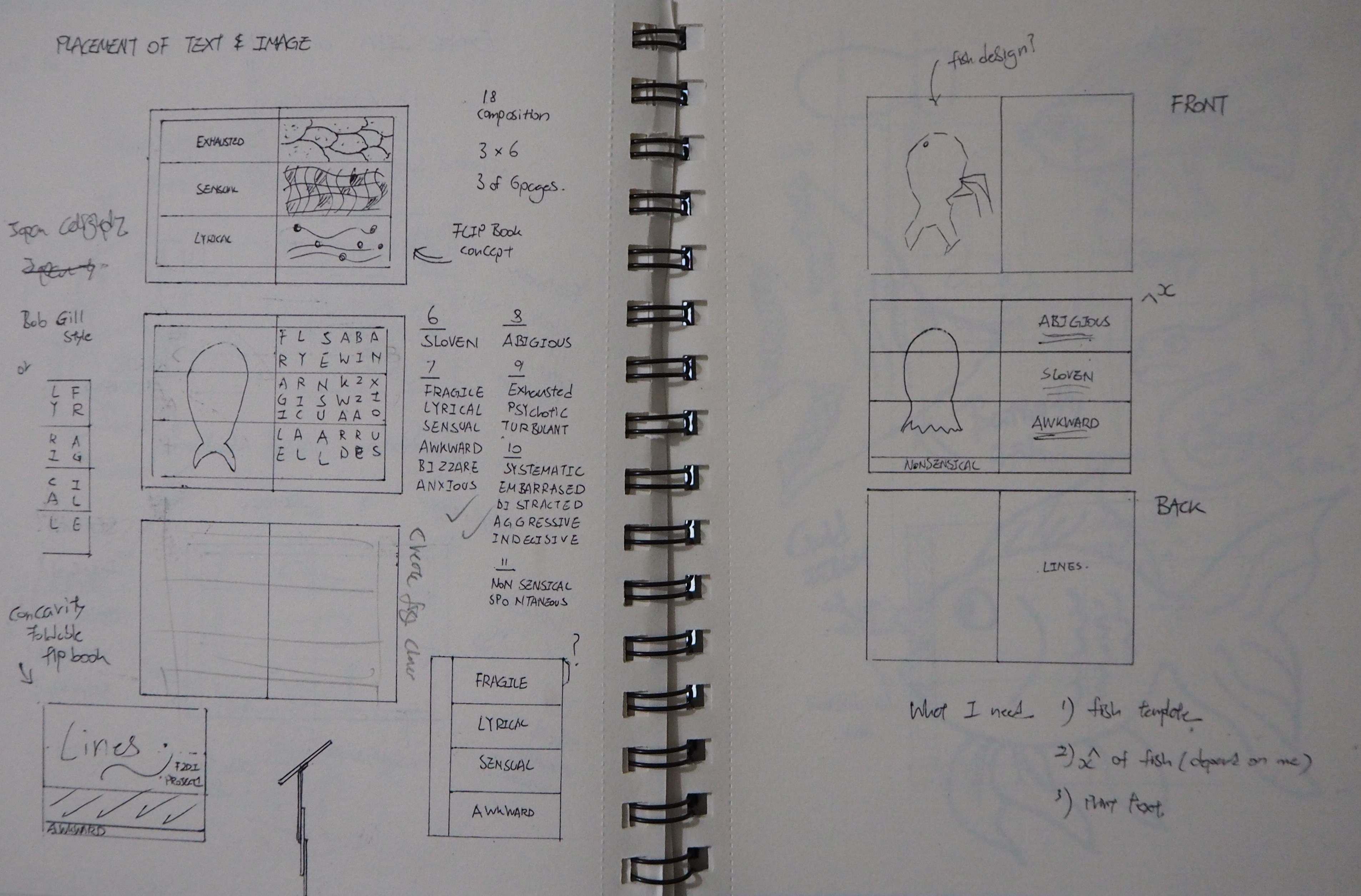
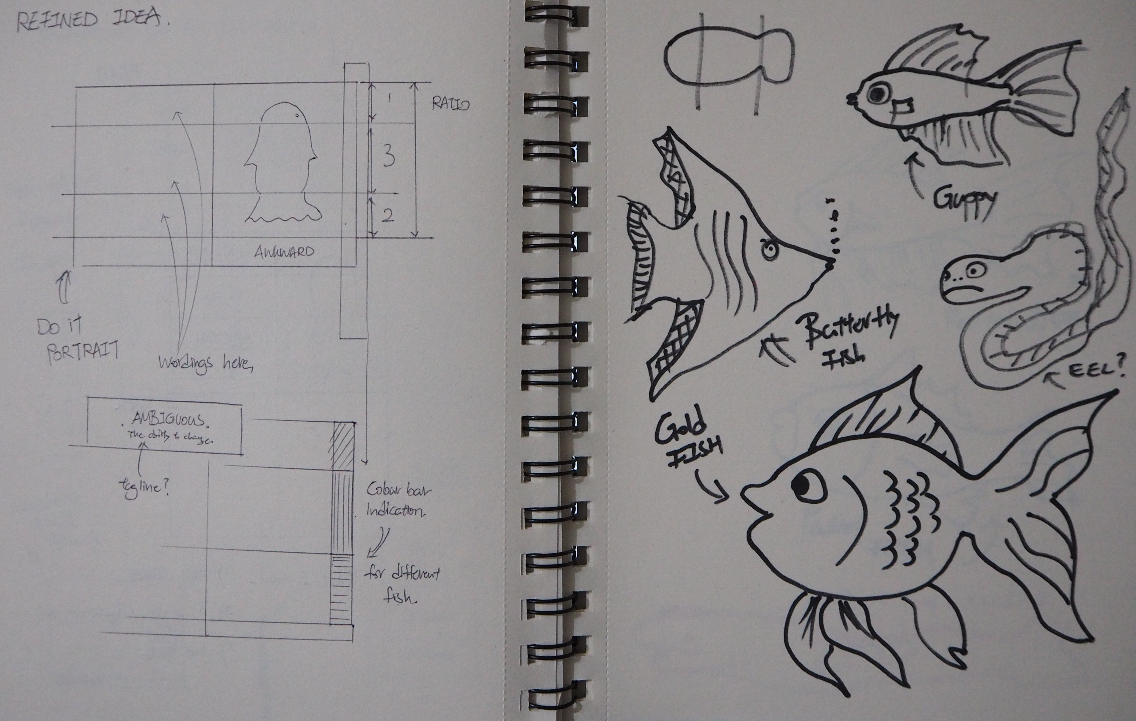
Before working on the actual material, I did some sketches and mock-up that would assist me in assembling my final Zine.
Below are some images of my initial sketches and mock-ups.

Sketches

Mock-Up #1 (A6)[Edited]
Initial idea made use of 3 panels that separates the fish into 3 different parts (Head, Body, Tail) with the text (on the left) arranged vertically.

Mock-Up #2 (A5)
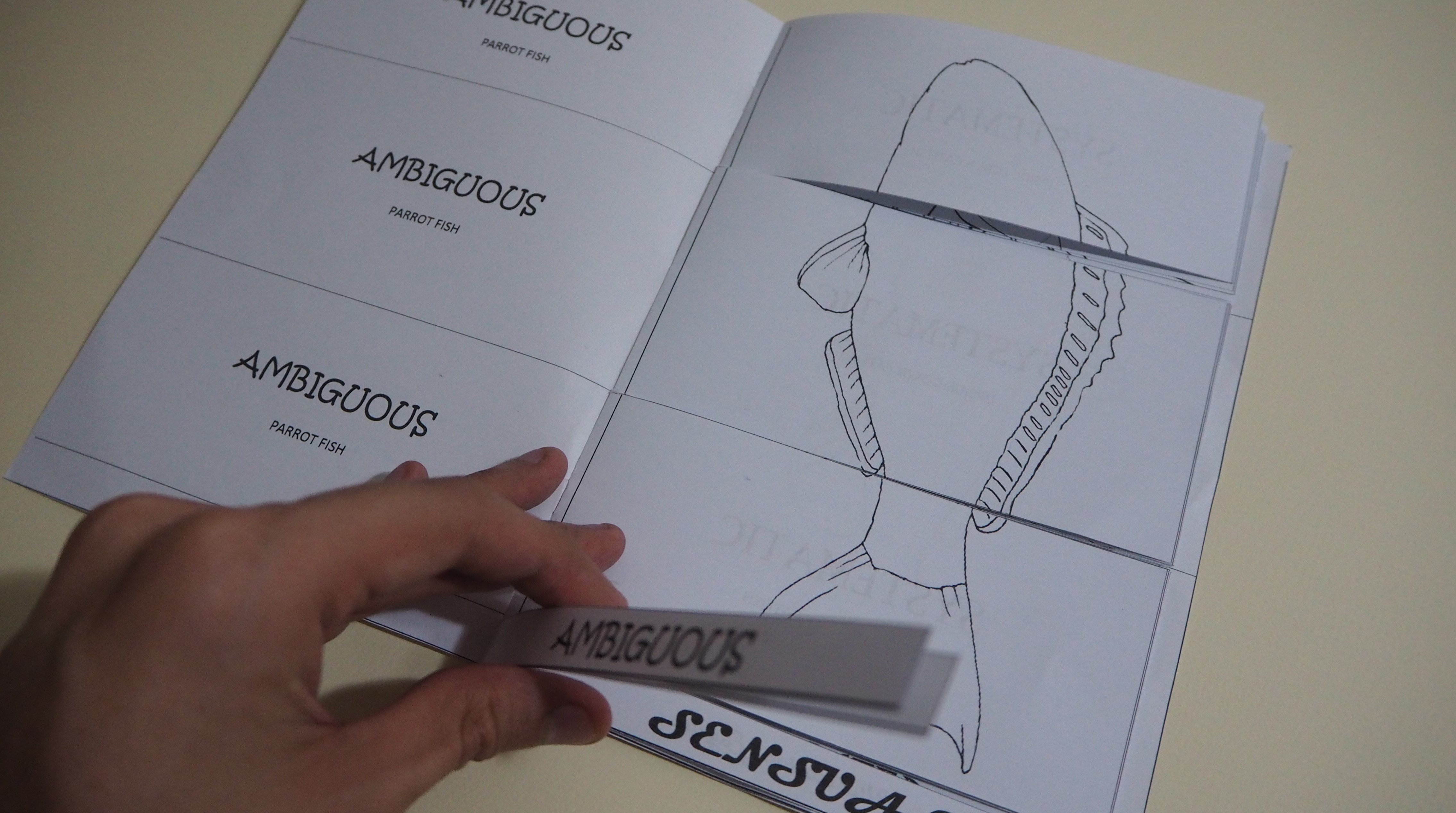
Printed in a double sided, careful manner.. This is the mock up of what the final Zine will look like.
With the mock-up in hand, I can visualize more and is able to make improvement on the mock up.
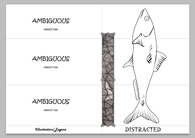
As such, I went to scan in my ‘Project 1 – Lines’ so that I am able to work on them digitally.
Q1
Q2
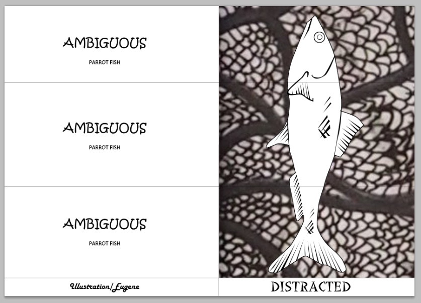
My initial execution is to have the ‘line’ expression blown to the size that it fill the entire background. However, the method caused the image to be quite blur and unclear.
As a result, there’s a need to make changes.

Q3
Horizontal Placement.
Q4
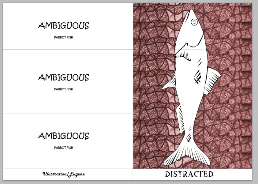
Duplicate the pattern vertically upwards.
Q5
Adding hues to the pattern.


Research [Cover Page]

What catch people attention in a book on a bookshelves?
– Probably it’s Author? For me, the cover page matter the most.
Sadly, I judge and buy books based on its cover page. (:

I look up to various websites for inspiration on cover page design and below are some findings.

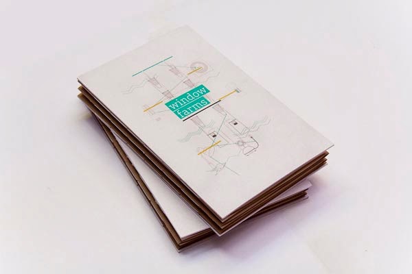
Window Farms: Information Design Book via Jiani Lu
https://www.behance.net/JianiLu

Personally, I find this cover page intriguing.. Probably it’s the product element that caught my eye.
The minimalist use of front and the use of highlight further enhance the readability of the text, in addition it somehow draws the viewers eyes towards the text.

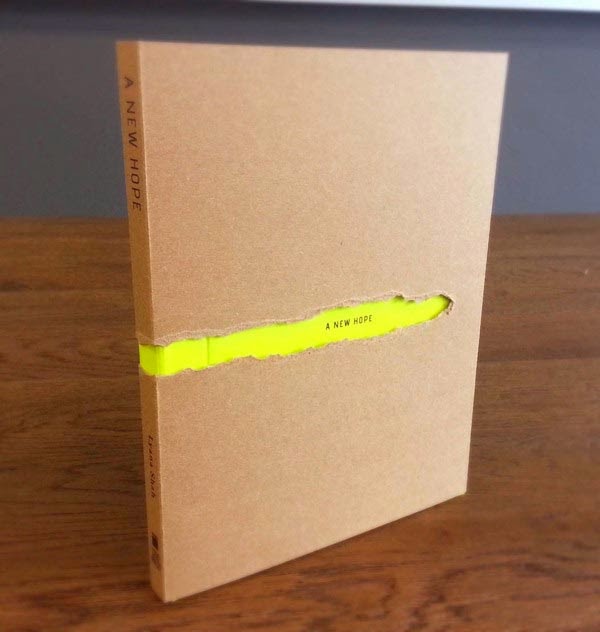
Book Cover Design via PY
http://www.behance.net/hpy

This is my personal favorite.
I dont think I need to explain much about this, the book cover already explained so.
Just curious, if the artist could use a black cover instead?
I think it will convey a stronger meaning?

The images below are a list of ‘No text’ Cover page
For more: Visit http://jayce-o.blogspot.com/2013/09/100-fresh-book-cover-design-ideas.html

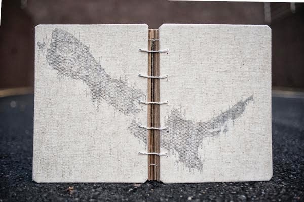
Binding Up The Bay via jonathan tan
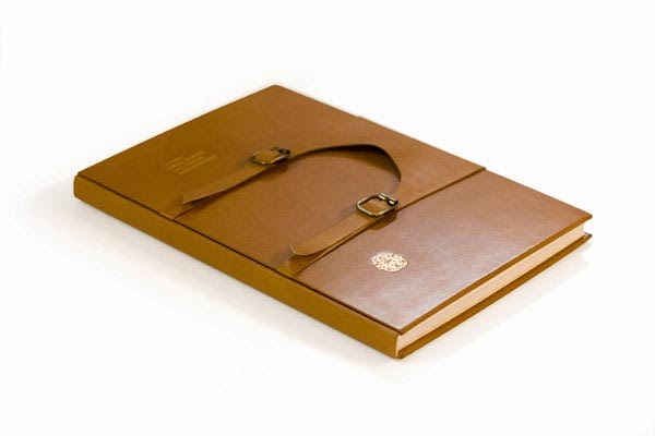
Candela Brand Book via RoAndCo Studio
Coffe sketchbook via Ductus

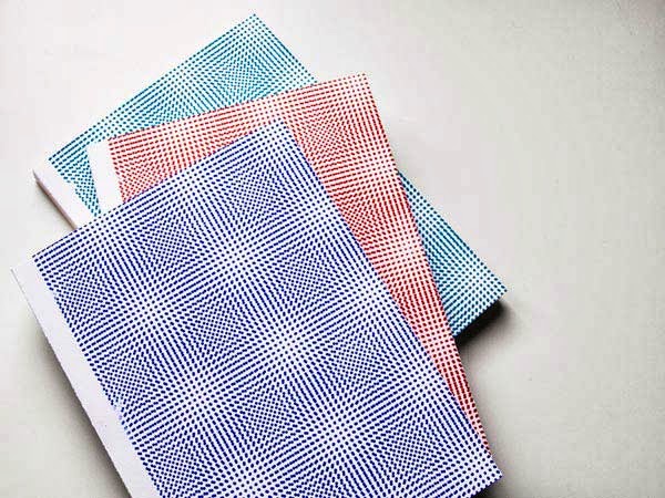
Screenprint collection book via Gabriel Jasmin

Execution [Cover Page]

Cover page without wordings does not confine to one but many different interpretations. I find the use of ‘No text’ cover page suitable for my topic since I’m playing with the idea of – ‘To create a sense of personal interpretation.’

As mentioned, I hope to achieve a visual appealing effect on my Zine as well.
Since, I’m working with the ‘Fish’ theme in mind.. My cover page requires the elements of fish or fish parts.

After several mock ups, I decided to create my cover page with abstract fish design.
When I was a kid, I remembered my art teacher teaching us to draw fish in a form of triangle.. This is how it roughly looks like..
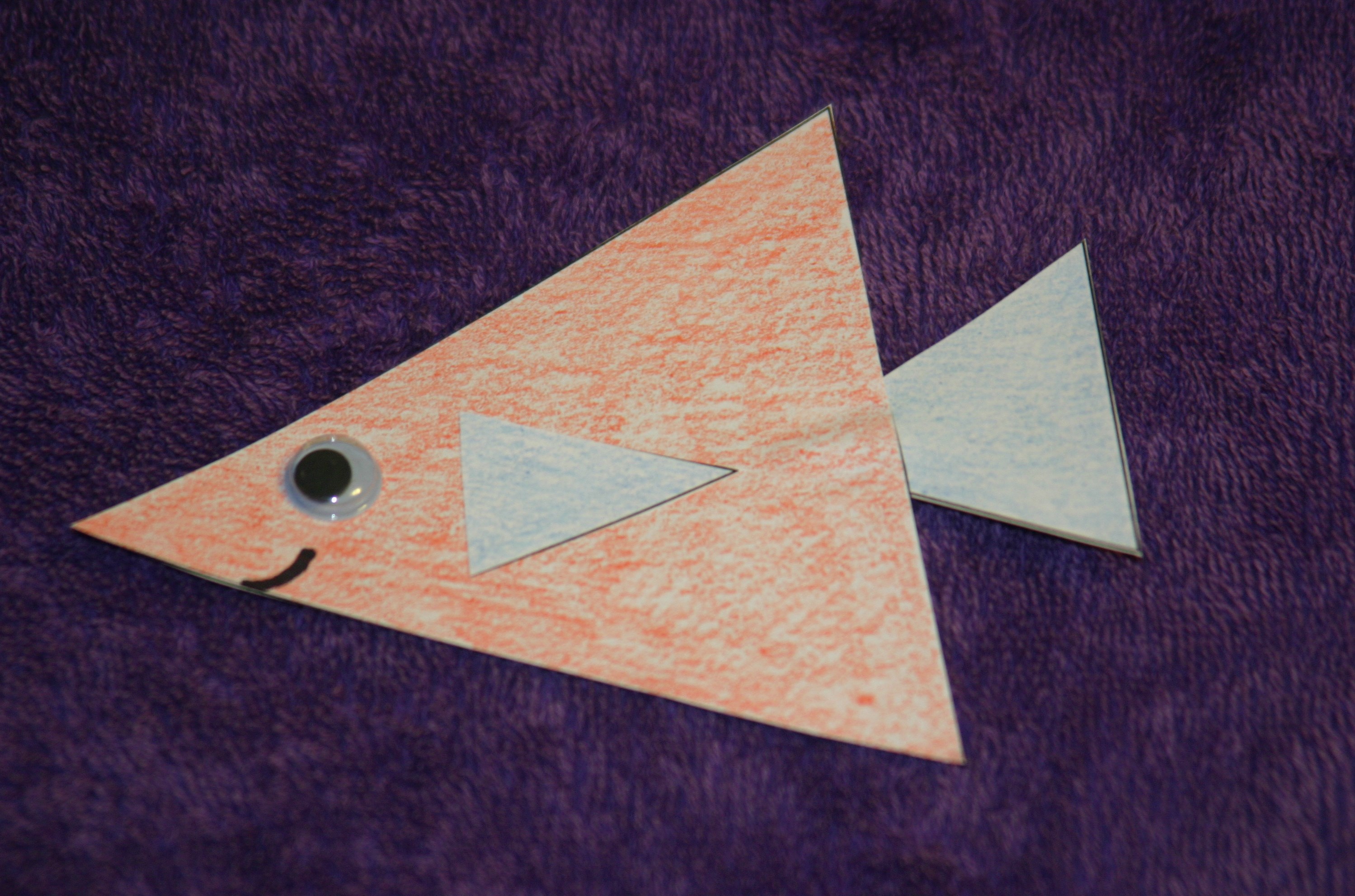
http://lovetolaughandlearn.com/triangles-learning-activities-for-shapes/

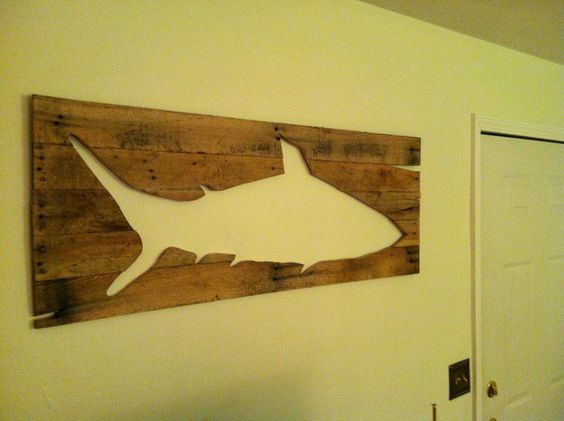
Revival Wood Works
https://www.facebook.com/RevivalWoodworks

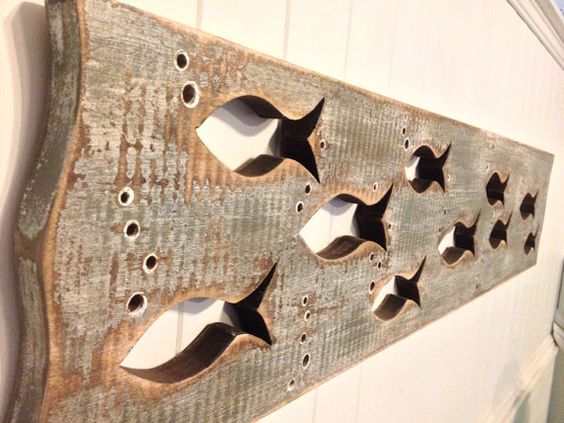
Grey Wood Art Fish School Sign Wall Decor Beach by CastawaysHall
https://www.etsy.com/listing/177582867/grey-wood-art-fish-school-sign-wall?utm_source=Pinterest&utm_medium=PageTools&utm_campaign=Share

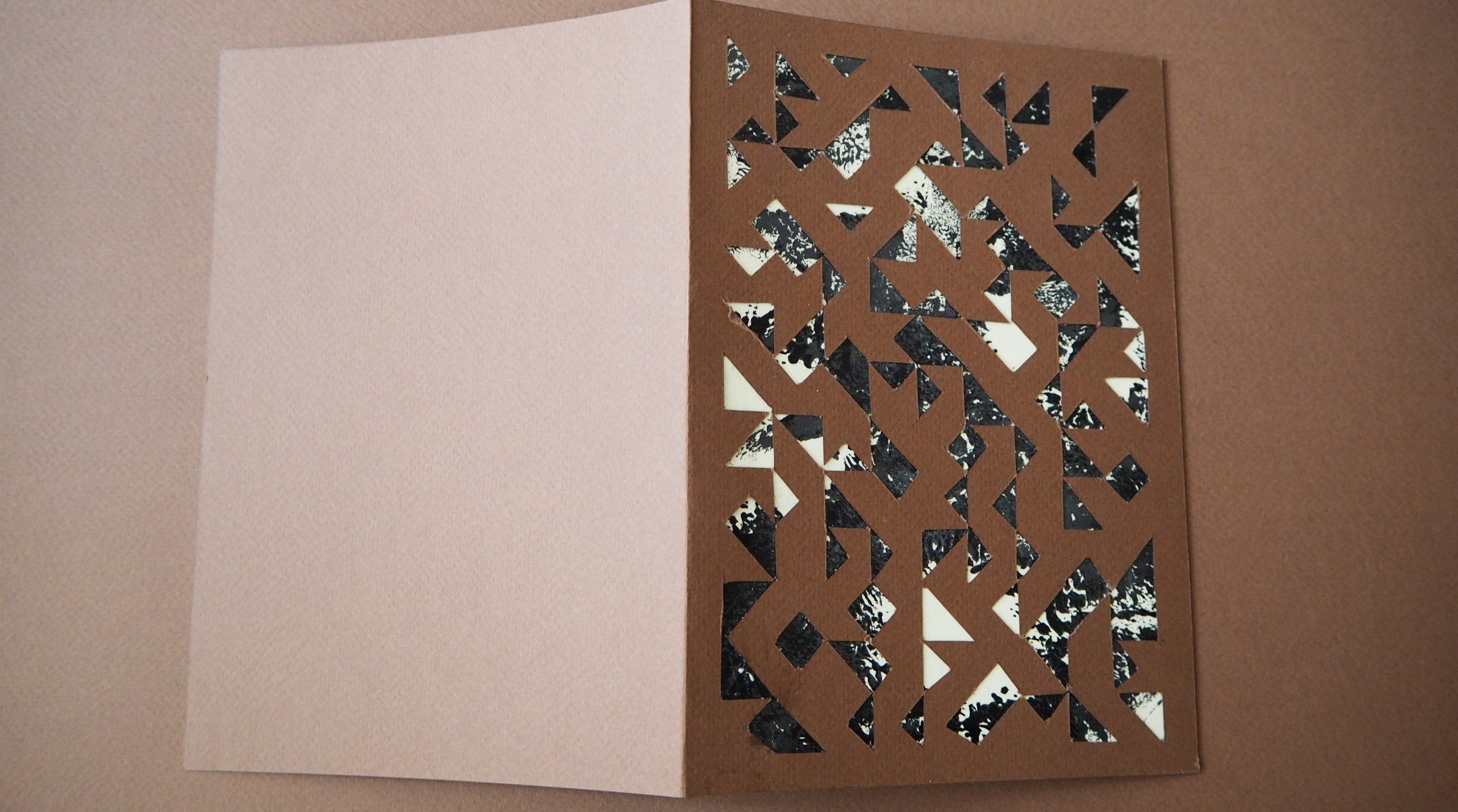
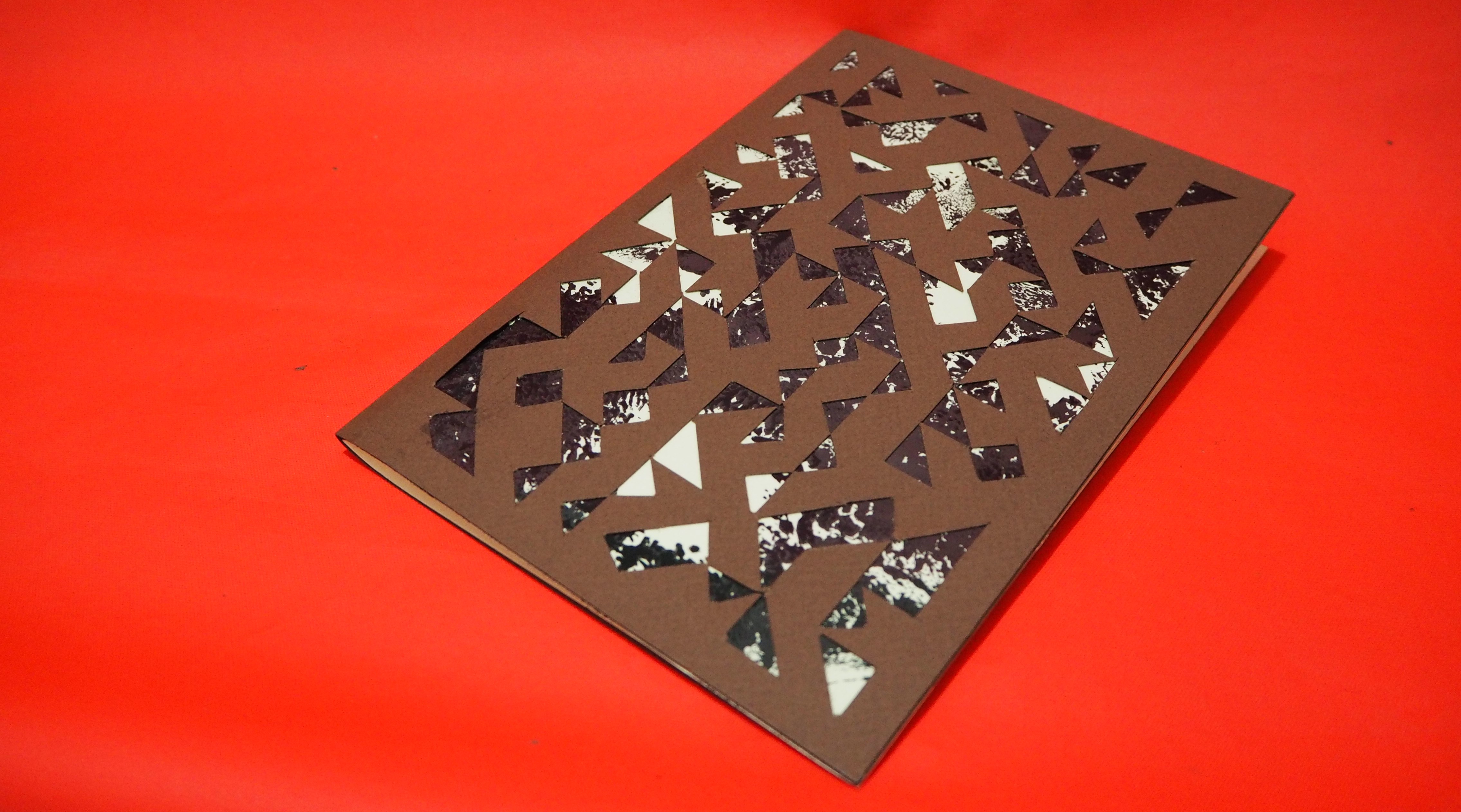
With the above, triangular fish and wall art, in mind.. I decided to handcraft a flat piece of abstract artwork on a brown paper. It is done so by drawing lines of intersection on the grid measuring 140mm x 200mm. The main idea is to develop the different interpretation each person have with the artwork.

Since the whole idea is to create a sense of personal interpretation, I felt that by craving the ‘fish’ design in this abstract way relates to my topic. I’ve ask several of my classmates to gather some of their opinions of the cover page, most of them see it as a pattern design or some sort of intense paper cutting. However, after explaining the concept to them, they are able to see the ‘patterns’ as fishes swimming around the cover page.

My initial idea is to cut out a fish pattern on the cover page, but I find it too literal and it does not create the abstract feel to the overall design.
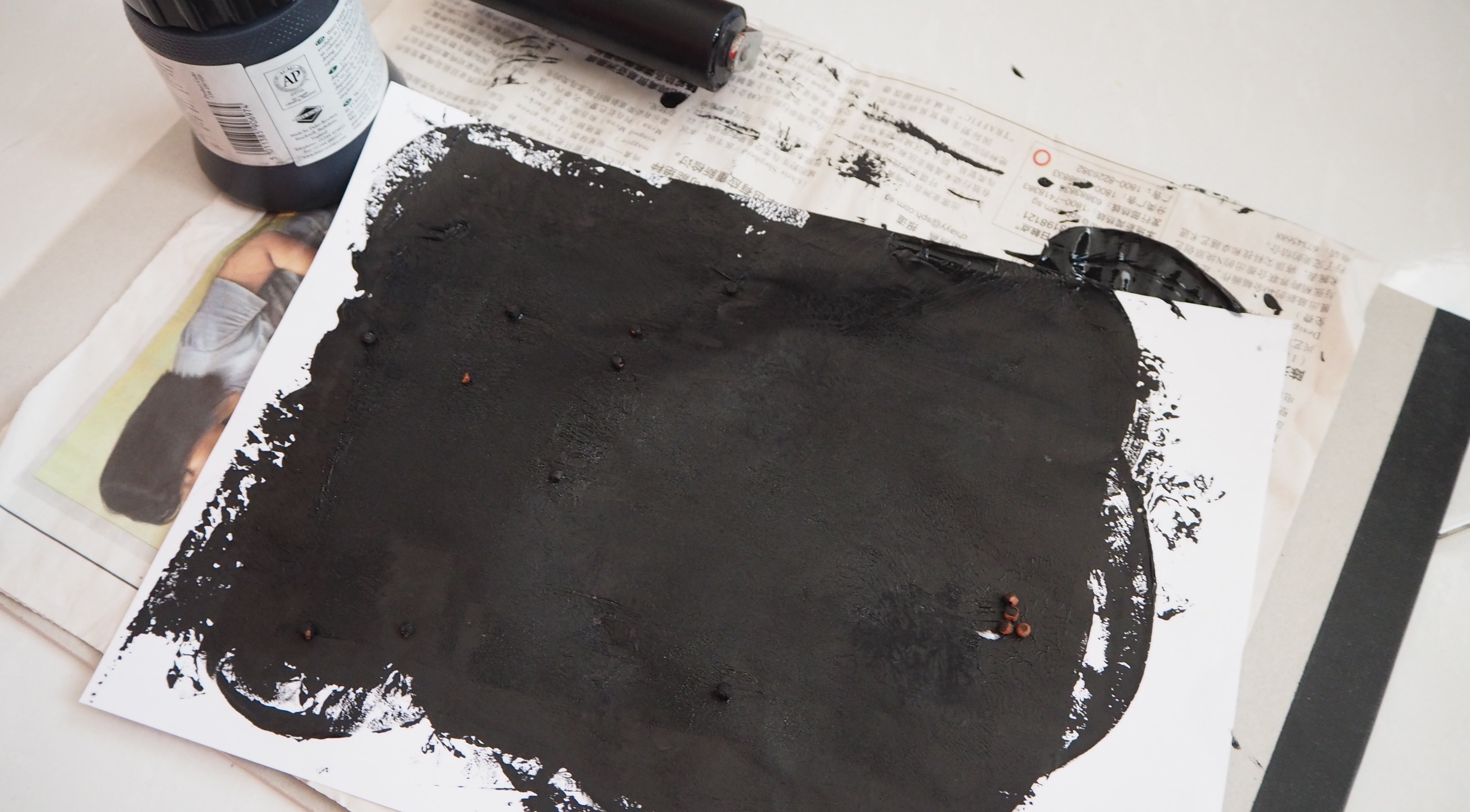
The next step involve adding mono-printed patterns on the back of the abstract fish design. This process is done so because it relates to the ‘Line’ project which I used the mono-printed methods to develop the individual expressions.


Address to Typeface & Use of Colour

002


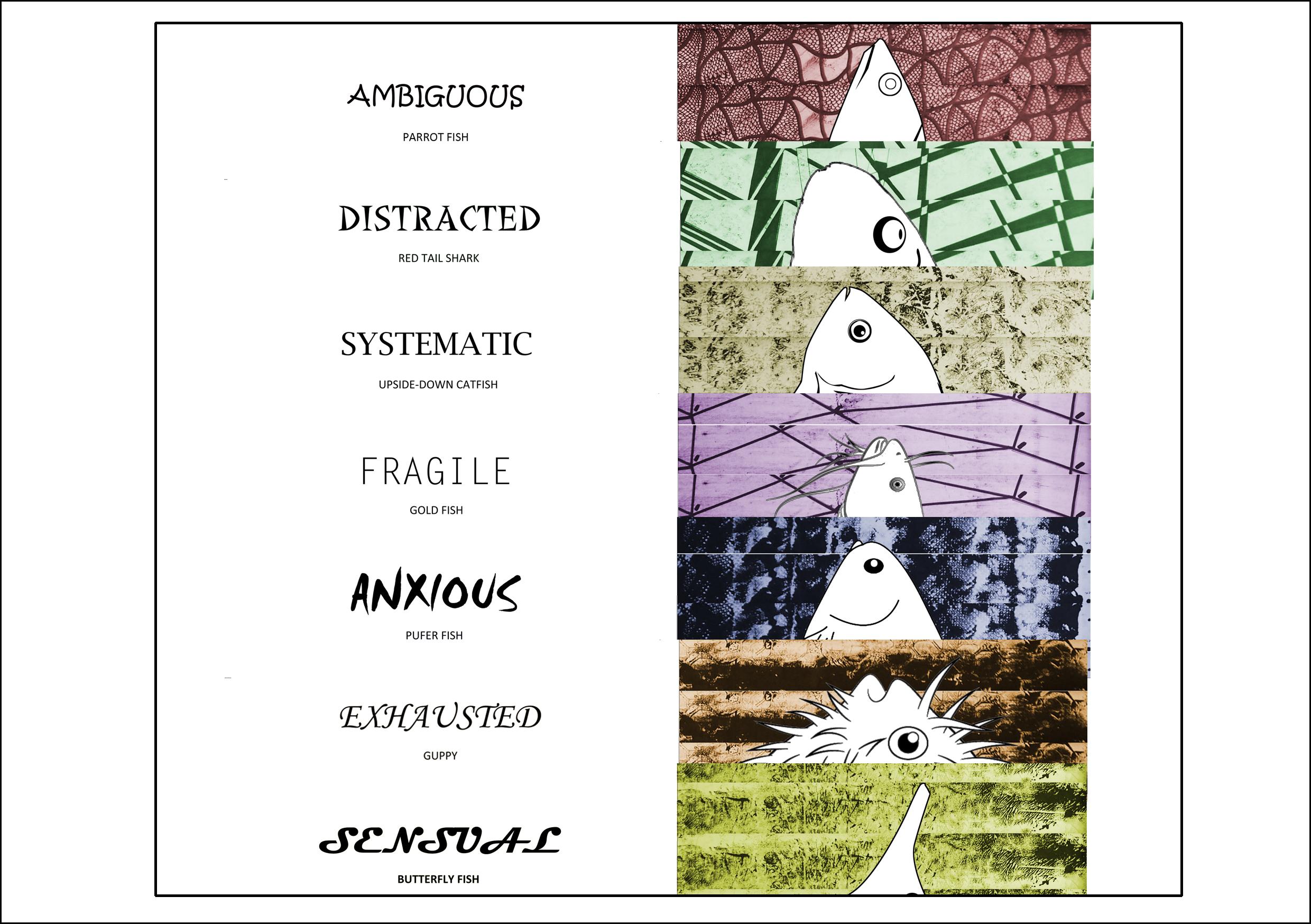
In each composition, I used different typeface to represent the different line expression. The concept of not having a repetition of typeface aims to communicate the purpose of personal interpretation.
Each line expression was tagged with the name of the fish it was being represented.
Below are the lists of typeface used.

Ambiguous – Kristen ITC
Distracted – Labomba LET
Systematic – Lucida Bright
Fragile -Letter Gothic
Anxious – Smudger LET
Exhausted – Monotype Carsiva
Sensual – Magneto

I felt that among the rest of the available typefaces, the chosen ones represent each line expression best. Similarly, I avoided the repetition of colours used to represent the fishes so as to not confused the reader. With the different typefaces and choice of colours use, I felt that the overall composition encourages a sense of playability.


Book Binding Method

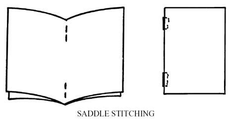
I bounded my Zine with the Saddle Stitch technique instead of having it ringed.
It was done so by stapling over the spreads on a piece of Styrofoam.

Due to its interactivity, I had to align 4 stapler bullets in series so that they does not interfere with each other.

Nevertheless, it was a good attempt!


Choice of paper

To reflect on the idea of a handmade Zine, I chose a pair of contrasting brown Tiziano A3 sheet to build my Zine. The colour and the method of execution holds everything together as a DIY concept.

Setting my direction right, I created my Zine in a flip book concept which allows interaction with its reader. The paper used should not be flimsy and should be thick enough to withstand pressure while the pages were being flipped.

I chose a 200 GSM paper so that it’s not too flimsy and not to hard as well.


The End (=

Foundation 2D Project 3 – Zine – Progress Pt1

Week 11 – 31 March 2016


Hey there!

The sharing by Nestled Ellipsis gave me a new insight regarding Book Binding/Zine. I was introduced to various methods of utilizing the Front & Back cover with elements of Visual Metaphors, it feel that a Zine/Book can bring meaningful message as well as interacting with its audience. I was amazed by the use of Chinese Character to create appealing artworks!

Appreciate Miss Joy effort in organizing the sharing session!


Execution

For this project, I wanted to breathe in a new method of execution.
Such as drawing illustrations with Pen & Markers – Which I have not try before..

However, the transaction from Photoshop/Illustrator to hand-drawn images might seems to be a big jump. Honestly, I can’t draw very well. But, I would like to take this opportunity to give it a go~ and probably gain more confident?

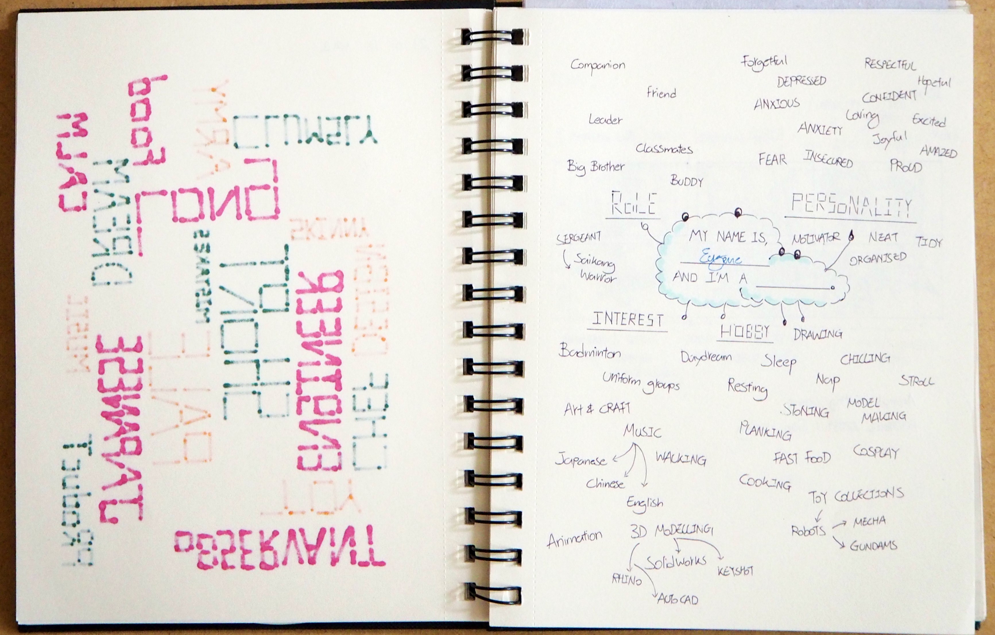
My concept for this project is to make myself a ‘Resume’.
Mainly because, as Design Students, we rely more on our Portfolio hence, I wish to ‘showcase’ myself with this Mini 8-page Zine.

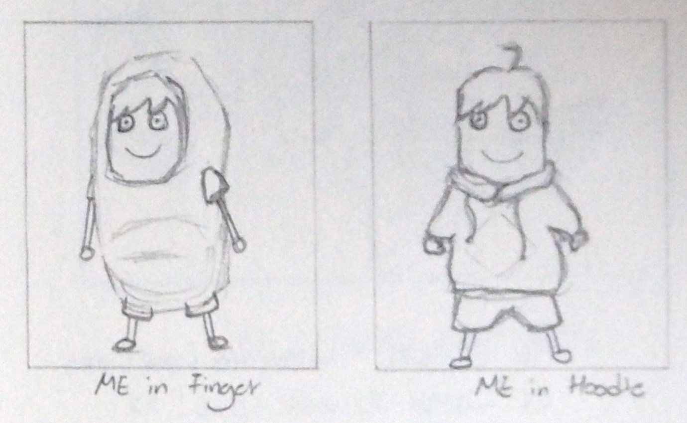
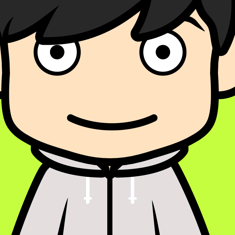
I also cartoonized myself, thinking if I am able to use it as the Front Cover..
Because it’s a Resume, it should have a profile of me to leave people an impression!
myAvatar


Style

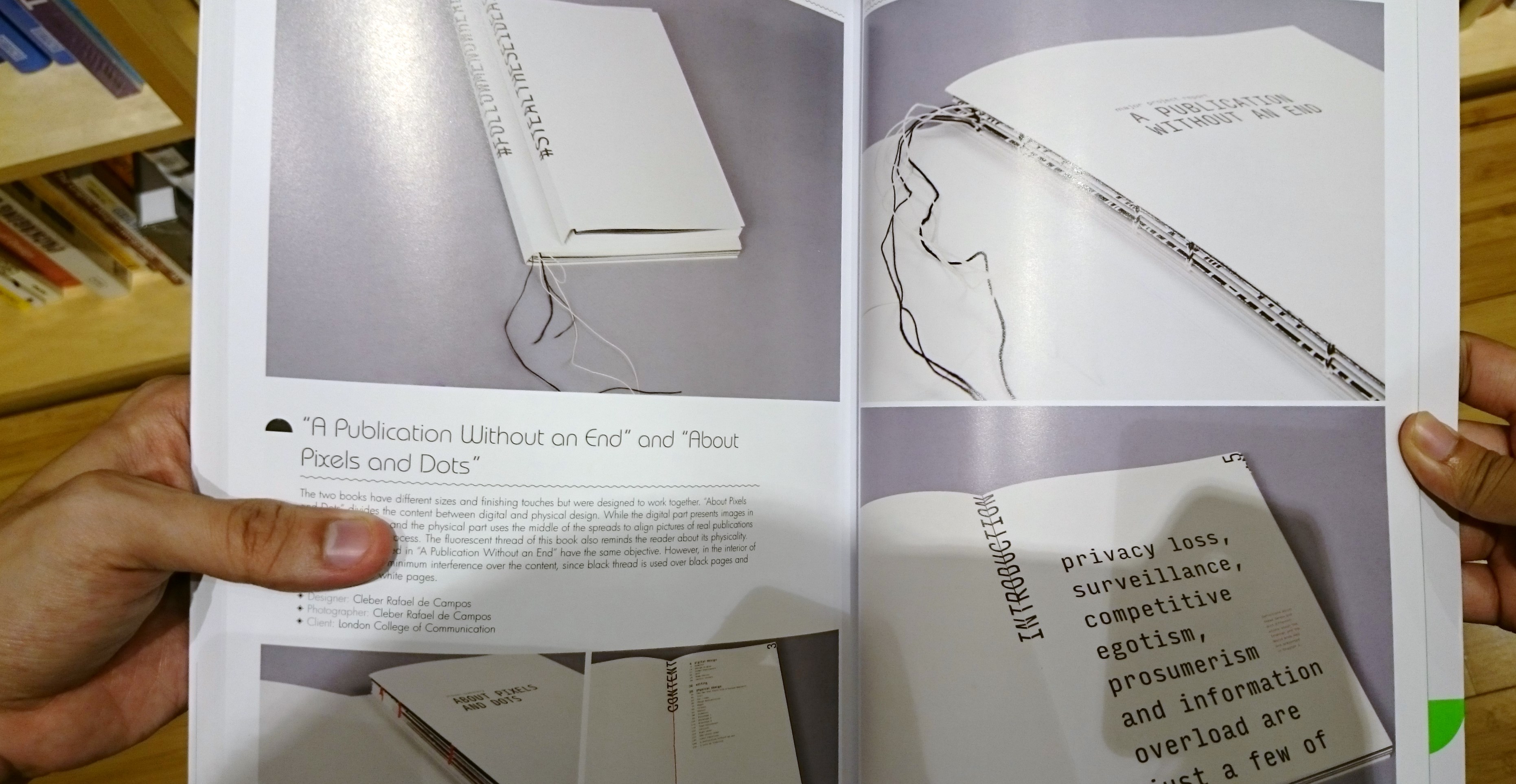
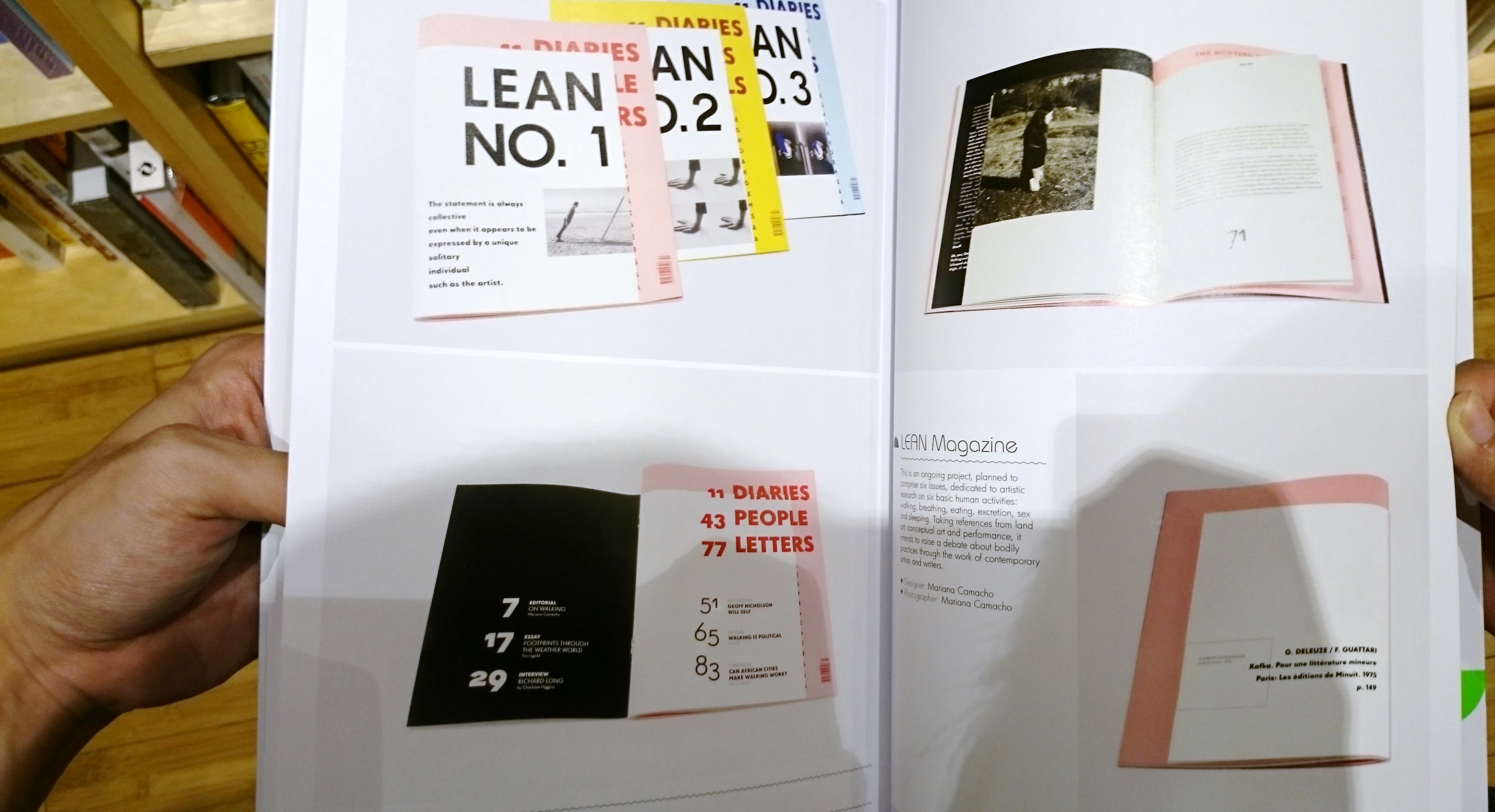
June and I did a research on the type of book binding methods at Kinokuniya.
There was some interesting styles/methods that we would like to share.
Refer to the images below,

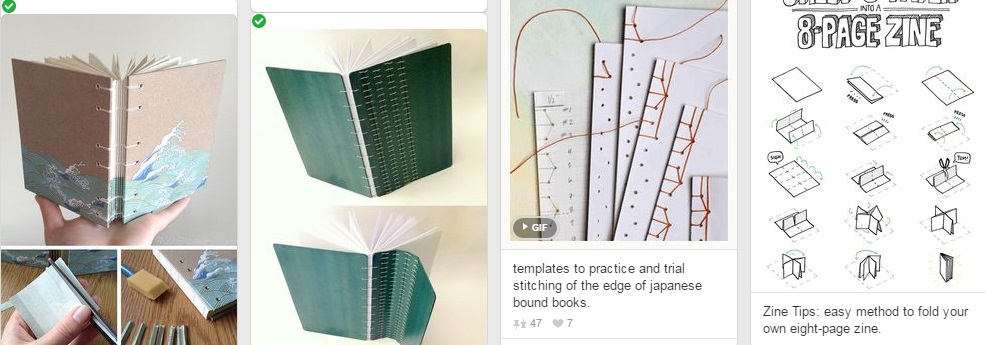
DSC_0654 DSC_0655 DSC_0658


Click on the Image below to access various Book Binding methods & Typography!

Foundation 2D Project 3 – Zine – Research Pt1


Foundation 2D Project 3 – Zine – Research Pt1

Week 10 – 24 March 2016


The introduction to InDesign was enriching and a positive experience!

There were numerous take-aways from this lesson such as identifying the ‘Brown Box’, ‘Text Wrap’ functions etc., it really makes designing a brochure, or related, so much easier!
I wish to learn more through in class tutorial though. cry

Today short entry bring you to my research on ‘Zine’ and the possible ‘Semester works’ to work with.


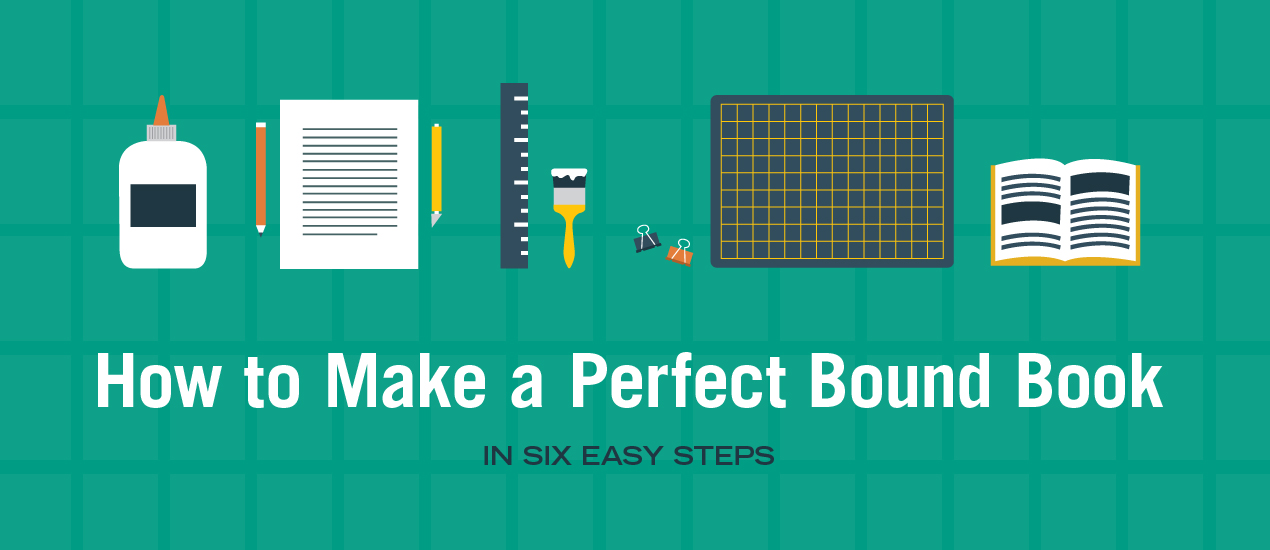
Book Binding Reference

– Click on the images below to access the original webpage.

001


Zine Typography

Using the right ‘Typography’ is one of the important aspect to consider for your ‘Zine’.
Different ‘Typography’ reflects the different tone, mood and feeling for the theme you are working on.
For example, dont use a ‘IMPACT’ front for a happy occasion.

Click on the image to check out more


Designer: Josh Smith


Execution 

In terms of my previous works, I would probably work to expand my ‘Typography’ project.
However, at the same time, I have this idea of working towards my ‘Biography’ which comprise of all my works from Polytechnic to now – Basically a self introduction.
In the meantime, I will work on both concepts to access their potentially respectively.


Have a Blessed Good Friday and Happy Easter!


Foundation 2D Project 2 – Point Of View – Progress P3 [Final]

Week 9 – 17 March 2016


Project 2 have come to a conclusion!^^

I’m delighted to see each and every compositions my classmates have put up!
It was truly a showcase of tremendous effort and time each of us displayed.

This post conclude Project 2 – Point of View.


Introduction

I was sharing my initial concept, of a narrative, that I hope to apply in my compositions.
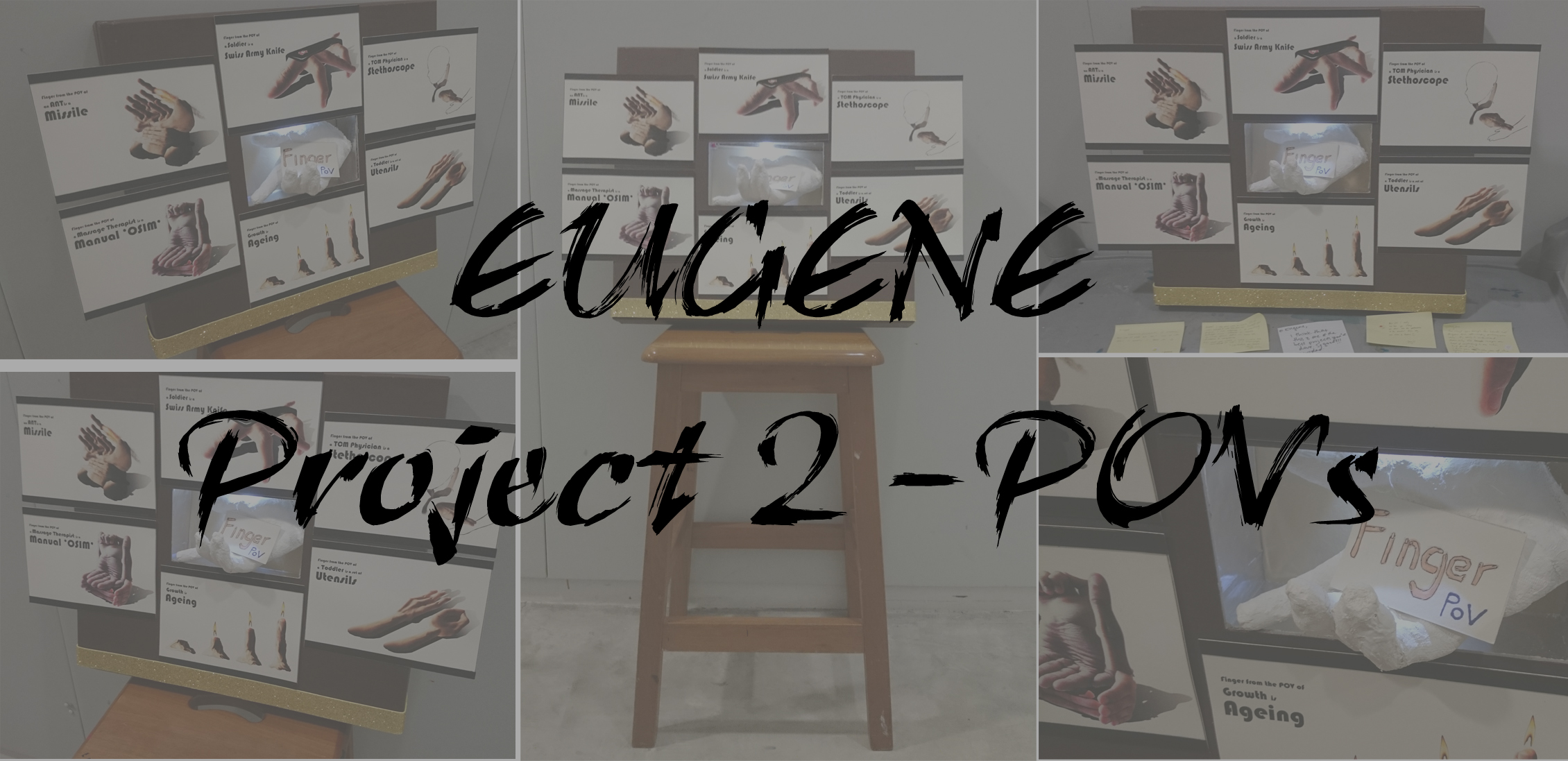
The story will be presented through visual narration which I depict myself as a ‘Finger’ walking through my life as a NTU student.

However, things did not go as smoothly as I want it to be.
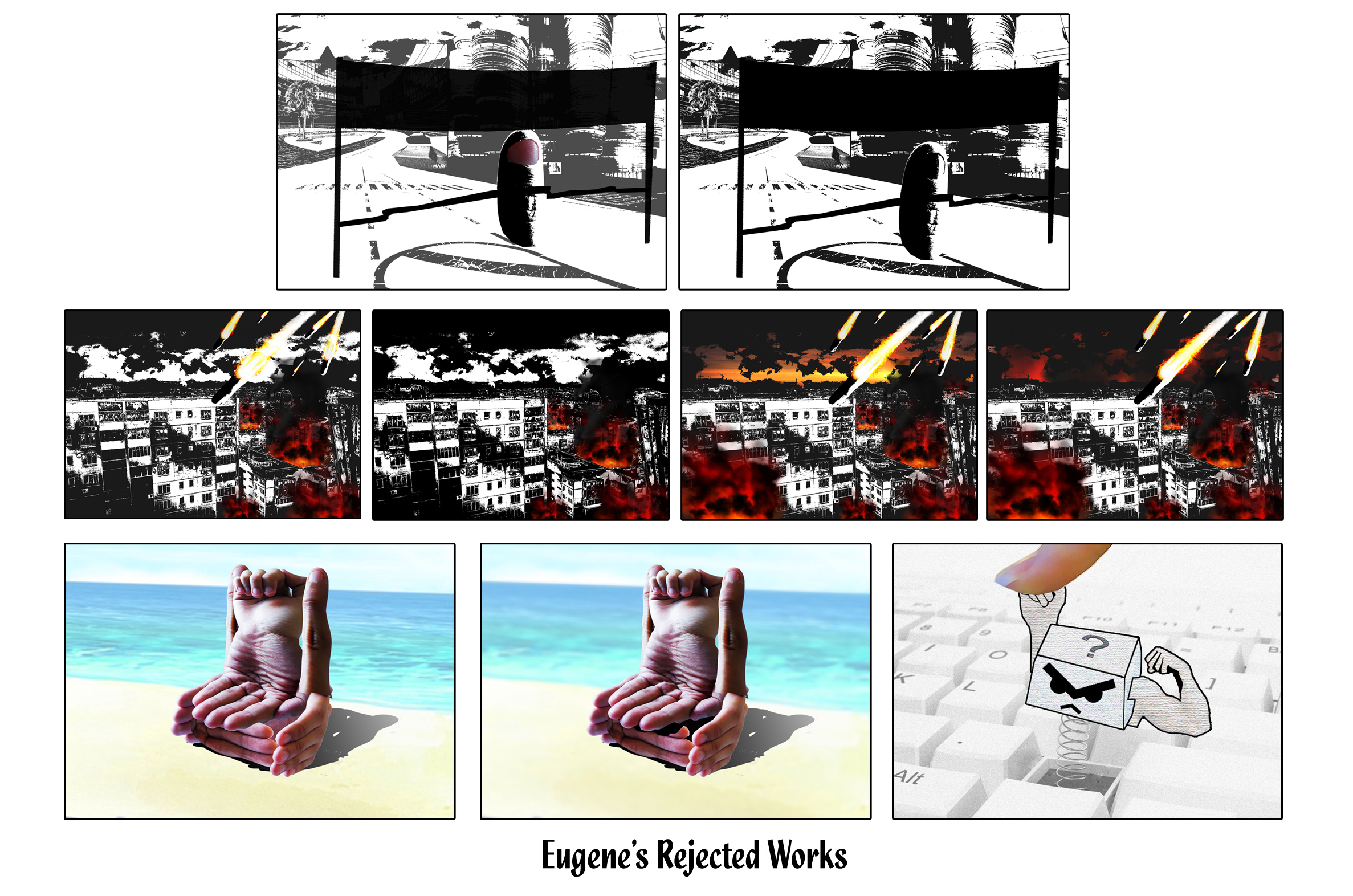
My concept of a narration seems to go slightly off track with 2 or more ideas cramp into the composition of 6. [There isn’t really a focal point]
I’m glad that opinion via the group consultation managed to ‘save’ me in time or else I will probably ended up in a wrong direction.

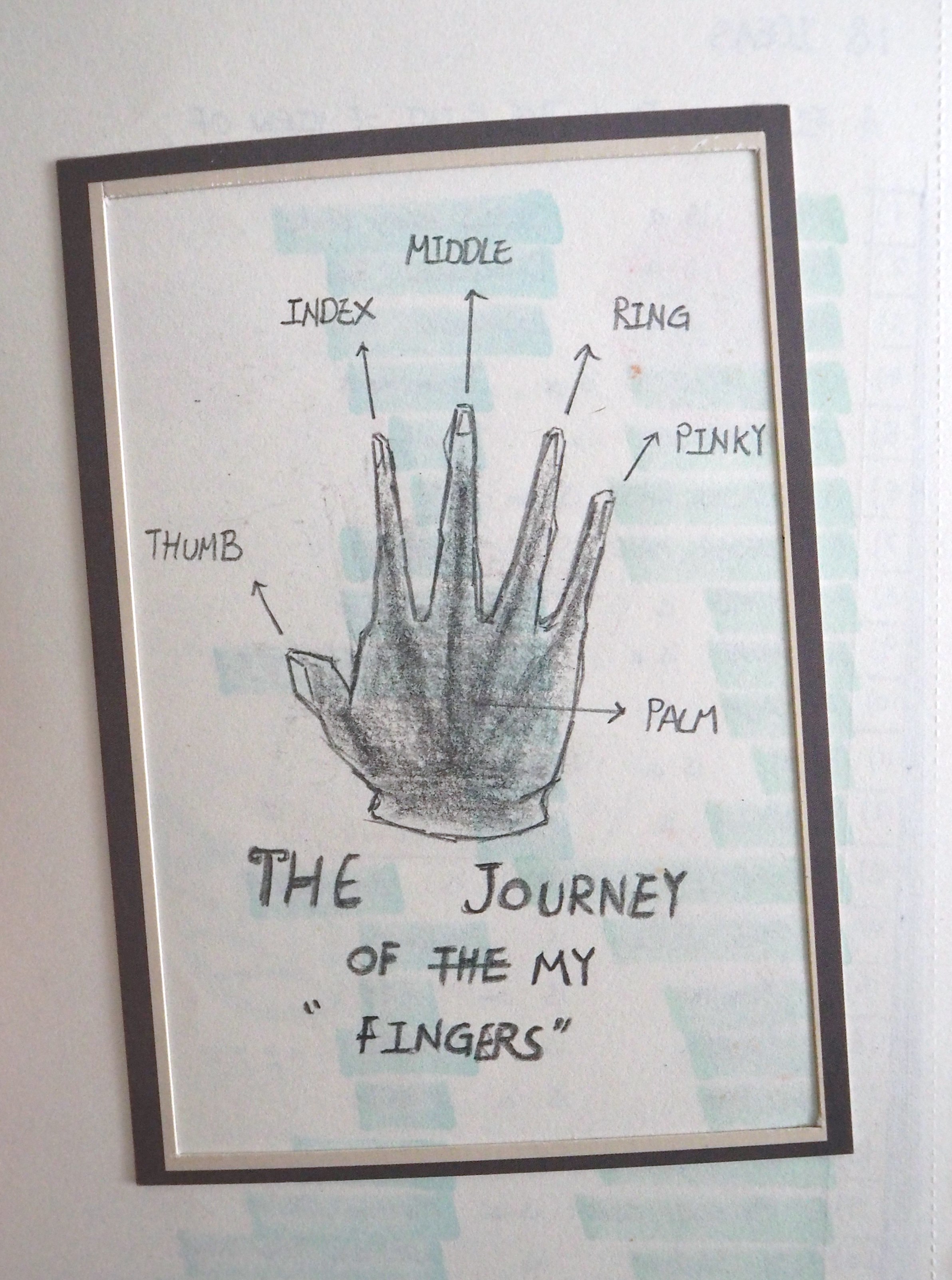
For this project, I worked on the topic on ‘Finger’ hopping to insert some fun and funky elements in it.
The exploration on the concept of ‘Finger’ seems to be rather vast, for example the different application of ‘Finger art’ with relation to the mediums use.

In the previous posts, I shared about various reference artists and mediums I wish to apply in my compositions.

Finger Art (Drawing on finger)
004

Finger Art (Drawing with Finger)
005

Finger Art (Surrealism)
001


Point of View

My initial POVs were selected to fit in the idea of visual narration.
The following are my initial chosen POVs.

1) Finger from the point of view of NTU Student is Winning the Star Wars. 
2) Finger from the point of view of Me is a Swiss army knife. 
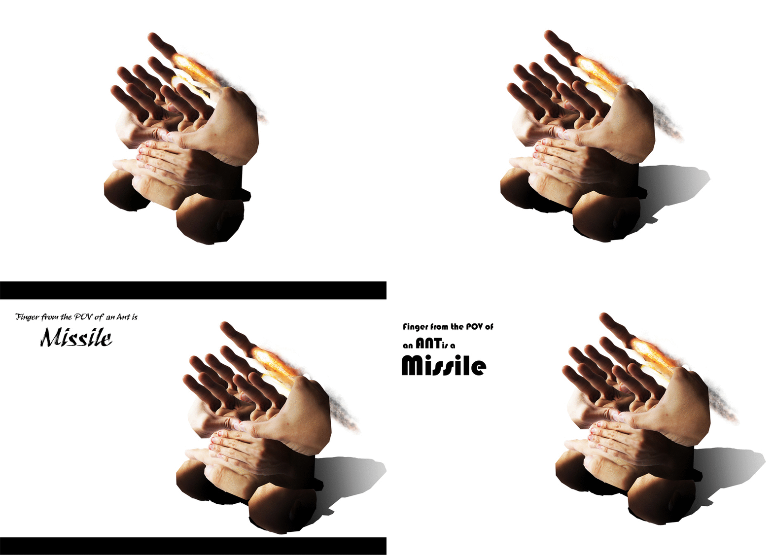
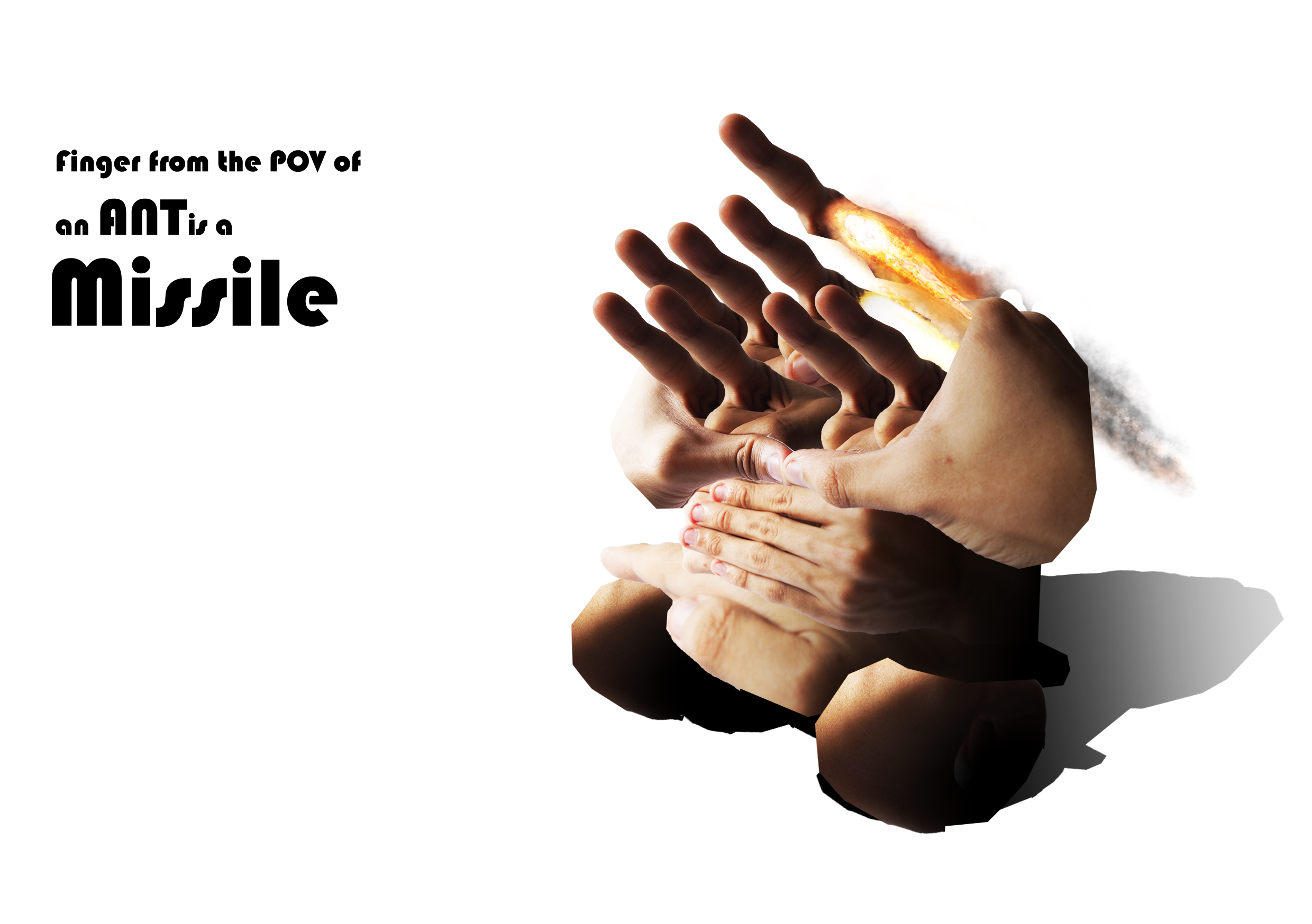
3) Finger from the point of view of Ant is a Missile.
4) Finger from the point of view of A Massage Chair is a Manual Osim.
5) Finger from the point of view of A Computer Keyboard is Endurance. 
6) Finger from the point of view of KFC is Licking Good.

The story flows this way:
Finger wins the Annual NTU Star wars race.
He braced himself for the upcoming semester by preparing tools that he requires.
The semester starts and Finger was ‘Bomba’ with lots of assignments from different modules.
He endured the first half of the semester and took a vacation during the recess week.
Later, school reopens and once again he faced a test of endurance.
His effort paid off and he enjoys the long semester break by giving himself a tasty treat.

These are the initial compositions that I’m working on before the group consultation.

Eugene

As mention, there isn’t a very clear execution as the styles implemented are like ‘Rojak’.
Meaning, I have a bit of this here and a bit of that there.
For the ‘darker’ scene, I wanted to convey the idea of a war scene. Whereas for the ‘Brighter’ scene, I hope to create a more relaxing atmosphere.
However, the use of ‘Threshold’ remove most of the details such as the finger and the HDB buildings. As a result, it add ‘noise’ and obscurer the message.
During the group consultation, the ‘Massage Chair’ outshine the rest of the compositions as it manage to draw attention and arise questions on how it was being composed.
My takes from the consultation is to have my focus on exploring the use of fingers to create a surreal-like products.

Yes! You got it right! Products!
OMG~!? I felt that I have been neglecting ‘Product Design’ for a long time…. and probably have moved on to ‘Animation’ or ‘Interactive Media’ as my major in ADM.

My immediate thoughts of ‘Product Design’ activate my engine inside me.
Product design is in my blood, it’s time to get kicking!


Surrealism (Product Design)

The changed of concepts resulted me to develop a change in some of my planned POVs.
I re-visited my 18 POVs and from there choose on subjects that have relation to ‘Product Design’.
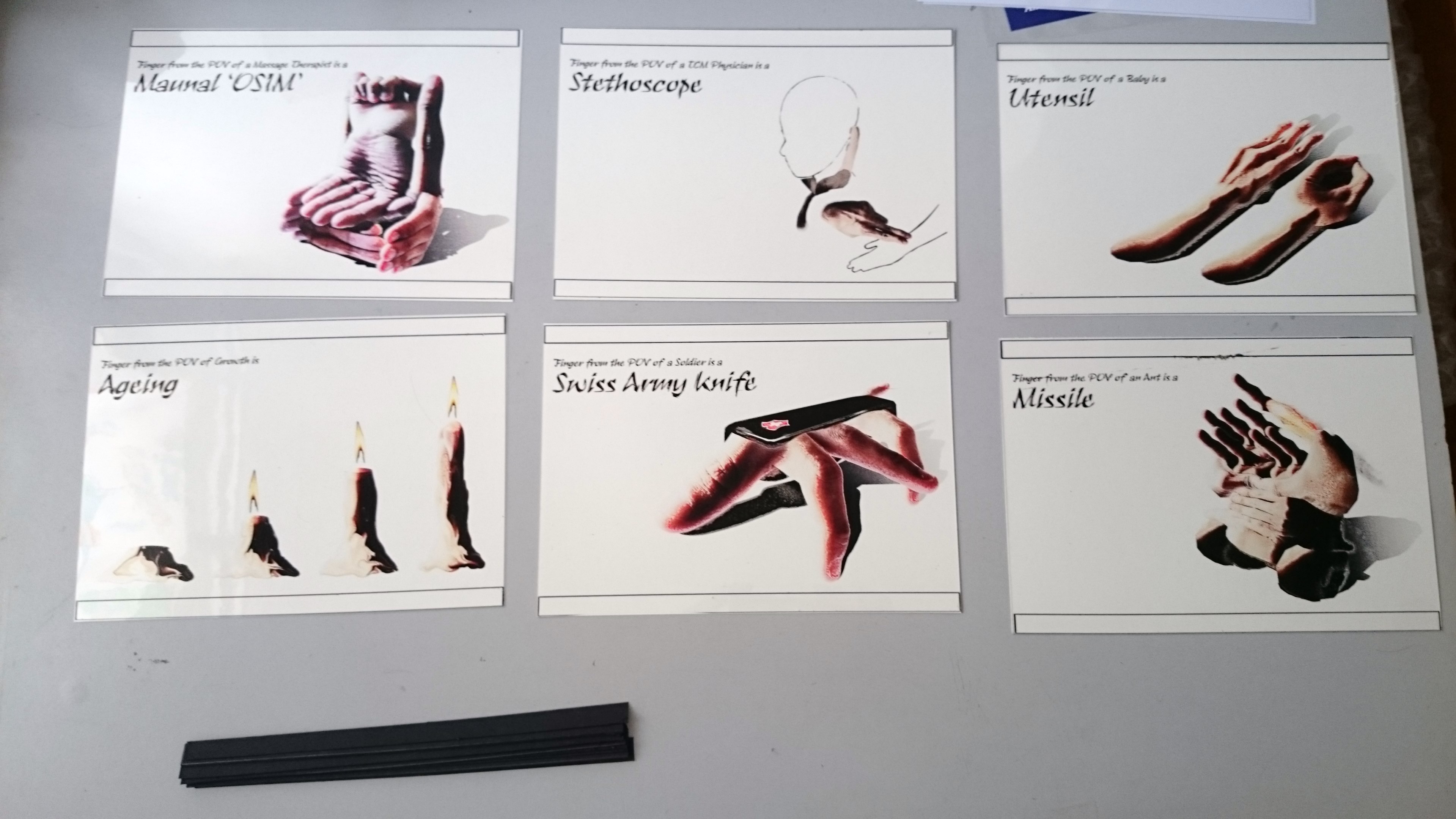
The updated list is a followed.

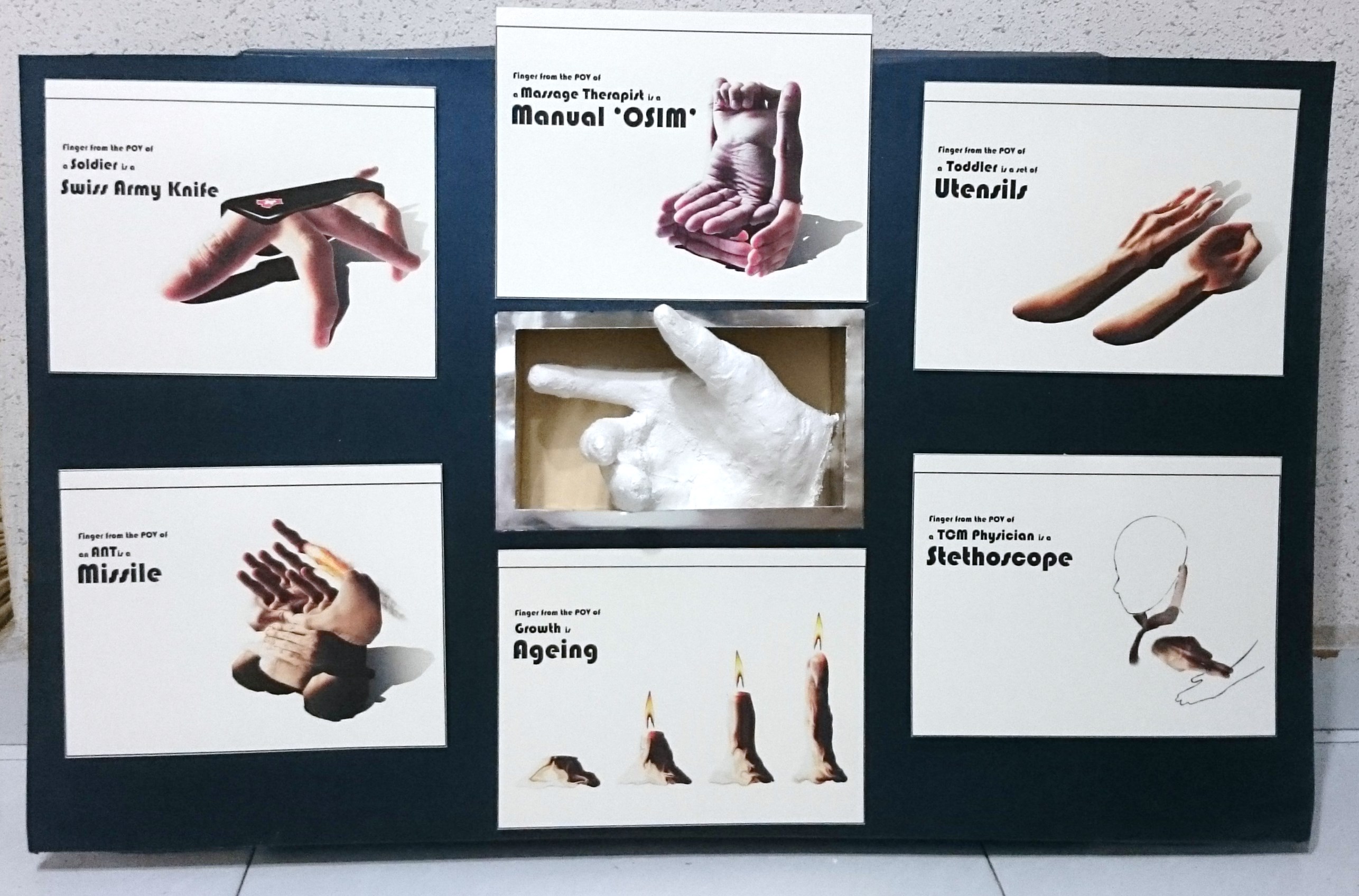
1) Finger from the point of view of A Massage Chair is a Manual Osim. 
2) Finger from the point of view of Me is a Swiss army knife. 
3) Finger from the point of view of Ant is a Missile. 
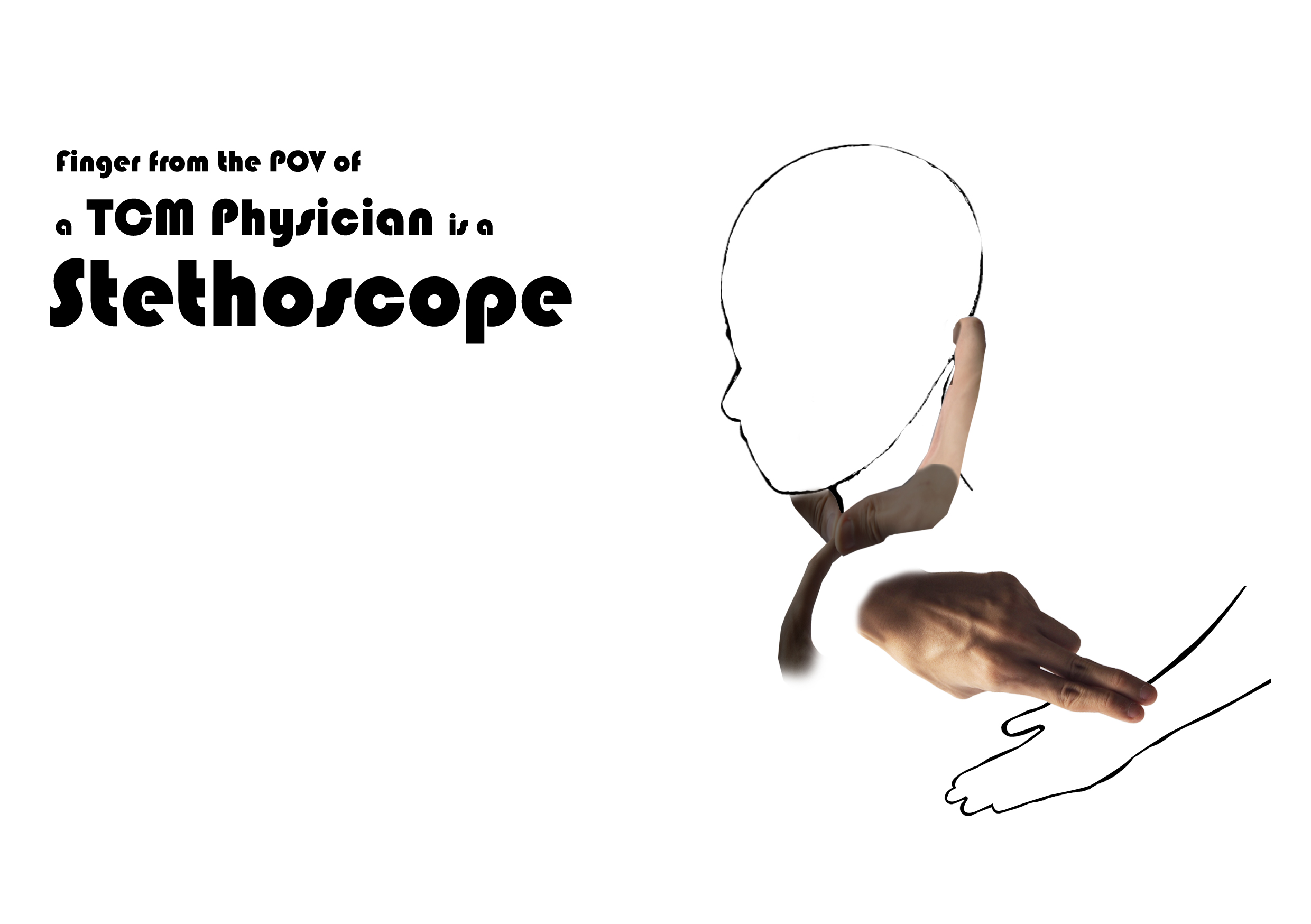
4) Finger from the point of view of A TCM Physician is Stethoscope.
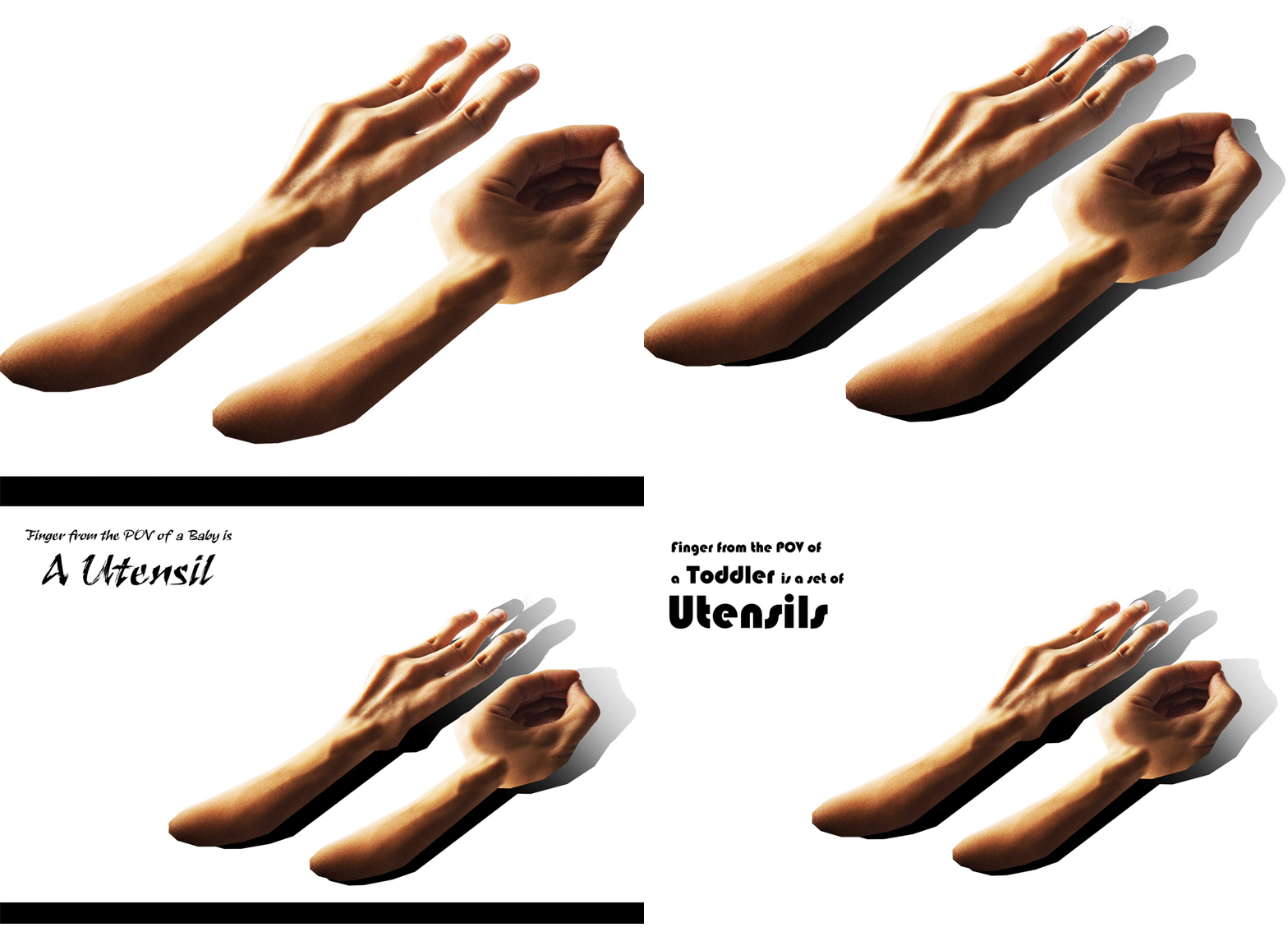
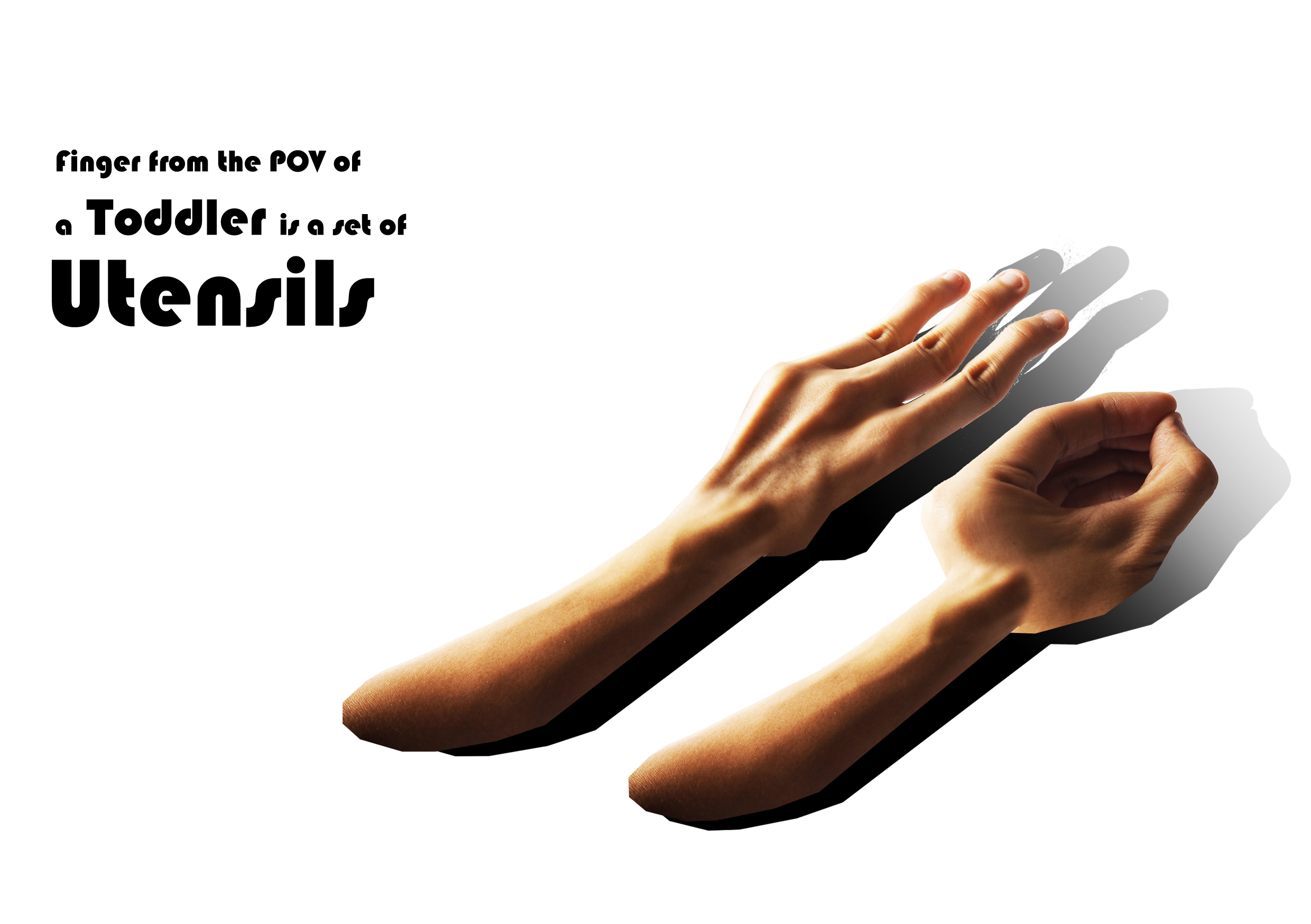
5) Finger from the point of view of Baby is Utensil.
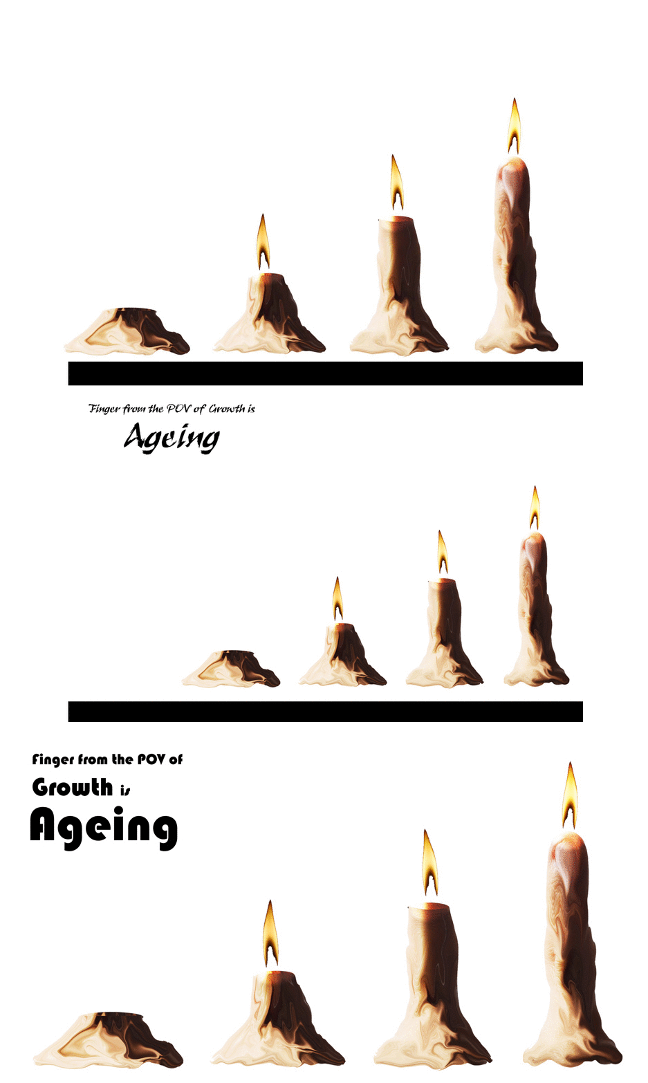
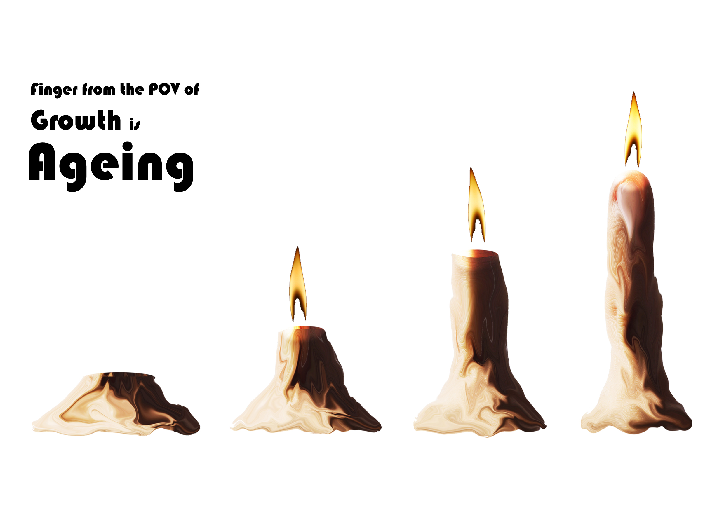
6) Finger from the point of view of Growth is Ageing.

I search for reference artists that probably work on ‘Surreal Finger Products’ but to no avail.
*Correct me if I am wrong, probably there are but I skipped on them accidentally.

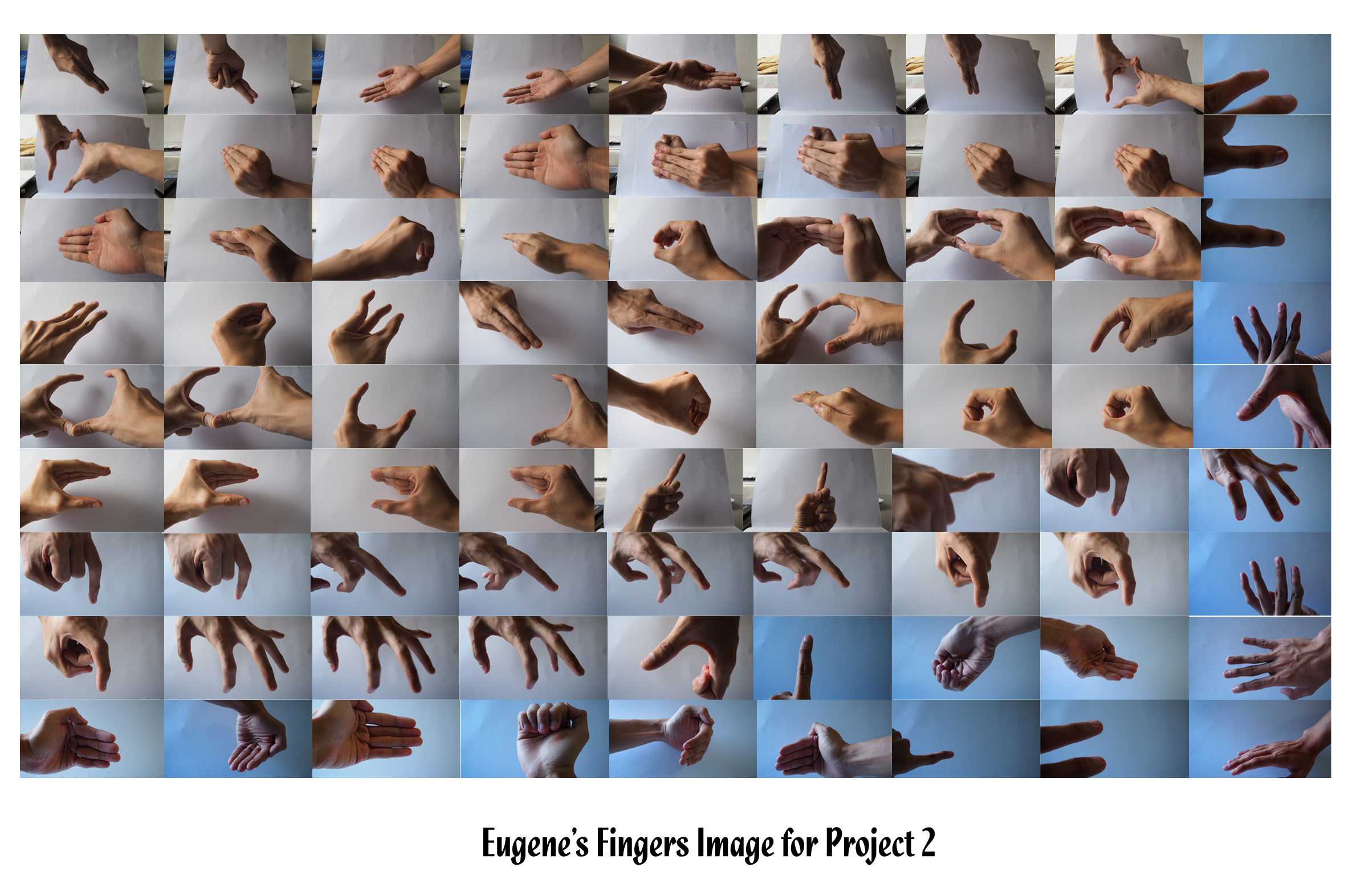
Using my fingers, and probably a minimal area of my plam, I took various shots for editing.
The following are the various shots of the ‘Fingers’ that were used to construct the product.

002

Development

1) Finger from the point of view of A Massage Chair is a Manual Osim. 
output_3ZZwpj

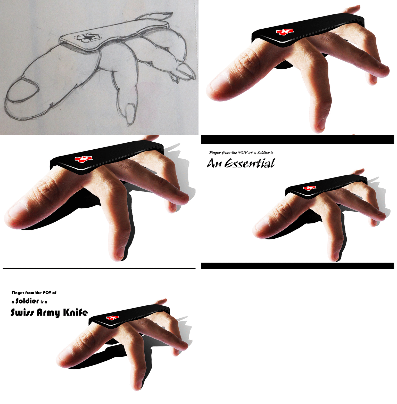
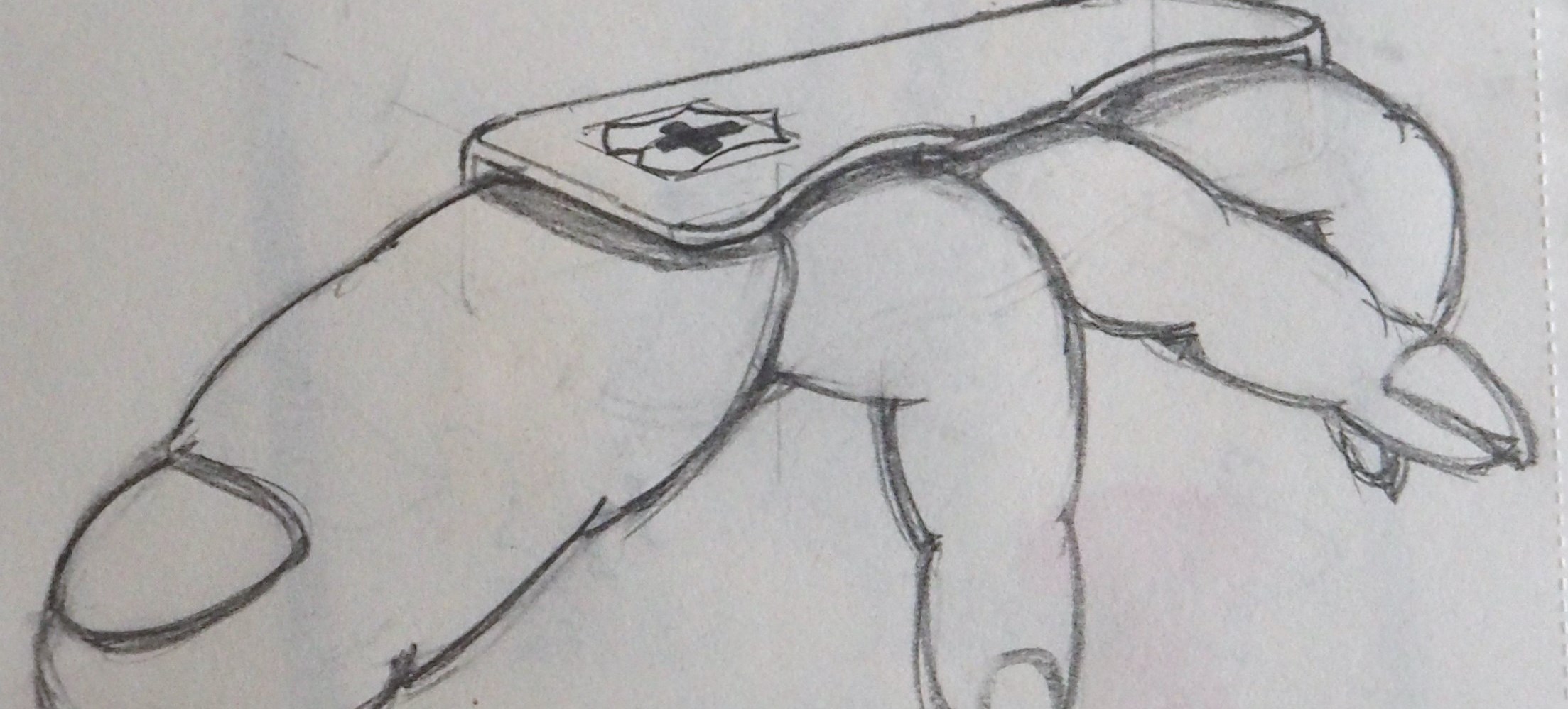
2) Finger from the point of view of Me is a Swiss army knife. 
output_V5GzDW

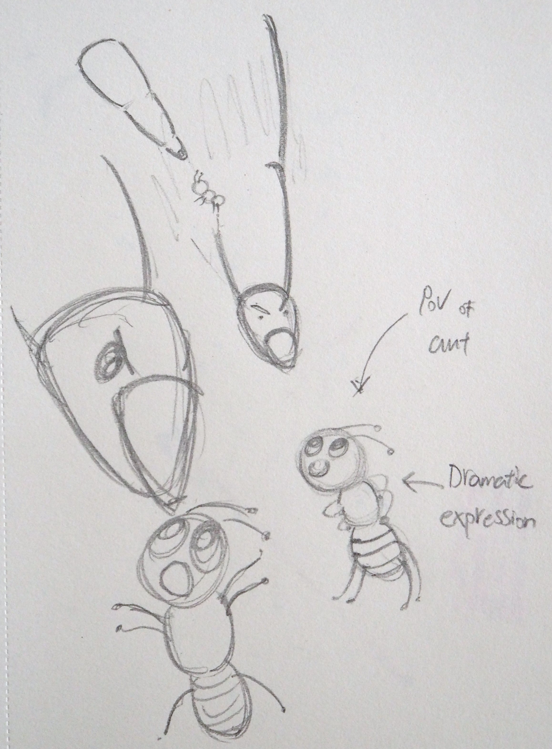
3) Finger from the point of view of Ant is a Missile. 
output_MRrcw5

4) Finger from the point of view of A TCM Physician is Stethoscope.
output_ldybgJ

5) Finger from the point of view of Baby is Utensil.
output_P1Gk0j

6) Finger from the point of view of Growth is Ageing.
output_YQVMsE

As you have probably noticed, the development of the Stethoscope went through several changes.
I went to ask around my group of classmates from my previous class to gather opinions,
It seems that the initial design of the Stethoscope looked rather like ‘Intestine’ or some kind of weird stuffs.
I tried to darken some areas so that it looks like a rubber tube and adding shadows to give it a 3D feel.
However, it still looks rather weird in some way..
Hence, I simplify the design of the Stethoscope with ‘User-illustration’ to bring out the idea of ‘Pulse-reading’.

Stethoscope


Method of Printing

Initially, I wanted to have my printing on acetate plastic so that I could have the concept sketches at the back piece of paper. However, the sketches resulted in a hindrance to my ‘Main product’.
Below are some of the prints I tired with acetate plastic.

2

DSC_0630

I also experiment with adding text/descriptions at the side of the composition,

4


Method of Presentation

My idea was to create a flat piece of sculpture that resemble the ‘hand’ but excluding the palm.
However, it does not creates a ‘stand-out’ feel but rather a ‘last-minute’ rushed kind of finishing.

3

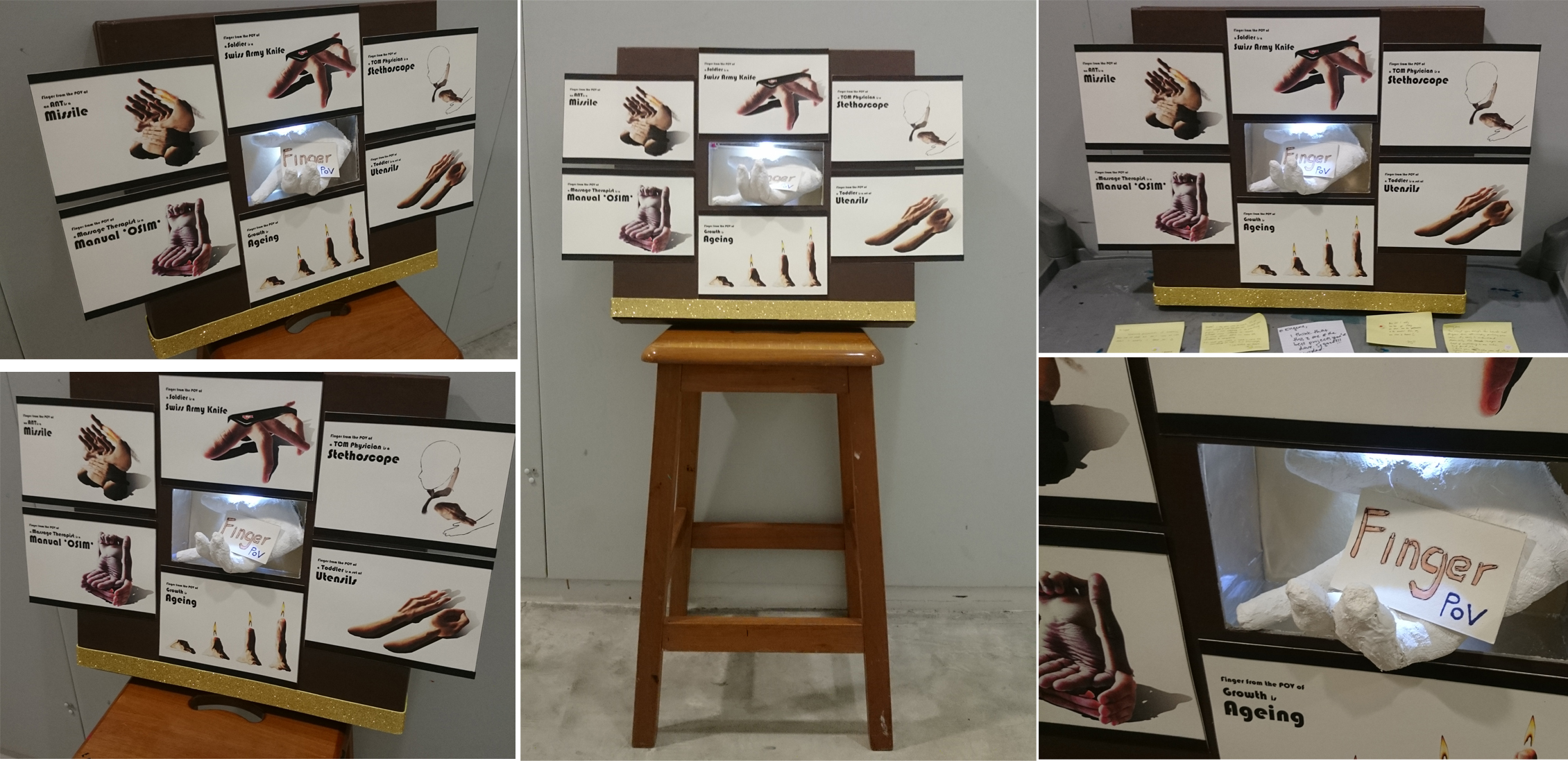
I proceeded to re-design my presentation board with something more sturdy and something like a shelving concept.

1

Followed by more refinements.

1

I really like how the final presentation board was made.
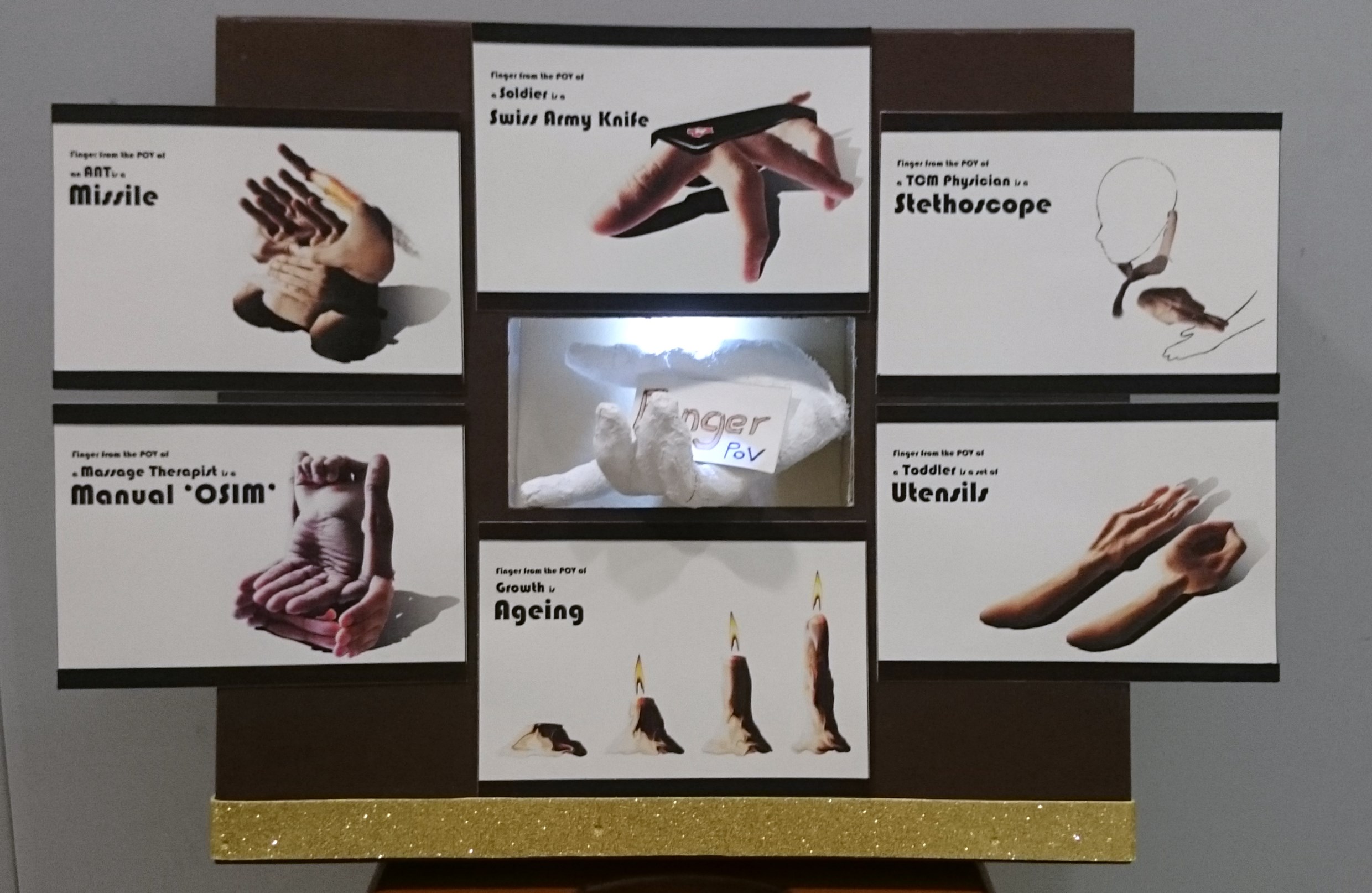
It started off with a 3D Hand model in the middle as the ‘Topic’ I’m working on,
and the 6 compositions arranged in a circular manner lead the viewers eyes around, explaining how our fingers were being used differently.

PS: Yup, that’s a mold cast of my hand.


Final Composition

006

Break down explanation

massage chair
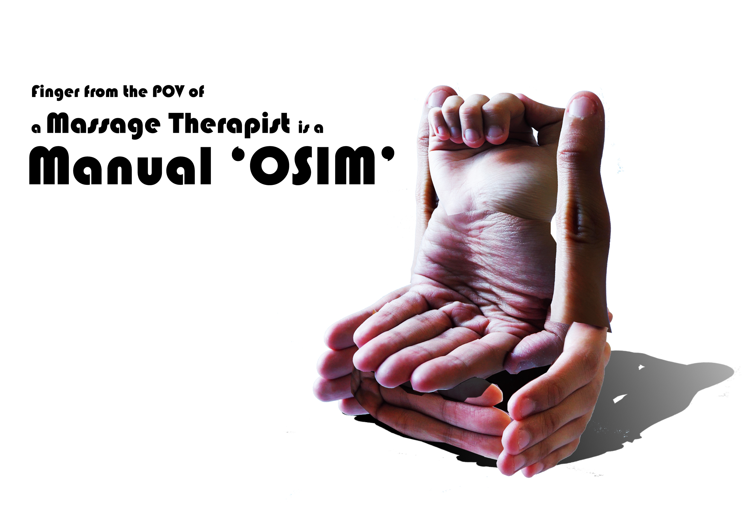
1) Finger from the point of view of A Massage Chair is a Manual Osim.

  • For this composition, I made use of the similar idea to work together such as the ‘Massage Therapist’ and a ‘OSIM’ chair. By combining these ideas together I am able to create a manual ‘OSIM’. It demonstrates the idea of finger = effectiveness and give good massage comparable to a OSIM chair.

Swiss Army Knife
2) Finger from the point of view of Me is a Swiss army knife. 

  • Our finger is very well-design efficient tool just like a Swiss Army Knife which is of practical use.
    Back in the SAF, the Swiss Army Knife is probably the best tool I ever had. It’s practical usage in any situation is equivalent to how useful our fingers are.

Missile
3) Finger from the point of view of Ant is a Missile. 

  • Sadly, our fingers are like a tool of destruction. For this composition I relate our fingers as a missile, from the POVs of an ant, to demonstrate the capability of inflict damage/mass-destruction.

Stethoscope
4) Finger from the point of view of A TCM Physician is Stethoscope.

  • With much concentration, our finger could actually become a ‘Stethoscope’. Personally, I do not know does pulse reading works but to the TCM Physician – their fingers are just as wonderful as a stethoscope which is use by the doctors practicing western science.

Utensil
5) Finger from the point of view of Baby is Utensil.

  • When we are young, our first set of utensils could probably be our fingers. To the toddlers, their fingers works the same as a fork and a spoon; the ability to hold and pierce through finger food.

Candle
6) Finger from the point of view of Growth is Ageing.

  • Our fingers have a story of their own too. As human grow, we aged – so do our body.
    The composition was arranged in a way that it resemble the reception bar in our phone. It shows the weaker signal on the far left, and vice versa. The candle light shows the ‘life-span’ that each finger have explaining the journey of growth vs ageing.


Reflections

I really enjoyed working on this project and the theme enable me to get creative with design.
Never did I thought that I could incorporate ‘Product design’ element to create images of different product just by using my fingers.
The use of surrealism in my compositions enable me to explore and understand more, widening my imagination and my approach to the overall design.
In addition, the study of shadow is also a take-away from this project.
Nevertheless, this project was enriching and I get to learn from the works of my classmates.
laughing


Check out my previous entries here:

Progress 2

Progress 1

Research 2

Research 1

Foundation 2D Project 2 – Point Of View – Progress Pt2

Week 8 – 10 March 2016


Hello! ^^

This coming Thursday is the submission for Project 2!
Looking forward to the critique session!
Today entry focus on my project progress and development.


Part 1: Initial Concept

Initially, I wanted to compose my compositions in a form of a narrative.
However, things did not go smoothly as I had trouble piecing the individual compositions together.
Nevertheless, allow me to share my initial concept.

As similar to my previous ‘Ego’ project, I created a character to represent me in the story.

003001

I also tried cartoonize myself by using an application via Google Play.
With reference to Andy Warhol’s pop art, I extract my features that allow people to identify me even as a cartoon.


Part 2: Initial Narrative Sequence

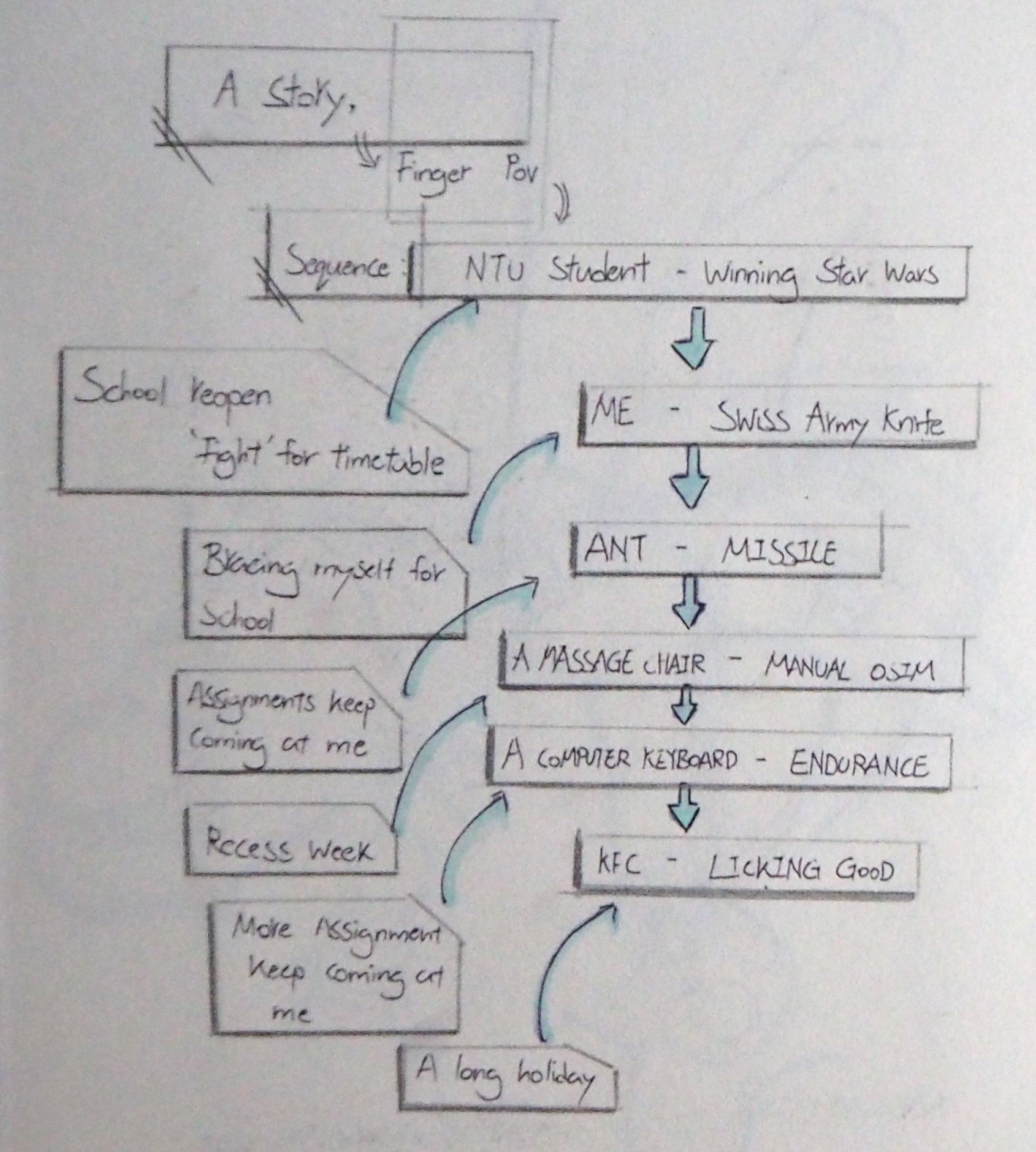
My initial concept of a narrative tell my life as a NTU Student.
See below for the flow of events;
P1010306
Basically, the story starts from ‘Winning the Ntu Star Wars’ and end with ‘Finger Licking Good’.
The story flow in a circular motion – From Classes to Recess week to Semester Break.
Each sequence is represented by a statement respectively.

Text

For example, the image [Above left] depict a ‘race’ between NTU students for their module of choice.
At the background, there are iconic infrastructures of NTU such as The Hive and ADM building. This are a few of the buildings that help us to identify the location. My plan to represent myself in the image does not really convey the intended message.
As gathered during the group consultation, the image seems to be too confusing and is too dull to capture attention from the viewer. In addition, my plan to incorporate ‘Fingerprints’  for this composition make it even confusing without any focus point.
Hence, I rejected the idea.

A good example of ‘Unclear’ would be the image on the right.
‘Finger from the POV of an ant is a Missile’ – The use of ‘finger’ in this composition was unclear due to several reasons such as the colour, shape etc.
I was recommended to use the ‘Finger’ as what it is suppose to be; play with skin colours, so that at one glance my viewers will be able to interpret and identify that as a finger.
Hence, reducing ‘Noise’.


Part 3: Take away from Group Consultation 

Many thanks to the contribution around the table; Miss Joy, Shannen, Renee and Daniel.
I greatly appreciated it!

As mention in the consultation, I intend to fabricate my compositions in a black and white manga style way.
The idea does not really bring out the story and I am suggested to concentrate on ‘Surrealism’ instead.
This is due to ‘Too much happening’ in my overall composition.
The use of different mediums made the overall feel disoriented and messy.

My follow up for this project is to bring my primary focus on ‘Product Design’ and ‘Surrealism’ as an secondary focus.


Time to sell some products!
Thank you for reading and looking forward to critique this Thursday! laughing

Foundation 2D Project 2 – Point Of View – Progress Pt1

Recess Week – 3rd March 2016


Hi!

Thank you for reading my second post for this week. ?
I categorized and differentiate my research and progress into 2 respective posts.
Hence, do visit my ‘Research-Pt2’ in the link below before reading this post.

Thank you!

Foundation 2D Project 2 – Point of View – Research pt2


Part 6: Exploration

P1010036P1010035
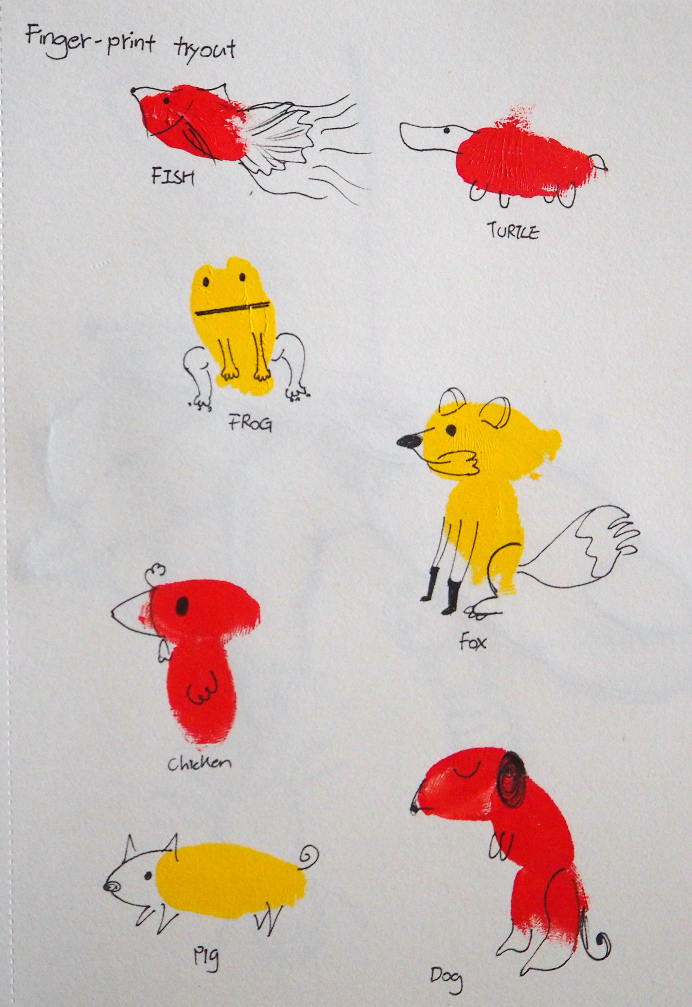
Initially, I wanted to make use of my fingerprint to create the compositions.
In the above fingerprint painting, I made use of my thumb and index finger to create the body of the animal.
After that, details were drawn on to the fingerprint.
I find this method interesting but however, I couldn’t link it to my selected 6 concepts as I wanted it to be more relatable. ?


Part 7: Approach

My approach to this project would be by digital means.
I’m trying out various platforms to compose the 6 compositions digitally, such as Photoshop and Illustrator.

During the consultation, I’ve shown Miss Joy some of my sketches.
The thoughts of introducing Surrealism into my composition made it possible for these theme.
I’m thinking of ways to combine my fingers with the suggested tools/equipment so as to fulfill the requirement.

Here are some sketches that was presented during the consultation;

P1010033
1) Finger from the point of view of Me is a Swiss army knife.
– In this sketch, I combine the drawing of my fingers with the shell of a Swiss Army Knife. The general idea is to portray the ‘usefulness’ of our fingers by comparing it with the Blades of the Swiss Army Knife. 
The Swiss Army Knife is drawn according to the one I received in NS (National Service), it have so much sentimental values! – It have so many uses; tightening the Muzzle of the SAR21 before a live-firing exercise, sewing badges on my No.4 and things like that.
Besides that, we uses our fingers everyday in any situation. It’s a ‘handy’ tool! ?

P1010034
2) Finger from the point of view of Ant is a Missile.
– Still working on this. foot-in-mouth


Keyboard is Endurance
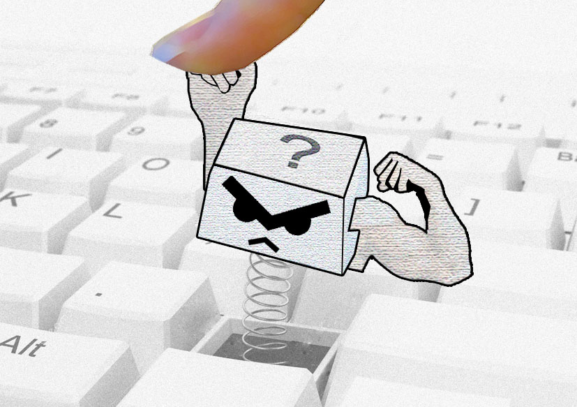
3) Finger from the point of view of A Computer Keyboard is Endurance.
– Trying out this composition with Photoshop by combining images online and digital drawing (With pen tool).


Part 8: 3 more to go!

Good stuffs takes time, I have 4 more composition to think about!
“Lost time is never found again!”  ?
Got to do it faster!!! >.<

1) Finger from the point of view of A Massage Chair is a Manual Osim.
2) Finger from the point of view of NTU Student is Winning the Star Wars.
3) Finger from the point of view of KFC is Licking Good.


The End

Thank you for reading! ?

Foundation 2D Project 2 – Point of View – Research pt2

Recess Week – 3rd March 2016


Hello there!

Thank you for reading this post!
I hope you enjoyed your recess week, hopefully it’s a productive one! ?


Part 1: The Great 18

As interesting as the title is, this project allow me to tap into my inner creatively and confidence which ignites my passion for conceptual design. As mentioned in my previous post, I would like to take this opportunity to try out something new and beyond my comfort zone.

As soon as I received the brief, my initial concept revolved around the idea of using ‘Tissue’ as a subject and in my composition. The ‘Tissue’ concept was a ‘Out-of-the-blue’ thing, it just came across my mind and I thought I should explore it further. Hence, I drafted some concept with prior to ‘Tissue’ the ideas are as follow,

1) Tissue from the Point of View of A Bowl Of Soup is a Wonton.
2) Tissue from the Point of View of A Desperate is a Life Saver.
3) Tissue from the Point of View of A Ghost is Clothing.
4) Tissue from the Point of View of A User is wiping the unwanted onto ‘Obama’ face. (Because Tissue are made from recycled paper/newspaper, hence you never know if you had wipe your unwanted onto ‘Obama’ face by any slight chance) *Obama is used as an example
5) Tissue from the Point of View of The Poor is Life.
6) Tissue from the Point of View of Sustainability is Recycle.
7) Tissue from the Point of View of The Sick is Hygiene.
8) Tissue from the Point of View of A Paper is Reincarnation.
9) Tissue from the Point of View of itself is A Twin (2 Ply).
10) Tissue from the Point of View of Our Body is Body Tissue.

Hence, I went to explore more ideas/concepts.Generally, I find the use of ‘Tissue’ less interesting despite it’s potentiality.
I want to compose a strong yet interesting concept that everyone is able to understand and relate, so as to minimize the ‘Noise’ for smooth message transmission.

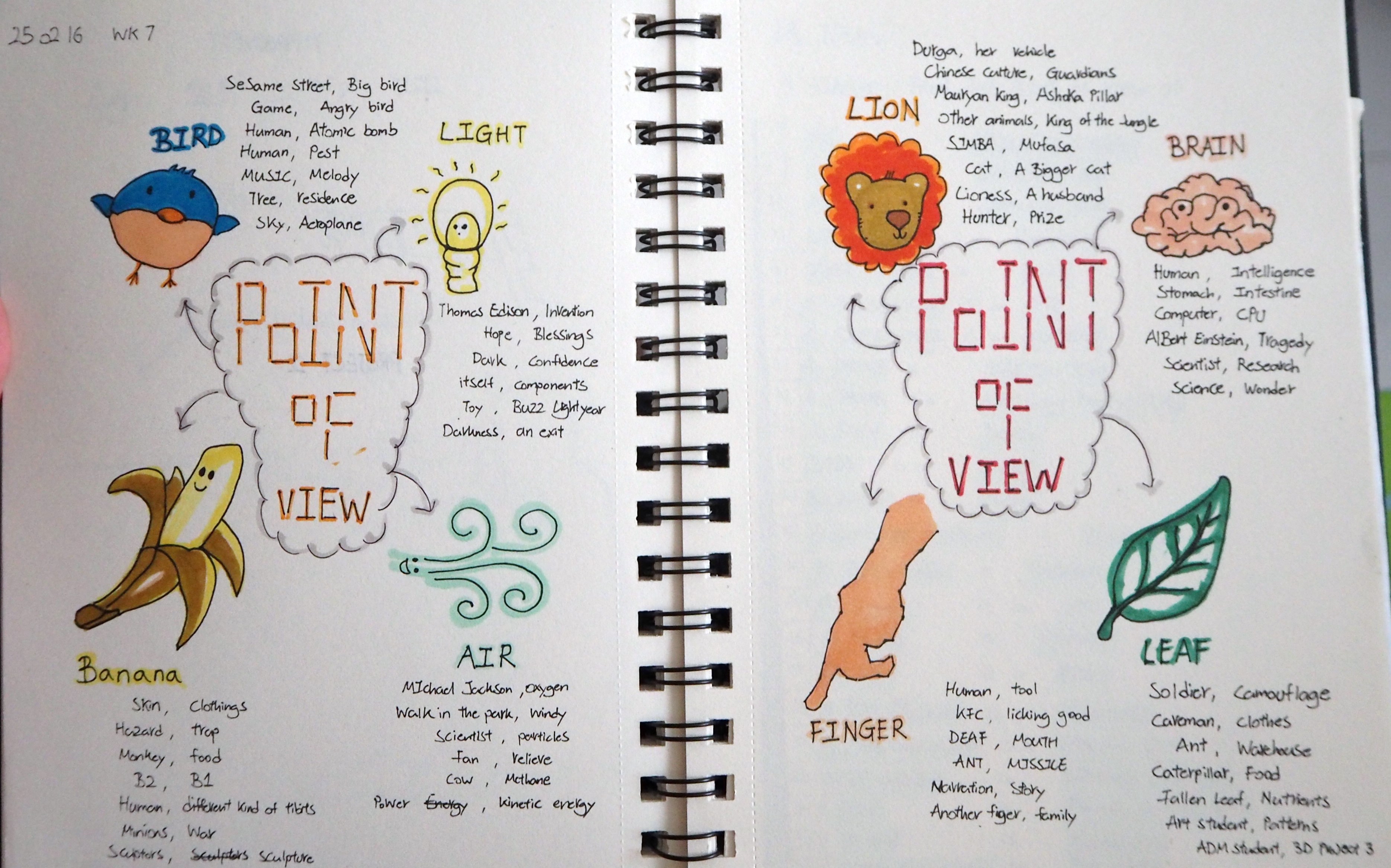
See below for the list;
Eugene VJ Don't copy Thanks

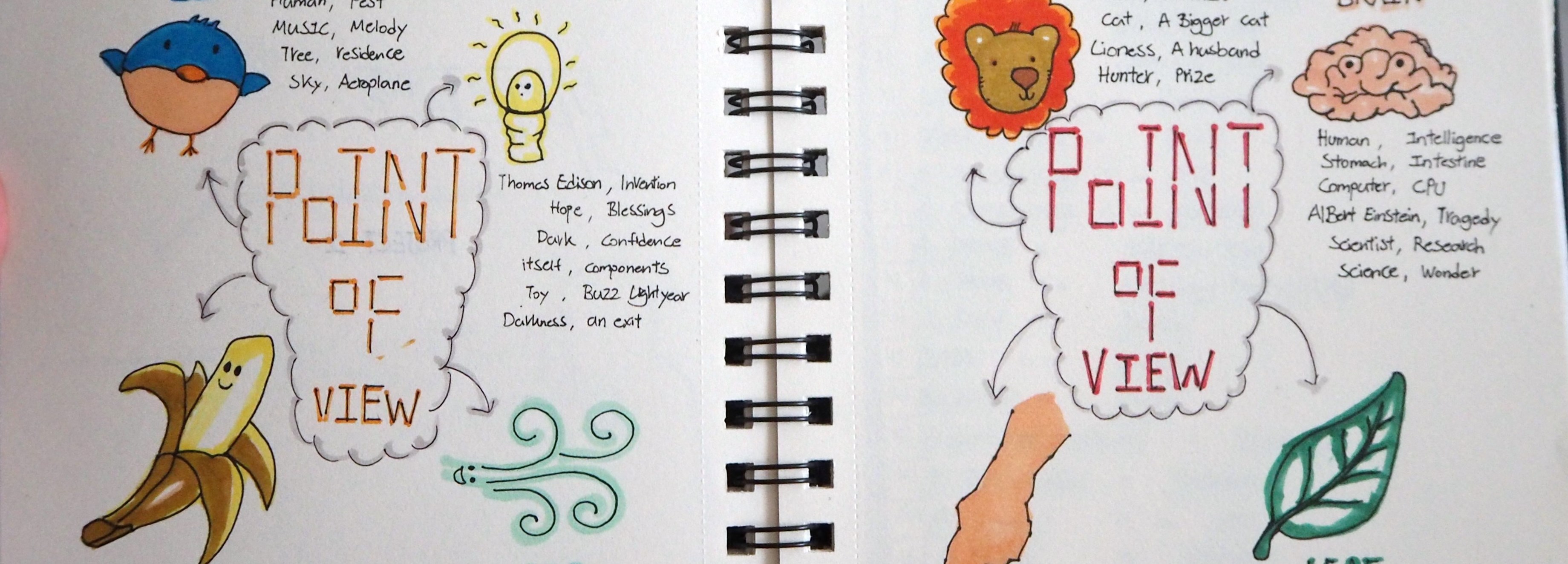
Some of the Ideas are

Bird
1) A Bird in the POV of Sesame Street is Big Bird
2) A Bird in the POV of A Game is Angry Bird
3) A Bird in the POV of A Human is Atomic Bomb
4) A Bird in the POV of A Human is A Pest
5) A Bird in the POV of Music is Melody
6) A Bird in the POV of A Tree is Residence
7) A Bird in the POV of The Sky is an Aeroplane

Light
1) Light in the POV of Thomas Edison is an Invention
2) Light in the POV of Hope is Blessings
3) Light in the POV of The Dark is Confidence
4) Light in the POV of Itself is Components
5) Light in the POV of A Toy is Buzz Lightyear
6) Light in the POV of Darkness is A Exit

Banana
1) Banana in the POV of A Skin is Clothings
2) Banana in the POV of Hazard is A Trap
3) Banana in the POV of A Monkey is Food
4) Banana in the POV of B2 is B1
5) Banana in the POV of Human is Variety of Snacks
6) Banana in the POV of Minions is War
7) Banana in the POV of Sculptors is Sculptures

Lion
1) Lion in the POV of Durga is her Vehicle
2) Lion in the POV of Chinese Culture is Guardians
3) Lion in the POV of Mauryan King is Ashoka Pillar
4) Lion in the POV of Other Animals is King of the Jungle
5) Lion in the POV of Simba is Mufasa
6) Lion in the POV of A Cat is a Larger Cat
7) Lion in the POV of A Lioness is A Husband
8) Lion in the POV of A Hunter is a Prize

Brain
1) Brain in the POV of Human is Intelligence
2) Brain in the POV of A Stomach is Intestine
3) Brain in the POV of Computer is CPU
4) Brain in the POV of Albert Einstein is Tragedy

111
5) Brain in the POV of Scientist is Research
6) Brain in the POV of Science is Wonder

Finger
1) Finger in the POV of A Human is A Tool
2) Finger in the POV of KFC is Licking Good (Slogan)
3) Finger in the POV of A Deaf is His Communication Tool
4) Finger in the POV of An Ant is A Missile
5) Finger in the POV of A Narration is A Story
6) Finger in the POV of Another Finger is A Family

Leaf
1) Leaf in the POV of A Soldier is Camouflage
2) Leaf in the POV of A Caveman is Clothing
3) Leaf in the POV of An Ant is it’s Warehouse
4) Leaf in the POV of A Caterpillar is Food
5) Leaf in the POV of a Fallen Leaf is Nutrients
6) Leaf in the POV of a Art Student is Patterns
7) Leaf in the POV of a G1/G5 ADM Student is Foundation 3D Project 3

And yup! These are the previously generated ideas, from these I chose the one I think suitable for the project and further refine it.


Part 2: Recap

After much consideration, the concept I will be working on for this project is ‘Finger’.
Reason:
I find it more relatable as compared to the rejected ideas.
Mainly because we all have Fingers and we probably have our own story of our ‘Fingers’
Although we use our fingers differently, there are probably some things that are in common.
I mentioned during last week presentation that I describe our Fingers as a ‘Wonderful tools’.
We use it everyday, anytime at anyplace. It’s wonderful isnt?
In addition, I would like to work towards a Simple yet Wacky concept as part of my learning experience.

To recap, my 18 concepts are as follow;

01) Finger from the point of view of Me is a Swiss army knife.
02) Finger from the point of view of Me is A Directional Tool.
03) Finger from the point of view of Me is An Expressive Tool.
04) Finger from the point of view of Other Fingers is Teamwork.
05) Finger from the point of view of Other Fingers is Family.
06) Finger from the point of view of A Finger Nail is An Eye. (Cyclops) or Finger from the point of view of A Finger Nail is A Clothing. (Finger nail = face?)
07) Finger from the point of view of A Thumb is Odd-One-Out.
or Finger from the point of view of A Thumb is a Life-long buddy. (Reference Old Master Q ‘老夫子’)
08) Finger from the point of view of A Palm is Medusa. (Snakes on head)
09) Finger from the point of view of Baby is Utensil.
10) Finger from the point of view of Buddhism is Mudra.
11) Finger from the point of view of A Computer Keyboard is Endurance.
12) Finger from the point of view of A Rude Person is Profanity.
13) Finger from the point of view of A Smoker is an Art. (The art of holding a Cigarette)
14) Finger from the point of view of A Tourist is Direction.
15) Finger from the point of view of Ant is a Missile.
16) Finger from the point of view of A TCM Physician is Stethoscope. (Pulse Reading)
17) Finger from the point of view of A Massage Chair is a Manual Osim.
18) Finger from the point of view of NTU Student is Winning the Star Wars. (Fastest Finger Wins)
19) Finger from the point of view of KFC is Licking Good. (Slogan)
20) Finger from the point of view of A Kid is Playfulness. (Lift Buttons)
21) Finger from the point of view of Little Green Men (Toy Story) is The Claw.

Narrowing it down to 6, I have;

1) Finger from the point of view of Me is a Swiss army knife.
2) Finger from the point of view of A Computer Keyboard is Endurance.
3) Finger from the point of view of Ant is a Missile.
4) Finger from the point of view of A Massage Chair is a Manual Osim.
5) Finger from the point of view of NTU Student is Winning the Star Wars.
6) Finger from the point of view of KFC is Licking Good.

Considering
1) Finger from the point of view of Baby is Utensil.


Part 3: Photo Inspiration / Artist References

001

002

003

More Surreal Finger Pinterest

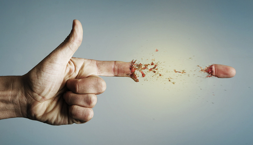
Jan Oliehoek

Jan Oliehoek

Jan Oliehoek use of surrealism in this artwork combine the human hand with a gun.
I wonder if I can apply Surrealism in my artwork? Hmm ?


Part 4: Consultation Take-Away

During the consultation with Miss Joy, I shared some of these ideas;
1) Story Telling (Finger Puppets)
– As the finger move to each composition, it’s ‘Puppet’ changes as well.
2) Composition Cut-Out
– Basically, inserting my fingers into the ‘cut-out’ holes of the composition so that my fingers become the add-on element.
3) A narration 
– Comic style presentation (Black & White)
– Probably Drawing and Illustrating with Photoshop/Illustrator

Joy also shares her valuable insights to help me improve on my concept,
Below are the points of discussion during the consultation;
1) War
– For example, ‘Finger from the point of view of KFC is Licking Good’ relates to the idea of Hunger War.
– Finger from the point of view of A Massage Chair is a Manual Osim relates to tackling body ache problems.

2) Daily Struggle
– Create a narration based on Daily Struggle so that other people is able to understand better.

3) Word Play
– Joy suggest the use of ‘Word Play’ to strengthen the concept.
– Hence, I went to read on English Idioms relating to fingers, the following are some examples;
1) Keep your fingers crossed
2) Five finger discount
3) Have a finger in every pie


Part 5: Others

This video appear in my mind as I was researching for inspiration.
Haha! Probably it’s a reminder for myself to take a short break. cool
Although this video, or rather this person, does not make any sense at all.. it is a good demonstration that the ‘Finger’ is nonetheless a good expressive tool.
Thumbs ? up man! ?????????

Foundation 2D Project 2 – Point of View – Research pt1

Week 7 – 25 February 2016


Hey there!

Today entry focuses on the Idea Generation for Project 2: Point of View


Part 1: Introduction

Choosing and creating a composition based on a theme will be a fun and rewarding project, I felt.
However, there are various consideration that I have to be assured of while working on the idea/composition.
As mention during the lecture by Miss Joy, the journey of the message could exist in 2 path
1) Contain ‘Noise’ that interfere with the intended message
2) ‘Self-Explanatory’

I intend to carry out this project along with these few considerations;
1) Legibility
2) Appeal

In this conceptual stage, I would like to work towards a Simple yet Wacky concept which is easily relatable and understood. I would like to take this opportunity to explore and work on other approach/mediums since this project is rather ‘Open-Ended’.
Because I am currently working on the conceptual stage, I am clueless what my final composition will be like. Hence, take it with a gain of salt. ??

Whose Perspective


Part 2: Idea – A story of a Magical Finger

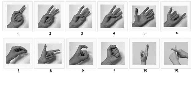
Number Mudra
01) Finger from the point of view of Me is a Swiss army knife. ?
02) Finger from the point of view of Me is A Directional Tool. ☝️
03) Finger from the point of view of Me is An Expressive Tool. ?

04) Finger from the point of view of Other Fingers is Teamwork. ?
05) Finger from the point of view of Other Fingers is Family. ✋
06) Finger from the point of view of A Finger Nail is An Eye. (Cyclops) ?
or Finger from the point of view of A Finger Nail is A Clothing. (Finger nail = face?) ?
07) Finger from the point of view of A Thumb is Odd-One-Out. ✊
  or Finger from the point of view of A Thumb is a Life-long buddy. (Reference Old Master Q ‘老夫子’) ✌️
08) Finger from the point of view of A Palm is Medusa. (Snakes on head) ?

09) Finger from the point of view of Baby is Utensil. ?
10) Finger from the point of view of Buddhism is Mudra. ?
11) Finger from the point of view of A Computer Keyboard is Endurance. ??
12) Finger from the point of view of A Rude Person is Profanity. 
13) Finger from the point of view of A Smoker is an Art. (The art of holding a Cigarette) ?
14) Finger from the point of view of A Tourist is Direction. ?
15) Finger from the point of view of Ant is a Missile. ?
16) Finger from the point of view of A TCM Physician is Stethoscope. (Pulse Reading) ✋
17) Finger from the point of view of A Massage Chair is a Manual Osim. ?
18) Finger from the point of view of NTU Student is Winning the Star Wars. (Fastest Finger Wins) ?
19) Finger from the point of view of KFC is Licking Good. ?
20) Finger from the point of view of A Kid is Playfulness. (Lift Buttons) ?
21) Finger from the point of view of Little Green Men (Toy Story) is The Claw. ✋

The human ‘Finger’ is a magical tool. It can perform incredible stuffs!
The journey of the human ‘Finger’ forms a narrative, considering them to be working almost 24/7.


Part 3: Artist Research

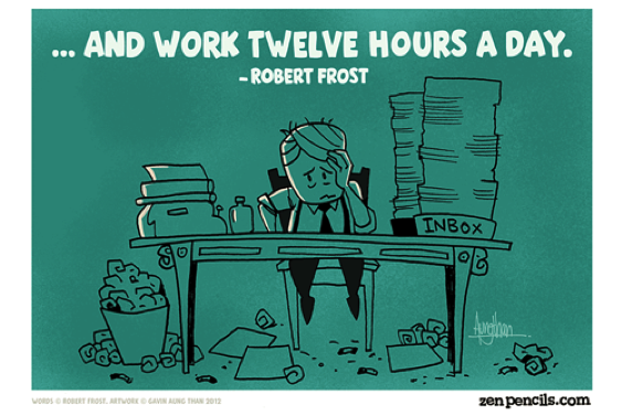
Zen Pencils – Illustration/Storyboard

Zenpencil
Zen Pencils cartoon illustration was drawn based on famous quotes.
Gavin Aung Than broken down the quotes and drawn them into separate boxes so that it can be easily understood. Zen Pencils have always been a inspiring platform for me in terms of story-boarding and character development. I’m looking into whether I can incorporate some elements into my project 2.


Judith Braun – Finger drawing
005
Judith Braun abstract composition were created using her fingers dipped in charcoal dust.
Despite the abstract element, her composition follows a strict rule of symmetry.
I find her use of medium interesting due to the fact that she didn’t use anything new for her composition -she uses her finger (Something that already exist).
In addition, she managed to draw a balance between ‘Arts’ and ‘Design’ allowing the differences to work hand-in-hand. Furthermore, I am amazed by the clean and neat finishing along with the ‘Negative Space’ element in her composition.


Iris Scott – Finger Painting
001
I pay attention to Iris Scott oil finger painting. I find her composition intriguing as every of her composition was done with great colour saturation burst with movement using a form of textual impressionism.
Quite similar to Judith Braun above, they uses their own finger to paint. Amazing!
Inspired by Iris Scott, I wish to pay close attention to her use of colour saturation, try to manipulate and try on new mediums.

Zaria Forman
005-1-768x241
Zaria Forman finger painting bring the art to a whole new level.
Her photo-realistic composition were drawn with her fingers which is truly breathtaking.
I am amazed by the fine details that she highlight in the composition.


Part 4: Inspiration

Finger Art

002

003

004

Finger Painting Maestro

I came across this video via Facebook a couple of weeks ago and I was amazed by his Finger Painting technique! I wonder if I can apply this for project 2!?

The idea of writing a narrative by the use of hand shadow is very inspiring too!

The study of Semiotics (Meaning) in this MV to provide effective visual communication.


Foundation 2D II Project 1 – Typographic Portrait – Progress Pt3 [ Final ]

Week 6 – 18 February 2016


Hey there!

Thank you for your kind attention during my presentation! Appreciated!
Here’s an extra thanks to those who gave me their opinion on my works~!
Haha! ? ?
I feel that each of us are unique and I’m glad that I can learn from you! ?

Today entry is a summary for Project 1 – Typographic Portrait.


Part 1: Background Design [Development] 

BG

Problem Faced:
The background was the hardest, in my opinion, because the attempt to make it as realistic as possible was a challenging task.  ?

I started off with Adobe Photoshop CS4 – Which I am most comfortable with. However, after several attempts trying to set the image right, I can’t seems to be able to do it. I tried directing my reference to some pictures of a real forest / wilderness and some of the National Geography Wild videos for inspiration. ?

There were a few considerations, as mention in the previous update, as follow;
1) Scale
2) Realism
3) Logical Placement
4) Colour

I told myself that, regardless how detailed the description via websites and videos can be, experiencing and understanding the actual environment by an individual will help more. ?

My Takeaway:
The completion of the background was my greatest accomplishment, I felt, for this project.
The development on the background was the most pronounced – From a flat image in Adobe Photoshop CS4 to a rather convincing landscape in Adobe Illustrator CS4.
This project allow me to explore the use of other mediums such as Adobe Illustrator CS4 and help me think critically in terms of logical placement and setting of the animals and environment. ?


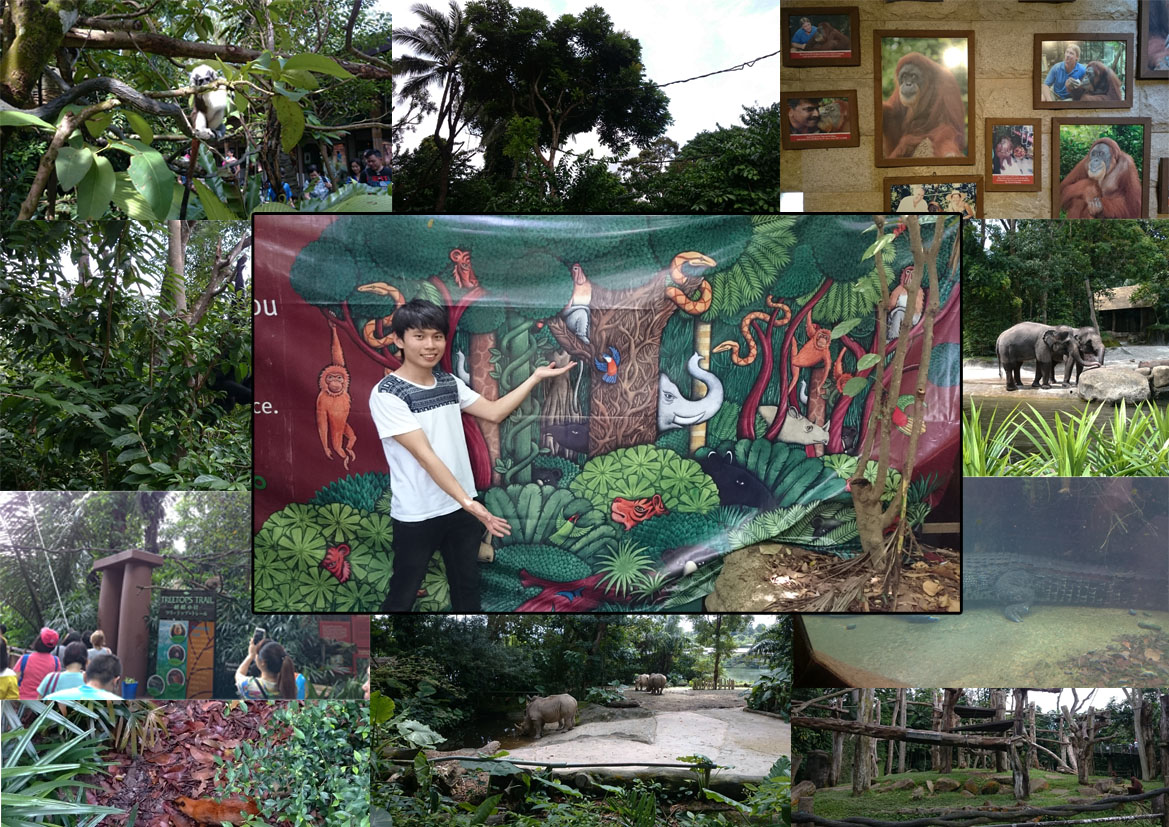
Part 2: Field Research at the Singapore Zoo

Junegene

In celebration for Valentine’s Day, June and I visited the Singapore Zoo (as I conducted my field research).
It was a fun and engaging learning process to see and know more about the relationship between the animals and their natural habitat. ?

Throughout the research, I pay attention to the animals behaviors and their movement from place to place.
Understanding these will help me with my composition, especially the silts animation that I’m working on.

However, Singapore Zoo does not offer a wider range of animals as compared to the rest of the world.
Hence, my composition on the ‘deer’ and the ‘wolf’ were done visually online.

Nevertheless, the trip to Singapore Zoo was a fun-filled and enjoyable one.
I strongly recommend to my classmates and I will probably re-visit another day. ?


Part 3: Explanation on Individual Panel

O1O1
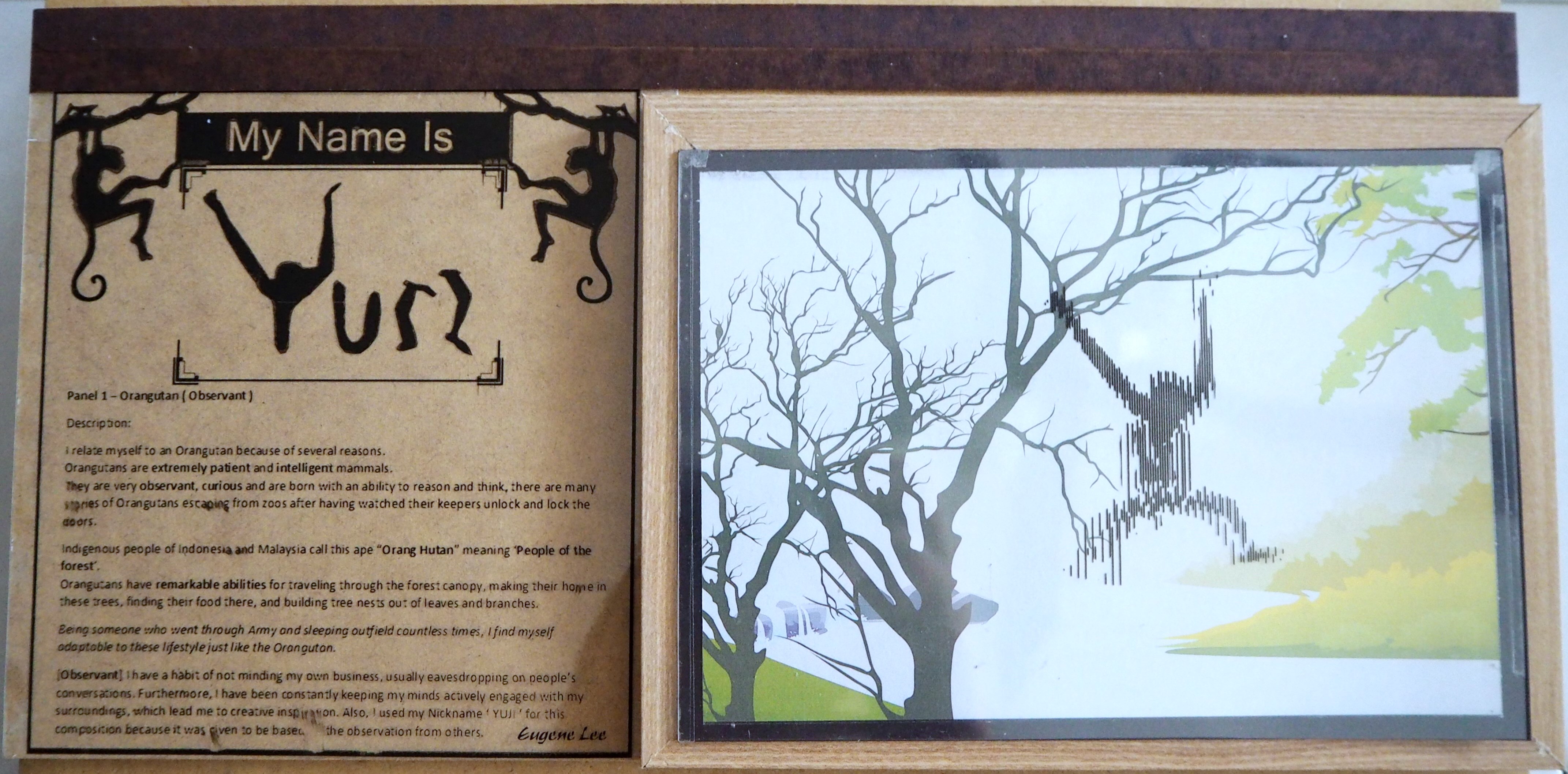
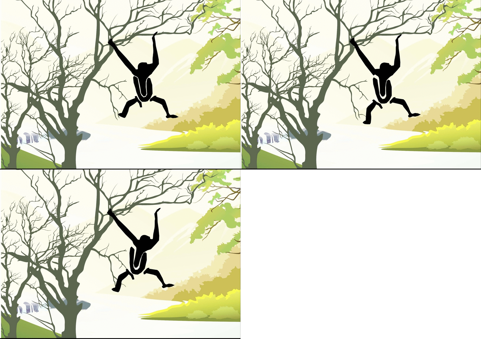
1: My name is YUJI and I am Observant.

Panel 1 – Orangutan (Observant)

I relate myself to an Orangutan because of several reasons.
Orangutans are extremely patient and intelligent mammals.
They are very observant, curious and are born with an ability to reason and think, there are many stories of Orangutans escaping from zoos after having watched their keepers unlock and lock the doors.

Indigenous people of Indonesia and Malaysia call this ape “Orang Hutan” meaning ‘People of the forest’.
Orangutans have remarkable abilities for traveling through the forest canopy, making their home in these trees, finding their food there, and building tree nests out of leaves and branches.

Being someone who went through Army and sleeping outfield countless times, I find myself adaptable to these lifestyle just like the Orangutan.

[Observant] I have a habit of not minding my own business, usually eavesdropping on people’s conversations. Furthermore, I have been constantly keeping my minds actively engaged with my surroundings, which lead me to creative inspiration. Also, I used my Nickname ‘ YUJI ‘ for this composition because it was given to me based on the observation from others.

W1W1
2: My name is ユージン and I have a Shadow Self.

Panel 2 – Black Wolf (Shadow Self)

The ‘Shadow’ is those aspects of self that are kept hidden in the dark forgotten place within us all, swarming with dark desires and impulses.
My shadow self relates to my strong negative feelings that usually lead me to ‘Over-Thinking’, ‘Anxiety’, etc.

[Shadow Self] I use ‘Black Wolf’ to represent my ‘Shadow Self’ because it denotes a dark, negative impression that infers self-interest. It can also represent greed, fear of being threatened and the lack of trust in someone or in myself.

The Black Wolf was designed with my name in Japanese –ユージン[Katakana format].
Which spelled ‘Yu-Jin-i’ when written in romaji. Foreign language support the idea of ‘Not Usual’ and the idea of foreign object.

In my composition, I refer to the Black Wolf as my personal challenges with boundaries. The boundaries are blockages that stop me from moving forward or making the wrong decision
– Usually associated with self-interest and temptation.

In addition, it was further elaborated by placing the Black Wolf in its attacking posture.
In this case, attacking the Deers in Panel 3. This portray my inner desire at work thus creating personal challenges.

D1D1
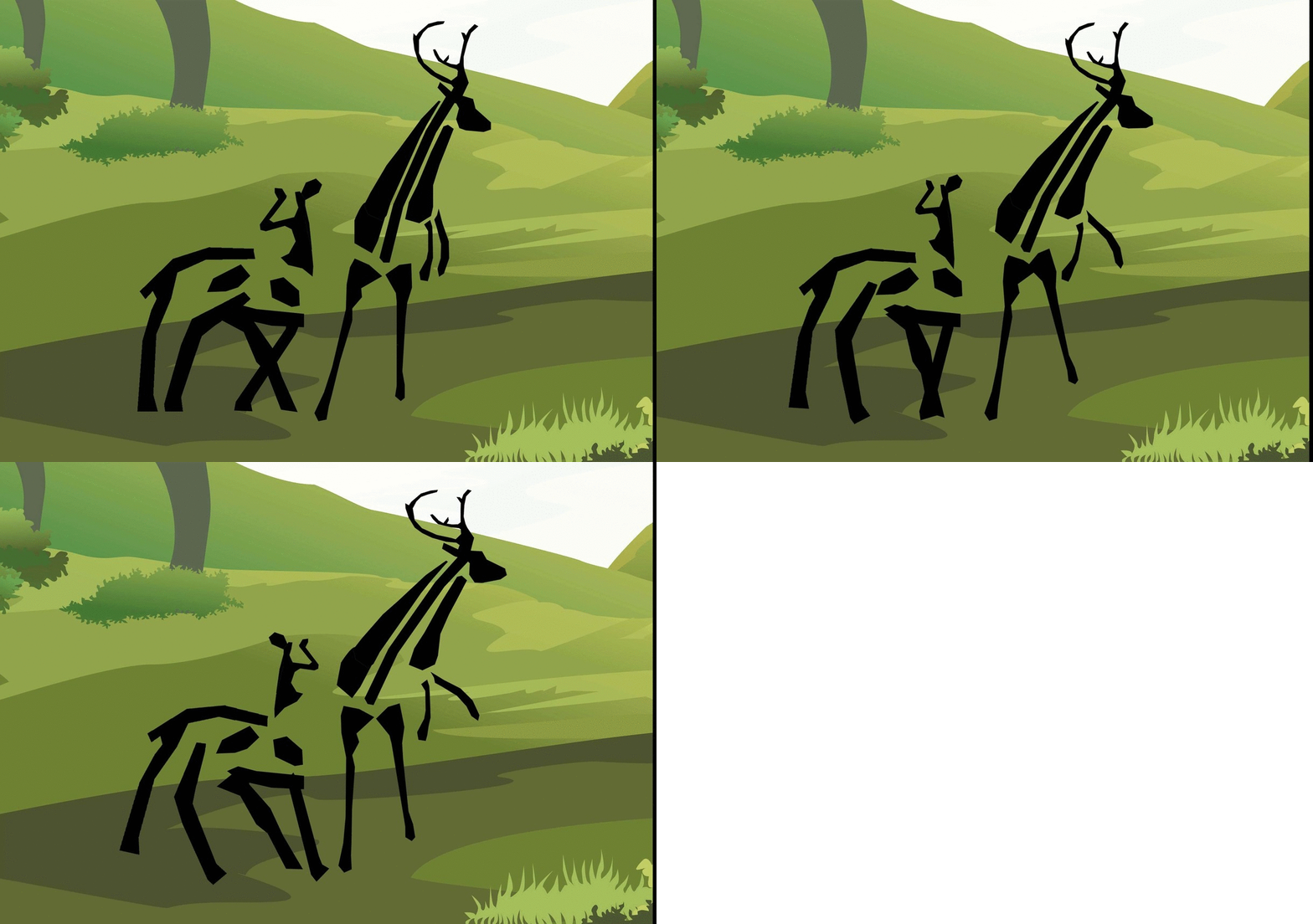
3: My name is 俊杰 and I protect whatever belongs to me.

Panel 3 – Stag (Giving Protection)

I relate myself to a Stag ( Male Deer ) because of several reasons,

Firstly, deer stay in a herds of approximately 25 deers per herd, mainly female deer and a dominant male deer (Stag). The male deer are protective deer that will fight to protect their herd of female deer and to protect their pride.

Secondly, deer are also known as selective feeders which they spend most of their time picking out the shoots, leaves, grasses and fruits that are easy to digest. Similar to myself, I chose food that I find are light, more nutritious and easier to digest.

Lastly, they are constantly being hunted by human (for meat, milk and skins) or prey to other wild animals such as wolves. They are vulnerable but they stay strong to protect whatever belongs to them.

[Giving Protection] In this composition, I designed the deer to resemble my Chinese name俊杰.
The general idea is to portray my characteristic of being able to give protection.
For example, my name does not make sense just or alone. It can only exist together as俊杰.
Hence, the stag is shown in a fighting position – against the wolf
whereas the deer is being protected.

M1M1
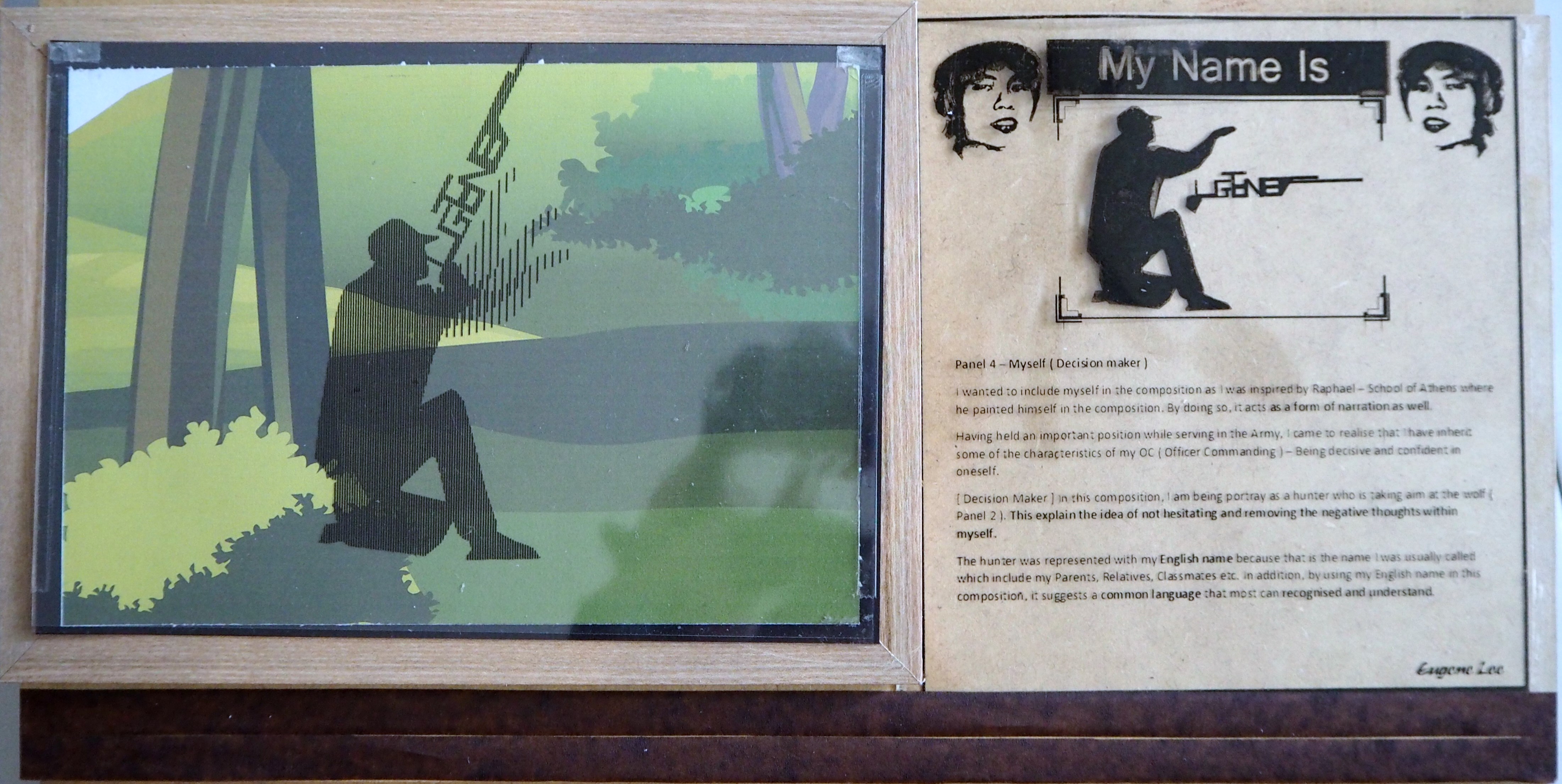
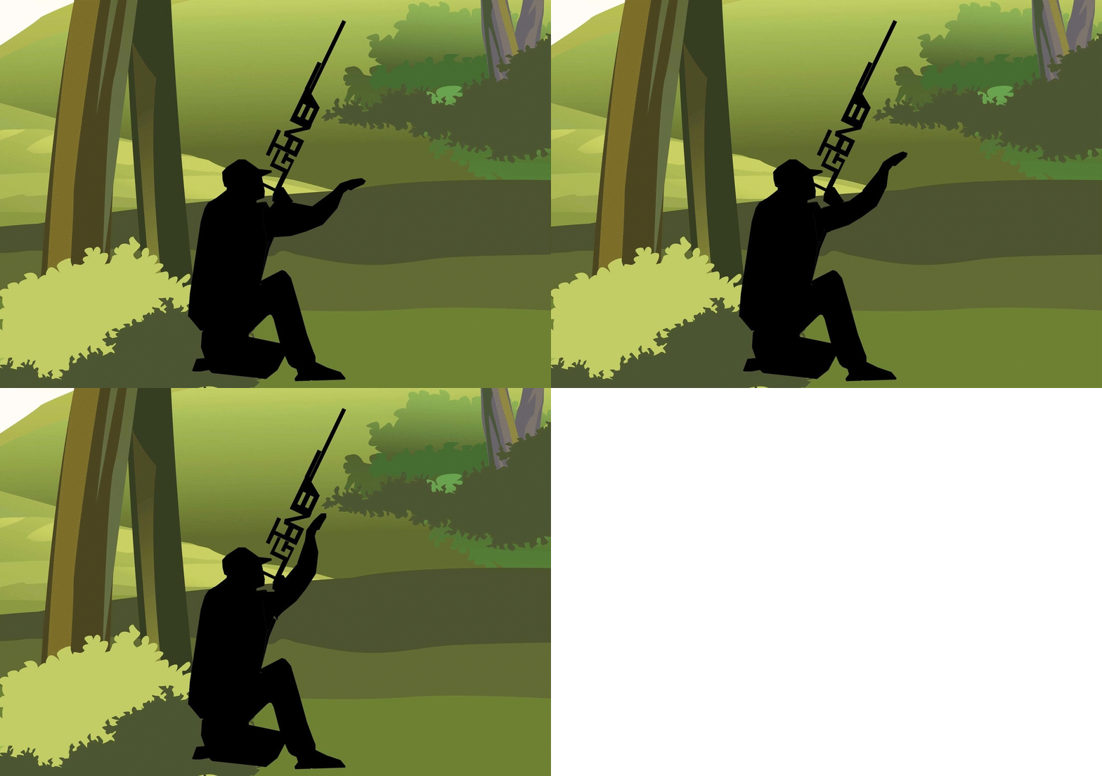
4: My name is Eugene and I am a Decision Maker

Panel 4 – Myself (Decision maker)

I wanted to include myself in the composition as I was inspired by Raphael – School of Athens where he painted himself in the composition. By doing so, it acts as a form of narration as well.

Having held an important position while serving in the Army, I came to realise that I have inherit some of the characteristics of my OC (Officer Commanding) – Being decisive and confident in oneself.

[Decision Maker] In this composition, I am being portray as a hunter who is taking aim at the wolf (Panel 2). This explain the idea of not hesitating and removing the negative thoughts within myself.

The hunter was represented with my English name because that is the name I was usually called which include my Parents, Relatives, Classmates etc. In addition, by using my English name in this composition, it suggests a common language that most can recognized and understand.


whole composition
When seen together as a bigger composition, the individual 4 panels combine together to form a narrative.
The story describe the ‘Big things’ happening inside me. The animals were selectively chosen that coincided with things that were happening inside me.
The goals of this narrative is to convey the message of ‘Never judge someone without knowing the whole story.’  There’s a story behind every person. There ‘s a reason why they’re the way they are. We never know what someone have been through and is often too early for one to judge.
Hence, “If we learn to understand each other, we will have a better understanding of ourselves.” – Sarah Gadon


Part 4: Behind-The-Scene [The Making]

bts
Framing up.

Orangutan Changes
Our eyes filled up the negative spaces in the animalistic typography to form the shape of an animal.

Display Boards
Individual panel’s description with explanation.


Part 5: Visual Journal

http://eugeneyuji.viewbook.com/album/typographic-portrait

Eugene VJ


Part 6: Reference Artists

moodboard
– Singapore Zoo Description Boards

Tetrad
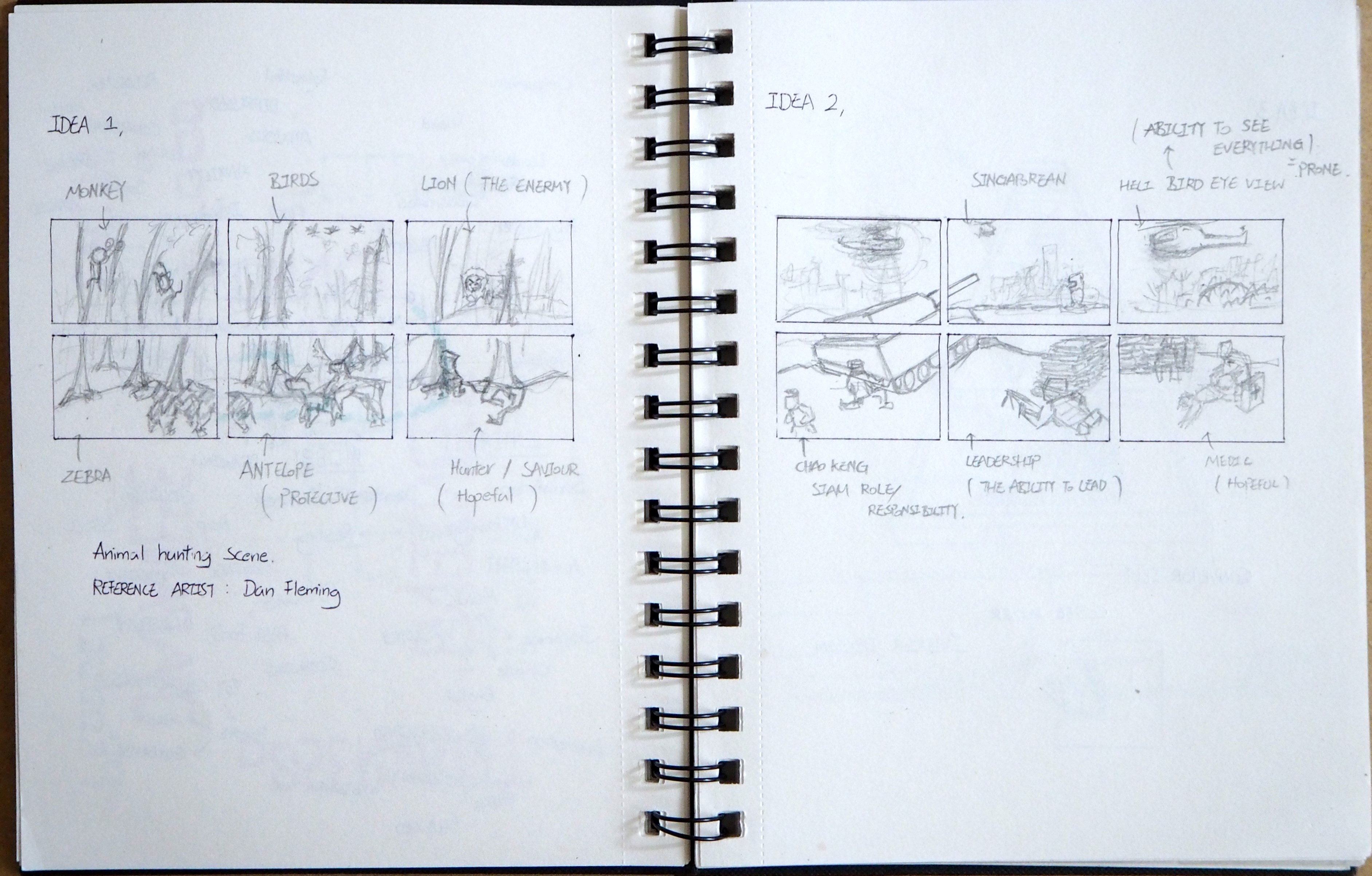
– Dan Fleming animal typography

Hello 2
– Marcus Reed animal typography


Part 7: Rejected Works

Eugene Second Animation
Background Design


Part 8: Feedbacks

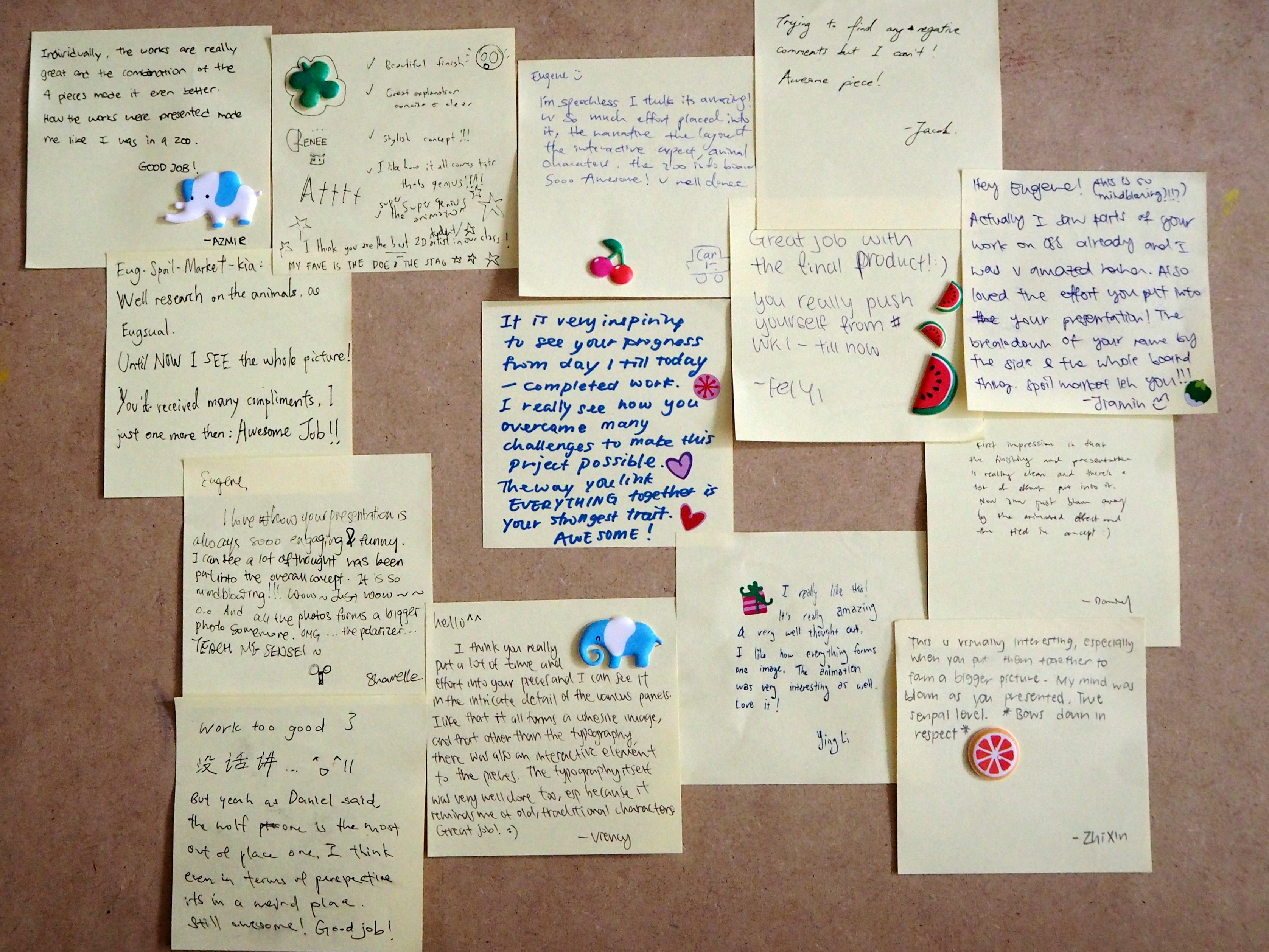
Feedbacks

To improve:
Panel 2 (Shadow Self) could have been darken to strengthen the ‘Darkness’ effect.


Project 1 Concluded.
The end ( =
??????