
Week 1 – 14 January
Hey there!,
It’s so great to be back in school! ?
I have enjoyed sharing interesting ideas, listening to presentation and stories in the previous semester, on top of that, we learnt and worked really hard!
G1! We did it! Although some of us won’t be seeing each other during lessons but let’s keep up the fighting spirit and do even better for this semester! ??
I’m sure that this will be another Egg-Citing semester because I will be working together with Miss Joy and the new classmates! (:
Awesome! Let’s start the first entry!
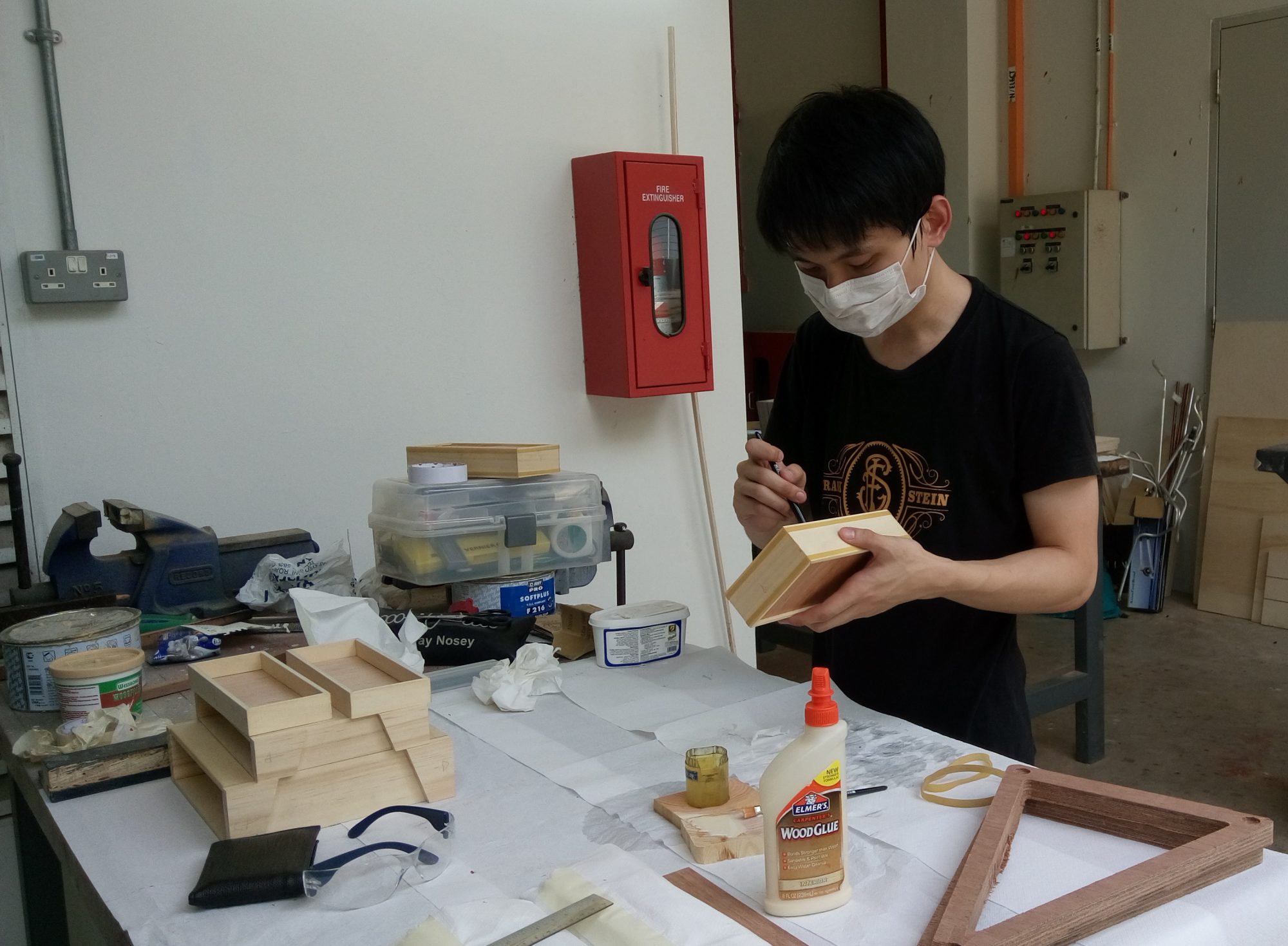
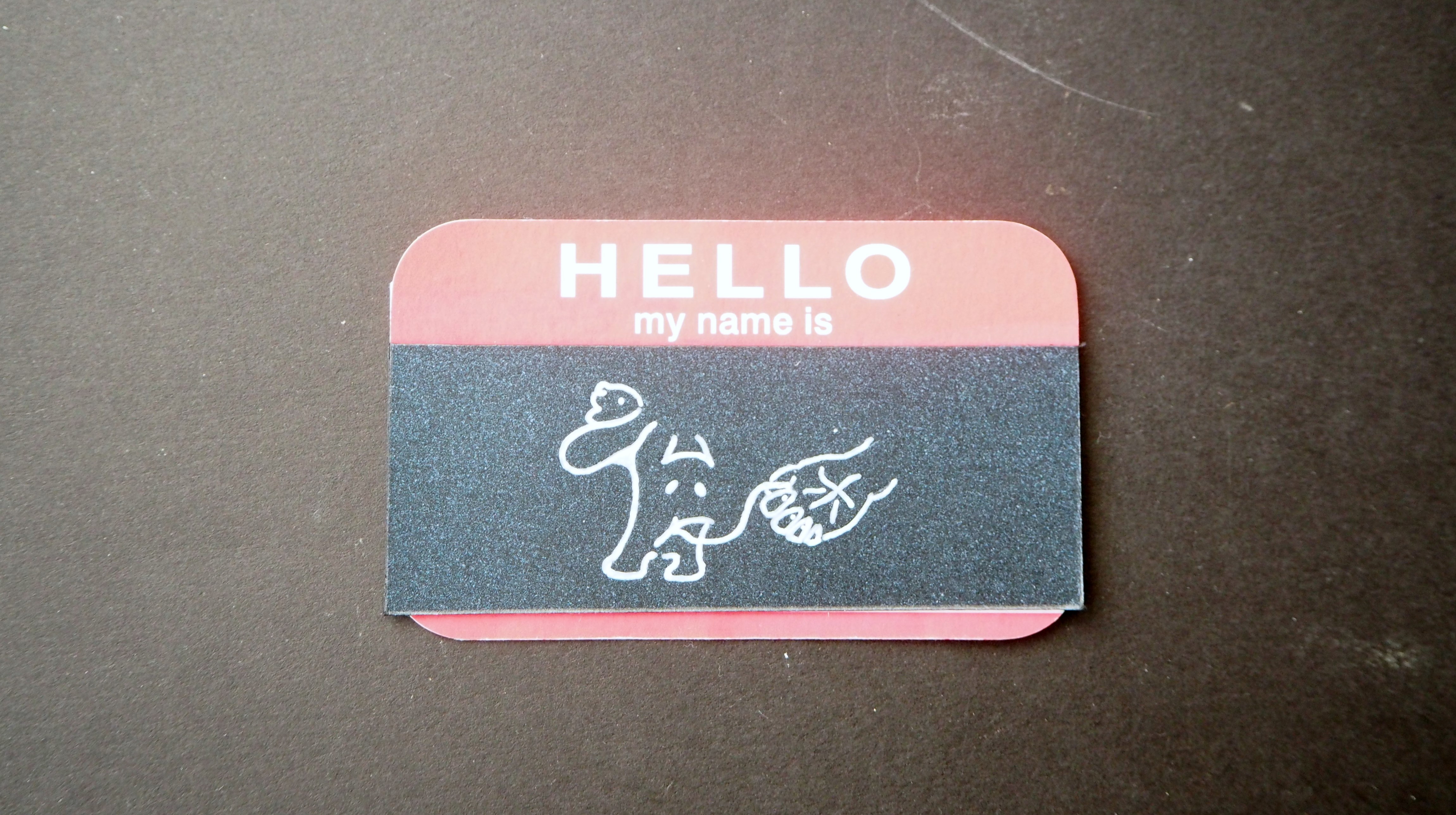
During the lesson, we were tasked to design 3 Name Tags of different genres –
1) Typography ~ (Describing a Character that is Engaging)
2) Abstract Solution ~ (No Start, No End)
3) Concept ~ (Led by a Concept)
Concepts Sketches / Idea Generation8
- Typography
~ as derive from the term ‘Typography’, it means playing around with the written language by making it interesting, engaging and more appealing when being displayed.
~ hence, I went to various concepts such as writing my name in different languages such as 华语, 日本語 and English accompanied with the use of different forms and writing styles.
~ to spice up the interesting component in my design, I drew my Chinese Name in a way that one Chinese Character look like a Puppy and another a Human hand narrating a story about Human & Animals Relationship.
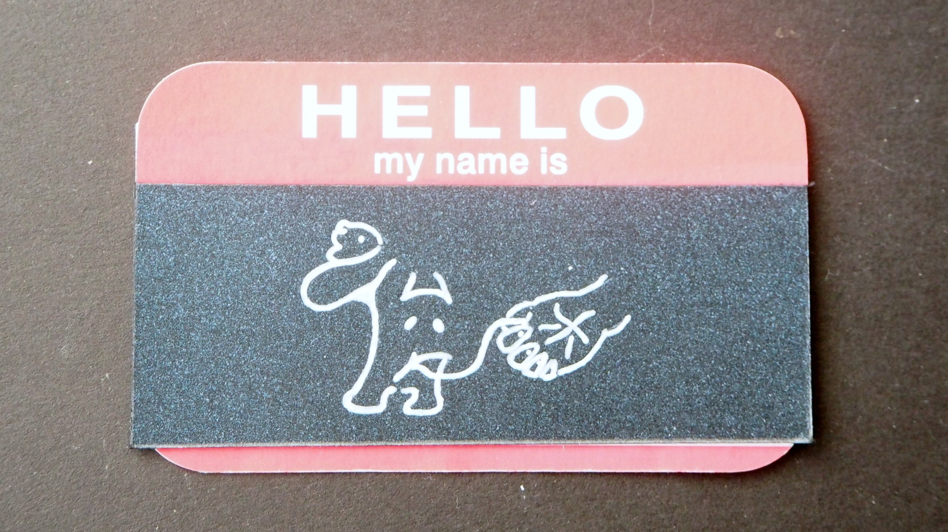
~ Reference Artwork by Corner Croft

- Abstract Solution
~ for this design, I explore the use of mediums such as
1) Chinese Ink
2) Folded Metal Wire
3) Can Cap
4) Pen & Pencil
~ My previous concept was untidy in my opinion, I wanted to create a abstract but neat composition, hence, I craft out my name with the letter ‘U’ so that it resemble the fish scale in an abstract manner. In the design, the viewer have to look closely in order to decipher my hidden name that was ‘engrave’ in it.
~ in my improved design I over-lap the cut-out circles, with the help from a hole puncher, and stick it on a piece of hard backing.
~ the design aims to carry the attribute of a ‘Arowana’ fish which represent ‘Precious’, ‘Expensive’, ‘Beautiful‘ etc.
~ Reference Artist – Marian Bijlenga (Fish Scale Art)
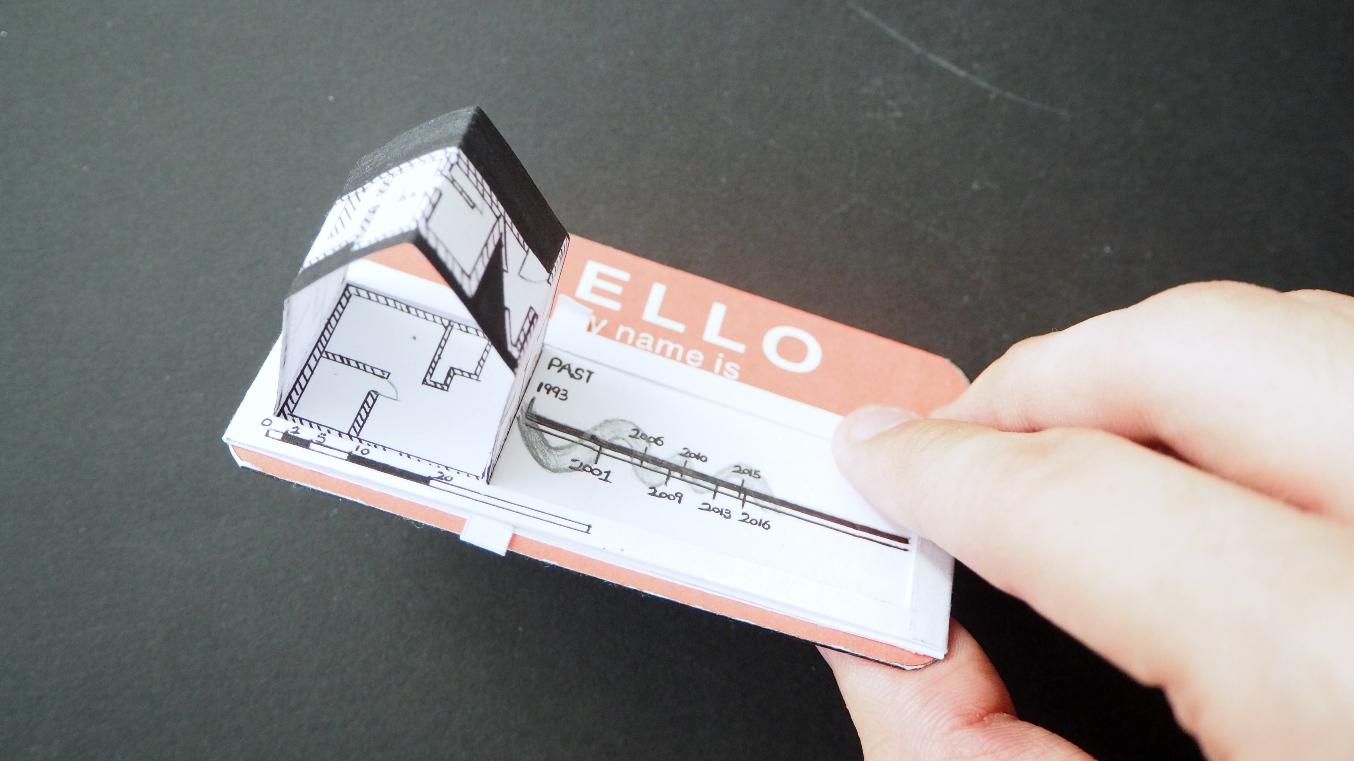
- Concept
~ in this design, I play with the theme ‘What Makes Me’ and how can it be link to ‘Product Design’.
~ in the initial stage, I brainstorm several concepts/sketches relating to ‘What Makes Me’ for example – Food? Childhood? Lego?. As more ideas developed, I decided to nail a theme based on a ‘Construction‘.
~ I find the concept interesting because I was reading up on the recent article on ‘Landscape Design’ and it features “Singapore – building a forest in a high-rise apartment atrium”. Link Here The advancement in building technology made creative infrastructure more possible! This can only be done so by having a good blueprint layout, knowledge and foundation etc.
~ For example, all Year 1 students have to strengthen their foundation by participating in the Core Modules. This enable the students to explore, deepen, sharpen their understanding of Arts, Design and Media.
~ The root of goodness lies within having a good foundation.
Final Name-Tags
1) Typography
2) Abstract Solution

3) Concept
