Foundation 2D II Project 1 – Typographic Portrait – Progress Pt2

Week 5 – 11 February 2016


Hello there! ^^

Next week is our first Foundation 2D presentation of semester 2!
Can’t wait to learn from my classmates project!
Similar to last week, today entry focus on the Work-In-Progress. ??


Part 1: Creating the Setting.

As learnt from my previous OSS entry, my composition will involve the use of 3 layers.
1) Background
2) Animalistic Typography (To be Printed on Transparent Sheet)
3) Silt Panel

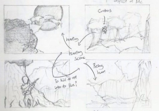
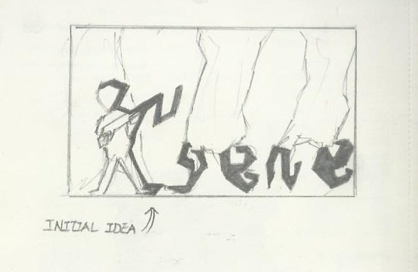
This is my initial 6-Panel concept.
Eugene Idea 1

Followed by the edited 4-Panel concept.

Eugene second edit

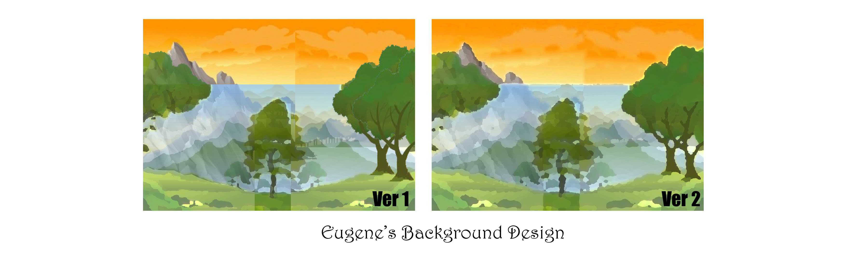
Proceeding with the edited concept, I created a landscape design with Photoshop.
Refer to below illustration.

Background Design
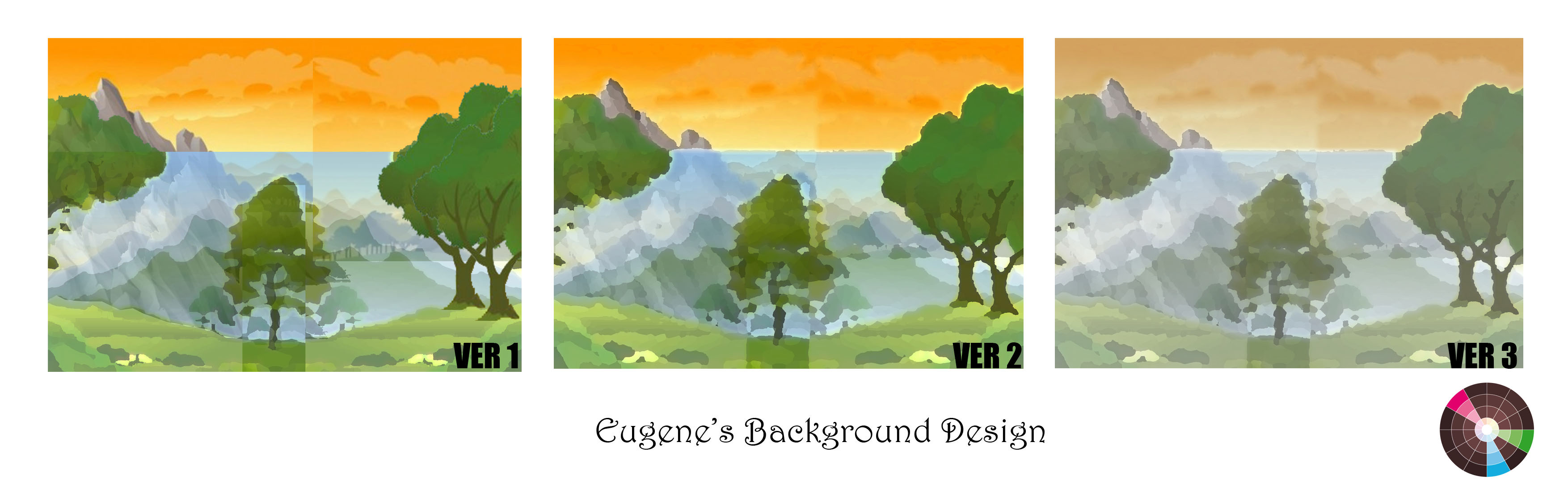
In the informal critique last week, I was recommended to decrease the Saturation of the ‘Split-Complementary’ colours so that it lower the chances of interfering with the Animalistic Typography (2nd Panel). The result is shown above in Version 3.

However, I was struggling with this background design because it does not seems as ‘Realistic‘ as I wanted it to be. ? I tried positioning the ‘Animals’ – I have in mind for this project, to fit in a actual wilderness situation. I placed the animals in their respective position and Eureka! *Ding!* I finally know the reason why!! ?

003
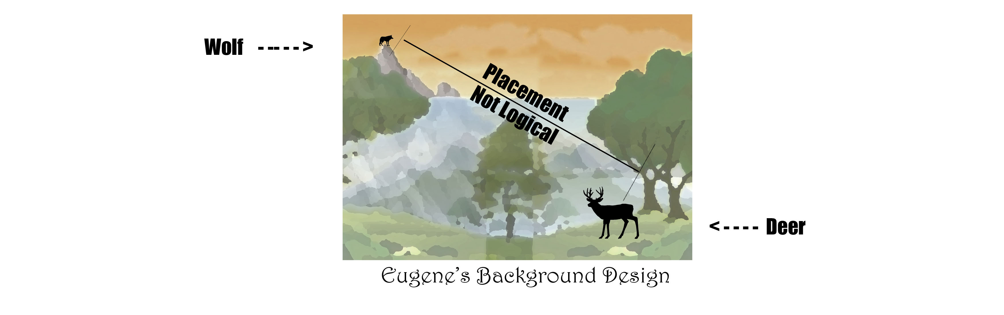
In the background design above, assuming the distance from the Wolf and the Deer are 5Km apart, there are various explanation that the placement is not logical. ?
Firstly, the wolf could have died speeding along the way. (Mountain have sharp edges.) ?
Secondly, with reference to the distance, the Wolf could probably look for other closer preys to hunt. ?
Thirdly, the deer could have been kill by ‘other’ animals instead ?
Lastly, the wolf is too small to be recognized. (Considering Audience View)

Hence, designing a background isn’t as easy as it seems!
I have to create it in a way that not only it looks presentable, it must be logical as well. 
(& I went to watch National Geo Wild to get inspiration for the background concept.) ?

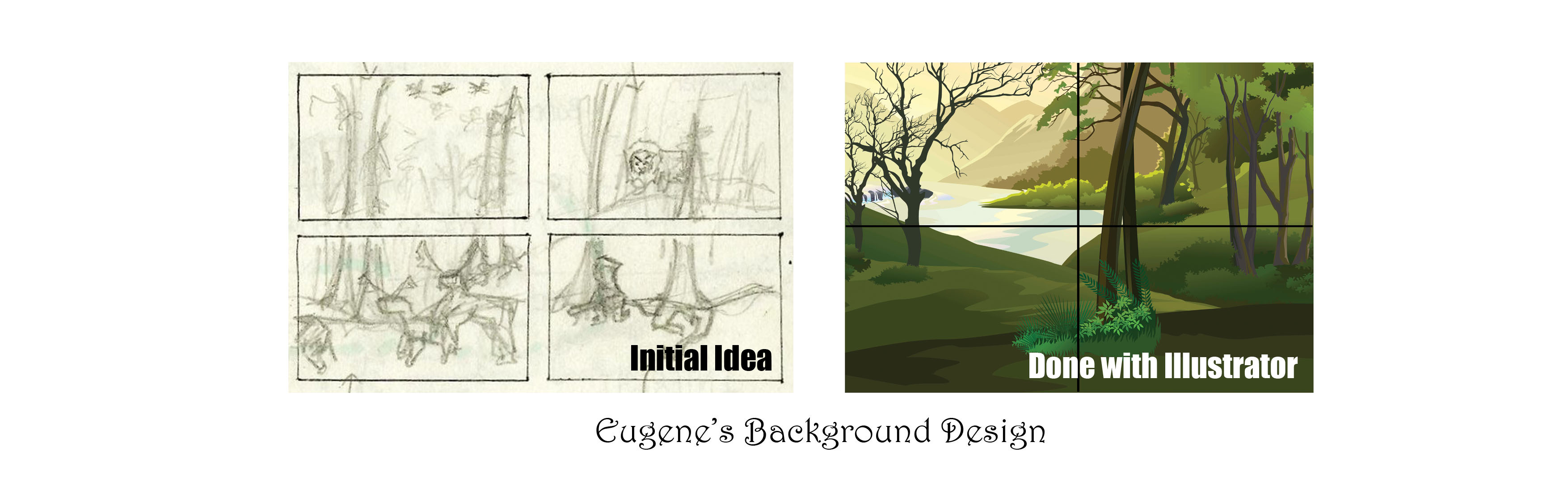
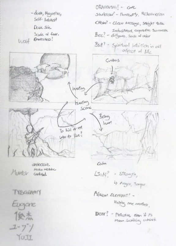
To further develop on my concept, June provided me with valuable insights as to work towards a ‘more’ realistic background design. She browse through my Visual Journal and found out that my ‘Initial Idea’ could actually be workable. ??

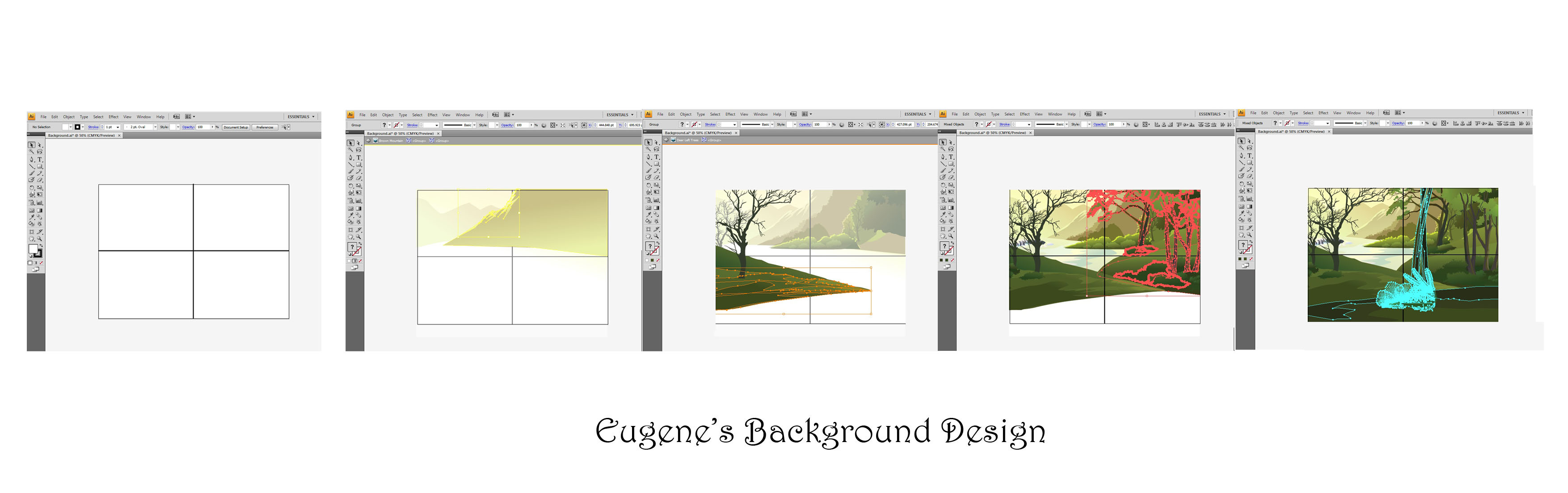
Having gain back more confident, I went to design the background with the software I’m most familiar with – Photoshop CS4. But I struggle once again, unable to create a desire background…
I told myself, I have no other choice.. Adobe Illustrator CS4 is my Last Resort!

And it’s a Miracle! ?
004005


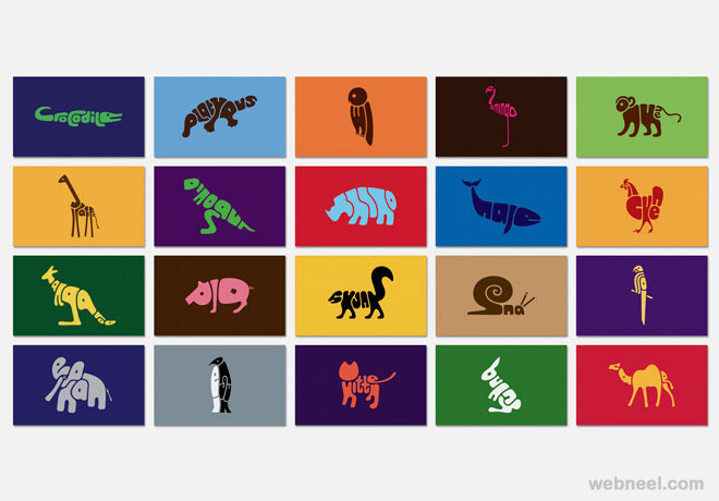
Part 2: Panel 1 (Orangutan)

Moving on, I went to execute my very first ‘Animalistic Typographic‘ with the animation effect.
The animation design element was surprisingly new to me, because I’ve never done any form of animation before. This was rather risky for me but but but! I have to get this done! It may be challenging for me but I’m not letting it discourage me! ??

To start off, the design process involve the sketching phase.
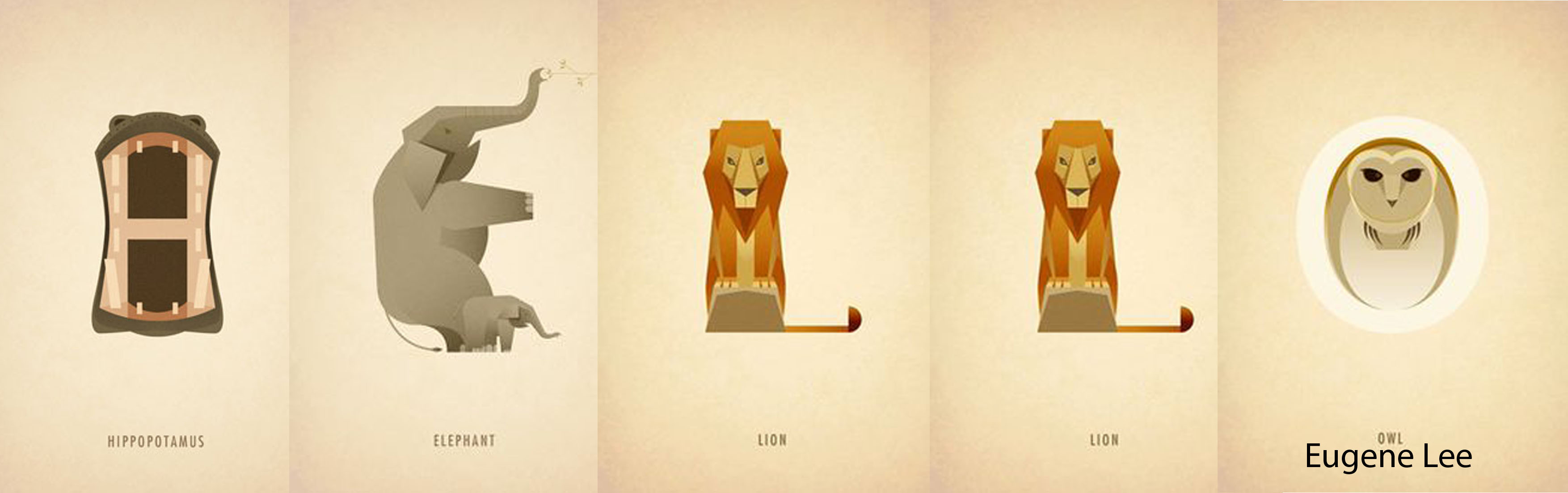
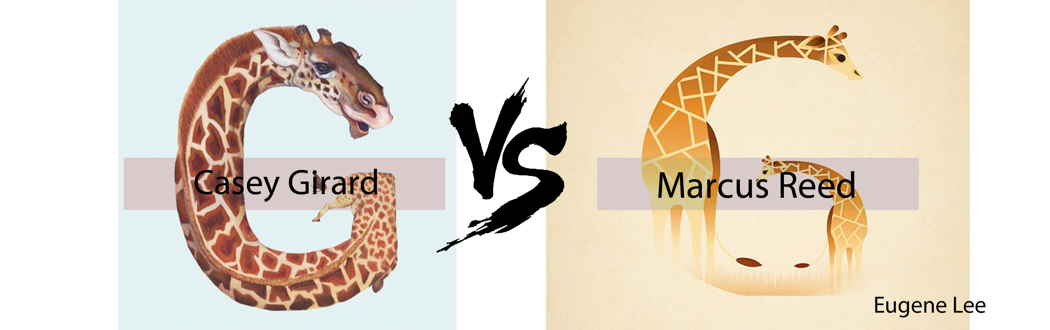
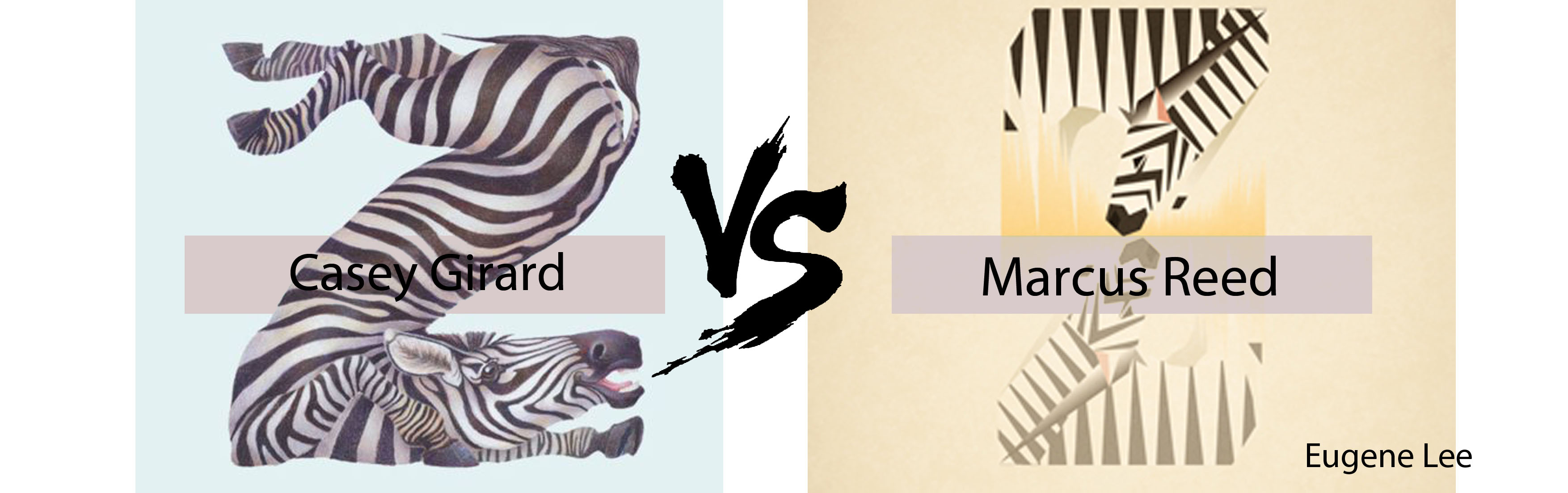
With reference to my reference artistsDan Fleming, Casey Girard and Marcus Reed. (Animal Typography)
and ‘Fun’ typography I refer to was Chris LaBrooy (Use of Setting)
Refer to below for Orangutan ‘Animalistic Typographic’ Sketch.

Eugene Visual Journal

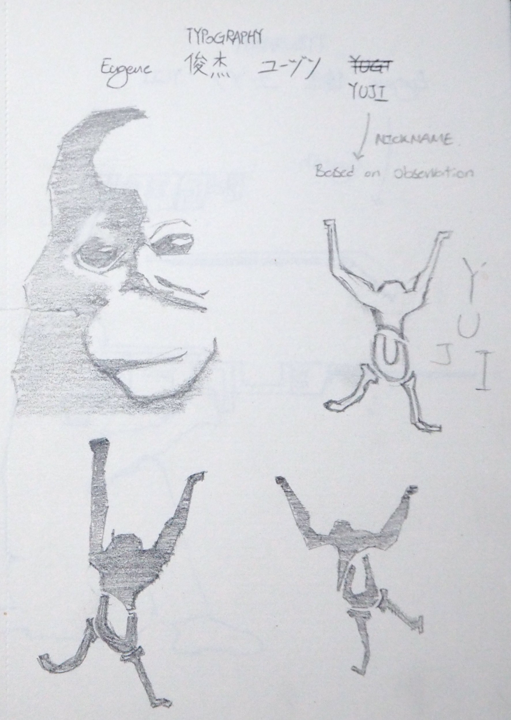
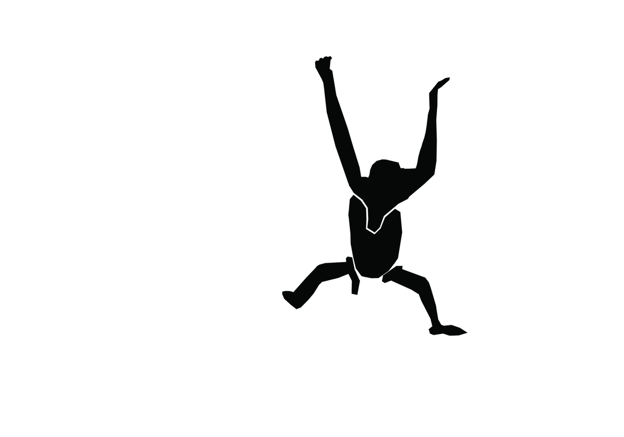
Basically, I broken down the Orangutan into 4 sections.
The Orangutan was formed by my nickname: ‘YUJI
With ‘Y = Arms & Head’, ‘U = Lower part of body’, ‘J = Left Leg’ and ‘I = Right Leg’.
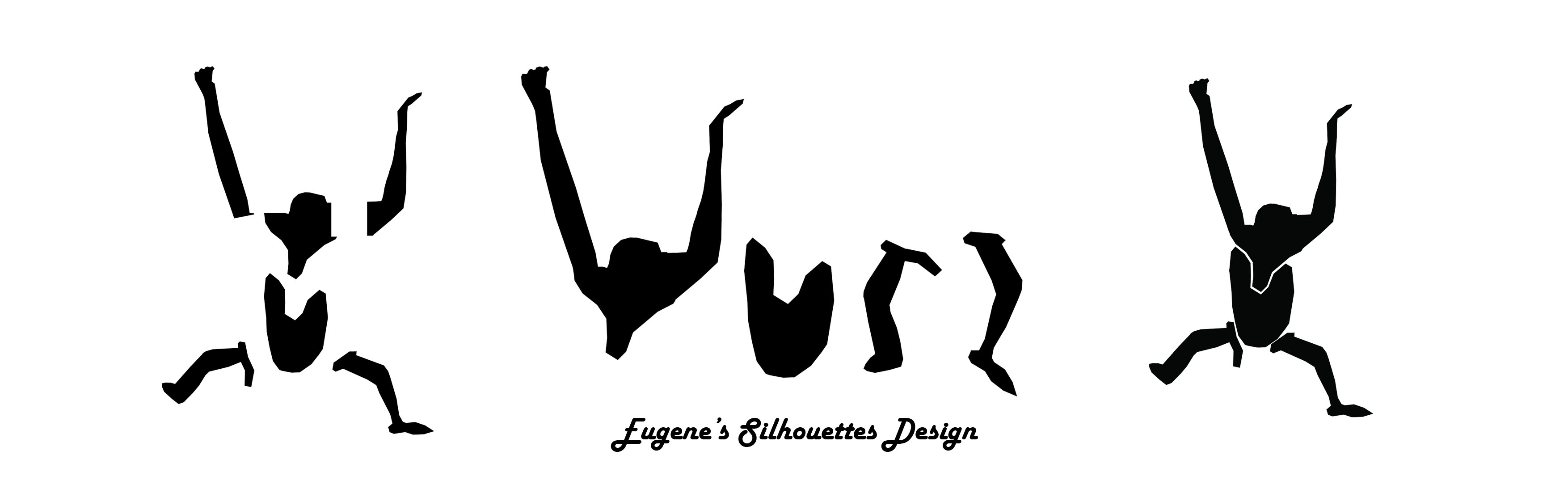
Later, I edited it in Photoshop (Frame by Frame) to give the silhouette a animation effect.
Refer to image below.

006

Orangutan Moving Gif

And! Here’s a video! ^^

Please note that the materials used in the above video is a draft and not for the final presentation.
(I smudge the ink on the Orangutan, and the Silt panel isn’t in it’s best form.)
I also tried out other types of transparent plastic sheets that I can find from Popular Bookstore, doing a ‘Trial and Error’ once again, let’s see which plastic sheets are the best! Can recommend to classmates if they require it for their future projects. ?

With reference to ‘NATURE‘, I pay attention on the movement of Orangutan between trees too!
Here’s a video from Youtube that explain how Orangutans swing from tree to tree.


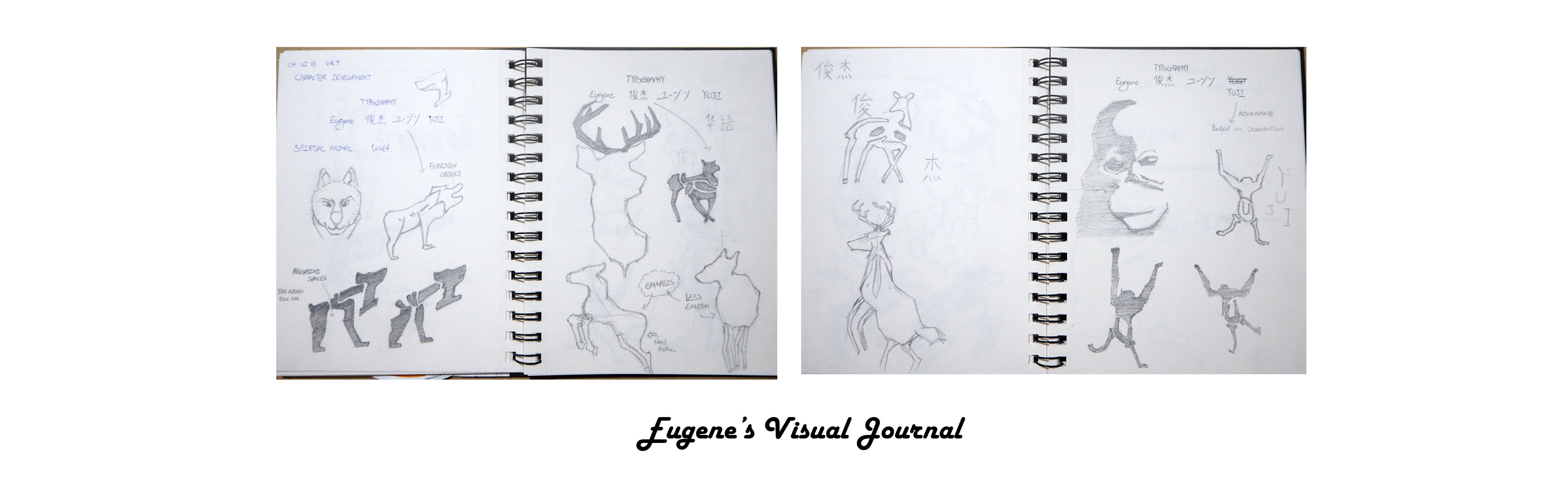
Part 3: Visual Journal

Last but not least, let me bring you through my update for Week 4 Visual Journal entry.  ?
Week 4 entries focuses on the character development.
As I was drawing the animal, I try to depict them in the best literal form as possible.

007008

So you may be curious why am I doing as part of the composition? ?
I was inspired by Raffaello Sanzio da Urbino – The school of Athens, where he painted himself in the composition. Hehe! ^^
But of course, placing myself as a subject in the composition narrates a story as well! ?

So stay tune for my presentation next week! ^^


On the side note,

I discussed and presented my ideas to some of my previous Classmates.
In the meantime, improving on my presentation and gather intakes from them.
Ziyaard, Vimal and Hsien Wei are pleased with my brief presentation and Andrew threaten to shred my Visual Journal. ? Haha^^

Alright! That marks the end of this week post.
See you next week!


Foundation 2D II Project 1 – Typographic Portrait – Progress Pt1

Week 4 – 4 February 2016


Hello there! ^^
This week’s post focuses on my work-in-progress.
Thank you Miss Joy for organising the informal critique on progress-peer review!
I’ve learnt greatly from four of my other my classmates as we throw our ideas/opinions around the table. Once again, thank you June, Pei yi, Lewin and Jacob for your interesting feedbacks! ?
You people are awesome! ?


Part 1: Work-In-Progress
Before the informal critique, I prepared several sketches and prints to gather opinions and thoughts from my classmates. I’ve been working on various technique/methods to establish an appropriate form for the background as well as the typography. Below are some of my work-in-progress mentioned during the critique,

Eugene -VJ

As mentioned in my OSS update last week, my concept involves representing my attributes/personality Typography Animalistically.?

I find the idea of using animal to represent my attributes/personality interesting because I find our relationship with animals are connected. Methodologically speaking on the assessment of human life history, the chimpanzee could possibly be our last closest common ancestor. In addition, we are connected with Animals because they give us warmth and support. For example, Food and Furniture products.

Monkey is not Human


Part 2: Celebrities on ‘Spirit Animal’

The following is a video clip from ‘The Real Daytime’ where a group of ladies discuss about their ‘Spirit Animal’. I find the discussion by the ladies expressive and relatable for example Tamera describes herself as a lioness because of the attributes such as being Fierce, Strong, Graceful and Loyalty. She later narrowed it down to Loyalty which describes her most.


Part 3: Different Views and Opinion

Created by Brieanna Watts Elmore, the website (Link Below) generates your ‘Spirit Animal’ based on the questions answered. [Please take it with a pinch of salt]

What is your Spirit Animal?

Wolf spirit animal
I answered the questions and I got a ‘Wolf’ as my ‘Spirit Animal’. ?
While the description might be true, it varies from different websites and sources.
To explain, different people have different views and opinion on animals.
Let’s take Wolf as an example. ?
On the positive side, a wolf could symbolise the deep connection with your intuitions and instincts whereas on the other hand, a wolf could also means the lack of trust in someone or your own feeling or actions.
This brings the question to my composition; How do I illustrate the wolf so that it conveys the attribute/personality that most can agree on? The answer to this could be the use of gesture and emotion that my wolf adopts. By doing so, my animal illustration could be more relatable and more expressive.


Part 4: Trial and Error

As I was drawing and trying to incorporate typography into my composition, I realised that I am doing it wrongly. My initial Idea (See below) involves my name ‘Eugene’ to be widely spread out onto the 1) Human, 2) Gun and 3) Roots of the Trees. As a result, the overall composition became a mess and unreadable.

Eugene - VS
Because this project emphasis on Typography, I realised the need to make it more readable and more relatable. For such, I brought my focus on the Gun (See below) instead of spreading across the composition. By doing so, the gun became the main focus which carries a certain meaning.

Eugene - VS2
I have also tried creating a draft for my wolf animation. Unfortunately, I have never tried creating 2D animation before as my specialisation is in 3-dimension products. However, I chose to do this because if I don’t try when will I start trying? Haha!?
Yup, my friend question me the reason why I troubled myself to do something that I am not familiar with. Basically I feel that in life there’s no easy way out. The learning process is never easy however as long as we put our heart into it, we can reach greater heights!?
This project is indeed an eye-opener for me – Challenging myself by using new medium. Hence, I went to research on many tutorials and try making one by myself. My first attempt was a walking human which walk quite weirdly when animated (The piece I showed some of my classmates and my some of my x-classmates). I also did a draft of an animated wolf with my name engraved in it (See below).

Eugene Second Animation

During the informal critique, I was given great pointers by my classmates such as to replace my existing idea with the one I did previously – Typography for ‘Hello, my name is’ card. The approach was to use my name and bend it to form the shape of the animal.


Part 5: Dadaism or not?

I also mentioned the use of Dada in my composition.
I was inspired by Liu Xue Anthropomorphic Sculpture and I planned to combine myself with the animal. The approach would be replacing my lower part of my body with that of animal.

Liu Xue
Liuxue

The reason for my approach is the idea of ‘You are your own worst enemy’ – because we control our own emotions and we decide which path to take. Hence, the animal is actually myself too.

hybridhuman
Joy mentioned that she was worried that my approach would result in the ‘animal’ becoming disfigured/unclear and suggested I follow the initial idea instead. Once again, thank you Joy for your valuable feedback! ^^?


Part 6: Creating Setting

Lastly, I mentioned about the use of background.
The image below is the background, I drew it with Photoshop which will be used for my composition. (Not the final yet, I’m still working on it).
I worked on Split Complementary Colours; Red-Orange, Blue and Green.

Eugene - Setting up the Background


Part 7: My Approach

After the valuable feedbacks I’ve gathered from the informal critique, my next approach would be as followed;
1) Explore various forms for ‘Animal’, – Include gesture as well.
2) Draw and Scan Animalistic Typography
3) Give the background a ‘Hue and Saturation’ make over, – Make sure it does not overlay the main element.


The End! ?

Thank you for reading this long post! ?
Appreciated & Happy Chinese New Year! ?

Monkey Year

Foundation 2D II Project 1 – Typographic Portrait – Research Pt3

Week 3 -28 Jan 2016

Hello there! ^^
The weekend is here again and we are a week closer to submission!
I hope everyone is doing well ~ ?
Once again, Thank you Miss Joy for spending your valuable time to advise us, I’m sure we really do appreciate it. ??


While working on various ideas for Project 1 and having Miss Joy look through the sketches, I realised that there are more areas which can be further explored. ?

With reference to last week OSS update, I researched on the use of Typography by Dan Fleming on animals. Although the artwork seems to be too literal, I was really impressed by how Dan Fleming made use of ‘Simplicity’ in his design. This includes – the Arrangement of Text, Font Size and the Contrasting Colours used.

Tetrad


Prior to the Artist Reference, I went to research more on Awesome Artists who illustrate Animalistic Typography. The Artists are as followed,

  • Casey Girard

Hello 1
Her use of Animalistic Typography involved the use of Animal bodies, whose names start with the letter they represent, to form the letters of the alphabet.

  • Marcus Reed

Hello 2
Very similar but very differently to Casey Girard Animalistic Typography, Marcus Reed positioned the animals in the way that is more realistic, more logical.

In the example below, both artists made use of Giraffe for the letter ‘G’. Casey Girard illustration looks more Surreal whereas Marcus Reed Animalistic Typography seems to be more realistic.

G

Another example below, I’d like to share is the letter ‘Z’. Instead of playing with the idea of Repetition – Twisting, Deforming and Compressing the Animal around to form a desirable shape why not the idea of ‘Reflection’ in Marcus Reed illustration?. I find this research helpful for my composition because I get inspired and I want it to be as real as possible. This is something that I would like to achieve – Realizing the Actual Environment.

Z

  • Taras Makar

Tar
Lastly, we have Taras Makar Animalistic Typography, which is also referred as ‘Animal Calligraphy’. – Basically the use of wordings to form the shape/outline of the animal.


Alright! Back to explaining my concept. ^^

Initially, I wanted to include the 3D element in my Project 1 [See Example under ‘Construct’] but I decided to try out something Fresh (Never try before) instead.

As I was drafting out my concept, I find this Project similar to our previous project we took in Semester 1 – Ego. I wonder how similar or different can these two projects get.
My concept for Project 1 involved the idea of representing myself in the form of wild animals in the nature environment.

Eugene Idea 1
During the consultation, I was given useful examples and pointers to further strengthen my concept. ^^ Below are some of my findings.

Anthropomorphism

Definition: Human attributes that is made resemblance to a Non-Human object.
Examples:


Anthropomorphism Art

Where? : Comes from two Greek words; άνθρωπος (anthrōpos), meaning “human,” and μορφή (morphē), meaning “shape” or “form.”

What? : The Attribution of Human Characteristics and Qualities to Non-Human Beings, Inanimate objects, Supernatural Phenomena, Etc.

Who? : It can be anything from Animals to Forces of Nature to Unseen Objects

Examples:


More Artists References on Anthropomorphism

  • Ryan Berkley

RIn the artworks above by Ryan Berley, various animals were used to depict the attributes of the Human-Being. For example, we can relate that Bear denotes ‘Strength & Confidence‘ and Donkey describe someone who have a independent personality.

  • Liu Xue

LiuxueOn the other hand, we have Liu Xue Anthropomorphic Sculpture. I find his use of Anthropomorphic interesting because of the way he replace the ‘human parts’. In most of Anthropomorphic arts, I researched on, usually the human head will be replaced by that of an animal. However, in the case of Liu Xue artwork, he replaced the lower portion of the Human instead.
I find it amazing and creative! I really love his works. ?

With reference to the above artists, it seems that Anthropomorphic Arts play along with the idea of ‘Dada‘ in it. The concept of merging a human together with a animal produce a hybrid weird creature. However, as strange as it might get, Anthropomorphic Arts certainly convey the emotions of the Human-Being.
Interesting Find! ?


More Readings:

John Berger: Why Look At Animals?
John Berger: Essay on ‘Why Look At Animals’ PDF

Basically, the relationship between Human and Animals have changed overtime as compared from the past to the modern day now. The drastic change was due to the gradual involvement in Human activities such as Modernization, Industrialization, Demands, Tourism etc. For example, animals that are supposed to nurture in the wilderness have lost their ability to do so when kept enclosed in a zoo.


The End of Part 3. (=

Foundation 2D II Project 1 – Typographic Portrait – Research Pt2

Week 2 – 21 Jan 2016

Hey there!
Thank you for paying attention during my presentation, I greatly appreciated it. ✌
I am so thankful for the amazing Slideshow/PowerPoint that was shared during the presentation; such as our takes on ‘Typography’. I’ve learnt and acquired meaningful information that can be apply for Project 1.

Thank you Miss Joy for guiding us through the Lectures! Appreciated! ?
As Miss Joy mention during her lecture, setting-the-scene is important,
see below for example.

EUGENE
‘Setting’
– The ‘Setting’ act as an important role in Typography too!
– What happen if I add an image of a Typical Singaporean Son in the original picture?
– Did the meaning changed?


000 Eugene

With regards to the Dada & Russian Constructivism, I’m glad that most of us gave our opinion on it – whether it is applicable or not, and how it could be useful for our Project.

To reiterate my points during my presentation, I mention that Typography used in the Dada Art Movement can be categorise into two different categories – 1) Strict, 2) Mix. In my opinion, the fact that Typography used in the Dada Art Movement seems to be randomly placed, it seems to be somewhat controlled. Because most Dada Artist do not want their viewer to focus more on the text, they placed typography in a way that it looks random but it still follows a set of imaginary rules.


LISTEN!
Chris LaBrooy Behance

The other stuffs that we looked at were the unusual or rather different types of techniques that can be used to express Typography. Some of the design goes very well with the meaning of the word itself. With reference to Chris LaBrooy award-winning typography, he uses the idea of ‘Visual Perception’ that incorporate musical instruments/equipment’s into the word; ‘Listen’.

He amazingly combine these two elements together, Form and Context, to create the ‘Content’ that we can easily understood and interpret. This led us to the point that Typography comprise of wordings with an Attitude – An expressional tool that emphasis on effective communication.


Typography are amazing!

As mentioned and shared with the class, Typography can be designed in an attractive manner by ‘decorating it more creatively and more beautifully’. In this way, typography is more than just being words, it can be a very inspiring form of art too! Below are some examples where Typography were made creative.

Gun by Mou5e
– Gun by Mou5e

Addition by Tokarnia
– Addition by Tokarnia


– Pop! by Nikko Pascua


Hand drawn typography by IKEA


Dan Fleming

Dan Fleming Creative Animal Typography

word animals best typography design amazing creative Dan Fleming

Dan Fleming animal typography was a perfect example that combine the outline of an animal with its name. Similar to Chris Labrooy, both play with the idea of ‘Visual Perception’ that allow us to interpret the context by its form. Amazing! ?


Takes from presentation

There are various Artists that were mention during the presentation.
The followings are the lists of Artists that were mentioned, Check them out! ?

1) John Lee
2) Magen Lee
3) Yellena James
4) Danger Dust
5) Danielle Evans
6) Red Hong Yi
7) Stefan Sagmeister


The End of Part 2. (=


Foundation 2D II Project 1 – Typographic Portrait – Research Pt1

Foundation 2D II Project 1 – Typographic Portrait – Research Pt1


Typography

What is it?
– The term ‘Typography’ refer to Letters with an Attitude.
Check out this video~! ^^

More Examples


Identifying Type of Typeface


Hannah HochEugene - Hannah HochLeft to Right: Cut with the Kitchen Knife, Proverbs to Live By, Quiet Girl

In the examples above, Hannah Hoch approach to typography together with the Dada Art Movement carried a strong message across which was stunning and amazing. Her use of substances such as the Negative White Space, Arrangement, Width, Spacing and Photo Montage work hand-in-hand to develop a form of communication which was significant.

Many aspects of her signature style and techniques were mainly use for manifestos and posters which carries strong messages, for example; Women Rights etc. The artworks thus creates a sense of visual identity accompanied with the strong design layout.

As I browse through the list of typography artworks by Hannah Hoch, I realised that the artworks can be categorised into 2 sections. 1) Strict Order, 2) Mix.

  • Strict

Proverbs to Live By

An example would be ‘Proverbs to Live by – Hannah Hoch’. In the artwork, her use of mix media such as Graphite, Crayon, Colour Pencil, Photo-Montage etc. interacts with the typeface. There seems to be a strict order of top to bottom with no type changes. The overall arrangement and the choice of text made the artwork clean, neat and tidy.

  • Mix

Quiet Girl

Hannah Hoch choice of typeface can differ as well. An example would be The ‘Quiet Girl’ – Hannah Hoch. In the composition, we can infer from the choice of different typeface used which range from BIG HEAVY fonts to small neat fonts. In addition, the typography involve playing around with fonts which are position horizontally and vertically on a single sheet. However, despite the use of different typeface used, the overall feel of the artworks seems to be in sync.


Dada’s Art Movement with relation to Typography.

Dada approach to typography was more experimental in my opinion. Because it varies from the arrangements and the choice of typeface, typography was used to convey a message of its own. For example, the use of Size & Fonts. In the example of Hannah Hoch artwork above, how people make assumptions/interpretation of the text depends directly on how the typography was presented. In the case of ‘LOUD, BOLD, STRONG’ letters, an individual may derive that ‘Annoyed, Turbulent kind of feel.

Kurt schwitters typography (1)

Typography was used as a medium in the Dada artworks. It was used to create hidden meaning/strong message. Dada artists were experts in visual communication, they are able to translate their visually amazing artworks into textual message with the addition of typography. They play around with typography such as the style, size, weight, the use of upper and lower case characters to highlight the importance of the subject. – Decipher meaning.

(Unconventional Typographic Design), (Explosive Arrangement), (Mixing of Fonts)


Russian Constructivism with relation to Typography.

The constructivists approach with typography focus on ‘Construction’. Constructivist pay emphasis on the message and the fundamental analysis of the materials, forms and art rather than what’s on the surface. An example would be El Lissitzky whose artwork pay more emphasis on the message and ideas rather than to express beauty.

BeatTheWhites
El Lissitzky; Beat The Whites With The Red Wedge, 1920

Check out this link on the “Most Iconic Typefaces made in Soviet Russia”
http://www.dafont.com/theme.php?cat=205

With reference to the website above, most of the fonts are Bold, Strong and Impactful.
That was probably due to how the Russian Movement gave rise.
In the example of El Lissitzky, most of his artworks turn out to be a propaganda effort in support of the revolutionaries and while paying attention to the font used, I can relate why the font must be big – To deliver an important, urgent and strong message.


Comparing both typography of Dada Art Movement & the Russian Constructivism

I find Dada Art Movement the ability to offer more variety as compare to the typography of Russian Constructivism. As mention earlier, I see the typography used in Dada in two different categories. 1) Strict, 2) Mix, whereas Russian Constructivism offers mostly ‘Bold, Strong and Impactful’ fonts.

I find both Art Movements as interesting and are equally useful depending on my project theme. Such as how the typography was being positioned, the size, style and the message it bring across.
Keep Exploring~!


DIY Movement [Digital]


http://blog.8faces.com/

Very different from the previous Dada & Constructivism Art Movement, DIY Movement channel us to the modern ‘State-Of-The-Arts’ style of art. With reference to the website above by 8faces, it support the idea of modern art because of the style used. This includes the illustrations, colours, 3D typography that work hand-in-hand to create an amazing artwork.

http://www.punkprojects.com/2013/01/easy-typography-art-diy.html

Similar to the modern typography style used in another source suggests the importance of illustrations and simplicity. Unlike the previous Art Movement, the modern DIY Movement removed all unnecessary media to deliver a message short and sweet, big and strong etc.


3D Typography [Digital]

I googled on a list of ‘3D Typography’ images and I was amazed by the incredible designs! I really like it! ?

Chris Labrooy - ListenChris Labrooy - Bike
I researched on Chris LaBrooy – A freelance designer/Illustrator, who draws and create impressive 3D Typography.
Check out his portfolio here – https://www.behance.net/chrislabrooy

In my opinion, I find the use of 3D incorporated in typography interesting as it bring out a sense of playfulness. Unlike Dada and Constructivism Art Movement, 3D typography manage to breathe in an attitude of playfulness, freshness together with a lively expression.
In addition, the use of 3D creates a sense of depth which brings out the emotion of the typography and because it wasn’t restricted and confined as compared to the previous two art movements, 3D typography encourages the idea of ‘Being Free’.


Hand-Made Typography [Digital]

Merry XmasMerry Xmas

http://www.designandpaper.com/?p=6104

Since Hand-Made Typography can be made digitally via designer software’s such as Adobe Photoshop, Adobe Illustrator etc, it suggest an essential part of the creative or presentation process. With reference to the website by DESIGN&PAPER, the typography involve a combination of various elements such as 3D Typography and the importance of colour theories used on a flat surface.

Similar to the Dada & Constructivism Art Movement, typography contribute to the overall finishing of the composition. Depending on the situation, the typeface correspond to the composition directly. For example, the typography used by DESIGN&PAPER for Christmas suggest using mediums that matches the seasonal trends.

http://blog.ninethousandthings.com/
In the link above, Alinichole teaches us a method she used to create her Hand-Drawn Typography.
Check it out~^^


Hand-Made Typography [Physical]

Hand-Made Typography could suggest a physical form too!

In this research, I explored the arts by Jaume Plensa who was famous for his use of typography in sculptural design. The sculptures were done by piecing many 2D letters together to form the shape. In addition, the typeface used for the typography remain constant.
Amazing isn’t?! 😀

say-hello

In addition, ‘Hand-Made’ suggest the possibility to create typography with different mediums such as Potato’s, Balloons, Pencils etc.  Above are some examples,

Once again, it suggest the attitude of playfulness and the ‘Beyond Boundaries’ in design. ?


Miscellaneous [Useful Stuffs)

More Readings

http://textarthistory.com/tag/modern-art/
http://www.creativebloq.com/typography/design-your-own-typeface-8133919
http://archive.notpaper.net/2008/12/hugo-werner.html
http://www.trickhouse.org/vol15/door_02_annewaldman/lewiswarsh.html


The End of Part 1. (=


Foundation 2D II Exercise 1 – Hello

Week 1 – 14 January


Hey there!,

It’s so great to be back in school! ?
I have enjoyed sharing interesting ideas, listening to presentation and stories in the previous semester, on top of that, we learnt and worked really hard!
G1! We did it! Although some of us won’t be seeing each other during lessons but let’s keep up the fighting spirit and do even better for this semester! ??

I’m sure that this will be another Egg-Citing semester because I will be working together with Miss Joy and the new classmates! (:
Awesome! Let’s start the first entry!


During the lesson, we were tasked to design 3 Name Tags of different genres –

1) Typography ~ (Describing a Character that is Engaging)
2) Abstract Solution ~ (No Start, No End)
3) Concept ~ (Led by a Concept)

CardCardCard


Concepts Sketches / Idea Generation8

  • Typography
    ~ as derive from the term ‘Typography’, it means playing around with the written language by making it interesting, engaging and more appealing when being displayed.
    ~ hence, I went to various concepts such as writing my name in different languages such as 华语, 日本語 and English accompanied with the use of different forms and writing styles.
    ~ to spice up the interesting component in my design, I drew my Chinese Name in a way that one Chinese Character look like a Puppy and another a Human hand narrating a story about Human & Animals Relationship.

    ~ Reference Artwork by Corner Croft
  • Abstract Solution
    for this design, I explore the use of mediums such as
    1) Chinese Ink
    2) Folded Metal Wire
    3) Can Cap
    4) Pen & Pencil
    ~ My previous concept was untidy in my opinion, I wanted to create a abstract but neat composition, hence, I craft out my name with the letter ‘U’ so that it resemble the fish scale in an abstract manner. In the design, the viewer have to look closely in order to decipher my hidden name that was ‘engrave’ in it.
    ~ in my improved design I over-lap the cut-out circles, with the help from a hole puncher, and stick it on a piece of hard backing.
    ~ the design aims to carry the attribute of a ‘Arowana’ fish which represent ‘Precious’, ‘Expensive’, ‘Beautiful‘ etc.
    ~ Reference Artist – Marian Bijlenga (Fish Scale Art)

  • Concept
    in this design, I  play with the theme ‘What Makes Me’ and how can it be link to ‘Product Design’.
    ~ in the initial stage, I brainstorm several concepts/sketches relating to ‘What Makes Me’ for example – Food? Childhood? Lego?. As more ideas developed, I decided to nail a theme based on a ‘Construction‘.
    ~ I find the concept interesting because I was reading up on the recent article on ‘Landscape Design’ and it features “Singapore – building a forest in a high-rise apartment atrium”. Link Here The advancement in building technology made creative infrastructure more possible! This can only be done so by having a good blueprint layout, knowledge and foundation etc.
    ~ For example, all Year 1 students have to strengthen their foundation by participating in the Core Modules. This enable the students to explore, deepen, sharpen their understanding of Arts, Design and Media.
    ~ The root of goodness lies within having a good foundation.

Final Name-Tags

1) Typography
Eugene

2) Abstract Solution

Eugene

3) Concept

Eugene