Week 6 – 18 February 2016
Hey there!
Thank you for your kind attention during my presentation! Appreciated!
Here’s an extra thanks to those who gave me their opinion on my works~!
Haha! ? ?
I feel that each of us are unique and I’m glad that I can learn from you! ?
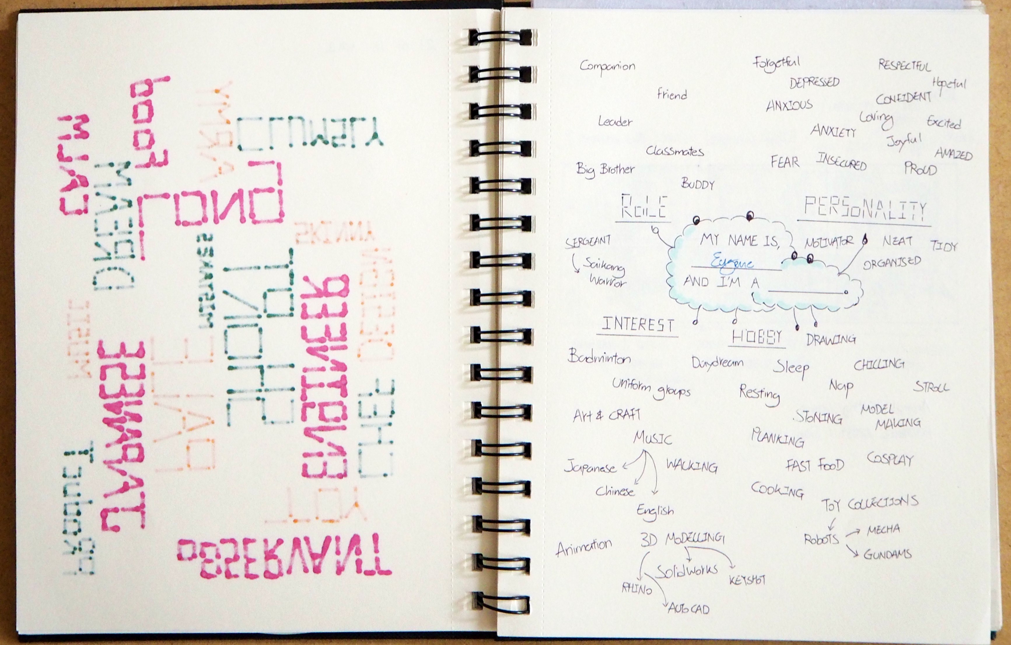
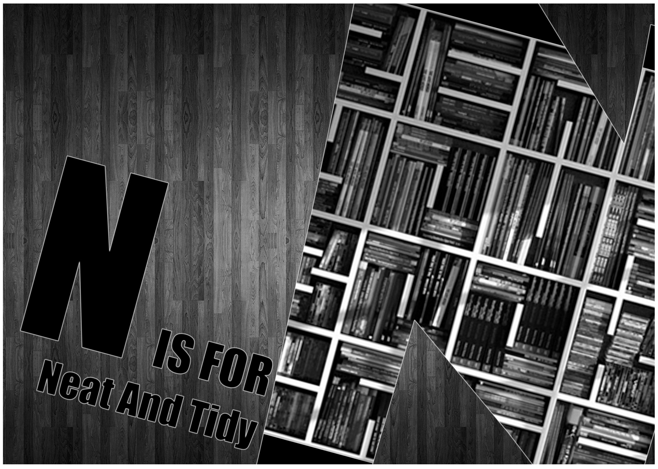
Today entry is a summary for Project 1 – Typographic Portrait.
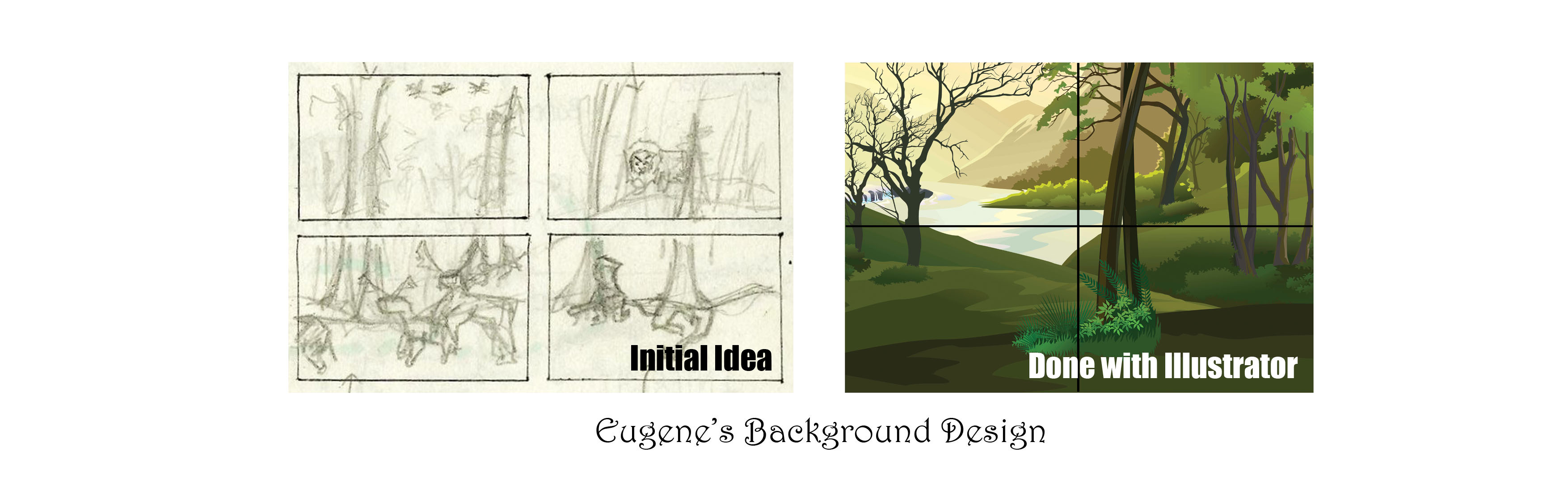
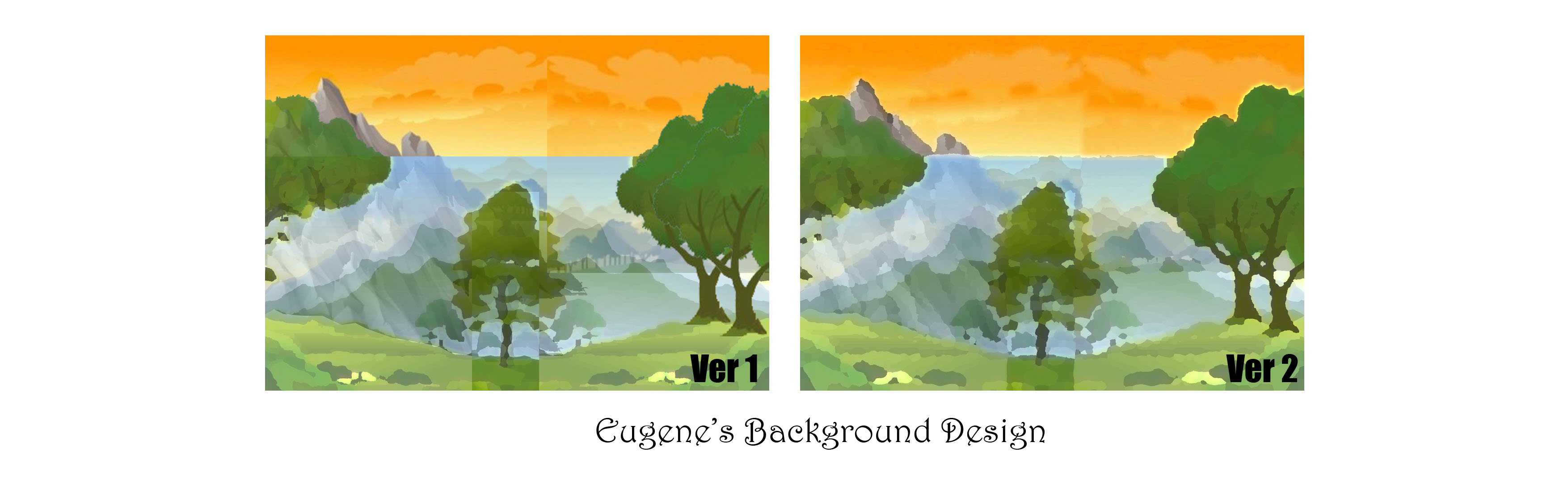
Part 1: Background Design [Development]
Problem Faced:
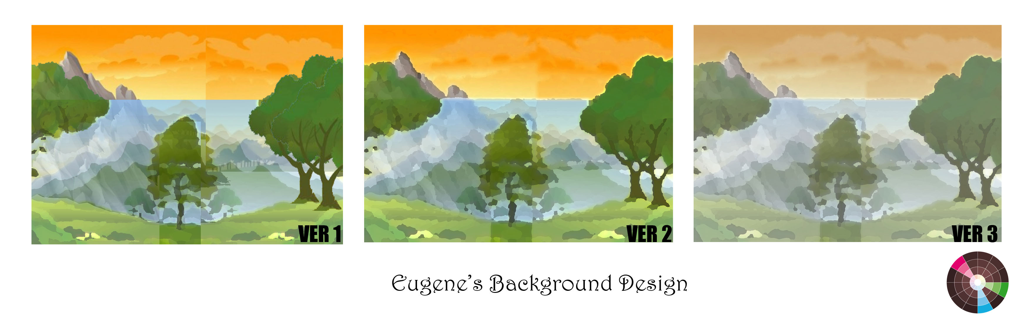
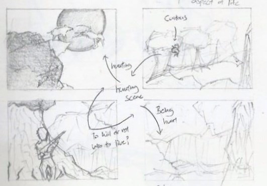
The background was the hardest, in my opinion, because the attempt to make it as realistic as possible was a challenging task. ?
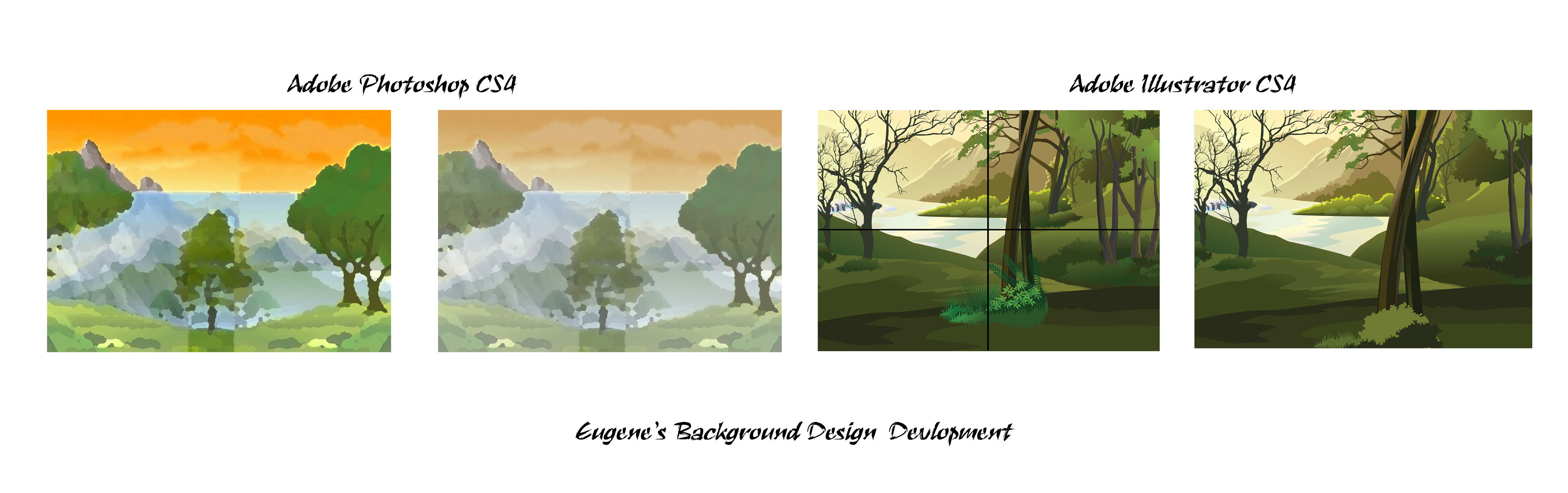
I started off with Adobe Photoshop CS4 – Which I am most comfortable with. However, after several attempts trying to set the image right, I can’t seems to be able to do it. I tried directing my reference to some pictures of a real forest / wilderness and some of the National Geography Wild videos for inspiration. ?
There were a few considerations, as mention in the previous update, as follow;
1) Scale
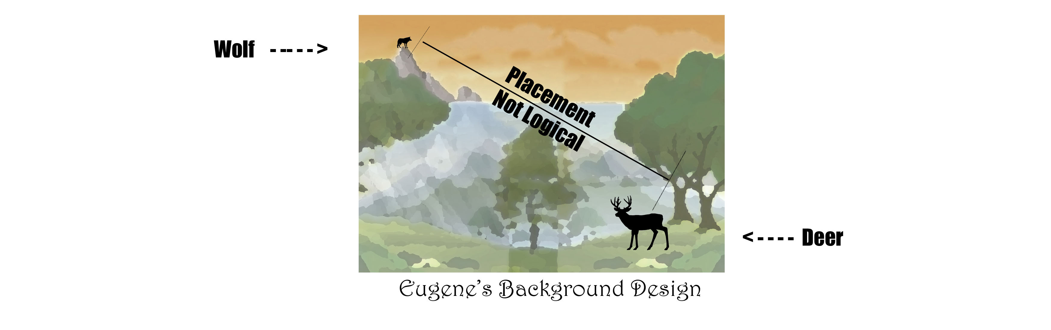
2) Realism
3) Logical Placement
4) Colour
I told myself that, regardless how detailed the description via websites and videos can be, experiencing and understanding the actual environment by an individual will help more. ?
My Takeaway:
The completion of the background was my greatest accomplishment, I felt, for this project.
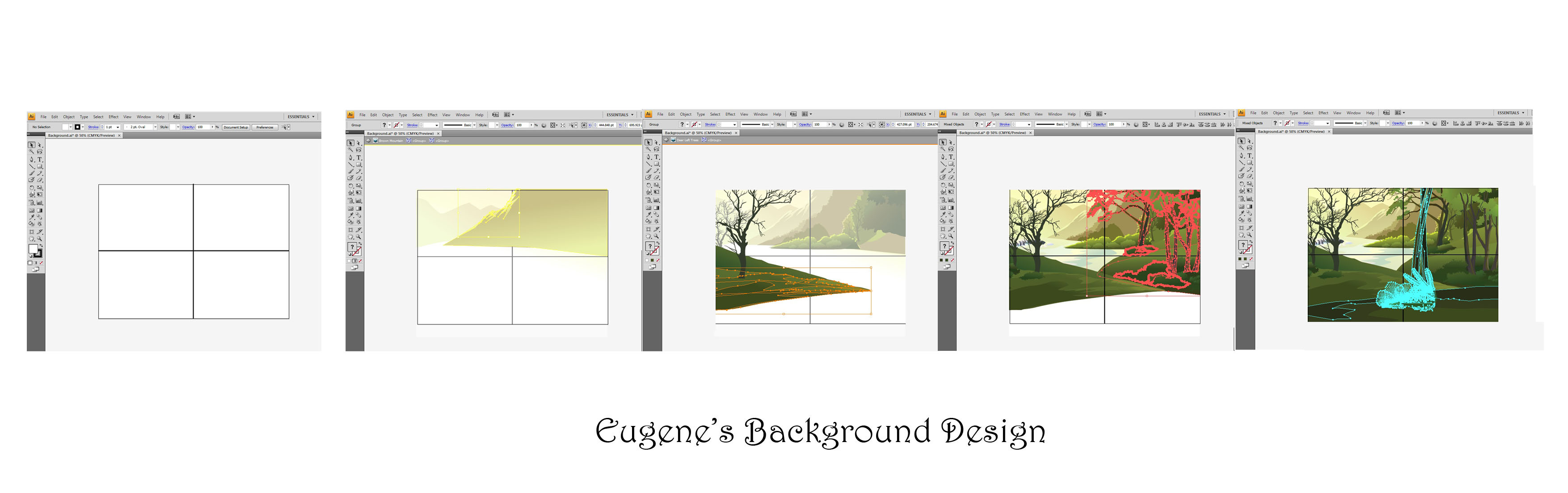
The development on the background was the most pronounced – From a flat image in Adobe Photoshop CS4 to a rather convincing landscape in Adobe Illustrator CS4.
This project allow me to explore the use of other mediums such as Adobe Illustrator CS4 and help me think critically in terms of logical placement and setting of the animals and environment. ?
Part 2: Field Research at the Singapore Zoo
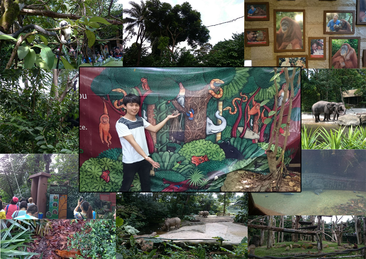
In celebration for Valentine’s Day, June and I visited the Singapore Zoo (as I conducted my field research).
It was a fun and engaging learning process to see and know more about the relationship between the animals and their natural habitat. ?
Throughout the research, I pay attention to the animals behaviors and their movement from place to place.
Understanding these will help me with my composition, especially the silts animation that I’m working on.
However, Singapore Zoo does not offer a wider range of animals as compared to the rest of the world.
Hence, my composition on the ‘deer’ and the ‘wolf’ were done visually online.
Nevertheless, the trip to Singapore Zoo was a fun-filled and enjoyable one.
I strongly recommend to my classmates and I will probably re-visit another day. ?
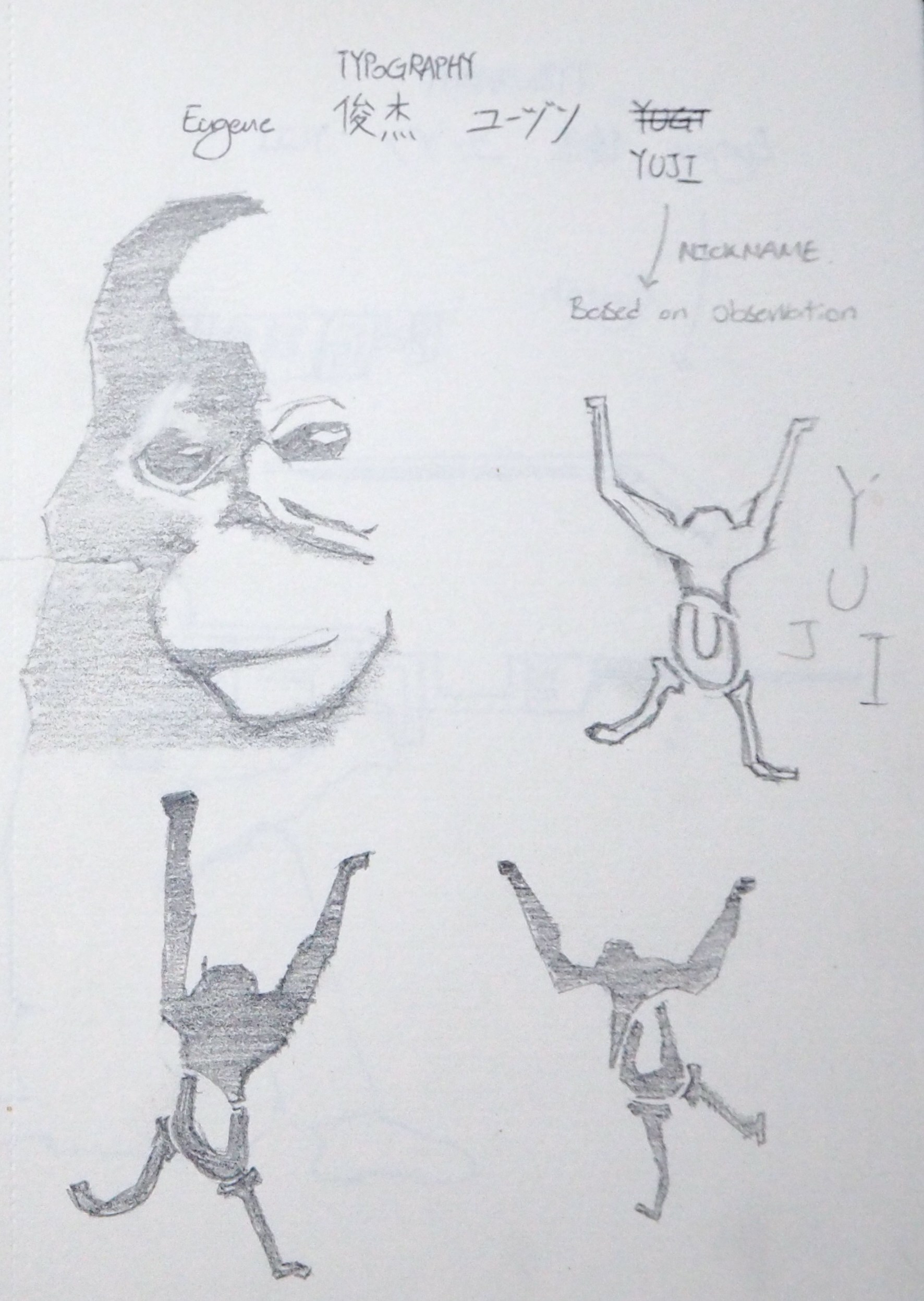
Part 3: Explanation on Individual Panel
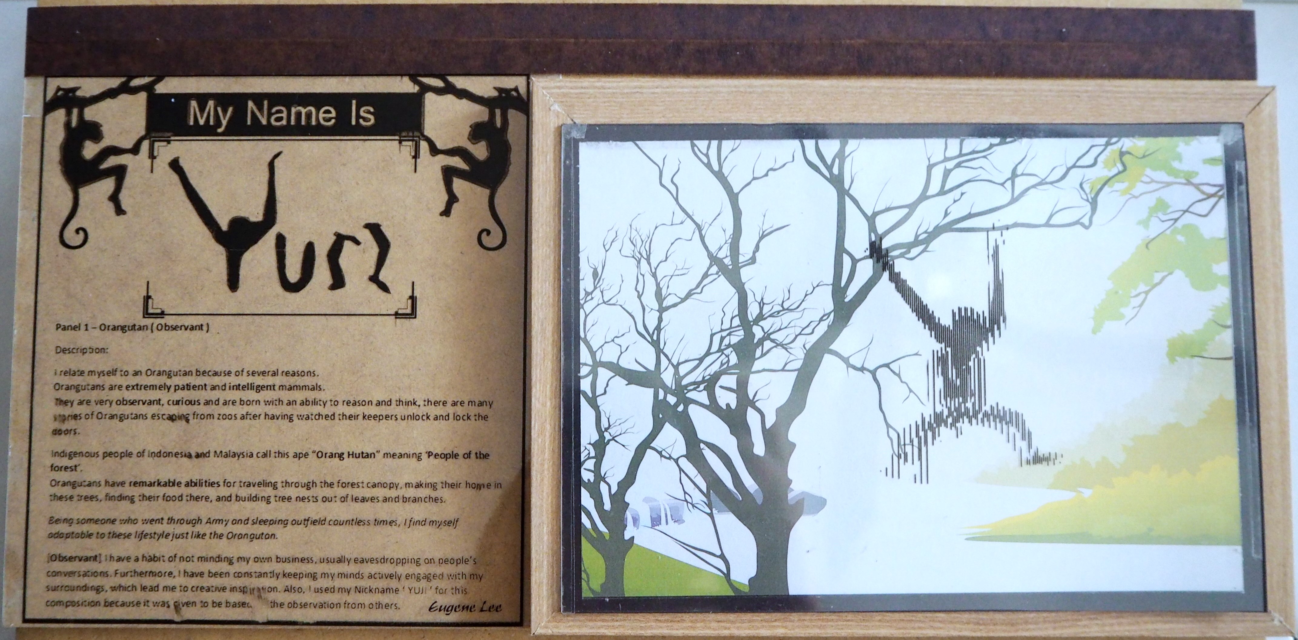
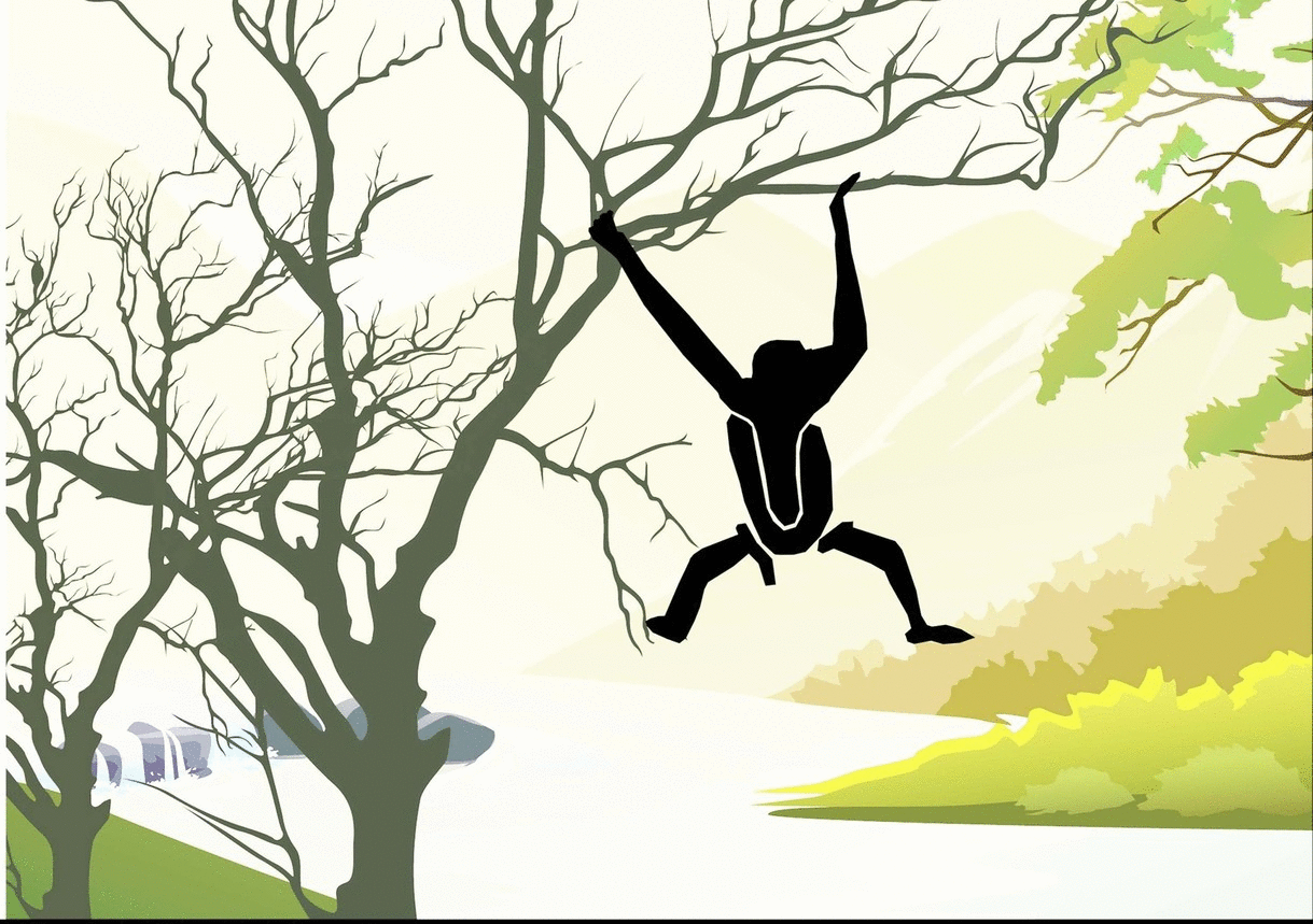
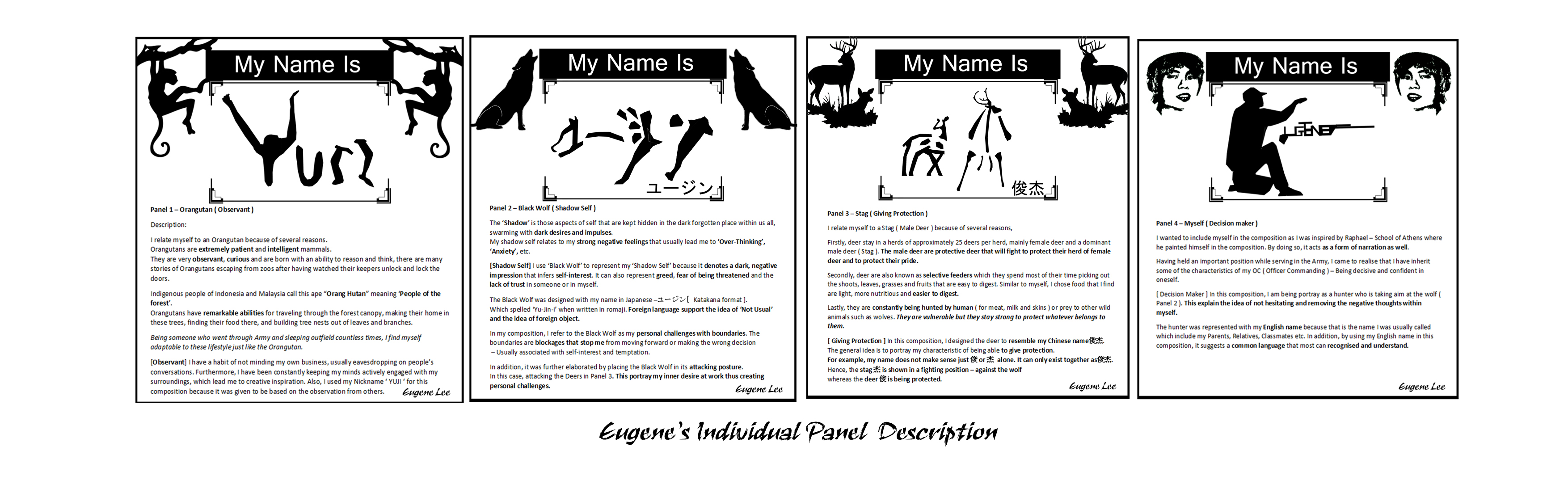
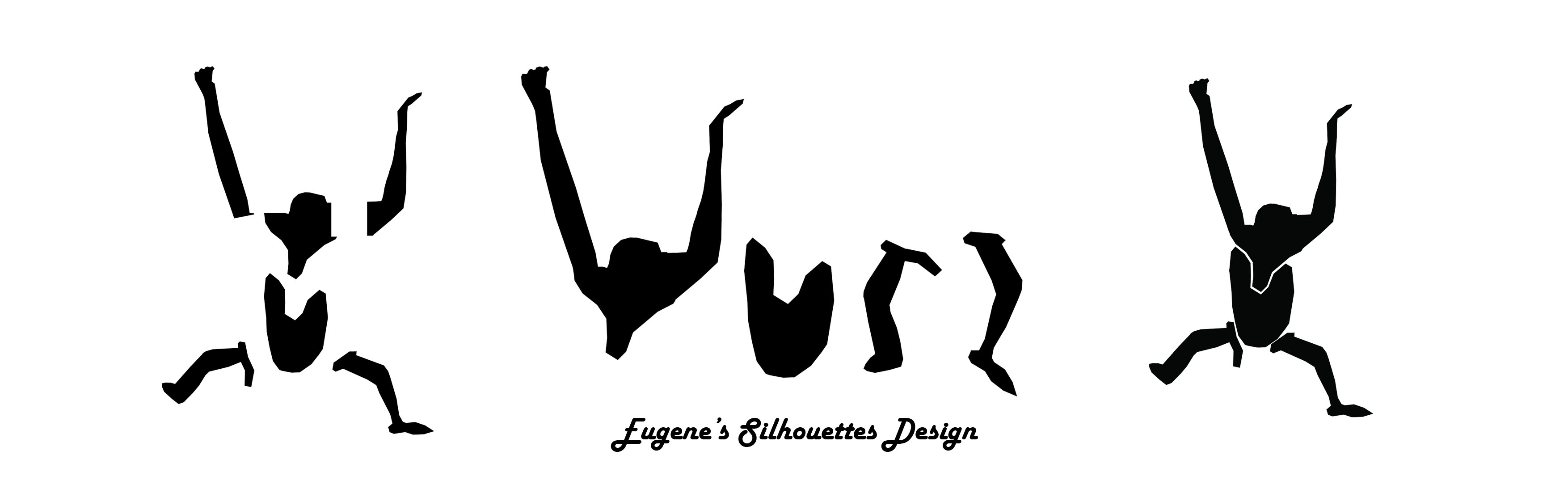
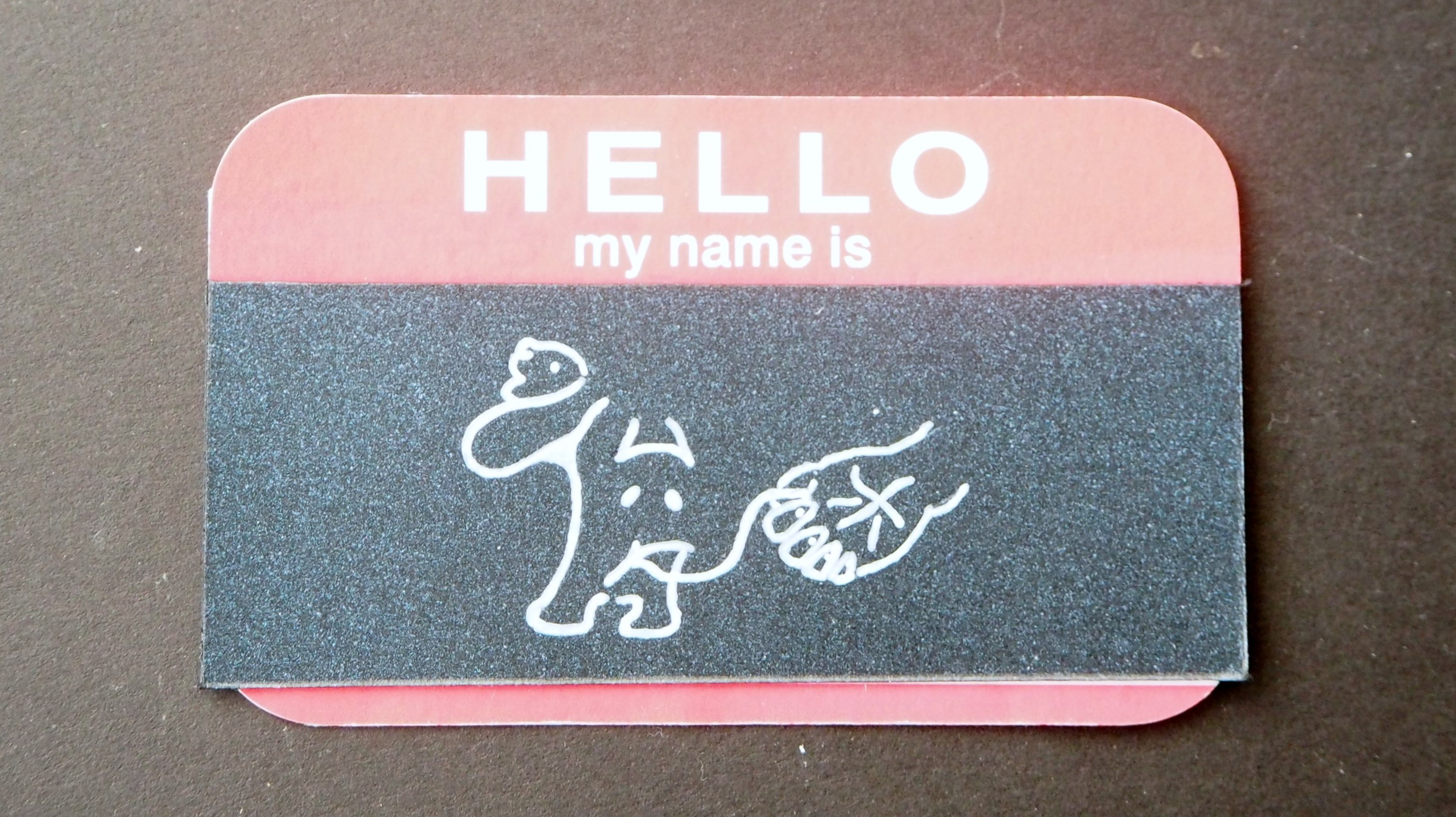
1: My name is YUJI and I am Observant.
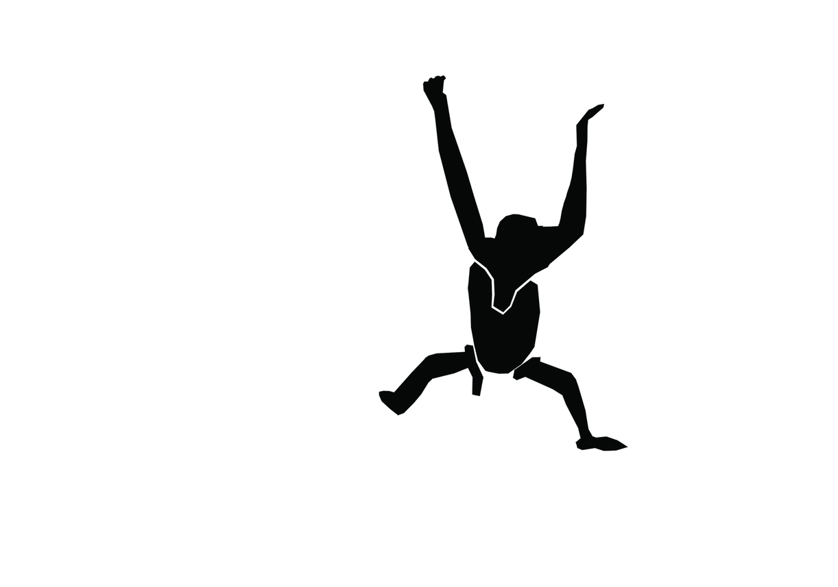
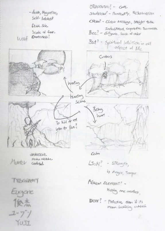
Panel 1 – Orangutan (Observant)
I relate myself to an Orangutan because of several reasons.
Orangutans are extremely patient and intelligent mammals.
They are very observant, curious and are born with an ability to reason and think, there are many stories of Orangutans escaping from zoos after having watched their keepers unlock and lock the doors.
Indigenous people of Indonesia and Malaysia call this ape “Orang Hutan” meaning ‘People of the forest’.
Orangutans have remarkable abilities for traveling through the forest canopy, making their home in these trees, finding their food there, and building tree nests out of leaves and branches.
Being someone who went through Army and sleeping outfield countless times, I find myself adaptable to these lifestyle just like the Orangutan.
[Observant] I have a habit of not minding my own business, usually eavesdropping on people’s conversations. Furthermore, I have been constantly keeping my minds actively engaged with my surroundings, which lead me to creative inspiration. Also, I used my Nickname ‘ YUJI ‘ for this composition because it was given to me based on the observation from others.


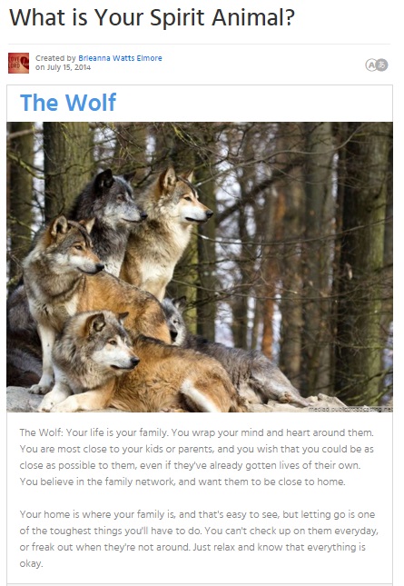
2: My name is ユージン and I have a Shadow Self.
Panel 2 – Black Wolf (Shadow Self)
The ‘Shadow’ is those aspects of self that are kept hidden in the dark forgotten place within us all, swarming with dark desires and impulses.
My shadow self relates to my strong negative feelings that usually lead me to ‘Over-Thinking’, ‘Anxiety’, etc.
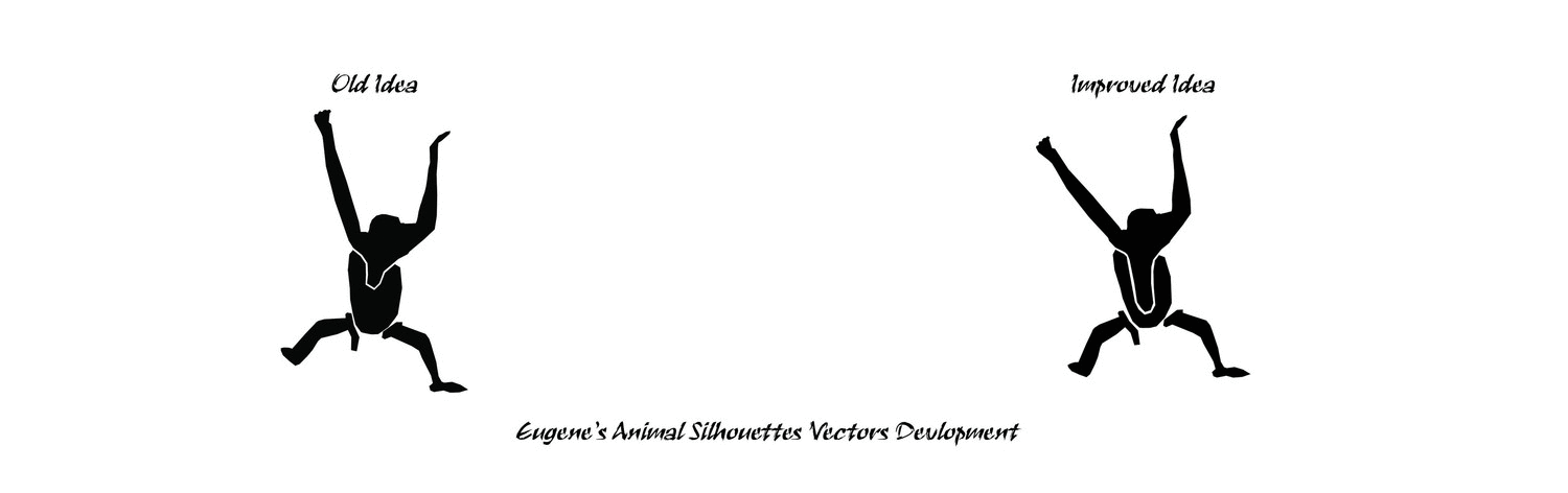
[Shadow Self] I use ‘Black Wolf’ to represent my ‘Shadow Self’ because it denotes a dark, negative impression that infers self-interest. It can also represent greed, fear of being threatened and the lack of trust in someone or in myself.
The Black Wolf was designed with my name in Japanese –ユージン[Katakana format].
Which spelled ‘Yu-Jin-i’ when written in romaji. Foreign language support the idea of ‘Not Usual’ and the idea of foreign object.
In my composition, I refer to the Black Wolf as my personal challenges with boundaries. The boundaries are blockages that stop me from moving forward or making the wrong decision
– Usually associated with self-interest and temptation.
In addition, it was further elaborated by placing the Black Wolf in its attacking posture.
In this case, attacking the Deers in Panel 3. This portray my inner desire at work thus creating personal challenges.

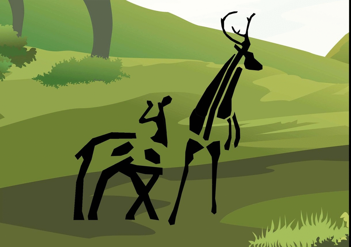
3: My name is 俊杰 and I protect whatever belongs to me.
Panel 3 – Stag (Giving Protection)
I relate myself to a Stag ( Male Deer ) because of several reasons,
Firstly, deer stay in a herds of approximately 25 deers per herd, mainly female deer and a dominant male deer (Stag). The male deer are protective deer that will fight to protect their herd of female deer and to protect their pride.
Secondly, deer are also known as selective feeders which they spend most of their time picking out the shoots, leaves, grasses and fruits that are easy to digest. Similar to myself, I chose food that I find are light, more nutritious and easier to digest.
Lastly, they are constantly being hunted by human (for meat, milk and skins) or prey to other wild animals such as wolves. They are vulnerable but they stay strong to protect whatever belongs to them.
[Giving Protection] In this composition, I designed the deer to resemble my Chinese name俊杰.
The general idea is to portray my characteristic of being able to give protection.
For example, my name does not make sense just 俊 or 杰 alone. It can only exist together as俊杰.
Hence, the stag 杰 is shown in a fighting position – against the wolf
whereas the deer 俊 is being protected.
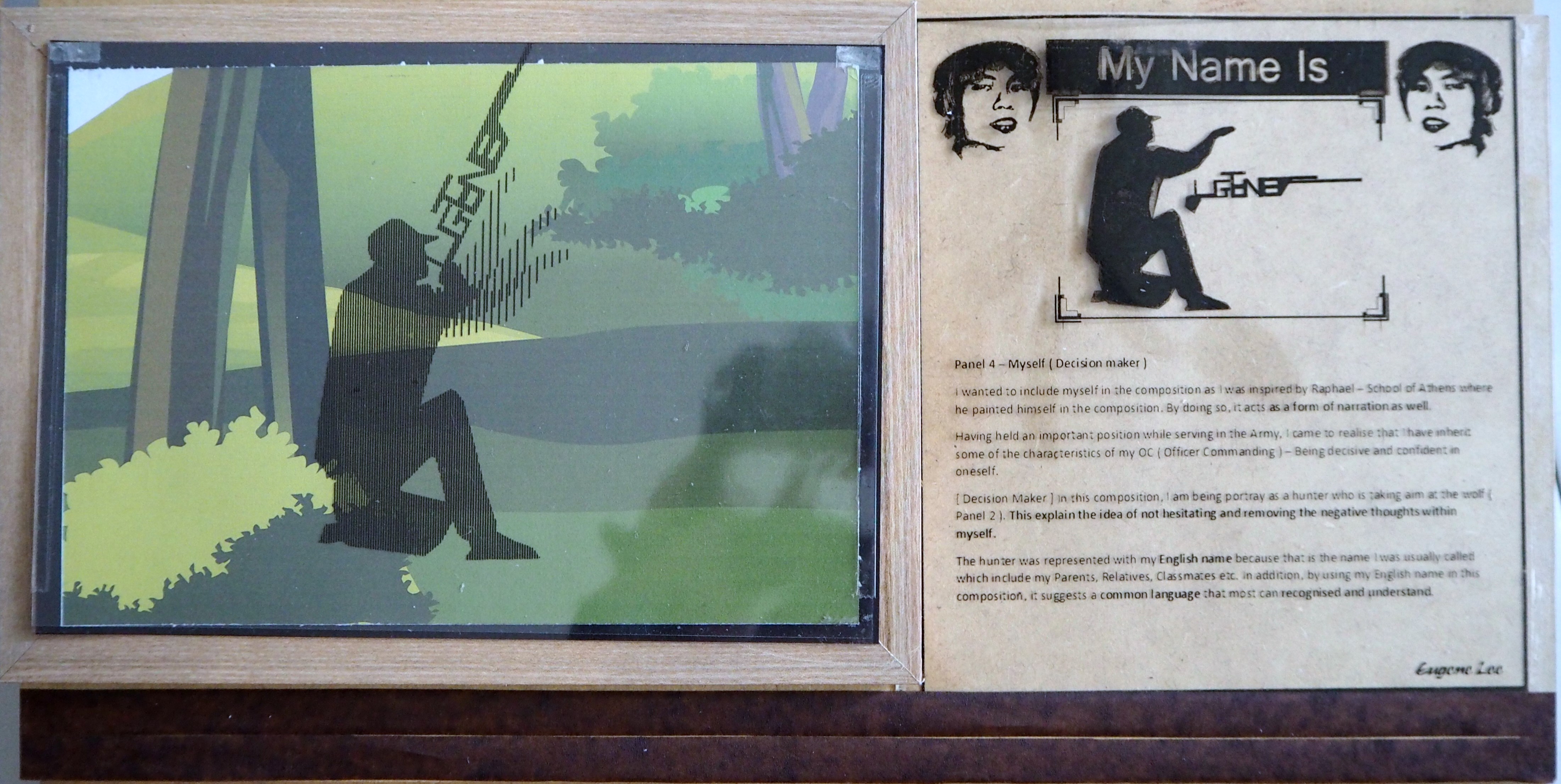
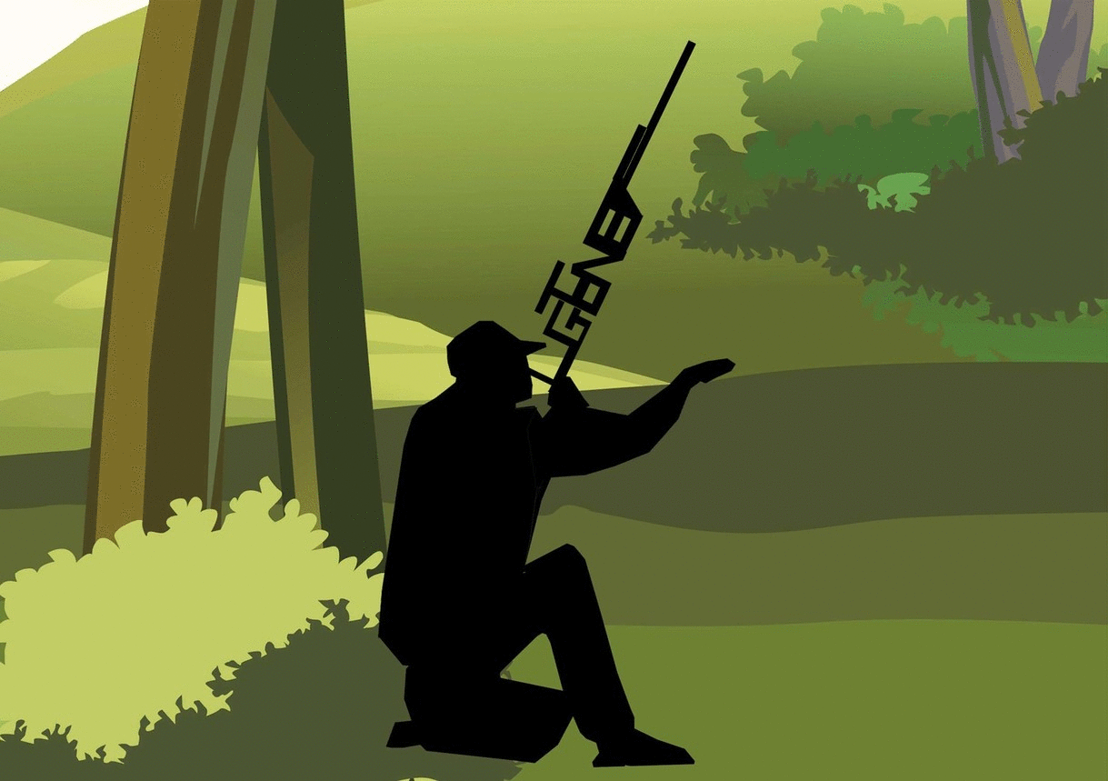
4: My name is Eugene and I am a Decision Maker
Panel 4 – Myself (Decision maker)
I wanted to include myself in the composition as I was inspired by Raphael – School of Athens where he painted himself in the composition. By doing so, it acts as a form of narration as well.
Having held an important position while serving in the Army, I came to realise that I have inherit some of the characteristics of my OC (Officer Commanding) – Being decisive and confident in oneself.
[Decision Maker] In this composition, I am being portray as a hunter who is taking aim at the wolf (Panel 2). This explain the idea of not hesitating and removing the negative thoughts within myself.
The hunter was represented with my English name because that is the name I was usually called which include my Parents, Relatives, Classmates etc. In addition, by using my English name in this composition, it suggests a common language that most can recognized and understand.

When seen together as a bigger composition, the individual 4 panels combine together to form a narrative.
The story describe the ‘Big things’ happening inside me. The animals were selectively chosen that coincided with things that were happening inside me.
The goals of this narrative is to convey the message of ‘Never judge someone without knowing the whole story.’ There’s a story behind every person. There ‘s a reason why they’re the way they are. We never know what someone have been through and is often too early for one to judge.
Hence, “If we learn to understand each other, we will have a better understanding of ourselves.” – Sarah Gadon
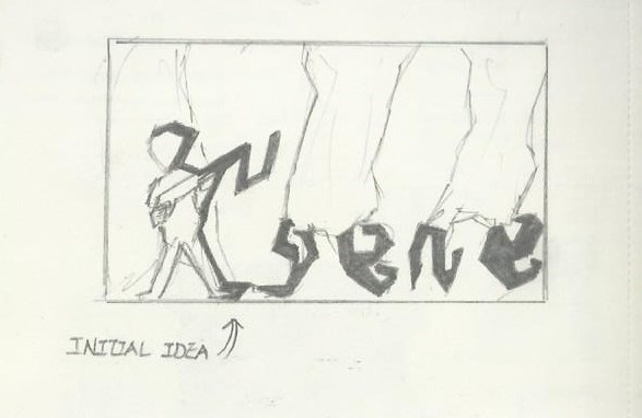
Part 4: Behind-The-Scene [The Making]
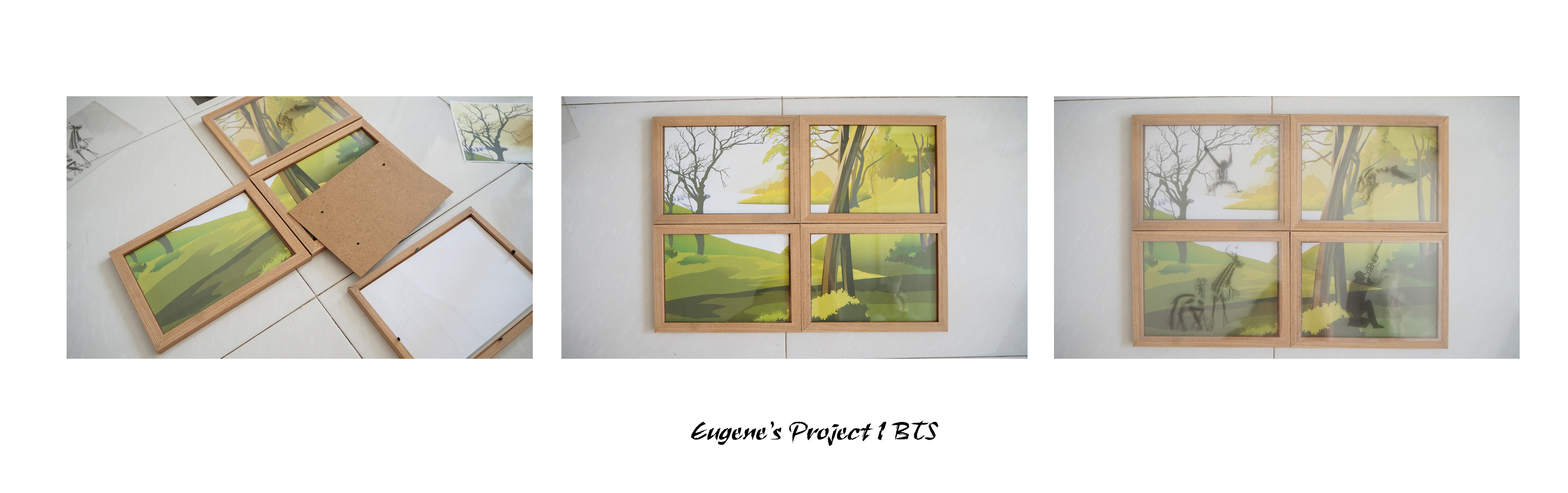
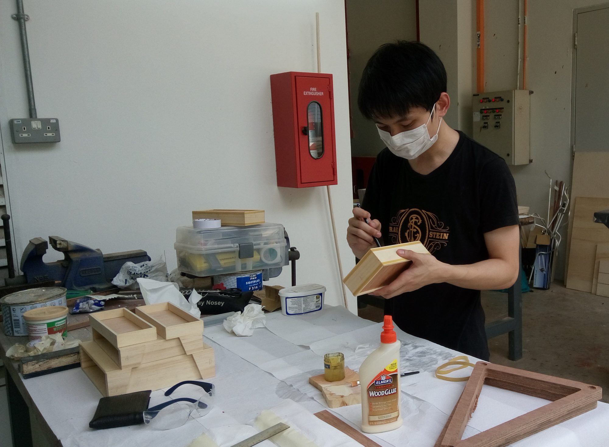
Framing up.
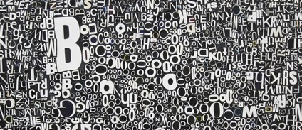
Our eyes filled up the negative spaces in the animalistic typography to form the shape of an animal.
Individual panel’s description with explanation.
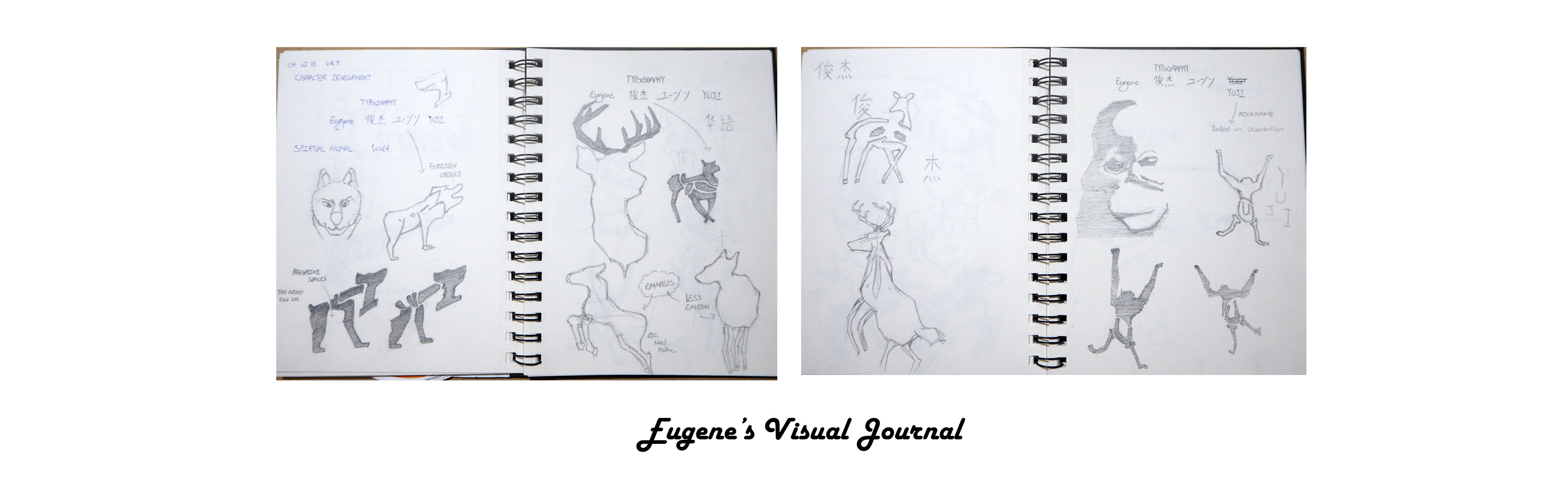
Part 5: Visual Journal
http://eugeneyuji.viewbook.com/album/typographic-portrait
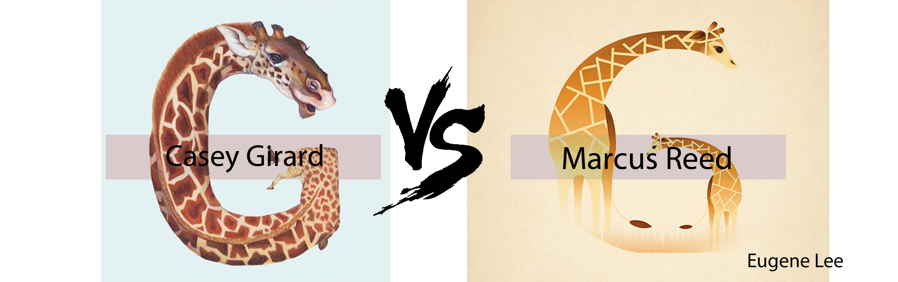
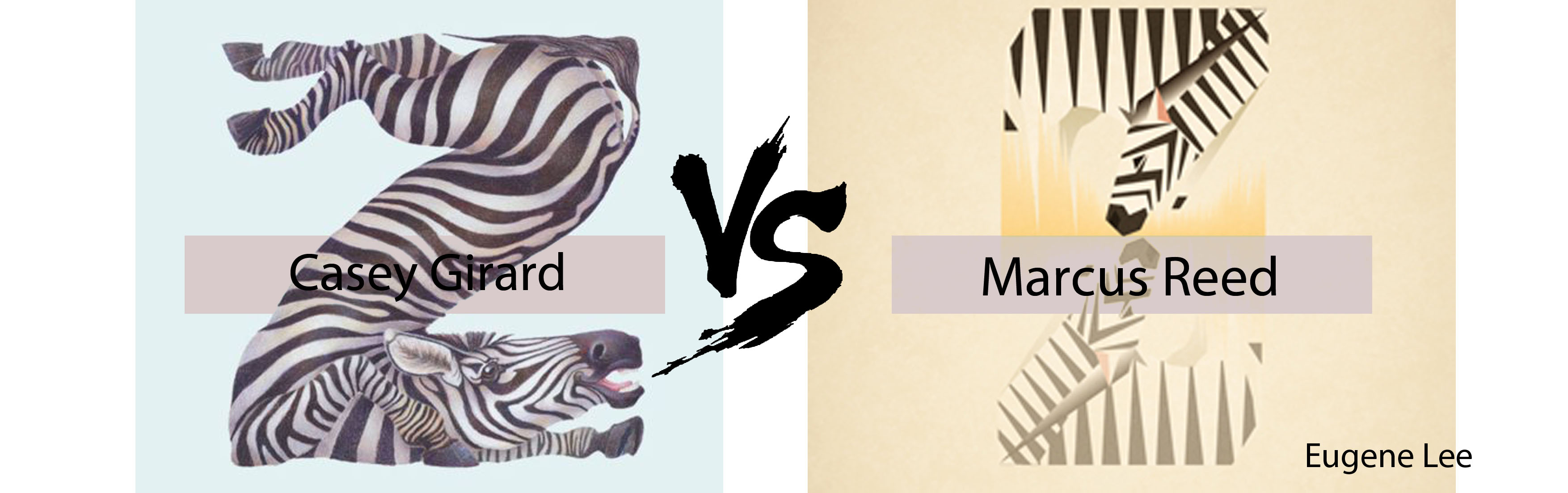
Part 6: Reference Artists
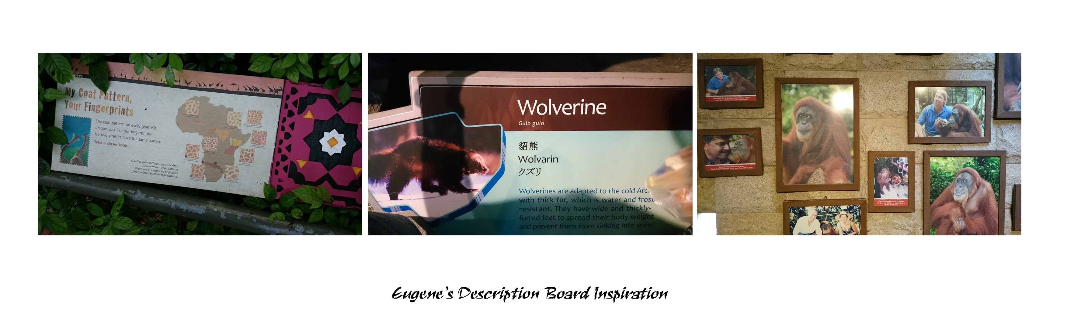
– Singapore Zoo Description Boards
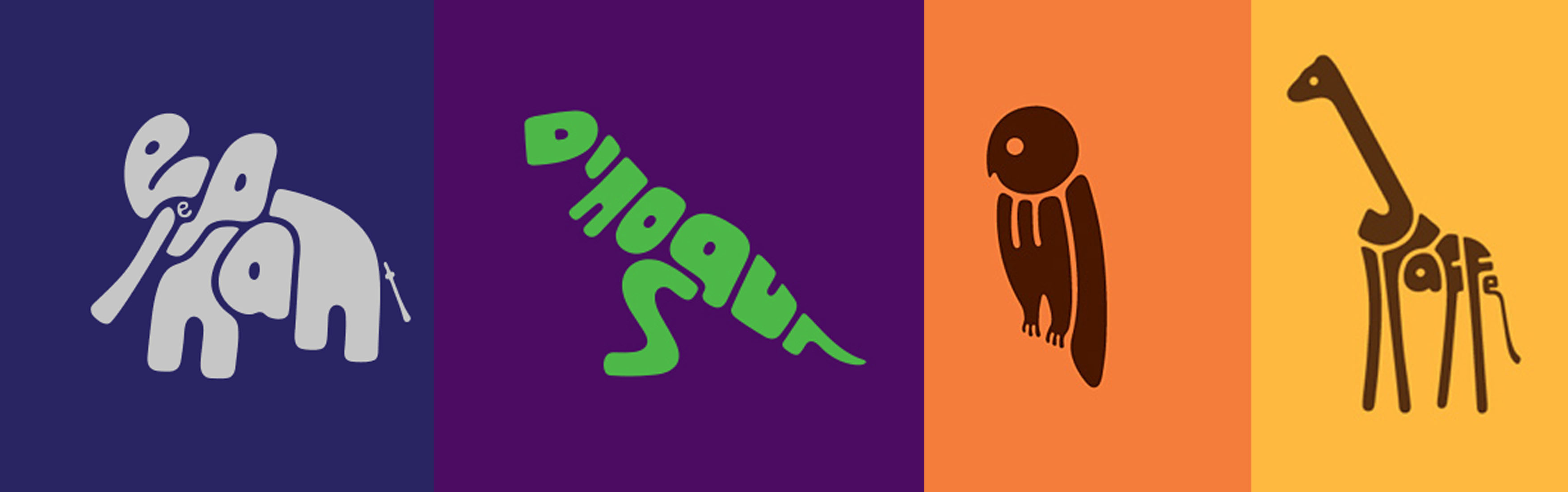
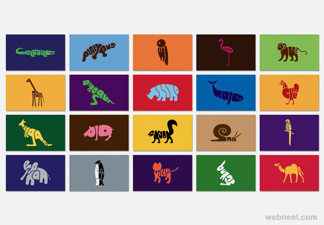
– Dan Fleming animal typography
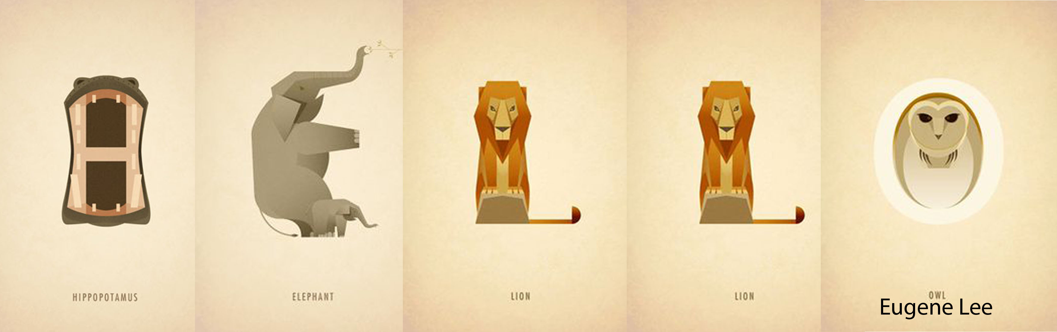
– Marcus Reed animal typography
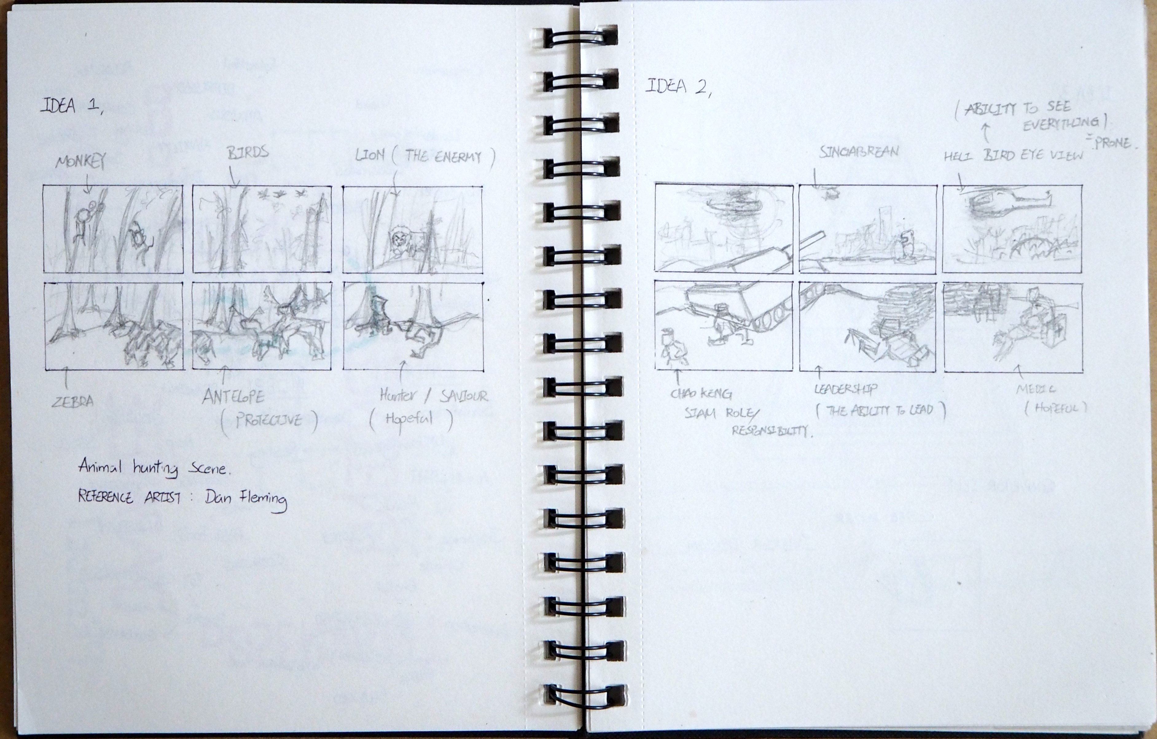
Part 7: Rejected Works

Part 8: Feedbacks
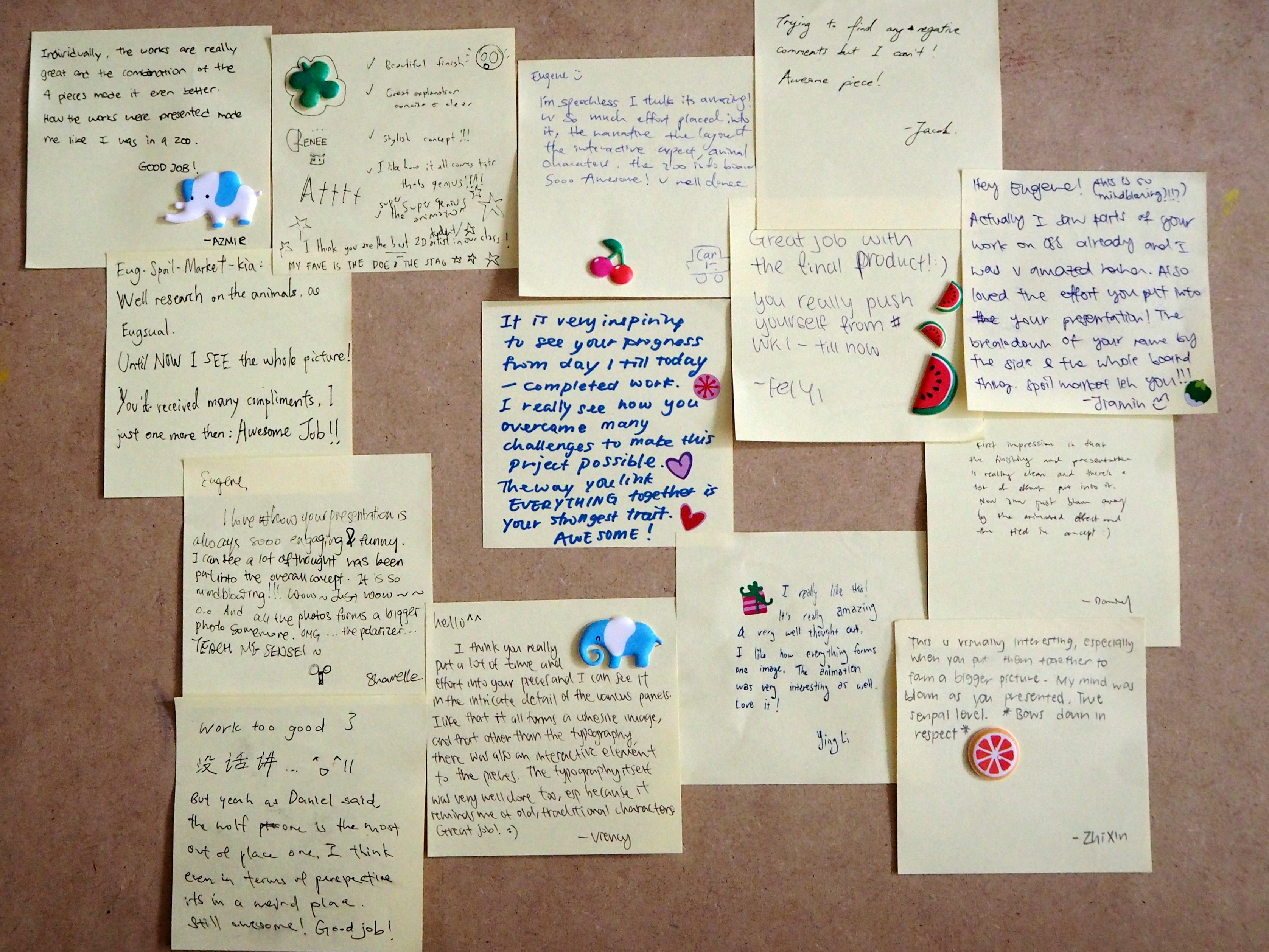
To improve:
Panel 2 (Shadow Self) could have been darken to strengthen the ‘Darkness’ effect.
Project 1 Concluded.
The end ( =
??????


.png)
.png)


