PD2 – Which Product Designer do you best identify with?

Hey there!
Thank you for visiting my page!
In this post, I shall discuss about a Product Designer I am best identify with!

We were tasked to choose from one of the following Product Designers

  • Marc Newson
  • Naoto Fukasawa
  • Ross Lovegrove
  • Yves Behar
  • Karim Rashid

I read several articles and check out their profiles, THEY ARE AMAZING!
I questioned myself if I can be as good as them in the future..
Be it sketches or design thinking, I am pretty much amazed and I look up to them.

The task to choose 1 out from the 5 product designers “that I’m best identify with” is pretty much difficult as they shared common ideal of a democratic design; values, sustainability, economy etc. but amazing in their own unique ways.
Alright, let’s discuss.

_____________________________________________

Product Designer Look up


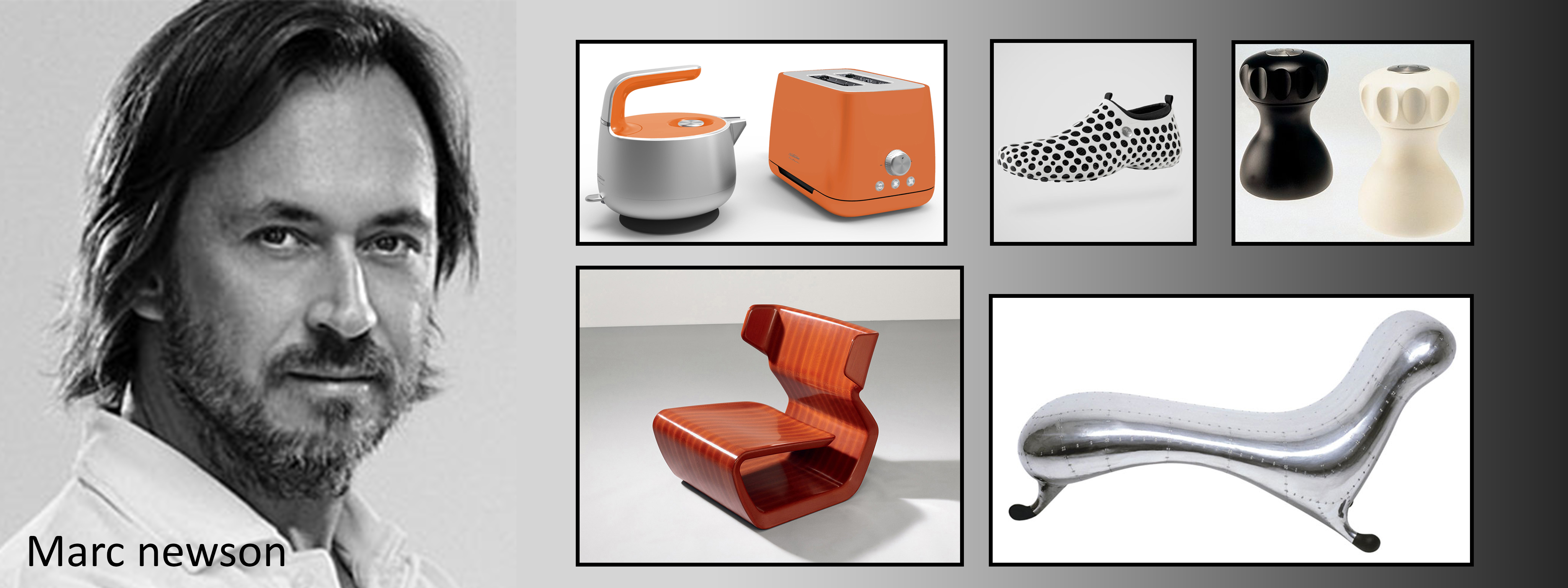
Marc Newson

Marc Newson
– Go for simplicity rather than complexity

Marc Newson’s design with the sense of quality – a product that is able to work forever.
I find Marc Newson designs; Clean, neat and elegant.
The choice of material and the colour scheme used in his products works in harmony thus creating a gentle overall feel.

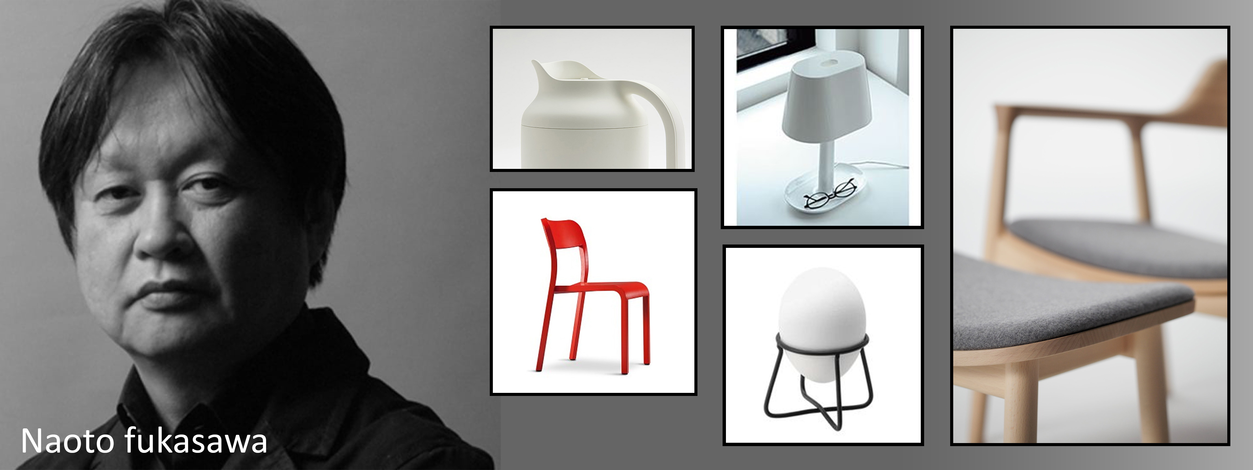
Naoto Fukasawa

Naoto Fukasawa
– Design with an objective

Naoto Fukasawa’s designs relies on finding solutions to the problem/s. – By studying human factors and understanding human behaviours.
I find Naoto Fukasawa designs; Very Minimalistic, interesting, Japan-ish.
His works harmonize the relationship between humans and their environment – whereby mechanisms and elements work together to enable a physical connection between the user and the object.

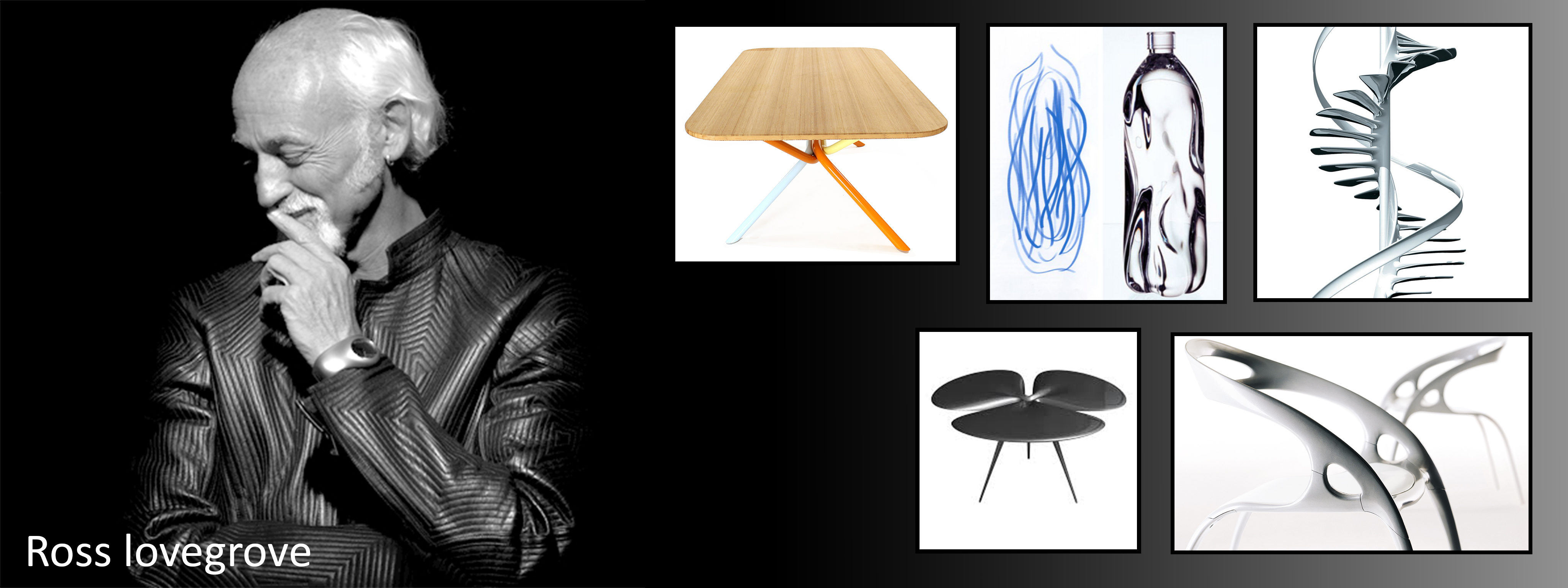
Ross Lovegrove

Ross Lovegrove
– Organic design, inspired by nature

Ross Lovegross designs consist of the amalgamation of art with the function of a design.
– Presence of the nature world are seen in his design as Ross are inspired by the principles of evolution and microbiology.
I find Ross Lovegrove design; Interesting organic forms that deal with lots of curves.
As mentioned, Ross Lovegrove blends most of his works with the elements from the nature capturing the essence of the natural world in his designs.

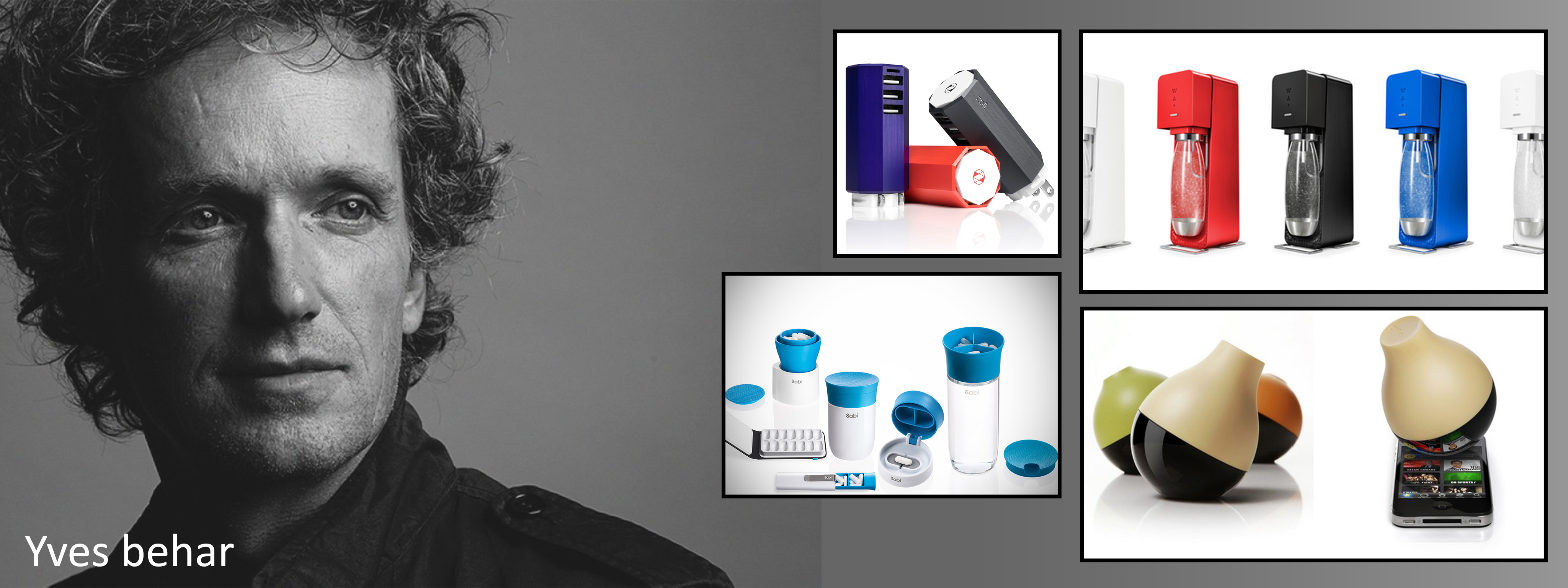
Yves Behar

Yves Behar
– Deliver that ‘interesting’ experience

Yves Behar design a wide range of products. – His designs emphasis on a more stylistic feel to a modern product by introducing a more ‘Interesting’ elements to it. – Modern design with a twist.
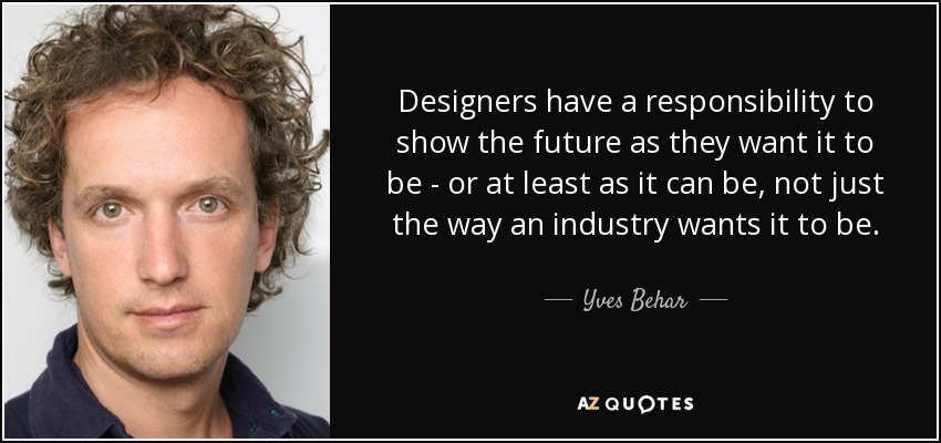
I find Yves Behar designs emphasis on the modern technology to make things better. Such as keeping up with technology and keeping things customisable/personalisation catering to specific individuals.
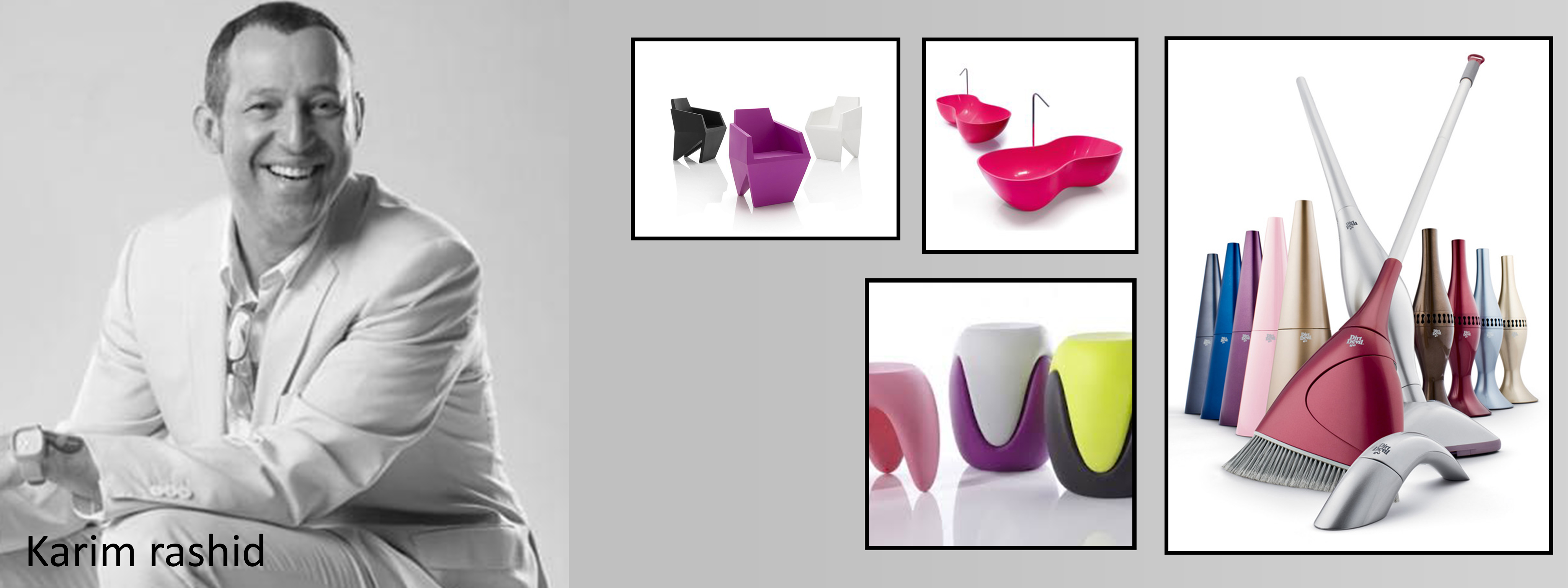
Karim Rashid

Karim Rashid
– Bringing art to design

Karim Behar has a wide range of interesting cool products. – Art element presented in the product creates a sense of uniqueness and individuality.
I find Karim Rashid designs rich in aesthetic values. Which is much curious yet pleasing to the eyes.
The aesthetic point made his product presentable, simple and clean-looking.

_____________________________________________

The Verdict

Q: Which one of the following Product Designers do you best identify with?

After looking up at the various mentioned Product Designers, I felt that I’m more identify with Yves Behar. Living in the fast-paced digital world today, the importance of technology cannot be neglected. Newer products would eventually replace old products thus the change drives product innovations. Like Yves Behar mentioned in the video, the future of design is relatively importance as more product would emphasise the interface between human/technology relationships. That apart, I hope to design products that are equally as beautiful and presentable as part of the aesthetic values.

Foundation 2D Project 2 – Point Of View – Progress Pt1

Recess Week – 3rd March 2016


Hi!

Thank you for reading my second post for this week. ?
I categorized and differentiate my research and progress into 2 respective posts.
Hence, do visit my ‘Research-Pt2’ in the link below before reading this post.

Thank you!

Foundation 2D Project 2 – Point of View – Research pt2


Part 6: Exploration

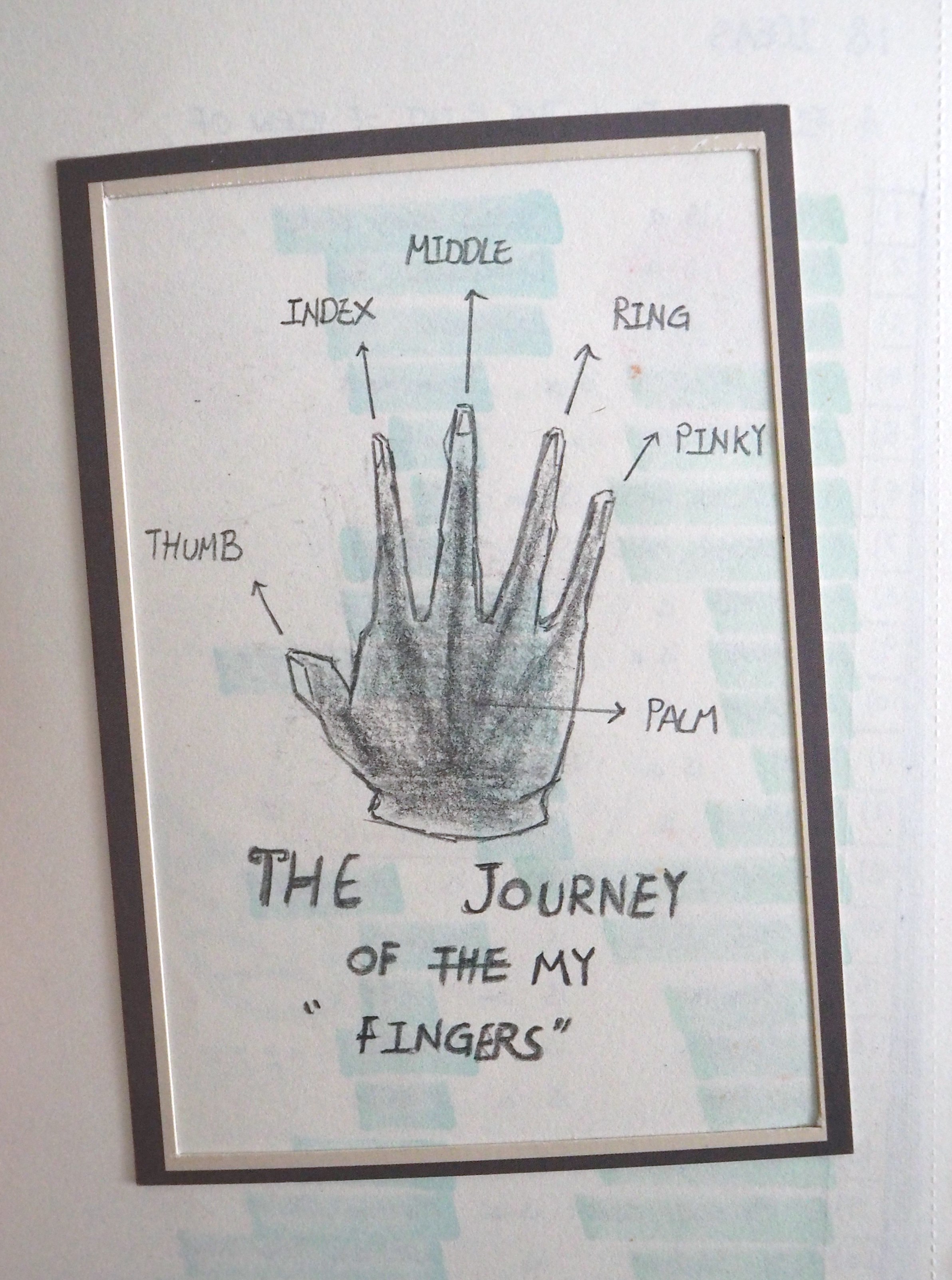
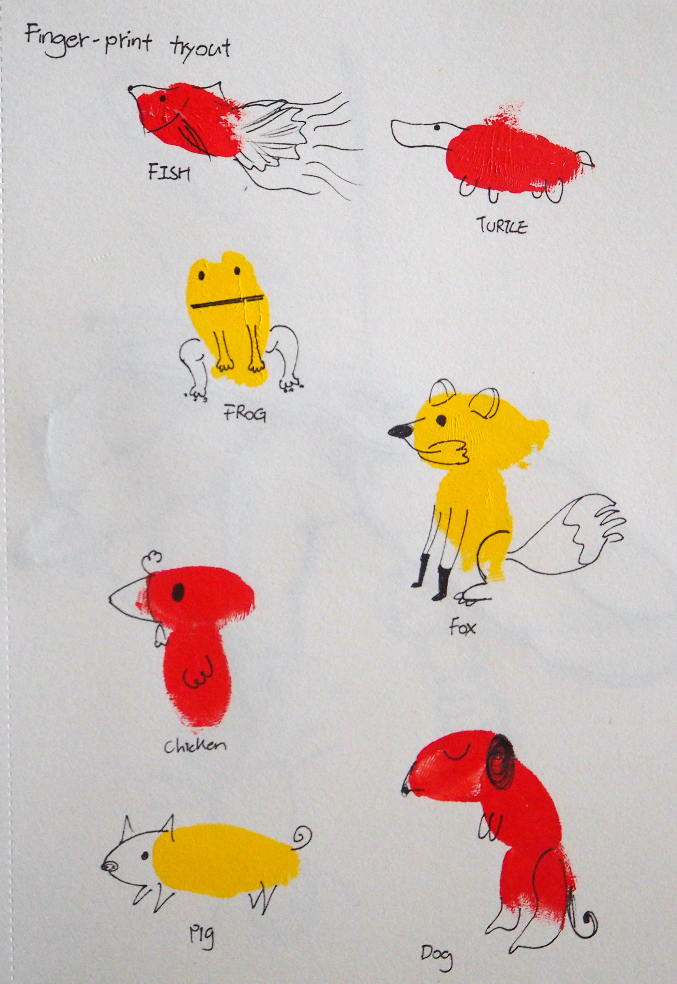
P1010036P1010035
Initially, I wanted to make use of my fingerprint to create the compositions.
In the above fingerprint painting, I made use of my thumb and index finger to create the body of the animal.
After that, details were drawn on to the fingerprint.
I find this method interesting but however, I couldn’t link it to my selected 6 concepts as I wanted it to be more relatable. ?


Part 7: Approach

My approach to this project would be by digital means.
I’m trying out various platforms to compose the 6 compositions digitally, such as Photoshop and Illustrator.

During the consultation, I’ve shown Miss Joy some of my sketches.
The thoughts of introducing Surrealism into my composition made it possible for these theme.
I’m thinking of ways to combine my fingers with the suggested tools/equipment so as to fulfill the requirement.

Here are some sketches that was presented during the consultation;

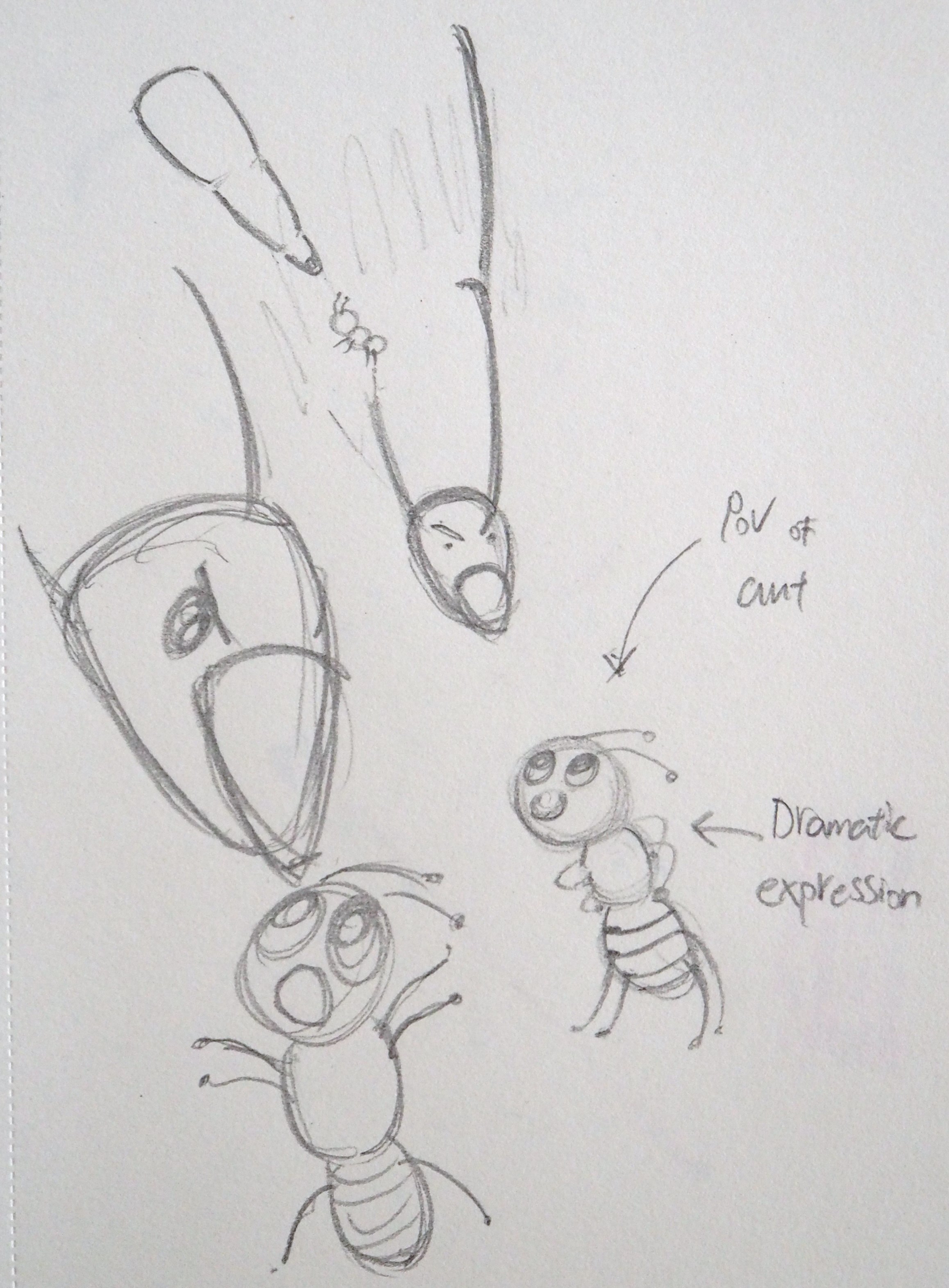
P1010033
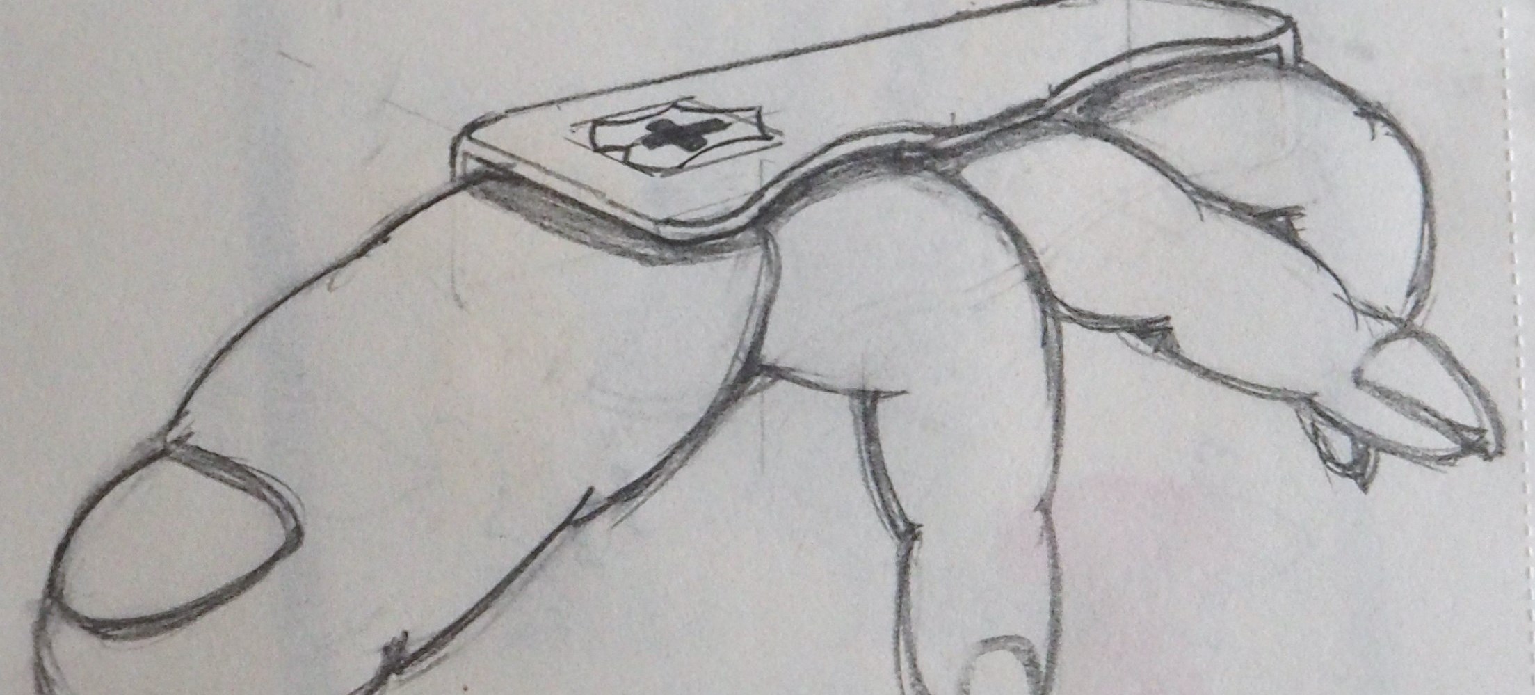
1) Finger from the point of view of Me is a Swiss army knife.
– In this sketch, I combine the drawing of my fingers with the shell of a Swiss Army Knife. The general idea is to portray the ‘usefulness’ of our fingers by comparing it with the Blades of the Swiss Army Knife. 
The Swiss Army Knife is drawn according to the one I received in NS (National Service), it have so much sentimental values! – It have so many uses; tightening the Muzzle of the SAR21 before a live-firing exercise, sewing badges on my No.4 and things like that.
Besides that, we uses our fingers everyday in any situation. It’s a ‘handy’ tool! ?

P1010034
2) Finger from the point of view of Ant is a Missile.
– Still working on this. foot-in-mouth


Keyboard is Endurance
3) Finger from the point of view of A Computer Keyboard is Endurance.
– Trying out this composition with Photoshop by combining images online and digital drawing (With pen tool).


Part 8: 3 more to go!

Good stuffs takes time, I have 4 more composition to think about!
“Lost time is never found again!”  ?
Got to do it faster!!! >.<

1) Finger from the point of view of A Massage Chair is a Manual Osim.
2) Finger from the point of view of NTU Student is Winning the Star Wars.
3) Finger from the point of view of KFC is Licking Good.


The End

Thank you for reading! ?

Foundation 2D II Project 1 – Typographic Portrait – Progress Pt3 [ Final ]

Week 6 – 18 February 2016


Hey there!

Thank you for your kind attention during my presentation! Appreciated!
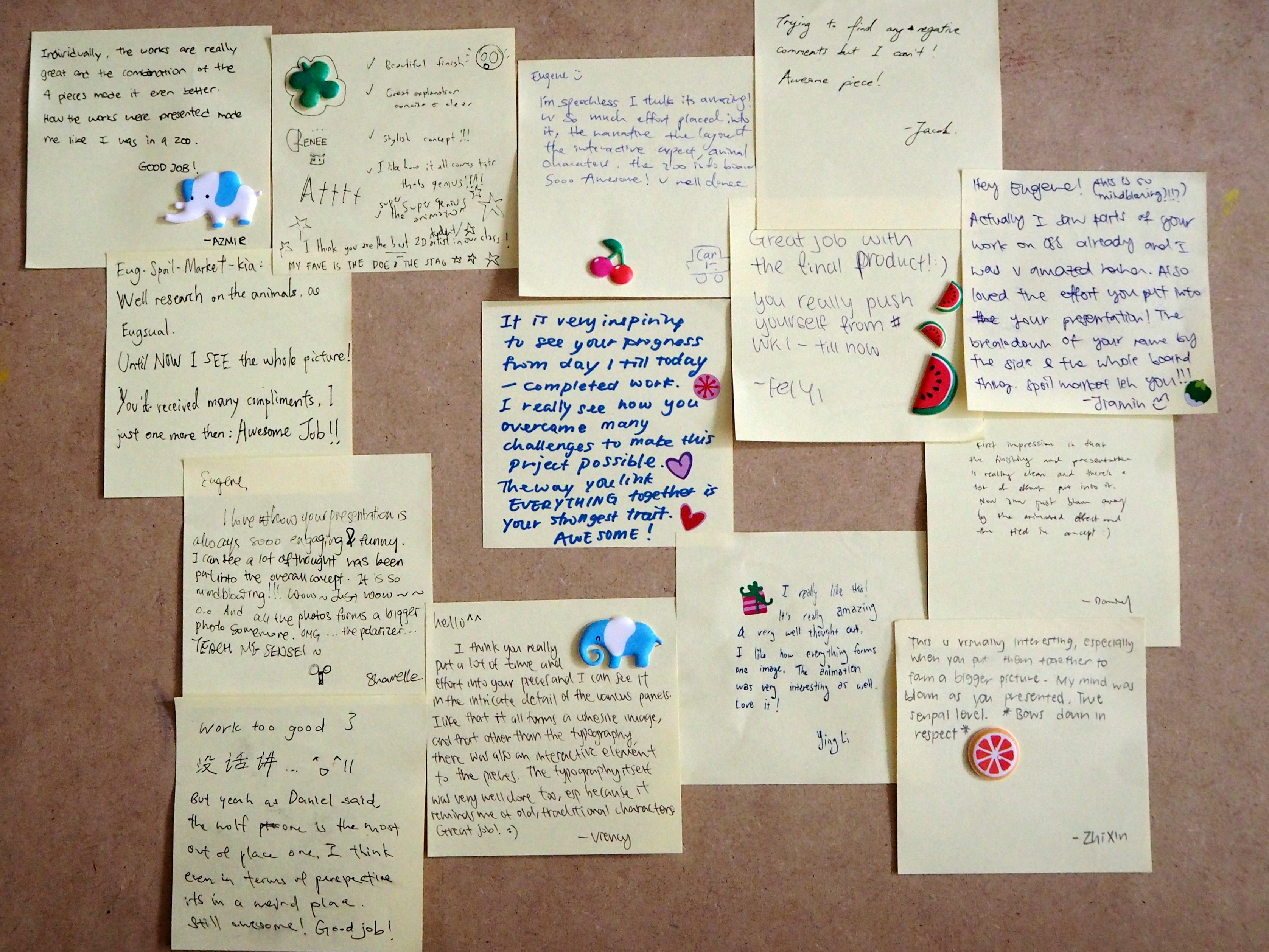
Here’s an extra thanks to those who gave me their opinion on my works~!
Haha! ? ?
I feel that each of us are unique and I’m glad that I can learn from you! ?

Today entry is a summary for Project 1 – Typographic Portrait.


Part 1: Background Design [Development] 

BG

Problem Faced:
The background was the hardest, in my opinion, because the attempt to make it as realistic as possible was a challenging task.  ?

I started off with Adobe Photoshop CS4 – Which I am most comfortable with. However, after several attempts trying to set the image right, I can’t seems to be able to do it. I tried directing my reference to some pictures of a real forest / wilderness and some of the National Geography Wild videos for inspiration. ?

There were a few considerations, as mention in the previous update, as follow;
1) Scale
2) Realism
3) Logical Placement
4) Colour

I told myself that, regardless how detailed the description via websites and videos can be, experiencing and understanding the actual environment by an individual will help more. ?

My Takeaway:
The completion of the background was my greatest accomplishment, I felt, for this project.
The development on the background was the most pronounced – From a flat image in Adobe Photoshop CS4 to a rather convincing landscape in Adobe Illustrator CS4.
This project allow me to explore the use of other mediums such as Adobe Illustrator CS4 and help me think critically in terms of logical placement and setting of the animals and environment. ?


Part 2: Field Research at the Singapore Zoo
Junegene

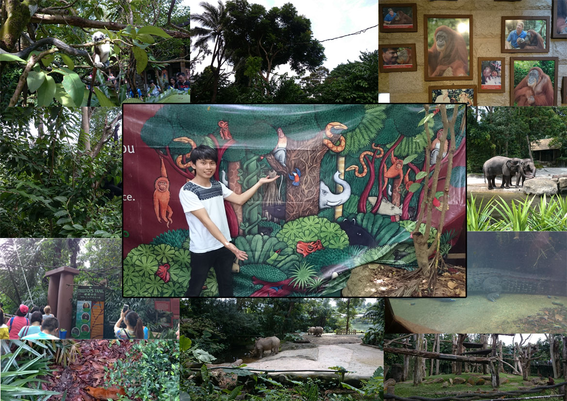
In celebration for Valentine’s Day, June and I visited the Singapore Zoo (as I conducted my field research).
It was a fun and engaging learning process to see and know more about the relationship between the animals and their natural habitat. ?

Throughout the research, I pay attention to the animals behaviors and their movement from place to place.
Understanding these will help me with my composition, especially the silts animation that I’m working on.

However, Singapore Zoo does not offer a wider range of animals as compared to the rest of the world.
Hence, my composition on the ‘deer’ and the ‘wolf’ were done visually online.

Nevertheless, the trip to Singapore Zoo was a fun-filled and enjoyable one.
I strongly recommend to my classmates and I will probably re-visit another day. ?


Part 3: Explanation on Individual Panel
O1O1
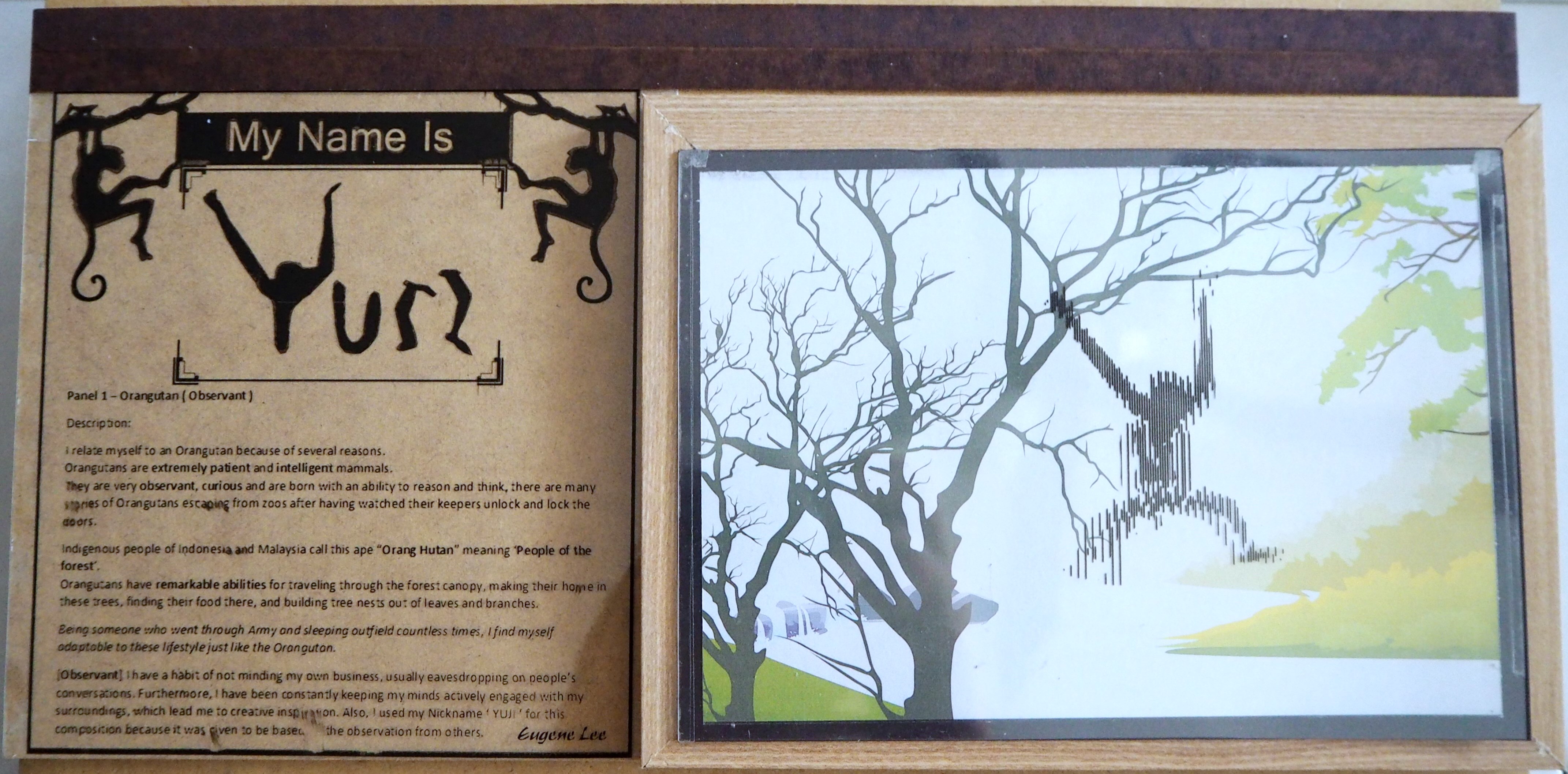
1: My name is YUJI and I am Observant.

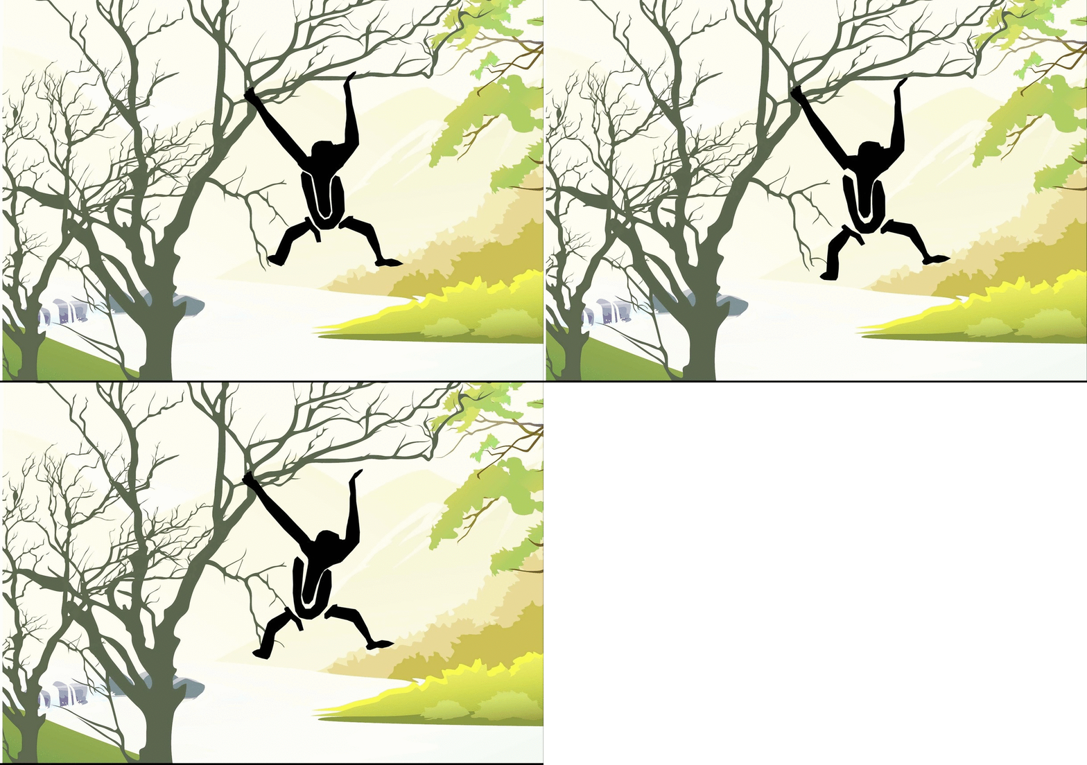
Panel 1 – Orangutan (Observant)

I relate myself to an Orangutan because of several reasons.
Orangutans are extremely patient and intelligent mammals.
They are very observant, curious and are born with an ability to reason and think, there are many stories of Orangutans escaping from zoos after having watched their keepers unlock and lock the doors.

Indigenous people of Indonesia and Malaysia call this ape “Orang Hutan” meaning ‘People of the forest’.
Orangutans have remarkable abilities for traveling through the forest canopy, making their home in these trees, finding their food there, and building tree nests out of leaves and branches.

Being someone who went through Army and sleeping outfield countless times, I find myself adaptable to these lifestyle just like the Orangutan.

[Observant] I have a habit of not minding my own business, usually eavesdropping on people’s conversations. Furthermore, I have been constantly keeping my minds actively engaged with my surroundings, which lead me to creative inspiration. Also, I used my Nickname ‘ YUJI ‘ for this composition because it was given to me based on the observation from others.

W1W1
2: My name is ユージン and I have a Shadow Self.

Panel 2 – Black Wolf (Shadow Self)

The ‘Shadow’ is those aspects of self that are kept hidden in the dark forgotten place within us all, swarming with dark desires and impulses.
My shadow self relates to my strong negative feelings that usually lead me to ‘Over-Thinking’, ‘Anxiety’, etc.

[Shadow Self] I use ‘Black Wolf’ to represent my ‘Shadow Self’ because it denotes a dark, negative impression that infers self-interest. It can also represent greed, fear of being threatened and the lack of trust in someone or in myself.

The Black Wolf was designed with my name in Japanese –ユージン[Katakana format].
Which spelled ‘Yu-Jin-i’ when written in romaji. Foreign language support the idea of ‘Not Usual’ and the idea of foreign object.

In my composition, I refer to the Black Wolf as my personal challenges with boundaries. The boundaries are blockages that stop me from moving forward or making the wrong decision
– Usually associated with self-interest and temptation.

In addition, it was further elaborated by placing the Black Wolf in its attacking posture.
In this case, attacking the Deers in Panel 3. This portray my inner desire at work thus creating personal challenges.

D1D1
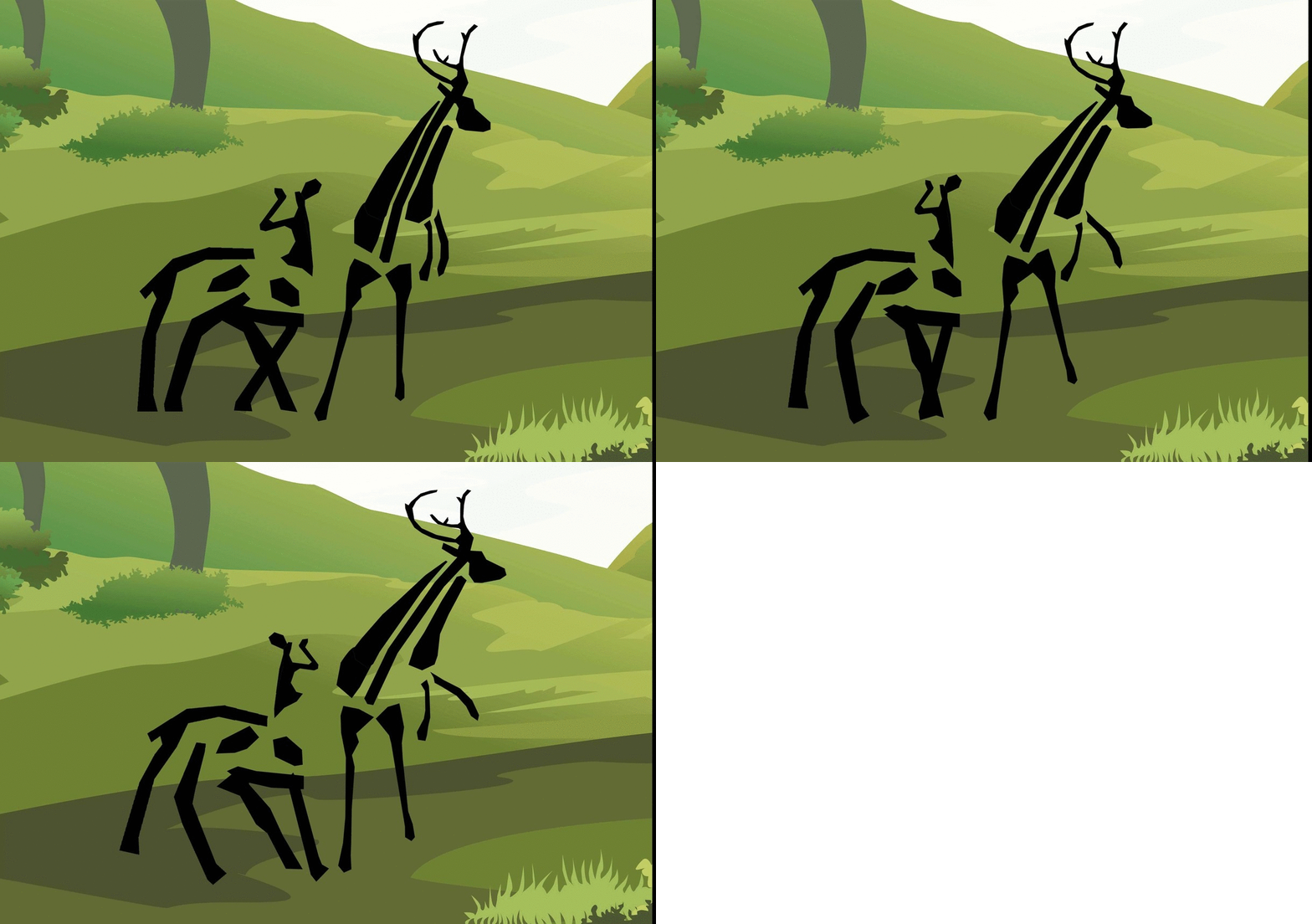
3: My name is 俊杰 and I protect whatever belongs to me.

Panel 3 – Stag (Giving Protection)

I relate myself to a Stag ( Male Deer ) because of several reasons,

Firstly, deer stay in a herds of approximately 25 deers per herd, mainly female deer and a dominant male deer (Stag). The male deer are protective deer that will fight to protect their herd of female deer and to protect their pride.

Secondly, deer are also known as selective feeders which they spend most of their time picking out the shoots, leaves, grasses and fruits that are easy to digest. Similar to myself, I chose food that I find are light, more nutritious and easier to digest.

Lastly, they are constantly being hunted by human (for meat, milk and skins) or prey to other wild animals such as wolves. They are vulnerable but they stay strong to protect whatever belongs to them.

[Giving Protection] In this composition, I designed the deer to resemble my Chinese name俊杰.
The general idea is to portray my characteristic of being able to give protection.
For example, my name does not make sense just or alone. It can only exist together as俊杰.
Hence, the stag is shown in a fighting position – against the wolf
whereas the deer is being protected.

M1M1
4: My name is Eugene and I am a Decision Maker

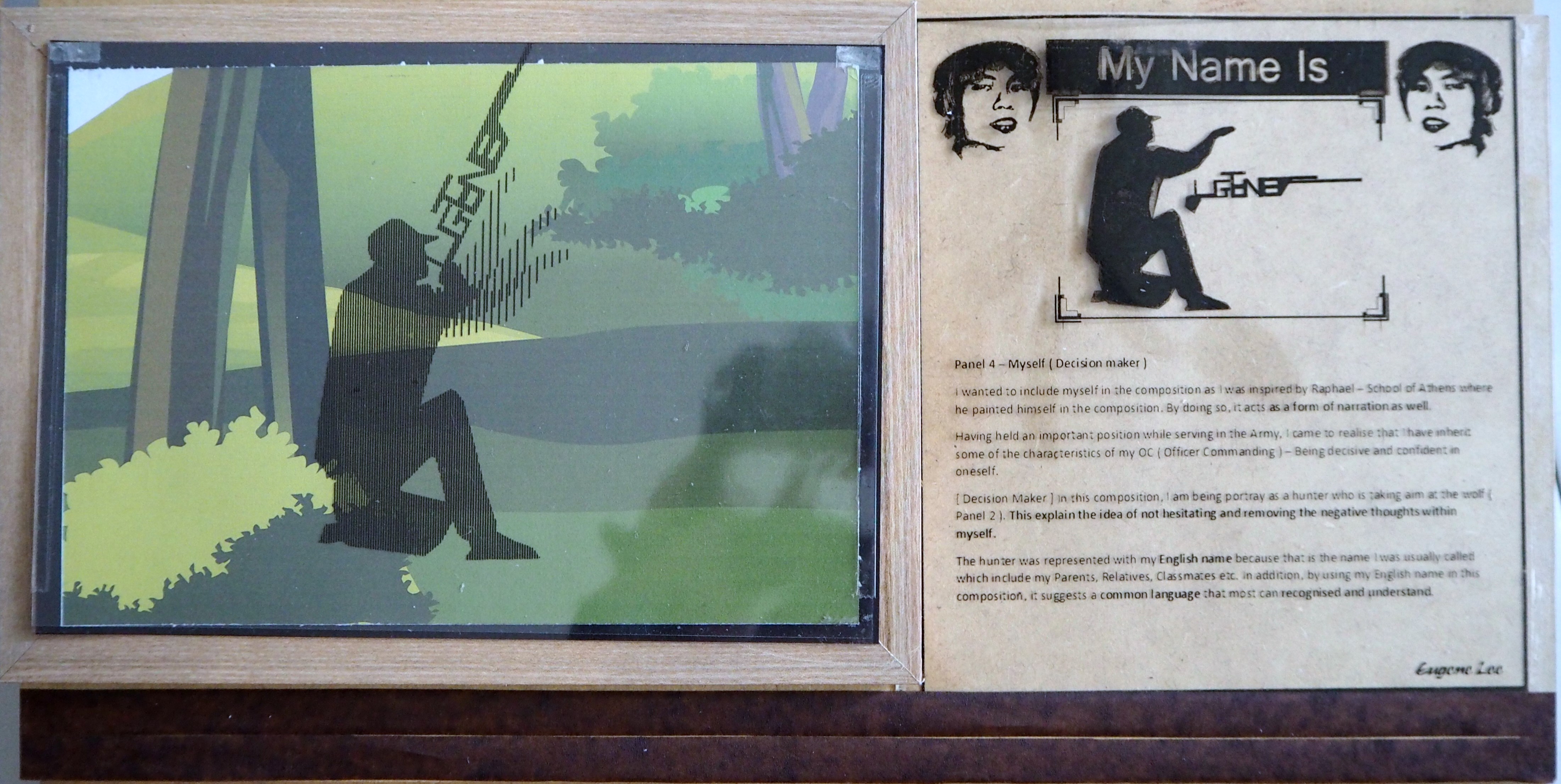
Panel 4 – Myself (Decision maker)

I wanted to include myself in the composition as I was inspired by Raphael – School of Athens where he painted himself in the composition. By doing so, it acts as a form of narration as well.

Having held an important position while serving in the Army, I came to realise that I have inherit some of the characteristics of my OC (Officer Commanding) – Being decisive and confident in oneself.

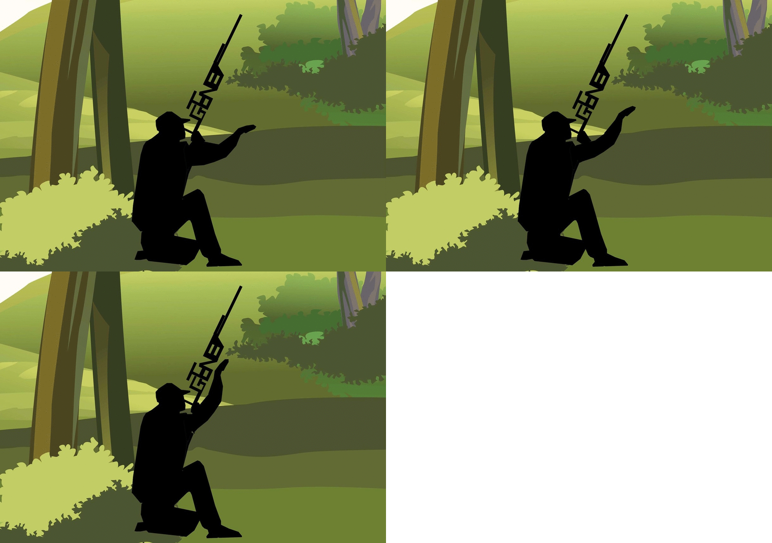
[Decision Maker] In this composition, I am being portray as a hunter who is taking aim at the wolf (Panel 2). This explain the idea of not hesitating and removing the negative thoughts within myself.

The hunter was represented with my English name because that is the name I was usually called which include my Parents, Relatives, Classmates etc. In addition, by using my English name in this composition, it suggests a common language that most can recognized and understand.


whole composition
When seen together as a bigger composition, the individual 4 panels combine together to form a narrative.
The story describe the ‘Big things’ happening inside me. The animals were selectively chosen that coincided with things that were happening inside me.
The goals of this narrative is to convey the message of ‘Never judge someone without knowing the whole story.’  There’s a story behind every person. There ‘s a reason why they’re the way they are. We never know what someone have been through and is often too early for one to judge.
Hence, “If we learn to understand each other, we will have a better understanding of ourselves.” – Sarah Gadon


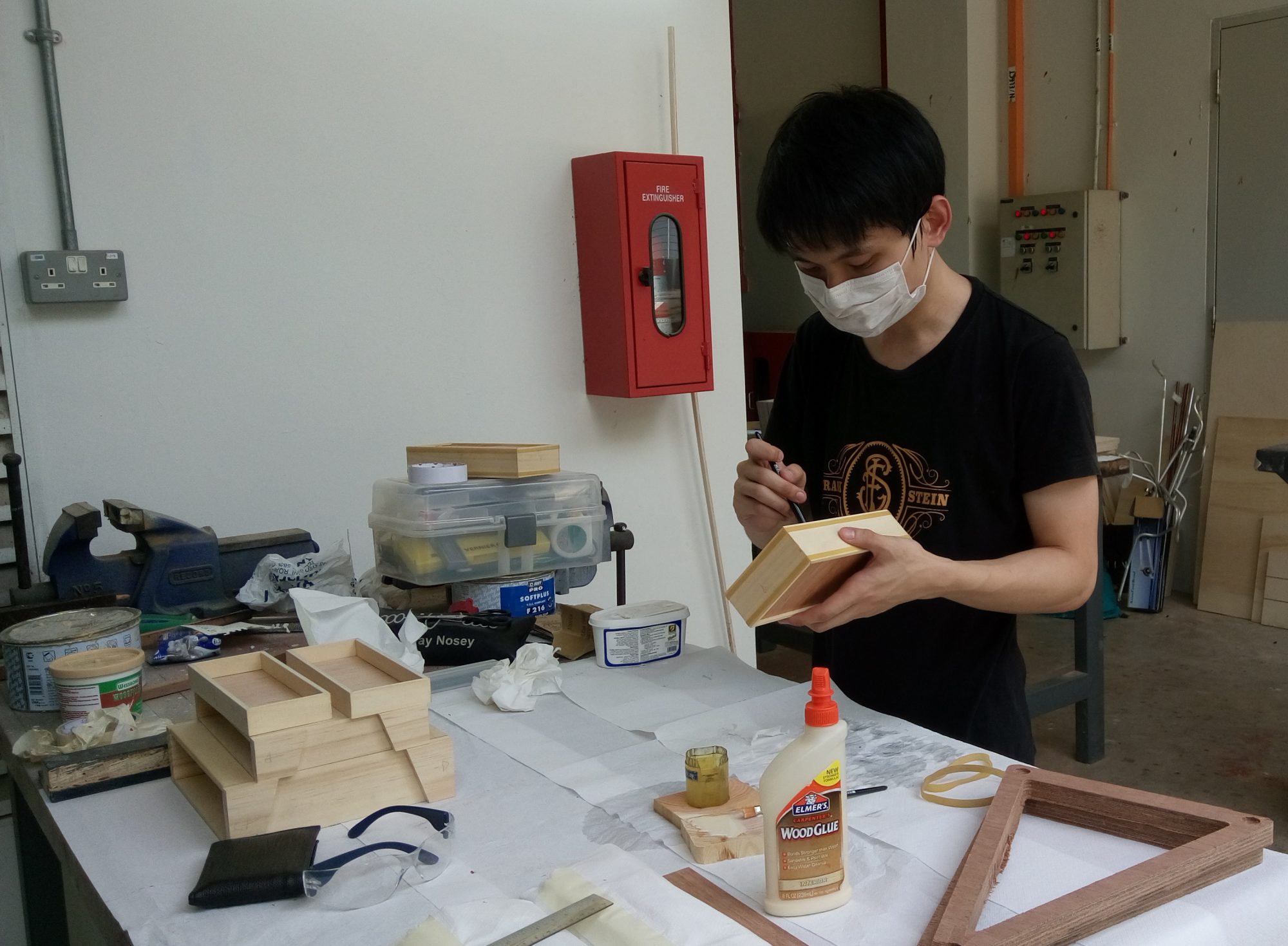
Part 4: Behind-The-Scene [The Making]

bts
Framing up.

Orangutan Changes
Our eyes filled up the negative spaces in the animalistic typography to form the shape of an animal.

Display Boards
Individual panel’s description with explanation.


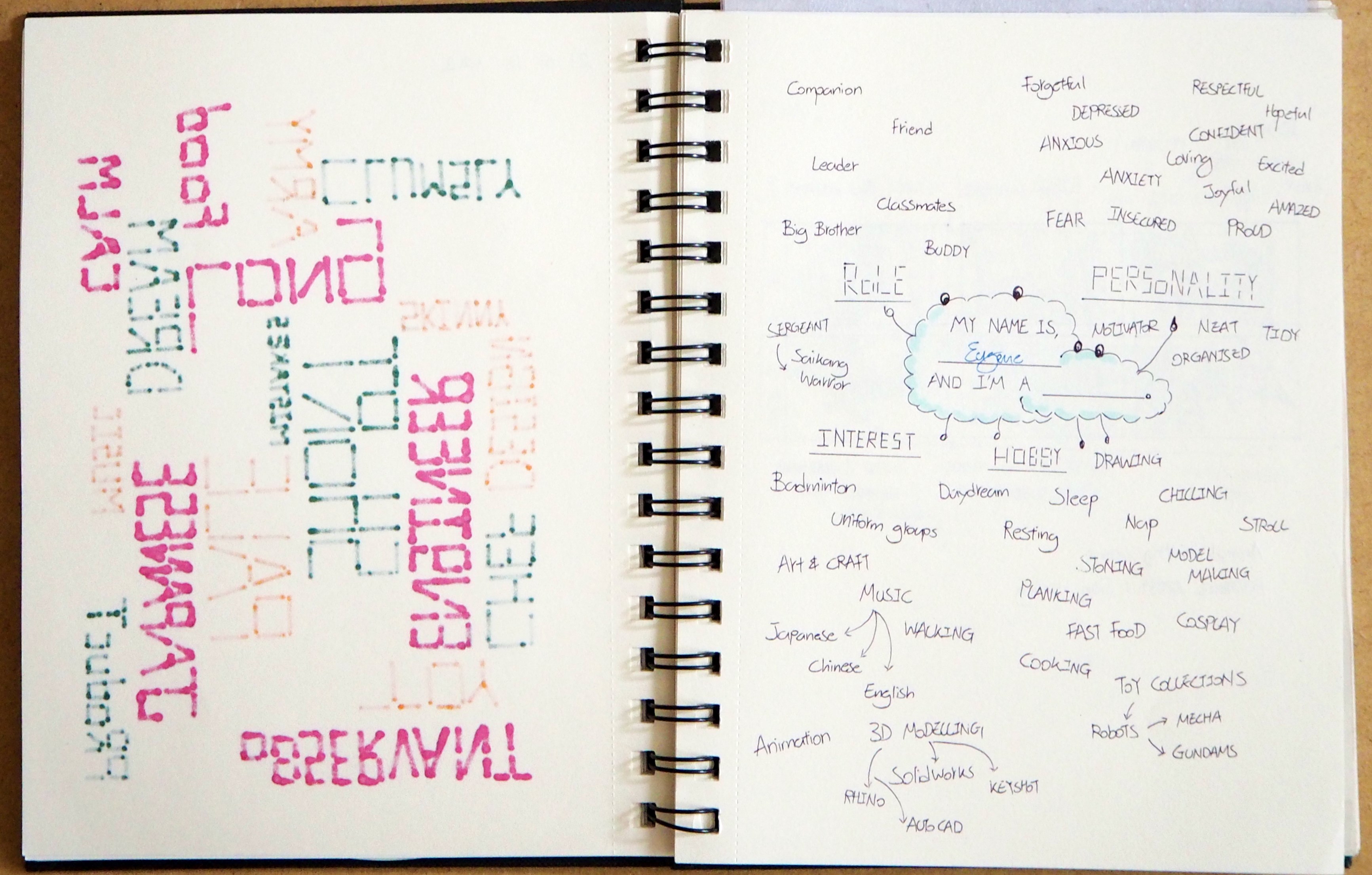
Part 5: Visual Journal

http://eugeneyuji.viewbook.com/album/typographic-portrait
Eugene VJ


Part 6: Reference Artists

moodboard
– Singapore Zoo Description Boards

Tetrad
– Dan Fleming animal typography

Hello 2
– Marcus Reed animal typography


Part 7: Rejected Works

Eugene Second Animation
Background Design


Part 8: Feedbacks

Feedbacks

To improve:
Panel 2 (Shadow Self) could have been darken to strengthen the ‘Darkness’ effect.


Project 1 Concluded.
The end ( =
??????
Foundation 2D II Project 1 – Typographic Portrait – Progress Pt2

Week 5 – 11 February 2016


Hello there! ^^

Next week is our first Foundation 2D presentation of semester 2!
Can’t wait to learn from my classmates project!
Similar to last week, today entry focus on the Work-In-Progress. ??


Part 1: Creating the Setting.

As learnt from my previous OSS entry, my composition will involve the use of 3 layers.
1) Background
2) Animalistic Typography (To be Printed on Transparent Sheet)
3) Silt Panel

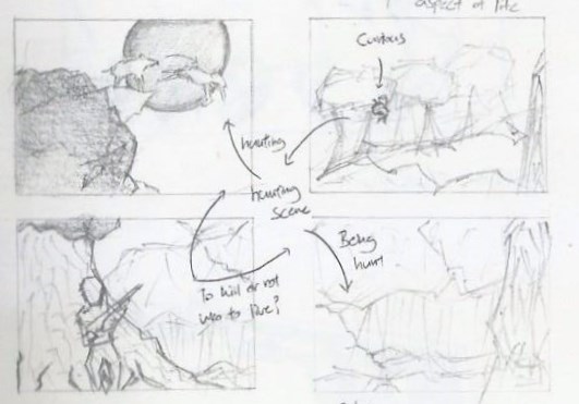
This is my initial 6-Panel concept.
Eugene Idea 1

Followed by the edited 4-Panel concept.

Eugene second edit

Proceeding with the edited concept, I created a landscape design with Photoshop.
Refer to below illustration.

Background Design
In the informal critique last week, I was recommended to decrease the Saturation of the ‘Split-Complementary’ colours so that it lower the chances of interfering with the Animalistic Typography (2nd Panel). The result is shown above in Version 3.

However, I was struggling with this background design because it does not seems as ‘Realistic‘ as I wanted it to be. ? I tried positioning the ‘Animals’ – I have in mind for this project, to fit in a actual wilderness situation. I placed the animals in their respective position and Eureka! *Ding!* I finally know the reason why!! ?
003In the background design above, assuming the distance from the Wolf and the Deer are 5Km apart, there are various explanation that the placement is not logical. ?
Firstly, the wolf could have died speeding along the way. (Mountain have sharp edges.) ?
Secondly, with reference to the distance, the Wolf could probably look for other closer preys to hunt. ?
Thirdly, the deer could have been kill by ‘other’ animals instead ?
Lastly, the wolf is too small to be recognized. (Considering Audience View)

Hence, designing a background isn’t as easy as it seems!
I have to create it in a way that not only it looks presentable, it must be logical as well. 
(& I went to watch National Geo Wild to get inspiration for the background concept.) ?

To further develop on my concept, June provided me with valuable insights as to work towards a ‘more’ realistic background design. She browse through my Visual Journal and found out that my ‘Initial Idea’ could actually be workable. ??

Having gain back more confident, I went to design the background with the software I’m most familiar with – Photoshop CS4. But I struggle once again, unable to create a desire background…
I told myself, I have no other choice.. Adobe Illustrator CS4 is my Last Resort!

And it’s a Miracle! ?
004005


Part 2: Panel 1 (Orangutan)

Moving on, I went to execute my very first ‘Animalistic Typographic‘ with the animation effect.
The animation design element was surprisingly new to me, because I’ve never done any form of animation before. This was rather risky for me but but but! I have to get this done! It may be challenging for me but I’m not letting it discourage me! ??

To start off, the design process involve the sketching phase.
With reference to my reference artistsDan Fleming, Casey Girard and Marcus Reed. (Animal Typography)
and ‘Fun’ typography I refer to was Chris LaBrooy (Use of Setting)
Refer to below for Orangutan ‘Animalistic Typographic’ Sketch.

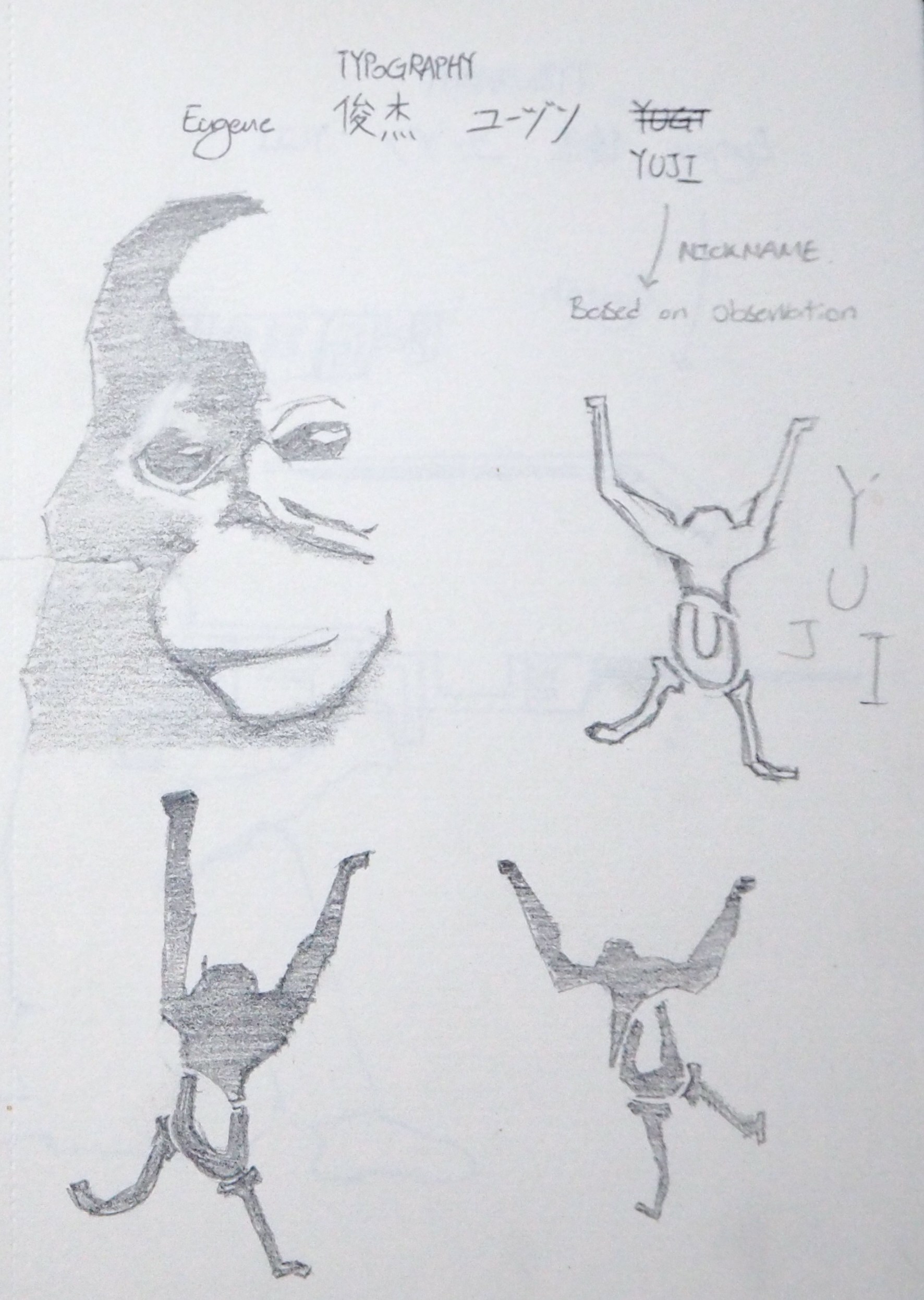
Eugene Visual Journal

Basically, I broken down the Orangutan into 4 sections.
The Orangutan was formed by my nickname: ‘YUJI
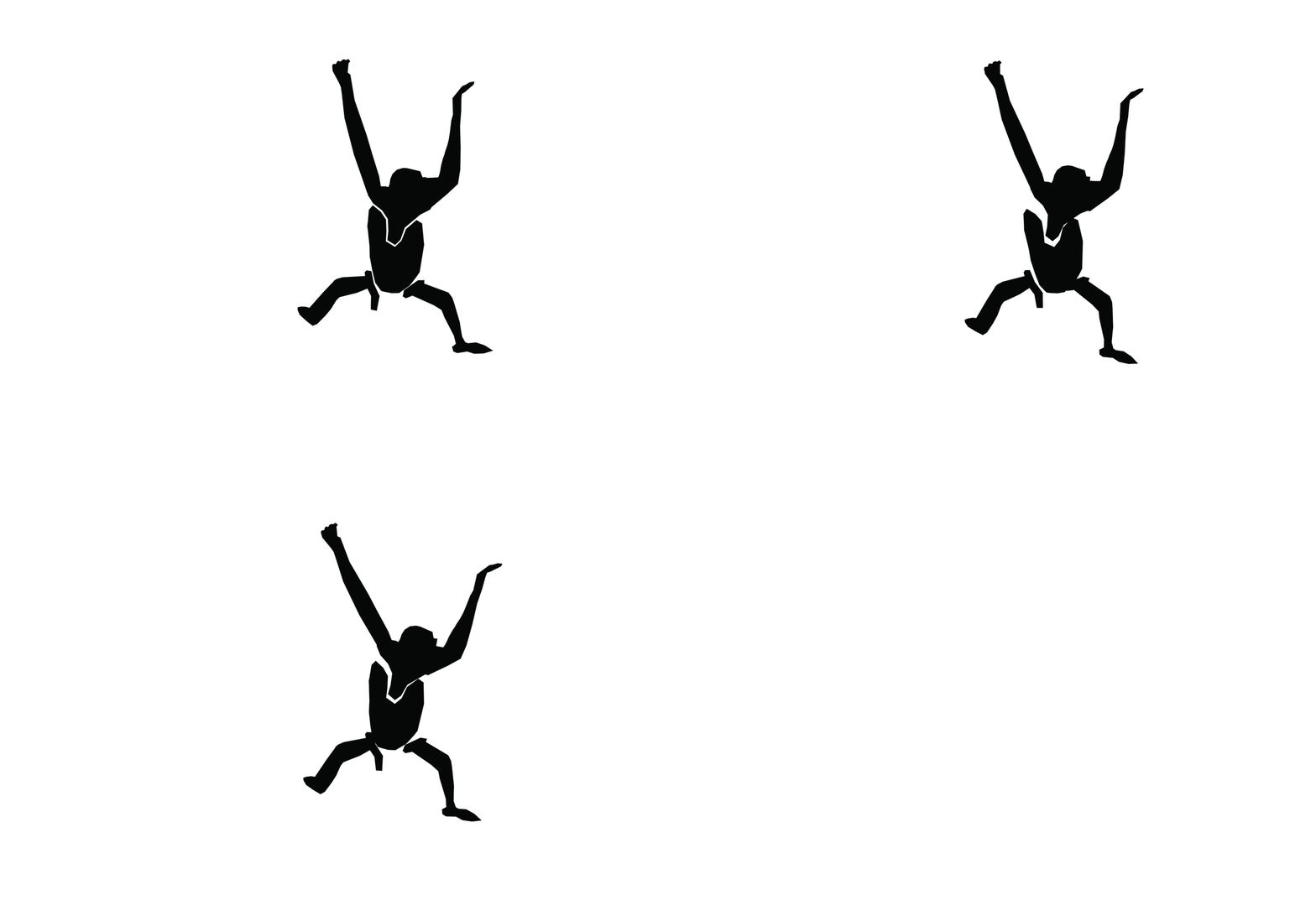
With ‘Y = Arms & Head’, ‘U = Lower part of body’, ‘J = Left Leg’ and ‘I = Right Leg’.
Later, I edited it in Photoshop (Frame by Frame) to give the silhouette a animation effect.
Refer to image below.

006

Orangutan Moving Gif

And! Here’s a video! ^^

Please note that the materials used in the above video is a draft and not for the final presentation.
(I smudge the ink on the Orangutan, and the Silt panel isn’t in it’s best form.)
I also tried out other types of transparent plastic sheets that I can find from Popular Bookstore, doing a ‘Trial and Error’ once again, let’s see which plastic sheets are the best! Can recommend to classmates if they require it for their future projects. ?

With reference to ‘NATURE‘, I pay attention on the movement of Orangutan between trees too!
Here’s a video from Youtube that explain how Orangutans swing from tree to tree.


Part 3: Visual Journal

Last but not least, let me bring you through my update for Week 4 Visual Journal entry.  ?
Week 4 entries focuses on the character development.
As I was drawing the animal, I try to depict them in the best literal form as possible.

007008

So you may be curious why am I doing as part of the composition? ?
I was inspired by Raffaello Sanzio da Urbino – The school of Athens, where he painted himself in the composition. Hehe! ^^
But of course, placing myself as a subject in the composition narrates a story as well! ?

So stay tune for my presentation next week! ^^


On the side note,

I discussed and presented my ideas to some of my previous Classmates.
In the meantime, improving on my presentation and gather intakes from them.
Ziyaard, Vimal and Hsien Wei are pleased with my brief presentation and Andrew threaten to shred my Visual Journal. ? Haha^^

Alright! That marks the end of this week post.
See you next week!


Foundation 2D II Project 1 – Typographic Portrait – Progress Pt1

Week 4 – 4 February 2016


Hello there! ^^
This week’s post focuses on my work-in-progress.
Thank you Miss Joy for organising the informal critique on progress-peer review!
I’ve learnt greatly from four of my other my classmates as we throw our ideas/opinions around the table. Once again, thank you June, Pei yi, Lewin and Jacob for your interesting feedbacks! ?
You people are awesome! ?


Part 1: Work-In-Progress
Before the informal critique, I prepared several sketches and prints to gather opinions and thoughts from my classmates. I’ve been working on various technique/methods to establish an appropriate form for the background as well as the typography. Below are some of my work-in-progress mentioned during the critique,

Eugene -VJ

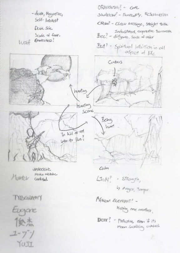
As mentioned in my OSS update last week, my concept involves representing my attributes/personality Typography Animalistically.?

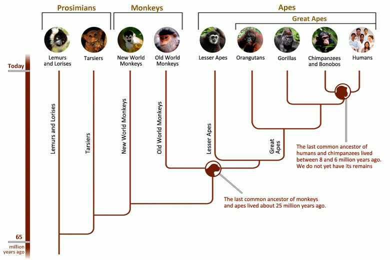
I find the idea of using animal to represent my attributes/personality interesting because I find our relationship with animals are connected. Methodologically speaking on the assessment of human life history, the chimpanzee could possibly be our last closest common ancestor. In addition, we are connected with Animals because they give us warmth and support. For example, Food and Furniture products.

Monkey is not Human


Part 2: Celebrities on ‘Spirit Animal’

The following is a video clip from ‘The Real Daytime’ where a group of ladies discuss about their ‘Spirit Animal’. I find the discussion by the ladies expressive and relatable for example Tamera describes herself as a lioness because of the attributes such as being Fierce, Strong, Graceful and Loyalty. She later narrowed it down to Loyalty which describes her most.


Part 3: Different Views and Opinion

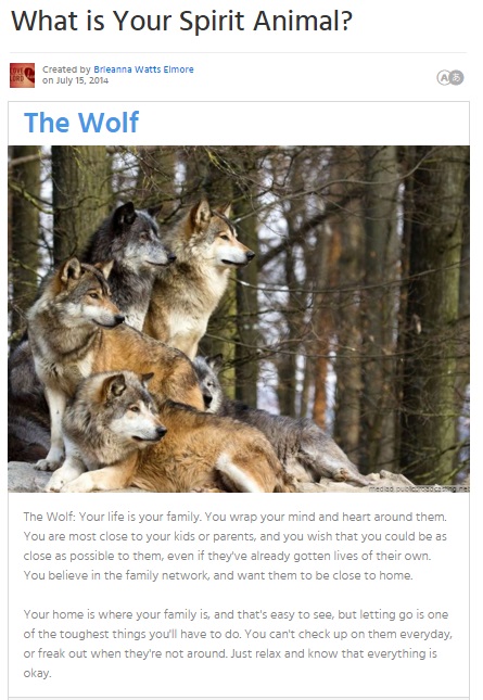
Created by Brieanna Watts Elmore, the website (Link Below) generates your ‘Spirit Animal’ based on the questions answered. [Please take it with a pinch of salt]

What is your Spirit Animal?

Wolf spirit animal
I answered the questions and I got a ‘Wolf’ as my ‘Spirit Animal’. ?
While the description might be true, it varies from different websites and sources.
To explain, different people have different views and opinion on animals.
Let’s take Wolf as an example. ?
On the positive side, a wolf could symbolise the deep connection with your intuitions and instincts whereas on the other hand, a wolf could also means the lack of trust in someone or your own feeling or actions.
This brings the question to my composition; How do I illustrate the wolf so that it conveys the attribute/personality that most can agree on? The answer to this could be the use of gesture and emotion that my wolf adopts. By doing so, my animal illustration could be more relatable and more expressive.


Part 4: Trial and Error

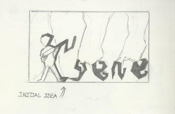
As I was drawing and trying to incorporate typography into my composition, I realised that I am doing it wrongly. My initial Idea (See below) involves my name ‘Eugene’ to be widely spread out onto the 1) Human, 2) Gun and 3) Roots of the Trees. As a result, the overall composition became a mess and unreadable.

Eugene - VS
Because this project emphasis on Typography, I realised the need to make it more readable and more relatable. For such, I brought my focus on the Gun (See below) instead of spreading across the composition. By doing so, the gun became the main focus which carries a certain meaning.

Eugene - VS2
I have also tried creating a draft for my wolf animation. Unfortunately, I have never tried creating 2D animation before as my specialisation is in 3-dimension products. However, I chose to do this because if I don’t try when will I start trying? Haha!?
Yup, my friend question me the reason why I troubled myself to do something that I am not familiar with. Basically I feel that in life there’s no easy way out. The learning process is never easy however as long as we put our heart into it, we can reach greater heights!?
This project is indeed an eye-opener for me – Challenging myself by using new medium. Hence, I went to research on many tutorials and try making one by myself. My first attempt was a walking human which walk quite weirdly when animated (The piece I showed some of my classmates and my some of my x-classmates). I also did a draft of an animated wolf with my name engraved in it (See below).

Eugene Second Animation

During the informal critique, I was given great pointers by my classmates such as to replace my existing idea with the one I did previously – Typography for ‘Hello, my name is’ card. The approach was to use my name and bend it to form the shape of the animal.


Part 5: Dadaism or not?

I also mentioned the use of Dada in my composition.
I was inspired by Liu Xue Anthropomorphic Sculpture and I planned to combine myself with the animal. The approach would be replacing my lower part of my body with that of animal.

Liu Xue
Liuxue

The reason for my approach is the idea of ‘You are your own worst enemy’ – because we control our own emotions and we decide which path to take. Hence, the animal is actually myself too.

hybridhuman
Joy mentioned that she was worried that my approach would result in the ‘animal’ becoming disfigured/unclear and suggested I follow the initial idea instead. Once again, thank you Joy for your valuable feedback! ^^?


Part 6: Creating Setting

Lastly, I mentioned about the use of background.
The image below is the background, I drew it with Photoshop which will be used for my composition. (Not the final yet, I’m still working on it).
I worked on Split Complementary Colours; Red-Orange, Blue and Green.

Eugene - Setting up the Background


Part 7: My Approach

After the valuable feedbacks I’ve gathered from the informal critique, my next approach would be as followed;
1) Explore various forms for ‘Animal’, – Include gesture as well.
2) Draw and Scan Animalistic Typography
3) Give the background a ‘Hue and Saturation’ make over, – Make sure it does not overlay the main element.


The End! ?

Thank you for reading this long post! ?
Appreciated & Happy Chinese New Year! ?

Monkey Year

Foundation 2D II Exercise 1 – Hello

Week 1 – 14 January


Hey there!,

It’s so great to be back in school! ?
I have enjoyed sharing interesting ideas, listening to presentation and stories in the previous semester, on top of that, we learnt and worked really hard!
G1! We did it! Although some of us won’t be seeing each other during lessons but let’s keep up the fighting spirit and do even better for this semester! ??

I’m sure that this will be another Egg-Citing semester because I will be working together with Miss Joy and the new classmates! (:
Awesome! Let’s start the first entry!


During the lesson, we were tasked to design 3 Name Tags of different genres –

1) Typography ~ (Describing a Character that is Engaging)
2) Abstract Solution ~ (No Start, No End)
3) Concept ~ (Led by a Concept)

CardCardCard


Concepts Sketches / Idea Generation8

  • Typography
    ~ as derive from the term ‘Typography’, it means playing around with the written language by making it interesting, engaging and more appealing when being displayed.
    ~ hence, I went to various concepts such as writing my name in different languages such as 华语, 日本語 and English accompanied with the use of different forms and writing styles.
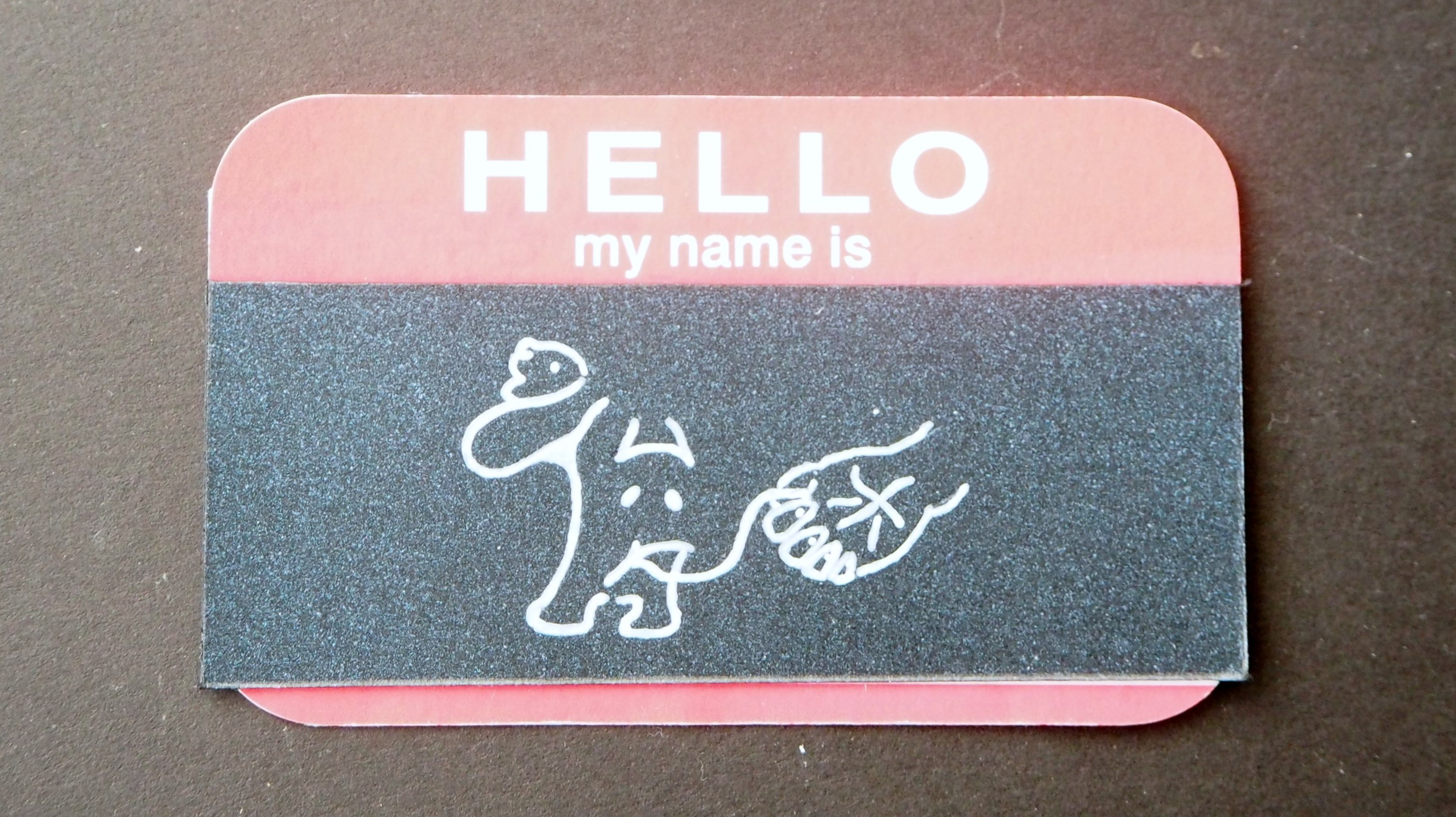
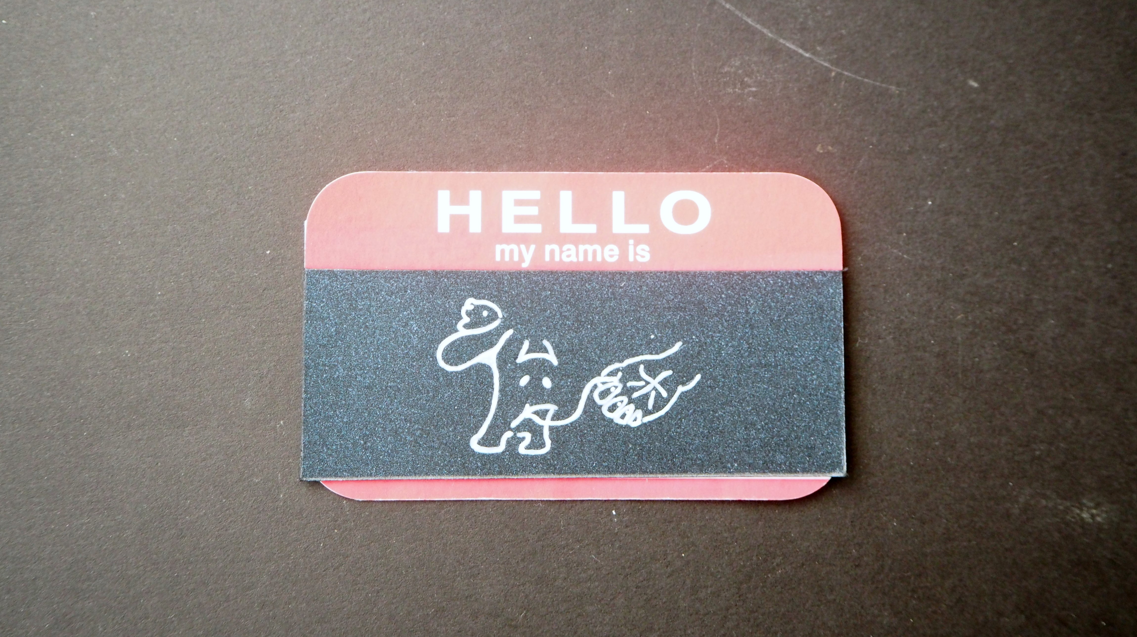
    ~ to spice up the interesting component in my design, I drew my Chinese Name in a way that one Chinese Character look like a Puppy and another a Human hand narrating a story about Human & Animals Relationship.

    ~ Reference Artwork by Corner Croft
  • Abstract Solution
    for this design, I explore the use of mediums such as
    1) Chinese Ink
    2) Folded Metal Wire
    3) Can Cap
    4) Pen & Pencil
    ~ My previous concept was untidy in my opinion, I wanted to create a abstract but neat composition, hence, I craft out my name with the letter ‘U’ so that it resemble the fish scale in an abstract manner. In the design, the viewer have to look closely in order to decipher my hidden name that was ‘engrave’ in it.
    ~ in my improved design I over-lap the cut-out circles, with the help from a hole puncher, and stick it on a piece of hard backing.
    ~ the design aims to carry the attribute of a ‘Arowana’ fish which represent ‘Precious’, ‘Expensive’, ‘Beautiful‘ etc.
    ~ Reference Artist – Marian Bijlenga (Fish Scale Art)

  • Concept
    in this design, I  play with the theme ‘What Makes Me’ and how can it be link to ‘Product Design’.
    ~ in the initial stage, I brainstorm several concepts/sketches relating to ‘What Makes Me’ for example – Food? Childhood? Lego?. As more ideas developed, I decided to nail a theme based on a ‘Construction‘.
    ~ I find the concept interesting because I was reading up on the recent article on ‘Landscape Design’ and it features “Singapore – building a forest in a high-rise apartment atrium”. Link Here The advancement in building technology made creative infrastructure more possible! This can only be done so by having a good blueprint layout, knowledge and foundation etc.
    ~ For example, all Year 1 students have to strengthen their foundation by participating in the Core Modules. This enable the students to explore, deepen, sharpen their understanding of Arts, Design and Media.
    ~ The root of goodness lies within having a good foundation.

Final Name-Tags

1) Typography
Eugene

2) Abstract Solution

Eugene

3) Concept

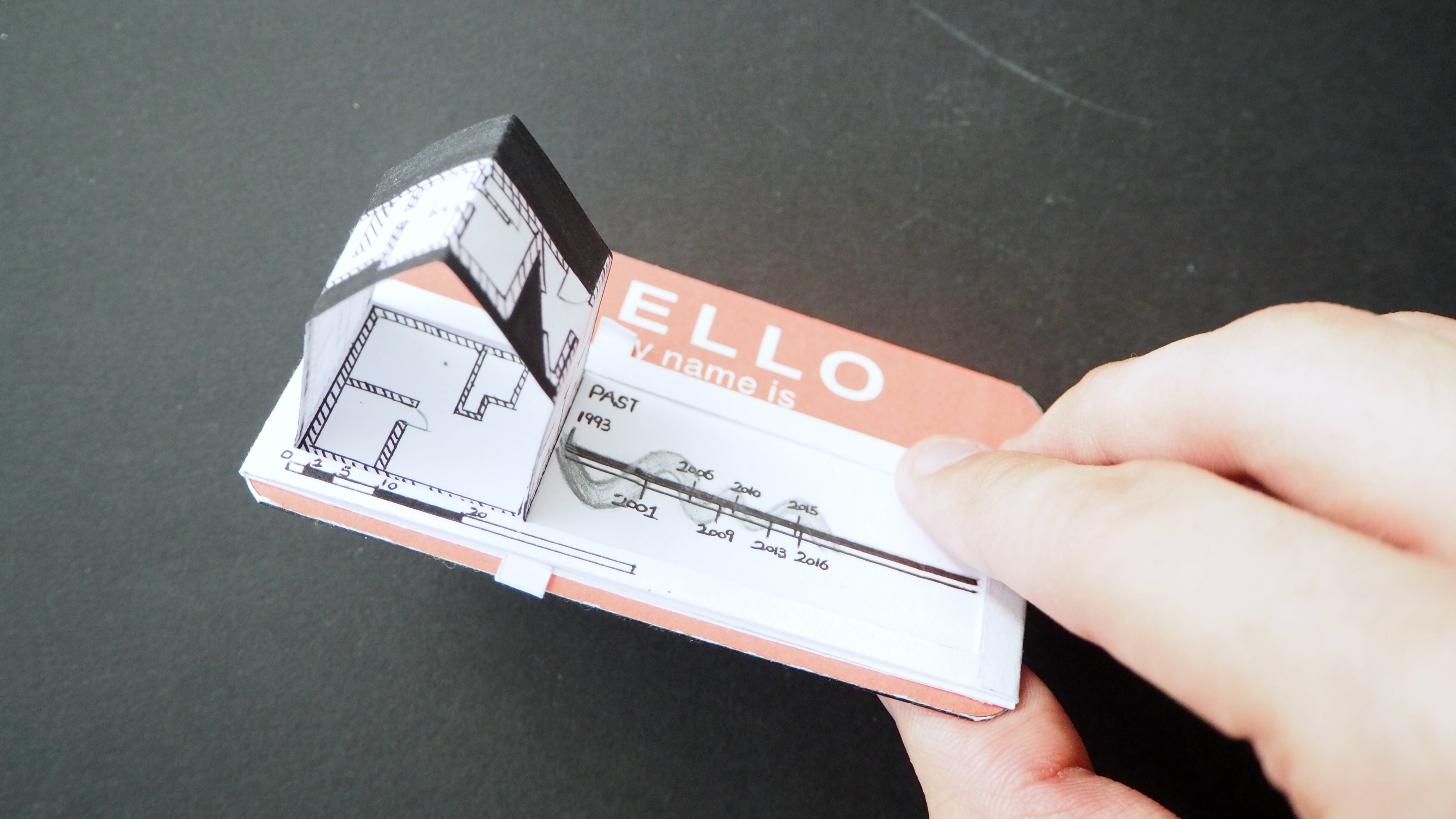
Eugene