Project 1B

In a world where the Gods who had offended Zeus were punished to lived among mankind on Gaia, Nyx’s divine family of darkness was one of them. The only way to sustain their divine power was by exploiting the weaknesses of mankind, thus she created a lair, Hypnos. It was a place for humans who had lost their way to be able to succumb to their temptations which came at a price, their life which sustained the fallen gods. However, it was now time for Nyx to hand the reigns over to either one of of her favourite children, Oneiroi, the purest hearted out of the two or Moros, the darkness that even Zeus himself fears of. The good to change the future of mankind or the darkness to continue causing chaos on Gaia? Her decision will change the future of mankind, her entire family, possibly even Mount Olympus.

I was inspired by Greek mythology during Art History lecture (yup, I got distracted) and I started researching about the gods when I came across Nyx who bore gods of darkness yet she and her family were little known of. Hence, I decided to create a story for them to let the world know more about who they are and that although they are rarely heard of, they should not be underestimated. Also, my story and it’s characters were taken from childhood memories whereby I really enjoyed reading books about greek mythology and wondered about how different life might be if the gods still walked on earth with us and so I might have just made my childhood dream into a reality.

Nyx

CHARACTER 1: NYX

She is the Goddess of the Night, thus I made her gown as part of the sky. It transitions from the dusk which is the gold coloured part to night which is the purple hues as the bottom of her gown. Her facial features are young because to me, gods do not age as they are divine beings that have special divine diet.

I wanted to portray her as a regal being with a cold, emotionless face but deep inside her she is a mother and she worries a lot. Yet, when one first sees her, they are instantly attracted to her beauty which is also how she lures in her victims but they are in awe of this cool vibe she exudes.

Oneiros

CHARACTER 2: Oneiroi

He’s the cool guy next door and seemingly perfect and that is the reason why everyone loves him. I chose this picture of google as the model had a melancholy vibe to him which is what I wanted. This helps to convey his character as someone who is perfect and a chivalrous person but his deep-in-thought expression shows us otherwise and maybe he has something that he is hiding or wanting to break out from.

I added black wings to his back not only because Oneiroi was described as so but it further enhances this angelic look of his. The colourful pastel background creates a dreamlike mood but it helps to draw the attention to Oneiroi due to the contrast.

moros

CHARACTER 3: Moros

I sourced this image from google too but I coloured the face of the model in black to create this mysterious and eerie feeling to this character as he is supposed to be evil. I layered the shattered glass backdrop behind him as being the god of doom, he destroys everything so he makes his entrance with something destructive. I tried creating this character with a bad boy vibe to contrast his brother Oneiroi.

I really really really enjoyed this project because I managed to convey how I wanted my characters to look like and I could show my style which I thought exuded a fashion magazine vibe to it. However, my poster needs to show a feud instead of just the mother in dilemma post.
My line is Emo

My Line is Emo 1

My Line is Emo 2

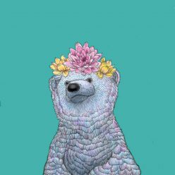
My pieces were divided into 2 boards based on their background colour – whites on one board, same goes for the black. By dividing them in this way, I created a yin and yang energy in my artwork. It is to convey that contrary emotions are interconnected with each other and that there is always a good in the bad and vice versa. Thus there is balance and this symbolizes that I am emotionally balanced.

To convey my emotions, I focused mostly on the use of texture to emphasize how I felt and to stimulate one’s tactile senses so that they would be able to understand my feelings.

Project 1A

Using the methods of addition, subtraction, substitution and superimpose, I aimed for my work to challenge certain laws and societal mindsets and to advocate for certain societal issues that have been ignored.


CHANGE

Addition
                          Addition

This was intended to create awareness that although social media allows us to gain insights into another’s life, at times it is taken too extremely. Increasingly more cases of people have died when taking their ‘selfies’ due to them being unaware of their surroundings during their attempt to take the perfect picture. Thus, I added in crosses, dead bodies and hands reaching out of the water to show the potential death that could happen when one is too self-absorbed in creating the perfect picture for the ‘likes’ on social media. An Instagram vector was added to relate this image to social media and I changed the username to stimulate the audience to think wisely and not follow trends that could lead to their deaths.

substitution
                      Subtraction

I subtracted the tuna sashimi off the sushi to connote that the overconsumption of tuna that has led to over fishing and the potential extinction of the species. Due to globalisation, more people has demanded for bluefin tuna for their sushi, leading to the occurrences of illegal fishing to meet this demand. This image wants to educate and inform people that the consequences of our greed has led to such issues in our society that we need to change.

subtraction
                                   Substitution

With the current debates about the US gun laws and the Black lives matter movement, this was meant to be a satire comment – that guns are frivolously used as though they are a toy water guns and those wielding the gun aim their bullets at individuals as if it was harmless. This is to create awareness of the danger of liberal gun laws and hence, I substituted the bullets with water to connote what I have mentioned above.

                                  Superimpose

To highlight the vast and rapid changes that Singapore has undergone, I used a collage of pictures to display this using some images that were taken by me. Even though I am proud of Singapore’s progress, at times I question that we might be evolving too fast that during the transition we lose a part of our history and culture.


CONCLUSION

I really enjoyed manipulating the images to create different connotation to highlight issues in our societies and provoke people to think and use their sense of morality to change their ways. This allowed me to explore creating powerful images with a different medium – technology and photography. Although I experience some difficulties in trying to convey my messages especially for the superimposition part, I hope with future projects that I will be able to improve.

Mark making session

We had a mark making session a few sessions back and we had to bring items from home that could be used to stamp a certain pattern onto the paper.

Newsprint, black block printing paint, chinese ink, rollers and palette knives were given to us to experiment on different techniques to create our monoprints.

IMG_0277
1st attempt at creating a pattern on the newsprint

I used a roller for all the patterns on this paper but experimented on different pressure and angles to roll on the paint. For the leftmost pattern, I used a snowflake cut out and placed it underneath the paper. I dripped splotches of paint onto the roller itself and rolled it out to create a repeated splotches effect with a snowflake pattern. For the other patterns, I simply experimented with the ways and amount of pressure to roll the roller and it created a layered, textured look.

2nd attempt but this time using more items.
2nd attempt but this time using more items

This time I used more items to create a distinctive pattern and layered them for a unique look. Through this, I realised that certain objects I brought such as imprinted pennies were unsuitable to create patterns as the grooves were too shallow hence paint became stuck in it.

3rd attempt
3rd attempt

My last attempt consisted of using both the rollers and items and it turned out unexpectedly nice because initially, I did struggle with the rollers to give it an even coating of paint. However, I preferred the faded look of the paint as each roll created a unique look whereby it was lighter on the eyes and had a rather whimsical look to it.

I quite enjoyed the process even though it was rather messy but it did teach me to work with a monotone medium as I normally preferred colourful mediums.