3D – The Gift

Client: Justinne 

As I said from my first post, I did not know Justinne well enough but later realised I shared 3 classes with her. I originally thought that she was quite quiet but when I got to know her better, she opened up I found out more about her personality and she was actually quite bubbly.

Thus, I wanted to create a little world inside a geode as a metaphor. Because when one sees a rock, they do not really care about it until they see what is inside (crystals).

img_2574

I first tried to replicate an Italian castle I found online and I did this using clay. I chose a European castle because she wanted to travel to Europe and furthermore, during the critique session she told me that she actually loves castles which I did not know of. Also, because it is a geode, I had to make crystals.

img_2583

So I melted wax and coloured it but had some difficulty dyeing the wax. Firstly, I didn’t think through that wax and liquid food dye would not mix together and it would actually burn from the high heat. Then I tried watercolours and it didn’t work either and my last desperate attempt was oil paint. It worked!

I guess it was better than buying wax dyes because now I could customise the colour of the crystals which I chose a bluish-green/ light teal colour.

Then I chopped up that huge chunk of wax (picture above) into smaller, angular pieces to mimic crystals.

img_2693

After that, I used the hot glue gun to attach the pieces and moreover, as this was supposed to recreate a little world inside a rock, I wanted to add faux moss inside. I wanted the moss to symbolise life because only when there are plants, can life forms begin. Therefore, I did not fully cover the whole surface with crystals because I needed to incorporate the moss too.

TADA!!!!

img_2934

img_2931

This is how it looks like when both sides are joined together.

img_2926

So in a way something so inconspicuous can be so beautiful inside with a story to tell. 

Que Sera Sera

Idea 1: Makeup Artist
img_3015

This was a zoomed in version of the lashes but as you can see the “EM” created from the shadows. During the critique, most commented on the Post Its that the lashes were too thin and should have made the”EM” bolder and then I realised it was because I forgot to push up/fold the lashes and when my classmates saw it, the lashes were flat on the paper as that was how I left it for transportation. Thus, they did not see the shadow (I used my phone to shine the light as it was the harshest light so the shadow could appear more defined) until I showed it to them during the explanation.

Idea 2: Landscape Designer

img_3013

Almost everyone in class was fascinated with this concept and idea and I was really really happy about it because sticking on the moss was a very tedious process and it got onto EVERYWHERE. I really liked how it turned out as using the artificial moss, it conveyed the message effectively and it created the visual texture that I felt would have been lost if I did it on Photoshop. Although I had some comments that I should have used a lighter background which I wanted to initially and had the same dilemma at Art Friend but I do think we proper lighting it should have worked out well.

Idea 3: Beekeeper

typo-1The “E” is bigger than the “M” on the bee which most did not see but either way, I felt that the “E” already conveyed the message. Although it was a risk to take to put such a tiny “M” on the bee just because I wanted consistency in the names. I chose bees too as from my Chinese name’s research I found out my name meant cultivated and I do think that bees have a sophisticated way of communicating such as the “8 dance” where they welcome a new queen bee.

Idea 4: Mixologist

typo-2

Also from my Chinese name’s research, I discovered that one of the characters meant brilliant or glowing which I felt as though the Flaming Lamborghini conveyed this message because of the flame and the brilliantness of the stunts that the mixologists do. I added in a shaker to make the design more obvious and also took advice from my friend’s and modified the designs. I zoomed onto the upper portion of the glass and drink as I felt it had a more important role than showing the whole glass of drink. Also I changed up the colour of some parts of the flame to make the “E” more obvious.

Overall, this project was mentally and technically challenging but I was glad that I was able to showcase my designs in 4 different mediums. I think the whole journey and process was worth it in the end as I managed to create something unique and also showcased my personality and a bit of my life into it.

Que Sera Sera

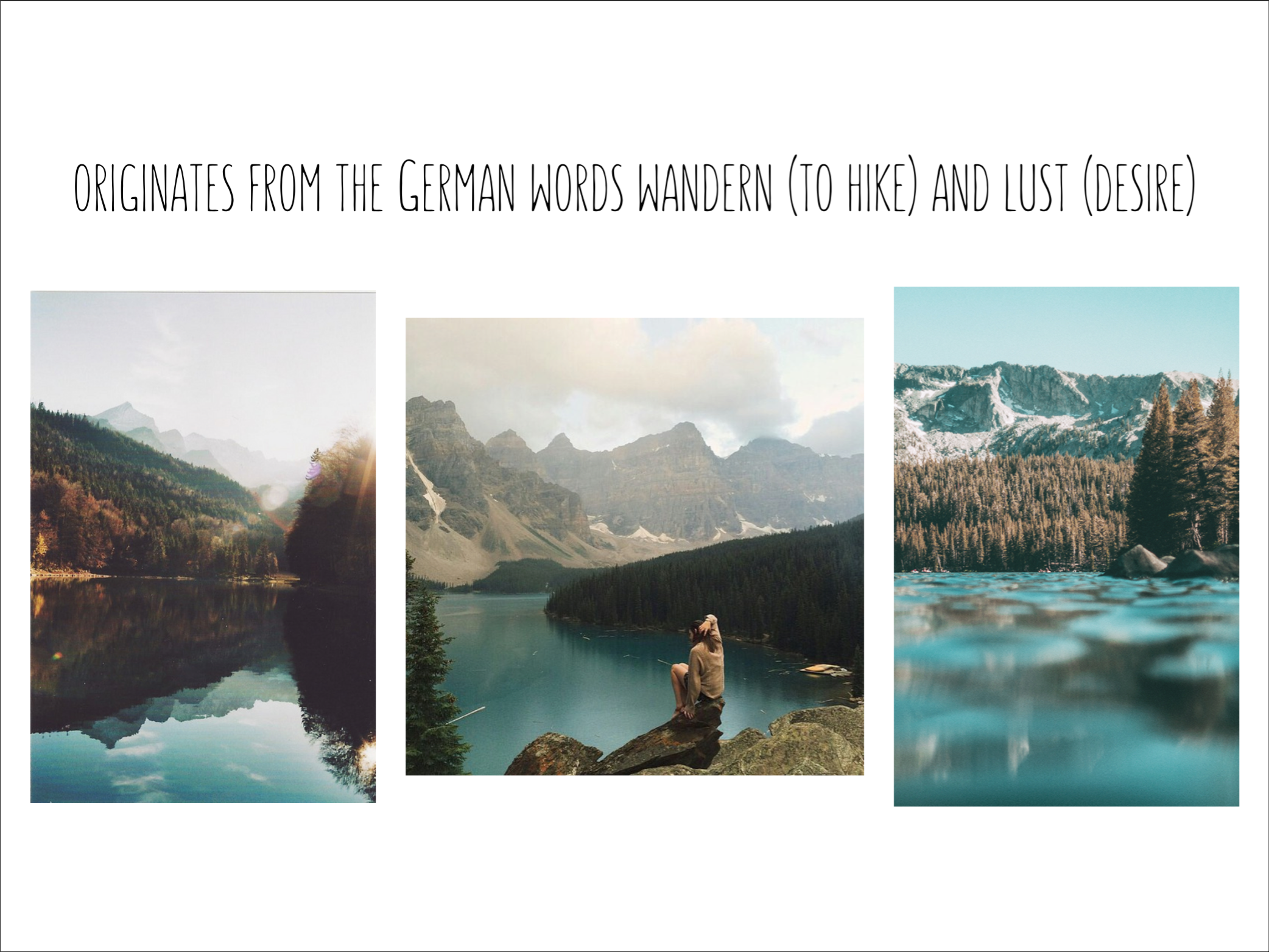
Following consultation with Mimi, I presented 2 drafts on my MUA idea.

mua-1

I wanted to use makeup products to convey the job but it was a bit too abstract and I had doubts about it + Mimi advised me not to do it so the idea was scrapped.

2D 3

This was the draft for my eyeliner idea but Mimi felt that this did not really convey the message because if you do not watch MUA regularly, you would not know about this trend so it was a bit risky. She advised me to do paper cut (I did my previous sem final project with it) on false lashes and incorporate my name in the lashes itself. She sketched it out and then I remembered they looked a little like this (refer to the picture down below). I’ve seen those in Watsons before.

1-pair-women-fashion-paper-cut-lashes-halloween-stage-club-font-b-fancy-b-font-party

So after that consult I went to research on shadow typography so that I could create my name with the shadows reflected below.

6e9c764c990209a584fd82df38c8bd63

7a6dd0779dc97dc3228a39fdd28fdf6c

shadow-typography-art-2
I came across some designs on Pinterest and I went to research and came across this artist – Fred Eerdekens. He uses shadows in his works to create an experimental piece and most of his works involves using drop shadow at the bottom. The “cut-out” picture is actually one of his works. I decided to use his technique as while researching, there were many forms of shadow typography which were more complexed and I felt that this technique could be accomplished relatively easily.

img_3007

So I experimented with the lashes. I did not want to make my name too obvious but at the same time I wanted the desired effect of the shadow reflection my name. The first paper cut above was not so clear cut while the second one below was too obvious. But after several tries, I finally knew the angle for my “E” for the lashes to look like lashes but created the shadow too. I struggled the most for the “E”.

3rd Idea: Mixologist

Coming from a family who appreciates alcohol, I was inspired by that to create something from that. I chose mixology as it involves a special knowledge to mix drinks whereby the alcohol compliments each other, catering to the customer’s tastes and also the ability to do stunts while mixing the drink and not spilling it.

img_3001

This was my first draft of the idea and first time using illustrator which was quite nerve-wrecking for me. The reason I chose a Flaming Lamborghini drink was because everyone becomes fascinated when the mixologist shakes it around and lights up the drink. This drink captures the essence of mixology which to me is in a way like a performance art. I showed this to Ben and Debbie who gave me some feedback about how to improve it. I did not see this before until Debbie mentioned that the flame in the middle looked liked an “M” and Ben told me to not use such a harsh outline for the martini glass. I showed Mimi this and she was glad to see that I finally got the idea of being conceptual and not narrative but she thought that the flame reminded her of an iceberg. I tried tweaking the job scope to fit something icy but just couldn’t so I decided to improve on it.

4th idea: Landscape Designer

My original idea was a gardener because not only is my house situated in a very vegetated area but I love nature. Moreover with the meaning of my name Emma as universal, nature basically explains all of that as it surrounds everyone.

b4ab3cc1296500f6b5b0e4b7aa4282cf

I came across this on Pinterest and I thought it was well-suited to the idea. But I wanted to improve on it and then I remembered coming across Anna Garforth’s design back in secondary school whereby she uses REAL moss as graffiti that grows on the walls. screen-shot-2017-02-19-at-2-07-05-am

I thought her idea was rather innovative and interesting as it fuses modernity with nature and also reminds us that nature is all around us.

 The reason I chose landscape designer instead as my condo hired a landscape designer once to beautify the area and my mum complained about them a lot because she thought she could do a better job. Also, during that time I learnt a lot about plants used and where to place them. I did more research on the job and realised they also help to design mazes in huge gardens and as a kid I love playing with mazes. Thus, I chose this job and the maze concept to incorporate my name.

img_3006

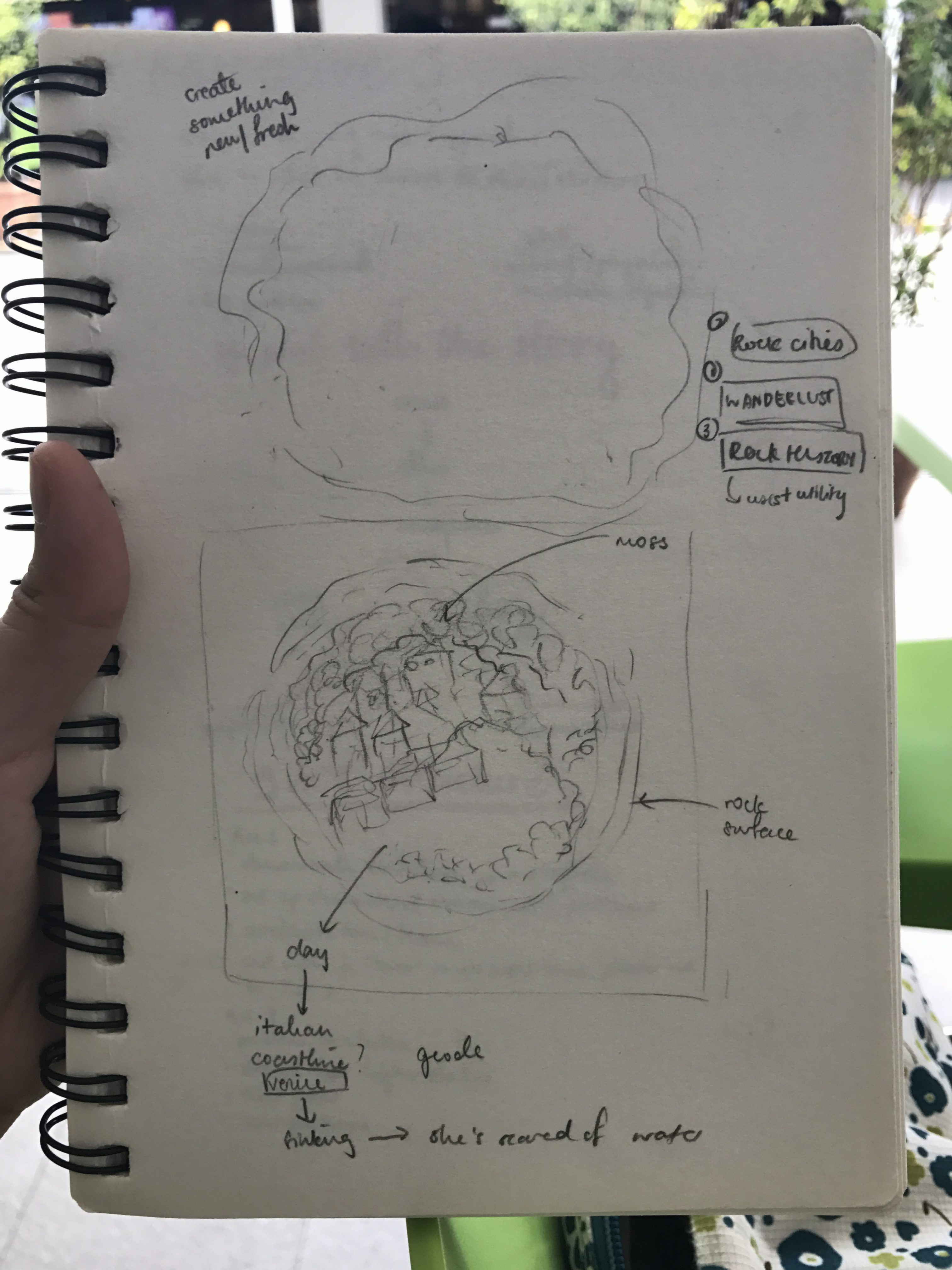
As you can see, I sketched out my name and I also wanted to make it into a maze that can work and this design took me 3 hours. I googled actual mazes too to give me inspiration on how to design one. Initially I planned to Photoshop the moss but I felt it might have been to flat + I had leftover fake moss from 3D so I decide to use that as my medium.

5th idea: Palaeontologist

img_3005

This was the week before the deadline and I had one last idea to go but I had a creative block. I was discussing with Ben about different concepts and I wanted to do archaeologists but my idea was based more on Palaeontologist and so I started to google for tools and fossils found at the sites.

dino

I came up with this but Mimi said it looked a bit too cutesy which I understood and also because the dino foot prints were considerable the main focus of my name. So I scrapped the idea and went onto Pinterest again for inspiration and I found my final design.

6th idea: Beekeeper

e0344d71d3416b8cc1a67c477705cff5

I found this 3D typography and that gave me inspiration for my job as a beekeeper. I love bees and some may find that weird but I just adore these cute creatures who are beneficial to us too. Most of the time they are harmless but most of us still get scared by their stings. I got stung by a wasp once so in a way bees were much cuter and friendlier than wasps. Also when I visited UK in 08, it was my first time coming across BUMBLEBEES which are the fluffiest and most adorable insect I’ve ever seen. They were so fat and round and that was when I wanted to become a beekeeper for bumblebees.

My idea involved using Illustrator but it didn’t work out and I deleted the file of my draft so apologies for the lack of drafts. I decided to use Photoshop instead as I was under a tight schedule and so I googled for a honeycomb pic and the photoshopping began. I tweaked the bee into a bumblebee by making it fluffier + tweaked the stripes to create an “M” for my name. The honeycomb was photoshopped with beeswax to create an “E”.


Que Sera Sera

From the research about my name, I tried to incorporate the meaning of my name into my works.


 img_3002

This was my initial idea listed. Some had no linkage to my name and most were food based. As you can see from the red marker scribbles, that was what I struggled the most while executing my ideas.

1st Idea: Sushi chef

img_3003

I have always loved sushi and I watched most of the sushi documentaries I could find because that is how much I LOVE sushi. Thus, I tried playing around with the food elements in sushi making and the red characters at the top actually was my english name, Emma, translated to Japanese. I did some sketches during the first/second lessons but Mimi said these were too narrative so I scrapped the idea + the idea was quite overdone too. 

Second idea: Makeup Artist

screen-shot-2017-02-19-at-12-21-34-am

I wanted to become a makeup artist because their work itself is refined and takes a certain skill and patience to master it. Nowadays when I’m on Instagram, I spend most of my time on explore page watching makeup gurus putting on their makeup, drawing their eyeliner with a flick that can kill; false lashes that looks so real; eyeshadow that is blended to perfection. And I’m just watching it in awe due to their patience and ability to create a look requires creativity and thought when choosing the colours. In a way makeup artists are like artists but their canvases are faces and I’ve always wanted to put use makeup like how they are creating a character but I kind of always give up after blending. Also, I am quite lazy so I usually don’t put makeup on unless I have the time. 

I wanted to use the eyeliner flick and incorporate my name into it as I am always amazed at how makeup artists always manage to draw a perfect flick on other people’s eye because I always take 2/3 tries before getting it perfect. Moreover, I had inspiration from this idea that I came across on Instagram and later more MUA (makeup artists) started hopping onto the bandwagon and copying it.


tumblr_ofdii7mzey1s1vn29o2_1280


Chopsticks

I was a very different person then and now due to ballet. I danced throughout my entire childhood and it was a world of freedom that I could get lost into. 

Chopsticks. No, it should be “Chopsticks! Push your knees in and don’t let them bulge out” or “Chopsticks! Point more! Point! Point! Point!”. I was called chopsticks not in a demeaning way but it was an affectionate way of how my first ballet teacher, Ms Cheah nicknamed me. My other classmates did not have nicknames except for me because being the only skinny kid, my legs reminded her of chopsticks. She even told my aunt who still dances till today about my nickname and I still get called that today. I knew that it was affectionate term as even after I moved up a grade, my aunt would notify me about Ms Cheah’s enquiry about me and how she did it was, “How is chopsticks?”

I decided to revisit Fort Canning Arts Centre where my previous ballet school, Singapore Dance Theatre used to be. It has now shifted to Bugis but the building has still remained. It was all renovated with the cool air from the air-con filling the corridor and there was an empty gelato shop there. It was sort of modern and historic fused into one as the building probably originates back to WW2. I was not allowed entry on the second floor because it was for ‘Staff Only’ but being back there already made me smile and the memories flooded.

I gushed about everything about the place and my ballet lessons to my boyfriend, who accompanied me to the site. It surprised me that I still contain so much excitement for it, everything there was beautiful and as it was. Fort Canning Arts Centre was majestically serene and surrounded by nature. That was one of the reason why I added background nature sound to the film because every single ballet lessons, I could hear birds, cicadas and leaves rustling with the wind. I got used to it and listening to those once again was actually soothing and brought peace within me. 

In the film, I wore pointe shoes and some moves. Pointe shoes were the epitome of ballet as that meant you are a true ballerina along with the tutu. Not everyone can do it because it is physically straining on the feet. Also, a reason why ballerina toes’ are quite messed up. Pain = Beauty. I missed the pain from wearing those shoes because back then I knew I would look poise in it and it was actually fun to rehearse dances. The shoes itself are hard on the base and sides so they give support while you’re on your toes. But the pain now reminded me of regret for quitting and punishing me for losing all that I’ve learnt then.

There was innocence in those pink shoes. In a way, I was a naive child and did not know much about anything but as soon as I left ballet, I had more time for other commitments and I grew up, cussed more, became less graceful and lady-like and so on… It was the transition from being this polite, obedient and innocent child to trying to figure out who am I that has led me to who I am. Which is truth that I symbolised with sunlight – innocence that has faded away from me which could be symbolised by the flickering at the beginning and ending and finally goes out, that is the catharsis that I am never going to be the person who I was the last time. And why sunlight? Because while studying Nathaniel Hawthorne’s The Scarlet Letter in Junior college, Hester’s child, Pearl is symbolised by the Sun as truth of Hester’s adultery. 

“There are many things in this world that a child must not ask about.”
― Nathaniel Hawthorne, The Scarlet Letter

Don’t grow up too fast in a time where “you only live once” is prevalent.

For the remaining projects, I plan to capture the sounds of ballet during my childhood and maybe go back to the beginning of how it all started which is my aunt’s interest in it that influenced me. I would never have become who I am if it was not for her.

“Que sera, sera—what will be, will be”

EMMA TAN WEI PIN

陈炜彬 (Chen Wei Bin)

The above are my names in English and Chinese respectively that my parents have chosen for me. My mum chose my English name, Emma while my dad chose my Chinese name, Wei Pin or 炜彬. Both my names were chosen for 2 very different reasons that I love to joke about with my friends. 

Emma is derived from the Germanic word ermen meaning whole or universal. Other than it being a pleasant name, my mum apparently named me Emma because she want my two older sisters’ names (Sara and Tina) and mine to only have 2 syllabus and 4 letters each. 

炜彬 had more thought and decision when naming me. My dad told us that he consulted a monk about my sisters and my Chinese names based on fengshui and our future. Also, the 火 part of the 炜 (wei) actually has associations to the Chinese element of fire which was based on my zodiac and birth date. 炜 on its own means brilliant or glowing whereas 彬 (pin) means ornamental, refined or cultivated. I actually just found out about this for this assignment…

My Chinese name has quite a unique story to it and it is a rather pretty name. EXCEPT, the han yu pin yin (what is used to spell Chinese names and words with the Latin alphabet) and in my case, Wei Pin, is actually used for many male names. Which I only discovered in JC when my Chinese teacher and guy friends were pointing it out.

I’m thinking of using my name as the basis for my jobs and I am still figuring out the mediums to use for this project.

Gift Assignment Research

After the first class and with the information I have, I started researching on works that could inspire me.

MATTHEW SIMMONDS

fc539be484b1bbd9ce3dcb1a8fc25c0a

When we hear of marble sculptures, we tend to think of the human forms belonging to timeless examples from Greece, Italy and elsewhere. A form is not necessarily a solid, as sculptor Matthew Simmonds points out through his work, which consists of sculptures not of full and defined human bodies, but of empty architectural interiors.

– Yatzner

Simmonds has worked on restoration of monuments such as Westminister Abbey or Salisbury cathedrals which has inspired him for his works of sacred and ancient buildings.

Every work of architecture is a victory over Nature and a celebration of Man’s skill and ingenuity. In the sculpture of Matthew Simmonds however, this principle is reversed: Nature overpowers architecture, as if it encases or envelops it: the pristine and elaborate interiors seen in Simmonds’ work are like fossils of buildings, trapped inside the rock into which they have been carved, thus diminishing their otherwise grand and humbling character.

2d42ca79dd23185ecb4794b791c464d9

I relate to his sculptures as they were not only interesting but they were out-of-the-box ideas which is similar to Justinne’s personality. Furthermore, Simmonds’ inspiration of ancient architecture and his ability to combine both nature and man-made to create a sort of freeform sculpture alludes to Justinne’s desire to travel, her carefree attitude and love for nature.

BEN YOUNG

ben-young-translucent-ocean-sculpture-17

Lighting plays a large part in the presentation of my pieces. When lit from beneath, the light reflects and gives off the illusion of the piece being brought to life. I hope viewers might imagine the work as something ‘living’ that creates the illusion of space, movement, depth and sense of spatial being. I like to play with the irony between the glass being a solid material and how I can form such natural and organic shapes.

ben-young-translucent-ocean-sculpture-19

I am fascinated with Young’s ability to combine his materials into organic shapes similar to that of Simmonds and the juxtaposition of the materials used to create the illusion of depth and solidity to his works. Furthermore, there is a sort of innocent narrative and serenity to the sculpture which could possibly be the illumination of his work using glass.

ben-young-translucent-ocean-sculpture-8

Alexandre Chapelin

2n-57af7447cd505__880

These are Lagoon Tables created by Chapelin which was inspired by his immediate surroundings on the Caribbean island of Saint Martin where his studio is based. The resin adheres to a travertine slab (a form of limestone) to mimic water alluding to the sea surrounding the island.

I refuse on making a manufactured product simply because each model is unique and I cannot produce two identical tables, so neither will 2 people own the same table of my creation.

I’ve always respected the difference between people, their personalities and characters and I believe this should reflect in the interior design of their homes.

– Alexandre Chapelin

This resounded with me as my client Justinne is unique on her own and the allusion of water reminded me of her as she loves the sea. Also, the nature-inspired table has a calmness to it and it’s own character which suits Justinne.

My artist inspirations are rather organic and nature based as not only does Justinne enjoy the nature but I do too and all these artist’s ability to fuse their works with organic and man-made materials creates an interesting take on their works. Moreover, they all have a narrative to tell which I intend to portray in my design too. 

Gift Assignment

This project is sort of an ice breaker created by Peter as my current class is made up of 70% from my Sem 1 class and 30% from other classes.  

We were randomly given partners (Peter tried his best to partner us from different classes) and I was partnered with Justinne! I realised Justinne came from my 4D class too and we are both majoring in Product Design as I later discovered. 

For the first task, we were supposed to gather as much information as we could from our partners. I think this part came relatively easy to me because I’m quite inquisitive (or maybe because I like talking) so in the end I helped generate some questions for Kai and Justinne to use. 

This helped with easing the nervousness and awkwardness we all felt and we all eventually opened up about ourselves. So this is what I managed to find out about Justinne (please do not mind the messiness).

img_2888 img_2889

To summarize, Justinne is an ENFP/ENFJ and likes doing things that are unique. She’s also an adventurer and grew up travelling but she prefers to travel to Europe or Canada. She likes personal/vintage works and things that are organic/natural as she told me that it is soothing to her. Also, she likes cooler colours even though she wears monotone colours and she likes the sea but prefers land as she is unable to swim. There is more information about her but I think these are the main ones that describe her.

Chopsticks – Research

I had a creative block and kept producing ideas but not actually working or starting on any of them. None of them gave me the feeling of “YAS THIS IS SO ME”, it was more like “meh”. I bounced around the idea of photography or filming and if I were to photograph something, should I use a DSLR or my Polaroid film (the beginner’s fuji instax)? I tried the instax during CNY trying to capture rare moments and I did but I lost the damn polaroid. Thankfully, I took a picture of it. 

That got me thinking and I suspect it was partially because of CNY’s atmosphere and chilling with my aunties and uncles that I realised that there were things that I have distanced myself from and forgot about but I actually do miss them.

It was ballet. I started dancing around 5 or 6 years old and both my sisters were doing ballet too. We were enrolled to Singapore Dance Theatre and back then it was still at Fort Canning Park. Being involved in an old art form of ballet and being able to learn it in a historic place was the crème de la crème. Fort Canning itself was beautiful. Surrounded by heritage trees that were there before WW2 and cicadas’ mating calls, it felt as though you were not in Singapore without all the modernity. It’s just magical and relaxing like somehow it was meant to be?  

My childhood largely consisted of ballet. Lessons were twice a week, 2 hours for each lessons. My 60 year old aunt was the one who introduced my sisters and I to it and she still dances. At home, I would dance to the steps that were taught to me or secretly trying on my aunt’s pointe shoes because those symbolised that you were a ballerina.

I remembered there was a shop at the end of the studios selling all kinds of items required for ballet. That scene reminded me of Mr Ollivander’s wand shop from Harry Potter just that this was filled with all sizes and kinds of ballet shoes to pointe shoes and leotards etc. The best feeling was getting a new shoe as it felt like Christmas morning. 

Discipline. Innocence. Grace. Flexibility. Ballet consisted of that and it kind of helped to shape my childhood but once I stopped dancing, those traits left me. I do regret leaving this part of my life behind. Some days I would just unknowingly do some ballet steps and I would be astounded at myself and then the nostalgia would hit me because I realised ballet is innately in me but I somehow suppressed that side. Ballet me and post-ballet me are 2 very different people today. That made me want to film about the lost innocence that I used to have and a memory that I erased from my mind.

Till today, my aunt has always said that I had a figure of a ballerina and it was a waste to stop dancing and looking back, yea, I agree that I could have been a very different person now if I had continued.