Hi everyone, please feel free to click on the images to access the project! 🙂
Project 1 (final): image making through type
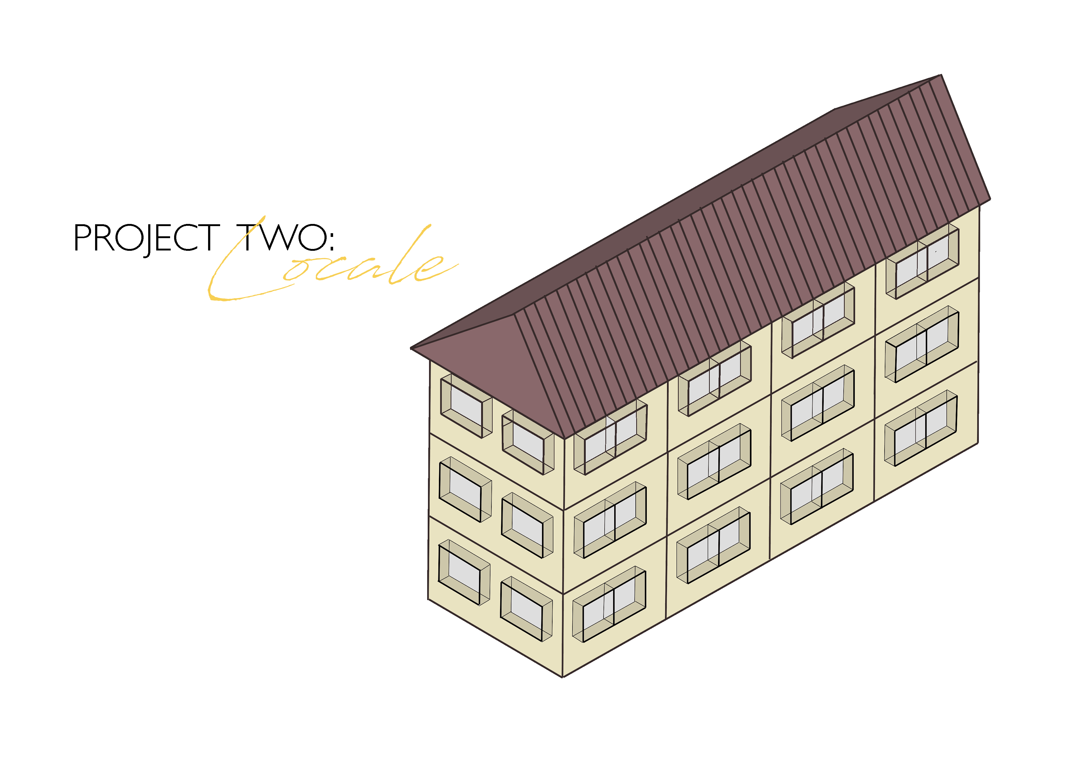
Project 2 part (1): Locale presentation
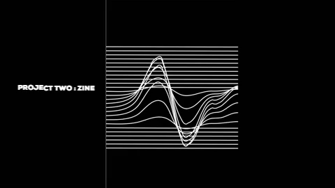
Project 2 part (2): Locale zine
A Little Something Of Everything
Hi everyone, please feel free to click on the images to access the project! 🙂
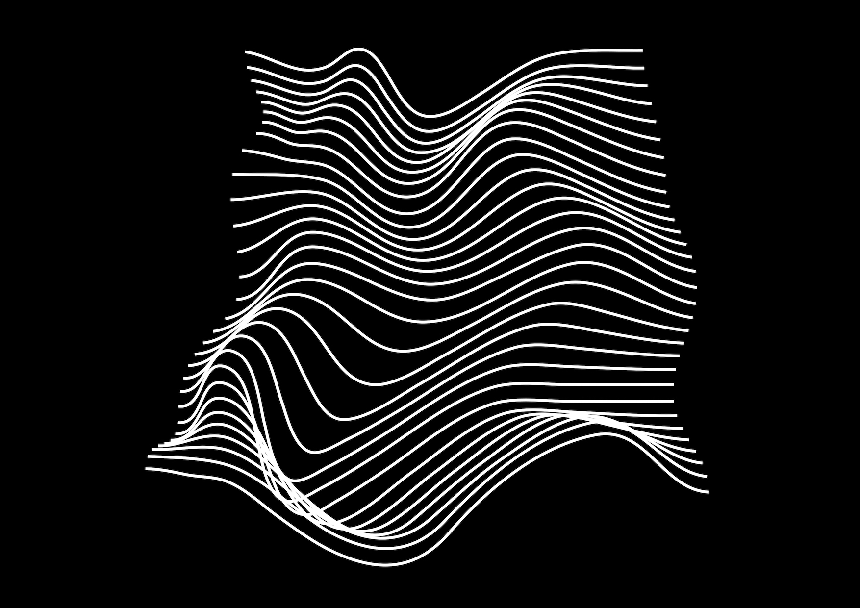
For this project, we are to create a zine that responds to a specific location in Singapore through abstract or highly stylized graphic form and colour.
The concept behind this zine is really simple where I wanted to focus on how the three main demographics (children, adults and elderlies) in Dakota Crescent come together to form a bond that ties the entire estate together.
For my zine, I chose to use lines as the main element of design. This is because I wanted to focus on the residents living in Dakota Crescent. The lines are representative of the bonds between the residents where these lines can go on forever.
This an overview of my zine.

Continue reading “Graphic Form | Project 2 : Locale [Final – Zine]”

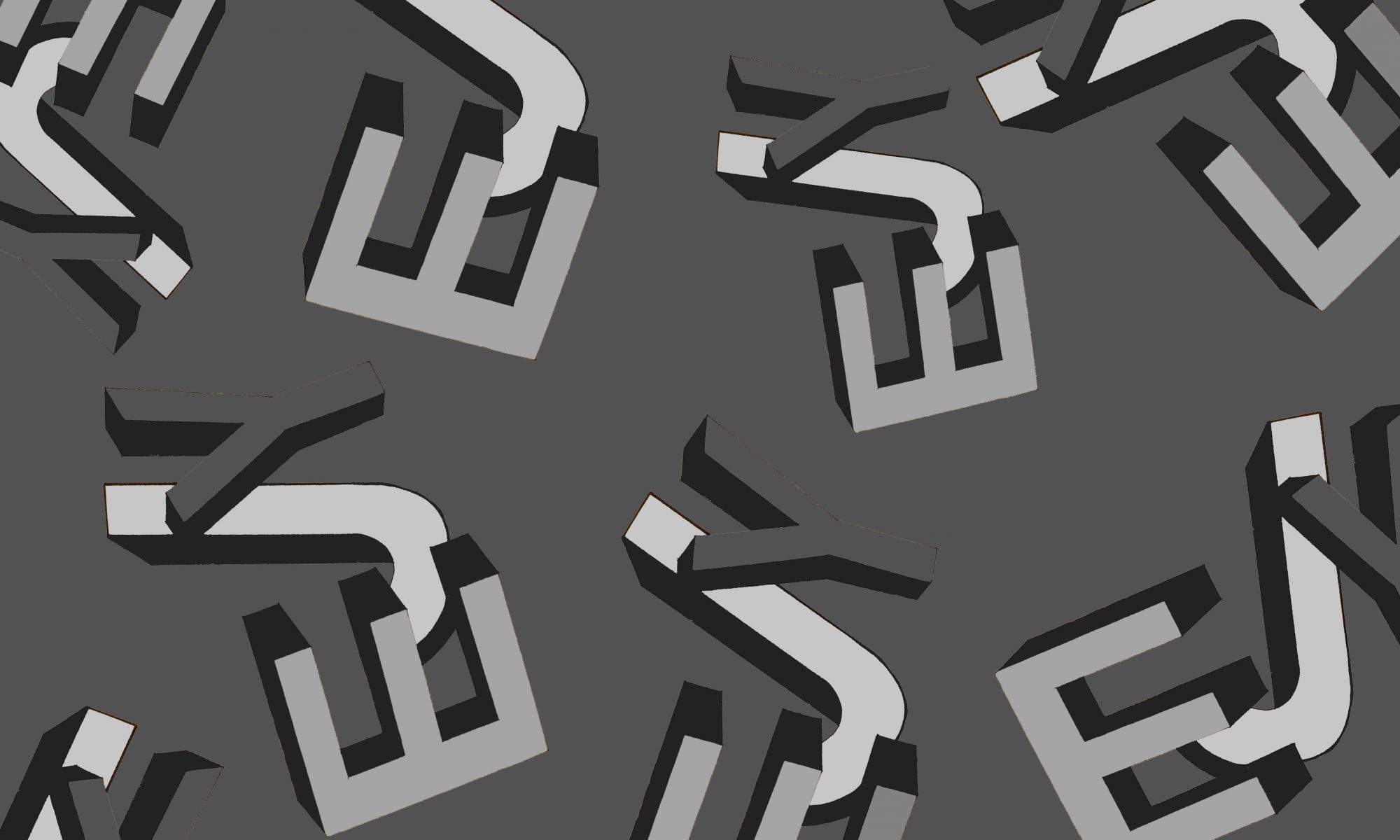
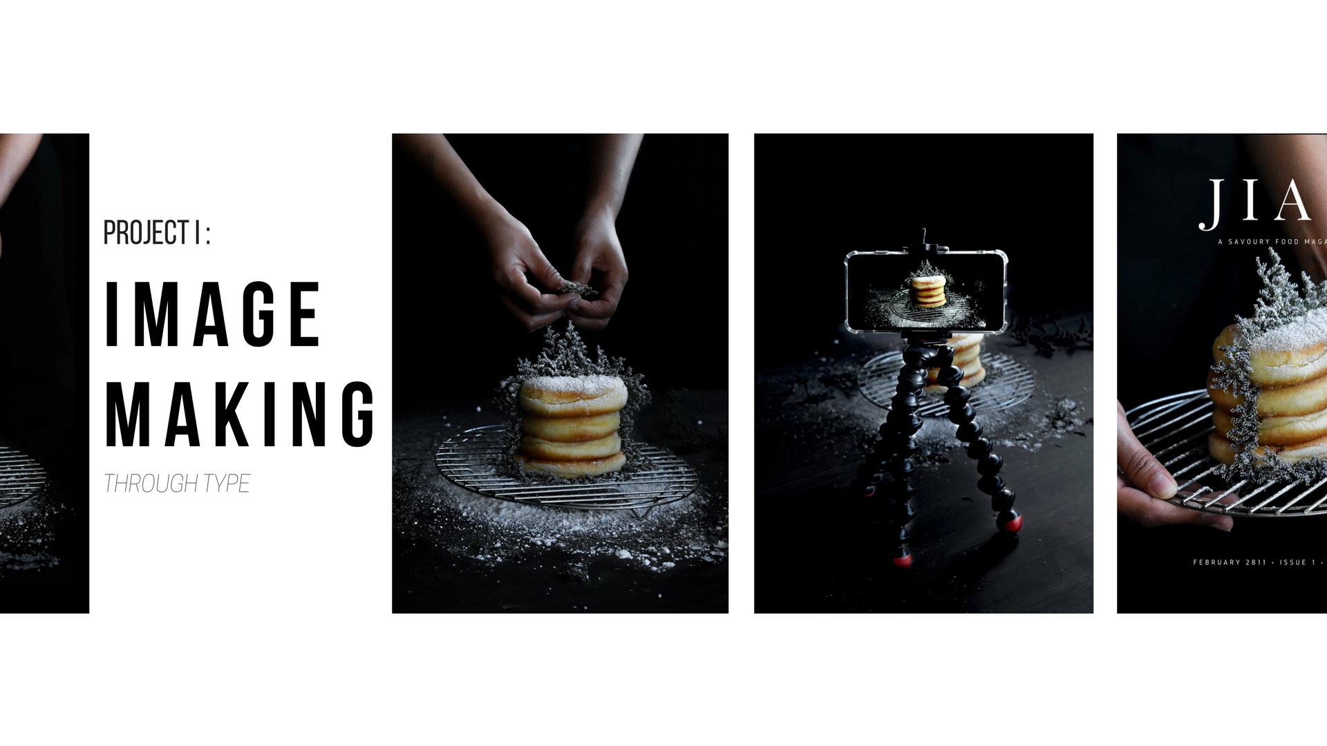
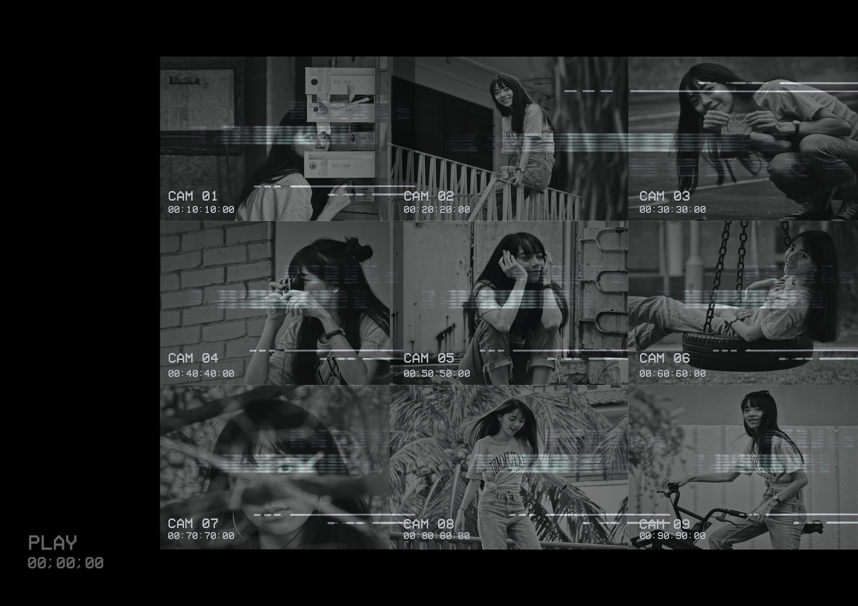
For this project, we are to create 4 different typographic portrait by using either your whole name, part of your name, your nickname or your initials to describe your future job.
To a large extent, these jobs, despite the difference in title, are related to one another if you look at it from a different perspective. Hence, instead of creating the typographic portraits as 4 different portraits, I wanted them to come together as a whole.
I chose to use photography as my medium and I will undertake the chiaroscuro (light-dark) style to create a focus on the alphabet incorporated in the portraits.
Continue reading “Graphic Form | Project 1 : Image Making Through Type”