For the next few days I went about illustrating my job in font. I didnt like the idea of scrolling through free font sites looking for a base font to build on my illustration.
The Sketches

This sketch was for an initial idea of the Chemist, however I realised that i too many options of which I was more interested to pursue, hence dropped the idea in its early stages of developement.


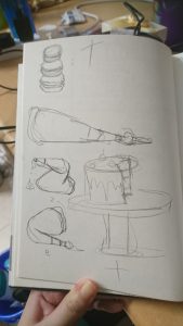
These were the basic sketches that eventually become the base for the pattissier illustration. I had a hard time deciding whether I wanted to portray the finished product (all the cakes) or the process of making a cake, so I did a short study of both.


These were the sketches that I had done up for the idea of the magician/circus performer. I wanted it to be very narrative with alot of things going on. However there were several factors that would lead me to change that idea eventuall. Thus the early stages of development had resulted in less defined alphabet sketches, but more details into how an actual object can look like an Alphabet. (Also without colour it is quite hard to differentiate the alphabet from the background).


This was the last of my sketches, but not the last of my exploration. I was really enthusiastic about this job prospect as there was a lot of things that i could play with to create my name. Different toys and tools, and I event had time to play with the prospect of creating my full name.
Playing with digital media
So I took to illustrating the Pattissier first, since i had a rather clear idea of what aesthetic I wanted to achieve from it.


I used Illusrator as I wanted a flat, pop art style that makes it ‘cute’. I did illustrate the two different ways that I mentioned above, one being with all the cakes all lined up as my name, and the other being the one where I illustrate a cake and the process of making the cake.
I went with the finished cakes, as it was more adorable, and it illustrated the idea of pattissier alright (my friends could tell what job it was, so it means I got my meaning across just fine).
I had a bit of trouble when creating the cakes, because it is not very easy to recreate texture on a vector system.
/fruit-tart-2500-58a474945f9b58819c899b6e.jpg)
(Source taken from: https://www.thespruce.com/fruit-tart-with-pastry-cream-filling-995161)

(Source taken from: https://celebdear.com/product/velvet-chocolate-cake/)
There is only so much detail you can put in on a tiny illustration and there is way too many things I want to put on my cakes like the shine on the fruit, and the crispness of the tart.
Subsequently I illustrated the Toymaker idea in the form of ‘Doll maker’ again on Illustrator. I felt that by doing so I could kind of merge the idea of fashion designer and doll maker into one, seeing as both may end up doing this similar process (One making the doll the product and the other the doll as a mock up for their actual dress).

It is set in the workshop, as I felt that by showing the process i can have a variety of things go into the illustration, not just the idea of ‘collecting’ toys.
I did this with the similar style as the first. However, I had feed back to try and do something different, so I tried to branch out for the third piece.
The third piece has a mix of Photoshop and Illustrator. I wanted a museum curator because i like the idea of arranging collections as an aesthetic. So i created the halls of the museum in Illustrator before realising that if I was going to photo collage this, Photoshop would be more effective.

It got a bit messy after that as I started to piece images together.
There is a lot of things I can improve on for the composition, but I did not have the time to do it. However I think its mostly due to the perspective of with I based the entire illustration in.
I did the last one entirely in Photoshop, trying to branch away from over relying on the style of illustrating.
I had an initial idea of having it in a similar aesthetic as the first two but I was dissuaded from continuing down that line, so it remained like that.

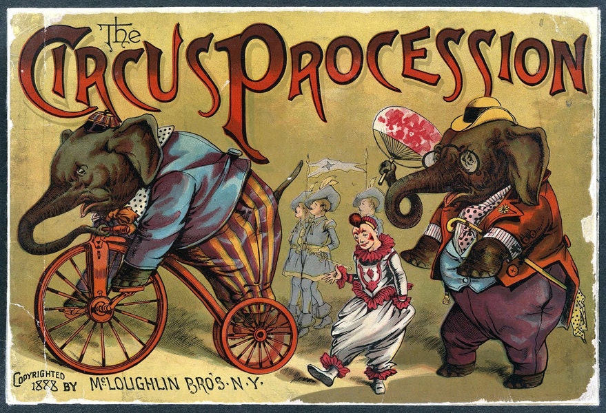
So this illustration was supposed to be about being a magician or a circus performer. I was searching under ‘magician aesthetics’ for this, and ‘circus aesthetics’ when I came across a circus poster, and went with that as the main aesthetic for this final illustration.


(Source taken from: https://www.etsy.com/listing/87011761/vintage-circus-poster-circus-procession)
(source taken from: http://www.elcheapoposters.com/ringling-bros-barnum-amp-bailey-circus-poster-6-circus010.html)
I really liked the animal ones, and also it was easier to find pictures that would reflect the style of these posters.

