Travel Easy

Micro-Project 9

So we were asked to make a video for our alter ego. Mine is kind of a wizard of some sort, the detail are ‘hush hush’ so we are not allowed to talk about it. So this video is about my alter ego travelling home every few minutes because it is that easy to do what ever it is she needs to do and come back within a few seconds.

Click Here for the video

‘Uh, so I forgot to mention that every room has a few portals that one can travel by. I promise not to use them when I visit unannounced….. Don’t tell my roommate.’


What is a desktop?

I guess anything that can be customized would reflect your own personality.

you can see the educational ‘Ambook’ icon, which is an e book, I had a you tube converter, and many other apps that I used in school, its a real mouthful to explain them all.  I guess in a way its, a reflection of how I don’t take to change that well. Subsequently there is the games that I had downloaded with my cousin so that we could play together, which reflects how close i am with my family. lastly there is also a lot of flash files and a few design apps on my desktop which reflects the artsy side of me.


Internet rage

The Artwork

Title: Angry Woman

Artist: Annie Abrahams

There is a total of 5 videos in the series Angry Woman made by Annie Abraham. In the first two videos 24 women of different nationalities would express their anger on camera at home, in their own language. The next two videos feature the women expressing their anger on camera in a single language, number 3 in French and 4 in English, but this time for only 12 minutes. the last one the 5 was a sequence of women screaming into the computer.

The review

Social Broadcasting can be defined as

The broadcasting of video, text and pictures directly to an intended audience through social media channels such as facebook, Youtube, Instagram and other channels as opposed to traditional channels such as radio, TV and print.

So why would this be considered a good medium for art?

(Screenshot from the third video of Annie Abraham’s ‘Angry Woman’)

First and foremost, it is unpredictable. In the third video there is the silent woman at the top left corner that illustrates her anger through actions and not words. She creates this visual contrast with the others, whilst their tone rises and falls with the passion of their anger, she remains quiet showing hand gestures like shooting the screen and biting her hands, to show the actions that we so deeply want to take when we want to vent.

(Screenshot was taken from the fourth video of Annie Abraham’s ‘Angry Woman’)

This also leads to the idea of contrast, with various women speaking and a single person only creating gestures it forms a vivid difference in that single video screen which draws attention to it. Subsequently, in the fourth video, where everyone was speaking in English, there was a single person who was screaming, or making incoherent bemoaning sounds. this hence creates a different sound effect to latch onto amongst the waves of others talking.

(Screenshot taken from the fourth video of Annie Abraham’s ‘Angry Woman’)

It is also about negotiation, where in a broadcast, one would like to synchronise their actions. In the 4 video, after about 7 minutes, all seven women on screen started taking calming breaths almost as if all of them decide to cool down together. Abit like what we did for one of our micro-projects.

When the performers’ Webcams were succumbing to technical issues, she transformed this problem by directing the group to intentionally turn their cameras on and off, creating a shifting, evolving, changing collage of images in direct play with altered configurations of the online interface.

Whilst this idea of negotiating and cooperating is apparent in certain ways of her work, the idea of negotiation can play a key role in making the social broadcasting fun (and covering up glaring flaws to the system).

But why is this done on social media and not the television. In a way social media is like a platform for a two way connection, where the tv and advertisment is a single connection (radio in some cases you can call in, but its still mostly one way). Anyone with a social media has the ability to take part in these works of art, in a way it gives like minded individuals, in this case ‘angry women’, the ability to join in the work and contribute it.

In a society where authenticity and privacy become endangered it is important to find ways to access our vulnerabilities and doubts, to make them public, to cherish our messy side. We need to make space for the beast in the beauty, to go back to reality, to claim the human.

Social broadcasting becomes a way for people to share issues that they feel strongly for, and be empathised with by a like-minded crowd. In a way, it creates a safe community for all to share and be vulnerable without fear of being judged.

Credits

  • http://www.starlightmediahouse.co.nz/latest-news/what-is-social-broadcasting/
  • https://thirdspacenetwork.com/symposium2018/disentangling-the-entanglements/
  • https://www.researchcatalogue.net/view/18236/18237

The Ghosts only your Phone can see

The art work


Image result for until the end of the world carla gannis

(source is taken from: http://carlagannis.com/blog/)

Gallery name: Until the End of the World

Artist: Carla Gannis

Year:  2017

Carla Gannis’ “Until the end of the World’ exhibition is executed like the ancient Greek theater where the ‘actors will speak through a mask’. in this case the ‘mask’ is her virtual persona, one like our social media, and how we portray ourselves on that ‘third space’.

The exhibition consists of various art works, like multi-media installations and ‘selfie-paintings’. She makes use of new technology to create the work, where visitors can ‘hover over the static piece of work with their phone to see it move and interact with it’.

Her works have certain nuances that suggests that it is feminist in nature, commenting on a woman’s place in society, and also on how society is affected by technology and the possible changes across the centuries.

(source is taken from: https://www.artsy.net/show/dam-gallery-carla-gannis-until-the-end-of-the-world)

The review:

Digital Identity: A digital identity is information on an entity used by computer systems to represent an external agent. That agent may be a person, organisation, application, or device.

I mentioned Carla Gannis’ ‘Selfie-drawings’ and how you could interact with them when using a certain app. In a way this character in the app has assume the role of Carla, and it paints a picture of how she wishes the audience to view her.

Its funny, because you can only interact with her through an app, like how people communicate via social media.

Image result for until the end of the world exhibition carla gannis selfie painting

(source taken from: https://www.artsy.net/show/dam-gallery-carla-gannis-until-the-end-of-the-world)

But Facebook appeared to some
writers as angel, and some as demon; to some as an emerging
global village, and to others as isolation in disguise; to some as an
opportunity for maintaining relationships, and to others as broadcast
narcissism.

As quoted from D.E. Wittkower’s ‘A reply to Facebook Critics’, it is a form of charade, this idea of digital identity, and it becomes a tool that helps some people disguise themselve, a safe heaven of annoymity to discuss certain subjects or to be unbothered, sometimes to decieve others for their own gain.

In this case this annoymity also acts as a platform for relatability, to be placed in the shoes of this character, like what Carla Gannis is doing in her work. She places the audience in an almost intimate setting with her virtual persona and allow us to interact with it, as though we have been physically transported to the third space. 

Credits:

The Day that Cardillacs Stands up

Artwork Review

(Source taken from: https://en.wikipedia.org/wiki/Cadillac_Ranch#/media/File:Cadillac_Ranch.jpg)

Title: Cadillac Ranch

Artist: Chip Lord

Year created: 1974/1994

Medium: Installation

Overview

Cadillac Ranch is an installation of 10 Cadillac’s buried nose deep in a line, in the dirt along route 66 west of Amarillo.

Its almost as if they were droven off a cliff and plunged head first into the ground. Now useless, the owners wander off looking for help and the Cadillacs lay, left there buried with their tailfins in the air waiting for travellers to chance upon it.

After awhile, the work was subjugated to the whims of the travellers, meaning they were either defaced with graffitti or ripped apart as souvenirs. Whats left of these cars are but a line of rainbow coloured skins of their former selves, rebirth into comic relief for a travellers amusement.

Cadillac Fatality.

(Source taken from: https://www.roadsideamerica.com/story/2220)

Ant Farm

As mentioned by Constance Lewallen, in his writing ‘Still Subversive After all These Years’

Ant Farm — a collective of radical architects who were also video, performance, and installation artists but, above all, visionaries and cultural commentators — offers an intriguing look into the conceptual activity of the late sixties and seventies, a time that has proved to be seminal for succeeding generations of adventuresome artists.

Their work embraces ‘the latest technologies to disseminate its scathing criticism of American culture and mass media’.

In the case of the Cadillac Ranch it is a commentary about consumerism and maybe pop culture. What a car and a crashed car is in society. More interestingly is how members of the online communitty take to the idea of a crashed car.

Its almost Ironic, how one can act so indifferent and even gleeful of the idea of chancing upon a crashed car. How satirical their photos get when they interact with the car itself.

Decades have passed. The Cadillacs have now been in the ground as art longer than they were on the road as cars. They are stripped to their battered frames, splattered in day-glo paint splooge, barely recognizable as automobiles. Yet Cadillac Ranch is more popular than ever.

As quoted from roadsideamerica.com

The pink period was one of the most popular.

in an attempt to cover the grafitti

And in a way it is quite interesting as it changes in an unsual way with time.  The artwork evolves with evey added touch of a new tourist own creativity into the mix. It keeps conversations going, give people something new to talk about.

Sources:

  • https://www.roadsideamerica.com/story/2220
  • http://www.stretcher.org/features/still_subversive_after_all_these_years/
  • http://amarillo.com/stories/070404/fea_artbeat.shtml#.WpaDXK6WbIU
  • http://www.spatialagency.net/database/ant.farm
  • https://www.moma.org/collection/works/107284
  • https://en.wikipedia.org/wiki/Cadillac_Ranch
  • https://www.eai.org/titles/cadillac-ranch-1974-1994
  • http://slide.ly/buzz/view/0753e05835bf697ae7eee5b1329f801f


Let us DIWO

DIWO and Maker Culture

During our Week 5 lesson we had the chance to have a lecture with Marc Garrett. He talks about the Furtherfield and how the idea of ‘Do-It-With-Others’ (DIWO) has allowed them to achieve greater heights.

What is so great about this idea of DIWO though?

Whilst many artist are able to create artworks by themselves, DIWO brings across this idea of community, a sort of shared experience that can be felt amongst others. It becomes a more accessible art, and even in the case they are almost like volunteery projects that help the community, or ‘Values-In-Action’ as we call it in Singapore.

Image result for furtherfield projects

(Source taken from: https://www.facebook.com/Furtherfield/)

On their website thery have various workshops like ‘Design 4 ACTION! Permaculture Course’ and exhibitions all aimed towards helping the community.

It explores the extent of which those who view and interact with work, including those from under-represented groups, becomes co-producers in the network, rather then the ‘audience’.

(Source taken from: http://www.tate.org.uk/art/artworks/beuys-7000-oak-trees-ar00745)

When I think large scale community progects I think of this art project by Joseph Beuys, ‘7,000 oaks’. ‘7,000 oaks’ start with 7,000 basalt stone, each a pair to one of the 7,000 trees, were piled in front of the Museum Fridericianu. Everytime a tree was planted the pile was reduced. While the project idea was started by one man, it took a community to help make this project successful, and later the project spread further into other communities with this idea of wanting to change.

Maybe in a way, its because this issues are important to the community, which will eventually become the drive, all the call to action.

Subsequently there is this idea of pooling ideas together to create something better.

Furtherfield connects people to new ideas, critical thinking and imaginative possibilities for art, technology and the world around us. Through artworks, labs and debate people from all walks of life explore today’s important questions.

Similar to them, our Experimental Interaction lessons aim to nuture this idea of collaboration. In our micro-project the tele-stroll,  we made use of the idea of the third space to create a video where two people in two different locations could interact as either a single person, or keep the company of each other. It is playful and brings together the ideas of two individuals to create something  even better.

Even a bit more recently, there is the idea of our glitched art works, which is a combination of the ideas of various people. It comes out differently, sort of representing how different each and everyone of us thinks.

The Conclusion

Thinking about it now, two heads are always better then one, and thats because our ideas are different, the way we work is different, and thats probably why DIWO would be a good thing for the makers culture, as the ideas of many would result in something far more creative then just the ideas of one.


Image Making Through Type Final

Final thoughts

So this is the out come of the past few weeks labour.

The first two looks a lot like each other, due to my set mindset of having them take on the similar aesthetic.


Subsequently, the third one is vastly different, where I tried to do things in a different perspective. This one was more exploratory then finished I feel.

The Last one is more grounded in how it branches away from the similar style of the first two, but it is also due to the fact that this one was referencing a style that already exists.

In conclusion, I think there is still a lot I can improve on for this project.

Image Making Through Process

For the next few days I went about illustrating my job in font. I didnt like the idea of scrolling through free font sites looking for a base font to build on my illustration.

The Sketches

This sketch was for an initial idea of the Chemist, however I realised that i too many options of which I was more interested to pursue, hence dropped the idea in its early stages of developement.

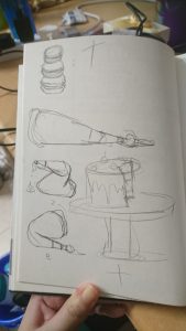
These were the basic sketches that eventually become the base for the pattissier illustration. I had a hard time deciding whether I wanted to portray the finished product (all the cakes) or the process of making a cake, so I did a short study of both.

These were the sketches that I had done up for the idea of the magician/circus performer. I wanted it to be very narrative with alot of things going on. However there were several factors that would lead me to change that idea eventuall. Thus the early stages of development had resulted in less defined alphabet sketches, but more details into how an actual object can look like an Alphabet. (Also without colour it is quite hard to differentiate the alphabet from the background).

This was the last of my sketches, but not the last of my exploration. I was really enthusiastic about this job prospect as there was a lot of things that i could play with to create my name. Different toys and tools, and I event had time to play with the prospect of creating my full name.

Playing with digital media

So I took to illustrating the Pattissier first, since i had a rather clear idea of what aesthetic I wanted to achieve from it.

I used Illusrator as I wanted a flat, pop art style that makes it ‘cute’. I did illustrate the two different ways that I mentioned above, one being with all the cakes all lined up as my name, and the other being the one where I illustrate a cake and the process of making the cake.

I went with the finished cakes, as it was more adorable, and it illustrated the idea of pattissier alright (my friends could tell what job it was, so it means I got my meaning across just fine).

I had a bit of trouble when creating the cakes, because it is not very easy to recreate texture on a vector system.

Image result for tart

(Source taken from: https://www.thespruce.com/fruit-tart-with-pastry-cream-filling-995161)

Image result for cake

(Source taken from: https://celebdear.com/product/velvet-chocolate-cake/)

There is only so much detail you can put in on a tiny illustration and there is way too many things I want to put on my cakes like the shine on the fruit, and the crispness of the tart.

Subsequently I illustrated the Toymaker idea in the form of ‘Doll maker’ again on Illustrator. I felt that by doing so I could kind of merge the idea of fashion designer and doll maker into one, seeing as both may end up doing this similar process (One making the doll the product and the other the doll as a mock up for their actual dress).

It is set in the workshop, as I felt that by showing the process i can have a variety of things go into the illustration, not just the idea of ‘collecting’ toys.

I did this with the similar style as the first. However, I had feed back to try and do something different, so I tried to branch out for the third piece.

The third piece has a mix of Photoshop and Illustrator. I wanted a museum curator because i like the idea of arranging collections as an aesthetic. So i created the halls of the museum in Illustrator before realising that if I was going to photo collage this, Photoshop would be more effective.

It got a bit messy after that as I started to piece images together.

There is a lot of things I can improve on for the composition, but I did not have the time to do it. However I think its mostly due to the perspective of with I based the entire illustration in.

I did the last one entirely in Photoshop, trying to branch away from over relying on the style of illustrating.

I had an initial idea of having it in a similar aesthetic as the first two but I was dissuaded from continuing down that line, so it remained like that.

So this illustration was supposed to be about being a magician or a circus performer. I was searching under ‘magician aesthetics’ for this, and ‘circus aesthetics’ when I came across a circus poster, and went with that as the main aesthetic for this final illustration.

Image result for circus posters

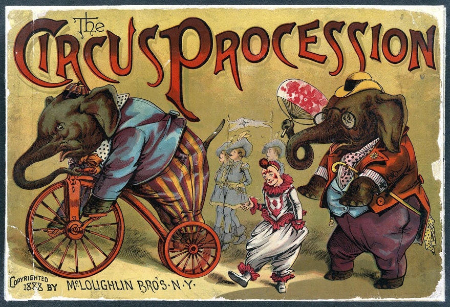
(Source taken from: https://www.etsy.com/listing/87011761/vintage-circus-poster-circus-procession)

Image result for circus posters

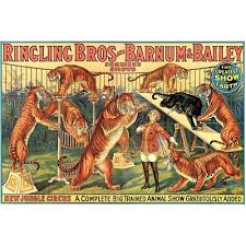
(source taken from: http://www.elcheapoposters.com/ringling-bros-barnum-amp-bailey-circus-poster-6-circus010.html)

I really liked the animal ones, and also it was easier to find pictures that would reflect the style of these posters.