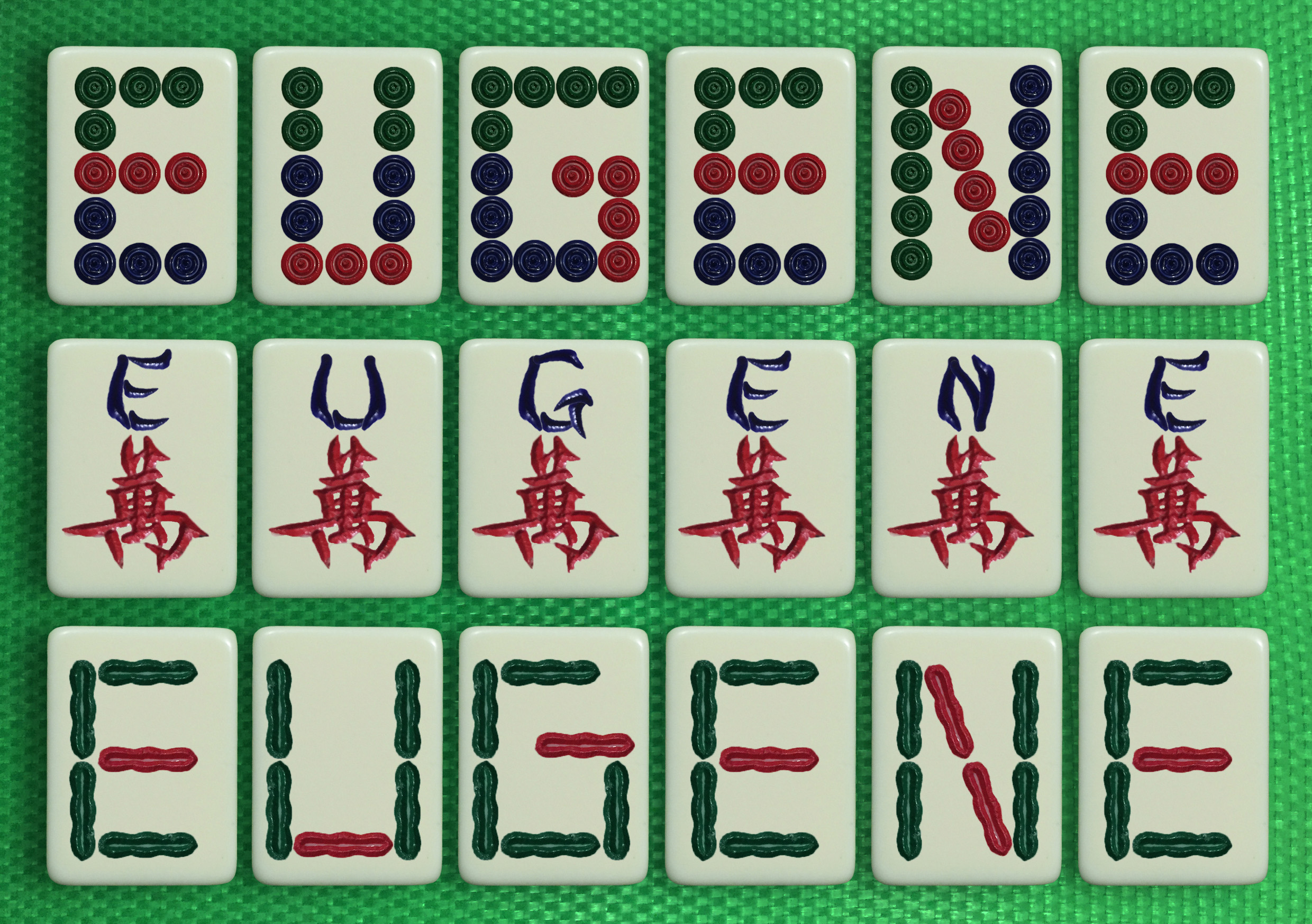
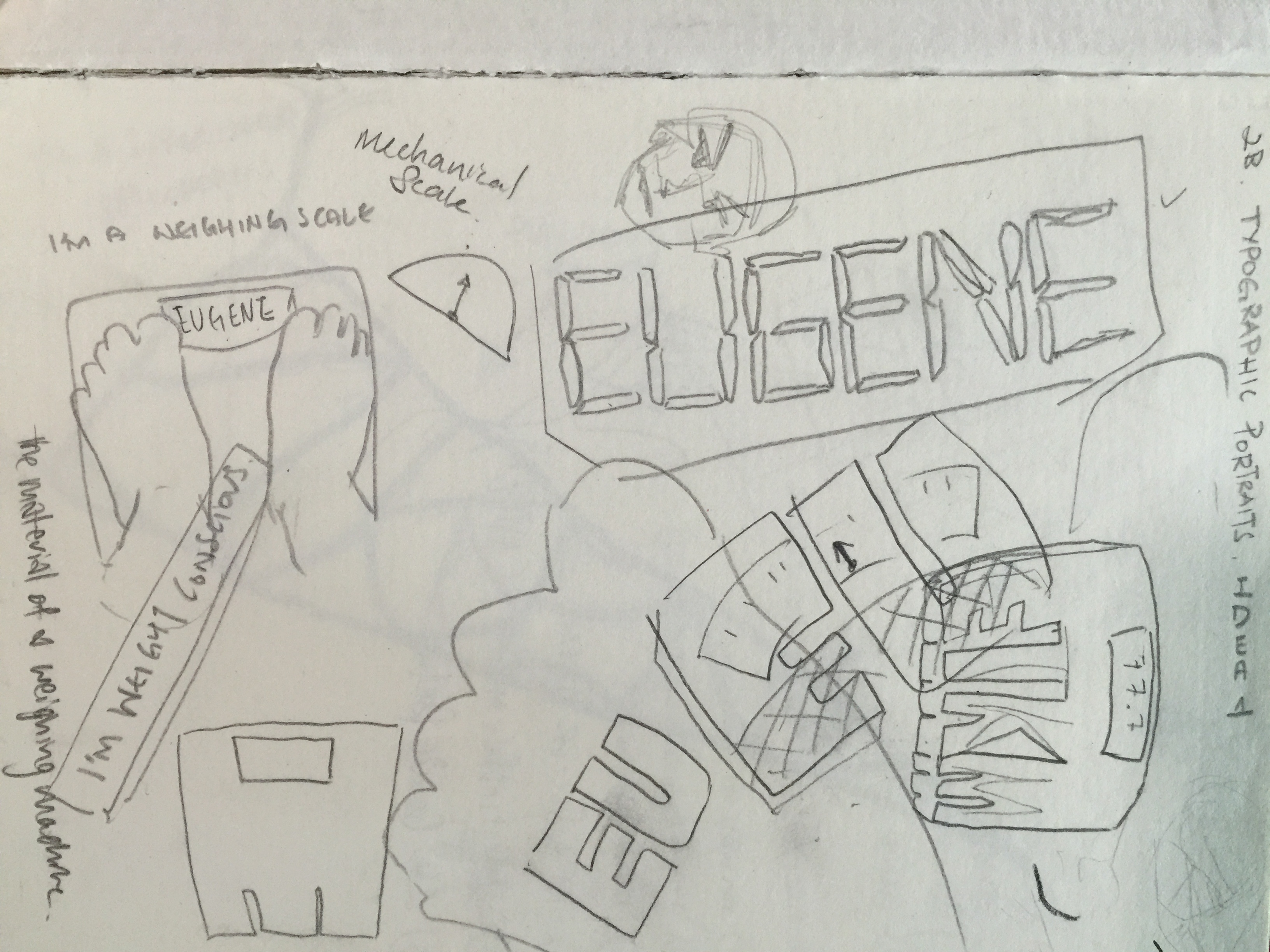
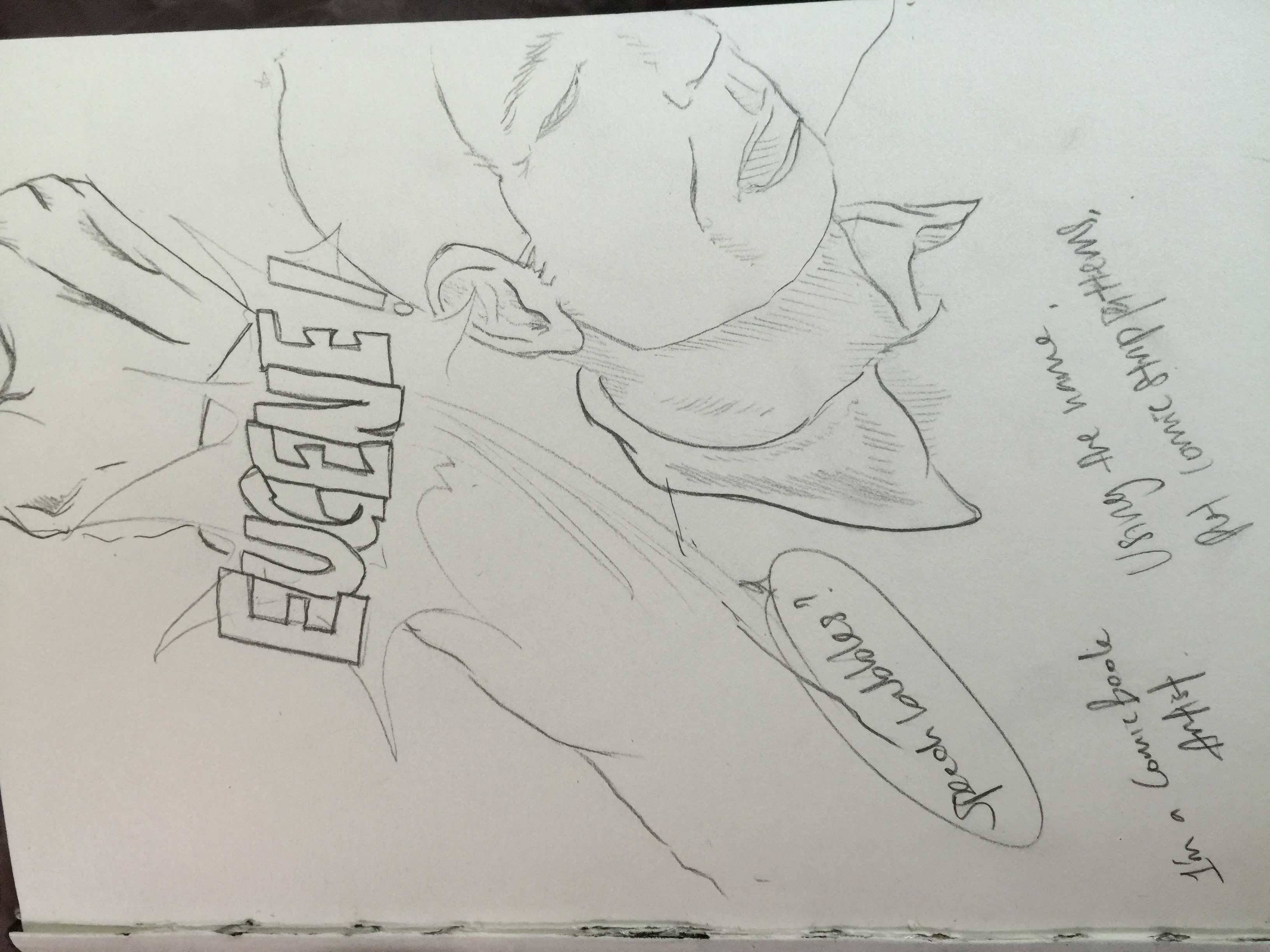
Here comes my final post for Foundation 2D.

The final images for my Zine is up! And what’d i’d call it is, my Corbizine. Enjoy!

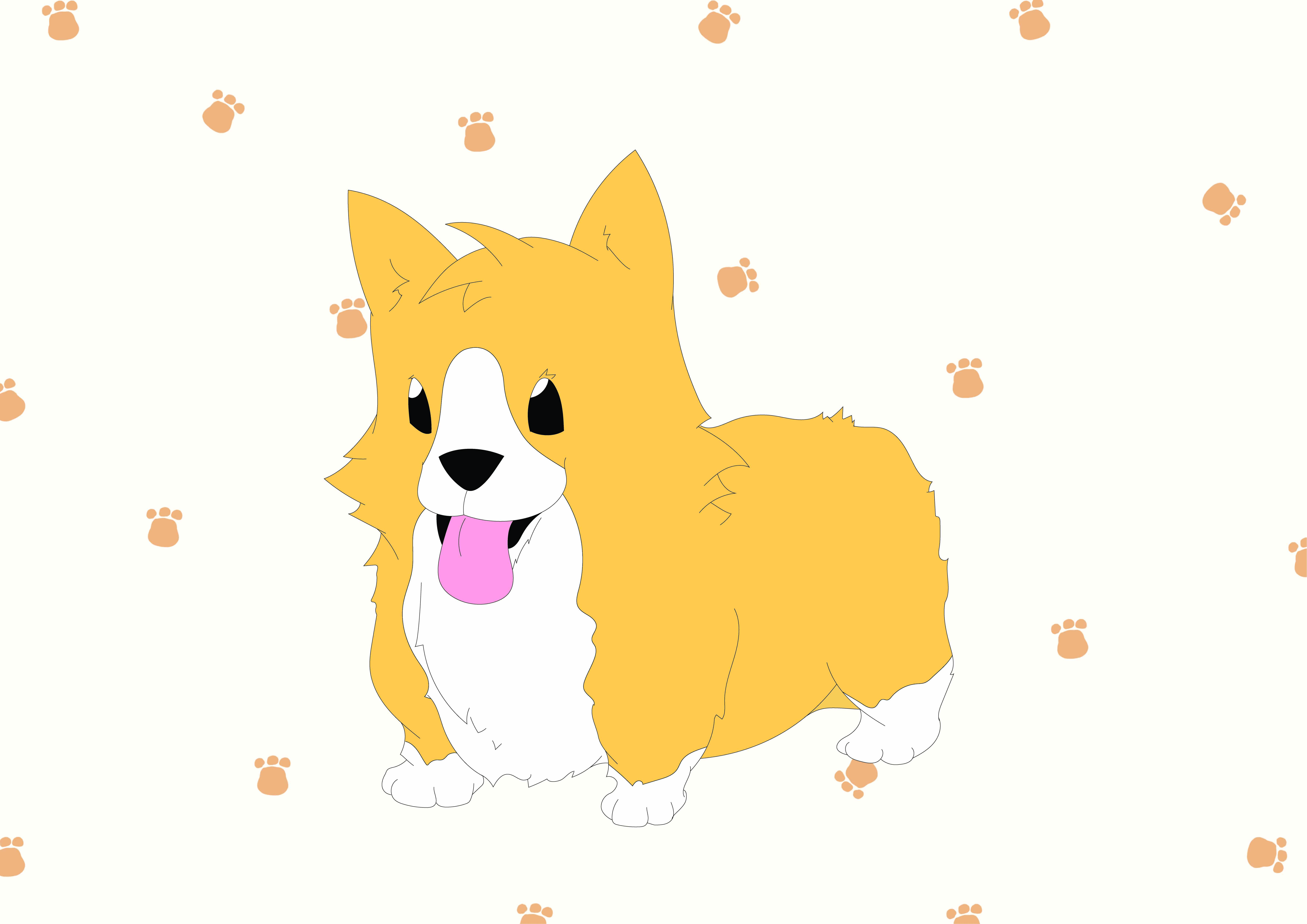
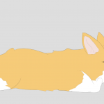
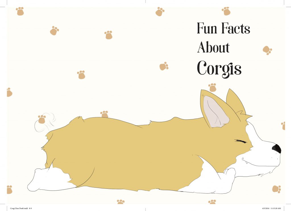
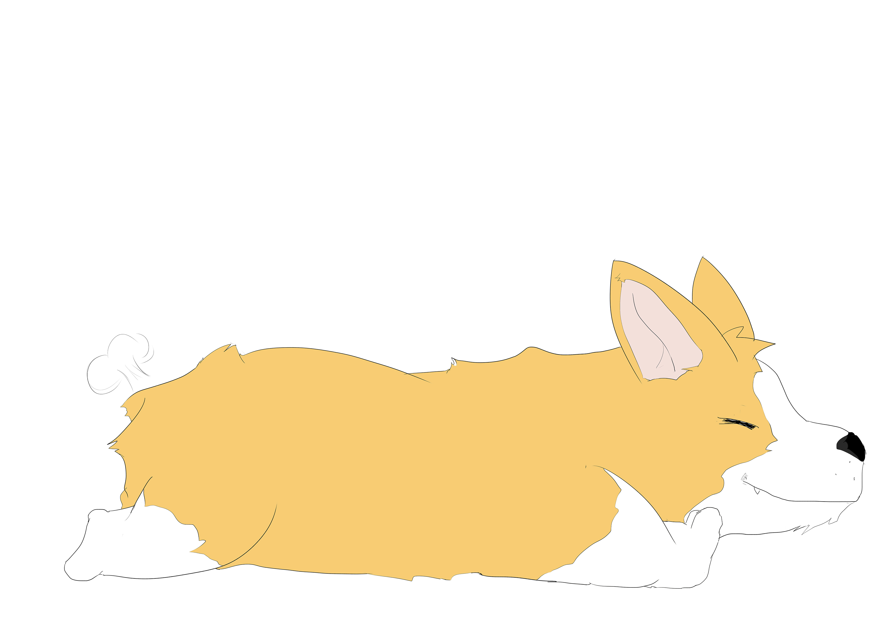
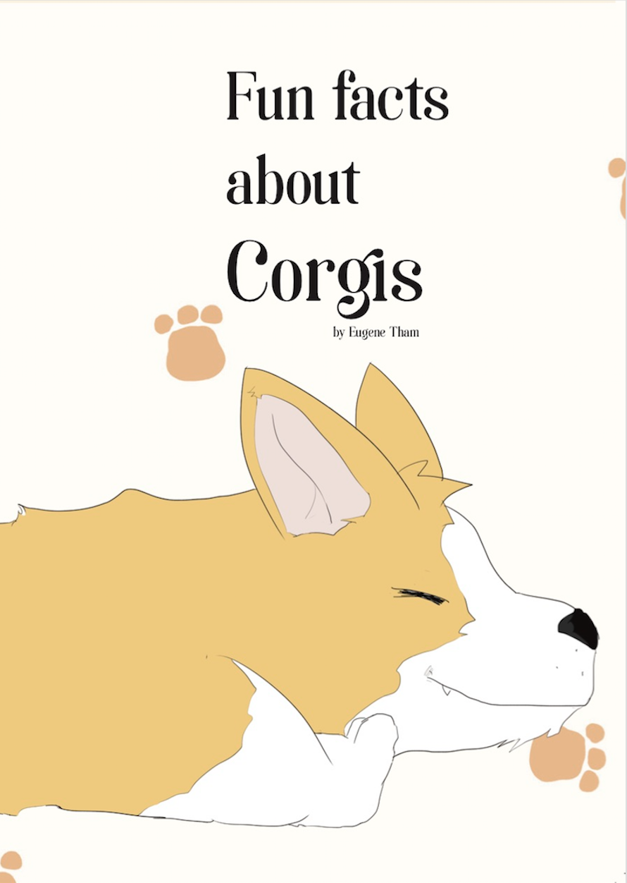
Starting up, is the front cover of my Corbizine. I illustrated the whole of a Corgi lying down, or as they call it, “Splooting”. The front cover consists of the front half of the Corgi’s side view.

Screen Shot 2016-04-12 at 12.30.55 PM

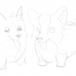
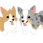
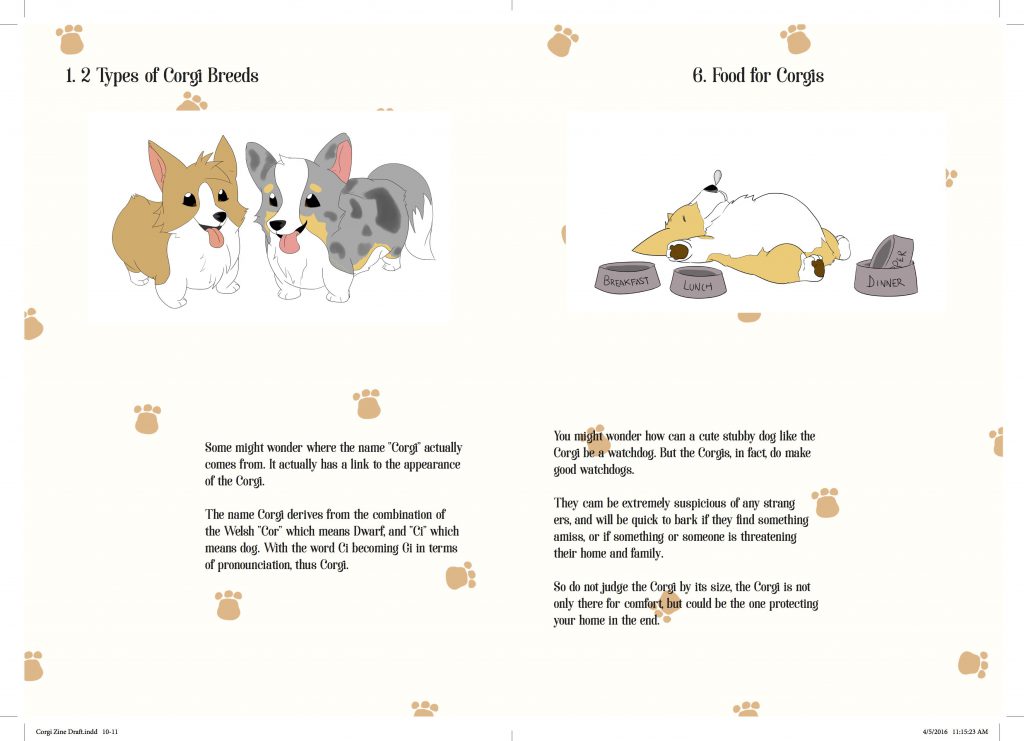
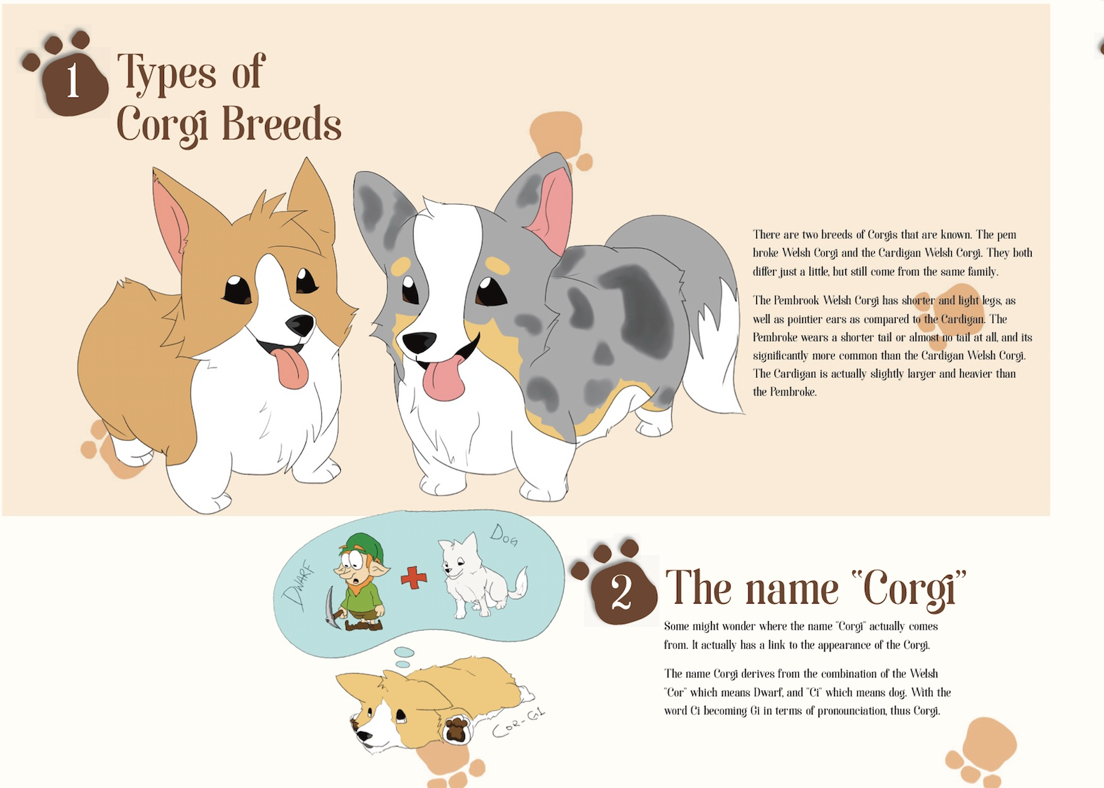
Next up, is the first spread of my Corbizine. It consists of the first two facts, 1) Types of Corgi Breeds, and, 2) The name “Corgi”.

As you can see, the first fact is vaguely bigger than the second one. This was to show a sense of visual hierarchy between the two, and also it gives a proper introduction into my Corbizine.

Screen Shot 2016-04-12 at 12.26.08 PM

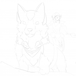
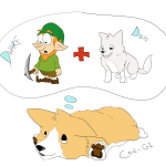
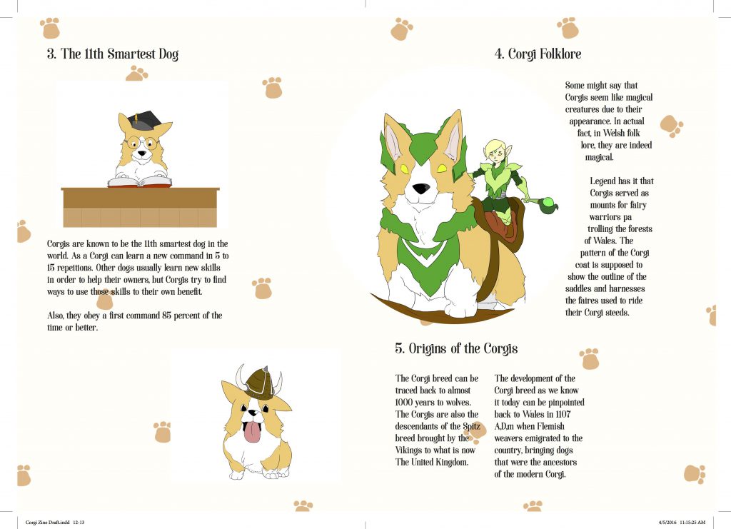
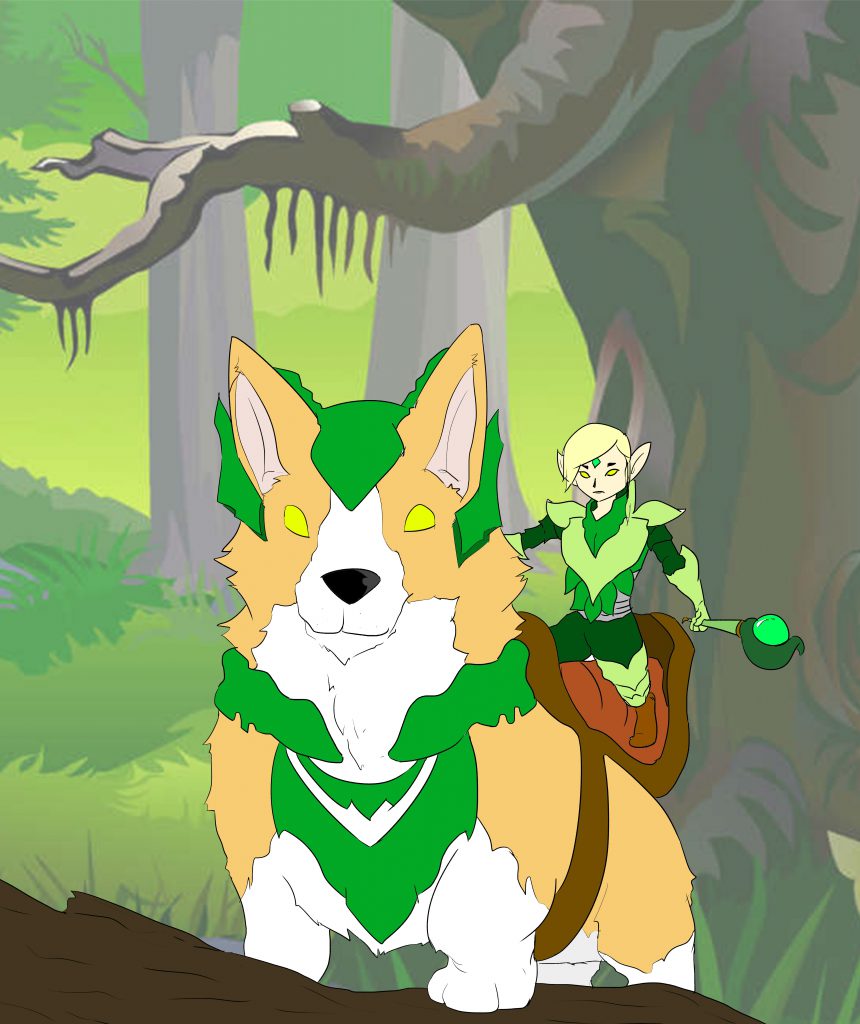
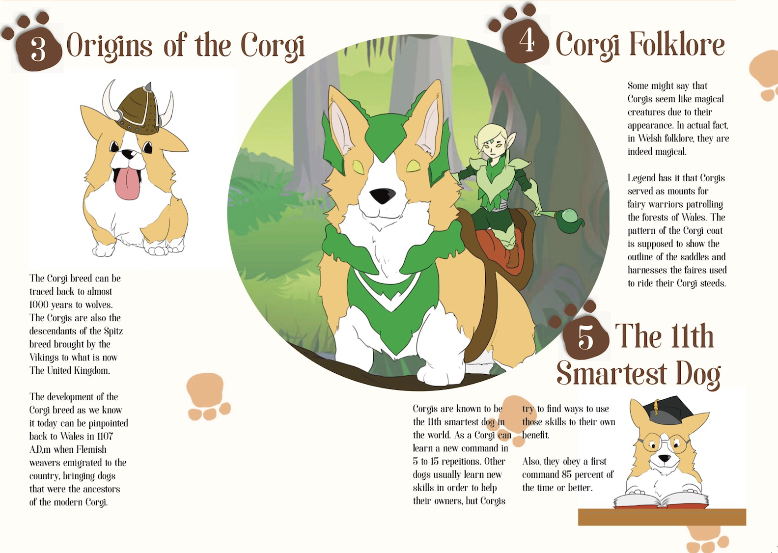
Following that, the second spread consist of 3 Corgi facts. 3) Origins of the Corgi,  4) Corgi Folklore, and, 5) The 11th Smartest Dog. Similar to the first spread, I gave a certain visual hierarchy, where the Corgi folklore illustration is given a background, and is seemingly larger as compared to the other two facts.

Screen Shot 2016-04-12 at 12.25.50 PM

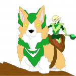
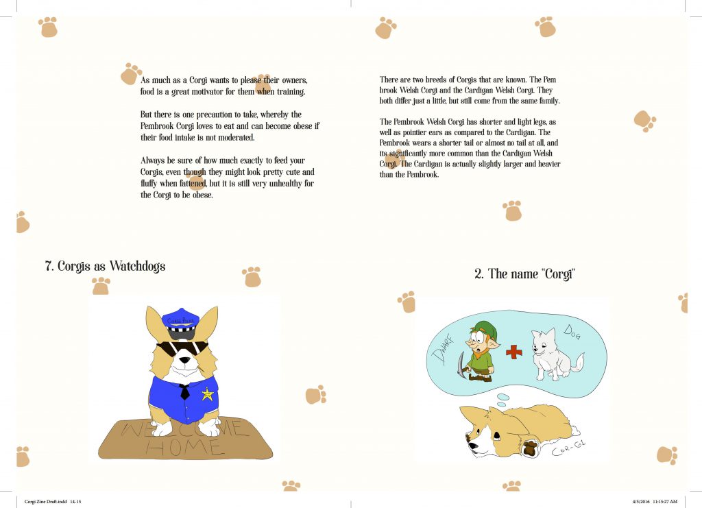
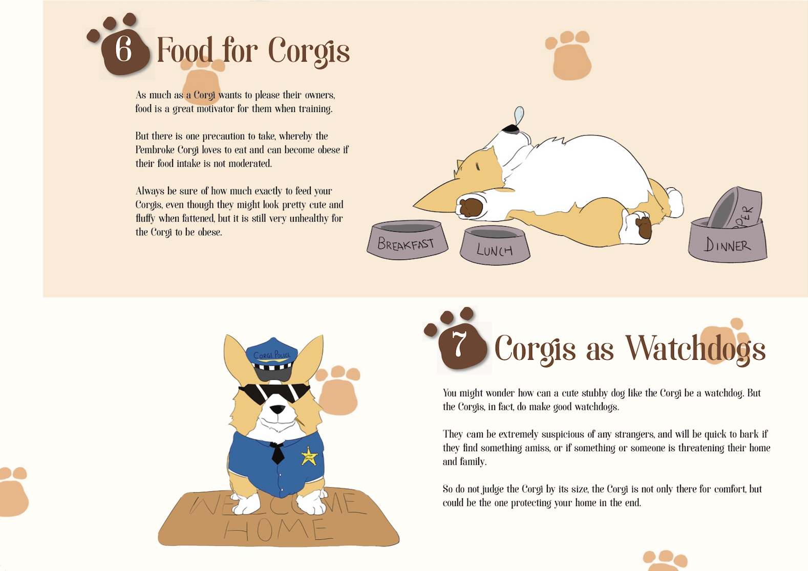
For my last spread, the last 2 Corgi facts, 6) Food for Corgis, and, 7) Corgis as Watchdogs. The layout is similar to the first spread, just push in the other direction, giving it a certain consistency seeing that it’s only an 8-page Zine. But for this spread, the top rule is only made slightly larger than the bottom rule, still giving it a certain visual hierarchy.

Screen Shot 2016-04-12 at 12.24.02 PM

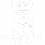
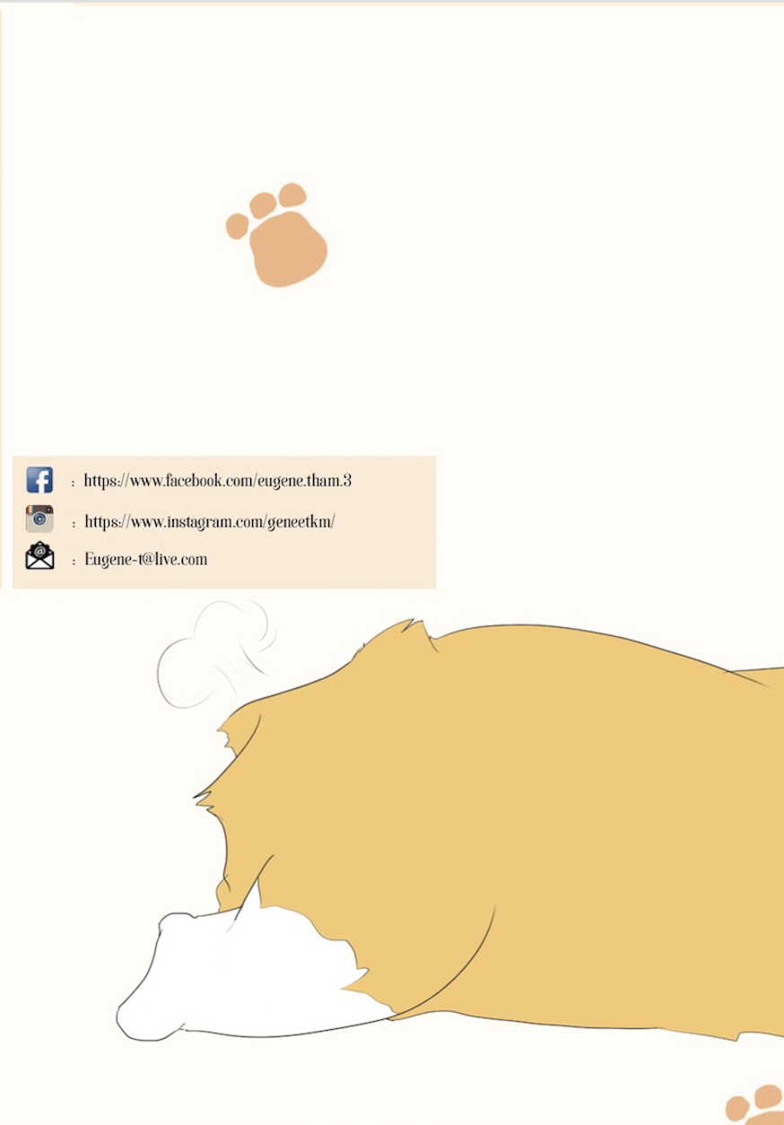
And here comes the last page, the back cover. It connects to the front cover if you lay it out as a spread, to form a whole Corgi! Also, I included my contact details as well in my Corbizine! If you do have any enquiries about my Corbizine, you know where to find me!

Screen Shot 2016-04-12 at 12.33.28 PM

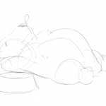
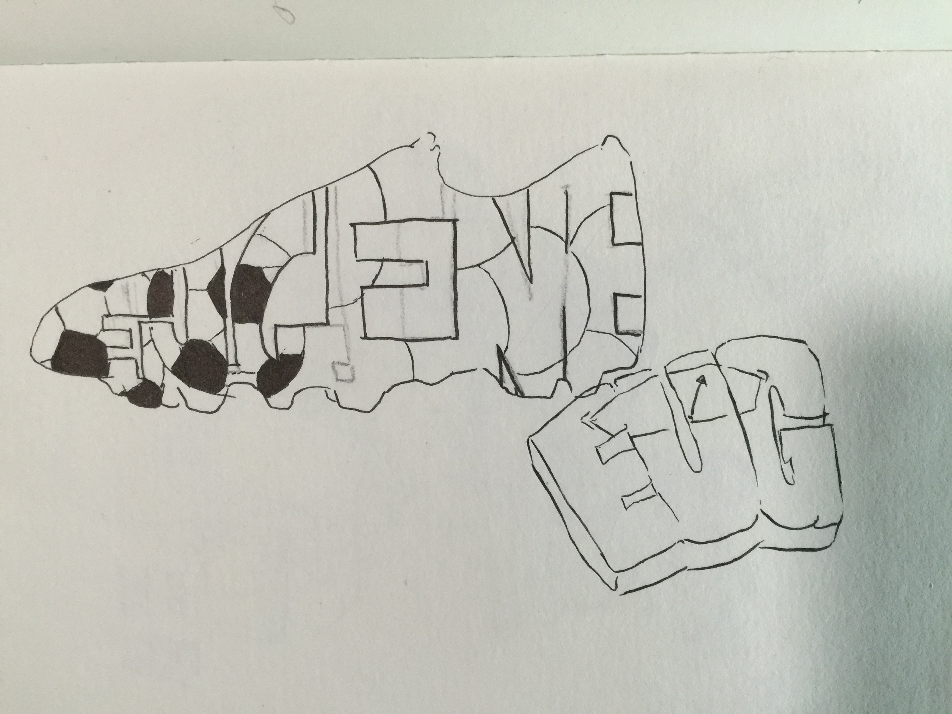
And last but not least, the back poster of my Corbizine, it shows a blueprint of a Corgi! I really got the idea from Toby as well as some visuals online, but I managed to tweak it here and there and illustrate everything on my own. It was certainly a fun experience!

Corbizine Poster


And there goes the end of Foundation 2D. Although I could’ve ended it with a Zine about my past works, I just thought it’d be a nice idea to illustrate a whole new one too! Definitely more fun than time consuming!

I’m glad of all that 2D has thought me, certainly thanks to both Prof. Shirley for this semester two, and Prof. Ina for for semester one. I’ve learnt so much from them and hope to implement all that I learnt when i head into my major as well!


Thank you so much for all that you’ve taught us, Prof. Shirley and Prof. Ina!

With the new Corgi idea, I went on to filter out at least 10 rules which I could use and ones that I thought I could illustrate. From there, I moved to trying to see how I could lay them out in the Zine itself. This proved to be quite a bit of problem, as I wasn’t too familiar with how to properly layout the Zine nicely.

I went on to see many examples of Zines online, to get some inspiration.

But in the end, I kind of stuck with something similar to what Prof. Shirley had recommended me to try with my previous idea, but with a little tweaks. From there I reduced the number of facts to 7, which helped in my layout also.

I started to illustrate the Corgis for all the different facts. I used MangaStudio to illustrate most of the illustration. It was actually a pretty fun and interesting process, as I somehow got very used to drawing with a tablet as well.

These below are a few of the starting sketches I did in the program.

From there I moved to colouring in those sketches.

This were the Corgi models that I was going for. I didn’t really have much references for this, mostly because I always liked drawing corgis! The initial idea was to include a background for all the Corgis, but i thought to try and add them into the Zine first to see how i could properly lay them out.

And this came to be the initial layout for my Zine, and as you can see, it’s really bad and it looked extremely plain. I then consulted Prof. Shirley with this, and she guided me with how i could properly lay them out. She gave me the idea of how to properly place every subject in the Zine, and how putting one as a main subject can help capture the audience attention even more.

I went on to try and improve the layout of my Zine with the advice I got from Prof. Shirley. Other than that, I tried including a background for most of them, but it seemed like if I did that, every subject would be fighting for attention.

I tried putting a background for two of the corgi facts.

I tried fitting a background for each of them into the Zine, but they definitely did not stand out much when I did that. So i stuck with giving only the main one, which is the Corgi folklore, whereby the mythical Corgi resides in the woods with the fairies!

This certainly gave each spread one fact that would stand out more, and not make it a competition between each illustration.

150622_zine-indesign2

Also, I followed the above layout for my Zine. Because of this, there would be a large poster illustration behind, and I thought of making a Corgi Anatomy Poster for the back.

Print

This was the initial illustration for the background poster, without the labels of each part. But it didn’t really seem to stand out much. So I got an idea from Toby, and he told me why not make a blueprint instead since a blueprint itself would have labels of each part as well. So with some inspiration of ideas for the blueprint online, I put together and illustrated and edited a blueprint of a corgi! I’ll show it in the next post!


This project really brought about a new experience. As it was a first time for me to design and make a zine from scratch, and also dealing with InDesign, which I had never even accessed before. Another obstacle that I was facing was to what did I actually want to put into my Zine.

Shirley initially said to just make the Zine about all of my past work in 2D, and I guess it would’ve been a lot easier to just work with that as I wouldn’t have needed to create and illustrate anything else. I figured to put every single one of my projects into the Zine, so consulted Shirley about the layout of the project.

new doc 3_2

She provided this really good layout guide of what my Zine should look like.

I went on to see how I should frame each of my projects. I mostly just researched different Zine examples, and there were many examples in Pinterest.

BUT, I honestly felt that I could do a lot better than that, and that my Zine might not be very interesting if it’s just about my work from the previous 2D projects. Also, it was pretty hard to have a continuous narrative or idea throughout the Zine, as my previous works didn’t exactly have much link between them.

THUS, the idea of doing a Zine about Corgis came to mind! And instead of just putting pictures, I thought why not illustrate every corgi picture in the Zine.

A good practice indeed!

Then I went on searching for what exactly I should put into the Zine about Corgis, and I noticed people are always looking at how the Corgis are all so short and stubby, very much focused on its outlook. So what better way to appreciate the Corgi breed, than to make a Zine about the facts of Corgis! I went on to search more facts about corgis, and filter out the facts which I could illustrate better.


My final Point of View object, I chose a Rubberband. Its an object that many people use and is still being used everywhere almost everyday. From young the Rubberband has proved to be useful in so many ways, from playing games with it, to storing items with it.

And thus, I really wanted to focus on the different use of a Rubberband for my project. Also, in this project, I stuck with keeping every composition to a hand drawn illustration.


5 1 4 3 2 6


Thank you so much for spending some time to read this! Hope you enjoyed the Rubberband! 

The moment I heard what this project was about, I immediately wanted to go straight into doing hand drawn illustrations for this project! The first project was all about going digital, so I thought it’ll be good to show something new, yet comfortable for me, for the 2nd project. It was probably a first for me doing hand drawn illustration for 2D, definitely a fun experience.


From there I went about brainstorming for ideas, of what object to use for the Point of View. Below are a few ideas I tried to come up with:

IMG_6092

In the end, I kind of stuck with Rubberband. Probably because its more or less an object that many people use everyday, but honestly i’d think some people don’t really know how much use of a rubberband is.

Following with a few ideas of what point of views I wanted in terms of a Rubberband. Definitely wasn’t easy thinking up ideas.

IMG_6093

From the list, I consulted Shirley, and she advised me to try out a selected few. (The ones with the orange ticks were the selected few). So I came up with a few sketches of what I thought I’d show the Point of View as.

IMG_6095

For starters, this initial sketch was supposed to be Rubberband in the point of view of a girl, is a Fashion statement.

I wanted to put a little more character into the illustrations. Which is why I added a little cartoon-ish features like the eyes and hands, to portray the Rubberband to be more life-like.

IMG_6096

The main sentence for this picture was, Rubberband in the point of view of a kid is toy gun/pain. This one came off a little harder than I thought. I initially wanted to pose it off as a kid aiming the rubber band with a gun like pose using his hands. But I thought it’d be more realistic with kids always typically taking the pose as i’ve drawn above. As you can see, I added a little bit of character into the Rubberband, providing emotions of how the rubberband would seem based on human reactions.

IMG_6097

Here are a few more sketched out ideas! The one on the left being, Rubberband in the point of view of money is Protection. And on the right, it didn’t really work out that well, but, its Rubberband in the point of view of an Artist is an Artwork.

IMG_6098

For this sketch, the one on the left is Rubberband in the point of view of a remote control is Friction. Its a pretty neat trick of tying rubberband at the front and back of the remote to keep it from falling off the sofa!

And as for the one on the right, it was Rubberband in the point of view of a plastic bag is a Chokehold. I had to test out a few drawing of a plastic bag, it was pretty hard to get the proper texture!


So after consulting Shirley, she told me, “Why not make the rubberband itself into a character? Not just the face, but a whole character!”. And I thought that was really interesting! and something really fun that I could work with. So, I just came up with a simple sketch of how I’d think it’d look like.

IMG_6099 IMG_6100

More or less the Rubberband character was going to look something like that! I gave it a round blobby look, and a hollow middle, just like a normal rubberband.

With the new rubberband character, I went on further to properly sketch out the sentence I had picked.

So this were the new sketches I came up with! I really liked how I could use a rubberband character to interact with the other object in the composition.

Then I went on to consult Shirley for my new sketches, and she approved everything! She told me to try and stick to one type of composition. One being like the Rubberband in the point of view of a paper, whereby its really just the two objects being in focus, without any background. Or to put it like the Rubberband in the point of view of a remote control, whereby there’s a background like the sofa.

From there I decided to choose one without background, to bring more focus towards the two objects! And I went on to work on my final few pieces!

Now here I present to you, my final 4 composition of the Typography Portraits project! Plus some short description of the chosen 4.

IMG_5802

MahjongFINAL

The first idea I chose was the I am a Mahjong Tile. It seemed like a really good time to be presenting one with mahjong, especially since it was still around the Chinese New Year period. But not only that, there’s also just a short description of meaning behind it.

Mahjong was actually a weekly thing that happened at home when I was younger. And as a young kid, one will always be curious as to what’s happening on and around. Being that curious young boy, I’ve always sat and watched how my family members played the game, and I picked up how to play along the way as well! And until now, even though I might not be that good at it, I still enjoy the occasional mahjong sessions. It brings a little reminiscence of the past and how i’ve always enjoyed playing mahjong.

SuperheroFINAL

As for my second chosen idea, I chose I am a Superhero. Even until now, I still have the kid inside of me that is still in love with all the superhero stuff. And I really do adore Spiderman.

But other than that, the reason why I chose this idea was that everyone, or at least most people, when they were young, would fancy or look up to a certain superhero or heroine. It’s kind of our childhood, and then there’s a few that carries it on until adulthood. And that’s where I come in, telling the story of how i’ve come to love spiderman as a superhero.

ComicArtistFINAL

And as for my third idea, I chose I am a Comicbook Artist. In this case, it kind of links to the second idea a little more, other than stories of when I was younger. I’ve always liked drawing, ever since I was about 4 or 5 when my mum and my uncle showed me how awesome and truly amazing drawing is. From then on, i’ve always practiced, treating it a lot like a hobby, only realising after that it could be something of what I want to pursue as a career in the future.

From then, too, I started to like comics. The way they’re drawn, how the stories are told, each panel shows the different characters and stories. And each one always played so well in my head. And from there, it links to the amazing styles of drawing that is seen in the Spiderman comics. Hopefully one day, i’ll be an amazing comic artist enjoying the illustration of each panel!

MazeFINAL

And last but not least, my last idea i’ve chosen is I am finding my way. I chose this idea also to show that, at a very young age, people start to discover what they love to do. From there, they choose whether or not to pursue what they love as career, or to choose the other option of getting a stable job and keeping the thing they love as a hobby.

Until now, i’ve always loved to draw, and it’s what I hope to be doing in the future as a career too. But just recently, I was in a dilemma of what I really wanted to major in. I wasn’t sure of what I wanted to do, and even with the benefit of both having drawing which is what i loved to do, I still wasn’t sure. Even though i’ve chosen animation in the end, but I still am not sure what the future holds for me. Which is why, in this idea of finding my way, I decided to show that there will be obstacles along the way, and paths that might lead me to a dead end. But by persevering and taking each task a step at a time, one day eventually, i’ll end up at where I wanna be, and to know what I wanna achieve. As no matter how many paths there are, there’ll always be that one path that will lead you straight to what you’re looking for, and you just have to persevere and not give up.


Thanks for taking some time off to read my not so short description! But I do hope you enjoyed it! Enjoy the rest of your awesome day!

The process of creating the different typographic portraits was definitely a tough one, as my idea slowly keeps changing while at the same time I kept thinking of better ideas that I could work on.

The first idea, Weight Consciousness.

scales

The idea for the weighing didn’t seem that it’d work that well. I tried clipping the image onto text in photoshop, but it looked really plain and did not really stand out that much.


The second idea, Superhero.

Spiderman screen04-web Spider-Man

The idea of implementing spiderman for my superhero was one that I wanted to stick with. I started with searching for a font that suit the spiderman theme. After which, I searched for a good quality suit texture of spiderman that I can use and put into the text that I use. And to also include a subtle addition of a spiderweb in the composition.

The first picture shows one of the ideas I tried, and thats the font that I’m probably going to work with. I consulted again with prof. Shirley and she gave the idea of making the spiderman logo less obvious, and to show more texture of the spiderman suit.


The next idea is Soccer Player. 

Test soccer_ball foolball IMG_5844ssp

Initially I thought this idea would work, but it turned out pretty hard to continue. I tried finding many different soccer balls, and its textures and patterns to put in the the text. The first picture was when I tried converting the text into 3D shapes while including the pattern of a soccer ball onto it. But it looked kind of weird and definitely too bright. The second one I tried was to make it more 2D, and I tried using the ESPN logo font as the font for my name as well. It still didn’t seem to work that well, and it felt like something was missing.


The next idea was Finding My Way.

d-illustration-stone-maze-puzzle-aerial-view-45442998 maze

For this idea, I had the whole idea for the maze already sketched out, as i’ve shown in my previous post. So all I had to do was to find a good pattern that I could work with and that would make the maze more believable and realistic. I choose the above texture of walls for my maze.


For my next idea, the Comic Book Artist.

Comicartist comic-pow-clip-art-8401671 2

comiccomic


The comic book artist idea, I went with only showing the speech bubble of the old school pop art style comics. Initially I tried finding fonts of comic books or pop art style fonts, but it felt very unnatural, not really much like a comic, as shown in the first image above. The next thing I thought of was to make the font from scratch and drawing it out instead. It came out a lot better than a font I found on the internet. After consulting with prof. Shirley, she also asked me to try and include the pop art style of having the dotted or half-toned effect on the words itself. To make it seem even more so like and old school pop art style comic.


Another idea I came up with was, I am a Mahjong Tile.

ok IMG_5735

IMG_5722 lol

This last idea came to me quite suddenly, and also while I was playing mahjong. There are characters in all the mahjong tiles itself too, so why not include characters or letters of my name into each individual tile! So I took a picture of the tiles, one that would be easier to edit and move the images. I got blank tile which I could easily add in the strokes and patterns of each tile.

lllllll

These are the 3 different tile patterns from the mahjong set that I came up with. All forming my name after I edited and changed the strokes for each individual tile.

IMG_5834

Initially it started out with 6 ideas which we were supposed to present at the end. And these were the 6 ideas that I had initially before narrowing it down to 4 ideas, also with a few names/nicknames just right above it that I can use as the typography words.

IMG_5833

It starts with this, being Weight Conscious. My ideas were implementing the object of the weight scale and input the name into the part where it shows the weight of the subject. But prof. Shirley didn’t want there to be objects in the typography, rather having the texture or something that shows the object on the words itself. These are just a few sketches of how I wanted the idea to be like, but it wasn’t easy finding a good texture of a weighing scale.


IMG_5835 IMG_5845

The next idea I had was being a Superhero. The first and only one I immediately thought of was being Spiderman. So with Spiderman, naturally I had thoughts of implementing webs that would form my name, and including a Spiderman figure at the corner to show that those are webs that are being shot out of Spiderman. But after consultation, prof. Shirley said she didn’t want to include and people or object into the typographic portrait, rather implementing the chosen object’s texture or material onto the words. So it went more towards finding the texture of the suit of Spiderman, or the features of Spiderman to put on the words itself. And also, to subtly include webs inside to add on to the features of Spiderman.


IMG_5838

The next idea I had was being a Dancer. Initially I thought this idea would come out pretty nice, or at least easier to do. I tried implementing dance moves into each individual character of the words. But as I showed it to prof. Shirley, she said the words didn’t really show much movement, and it really is hard to capture the movement as the character kind of seems pretty static. As dance is really all about the movements and the flow of the moves as well. I tried including a stage as well, in the sketches, and a spotlight, to show like as it the characters are performing on a stage.


IMG_5840 IMG_5844

(Ignore the weighing scale sketch below the shoe, unrelated to soccer)

My fourth idea was being a Soccer Player. And as it was for the start of the previous ideas, I wanted to implement the object of either the soccer ball or the boots of the player into the typography. But as prof. Shirley did not want to include the objects itself into the typographic portrait, I had to include the objects or textures of it onto the words. And the one stand out thing of being a soccer player is probably having the soccer ball texture on the words itself. So I tried different ways of including the texture as shown in the sketches. With one of which I tried including the texture of the soccer ball, and fitting the typography into a shape of a soccer boot.


IMG_5837

maze

IMG_5841

And as for the next idea, it was me Finding My Way. And what better way to find my way is to put myself in a maze. So immediately I thought of how I could implement a maze within my name. I went on to research a little on how mazes were made, and how the lines for the maze INSIDE of a huge square or rectangle. I found a simple maze as shown above in the images, and I got the idea of how I wanted to put my name as a maze that shows that i’m Finding My Way. So I hand draw everything onto my sketchbook to slowly try and piece everything together and form a real maze. P.S. the maze can really be played.


IMG_5843

comics_word_vector_2_157054mill5

And for the my last idea, was me being a Comic Book Artist. So the first thing I thought of to really show a comic book style, is the old school way of how actions happen. Like when there’s an explosion, or someone gets punched as shown in the images above. Instead of the action word of getting punched, I would include my name in the action word, as shown in the image above. But prof. Shirley said that I did not have to go so much into details to show a comic book style by showing a whole panel of a comic. Rather why not just show the word itself of going BAM, BOOM or CRASH as shown in the second picture of above. And instead of those words, put my name into it. And also to modify the comic art style into a more old school pop art comic style.


These are all just my initial ideas, and definitely as one gets further into a project, the ideas gradually change and hopefully get better.

Idea 1: Friends? They come and go.

You watch as the years go by, and the friends you have leave you one by one.

To the extent that you keep things to yourself, even things like how you found out you’re losing your sense of sight gradually as the days past.

You feel alone, you think you’re alone. All until the day you fully lose your eyesight.

But what you thought, it was wrong. There were people around that actually cared and watched over you everyday. The closest friends that you never noticed, that you pushed away thinking that no one cared. But they stayed.


Idea 2: Soccer Ball Mockumentary

  • Buying the ball at the shop
    1. The ball being happy, “YAY, HELLO, NEW OWNER!!”
    2. Bringing home all excited
  • Owner seems excited about the ball
    1. Plays with the ball everywhere you go
  • Brings the ball to many different matches
    1. Starts comparing the ball to others, amazed at how good the others look
    2. Ball starts wearing out
  • Ball starts to feel that it looks pretty ugly, wondering what it should do
    1. To leave the owner? Or to try to find ways to look better for the owner
  • Wherever the ball goes with the owner, it meets different kinds of ball of different sports, asking them what to do
    1. Maybe, the ball explains what their sports go through, either being very proud of what they’re doing, or immediately telling them NEVER try it out
    2. Either be amazed or completely ignore the opinions of others
  • In the end, choosing not to leave and staying with the owner


Maybe somewhere in-between the owner misplaces the ball? And that’s how it goes on the adventure to meet the other sports.

In the end finding its way back to its owner.

OR

In the end the ball gets punctured, flattened and recycled.

The narrator is either the ball itself OR someone telling the story.


Idea 3: A Documentary about Dance

Initial idea is to show the different genres of dance. But might be a little too messy.

Second concept:

  • A specific friend and his dance class/crew/group.
  • Interview a selected few and ask a few questions.
    1. Mainly questions involving why they choose to dance
    2. Is it more of a hobby or career?
    3. What made brought about the passion to dance?
  • Film them dancing and practicing as a group
    1. AND individually
  • While interviewing, show a small panel of their dance moves/practice
  • End with a final performance
  • OR if they need, a way to promote their dance at the end