Patched (Part 2 – Final)
Final Revision
Alright so now I have to come up with my own patterns!
And I’m only left with less than a week to do so!! Ahhh!!!
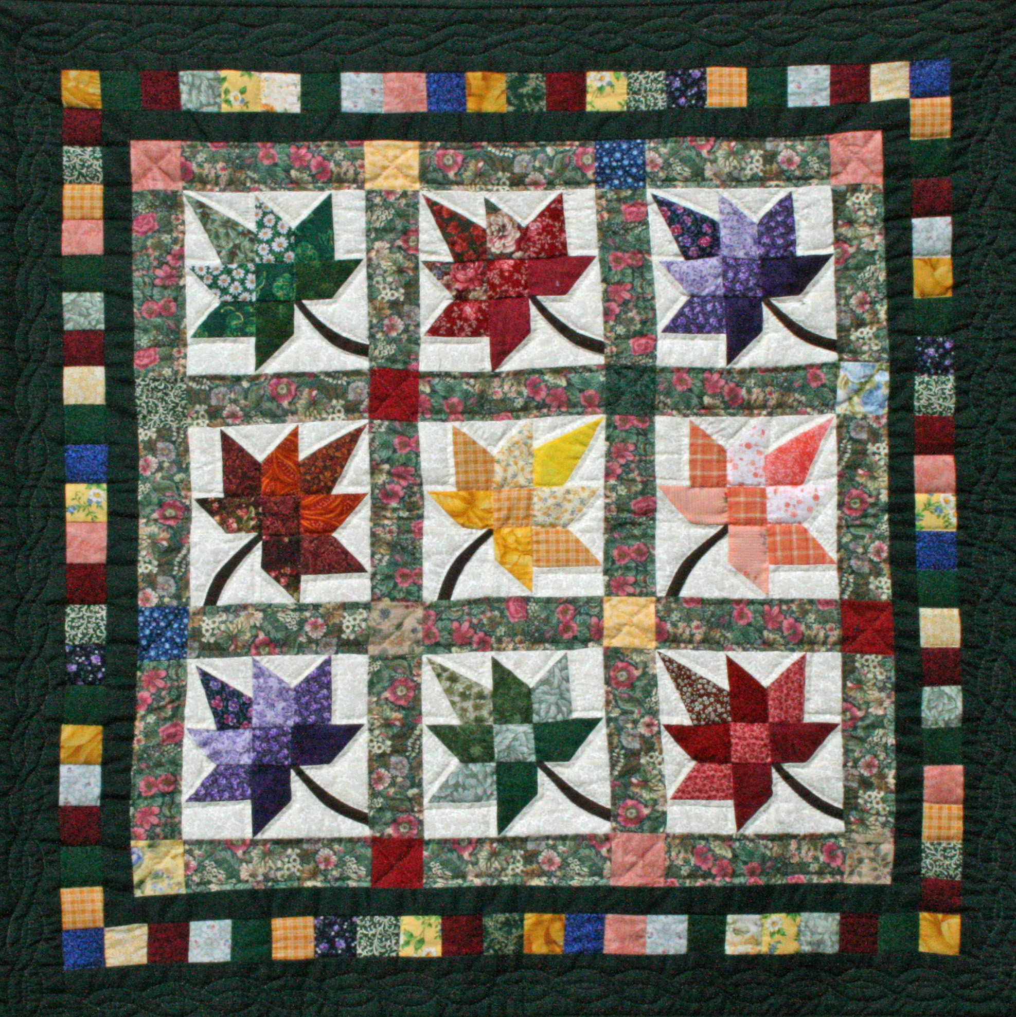
I still really like the yellow flower pattern that I found on Pattern Jam though. So what I did was to take that motif and tried to replicate an exceedingly similar pattern :p After which, I also combined it with another flower motif I drew myself and added some dots to create another pattern. Hence, my final piece was created using only two patterns. However, I played with scale and colours so that it would still have visual interest.


Ta-da!
I decided to leave the square plain and only made it look like a patch for I was afraid that the patterns were already too much on the eye and more designs on the center would confuse the viewers instead. Also because my references tells me that patchwork quilt fabric squares usually looks similiar:

Problems
For all my previous mock-ups, I found that alignment was a huge issue. I had not thought that working with triangles would be so difficult before this project. It really took me till the last revision to finally straighten out my triangles and made sure that they were aligned properly digitally.
The next problem was printing alignment. I realized that even if the double-sided printing came out just a teeny bit off, it would affect my entire card because my designs were strictly triangular and there was no room for any bleeds or errors!
The worst thing was that my previous test prints were all on 80gsm paper which was already the easiest to fold. That had me worrying sick that a higher grammage would be too difficult to fold. One word: STRESS!
Printing
Okay so finally the day for printing has come. I geared up with cutting mat and penknife and 30-cm ruler and headed to Sunshine Plaza. Tried out a 170gsm paper first and it gave me this:

The paper was too thick so the card did not fold well even after scoring. I then tried a 140gsm paper. This grammage folds well and the card sat really nicely. But :

So I headed to the other print shop highly recommended by all my friends for their awesome double-sided prints. It was really expensive (double the price), but considering the wonderful finish, I would say, it’s a small price to pay 🙂


Improvements
Right after the uncle sent my design to the printer, I realized I could have tried printing on fancier paper such as those with cloth/fabric textures. But it was too late and I didn’t want to spend more money :p But it would definitely have been fun to explore the other paper choices.
If given more time I would also like to work a little more on my patterns because I feel like pattern design is a huge thing even on its own and it would be great to come up with motifs and designs which are uniquely mine.
Takeaway
1. It is hard to digitally draw perfect triangles
2. Alignment is affected by EVERYTHING – calculations, paperweight, printing quality
3. Good double-sided printing is expensive but so worth it
4. Scoring requires some thought and folding, some patience
Patched (Part 1)
Week 01 – Brainstorming
I came up with three concepts for sharing with the class during the first week.
1. Wishing you a speedy recovery!
For this, I envisioned a tri-fold card with a cartoon/comic style to emit some lighthearted humor. I felt that the card could depict a race car or an animal that is known for its speed such as the jaguar or cheetah.
2. You’ll be patched up in no time!
While thinking of the various ‘get well’ wishes, I thought of the phrase “patched up” and immediately got reminded of the patchwork quilts that my grandmother used to make. I felt that the quilt was a nice image as it possesses a sense of warmth associated with that of a home which gives a intimate (?) touch. However I wasn’t sure what kind of fold to use to complement this concept.
3. Get well soup-er soon!
I also tried thinking of things that will cheer me up or make me feel better when I am sick. Piping hot soup was one of them. But I didn’t know how to expand on this concept. Michael suggested linking hot soup to speedy recovery by presenting an ‘instant soup’ and ‘get well instantly’ or the drink-this-soup-and-feel-better-instantly concept.
Week 02 – Expanding on Ideas
Inspirations
I borrowed a few library books for inspirations on the types of folds that were being used and picked out a few that I liked:

I like this because I thought that the smart use of die-cut shapes in this card really brought out its message despite it being just a simple single fold.

Giving a twist to an ordinary gate fold. I thought I could potentially use this for the soup design.

Pop-up plus super cute illustration brings out the kid in anyone 😀

I thought that the one of the left combined the use of die-cut shape and the gestalt principle of anomaly very well. The one on the right again gave me an idea of the type of fold I could potentially use for the soup idea.

A real soup card. Hmm but I don’t understand this one. How is this a card? It looks extremely 3D as if the can is really there? :O

Tri-fold card that might potentially be used for my first concept

Interesting die-cut
http://beccysplace.blogspot.sg/2013/12/technique-class-serviette-fold-cards.html
I also found this which I thought was perfect for my quilt idea!
Moving On
I came up with a draft for the soup idea but didn’t get very far because the concept was weak in that one lol. So I ended up working on the quilt concept instead!
I made a template fold first and colour-coded the planes for me to keep track of what I’m dealing with.

Then the first draft. I purposely chose all the very antiquated-looking fabric patterns and colour for the first draft because my initial idea was to bring out the grandmother feel with the warm and earthy tones. However it turned out too dark I did not like it a bit.


Michael agreed that the colour was bleh and that the inside square looked too plain. He suggested that I added some designs there to show continuity. Also, I shouldn’t change the colour of the logo, ooops.
Week 03 – Improvements
To brighten things up, I turned to bright pastel hues and a more youthful looking pattern featuring flowers. I koped the patterns from this amazing website to do up a quick mock-up due to time constraints.


The feedback received this time round was that I could use more colours other than pink and yellow. The square in the center can also be treated a littler more such that it doesn’t feel like it was being slapped on just because. My classmates suggested that I could make it a ‘patch’ by itself. More patterns could still be added to the back. Also, I told Michael that my patterns were koped from the Internet and of course it was a no-no ^-^”
Okay this post is getting long, check out the next one for the final 🙂
Health is Wealth (Part 4 – Final)
Following the consultation with Michael, I came up with this:

After the sharing in class, I noted down some points to edit and improve on, such as:
– Crack or dent on the head
– Contrast in the babies’ heads
– Be more inclusive of the text
– Incorporate the Zika virus’ structure into the hammer
– Mosquito needs to look more menacing
– Layout has to be more dynamic
– Take note of the background colours
I also didn’t really like the big ugly words on the hammer (can it get any more explicit?) and I noticed that I did a terrible job at rendering the mosquito’s legs.


I then tried two altered layouts for the newly rendered hammer and added in lines to indicate motion (and force). I also added in smoke and electric current to show the head whack-a-baby machine malfunctioning or damaged. More text were also added to reinforce the message of the poster. Here are some feedback Michael gave during our final consultation:
– Mosquito is still not menacing enough, add evil eyes?
– Virus hammer is not working, revert to original mallet
– Dent on baby’s head should be moved to the back to create more tension
– Text to be flushed left

I accidentally deleted some parts of the mosquito and decided to play along. Got some poorly made evil eyes, LOL.

Okay, proper evil eyes for real.
I didn’t like how the eye looked on the mosquito as it made it look like a cartoon prawn instead. So during my final print, I removed it!

TA-DA!
Health is Wealth (Part 3)
What was I thinking
Quick recap cause I want to bury the horrendous first drafts in the middle of this post.
So I came up with two initial drafts with the idea of a condom acting like a bell jar to contain the virus. During the first class presentation, Michael pointed out that there were too many mosquitoes and that one alone was already enough.
The idea of keeping the virus in seemed weak when you get reminded of the fact that people are selfish, so I thought of reversing the concept. Instead of keeping the virus in, perhaps I could remind people to keep it out.
I then went to further research more into condom advertisements and the two most prominent brands I came across were Trojan and Durex and their posters are mostly kept very minimal, with just a thought-provoking central image and a slogan below or at the top. Okay, I think I’ve typed a substantial amount of words – enough to keep the ugly pictures out from the top.
Here goes:

Every time I look back at my initial drafts and ideas I have to cringe really badly, sigh.
Anyway, I thought that I was really limiting myself with the condom direction and tried working on the alternative concept – Bar Zika before it scars. I then went to Michael with these ideas:
– narrative / comic strip
– aedes mosquito as a prisoner on the loose
– deformed baby’s head
“Whack-a-mole,” he said
And ding! An image formed in my mind 🙂
Shall continue in another post cause I’m really desperate to bury the ugly drafts aha.
Health is Wealth (Part 2)
Key findings
Although there are not yet any known cures for Zika (only symptomatic relief), the virus generally only has mild effects. That is with the exception of pregnant women as Zika is known to be capable of causing birth defects, such as microencaphaly, in fetuses should their mothers be infected. As such, prevention is the best bet. Methods include vector control and abstinence from, or practicing safe sexual activities.
Word Association
zika pregnant preggie fetus baby child defects abstain sex safe condom aedes mosquito mozzie bite itch stagnant water fever rash conjunctivitis small brain microencaphaly suck blood bleed breed spray repellent net cover enclose contain bar radar scar ninja au revoir
Slogans
Zika-free, we can be!

Target audience: General masses
Attitude: Positive, encouraging
Style: Illustration / Cute and simple vector graphics
No, I’m no Yoda. Just trying to make the slogan rhyme. Anyhow, this seems to me like a hoorayish kinda slogan oozing with positive vibes, almost to the point of naivety? “We can fight zika off together if we all play a part! Yey!” *hold hands and clap and sing-a-long* But I find it too utopian for my liking. If everyone was so cooperative, there wouldn’t be a need for the poster in the first place. Besides, since Zika isn’t really that much of a big deal to people other than pregnant women and their families, there isn’t much motivation for the others to actively take part in zika-prevention. So no, I don’t think this will be an effective approach in getting the masses to act.
Bar Zika, Zika scars

Target audience: Couples planning to have kids / Pregnant ladies and their family
Attitude: Explicit, to invoke fear, dark, ominous, dynamic
Style: Gory hyper-realistic images
Alternatives:
Bar Zika lest it scars
Bar Zika else it’ll scar
The human body has a fight/flight mechanism, which is useful for keeping it alive under threatening situations. As a result, we are naturally motivated by fear so I believe that the most effective way to get people moving is to show them the frightening consequences of not doing so. In this case, to portray the adverse effects Zika would have on innocent lives.
Trap Zika! Use a jar?

Target audience: Couples planning to have kids / Pregnant ladies and their family
Attitude: Allusive, thought-provoking, static
Style: Sterile, clean, simple with central image – either vector graphic or photograph
Alternatives:
Like a jar, condoms trap Zika
Just trap Zika in a jar
Halt Zika transmission. Use condoms.
Somehow I thought an inflated condom balloon looks like a bell jar and bell jars are used to keep things stagnant and sterile, which makes it seem like a pretty apt image for bringing across the message that Zika can be contained so long as one practices safe sex. It’s also much more realistic than asking people to cease all sexual activities I guess. But I can’t get the slogan to sound right >_<
Health is Wealth (Part 1)

A picture speaks a thousand words
A powerful image alone is a common and effective tool for health posters.
This is probably because a visual is able to reach out to audiences of all ages, regardless of language barrier or level of education. Utilizing only a key image and a witty/catchy slogan as its focal point, a health communication poster also tends to be minimalist and straight to the point.
A search on health communication posters gave an array of photography-based results as such:


Graphic posters are also pretty common:


I really like this poster because of its simplicity. It has a symmetrical layout, with the background being a repetition of a pattern which is instantly recognizable as a fence. The poster also utilizes the gestalt principle of anomaly to highlight a red ribbon, the symbol of aids awareness, which I feel is pure genius! The text that reinforces the notion that the poster is trying to portray is also printed directly under the anomaly such that the eye naturally travels to it. Overall, I’d say the designer is extremely well-aware of the connotations people tend to associate with HIV and, through conscious arrangement of each element, he managed to communicate it effectively.
This is something I’d very much like to achieve for my poster.
Let’s put Zika back behind bars
I’m so bad at slogans and that is the best I can come up with at the moment -_-”
But anyway, the concept is… Aedes mosquitoes are vectors of the Zika virus. As long as they don’t breed, we can technically control the spread of the disease. They also have black and white legs, as if in their jail costumes. So we’ll throw them back behind bars, along with Zika.
Well, that’s only one method of containment as Zika can be transmitted through other means such as from a pregnant mum to her child, through sexual activities and blood transfusion. I could probably come up with more slogans targeting these instead. Or, to use mosquito patches/coil/net, etc.
Hmmm… we’ll see.
Window of Opportunity (Part 4 – Final)

Close your eyes and picture this:
A symphony of rustling leaves and silent creaking bamboo stalks surrounds you. A gentle breeze caresses your face as you take a deep breath which smells of damp forest and moss. The rays of the morning sun filter brightly through the softly swaying stalks, casting ever-changing shadows on the lush undergrowth. Coolness is deep within the bamboo grove.
Calmness, tranquility, zen-ness, serenity and peacefulness – these are the feelings associated with being in a bamboo grove, which is the therapeutic element I want to bring to the hospital.
I chose to depict the bamboo forest in a relatively abstract manner because:
1. I believe that the window art should set an immersive mood
– There are already enough distractions along the J-Walk
– Users are just buzzing through; seldom will they take the time to admire the art pieces
2. I thought that I could play with light
– Production of varying shades of green shadows which will mimic a forest undergrowth
As such, I came up with a few drafts using the traditional collaging method. And after some digital modifications, I shortlisted four of the designs but couldn’t decide on which to choose.

So I sent them for test-prints to study the effect of light on each of them. I first printed on tracing paper (substitute for translucent decal) because I wanted to block out, as much as possible, the shadows of the rows of bars outside the windows. However, I found that it restricts too much light.

I then tried it out on transparency. After which, I realized that there weren’t significant differences among the casted shadows and that is when I decided on submitting the last piece because unlike the others, it gives the most sense of depth.

Bamboo is flexible – bending with the wind but never breaking, capable of adapting to any circumstance. It suggests resilience, that we have the ability to bounce back even from the most difficult times.

As such, I feel that the spirit of a bamboo is a very apt for the hospital setting.
References
Description
Japanese Court Poetry by Robert H. Brower and Earl Roy Miner, Page 366
VAG Rounded

Group members: Reynard, Siqi, Soomin, Vanessa, Xian Tian
Research
After deciding on the font, our group went to find out more about it from library books and by Googling. Below are some of the key findings that we’ve compiled based on the prompts given to us:
1. Reason of existence and origins
VAG Rounded was developed in 1978 for Volkswagen AG (Aktiengesellschaft, meaning “stock company”) as part of the re-branding strategy following the merger of Volkswagen and Audi. The typeface was used for the Volkswagen and Audi Dealer Organization, and for all non-car related activities of Volkswagen, such as the V.A.G Bank and V.A.G Leasing. It was first published for public use in the 1980s, first by Berthold (1980s) and then by Adobe (1989). Its use was discontinued by VAG around 1992.
2. The context in which it originated
In the 1970s, curves were considered fashionable and employed in most forms of design (even paper corners were to be given rounded finishes!). Fonts were no exception. In addition, TV resolution were still of relatively poor quality then. As a result, intricate details and serifs tend to be lost on screen. This distortion of text, though minor, still made the words less legible and a solution was needed. That was how rounded fonts came into the field.
3. Who designed it?
There is dispute over the original designer of the font, which till today, is not yet resolved. It is believed to be one of the following three – Gerry Barney and his team at Sedley Place, GGK Düsseldorf or Wolf Rogosky and Gerd Hiepler.
4. Examples of applications and existence
VAG rounded is popular with both small and large companies as it is thought to “lend a modern friendliness to what might otherwise be a cold trademark.”

A rounded font like VAG rounded is also preferred for use on signs and screens due to its high legibility. Furthermore, the roundedness of VAG rounded also makes it an ideal font for branding. This is because when a signage system is backlit, type will be outshone; even the sharpest edges will blur and appear out of focus. So if a type is sharp in one application but appears round in another environment, both cases may not be recognized as one brand. The solution to this problem is a typeface that is equipped with round shapes and corners.
Companies that have used the font include T-mobile and Apple. More examples of use found here.
—————————————————————————————————————————————————————————-
Execution Ideas
We then came up with a few possible ways of presenting the information that we’ve found to the class. Here are the products of our brainstorming:
– Video/GIFs
– Infographic poster
– Song and accompanied music video
– Skit
– Talkshow
We finally decided on the talkshow after we all agreed (via elimination) that a skit will be too cheesy, a poster too boring and a video too time-consuming (unrealistic goal).
How to spice up our content
Simply presenting information about VAG rounded seemed too boring. We then discussed a few ideas on how to give our presentation a focus or problem to further delve into:
– Make VAG rounded stand out from the rest
– Highlight VAG’s roundedness and why it’s popular – Comic sans is round, but why is it hated upon?
– Who discovered it, why the switch to roundedness?
—————————————————————————————————————————————————————————-
Plan One
Outline
Interviewer – Gives brief introduction to VAG rounded
User 1 (VAG) – Explains its creation; the bridge between futura (volkswaagen) and times (audi)
User 2 (Mac) – Explains why they adopted it for keyboard use
User 3 (Llao Llao???) – Explains why it resonates with youths
User 4 (Teletubbies???) – Explains why it resonates with kids
Or maybe the last user can be on the consumer end (i.e. mac user or llao llao patron). He/She could elaborate on how the use of VAG has influenced their opinions on the brands they support, if it did.
We were also pretty psyched about the idea of comparing VAG Rounded & Comic Sans because we were curious as to why one succeeded and the other did not, despite both of them being round.
Problem
There’s no context to the talkshow and why it’s doing a feature on VAG rounded.
After more research, we couldn’t find more examples of VAG rounded in use other than VAG, Mac and a German positive vibe campaign. VAG also did not turn up on the first page of the google search on “rounded fonts”. From there, we realized that it isn’t that popular of a rounded font at all. In fact, at a certain point of time, Comic Sans was even more popular than VAG! But that’s not surprising, since everyone used it in 90’s due to the emergence of desktop publishing. We then did a research on why Comic Sans is so infamous (and hated) and figured that it didn’t have as much to do with it’s mediocre design, but rather it’s inappropriate overuse. Hence, it doesn’t mean a thing if we were to compare the popularity of VAG rounded to Comic Sans.
Solution
After which, we stumbled upon an article summarizing rounded fonts and felt that we could do something similar in our talkshow – an overview of why rounded fonts were popular in the 1970s and why they have been making a comeback in recent years using VAG rounded as a key example.
—————————————————————————————————————————————————————————-
Plan Two

Outline
The Letterman Show – Discussing the latest FACE in the world of typefaces.
Host: Introduces today’s topic, VAG rounded
Youth: Raves about font, what she likes about it
Volkswagen and Audi: Provides context and origins, sheds light
Mac: Discusses why font was chosen for keyboard
Youth: Raves more about contemporary uses
Host: Ends off, sneak-peek of next week’s topic (joke/another typeface)
We also finalized our roles and came up with key questions to shape the flow of the show.
Questions
For VAGNESSA THE VAG ADDICT
1. What is this new craze over VAG rounded about, why do you personally like it?
2. What makes it special? Why not other round fonts?
3. Do you think that VAG is the best contemporary font for brands? Why, or why not?
For VOLKSWAGEN AND AUDI
1. When and why was VAG rounded created?
2. How did it come about?
3. Who designed it?
4. How was it received by the public then, was it popular? Give context to support.
5. If you could go back in time and make VAG rounded not as available to the public, would you?
For MAC
1. When and why did Mac start using VAG rounded?
2. How has VAG rounded influenced the look of the company?
3. Will Mac continue to use VAG rounded?
Rehearsal
From the questions listed above, our group was able to craft out our own responses and the whole flow of the talkshow. We also did up our slides before meeting again two days before the final presentation for a rehearsal and to discuss what other elements we could add to our talkshow.
After the discussion, we decided to add in props such as the light, sofa and flipboard. We also decided to add in fun stuff like trivia quizzes during commercial breaks, sound effects and fake prizes to simulate the feel of an actual talkshow.
Do watch out for our presentation 🙂
—————————————————————————————————————————————————————————-
Reflections

Reynard
This project has brought me the lesson of the characteristics that a font can have. I started the project not knowing anything about VAG Rounded or how it looks like. However, it’s been quite a realization how prominent it is. The main lesson I learnt would be an effective typeface can be judged by how invisible yet how strong its characteristics are.
I’ve grown quite a newfound respect towards rounded fonts as well since I find them too childish at first but it’s been quite a stylish revelation. VAG Rounded has been a good representation of the retro stylings.
Siqi
Through this project, I am awed by the fact that a difference in font clarity or detail, however small, between screen and print of the same brand could confuse the viewer in a way that they couldn’t recognize it. I also learnt how rounded fonts helped to solve this problem by providing clarity on screen during the period where resolution wasn’t high enough yet. It was interesting to see how even slight nuances can alter the look and feel of a typeface!
Soo Min
Through this Type History assignment, I was struck with a realization. Type is everywhere. We see it everywhere –we seem oblivious, but typeface influence us subconsciously. For instance, VAG Rounded “lent a modern friendliness” in our daily lives: on our keyboards, on fast food chains, and on cars. By exploring the story behind the chosen typeface, I became aware of its power. In other words, typeface can be used to give a certain atmosphere or look, and the ubiquity is just incredible.
Vanessa
In this project, I found myself being more observant to the novelty of a rounded font. By studying the specific applications of the use of VAG rounded, it gave more clues to the trends of design over the recent years. In particular, it was interesting that certain brands could give off a very different feel once they changed to using a more rounded font, to look much more attractive and friendly to the young.
Xian Tian
I enjoyed this project, especially the ways our classmates presented. I am impressed by their ideas to show the history of the different typefaces and I found that typography can be fun and interesting. Before researching the background of VAG rounded, I didn’t realize that it is just around us and so important in our lives. For example, I am a Macbook user and I’ve never discovered that the fonts used for the keyboard is VAG rounded. I appreciate being helped by my group members who made this presentation well.
Window of Opportunity (Part 3)

I think I found a solution to all my previous concerns and it is none other than… *drum rolls*
…bamboo!
The ‘AHA!’ Moment
I’ve finally decided on the bamboo grove as my therapeutic element for this project, and I’m gonna execute it using the abstract method originally planned for SUNSHINE. My idea is to bring the tranquility of the bamboo grove to the hospital by printing the abstract design onto translucent decal, such that sunlight can still pass through to cast the varying shades of green onto the hospital floor. I imagine the coloured shadows mimicking the scene of a forest ground too, where one could experience a sense of coolness and restfulness.
The Grass Towers

the perfect gentleman
Click here for a list of reasons why the bamboo is such an awesome plant. Its zen quality also makes it suitable for bringing a state of calm or serenity to the stressful hospital setting.
Moving On
Yay, so I’m out of the rut. Here’s what I did next:
Step One: Paint a bunch of stuff

it doesn’t have to look nice (yet)
Step two: Slice them up

Step three: Arrange and rearrange

xiantian told me pasting it straight was too neat

so i tried criss-crossing

and more criss-crossing

and even weaving! but gave up cause hello? bamboo grove!

so i went back to my first love, the vertical strips
Step four: Stick them on and scan them in


Step five: Manipulate digitally
The possibilities are endless, which is what I love about collaging 😀
Window of Opportunity (Part 2)

I’m stuck in a pit and this post explains why 🙁
Xiantian and I took a second trip to Ng Teng Fong Hospital. This time from 6pm to 8pm.
A Second Look
– Horizontal bars (!!!!!!!!!!)
– Dark and gloomy
– Mostly staff, patients’ families, and random passers-by, who are either in a rush or on their phones
– Distraction galore – exhibition, tv, clock, etc.
Time to Say Goodbye…
…to my initial idea. The bars are just too distracting and restrictive. Besides, since there are already enough information taking up the J-walk users’ attention, I figured that my artwork shouldn’t add to the distraction. Rather, I should take an immersive approach to set the mood of the pathway.
Therapeutic Elements
I felt that the gloomy walkway seriously needed a huge dose of vibrant colours (primarily yellow, with maybe a hint of orange) to brighten it up. Only by doing this can the spirits of those passing through be lifted, even if just momentarily.
Sunshine

sunshine, daisies, butter, mellow
The first thing that came to mind when I thought of bright cheerful sun colours is sunshine. Other than being our primary source of energy, light has always been closely associated with the idea of hope and warmth.
I’m walking on sunshine
I believe that the best way to represent light is in its abstract form – to let the colours of the aureate rays speak for itself. Hence, I felt that a collage is an appropriate method of execution for this idea. If the design is to be printed on translucent decals, light would pass through and cast different shades of yellows on the floor which would give the illusion of “walking on sunshine”.
However, I am concerned with the jarring bars that line the outside of the window – to make the decals translucent means that they would become part of my design. And I can’t think of a way to make it work because horizontal lines would only serve to break up the light rays.
Walking into the light
From last week, my classmates brought up the point that hospitals tend to steer away from abstract art because there’s a high tendency of them being taken negatively. Hence apart from the horrid grills, I am also concerned about the notion of light being interpreted as death or the afterlife in a highly stressful environment such as the hospital.
Sunflowers
Taking both the above considerations into account, I felt that light might not be such a good therapeutic element to work on after all. So I came up with another therapeutic element which combines the sun and a more explicit form of nature – sunflower fields.

reminder of the source of life and all that is good
However, I am stumped as to how to bring a field of sunflowers into the hospital graphically.
And here is where I’m stuck. *pulls hair*
Presentation & Feedback
Seeing my classmates’ works today, I am well aware that I am lagging one week behind everyone else and it’s pretty stressful, haha. After speaking to Michael, he mentioned at the end that the forest shadow art which I presented last week seem to have potential.
Now I think I kinda have an “aha!” moment but… to be continued.
Window of Opportunity (Part 1)

Whaddup new semester, new modules, new classmates and new mentors!
What’s more exciting than a field trip on the first day of school?
Here are some observations I made during the visit to Ng Teng Fong Hospital:
Ka-ching
The linkway connects the Admissions/Billing Office to Outpatient Clinics. Hospital stays are depressing cause other than the cost of it, admission simply means you’re not getting better. Visits to outpatient clinics are also not cool because waiting time can be super long and that sucks.
Question: How to go about cheering up people who’ve lost (are losing) money, health and time?
Tick-tock, tick-tock, we must eat
The linkway appears to me as some sort of a retail attraction, with most outlets being F&B related. There are also a gift store and a flower shop.
Let there be light
There are a total of 16 of the large windows spanning both sides of the linkway (eight on each) which oversee buildings surrounding the hospital (i.e. IMM, JCube). Light pours in from those glass panes, so there’ll be back light if artwork were to be displayed on them. This means that our designs would have to make use of the light that’s coming through in order to succeed.
Took the road less travelled
The travellators are bordered by two narrow strips of passageway on their right, on which (normal) people wouldn’t walk. I found that interesting because they are actually wide enough for walking (I tried!), but just because they are narrow, it is simply assumed that they are not to be walked upon. Not sure if this is even a useful observation but… oh well, we’ll see.
Mind Mapping / Associating Words

I have a few therapeutic themes in mind and they include:
Food! Oh, glorious food!
Every time I’m feeling under the weather, nothing would comfort me more than a bowl of piping hot soup or a meal. And because of all the F&B outlets at the ends of the linkway, I thought it would be a pretty apt theme. However when I spoke to my cousin about this idea, she insisted that images of delicious food would make the patients even sadder, because being sick, they wouldn’t be able to enjoy those delicacies. I thought she had a point.
MOTHER Nature
Mummies are nurturing figures. Surely, nothing can be more therapeutic than having her around? There are so many forms ranging from flora to fauna, beaches to dunes. I can’t decide on what to choose!
Laughter – the best medicine
I thought that injecting humor or the notion of fun and play to a clinical setting could lift the spirits of the people using the linkway.
Music
Classical music can be calming because of their soothing rhythm. I might just explore the different moods that various instruments produce and then think of how to best translate them into graphic form?

Below are some of the possible ways to “Eggsecute” the various themes/graphics:
Illustrations on Photography // Paper Cuts


I thought it would be a waste to block out the original view outside the window and that it would be interesting to incorporate them into my design. This could work for FOOD, NATURE and HUMOR.
Stained Glass, Transparencies and Shadow Art

These are ways in which we can make use of the light passing through the windows. I felt that intricate paper cuts or varying opacity of decals could alter the amounts of light passing into the hospital and cast shadows which could mimic the feeling of being under a forest shade (NATURE), which is something I find therapeutic.
However, I’m afraid that it might restrict too much light from entering and in turn, make the place dark and gloomy instead. Furthermore, the shadow designs wouldn’t work at certain times of the day (i.e. night) and if there is an inadequate amount of sunlight shining through.
Check out the rest of my moodboard images here.
Presentation & Feedback
I gained much insights after the sharing session with the class today.
Firstly, I totally forgotten about the horrendous rows of bars lining the outside of the window (why?!?!) even though I took a video of the place, lol.
Secondly, Vimal pointed out that the illustration on photography idea would only work from certain angles. This is a problem I’ve briefly considered but didn’t really give much thought to. Joy then suggested the idea of marking out the viewing points (or placing footpads) of the angles from which people can view the art work from. I felt that it was a playful thing to do. However, I’ve neglected to take into consideration that the users of the linkway were mostly in a hurry (as pointed out by some of my classmates today) and wouldn’t give two hoots about interacting with the windows or artwork. So… I might need to reconsider this interactive approach.
Lastly, Michael noted that I didn’t have a strong and/or specific enough therapeutic theme. Sigh, indecisive human is indecisive. This is something I need to work on asap.
Action Plans
A second trip to the hospital is in order for me to check the bars out. I’ll also need to take note of the potential audiences’ behaviours and evaluate whether the fixated approach might work. If yes, where and how to make it work with the bars and stuff. If no, I’ll have to decide on a specific element and work on its general approach.
References
Click on the pictures for individual image source and links to more of the artists’ works
Death on Death (Part 4)
Read the other parts: 1 | 2 | 3 | 4
My instagram and facebook feeds were flooded with everyone’s amazing zines and I’m just like…!!!
It totally didn’t occur to me to take photos of mine at all lol ?_?
So the digital version is all OSS get and it doesn’t do all my test prints justice because the final effect on tracing paper is just different! I’ll probably update again once we get our zines back!!!
ZINE


de-spirit
I chose this title for three reasons:
1. It signifies departure into the spirit world, which is what Death is.
2. It seems like an act of removing a spirit (i.e. declutter, desensitize, etc.) and that’s Death’s job.
3. It sounds like ‘dispirit’ which must be what poor misunderstood Death feels.
Death on Death
It’s a clue telling people this is a book about death written by Death.
Epigraph
It’s a duty-dance;
might as well sway with the waves,
forget ’bout the rest.
The first line was inspired by Kurt Vonnegut’s Slaughterhouse-Five which is also known as The Children’s Crusade: A Duty-Dance with Death. It is a duty to dance with Death for it is not something we can choose to avoid. Rather than worrying about when the music would end, we might as well live in the moment and enjoy the movement.
Waves and Music
When planning the layout, two sub-themes struck me most. They were music and waves. I wanted to incorporate them subtly into the publication, hence I used ‘sway with the waves’ instead of ‘enjoy the music’ in the epigraph. To me, music are sound waves too. If you took a closer look at the pages for the four characters, you’d spot a tiny musical symbol at the end of their descriptions.
I placed a slur symbol for The Little Mermaid because I felt that her sacrifice through Death was what bonded her with the prince. Hence, the two are still connected although she is floating in the sky as a foam spirit and the prince is still well and whole on Earth.
On the other hand, I used a tie symbol for The Wicked Witch because Death is what allowed the two sisters to meet again. As for The Friendly Ghost, I placed the bass clef symbol as clefs are usually found at the beginning of every score to indicate the pitch of the notes being played. As Death signifies the birth or a new beginning for a ghost, I thought a clef works well. Lastly, a whole rest was used for The Free Elf because Death is an end to his suffering and he may finally rest in peace.
Die-Cut, Tracing Paper and Stab Binding
I chose to do a die-cut of the ‘spirit’ on the cover and printed the epigraph page on tracing paper because I felt that it would make the spirit look like a spirit floating away. And the shadow that the text will cast on the tracing paper would also give the same feeling.
I settled on using Japanese stab-binding, in particular the tortoise shell one, because it suited the use of various types of paper and it would give my otherwise plain cover more visual interest.
Oh, the feels
It has been a wonderful semester with Joy and my new classmates. Not only did I get to know more people, I also got to see their works and through them, got introduced to new styles which I might never have found out about otherwise.
So it’s a wrap for foundation year! All the best to everyone in your respective majors 🙂
Death on Death (Part 3)
Read the other parts: 1 | 2 | 3 | 4
After choosing the suitable prints, I plunk them into Illustrator and manipulated them digitally.
It was the most time-consuming part of the digital process as my faithful laptop is already 5 years old and every minor tweaking of any live-trace option was followed by a lag.
Thanks Zhixin
Before proceeding, I showed Zhixin the last rough paper mock up which I did. She commented that she could already see the general idea I was trying to portray but she felt that my choice of words just needed some more fine-tuning.
I was so relieved to hear that and it gave me courage to finally start on the digital layout.
First drafts usually suck but you still need them to proceed

IDK what I was thinking when I did this layout hahaha it’s really too ugly.

I arranged the words this way so that it would look like waves. And also, since this page would be printed on tracing paper, I didn’t want the words to overlap with those on the next page.

This is my favourite pattern in the series 🙂

Before starting, I didn’t really know what prints I wanted to use for ghost and elf. It only occurred to me to base this on a fixed character after I realized I had one in my mind for the rest.
It also only dawned on me that the monoprint patterns were abstract depictions of the characters’ cause of death after I was done with the first two prints. So I googled for ‘famous ghosts’ and Casper showed up. I also learnt that he died of pneumonia – which I thought was very interesting.
Then it hit me that one of my prints looked like a gram stain:

Gram Stain of Streptococcus pneumoniae
It didn’t really matter to me that my prints weren’t exactly streptococcus (round bacteria in a line).
After all it’s meant to be abstract right?

Poor Dobby with the dagger Bellatrix threw at him. I thought this print looked like a zoomed-up blade.

I used the same pattern as for life in inverse to show that they are opposites. Again, the layout ._.
Thanks Madeline
During group consultation, Joy noted that the single word placements were too difficult to read as our eyes aren’t trained to do so. She also pointed out that each character had the following:
1. To (Character)
2. Death is (cause of death)
3. The real meaning Death wants people to see
Everyone else thought that my layout for the individual prints were kinda weird – I thought so too. Sigh, so much for wanting to playing around hahaha. Then Madeline pointed out a really good point about making Life and Death mirror images of one another by literally placing them on opposite sides.
Draft Two: Getting there, slowly but surely?

I was pretty limited when it came to playing with layout because of my choice of paper. So I could only shift the pattern to the left so that the words could fit by the side without overlapping.


I took Madeline’s awesome suggestion and made Life and Death mirrors of one another. Instead of inversing it, I created an outline for death to make it look brighter than Life’s POV. Outlining also makes it a nicer pattern!
Also, I changed the sentences to:
To The (Adjective) (Character),
I am (cause of death).
(Why is death beautiful for character)
I switched the sentences to first-person to further show that Death is telling us his story and emphasized the last sentence, which was the most important thing he wanted us to take away.

After die-cutting the book cover the previous time, I realized that it would be better to print the design on the back so that my clumsy cutting skills wouldn’t ruin the front of the cover, haha 🙂
All my test prints are in the sketchbook! So I wouldn’t be posting them here. I tried printing on various tracing papers because my first try didn’t work too well for the foam design. There are many kinds of tracing papers – the white ones, the more translucent ones, the super thin ones and the super thick ones. To sum up, I am broke after trying out the types of tracing paper in Fancy Papers >_<
Death on Death (Part 2)
Read the other parts: 1 | 2 | 3 | 4
Here’s a quick recap of all my ideas for this zine thus far:
1. Monoprints
2. Death
3. Abstract
4. Narration
5. POVs from the SOCKS characters
6. Die-cuts
7. Special papers
Here comes the hard part: to incorporate all the above elements into a single publication.
Ideation II
I wanted to do an abstract pattern book backed by a simple narrative told by Death. To me, Death is this poor bloke who’s always been labelled as the Bad Guy and he hopes to clear this prejudice by using case studies which are the four characters from SOCKS – mermaid, witch, ghost and elf.
After sort-of nailing my concept, it was time to move on to planning the layout.
Epigraphs are so hard to write
I like planning my pages using rough paper first before moving on to doing it digitally. It took me slightly more than a week and about four drafts before I was finally slightly more satisfied with the layout of pages. I also came up with a title for the zine and struggled to write a suitable epigraph that would sum up my overall concept nicely.
The epigraph was the hardest to write because being succinct was never my forte (apparent from all my wordy posts) and it had to summarize the key ideas and themes of the zine in an elegant way.
Besides, my thought process is super weird – I tend to have a gut feeling of the final outcome without even knowing how it came to me. My ideas always seem so complete in my head but whenever I try explaining it to someone, the whole world simply falls apart and I’m left feeling crumpled, defeated and small, thinking my concept is crap and that I am crap.
But okay I digress. Monoprints next! And finally some visuals, YAY! 😀
Monoprinting is crazy fun

Reasons why Siqi likes monoprinting:
1. Everything looks nice. Really.
2. You don’t have to think. Automatism at its best.
3. You can use ANYTHING.
4. It’s therapeutic.
5. Messy fun like back to kindergarten 😀
Here are the results of only one hour of printing madness:


I did everything on newsprint because that was my takeaway from the first semester. I loved how the harshness of the ink was softened by the newsprint’s texture and creaminess. It feels organic.
I then scanned the prints in and scrutinized them to find suitable patterns to illustrate my POVs.
Death on Death (Part 1)
Read the other parts: 1 | 2 | 3 | 4
Create a zine using works from previous 2D projects?
What to do?
I was stunned when this brief was handed out to us. How was I to one-up myself?
*inserts laugh-cry emoji*
I like the work produced this semester but didn’t want to restrict myself to the kiddy, playful style. Thus I looked back further to the previous semester and CRINGED SO BADLY 🙁 Luckily, my first project had at least been slightly more decent. Monoprinting was also a truly enjoyable process.
Thanks Andrew
In hopes of getting some inspiration for a theme, I went around asking everyone what their zines were about. It freaked me out when Christy told me she’s already finalizing hers for print. WHY SO EFFICIENT! So that evening, I whined about not having a theme in the print room and Andrew kindly suggested told me off very plainly to stop wasting time and to just choose a theme and get going :O
Since he was doing a parody on Damien Hirst’s art which mostly followed a central theme of death, I then thought of using it for my zine too. Besides, I’ve always been fascinated by death and am already doing it for foundation drawing so it was pretty apt. Andrew also suggested looking at Death from the POV of the SOCKS characters. I thought it was a genius idea.
Ideation I
So I came up with the list of POVs and thought about how to tackle the zine.
Death from the point of view of a mermaid is foam.
Death from the point of view of a witch is water.
At this point, I was struck with the idea of combining these two designs by using tracing paper.
Death from the point of view of a ghost is birth.
Death from the point of view of an elf is an escape.
Death from the point of view of Grim Reaper is a job.
Death from the point of view of Life is a very long phase.
Death from the point of view of a Death is a self-portrait.
I had two initial ideas in terms of concept and art direction. The first was making an abstract pattern book and maybe incorporating them into dresses or fashion thingies? LOL IDK. But because it was so weak, I thought of coming up with a narrative to string everything together. Hence, another children’s book, but Eric Carle style since I wanted to use monoprints. The problem is I couldn’t see how I could turn this mishmash of POVs into a narrative. Sigh.
Thanks Joy
During the first consultation with Joy, I told her about my intentions of using die-cuts and different papers and she was okay with it. After hearing the two ideas, Joy also said that she didn’t think I have to separate them. In fact, she thought that I could even combine the two!
She then urged me to think about how I can justify the chosen characters being in a same publication. An example (or suggestion more like) she gave me was to make the book a Grim Reaper’s “trophy book”. I felt that it was a genius idea too!
This post is getting much too wordy. I’ll continue in another 🙂
Through a Kaleidoscope (Part 4 – Final)
Read the other parts: 1 | 2 | 3 | 4
The hell weeks are over! Good job, everyone, for surviving 😀
*abrupt transition to project two updates*
Here’s a story about socks:


One day, a mermaid passed by a shipwreck and picked up a pair of socks near it. Without feet, the only natural thing for her to do was to put it on her hands. But she found that there were no space for her fingers and threw them away.

Incidentally, a witch on vacation chanced upon the discarded socks. She thought they’ll look great with her ruby slippers and took them home to wash.

A ghost passed by and saw the undone laundry. He thought that it would be a funny prank to play to steal one of the socks. Then he had a sudden idea and decided to gift the sock to his best friend.

Upon receiving an article of clothing, the elf was freed! Merrily, he hung his trophy up for display.

While doing his Christmas rounds, Santa came across the sock and thought that it wouldn’t fit any of his presents. He then replaced it with his own stocking and threw the stripped one out of the window.

Who found the sock next? A monster! He gobbled it down in no time. Nom nom.


What’s up with the book
Socks have always struck me as a very cute object, so I chose it over fear instead. I tackled this project from an imaginary character-based approach to further bring out its whimsical feel. My initial idea was to make individual postcards, something like those graphic toons you can see on the web. But after the first consultation with Joy, during which she suggested that I turn my six POVs into a narrative, I got a sudden inspiration to make a children’s illustration book for this project 🙂
I was so excited because my immediate thought was to dedicate the book to my nephew and niece. When they grow up they’ll be like “My aunt made a book for me!” Then their friends would think they’re cool kids and I’ll be known as a cool aunt too. HAHAHAHA selfish purposes ooops sue me.
Story Boarding
After coming up with the narrative, I drew a storyboard (see sketchbook) cause I thought six ‘stills’ could be selected and re-created as the final pieces. However that wasn’t the case as I later realized that each of the ‘stills’ had lacked context and/or character.
I then redrew six static designs along with the settings in the hopes of conveying the story. Unfortunately, it was too complex for an e-card, too useless in bringing out the POVs and too big an illustration for my taste. P.S. I like minuscule doodles.
Another nagging worry was that my kiddy doodles were well… just doodles and very amateurish and not worthy of submission.
Group Consultation
Joy and my classmates (Vimal, Xinyi and Zactee) thought that a comic strip would better convey the narrative and show the POVs better. They also reassured me that my doodles were okay and not as lackluster as I thought them to be. Thank you!!!!!!!!!! \(TvT)/
Doo doo doo doo doo doo doo doodles
Okie so I did a draft of the comic thumbnails and then proceeded to draw the actual ones (24 of them) on A7 paper each. I then filled in the ink and wash and scanned them in. Since my idea was to make a book, I also drew a book cover using socks to form the type and a bonus picture of the poor witch finding the lone sock to fill up the extra page at the end.
Printing
All along I thought the final product would be printed on off-white matt paper. While doing the layout in InDesign however, it occurred to me that white gloss would work better instead. So I tested during printing day and decided to go for the latter 🙂
Reflections
I certainly had fun doing this project, though I wish I could have more time to explore illustration styles that are different from mine. Mine are so kiddy my friend thought they were drawn by my nephew ._.” Need to improve!!!
Through a Kaleidoscope (Part 3)
Read the other parts: 1 | 2 | 3 | 4
Hello, just some quick updates!
So I camped at the children’s section of the library and found me some gorgeous books :>
Eric Carle


Familiar? He’s the same guy who wrote The Very Hungry Caterpillar!
Jill Barklem


My eyes salivated at those \(TvT)/
妹洋子


Some books from when I was a kindergarten kid. The illustrations were so cute I couldn’t bear to throw them away!
Jason Chapman


But I thought simple illustrations with solid outlines were better suited for this project.
Emma Carlisle


TOO CUTE!
Actually I found more books during my first sitting, but didn’t manage to borrow them home to scan so I took some photos with my phone instead. Unfortunately iPhone 4S camera just doesn’t do them justice, so I won’t be uploading them 🙁
Lastly, here’s what I sort of have in mind:


Through a Kaleidoscope (Part 2)
Read the other parts: 1 | 2 | 3 | 4
Ain’t got enough guts to choose the red pill
Okay so despite me having elaborate plans about FEAR (see previous post), I realized that I haven’t got enough courage to tackle it… (yet?) Truth be told, I felt that FEAR might be a little too personal and I’m a scaredy-cat 🙁
Do forgive me for taking the blue pill instead!
Characters
I’ve had reservations about using SOCKS at first cause I thought there wasn’t much of a concept behind it and it all seemed very pointless – like doing it just for project’s sake. However, after looking at SOCKS again – this time from a character-based approach, which was what Joy suggested during the previous class presentation session – I feel like I sort of have a concept now :>
Occupation
Socks from the point of view of a sock-puppeteer are livelihood.
Socks from the point of view of a comedian are jokes.
Socks from the point of view of a model are fashion statements.
Socks from the point of view of a knitter are patterns.
Socks from the point of view of a soccer player are protection.
Socks from the point of view of Santa Claus are mailboxes. (Being Santa is a tough job okay!)
I recycled these from my previous list.
I know, boring!!! *yawn*
Then I thought some fantasy ought to do the trick:
Magical Creatures and/or Imaginary Beings
Socks from the point of view of an elf are freedom.
Socks from the point of view of Santa Claus are mailboxes.
Socks from the point of view of a mermaid are dysfunctional gloves.
Socks from the point of view of an ogre are tasty treats. (Ogre: yummeh! Us: eeeek!)
Socks from the point of view of a witch are a fashion statement. (Think: Wicked Witch of the East)
Socks from the point of view of a ghost are opportunities for pranks. (That explains our lone socks!)
Comical style – the way to go?

Liz Climo
Deep Dark Fears
Sheldon – the tiny dinosaur who thinks he’s a turtle
The Awkward Yeti
Incidental Comics
Gemma Correll
Socks just give me a very cutesy vibe and I feel that I can express the pieces for this project best by using illustration. Especially so since I’m doing it on imaginative beings too!!! Plus I LOVE to doodle stuff. Like, my science notes used to be full of stickmen and what-nots 🙂
Consultation
After showing Joy my six perspectives, she said that it reminded her of the short film, “The Gods must be Crazy”. We took a look at the video together and it was hilarious. The story is about a group of tribesmen thinking that a coca-cola bottle that had landed from a passing helicopter was a gift from the Gods. It then shows the different ways which they came to see the mysterious object and how they utilize it thereafter. Joy then said that I could arrange my six perspectives into a similar narrative.
Ding!
That gave me an idea! I could totally make it into something like a children’s book!!! 😀
Oh! I can also look into different children books’ illustrations for inspiration and references!!!
That means reading all my nephew’s library books with him, YAY! 😀 😀 😀
Sorry for the abuse of exclamation marks! I’m feeling very excited now!!! 😀
References
Click on the pictures for individual image source and links to more of the artists’ works
Through a Kaleidoscope (Part 1)
Read the other parts: 1 | 2 | 3 | 4
Hello!
I’ve been really busy with CCA (we just had our annual concert!) and haven’t had enough downtime to sort out my thoughts for this project yet (^-^”) So this is just an update to meet the deadline, lol!
I’ll edit this again soon. Promise!!!
—– edited —–
Oh, the endless possibilities!
When I first received the brief, a million subject matter came to mind. There are SO MANY THINGS in the world, how do I just pick ONE? Where do I even begin?
I then talked to some of my friends and they all very kindly and enthusiastically suggested more stuff to add to the million. Perhaps I wasn’t thinking hard enough, or perhaps I just lack creativity in general (do hope it’s the former), but I could only come up with a limited amount of perspectives to view each of the suggested subjects from.
Then one fine day as I was going about my daily business, I recalled a funny incident from secondary school and thought of my friend, Shuhui. Immediately, SOCKS came to my mind. Not quite sure how my brain works but okay.
Socks
1. A sock from the point of view of an elf is freedom. (Dobby is freeeeeeeeeeee!!!)
2. A sock from the point of view of Santa Claus is a mailbox.
3. A sock from the point of view of a foot is a glove.
4. A sock from the point of view of a nose is stench.
5. A sock from the point of view of a hair bun is volume.
6. A sock from the point of view of a hand is a puppet.
7. A sock from the point of view of a sock-puppet is a fetus.
8. A sock from the point of view of a sock-puppeteer is livelihood.
9. A sock from the point of view of a shoe is a shield.
10. A sock from the point of view of a slipper is a redundancy.
11. A sock from the point of view of a comedian is a joke.
12. A sock from the point of view of a model is a fashion statement.
13. A sock from the point of view of a knitter is a pattern.
14. A sock from the point of view of a soccer player is protection.
15. A sock from the point of view of a washing machine is a lost child.
16. A sock from the point of view of a clothesline is a burden.
17. A sock from the point of view of bacteria is a breeding ground.
18. A sock from the point of view of dust mites is a home.
I classified them as POV from (a) magical creatures, (b) body parts, (c) types of footwear, (d) occupations, (e) laundry things and (f) microorganisms for no reason other than because I need some structure in my life, hur hur.
Another subject matter was inspired by this article I read some time ago. I thought FEAR could make this project more meaningful as it might serve to raise awareness for mental health. So I googled some of the most common mental health issues and came up with this list:
Fear
1. Fear from the point of view of an agoraphobic is unchartered territory.
2. Fear from the point of view of an anorexic is fats.
3. Fear from the point of view of a depressed person is hopelessness.
4. Fear from the point of view of a social phobic is interaction.
5. Fear from the point of view of an insomniac is the night.
6. Fear from the point of view of an claustrophobic is constraint.
7. Fear from the point of view of a hypochondriac is germs.
8. Fear from the point of view of a tryphophobic is holes.
9. Fear from the point of view of a perfectionist is flaws.
Zhixin then told me that this idea was B-O-R-I-N-G! and suggested that I made it more personal by making it about people I knew. I then spent the evening texting my friends “Hey you, what’s your greatest fear?” Imagine receiving a text from someone you haven’t spoken to in a year asking you what’s your biggest fear! Like whoa what is this person trying to do man??!
Luckily, I already had a reputation for asking random questions out of the blue so no one questioned me much and I managed to consolidate this list fairly quickly:
1. Fear from the point of view of Hui Zhong is a dog.
2. Fear from the point of view of Victor is losing a loved one.
3. Fear from the point of view of Darrell is embarrassment.
4. Fear from the point of view of Daiqian is death.
5. Fear from the point of view of Yu Xuan is mediocrity.
6. Fear from the point of view of Shu Hui is being eaten by sharks.
7. Fear from the point of view of Jun Feng is old age.
8. Fear from the point of view of Ming Rui is darkness.
9. Fear from the point of view of Charlene is humans.
10. Fear from the point of view of Hui Min is the supernatural.
11. Fear from the point of view of Ruo Tong is mice.
12. Fear from the point of view of Kenneth is girls.
13. Fear from the point of view of Jillyn is becoming evil.
14. Fear from the point of view of Derek is being a liability to others.
15. Fear from the point of view of Zhi Xin is crowds.
16. Fear from the point of view of Rusyaidee is needles.
17. Fear from the point of view of Andrew is spiders.
18. Fear from the point of view of Siqi is the unknown.
Feedback
Generally, the class thought FEAR from the POV of my friends was an interesting take on this project. Thanks Zhixin!
Andrew and Eugene felt that no one really cares about my friends’ fears because they don’t know who those people are even. I thought so too! Andrew then suggested that I look at fear from the perspective of the objects that people are most afraid of. Hmm… turning the tables around sounds interesting!
Joy suggested that I could look at SOCKS from a character-based approach. She also pointed out that I could merge the two FEAR ideas into one by personifying each mental illness which would help to generate interest and possibly raise awareness without seemingly trivializing the matter. Another suggestion was to make the whole FEAR thing ADM-themed.
I was also encouraged to make this project an interactive one which would then show how I’m trying to conquer my fear of the unknown (OMG this was what I had in mind!!!)
Fickle-minded human is fickle-minded
I HAVE SO MANY IDEAS ON FEAR!!! An example is a storytelling project with the public. What we tell others about ourselves make up who we are. I want to know people always. I want to hear their stories and their fears, what makes them happy and sad and angry.
In terms of art direction, my initial thought for FEAR was dark abstract art. But then it seems to defeat the purpose of raising awareness, as not everyone understands abstract stuff. I then wondered if I should go all bright and cartoony as I give each mental health a persona to hook people up first before scaring them away before provoking their thoughts on the issues. But it’ll be hard to do and a total disaster if not done properly – mental health patients might view it as an insult and become offended. As for SOCKS, I picture it to be very whimsical and cute and possibly even funky, which are things I kinda like. But its lack of concept bugs me to no end.
As such, I still can’t decide on which to do and what art direction to go for.
Too bad I’m not Durga and don’t have that many hands to do everything. Sucks to be me.
Personality Typing (Part 5 – Final)
Read the other parts: 1 | 2 | 3 | 4 | 5
Congratulations everyone for surviving a hectic week, we killed it! >:D
I did this project with the early 90s game theme for the following reasons:
1. Life’s a game!
2. I’m old-school and nostalgic by nature.
3. I feel that start screens are great examples of elemental typography and were very applicable.
Here are my final compositions:

Photo Credit: Freda
I made a Micro Genius prop to go along more so for the seven-year old Siqi than for getting better grades. I think my brothers (DGG and EGG) would be proud of me, hehe. But also because I believe it would give context to my work too, for those who are unfamiliar with tv game consoles.
Anyway, all four might look the same at first glance. But you’ll notice a slight difference in the graphic quality, date and number of players upon closer inspection. Also, you’d probably have realized that I didn’t use my name for the typography but instead came up with fictitious game names.
So without further ado, let me tell you their significance:

I was once a Lab Lad and I like experimentation.
I was a biomedical science student and had zero art background before coming here. The characteristics I was trying to portray were order and rigidity. However, the type suggests that I might have had a hint of creativity in me as I am starting to see ordinary lab apparatus as art forms. This idea was brought up by Joy and Jo during one of our group consultations.

I then became a Space Oddity as I roamed like a starman for a while.
I felt very lost after graduation. Although I liked studying science, I knew very well that it was not a career I wanted. So I took a gap year to figure things out and to work on my portfolio. It was a lonely and terrifying experience, but certainly a rewarding one. Much like space exploration.
Trivia: This piece pays homage to David Bowie whose album, The Rise and Fall of Ziggy Stardust, had kept me somewhat sane. Rest in peace. And to Major Tom too.

I’ve entered the Garden of Eden and I’m basking in the chaos called Creation.
I’m currently enjoying my time here as an art student. The freedom of creation ADM offers is in polar contrast to the passivity of studying knowledge that has already been discovered. However, the logical side of me honed from my Science background is still very much embedded into my DNA. Thus I had hope to convey a sense of growth, spontaneity and relatively controlled chaos.
Trivia: I was also a florist during my gap year. So a garden and flowers were pretty apt. LOL.

I am a Shapeshifter and I’ve never been more ready to play.
In summation, change is the only constant in this game of life and we have to adapt to survive. This piece is meant to show movement and evolution.
Progression of time portrayed via graphic quality
My original idea was to pixellate all four of the types in increasing complexity (8-bit to 64-bit) but I wasn’t confident in creating pixel art for elaborate fonts and cheated by using the mosaic filter in Photoshop. However, if the designs were just slightly complicated, the end result wouldn’t show up well at all.
Eventually, I settled on making Lab Lad 8-bit, Space Oddity a mixture of 16-bits and vector, Garden of Eden the current graphic quality and Shapeshifter a 3D holographic projection.
Mental state portrayed via play select
I hate playing games alone. I really do. That’s perhaps the reason I’ve stopped playing because ain’t nobody has time to play with me anymore 🙁
2P means having friends and being exposed to healthy levels of social engagements. 1P means hermit and isolation. Press start means “come on life throw it in my face”.
Dates correspond to personal timeline
1994: Born!
2011: Poly starts!
2014: Gap year starts!
2015: ADM starts!
2016: Now!
Choice of colours also reflects mental state or happiness
Lab Lad is a monochromatic green because green is often associated with toxic reagents or weird concoctions like maybe a witch’s brew. It’s also reminiscent of a clinical laboratory setting. The limited colour palette shows a rather static mood – ambivalence, perhaps?
Space Oddity is black, white and grey to convey a feeling of isolation, desolation and depression.
Garden of Eden uses complementary colours – pink and green – for contrast. Pink also gives a pop of colour (or joy) like blossoming flowers in spring after a harsh winter that is Space Oddity.
Shape Shifter is a cut-out of holographic paper to give a more modern, futuristic and timeless vibe.
Here’s a table summarizing everything:

Feedback
Charlene suggested that I could have made the play select for each screen a little more interesting by infusing puns! Andrew feels that the four compositions looked a tad too repetitive and suggests that I could have switched them up a bit like different stages of a game. Joy mentioned that my shapeshifter one looked like a glitch but I was too sleep-deprived to understand the rest of what she said 🙁
A big THANK YOU to the four lovely people (Amy, Madeline, Zactee and Mysterious Person – who are you haha!?) who wrote me post-its notes (TvT) I really appreciate it a lot. I’d have written one for every one of my classmates if not for my lack of sleep that day :p Besides, I’m not the type capable of giving immediate feedback – my brain functions too slowly, need time to think! Do let me ponder a bit on your work kay? I’ll probably comment on OSS soon!
Anyway, I was quite relieved that majority of the feedback given to me were positive ones. I know I’m still lacking in so many aspects and have so much more to improve on! So please, don’t be afraid to be brutal to me! I am tougher than I seem! 🙂
Reflection
I learnt a lot about how printing, paper and graphic quality can be manipulated to evoke the feelings you want to communicate. Through seeing my classmates’ works, I’m also exposed to a lot more various ways of approaching typography. Not to mention, getting to know a little more about them too since I hardly know anyone in the class! Overall, I enjoyed this project IMMENSELY and I can’t wait to show my brothers the Micro Genius, hahahaha! 😀
Do check out my sketchbook for the process of the huge jump from my previous drafts to the final compositions! And the printing experiments too!
Personality Typing (Part 4)
Read the other parts: 1 | 2 | 3 | 4 | 5
I realize my posts and visual journal tend to be chock full of text as opposed to images (T_T) and that’s because I often can’t sort out my thoughts till I’ve read what I’ve wrote. Hence, despite my best and – believe me – constant intentions of keeping my word count to a limit, I still almost always end up on a verbal diarrhea.
See, I’m doing it again (>_<)
Here goes another attempt at keeping things short and sweet. Brace yourselves!
[verbal diarrhea]
Group consultations are great
I love how everyone is so different, it certainly aids seeing things from different angles. AND peer pressure, lol. My classmates’ work were so super awesome (!!!) and that made me want to push myself further such that mine would, at the very least, be comparable. Yeah, basically what Andrew said but paraphrased.
Trait changes and some tiny reshuffling
I was once a Lad Lad and
I like experimentation.
I then became a Space Oddity as
I roamed like a starman for awhile.
I’ve entered the Garden of Eden and
I’m basking in the chaos called Creation.
I am a Shapeshifter and
I’ve never been more ready to play.
Drafts
Science is fun, yes. Yet, it had always seem too passive and rigid.

Tried Mario colours first, hehe. It looks gross, I don’t know what I was thinking.
Huizhong then suggested I use the apparatus’ actual colours (ie. glass equals blue) to make them more recognizable. But if that were to happen, it would become a monochromatic palette which wasn’t what I wanted. So I gave complementary colours a go instead.

It isn’t bad… but there’s no meaning to it either. I decided to give up on choosing colours for now. Here’s a new interest: What if I only used the outlines? Or both?


Alien or Astronaut, space is a lonely place. So was my gap year.

It looks so messy with all the different elements, ugh. Must. Simplify.
“We are Adam and Eve / Born out of Chaos called Creation”

That was done before typing this post. Evidently, my thoughts weren’t developed yet. More chaos is in order! Think Baroque, excessive flourishing and nature exploding in your face.
Change is the only constant. Life’s a game.
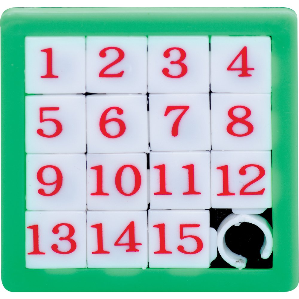
I’m thinking something along the lines of a sliding puzzle game. We shift around to make out the picture, only to scrabble it up and try again once it’s done. Much like the different phases in life.
Pixellating the type is another thing altogether!
Unlike Janson, I wasn’t confident building my own pixel art within this short a time-frame. Especially so since typography was much more intricate than sprites. Thus I took to other alternatives such as Photoshop filters. Tried 10, 5 and then 8 mosaic squares. The last one looked the best when inserted back into Illustrator and traced.


However, 8 squares only applied to Lab Lad. The others, especially Garden of Eden, didn’t translate too well when pixellated and traced back in Illustrator. Maybe my revised designs would be easier to pixellate? If not, I’m also fully prepared to do away with pixels for the title and embrace a slightly more modern old-school start screen design 🙂
[/verbal diarrhea]
Personality Typing (Part 3)
Read the other parts: 1 | 2 | 3 | 4 | 5
I’ve shortlisted the four attributes which I’d like to use for this project:
Researcher | Lab Lads
Florist | May’s Meadow
Art Student | Art Attacks
Alien | Starman
I chose those as each of them (have played?) plays a huge part of who I am.
Joy suggested that their chronological order can be depicted using the transition of colours or the lack-thereof (monochrome to 8-bit to 16-bit to 32-bit). Here’s a picture showing the difference between a 8-bit and 16-bit Mario to aid visualization:

Joy also encouraged me to do a quick study of videogame design. Here are two videos which I found very useful in summing up the history and evolution of videogame graphics. It is actually a five-parts video but I’ll only be posting the first two parts here since they are more relevant to my research. Do check out the rest of the parts if you’re interested!
P/S: I couldn’t embed the videos so please click on the subtitles to watch!
- Most early games were limited to a monochrome display
- Some used colour overlays (translucent sheet over B/W display)
- Galaxian (Namco, 1979) was the first truly successful RGB colour game
- By 1980, colour graphics had become the norm
- Pixels isn’t the only paradigm for rendering, some games used vectors
- Raster is good for complex scenes whilst vector is good for smooth lines
- Sprite scaling was sometimes used to achieve a sense of depth (as with linear perspective, art history ftw hahaha)
- The move to 16-bit then provided more options for pixel design
- Arcades’ golden era ended in the mid-1980s due to the rise of home consoles
- Various types of screen scrolling were also mentioned but I didn’t think it was applicable for this project
- Sprites are 2D images designed to move across the playfield
- They represent the non-static aspects in a game
- Cartoon mascots were the rage
- Sprites are made by plotting pixels, rotoscoping or digitalizing photographs
After the research, I think the complexities of sprites can also be used to signify transitions. That is, if I include sprites in the design ._. Sorry for the huge wall of text. Here are some pictures for your viewing pleasure:
Science


Floral


Art


Space


References
Click on the pictures for individual image source
Personality Typing (Part 2)
Read the other parts: 1 | 2 | 3 | 4 | 5
I had wanted to use pixel art / typography for the ‘hello’ class activity but then my tiny brain, for once, sort of outdid itself and surprised me with a concept package which I thought could be used in this project.
Sorry if my sentences are running into one another. I’m just so excited!!!
Behold, my childhood:


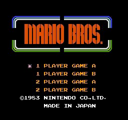

I used to play these with my brothers on our Micro Genius and NES.
P/S: I’m not actually THAT old okay!!! I just super love love love old-school stuff.
I also like how the title of each game is designed to reflect the genre and/or setting of the video game itself. Take Circus Charlie for example, it is set in a circus, which explains the fancy font and colourful starry border. Ice Climber’s a block of inscripted ice which the game character(s) have to break and Battle City is made from the bricks that’s most associated with the game. It’s the 80s-digital equivalent of elemental typography that Zactee had shown us in class last week.
I know these designs might be seen as outdated now, especially so with the crazy advancement in computer graphics (8-bit no more, *cries*). But I feel that their concepts, if paired with more sophisticated designs, can definitely be applied in this project!
Anyway, I really hope to be able to do up something similar for the first project. Now all I gotta do is to think of attributes of myself which can be translated into ‘games’ and then design the individual typography and perhaps some pixel characters or backgrounds to go with 😀
References
Click on the pictures for individual image source
Hello…
… can you hear me?
No, you can’t. Hur hur.
–

1. Typography
All my initial drafts looked pretty much the same – my tiny name at the bottom right corner. The only difference was the fonts used. I had chose a serif font for the first draft because I’m a rather meticulous (some might call OCD) person and can get pretty anal about all the nitty gritty details.
Then, there was also the pixel font for my second draft which I really liked because it’s old-school. Eventually, however, I decided against using it for this class activity as I thought it had much potential to be built upon so I’m ‘reserving’ it for Project 1!
*rubs hands in glee*
Therefore, the final piece ended up looking nothing like my drafts. I settled for using the periodic table of elements as reference because I was previously a Science student. I’d have used Silicon for ‘Si’ and Iodine for ‘I’ but the periodic table didn’t have an element for ‘Q’ or ‘Qi’ 🙁
2. Conceptual
“A woman is like a tea bag; you never know how strong it is until it’s in hot water.”
This teacup design was inspired by the above quote from Eleanor Roosevelt. As masochistic as it sounds, I do believe it makes sense, not only to women, but to men as well. In spite of the pain, I feel that hardships do indeed put people on a steep-learning curve which will make them tougher. Plus I love to drink tea too.
Joy had suggested that I try painting this piece using tea, which I did. However, unlike coffee, tea was too pale on paper and napkins. I then mixed it with a bit of brown poster paint for the final piece.
3. Abstract
We all love what we can’t have and I love autumn! Apart from the beautiful (albeit dying or dead) foliage, and cooling sweater weather, I find its melancholic nature intriguing and a reflection of my personality as well.
The drafts done using markers in class can only be described as lackluster. I also tried painting various abstract fall motifs using poster paint and watercolour but they were all so ugly I felt like shredding them, lol. So shred them, I did!
Then a stroke of genius (?) hit me and I pieced them back by collaging them with an angpow that Freda happened to have. I like the final product cause the vertical umber, crimson, sienna, golden stripe pattern really gives an illusion of maple falling in the woods and the layered effect is reminiscent of piled leaves.
Personality Typing (Part 1)
Read the other parts: 1 | 2 | 3 | 4 | 5
Hand-made Typography
A simple search for “Hand-made Typography” on Google gave me 1,760,000 results and the act of scrolling through just the top five links was enough to make my eyes go all swirly (@_@)
Below are some pieces that I’ve seen and liked:

Kurlansky´s Krazy Kaps, Mervyn Kurlansky
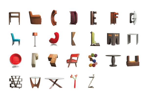


I was especially drawn to typography using found objects because I thought that they were just so clever! It’s amazing how we’re actually surrounded by alphabets hiding in the tools, furniture and even body parts that we take for granted everyday. It goes to show that Art is everywhere, if only we know how to look for it.
Hayrullah Yorgancı

Hayrullah Yorgancı
Hayrullah Yorgancı

Hayrullah Yorgancı

Hayrullah Yorgancı
This series of object typography by Hayrullah Yorgancı also caught my eye. I liked its simple concept, fat font and cute illustration.

Building Success, David McLeod

Toyota: Fueled by Everything, David McLeod

Obscured, David McLeod
David McLeod’s 3D typography is interesting in that he applies relevant textures and forms to successfully bring his messages across.

Whispered Garden Alphabets, Thuy Mat tit
The sheer amount and variety of types was just astounding. There are too many examples of hand-lettering and they are all so beautiful but I can’t possibly put them all here!!! So the above is one of my favourites. I just love the intricate and clean details that makes up the whole font. Pretty! Also, this place is full of typography gold.
Handmade typography has no boundaries. I’ll take a closer look into layout and composition of text next.
References
Click on the pictures for individual image source
Over the rainbow (Part 2)


FINAL


Rational + Emotional = Me (Contradiction)
Thoughts – Indecisiveness = A Better Me (Constructive)
Meticulous x Passion = An Ideal Me (Growth, Fruits of Labour)
Endurance + Courage = Me in Five Years, hopefully (Personal Development)
Over the rainbow (Part 1)


Beneath a Sunny Sky (Part 4 – Final)
Read the other parts: 1 | 2 | 3 | 4
Russian Constructivism (1913 – 1940)
Constructivist art is committed to complete abstraction with a devotion to modernity, where themes are often geometric, experimental and rarely emotional.
Inspiration


Thoughts
I really love constructivism as the artwork is broken down to its most basic elements – the use of bold geometric shapes to create pattern and layout. The use of a minimal colour palette is also effective and relevant to this project. Therefore I settled on using this style for my final four pictures 🙂
FINAL FOUR

Row Row Row Your Boat

The three rows depicted here are as follows:
1. Three rows of spoons (or oars) in the background
2. Marilyn Monroe (row)
3. A group of people rowing the dragon boat
Gently Down The Stream

I layered three arrows and gave them different half-tone sizes to create depth. It also represents entering, or going down into the stream, which has plenty of fish.
Merrily Merrily Merrily Merrily

Or Marilyn Marilyn Marilyn Marilyn (!)
A merry-go-round is also placed by the corner to suggest a joyous spirit.
Life Is But A Dream

Day-dreaming is often described as ‘building castles in the air’. Therefore, I switched the typical buildings seen in Russian Constructivism to three castle towers to represent the idiom. Marilyn also falls into the realm, indicating that she’s living her life in the world of sandcastles and that it is all a dream.
Reflections
Through this project, I got to learn more about Dadaism, Gestalt Principles and Russian Constructivism. Despite loving gestalt principles, I feel that I am unable to achieve creative figure and ground designs and I hope to be able to improve on this for subsequent projects. Russian Constructivism was like a bonus find! I’ve always seen and admired vintage posters with this style all around, but never knew what it’s called until this project came along.
I learnt that referencing other artists’ works is also an important process for achieving their style. In addition, I find that the discussions with my classmates also greatly helped in my design process because after doing too much Photoshop for some time, we tend to lose our focus and end up not knowing what is nice anymore. Also, different individuals have different ways of interpreting an image. By asking more people for feedback, we can then improve our work from different perspectives.
Overall, I’m really happy because I feel that I did manage to push myself out of my comfort zone and experiment with different styles, eventually settling on one that is the complete opposite of my lousy initial drafts!
Click on the pictures for individual image source
Beneath a Sunny Sky (Part 3)
Read the other parts: 1 | 2 | 3 | 4
After the previous exercise, I realized that I’ve been stuck on the first sentence for far too long. A stalking browsing session through other classes’ OSS also gave me more ideas on how to approach this project – such as the interpretation of the chosen rhyme in a different way, or creating a story out of it. Hence, I sought to look at things from a different perspective by coming up with a few stories for the rhyme.
Set 1

A chick travels through the kitchen by rowing its egg-shell boat through a milky river, only to wake up and find that it was all a dream.
Thoughts
Although I started out wanting to use the figure and ground method, I ended up not doing so as I couldn’t come up with any smart designs 🙁 I used simple illustrations and patterns in hopes of creating a cutesy story. But after consulting with a few of my friends, most of them couldn’t tell that it was a chick (they thought it was some sealion hahaha #fail). So I decided to switch to using a more realistic style instead.
Set 2

Marilyn Monroe eats breakfast while recalling her dream of rowing in a bowl of oats (boat).
Process

I thought of using Marilyn Monroe because her last name had a (row) pun. Forgive me, I tried, haha! I wanted to communicate the idea of her rowing in a stream of milk (milk goes with oats) and thus tried incorporating cow skin patterns in the design.

I initially wanted to show a top view of Marilyn rowing in a carton of milk. After adjusting the threshold, however, I found that it resembles the cow skin pattern itself! Eventually, I replaced the carton with a cow using the gestalt principle of closure. I also found that the spoons (or oars) can be seen as the cow’s eyes too!

Most of my friends thought that the oats were pizza (!!!) So I replaced it with a psychedelic background instead, to signify the feeling you get when you just wake up from a bizarre dream.
Thoughts
This is one of my favourite sets thus far. I feel that I’ve challenged myself by going for a style that’s vastly different from my usual kiddy kind. I also love how it turned out! However, the feedback given by my classmates was that the first two pictures seemed like an entirely different set from the last two. That, I totally agree!
So I explored more styles on Pinterest, eventually coming across Russian Constructivism.
It was love at first sight.
Beneath a Sunny Sky (Part 2)
Read the other parts: 1 | 2 | 3 | 4
After researching on dadaism previously, I decided that it wasn’t what I’d like to do for this project. As such, I then proceeded to look for other design styles. Since Mimi had mentioned the gestalt principles during one of her lessons, I thought I might check it out.

Gestalt is a psychology term meaning “unified whole”, and refers to visual perception theories developed by German psychologists in the 1920s. Here are some of its principles:
1. Similarity

People tend to perceive a group of objects as a pattern if they look similar to one another. When similarity occurs, an object can then be emphasized as an anomaly.
2. Continuation

Continuation occurs when the eye is compelled to move through one object and continue to another object. It is usually achieved through the use of implied lines.
3. Closure

Even if an object is incomplete, it can still be perceived if enough of its shape is indicated.
4. Proximity

When elements are placed close together, they tend to be perceived as a group.
5. Figure and Ground

The use of negative space in bringing out the figure above.
Process
Phase I: Inspiration
I feel that the gestalt theory is really interesting as it plays with the human mind and its visual habits. Out of the five principles, I especially like Figure & Ground because despite its simplicity, it effectively engages its viewers and encourages them to spend more time looking underneath the surface. I also love how very clean the designs can be made.


Phase II: Word Association
*see sketchbook*
After getting a little carried away browsing through examples on Pinterest, I came to realize that some, if not most, of the figure and ground designs are visual metaphors or have word associations of some sort or another. So for a start, I generated a list of words in relation to each sentence of my rhyme, Row Row Row Your Boat.
Phase III: Initial Sketches
*see sketchbook*
After which, I came up with a few sketches using the images from the word list, trying my best to incorporate the gestalt principles in them as well. However, it wasn’t as easy as it had seemed! Or maybe I’m just not creative enough… 🙁
Phase IV: Initial Photoshop Drafts
Due to the idea drought in my brain, I still had no satisfactory sketches even after two weeks!!! In class, while all my friends were busy working on their images, I was restraining myself from pulling out all my hair due to frustration, haha. Huizhong and Ruotong then told me to start playing around with some images on Photoshop first and that ideas might develop from there. So I took their kind advice and came up with these:


Yup. So my first set of drafts are based on the word play on ‘row’ and ‘roll’. It’s painfully lousy and I’m not proud of it. Mimi’s feedback for me after seeing these drafts was that they were whimsical (I think she was being kind), but lacking in content (yep).
Through this exercise, I came to realize that I’ve been stuck on the first phrase for far too long, and have been taking it too literally. Although I need to start from scratch again, at least now I’ve got some ideas to improve on. And I can stop pulling my hair.
For now at least 🙂
Click on the pictures for individual image source
Assignment 3: Retelling Myths – Recount
Recount
M18 | Gothic, Mystery | Coming Soon
Adapted from: Vlad the Impaler | Dracula

Logline
The origins of Count Dracula – A Wallachian prince was forced to terminate his Undead wife, losing his humanity in the process, as a retribution for his vicious impalement of a peasant during the war with the Ottomans.
Characters
Vlad / Protagonist / The Wallachian prince who was revered by his people for winning the Ottoman war. He changed his vicious ways after marrying Ilona. He eventually fell into Minerva’s revenge traps and was forced to impale the Undead Ilona, becoming infected in the process.
Mikhail / Antagonist I’s Love Interest / The peasant impaled and beheaded by Vlad during the war.
Minerva / Antagonist I / The wife of Mikhail who was turned into a vampire while on the run from her captors. She sought to seek revenge on Vlad by infecting Ilona and having him impale her personally.
Ilona / Protagonist’s Love Interest / The wife of Vlad who encouraged him to stop his cruel acts. Died of a mysterious illness (infected by Minerva) and became the vampire behind the strange deaths in Wallachia.
Basarab / Antagonist II / The Turkish prince planning to take over the Wallachian throne.
Synopsis
Prologue
During a raid at Novoselo in 1462, Vlad impales a peasant (Mikhail) despite his wife’s (Minerva) pleas. Vlad then approves of his men’s requests to ‘have their fun’ with Minerva. She escapes into a forest only to have a dark figure swop down on her.
Act I
Transylvanians celebrate Vlad’s marriage with Ilona and the winning of the Ottoman war. Vlad agrees to his wife’s request of stopping his cruel acts. They lived in peace until fourteen years later. A pale Ilona tries to pacify Vlad as he rages at a group of healers for not being able to diagnose her. She dies soon after.
A dark figure flits through Wallachia after midnight. It enters a house and lowers a set of fangs over a sleeping man. In the morning, constables remove corpses from the house as Transylvanians gather outside and gossip about all the recent strange deaths.
At a court meeting, Vlad is informed of Basarab’s movements towards Wallachia. He learns of the newest case of death and that the rising distrust among his citizens towards him was the reason few men had joined his army.
Act II
Vlad receives an anonymous tip-off promising him the answer to all the murders on the condition that he brings his two sons to Ilona’s grave unguarded at eleven o’clock that night. Upon arrival, they see a woman with red eyes (Minerva). Handing him a stake, she tells him that Ilona is a vampire behind the mysterious deaths and that the only way to stop her is to impale her. Vlad thought her crazy.
Just as he was leaving, Ilona emerges from her tomb. Having seen their mother, the two boys ran towards Ilona. She kills one of them. Vlad is finally convinced about Ilona’s vampirism. He succeeds in impaling her, but not before being bitten in the process.
Minerva now holds the second son hostage. Vlad pleads with her to spare his son. Through flashback, he learns about Mikhail, and Minerva’s revenge on him by the infection of Ilona. Vlad collapses after his second son dies.
Act III
Prince Basarab celebrates his ascension onto the Wallachian throne. At midnight, the corpse in the coffin under Vlad’s tombstone opens its eyes, showing blood red pupils.
Epilogue
In modern-day Transylvania, Count Dracula turns away from Jonathan after a long survey. In a soft whisper he says, “Yes, I too can love. You yourselves can tell it from the past. Is it not so?”
Thoughts
Dracula by Bram Stoker is written as a series of chronologically arranged diary entries, letters, phonographs and telegrams written by the ‘vampire slayers’. After finishing the book at the start of the year, I was sorely disappointed to find that we don’t get to know much about Dracula at all. My epilogue is a reference to a scene in the book, which was one that almost drove me crazy. That quote in the epilogue had left me craving for his backstory, which was why I decided to write one myself.
Through this project, I wanted to introduce an alternate possibility that maybe Dracula wasn’t evil all along. In his own words, maybe he too used to be capable of love. Just like how Disney had not so recently justified Maleficent’s actions, I had hope to justify his.
Furthermore, society’s image of the vampire have changed drastically over the years. Instead of the frightening attackers that they used to be, vampires are now being portrayed as sexy protectors (E.g. Twilight) due to popular demand. By writing a backstory for Dracula, readers can now empathize with him and choose to believe what they want to believe – that vampires are actually pitiful creatures.
Beneath a Sunny Sky (Part 1)
Read the other parts: 1 | 2 | 3 | 4
Dadaism (1916 – 1924)
“The beginnings of Dada were not the beginnings of art, but of disgust.” – Tristan Tzara
Dadaism was born in Zurich as a reaction to the violence and trauma of World War I. To the dadaists, the war had signified a degradation of social structures such as nationalism and authoritarianism. Disgusted, they rebelled against this conformity of culture, social values and thought by the development of shock tactics of their own. As a result, conventional definitions of art, and even rational thought itself, was questioned.
Fun Fact: Dada sounded the same in every language, and it doesn’t make any sense.
Wildly diverse media and methods were used but techniques more prevalent were:
1. Collage – Pasting cut pieces of objects together (e.g. train tickets, maps, rubbish, etc.)
2. Photomontage – Collage using actual prints from the media
3. Readymades – Manufactured objects turned into sculptures
4. Assemblage – 3D versions of collage
Thoughts
I was rather daunted by dadaism initially because I have always felt that it was a ‘messy’ movement. The fact that it was so intertwined with politics – something I’ll never quite get – also didn’t help. In fact, I even felt queasy after looking at the various works of Hannah Hoch and Raoul Hausmann, both were key figures during the movement.
VON OBEN, HANNAH HOCH
DER KLEINE P, HANNAH HOCH
SIEBENMEILENSTIEFEL, HANNAH HOCH

DER KUNSTREPORTER, RAOUL HAUSMANN

DADA IM GEWÖHNLICHEN LEBEN, RAOUL HAUSMANN

TATLIN LEBT ZUHAUSE, RAOUL HAUSMANN
Although the main colours used in most of their works are complementary, and each collage was nicely composited, I just cannot ignore the jarring sense of weirdness which they exude. Seriously, they give me the creeps! *shudders*
Moving on, I then stumbled upon the works of Jean (Hans) Arp which I really like.
YEUX, NEZ, MOUSTACHE, JEAN ARP
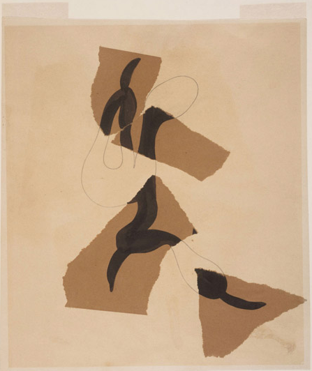
COMPOSITION, JEAN ARP

CRUCIFIXION, JEAN ARP
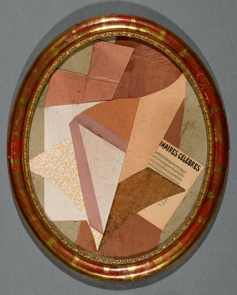
SANS TITRE [UNTITLED], JEAN ARP
I love the composition and the limited colour palette used in each of his works. In addition, Jean Arp’s collages are much more abstract and simplistic, and they give off a harmonious feeling such that I feel a sense of calm when I look at them. However, as his collages are mostly made of chunky shapes, rather than more defined or illustrated subjects, they don’t seem to be good references for this project so I’ll just have to look for more stuff.
What I find most interesting about dadaism is that there are no rules – pure freestyle! One can put together a pile of trash and call it Art as long as they have a symbolical meaning to back it up. This lack of boundary makes me wonder, “SO WHAT EXACTLY IS ART??!”
And I guess that was the main idea of dadaism in the first place!
References
http://www.theartstory.org/movement-dada.htm
http://www.moma.org/learn/moma_learning/themes/dada
http://www.nga.gov/exhibitions/2006/dada/cities/
Click on the pictures for individual image source


Assignment 2: Sequencing Images with Text – Teal Blues

A Garang Guni truck finally plucks up enough courage to confess to his crush – a racecar.
Thoughts
This project had been a struggle for me. My brain simply refused to produce any original story no matter how much I had tortured it.
A week later, inspiration finally struck after listening to Super Mario by Hebe Tien. The song is about an ant nursing a crush on a cat (!!!) who lives opposite the street. Understandably, the busy road between them stands as an obstacle that the ant is unable to cross. He then takes a stroll along his side of the street, which eventually leads to a journey of self-discovery.
Now that I have a story, I found myself without a suitable subject. Having only 20 images to work with, I needed to portray an instantly recognizable obstacle between two characters, and human actors just wouldn’t do.
Then one day, while playing with my nephew, it occurred to me that I could use a few of his massive collection of toy cars as the subject of my story. It is a universally known truth that trucks can’t match up to sports cars in terms of speed! And with that, Teal Blues was formed!
I had purposely ended the story without Sylvia’s answer because I felt that what really mattered is that Teal had finally accepted himself for who he is (slow, but hardworking) and had plucked up the courage to confess. Therefore, yes or no, Sylvia’s answer did not make a difference to Teal’s character development. Realistic or romantic, I shall leave it to you to decide 🙂
Assignment 1: Picture Story – Curating Self

Task 1: Me
Who am I?


I am an immensely private person – though I long to be understood, I enjoy coming across as mysterious as well. Despite constantly thirsting for adventure, I frequently find myself not daring enough to venture, choosing instead, to observe the outside world from the comfort of my safe haven. I guess I’m just a typical wallflower. And perhaps, a huge mass of walking contradiction.
Task 2: Object and Representation of Self
“A reader lives a thousand lives before he dies; the man who never reads lives only one.”

The object that I have chosen is a book simply because I love to read. Books are, in essence, free travel, wise mentors and the most constant of friends. I can go places, learn lessons and meet people with them.

When life gets too overwhelming, books transform into portals, providing me with a temporary escape to the fictional world for a breather. They are, in other words, my source of comfort.

Through the Looking-Glass by Lewis Carroll is one of my favourite books.
Task 3: My World
“People are like teabags. You never know how strong they are until you put them in hot water.”

Seeing as the object that I have chosen is a book, it must come as no surprise at all that my choice of venue is a library. Not just any library, however, but specifically the one in Singapore Polytechnic.
We all know that SP is the first polytechnic in Singapore. Thus, most of its architecture is extremely old, if not ancient. The main library is no exception. It is filled with nostalgia – generations of students have came and went, new books have been mixed in with their old counterparts, only to become aged themselves as the years go by. The library’s quaintness is precisely what draws me to it.

This is the stairway leading to the science corner of the library, which is where I used to belong. Evidently, it isn’t the happiest place to pass by every day. I’m pretty sure the school librarians have realized that too, for various motivational posters have been put up along the stairway, perhaps in hopes of lifting students’ morale. The poster featured here is my absolute favourite, and I can’t help but wonder, how many students had it motivated throughout the years?

This is the design and architecture level, the newest part of SP library and whose renovations were only completed during my final year in school. I was always super excited to visit this space because as a Science student then, I have always felt like a rebel whenever I came here to browse the artsy books. I guess it was this place that marked my transition from the Sciences to the Arts. That is why I love SP library.


Piu, piu, piu


The bullets halted in their tracks the moment he held out his palm.
“You can’t hurt me, I’m invincible.”