Object and Representation of Self – Research

Hello World!

This is a story of adventure, suffering, and a lot of mosquito bites.

This is a story of how I worked on this assignment. 

Conceptualization

I have always been inspired by the works of Kyle Thompson, by his color tones, concept and editing. I found his photographs almost film-like that evoked a sense of nostalgia and his warm/purple tones evoke a sense of make believe. Though his concepts are much more surreal than I can attempt in this assignment I aimed to capture his storytelling skills through something less surrealistic.

Untitled by Kyle Thompson

Another artist I take inspiration from is Wes Anderson

Still from Moonrise Kingdom, Wes Anderson

I always enjoyed his sense of discipline to commit to a visual style and how he creates visual interest through creating depth, color and space. After writing a journal on his visual style, I took inspiration from some of his cinematography and put it into some concepts.

I then started to brainstorm various objects that had meaning to me. I had to keep in mind various elements like – is it doable as a concept, visually interesting and significant to me. I narrowed down on my childhood binoculars because it fits all three criterion and was also a prop I was curious to explore, and also partially because my cat is not a cooperative prop.

My ideation pages

I planned my shot with reference to my visual artists and inspirations and focused to vary three things – shot size, angle and subject size. The shots I’ve planned included close body shots, unusual cropping and a mix of high and low angled shots.

I split the images into three concepts. Play tells the story of childhood exploration, the thrill of discovery and fun. Explore tells the story of fear, reluctance, mystery and adventure. Discover is about amazement for world that I made believe and the destination of the journey. The final concept after shoot was however, much different.

Preparation

The prop: After rummaging through my room to find my binoculars, I noticed that it still retained its brown dusty army look – I thought the colors removed the element of make believe as it appeared toy-ish, so I pestered my senior for his gold spray can and proceed to turn it antique gold, much like a real explorer. I mean, the sense of adventure were real to me as a child and I aimed to capture that, so I thought it was a big element to put in that bit of effort for. I taped some parts so that it was not entirely gold, because according to mister google, the ones explorers used wasn’t entirely gold. Well, okay mister google. 

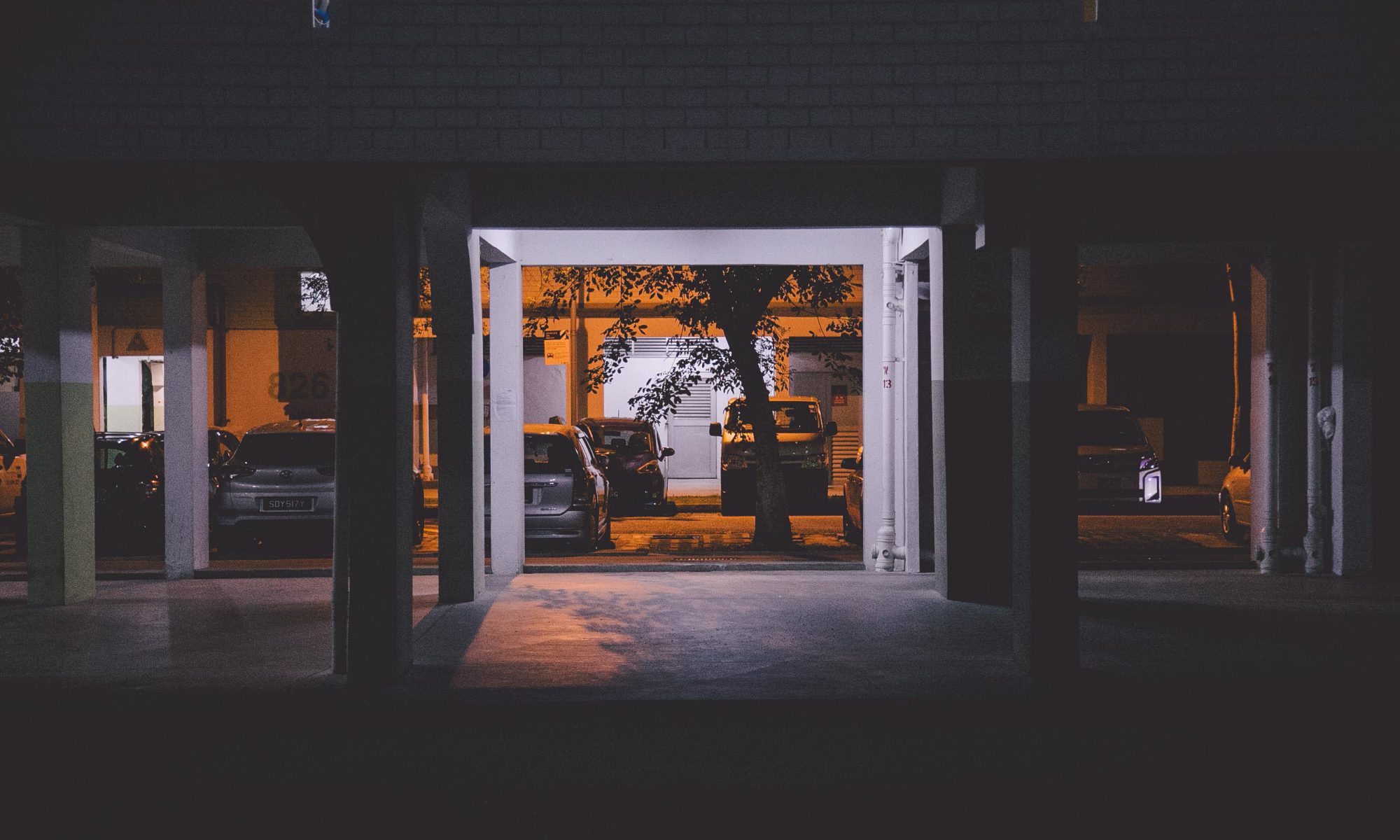
The world: On the way out of NTU one day, I noticed there was this huge field and nature just outside of campus, filled with towering trees and unobstructed view of the sky. I decided to use this as my backdrop for this project as it captured the imagined world.

Execution

and thus begins my losing battle against prickly grass
and a swarm of thirsty mosquitoes

On a weekend, I set up a tripod, hooked my camera up via bluetooth, and began shooting. It was a LOT of trial and error – getting the focus right, my posture and expression, my body language, framing and all. I made various impromptu shots along the way, but after two tiring hours in the blazing sun I returned with 400 shots to sieve. I rewarded myself with two cups of ice-cold milo that day.

Post Production

I adapted the style of Kyle Thompson with a hint of Wes Anderson. This included slightly warm hues, brightly lit images and earthy tones to evoke a sense of warmth, nostalgia, make believe and a connection to nature.

Six rejected photos from the concept

I edited a total of nine shots from that day and further narrowed it down to three. Through the use of elimination, I settled on three.

In summary, some were not too strong on story, some evoked the wrong mood and some just don’t show my toy well enough.

1. I figured this shot was bland and did not seem to evoke a very strong story. It seemed to emphasize the space more than the prop
2. It didn’t show a sense of joy or wander in this photo – it did not seem to fit any concept as I wasn’t smiling. Why must I look so grumpy in photos. 
3. This was an impromptu shot I did, though I liked the sense of wonder it evoked, it did not seem to convey it as strongly as I hoped.
4. This was a shot I liked initially but after consultation it was brought up that the prop was not very clearly seen.
5. This, to me, was an interesting crop though it show the personality of the prop, it did not convey as strongly the connection to it with me.
6. As I was facing away from the camera, it did not show my emotional state with the prop, though it spoke strongly of a story, it lacked emotion.


The next day I ventured into one of my secret worlds left alive in search of the same feelings I had as a child. This however, was a more impromptu less planned process. I figured capturing an essence or vibes of a place should be done on location than pre-planned however I had the crux of my image in mind when I was shooting such as.

1. It is visually interesting or unique in framing?

2. Does it show calmness, inspiration and magic in the image?

3. What emotion can I draw from the image?

Visually, the inspirations were much the same – of Kyle Thompson and Wes Anderson. I looked for symmetry, simplicity and a little bit of magic in the frame.

Overall, I really enjoyed documenting the images – it was an interesting look into how some photographers and cinematographers inspired the style I have today, and it’s also a nice #throwback to my childhood days again.

I apologize if I was too rambly. 

Okay bye. 

Object and Representation of Self – A look into Kyle Thompson

Untitled by Kyle Thompson

Have you ever looked at an image and wonder, “dang, how did he do that?” That was the very first thought that came to my mind when I looked at the various works of Kyle Thompson.

Kyle Thompson, born in Chicago on January 11th, 1992 is a conceptual/surreal photographer that captures images in abandoned forests, houses and sometimes icy cold rivers. What started out as therapeutic self portraiture works quickly captured the awe and amazement of people around the world for his creativity, surrealistic and magical element in his pictures.

I have always admired this type of photography – they are not too whimsical and have a certain realistic/probable feel to it. Combined with his film-like editing and simplicity, his portraits have shaped and inspired the style I do today.

Here are three stylistic decisions I chose to adapt from his photography.

1. Imaginative 

I have always believed to capture the mind/heart, you must first capture the eyes and interest of the audience. I’m a firm believer that once visual interest is present, people will take a nice long look at it to figure out the story … or they’ll just think ‘which parts are photoshopped’. Hopefully the former.

Kyle Thompson achieved this through making his images, firstly, of course, well shot – it doesn’t appear photojournalistic, blur or abstract. Secondly, he captures the imagination of the viewer through his impossible, yet possible, images.

Untitled by Kyle Thompson

This photo, at first glance, you will wonder – did he really just set himself on fire? Well – no. It’s obviously photoshopped for starters. But the fact that you take intrigue in looking at it, allows you to either spend a few minutes thinking – ‘how did he do it?’ or look into the story of ‘why did he do it?’ The image does not look too impossible as the fire do look realistic, and he the fire is in a way … diegetic, it’s not levitating in the middle of nowhere, it is burning something that can be burnt. This plausible response adds believability to the image.

2. Film-Like Editing


Untitled by Kyle Thompson

Another stylistic decision is his film-like editing. Majority, if not all, of his images uses a split-toning look that turns the highlights slightly teal and his shadows purple. This lets his images evoke a sense of antiquity and his slightly purplish hues adds a sense of whimsical magical look to it.

In recent days, the whole vintage camera look have been really in trend for his olden, faded look, and achieving it digitally just adds a sense of nostalgia that people seem to be fond of. Slightly aesthetic than metaphorically, honestly. 

Untitled by Kyle Thompson

Perhaps another reason he chose to adapt the film look is to remove the idea of ‘perhaps this is photoshopped’ so that the viewer is put to believe he really did do those crazy things. 

3. Wide framing

Untitled by Kyle Thompson

Lastly, his choice to frame his subject (majority of times, himself) adds a sense of space and give a sort of meditative-vibes to his images. They’re not particularly suffocating or claustrophobic, and I really appreciate this because it allows me to look at it therapeutically. It also allows him to build a sense of space as his images show the environment, usually abandoned places, and adds the element of magic in the image, almost like a fairy tale scene.

In summary, there are various elements that Kyle Thompson uses to build visual interest and a sense of magic to his images – apart from the core of the image which is a surrealistic and impossible element, there are other stylistic decisions he makes that adds to the visual interest.

Also, if you’re wondering why majority of his images are untitled, it’s because he believes not adding a title lets the viewer draw their own story, not because I couldn’t find the image title – really. 

okay bye.

My Line is Emo – My first Mark Making Lesson

Hello World!

Today I learnt how to make fancy schmancy print with linocut and experimented with various techniques. I decided to focus on one part of my assignment – rice and how they made me feel (but a full story on that another time).

I began  experimenting with different mark making methods, starting with manually pressing the rice onto newsprint by hand, then by using a roller. The results were very faded and sometimes the rice shifts around and it printed twice. It created this ghostly effect that I was initially not fond of as it made the rice spooky.

I then decided to experiment with the pressing machine thing (which I now do not recall the name of, so let’s call it a linocut pressing-inator) and this created a more solid print which really shows the rice’s shape, and also crushed some of my rice grains (rest in peace my little friends).


Row 1 by machine, row 2 by roller, row 3 by hand. 

I started to appreciate the hand-pressing method as it conveyed my mood better and that faded look seem to tell more of a story than a solid smashed rice look. This three prints, of course, came after many trial and errors – there were various other exploration with chinese ink, acrylic and block printing paint, which are in my sketchbook.

Secondly, I experiments with linocut. I have not been the best at crafts, but I guess that’s the fun of experimenting – you’re allowed to be bad at it… right. But I created little rice prints on it before putting in under the linocut pressing-inator the result is a little splotchy stamp with loads of negative space – at first I was a little irked by the little splotches of white and the parts that did not transfer properly, but my professor said to embrace the little flaws. and eventually I came to like it.

My classmate said it looked like raindrops (when I kinda intended for it to look like rice) but then, same same lah.

I learnt to about various other mediums that can create interesting print and how there are so many variables that come into play when mark making – firstly the tools are not just confined to brushes, pen and markers – some of my classmates experimented with leaves, branches, sponges and even their own fingers! I learnt that mark making is as wide as your imagination and with that I learnt to be inspired by things around me a little more – how seashells have their own unique markings and how leaves when pressed create prints that resemble fireworks.

I also learnt that the material you work with also affect the look – newsprint is a lot more absorbent than drawing block. I was also suggested to experiment with white cloth or paper towels – which I think will be really cool. Understanding how each and every base reacts to your material lets you create more beautiful prints too!

Lastly I learnt art is about having fun. As a child there was always a curious and creative side to me that is lost over the years from trying to create interesting and aesthetic art. I really like this project cause it lets me go back to my childhood days where art was play and not as stressful.

It feels great to be excited to create again. 

Okay bye.


Pandora’s Box – Bus, Dinosaurs, Caps and Tanks, oh my!

Hello World!

3D INTERESTING OBJECT

This is Toby the Bus, he keeps all my one dollar coins I’ve hoarded – I mean… collected… because in hall, one dollar is life – it gets you coffee from vending machines to last through class, it is your emergency money supply for late night suppers, and it allows you to use washing machines and dryers to wash accidental paint stains you’re too lazy to wipe.

Personal usage aside, I found it three dimensionally interesting because it’s simple but has lots of details on it. I was tasked to look at it from a 3D artist perspective and note the details that gone into making this a design. This is my findings:

Dominant (D): The opaque red shell.
Subdominant (SD): A contrasting transparent windows.
Subordinate (SO): The details in the wheels, the bumps along the shell and the white line that cuts across the bus.
Features: A convex shaped shell, eye-catching red (which shows presence), Void at the side (visible in front) – approximately 5 percent void, 95 percent mass , symmetry along principle axis, Textured bumps on the side of the bus, proportionate and made of similar volumes.

PANDORA’S BOX

I was assigned the theme of Asymmetry.

Asymmetry
adjective
with two halves, sides, or parts that are not exactly the same in shape and size

Contrary to what people think – I’m actually struggling,
that smile is just cause I’m trying to remain optimistic.

I played around with putting blocks off center, and ensured the 3 elements of D, SD and SO is visible from all 3 viewpoints whilst still being asymmetrical from all sides.

These are my three new friends I’ve made!

This is Amy the tank. She likes long walks on the beach and destruction. This is was the first ‘sculpture’ I designed – with it comes some learning points.

Firstly, I put the concept of D, SD and SO into practice. I learnt that the difference in dimension/length of the three objects should be significant from all three perspective (meaning the length, width and height should all be significantly bigger or smaller). From this I noticed the difference is visible from the top, but from the side and front the SD and D gets jumbled up.

I also learnt that the placement of the SD, D and SO should be visible from all sides, I did various trials and errors flipping the box around and settled on this placement.


This is Bob the dinosaur, he doesn’t like meteors. This sculpture took learning points from previous figure and made improvements.

Firstly, I explored with depth, I placed objects in front of the other, jutting out slightly from the edges and this created an interesting composition, it made squares and rectangles have little indents and added depth.

I learnt to be more decisive with where I put the blocks as design is about specificity. For example, if a block is meant to be on the lower third, it should be on the lower third and not tether between the third and half. I learnt from analyzing real life objects such as wristbands and lipsticks that where you put SDs and SOs either adds symmetry or adds visual intrigue.

This is Calvin the hat, people think he’s shady because he’s always on top of things. With this sculpture I experimented with making something different from the previous two, whilst still remembering my previous learning points.

I played around with the placement of the D, SD and SO. In previous sculptures, the SD was put on D and the SO was put on SD. This sculpture, SD and SO rests on the D. I noticed that this added less intrigue and instead made it look the D much bigger than it looks.

Remembering my learning point from figure 1, I made the difference much more significant between the 3 blocks, the result is a clear D, SD and SO in all three views. I also remembered to be decisive and placed the SD on the top third and SO on the lower third.

Reflection

My three new friends have taught me
1. The difference between D, SD and SO, how they should be three dimensionally different and how SD and SO add detail an depth to the D.
2. To be observant to where I put the SD and SO, there are many ways to place these details – but it should be on purpose and decisive. Cutting the D into parts such as halves, thirds or even quarters allows structure and a purposeful design.
3. And most importantly, to explore design – a design can be interesting the first time, but upon closer analysis there are a million ways to put things around, and this makes 3D art endless – and this is just boxes to begin with!

Okay bye.

Object and Representation of Self – A look into Wes Anderson and Stanley Kubrick

Hello world

When I learnt about tone, depth and perspective in week 2, I was introduced to two film directors, which their style intrigued me – Wes Anderson and Stanley Kubrick.

I’ve always been intrigued by simplicity and minimalist concept in cinematography, and there’s was something about the two directors’ style that I was especially fond of. So I decided to do a little exploration about their filming style. Low and behold, they both share much similarity in style. A lot more than expected, actually.

1. One Point Perspective/Symmetry

A Space Odyssey, Stanley Kubrick 
Moonrise Kingdom, Wes Anderson

It is quite apparent that there is a strong similarity in terms of symmetry and one-point perspective in these two films. Whether it is the protagonist standing in the center of the frame on a simple landscape, or two rivals seated on an armchair equidistant apart, these two directors create interest through cleverly finding symmetry. Through exclusively shooting in one point perspective the directors create interest by using the space than characters to keep the frame interesting. I realized through one point perspective is that there is an appreciation of space and creates a theatrical vibe to the films. Also depth is created through foreground, midground and background for example in the above screenshot for Moonrise Kingdom, the horizon is in the background, the lighthouse is in the midground, and the protagonist is in the foreground. However it is not only through depth but also play of camera, such as this glorious scene.

2. Theatrical Blocking

Clockwork Orange, Stanley KubrickMoonrise Kingdom, Wes Anderson

Another common trait both share is the unusual blocking of characters that is almost theatrical. If a character is the focus on the scene, the opening shot features them in the middle or at least bigger than the others. When a new character is introduced, they disrupt the symmetry by entering the scene and somehow assimilate back into the director’s distinctive symmetrical style. I was so intrigued by it – the discipline to commit to the one-perspective shots and yet creating focus through playing with blocking, size and color.

3. Vivid Colors

The Shining, Stanley KubrickGrand Budapest Hotel, Wes Anderson

Perhaps one of my favorite things about these two directors is their usage of vivid colors. They create contrast between space and character through juxtaposing their wardrobe’s color against the color of the background. The way they grade their shots also puts this point in play – such as grading it to be more pastel-like, more saturated or just increasing the tone of one specific shade of color.

Overall, what makes me so interested in these two directors is summarized into one word – discipline. The discipline to stick to a certain style and find various ways to overcome the obstacles that come with it and to not break their distinctive style across various films. People have always associated flat images as boring, no visual interest and lacking in depth. However, there are so many other elements that can be used to build interest and having a flat image even accentuated these decisions and these two directors show that in art, once the rules are learnt, the rules are meant to be broken.

————-

In other news, after learning a little about how sound, I’ve decided to do a quick edit of exploration with diegetic and non-diegetic sounds to build mood atmosphere and tone. What better way to show what I’ve learnt that put it in (a very quickly edited) application! Enjoy!


4D – Class Assignment 1 Perspective

One-Point Perspective

This perspective gives an image a symmetrical, almost painting like look as brings forth the ideas of an “as-is” look. I find this works well to emphasise space.

Two-Point Perspective

This perspective encourages depth and brings a focus on the center of the image. It also allows symmetry however the strength comes in bringing focus in the subject located at the center. It also brings out the depth of space. Moving from a one-point to two-point, there is an emphasis on a subject.

Three-Point Perspective

Three point perspective emphasises height of the subject. It brings forth the idea of making something look more taller or shorter depending the angle. It gives the image a personality from a viewer perspective – either a towering powerful figure or a tiny minion to a king.

Also iPhone cameras make my photos wonky.