As this was told through the eyes of a neutral party, Siri – we see how situations play out “as-is”, such as the phone conversation between Raymond and Rachel, without the interference of Siri and the list of messages with rejected grab requests. We see how Raymond is as a character and derive our understanding of who he is from a non-bias perspective.
Characterization
Here we see how Siri’s personality comes into the story. We witness how Siri’s auto-correct system contributes an air of non-violence to the situation. Also, similar to Athirah’s interpretation of Raymond, we see how his dislike of profanity comes into play this scene.
Reflection
It was a fun experience working with an unfamiliar software – aftereffects. As a film major, the first instinct of it was to pursue a main character’s POV through a short film narrative, however I took this assignment as an opportunity to explore something outside of film. It turned out to create something unusual which was exciting for me and taking this assignment as a comedic experience rather than a serious one, I had the freedom to exaggerate, make it ironic and push comedy further to create this film
When we decided on the story we started to think about characters apart from those involved apart from the main characters – the passanger, the driver and the other passanger. We thought about who else could we feature and we decided to choose an inanimate or a omniscient character.
We thought since the entire conversation took place over text, we decided – hey why not Siri? and thus the fourth character was born.
I thought about the tone and voice of Siri to be more neutral and omniscient. However, it was feedback that being omniscient was not enough to create a compelling character. Giving Siri no voice was a challenge as it was one less method to give character to it. I thought about how Siri could influence the story and decided on something very commonplace – the auto correct system in text messages. I gave siri a voice of non-violence and allowed audience to see Siri to have a peace-loving nature, thus that’s more character to him.
PROUCTION
Our group set out to shoot the scene (even though it wasn’t really featured in the final edit), and we thought it’d be comedic for it to be low-production budget. So we got a friend, who looked suspiciously ahbeng, to act as Raymond.
I shot while Athirah directed and Christianne was playing Rachel. It was … interesting process but there was a lot of experimentation involved with the shoot as we had the challenge of not being allowed to move or drive the car with some camerawork.
To see the final outcome from the shoot, see Athirah’s or Christianne’s OSS!
Post Production
I first created the ‘bases’ that I needed to animate; the message screen, lock screen, inbox and a all-purpose ‘base’ with photoshop. Then I imported it into aftereffects and animated the graphics. I used AE to create the typing animation as well as the speech bubbles.
I then exported from AE to Premier to work on sound design as well as fine tuning the animation. Including the voice overs, the sound effects and the background hums.
If you would like to see the final edit. Click here.
Doing the film from the perspective of Siri, I realized that the best way to show this was through the perspective of the phone and I looked into short films that utilizes the interface. So, I turned to what youtube has done before for stories and shorts done through the perspective of the phone.
And I learnt from looking at the films that they use a few interfaces.
Text messages
Group texts
Lock Screen/Home Screen
Interface notifications
I decided to push it further by utilizing phone calls to add more depth to the story rather than make it more like reading.
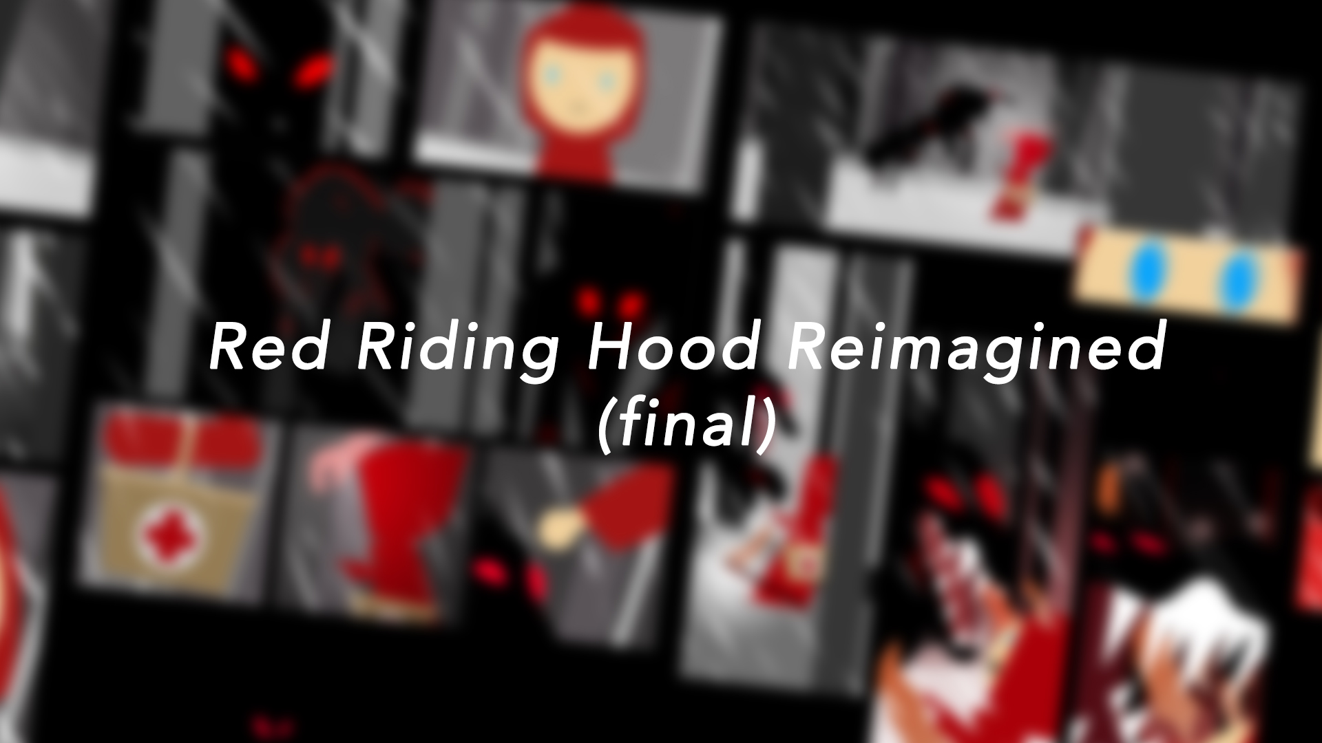
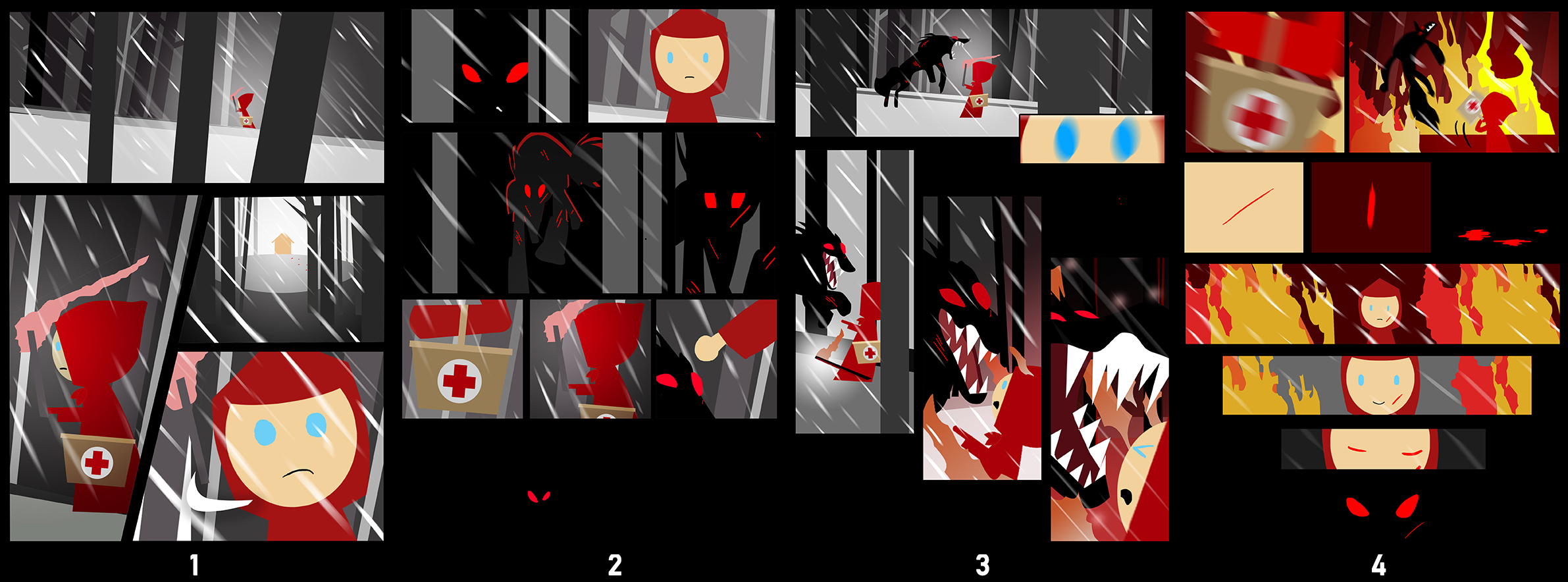
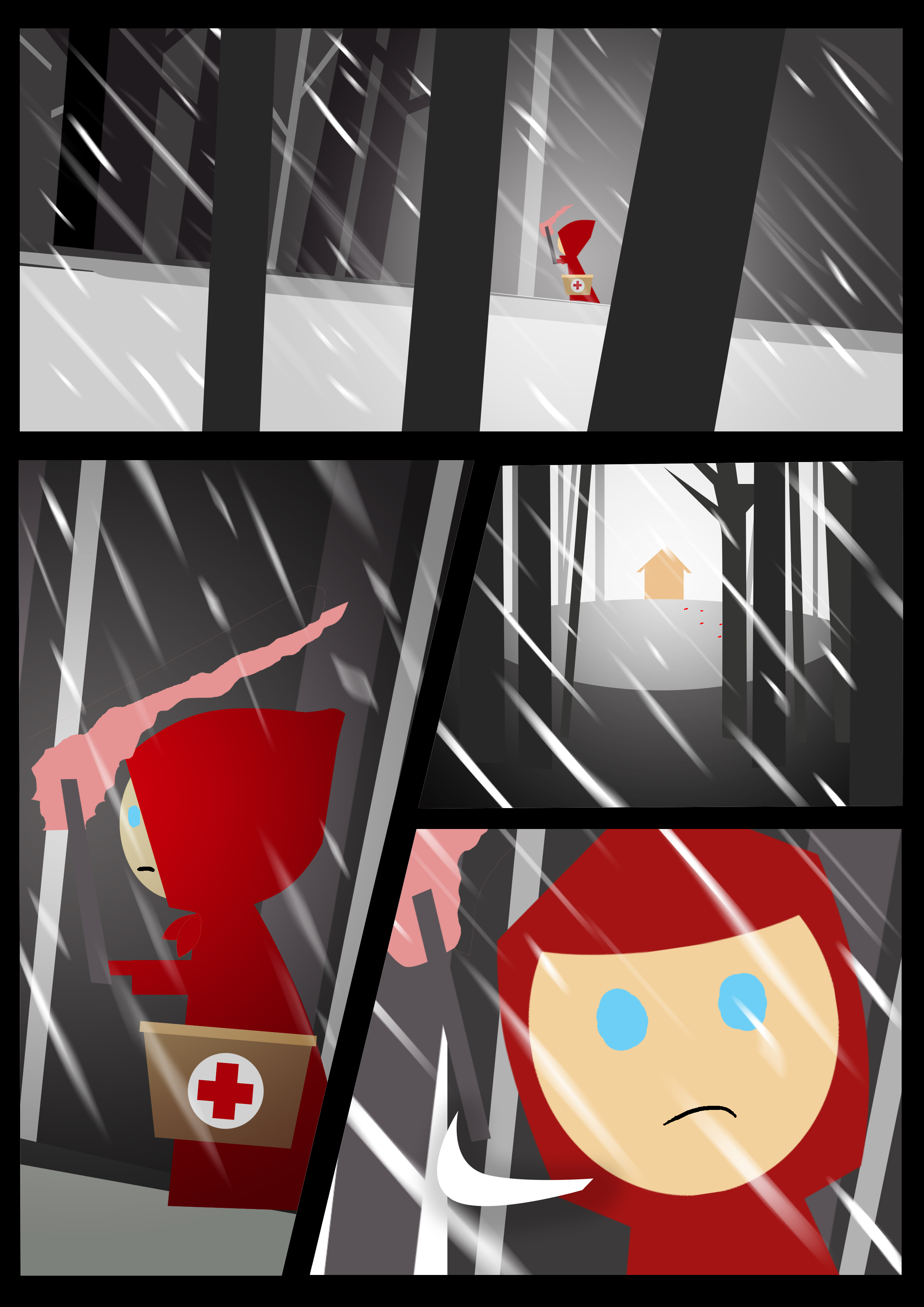
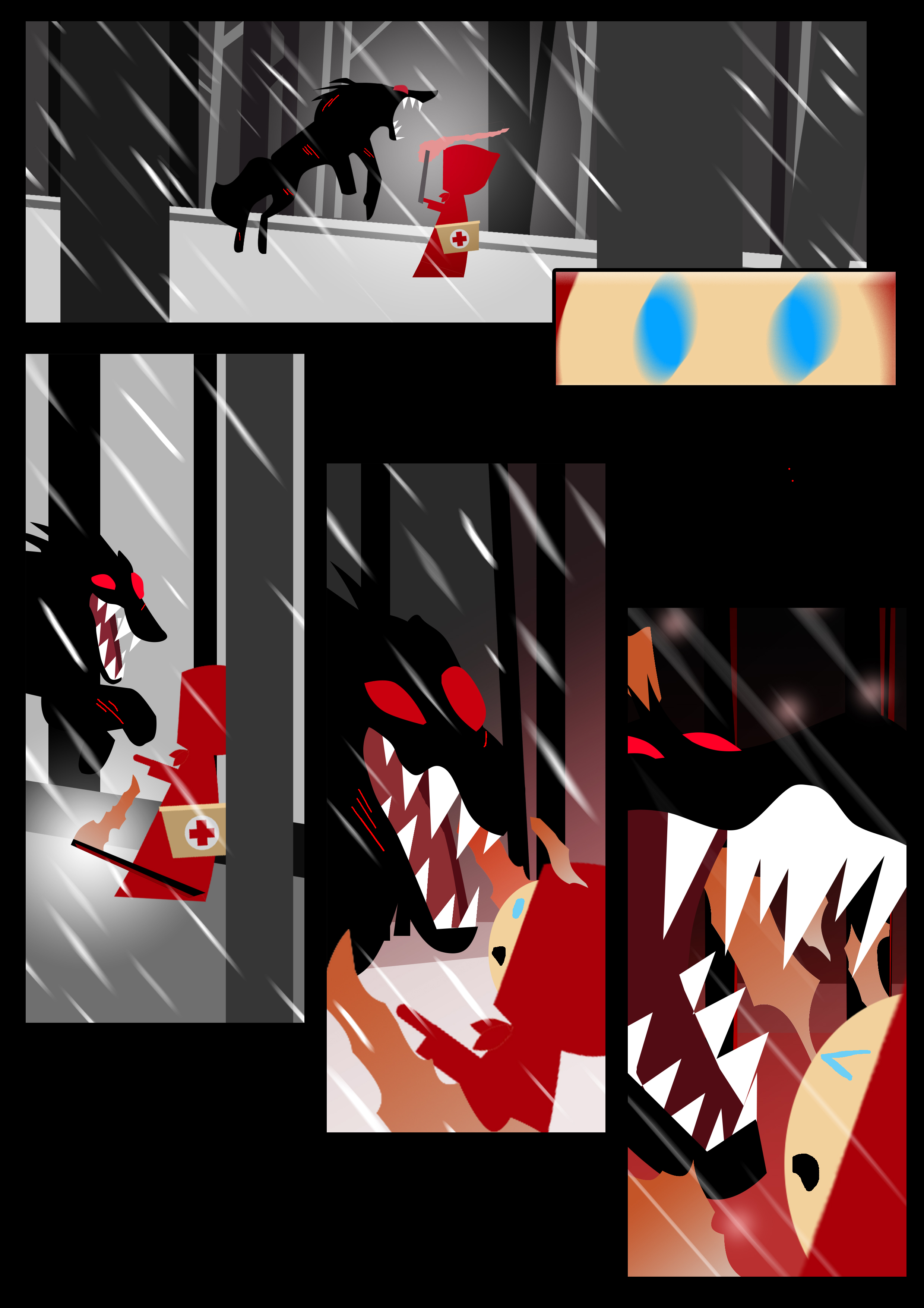
This comic tells a story of Red Riding Hood in her adventure to her grandmother’s place on a snow storm (that’s why her grandma couldn’t get out of the house, I suppose). The snow storm creates a blanket of darkness so Red Riding Hood had to carry a torch to see.
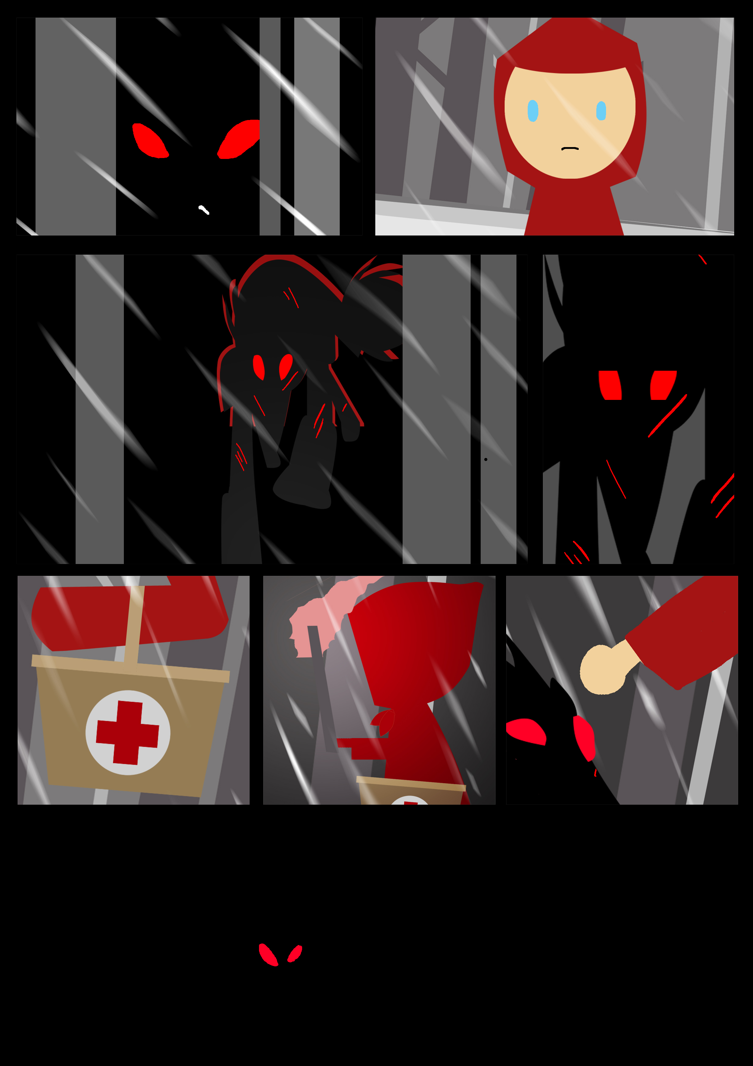
Feeling watched, the looks into the bushes to see an injured wolf. Being a kind-hearted individual, she tries to nurse the wolf back to health, but feeling threatened the wolf attacks red riding hood.
But in her quick thinking, she swats the wolf away with her basket but not before the wolf manages to leave a scar on her. Realising what happened, Red Riding Hood gives a smile before she comes a wolf.
It was interesting that a friend pointed out what if the wolf was the grandma so I added bloody footsteps in the top panel to imply the wolf had already attacked the grandma, or perhaps, the wolf was the grandma?
When I thought about this assignment, I wanted to pursue a minimalist simple style as I felt when it comes to comic, little things are the ones that convey the emotion, whether it’s the posture, the foreground and background or what you choose to show and don’t show. I felt with a minimalist approach, there is emphasis on what is seen, unseen, placed in foreground and background and what are the color schemes I use.
I was very inspired by the sort of simple animation that was juxtaposed against the 3D animation of kungfu panda and studied how they created transitions and used a very simple color palette of red, black, white and orange to convey the mood of the scene.
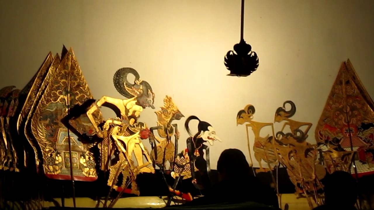
I realized that they took inspiration from Shadow puppetry, and more specifically, that of Wayang Kulit (a form of shadow puppetry in Indonesia).
I looked at some example of Wayang Kulit on youtube, and studied how they conveyed storytelling through something as simple as light, shadow and the difficulty of not having a lot to work with
With that, I started drafting ideas on my storyboard.
Having no experience in comic drawing, I realized I had difficulty in the very first step of comic drawing – the panels. I had a lot of questions in my head.
1. How do we determine the size of the panel? Is there a reason why some are big, small, long or short? What about those that cover one whole page? why?
2. What’s the significance of diagonal lines in a comic? What about curved lines? Why do comics do that?
3. How do we plan the comic panels without knowing the whole layout? Is there enough at the start? or is it too fast at the end?
There we so many questions, and after consulting my classmate (Hi, Claire), she told me that it comes with planning and reasons for such decisions are mostly dependent on the style of the comic artist.
She told me diagonal lines might imply movement or to add some motion to the page, diagonal lines are also something of visual interest. She also told me bigger important scenes require bigger frames, smaller panels are to die scenes together so that it makes logical flowing sense.
So, me being curious me, started to look at some examples of comic panels.
Interesting.
I then drafted out how I plan to do my comic – this was a painful process, really. One moment, I had one entire page empty, the next I had the head and tail but no body and the next I had blank panels. It was excruciating but I manged to get my panels out in 2 days.
I then thought about color schemes – something as minimal as drawing being a challenge, now I had to think about colors? What.
Ultimately, I chose these colors – because … I liked the harmony of it. It’s simple and from this color scheme I could already decide what color and what I wanted my elements to be.
Inception (2010) dir. Christopher Nolan
Winner of Academy Award Best Cinematography in 2010
Mise-En-Scene Elements
1. Setting and Props
Bottles of chemicals in foreground and background implies his job as a chemist to create sedative.
Set in a medicinal shop, further establishing his job.
Set in a slightly rundown location instead of a slick clean white hospital, implies his financial status as not the most successful chemist/medicine dispenser.
Organised bottles, implies his neat and meticulous personality.
Cat on frame left – metaphorical for his independent and intelligent nature
2. Costume , Hair and Make up
Slightly bushy hair and simple jacket – implies he is above middle classed in financial wealth, but not the highest
3. Blocking, Facial Expressions and Body Language
Remains seated, implies his power as equals to the character he is talking to (Cobb, in this scene)
Comfortably seated – implies he is comfortable in the relationship.
Fingers interlocked is a subtle body language of his secretive nature.
4. Lighinting and Color
High-Key lighting, low contrast in the lighting.
Shadows in various parts of the frame metaphorical that there are secrets around the room
Warm tones to imply a homely feel to the shop instead of an industrial or clinical look.
5. Arrangement of Elements in Frame.
Diagonal lines brings attention to the character.
Framed at lower right third of the frame, building visual interest
Cat on frame left is not a subject of the scene but rather a foreshadowing or metaphor of his character.
Bottles, paper and stamp on his table implies he was mid work before scene (maybe he’s a busy man?) or he is just messy (like me, haha).
I used digital compositing and manipulating to combined all the images together. The images I used are captured from camera and then put together with photoshop to create the composite.
I borrowed the hands of my friends and screenshots from the app to create the images. In case you’re wondering, yes, the guy in the shirts is me.
FINAL OUTCOME
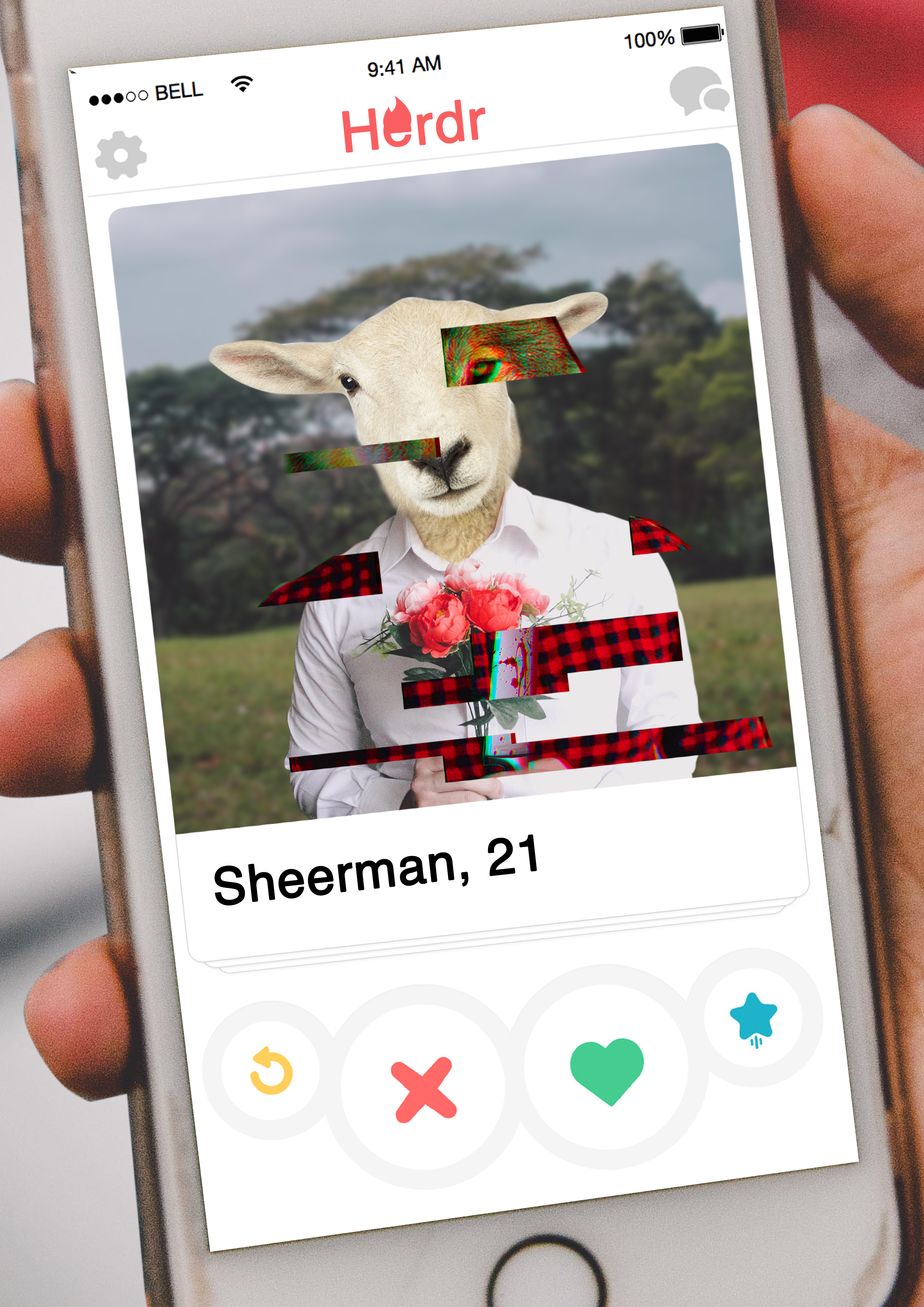
I built on my previous assignment concept of the fable of Wolf In Sheep and introduced colors into the frame.
These two comic panel tells the story of a wolf who lures unsuspecting sheep with this Herdr profile of a charming young and sweet sheep. Once he agrees to meet them, he lures them into a romantic candle lit dinner where he attacks and then dines on his unsuspecting victims.
The first frame is a developed concept from the previous assignment. This frame tells the story of an innocent viewer looking at what seems to be a nice young sheep. However, glitching out – it features the true identity of a malicious wolf.
It features a lot more mise-en-scene than the previous (as per feedback)
1. White Shirt – Represents purity and innocence. Also matches the pelt/wool of the sheep.A shirt is a lot more formal, proper and smarter than a tee shirt. 2. Red Flowers – Juxtaposes against the white shirt, represents love and romance. Which is what Herdr (the animal version of Tinder) represents. 3. Sheep – Represents innocence and naïveté. 4. Wolf – Represents malevolence and juxtaposes the innocence of the sheep. 5. Red Shirt, Knife and Blood Stains – Emphasizes the underlying violence and death.
This panel shows viewer and the wolf over a candle-lit dinner. The viewer sees an empty plate, but the dimly lit situation seems a little eerie. Oh, is that blood stains or ketchup on his shirt? Hmm.
It features the following mise-en-scene elements. 1. Red Shirt – Emphasizes violence and adds an uneasy vibes of malevolence. The similar red shirt from the previous panel lets the viewer draw the connection that this is the character we thought we saw. 2. Heavy vignetting – Builds an uneasy feeling as the viewer is forced to draw everything from what little he/she can see. 3. Wolf head – Emphasizes the person sinister character. 4. Empty plate – It adds a sense of uneasiness to the frame, there is a dinner plate, but why is it empty? Maybe because the viewer is what’s for dinner?
Reflection
This is was quite a fun project, I took most of the elements from photographs I had and snapped pictures of things from around the house. Overall I liked how it turned out!