Bruno Mangyoku is a french illustrator and animator. Bruno’s graphic style is complimented by strong textured colour palettes and simplicity.

Play – Europa City’s Magazine – Bruno Mangyoku
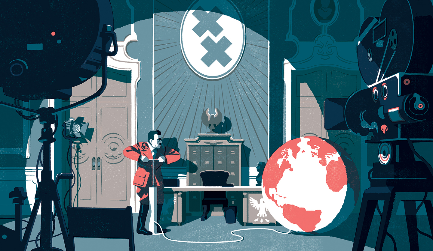
Using complementary harmony, he builds interest in the dynamic characters on stage. I was intrigued by how he varied the tones in the blue to allow the orange to stand out. There is no contest on what is the focal point of the image and what supports the story.


Sometimes he uses warm and cold tones to build a distinction between an interior and exterior of a space, and juxtaposing contrasting tones to allow characters or elements to stand out.

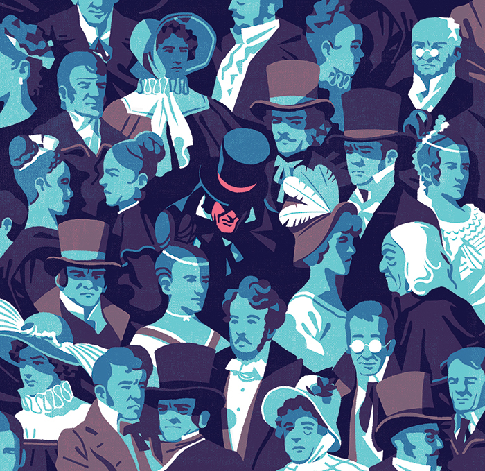
Sometimes he uses juxtaposing colors to create a separation from the image collectively – perhaps to bring focus to and imply an ‘out of the world’ character or a ‘different’ character.
Apart from contrasting tones, he builds focus on his subjects through the use of shapes such as in the image above, he draws the eyes to the space of spotlight, then further emphasizes his subjects by coloring them differently.
Conclusion
I decided to explore this artist in his usage of colors to build focus through minimal usage – I learnt that I can vary the tones and chroma of a single color (eg. dark blue and light blue, desat blue and sat blue) to add details to an image, as well as use lighting, shapes and leading lines to build focus.
LEARNING !!!
okay bye
Good artist reference! Hope to see how this style is applied in your work.