
This composition is inspired by vintage instruction manuals. The idea came to me whilst I was in the public bus one day and a young boy next to me was reading his biology textbook.
I first considered the elements that I needed to include, the image of virus, the image of an idea, and the various elements that supported this idea and how they can be composed together to look like ONE complete image than a flurry and collage of various elements. The quote is abstract, but making it look whole and united was a tricky challenge.
I looked into instruction manuals that evoked a vintage vibes and looked for similar elements in the design, as this is an unconventional choice of inspiration – there is little research available that explores what are the elements that are consistent.


I realized some common elements in vintage anatomy illustrations.
- very simple visuals.
- labelled with dotted lines.
- simply textured.
- labelled with numericals or alphabets
I also kept it true to the original inspiration and looked into biology textbooks of today, and studied how they portrayed the complexity of biology.

I utilized simple visuals and images, a ‘zoom in’ from the brain to showcase the biological-textbook inspiration (and also to convey the ‘sickness in the mind’ and kept the treatment of the images consistent, which is a sort of striped look on the images to give it texture. The overall is a simple, consistent treatment of the image that looks like an extract from a modern biology textbook designed in an antique way.

* * *

This composition’s inspiration is clear – Egyptian paintings. It is undeniably vintage and adding a creative spin of it and varying it with modern gifts. Although it was the easiest thing to do composition wise to keep it landscape, the project required the images to be portrait.
I looked into how Egpytian paintings composed their story and how they use simple images and icons as their language.

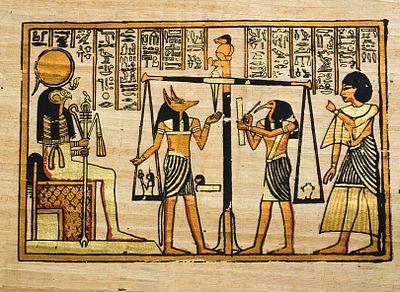
Through research, I found that Egyptian art is static, formal, abstract and blocky. They are very much flat, lacked depth, two-dimentional and are read from left to right. I decided to forgo the usage of hieroglyphics in my final composite as the text would be difficult to understand, added complexity to an otherwise simple art and looked a little to cluttered on a whole.
I asked a classmate about what are some superficial things a girl might want and she mentioned – handbags, diamonds, money, flowers, nice car, clothes, and perhaps jewelry as well. Interesting. But after designing it, I decided to add the local element of the 5 Cs of the Singaporean Dream – Cash, Condo, Country Club, Car, and Credit Card. Ironically, it has it’s own wikipage about it
Some design concepts I utilized was the usage of leading lines – where all characters are facing the same direction, except for one, which is the princess. This difference creates a focus on who is the primary character in this story. She is also different because as compared to the others, she is sitting down, which is a commonly used method in Egyptian paintings.

I did some clean up on the lines that looked a little grungy and bumpy and kept them a cleaner white and cleaner black. I left the gifts a little different in treatment firstly because it provided emphasis on the gifts as they are visually different and secondly to portray the idea that these are unconventional gifts of an egyptian princess – cause you know – what good can a condo do when you have a whole pyramid of your own, right?

* * *
![]()
This was one of my favorite experimentation pieces, as someone who has done surreal and conceptual photography. I was inspired by two pieces when I did this design.
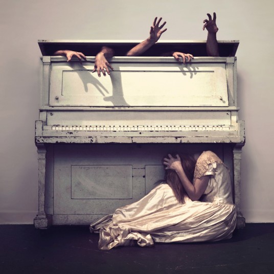
Sleep by Nicolas Bruno
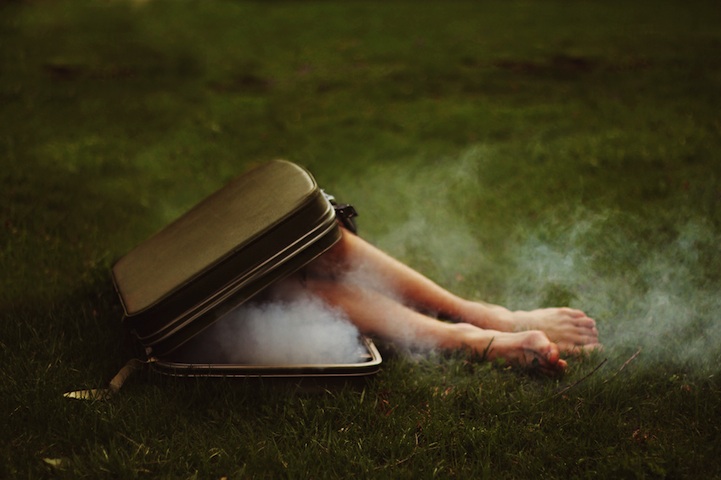
Untitled by Kyle Thompson

I liked the way the arms crept out of the various boxes they are put in and how the tension in the arms or how limp the limbs (ooh what a tongue twister) evoked certain … emotions or intention. I kept the design simple and reminiscent of these two surreal photographers, and I think that was the beauty of it.
* * *

I wasn’t sure if I was watching too much animated movies or just surrounded by animated friends when I did this – but this was inspired by Japanese anime (must be because Fendi is half Japanese! someone cries in the distance). I normally am not one of anime, but somehow when I did this design, I felt like an anime would be comical and evoked the message well.

I decided to go all out with this (but I think I could’ve pushed it further), and added anime-esque sunrays popping out from the huns and snowflakes that looked like stars. After designing it, the snow the huns popped out from looked like rocks or a volcano – so I figured the snowflake was a semiotic to emphasize the idea of snow better.
The daisy on his head was a little comical element I thought of because I was binge-watching Miyazaki movies and I thought why not just make him look like Totoro.

* * *
Overall, this was a fun project – it was quite exciting to be have freedom to visually represent my quote in a satirical, non serious way and some in a much more serious way, too. I explored two serious quotes and two comical quotes.
It was fun to look into various design elements such as gestalt theory, implied lines, visual treatment and compositing. I learnt that inspiration for design can be taken anywhere – not just necessarily vintage dingbats and vintage posters but also in photography, animation and looking back into the past such as egyptian drawings, too!
It may or may not be a good thing that all the visual elements are sourced from the internet and that removes the element of handrawing some things you want, but allowing myself to utilize limited resources kept me creative in problem solving – such as when the snow didn’t look like snow – how I utilized semiotics, or when I couldn’t find egyptian looking Gucci bags online and realized – I didn’t need it.

Please excuse my unflattering face.
But thank you Fran for the photo and trash panda tee!
Overall this was a fun experience to me! And TOTE BAG MAKING WAS FUN. Next stop – EGO!
To see my struggle to Tote Bag, click here.
To see my previous/rejected design, click here.