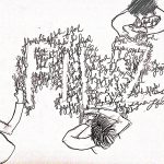
I made sure that the mandala designs are not all too flowery and that there is a diversity of designs. I also used a template on Microsoft Word to control the kerning in between the alphabets. How my final looks like scanned. Mandala designs in henna would always… Read more →
Category: Project 1 Que Sera Sera
Project 1: Que Sera Sera (Process + Research for Henna Designer)
For my Henna Designer, I wanted to incorporate mandala designs into the font and the alphabets would be inside and be part of the mandala, as seen in the two drafts below. To imitate the colours of the Henna, I tried using different shades of the brown colour pencils. However, the tip… Read more →
Project 1: Que Sera Sera (Final for Florist)
I watercoloured this font to give it some colours and to make the hints of flowers and leaves more obvious. I also used a template on Microsoft Word for kerning, so that the spaces are even. It is a given that florist = flowers. Therefore, my intital idea till the end was to use incorporate flowers. I’m glad that I’ve… Read more →
Project 1: Que Sera Sera (Process + Research for Florist)
Florist are always associated with flowers. Therefore, my first few drafts are all fonts surrounded by flowers. I was also interested in Artist Sabeena Karnik‘s typography where alphabets are being created by flowers surrounding it. However, after looking at these two drafts, I feel that I would prefer having the flowers making up the font and not the font made… Read more →
Project 1: Que Sera Sera (Final for Writer)
In my final for Writer, I cropped out a huge part of the typewriter to only show a bit of the typewriter. This is to avoid taking away the attention from the font. The font and the texts are done in a way that it looks like they were being typed out by a typewriter, with the sharp and straight… Read more →
Project 1: Que Sera Sera (Process + Research for Writer)
For writer, I thought of using crumpled papers to show the rejected ideas that writers have crumpled up and discarded. Thus, explaining my first draft. After the first draft, I thought it looked quite boring if all of the alphabets were made up of crumpled paper. Therefore, I tried to make the different alphabets be made… Read more →
Project 1: Que Sera Sera (Final for Architect)
This is my Final work for the Architect font. Overall, am happy with how standardised and uniform the font looks , now that I’ve learnt the importance of kerning. I’ve learnt that doing as many drafts as you can before doing the final work really helps you to pick out the corrections needed very easily. How it looks… Read more →
Project 1: Que Sera Sera (Process + Research for Architect)
For Architect, I had a clear picture from the start that I wanted buildings to make up the font. Therefore, I sketched a small draft below. After this draft, I was really confident that for Architect, I wanted a thick, blocky font that is made up of buildings. I went on to sketch another draft but now including twirling… Read more →