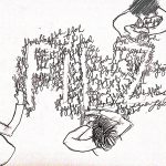
Florist are always associated with flowers. Therefore, my first few drafts are all fonts surrounded by flowers. I was also interested in Artist Sabeena Karnik‘s typography where alphabets are being created by flowers surrounding it. However, after looking at these two drafts, I feel that I would prefer having the flowers making up the font and not the font made… Read more →
Project 1: Que Sera Sera (Final for Writer)
In my final for Writer, I cropped out a huge part of the typewriter to only show a bit of the typewriter. This is to avoid taking away the attention from the font. The font and the texts are done in a way that it looks like they were being typed out by a typewriter, with the sharp and straight… Read more →
Project 1: Que Sera Sera (Process + Research for Writer)
For writer, I thought of using crumpled papers to show the rejected ideas that writers have crumpled up and discarded. Thus, explaining my first draft. After the first draft, I thought it looked quite boring if all of the alphabets were made up of crumpled paper. Therefore, I tried to make the different alphabets be made… Read more →
Project 1: Que Sera Sera (Final for Architect)
This is my Final work for the Architect font. Overall, am happy with how standardised and uniform the font looks , now that I’ve learnt the importance of kerning. I’ve learnt that doing as many drafts as you can before doing the final work really helps you to pick out the corrections needed very easily. How it looks… Read more →
Project 1: Que Sera Sera (Process + Research for Architect)
For Architect, I had a clear picture from the start that I wanted buildings to make up the font. Therefore, I sketched a small draft below. After this draft, I was really confident that for Architect, I wanted a thick, blocky font that is made up of buildings. I went on to sketch another draft but now including twirling… Read more →
Presentation: Semiotics, Symbols, Ways of Meaning
Hi guys, Naj and I hope that our presentation was useful and gave you a little understanding of semiotics and how we apply it in design. Here’s the link to our slides 🙂 : https://docs.google.com/presentation/d/166fpPswnVBDcRs3lCCXD_S-xD1h2H8c78rwymEE7zWE/edit?usp=sharing Read more →
Project 1: Alter Egos (Final)
The Final Video https://vimeo.com/201846288 This is a short film depicting how difficult things can get when a socially awkward Tinzah meets the sassy Arinah Lumpspace Princess. Reflection At first, I was pretty reluctant to be in front of the camera and act. However, I feel that the best person to portray Tina would be myself since I relate to her… Read more →
Project 1: Alter Egos (Process)
Ideation I was watching one of Bob’s Burgers episode when the idea struck me. Tina fantasized that her classmate liked her when in reality, the classmate was just being curious. Tina got into one of her weird daydreams and fantasized about her classmate after that. I thought that scene would be perfect to incorporate both LSP into this. So, instead… Read more →
Project 1: Alter Egos (Research)
B R A I N S T O R M I N G Characters from Literature/Fiction Tina Belcher from Bob’s Burgers Interior (forms character): She socially awkward and gets nervous easily. Despite all that, she’s fearlessly her in a way that she does not try to cover up her dorky-ness amidst a crisis or hides away her not-s0-cool interests. She also… Read more →
Project 3: Genre and Narrative – Who Is She
For this project, our group decided to take on the theme of horror. Concept: We researched and got inspired by interesting Thailand short advertisements that end with a twist. We really liked the setting of this short advertisement that ended with a twist and a quirky tagline. One example was the Pantene shampoo commercial that started off with an emotional… Read more →