
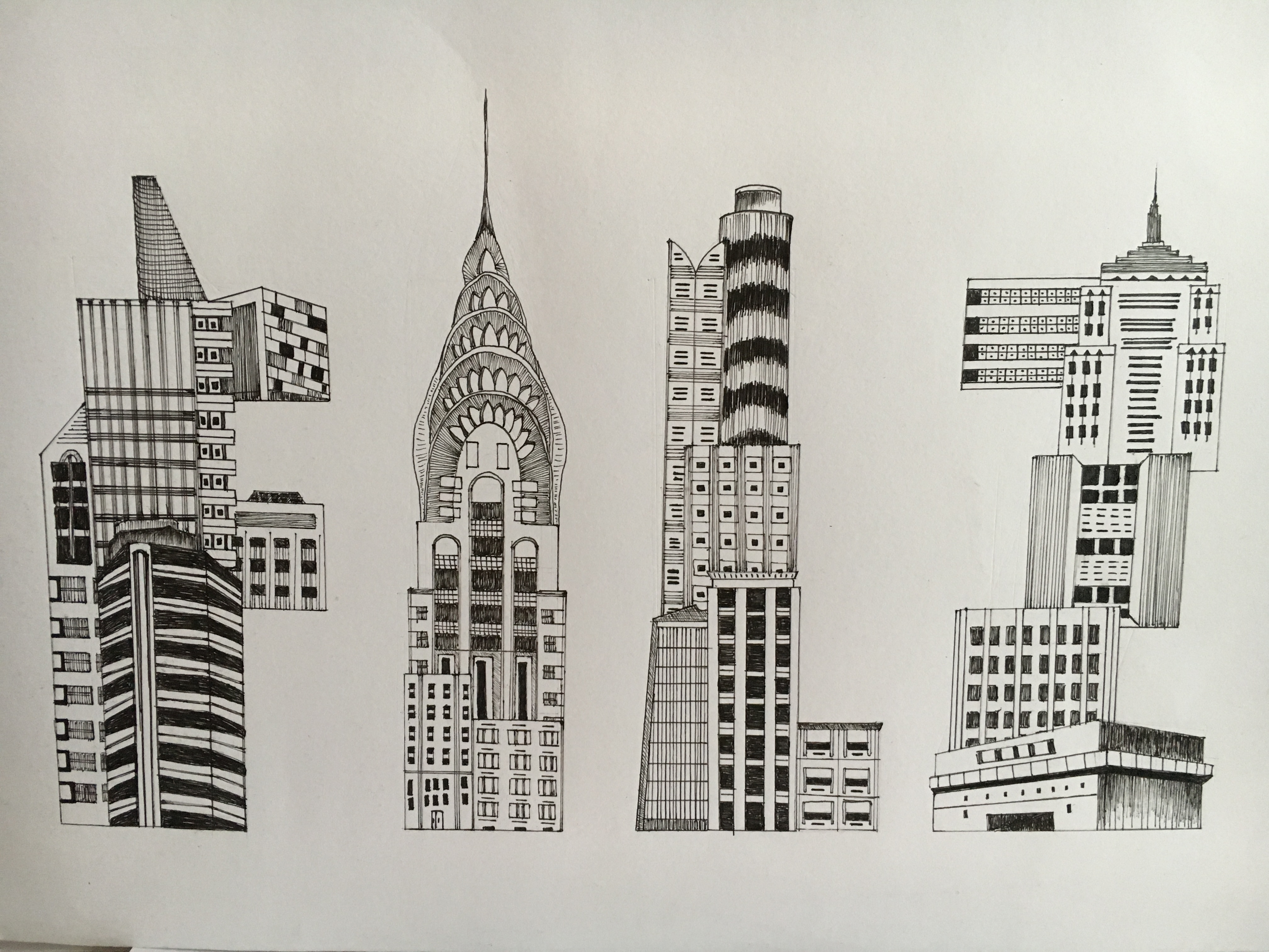
- This is my Final work for the Architect font.
- Overall, am happy with how standardised and uniform the font looks , now that I’ve learnt the importance of kerning.
- I’ve learnt that doing as many drafts as you can before doing the final work really helps you to pick out the corrections needed very easily.

- How it looks like when it is scanned.
- To me, the first thing when it comes to mind when a person mentions Architect are buildings. that is why my main focus for this Architect font are buildings.