Category: 2D Foundation II – G8

Project 3: Zine

Final Work:

1. covers pages234. page34 pages67


Concept / Process:

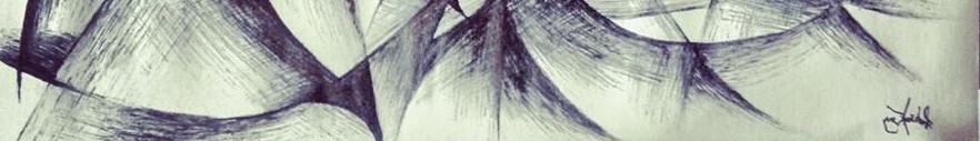
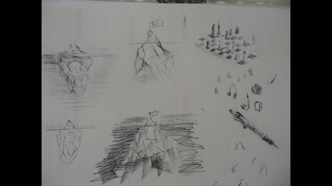
At The Water’s End is a zine in which I look back on my experience of jungle navigation and survival training during my army infantry days. I did a lot of sketching whilst I was in there in the jungle and I wish to curate these sketches, reflections and poetry into a simple zine for people to see my drawing style and read my thoughts and feelings during those times.
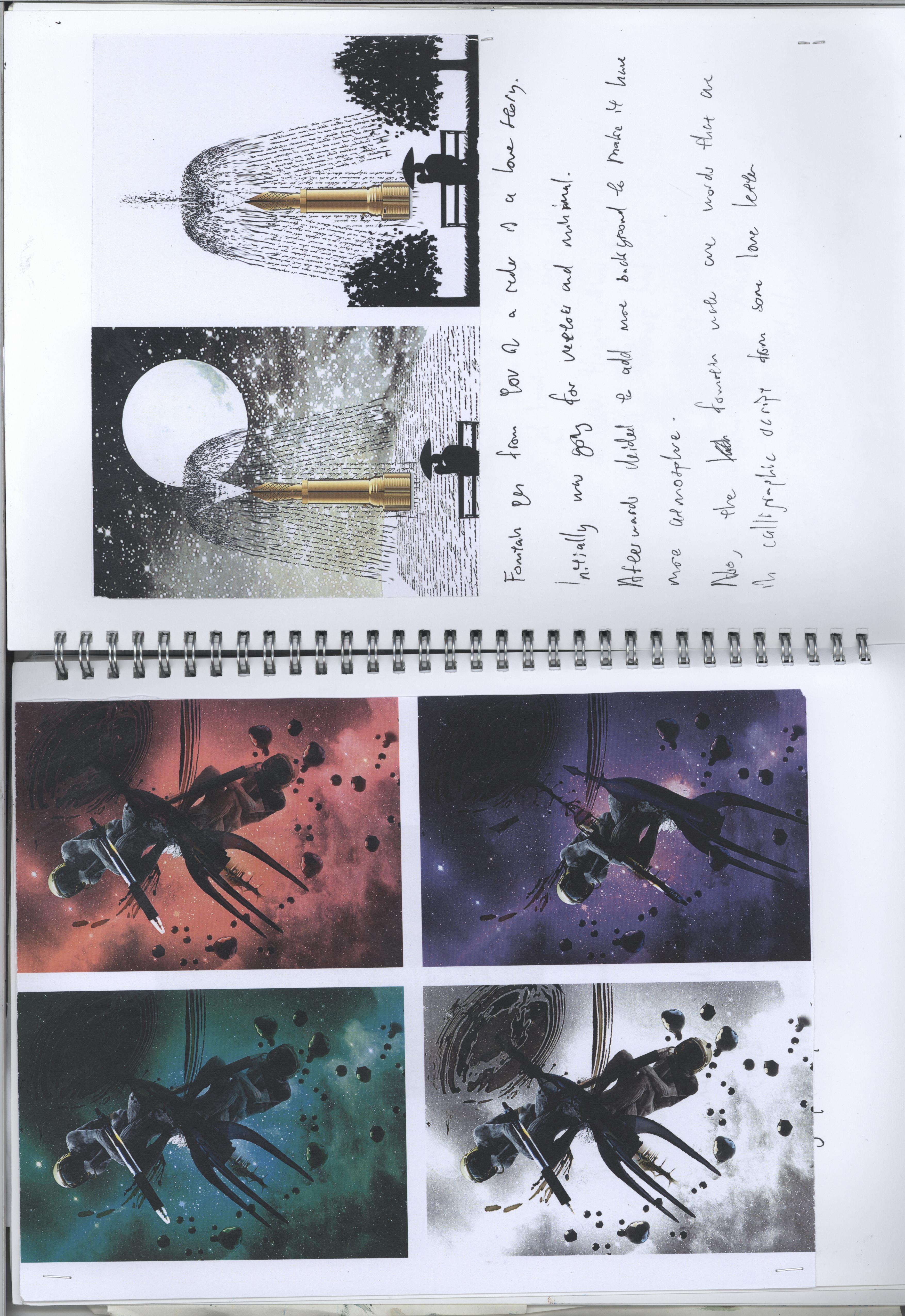
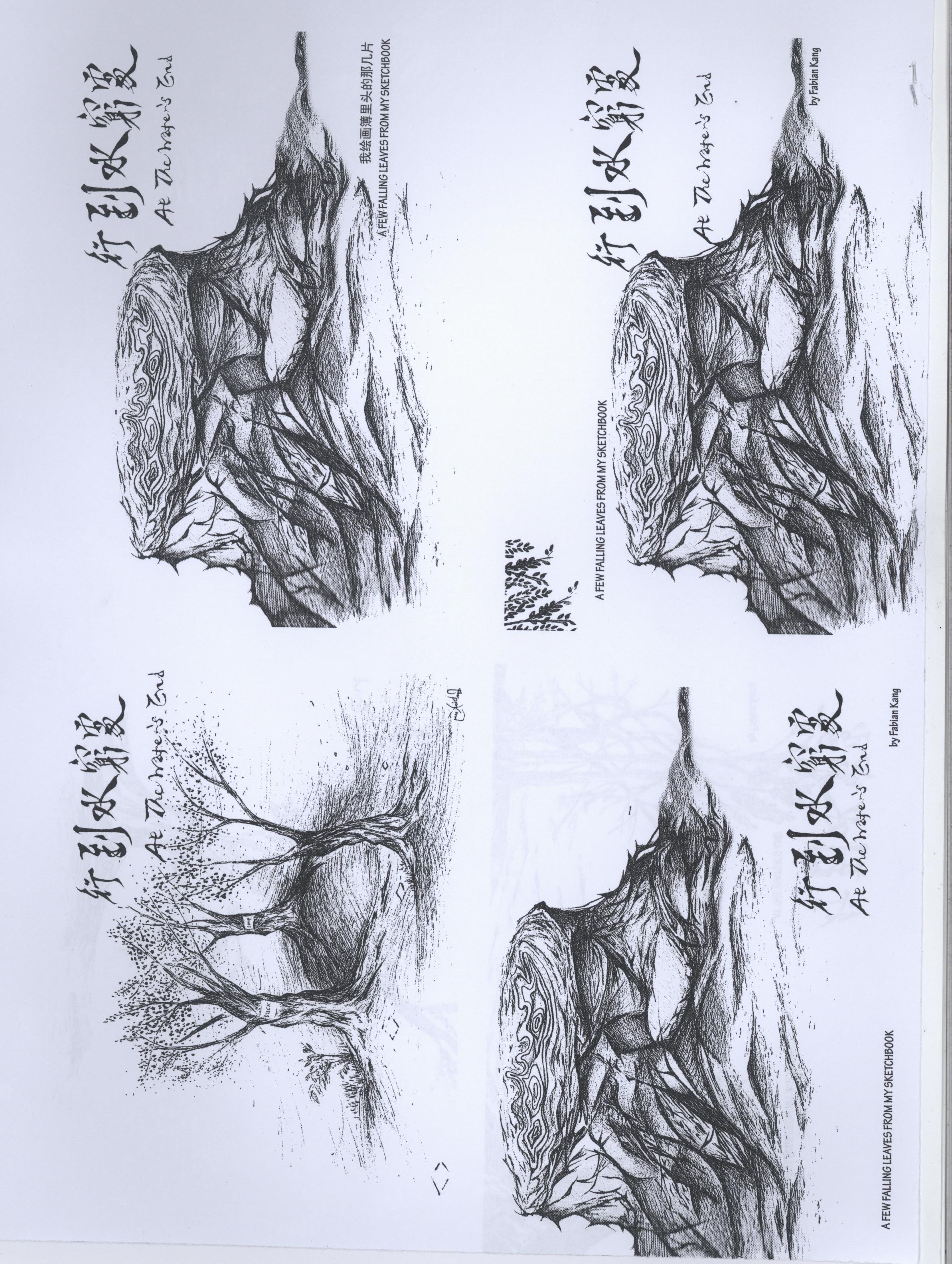
行到水穷处,坐看云起时。

The title is translated from a famous poem by Tang poet Wang Wei. This particular verse means that “if you reach the water’s end, the end of your resources, fret not, because if you look to the sky, you’ll see the clouds and with it the rain that will fall to the earth again”. For me, the jungle training was really pushing me to my limits, be it physical or mental. Hence these drawings  and poetry were an expression of the longing for home and my motivation to keep me going, as such they became in line with that belief that “the clouds will bring the rain again”.

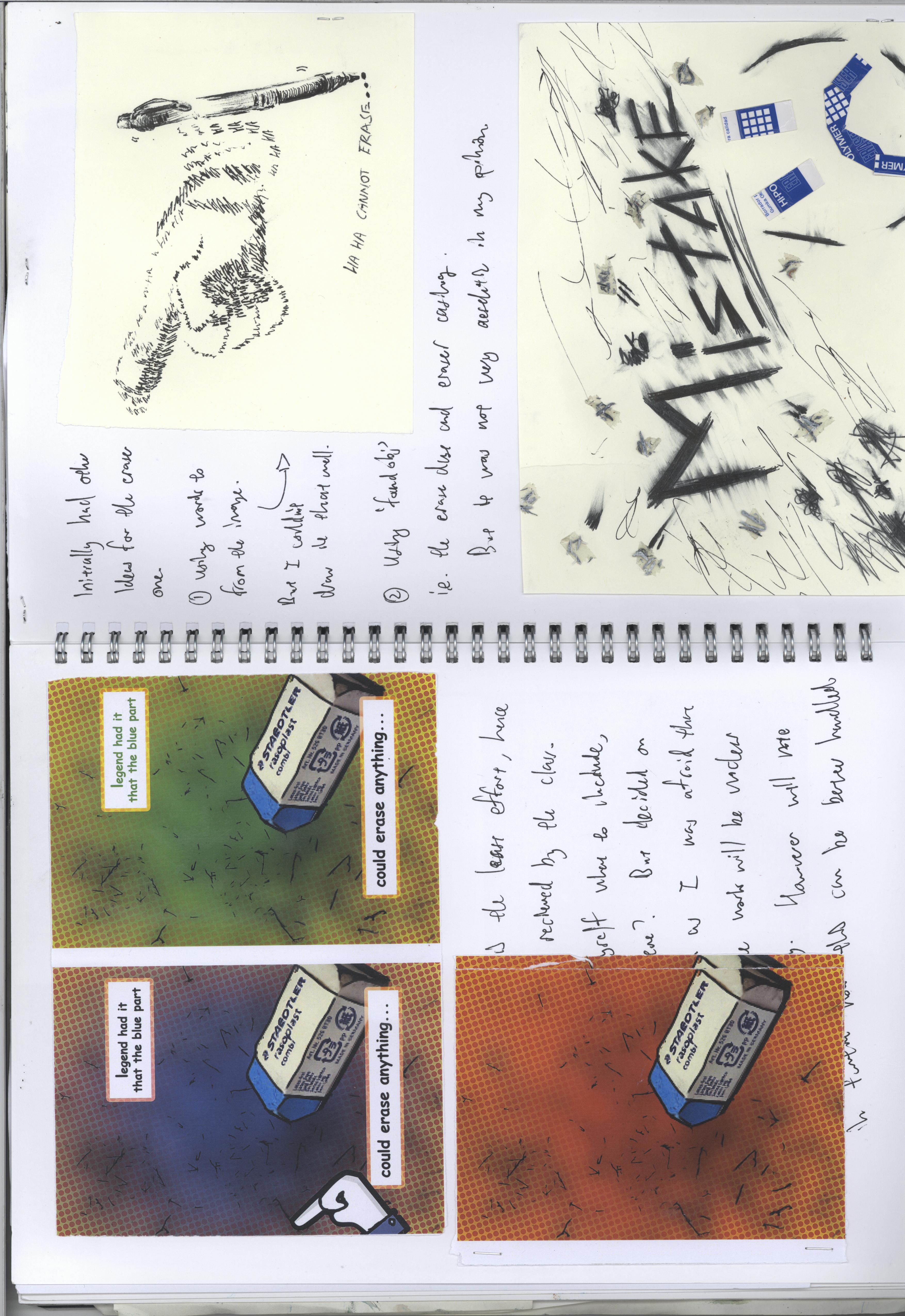
I chose to go for black and white as my drawings were without colour to begin with. Did think of using maybe muted greens or browns but I felt that it still conflicts with the sort of attention I wish to draw unto my drawing style which plays a lot on the texture and form of the pen strokes. Also, I chose a paper that would have the texture to carry the feel of my drawings across. All in all, I was aiming for a simple and clear design to convey my intended message.

The pages have been divided into clear sections.

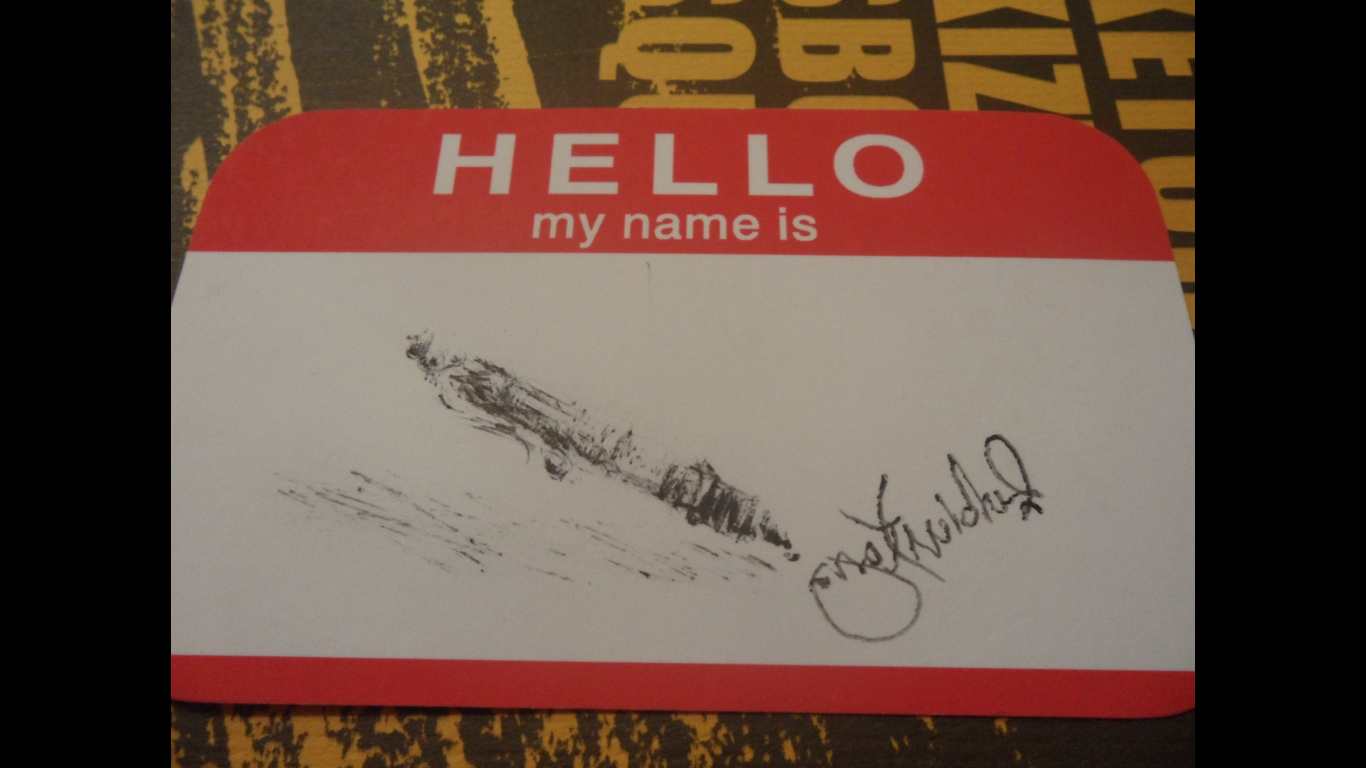
  • Cover page where I showcase the drawing I think can best represent the journey which is a stump on which I drew the contours of the map.
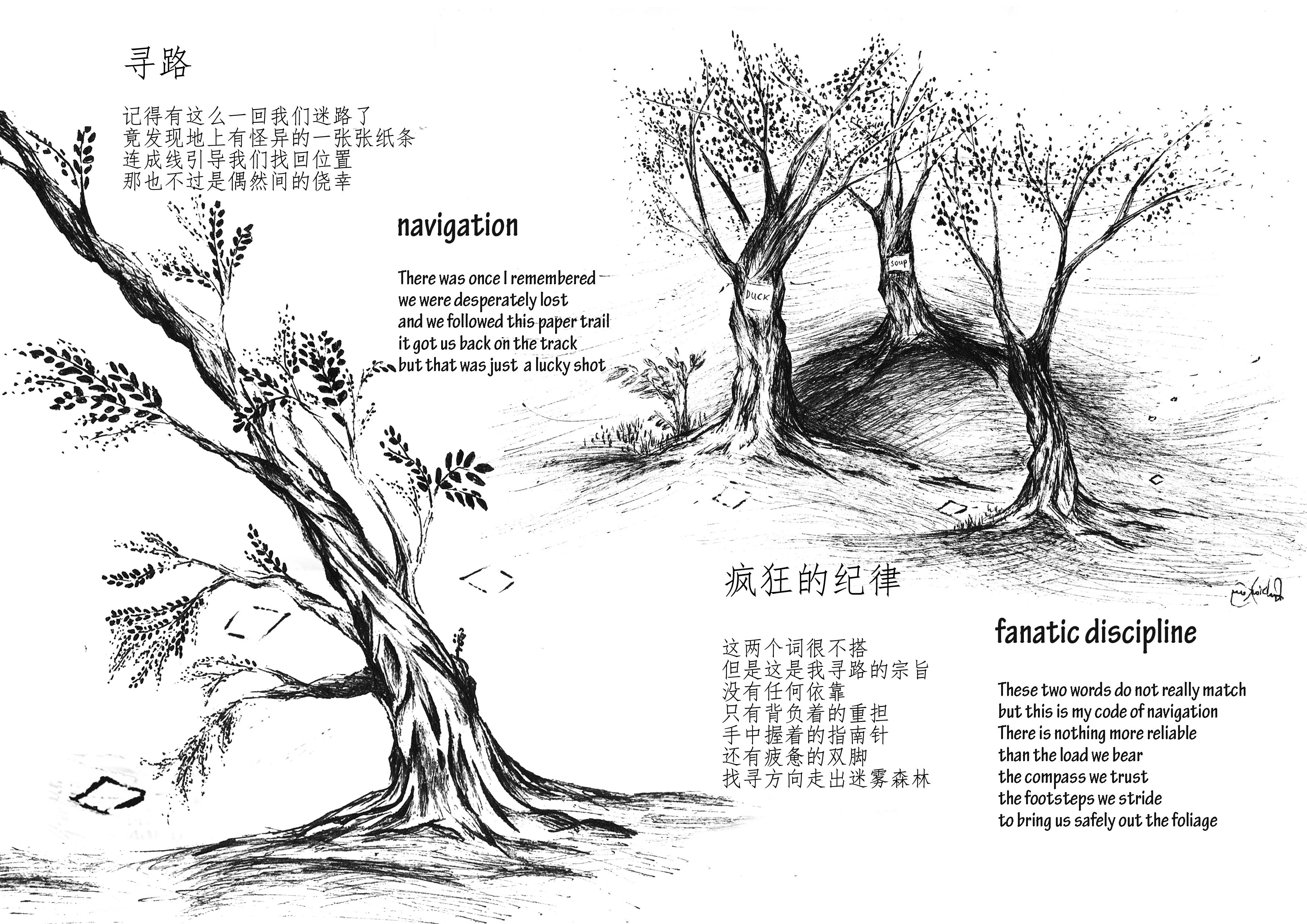
  • A spread on the feeling of navigation which I feel is a highly disciplined task and a little narrative about getting lost in the woods.
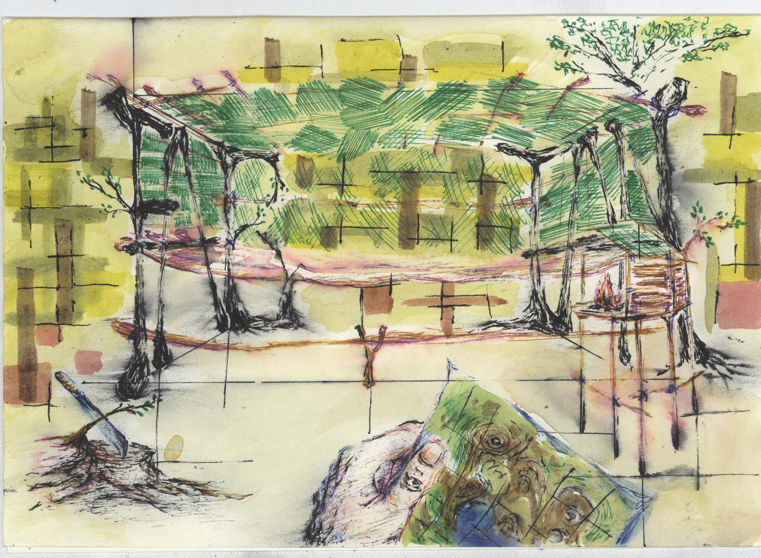
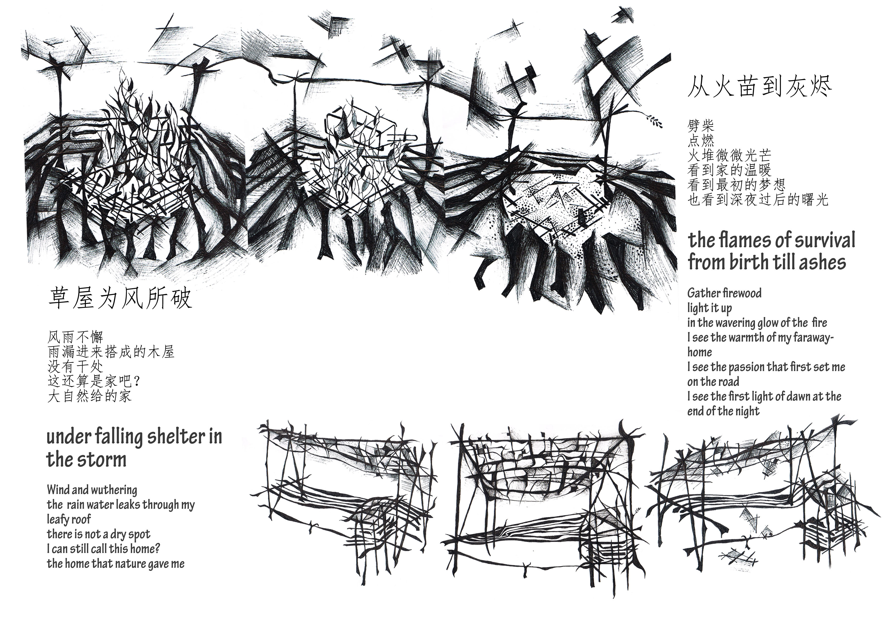
  • A spread on survival, the kind of structures we built and how it was to be responsible for your own roofing and your food.
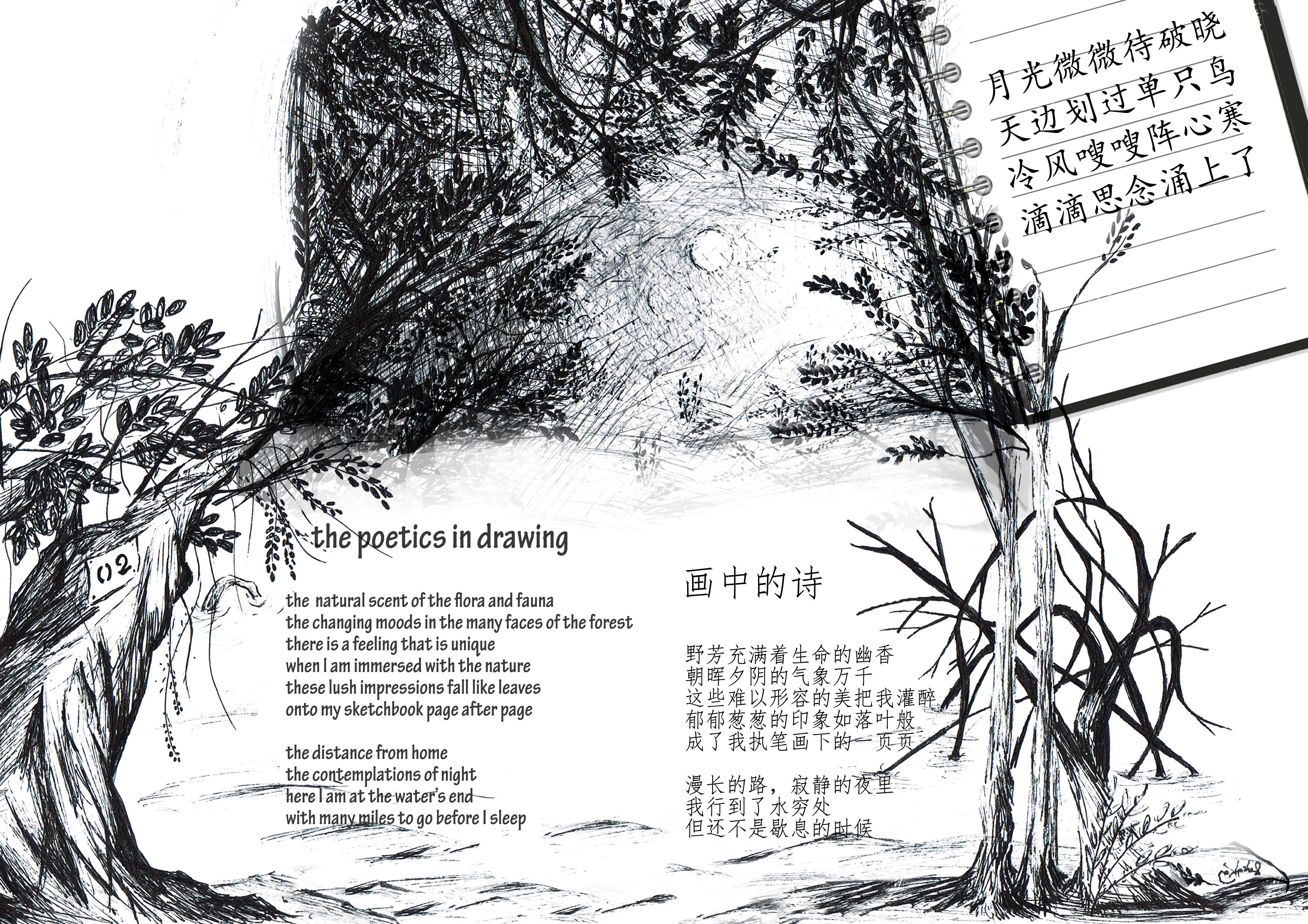
  • A spread on the contemplation in the quiet night and the poetry I wrote.

On the back cover, I gave my zine a tagline which reads “A few falling leaves in my sketchbook”. This is because pages are sometimes referred as leaves, as in leaflets. In Chinese, the connection of the 2 words a more apparent. We have pages which is 页 (ye4) and leaves 叶 (ye4). Both have the same pronunciations. My idea of connecting these two was because to me the inspirations from the jungle (leaves 叶) actually falls onto my sketchbook (pages 页) and thus became the drawings I drew and poetry I wrote.
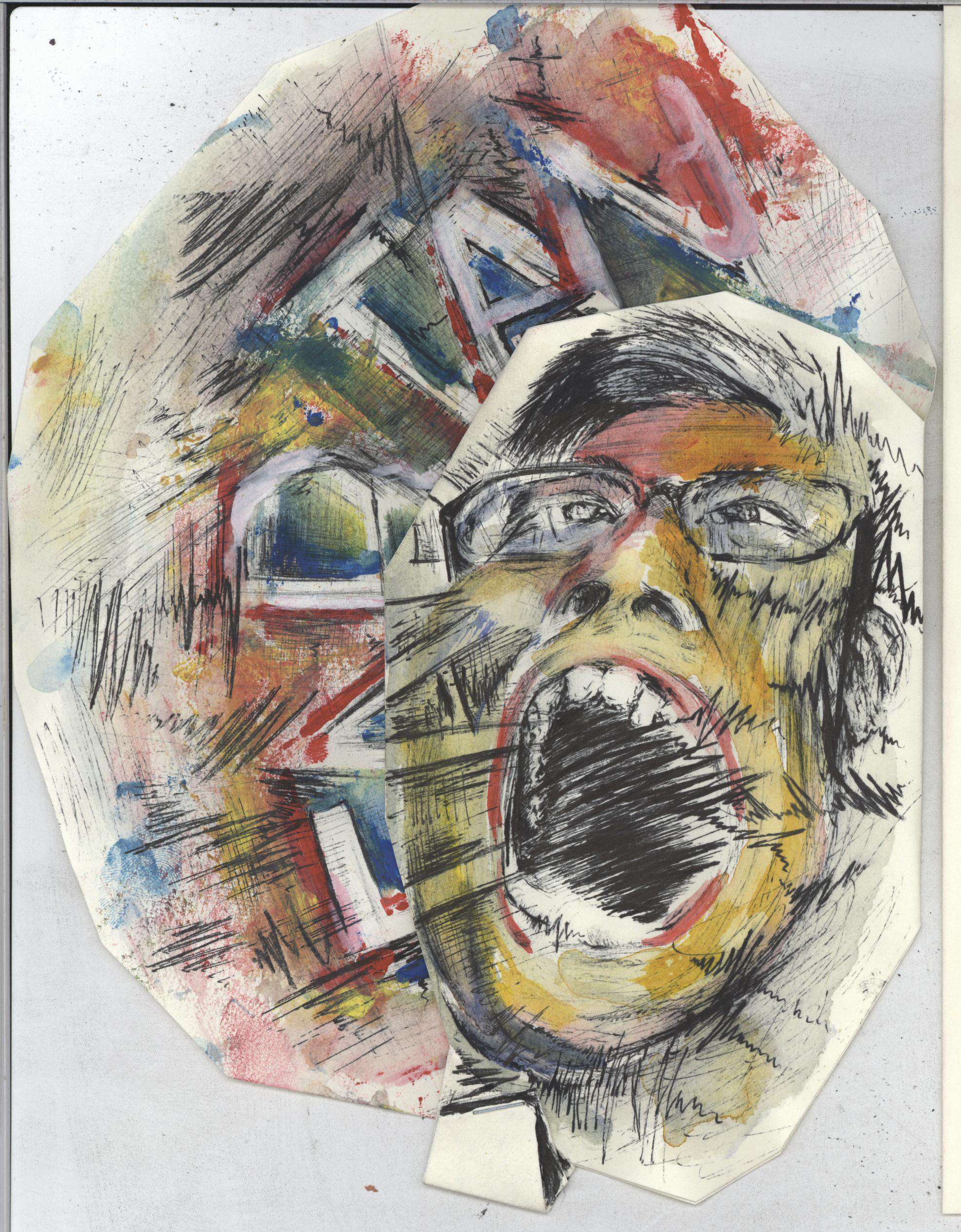
Sketchbook:

007 (2)

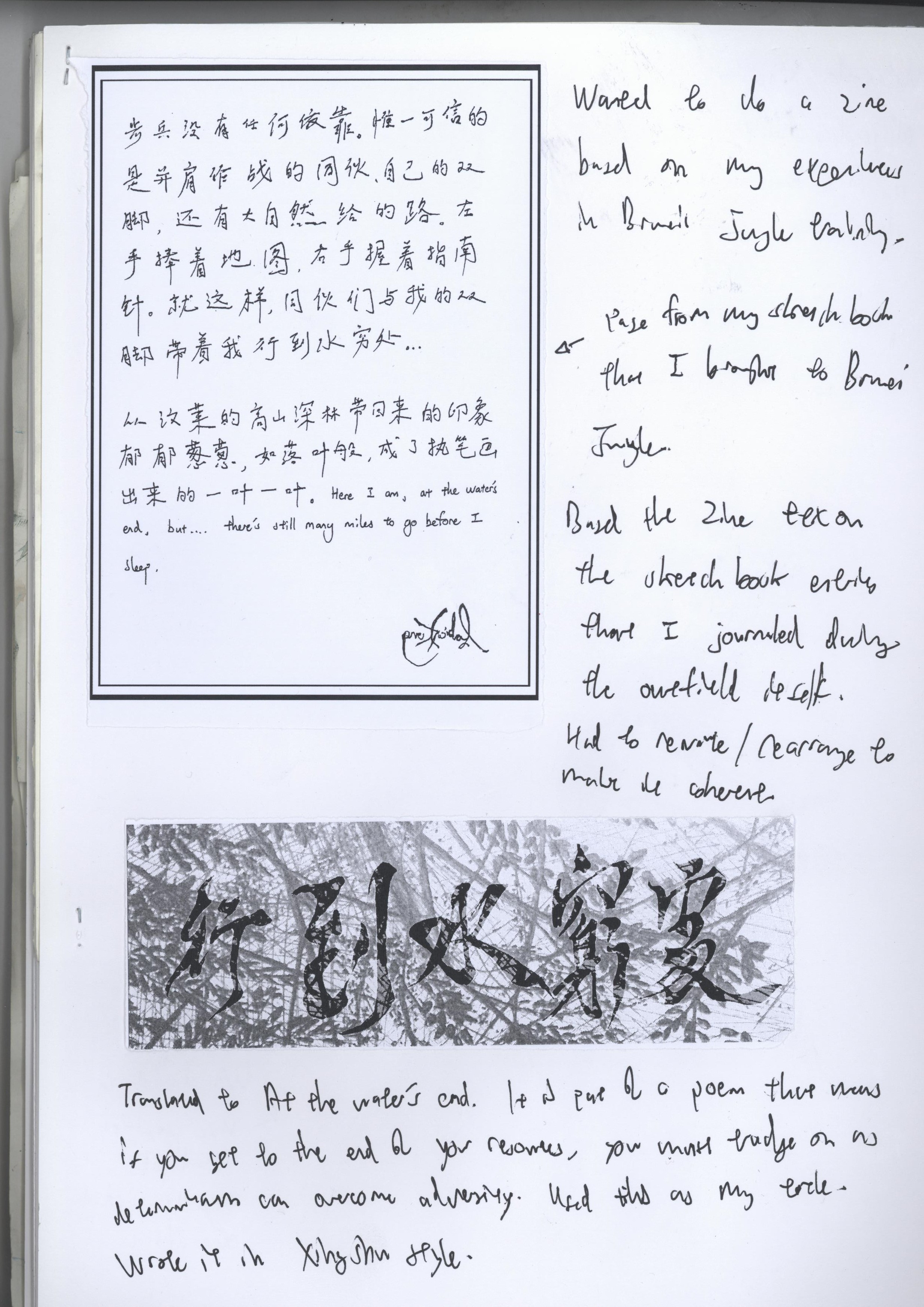
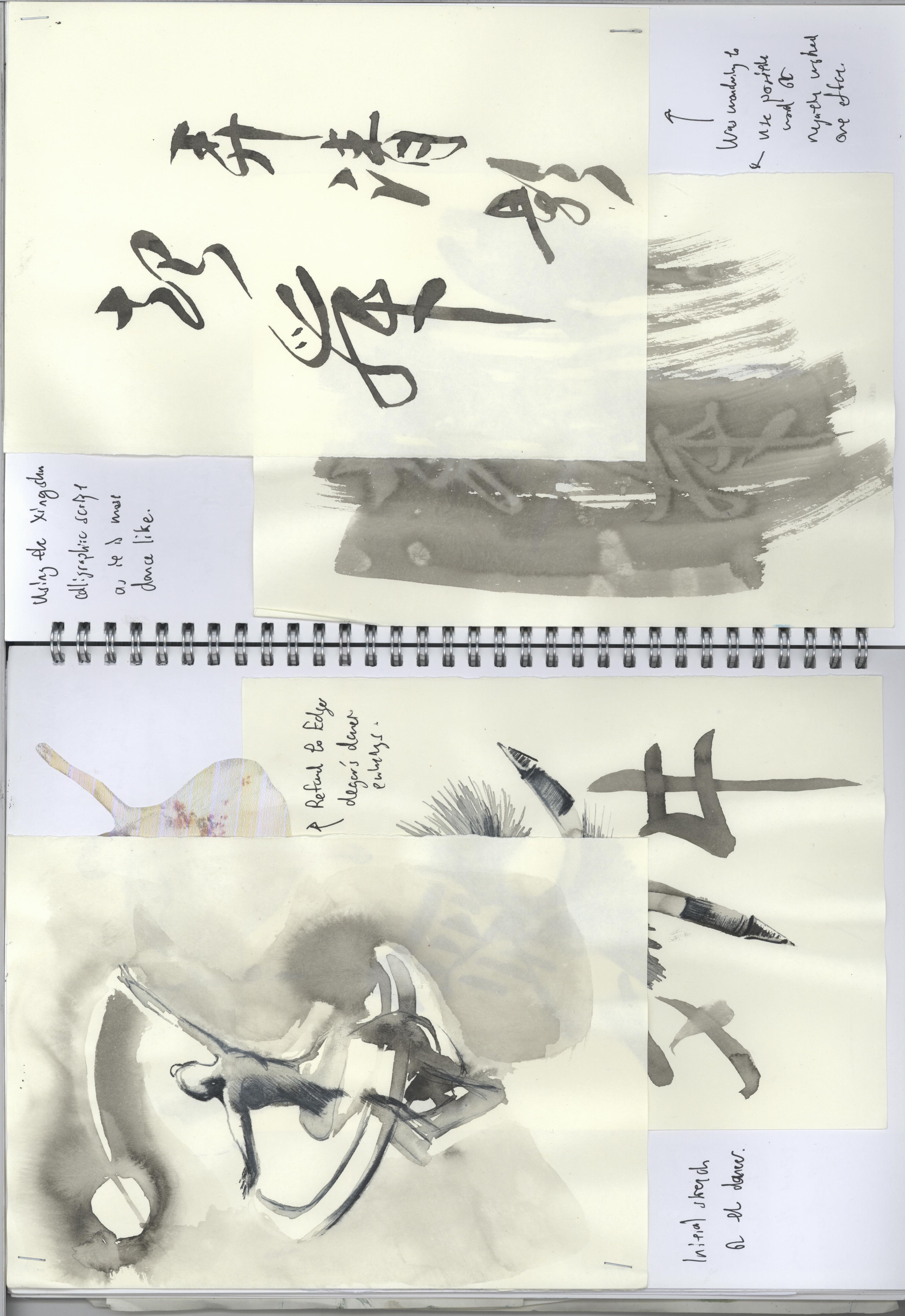
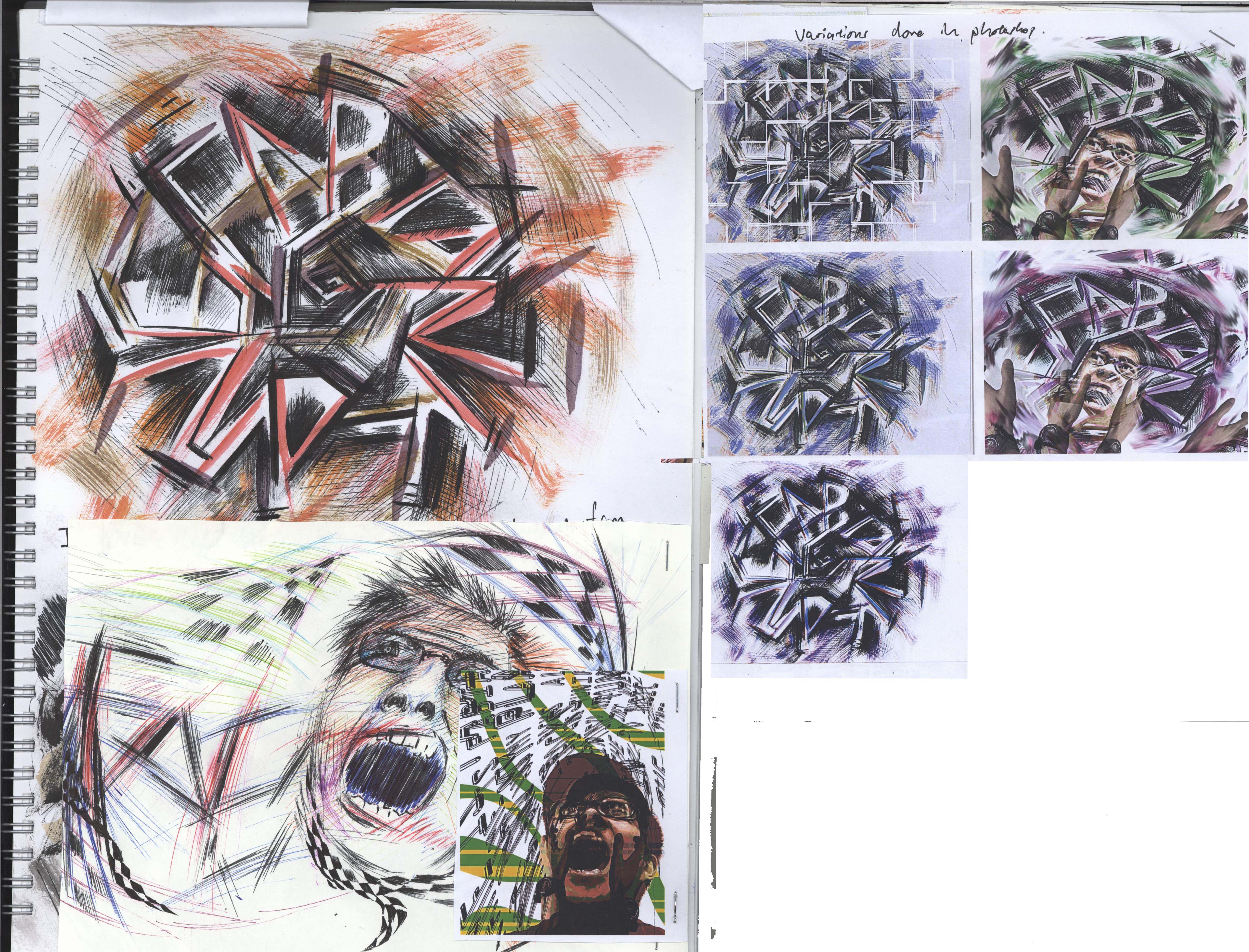
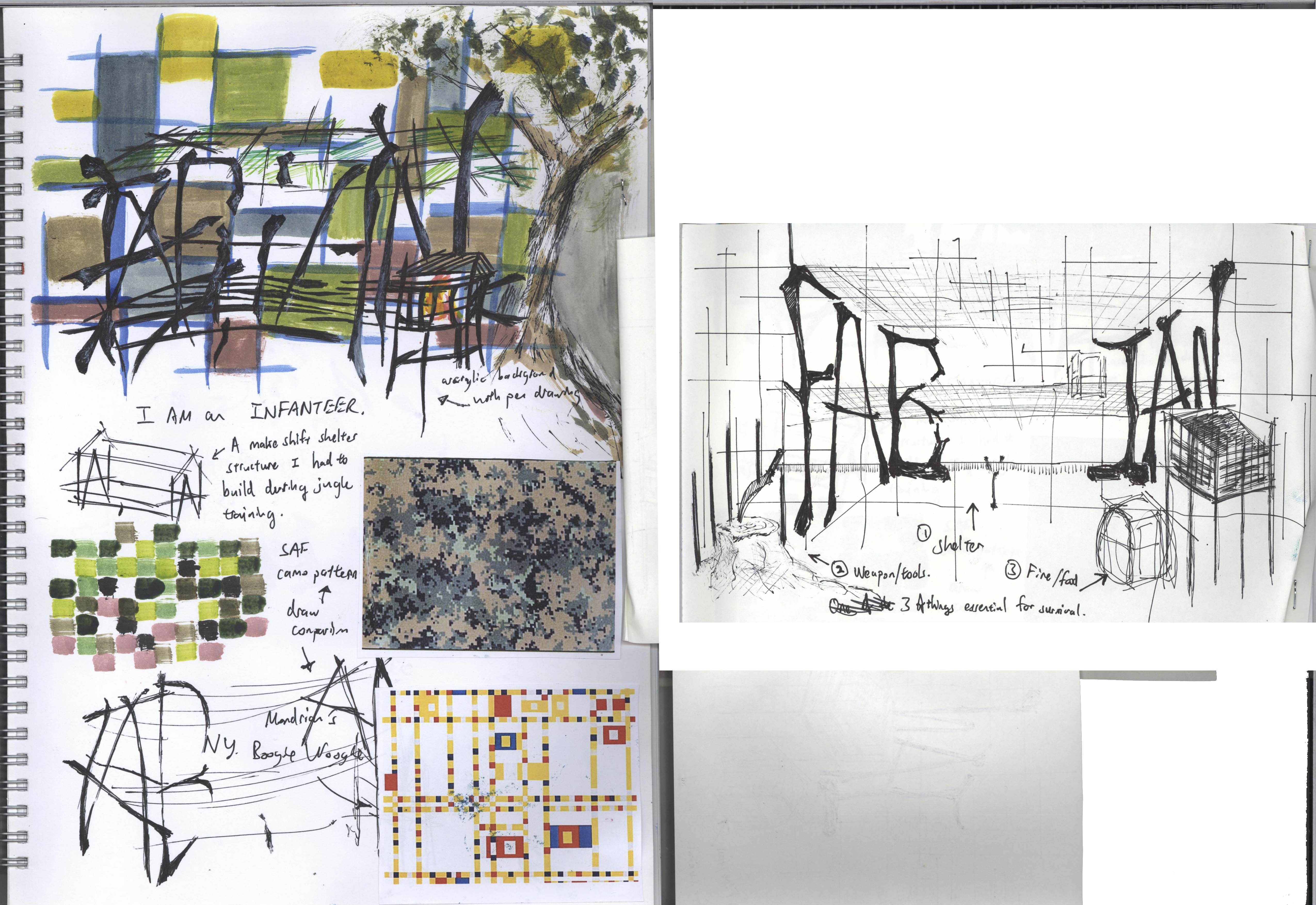
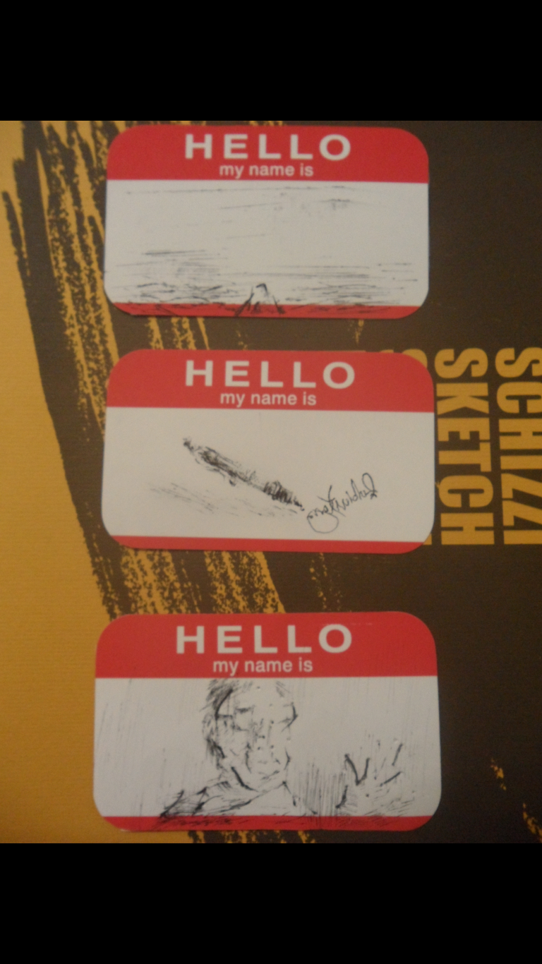
An original page from my Brunei sketchbook as well as the title calligraphy style.

007

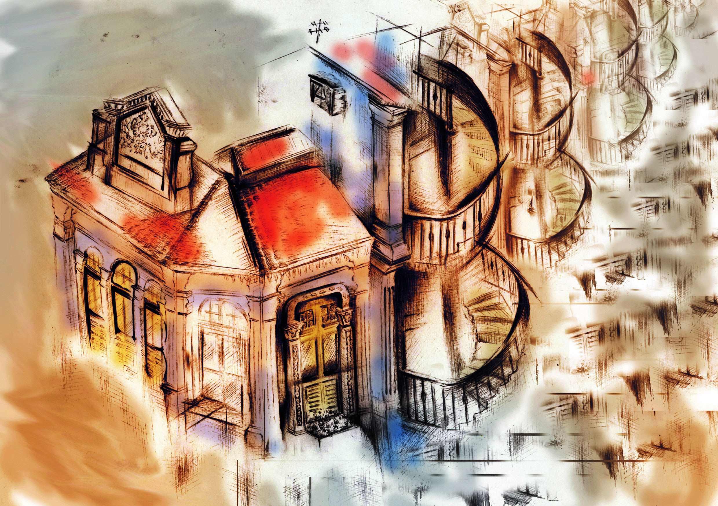
Cover Page ideas and layout.

008

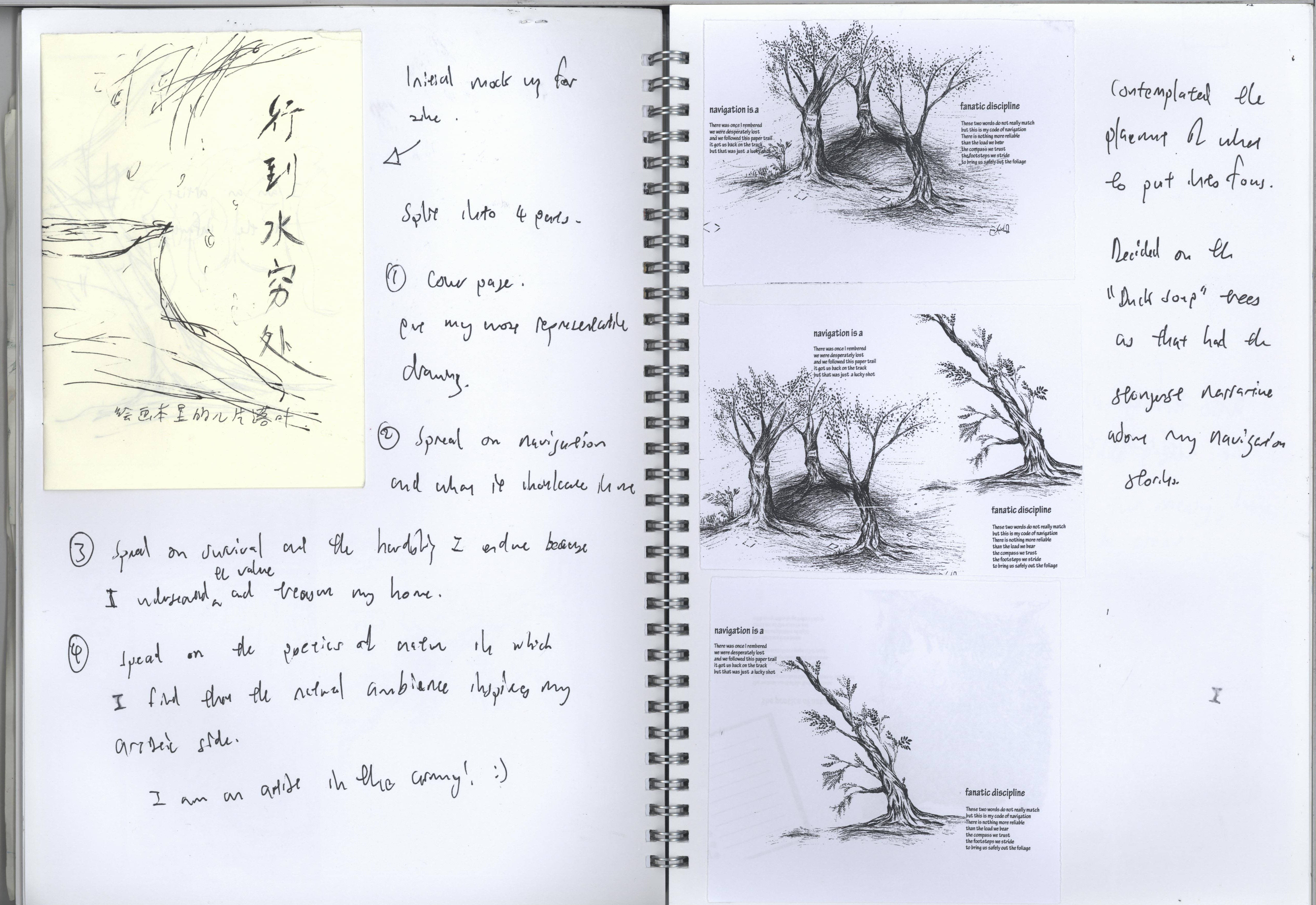
Mock up of the zine. Pages and layout for the navigation part.

009

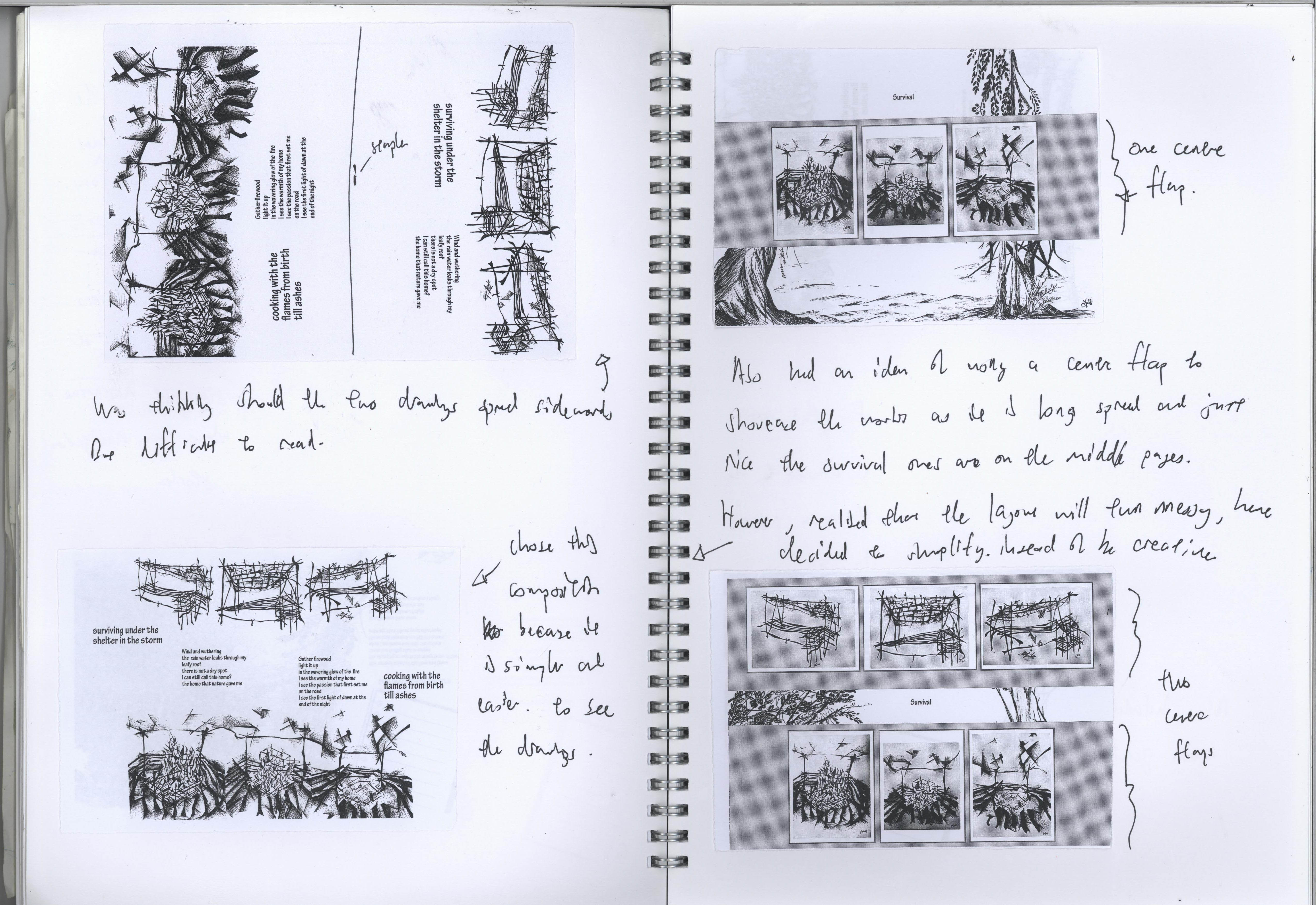
Pages and layout ideas for the survival part. Was also thinking of making it interesting by introducing an extra flap to put the longer drawings. However realized that that will complicate things and conflict the simplicity of my zine.

010

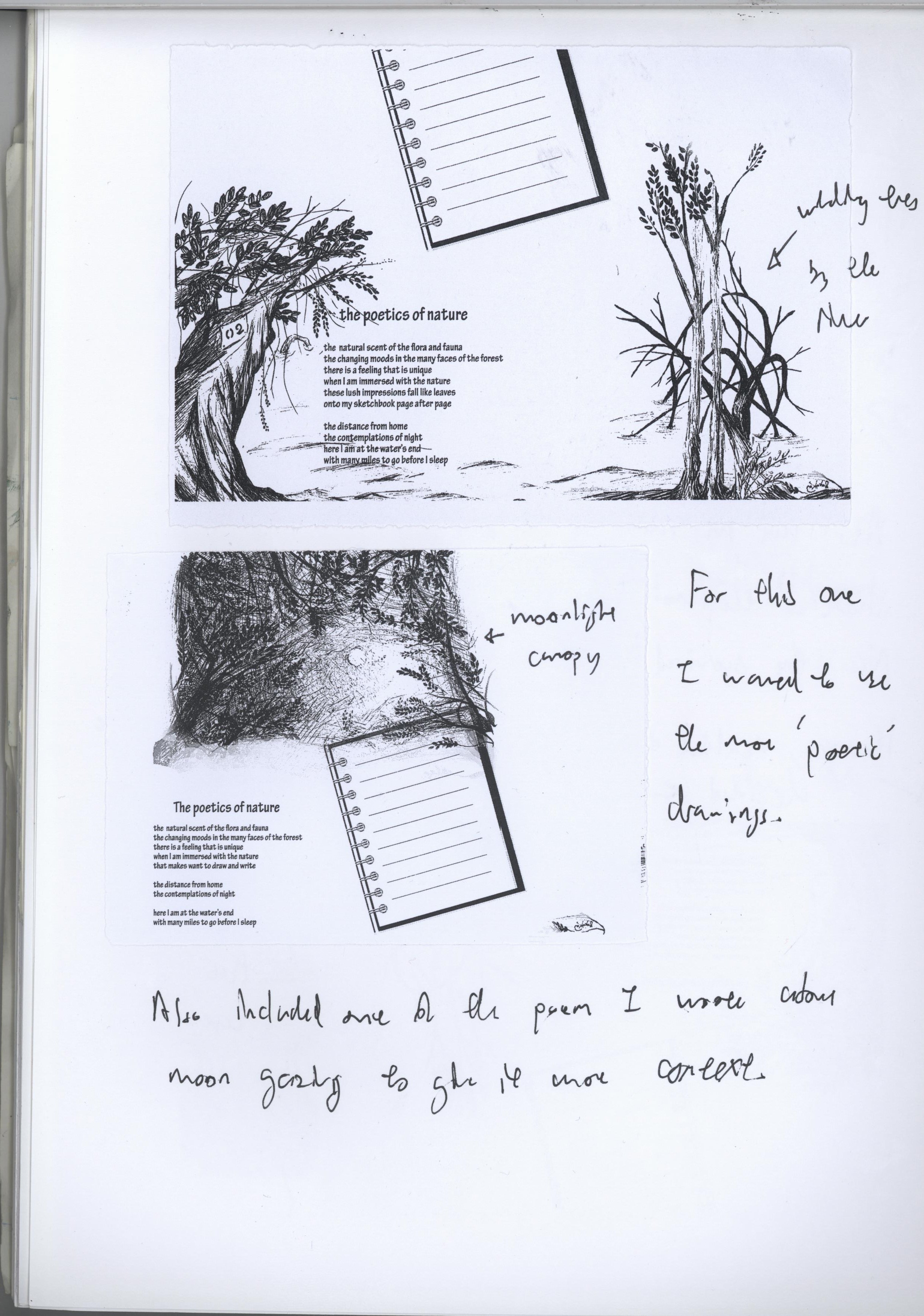
Poetry page ideas and layout.

Project 2: Point of View

Final works for project 2:

p2A

The pen from the point of view of an astronaut is a useless blob.

p2B

The pen from the point of view of an artist is the dance across the paper.

p2C

The pen from the point of view of an enemy is a lethal weapon.

p2D

The pen from the point of view of a love story is fountain of emotions.

p2E

The pen from the point of view of an ink-replacement administrator is a blood transfusion patient.

P26

The pen from the point of view of an eraser is an indelible mistake.


Concept/ Process:

Initially I had a few other crazy ideas but as I wasn’t able to arrange those disparate ideas into a series, I turned to something which was more readily available.

In my final work, I attempted to use the Pen as a main subject because it is a medium that I work with frequently and I thought it would be great to explore different views of it.  I used a variety of pen for the concept wise, including ball point, fountain, calligraphic, etc. And what I wanted to do was to imagine scenarios or the weirdest things people say about the pen and see how that can play out.

For example the one about pen in outer space was because I hear a lot of stories about how astronauts have tried using the pen in zero gravity and obviously it wouldn’t work. So scientists and product designers got together to design one that does. The most famous is the Fishcer pen. So in that particular work I was showcasing what I think it looks like to go all the way out there to find out that the pen doesn’t work.

And in the work about pen being a lethal weapon, I was interested in visually depicting a quote from David Handler who wrote the famous children’s series “A series of Unfortunate Events” . He says that “Anyone who thinks the pen is mightier than the sword has not been stabbed with both.” And I thought that was a really intriguing twist to the common saying.

Most of the work are digitally done as I thought it would be easier to convey through digital means as my drawing on such a small surface might not be detail enough. For the drawings I kept them minimal as well because from the previous project I realized that working on a small surface area it is best for me to not be too detailed as things get way too cluttered.


Sketchbook explorations:

003

Process for “Pen in Outer space” and the “Fountain pen love story”

004

Process for “Pen vs Eraser”

006

Process for “Pen as Dance”

005

Process for “Pen in Bloodtransfusion” and “Pen as a weapon”


Project 1: Typographic Portrait

This is my final submission for the project (physical form):

SAM_3261

This are the raw scans without borders:

I am FABIAN KANG …

bilin8g3ual

And I am BILINGUAL (148 × 210 mm, pen on paper)

ROCKERRR

And I tune in to ALTERNATIVE ROCK (210 × 148 mm, mixed media; acrylic, pen, monoprinting on paper)

this is a bit of an “interactive” piece, see the vid below

bilin8gual

And I am an INFANTEER (148 × 210 mm, mixed media; pen, acrylic on paper)

fabian dance

And since a long time ago I’ve always sought companionship in my UMBRELLA (105 × 296 mm, digital photo, image manipulation; print out)


This is a piece that I was initially considering for one of the final:

usE2k1

And I am an Urbansketcher (Pen on paper, digital scan and image manipulation)

Here is some of the research and exploration that had been done.

bilingual

Research for “I am BILLINGUAL”.

Had to negotiate between Chinese calligraphy strokes and the introduction of English alphabet. I had practiced Chinese Calligraphy for quite sometime in my childhood, so it was a kind of cultural and formative dialogue as I endeavored to  put two and two together.

rock

Research for ” I tune in to ALTERNATIVE ROCK”.

Had to think about how to bring out the energy and spontaneity of the music I listen to. Decided to in cooperate the equalizer lines into the work.  And of course, I certainly tuned in to rock for the creation of this piece. Found a new favorite track in the midst of it too, it’s called “The Bees made honey in the Lion’s skull” by Earth, it is really good.  If you are interested>>> https://www.youtube.com/watch?v=wEiRKpflgQA

infanteer

Research for “I am an INFANTEER”.

Had to recollect my memories from Jungle survival training. Weaving my name into the form of a temporary shelter we had to piece together out of wood and leaves.  The camouflage pattern we use also made me draw some reference to Mondrain’s New York Boogie Woogie (1943).

dance

Research for “since a long time ago I’ve always sought companionship in my UMBRELLA”.

Just messing around with poses and digital editing. Had to do quite a bit of contortion for some of the letters. And, yes, I do have a great habit of bring an umbrella around when I leave home, in case of a rainy day.


Other research for ideas that did not come to fruition in the final:

USKmagrite

edis rehto eht morf olleh

Hello my name is Fabian.

This is a page of visual brainstorming for the little hello exercise and the 3 outcomes are below:

Screenshot 2016-01-25 22.13.14Screenshot 2016-01-25 22.14.14


I will proceed to talk about 2 of them. This one is called “tip of the iceberg” which I used a visual metaphor of an iceberg for myself. So if you flip the card to the other side, you can see that the surface is not everything. So if you do get to know me more, then hello from the other side indeed.


Screenshot 2016-01-25 22.13.25 Screenshot 2016-01-25 22.13.29

And this one is my favorite out of the 3. A little quick sketch of the pen I use, with my artist signature. I feel that my drawing style and my signature are very singular aspects of my artistic expression and experiences insofar, certainly a great way to introduce myself to those whom I’ve yet to acquaint with.

Screenshot 2016-01-25 22.13.20


Hello my name is Fabian.

I like to draw with pilot G2 pen.

I do not know how to waltz or to salsa.

The G2 pen is the only pen I know how to dance with.

Creativity splutters from this handheld fountain of ink.

I am Fabian. Nice to meet you.