Some research I did before starting the poster was to look at the different ways information was disseminated.
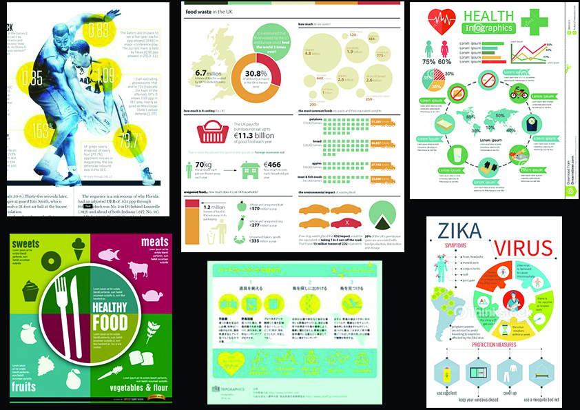
- Infographics: This form of information sharing largely uses graphics and colors to provide information in bite sized portions and make it easily digestible.
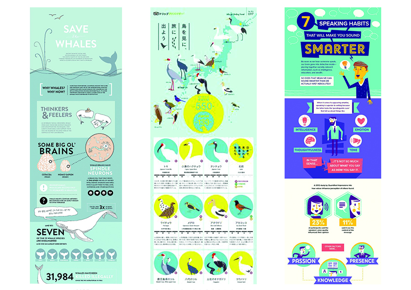
2. Illustrated infographics and comics: This form of information sharing uses a storyline and related graphics to share its information.
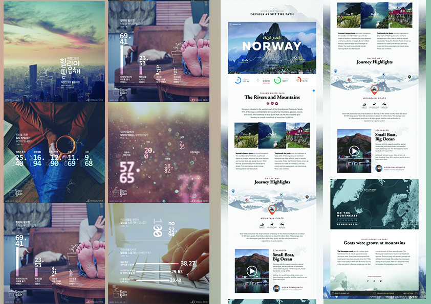
3. Image-driven: This form of information sharing is similar to how websites are design. It sections the information and uses large images that works with the text to create a pleasant combination.
The initial idea was to focus on sharing information in bite-sized portions and also to highlight the danger of Zika. Therefore I decided to focus on the second mood board above.
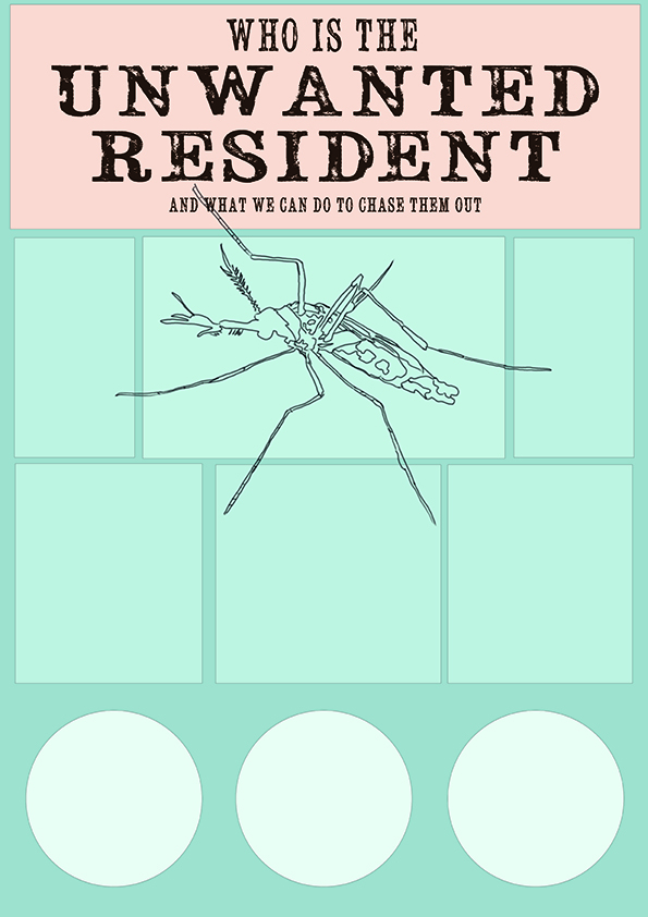
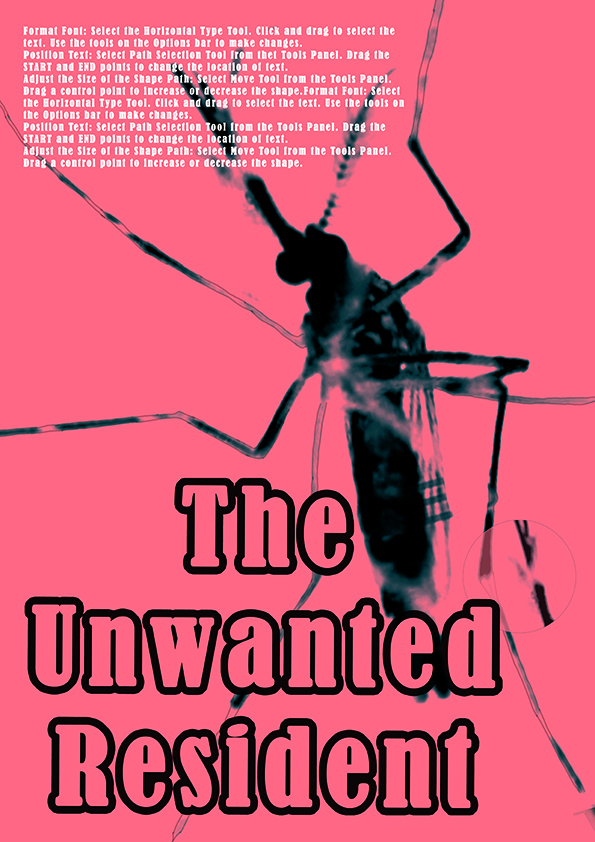
Initial mockup: Editing the image of a mosquito and redrawing it in an illustrated style. The purpose was to make it seem like a wanted poster hence the choice font seemed to that in a cowboy show.
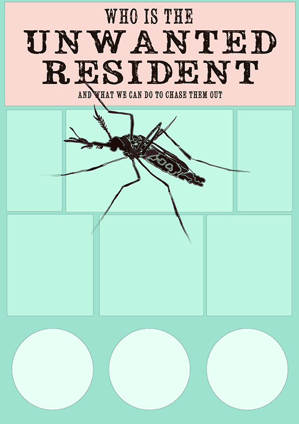
After consultation, the slogan I decided to work around was “Who is the unwanted resident?” which focused on the idea of the mosquito being unwanted in the home. Certain information I wanted to illustrate were tips on how to mosquito-proof your home and what zika was.
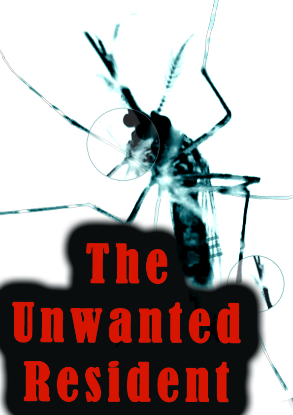
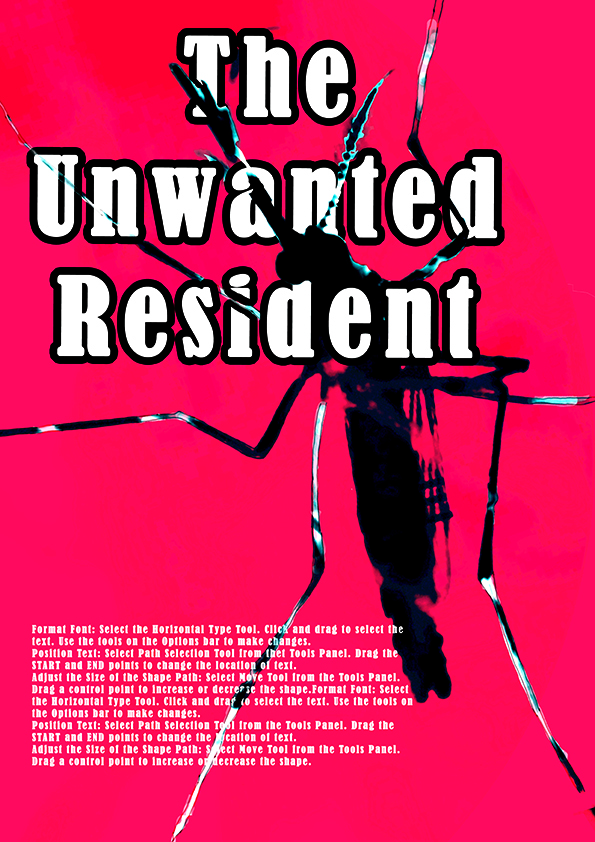
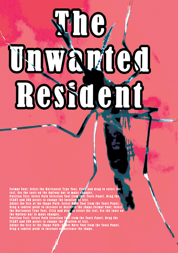
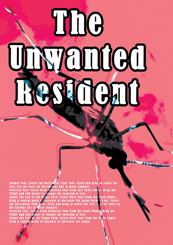
In the end, due to time constraint, I decided to focus on an image and instead use it to catch the attention of the viewer and be able to bring across an understanding of the content with a look. Therefore I focused on the most iconic image to represent zika- the mosquito.
The following are some of the drafts:

After a final consultation, the slogan was edited to “The Unwanted Visitor”. Using visitor instead of resident gives the connotation that this is something we do not want in the house in the first place as opposed to a resident which means that it already resides in the home.