Week 2 Journal- Buddhist Temples

What is your favourite Buddhist Temple in Singapore? Why?


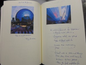
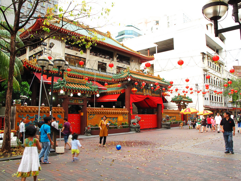
I don’t have a favourite Buddhist temple but the most memorable one is the Guan Yin Temple, also known as the Kwan Yin Thong Hood Cho Temple, on Waterloo Street.

6194545742_4452d2e3a9_b

Image taken from https://www.flickr.com/photos/40261708@N02/6194545742

My parents pray to Guan Yin so this is a temple that we will frequent, more so in the past then now. It was a temple that I remember going to quite frequently on hot Sunday afternoons. The crowd was terrible and the amount of smoke from the incense burnt would irritate my eye most times. After praying, you could get sweets from the table in front and my dad always took some for us. “It’s for good luck,” he would say and I think my siblings and I were just happy to have sweets. My mother would take chrysanthemum flowers back for blessings too.

Now, when I visit the temple again, it is a place that brings me peace. The crowd is still terrible, the incense not so bad, and the sweets and flowers are still there for people who want to be blessed. Sometimes you see the occasional auntie riffling through the flowers as if she needed to get the best piece. It is a place that holds memories for me but it is also a place where I feel a little closer to a divine presence.

After learning more about Buddhism from Art History and my earlier interests in reading about it, I feel like I can understand the religion better.

Chinese Porcelain Visual Response Reflection

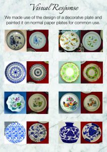
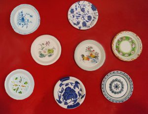
In reproducing Chinese porcelain designs on paper plates, we seek to address its changing nature, from decorative items to utilitarian wares.


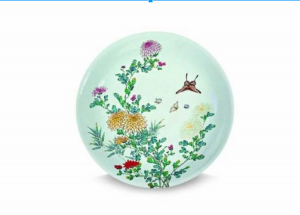
The plate we referred to was the Chrysanthemum dish made in the Qing dynasty (1644-1912), found in the Asian Civilizations Museum.

Screen Shot 2016-04-18 at 1.03.38 am

Chrysanthemum dish

China, Jingdezhen kilns, Qing dynasty

Porcelain with depictions of plants and butterflies


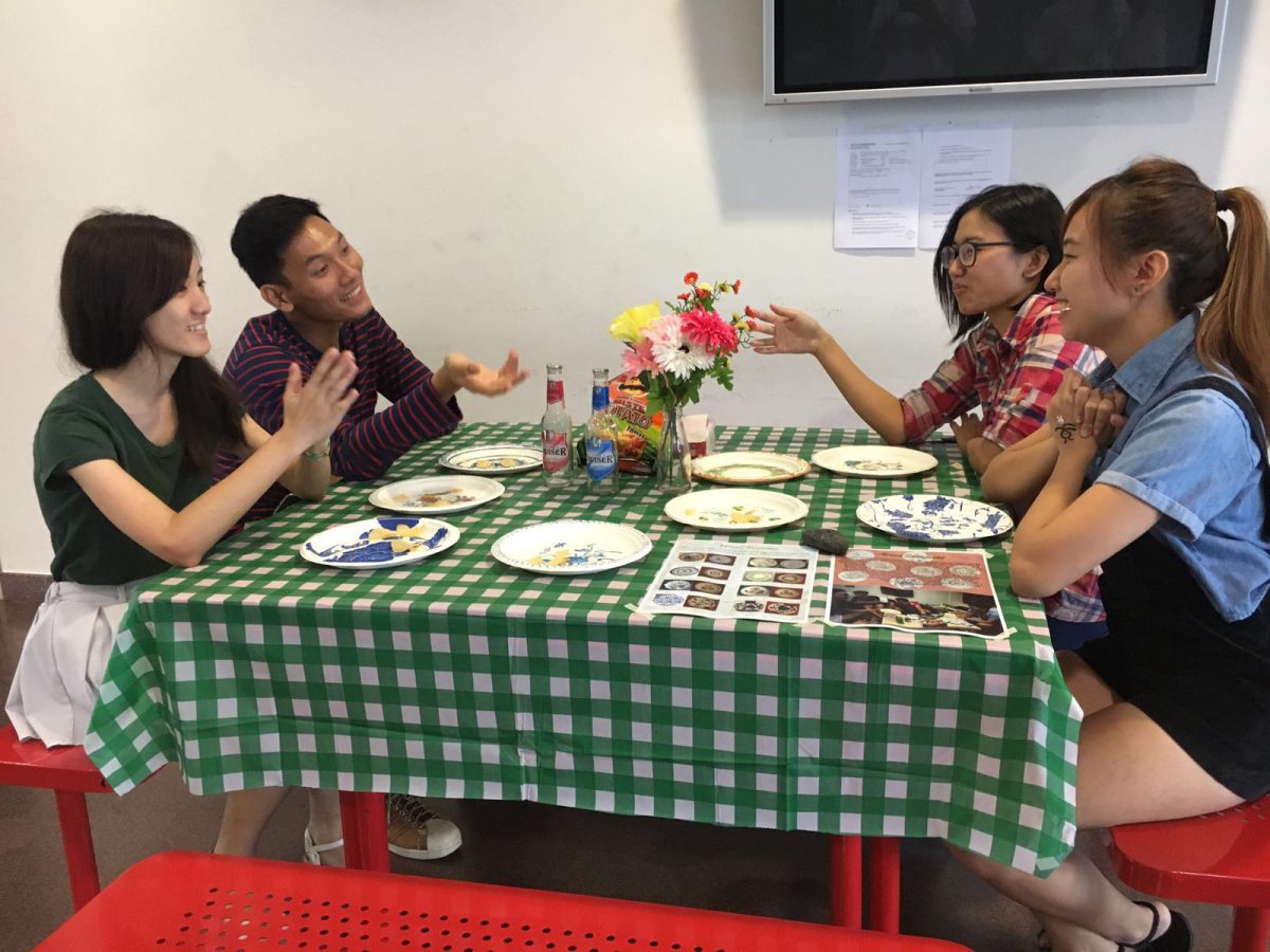
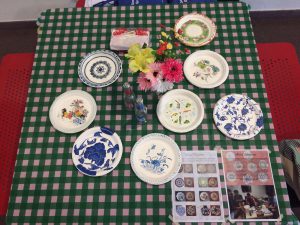
After research and group discussions, we settled on the uses of Chinese porcelain designs and comparism of the past and future uses. In the past, such plates were deem precious and placed for decorative admiration yet such designs can be found on plates used for eating now. To emphasise on the shifting nature of the designs now, we use paper plates, a disposable item easily thrown away after use. People are more blasé about such designs and with printed technology, it is easy to throw away what might be deemed precious centuries ago.

PICS

SAMSUNG CAMERA PICTURES


To emulate the casual setting we were going for, we decided to set up a picnic table where such plates are more commonly used. Bottles, chips, and flowers are provided to create a friendly atmosphere where friends can easily gather to chat.

 b2c91c15-e42d-4705-bf3d-d07b28240214

Through this project, I realize art is never just a reflection of its own period but also an instigator of critical questions to an artist, art students, art historian, anybody. Yes, it does represent the period from when it came from but such art inspires the next generation of art and that is how we fit in. Looking at a plate created centuries ago prompted us to think about the ever-changing nature of goods and compare them. It can go many ways then, we can ask ‘why has it changed?’ or ‘when did it change?’, the questions are endless. In creating a visual response, we are creating a conversation with the piece which I found intriguing and frankly, rather amazing.

Art History- Final Project Research

Group members: Andrew, Fern, Chen Yue, Ziyu

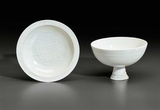
During the discussion on Thursday, we agreed to focus on Chinese ceramics. Which Chinese ceramic we wanted to focus on, well, we will need to do further research. We might focus on the white wares.

However what we agreed on is to focus on functionality of Chinese ceramics and the modern interpretation of such items.

For example, Chinese ceramics were used by royalty or the commoners, depending on the clay used and the final product. White wares were more commonly purchased by the rich while the more common wares were used by commoners.

Several functions of current plates include

  • decorative or aesthetic purpose
  • usage during consumption of food
  • as symbols of status

The implementation of final prototype:

– We intend to create a ceramic plate or to find a model of it in different materials to explain its current modern usage.

-Paint it in resemblance of a Chinese ceramic.


Introductory Paragraph- Chinese Tomb Art

There has been a change in my thesis statement but I think I’ll put down the paragraph first and see if it’s easy to pick out.


Introduction:

The Ancient China concept of death indicated that the body had two spiritual elements, the hun spirit representing the expressive soul headed for paradise and the po spirit that remained after death[1]. To appease the po spirit, the dead were buried with art such as sculptures or bronzes and everyday objects, essentially “recreating life in all its essentials.“[2] The higher rank the deceased had, the more goods were placed in their tombs, one of the most famous being China’s First Emperor Qin Shihuang tomb and his terracotta warriors. Founded in 1974 by farmers , the terracotta army remained one of China’s links to its extensive history, one being the study of military hierarchy in the ranks; Despite the facial individualities of the soldiers[3] the overarching shape of the terracotta figures, as shown by its posture, weapons, and dressing, encapsulates the rank of the figure.

[1] Wood, China’s First Emperor and His Terra Cotta Warriors, 127.

[2] Man, The Terracotta Army: China’s First Emperor and The Birth of a Nation, 100.

[3] Fu, The Underground Terracotta Army of Emperor Qin Shi Huang, 12.


Bibliography:

Wood, Frances. China’s First Emperor and His Terra Cotta Warriors. New York: St.Martin’s Press, 2008.

Man, John. The Terracotta Army: China’s First Emperor and The Birth of a Nation. Great Britain: Bantam Press, 2007.

Fu, Tianchou. The Underground Terracotta Army of Emperor Qin Shi Huang. China: New World Press, 1996

Question 1 essay proposal

Hi there,

Below is the essay proposal format I have for art history. It is still very rough but has a layout of what I am intending to focus on for each paragraph.


Proposal format for question 1: 

What is Chinese tomb art? Compare two bronzes from the Shang dynasty. OR compare two terracotta figures from the Qin dynasty.


Introduction:

  • What is Chinese tomb art?
  • Why are there Chinese tomb art?
  • Examples of Chinese tomb art

Tentative claim:

  • The terracotta warriors in Qin Shihuangdi’s grave are part of a majestic range of Chinese tomb art for the emperor.


Plan for essay:

  • Compare between two terracotta warriors.
  • Analysis of similarities and differences between both art pieces.
  • Analysis of significance of tomb art in context.


Possible paragraphs envisioned (Numbers below represent paragraphs)

  1. Introduction to Chinese tomb art. This includes their use, appearance, and context of history and religion in which it was used.
  2. Introduction of both terracotta pieces for comparism. Compare on similarity and differences.
  3. Analysis on context for both terracotta pieces.
  4. Attempt to answer and support the tentative claim that terracotta warriors are part of a majestic form of Chinese tomb art.
  5. Conclusion to highlight tentative claim once more.

Typographic Portrait- Research and Final Product

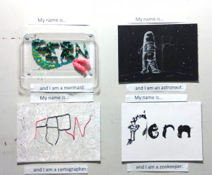
A brief look at the final product before going into research details.

Final outcome:
Screen Shot 2016-02-24 at 1.16.00 am


Research Process (Part 1):

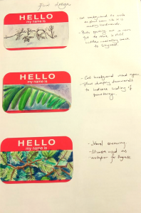
By way of introduction to the typographic portrait project, we were given an interesting mini-project to work on: Use conceptual, abstract, and literal imagery with typography to depict an aspect of yourself.
 

Screen Shot 2016-02-24 at 12.28.05 am

The word shown here is ‘Shy’. Literal representation is shown with the imagery of the mimosa, a plant sensitive to touch. Its leaves close upon contact, thus it can be compared to the quality of shyness if an anthropomorphic quality is ascribed to it.

The abstract, a close-up of a mimosa leaf bent downwards, was meant to be an unidentifiable object yet its bent would suggest a desire to hide.

The conceptual was shown with typography made out of ferns. The plant presented here was the mimosa once again, and twigs were formed together to spell my name. The quality of shyness was depicted through the difficulty in picking out the name at first glance, and suggests something hiding itself away.

This project served as a warm-up leading to our first project: Typographic Portraits, and was a refreshing look at the use of imagery in the depiction of self. I admit it was a little difficult for me to come up with imagery I thought suitable, or even find perfect, enough but I guess we have to make do with what we have.


Research (Part 2):

Required: 4 typographic portraits using your name to describe various subjects


The first part of undertaking a project was to brainstorm and filter out potential ideas, or in this case, occupations or affirmations I wanted to show.
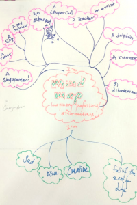
Screen Shot 2016-02-24 at 1.17.00 am


There were typographic designs I found interesting and wanted to explore too.

18– Words in shades and interesting angles to suggest and create a space or perspective. Tricks the mind that it is looking at a one point perspective, this could be interesting if matched to a good affirmation.
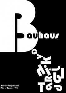

Bauhaus type-inspired0

– From Bauhaus

– Negative space is highlighted severely, giving it a clean look. It is authoritative looking.
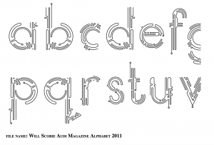


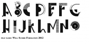
Will Scobie 5

– Typography by designer Will Scobie

– Clean continuous lines, leaving much white space.

– Futuristic looking personality. Line can depict personality too.

Screen Shot 2016-01-20 at 11.43.29 am

– Use of previous font in magazines.

Will Scobie 3

– More typographic font from Will Scobie. Different personalities to the words.
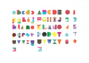
typography

– Alphabets were made up of different colored shapes. It suggests that text and numbers are so ingrained in us that we are able to decipher typography with suggestions of them.

– An interesting idea to create recognisable forms with basic shapes.

– Delightful selection of overlaps and solid colors.
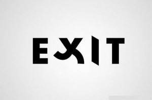
exit

– Literal representation of the word “Exit” with the typography.

– A way to show humour and also bring across the message in the word
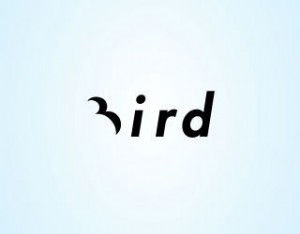
Jennie lynn grunstad

More examples which I found interesting.
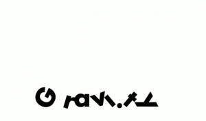
1


Final products:

The four subjects I wanted to explore were:

I am Fern and I am a…  Mermaid/ Cartographer/ Astronaut/ Zookeeper


Astronaut:

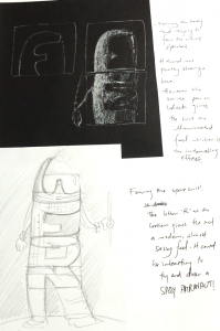
I attempted to answer the question “What images does the word astronaut conjure up in your mind?”

They were space, moon, floating, stars, spaceship etc.
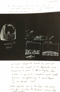
Screen Shot 2016-02-24 at 1.17.24 am Screen Shot 2016-02-24 at 1.17.30 am Screen Shot 2016-02-24 at 1.17.37 am

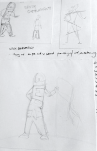
Through different sketches, I explored the way I wanted to show me being an astronaut, and eventually settling on the idea of depicting the space suit with my name.


Pros: I felt that the medium worked well. Using white on black paper meant that it felt more like I was revealing the astronaut from the darkness. The black represented Space well and white contrasted against it would stand out. The futuristic design of the space suit would stand out better, creating a surreal effect.

Cons: The final typographic portrait could have made the letters clearer. The original intent was to hide the words so that one would have to work at unveiling the words in it. However it might have been better to allow the words to stand out more.


Mermaid:

Sketches for mermaid.

PHOTOScreen Shot 2016-02-24 at 1.33.56 am
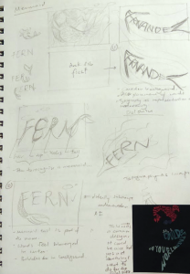
Using typography to create an image of a mermaid seemed a little cliche. Also it was the first idea to occur to me and you know what they say about not implementing the first idea in your mind…

So, there was a little more playing around with the idea of representing the mermaid with just my name. I was asking myself, without depicting a mermaid, what tells us that something is related to a mermaid? The conch shell bra, the hair, the tail?

It was the tail I went with in the end as I felt it was more iconic. Coupled together with fake seaweed made of plastic bags, I felt that there was an underwater theme together with the depiction of a mermaid.

One last thought: It would be pretty cool and clearer if the words were submerged in water  yes?


Pros: This was really fun to make and I enjoyed myself. The final piece with water looked really pretty too.

Cons: Maybe the seaweed could have been places better. A taller container worked have been better in ensuring that the water does not spill out too.

Cartographer:

A cartographer is someone who creates map and has many other duties including field trips out to locations and using design software and tools. Sounds pretty heavy.

The thing I felt most represented cartographers was a map.

f27f9f9aac540f0da3468825843e19ab

There were rather interesting images online, such as the alphabet formed with islands above. Perhaps I could recreate my name using land reminiscent of countries on world maps?
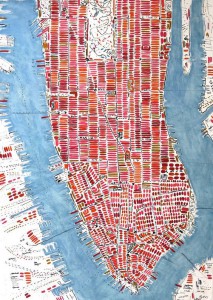
e59e3ac18c9b0ff7bbbc4a0f595ad542

Complex lines crossing and interlocking to show a city. It could be interesting to use such lines in creating my name.

Final piece:


Screen Shot 2016-02-24 at 1.16.47 am


Pros: The line work was pretty good, if I may say so..

Cons: The name could have been expressed better instead of using strings on a certain portion only. Before the presentation, I was looking at the piece again and thinking about it, and thought if the streets were color coded with main streets depicting the names standing out with color alone, it would be pretty cool. (Serious, then it was mentioned during the critique and I knew then that it would have been better to do the color thing.)


Zookeeper:

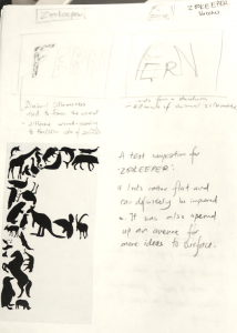
I was stuck on this so I created some drafts just to help me think through the ideas.
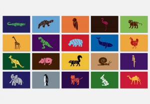
 

25-typography-design-word-animal

This typographic examples of animals were really fun to look at but would not have been something I could use in the zookeeper typographic portrait.
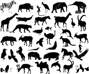
4921238-animals-collection-vector-Stock-Vector-silhouette-elephant-zoo

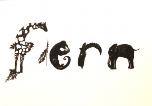
Research of animal silhouettes to create the below text.

Font_zookeeper_color

Draft of animals to form an alphabet.
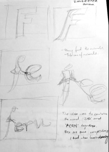
 

Screen Shot 2016-02-24 at 1.17.18 am Screen Shot 2016-02-24 at 1.17.11 am Screen Shot 2016-02-24 at 1.16.34 am

The negative space in between F and E was to show the alphabet Z. The alphabets e and r are curved to suggest o’s. In that way, the negative space spells Zoo.

Pros: I quite liked the little negative space and the use of animal imagery.

Cons: It could have been a little more polished.
3 Act Structure- Land and Bread

Hi everyone, I’ll be doing an analysis of the short film “Land and Bread” using the 3 act structure. View below to find out more!


3 act structure:Tierra y Pan (Land and Bread) short film

first act (1X) (beginning) (setup)
– Beginning: First character introduced was the dog, in close up. Second character, the little girl in the red top, was introduced soon after.
– Inciting action (life will never be the same for the character): The mother arrives holding her belly, about to give birth. A change is going to happen. Climax of act 1.
– Second thoughts: Mood in the film has become morose with showing of grey skies when film zooms out.

 
second act (2X) (middle) (confrontation)

Obstacle: The child is alone with the mother and has to call for an authoritative figure. Time is needed to seek out the figure, in this case the father.
– Obstacle: The doctor takes a while to come. The place seems barren which might suggest that calling the doctor would take a period of time.
– Midpoint   (big twist): There is a death but we do not know who has died yet. Is it the mother or the child? We only know someone has died when the doctor left, his head bowed down, and he removed his blood-stained cloth, stashing in the pick-up and leaving without any celebration that would have happen if there was a healthy birth.
– Obstacle: The dog’s incessant barking irritates the man. He yells at it and unties it from the post. A feeling that violence had been averted.
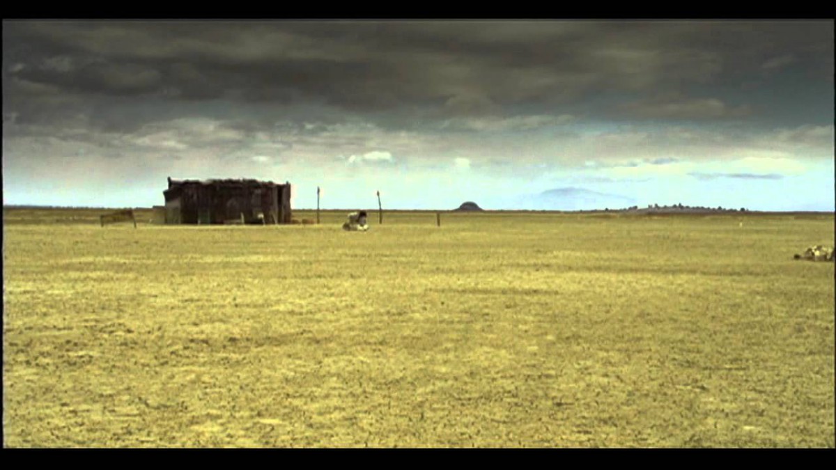
– Disaster: The father comes out with something wrapped in cloth. He starts to dig a grave. The baby is the dead.
– Crisis: The feeling of dread in the show has intensified. Dread is fully felt upon seeing the marked grave of the baby. The crisis is the expected change that will happen in the family from now on.
– Climax of act 2: The mother and child mourn the grave of the dead baby.


third act (1X) (end) (resolution)
– falling action *climax of act 3: The dog comes back and digs the grave of the dead. A taboo subject for many cultures bordering on the uncomfortable.
– resolution (wrap up/end): The ending is open-ended and leaves the viewers with the feeling that life goes on. The wind will continue blowing and the house might continue existing and life will go on.

Journal Week 1: How do you learn?

I am a tactile/visual learner in equal percentage, which is what I found in a recent online test. The link is available here.

With descriptions and explanation from the website below, I am able to better understand the way I learn and how I can help myself learn better.

Tactile Learning:

You learn by touching and doing. You understand and remember things through physical movement. You are a “hands-on” learner who prefers to touch, move, build, or draw what you learn, and you tend to learn better when some type of physical activity is involved. You need to be active and take frequent breaks, you often speak with your hands and with gestures, and you may have difficulty sitting still.

As a tactile learner, you like to take things apart and put things together, and you tend to find reasons to tinker or move around when you become bored. You may be very well coordinated and have good athletic ability. You can easily remember things that were done but may have difficulty remembering what you saw or heard in the process. You often communicate by touching, and you appreciate physically expressed forms of encouragement, such as a pat on the back.

Visual Learning:

You learn by reading or seeing pictures. You understand and remember things by sight. You can picture what you are learning in your head, and you learn best by using methods that are primarily visual. You like to see what you are learning.

As a visual learner, you are usually neat and clean. You often close your eyes to visualize or remember something, and you will find something to watch if you become bored. You may have difficulty with spoken directions and may be easily distracted by sounds. You are attracted to color and to spoken language (like stories) that is rich in imagery.


Some suggestions given to tactile/visual learners are that

  • Use flashcards to learn new words
  • Try to avoid distractions.
  • Colour code things.
  • Try to visualize things that you hear or things that are read to you.
  • Do lots of hand-on activities.
  • Etc

Well…

It’s a good thing I’m in Art and Design huh. With visual/tactile (and also auditory) learning tendencies, my way of learning has mostly been to draw out my notes, fidget a lot when in class, imagining the events in a book or notes, especially in history, so that I remember the events better, and even just moving a lot when thinking.


Ideas for 4D Foundation II

Ideas for Foundation 4D II

I’ve two ideas currently and tried to keep to topics that were personal to me.

  • Running- a short animation film on the process of running, from the anticipation in the start to the process, where one works through determination and perseverance, to reach the end where they look back on their efforts and look forward to the next run.
  • Home- specifically based on NTU students staying in Hall. They commute from Home to Hostel every week. What does it mean to be constantly moving between places that you stay in? I hope to explore this in a short animated film.

2D Fundamentals Assignment 3: Ego

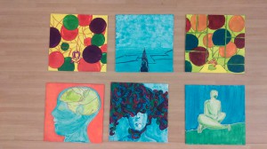
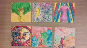
Hooray, we’ve just completed our last 2D Fundamental assignment and below are images of my works and sketchbook.


Final works:

IMAG3671

The equations are as follow and each picture aim to depict the below mentioned quality:

  1. Curiosity + Practicality = Me
  2. Intelligence – Anxiety = An Ideal Me
  3. Improvement in technique x Confidence = A Better Me
  4. Hard Work + Experience = Me in 5 years

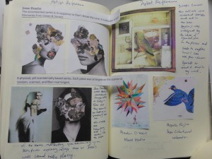
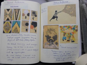
Images from sketchbook:

SAM_1807

SAM_1808

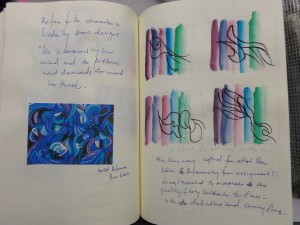
Artist References: Hollie Chastain, Jesse Draxler, Joseph Cornell, Mayuko Fujino, Martin O’Nell

SAM_1809

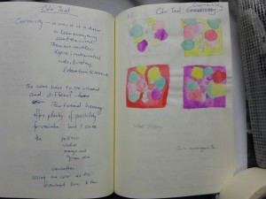
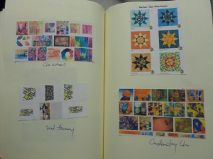
Tetrad Harmony color test

SAM_1810

Analogous harmony color test

SAM_1811

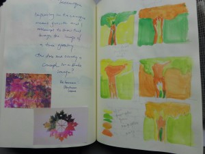
Analogous warm 5 color test

SAM_1812

Tetrad Harmony color test

SAM_1814

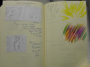
Artist Reference: Fong Qi Wei

SAM_1813Color scheme ideas