Assignment 3 Final: Get well card

The final designs for assignment 3 are as below:

front_oss
Front of card
back_os
Back of card
img20161107122131
Front detail of card with die-cut
img20161107122156
Front detail (2)
img20161107122143
Back detail with die cut
img20161107122138
Interior of card

There were certain challenges that I faced along the way which I feel helped me grow as a designer. Some of the challenges and solutions are as below:

  1. Designing the folds before imagery. Also thinking that folds had to be extremely elaborate for it to look nice which isn’t the case. A simple one fold can still look good. The thing that has to match and be considered is the combination of card fold and design. How does the design relate to the fold? How does the viewer interact with the card? How do they approach the card and what visual cues can we give them for a better experience on their side? These user-oriented questions would be better instead of self-oriented questions.
  2. Clarity of design. We need to ensure that the potential viewers understand what they are looking at before we can call the design a success. One good way of gauging is to show a mock up to people of the same age group as your potential client. They will be able to give indicators if the design is working.
  3. Pushing your design is needed. When you have an idea and it’s working out fine, what we can do next is how can we further push the design?
  4. Printing! This was a major problem because the alignment between both sides of the card had to be precise, which it wasn’t. I had to go back to the printer’s a second time after editing the design at home and check the alignment on the spot again. Upon seeing that there was still a small margin of error, I came up with a blue gradient on the outside of the design so that it would not look like it was a mistake. Also when printing, considering the card weight is important too.

I did learn quite a lot from the assignment and hoped that I would continue adding on to the knowledge as I continue on with my studies!


Assignment 3 Research: Get well card

The assignment started simply enough- create folding and perforation lines to make a 3D card out of a single sheet of paper. Unfortunately I have never been too good at 3D materials but I am interested to see what I can do. Here we go.

When reading about the brief, where we have to explore possibilities in creating a get well wishing card, the first thing I did was think about the folds I wanted to use. I went through card pieces I saw online and at Art Friend and played with the idea of different folds to create.

viscom1
Sketches for card graphics and fold
viscom2
Other exploratory sketches

I wanted to card with two folds that folded on top of each other. There were two ways that it could go then:


  1. A person raise their hands in triumph while the second layer forms a sunburst design. Both layers would be cut out with a die cut. The last layer would be a background upon which the first two layers would rest and together they would form a completed image of a person in a dynamic pose and cheering the viewer on.
  2. Words on top divided into three portions according to the fold of the card. The words say “Get Well Soon”. The imagery for this is undecided.
viscom9
Front of mock up.
viscom8
Back of mock up with box for corporate text and logo.

At the end of the first consultation,  Michael, our lecturer, suggested that the image be the focus before thinking about the folds we want to use. It was the complete opposite of what I had been doing which made me panic for a moment. Then it was back to the drawing board.

When I think about graphics, I also think about what I am capable of currently. If 3D isn’t my thing, then I can focus on creating good graphics. What I wanted the viewer to get out of the card is happiness and a sense of warmth. Hospitals can be rather cold places, with their bare walls and rooms devoid of personal items. The card should aim to provide some warmth and convey the sense of love that people are giving when they give a card.

I focused on the graphics and thought if I wanted to do it digitally or traditionally. The things I thought of were flowers or colourful designs so I went to look for images online.

http://www.canstockphoto.com/illustration/wildflower-background.html
g50-peacock-masha-dyans-watercolor-greeting-card
http://masha.com/page/6/?taxonomy=product_shipping_class&term=1
x51-christmas-ornaments-angel-galina-sokolova-watercolor-greeting-card
http://masha.com/product-category/holiday/

At this point, I just looked for images that interested me visually but had no idea yet how to apply them to the final product. Also I then came up with more sketches focused on interaction with the viewer.

viscom3
Sketches and character sketches

3. The woodlands creature idea involved the inside of the card being a suggested space where woodland creatures come up to surprise the viewer with their cuteness and well wishes. I was still thinking of using the two fold design. So the first layer would be a door which would open up to an interior where the characters would give the surprise.


At the second consultation, we then discussed about the possibility of doing away with two folds and bringing it down to one fold where the first layer would just act as a door and the act of opening the card is akin to opening a door. Michael also suggested doing away with the “Get Well Soon” words at the top and creating a die cut with a character at the front, which will correspond to the design at the back.

I quite like the idea and decided to stick to it. I had a few design sketches for certain characters but realised that they would not all fit into the final design. So I kept to just four final characters- the Hedgehog, who would be inviting you into the room and has presents (yay!), the Bear, who likes to see people happy and warm so it made soup for you, the fox, who is shy but likes to dance in joy at seeing a person healthy, and the squirrel, who likes its nuts or acorns but doesn’t mind sharing if it makes you feel better.

viscom4
Character sketches
viscom5
Hedgehog sketches

After designing the characters, I then designed the layout. Using various image sources, I combined them into a final design.

viscom7
Pencil sketch for the front
viscom6
Pencil sketch for the back design


viscom10
Front mockup

At the third and last consultation, the suggestions given were that I had to consider about the space I was inviting the viewers in to when they opened the door. Also the images of the mushroom could be a little bigger to suggest distance instead of it being flush against the door. A classmate suggested that the corporate text at the back could be combined together with the design, perhaps on a notice board, which I found really helpful!


Typographic Portrait- Research and Final Product

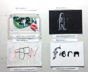
A brief look at the final product before going into research details.

Final outcome:

Screen Shot 2016-02-24 at 1.16.00 am


Research Process (Part 1):

By way of introduction to the typographic portrait project, we were given an interesting mini-project to work on: Use conceptual, abstract, and literal imagery with typography to depict an aspect of yourself.


Screen Shot 2016-02-24 at 12.28.05 am

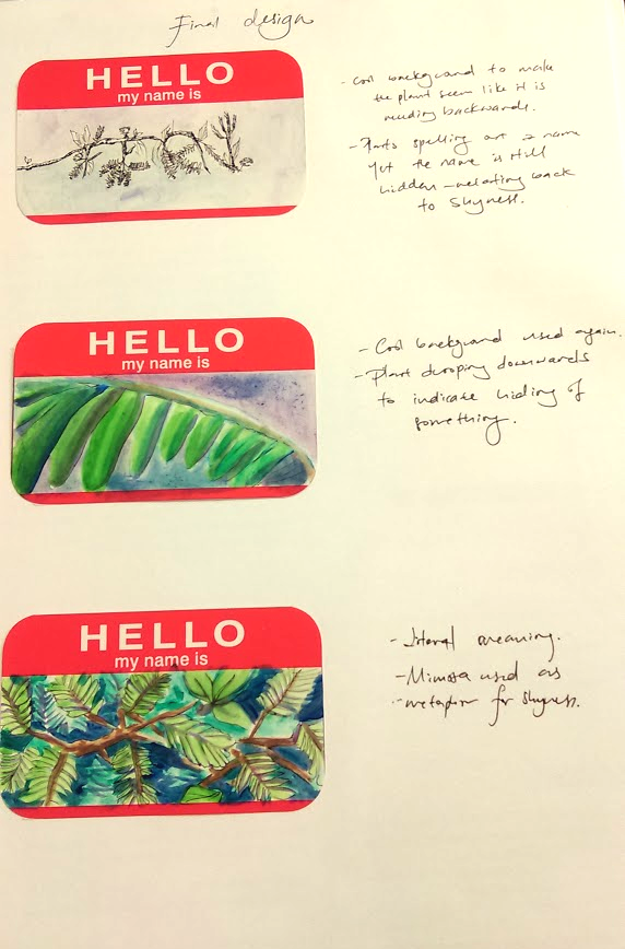
The word shown here is ‘Shy’. Literal representation is shown with the imagery of the mimosa, a plant sensitive to touch. Its leaves close upon contact, thus it can be compared to the quality of shyness if an anthropomorphic quality is ascribed to it.

The abstract, a close-up of a mimosa leaf bent downwards, was meant to be an unidentifiable object yet its bent would suggest a desire to hide.

The conceptual was shown with typography made out of ferns. The plant presented here was the mimosa once again, and twigs were formed together to spell my name. The quality of shyness was depicted through the difficulty in picking out the name at first glance, and suggests something hiding itself away.

This project served as a warm-up leading to our first project: Typographic Portraits, and was a refreshing look at the use of imagery in the depiction of self. I admit it was a little difficult for me to come up with imagery I thought suitable, or even find perfect, enough but I guess we have to make do with what we have.


Research (Part 2):

Required: 4 typographic portraits using your name to describe various subjects


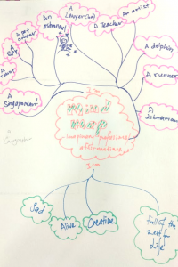
The first part of undertaking a project was to brainstorm and filter out potential ideas, or in this case, occupations or affirmations I wanted to show.

Screen Shot 2016-02-24 at 1.17.00 am


There were typographic designs I found interesting and wanted to explore too.

18– Words in shades and interesting angles to suggest and create a space or perspective. Tricks the mind that it is looking at a one point perspective, this could be interesting if matched to a good affirmation.
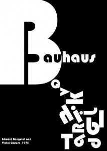

Bauhaus type-inspired0

– From Bauhaus

– Negative space is highlighted severely, giving it a clean look. It is authoritative looking.


Will Scobie 5

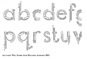
– Typography by designer Will Scobie

– Clean continuous lines, leaving much white space.

– Futuristic looking personality. Line can depict personality too.

Screen Shot 2016-01-20 at 11.43.29 am

– Use of previous font in magazines.

Will Scobie 3

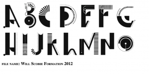
– More typographic font from Will Scobie. Different personalities to the words.

typography

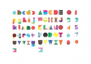
– Alphabets were made up of different colored shapes. It suggests that text and numbers are so ingrained in us that we are able to decipher typography with suggestions of them.

– An interesting idea to create recognisable forms with basic shapes.

– Delightful selection of overlaps and solid colors.

exit

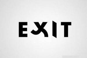
– Literal representation of the word “Exit” with the typography.

– A way to show humour and also bring across the message in the word

Jennie lynn grunstad

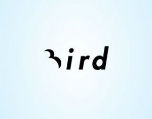
More examples which I found interesting.

1


Final products:

The four subjects I wanted to explore were:

I am Fern and I am a…  Mermaid/ Cartographer/ Astronaut/ Zookeeper


Astronaut:

I attempted to answer the question “What images does the word astronaut conjure up in your mind?”

They were space, moon, floating, stars, spaceship etc.

Screen Shot 2016-02-24 at 1.17.24 am Screen Shot 2016-02-24 at 1.17.30 am Screen Shot 2016-02-24 at 1.17.37 am

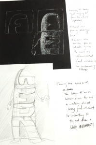
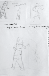
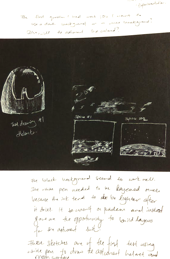
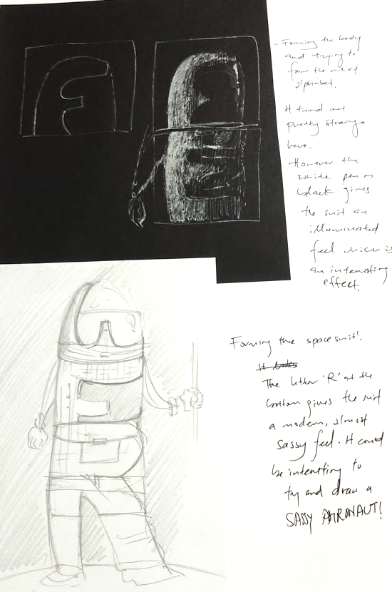
Through different sketches, I explored the way I wanted to show me being an astronaut, and eventually settling on the idea of depicting the space suit with my name.


Pros: I felt that the medium worked well. Using white on black paper meant that it felt more like I was revealing the astronaut from the darkness. The black represented Space well and white contrasted against it would stand out. The futuristic design of the space suit would stand out better, creating a surreal effect.

Cons: The final typographic portrait could have made the letters clearer. The original intent was to hide the words so that one would have to work at unveiling the words in it. However it might have been better to allow the words to stand out more.


Mermaid:

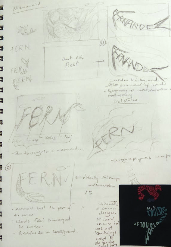
Sketches for mermaid.

PHOTOScreen Shot 2016-02-24 at 1.33.56 am

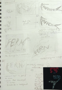
Using typography to create an image of a mermaid seemed a little cliche. Also it was the first idea to occur to me and you know what they say about not implementing the first idea in your mind…

So, there was a little more playing around with the idea of representing the mermaid with just my name. I was asking myself, without depicting a mermaid, what tells us that something is related to a mermaid? The conch shell bra, the hair, the tail?

It was the tail I went with in the end as I felt it was more iconic. Coupled together with fake seaweed made of plastic bags, I felt that there was an underwater theme together with the depiction of a mermaid.

One last thought: It would be pretty cool and clearer if the words were submerged in water  yes?


Pros: This was really fun to make and I enjoyed myself. The final piece with water looked really pretty too.

Cons: Maybe the seaweed could have been places better. A taller container worked have been better in ensuring that the water does not spill out too.
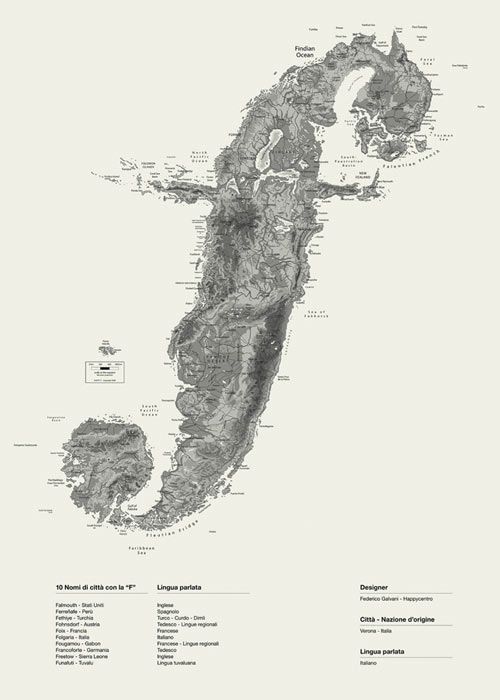
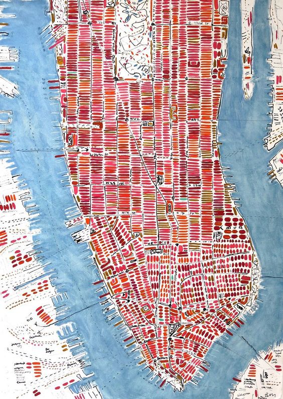
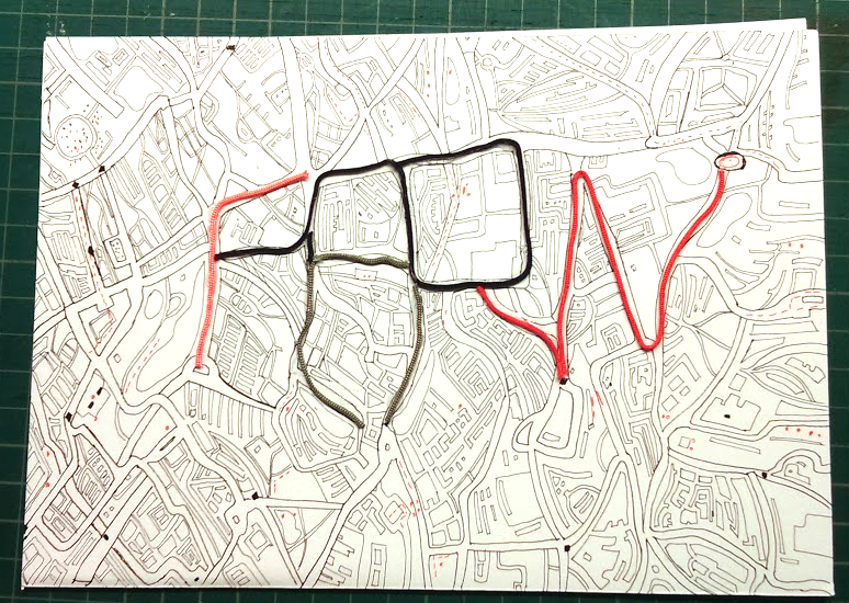
Cartographer:

A cartographer is someone who creates map and has many other duties including field trips out to locations and using design software and tools. Sounds pretty heavy.

The thing I felt most represented cartographers was a map.

f27f9f9aac540f0da3468825843e19ab

There were rather interesting images online, such as the alphabet formed with islands above. Perhaps I could recreate my name using land reminiscent of countries on world maps?

e59e3ac18c9b0ff7bbbc4a0f595ad542

Complex lines crossing and interlocking to show a city. It could be interesting to use such lines in creating my name.

Final piece:


Screen Shot 2016-02-24 at 1.16.47 am


Pros: The line work was pretty good, if I may say so..

Cons: The name could have been expressed better instead of using strings on a certain portion only. Before the presentation, I was looking at the piece again and thinking about it, and thought if the streets were color coded with main streets depicting the names standing out with color alone, it would be pretty cool. (Serious, then it was mentioned during the critique and I knew then that it would have been better to do the color thing.)
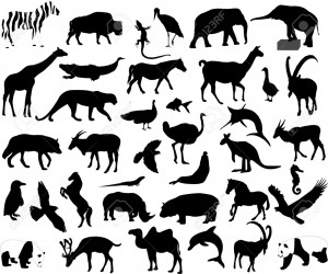
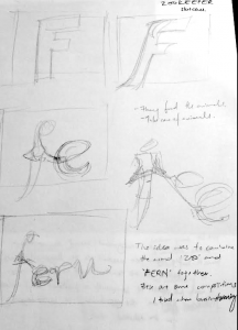
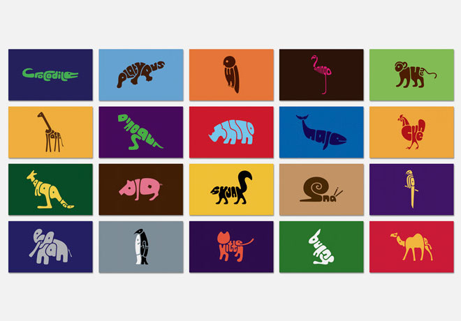
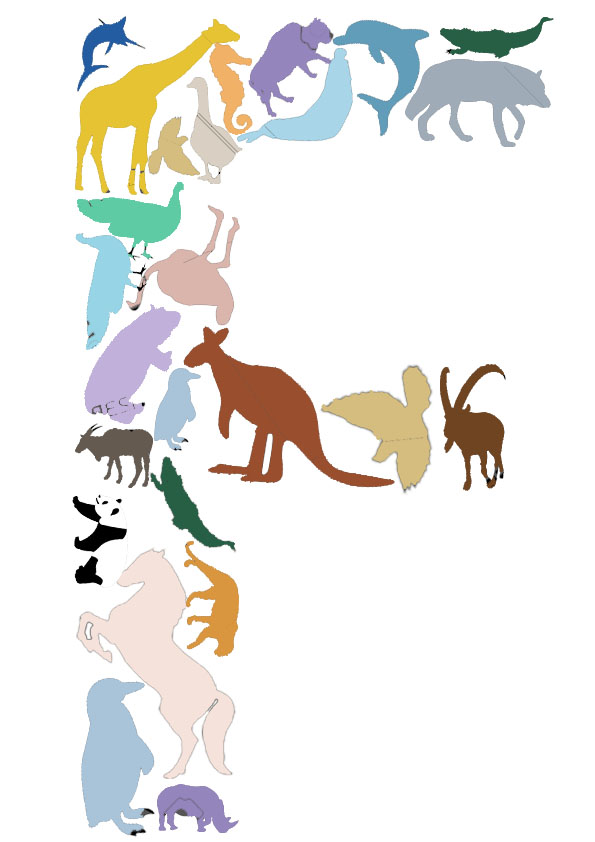
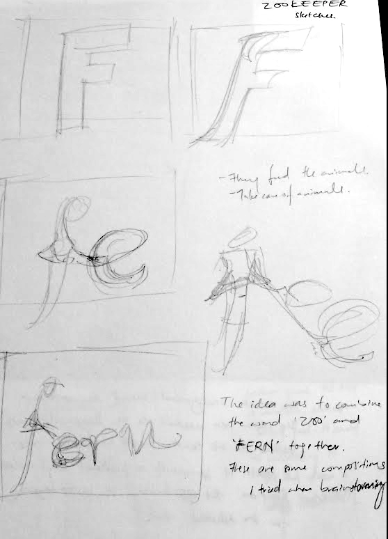
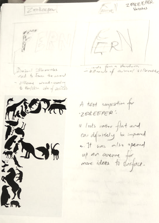
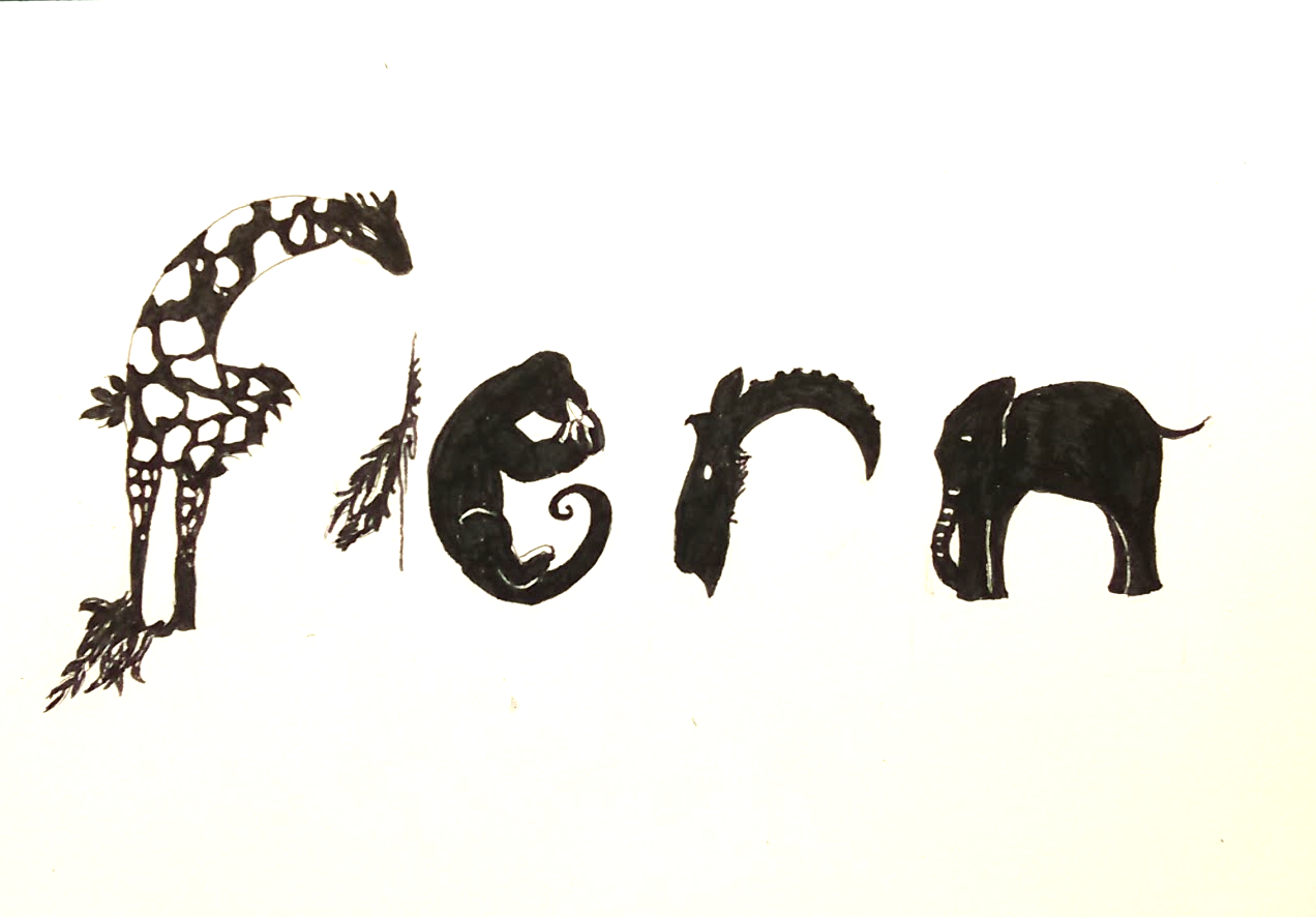
 

Zookeeper:

I was stuck on this so I created some drafts just to help me think through the ideas.


25-typography-design-word-animal

This typographic examples of animals were really fun to look at but would not have been something I could use in the zookeeper typographic portrait.

4921238-animals-collection-vector-Stock-Vector-silhouette-elephant-zoo

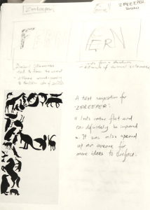
Research of animal silhouettes to create the below text.

Font_zookeeper_color

Draft of animals to form an alphabet.


Screen Shot 2016-02-24 at 1.17.18 am Screen Shot 2016-02-24 at 1.17.11 am Screen Shot 2016-02-24 at 1.16.34 am

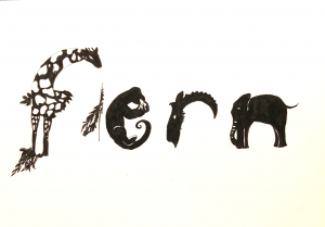
The negative space in between F and E was to show the alphabet Z. The alphabets e and r are curved to suggest o’s. In that way, the negative space spells Zoo.

Pros: I quite liked the little negative space and the use of animal imagery.

Cons: It could have been a little more polished.