Deciding on the final direction I wanted to go with. There were so many ideas I had that it seemed such a pity to just focus on one but due to practicality and time constraint, I eventually settled on what I feel I could do.
Technical skills could be improved. I feel that I’ve learnt quite a bit about drawing on Photoshop through this assignment and aim to improve my knowledge.
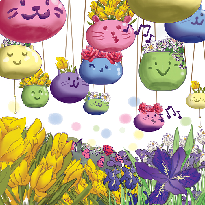
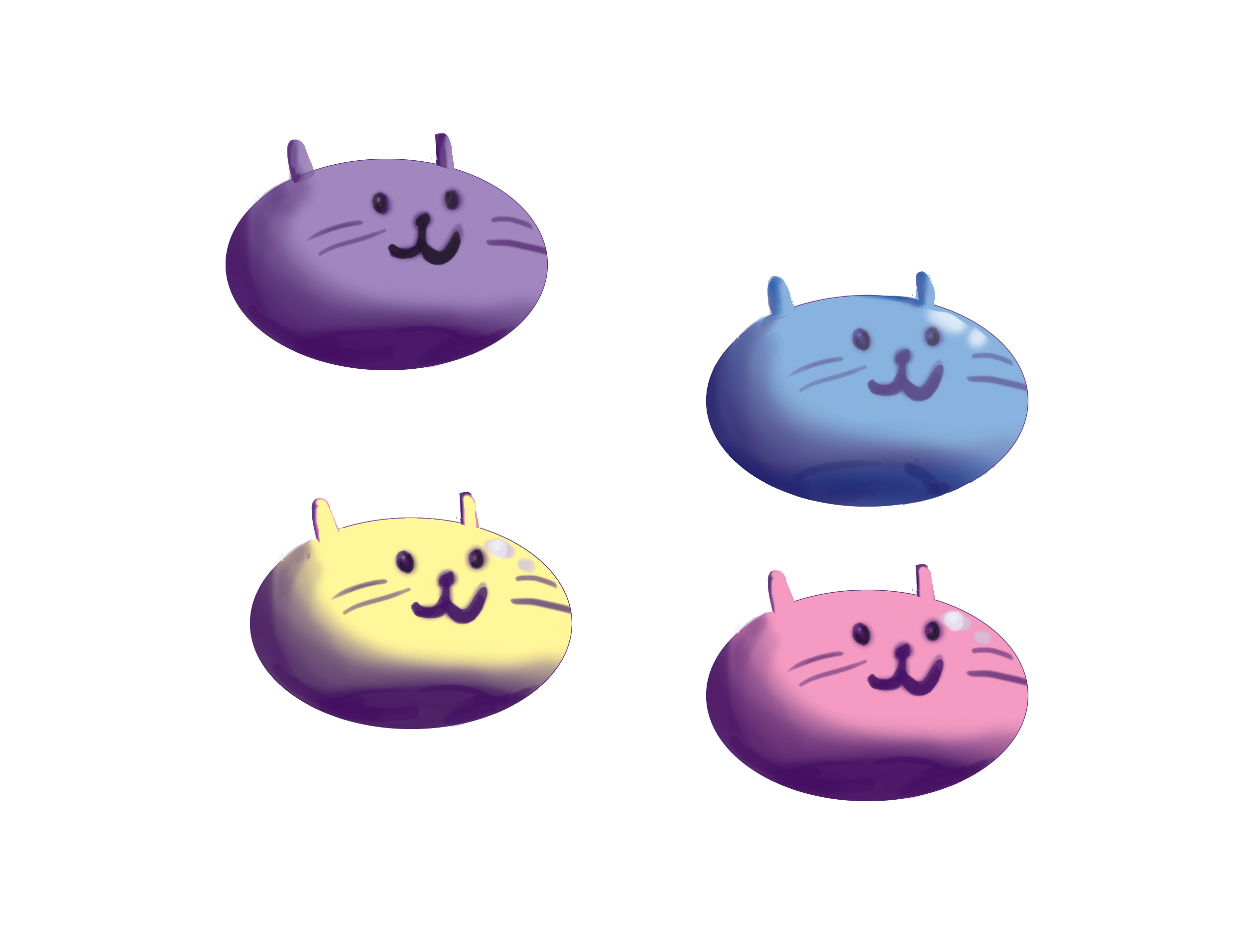
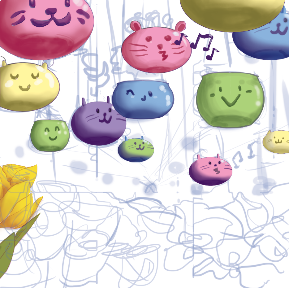
Choosing of colours: I wanted to go with colours that would pop and be pleasant to the eyes hence the choice in pastel colours. The flowers had their own colour schemes too which made having a library in Photoshop a godsend.
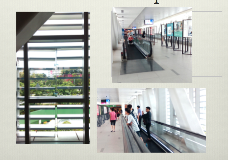
In our first class, we received out brief: Create something that would fit on the glass window of the hospital and consider its relationship with the viewer, that’s what we would tasked to do. During the field trip to the hospital, here are the things I noticed about the space we were supposed to design for.
The space was airy and large but seemed a little cold because of the monotonous colour usage.
Some windows were blocked by grilles which provided a limited view of the outside.
There was light coming in from all side and shadows were very diluted.
People were mostly zoning out or looking at their phones. Most of them were staff and some of them were patients. Some patients and their presumed relatives seemed worried or tired.
Through this observations, I thought about the function of my graphics and wanted them to be positive, light-hearted, and have the ability to provide a moment of happiness for the viewer. Since the location is only a place that links people to other parts of the building, they only have a few minutes to spare which is the only time I have to capture the attention of the people.
Initial imageries I wanted to play with were plants, for the soothing atmosphere it provides and its link to the outside of the hospital, or patterns with colours, that would invoke an emotional response in viewers.
The initial ideas I had were:
Create 3D interactive pieces that viewers can interact with. e.g plants made out of cotton wall.
Stickers with fun designs to be pasted on the wall. This opens up a lot of opportunity to play with the light coming through the window. Also there is a possibility of creating a suggested space where viewers can imagine the stickers as items that sit on the window ledge.
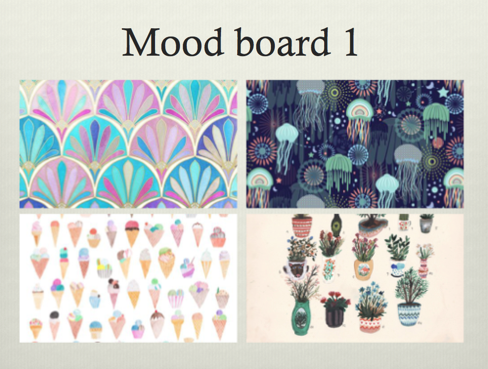
After learning that this was a purely 2D project, I decided to focus on the second idea. I then came up with 3 mood boards.
Patterns and colours form a soothing designPapercut-like designs- nature and floral motifsDesign of plants with cute graphics. Creation of a garden within the space of the window.
Throughout this three mood boards, I decided to work on the third idea and came up with some rough sketches. Before working on the rough sketches I decided to research on the function of a garden and the meaning of flowers which I was going to introduce to the design.
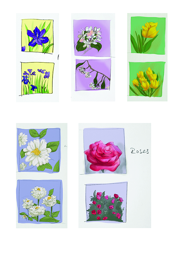
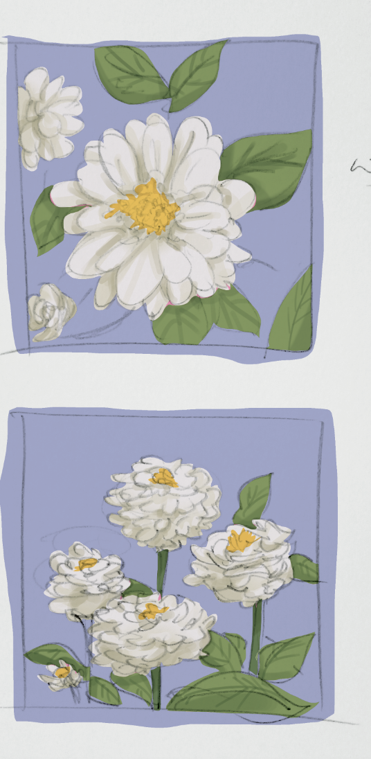
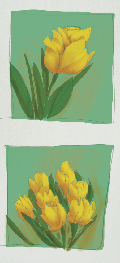
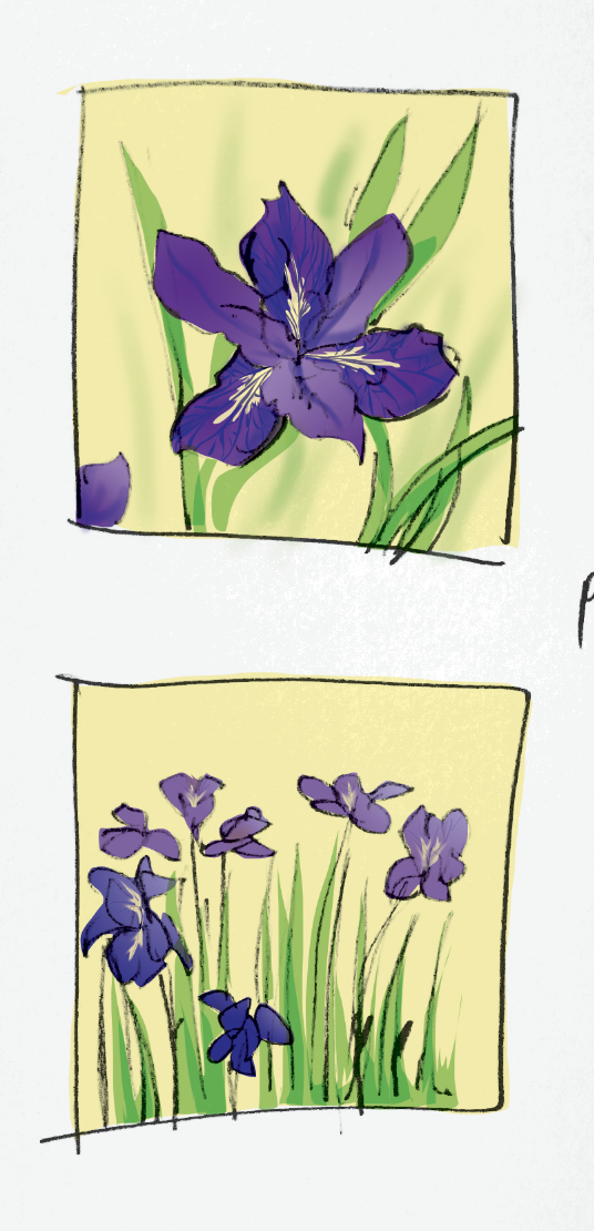
The flowers were limited to just 5 different kinds with varying colours.The flower language of white zinnia is goodness.The flower language of yellow tulips is sunshine in your eyes.The flower language of smilax is loveliness.The flower language of iris is hope.The flower language of pink rose is sweet thoughts.
The flower language of all five flowers form a bouquet of good thoughts and well wishes which I attempted to convey through the array of colours and graphics.
I went to reference books on landscape design after to understand what the best way to design a garden was. Some tips I took away and decided to utilise were:
A well-equipped garden will revitalise us
The presence of plant life in a confined area inspires a feeling of satisfaction
Garden as a place for leisure
Perspective can be used to make a garden seem larger
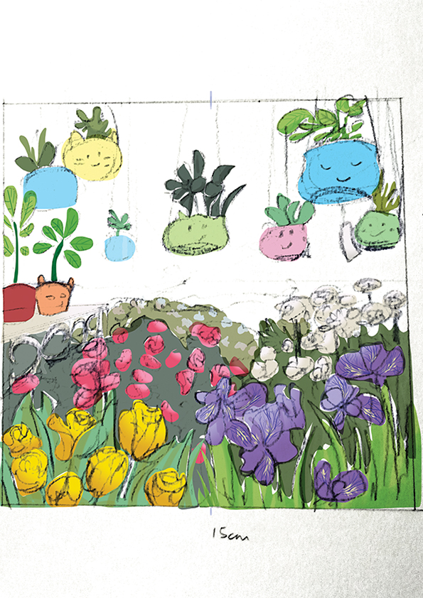
Rough sketches:
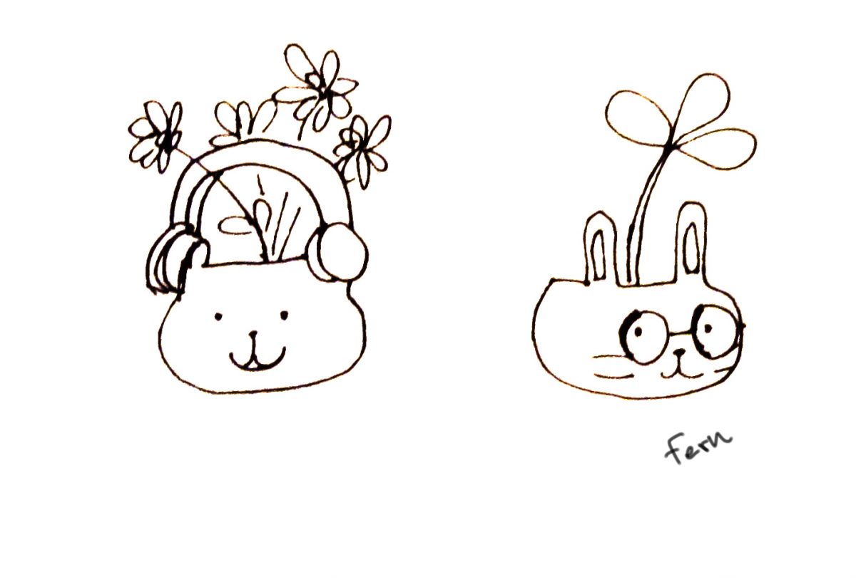
Incorporating the flowers and pot graphics into a designAnother perspective but instead there are shelves.
After the consultation with Michael, our lecturer, and the class, there were suggestions that the garden could be less dense while the flowers in the foreground could be larger to suggest that the garden is closer. The floating flower pots and its almost fantasy-like nature received favourable comments. Since it was a personal favourite too, I decided to keep it.
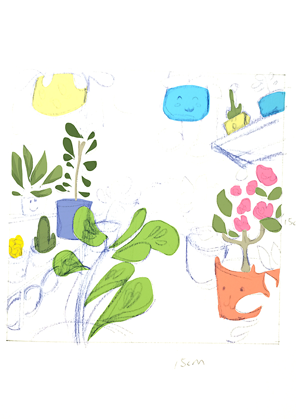
Second draft:
Using one point perspective helps lead the eye in and create a suggested space. The pots seem higher and seem to float above the viewer.
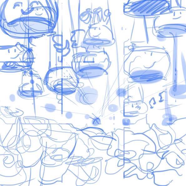
Stages of development:
Other ideas for design of potsColouring the pots.In-progress. Pots and flowers coloured.