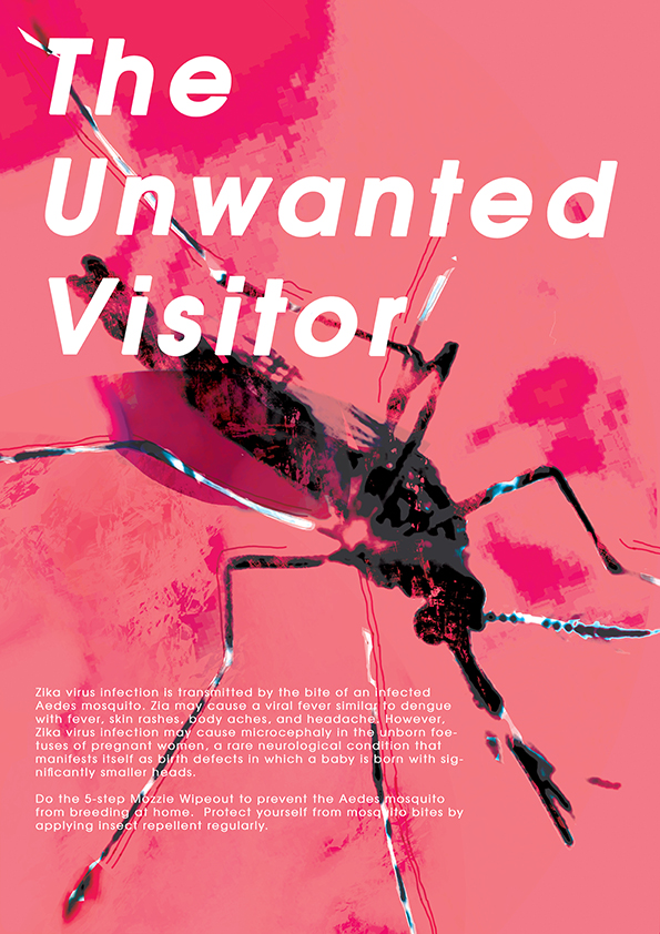
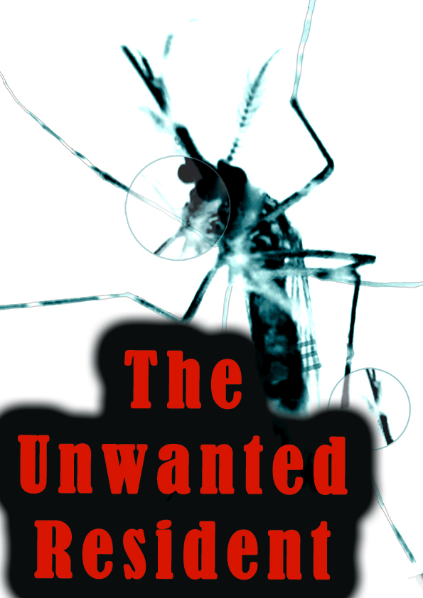
After weeks of consultation and tweaking, the final artwork was as below:
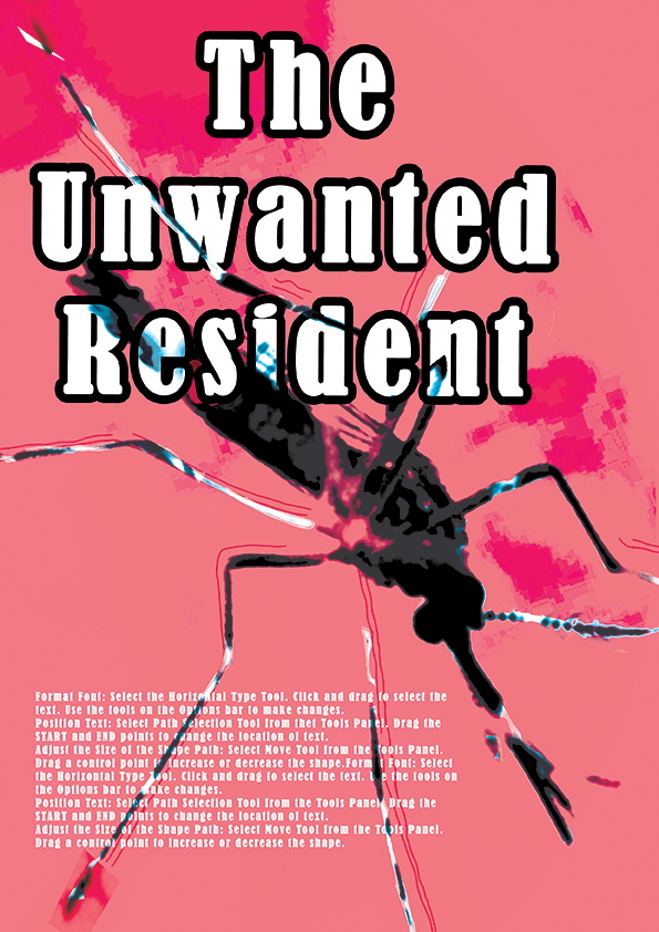
I wanted to give it a contemporary feel hence the font chosen. Texture was also used to suggest blood stains and the sac at the bottom of the mosquito where blood is usually collected. The mosquito creates an instantly recognisable image which people can understand visually before the words register.
Certain challenges I faced were:
Deciding on a slogan: Maybe copy writing is not my thing because I had a bit of trouble trying to come up with something catchy.
Deciding on a layout I wanted to use: It was a little strange that I thought we had to do a sort of infographic and then I see everybody doing image-driven posters instead. In the end, due to time constraint, I did up a poster. Making a decision and sticking with it is something I have to learn.
Positioning of image: I went through many drafts and mock-up to come to the final product. It was pretty interesting in the end.
Some research I did before starting the poster was to look at the different ways information was disseminated.
Infographics: This form of information sharing largely uses graphics and colors to provide information in bite sized portions and make it easily digestible.
2. Illustrated infographics and comics: This form of information sharing uses a storyline and related graphics to share its information.
3. Image-driven: This form of information sharing is similar to how websites are design. It sections the information and uses large images that works with the text to create a pleasant combination.
The initial idea was to focus on sharing information in bite-sized portions and also to highlight the danger of Zika. Therefore I decided to focus on the second mood board above.
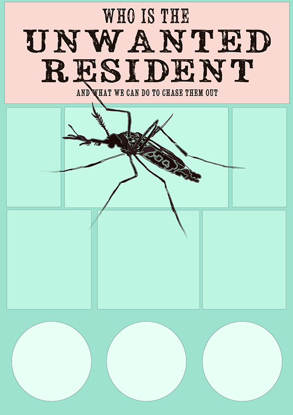
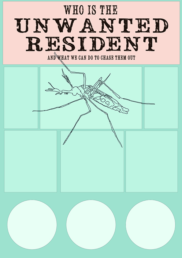
Initial mockup: Editing the image of a mosquito and redrawing it in an illustrated style. The purpose was to make it seem like a wanted poster hence the choice font seemed to that in a cowboy show.
Mock up 1: The squares and circles were to contain informationAnother variation
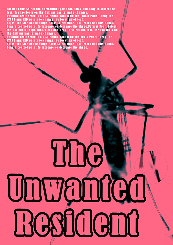
After consultation, the slogan I decided to work around was “Who is the unwanted resident?” which focused on the idea of the mosquito being unwanted in the home. Certain information I wanted to illustrate were tips on how to mosquito-proof your home and what zika was.
In the end, due to time constraint, I decided to focus on an image and instead use it to catch the attention of the viewer and be able to bring across an understanding of the content with a look. Therefore I focused on the most iconic image to represent zika- the mosquito.
The following are some of the drafts:
Another variation of the poster where the information was supposed to encircle the mosquito image.
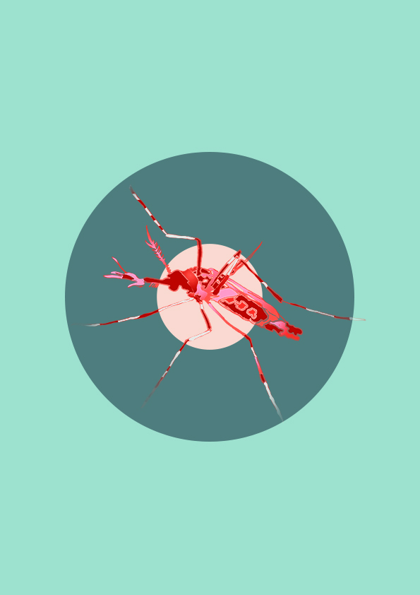
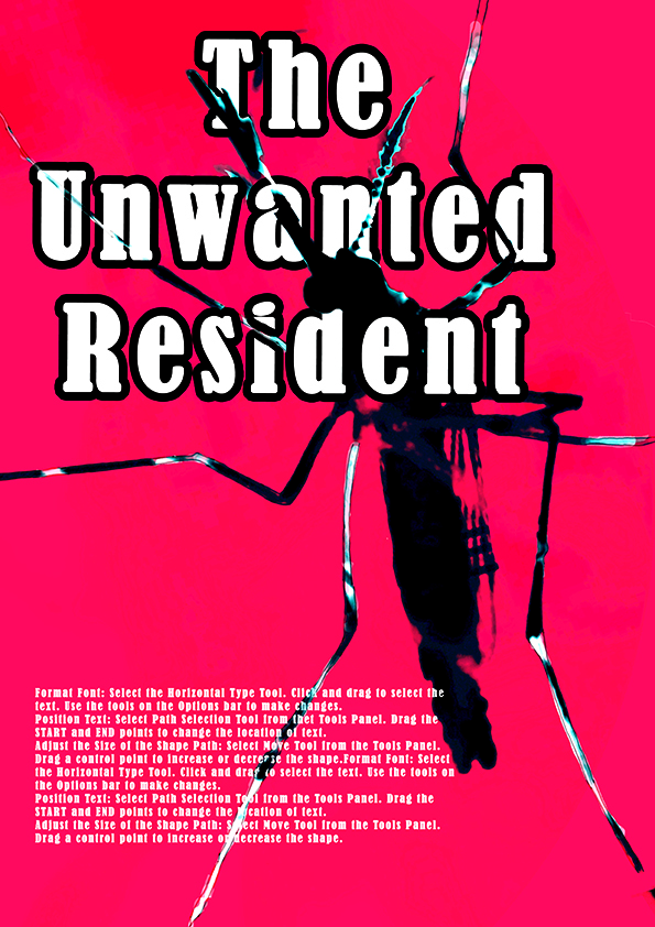
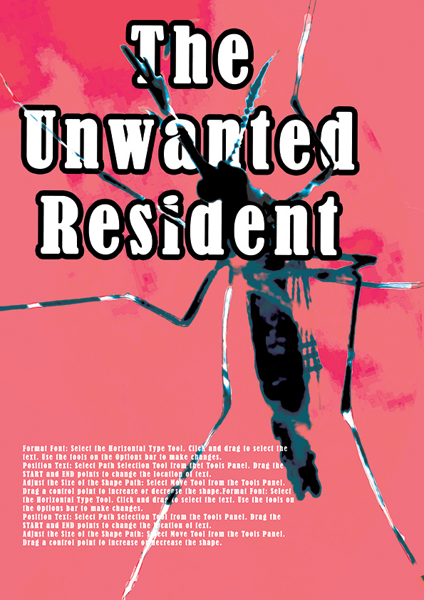
Playing with the mosquito image as main focus of poster. This has an old school feel, like the James Bond movie, hence I decided to put the target images to make it seem as if the mosquito was being aimed at.A variation of the poster above. Black and red was added to give the mosquito a more menacing feel. Certain aspects of the mosquito are repeated also to emphasise its scariness.Initial design with red background. This was an incident; I accidentally painted a whole layer red and it gave a bloody effect which I decided to keep.A variation in which the font is changed and the red is more saturated. It gives a vintage feel which I quite like but might not use since I want to make it more relevant to present times.The colour is a little off-color here… Playing with a textured background and suggesting blood stains.Changing the position of the poster gives it a smoother visual flow. As English speakers, we read from left to right, which is what the suggested direction the mosquito image is providing us.
After a final consultation, the slogan was edited to “The Unwanted Visitor”. Using visitor instead of resident gives the connotation that this is something we do not want in the house in the first place as opposed to a resident which means that it already resides in the home.
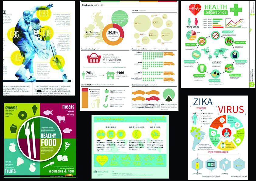
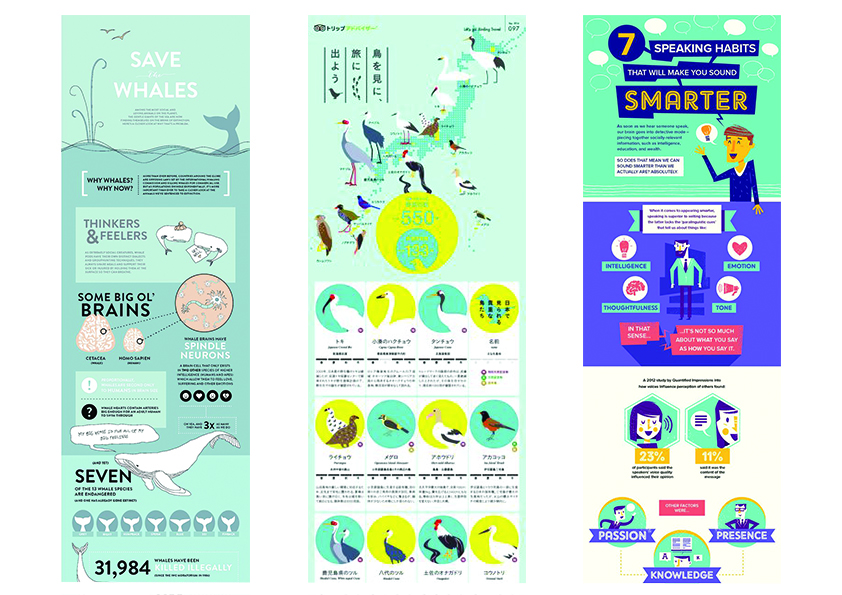
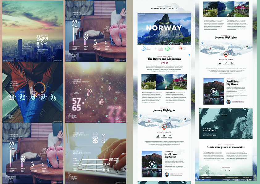
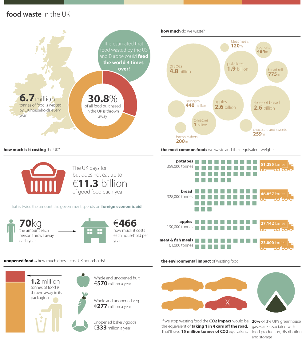
An example of health communication posters I have always found interesting are infographics. I have added two examples to show the variations an infographic can have.
What stood out for me were the harmonious flat colours and graphics. The colours had two purposes- They were used to create visual interest and also to create an image which the viewer can easily identify. Colours were also used to segregate different portions in a pie chart. In using graphics and colours together, it becomes almost like a story in visual form. For example, in the second posters, the orange van and green blocks were used to identify amount and the visuals make it easier to understand in one glance. The colours in the health posters tend to veer towards darker colours which seem more appropriate when the information is about caring for your body or going for checkups. A darker, somber colour would probably be better for older viewers. Yet perhaps putting one colour as contrast could help to create eye-catching sections for viewers to zoom in to immediately.
The information was easy to locate too. With a line separating major sections and information being spaced comfortably apart, the poster is easy to view and understand. Information is provided in bite sized pieces and is better to digest in.

