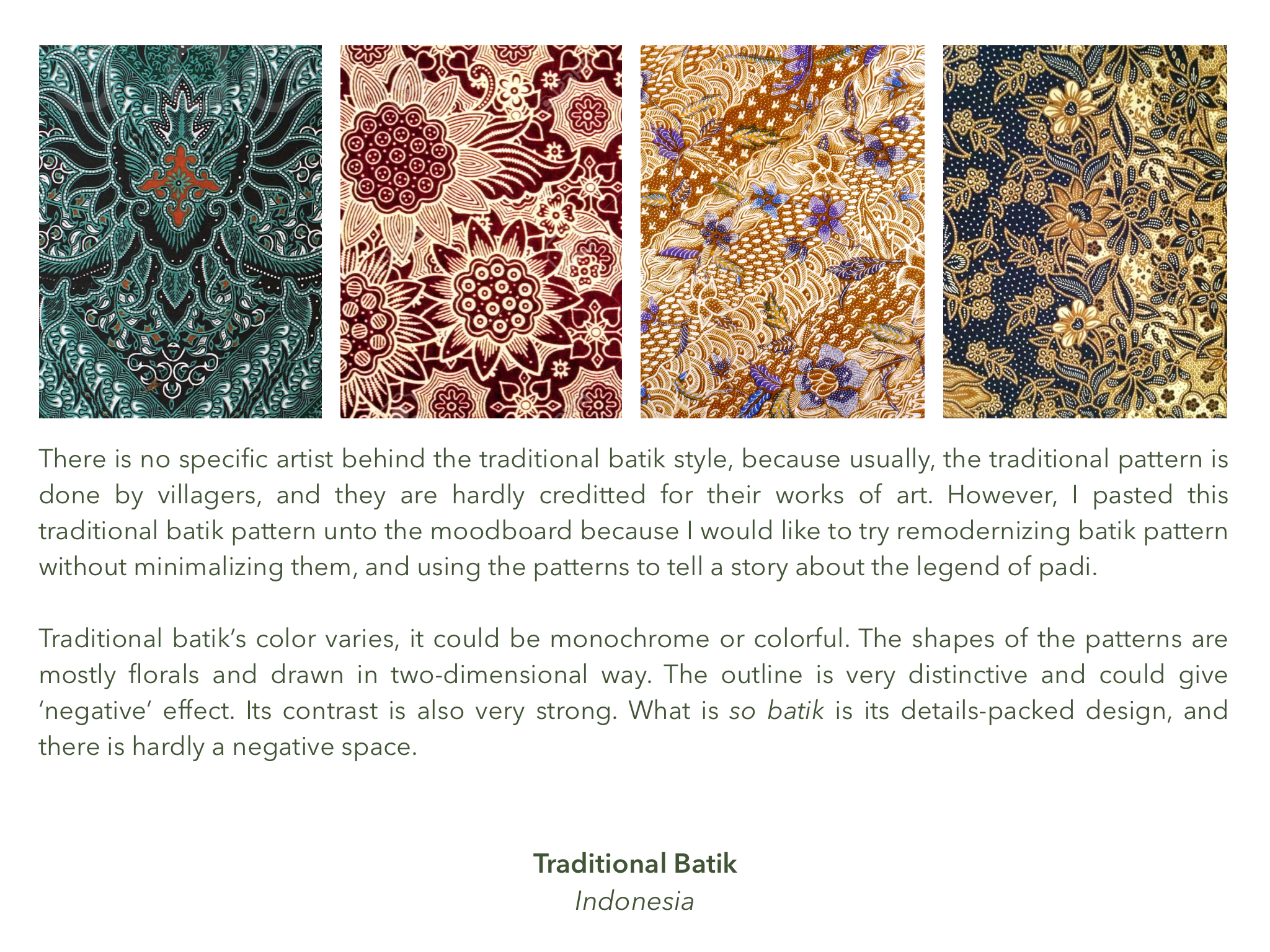
Mother Goddess

Based on the motifs I have made, I have created the patterns for the swatched books. My intention is to create patterns that are one-of-a-kind yet viable to be created as commercial products.

Below are some applications of the patterns that I have made. I envision that the commercial items can be both artistic and universally fashionable.

More patterns and complete swatchbook can be found in the Issuu down belowww:

or open this link

I hope you enjoy both the banners and patterns <3 I hope I can illustrate more the way I did for this project 😀

Media Art Nexus: Mother Goddess at Night

And here it is, the digital wall art is up at North Spine, NTU! I am so glad to have taken this class. I have never imagined my art could be exhibited this way 🙂 Thank you Ina for your guidance and faith in all of us. I can see the belief in your eyes that we can do our best with our own style and preference.

Next will be the swatches and patterns 🙂

Banner Final Look

The difference with the previous design is the presence of multiple colors. Thanks to Ina’s guidance, the banner looks more alive than it was initially :). I always had this fear of using too much colors, because I tend to use too much colors, so I preferred to reduce the number of colors used to keep it not too ‘noisy’ or disturbing. However, Ina used color theory and yeah, color works!

Click here to see previous design

MOTHER GODDESS Banner is up!

Time flies extremely fast! Together with Yoosh, we printed our banner, and that was a really smooth process: one-time printing and it’s successful. Then, we all have put up our banners at the ADM Lobby 🙂

The moment everyone’s banners were up there, I gasped and told myself, “the best banner is everyone’s because every banner complements each other. No one banner would look better stand alone!” And i’m truly proud as a part of this class.

Can’t wait to see our artworks on the Media Wall Nexus XD and in the form of Swatch Books.

Banner Progress (After Recess)

So, I decided to not just re-resolution-ize each element that I have drawn as motifs, but also to change the composition of my banner. Because I feel that the last banner I have shown to Ina and the class has no feeling.

Ina also said that there was a lack of tiny details or texture in the micro level in order to entertain the viewer’s eyes when they look at the banner closely. So I was thinking, what should I do? if the banner is done in illustrator and in vector form, the texture might be needed to be in vector form as well. The flatness of digitalized image is not my cup of tea. I always like the touch of something hand-drawn and traditional.

So I decided to almost ‘re-do’ the banner by creating high-resolution hand-drawn images so I can retain the sketchy element. To add something more but subtle, I photoshopped the important elements such as the head, skeletons, and crown to have ‘dots’ in the shaded area. I hope it looks okay when being printed in original size.

I play with only two colors because…I don’t know what else to add in order to maintain the seriousness of it. I don’t want it to be as cheerful as my previous banner because in this new composition, there is an eye that is very sharp and full of emotion.

The process that I took is very traditional, almost like a photomanipulation + digital painting. Each element is manipulated and composed one by one. Then in order for my laptop not to crash, I flatten them after I’m satisfied the black-and-white composition. Coloring is the last step, and each element and corner of the banner is colored differently. It’s almost like a painting. I don’t know, I think this is my cup of tea even though it’s a lot of work.

Below is the progress. I hope it’s fine…

Week 5: Banner Progress

In week 5, I made progress in the banner composition and color choices and I came out with these.

Ina has approved of the second draft and hence I’m working on the final high-quality version for the final print. It is approved because it’s more interesting and detail-full compared to the first one. Well, I learn the importance of a good “macro view” and “micro view” from this process.

Motif Development Week 4

Feedback on Week 3

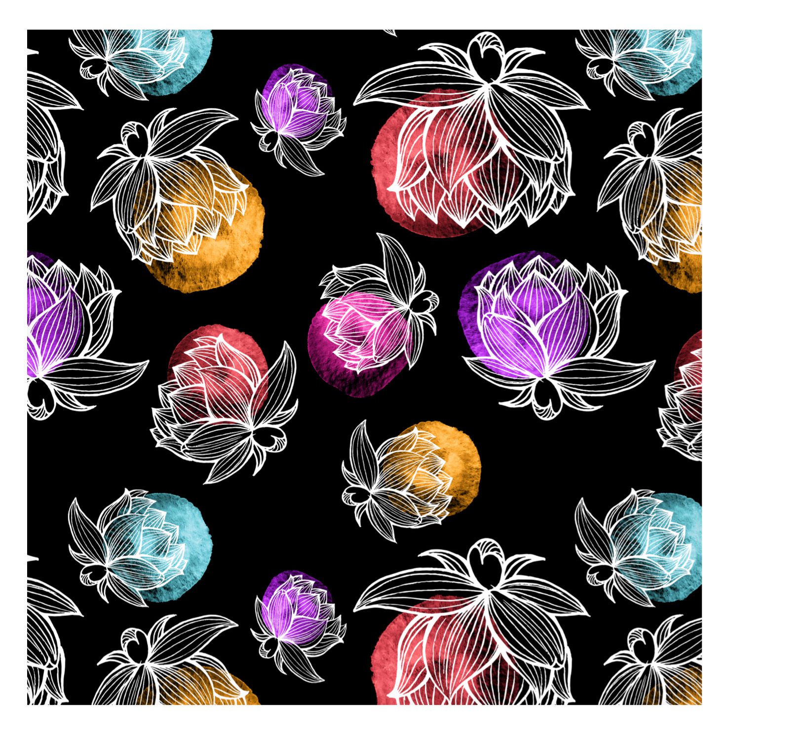
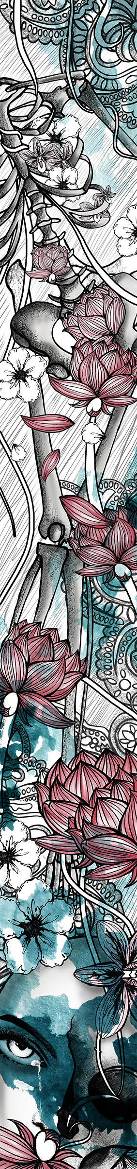
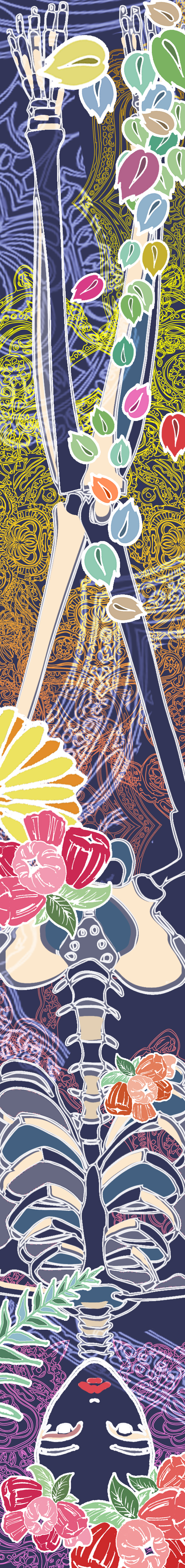
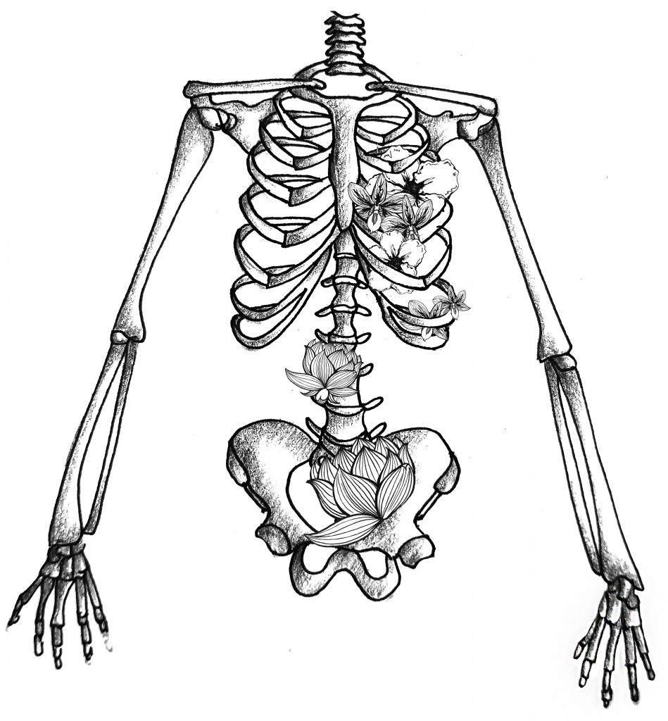
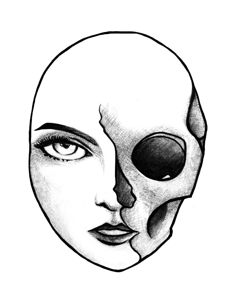
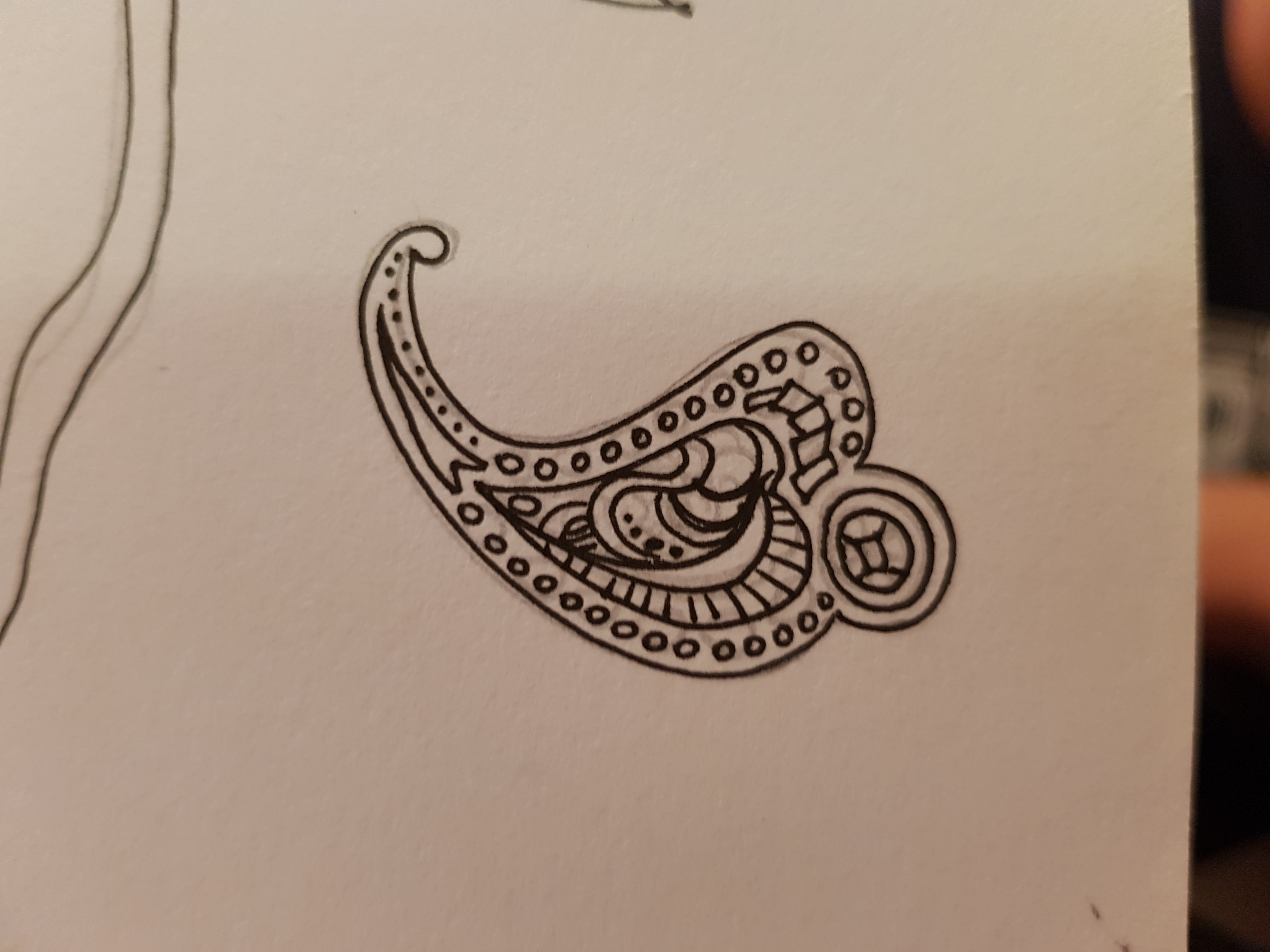
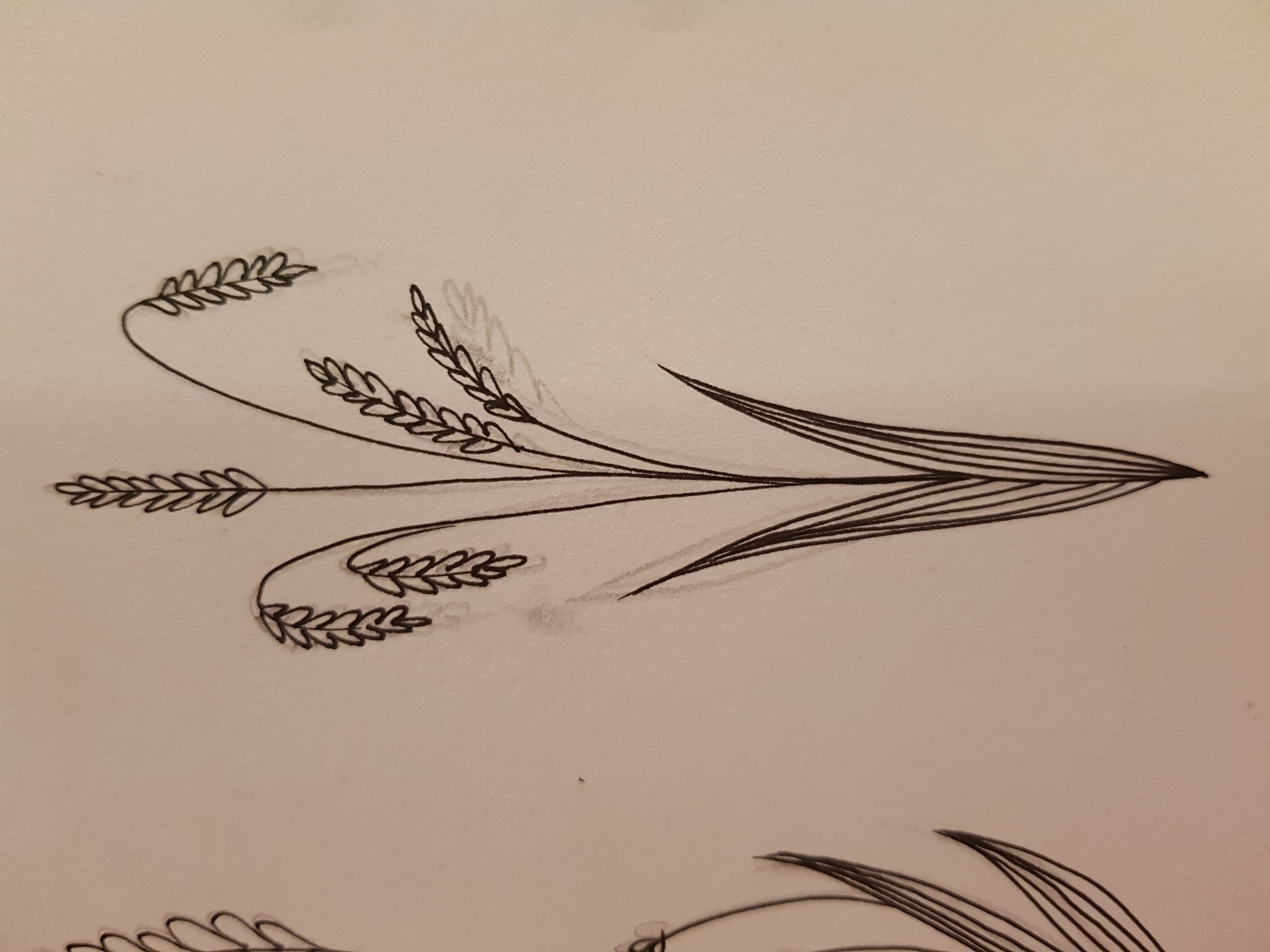
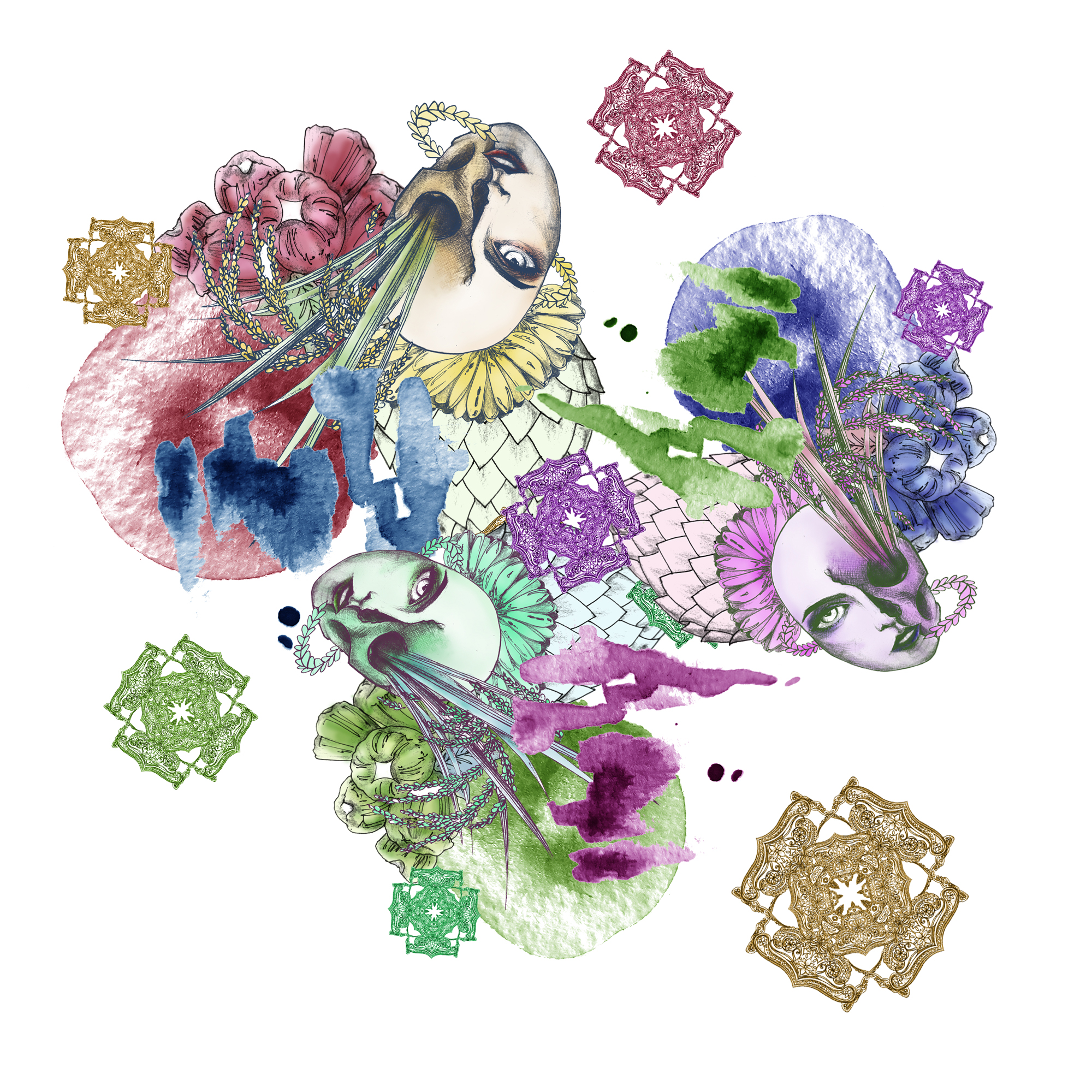
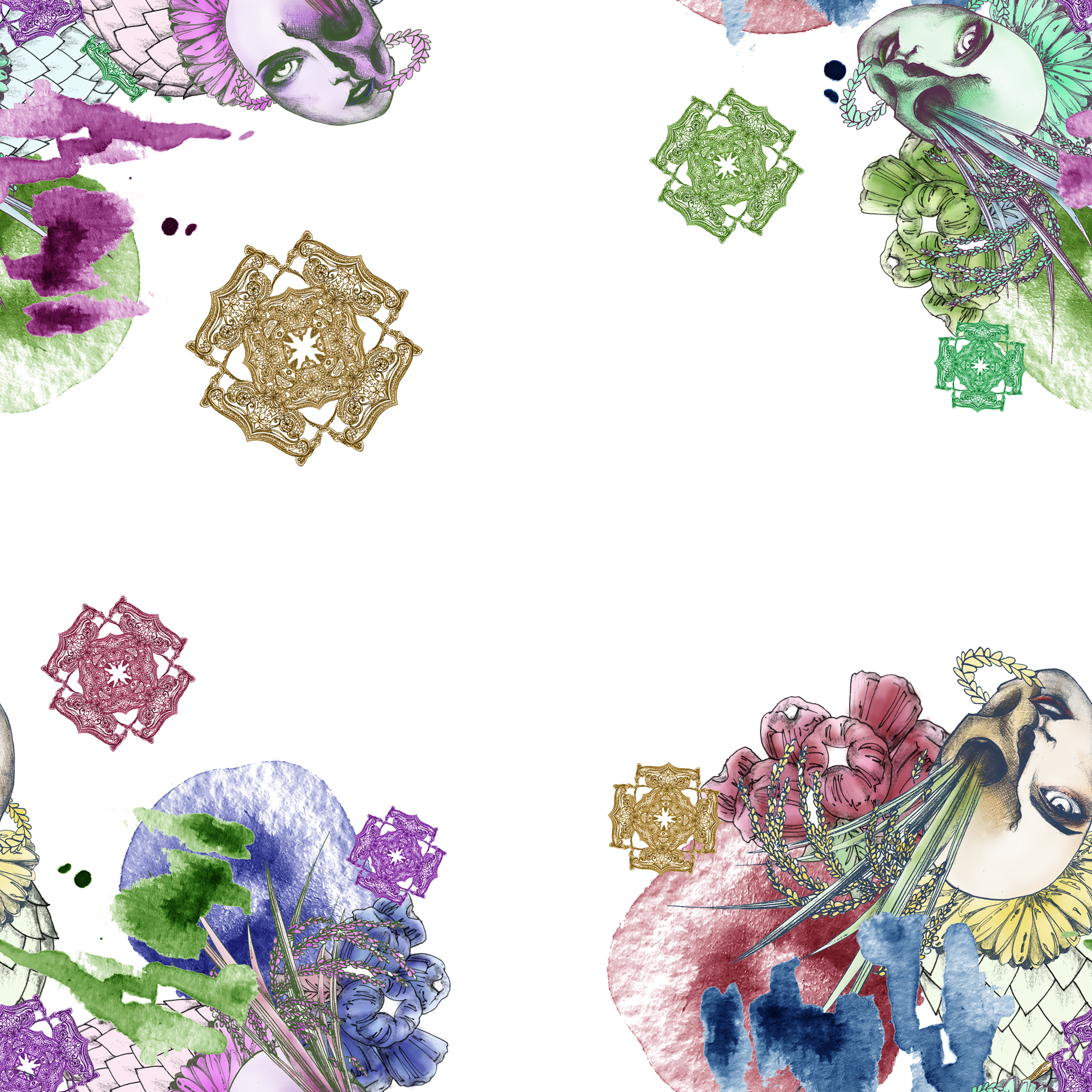
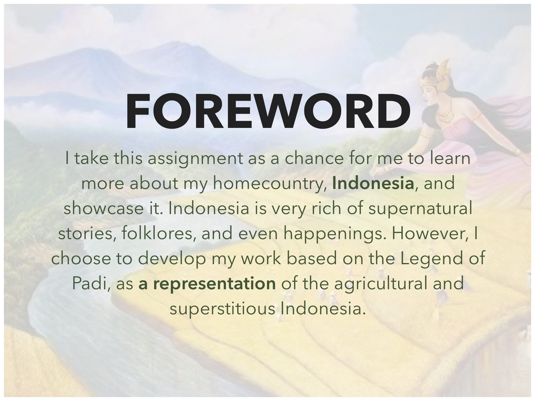
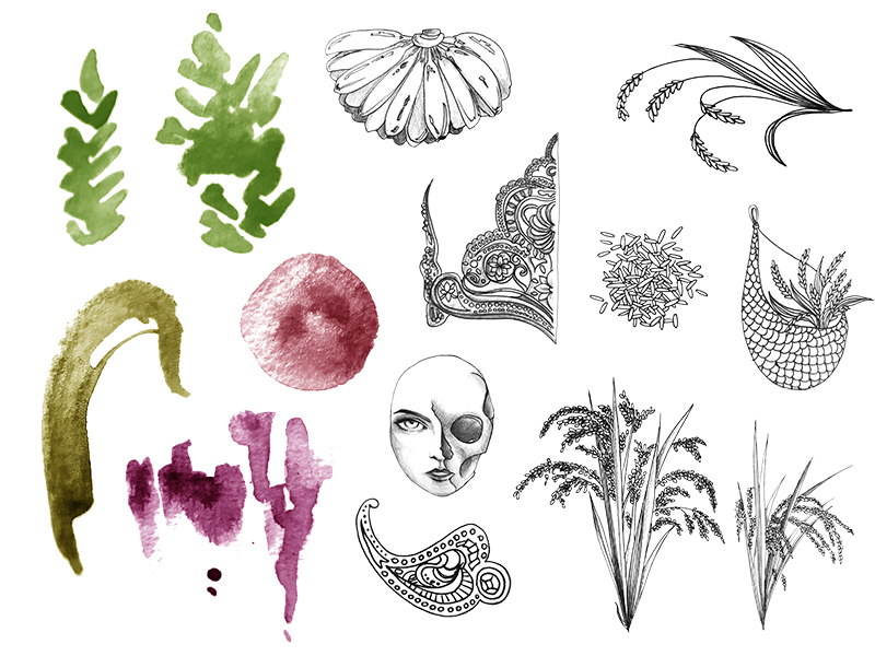
Based on the feedback on Week 3, I ‘narrowed down’ the story or topic before developing anything. Ina said the element of crops and plants sprung out of the goddess’ dead body is interesting, and I think so too. In addition, I thought it would be nice to have some elements that can give the vibe of ‘royalty’ or something that relates to the kingdom of gods, instead of purely vegetation and body. Based on these thoughts, I created individual ‘elements’ using pencil and pen.
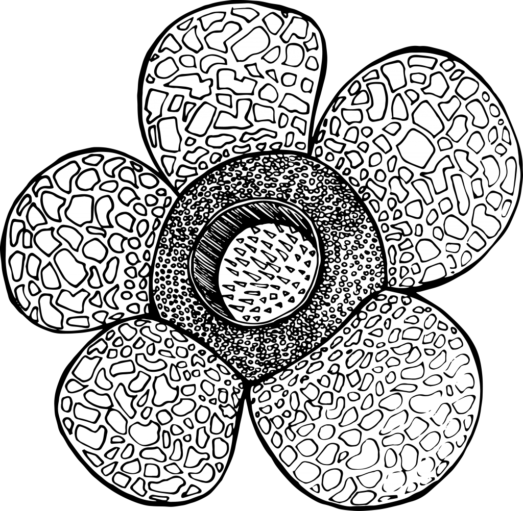
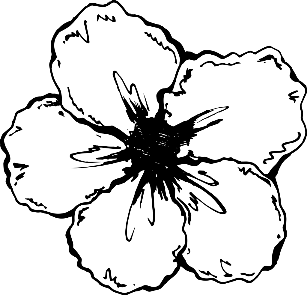
Elements/Motif

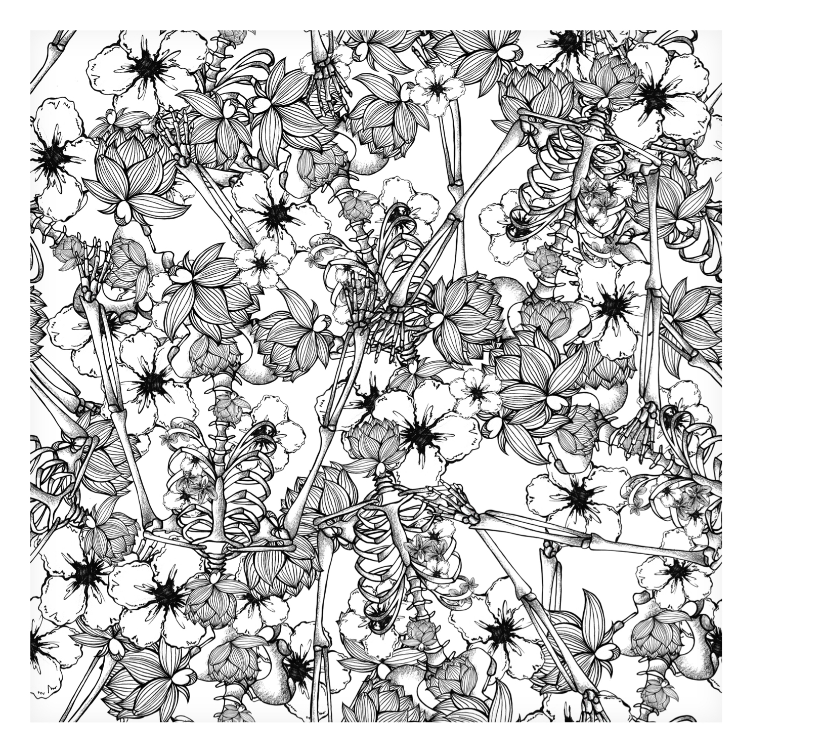
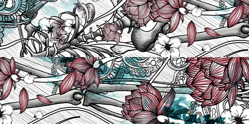
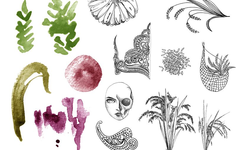
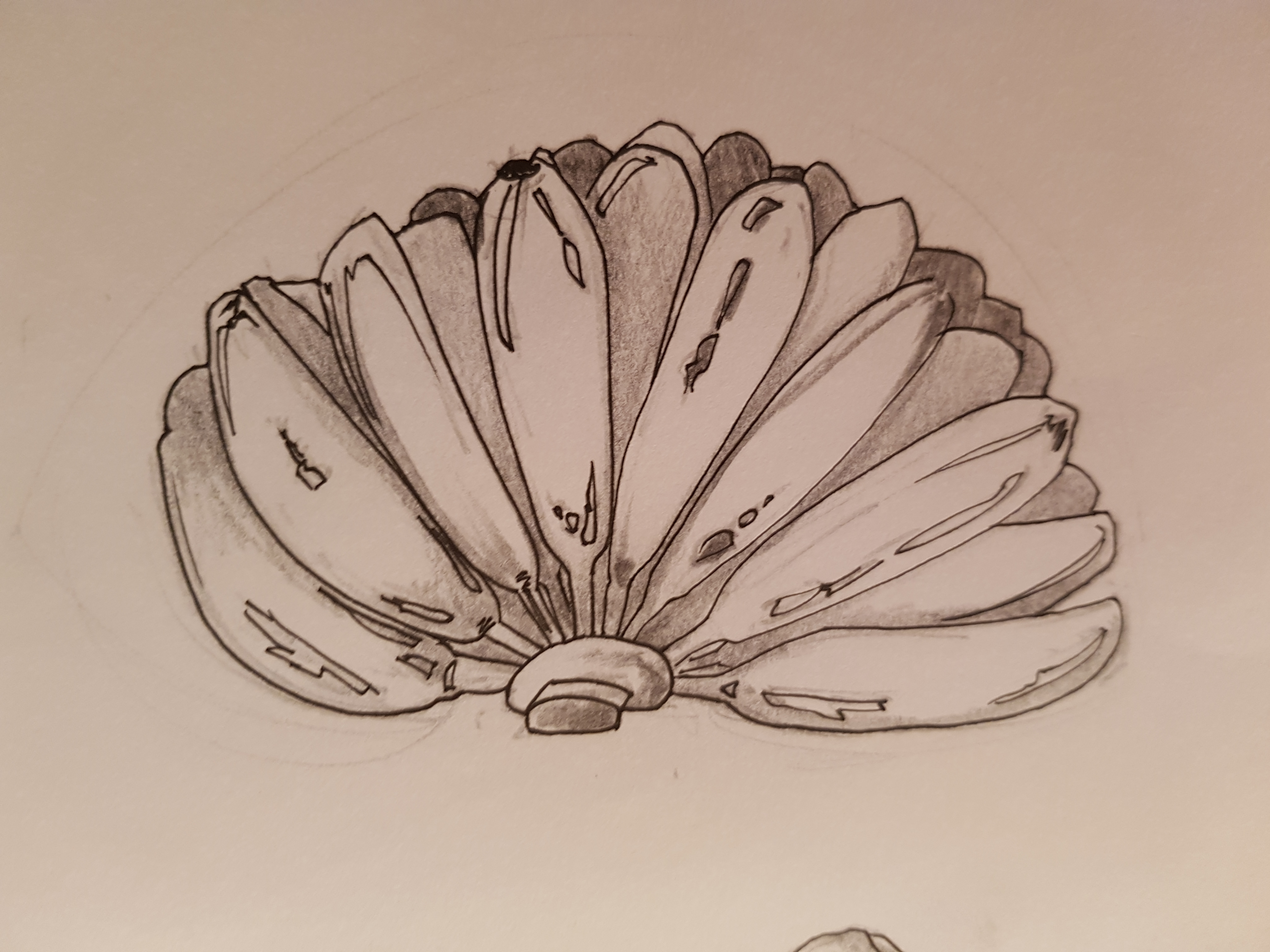
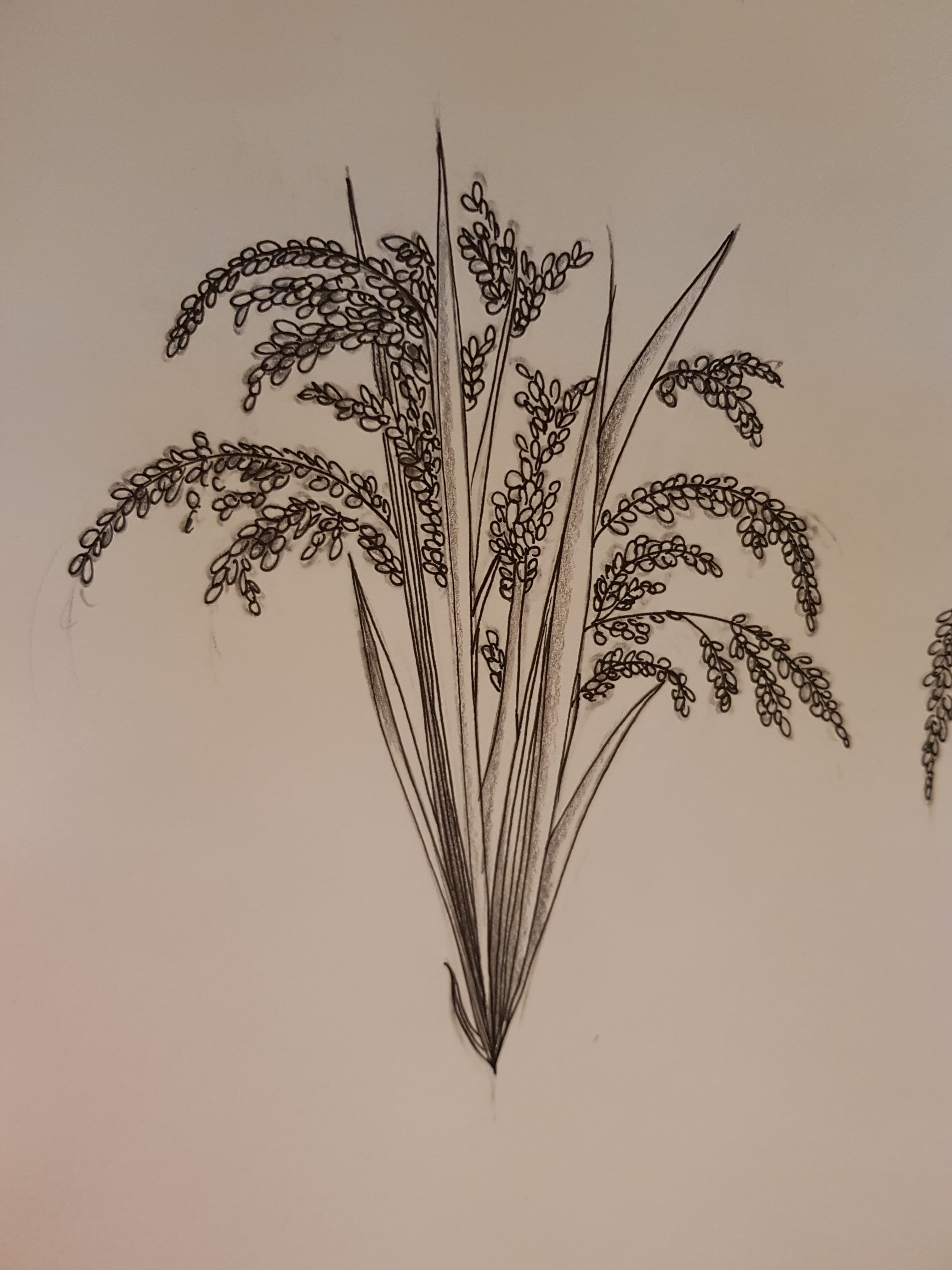
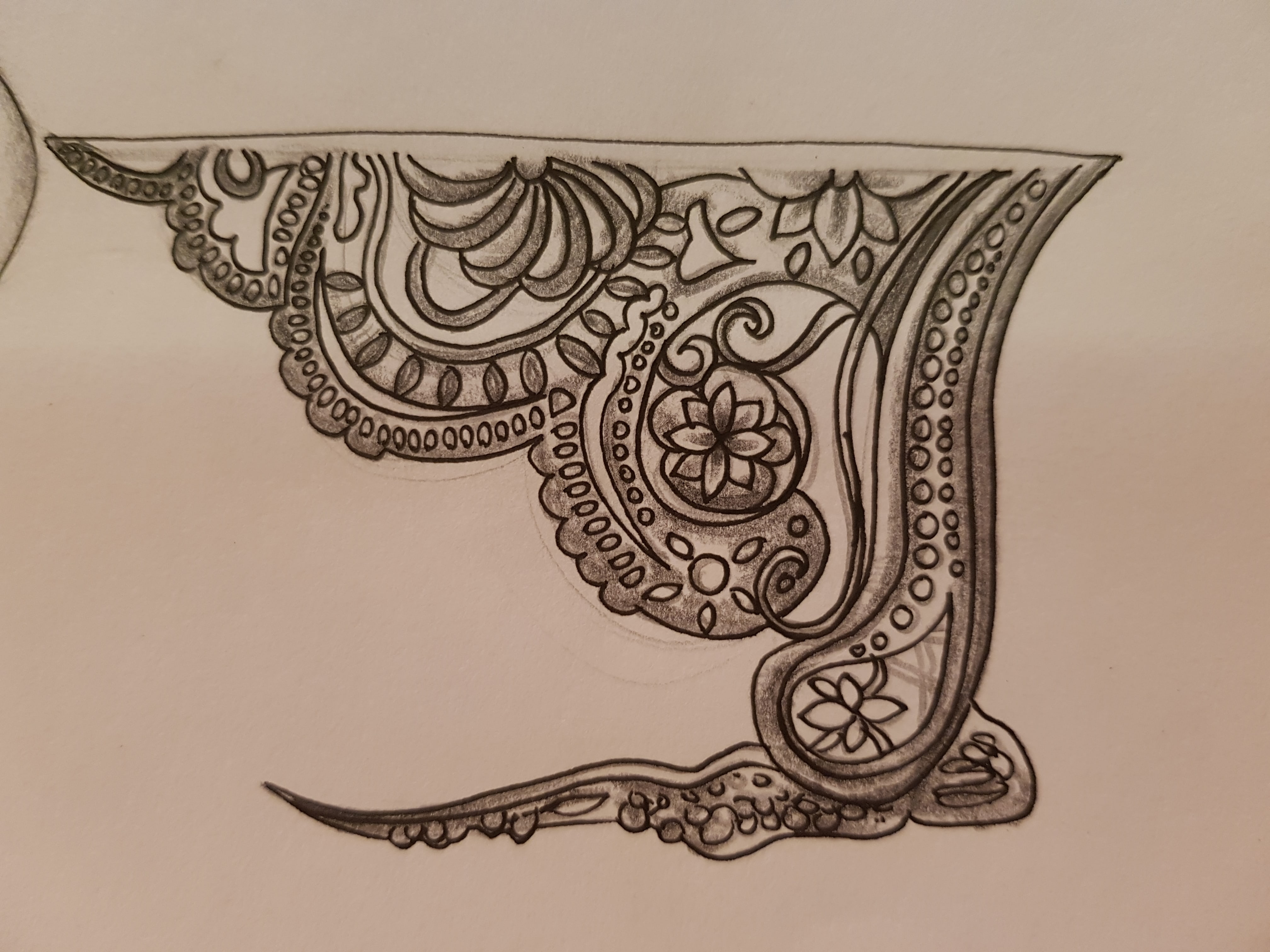
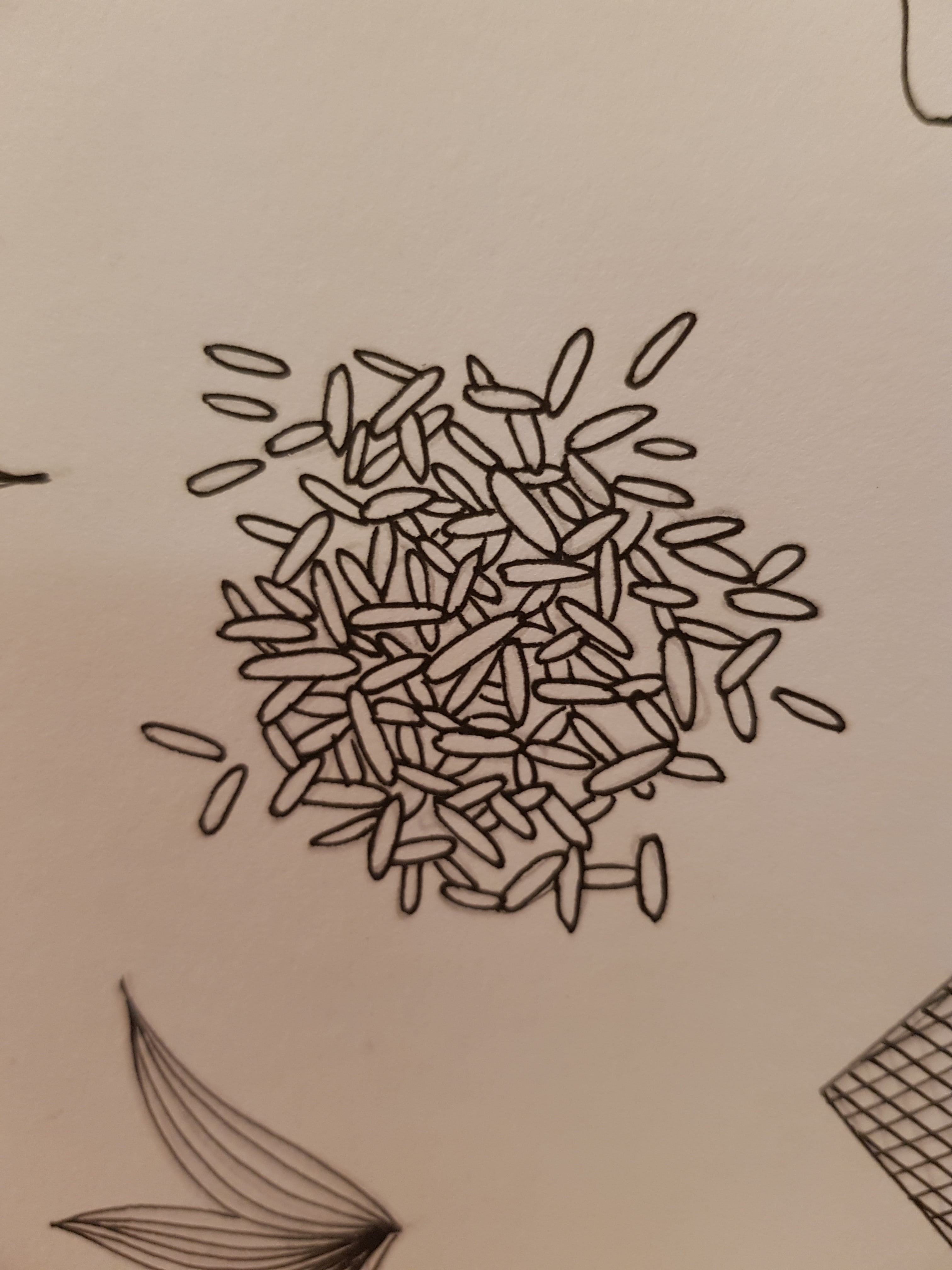
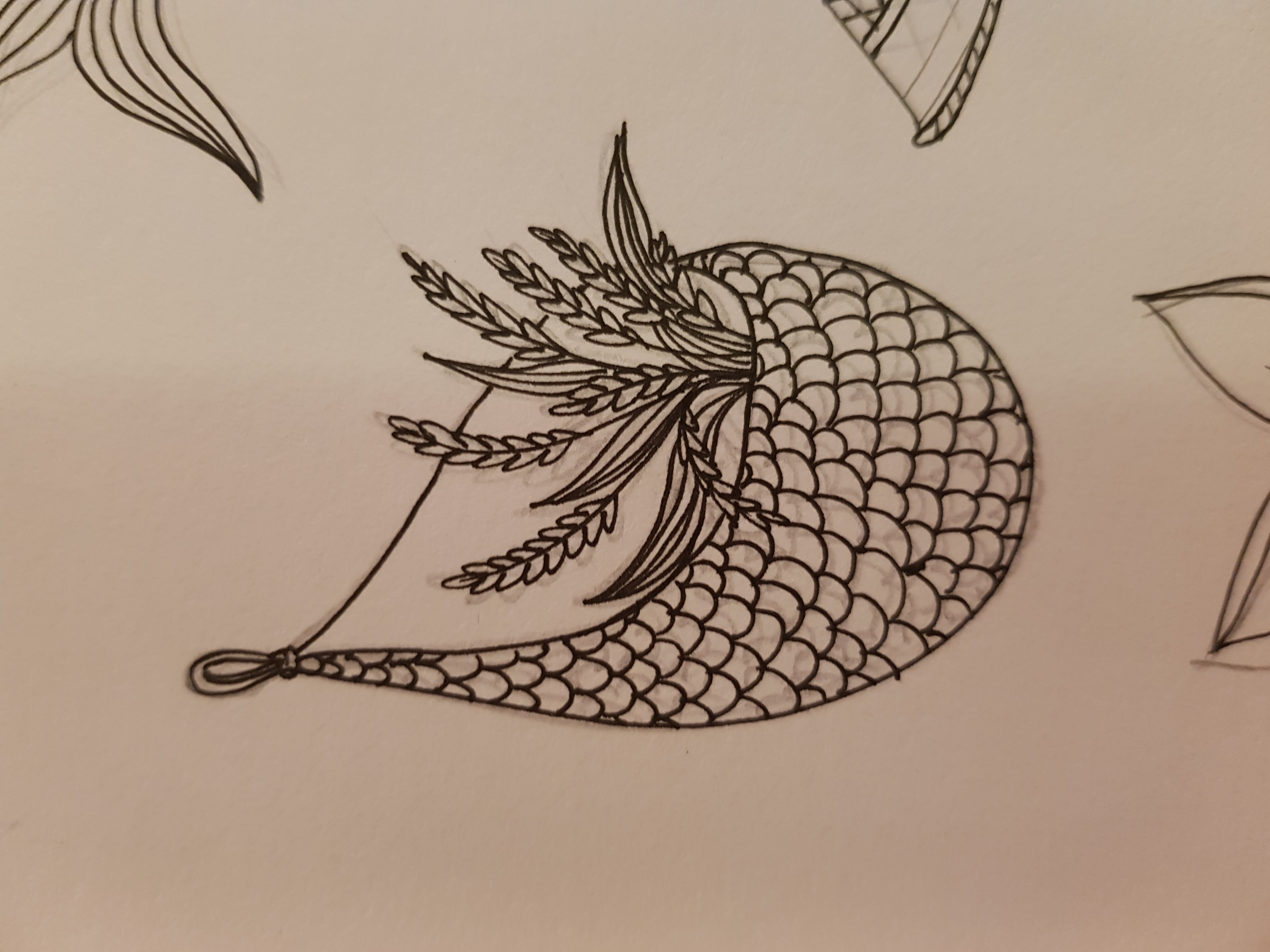
The elements consist of various fruits and crops (not just padi) which grow in Indonesia, a Javanese crown, and a female half-face half-skull. I’m inspired to draw half-skull because I imagined the ‘supernatural logic’ behind the growing crops from the dead body. I thought maybe, the life of Nyi Pohaci was kinda ‘transferred’ to the crops, so the half-skull illustration to depict the ‘process of life transfer’, where her beauty was drained out, left with only her skull.

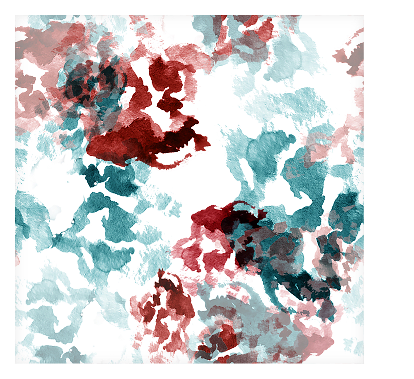
Below is some of the ‘cleaned-up version’ of the sketches. And I did some random watercolor splashes too for experimentation later.

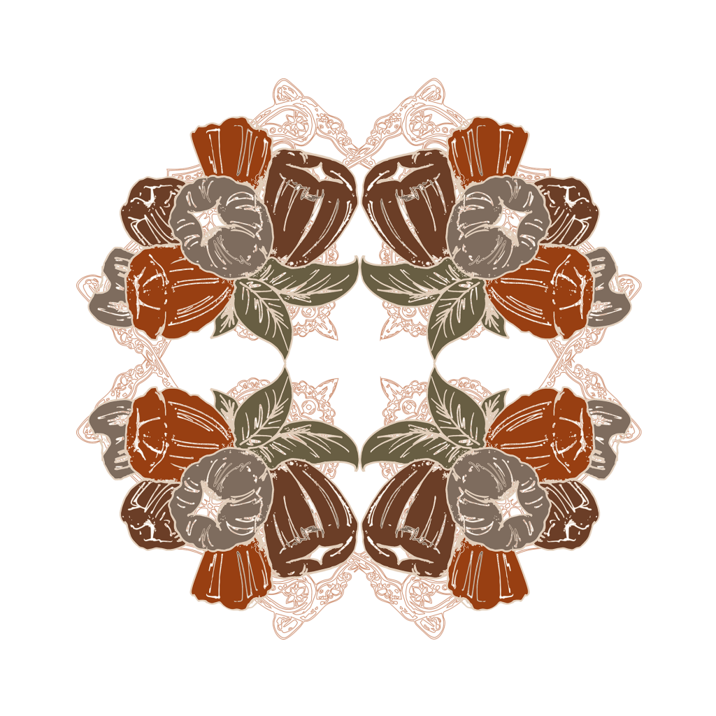
Experimenting to create more motifs

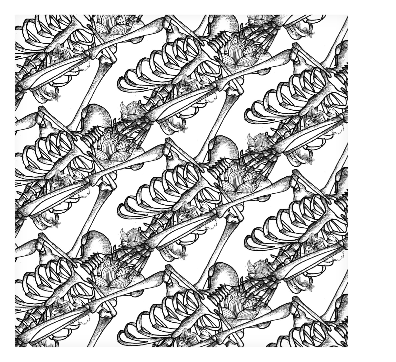
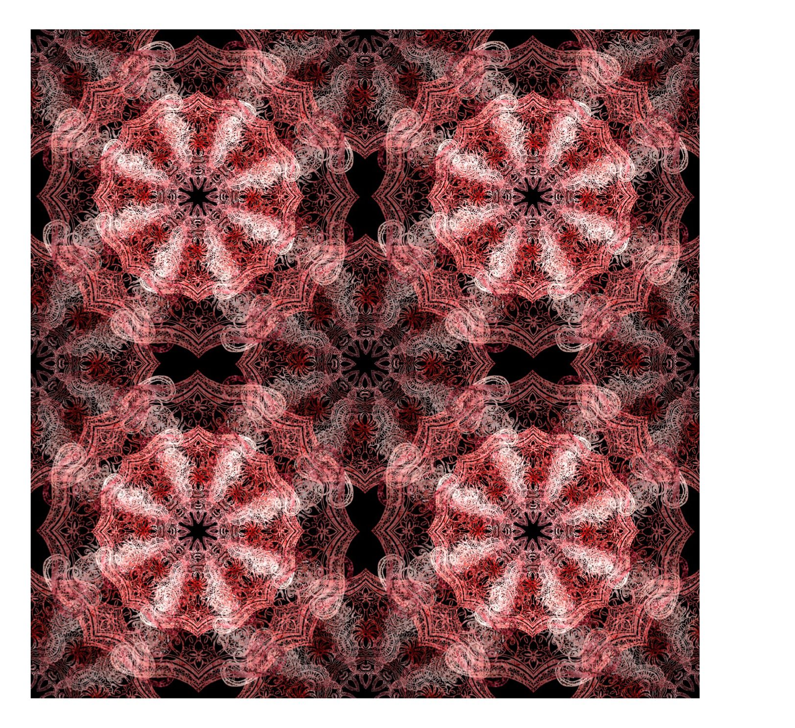
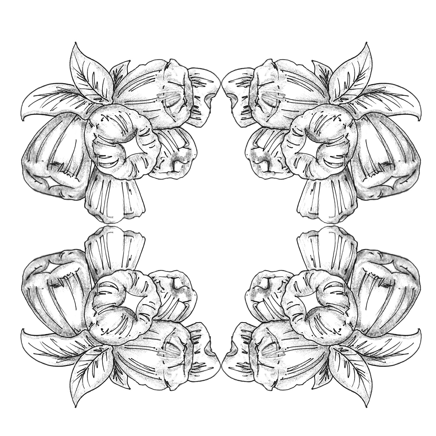
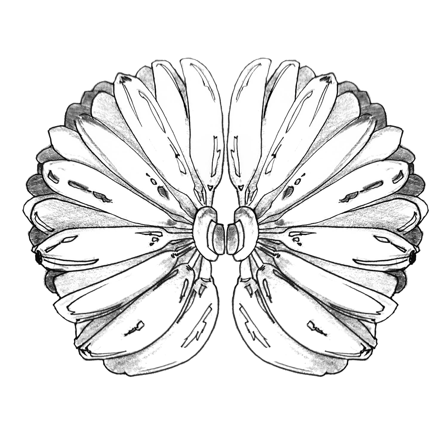
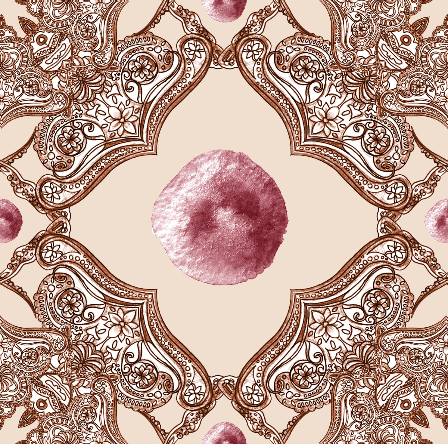
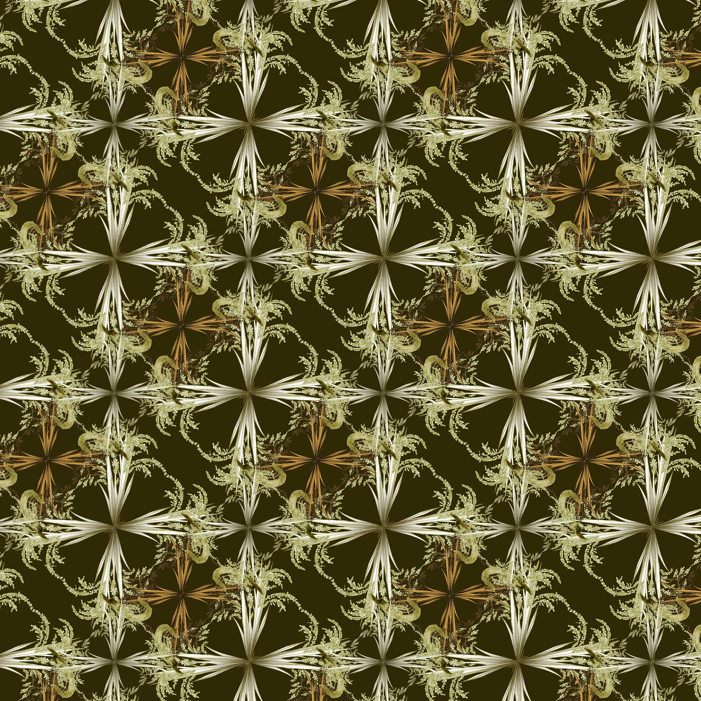
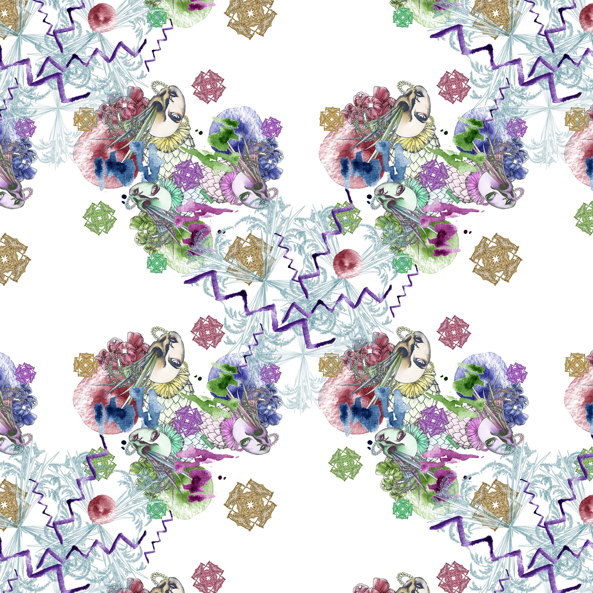
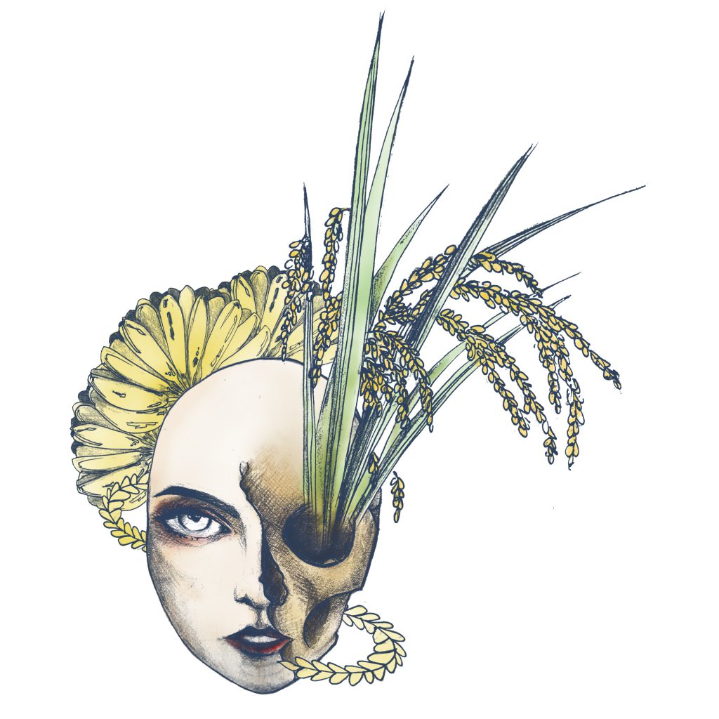
I felt the singularity of those elements are lonely and less intricate. I could not imagine the South East Asian feeling if using the elements as it is to the pattern. So I tried playing around with the elements to create motifs. I did multiple mirroring, and I pretty like it.

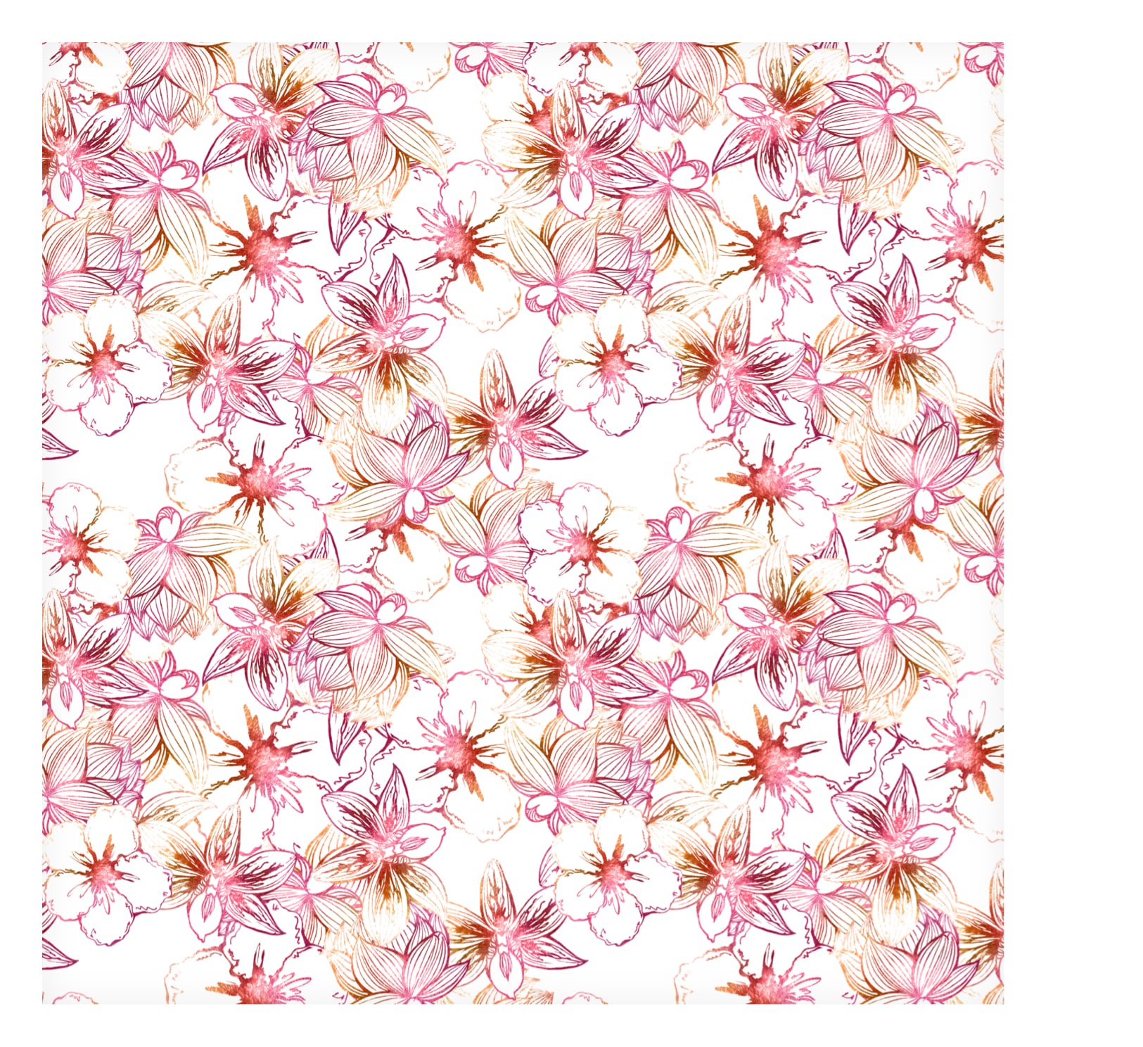
Today in class, I tried combining different elements to make a not-symmetrical motif.
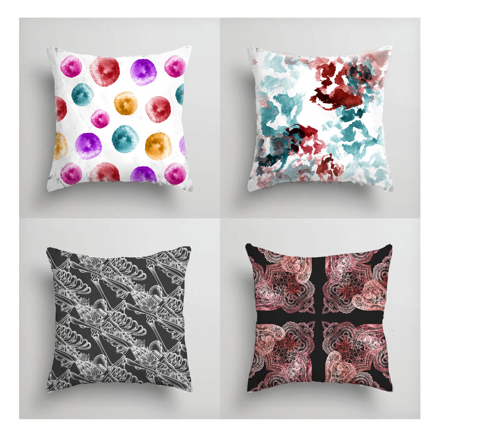
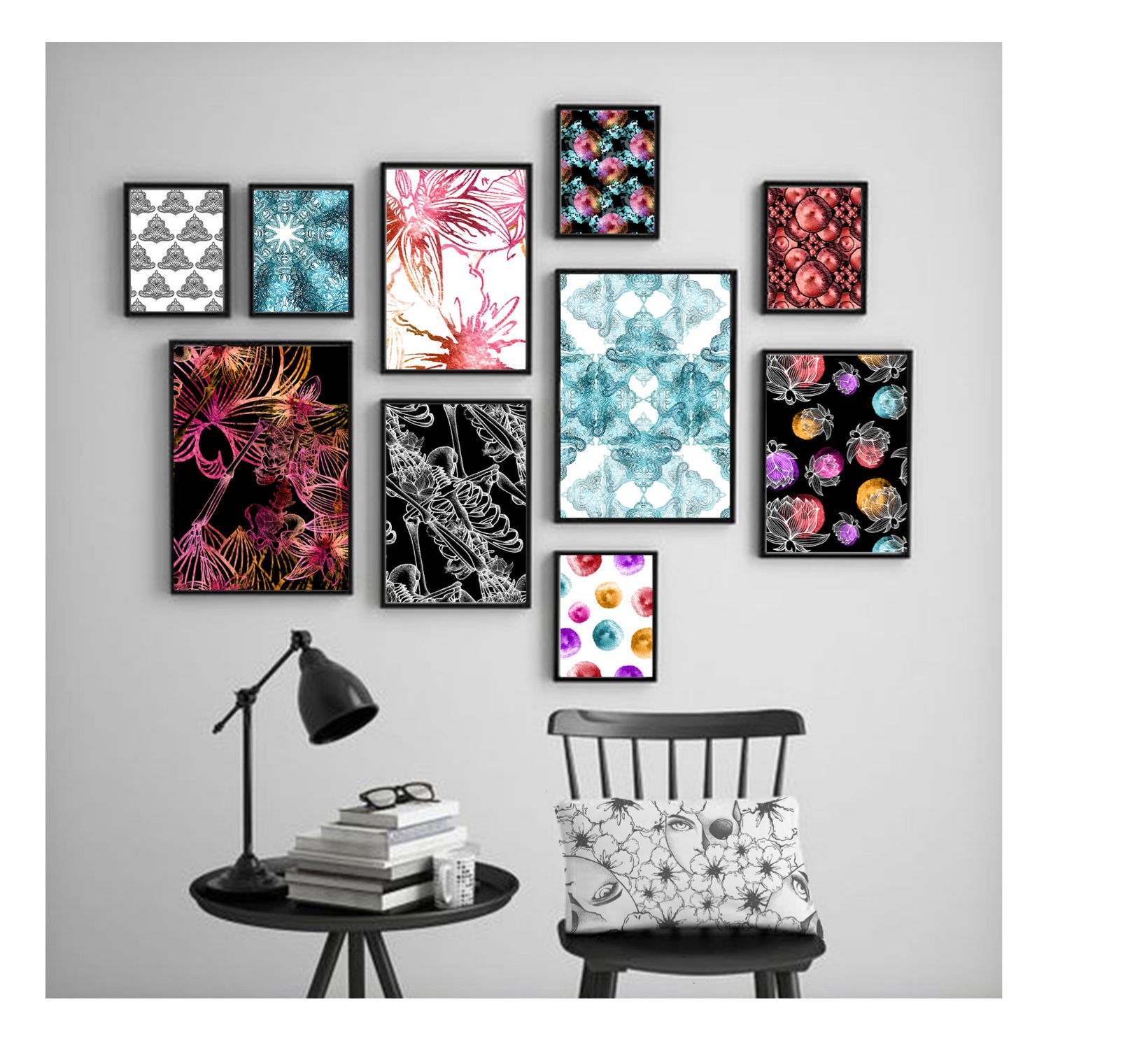
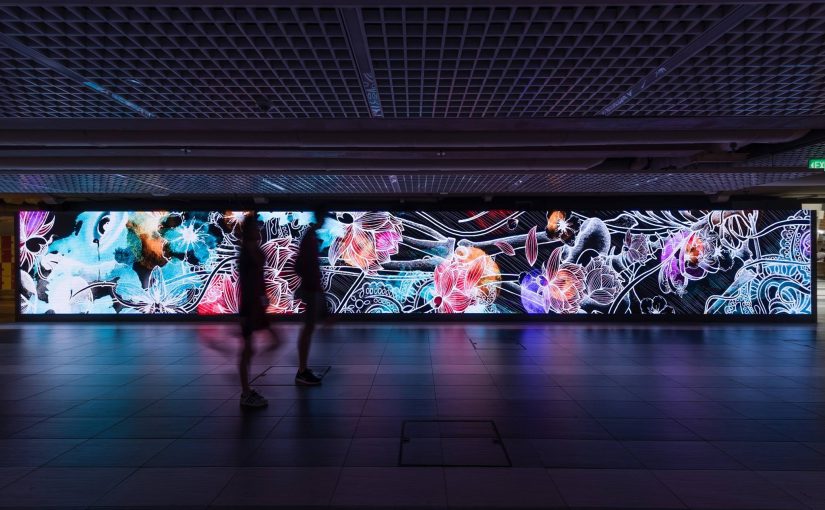
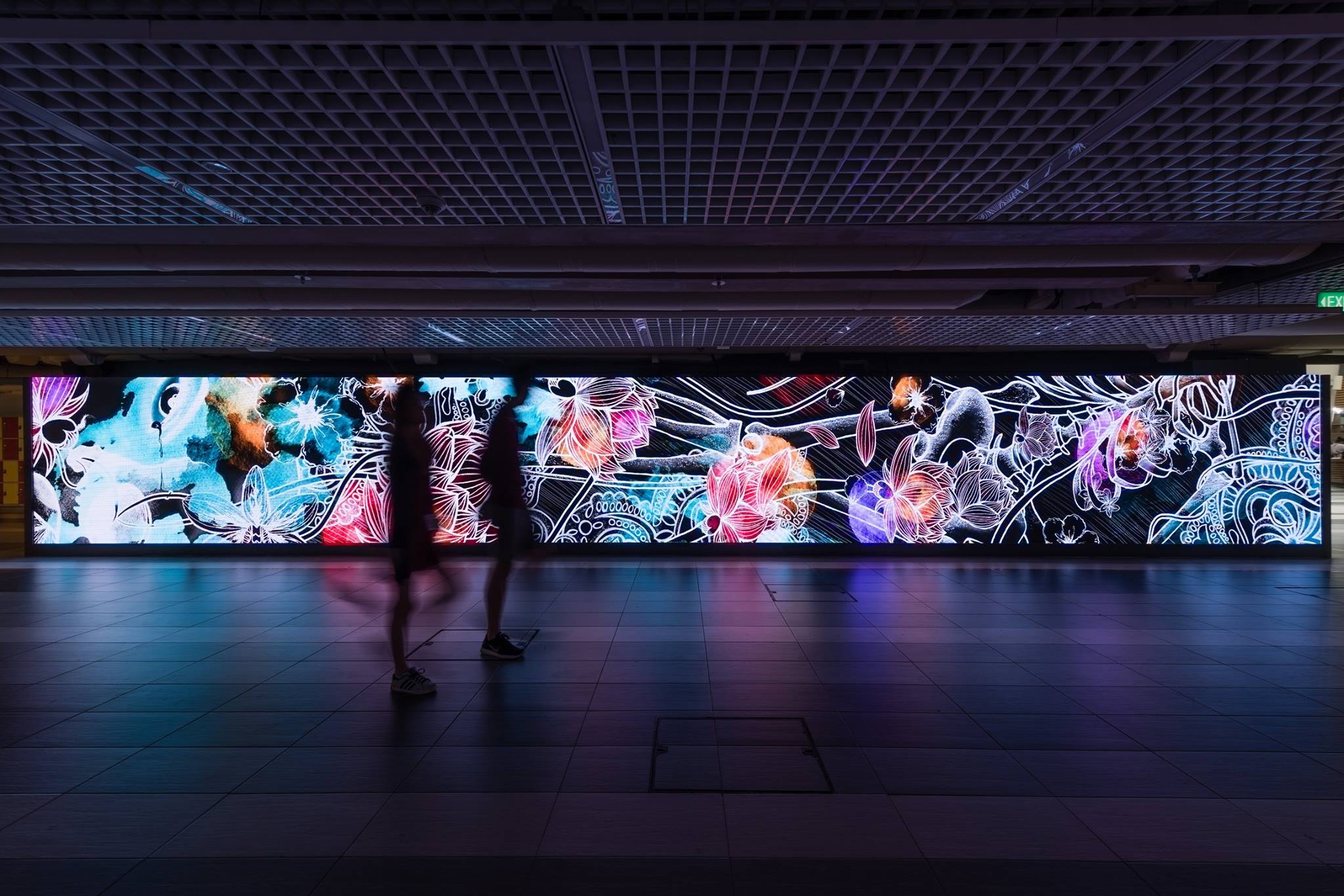
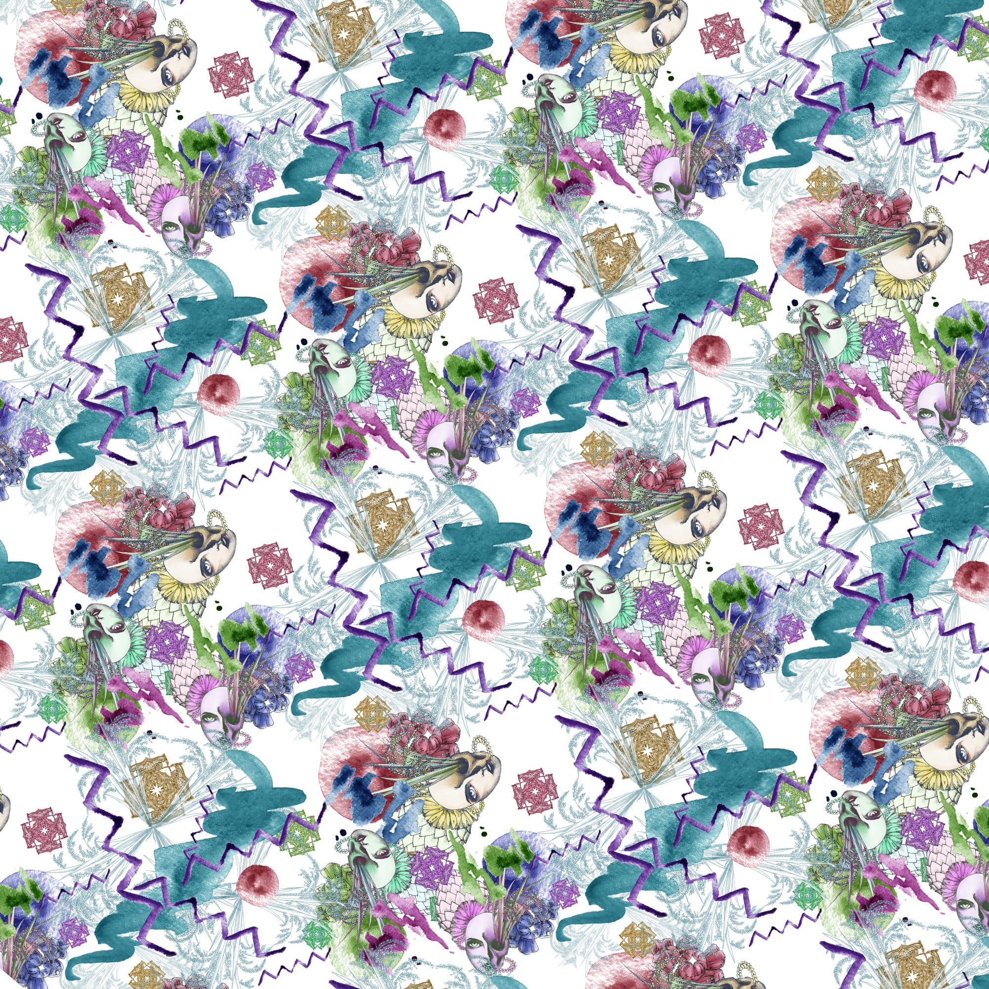
Developing patterns

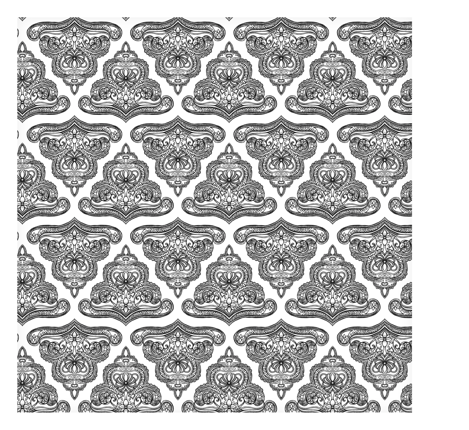
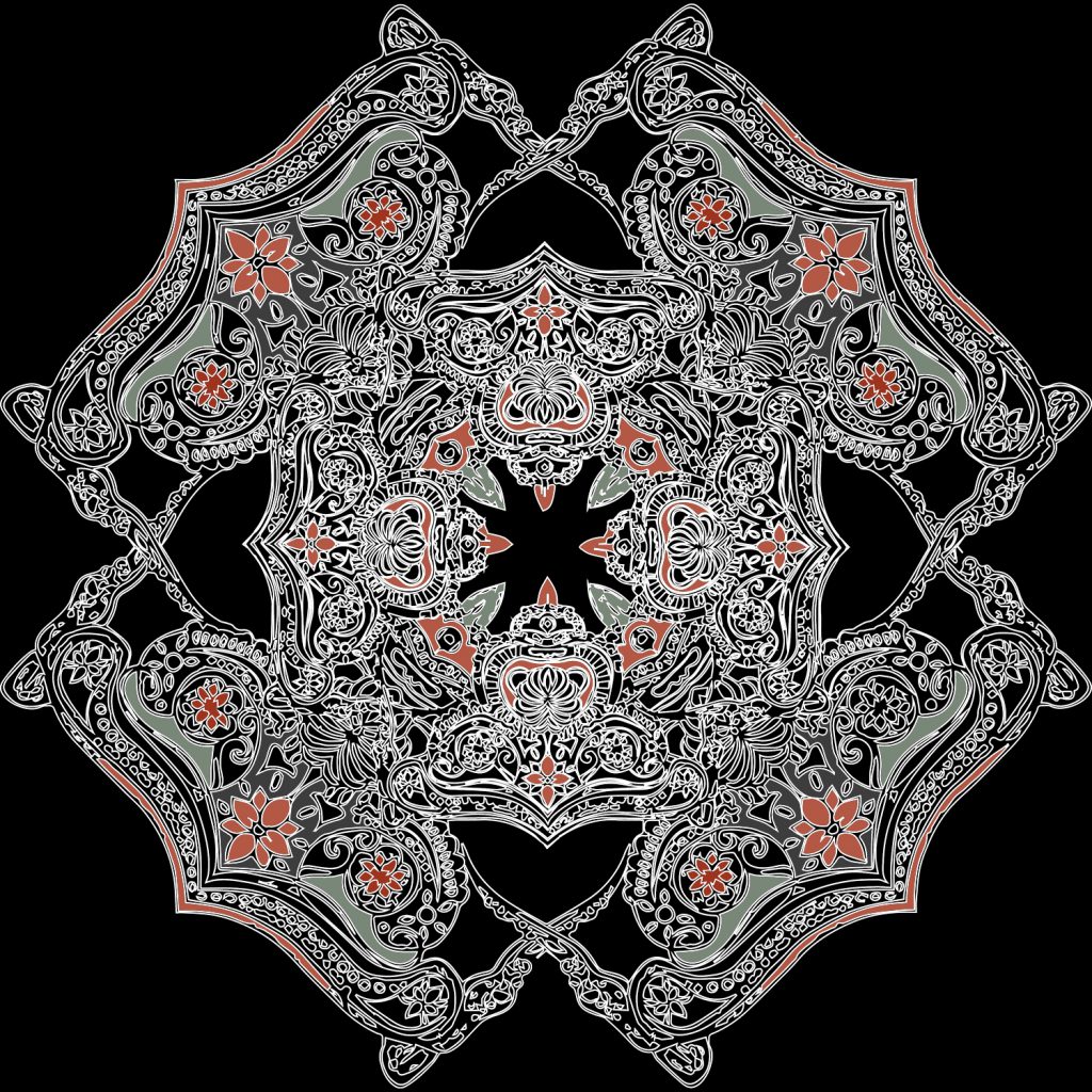
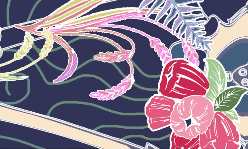
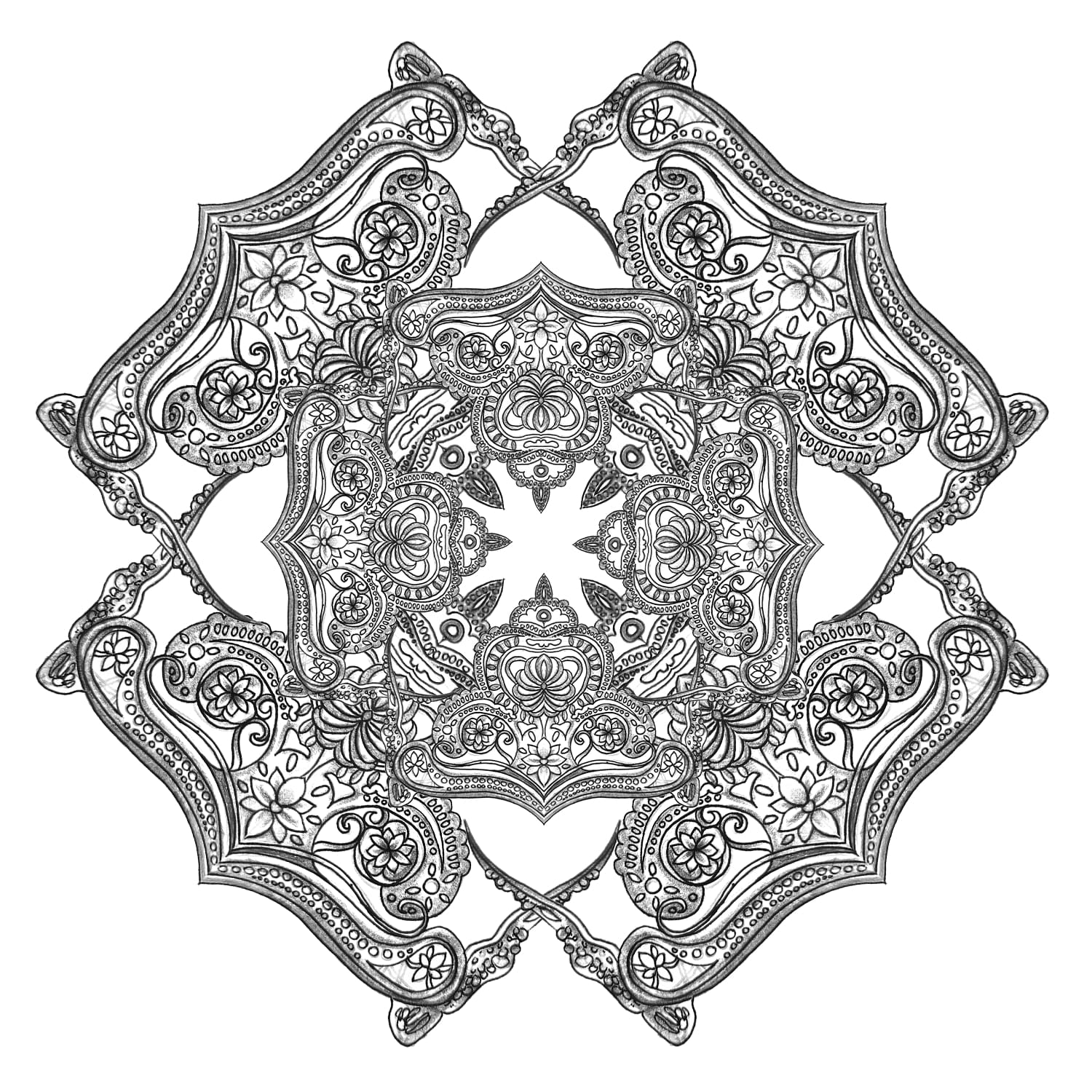
From the modified motifs, I created regular patterns and somehow, I could feel something South East Asian/Indonesian from them. I want to try something that looks less regular, but I don’t really know how to do it…

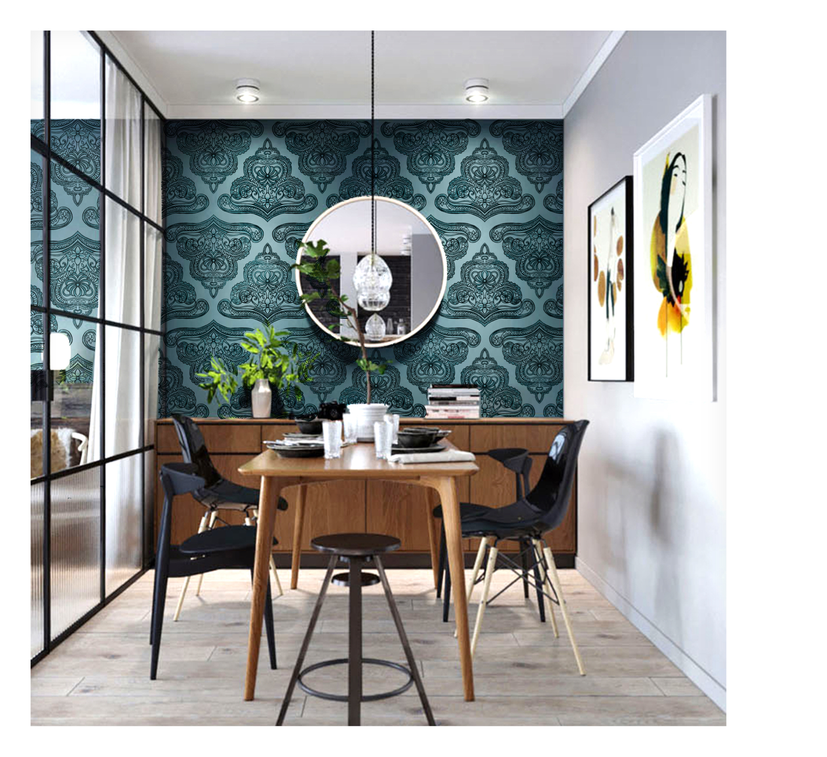
More patterns are done in class. I prefer something more ‘geometric’ if it is a full repetitive pattern. I think I should draw more interesting elements?…

So far, this is my progress :).

Pattern, Art, Design and Architecture: Mood Board (Finalized)

The gallery is my finalized presentation/mood board for the assignment. I didn’t find any batik swatches in the library, but I have batik clothes so I might bring it for the presentation in Week 3. I hope through future trials and errors, and multiple experiments, I can create batik pattern that is both traditional and contemporary, so that it is representational of Indonesia in a timeless, universal way.