Class Trip to Future World – Response

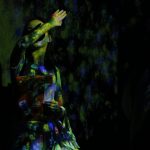
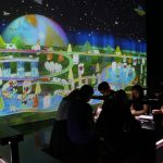
I cannot be more than grateful to be able to visit Future World exhibition as a class trip and being explained by the TeamLab member himself, Takasu. Overall, it was an eye-opening experience about how close we are to the ‘future’, where everything is third generation computing, and able to turn non-technological things into a piece of technology in an instance – in the exhibition, projections of animation on tables, walls and things react to our presence and actions. I feel like I was in the future, fully immersed that I almost forgot most of the world out there is unlike Future World right now.

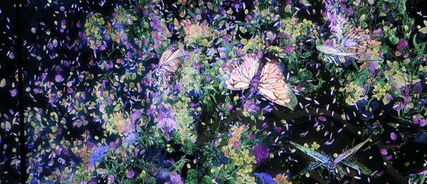
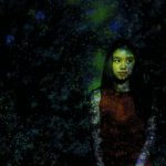
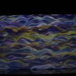
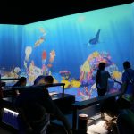
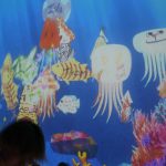
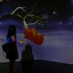
My favourite installation for me is the Story of the Time where Gods were Everywhere, at the Park Session. This is the installation where the rain of ancient caligraphy could turn into ‘real objects’ when we touch it. For example, if we tap unto the caligraphy with double circle, it would become a sun in that ‘world’. Then, if we tap the animal symbols before there is food such as grass, they would die. Wrongly tap a fire symbol would burn the whole forest. It reminds me a lot about the creation of the world in the Bible, where everything is in its right order so that no creature suffers. It is so impressive to me too because different audience are able to create different world, and one could change the other’s world. We can become ‘gods’ in this installation, like literally.

The Story of the Time where Gods were Everywhere Photos

img_6916-min img_6934-min

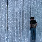
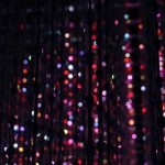
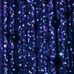
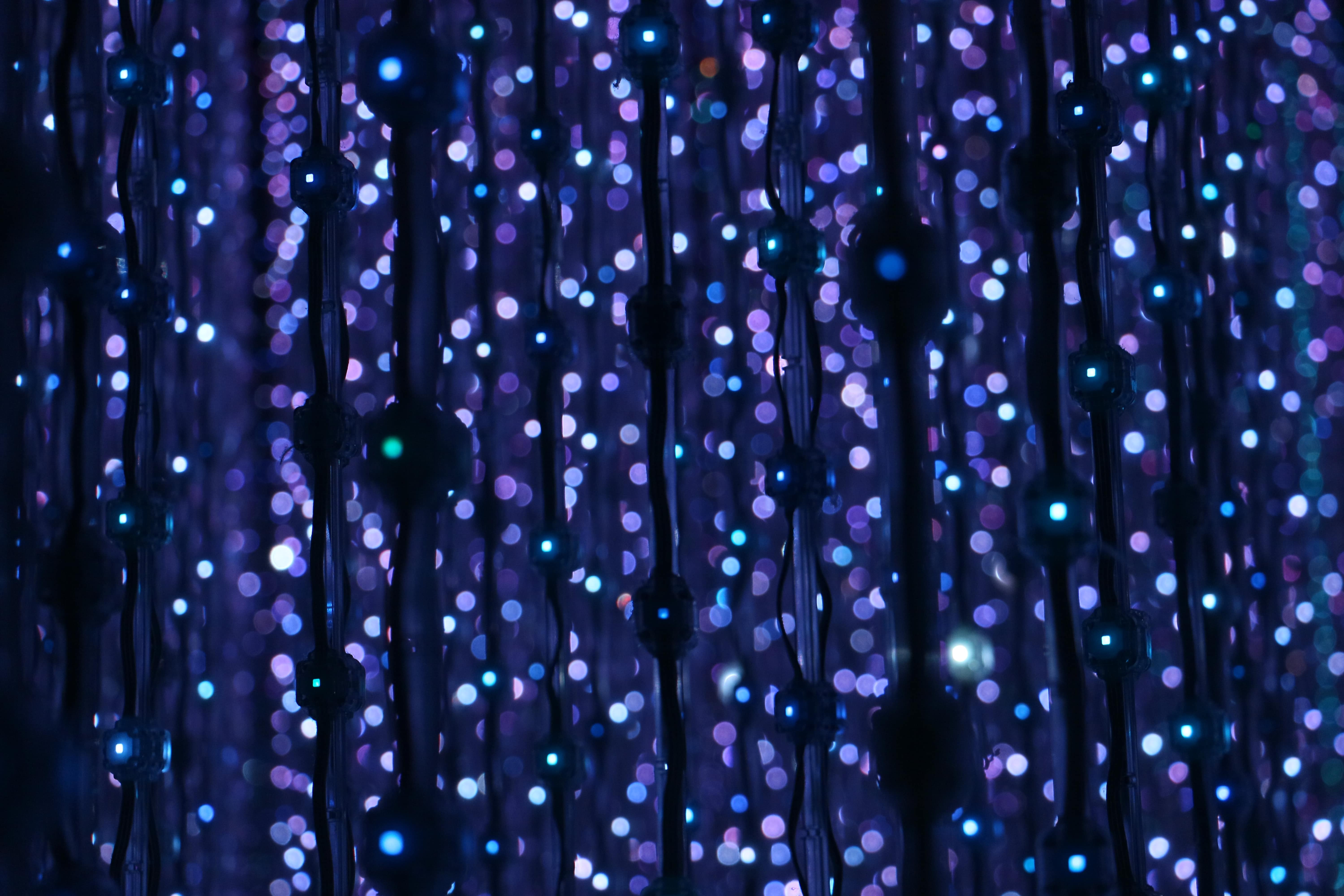
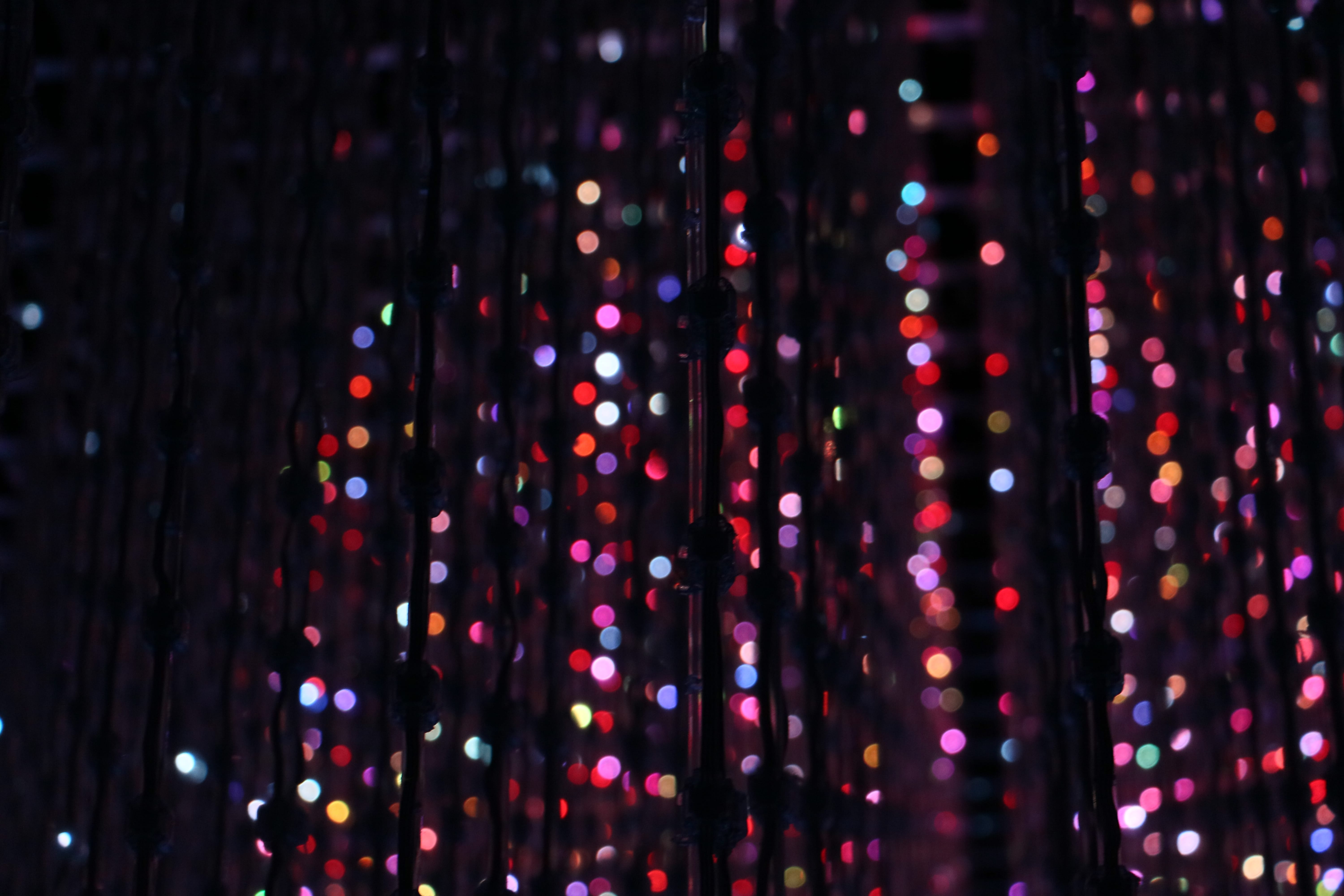
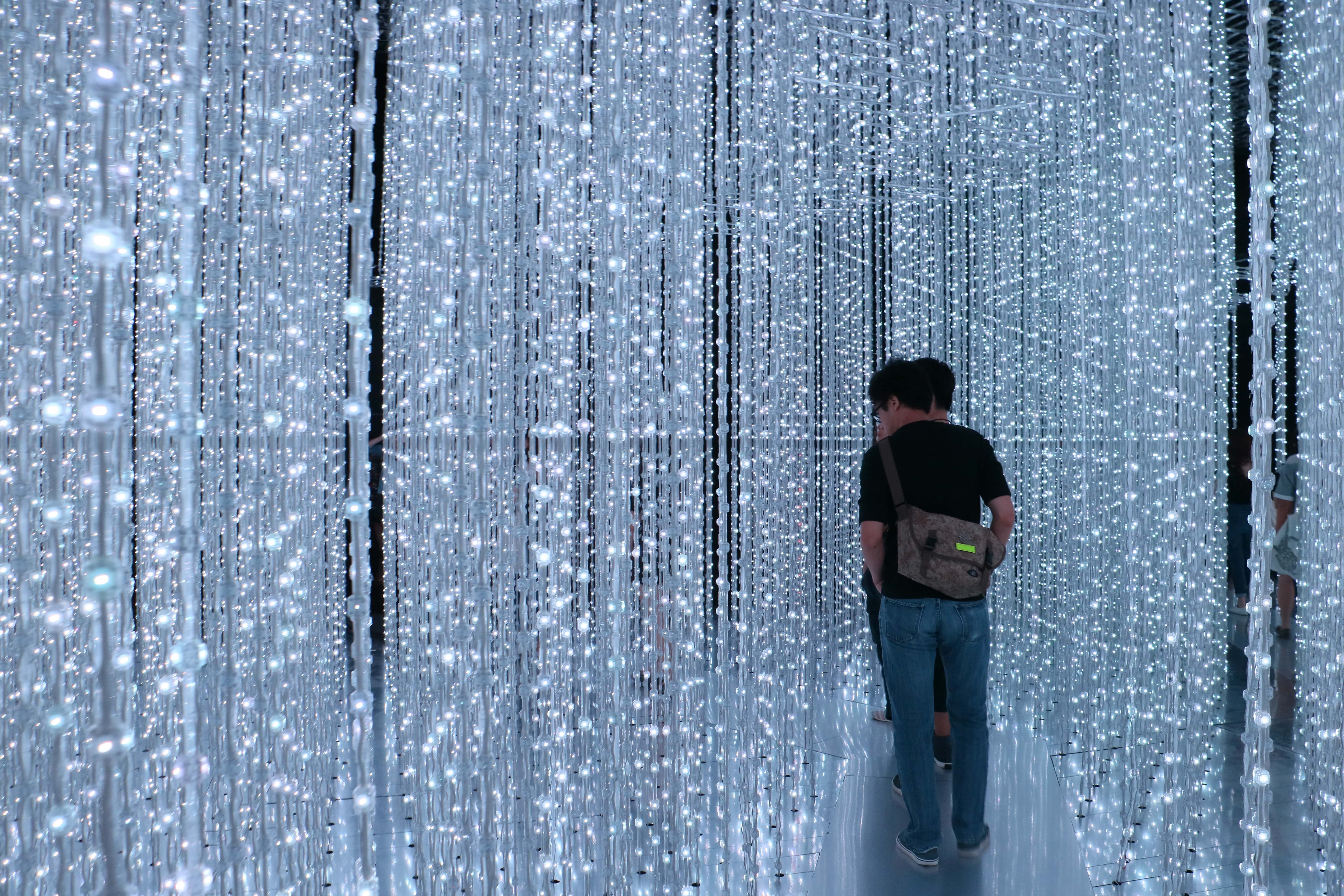
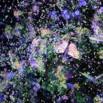
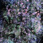
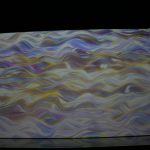
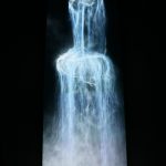
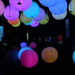
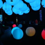
However, the most unforgettable piece is the last installation, Crystal Universe. Visually, it is really breathtaking that I thought they were all diamonds or stars. Such strong visual is forever embedded in my mind it create a very high standard for the aesthetic of installation art. Sadly, there were no enough time to really feel the entire 4D experience by supposedly ‘swiping stars and planets’ in the mobile app. But this is really the most gorgeous installation I’ve ever seen.

Crystal Universe Photos

img_6947-min img_6944-min img_6939-min

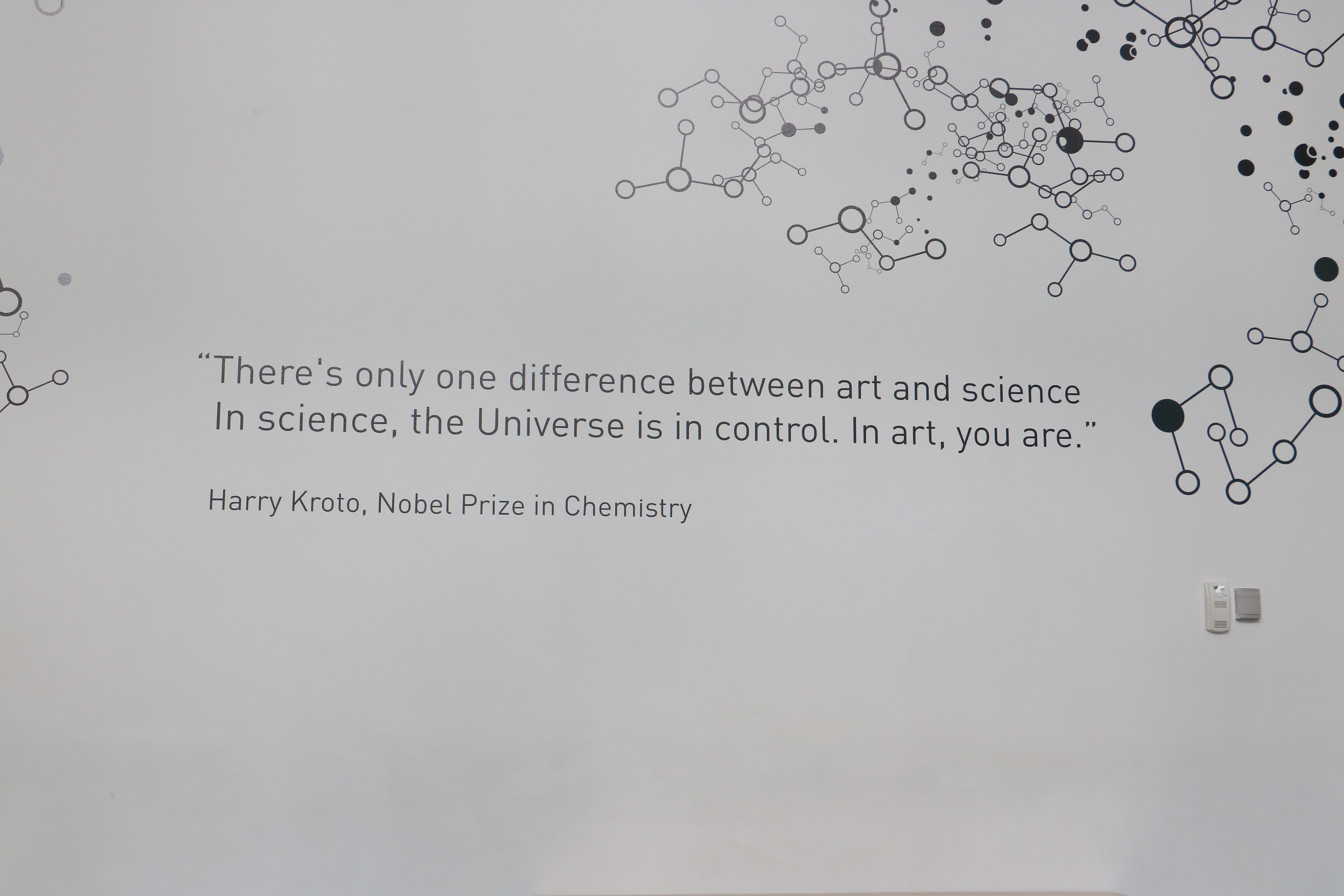
At the end of the tour, there was a lecture that was short but sweetly revealed the art concept behind the whole Future World: the Japanese or eastern perception of beauty. Never I expect that would be the inspiration, because the installations are so futuristic – who gonna think it was inspired closely to the eastern traditional perception of beauty? The western beauty theorem ‘direct us’ while the eastern ‘surround us’. I must admit the beauty, feeling and experience of the exhibition are multi-directional that it feels like another world. This is one great lesson for me as an artist and product designer.

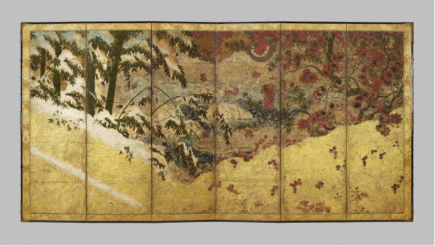
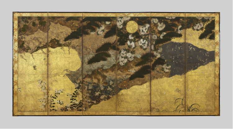
NATURE Section – Interactive installation where the ‘flowers’ we step on will die and more will grow in the place we do not stand on; animation of the sea. Both are inspired from Japanese traditional screen.

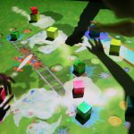
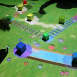
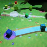
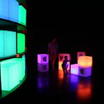
TOWN Section – Immediate urban planning; move the block and you move the whole infrastructure on the screen; draw your buildings and vehicles and you might see them on the screen; building blocks that change colors; interactive table

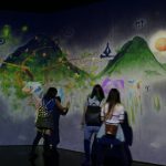
PARK Section – A place for you to play with other visitors; hopscotch!; create your own fish; become a god and create your world.

SPACE Section – Immerse yourself in the celestial space and cosmos.

img_6957-min

The Hawker Experience: Tourist vs Local

The Hawker Experience: Tourist vs. Locals

Singapore is known for her hawker centre – similar to a food court but much more down-to-earth and an open space without aircon. The food stalls are run by individual owners, unlike foodcourt’s which can be managed by a bigger company. The food in hawker centre have a really wide variety: chinese, malay, indonesian, indian, western, korean, japanese and many more. The largest and most famous hawker centre would be Lau Pa Sat, located at the heart of the Raffles Place CBD. When I was still a tourist in Singapore, I used to visit Lau Pa Sat and did not really consider to eat at other local hawker centres. However, after a few years living in Singapore, I realized that the experience that Lau Pa Sat offers to the customers are so different from many other hawker centres, even the famous ones too.

Photos of Lau Pa Sat

Photos of Clementi Hawker Centre

Observations: Comparing Lau Pa Sat and Clementi Hawker Centre

Table Comparison Table Comparison 2

So

What I can conclude from the observations is that Lau Pa Sat is a ‘special breed’ of hawker centre. It is much more ‘advanced’ that it is similar to a food court rather than hakwer centre. Clementi hawker centre is really similar to other hawker centres such as Newton Circus, Holland Village Market, and many more. If Clementi and Lau Pa Sat were persons, Clementi would be someone who lives not to impress anyone, and while Lau Pa Sat would be a person who is very well well-groomed in order to please new guests. In fact, Lau Pa Sat is really famous among tourists and I think it is designed and managed so well – more variety of food, cleaner, less noise, arranged, decorated – in order to give a good impression about Singapore to people who have a leisure travel here.

PS: And, after I did further research on the internet, Lau Pa Sat has undergone a lot of renovation and no wonder it looks like a super pretty hawker centre! here is the original Lau Pa Sat before the decoration. Even the chairs and everything are changed, the metal engraving at the ceiling are painted, and the color of the place is changed to be made more coordinated. I cant see Lau Pa Sat as a true representation of hawker centre anymore.

telok_ayer_market_6_jan_06

But to be honest, I did enjoy Lau Pa Sat more than Clementi to be a place for me to have meal on a Friday. Thanks to its good interior, ambience, hygiene and excitement – I tried the Costarican food, not bad really (food photo in the gallery)

From this comparison, the concept of a hawker centre is an eating place for public in an open space (not indoor, no aircon). And indeed this is very Singapore. 

Improvements for Lau Pa Sat

As a designer, I thought of improvements while was doing some research. I realize there is no main entrance in Lau Pa Sat, and all ends are exits to different roads. It would be great if there is ‘directory’ or signage showing which one is to which road. This would ease the flow of visitors.

But again, I really think this Lau Pa Sat’s shape and floorplan are originally like this since the 19th century. Well, even though it has undergone renovation, I think the government still want to retain the authentic aspect of this place.

Improvements for Clementi

It is a classic example of hawker centre in Singapore. I don’t feel like suggesting any improvements because this is one of true identities of the society. Probably to make it better, the local governor or leader could start a campaign of ‘putting back your own tray’ because there were really a lot of trays and plates left on the table with no one cleaning them up. Probably, there is short of manpower or the cleaners are on breaks, but it would be great if the costumers could do such an easy task to improve the experience of eating in a local and classic hawker centre.

You want to go to the places? here are the address:

  • Lau Pa Sat: 18 Raffles Quay, Singapore 048582
  • Clementi Central Market and Food Centre: 448 Clementi Ave 3, Singapore 120448

Team SHINGAPORU: Research and Practice Project Plan

Topic: Nihonga Japanese Screen Painting

Chosen Artifact

Moon Sun

Four Seasons with Sun and Moon, as seen in the National Museum of Singapore, “Treasures from the British Museum”.

Visual Analysis

  • Both screens have subject matters of nature and landscape: trees in different seasons, hills and valleys ‘framing’ the trees, grass, flowers.
  • Golden frame.
  • Each screen is divided into 2 ‘scenery’. First image: winter (L) with its white snow on the leaves, autumn (R) with red falling leaves, and both are during the day because the tone is bright. Second image: Summer (L) with barren land and withered plant, spring (R) with baby plants, blooming flowers and grass, and both are during the night because there is circular moon at the top side of the painting

Contextual Analysis

  • Sun represents the male yang, moon represents the female yin
  • The way of yin and yang (‘Onmyodo’) in the religious context
  • Yang also represents brightness/light while yin represents darkness.
  • The four seasons is a common subject matter in japanese paintings. It represents a full cycle and the passing of time. Expressing a transition.

Visual Response Idea

  • The digital painting of Singapore modern landscape.
  • Might include famous landmarks, buildings and places such as Merlion, Marina Bay Sands, Singapore Flyer, Buddha Tooth Relic Temple, Esplanade Theatre and many more.
  • Nature’s element presented in the painting: rain forest trees, orchids, or other plants which are present in Singapore.
  • The painting can be folded, just like Japanese screen

Claim

Commemorating the 50th anniversary of Japan-Singapore diplomatic relationship. That is the reason why we combine Japanese traditional aspect (folded screen) with modern landscape of Singapore. We feel that not many people know about this ongoing special celebration, hence this visual response might serve more than just a display but an informative artwork.