About
In this project, we are assigned to create postcards with a typography of our name. Just like its title, the typography should be a ‘portrait’ of myself: a representation of who I am and/or my aspiration.
Research
The first artist I have researched is Hannah Hoch. Her collages speak their messages strongly, and some even have multiple interpretation. Her pieces intrigue me to try ‘less clean’ photomontage.


The second research is Dada Movement. Here, more typography is involved in this style even though it is similar to Hannah Hoch’s.


The third one is Russian Evolution art. This one is more poster-like and bold.


The fourth is DIY typeface. This is experimental basis and surely will bring a much more distinguishable look than digital image.

Process
First thing first, I did a mindmap about myself: my facts, my aspiration, and “If I were…”s.
Some of the ideas that I picked are:
- Messy perfectionist
- Nerdy bimbo
- Dreamy fashion designer
- Mischievous artist
- Coquettish tai-tai
- Emo musician
- Mischievous Christian
Then, I started sketching drafts. At first, I was influenced heavily by Hannah Hoch and Dada art, making me to plan a too image-drive postcards. I forgot to emphasize much on typography and to infuse my characteristic into the text, not the image. The first set of draft sketches/planning is wrong.
For the 2nd set, I did both traditional pencil sketches and digital sketches. Some of the digital sketches I have done:


However, I think that these drafts are still lacking ‘thoughts’. The first one can be developed further but the 2nd and 3rd…they are not really satisfying.
As the deadline was getting near, I chose 4 points out of all the points I mentioned earlier about myself and worked on these 4 ideas.
The final inspiration I gained:
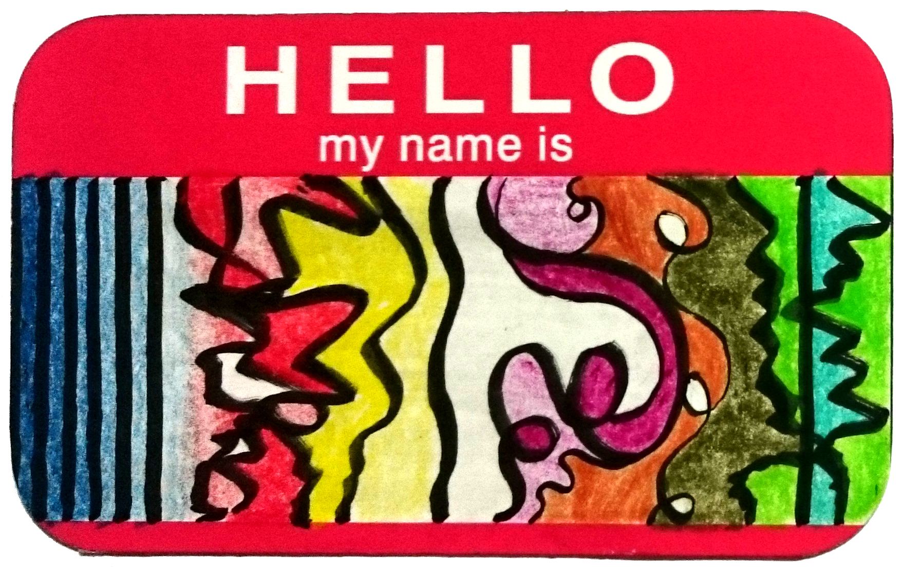
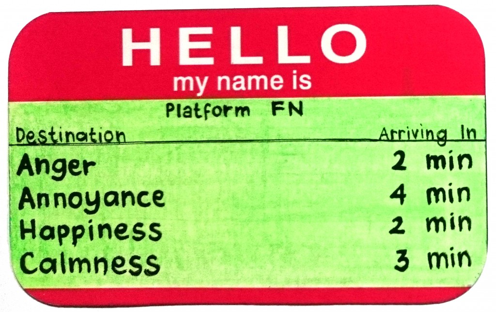
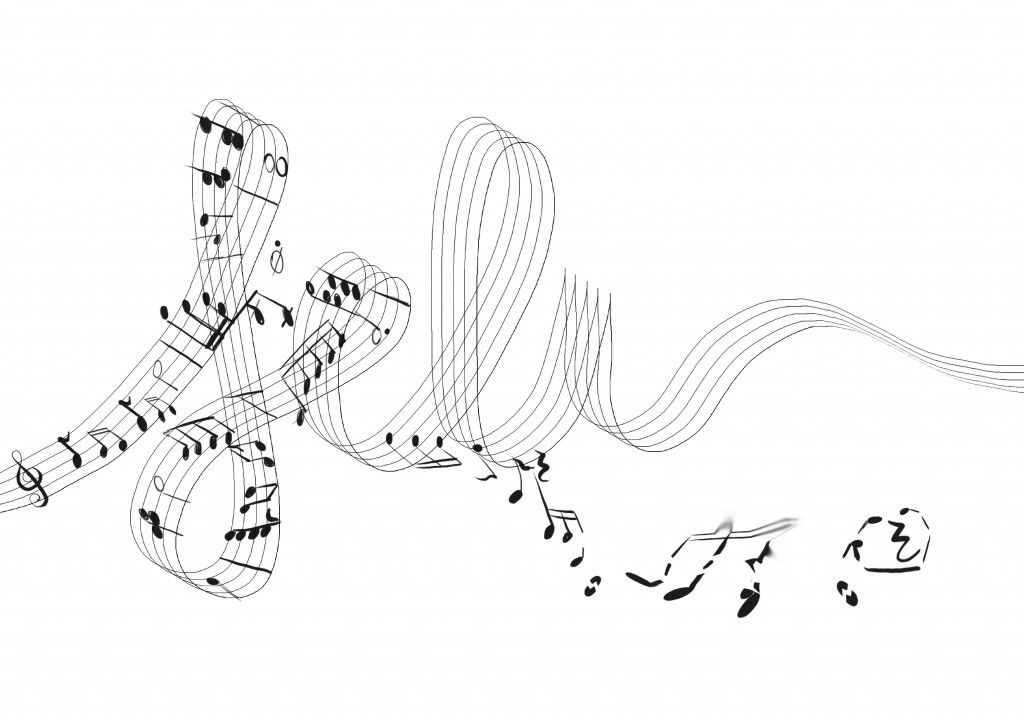
- emo musician: inspired from music sheet’s 5 lines and written notes. The blood, the last idea I got to improve this typographic portrait, is to portray extreme depressed action of ‘self-cutting’.


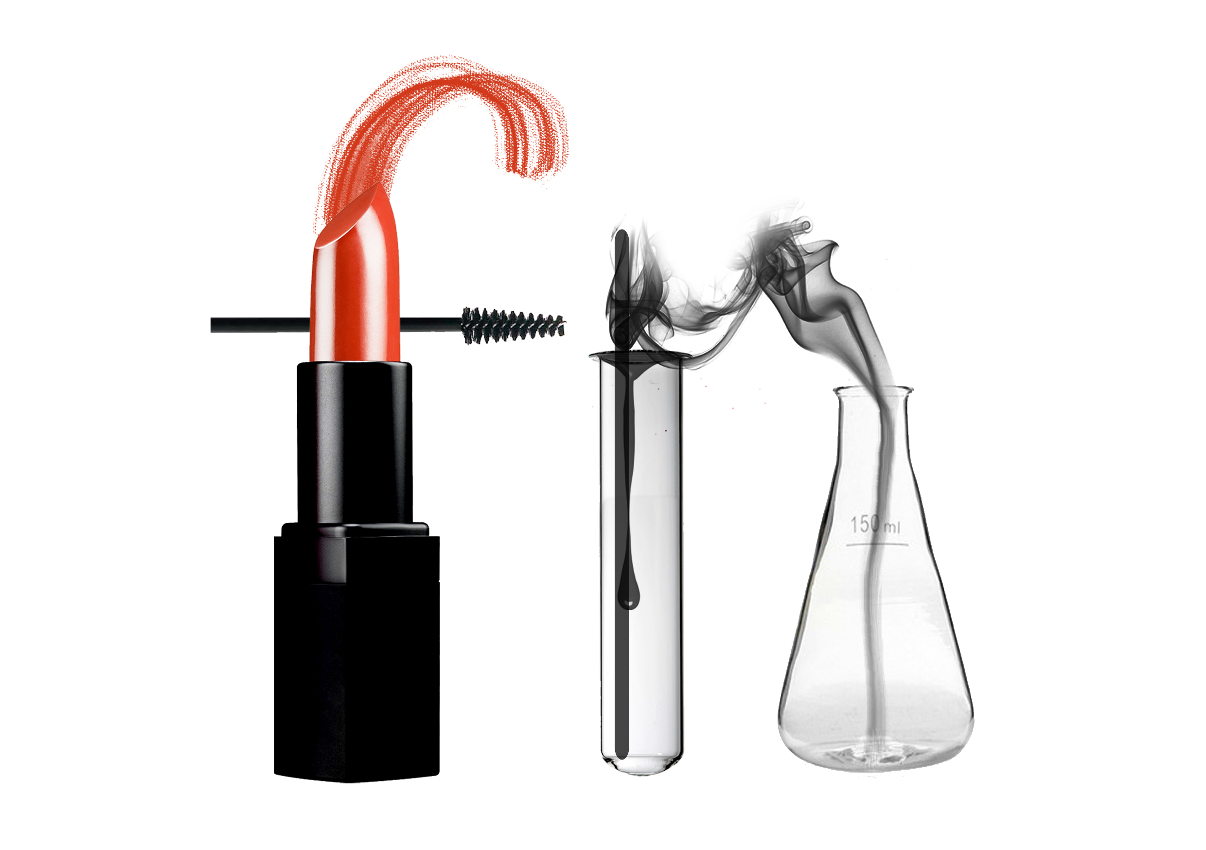
- nerdy bimbo: I want ‘bimbo’ to be portrayed through makeup kits, and the ‘nerdy’ idea through various chemistry class’ equipment.


- dreamy fashion designer: the idea of using mannequin as the ‘i’ is derived from the digital sketch I have made earlier. Then, for this postcard, I use the ‘opposite’/mirror concept. ‘Dreamy’ means I love to think of fantasies, fairy tale, impossible things to happen.


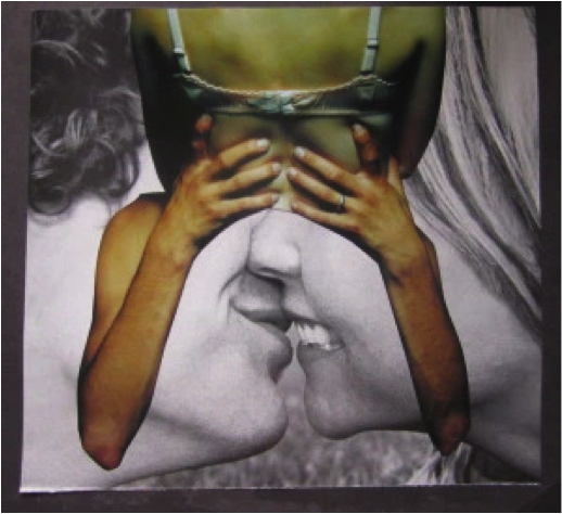
- mischievous artist: initially, I didn’t think of monkey to be the symbol of mischief. I thought I would use something like messy brush strokes and splashes on a wall, which is not very communicating the message…


Exploration of Style/Reflection
It is natural for me to create a ‘clean-style’ image. However, the usage of only three colors: black, white and red is unintentional. The first two images (Emo Musician and Nerdy Bimbo) are both consist of these 3 colors only. Hence, I just continued making the last two images to be in the same colors.
Initially, I really wanted to try photomontage. However, the idea of photomontage drove me to think of image not typography. I am very new to typography and hence I decided to just focus on typography, and let all the messages I want to deliver stored in the typography only.
The simple/clean style also allows me to create design aesthetically through the meanings, not through visual elements such as colors and shape. First, I focused solely on how to convey the messages effectively, then I altered here and there to get the desired aesthetic of the design as a whole.
Overall, this project exposed me to the door of typographic art/typography’s world. I am amazed by how simple typography can be but the simplicity carries out a lot of mood, message, purposes. This project makes me want to learn more about typography.