
The topic of colours is very wide and vast, there’s simply too many things to cover! Therefore, this post be a compilation of the basics of colour theory and how they can be applied.
Colour Systems
Colours come in two systems, additive (RGB) and subtractive (CMYK).
Additive (RGB):
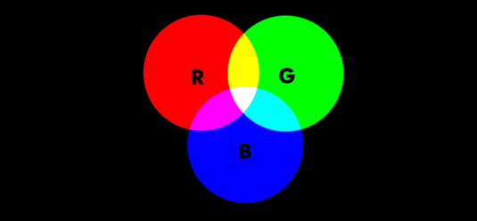
Additive colours work with anything that emits light and are used for screen. It is called additive because the more light you add, the brighter and lighter the colour becomes. White is the combination of colour, while black is the absence of colour.
Subtractive:
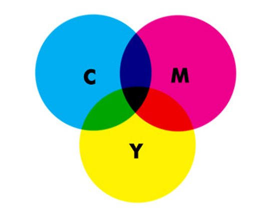
Subtractive colour works on the basis of reflected light and are used for print. It has three primary colours – Cyan, Magenta, and Yellow (CMY). White is the absence of colour, while black is the combination of colour. ‘K’ stands for ‘key’, which is black.
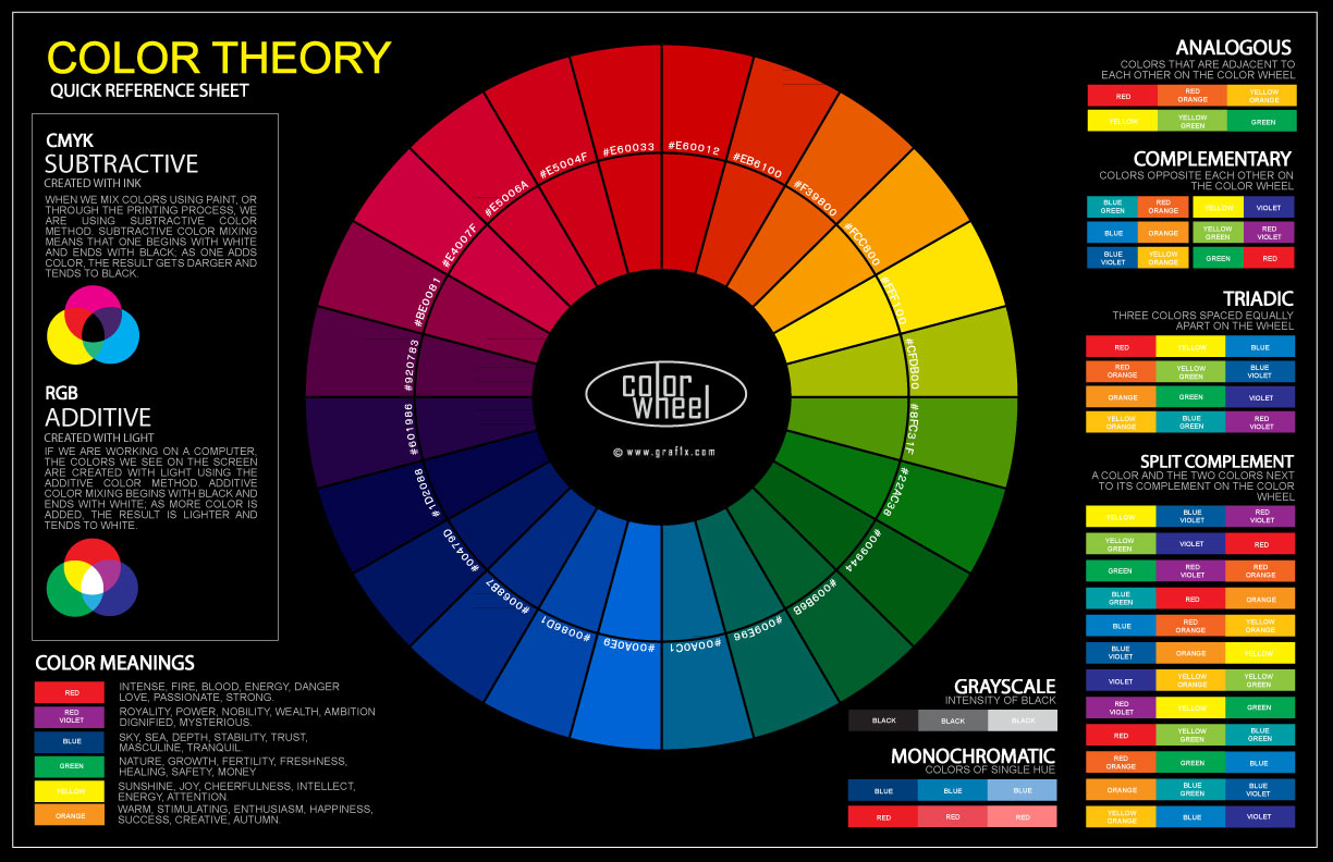
Colour Wheel
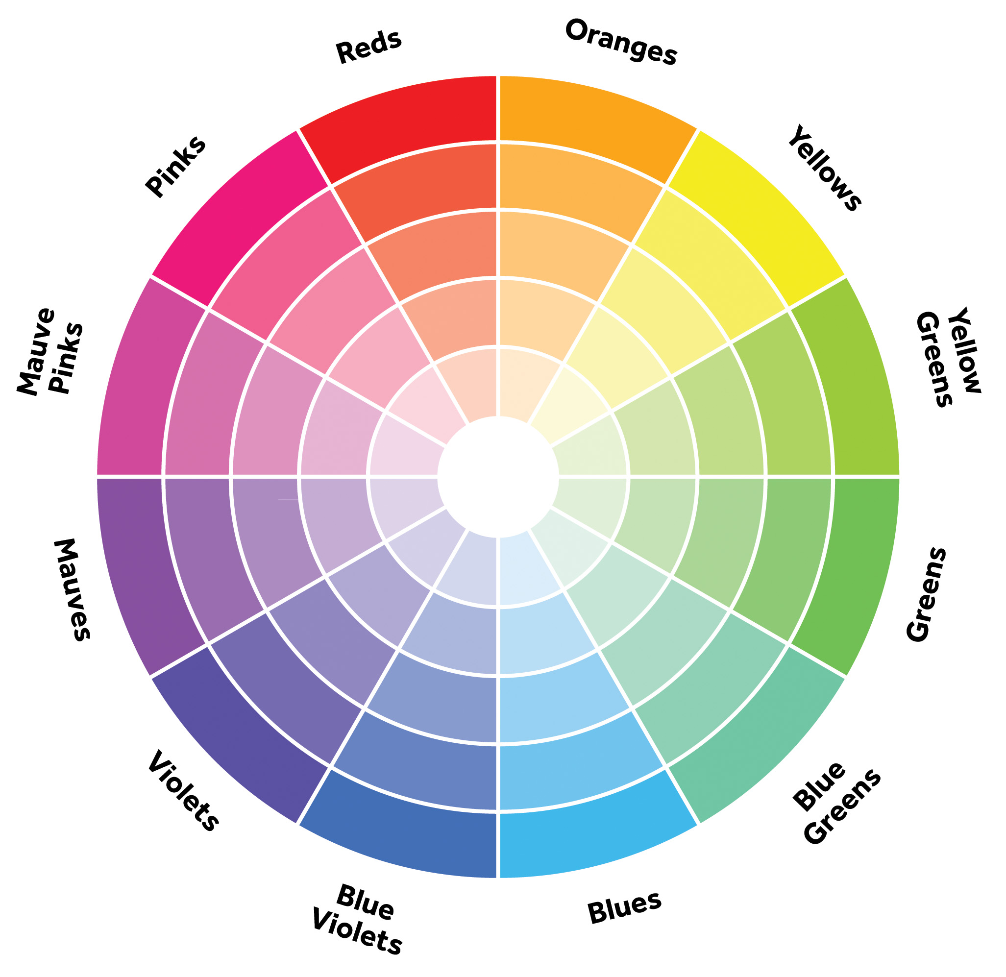
Categories:
- Primary colours: Red, yellow and blue
- Secondary colours: Green, orange and purple. These are the colours formed by mixing the primary colours.
- Tertiary colours: Yellow-orange, red-orange, red-purple, blue-purple, blue-green & yellow-green. These are the colours formed by mixing a primary and a secondary colour.
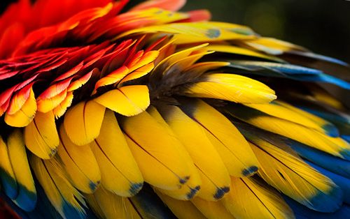
Warm and cool colours:
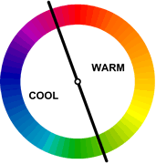
Warm colours are vivid and energetic, and tend to advance in space. Cool colours give an impression of calm, and create a soothing impression. White, black and grey are considered to be neutral.
Tint, shade and tone:

Colour Harmonies:
Based on the colour wheel, we are able to extract and match colours to create pleasing combinations.
Complementary:
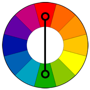
Complementary colours are located opposite each other in the colour wheel. The high contrast of complementary colours creates a vibrant look especially when used at full saturation. This colour scheme must be managed well so it is not jarring.
They are tricky to use in large doses, but work well when you want something to stand out. They are bad for text too.
Example
Complimentary colours are often applied in food plating so as to attract people to buy the food.

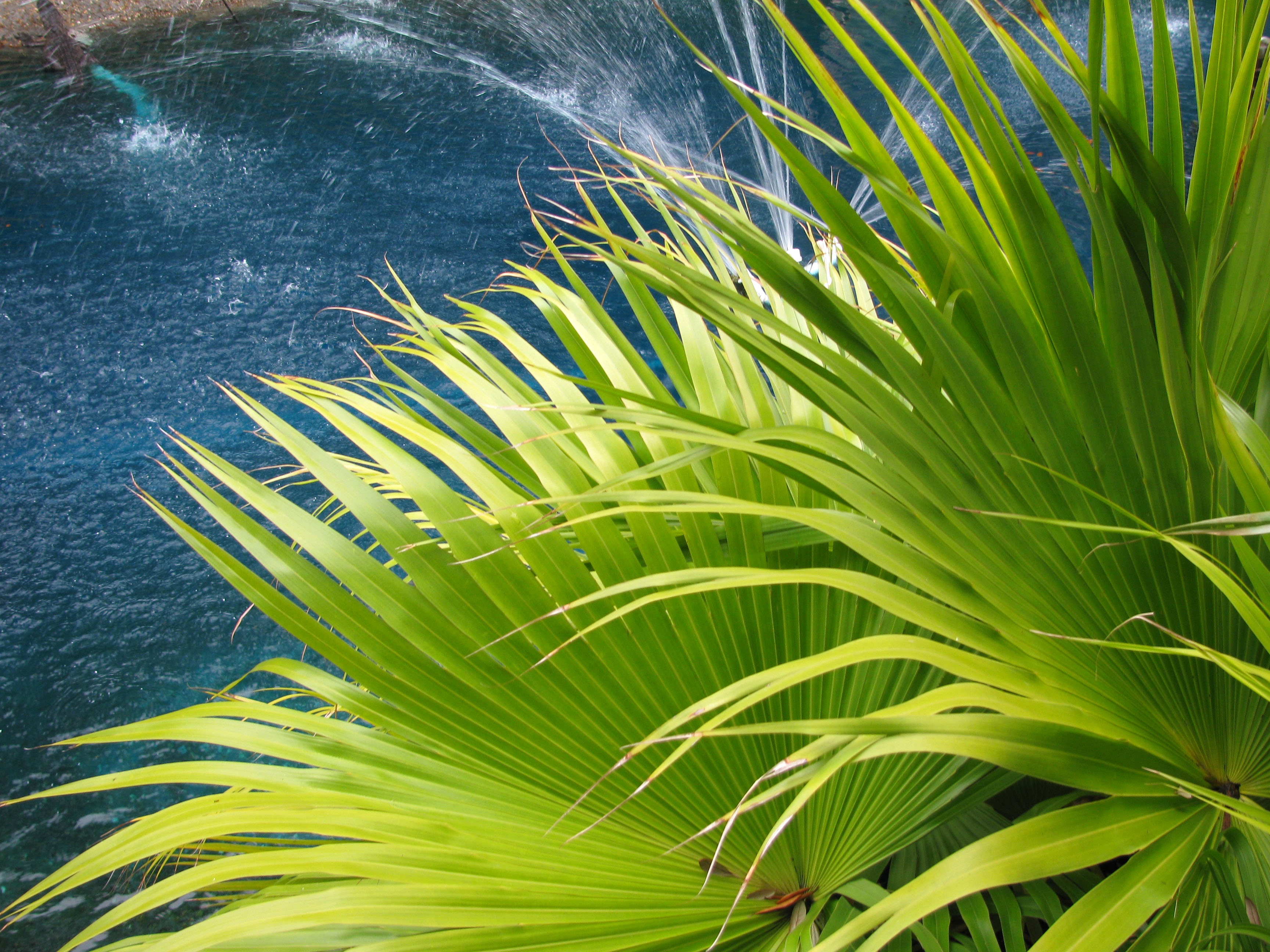
Analogous:
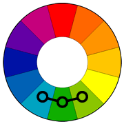
Analogous colour schemes use colours that are next to each other on the colour wheel. They usually match well and create serene and comfortable designs.
It is important enough contrast when choosing an analogous colour scheme. Choose one colour to dominate, a second to support. The third colour is used (along with black, white or gray) as an accent. [Application of the concept of dominant, sub-dominant and subordinate that we learn in 3D]
Example
These colour schemes are often found in nature and are harmonious and pleasing to the eye.
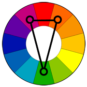
Triad:
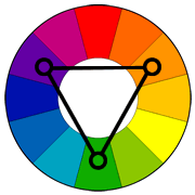
A triadic color scheme uses colors that are evenly spaced around the color wheel.
To use a triadic harmony successfully, the colors should be carefully balanced – let one color dominate and use the two others for accent.
Example
Triadic color harmonies tend to be quite vibrant, even if you use pale or unsaturated versions of your hues.
Split-complementary:
The split-complementary colour scheme is a variation of the complementary colour scheme. In addition to the base colour, it uses the two colours adjacent to its complement.
The split-complimentary colour scheme is often a good choice for beginners, because it is difficult to mess up.
Example
This colour scheme has the same strong visual contrast as the complementary colour scheme, but has less tension. Hence it can be found in nature as well.

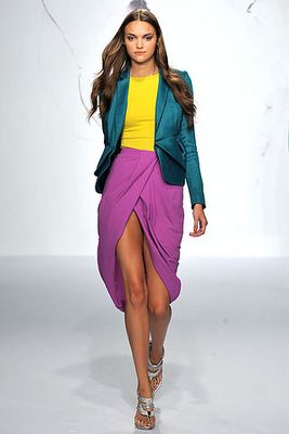
Tetradic:
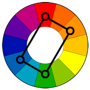
The rectangle or tetradic colour scheme uses four colours arranged into two complementary pairs. This rich colour scheme offers plenty of possibilities for variation.
This colour scheme works best if you let one colour be dominant. Pay attention to the balance between warm and cool colours in the design.
Example
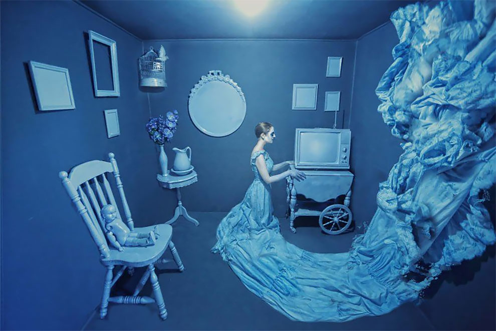
Monochromatic:

Many mistake monochromatic colour scheme for grayscale. In fact, monochrome is incorporating different shades of the same colour. It is able to create a harmonious and visual cohesive look.
Example
Chromatic and Achromatic:
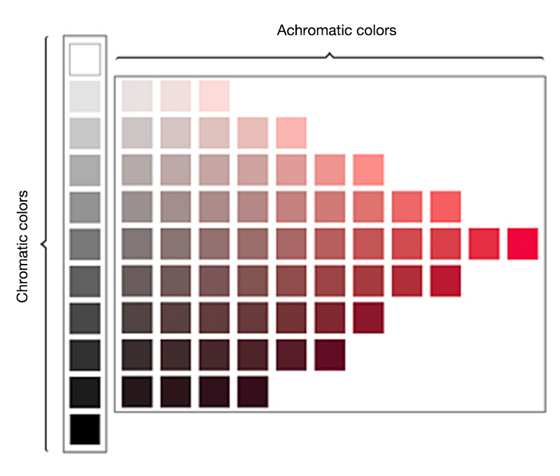
Achromatic colours (white, grey and black) have lightness but no hue or saturation. They can be created by mixing complementary colours together. Chromatic colours, on the other hand, have characterising hues such as red, blue and yellow, as well as saturation, which is an attribute of intensity, in addition to lightness. The lightest possible shade is white, the total transmission or reflection of light at all visible wavelengths.
Grayscale:

Grayscale is a range of shades of gray without apparent color. The darkest possible shade is black, which is the total absence of transmitted or reflected light.
Summary
All in all, it’s important to understand the relationship between colours as they will be essential in portraying certain moods and messages. While it is tempting to make use of many colours, a piece of design is only effective when the colours are chosen and used wisely.
Info and Image Sources
- Hampton-Smith, S. (2017). How to master colour theory. [online] Creative Bloq. Available at: http://www.creativebloq.com/colour/colour-theory-11121290 [Accessed 25 Oct. 2017].
- Sophie Robinson. (2017). How to choose the right colours for interior design – Sophie Robinson. [online] Available at: http://www.sophierobinson.co.uk/how-to-choose-the-right-colours-for-interior-design/ [Accessed 25 Oct. 2017].
- Tigercolor.com. (2017). Color Harmonies: complementary, analogous, triadic color schemes. [online] Available at: http://www.tigercolor.com/color-lab/color-theory/color-harmonies.htm [Accessed 25 Oct. 2017].
- Chrichri.dk. (2017). Tabbouleh med friske abrikoser – ChriChri. [online] Available at: https://www.chrichri.dk/foodhealth/dinner/2014/07/tabbouleh-med-friske-abrikoser/ [Accessed 25 Oct. 2017].
- Pinterest. (2017). Color Schemes. [online] Available at: https://www.pinterest.com/pin/458030224576660010/ [Accessed 25 Oct. 2017].
- Pictures-and-images.net. (2017). Photography Autumn Foliage Related. [online] Available at: http://pictures-and-images.net/content/photography-autumn-foliage-related.html [Accessed 25 Oct. 2017].
- Lacayo, M. (2017). Porte, Imagen Personal y Profesional. [online] Porteimagen.blogspot.sg. Available at: http://porteimagen.blogspot.sg/2011/03/ [Accessed 25 Oct. 2017].
- Color-hex.com. (2017). Monochrome 0CF Color Palette. [online] Available at: http://www.color-hex.com/color-palette/1550 [Accessed 25 Oct. 2017].
- Ego – AlterEgo. (2017). Colors, a series of fantasy scenes photographed by Karen Jerzyk – Ego – AlterEgo. [online] Available at: http://ego-alterego.com/colors-series-fantasy-scenes-photographed-karen-jerzyk/#.WfCbExNL_Uo [Accessed 25 Oct. 2017].
- MAU ART & DESIGN GLOSSARY|Musashino Art University. (2017). MAU ART & DESIGN GLOSSARY|Musashino Art University. [online] Available at: http://art-design-glossary.musabi.ac.jp/chromatic-and-achromatic-colors/ [Accessed 25 Oct. 2017].
- Color-hex.com. (2017). Web-safe Grayscale Color Palette. [online] Available at: http://www.color-hex.com/color-palette/3046 [Accessed 25 Oct. 2017].
- Color-hex.com. (2017). Web-safe Grayscale Color Palette. [online] Available at: http://www.color-hex.com/color-palette/3046 [Accessed 25 Oct. 2017].
- Graf1x.com. (2017). The Color Wheel Chart, Poster for Classroom – graf1x.com. [online] Available at: https://graf1x.com/the-color-wheel-chart-poster/ [Accessed 25 Oct. 2017].
1 comment for “[2D] EGO: Colour Research”