My ideation and sketches are all available in my CPJ, so I will not be repeating them here again! Instead, I will be focusing on the execution of the 4 equations in this post.
All my panels feature an analogous colour scheme because my bun is white and it stands out already, hence an analogous colour scheme would harmonise with white, instead of overpowering it.
My art direction is inspired by Pusheen the Cat and Sumikko Gurashi.
Equation 1
Me (introduction) + Complicated name = A broken radio
Development 1:
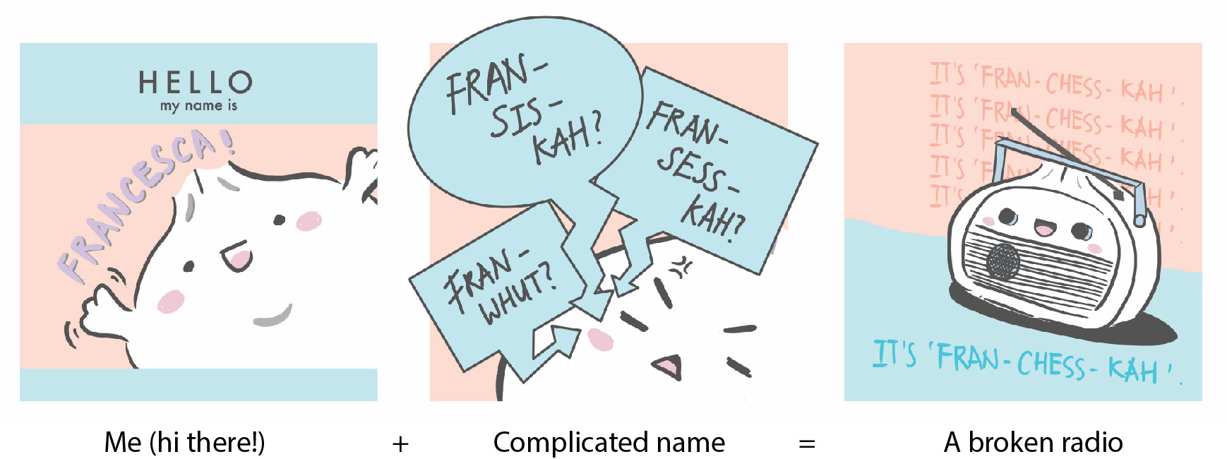
Chosen colour scheme:
- Pink: Represents the warmth that I want people to feel when they’re around me. Good impressions matter!
- Blue: Represents aloofness. I try pretending that this issue doesn’t get to me, but it does get to me sometimes…
- Purple: Represents suppression. I used to be very self-conscious and loathed my parents for giving me such a strange name. I remember having low self-esteem in primary school simply because of my name and purple is used to represent my feelings during that period of time. Fret not though, I’ve come to embrace my name now!
Room for improvement:
Based on Mimi’s comments, my designs are too zoomed in because my bun is taking up a lot of space in the frame. It leaves little room for background details that will make the design more lively and engaging. Hence making it too simple as of now. I should reconsider the way I draw my strokes too since it doesn’t match the art direction that I’m going for.
Development 2:
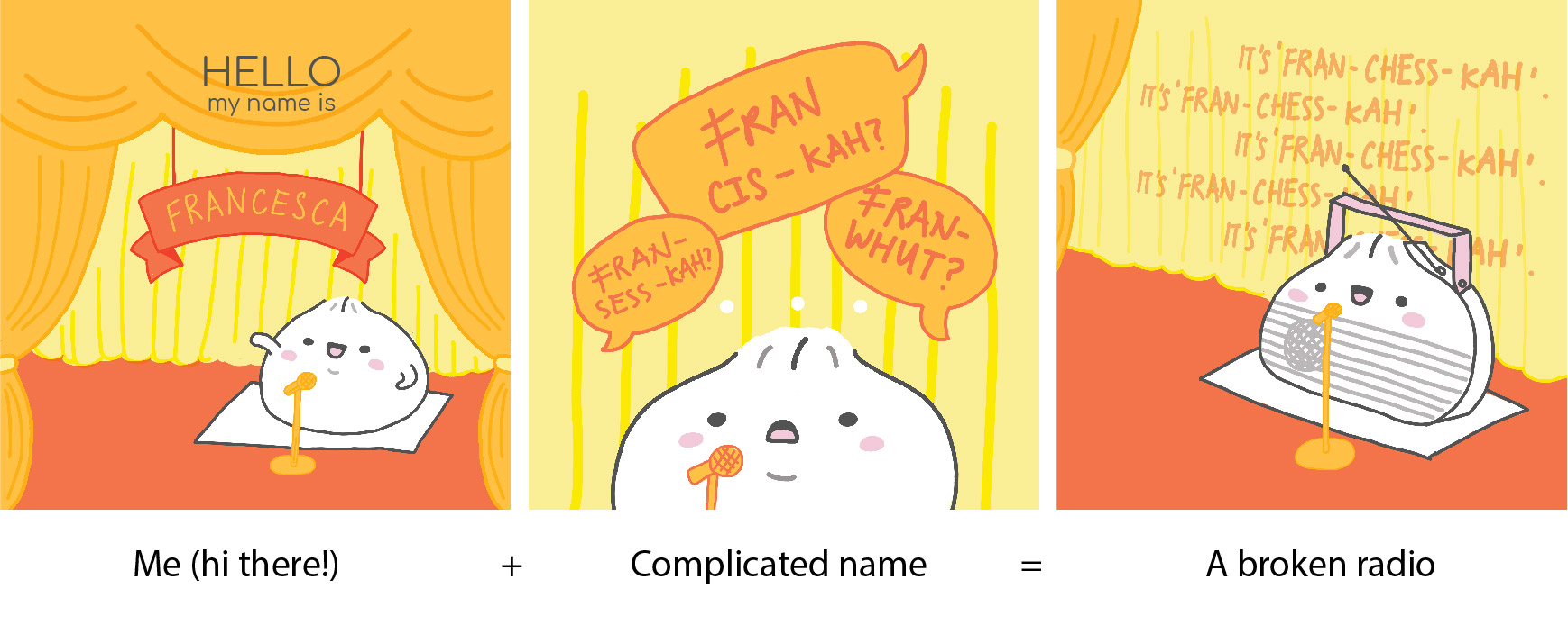
I decided to change the colour scheme into something that is brighter to reflect the excitement that I feel when I first introduce myself.
Chosen colour scheme:
- Yellow: Represents self-esteem. Like what I’ve mentioned previously, names do affect self-esteem!
- Orange: Represents frustration. How I feel whenever I have to keep repeating myself.
- Red: Represents stimulation. Very similar to the frustration that I feel. It’s pretty annoying when people can’t pronounce my name right, but at the same time it’s not their fault. So I’ll just patiently correct them over and over again!
I noticed that the line weights of my 2 references (Pusheen the Cat and Sumikko Gurashi) are uniform throughout. Hence I followed suit in this development, as opposed to the variation in line weight in the previous development.
Room for improvement:
Based on Mimi’s comments, the ‘Hello my name is’ card is not used for a stage setting, usually used for a small group setting. Illustration style still needs to be improved. Because the art direction that I’m going for is so simplistic, the line work has to be very meticulously drawn.
Development 3:
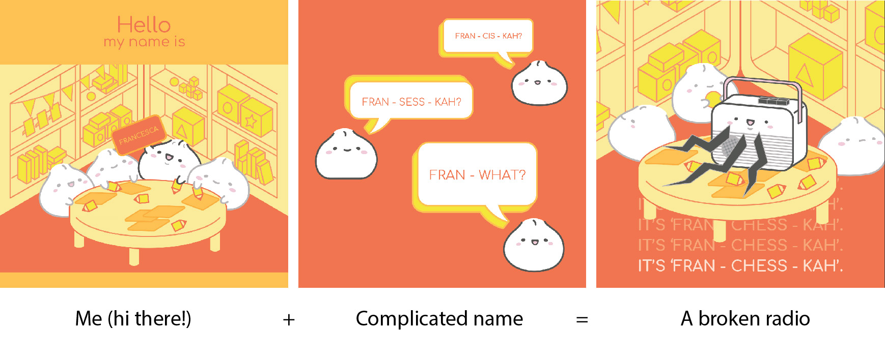
The setting has been changed to that of a pre-school now. It reflects how my kindergarten classmates weren’t able to pronounce my name properly back then. Even now as I volunteer at a place for underprivileged children, the children there aren’t able to pronounce my name properly either haha.
Previously, I was illustrating on Photoshop using my tablet, hence my line work isn’t ideal. I switched to Illustrator this time so that my lines will be smoother and cleaner. Looking at the illustration style of Pusheen the Cat and Sumikko Gurashi, I’m confident that they are illustrated using Illustrator too.
This change required me to take a huge leap of faith because illustrating in Illustrator requires much skill as well. I find that it’s much more tedious than simply drawing on Photoshop, but I decided to challenge myself so that I can achieve the results that I want. The transition to Illustrator was indeed the right decision because my current illustration style looks much closer to my references now.
‘Complicated name’ frame development:

The first 2 frames depict my struggle to decide which colour placement is better. The first frame goes better with ‘Me (hi there!’ frame, but the red background drowns out the orange speech bubble. The colour placement definitely works better for the second frame, but this frame doesn’t go as well with ‘Me (hi there!)’ frame.
I also felt that the speech bubbles were very flat and boring, hence the 3rd frame was an exploration on how to make the speech bubbles ‘pop’ while still staying true to my art direction. I was pretty happy with the 3D speech bubbles but still felt that something is lacking.
I decided to include steam buns into the design as well to give it more life and personality.
‘A broken radio’ frame development:
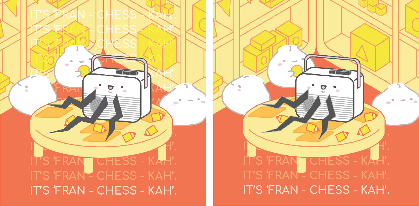
The phrase ‘It’s ‘Fran-chess-kah” has been repeated many times to depict how I’m a broken radio. I initially repeated it all the way from top to bottom, as seen from the first frame. But I felt that it was too cluttered and reduced the number of it, as seen from the second frame.
Other changes:
In my CPJ, I implemented paper cutting by selecting an element of the design and making it pop up literally to bring emphasis on it. I scraped that idea altogether in the end because I felt that it didn’t enhance the design in any way, so it was basically unnecessary.
Equation 2
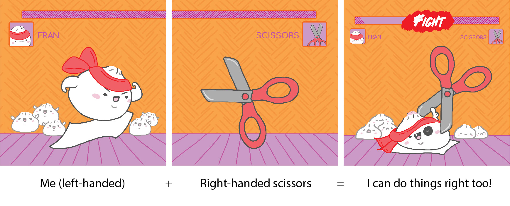
Me (left-handed) + Right-handed scissors = I can do things right too!
The original situation was ‘Right-handed world’, but I changed ‘world’ to ‘scissors’ to make this situation more specific.
Development 1:
Chosen colour scheme:
- Red: Represents strength and revival. Apt in representing how left-handers have to adapt in a right-handed world!
- Orange: Represents frustration because it’s not easy trying to do things the right way (get it? the RIGHT way)
- Purple: Represents inferiority because left-handers are the minorities and it is as if the world works against us.
This panel is heavily inspired by old-school Street Fighter games! I used this style to represent how it is me going against the right-handed scissors in a fight. The health meter above will be able to indicate clearly who’s winning or losing. In this case, the scissors is clearly winning. As my outcome is ‘I can do things right too!’, I drew the bun being defeated but still giving a thumbs up to show that it is trying its best. It is meant to be sarcastic!
Room for improvement:
Based on Mimi’s comments, the composition is all over the place. In a nutshell, it’s not visually appealing. This was when I was still using Photoshop to illustrate so… it looks even worse than it’s supposed to be. The left-hand of the bun is not exaggerated enough. It is also difficult to tell that the pair of scissors is actually a right-handed one, would be clearer to use scissors with different hole shapes.
I’m also feeling iffy about the phrase for the last frame, ‘I can do things right too!’. I felt that this would be a good pun, but it really isn’t working out. I was afraid viewers will be misled and confused by the different messages that my words and thumbs-up are giving.
Development 2:

This panel is done in Illustrator this time, hence the strokes are much more uniform and neater. The setting has been changed to a fighting ring to further emphasise that the bun is fighting against the scissors. The design of the scissors has been changed too!
Since the first two frames are connected, I drew them out as a single rectangular frame first before splitting them into squares. This works much better than drawing both frames separately (I did that for the previous development and it sucks).
The final frame illustrates me getting kicked in the butt by the scissors. That’s because I really struggle with using scissors and it requires much effort to simply cut something nicely.
‘I’ve tried my best’ frame development:
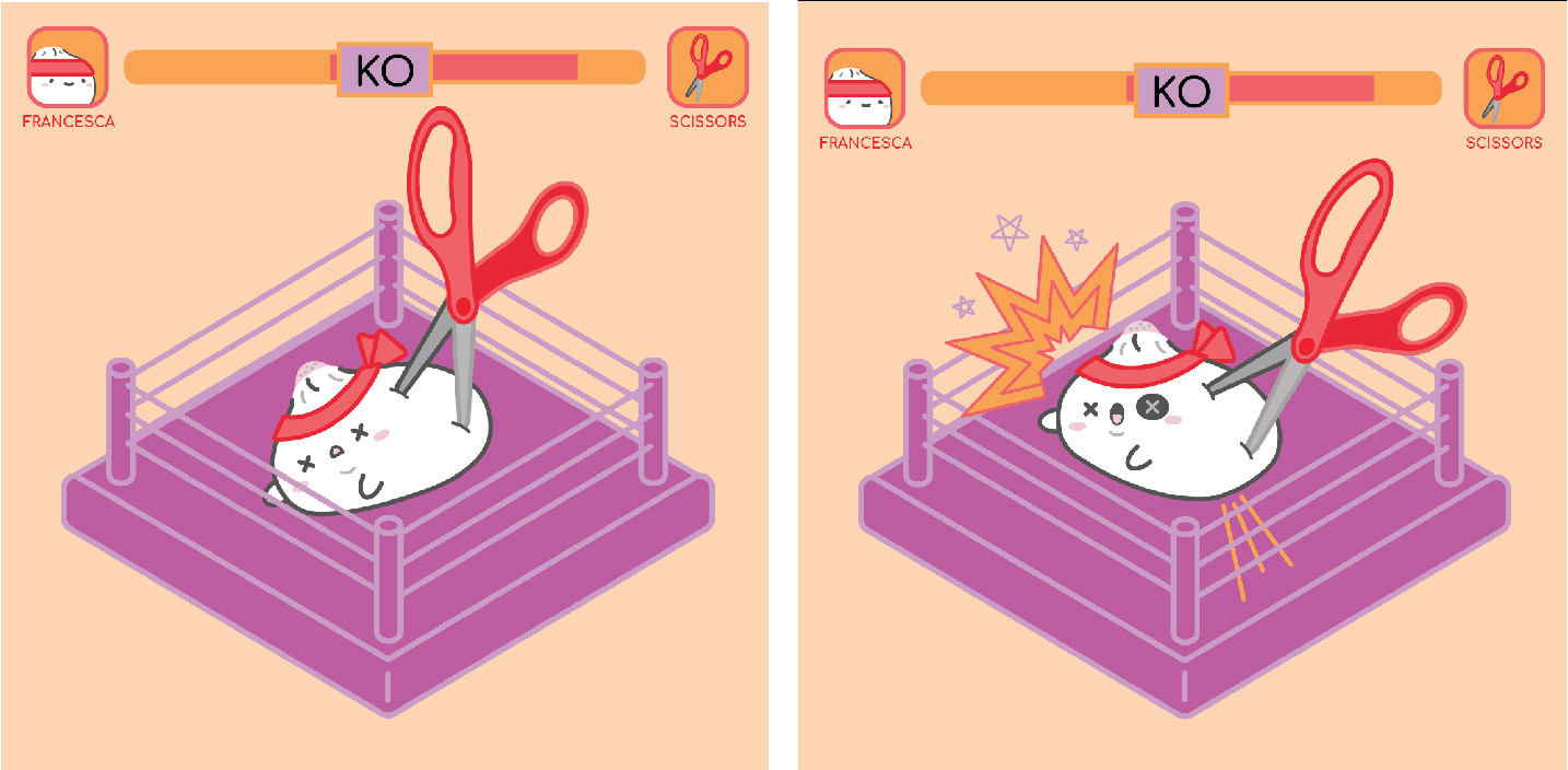
The frame on the left is my initial design but I felt that it’s too static and doesn’t convey the energy that is present in a fighting ring. Hence, I exaggerate the bun’s expression by giving it a gasping mouth and a bruised eye. I also added start effects to illustrate the impact of being beaten up by the scissors.
Equation 3
Original equation: Me (good student) + Art history lectures = Listening to lullabies
I worked on the ‘Me (good student)’ frame in Photoshop before abandoning it for Illustrator. I ended up changing the setting of this equation from the lecture hall to my room. I felt that my room would give me more room (get it?) to explore with the design.
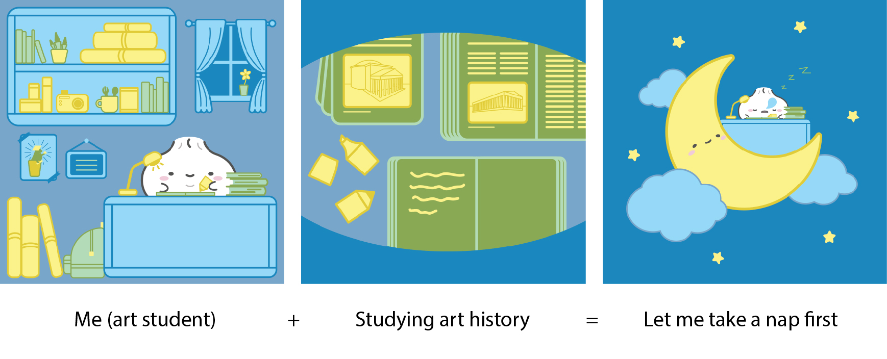
New equation: Me (art student) + Studying for art history = Let me take a nap first
I felt that this new equation is much clearer in context, hence making it easier to illustrate its context too. It’s based on a true story because I procrastinate SO MUCH when it comes to studying…
Development 1:
Chosen colour scheme:
- Blue: Represents serenity and calmness. Because night time is usually quiet and peaceful, it helps me to be concentrate better and hence be more productive.
- Green: Represents boredom. I think that this is self-explanatory for this context.
- Yellow: Represents fear and anxiety. These are how I feel towards exams! I would much rather do projects than take exams, that’s why I’m in art school. Till I realised that there’s art history exam!
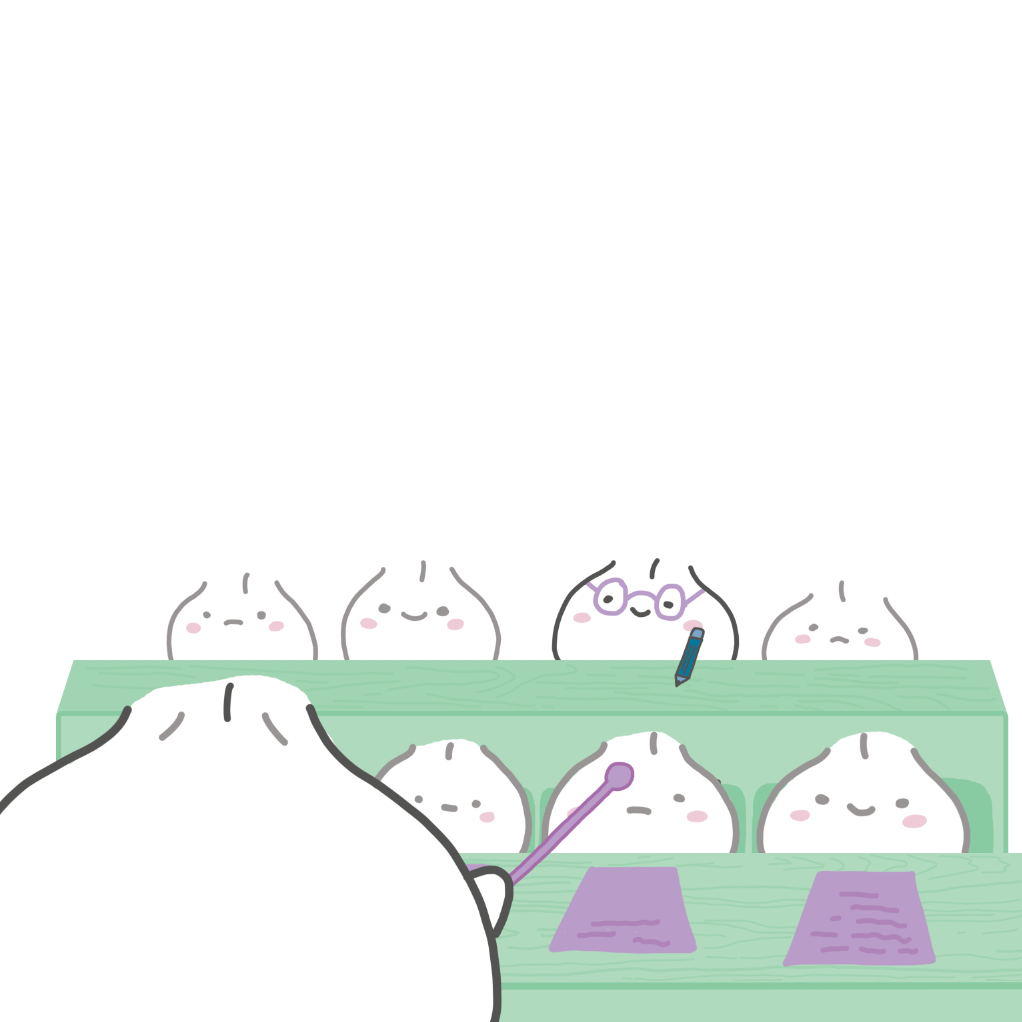
The first frame depicts my room in hall. To show that I’m an art student, I illustrated paper rolls (in the notorious Artfriend yellow), camera and brushes. I also added a window with a flower sitting on the ledge to give the room more character. The outside of the window is depicted in a darker blue, which is the dominant colour in the last frame. (My trash panda from Forrest Gump project makes an appearance again!)
The second frame is a POV shot and it shows my eyes closing as I try to absorb all the information. The Parthenon and Pantheon links back to art history.
The last frame is a nod to nursery books for children, where characters are usually depicted sleeping on the moon. This scenario is fitting due to the cute and simplistic nature of my art direction.
‘Me (art student)’ frame development:

The frame on the left is the original colour scheme, it’s very similar to the final one except that the green is much paler. When I printed it out, the light green is completely washed out by the light blue. Hence I made the dark green even darker so that it can help to bring out the light green.
‘Studying art history’ frame development:

I initially wanted to give the books more depth by making the lines curve, but it doesn’t suit my art direction so I ended up making the artwork flatter, as seen in the second frame. I also wanted to make the books messier by tilting them, the mess is an accurate depiction of how students study. But I ended up making the layout design neat because I felt that tilting the books would make the whole composition not aesthetically pleasing.
Equation 4
Original equation: Me (pumped-up) + Projects = Distracted by everything else
I scraped this equation because it was too similar to Equation 3.
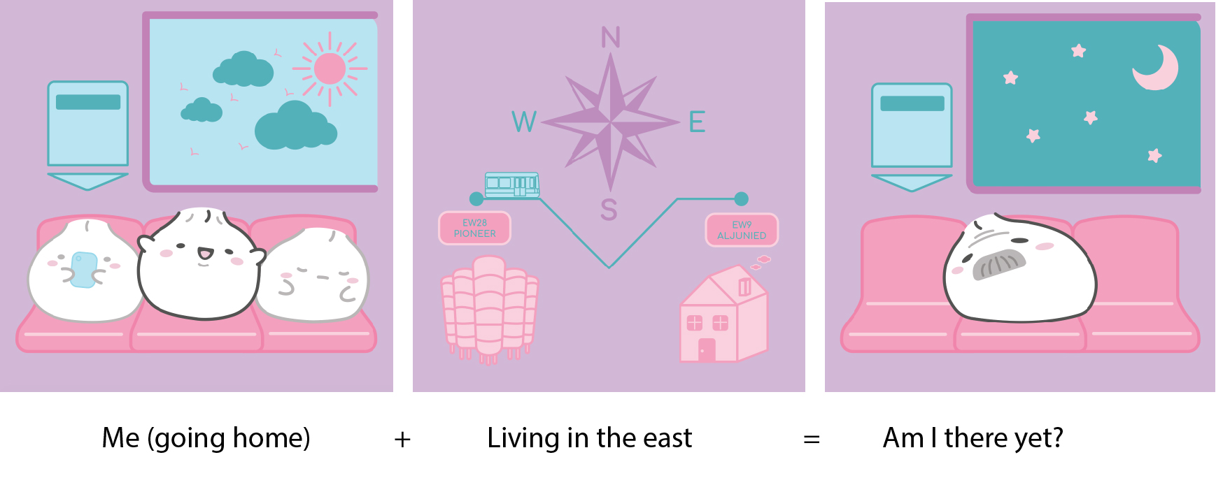
New equation: Me (going home) + Living in the east = Am I there yet?
This equation illustrates my excitement to go home from hall every weekend! But the most dreadful part is the tedious journey home because it takes me at least 1.5 hours to reach home.
This panel is the most difficult one to execute because the colour scheme is difficult to work with, but I really want these colours because of the meaning behind them.
Development:
Chosen colour scheme:
- Purple: Represents luxury. To me, going back home once a week is a luxury and I really cherish my time back home!
- Pink: Represents warmth. The feeling that I get knowing that I’m home.
- Blue: Represents coldness. The dread that I feel knowing that the journey is pretty long.
The first frame depicts me being exciting about going home. The setting is in the train, hence it features other buns doing what people would normally do in a train – use their phones or sleep.
The second frame depicts the long journey home, the compass is to indicate that my journey starts from the west and ends in the east. The colours look like they blend together on screen, but the contrast is much better when printed out.
The last frame is the opposite of the first. Day has turned to night to indicate that a lot of time has passed. Other buns have alighted from the train already. The bun is no longer energetic, but has turned into a lethargic old bun. This aging aspect indicates that a lot of time has passed as well.
‘Me (going home)’ development:

It’s difficult to find the right shade of colours because all of them kept blending into one another. I eventually found one that worked better, but of course the contrast could’ve been must clearer. My design included buildings in the background initially because I was afraid that viewers might not be able to tell that this is the train. But I felt that the buildings were a distraction and removed them.
‘Living in the east’ development:
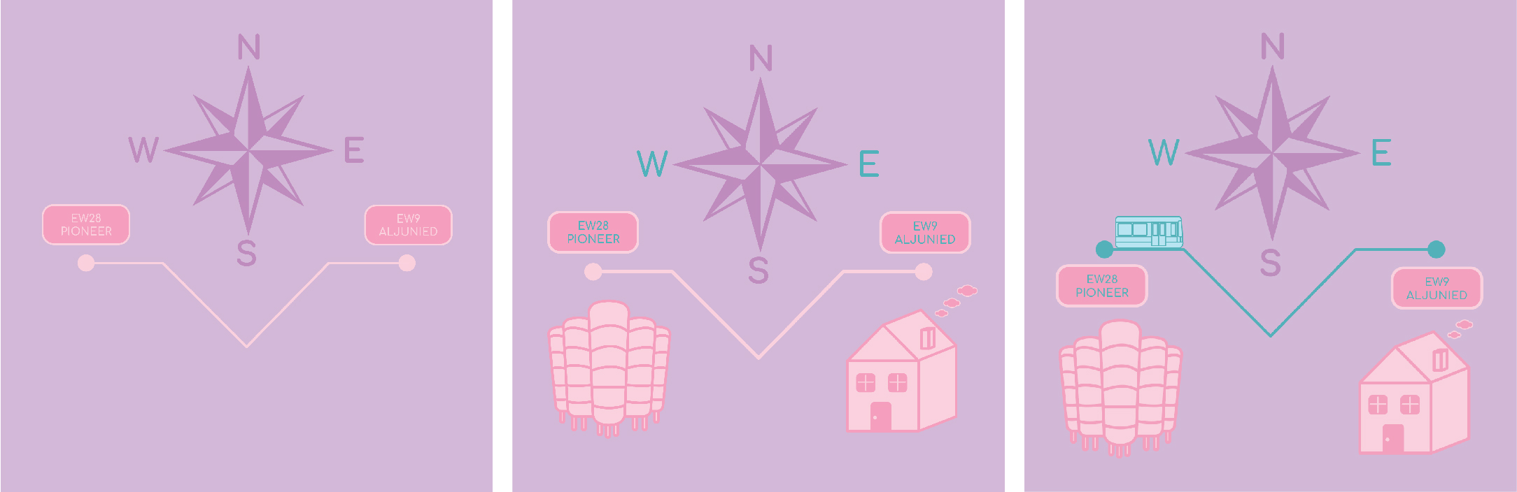
A clear example of how the colours kept blending in to each other. For the middle panel, even though it looks horrible on screen, it’s actually fine when printed out! Again, the colour scheme could’ve been much better… I’m definitely not proud of this panel and would redo it if I could turn back time.
Jocelyn mentioned that it’s not clear that the line represents the MRT line and suggested that adding a train would make it much clearer. And tada! The birth of the third frame.
‘Am I there yet?’ frame development:
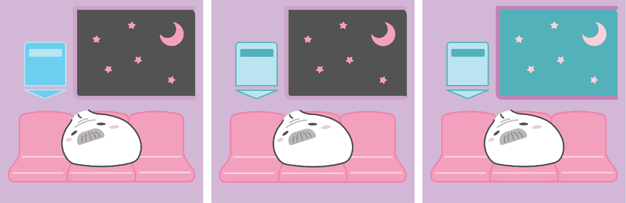
I used dark grey to represent night time initially but the grey looked really overpowering and out of place, because it isn’t part of the analogous colour scheme. This prompted me to rethink the entire colour scheme. I must say that the biggest challenge is ensuring that the same colour scheme works well throughout all 3 frames of the equation. If it doesn’t work well in one frame, the entire colour scheme must be changed. So it was tedious ensuring that the colours work well throughout.
1 comment for “[2D] Ego: Process and Development”