Please refer to this post for the big idea and visual research before proceeding with this post!
Ideation
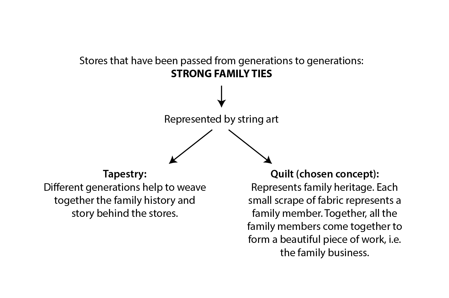
Since my idea revolves around the theme of family, here is a diagram of the possible concepts that I can use to represent family.
Execution
Tryout 1:
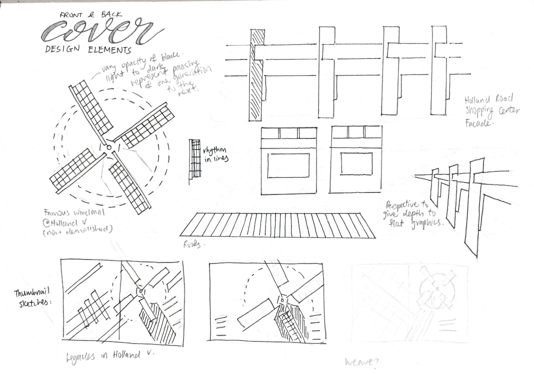
I started by deconstructing the iconic Holland Village windmill and Holland Road Shopping Center into simple graphic forms.
Sketches:
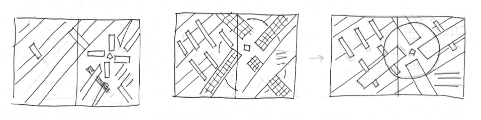
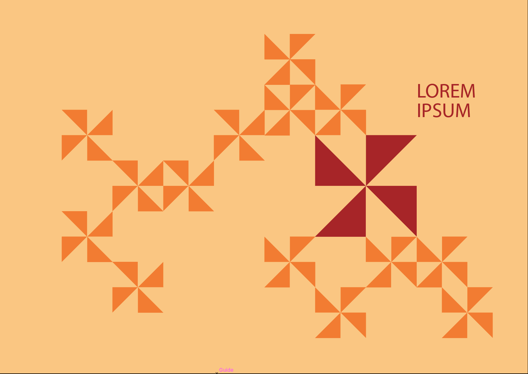
Vector art:

Final artwork for Tryout 1:

- Blades of windmill have been simplified into rectangles
- Base of windmill is made of lines of varying thickness to convey a sense of depth
- Dotted circle around windmill blades gives the design a sense of movement
- Colours are inspired by facade of Holland Road Shopping Center
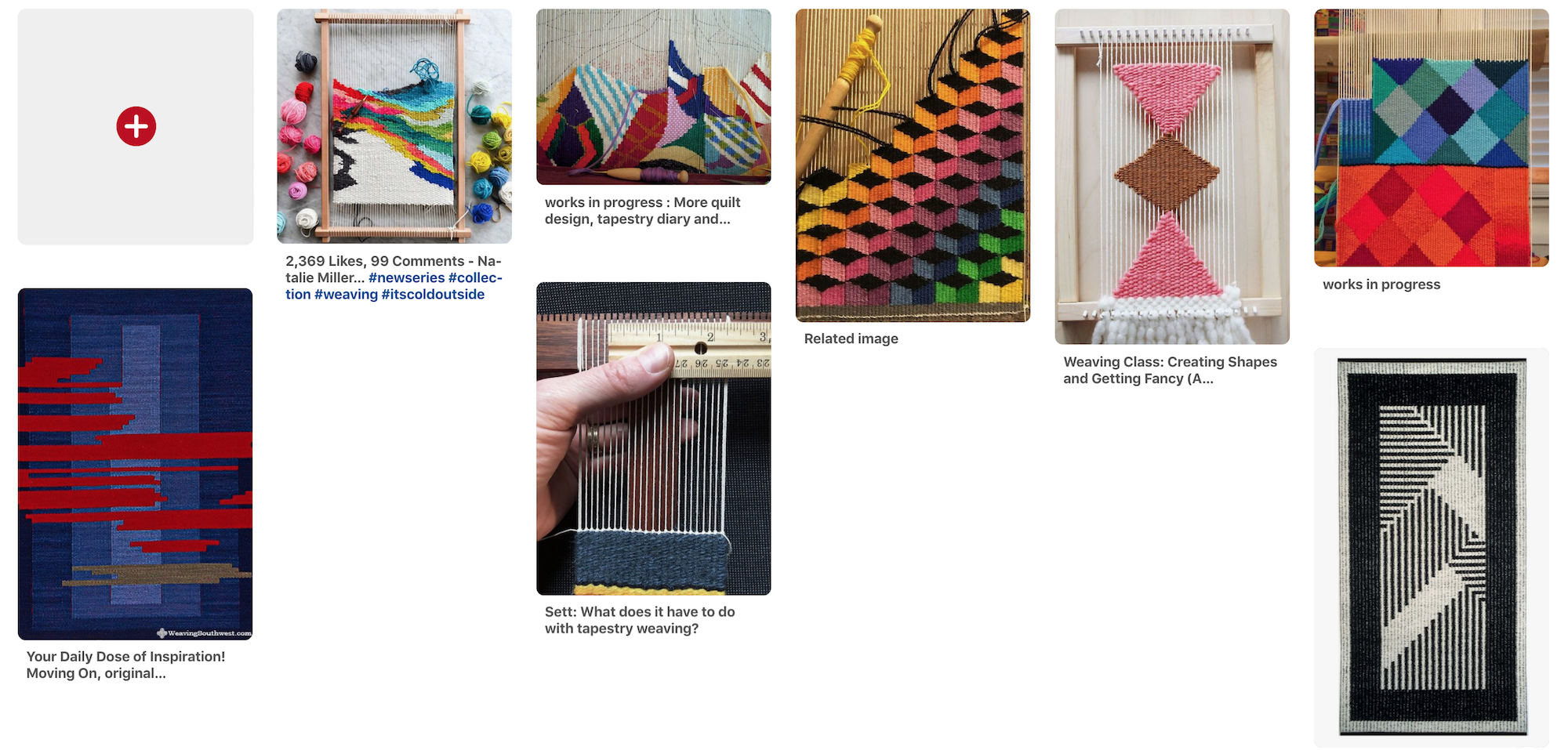
Tryout 2 – Tapestry concept:
Like I’ve mentioned in the ideation stage, I wanted to use a tapestry as a metaphor for different generations of families weaving together a history and story for the business. As time goes on, the tapestry will become more complex and completed.
References:
Sketches:

But I ended up abandoning this concept because I felt that it was difficult to represent a tapestry through graphic form. The thread and weaving textures play a huge part in making the tapestry look unique and it’s difficult to replicate it in 2D form.
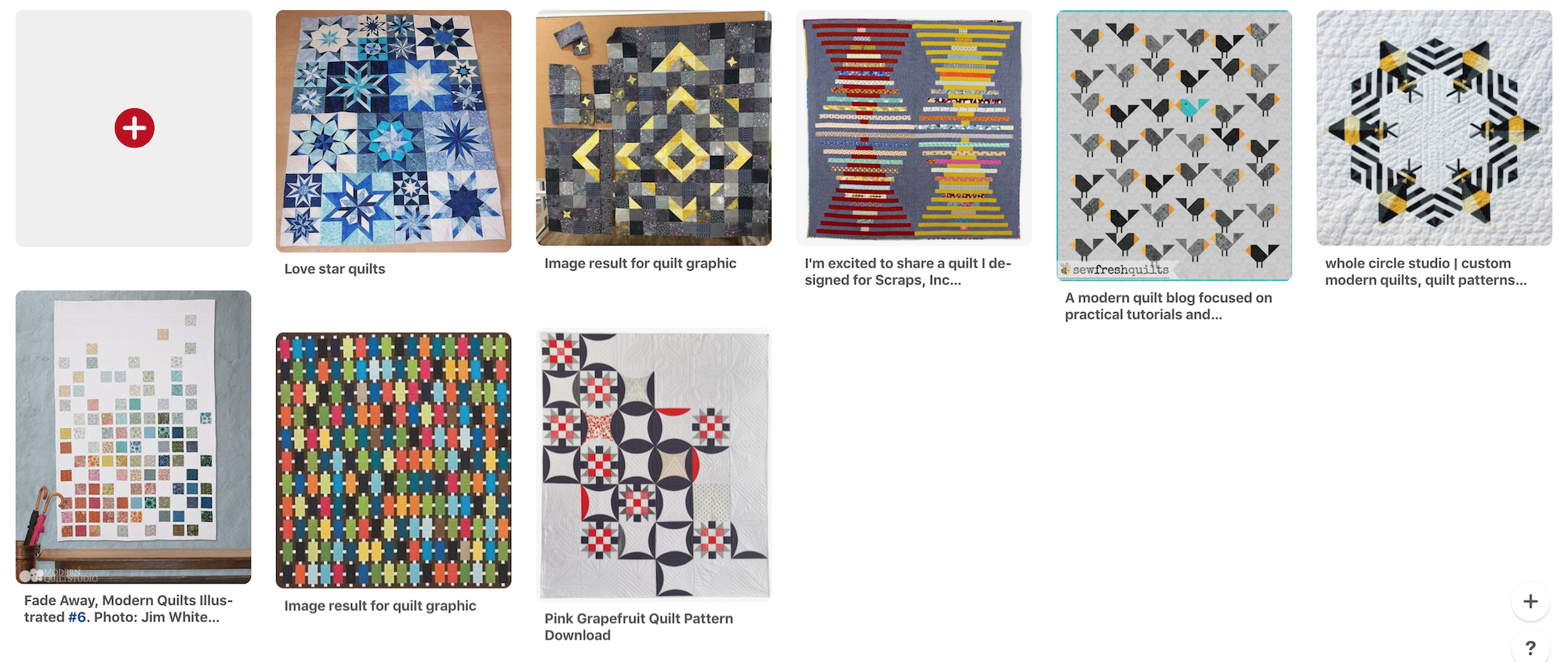
Tryout 3 – Quilt concept (chosen):
I felt that the quilt is apt and appropriate as a metaphor for my idea in many ways:
- Traditionally represents family heritage.
- Quilts are made from scrapes of fabrics woven together. Each scrape of fabric is unique and represents a family member. Together, each unique family member contributes to the family business in their own way.
- Scrapes of fabrics were used because people were poor back in the days, hence they had to preserve every resource they had. This points back to the humble beginnings that these family businesses had.
- Quilts are used as blankets, keeping one warm and cozy. This is similar to how family businesses differ from a corporate business. There’s a sense of warmth and togetherness that family businesses possess.
References:
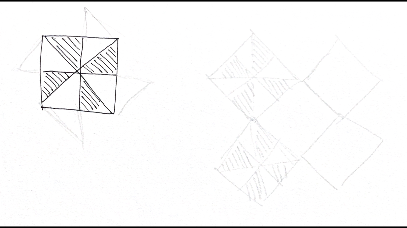
Sketches:
Rough sketch of how I want the patch tessellation to look. Together, the triangles give the impression of a windmill.
Vector art:
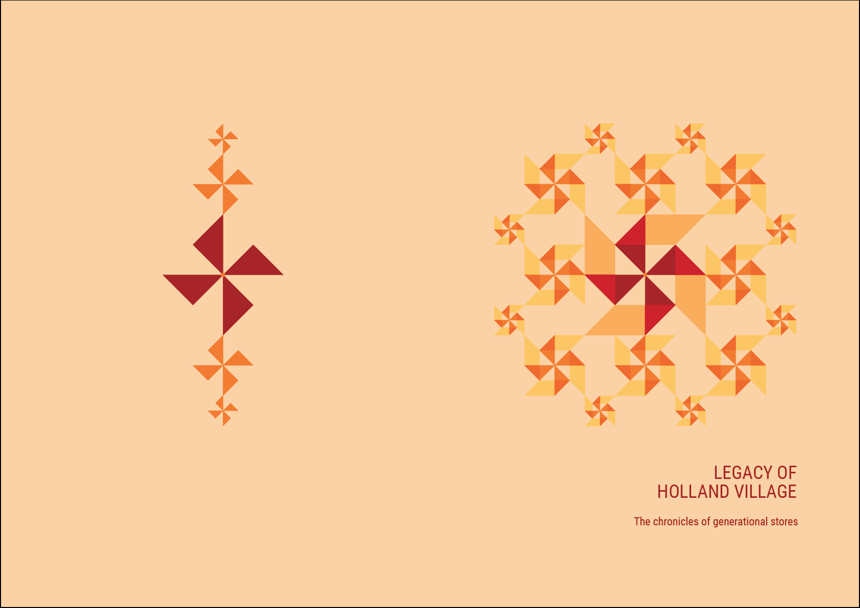
Development 1:
- Windmill motifs tessellating
- Design was too flat in terms of colour
- Tessellation doesn’t reflect quilt concept
Development 2:
- Varied the sizes of the windmill motifs to give a sense of hierarchy
- Included parallelograms to the motifs, inspired by the shophouse roofs found in Holland Village
- I felt that this design was much better than the previous one, but still lacks the quilt element in it
Development 3:
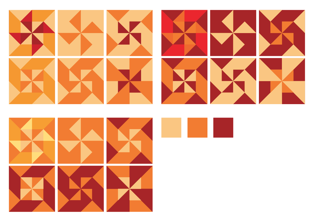
- Created 6 other motifs based on the single and most complex one that I made (as shown in the previous development)
- Fitted these motifs within a square box to imitate the iconic quilt patchwork design
- Varied the colour combinations of the motifs and made 3 sets in total
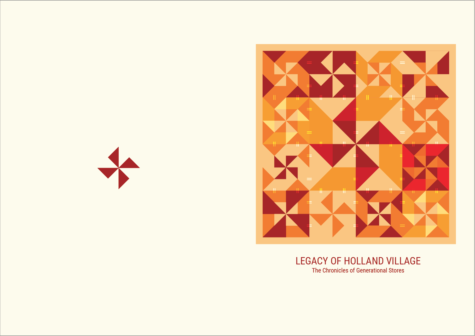
Development 4:
- Arranged the motifs in a square
- Kept the back cover design minimal since the cover is already full of details
- Not sure if people will be able to tell that it’s inspired by a quilt just by looking at the design
Development 5:
- Added ‘stitch’ lines so that the motifs looks like they’re being patched together
- Added a border around the entire design as well since traditional quilts commonly have a border around them
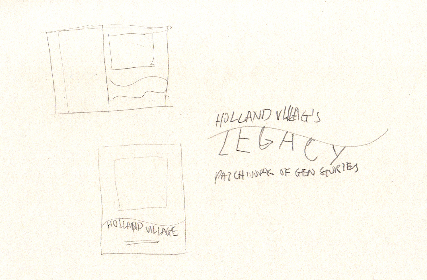
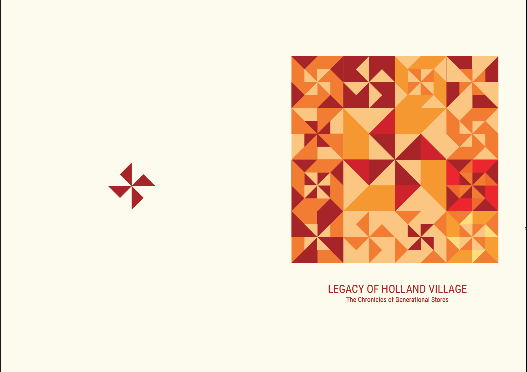
Development 6:
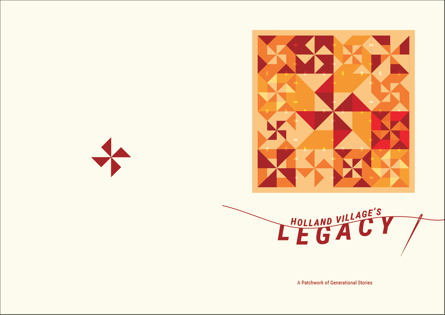
- To keep it consistent with the quilt concept, I designed the title such that a thread will reveal the title underneath
- Since the quilt design is rather stiff, the flowy nature of the thread is a great contrast to it
Development 7:
- Changed the title from ‘Holland Village’s Legacy’ to ‘Legacy’ only since it’s boring to include the location’s name into the title!
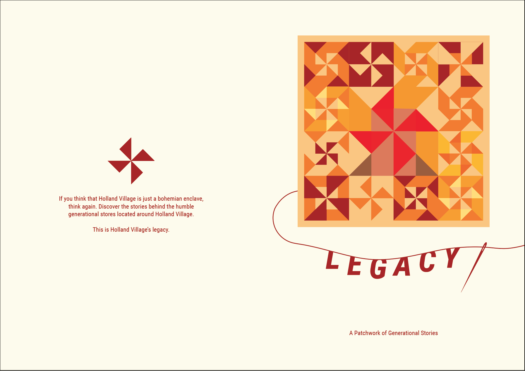
- To ensure that readers know that this zine is about Holland Village, the biggest motif in the quilt has been designed to look like an entire windmill, not just the blades.
- Removed the stitches design because I felt that they were too distracting and unnecessary.
- Thread emerges from the quilt to give a sense of work in progress, that the legacy of Holland Village will continue as time passes.
- A short synopsis is added at the back cover so that readers will have an idea of what this zine is about.
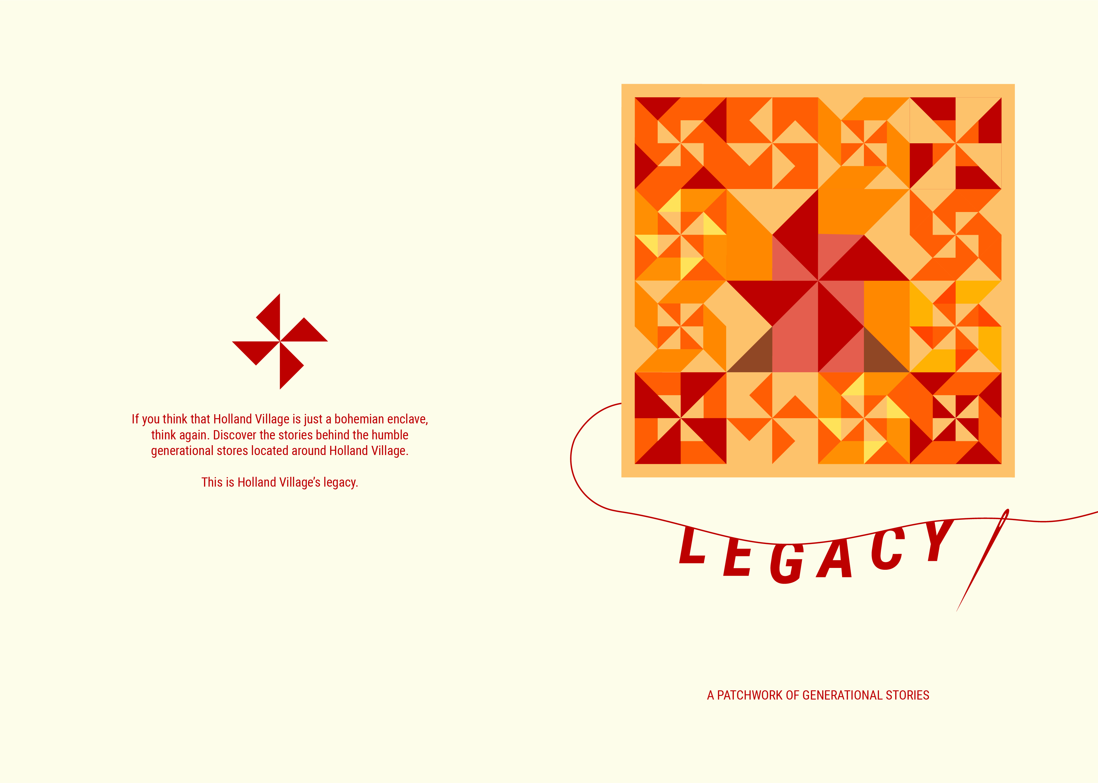
Final design (after test print and adjustments):
1 comment for “[GF] Locale: Front and Back Cover – Process and Development”