
The Big Idea
Observations:
From my interviews and online research, one thing that all these stores have in common are that they have a rich and long history. It is encouraging to see family businesses still thriving despite the economy and the younger generation being willing to continue the legacy of their forefathers.
Insight:
- Holland Village may be well-known for the hipster bars and cafes, but there are unexpected stores that stand out from the crowd because of their own unique charm. Such stores include, Thambi Magazine Stand and Money Changer and Khiam Teck party store.
- These stores have indeed stood the test of time and can continue to operate because of the strong family rapport.
The Big Idea: Legacy
Instead of focusing on the hipster and expat scene that Holland Village well-known for, this idea showcases the unassuming stores that have been operating in Holland Village for a long time. The stores that will be featured are: Thambi Magazine Stand and Money Changer, Khiam Teck party store, Wellie Batik Fashion and Independent Market.
What’s so unique about these stores?
- They are some of the oldest stores in Holland Village, first established at least 30 years ago.
- They are family-run businesses that have been passed down from generations to generations.
The title ‘Legacy’ refers to two facts:
- Stores’ legacy on Holland Village: Their long history and being able to sustain despite the changing economy and culture of the area.
- Passing of baton from generations to generations.
This zine will be presented from a dog’s perspective. Why a dog? Many expats (and locals) own dogs since they stay in terrace houses that are big enough for the dogs to run around. From my site visit, I noticed that many like to bring their dogs out for walks in the mornings. Dogs have a natural sense of curiosity and they view the world around them from a fresh and innocent perspective.
All in all, the aim of this zine is to raise awareness about these stores and encourage readers to patronise from them so as to keep the business alive.
Visual Research
Good OH! Holland Village Zine:
The kind owners at Wellie Batik Fashions showed me this zine that was given to them. Upon further research, I am able to find it online! Likewise, this zine is all about Holland Village. It is done by Currency creative agency and commissioned by OH! Open House.

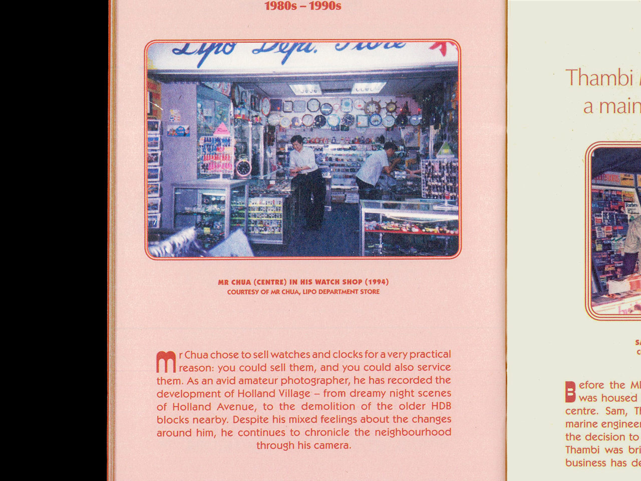

I’m really impressed with the art direction that the creative team went with. From the colour scheme to the typeface, the zine really captured the essence of Holland Village in the past and now. However, it was done in a historical documentary-style, therefore I won’t be taking too much inspiration from the layout, but I will definitely be taking inspiration from the typeface and colour scheme.
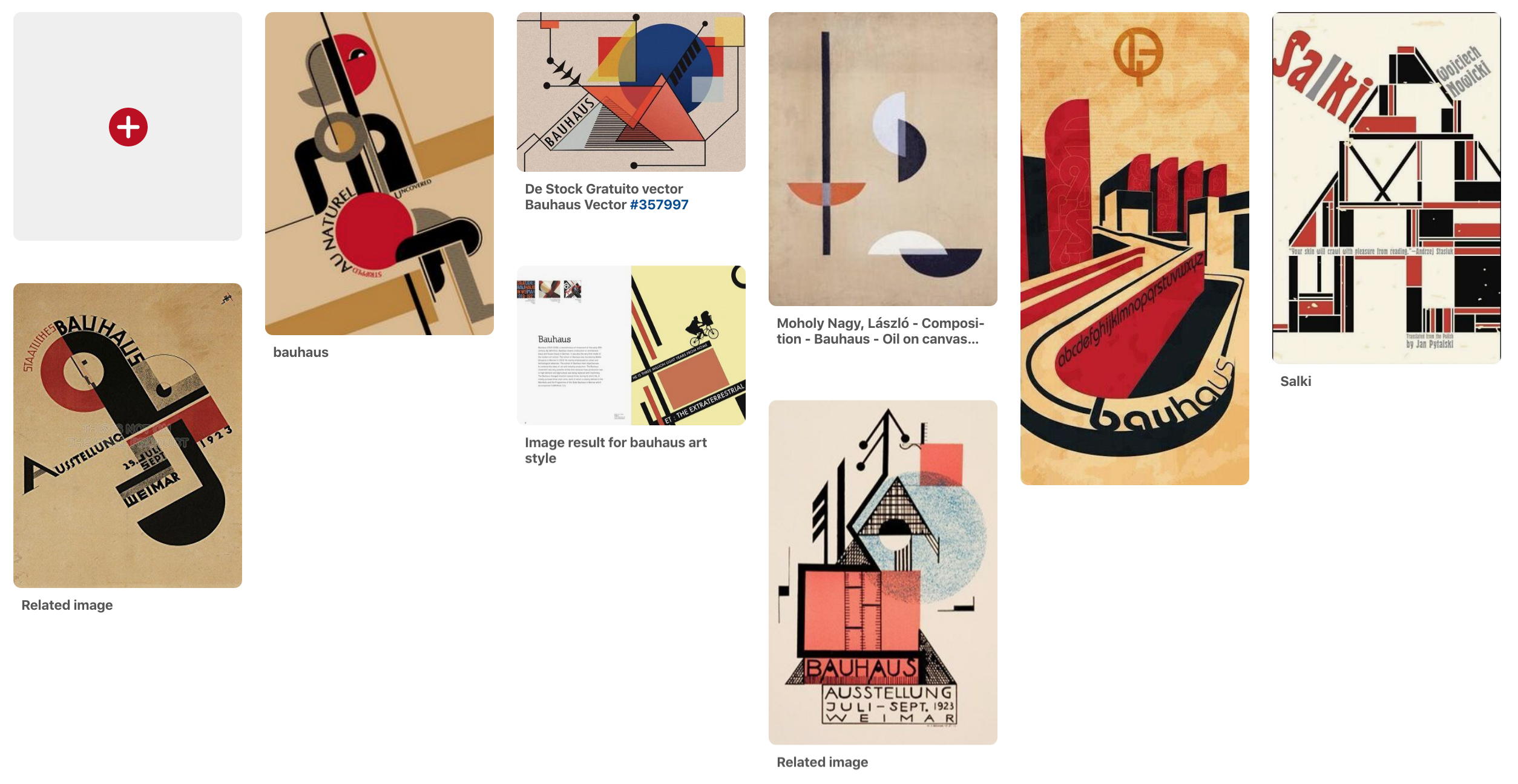
Bauhaus art movement:
Inspired by the Good OH! Holland Village zine, I initially wanted to go for a old-school and vintage art direction. However, after much thought, I decided to go with an art direction that is contemporary to reflect that state of the stores now. It emphasises on the long way that the stores have come.
The Bauhaus art style is the perfect style for me because I wanted to go for a more minimalistic and simplistic style. I hope to break down my illustrations into simple representative shapes, however, they must still be able to be recognisable.
Artists References
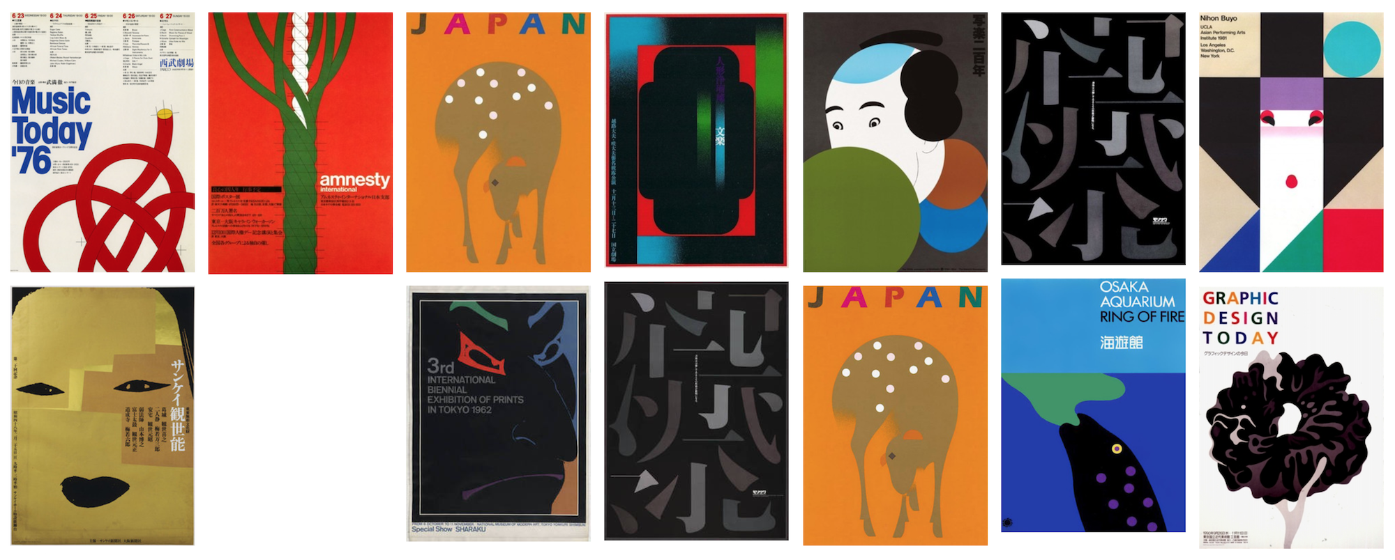
Ikko Tanaka:
Ikko Tanaka is a Japanese graphic designer who is well-known for fusing modernism principles and aesthetics with the Japanese tradition. This is evident in his work where he used simple shapes to illustrate traditional Edo art. He is also the first art director of Muji, helping to articulate the Muji vision and appearance, providing ideas and prototypes that visualised the design strategy. No wonder many commented that Muji has a Bauhaus style because of its minimalistic and no-frills approach!
Noma Bar:
Noma Bar is an Israel-born graphic designer, illustrator and artist. He is one the references that Mimi gave and I was thrilled when I found out that he was the graphic designer behind Haruki Murakami’s books! Haruki Murakami is one of my favourite authors and I remember being blown away by the new book covers because they were so cleverly-designed and really captured the essence of the stories. Nora Bar’s usage of negative space helps to convey the meaning on a deeper level. I can’t promise that I will be able to use the negative space as effectively as him, but I will definitely give it a try.

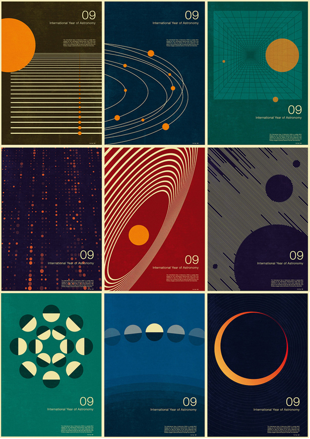
Simon C. Page:
Simon C. Page is a self-taught British designer who created designs for his own personal use. But his works caught the eyes of International Astronomical Union and UNESCO who commissioned him to create posters for International Year of Astronomy (IYA). Page’s style is minimalistic yet eye-catching at the same time. His designs are harmonious because it’s a good balance of design elements and breathing space.
All in all, Ikko Tanaka, Noma Bar and Simon C. Page’s styles are all minimalistic, yet they captured the essence of the subject that they wanted to convey. This inspires me to create design elements and forms that are meaningful, and not simply there purely for aesthetic reasons.
Ideation
Page flow:
- Front and back cover
- Spread 1: Short intro + Thambi Magazine Stand and Money Changer feature
- Spread 2: Wellie’s Batik Fashion
- Spread 3: Khiam Teck Party Store + Ending note
Process and development for each spread will be uploaded on separate OSS posts!