WHY A CAT LADY?
Even though cats are often seen as cold, aloof, or even evil and plotting to take over the world, there’s still something endearing and irresistible about them! As I’m not allowed to own a cat, my friends and I would visit cat cafes to get our ‘cat fix’. The previous time that we went there, we got to play with two seven-week old kittens! Purr-fecto!
IDEATION
Moodboard:
This moodboard aims to capture the ambience of how a home for many cats would look like. A home for cats would be filled with many cat trees and furniture specially designed for felines.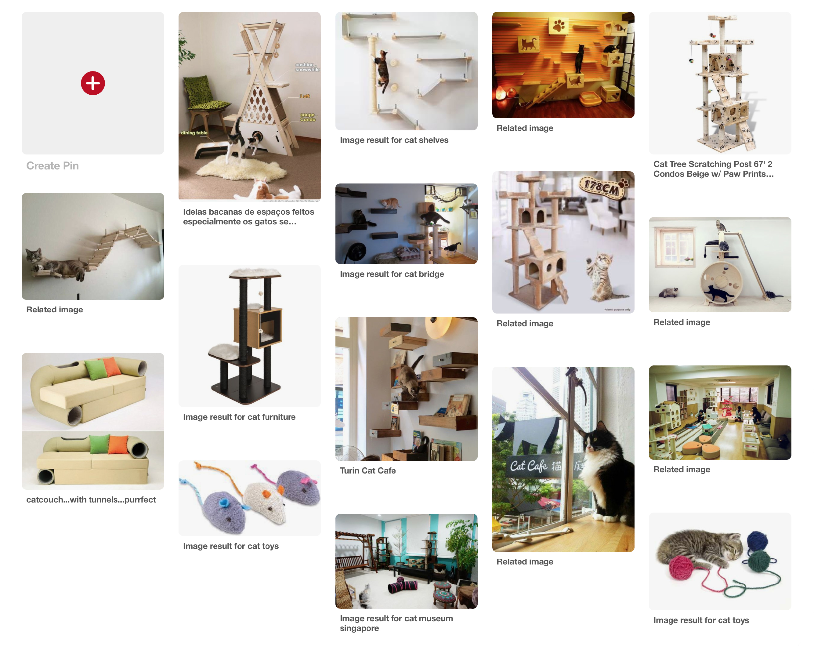
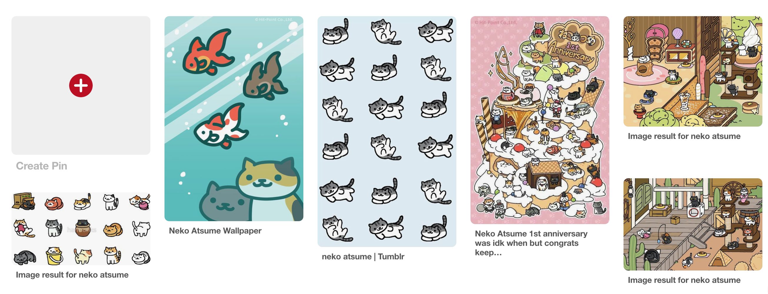
Art direction/Artist Reference:
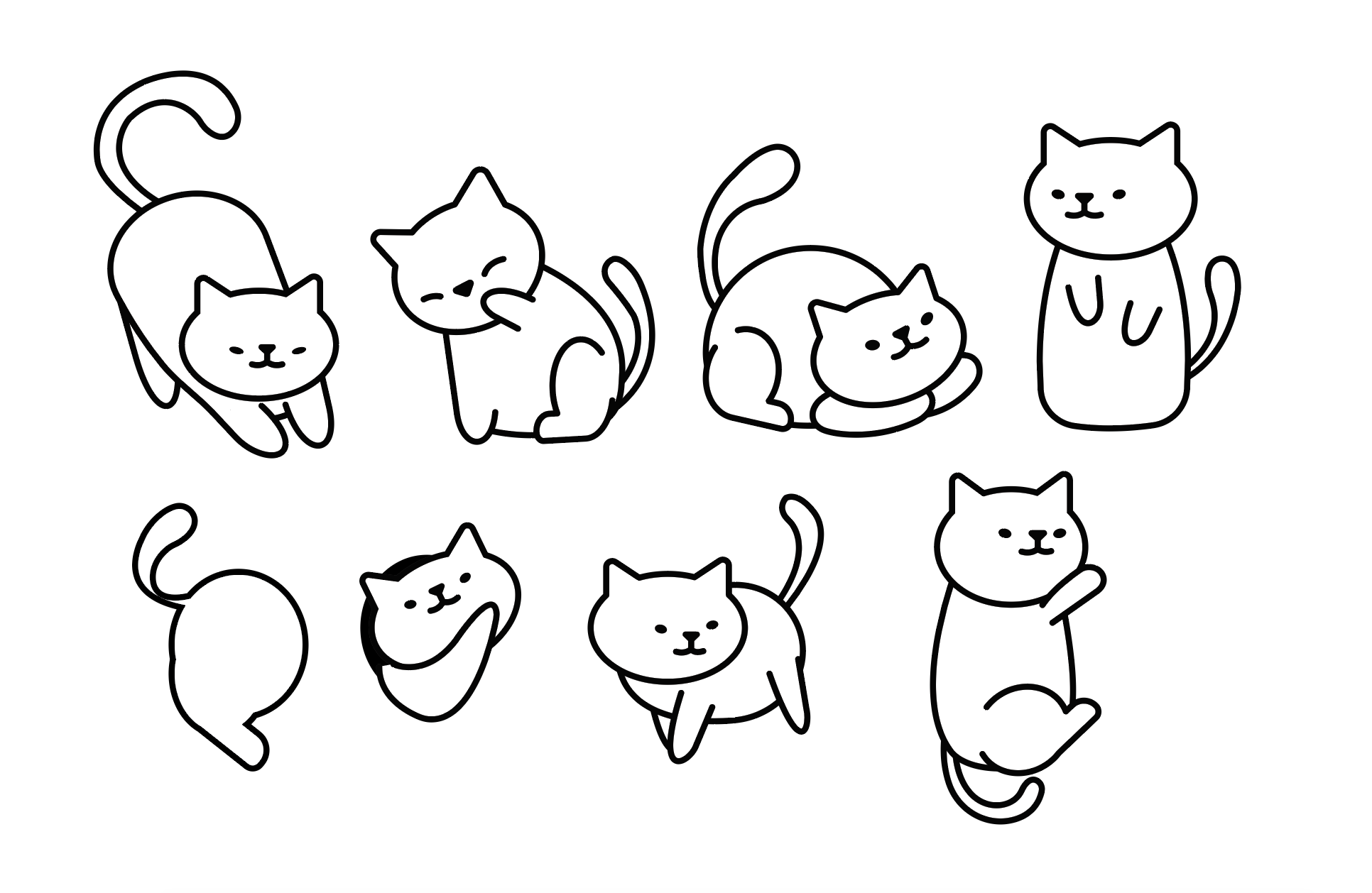
‘Neko Atsume: Kitty Collector’ is a cat collecting game for mobile devices. Even though the artwork is simplistic, it is able to capture the home environment and cats’ body languages well.
Techniques:
- Digital vector illustrations
- Isometric typeface
Rough colour scheme:
- Neutral tones: To convey chill and cosy vibes
- Bright pastel colours to convey playfulness and mischief
Colour scheme is subjected to change!
Sketches:
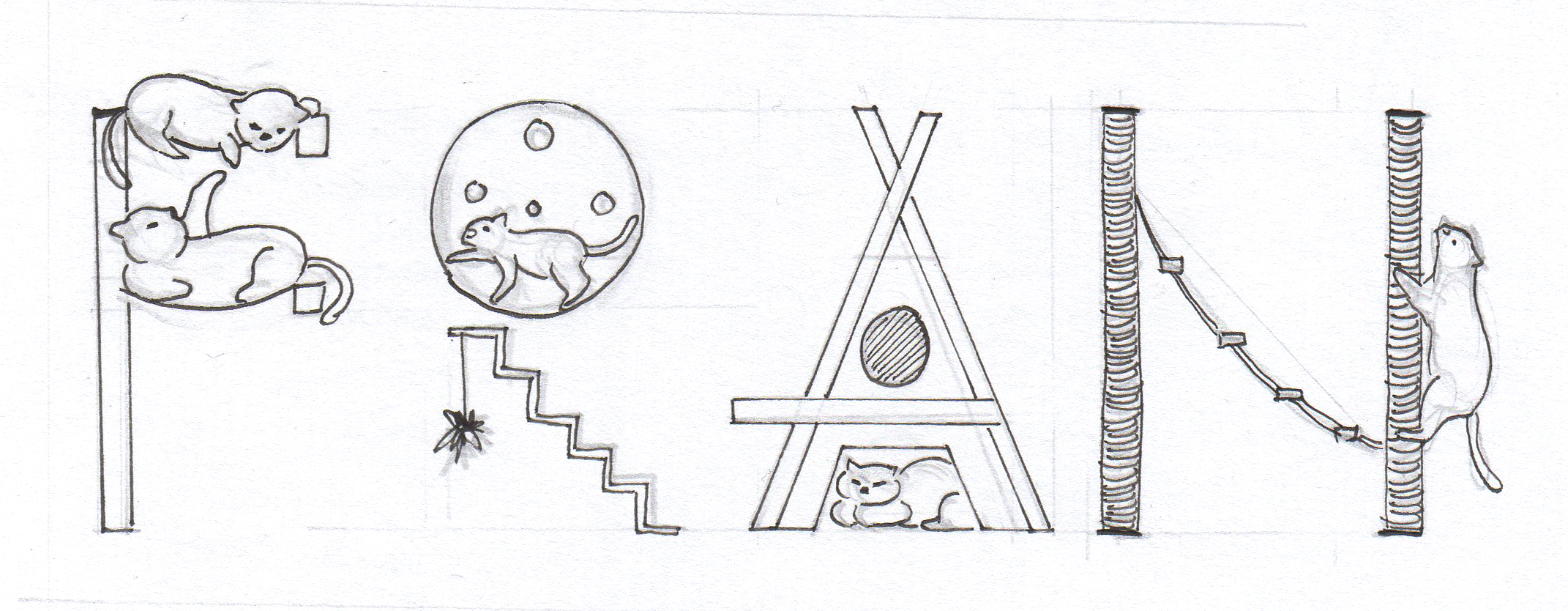
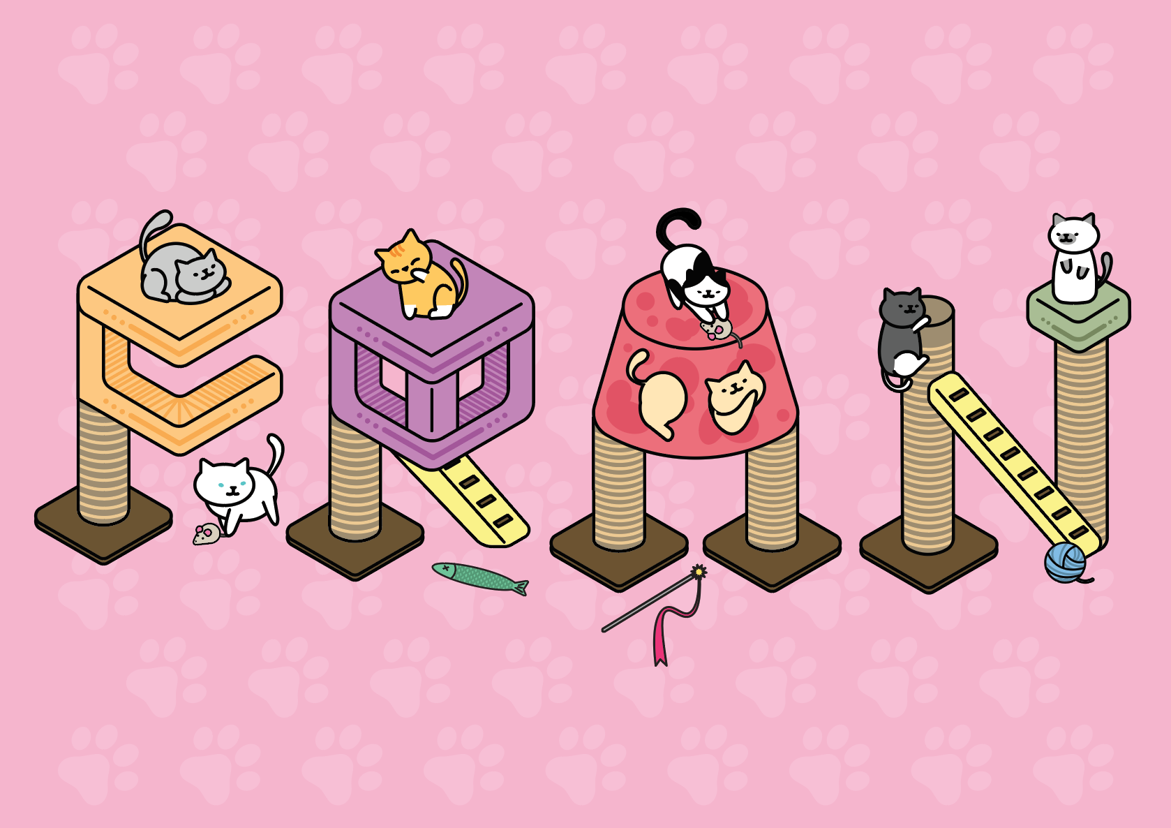
Concept 1 – Using cat trees to form ‘FRAN’
Development 1:
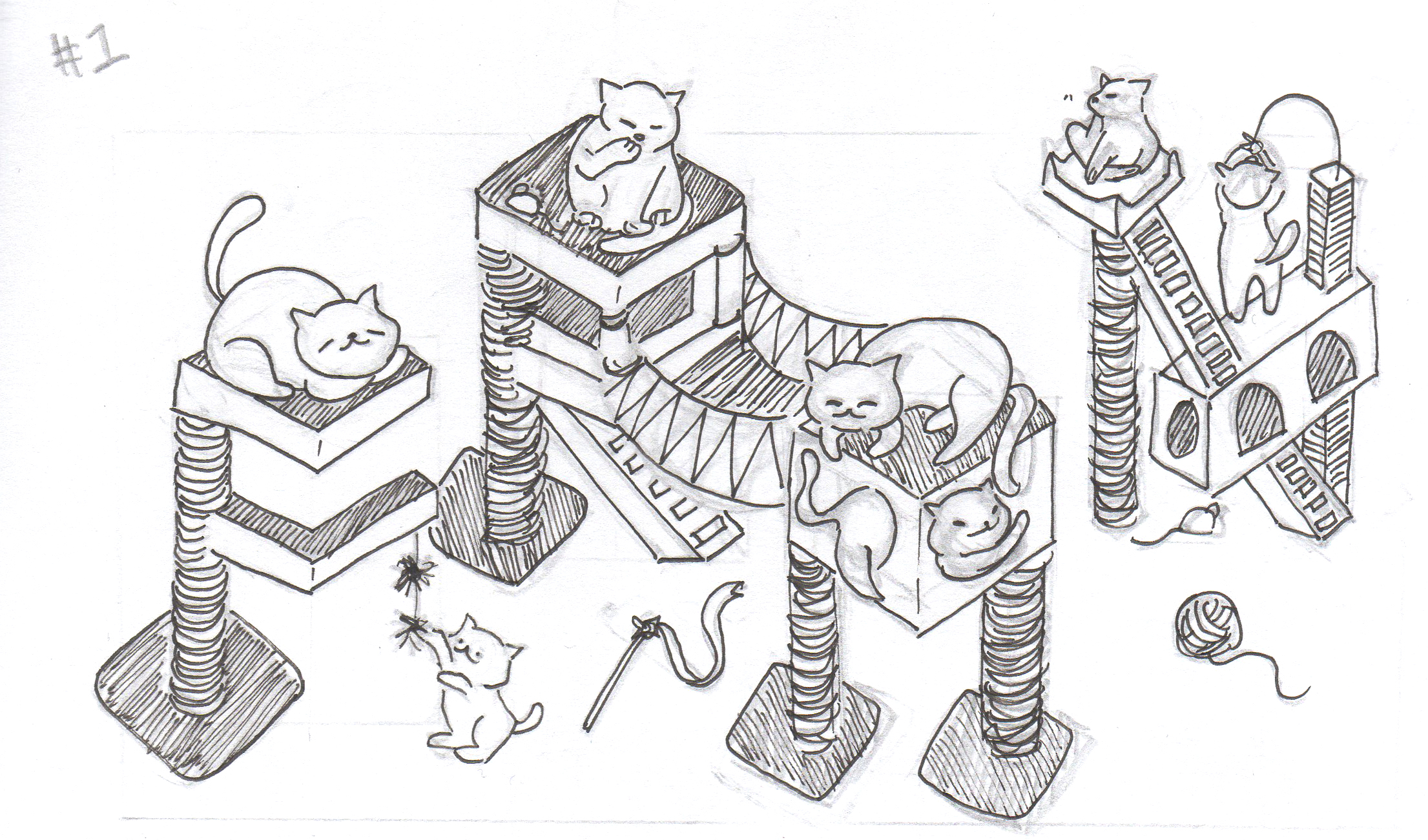
- ‘R’ and ‘A’ are not legible, remove the bridge that connects them together
- Captures the personalities of cats
- Some toys littered around the area
Development 2:

- ‘A’ is now more obvious
- Cats can be made smaller so that the alphabet cat trees stand out more
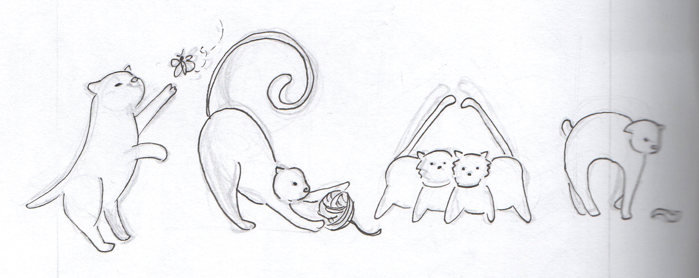
Concept 2 – Cat body language to form ‘FRAN’
Development 1:

- Testing out different ways to form the alphabets
Development 2:
- Decided to scrape this concept because the type is not legible enough
Concept 3 – Alternative to Concept 1
- Concept 1 is still stronger as compared to this because it is isometric, which is more interesting than flat artwork style
EXECUTION
Chosen concept: Concept 1 – Isometric cat trees!
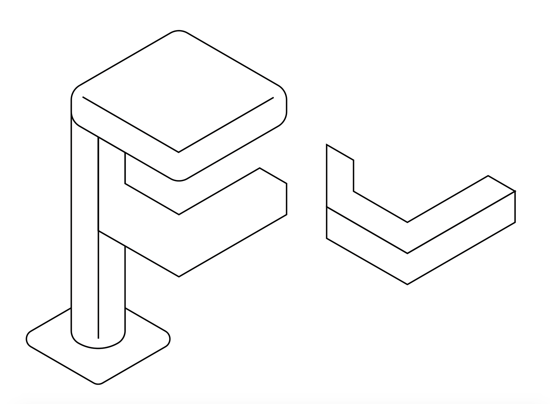
Development 1:
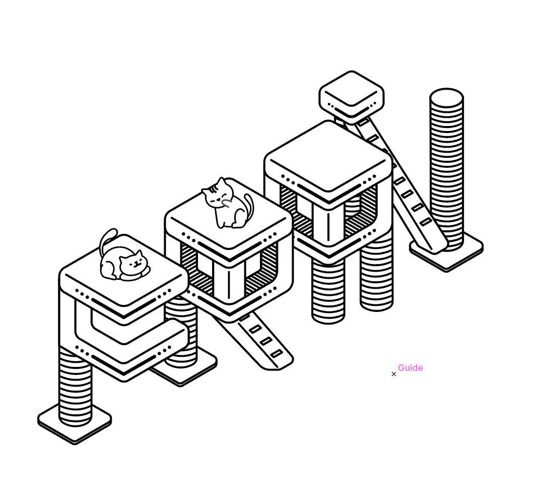
In order to create the isometric effect, I started out by using a diagonal grid to figure out what diagonal to vertical ratio would be most pleasing to the eye. My initial ratio was 3:6 but I felt that it was too cramp. Even though the ratio 4:8 is similar to that of 3:6 (they’re both 1:2 when you simplify it, oh gosh math), but the 4:8 ratio gave me the freedom to play with depth of the alphabets.
Once the ratio is settled, I broke down my alphabet design into basic rectilinear shapes. I’m working with black and white first so that the colours won’t distract me from my designs.

Development 2:
I wanted my cat trees to have rounded corners because this gives the trees a softer look. In order to do so, I had to merge all the 2D shapes that make up the 3D shapes before rounding the corners.
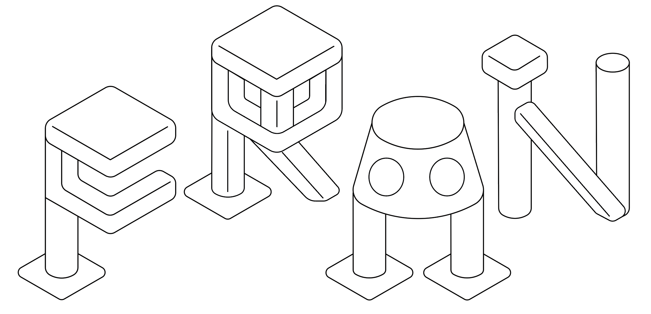
Development 3:
Now that the cat trees are done, it’s time to move on to the cats! For the most part, I am able to break the cat designs down into basic shapes, then transform them into my desired shapes. As for the cat designs that are difficult to break down into basic shapes, I drew them out with the pen tool directly.
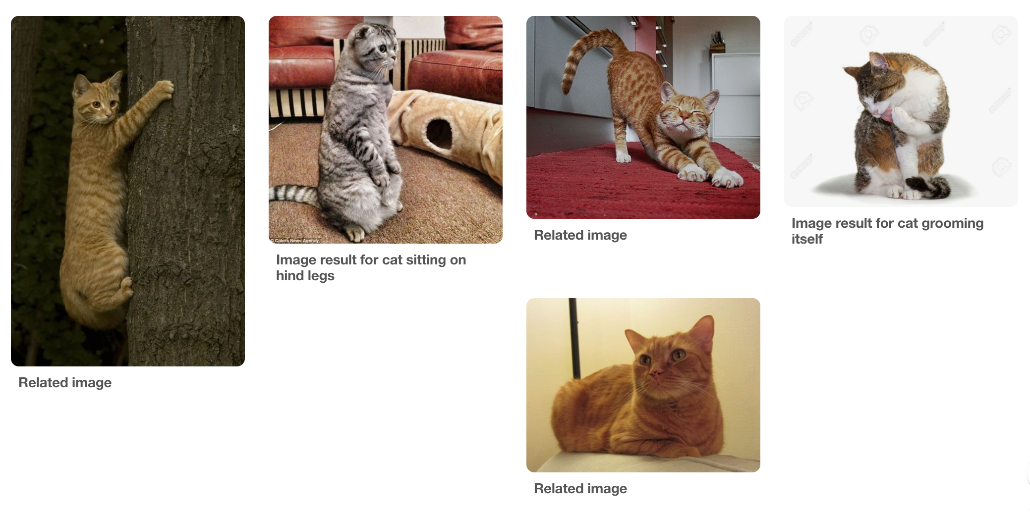
I also looked to photos of cats’ body language for reference.

Development 4:
Final black and white illustrations of the cat trees, cats, and even toys! I felt that the addition of toys would make the scene more realistic and playful.

Development 5:
The colourised version! I added more details to the cat trees and cats so as to make the illustrations more interesting. I also made a minor change to the alphabet ‘N’. Initially, the green cat bed was on the left and the brown floor mat was on the right, but I swapped their positions because I felt that the cats look more natural in these new positions.
The alphabets are arranged this way to create a sense of space and depth. However, it’s not effective because the kerning of the alphabets are inconsistent, which makes the overall composition look awkward.

My solution is to simply line the alphabets in a row. I also made the cats smaller so that the emphasis will still be on the alphabets.
Mimi’s comments:
- Isometric angles look off to the eye, especially ‘A’ and ‘N’
- Make the colour scheme more harmonious
- Currently the cats stand out more than the cat trees
- The colour for the leg for ‘R’ stands out too much
- Print it out to ensure that type is readable from afar
Development 6:
I decided to go back to square one – rethinking the colour scheme and overall arrangement of the type.
Due to the nature of the alphabet ‘N”s design, it looks very out of place in this arrangement.
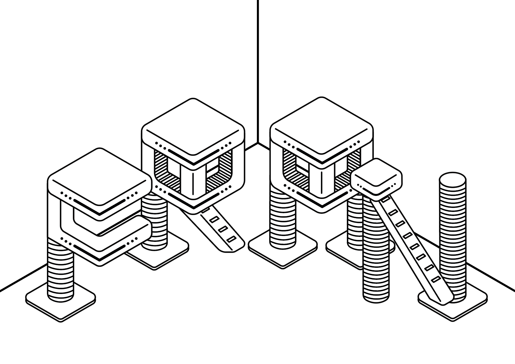
The problematic ‘N’ doesn’t work well in this arrangement too since it is obstructed by ‘A’.
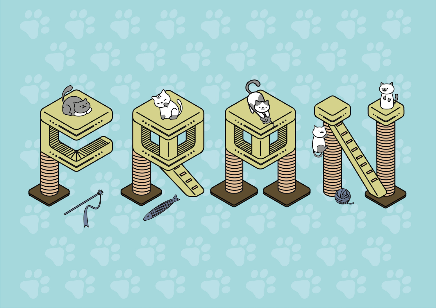
Development 7 – FINAL DESIGN:
Hence, I decided to return to the original arrangement of placing them in a single row. It may not be as dynamic, but it works out.
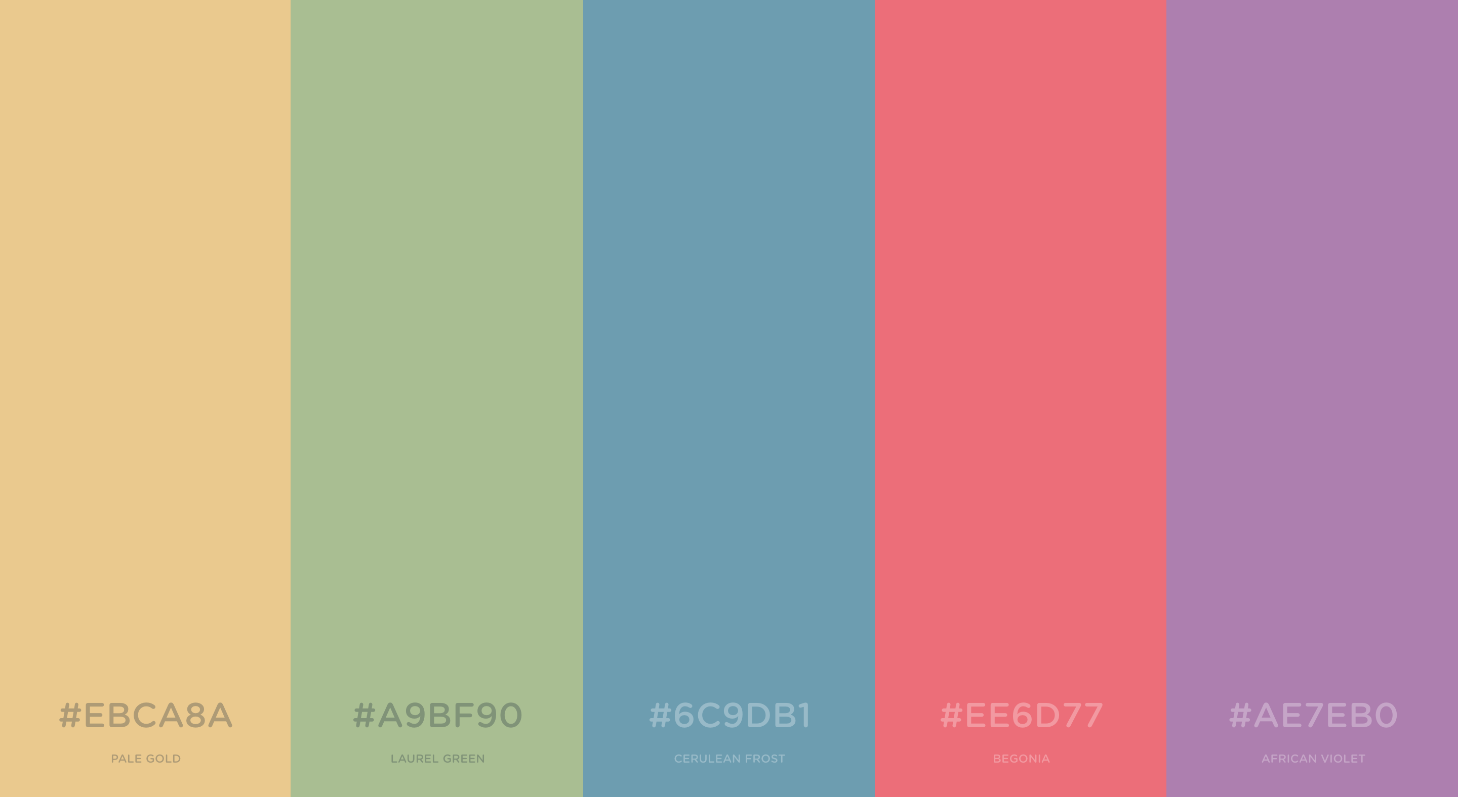
I also changed the colour scheme to an analogous one since I want the overall mood to be chill and relaxing. The analogous colour scheme is paired with brown tones because cat trees are mainly of this colour.
As for the cats themselves, I limited the colours of their patters to white and grey because I don’t want them to distract viewers from the type itself.
New colour scheme:

Final design: