WHY A MARINE BIOLOGIST?
The original occupation for this type was a scuba diver and marine biologist. But it was changed along the way and you’ll see why as you read my process. But for now, let’s go with marine biologist first!
It is not uncommon to hear that many have Thalassophobia, which is the phobia of the oceans. But as for myself, I grew up watching animal documentaries with my dad, hence the oceans and the creatures that reside in them have always fascinated me. If I have to choice to choose between being a bird or a fish, I would rather be a fish because I would like to meet the sea creatures and get to know them (and hopefully not get eaten)!
Therefore, when I retire, I would want to be a marine biologist so that I can study how the sea creatures adapt underwater!
IDEATION
Rejected Idea – Scuba Diver:
My original chosen occupation was scuba diver, which is similar to that of a marine biologist. However, I faced a lot of difficulties trying to make a type out of it and hence I decided to change it.
Moodboard Part 1:
This moodboard aims to capture the serene underwater atmosphere.

Art Direction Part 1:
Because light bends in water, our vision underwater will be distorted. Hence I thought of using scanography to create this distortion.
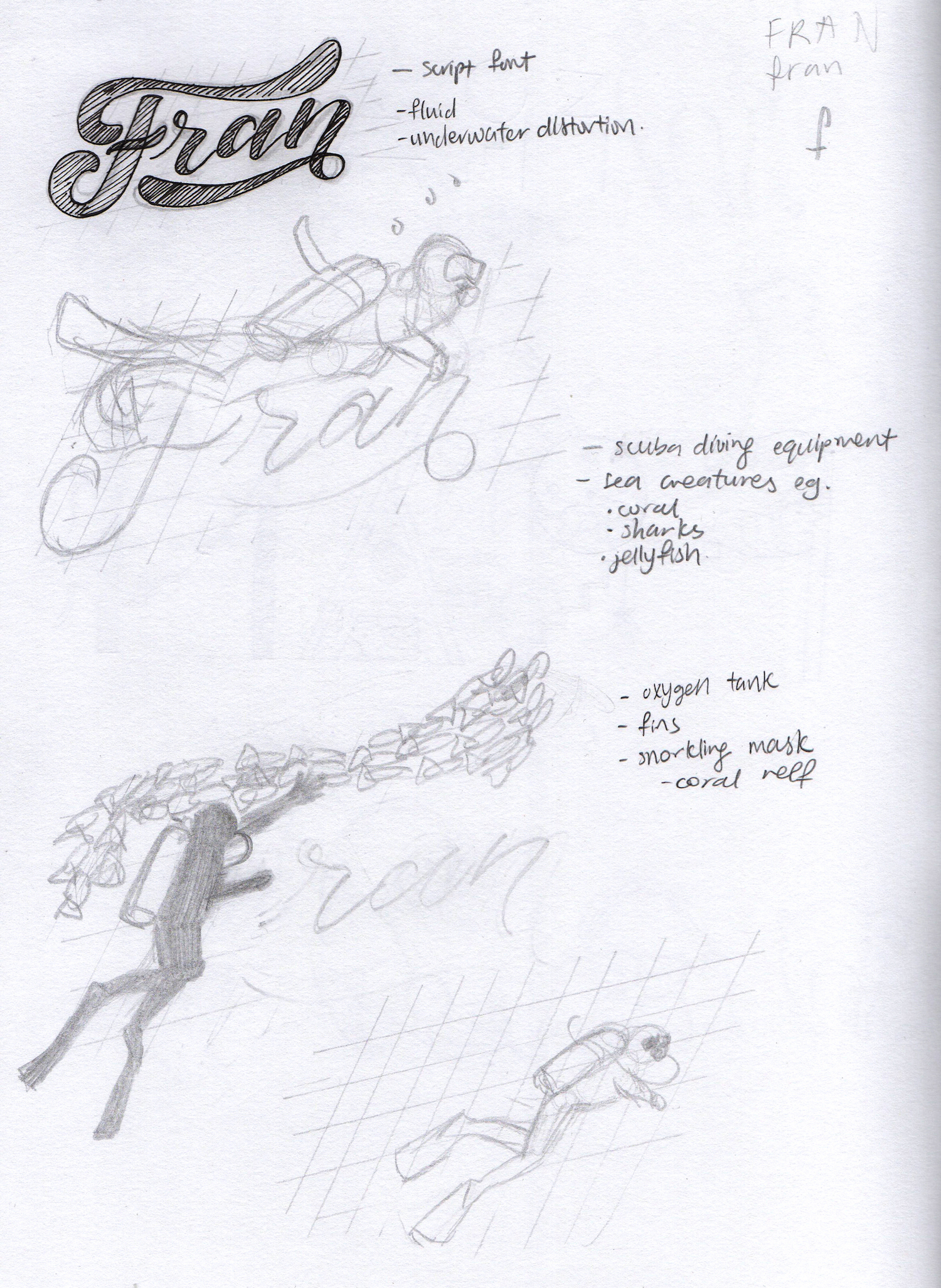
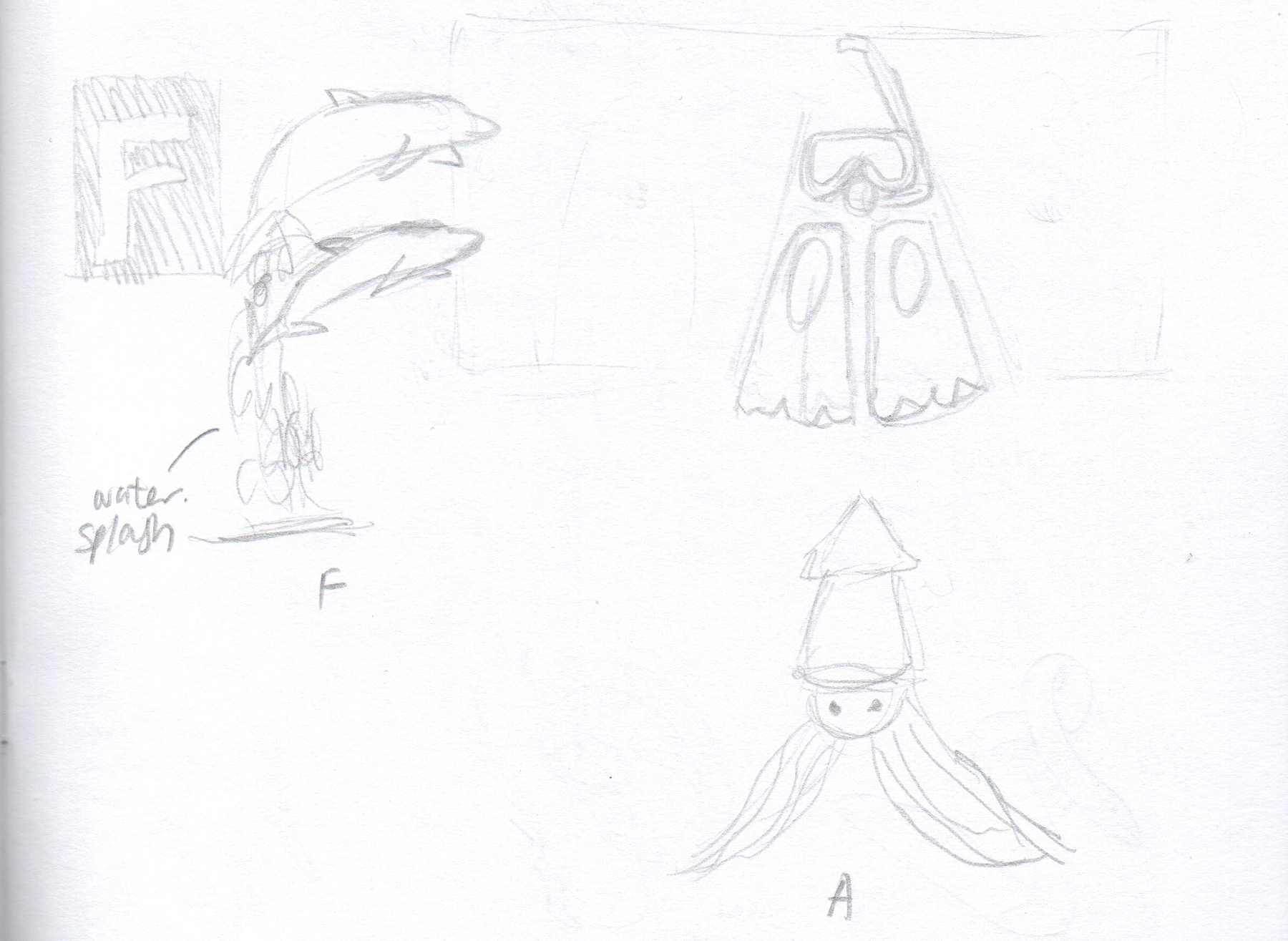
Sketches Part 1:
I used a script font as the basis of my type because it is fluid, which can represent the nature of water. However, I had a lot of trouble using the scuba diver, equipments and animals to form the type.
Moodboard Part 2:
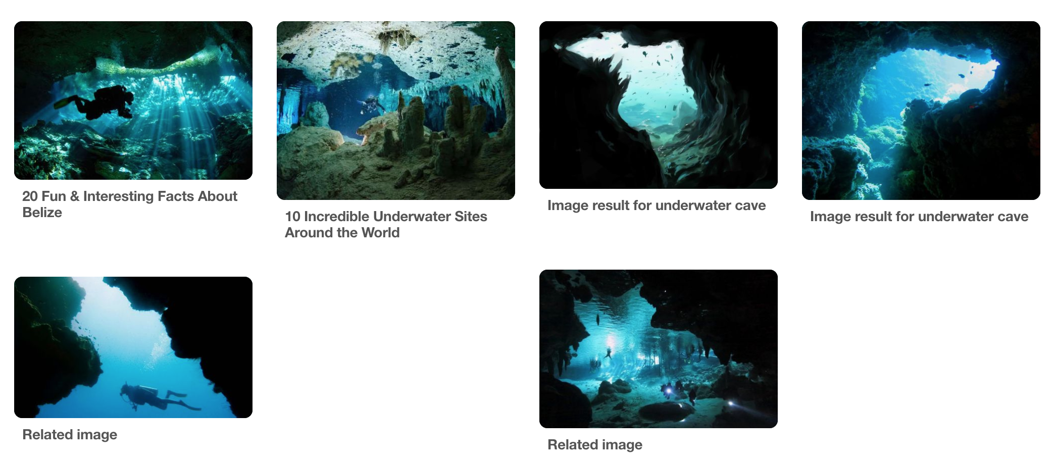
I chanced upon images of underwater caves and I was intrigued by the negative spaces that these caves created. I thought of using the negative space to form my name.
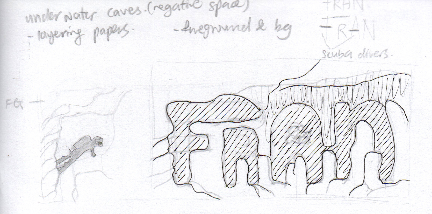
Sketches Part 2:
Well… my attempt at trying to use the caves’ negative space to form my name was unsuccessful. I wasn’t able to seperate the foreground and background of the scene in my mind. Moreover, the whole scene would be too messy and confusing if I include divers and animals, so I ended up scraping this idea entirely.
Final Idea – Marine Biologist:
Moodboard:
The moodboard for this idea remains the same as the first rejected scuba diver idea.
Art Direction:
For the illustration style, I’ll be going for the pen and ink look, with the hatching and intricate line works. However instead of executing it traditionally, I will be executing it digitally instead since I will be incorporating colours. The digital platform will give me more freedom to manipulate the colours easily.

Artist Reference:
Manuel “El Pollo” Rios is a graphic designer and illustrator from Mexico. His whimsical illustrations are filled with exciting intricate details and I really admire the colour schemes that he applies!
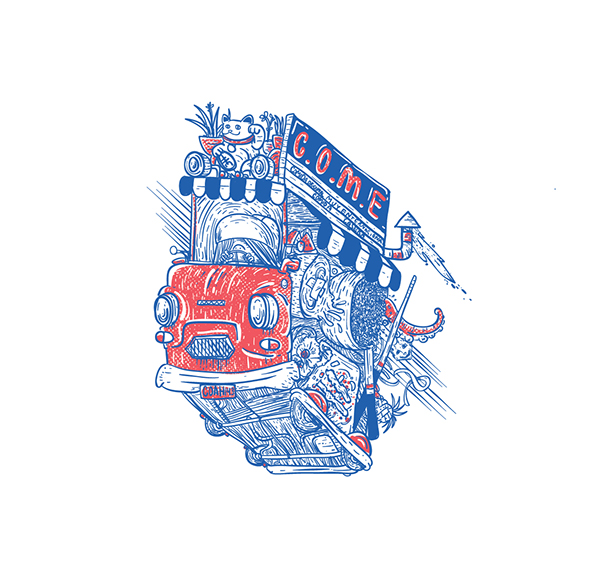
Image source: https://www.behance.net/gallery/20891507/COME
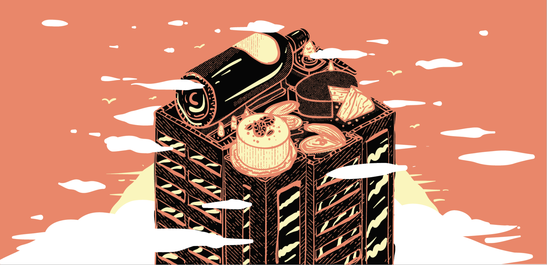
Image source: https://www.behance.net/gallery/45368171/Food-Spy-Rooftops
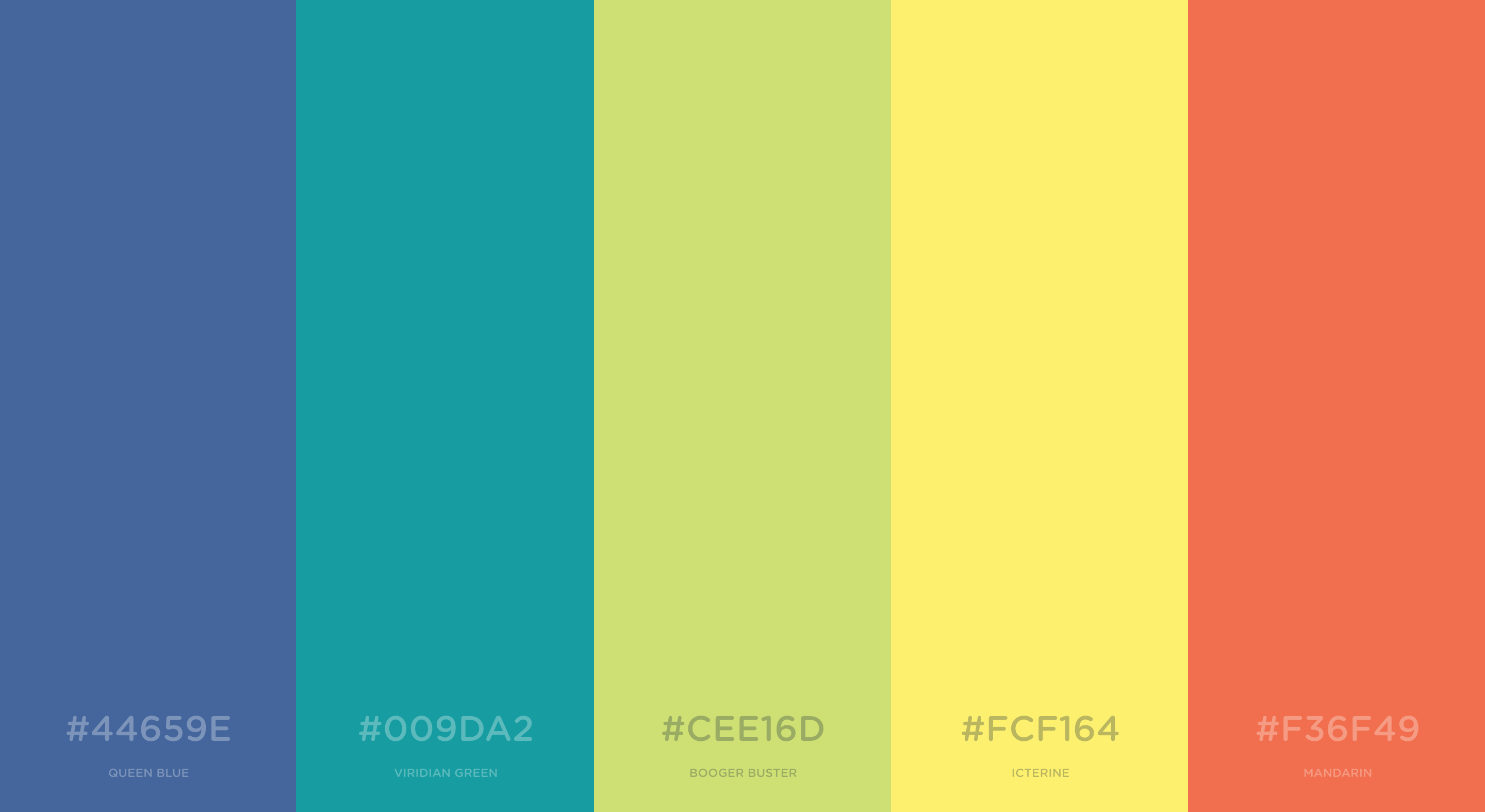
Colour scheme:
- Blues and greens
- Pops of colours such as yellow and orange
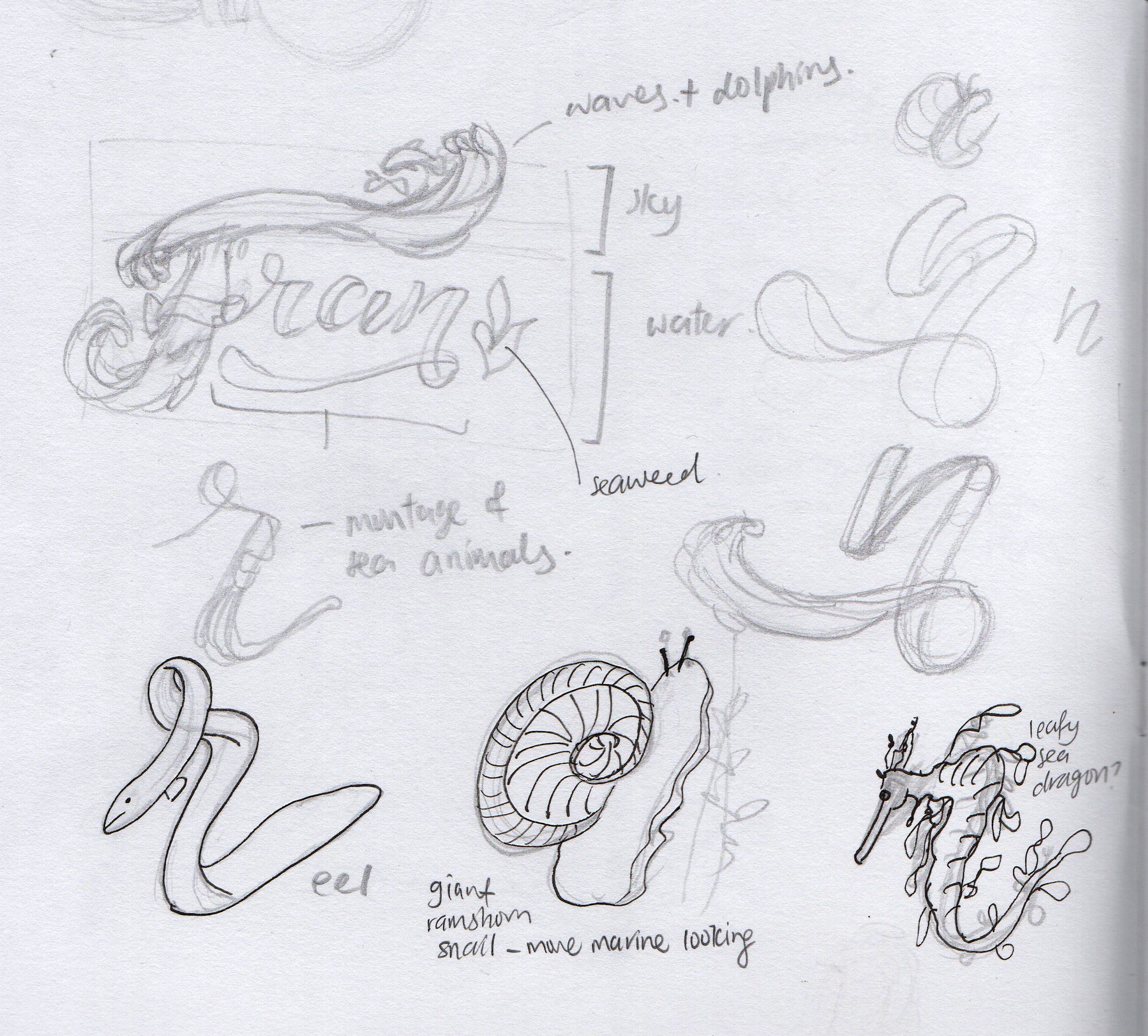
Sketches:

EXECUTION
Development 1:
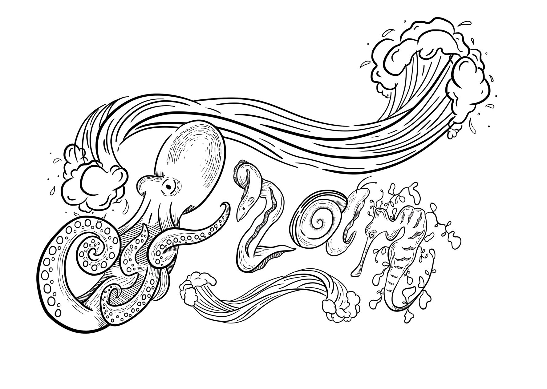
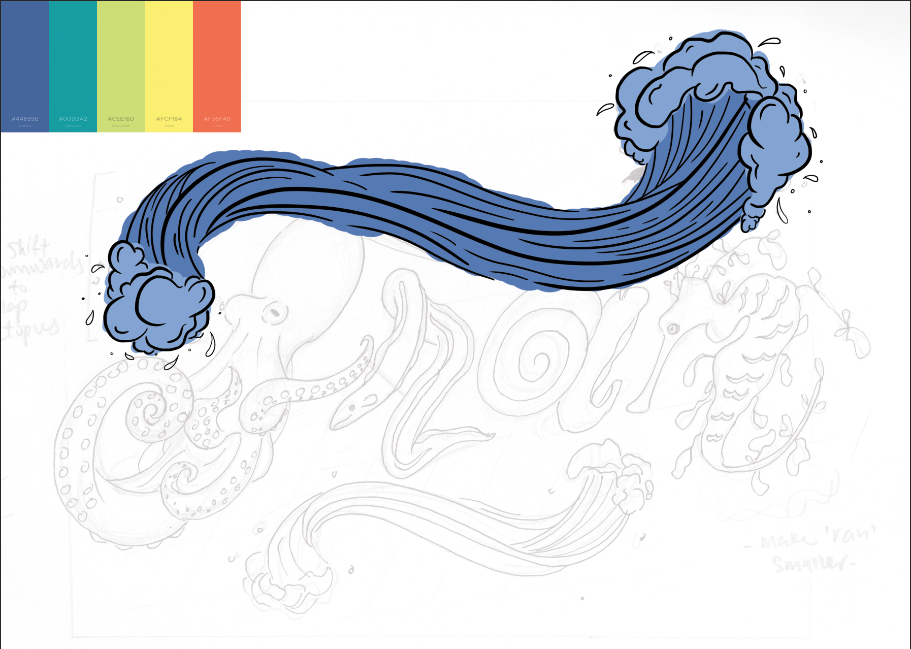
I started out by doing the lineart of the sketch.
Development 2:
The next step is to start adding colours!
The coloured product:
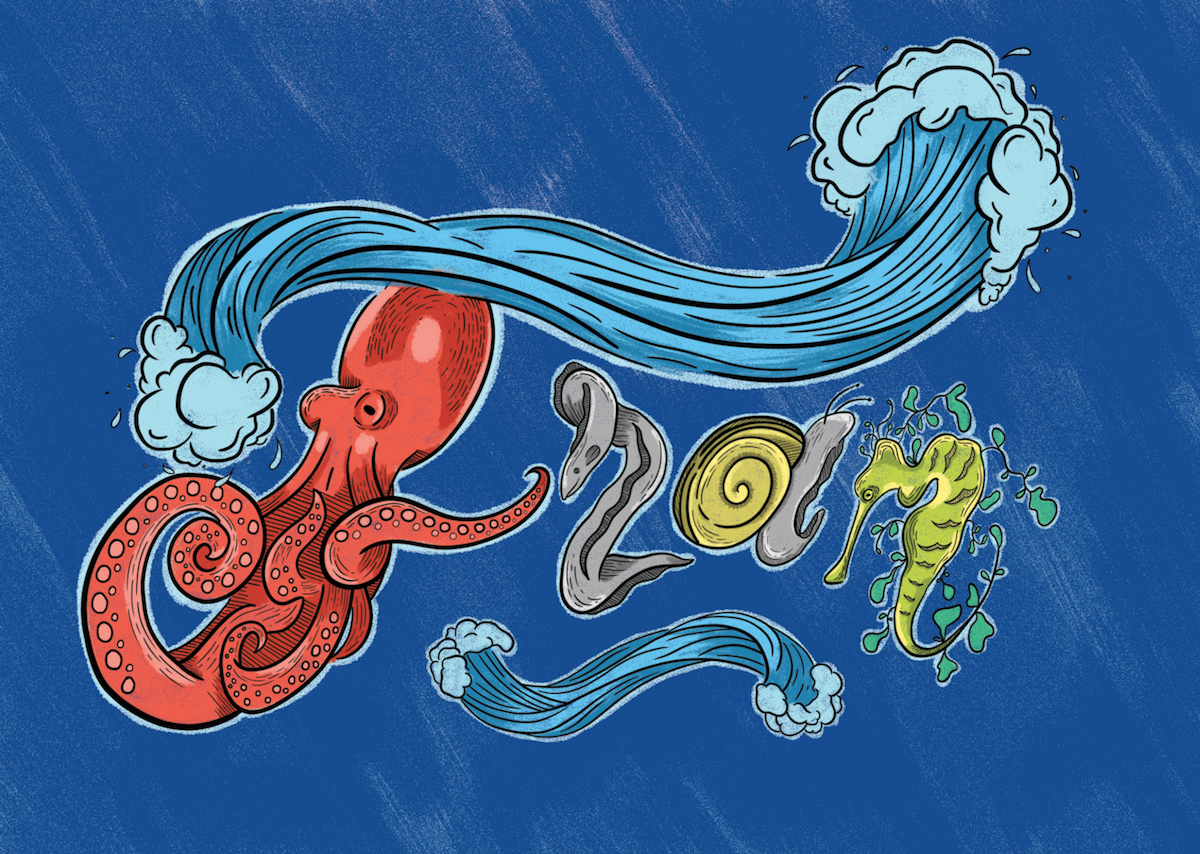
Mimi and classmates’ comments:
- Make the octopus a teacher, holding a ruler. then the other creatures students following behind
- Colours are not unified, octopus stands out too much and the other creatures share colour scheme that’s too similar
- Difficult to tell that the leafy sea dragon is ’n’, the leaves are too distracting. Can change to a seahorse instead (rework the ’n’)
- The waves at the bottom is distracting.
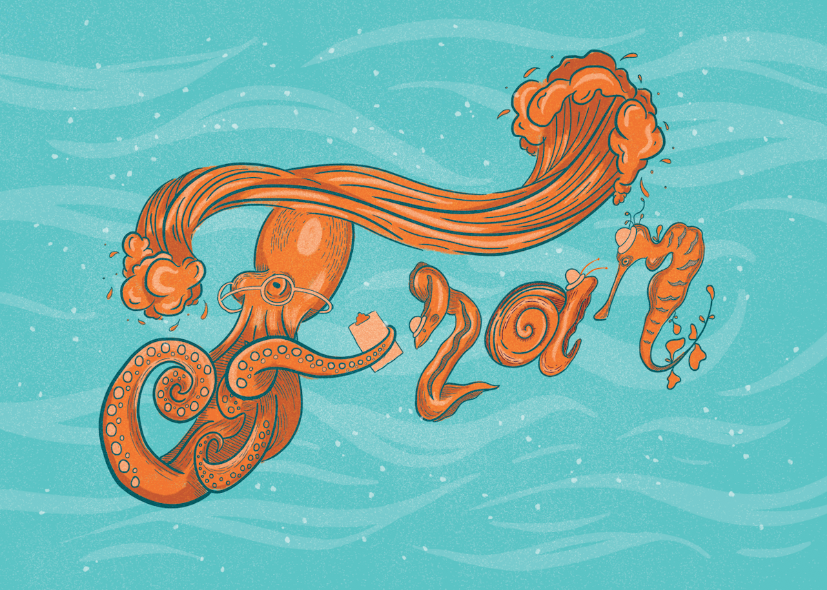
This was the moment where I changed my occupation from a marine biologist to a octopus teacher. The octopus teacher is very much like the ray teacher in ‘Finding Nemo’!
Development 3:
It took me a lot of colour exploration before I finally settled down on the final colour scheme. I had so much trouble because I was too fixated on using the actual animal colours, instead of simply stylising them like what Manuel “El Pollo” Rios (my artist reference) did.
Here are some failed attempts:
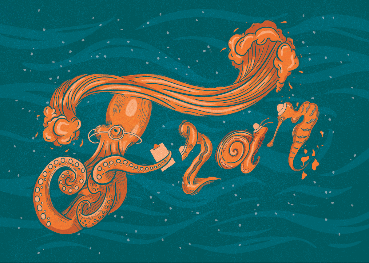
I wanted to retain the background as blue to indicate that it’s the sea, but I had to ensure that the animals stand out too, hence I gave them the colours black and orange. The contrast between the black and orange was good, but I felt that black was too strong and stands out too much. It simply doesn’t go well with the background at all. Hence, this colour scheme was scrapped.
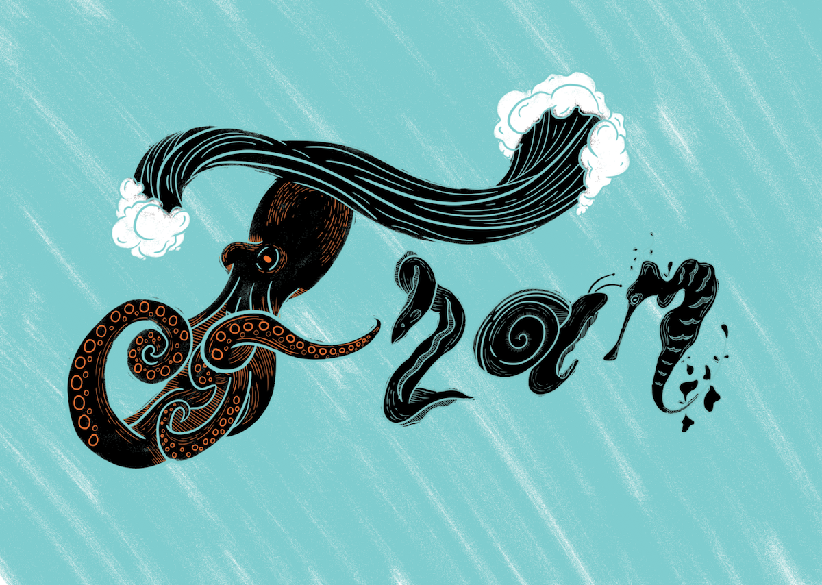
My room mate also noted that the ‘F’ is not very obvious, so I made the tentacle that forms the crossbar of ‘F’ to be bigger.
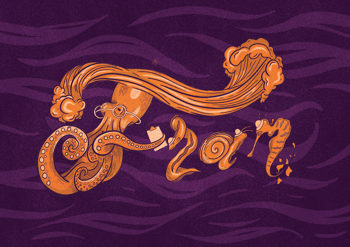
Another colour scheme that I attempted was complimentary colours orange and purple. To be honest, I was happy at how it turned out, but my friends commented that it doesn’t look like the sea anymore, which I agree on hindsight. So this colour scheme is scrapped too.
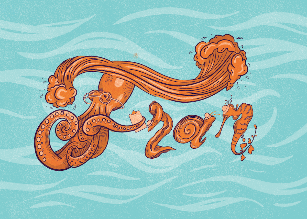
In order to convey the idea that this octopus is a teacher and the rest of the animals are her students, I gave the octopus teacher spectacles and a clipboard, which are what a stereotypical elementary school teacher has. The animal students get little hats as a form of identification because I couldn’t put school uniforms on them.
I also applied a grainy texture because I feel that it goes with the slightly vintage style of illustration that I went with.
I simply changed the background back to blue and I feel that the colours go pretty well together.
Changed the background to a darker turquoise in hopes that the orange will appear to be brigher… but it doesn’t work in my opinion because it feels as though the dark colour is overwhelming the orange. For example, ‘A’ doesn’t appear to stand out.
Development 4 – FINAL DESIGN:
After lots of tweaking around with the colour, this is the final result! If you have noticed, the lineart colour has always been the same as that of the background, but I decided to make an exception for this development because the darker lineart colour helps the illustration to stand out against the background. As for the composition, I arranged the animals in a slight upward slant to give the sense that they’re all heading somewhere! It’s much less static than arranging them in a straight line.