WHY A BAKER?
Even though I don’t bake (because my house doesn’t have an oven), I love watching baking videos! It looks like such a therapeutic activity and it’s fascinated watching all the different ingredients come together to form something so yummy. Therefore, one day when I have an oven (and time in my hands), I’ll definitely want to explore baking! Needless to say, I love eating so… I want to bake so that I can eat more.
IDEATION
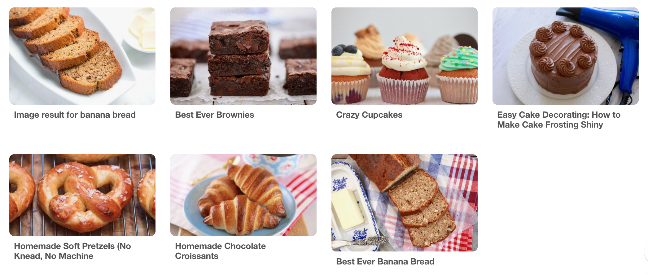
Moodboard:
This moodboard consists of baked goods, as well as equipments that are required for baking.
Art Direction/Artist Reference:
Cocoon Cooks is a food blog run by a Portuguese couple. They thrive on plant-based foods and living a healthy, active lifestyle. Every recipe they is accompanied by these simple yet adorable vector illustrations which give viewers a sneak peak into what ingredients go into the recipe.

Colour scheme:
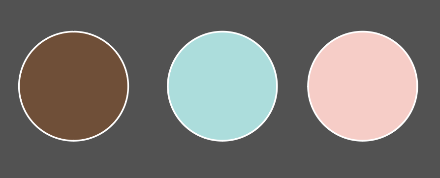
I knew right off the bat that I wanted to limit my colour palette to only 3 colours and pastel colours are a must! The limited colour palette is so that I stay in line with my art direction and to ensure that the colours look cohesive together (lesson learnt from the previous 3 types). I wanted pastel colours because they make the mood lively, which is what baking is supposed to be like.
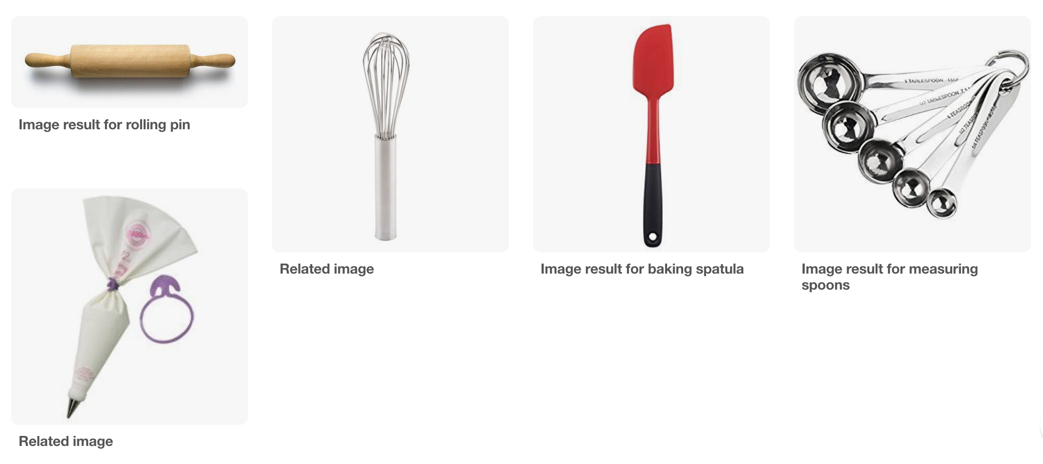
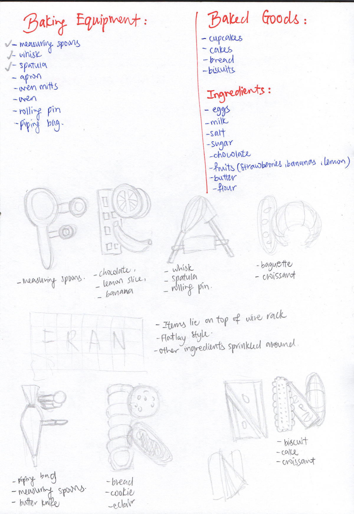
Sketches:
Like the type for ramen chef, I started by listing out various common baking equipment, baked goods and ingredients. Once all these have been listed out, I can start selecting and incorporating them into my type.
EXECUTION
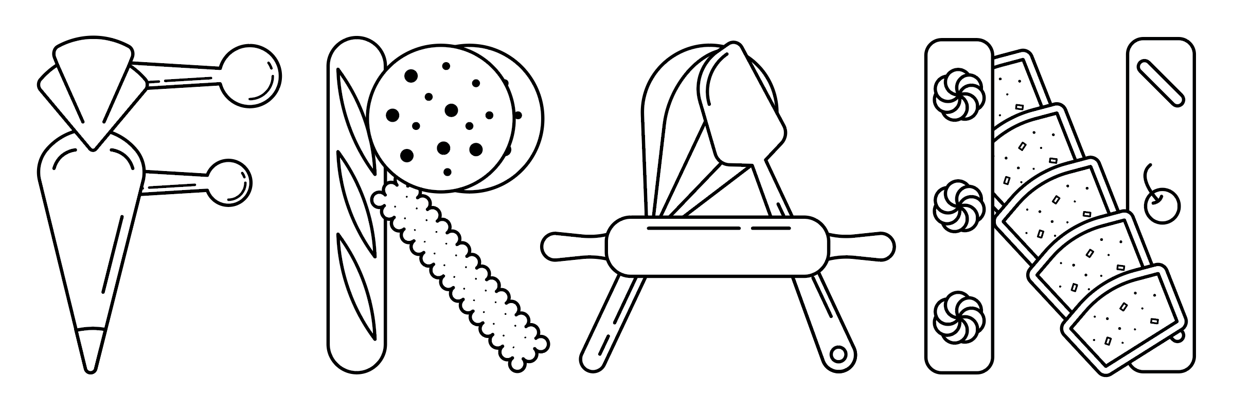
Development 1:
Out of all 4 types, this is the easiest to execute because it’s simply manipulating basic shapes such as rectangles and circles.

Development 2:
The charm of this style of illustration lies in its simplicity. The alphabet ‘N’ looks out of place beside the other alphabets because it has too much detail. Hence, I needed to tone down the details so that the overall type look cohesive.
Development 3:
Since the nature of the illustrations resembles the flat lay style of photography, I thought of placing them on a baking rack, very much like how a real life baker would do. But they just look strange, so I’m scrapping this idea.
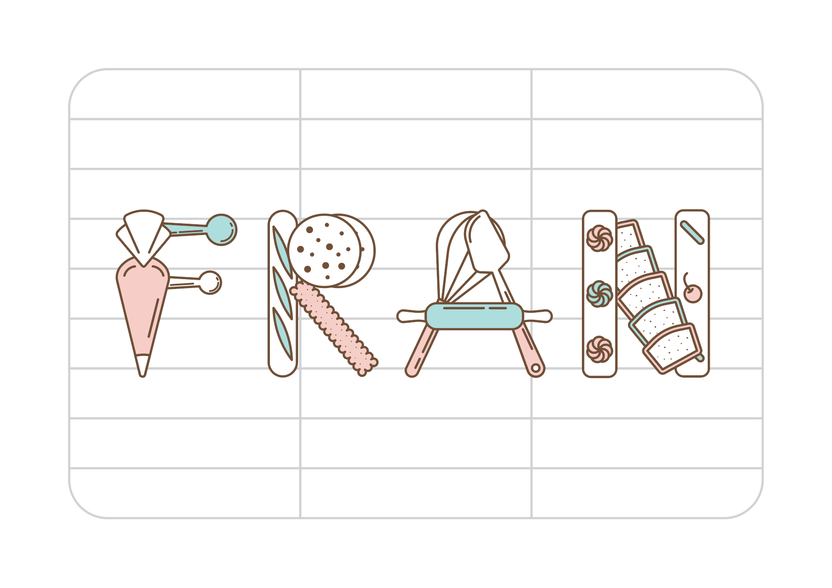
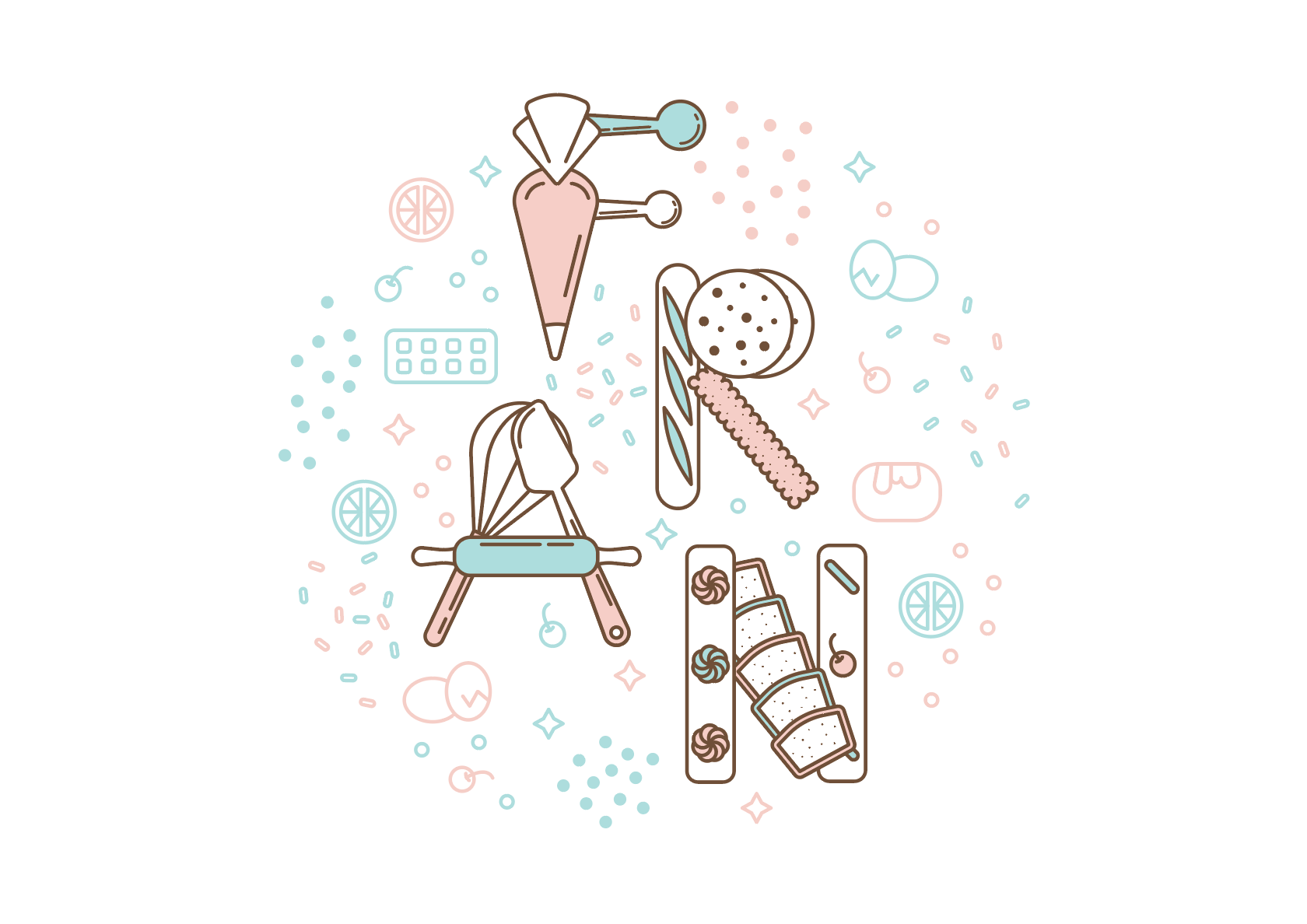
Development 4 – FINAL DESIGN:
I decided to arrange all my alphabets and other design elements to form a circle because I felt that this reflected the idea of how many ingredients come together to form an end product. To ensure that my type is still the star of the show, I gave the other design elements either blue or pink outline, so that the type with brown outline will stand out. I also decided to keep the background white so that the composition will have a comfortable breathing space.
The overall composition may look simple, but it’s actually very challenging and I spent a lot of time shifting them around to ensure that that everything looked balanced. The simpler it looks, the more difficult it is to make it work!