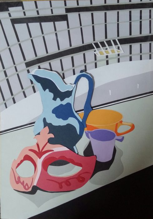
Idea:
Colors used in the background (i.e. building) are generally more neutral and achromatic while the elements in the foreground are given colors that have greater value and brightness. This will bring the focus to the items and make them stand out.
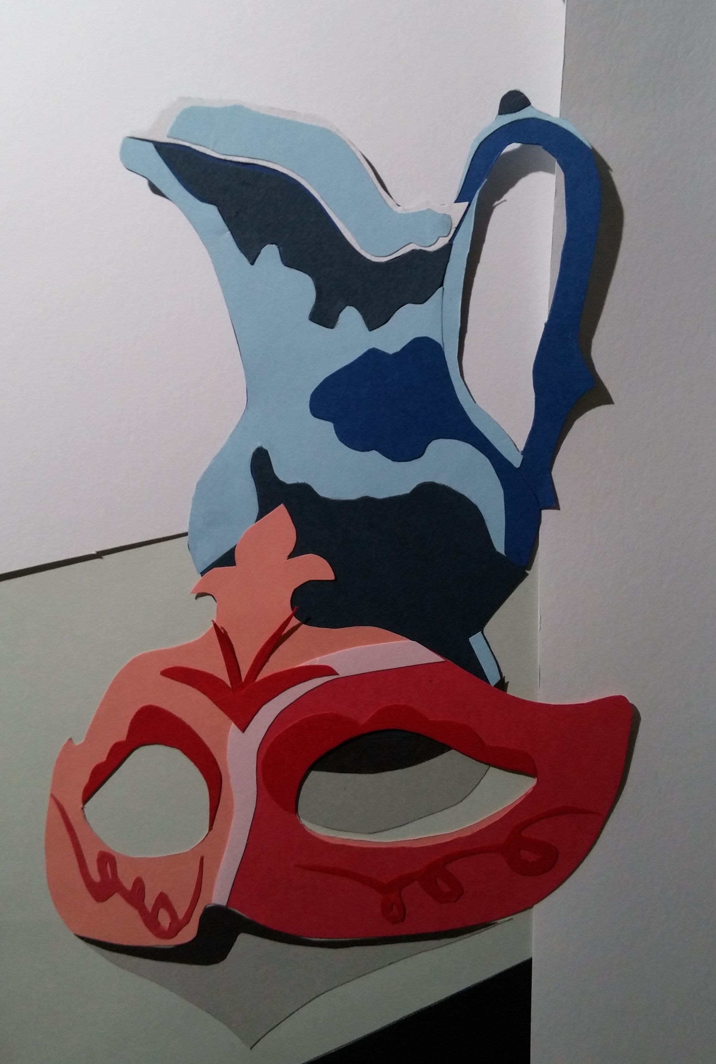
Primary colors (i.e. blue and red) are used for the vase and mask.
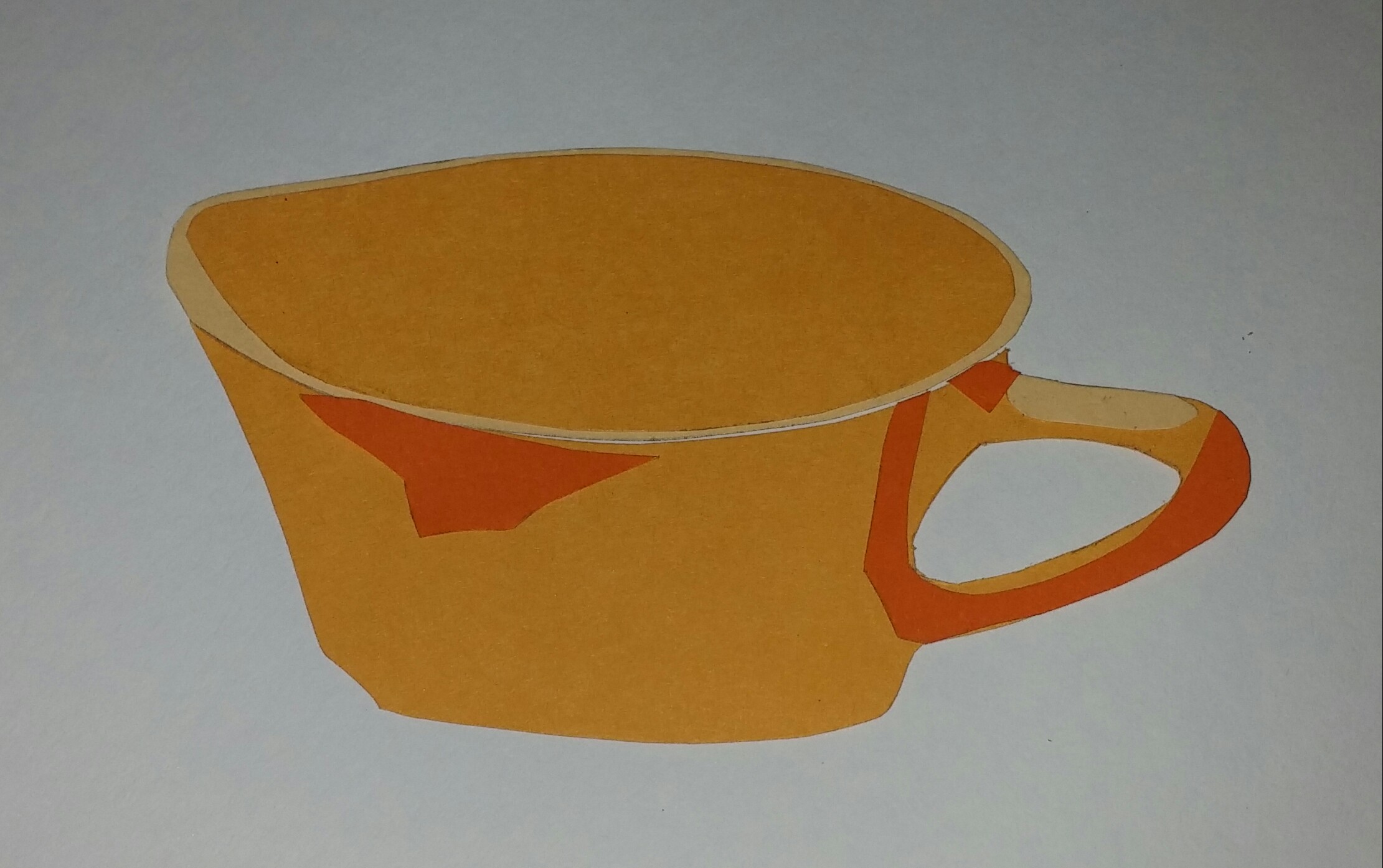
Secondary colors (i.e. purple and orange) are used for the two cups.
Color harmonies that are applied to the elements include:
- Complementary: Blue and Orange
- Analogous: Red, Purple and Orange
- Split Complementary: Orange, Blue and Red
All elements are monochromatic through using different values and intensities of the same hue to show their design and shadows. For instance, 4 shades of red are used for the mask.
In addition, color balance and proportion is applied for the amount of orange and blue used in this cut out. The complementary conversion ratios for color balance for the respective colors is 1/3 to 2/3.
Apart from the cut outs, a layer of plastic is used over the building to represent the windows and gives off a little reflection.
Planning
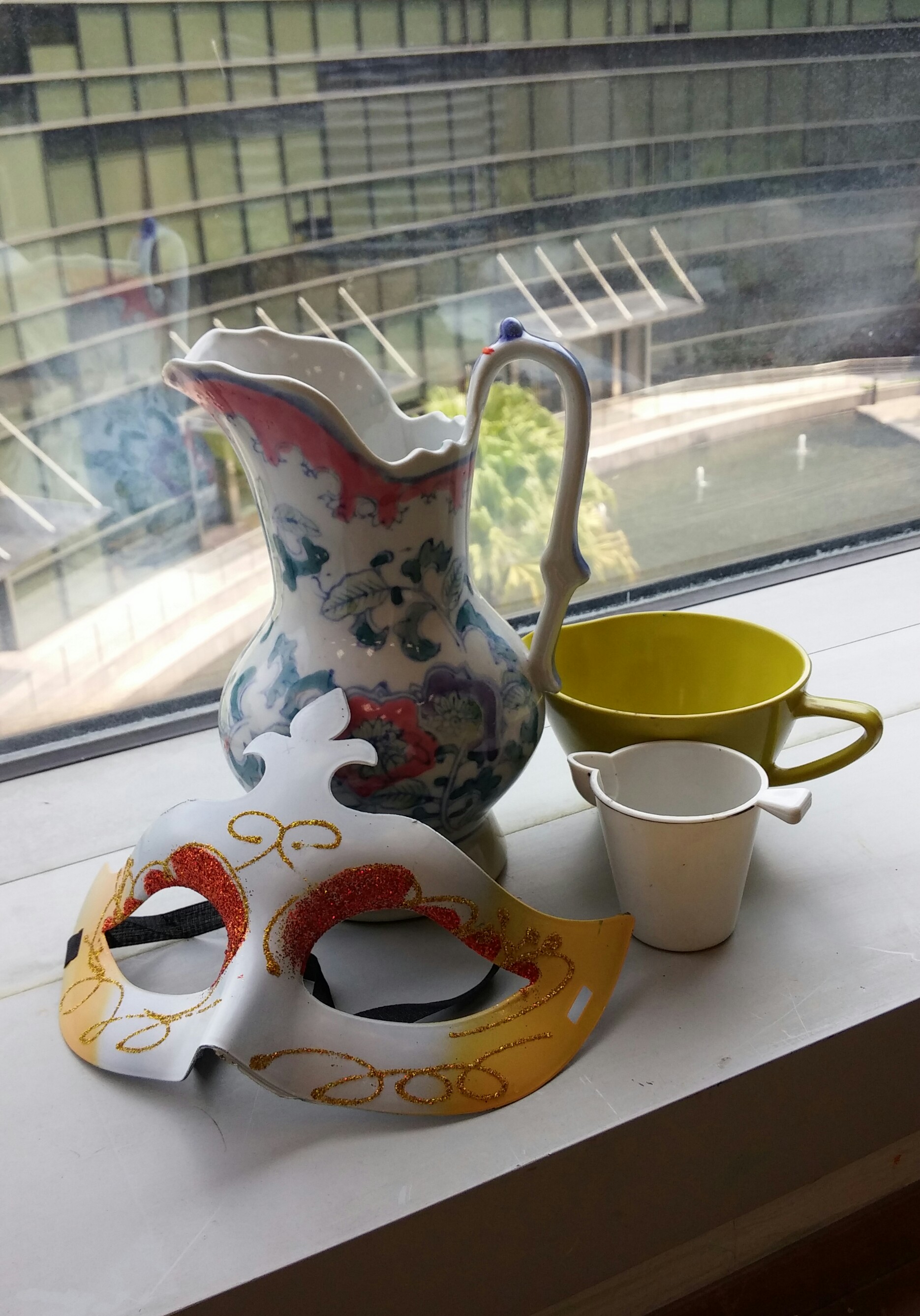
Photo taken:
The Rule of Thirds is applied in this photo, where the background and elements occupy 1/3 and 2/3 of the space respectively. The colors used for the various elements in the final cut out will differ from the actual photo which has little colors. There is room for creativity where more color harmonies can be included.
A quick look at the colors chosen.
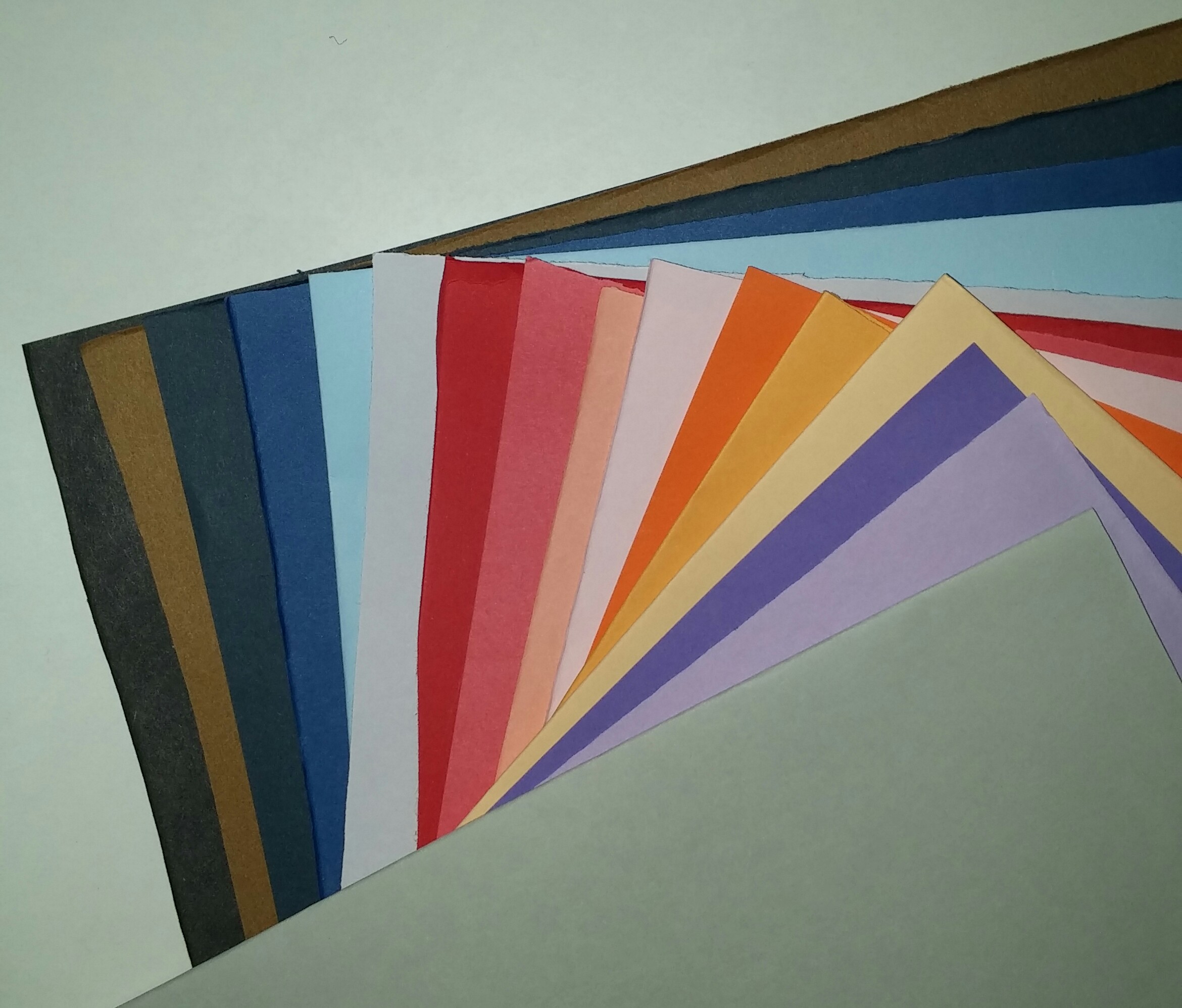
Background:

Items:

You must be logged in to post a comment.