Zine Line Vine (Process)

Zine .

a line is a dot that went for a walk

Zine + Bookmark

… . . .  .  .  .   .    .    .       .      .        .        .           .            . 

For this project, I chose to focus on just one out of my previous projects.

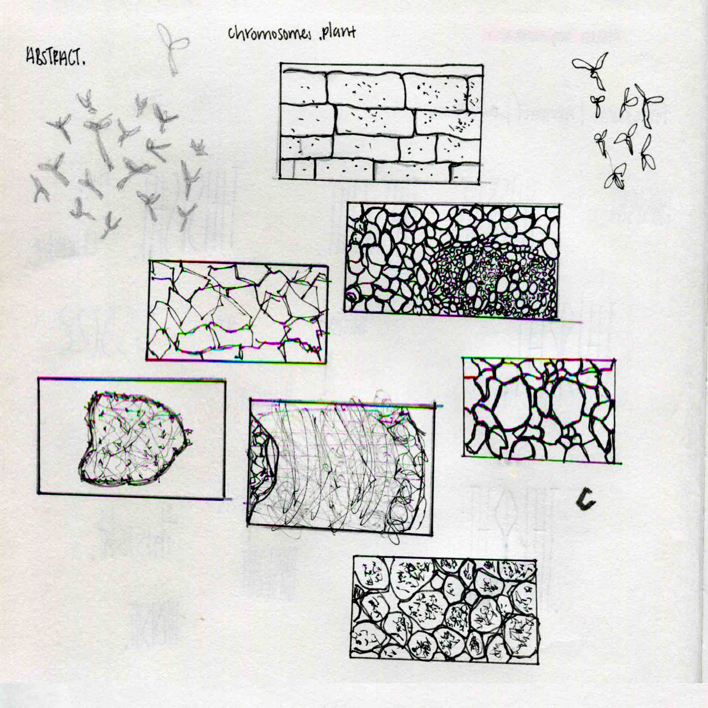
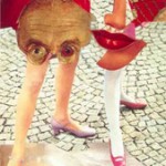
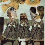
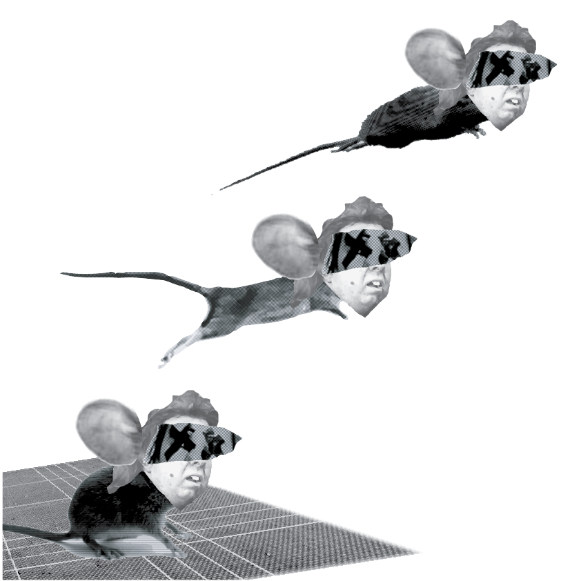
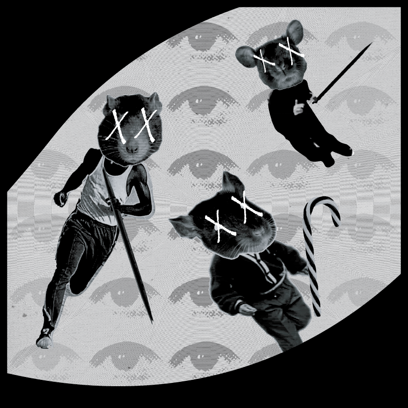
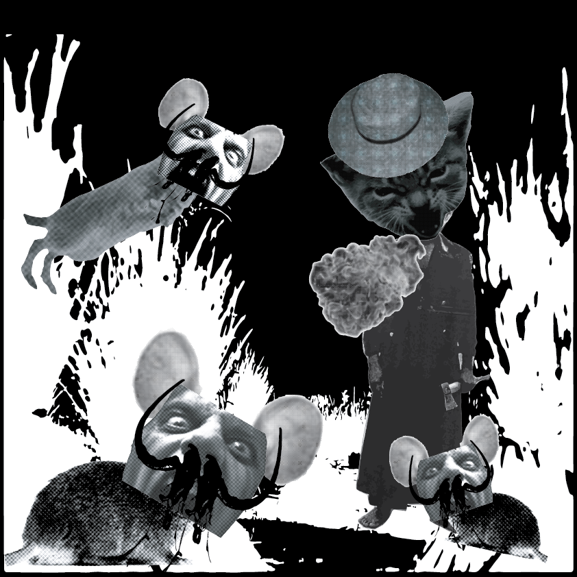
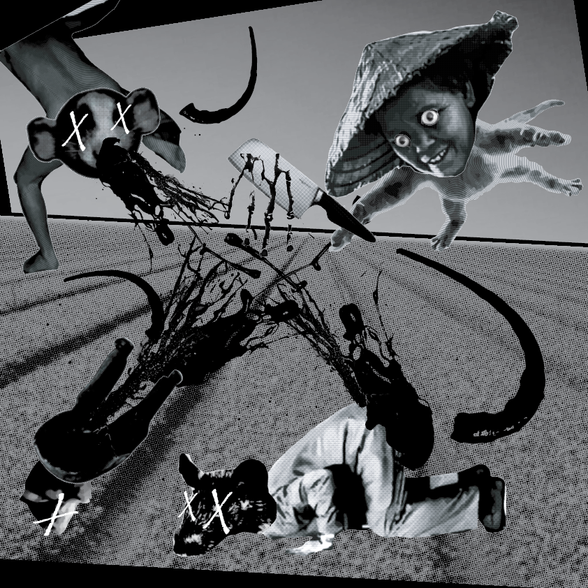
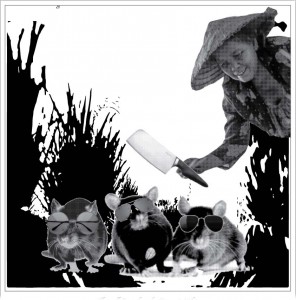
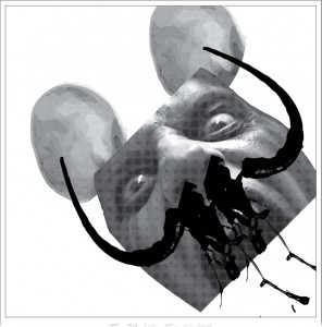
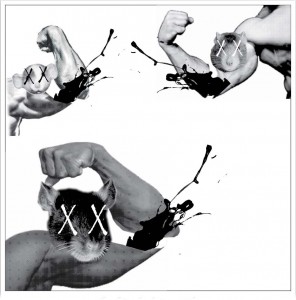
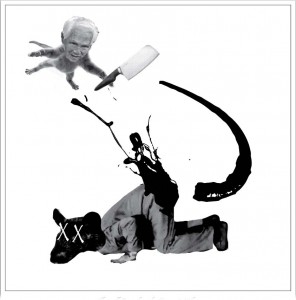
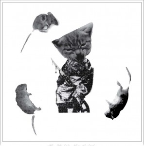
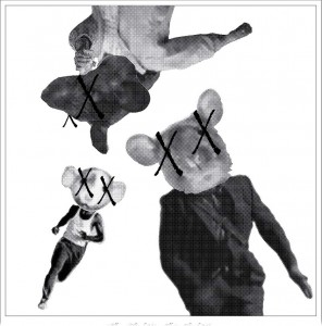
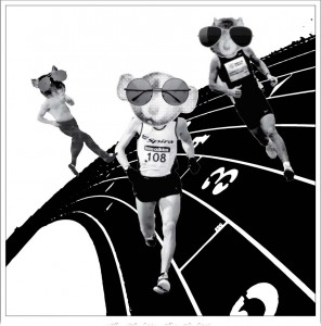
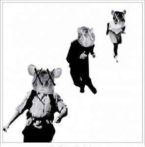
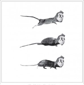
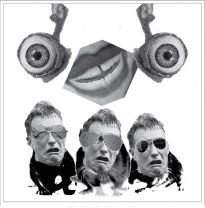
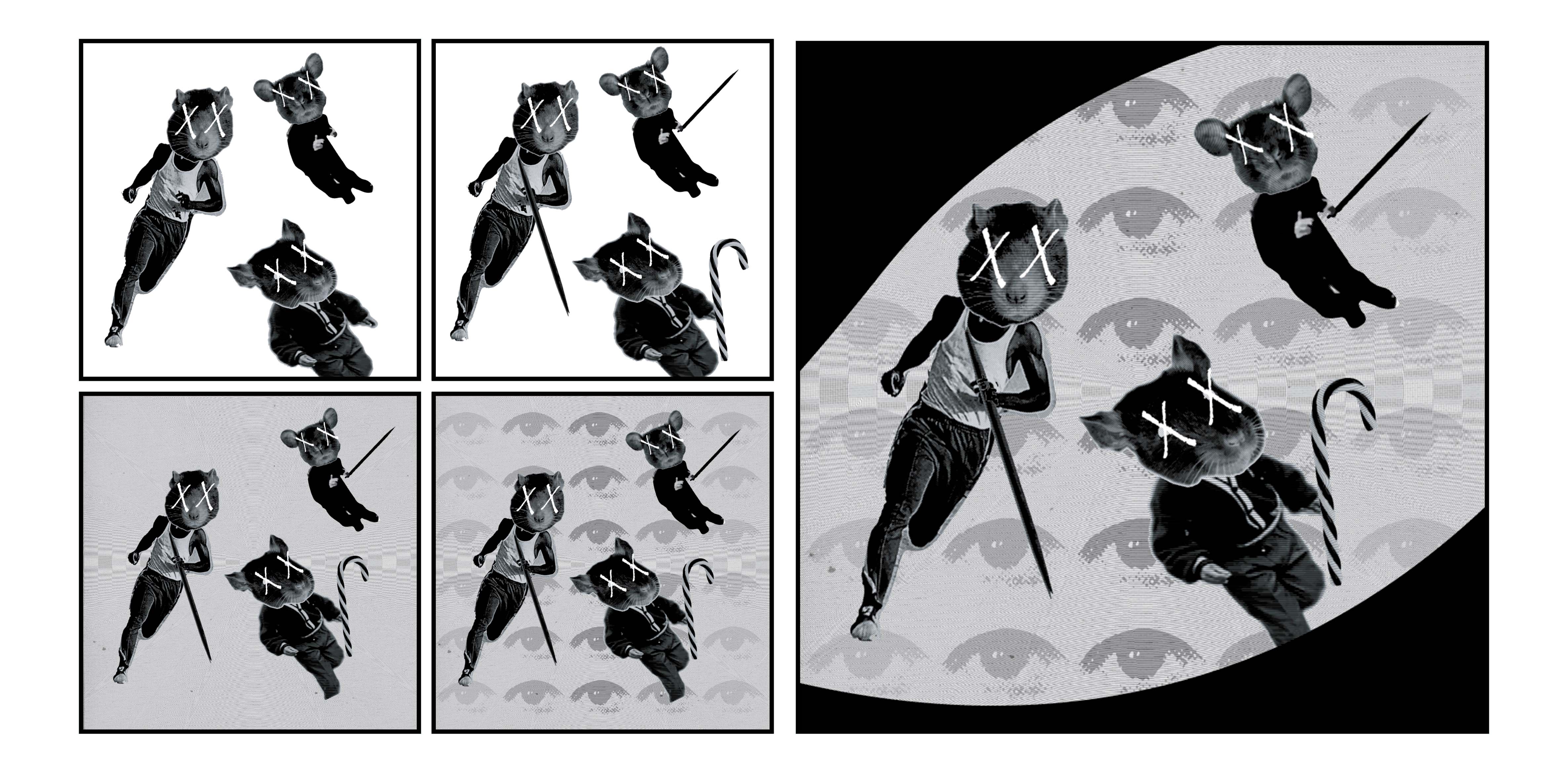
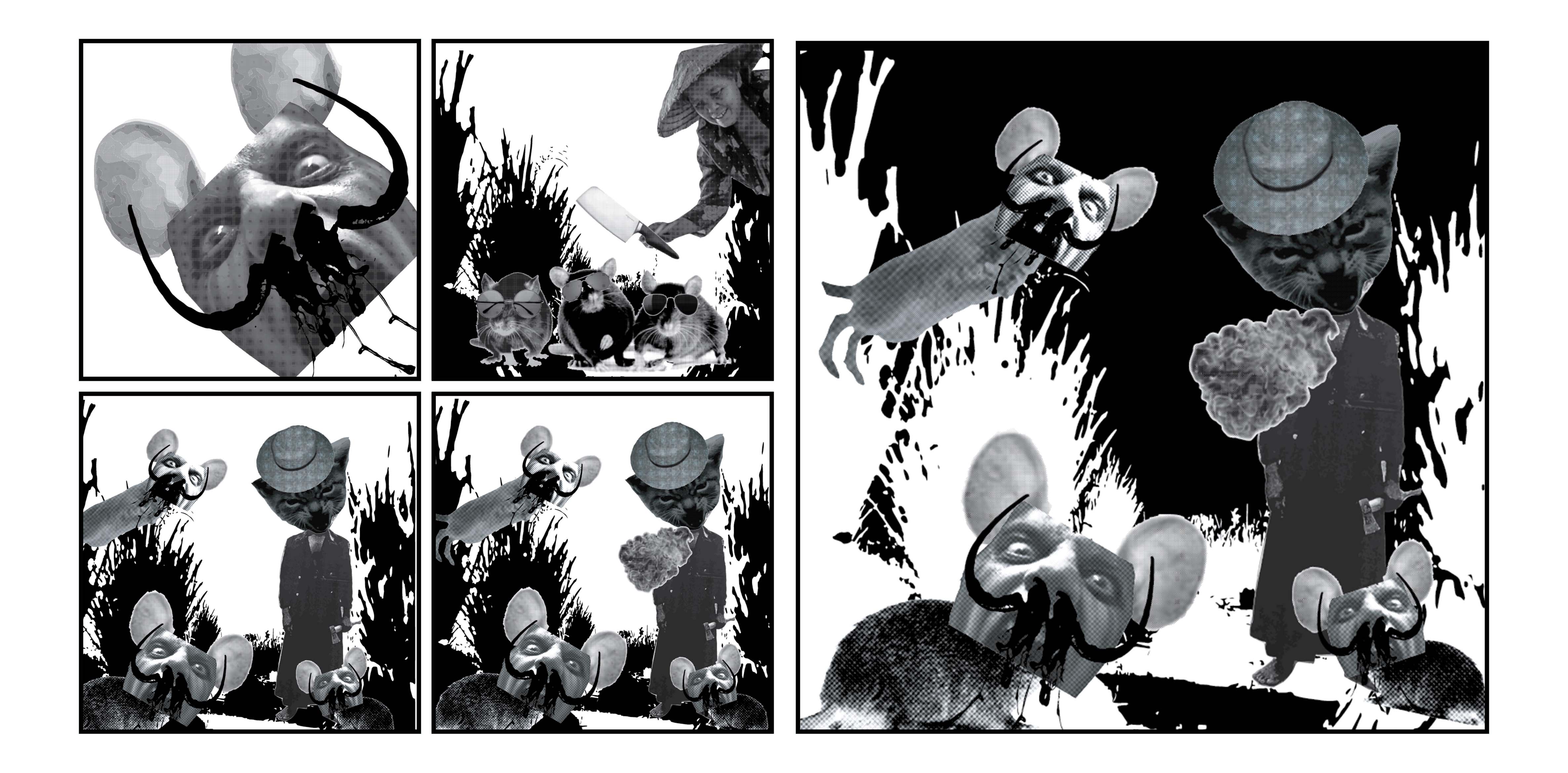
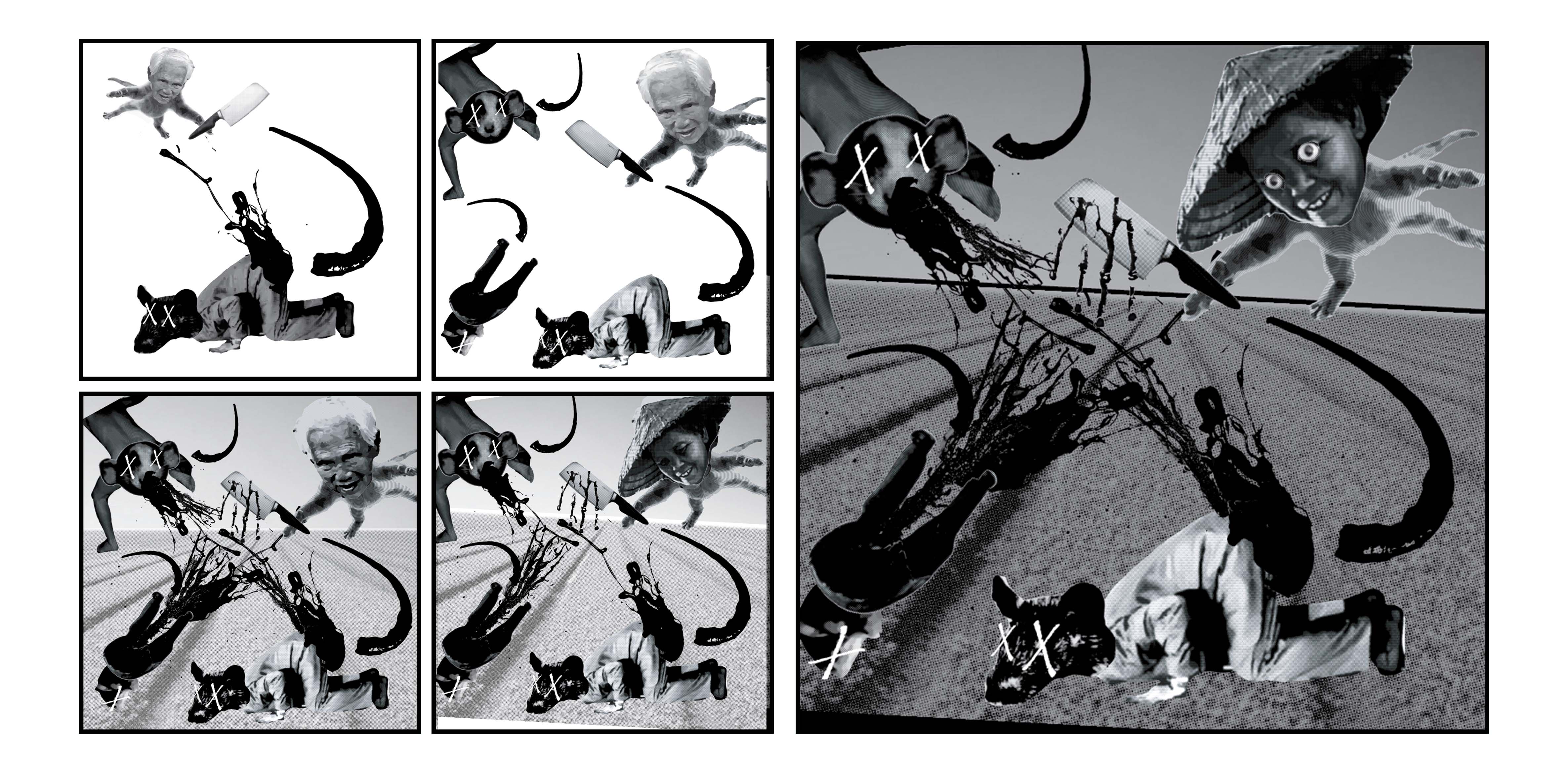
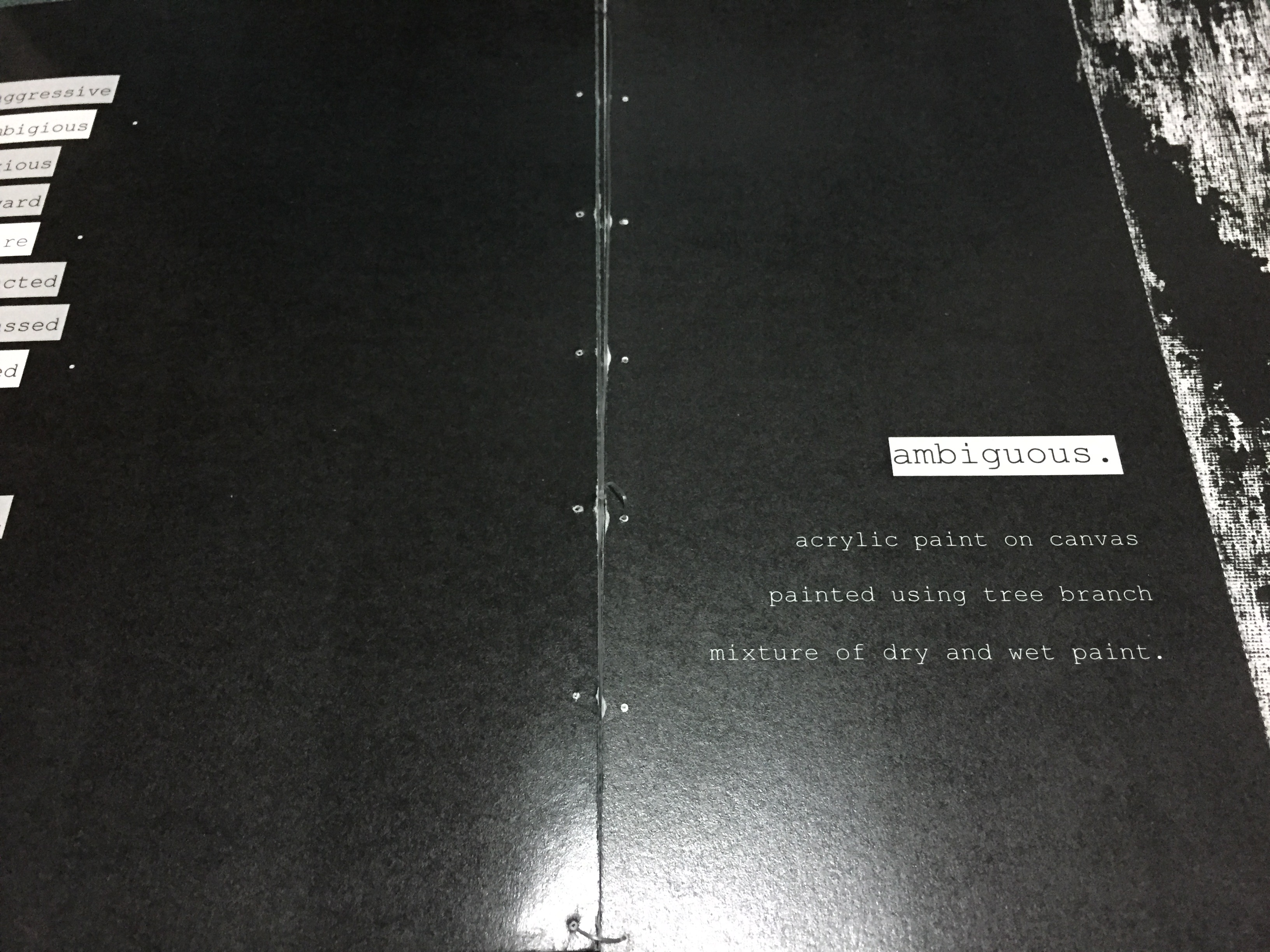
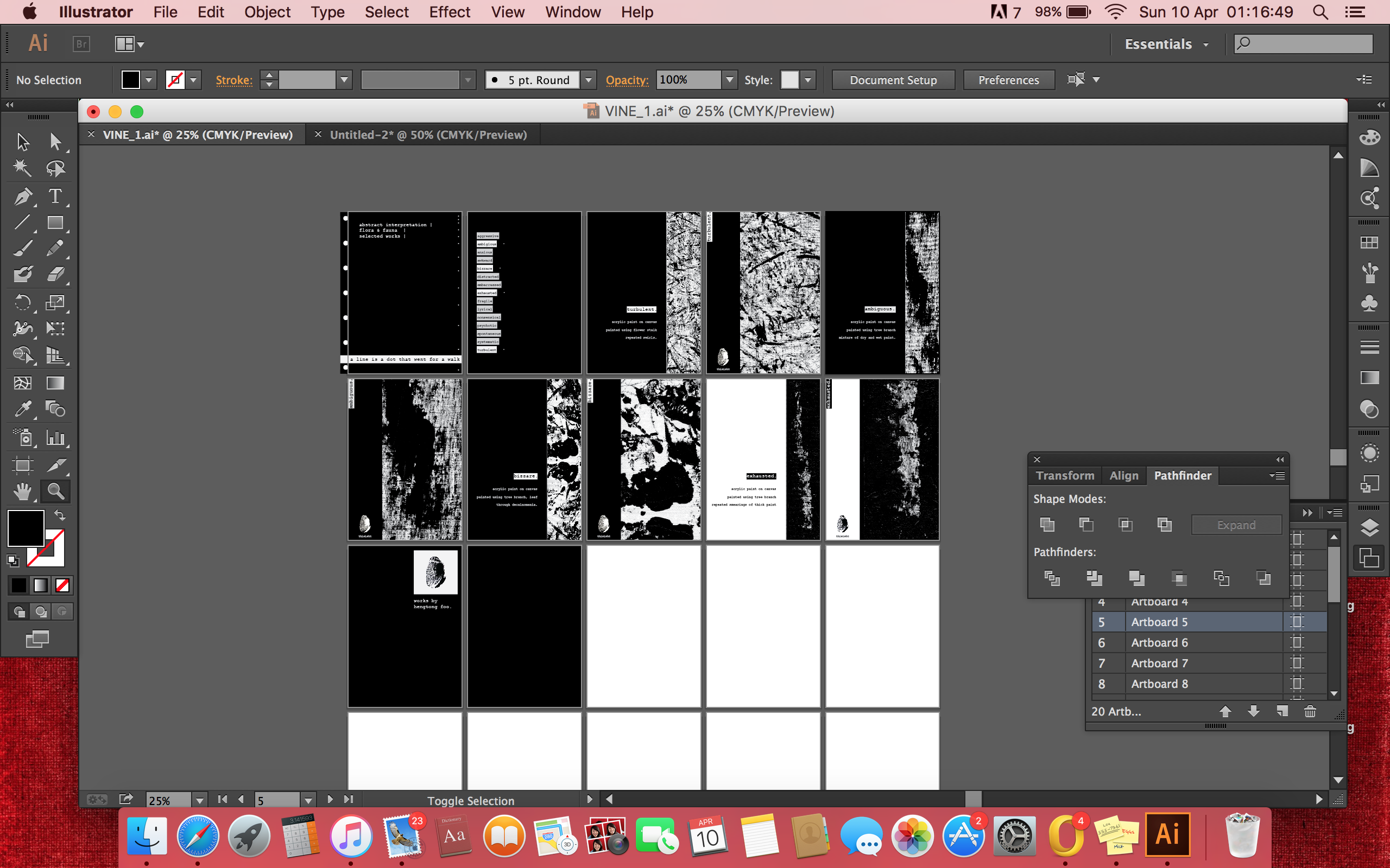
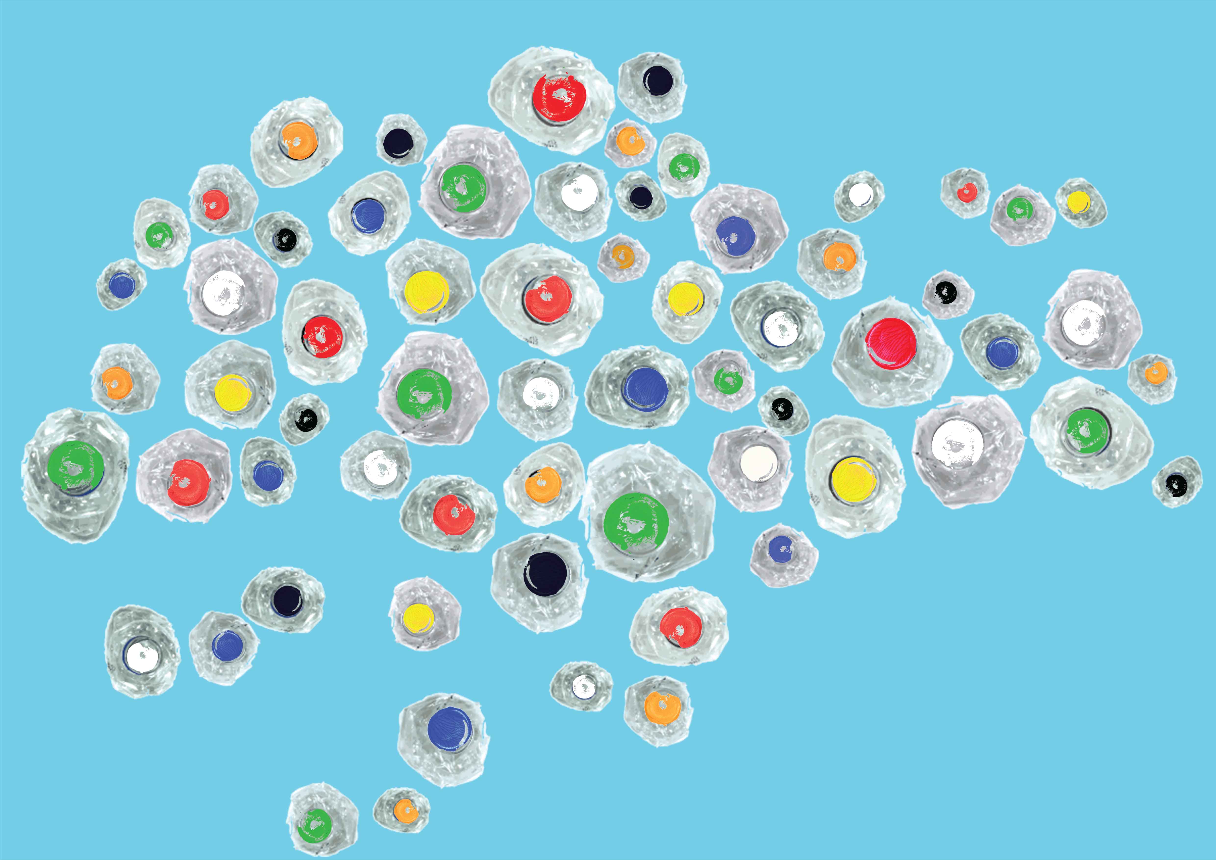
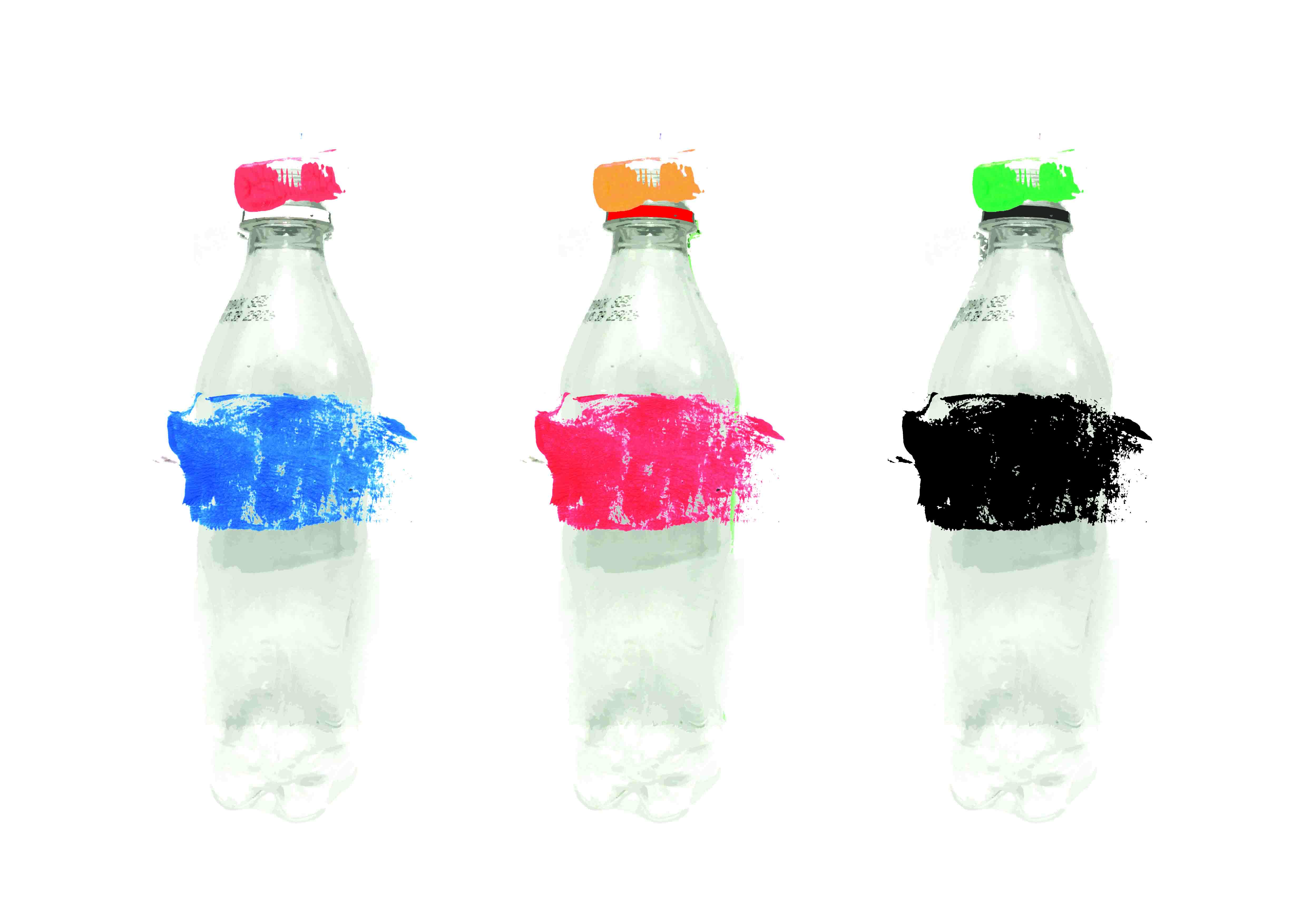
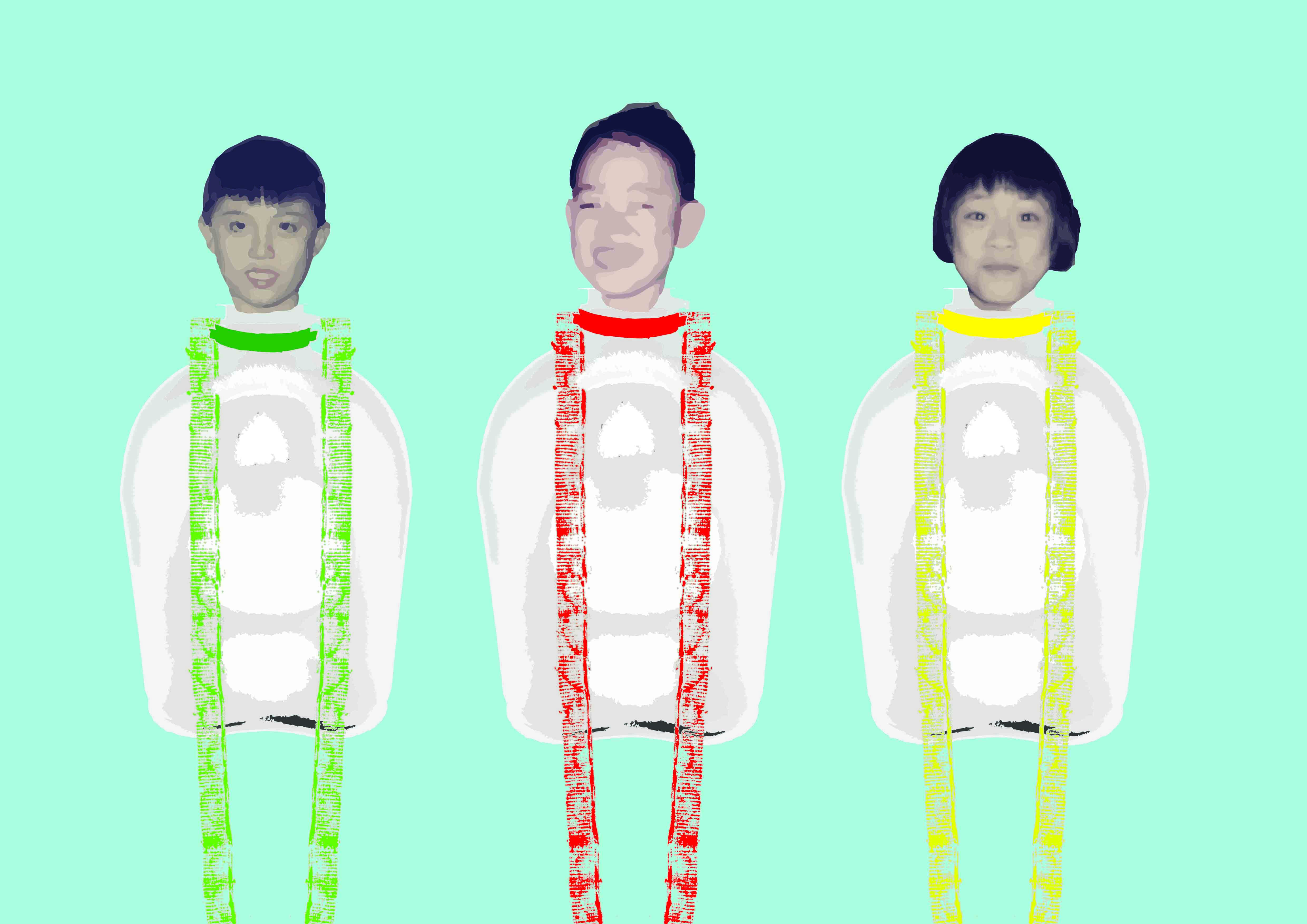
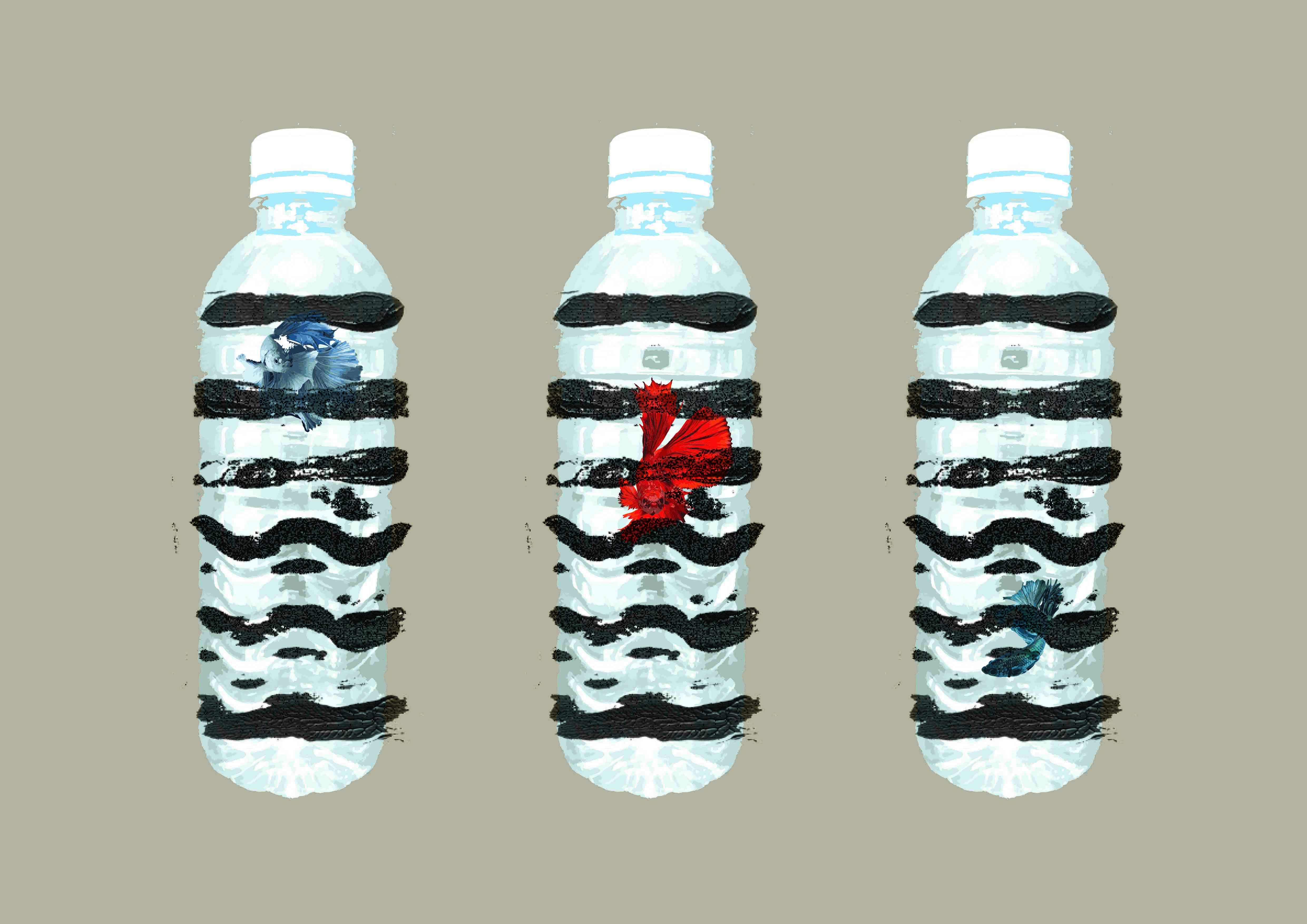
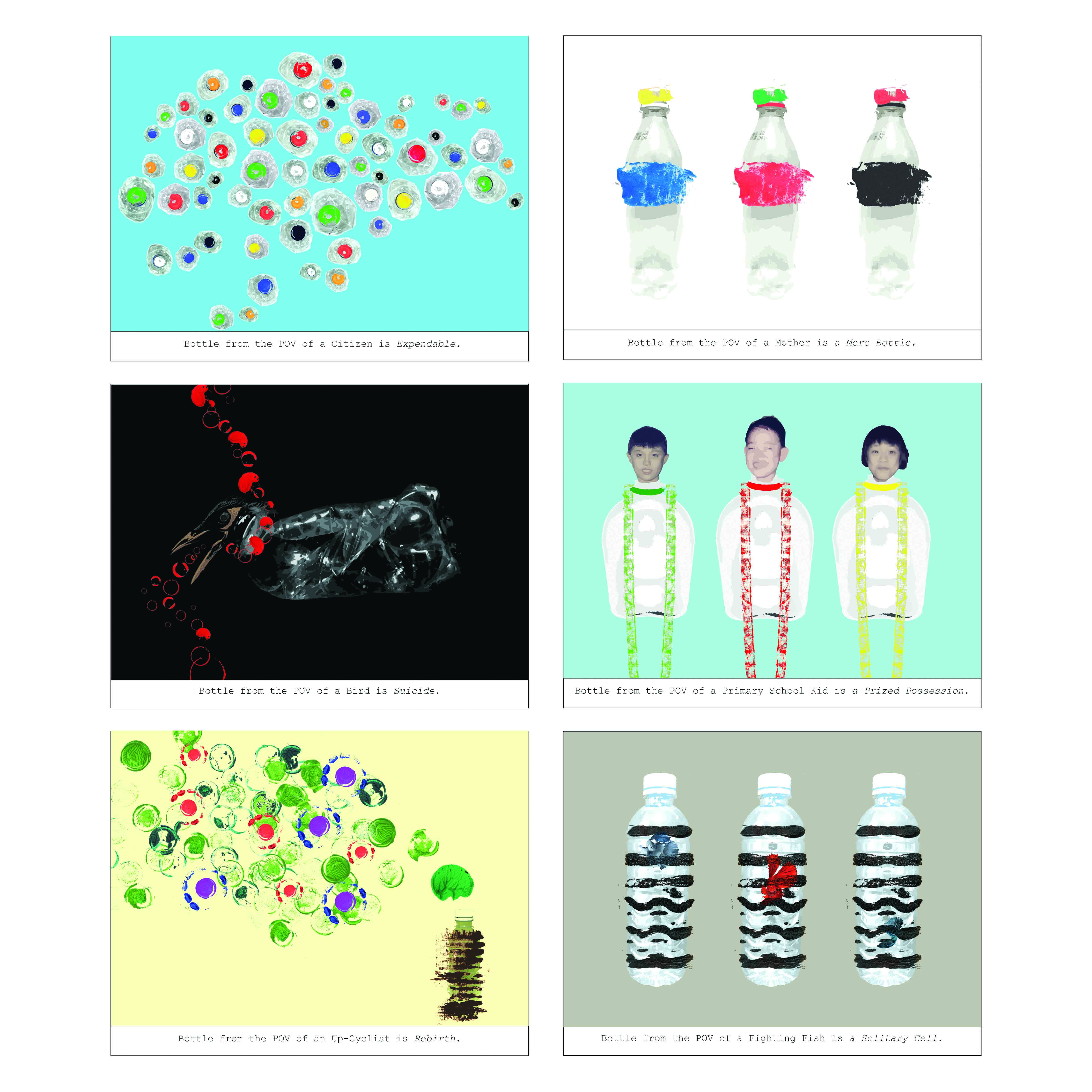
I decided to base my Zine on the very first 2D assignment, of which I made use of flora and fauna to expressed 18 different emotions. The spontaneous outcomes that came out were really interesting and I wanted to make use of the ‘windows’ of artwork in my Zine. Therefore, my Zine will consist of a compilation of the work. Also, as this is the final project for 2D, I feel that it would be cool to end off  2D with my first project assignment.

However, I wanted more of a motive of the usage of ‘windows’, and I finalised the idea of making my Zine to be a bookmarkThis way, I am able to justify the use of each ‘window’ thus add more layer to my Zine.

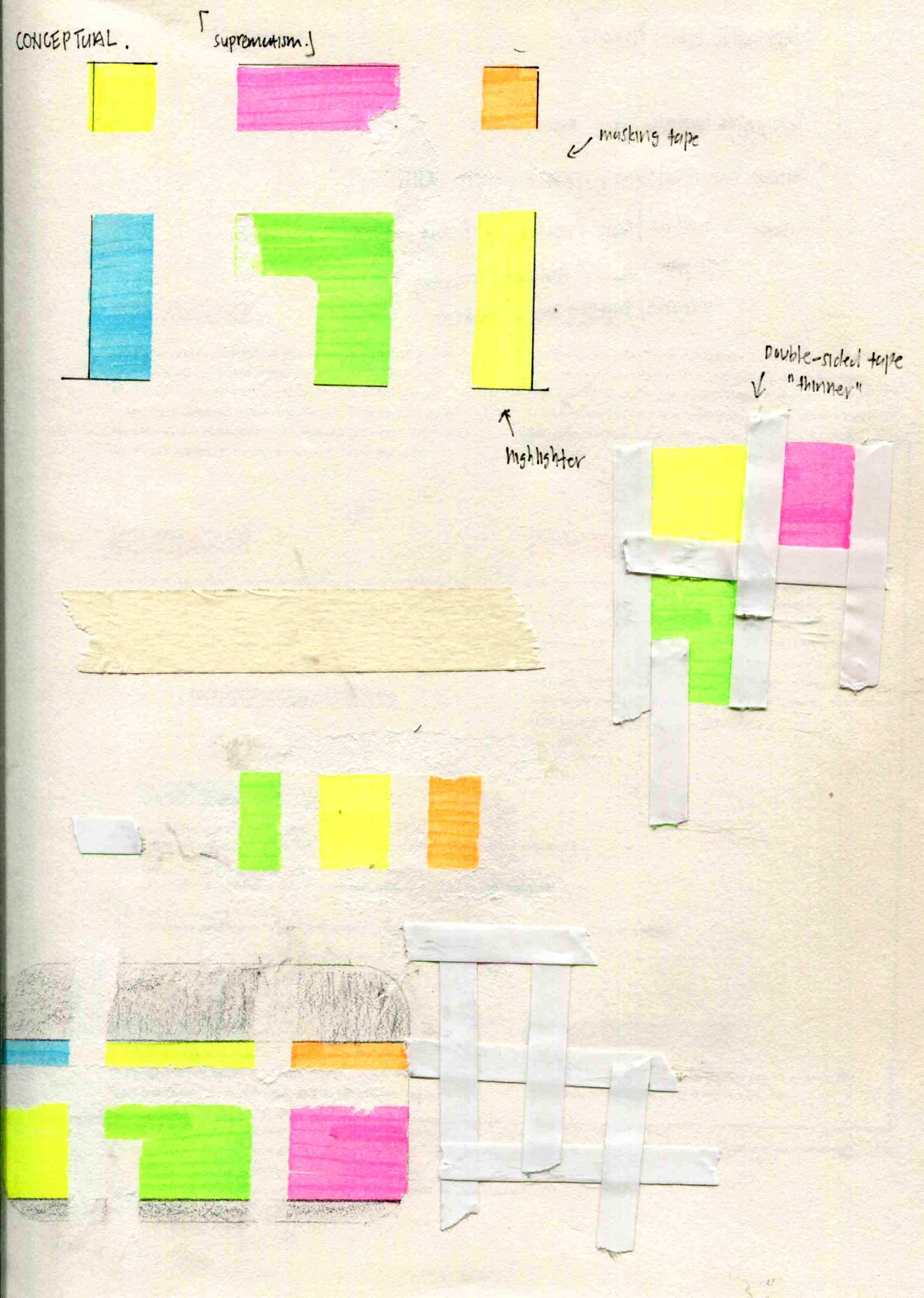
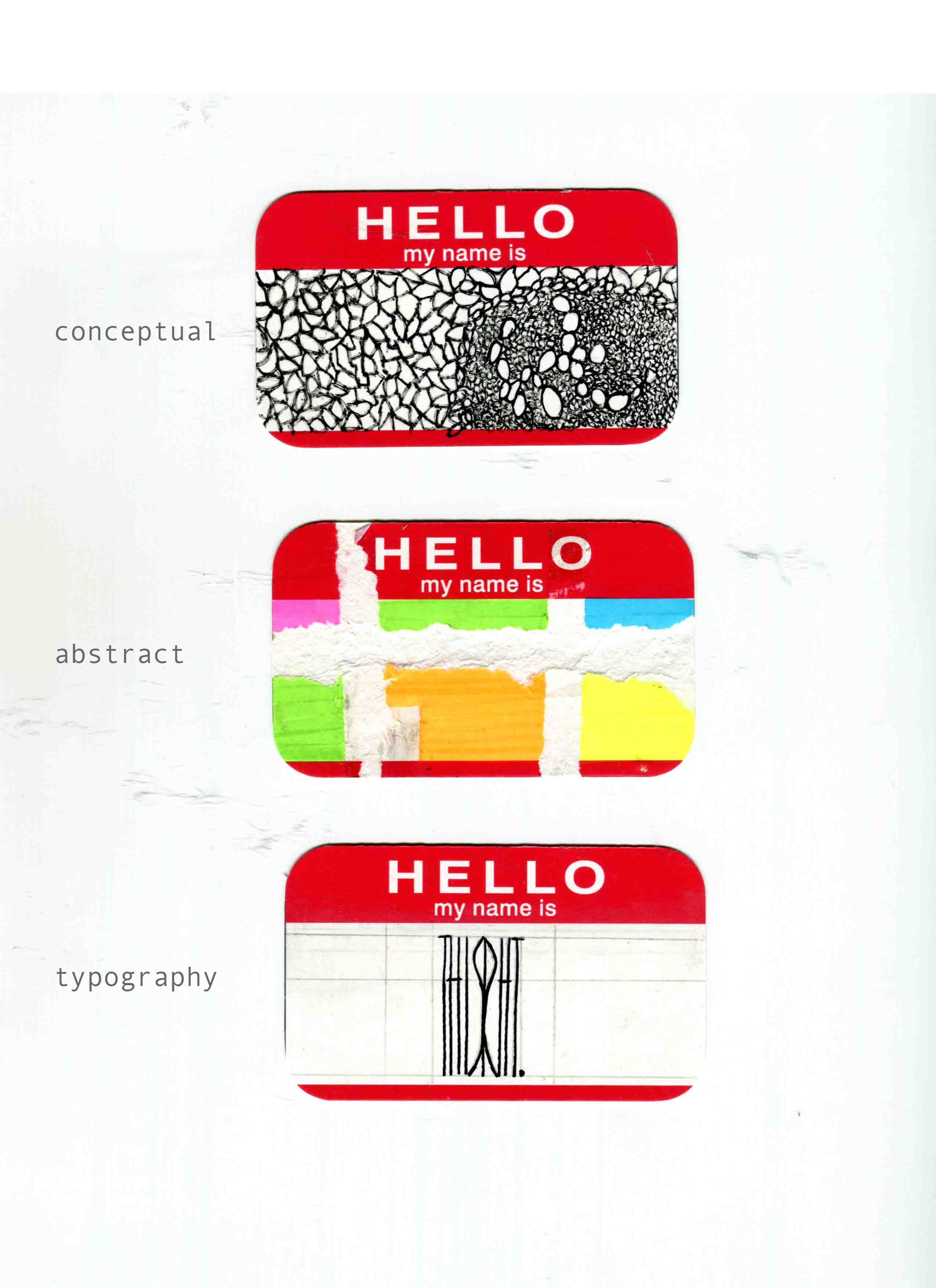
For the concept, I decided to work using a minimalistic approach.

I referenced exhibition catalogues and graphic books where the use of words are minimised and the images enlarged.
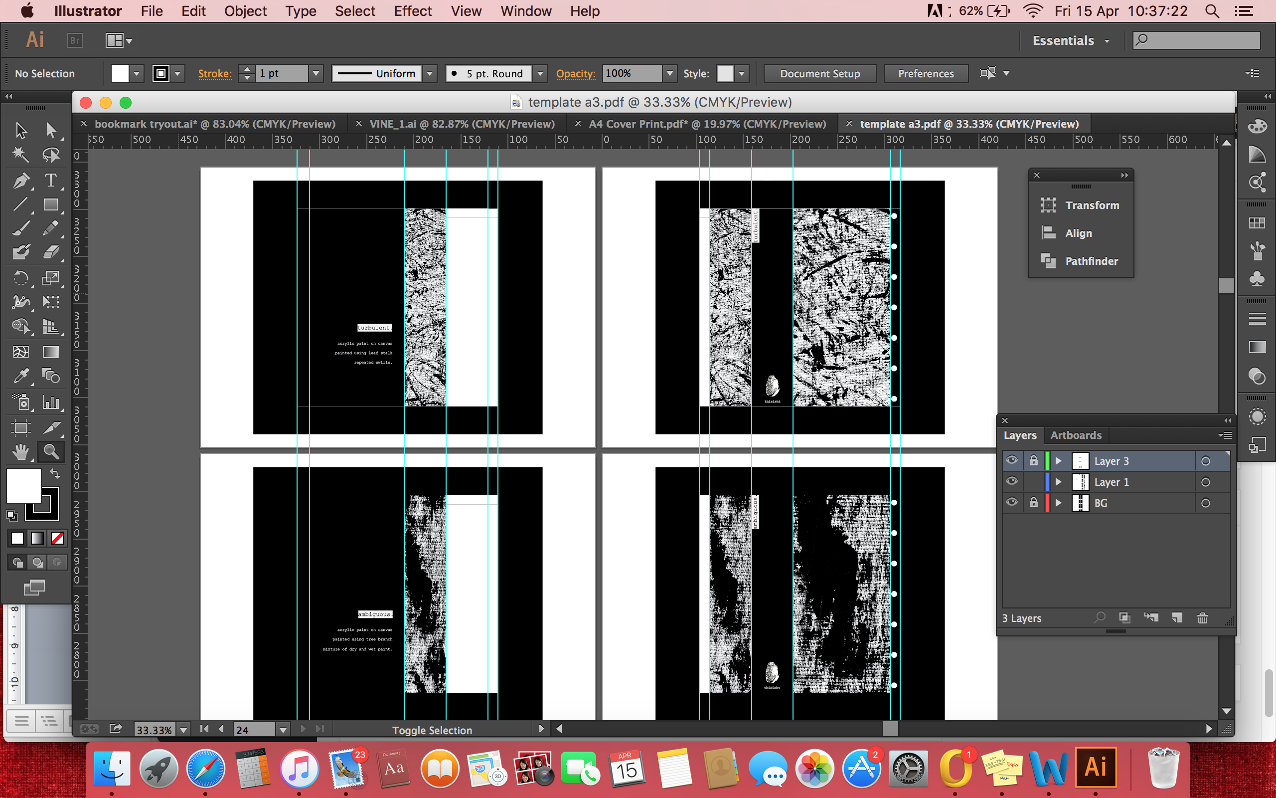


Initial Composition

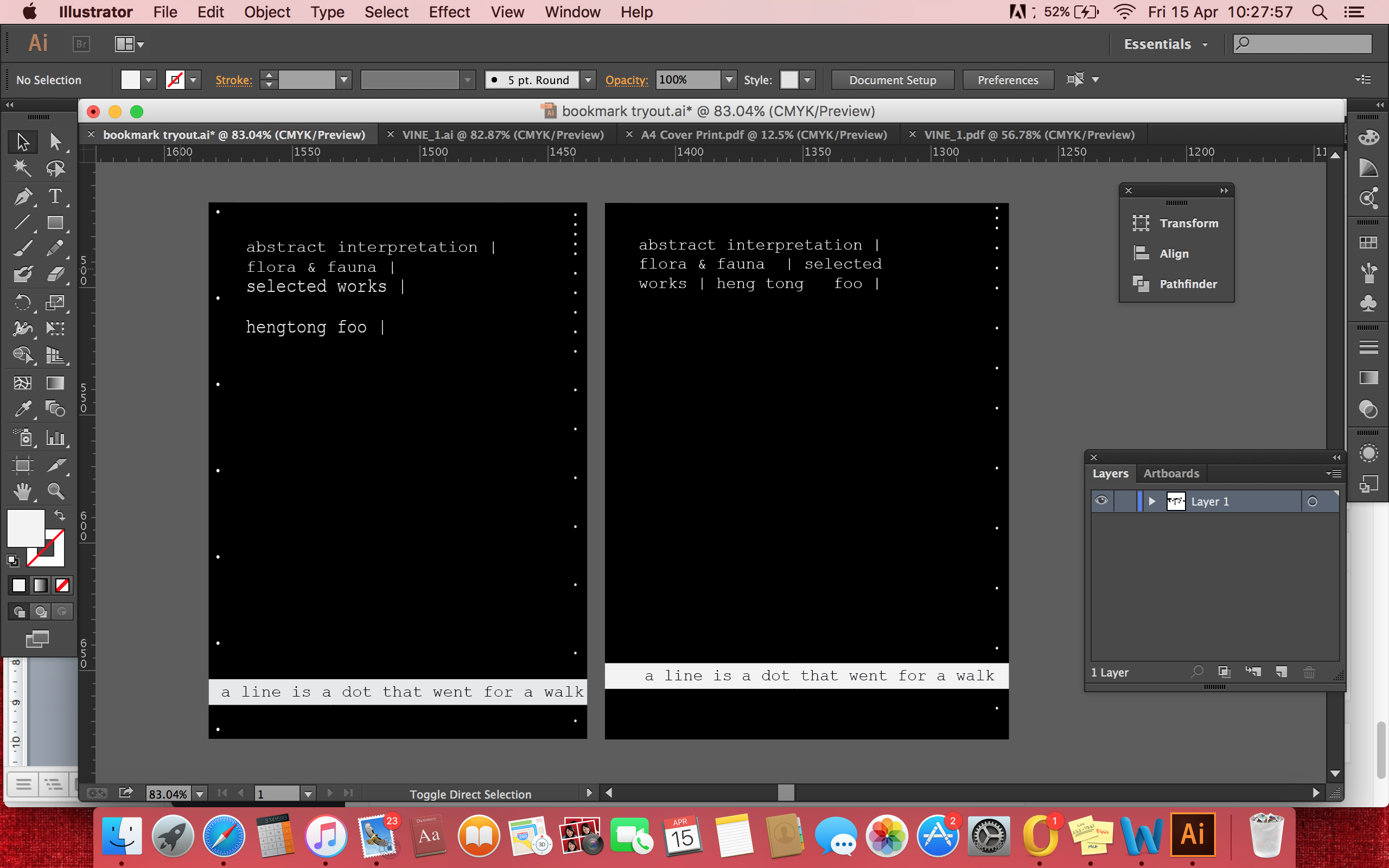
For my initial composition, I scanned all my artworks and enhanced the details through photoshop. I then created each artwork to be flushed to one side of the page and with the title and 2 lines to explain the individual designs.

Screen Shot 2016-04-15 at 10.11.57
Tried different compositions for the Cover design

Screen Shot 2016-04-13 at 16.56.53

I planned to create each artworks as a bookmark, to be able to be torn away from the page through perforated lines. From the initial idea, I realised that the artworks are flushed in the wrong direction, to the side to be bound into a book.

Screen Shot 2016-04-13 at 17.03.30I redid the compositions and derived with my first mock-up of the zine.
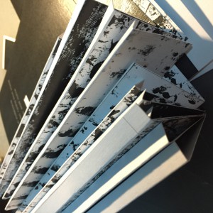

Mock-Up

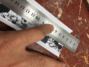
The mock-up was printed on 300gsm high gloss paper. There were a lot of issues to be addressed from the mock-up. Alignment issues and font size issues can be seen only after printing out the physical copy. Also, the holes to be bounded were too small.

IMG_2698
Print on High Gloss 300GSM paper

Consultation

Got a lot of ideas from Prof and my peers on how to improve my model.

* Use of textured paper <thanks Amy!>

* Extend the life of the zine, as perforated bookmarks will eventually leave the zine empty <thanks Darren!>

* Binding type, alignment issues <thanks Professor!>

* Looping of cord at the top can hang the book <thanks Professor!>
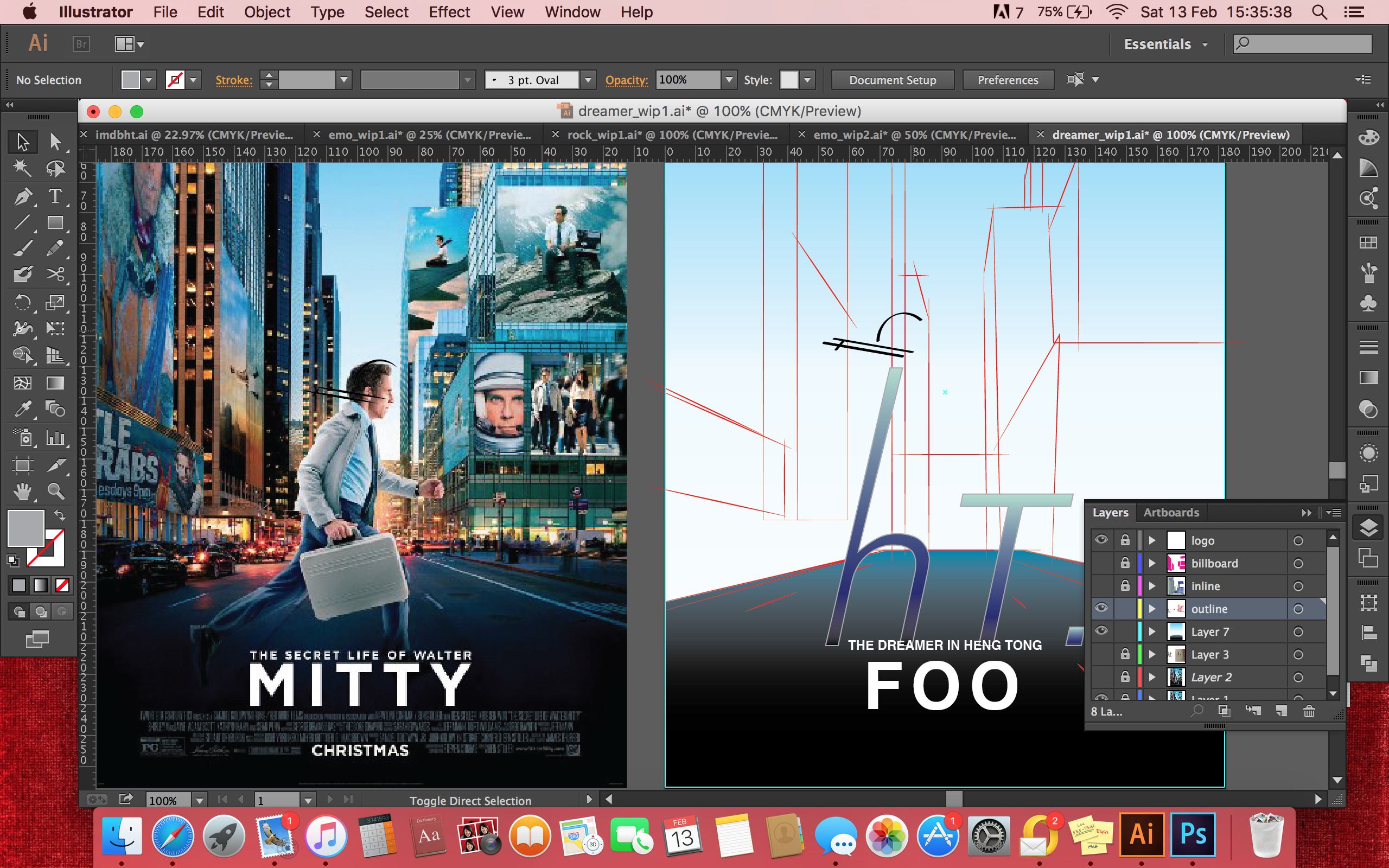
Remodelled Zine

After consolidating the feedbacks, I look to extending the shelf life of the Zine, thus I scrapped the idea of tearing the bookmark from the page through perforated lines. Instead, I went with the idea of slotting pockets to contain the bookmarks. This way, the shelf life of the zine is extended.

To counter the alignment issues, I paid careful details while reformatting the zine pages on Illustrator.

Other issues that were previously unknown to me were pointed out by Professor.

Screen Shot 2016-04-15 at 10.27.57
Flushing of texts, Centralising of sentence
Text flushing
Text flushing
Overall layout
Overall layout

I developed the bookmark idea from to be teared by perforated lines to the use of an additional pocket.  This way the lifespan of the Zine is extended. Also, the zine is printed in textured paper as suggested by my peer.

Added an additional white box to be folded after printing
Added an additional white box to be folded in after printing to create pockets

Printing and consolidating the Zines

Issue encountered

Addition of an extra flap to be folded into a pocket to contain the bookmark sounds feasible, but due to the thickness of the paper of 300GSM, the fold made the page really imbalanced in thickness.

Thus, I reprinted the pockets in 120GSM paper, so it doesn’t interfere with the thickness of the individual page, at the same time retaining the durability of the pocket.

Additionally,

the slight bump on the page compiled with the textured paper will induce the user to feel the artwork and then find the bookmark hidden within the pocket.


Binding

For my binding, I decided to use cords to be stringed through in ring-bound format.

IMG_2714
Trying out different styles
Use of Jute Cord as the bristles give off an organic touch, coherent with the theme

IMG_2636IMG_2637

IMG_2639
Changing colour of Jute Cord to fit the monochromatic theme

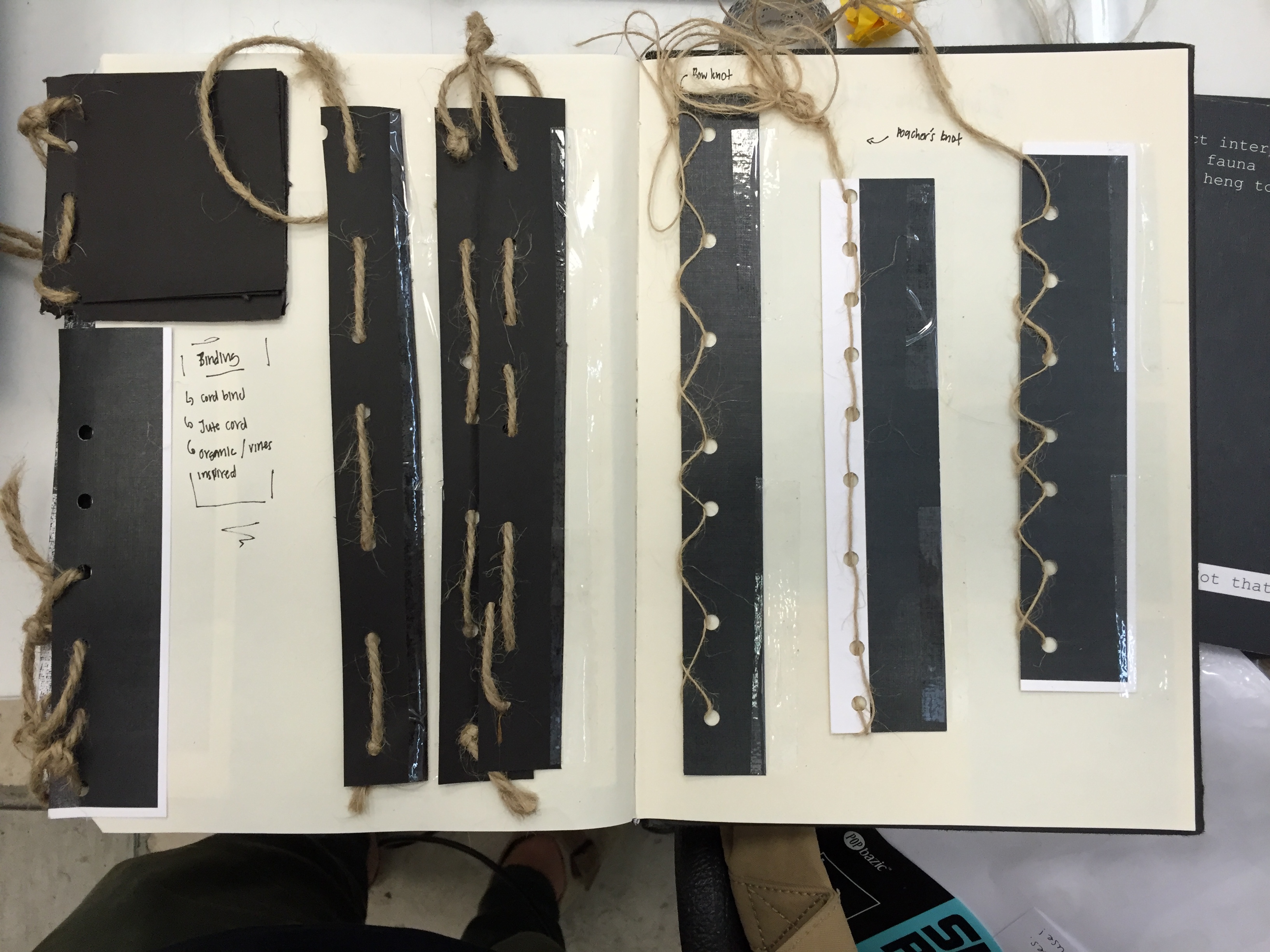
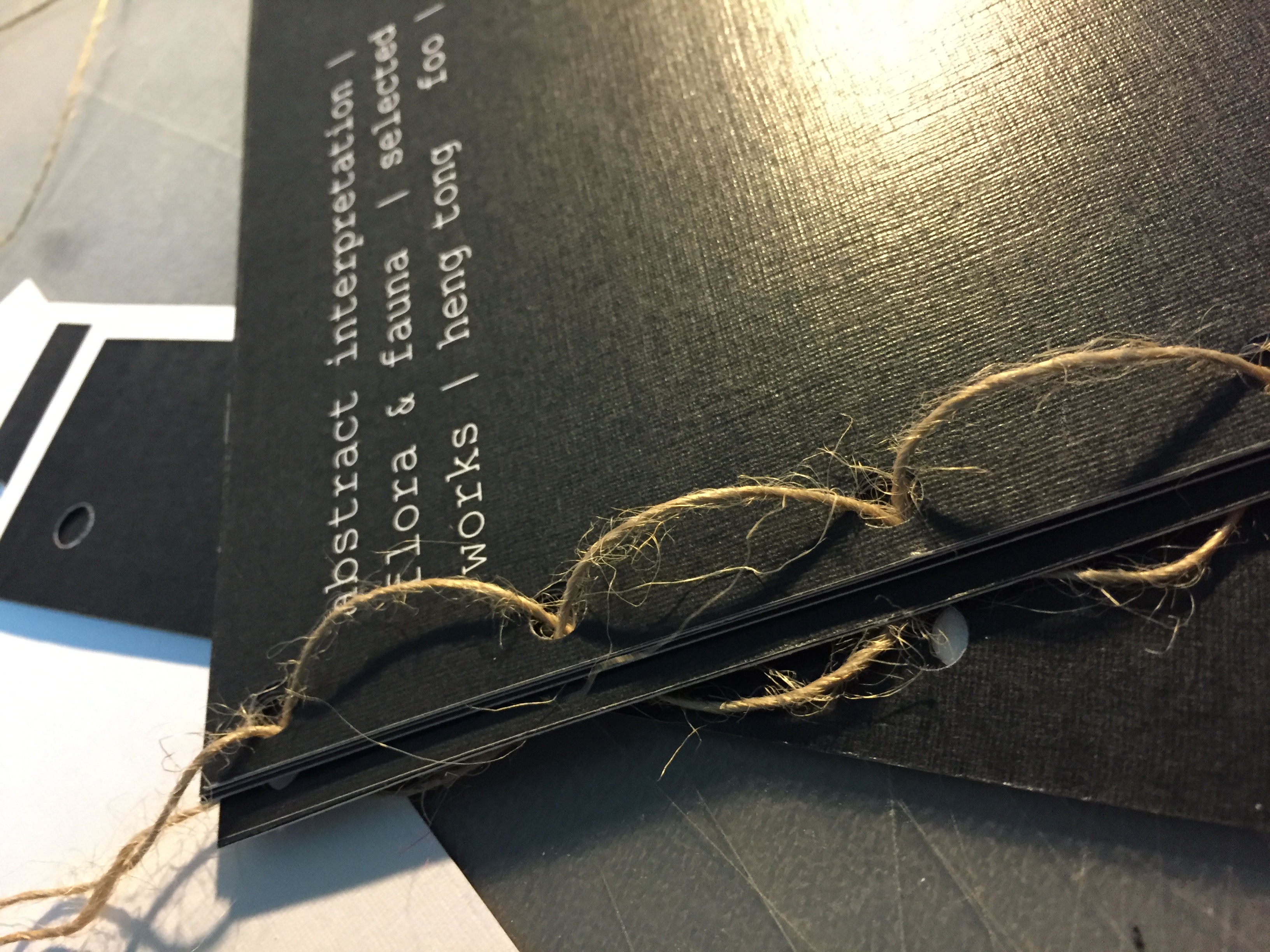
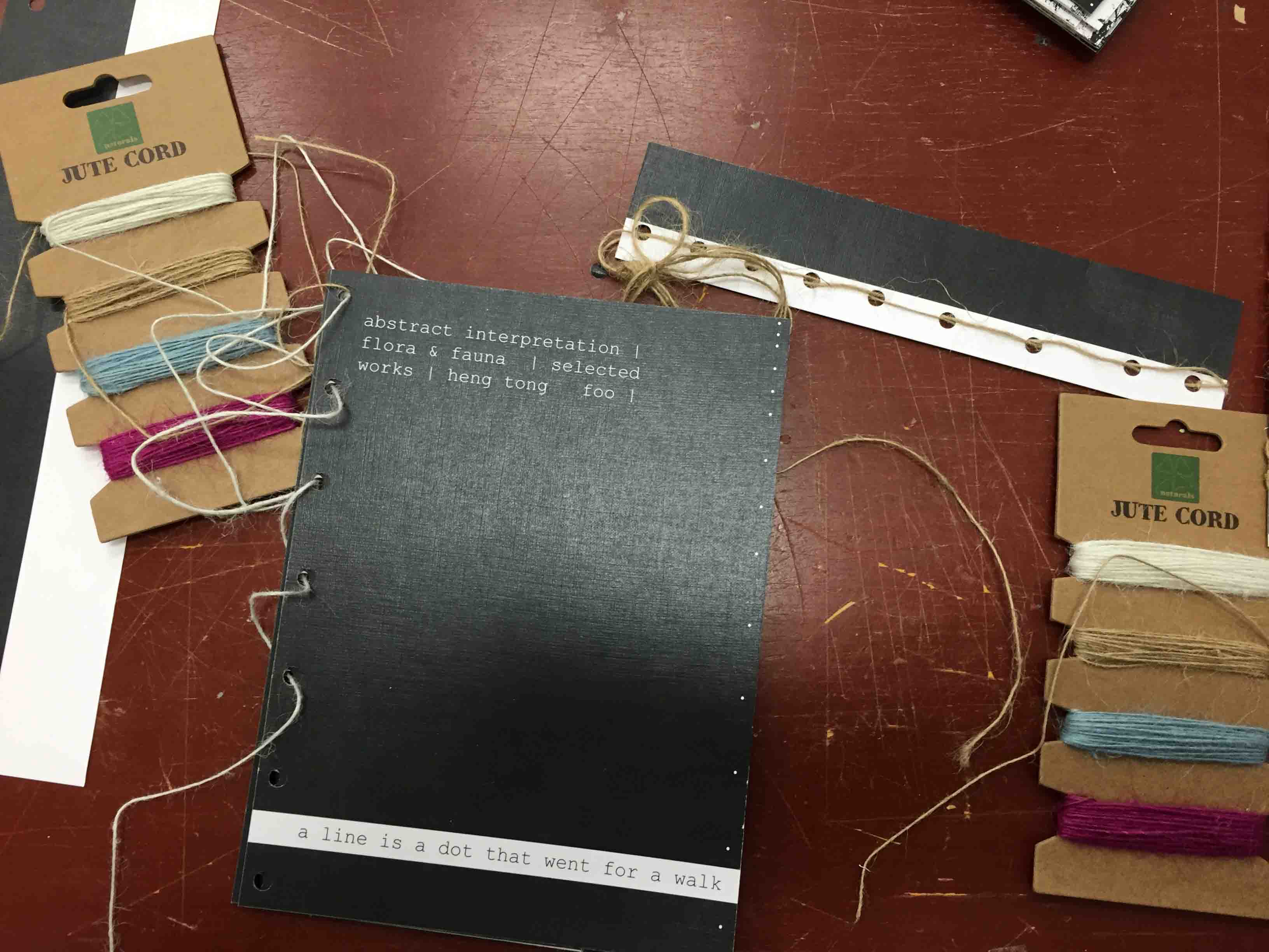
Jute cord intertwining the punched holes as vines.

At the top of the bind is an additional loop of poacher’s knot enabling the zine to be hung. A purely decorative feature that is coherent to the organic theme as “fruits hung on tree”.


To be continued.

POV [Progress >>> Final]

POV

OBJECT = BOTTLE


Was really struggling to bridge the 2 initial ideas of [Environmental] and [Nostalgia] themes throughout this project. Ultimately decided to bridge the 2 themes together through Execution.

Execution = Digital Manipulation + Abstract paintings using Bottle as medium


Chosen 6 POVs:
Bottle from POV of a Citizen is Expendable.
Bottle from POV of a Bird is Suicide.
Bottle from POV of an Up-cyclist is Rebirth.
Bottle from POV of a Mother is a Mere Bottle.
Bottle from POV of a Primary School Kid is a Prized Possession.
Bottle from POV of a Fighting Fish is a Solitary Cell.

Execution:

BOTTLE PHOTOSHOOT

Collected as many varieties of Plastic Bottles and did a makeshift photoshoot to be used in the final composition.

bottle photoshoot compliationTook out the labels, took photos of the plastic bottles in different forms such as chilled, crushed, empty, capped and without cap.

ABSTRACT PAINTING

Compliation Scans

Used Acrylic Paint on Acrylic Paper and various parts of the bottle to paint. Some interesting parts include the grooves of the bottle caps, grooves of different bottles and the bottom of the different bottles.


Ideas:
Bottle from the POV of a Citizen is Expendable.

bottles

Idea is based on how readily available Plastic Bottles are in a City, and how readily abandoned they are. I made used of the Map of Singapore to convey the idea of a City, and created the composition using crushed bottles. Crush bottles are used for the idea of how easily abandoned the plastic bottles are. Finally added painted bottle caps of different colours to show the vast variety of bottles.

Final Composition

POV citizen

Bottle from the POV of a Citizen is Expendable.

Crushed bottle forms the Map of Singapore. Different coloured bottle caps signify the variety. The crushed bottles looks to be floating on the sea, signifying the idea of easily abandoned.

Bottle from the POV of a Bird is Suicide.

Unknown

Idea is based upon the images captured of birds who choked after ingesting bottle caps that have floated on the sea thinking that they are edible.

Digitally manipulated the head of the Myah, one of the most common birds in Singapore, and a crushed bottle. Crushed bottle signify death of the bird. Added the painted bottle caps in the form of blood and the noose to tell of the bird being choked to death. Made adjustment to the size of the bottle caps digitally.

Final Composition

Bottle from the POV of a Bird is Suicide.

The idea of a noose was suggested during the group consultation by Andrew. Many thanks brother.

Bottle from the POV of an Up-cyclist is Rebirth.

4534417388_1feb5d0f80_z

Idea is based on Upcycling and giving new life of  recycled objects. The idea of using bottle to form the shape of the tree and painting leaves and flowers using the bottle. The use of the Bottle Tree from the Bottle Tree Park was sprouted from the Group Consultation.

Final Composition

POV treehugger

Bottle from the POV of an Up-cyclist is Rebirth.

Bottle was coated with brown paint to show the idea of a tree. The different bottle caps painted green signify leaves while the blue and red flowers signify growth and Rebirth.

Bottle from the POV of a Mother is a Mere Bottle.

The idea was generated during the group consultation (again). Prof Joy mentioned the idea of having different caps to the bottles just because they fit. I felt it was really interesting and a powerful motif to be conveyed.

Used the Idea of portraying 3 bottles in 3 different compositions. Added the mismatched painted labels and bottle caps. Played around with different bottles but felt that a uniform composition is more powerful.

Final Composition


POV mother

Bottle from the POV of a Mother is a Mere Bottle.

Bottle from the POV of a Primary School Kid is a Prized Possession.

Idea was based on the Clip-Strap that clips to any bottles that was really popular among the Kids, when I was young. The Clip-Strap has since become obsolete.

Initially I used the word ‘Accessory’ in my ideation. I decided to look back at my family’s old albums to see if I have any pictures taken of my bottle when I was a Kid.

Yup that was me then. Looking at how happy I was with my Bottle, I felt that the bottle signified more than an Accessory, but a Prized Possession.

I again based my Composition using 3 bottles. I base my idea on showcasing the straps on the bottle, similar to how Jewelries are showcased in Shops. I used the bottle of a similar shape, however nobody recognised the relation during the initial composition. Thus I added my face as a Kid, and dragged my siblings faces into the final composition. I made use of the grooves of the bottle caps to paint the strap of the Clip-Strap.

Final Composition

POV Prized Possesion

Bottle from the POV of a Primary School Kid is a Prized Possession.

Bottle from the POV of a Fighting Fish is a Solitary Cell.

The idea is fairly simple. I wanted to compose the image as a fighting fish trapped as a Prisoner in a bottle. I made use of the side grooves of the plastic bottle to signify the idea of cell bars.

Initially the idea looked fairly finished, but the idea of a cell wasn’t really conveyed. Also the composition did not fit the general format of the 5 other pieces. I redid the composition in 3 bottles with 3 different fighting fishes.

Final Composition

 POV FIGHT

Bottle from the POV of a Fighting Fish is a Solitary Cell.

Final Composition

final Composition


Rejected Ideas:
Bottle from the POV of a Hiker is Mandatory.

Idea is based on Water Bottle as an essential pack for a hiker. Added the idea of 2 extra mountains to simulate the idea of Lungs, and wanted to paint the image of a rib cage over the image. Felt the idea wasn’t conveyed  strongly and didn’t fit the theme, thus REJECTED.

Bottle from the POV of a Novice Cook is a Measuring Tool.

POV novice cook

Idea is based on using the bottle as a measuring tool. Used powder to simulate the idea of flour over the bottle. Composition felt unfinished and weak in execution, thus REJECTED.


Final Thoughts

Having struggled with 2 conflicting ideas throughout the project, I felt that the group consultation was really useful. I am happy with my outcome.


End.

typography [work in progress #04]

typography

work in progress #04


My name is hengtong and I am a movie fanatic.

Screen Shot 2016-02-11 at 22.04.10

Pretty simple re-dipiction of the IMDB logo/ Read IMDB as “ I am DB”, swopped the idea around to “ This is HT”.

Overall little too literal to the actual logo, but I like the outcome as it clearly defines me as a movie fanatic.


My name is hengtong and I am emotional...

Screen Shot 2016-02-11 at 22.03.49

inverted the original movie poster to the back view, character is looking down showing an emotional pose/ Use of graphic illustration to depict the letters H and T, however too lifelike, difficult to distinguish the letters, will need to simplify.


My name is hengtong and I love Rock!

Screen Shot 2016-02-11 at 20.51.13Screen Shot 2016-02-12 at 00.10.16

Replaced the electric guitar to a bass (which I am learning to play)/ added my hat to the letters of h and t/ again too lifelike, difficult to distinguish letters H and T.


My name is hengtong and I am a dreamer ;;;

Screen Shot 2016-02-13 at 15.35.38

not telling of the attribute/ will need further development


To be continued.


typography [work in progress #03]

typography.

work in progress #03


Concept: #MovieParody

My name is Heng Tong and…

I am a Movie Fanatic.
I am emotional...
I love Rock!
I am a dreamer ;;;

Idea

#MovieParody

Using movie posters to convey individual attributes. Previously, tried to extend my research onto movies from other Countries and attempt to guess the gist of the movie from the poster.

Finally I have decided to use movie posters from existing movies that I have watched before. This is so that I am able to fully understand the movie and how the poster relates to it.

I will attempt to recreate each movie posters as a typography.


Study of movie posters

Interesting read on the 7 elements of creating a great movie poster: http://www.webdesignerdepot.com/2011/02/7-elements-of-a-great-movie-poster-design/

Break down of article:

  1. Attention – Jump out from the wall
  2. Iconography – Showing without telling
  3. Interest – Create an incentive to see the film
  4. Appeal – Create Desire with Fans and Non-fans
  5. Style – A look that’s consistent with the Film
  6. Lasting Appeal – A look that suits other formats
  7. Recognisability – If it’s a sequel, make it obvious

Matching Attribute to Movie Posters

#01 My name is Heng Tong and I am a Movie Fanatic.

Concept: Making use of the IMDb logo as an indication of the vast amount of movies that I have watched / Use of the IMDb website to bridge the other 3 attributes together as a movie poster parody.

Screen Shot 2016-02-09 at 12.52.34 copy

Ideation:

sk4

===

#02 My name is Heng Tong and I am emotional…

Movie(s) I relate to:

MV5BMTYzODgzMjAyM15BMl5BanBnXkFtZTcwMTI3NzI2MQ@@._V1__SX1126_SY585_Forgetting Sarah Marshall

R | Comedy, Drama, Romance | 2008

Plot Summary: Devastated Peter takes a Hawaiian vacation in order to deal with the recent break-up with his TV star girlfriend, Sarah. Little does he know, Sarah’s traveling to the same resort as her ex – and she’s bringing along her new boyfriend. (Taken from IMDb)

Character Study: Peter Bretter (main protagonist) is an emotional and sensitive adult going through a rough breakup. free spirited, at the same time making a joke out of the movie.

Similar traits with me: Emotional, contrasting facade, Mismatched facade.

Movie Poster element: Attention/ Interest/ Appeal. Jason Segel stars at the main protagonist. He is well known as a Comedic Actor thus appealing to the audience as the Comedic genre of the movie. His sad expression and the drawing of a shattered heart tells of the romance genre. However, there is little to no indication of the sexually explicit content of the actual movie.

Ideation: 

sk1

===

#03 My name is Heng Tong and I love Rock!

Movie(s) that I relate to:
MV5BMjEwOTMzNjYzMl5BMl5BanBnXkFtZTcwNjczMTQyMQ@@._V1__SX1126_SY585_School of Rock

PG-13 | Comedy, Music | 2003

Plot Summary: After being kicked out of a rock band, Dewey Finn becomes a substitute teacher of a strict elementary private school, only to try and turn it into a rock band. (Taken from IMDb)


Character Study: Dewey Finn (main protagonist) is a motivated, fatherly mentor who is inspiring for his fellow students, while imparting his skills to them as they chase his dream.

Similar traits with me: Rock running in bloodstream, failed musician, spirit of rock

Movie Poster element: Attention/ Interest/ Appeal. The posture of Jack Black as Dewey Finn shows himself holding the electric guitar as he gestures the ‘rock’ hand symbol. This shows the movie genre to be about Rock Music, and the manner the students are dressed in the background shows the contrast of his formal attire.

Ideation:

sk2

===

FrankMV5BMjM0OTczMTcxOV5BMl5BanBnXkFtZTgwMDU1MDUwMjE@._V1__SX1126_SY585_

R| Comedy, Drama, Music | 2014

Plot Summary: Jon, a young wanna-be musician, discovers he’s bitten off more than he can chew when he joins an eccentric pop band led by the mysterious and enigmatic Frank. (Taken from IMDb)

Character Study: Frank is an eccentric, enigmatic frontman of the alternative band ‘The Soronprfbs’, who wears a mask to face the world. Frank is not bothered by the public who perceives him as bizarre, but loses confidence as the public start to judge him for his music. Frank is different, but embraces that factor.

Similar traits with me: Eccentric, Alternative, Different

Movie Poster element: Iconography/ Lasting Appeal. Shows the mask of Frank. Nothing is telling except for the strong influence that the film is loosely based upon the comedic persona ‘Frank Sidebottom’ in the 1980s.

Ideation:

sk2

===

#04 My name is Heng Tong and I am a dreamer ;;;

Movie(s) that I relate to:
the-truman-show-posterThe Truman Show

PG | Drama | 1998

Plot Summary: Truman Burbank is an insurance agent who is oblivious that his whole life is a staged reality T.V show with cameras hidden and actors acting as his friends, until one day he discovers that his whole life is a set-up.

Character Study: Truman Burbank (main protagonist) is a good natured man living in a routined, normal life. He is motivated, ambitious and adventurous as he chases for an unlikely dream to move to Fiji even as the actors around his life dissuade him. Eventually overcomes his fear of water as he pushed for the truth.

Similar Traits with me: Gullible, Oblivion, Motivated

Movie Poster element: Appeal/ Interest. Shows the main protagonist asleep in a large screen across the busy street of New York. Tells that the Truman Show is ‘popular’, as the main protagonist sleeping peacefully, oblivious of the sadistic truth that his life is a reality programme.

Ideation:

sk5

===


MV5BODYwNDYxNDk1Nl5BMl5BanBnXkFtZTgwOTAwMTk2MDE@._V1__SX1126_SY585_

The Secret Life of Walter Mitty

PG | Adventure, Comedy, Drama | 2013

Plot Summary: When his job along with that of his co-worker are threatened, Walter takes action in the real world embarking on a global journey that turns into an adventure more extraordinary than anything he could have ever imagined.

Character Study: Walter Mitty (main protagonist) as a dreamer, who never acts upon his desire. His imaginations takes him really far but he is always  stagnant. Finally decides to reach out for his goal and subsequently goes on a wild adventure.

Dreamer, Wild Imaginations, traveller

Movie Poster element: Interest/ Appeal. Ben Stiller is recognisable as a Comedic actor. He is seen portraying different personas from the many billboards in the distance. The main body is seen running in the direction, presumably towards his goal/dream.

Ideation:

sk3


Chosen Ideation

I am a Movie Fanatic. [ IMDb Logo Spoof]

I am emotional… [ Forgetting Sarah Marshall Poster Spoof]

I love Rock! [School of Rock Poster Spoof]

I am a dreamer ;;; [The Secret Life of Walter Mitty Poster Spoof]


To be continued.


typography [work in progress #02]

typography.

work in progress #02


Concept: #MovieParody
  • Using movie posters to communicate selected attributes
  • Identifying movie characters and how they relate to my attributes/ me
  • Character study; whether the movie poster justifies the actual content of the movie, if not how to?

Group Consultation takeaways
  • Looking into different movie posters of other Countries/ Languages
  • Manipulating other ways of showcasing my name as typography
  • How audiences see the poster VS how the producers want the audience to view
Looking into different movie posters of other Countries/ Languages

*How Audience sees the poster VS how the producers want the audience to view

Previously, I only chose to use movies that I have watched for my research. Most of the movie only consist of english movies from America and United Kingdom. It was pointed out that appeal of movie posters to audience differs from Countries/ Culture. (for instance Bollywood Movies 😉 )

Therefore I decided to look at movie posters from across different Countries and attempt to decipher the genre and film styles. (note: I looked at posters of films I haven’t watch)

After which, I will compare the actual content by reading the Plot Summary to gage my deduction skill.


A Perfect Day (Italian Film)

images-2HT’s thoughts: Movie poster depicts the 5 main characters looking down towards probably a suspect through interrogation. The characters all stare with a solemn expression. The 5 main characters consist of 3 males and 2 females of different age group. The bottom 2 males placed with bigger than the rest look to be the main characters. The backdrop shows a sky depicting the 5 characters may be outlaws on the run. Movie poster gives off a Crime/ Adventure/ Thriller genre.

Actual Plot Summary: As Sophie and her seasoned colleagues Mambru and B race against time to save the water supply for an abandoned community, they must outwit pedantic UN bureaucrats, military factions and exploitative local criminals – all the while cleverly distracting Mambru’s ex-lover Katya, who has flown in from head office to shut their mission down. A dead cow, an un-cooperative supplies store and an angry dog tied to the length of rope they desperately need: the team and their guide negotiate the seemingly simple task of extracting a dead body from a well, but staying sane proves to be the biggest challenge on this not-so perfect day. Genre: International/Drama/Comedy (Taken from rotten tomatoes.com)

Deduction Result: Far off | Epic Fail

Hunterrr (Bollywood Film)

hunterrr-brand-new-poster-mandar-ponkshes-naughty-thoughts-on-display-1
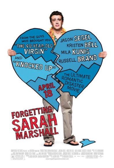
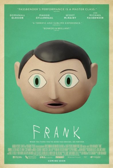
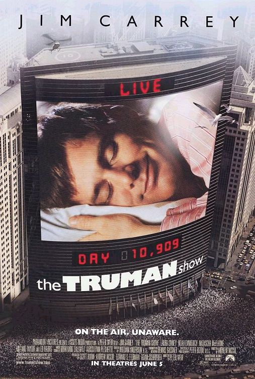
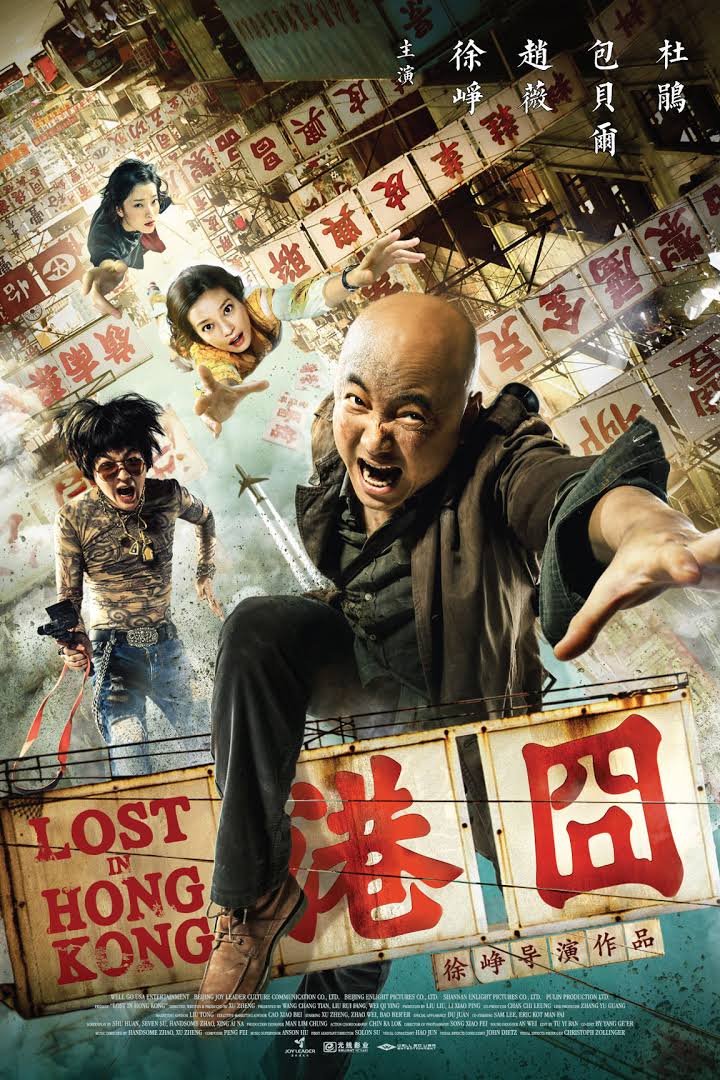
HT’s thoughts: Poster shows the cross section of the main protagonist’s mind. His mind is filled with loosely dressed ladies, and an explicit position somewhat hidden. The main protagonist’s face is showing a longing expression. Also, the complementary colours of the blue of the background complements the red from his shirt. This may infer to a simple plot. Movie poster gives off an Adult Comedy/Romance genre.

Actual Plot Summary: Mandar, an ordinary guy is obsessed with sex and chases girls until he meets Tripti and decides to settle down with her. Genre: Adult/ Comedy/ Romance (Taken from IMDb.com)

Deduction Result: Close | Passed

Lost in Hong Kong (Chinese Film)

imagess

HT’s thoughts: Movie takes place in the heart of Hong Kong with the showing of the iconic billboards of the Hong Kong street. Shows 4 different characters reaching out. The characters are dressed and looks really different. The biggest character in the poster looks to be the main protagonist and the heavily tattooed guy beside him shows some sort of comedic relief. This is in contrast to the 2 other female characters who are really beautiful. This gives off an unlikely pairing of the clique, probably meaning something  happened to tie the 4 characters together. Movie poster gives off a Comedy/ Adventure genre.

Actual Plot Summary: The film follows Xu Lai, a former artist whose dreams were dashed when the responsibilities of life set in. With his life now revolving around his wife Cai Bo who is obsessed with having children, the quirks of his eccentric family and his mediocre, ordinary existence, Xu Lai hopes to reconnect with his first love Yang YIi on an upcoming vacation. However, his hopes are dashed when he finds himself wrapped up in a murder investigation that proves truth is often stranger than fiction.

Deduction Result: Fair | Passed


From the exercise done, I am able to further understand that the movie poster may not be able to convey what the actual movie is about. Movie posters as appealing as they are made to be, have to appeal to the right audience.

Therefore, for me to communicate my attribute as per movie poster, I may need to show more of the character than the actual movie. This will means character study of the movie protagonist is essential to judge regarding the movie poster VS the actual movie. The typography has to be able to convey the attribute and at the same time draw relevance in conjuncture to the movie genre/ character.


To Be Continued.


typography [work in progress #01]

typography.

work in progress #01


My name is hengtong and

I’m a movie fanatic.
I love Rock!
I am emotional...
I am an dreamer ;;;
I prefer to work hands-on.
I am a closed- shell. 

Concept.

Typeface | 3D Typography | Movie Posters Parody

identifying hengtong as: hengtong / ht / hT / HT / 兴通

Screen Shot 2016-02-05 at 23.12.42

shortlisting/modifying

Screen Shot 2016-02-05 at 22.00.26


Typeface | 3D Typography | Movie Posters Parody

concept: to create 3D typography of everything and anything that defines each emotion/idea.

expectations: 

reality: 

(concept: I prefer to work hands on) 

using of work tools to form the letters ‘h’ and ’t’.

(concept: I am emotional) 

-using onion as a motif for tears    

-onion as the prideful escape of hiding tears

final thoughts: time to think of a new idea. [REJECTED]


Typeface | 3D Typography | Movie Posters Parody

concept: parody of movie posters to fit each of idea of illustration. 

points to ponder

  • using movie posters as the visual content
  • character study; think about whether the movie poster justifies the gist of the actual movie, and if not how to recreate the poster
  • choice of movies; types of genre; different language, culture, audience
  • manipulating typography to fit emotion
  • typography has to convey the intended emotion by itself

To be continued.


typography

typography.

= legible. readable. appealing

using typeface to evoke emotion.


research on reference artists | 3D | where exist typography

El Lissitzky .

Russian. Suprematism. Constructivism . avant-garde. abstract. geometric. art. typography

four-arithmetic-actions-1928

interesting use of letter as figures.


Futurism. Italian. 

generally very similar font used.


DADA. Switzerland

feac21712be7b38483278723830e3e58 pic2

text are random and take up all spaces available.


research on reference artists 3D | where exist typography

3D typography


research on reference artists | 3D | where exist typography

Album Art

Movie Posters

End.

Hello. my name is hengtong.

Hello. 2D II began with the class activity of Hello name cards.

We were given a blank piece of paper to ideate, and subsequently consulted Professor Joy who further developed the ideas.


Typography . Abstract . Conceptual

THISISHT. is a nickname I entitle my virtual self. An ironic play on a not-so-clean phrase such that people often do double takes to realise. I played on the idea of an illusion of mirror imaging.

type_scan2

cards_ty


Typography . Abstract . Conceptual

Drawing and sketching isn’t my forte. I prefer to use found objects to aid in my works. Often, an element of surprise exists as you don’t know what to expect when using such mediums.

I made use of tapes to construct the letters ‘h’ and ’t’, of the initials of my given name. I then coloured the blank spaces with colours. This idea reminded me of the ‘De Stij’ art movement. Mainly the painting ‘Composition C’ by Pier Mondroin.

composition-c

While taking out the tape from the card after colouring, the tears from the sticky tape onto the paper creates the surprise element such that the final  outcome cannot be replicated.

type_scan3

cards_ab


Typography . Abstract . Conceptual

Initially I planned on using flora and fauna to create a total random outcome. I further developed into zooming into the cells of the plants and found some really interesting findings.

I found the size and placement of the cells forming an illusion of letter really interesting. Through some ideation I derived at my final outcome of rearranging the cells to form the letters ‘ht’, the initials of my given name.

type_scan1

cards_con


cardss

End.

Nursery Rhymes: Three Blind Mice

final_thumnail

Three Blind Mice

Three blind mice! Three blind mice!
See how they run! See how they run!
They all ran after the farmer’s wife,
Who cut off their tails with a carving knife.
Did you ever see such a thing in your life
As three blind mice?


Research

I began my research process on the Origin of the nursery rhyme. Even when reading the rhyme as it is, there is a sense of darkness and gore. The Origin justifies this idea.

The nursery rhyme dates back to the story of a trio of Protestant bishops plotting against the Queen Mary “Bloody Mary” Tudor, ultimately fails and were subsequently blazed by the order of the Queen.

Thus, the overall theme is Dark/ Disturbing/ Gory/ Sinister/ Creepy.


Inspiration

My inspiration is based on the Da-Da Movement photo collages.


4 Final Selected Artwork


Three Blind Mice! Three Blind Mice!

Three blind mice! Three blind mice! 

The artwork is a minimalistic interpretation on how we as human beings perceive mice as. It depicts the three blind mice scampering away. I used the idea of mice looking very similar to each other, from the eyes of a human being. Thus I added the same head to all three mice. I made use of the infamous character of Peter Pettigrew from the Harry Potter series as he is the epitome of the Mouse character.

 .

1-01See how they run! See how they run!

The artwork compromises of 3 different individuals running. The idea follows the first artwork of imposing a different head to the body. This time round, the idea is reversed as the mouse head is added to the human body. Also, each individual, a small kid/ an athlete/ a gentleman , is holding onto a walking stick. The walking sticks are reinterpretated into a candy stick for the kid, a javelin for the athlete and a Japanese toothpick for the gentleman. The ‘X’ letter depicts blindness of the characters. Lastly I played with the shape of an eye forming the border of the artwork, to signify the running individuals reflected in the retina of an eye.

.

4-01-01 They all ran after the farmer’s wife,

This artwork is based on the origin of the Nursery Rhyme, and I perceived the three blind mice as courageously facing the farmer’s wife, who is not phased by their confrontation. For this artwork, I played with the use of juxtaposing animal head (Cat) on a human body; and human head on an animal’s body (Mouse). The three blind mice are seen leaping towards the farmer’s wife. I made use of the moustache of a man as a whisker of a mouse and a tail. The Farmer’s wife is purring and breathing fire out of her mouth, having a haughty expression. I also inverted the background colour and play with the negative film effect.

.

3-final-01-01Who cut off their tails with a carving knife.

For this artwork, I played with the dark, sadistic notion with gory effects. I made the background off-centre to give more dynamism to the artwork. Again, the idea of juxtaposing from the previous artwork, is inverted. The blind mice are seen having their tails cut out, with blood spilling all over. The farmer’s wife is in a Cat’s body and leaping out with a knife that is dripping blood.


Process

I began my process by sourcing for magazines for cut-outs, but I wasn’t able to really get inspired by the diversity of the majority images. I moved on to Photography books and also made use of images from the internet and movie screen caps.

Process_1


Initial Artworks

“Three blind mice! Three blind mice! See how they run! See how they run!”

“They all ran after the farmer’s wife, who cut off their tails with a carving knife.”


Development

Three blind mice! Three blind mice!

4
See how they run! See how they run!

3

They all ran after the farmer’s wife,

1
Who cut off their tails with a carving knife.

2


Reflection

I personally love the Nursery Rhyme theme for this assignment. I have always been intrigued by Surrealism and Dadaism, therefore I was pretty happy working on this project.

Initially I wanted to base all my illustrations on purely magazine prints, but the images gathered was not strong enough, which in a sense killed off a lot of working time.

Overall I do feel that my final images do not really convey my intention and ideas as much as I would have liked. However, I am really pleased with the ideation behind each artwork and I am still happy with the final outcome.