
Ikebana with Found Objects

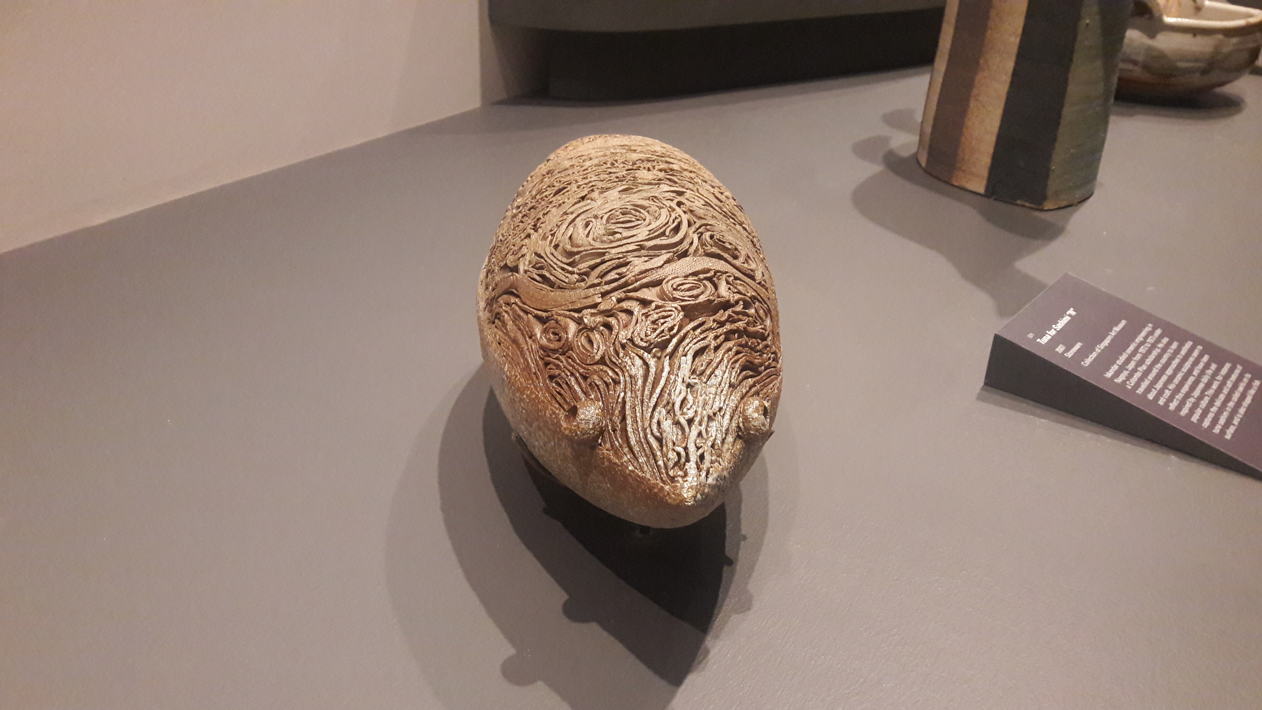
One example of his works that represents the essence of these Japanese aesthetic is Tuna for Sashimi “N”. It is a sculpture of a tuna is made from stone. The sculpture was inspired by Japanese daily life and popular culture.

As you can see from the picture, the tuna’s upper surface has texture that is meant to represent tuna sashimi being coiled. There is no sense of symmetry in the placing of each coil hence created a very organic look towards the fish.
This perhaps was the artist efforts to portray the concept of wabi-sabi which is beauty in imperfection. And its relatively small scale and material of the sculpture arguably creates a sense of humility. And the fact that he chose a tuna as his subject matter further emphasize that point.
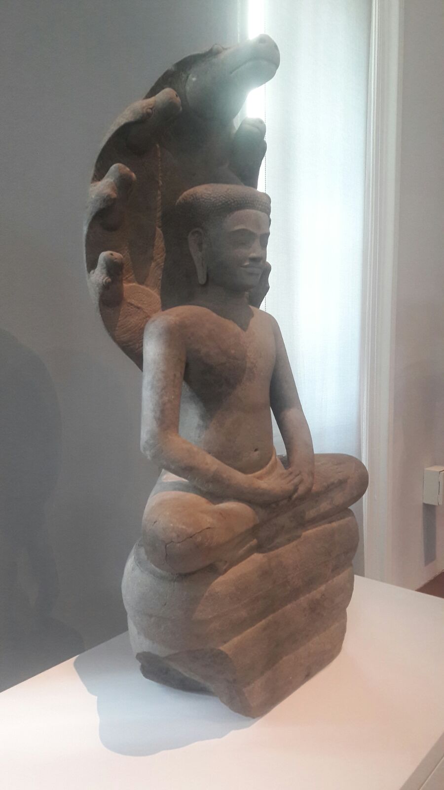
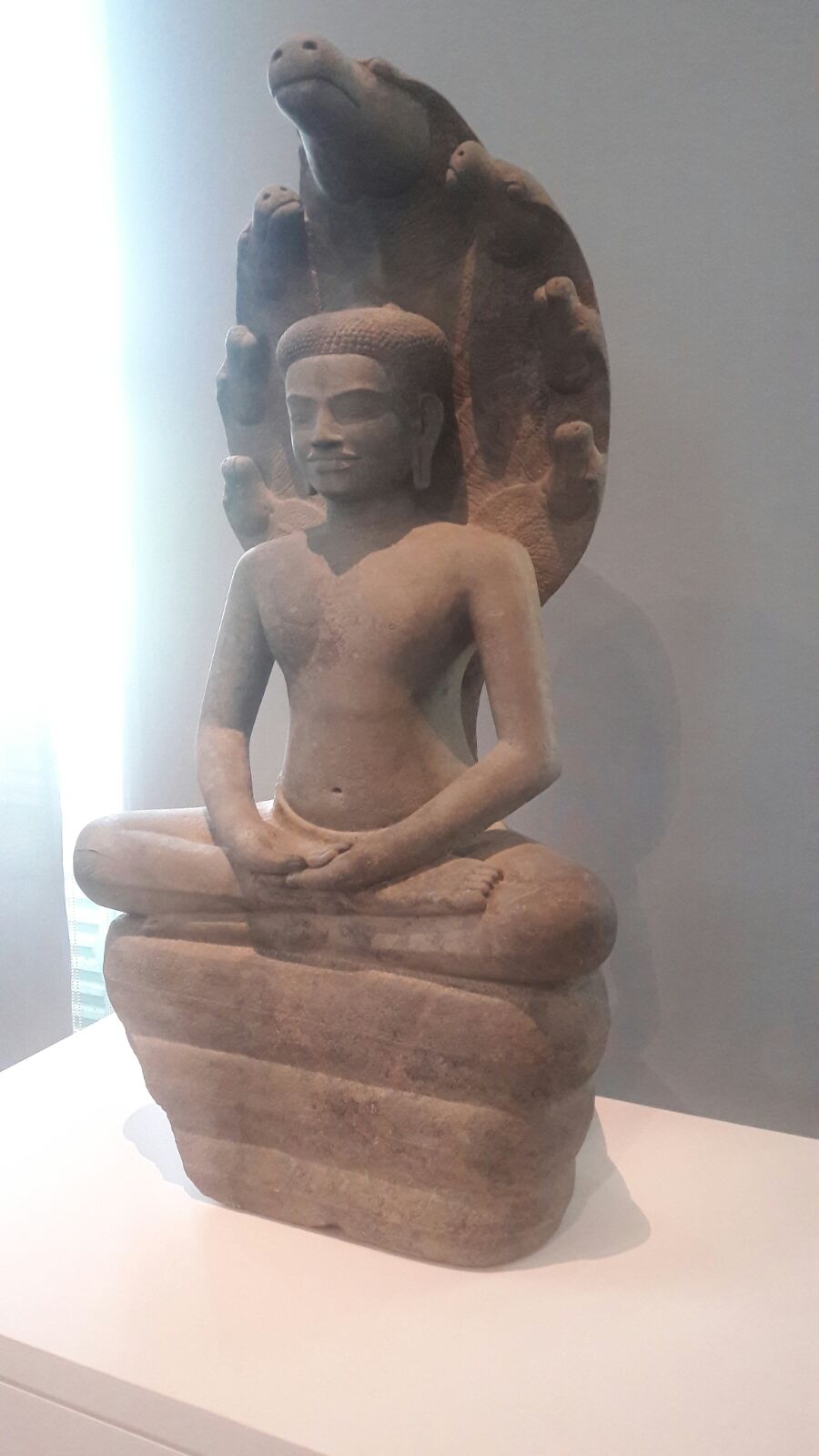
Buddha Protected by Naga Muchalinda
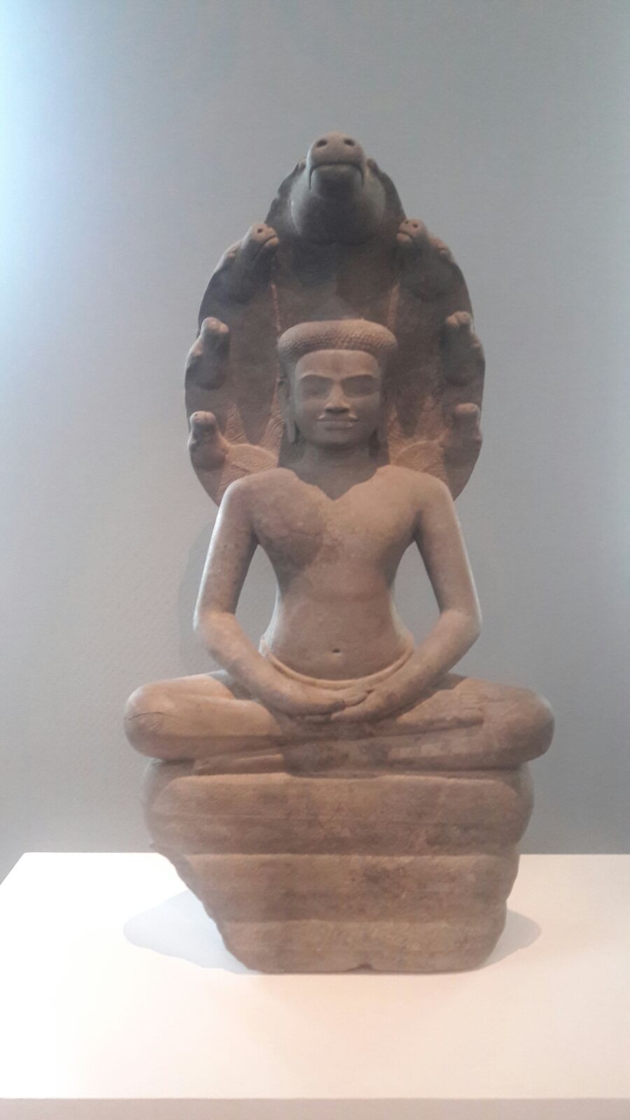 Cambodia, 11th – 12th CE, sandstone
This statue’s size is roughly half of a normal human size. Another thing to note is that the statue is roughly symmetrical.
Left (left), back (center) and right (right) views of the statue
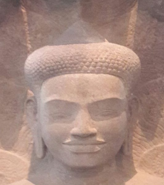
We can identify the centre figure in the statue by Buddha because of several characteristic: the body pose which is the sitting Buddha, the mudra hand gestures, top knot on his head, the elongated ears, the flowing robes (pants) and the fact that he has no jewellery on him. It is interesting to note that this Buddha is smiling.
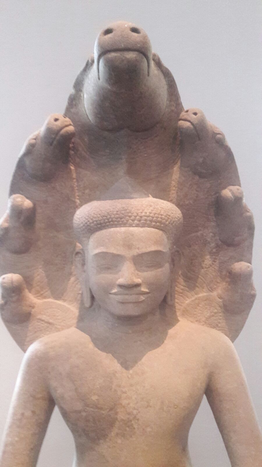 Buddha is smiling
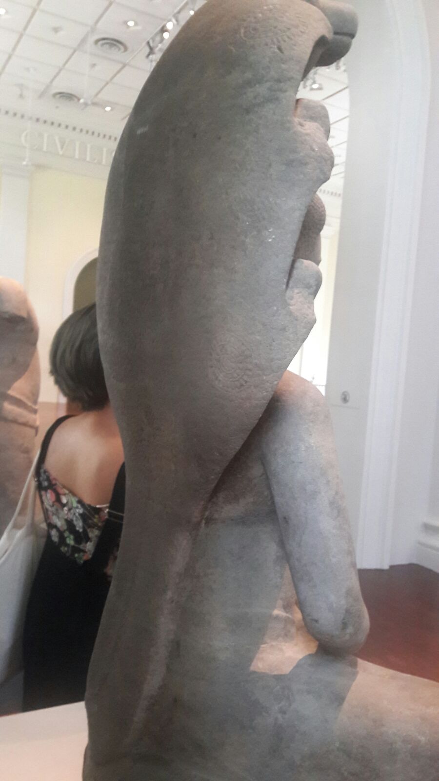
The creature on the back of Buddha is a Seven Headed Snake. As you can see at the picture the size of the heads differs. The top centre one is bigger than the rest and it is looking the same direction as the Buddha, whilst the others are looking towards the centre serpent head.
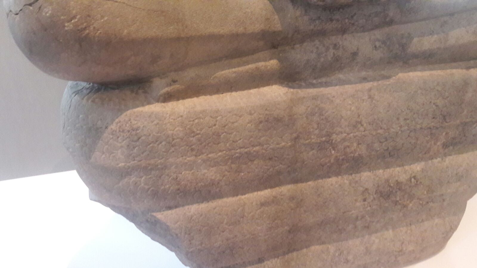 Closer detail of the serpent’s scales
The Buddha is sitting on the Seven Headed Snake’s body. The Seven Headed Snake’s body is coiled three times. The scales have been intricately carved to further emphasize that this creature is some type of lizard. The scales are also present at the back of the statue. This might accentuate the fact that this statue is supposed to be viewed 360-degree view (except for the bottom). Other that scales, on the chest and on the back of each of the serpent’s head we can see a circle motive which can be used to further identify the identity of this creature or perhaps it is used as decoration.
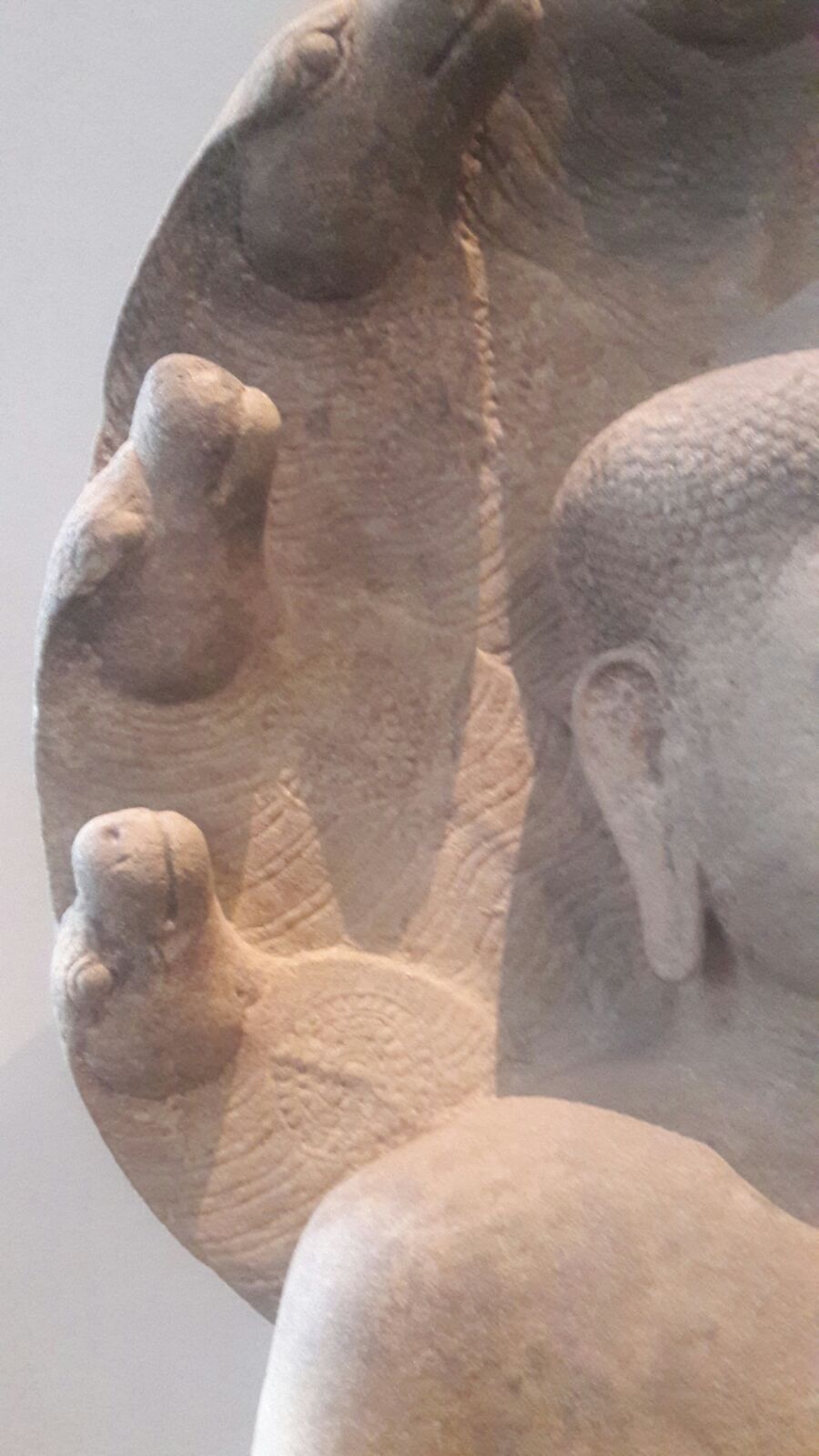 Closer detail of the serpent’s heads
Word count: 241 (Description only)
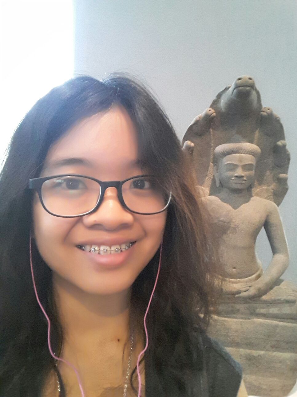
Selfie time! Oh look he’s smiling too!
As I have previously mention on my other posts I used a couple elements to unify my zine which are
I always have a vocal point in each spread. The cat, the dog’s head, the whipping hand and the moon and cows became the main focus in each composition.
I used monochromatic and complementary colors. The monochromatic is used to identify my Rhyme project, the central image (dog’s head, whipping hand, the moon and cows). Then used blue hues on my background so it would complement my orange title text.
This was a recurring themes in each of my Rhyme project. Besides balancing and giving a rhythm to my spreads, I personally like them, so I decided to keep them
Using Adobe Indesign I added additional titles and texts:
FRONT AND BACK COVER PAGE
I added my name in the cover page, and added contact information at the back cover.
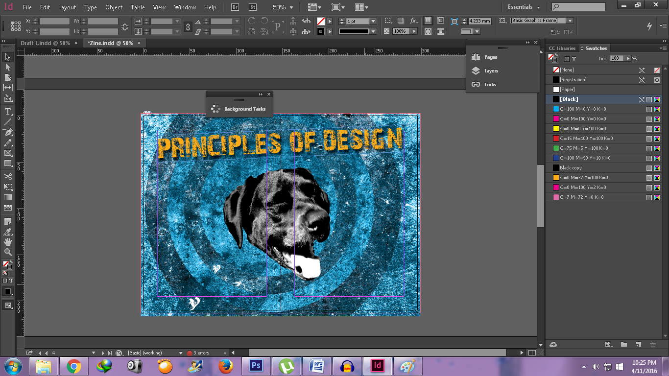
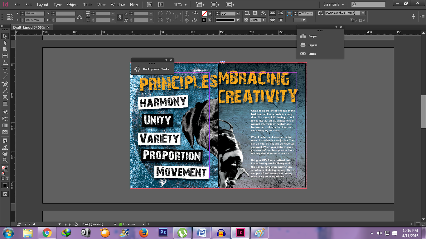
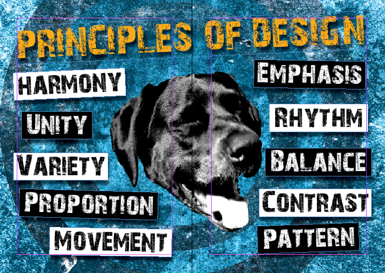
PRINCIPLES OF DESIGN
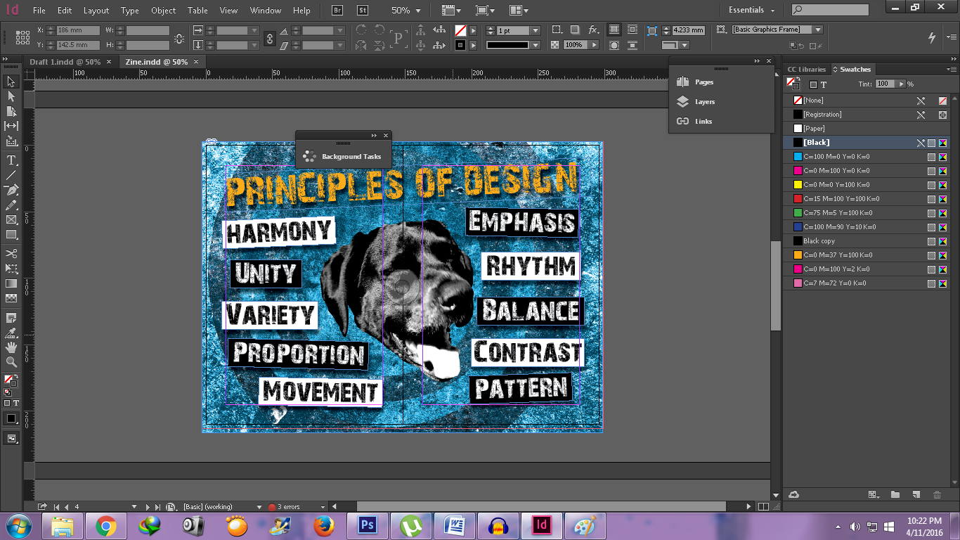
I decided to make boxes for each principle of designs.
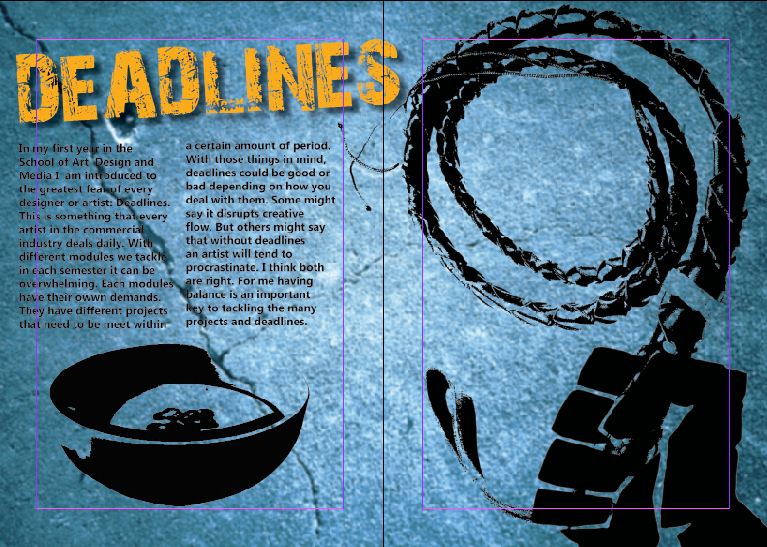
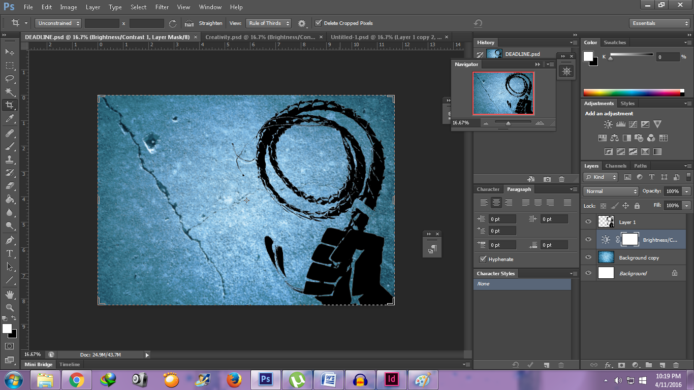
DEADLINES
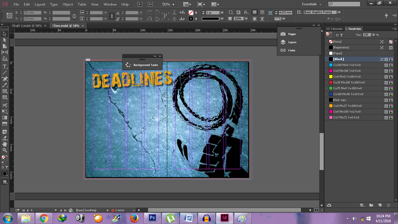
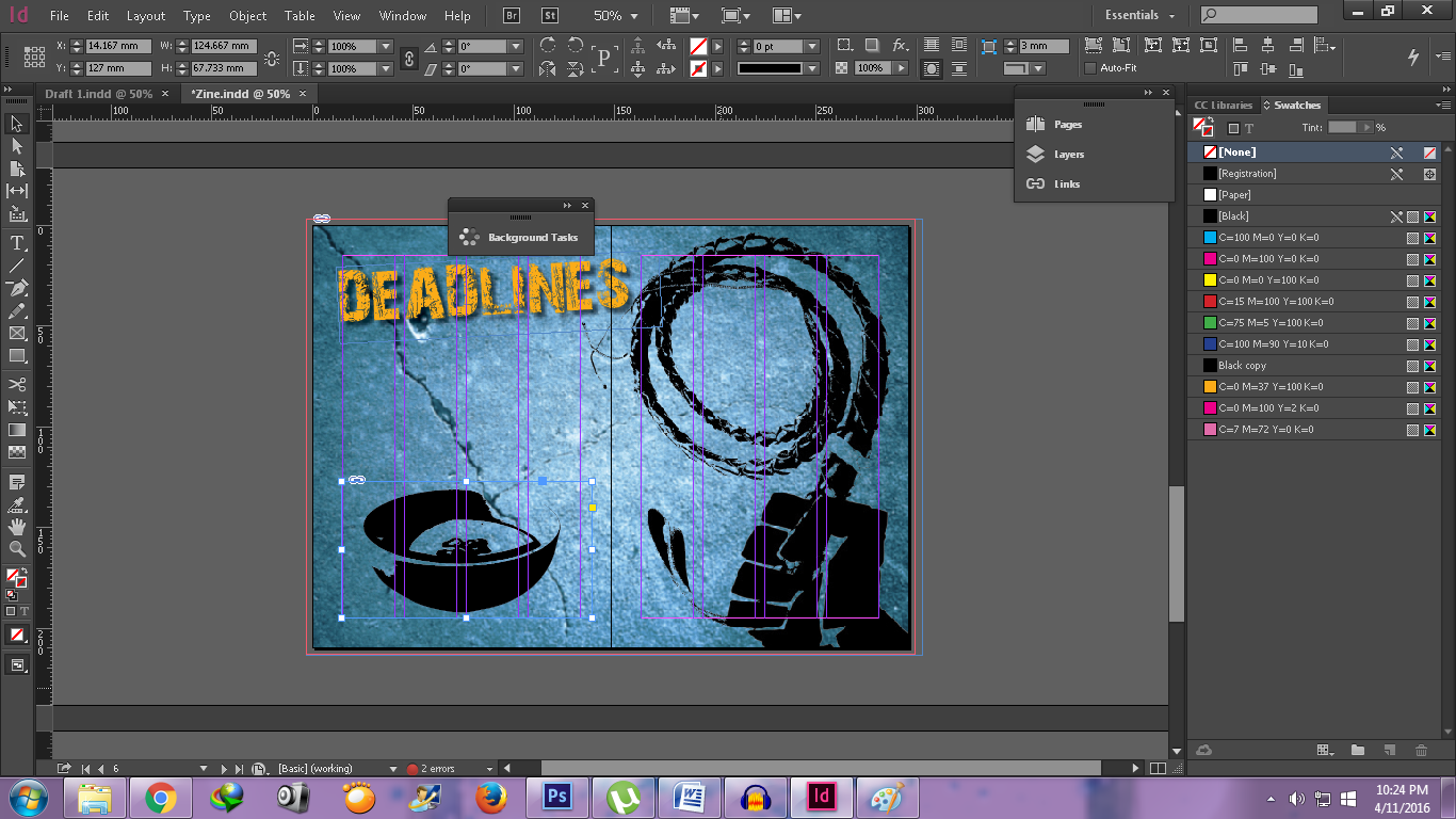
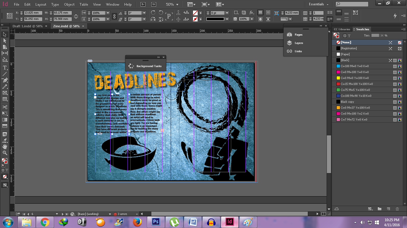
I added a bowl on my “Deadlines” spread because I did not have sufficient text to cover the whole left page.
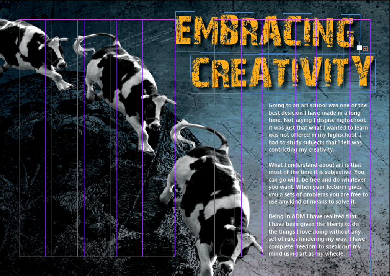
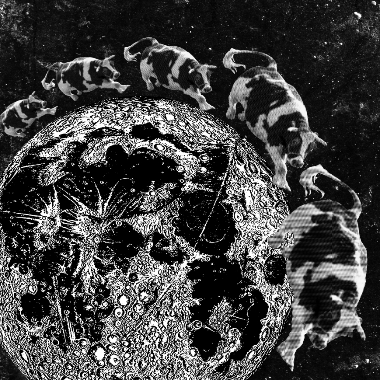
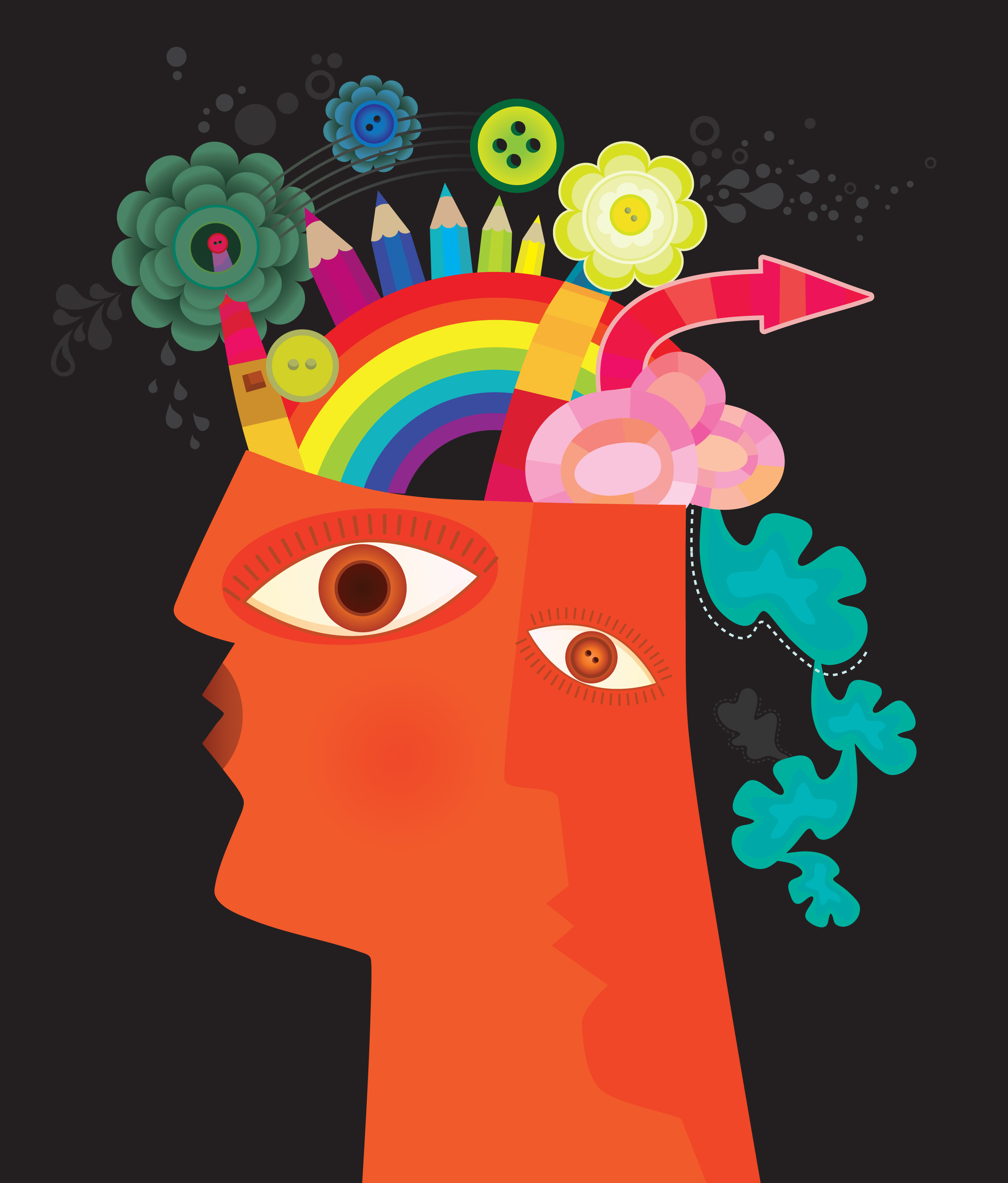
EMBRACING CREATIVITY
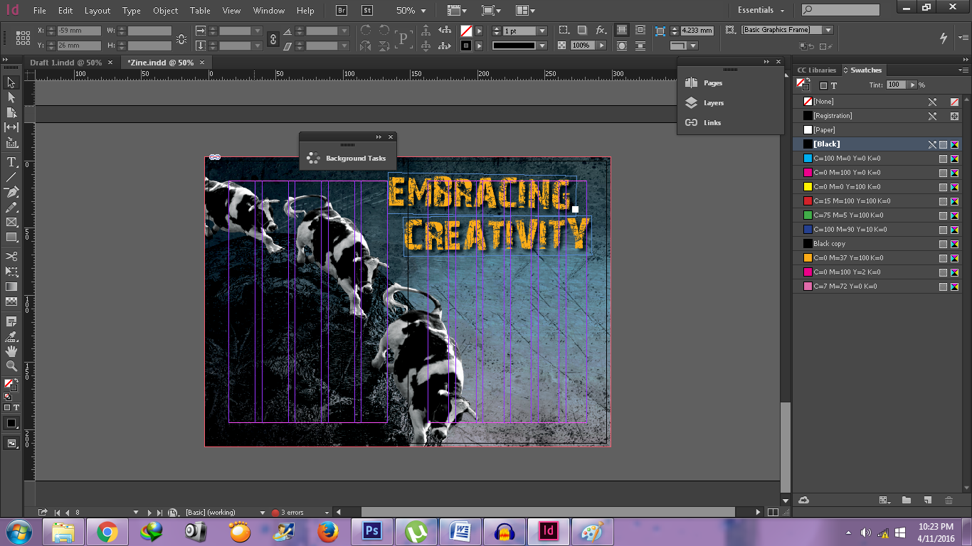
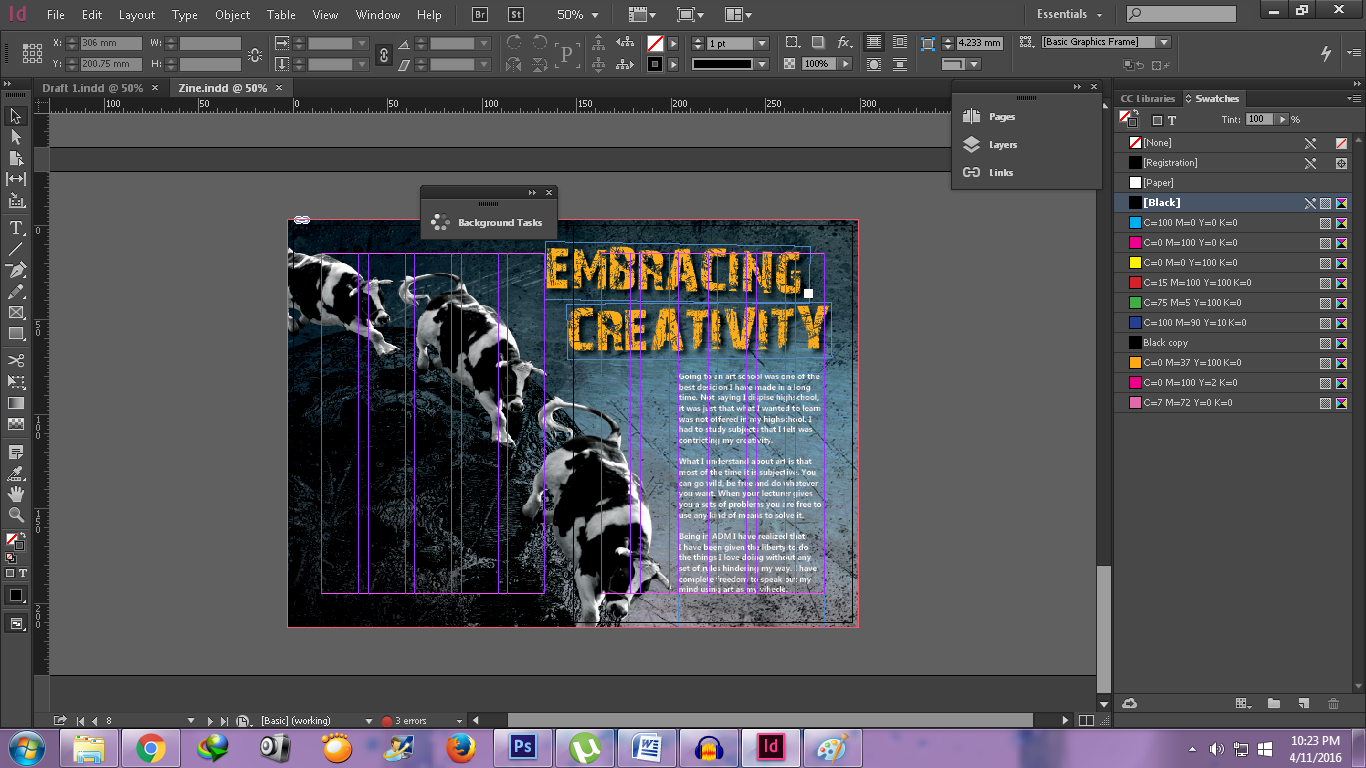
Because the background was quite dark, I decided to change my text color into white so it will be easier to read.
After finishing making my spreads. I rearranging my pages for printing. i rearrange so that I can use saddle back stitch.


Then I export it to a pdf file.
And then print!


I enjoyed my final 2D Foundation project. I will miss this class, because not only I met a lot of friends, but it was one of the few modules that I put a lot effort when doing the projects. See you next time in my next post!
I knew from the beginning I wanted to incorporate my pass 2D Foundation works into my zine, especially my digital works. Because I felt that my digital works represented me trying new things that I was afraid of trying. It was not a hidden secret that I prefer doing my works by hand rather than digitally, because I was uncomfortable with the latter. But eventually it developed into a fear of trying new things and failing at it. So being in the 2D Foundation class, it forced me to the things that I was uncomfortable doing. My digital works are my triumph against my fear.
So far I had two projects that I did digitally. One was the Rhyme project from semester one and the other was the typography project from semester two.
I chose the first one, because I felt it would give me more materials to work with. My mindset was set on using my Rhyme project as not only the background of my zine but also two showcased my progress so far in ADM.
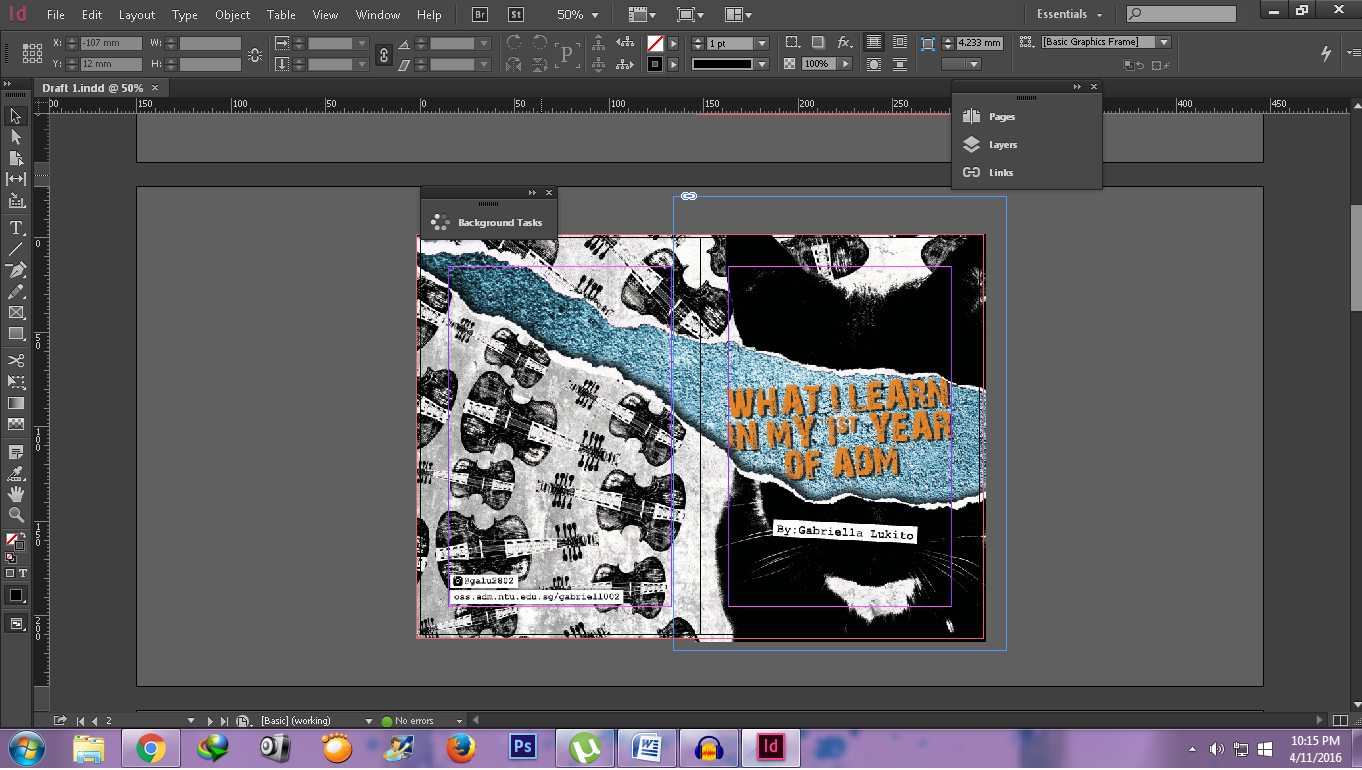
FRONT COVER & BACK COVER
I used the line the cat and the fiddle from the nursery “Hey Diddle Diddle”. However in the sketch I cut the image in have as if I had ripped it. I added some ripped paper so it looked more realistic. I purposely removed the eyes because I felt it would be a bit weird to have it on. Perhaps it would look that I separated top part of its head from its body.
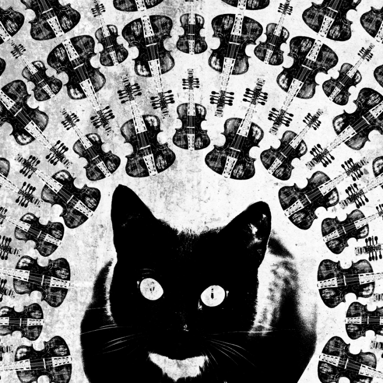
And when the paper ripped it revealed a concrete background. I added the blue hue because I was planning to use orange text so it would complement each other. This is the finished piece that I did in Photoshop before I added the text in InDesign.
PRINCIPLES OF DESIGN
With this one I used the dog laughed at such a sport image. I wanted the dog to be the vocal point of the composition. The principles will be put around the dog’s head, 5 on each side so it will be balanced. Again I used a blue hue so it will complement the title text that I will add in later. As you can see like the cover pages I still keep the monochromatic colors too.
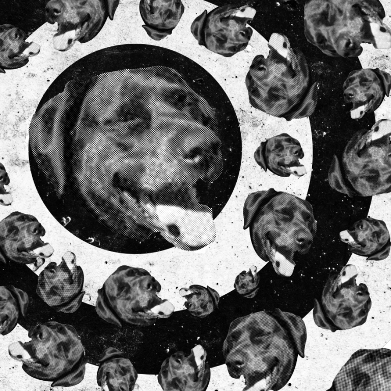
As you noticed I also played with a lot of texture, because I felt if I did not put in textures, the background would be blank and the composition would not be balance. I used texture from asphalt, concrete and black splatter.
DEADLINES
I used a cracked wall for the background and added again the blue hue to unify my zine. To represent my Deadlines” spread I used the hand whipping image from my Rhyme project for the line and she whipped them all soundly and sent them to bed which is from the nursery ”There was an Old Woman Who Lived in a Shoe”. I thin it at more to the ferocity of the subject (in the sense how much I dread deadlines, LOL). I put the whipping hand on the right, so that I can placed my writings on the left.


EMBRACING CREATIVITY
I revert using the nursery “Hey Diddle Diddle”, in which this time I used the line the cow jumped over the moon. Just like the “Deadlines” spread I put the image on one of the sides of the spread. However unlike “Deadlines”, I put the cows and moon on the left because I was planning to put my text on the right.
RESEARCH & DEVELOPMENT
For my class’ Final 2D Foundation Project we were assigned to make zines! According to the Cambridge Online Dictionary a zine is a small magazine that is produced cheaply by one person or a small group of people, and is about a subject they are interested in. And in this project we were supposed to create an 8 page zine that talks anything about us.
I was very excited for this project, mainly because I was very glad that the semester was almost over. A part of me felt very tired and overwhelmed with my projects. I suppose that sounds a bit cynical. But the other part of me feels sad that my first year in The School of Art, Design and Media is almost over. That is why I’ve decided to explore what I’ve learn so far in an art school. But before that I lamented back what I did before coming to ADM.
Before ADM
Back in high school I came from a school that did not provide formal teachings on art, even though that was what I wanted to learn since I was in the 8th grade. But a lot of people around me at that time were not convinced that I could make it in art. I endured my high school days, but I hate most of it, because I felt forced to learn things that I didn’t find interest in. In fact a lot of my friends were pressurized to do something that they were not necessarily enjoy doing or passionate about. So by the time I was a senior in high school I knew that I wanted to pursue art. And thank God that my close family was on board with me choosing this field of study.
However some of my friends and extended family were skeptical. They would say “Oh what do artist do?”, “How are you going to get money to feed yourself?”A lot of them were under the impression that I will be unemployed in the future no matter how good I am in what I love doing. Despite all of that, my parents and my closes friends still supported me. Their support help fought through every negative comment that I had during my final year of high school.
After getting here and getting away from the negativity, I was free to do the things that I’m passionate about. I learn a lot of things, not only about art but also about life.
3 Important Things I Learn in My 1st Year of ADM
1.Principles of Design
I’ve talked about the principles of design in previous post for my Rhyme project. As I’ve said before, the Principles of Design are there to guide an artist or designer to create a dynamic composition or artwork. It was not only discuss in my 2D Foundation class, but also it was discuss throughout all of my foundation modules. This was the basic of the basics. Making the composition was the start or every art piece.
I did not realize how important it was until recently when I struck discussion with my friend in the same CCA, which was Union Shop. That person was assign to take photographs of the products. Her shot were not that bad, but some of the pictures had some problems such as balance, cropping, the background did not complement the products, etc. Before that discussion, I honestly did not take seriously these principles. Of course when I do a composition, I unconsciously keep them in mind. But when it is time to do a presentation, I have hard time explaining why I did my composition like that. Not until I came to ADM, I understand it more and became more sensitive to it
2. Deadlines

I believe everyone deal with deadlines one way or another. But what I noticed in the short amount of time I’ve been here, a lot of art students tackle this differently. Usually for each project we will be given around 4 weeks to accomplish. Well, you might say that is a long time to finish one project. But if you put into consideration that we have 5 to 6 modules in each semester you might not see it as a long period. Though arguably most our deadlines overlapped. We try our best to give attention to all of our modules, but it gets overwhelming at times. Especially if we don’t manage our time properly, deadlines can be a pain. However I see the benefits having deadlines. They definitely train your time management and remind you not to spend too much time in one particular work and neglecting the others. I personally feel having to deal with the fact that I am rushing works during the last week because I spend the other three thinking of an idea. I am trying to kick this habit and I believe my time management is getting better.
3. Embracing Creativity
As I have mention, I felt constrained before entering ADM. I mean aside feeling being forced to learn things that I did not like, I felt I did not have time to do the things I love. My time was consumed by studying subject that I was not fond of. Of course I knew I needed to finish high school so that I can enter this university. But admittedly at times it was a burden. There were times where I truly despise my high school life. I felt trapped.
But being here, I felt those burden was slowly being lifted. Not only that I can do art, but I was challenged in that field. I wanted to grow from the little knowledge that I have. I wanted to know more, explore more. I did the things that I previously could not do, whether it was because I had no time or because I was afraid to do it.

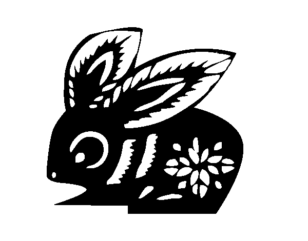
Hello again people of the web! Miss me? Once I again I come back with a few stories to share. This time is about my 2D Foundation Class’ 2nd Project which is titled “Point of View”. In this assignment we are required to think of an object and how it can be viewed by something else in a different way. You could say we are required to think out of the box! You can have multiple objects but I chose to have one which is a rabbit!

The reason why I chose a rabbit is because I have taken a Children and Literatures module. In one of the reading requirements I was suppose to read about Alice in Wonderland. I was so intrigued by the novel that I wanted to do something with one of my ADM projects to pay homage to it that I promised myself if the opportunity presents itself I would do it. So two out of six sentences I manage to get inspiration from Lewis Carroll’s novel, while the others I try to find it myself. I ended up having 20 sentences to choose from and those are:
Shirley, my teacher helped me to short list into six final sentences:
A RABBIT FROM THE POINT OF VIEW OF ALICE IS CURIOUS
Many fantasy stories start with the main character transported into a new realm. One might argue is not the rabbit hole that transported Alice, but it is the White Rabbit. All adaptation of Alice in Wonderland always starts with Alice curiously following the White Rabbit. In the chapters, Alice’s curiosity tends to be the cause of her troubles.
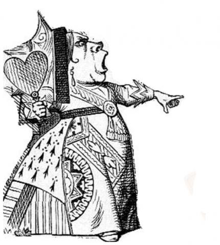
A RABBIT FROM THE POINT OF VIEW OF THE RED QUEEN IS A SERVANT
In the books and especially in Disney’s 1951 film animation Alice in Wonderland the White Rabbit is portrayed a s a worrisome character. Well, it is understandable if you have a queen like the Red Queen. In Disney’s animated film the Red Queen is a combination of two different queens: Alice in Wonderland’s Queen of Hearts and Through the Looking Glass’ Red Queen.
A RABBIT FROM THE POINT OF VIEW OF A CARROT IS THE END
Every carrot’s nightmare is a rabbit. Thanks to popular culture, people associate rabbit with eating carrots. Remember Bugs Bunny? What’sup doc? But in reality a rabbit’s diet also include grass, forbs, and leafy weeds. The exact quantities given often depend upon the rabbit, so you may need to test your buns individual limits, as a rule an average 2.5kg rabbit should get 1.5-2.5 cups of fresh vegetables per day.

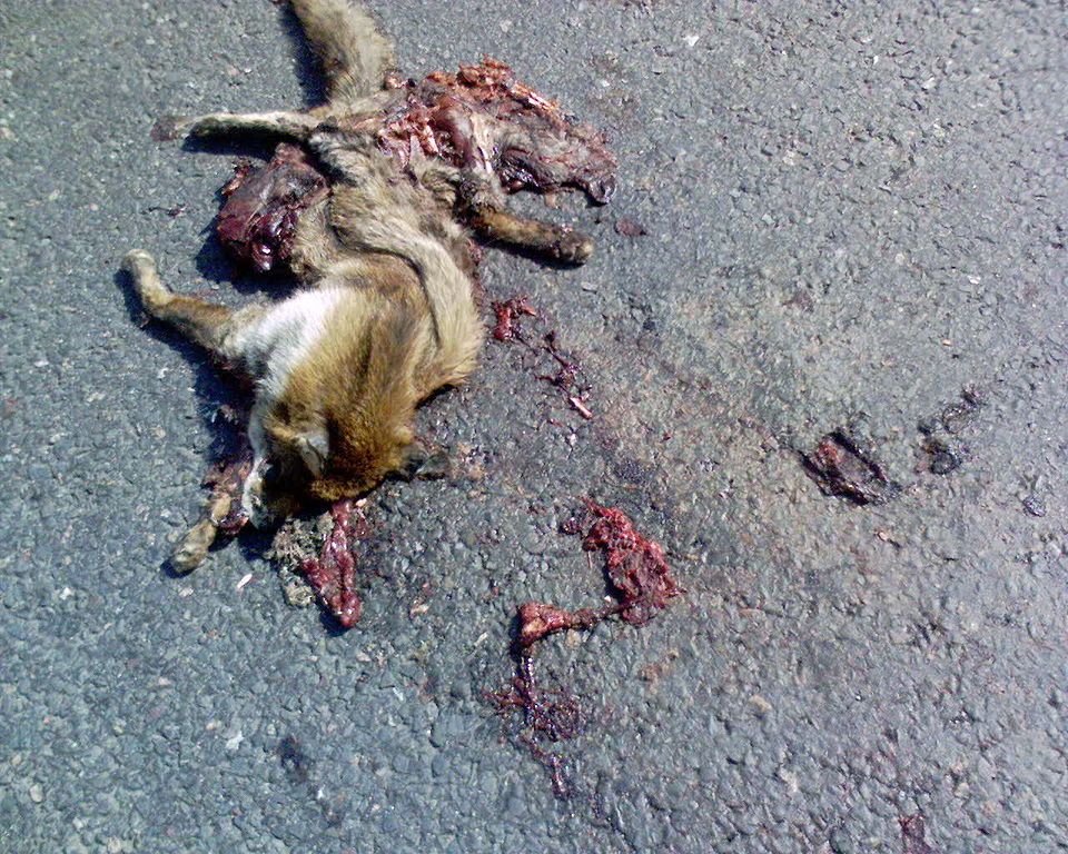
A RABBIT FROM THE POINT OF VIEW OF A RECKLESS DRIVER IS ROAD KILL
Road kills are animals that are struck by motor vehicles that are driven by humans on the highways. Unfortunately these incidents are causing some animals becoming endangered and other negative impacts such as injury to, or death of, vehicle occupants, loss of valuable livestock or pets, vehicle damage, economic losses (cleanup, repairs to vehicles, etc.) and it is a distasteful sight, particularly costly to locations economically reliant on tourism.
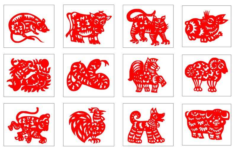
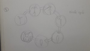
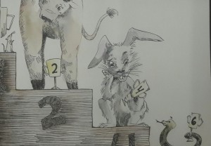
A RABBIT FROM THE POINT OF VIEW OF CHINESE ZODIAC IS THE FOURTH
If you are familiar with Chinese mythology, you will surely know the Chinese Zodiac. The Chinese Zodiac or shengxiao (/shnng-sshyaoww/ ‘born resembling’), is a repeating cycle of 12 years, with each year being represented by an animal and its reputed attributes. Traditionally these zodiac animals were used to date the years. In order, the 12 animals are: Rat, Ox, Tiger, Rabbit, Dragon, Snake, Horse, Goat, Monkey, Rooster, Dog, Pig.
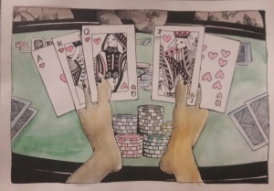
A RABBIT FROM THE POINT OF VIEW OF THE SUPERSTITIOUS IS LUCKY
Many believe that a rabbit’s foot is considered to be lucky and bring good luck. This belief is held by individuals in a great number of places around the world, including Europe, China, Africa, and North and South America. It is likely that this belief has existed in Europe since 600 BC amongst Celtic people. But not all rabbit’s foot are considered lucky. There are three conditions that need to be fulfilled which are:
I knew I wanted to do all of it by hand. I wanted for each to have different “storybook” style. I took a lot of inspiration of storybook illustrator such as John Tenniel (Alice in Wonderland), Lisbeth Zwerger, Ralph Steadman, Jules Feiffer (The Phantom Tollbooth), Quentin Blake (Matilda) and Maurice Sendak (Where the Wild Things Are).
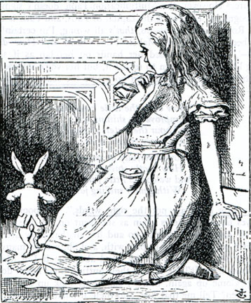
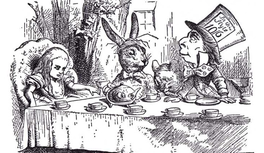
John Tenniel’s illustration of Alice and the Mad Hatter
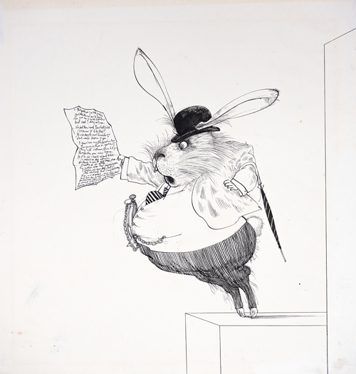
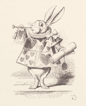
Ralph Steadman’s illustration of the White Rabb
it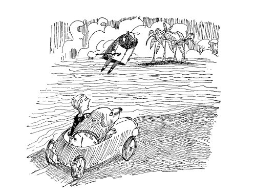
Jules Feiffer’s illustration of The Phantom Tollbooth
For each of the sentences I did a couple of thumbnails and showed them to Shirley. I wanted to have a couple options that I can chose from.
A RABBIT FROM THE POINT OF VIEW OF ALICE IS CURIOUS
As I had mentioned I had wanted to do something that is related to Alice in Wonderland, so I had the initial design that I wanted to portray Alice and the White Rabbit. I eventually got two illustrations.
This illustrates Alice after her adventures in Wonderland. She is looking for the true White Rabbit amongst all of the white rabbits, because to her the White Rabbit is portal back to Wonderland.

Perhaps she is reminded by her wonderful misadventures in Wonderland and the rabbit is just bewildered by her staring.

A RABBIT FROM THE POINT OF VIEW OF THE RED QUEEN IS A SERVANT
Like the one with Alice I knew what I wanted to draw. Like Alice I drew 2 illustrations:
As the White Rabbit looked up with an intimidated face, the Red Queen stared down at him as if he had done something bad.


This really spells out torture for the poor White Rabbit. He is carrying the heavy queen and her throne while she looks sinisterly happy with his sufferings. Truly such and evil queen!
A RABBIT FROM THE POINT OF VIEW OF A CARROT IS THE END
At first I wanted to show a life cycle of a carrot: from a seed to a full mature carrot.


A RABBIT FROM THE POINT OF VIEW OF A RECKLESS DRIVER IS ROAD KILL
I had separate illustration to show that the rabbit has been run over by a car:


A RABBIT FROM THE POINT OF VIEW OF CHINESE ZODIAC IS THE FOURTH


A RABBIT FROM THE POINT OF VIEW OF THE SUPERSTITIOUS IS LUCKY
This one I had so many problems solving.


I was very happy with the final results. Even though it took quite a long time making them, I had lots of fun mixing and experimenting with different styles. Let me present you the six “Point of View”!
A RABBIT FROM THE POINT OF VIEW OF ALICE IS CURIOUS
I wanted to emulate Tenniel’s style so I used micron and pen to recreate those thin lines and I kept it black and white.

A RABBIT FROM THE POINT OF VIEW OF THE RED QUEEN IS A SERVANT
This one I eventually created a high contrast so that it showcased the Red Queen’s dominating and demanding nature. We see the rabbit is at the corner left of the composition and seems to be small again to emphasize his lower status in front of the queen.

A RABBIT FROM THE POINT OF VIEW OF A CARROT IS THE END
I used color in this one. I wanted the style to resemble children’s alphabet book. In my opinion the cute and innocent drawing style contrasts with the dark themed sentence. I eventually added the feet to balance out the composition.

A RABBIT FROM THE POINT OF VIEW OF A RECKLESS DRIVER IS ROAD KILL
This was my first try! At first this was meant to be a sketch, but I liked the unclean look that I used it for my final submission. (LOL) I actually repeated the illustration but ended up to clean! So I used the first one. This shows that I am a very clean type of artist. Clean to a fault!

A RABBIT FROM THE POINT OF VIEW OF CHINESE ZODIAC IS THE FOURTH
This one I took queue from Ralph Steadman’s style. I like how the rabbit is looking at his trophy. He seems dissatisfied, but seems reluctant to argue with the results. I mostly used earthy colors such as orange, yellow, brown and dark green. For the rabbit I used hues of grays and blue to differentiate it from the others
A RABBIT FROM THE POINT OF VIEW OF THE SUPERSTITIOUS IS LUCKY
I used Shirley suggestion to create the solution for this sentence. I like how the red color really pops among the green table. I liked how the green also framed the rabbit feet, further emphasizing their importance.
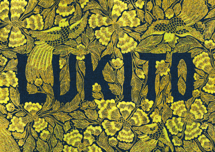
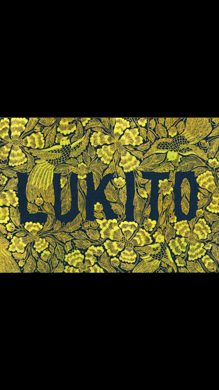
I’M INDONESIAN
After having the concept nailed, I immediately start working. At first it was just sketching on paper which I will redo on Photoshop using my tablet. But then I realized it was taking a lot of time for me to sketch. After the third day I was tired of counting the hours I spent with one of the typography. Then my good friend Joyce, who is also in the same class as me, suggested to scan the design and clean it in Photoshop. It was a great advice! This is the scanned design. Imagine how many hours it would take to redraw this again on Photoshop.
I up the contrast and eliminated the white background. Then I layered a yellowish gold cloth. I use the clipping mask option so that the line work I did would have the same texture as the cloth. After that I added a navy blue clothe as background. I think it contrasts really well with the yellow-ish gold. In the process of it I edited the colors a lot. Tweaking here and there until I got what I was looking for.
Here is the final look!
I’M DILIGENT
With this one I took up que from the Im Indonesian design. I drew the design first in black and white and scanned it into the computer. Afterwards I added the colors and background in Photoshop.

I drew a honeycomb with the honey dripping and added a bee to represent me the diligent hard worker.
In Photoshop I colored in the honeycomb one by one. What a pain it was. There we so many.
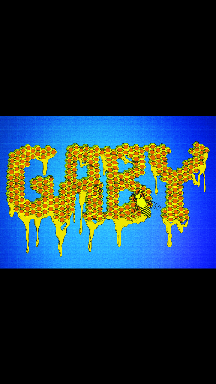
In the end I used a blue background, because it complements the orange and yellow hues that my typography has.
I’M A TRANSLATOR
With this one I used Photoshop completely.
First I though of words to create the letter.
I was listening to some English songs such as Taylor Swifts “Bad Blood” and Justin Biebers “Sorry”. So some of the words ended up being use in the letter. (LOL)
After finishing the G, I moved on to the L which contains the Indonesian words. So I just translated some of the words in G and added some in.
Added a notepad background to finish the look.
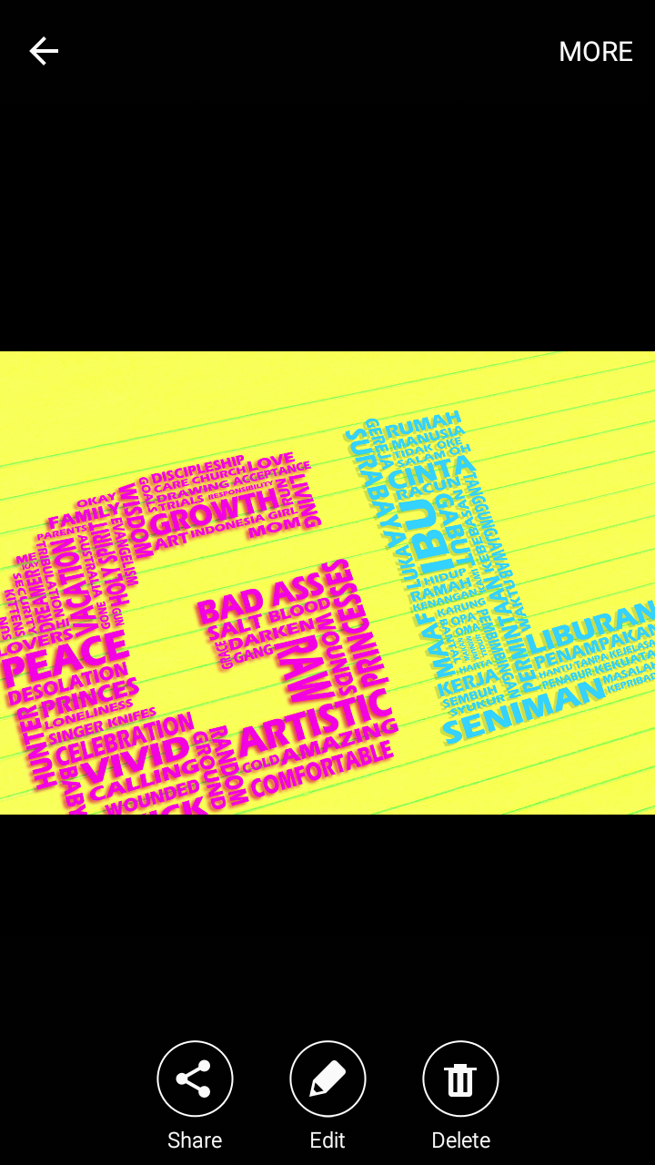
However I wasn’t satisfied. It was too straight. So I tilted the words a bit and crop them. The diagonal angle made the composition more interesting.
I’M A NIGHT OWL
I drew the owls on paper first, just like the “I’m Indonesian” and “I’m Diligent” typography. I finally decided to warp my owls into letters to spell out my name. Like the others that I had to design first on paper, this one was a labor of love. Those feathers took a long time!
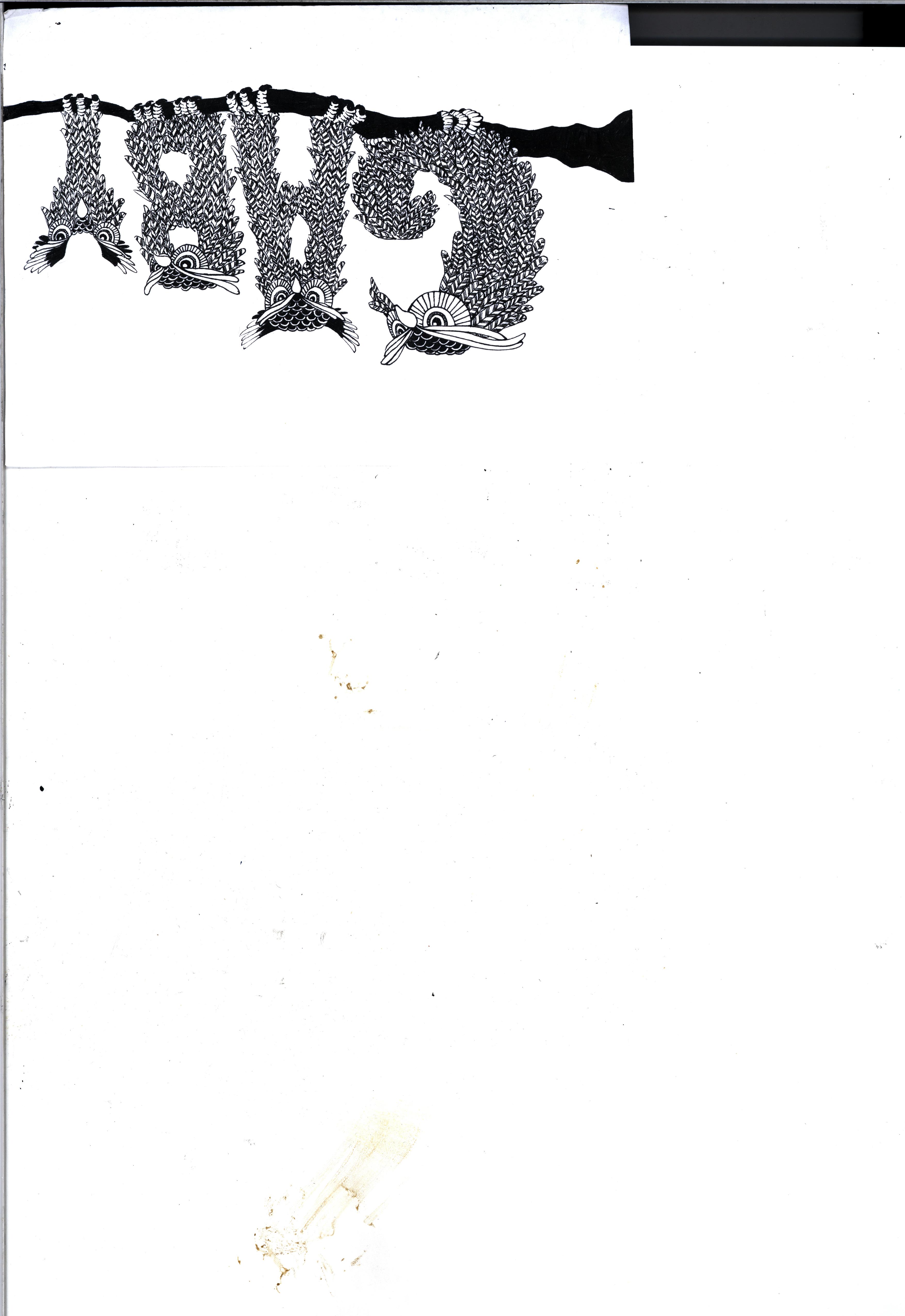
After scanning them, I opened Photoshop. The look that I wanted to achieve was it to look like paper cut outs, in fact this my initial idea after finishing the design. It was just that my design was very intricate, I knew it would take a long time to create and a great amount of patience to accomplish it nicely (which unfortunately I do not have)

In the end I added a colorful background of blue and pink to represent the breaking of dawn. This is because I’m usually awake till 3 in the morning which in my country we can usually see the sun rising. Its different in Singapore. Its still dark even at 6.
So guys, those are the four characters that represents me. Personally my favorite would be the first one, “I’m Indonesian”. I’m very proud of my country and its culture. Being in another country made me more appreciate my homeland even more.
See you in the next post!